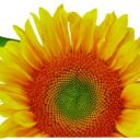
#high enough quality image of it to get a detailed look</3
Text


post no longer cancelled though actually. take my hand. look at their littwle shoesies with me :')
#this type of shoe is a calceus btw#it is slightly baffling to me how these are actually constructed byt. thats part of the fun of it#it also made me realize i hadnt looked at them closely enough before to draw them accurately. i didnt notice the little ties....#also what the hell kind of material are they made of thats soft enough to show the outline of the toes through it???#felt maybe???#they look so soft&floppy on the top side its kind of dubiously practical but they do seem to have some kind of harder sole at least#one statue that shows the shoes in their entirety instead of being hidden by fabric is the aulus metellus/orator bronze but i cant find a#high enough quality image of it to get a detailed look</3
32 notes
·
View notes
Text
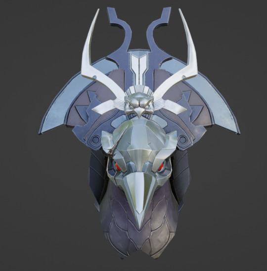
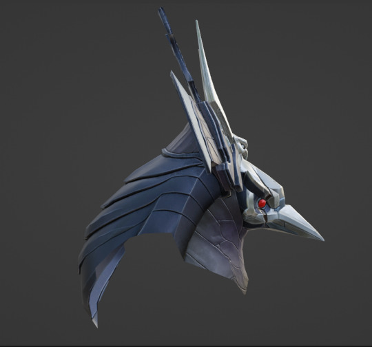
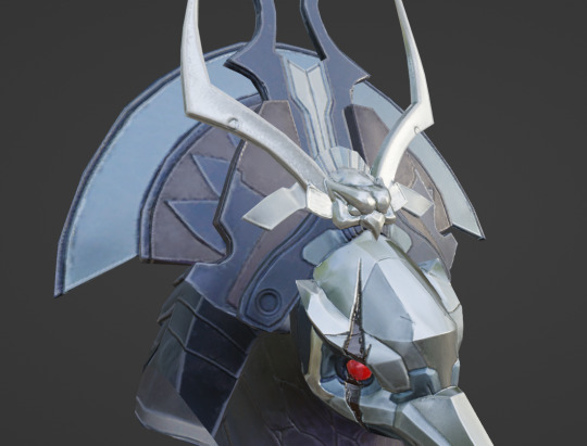
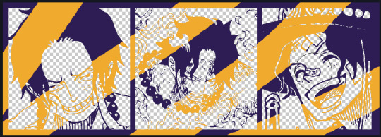
Metroid Dread Model Deep Dive: Raven Beak, Part 1
You know him, you've (probably) fought him, he's a staple of this blog...
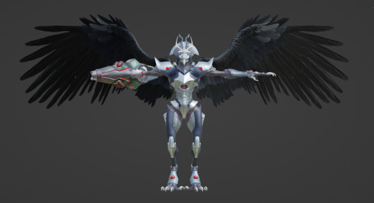
It's Raven Beak! We're finally doing this.
Today, I'm providing a comprehensive look into Raven Beak's model. I probably won't have enough space to cover the entire thing, as the image limit for Tumblr posts is capped at 30, but we're starting with the head and working our way down.
The rest of this post is under the cut for your convenience.
Navigation:
Fullbody turnaround and helmet meshes
Helmet details
Shoulders, arms, and hands
Arm cannon
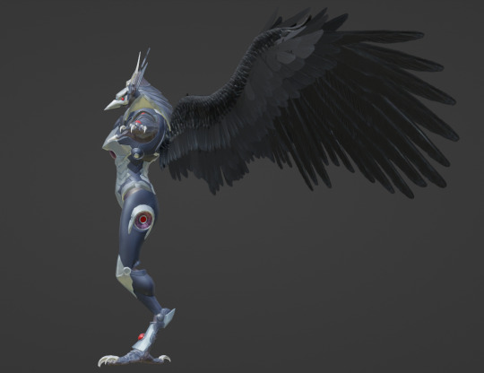
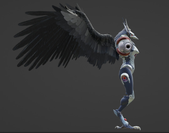
Wings and torso
Legs and feet

Raven Beak is referred to as chozocommander in the files: his textures are abbreviated to "commander[whatever]" in the files, with the name of a mesh or general purpose specified in the square brackets (commanderbody, etc). Raven Beak appears in three maps: Hanubia, Artaria, and Itorash. As Metroid Dread's cutscenes are executed in-engine, his model can be extracted from the map packages for the aforementioned regions.
There are several models linked to him during cutscenes that aren't part of his base model: chozocommander_arm, chozocommander_face (appears in Hanubia and after the mask breaks in Itorash), chozocommander_wing_r (which he rips off during the cutscene preceding phase 3 of his fight). chozocommander_arm is a more detailed version of his left arm that exists in the actor files for both Artaria and Itorash, the two zones where a cutscene involves the camera getting close to his arm while he chokes Samus out.
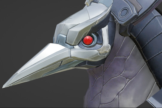
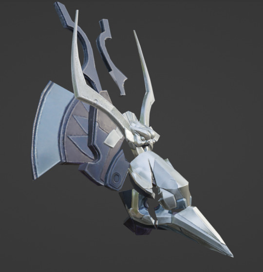
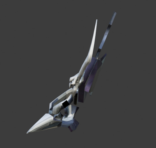
With that out of the way, our first order of business is his helmet, and there's a lot to look at.
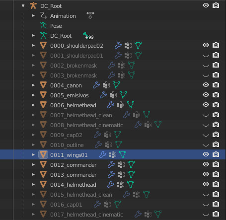
Here's a list of all his meshes. We'll go over each part as they become relevant. Relevant to our current objective is helmethead, helmethead_clean, helmethead_cinematic, and brokenmask.
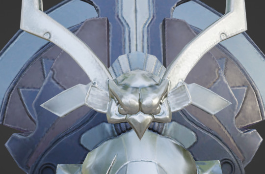
You'll notice that each of these have two meshes to their name. The names that are lower on the hierarchy are the actual helmets, and those higher on the hierarchy are overlays for the eyes to make them glow.

Here's what that looks like without scene lighting:

With the overlay...
... and without the overlay.
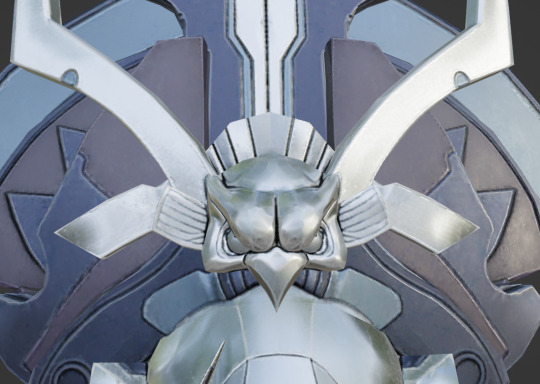
helmethead_clean features Raven Beak's helmet without the crack from the Super Missile: this is what we see during the opening cutscene in Artaria.

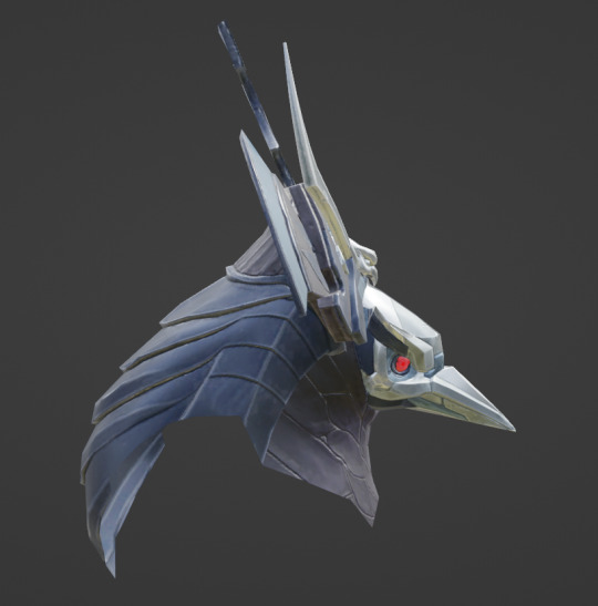
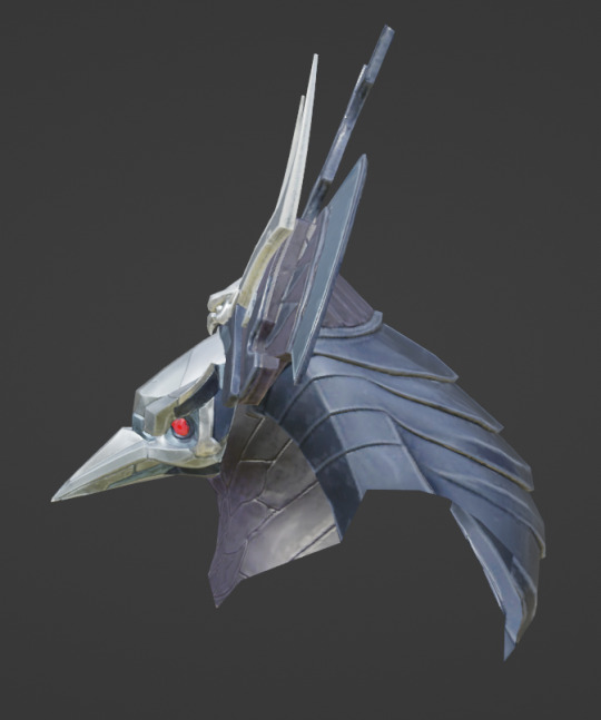
helmethead bestows the crack over the right eye.
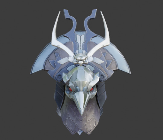


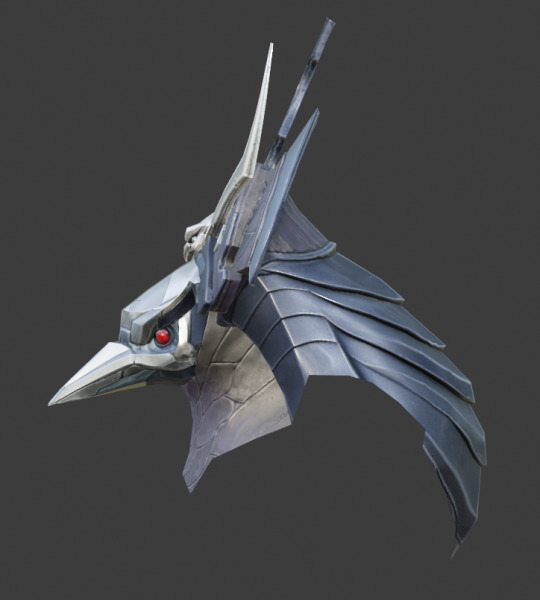
Of all the helmet meshes, the cinematic version is the cleanest and most detailed: this one is used during parts of cutscenes where the camera zooms in on Raven Beak's face.
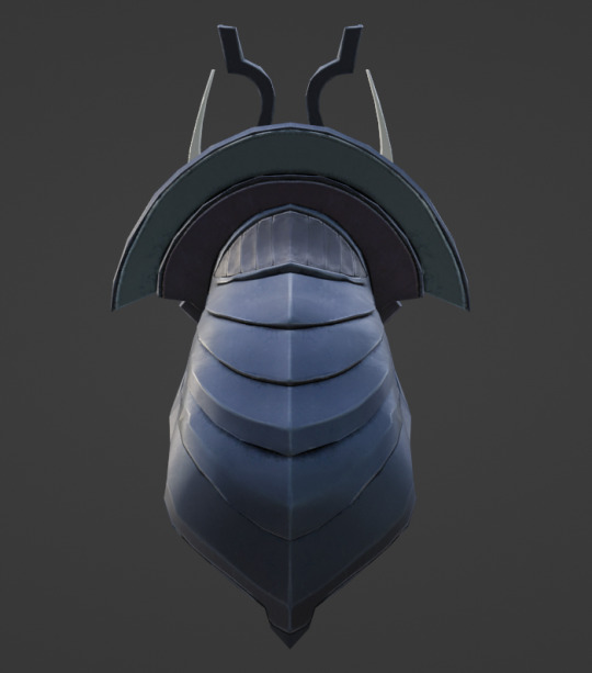

I'll be using this model to explore the smaller details.
All helmet meshes except the broken mask have their own textures: the broken mask uses the basic helmethead's textures.

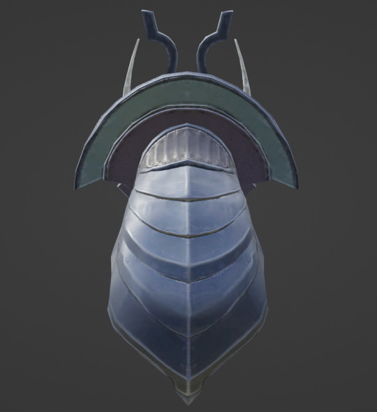
brokenmask (left) and brokenmask01 (right). These are used to animate the sequence where the helmet breaks in the post-boss fight cutscene.


Earlier, I mentioned that the cinematic mesh is cleaner than the others. The textures and geometry on the cinematic mesh are crisper and more defined because it's used when we want to get a good look at his face: you don't need to see every plane of his beak in high definition during combat.
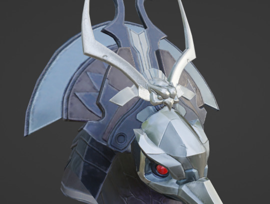

Here's a closeup of each primary model for the helmet to demonstrate. From left to right, we have helmethead_clean, helmethead, and helmethead_cinematic. helmethead_clean appears to have the lowest clarity in its textures. helmethead is passable, but the planes on helmethead_cinematic are leagues cleaner: there's very little artifacting (the janky crunch affiliated with lower quality jpgs), the colors appear richer, and effort was made to define the negative space.
Look at the owl-shaped crest in the center of the headdress (helmethead left, helmethead_cinematic right): there are darker lines between the arch behind the head, and care was put into darkening the spaces between the eyebrows, around the eyes, etc.
I've already hit the image limit, so we're going to examine the details on his face even further in another post: I've waited so long to share all the little differences between these helmet meshes in excruciating detail, so I suppose it's only fitting that our first entry is about more about that than it is showing off the finer details of the headdress and mask themselves.
I would not have been able to dive this deep a year ago when the image limit was capped at 10. I hope they increase it further so I can inflict you with more model facts.
I am working on the second post. The navigation section at the top of the post will be updated as things go live.
#raven beak#chozo#metroid#power suit#metroid dread#blender shenanigans#model refs#metroid dread spoilers
78 notes
·
View notes
Note
How do you get your drawings to be high quality? Whenever I post art the quality is SO bad 💔
uhm... sorry this is got long. for some reason you activated my work mode. i don't have a constumer service voice but i have like an explenation mode for clients so... uhm. here is way more information that you asked for. my apologies...
Resolution is what determines the sharpness of the artwork. The low-resolution illustration will appear pixelated when scaled in large sizes. this is why it is recommended to work on a digital canvas with a resolution of at least 300 dpi when you work. (i prefer 400dpi)
dpi are Dots Per Inch. dots just being a different name for pixels. the more pixels are contained in an inch the smoother lines and gradients are. an indication of higher quality. but, the device you are working on has to use up most of its ram/power to calculate the preview on the screen. so higher quality demands more capacity from your device but also from websites that display your artwork. Soo...
I have two files.
One on 400 dpi is way larger for me for smooth comfortable drawing.
and the second drawing is sized down to 150dpi to accommodate the recommended resolution of the website I want to post the image.
luckily for us, most social media sites have a similar resolution.
Tumblr's Dashboard images have a minimum size of 500 x 750 pixels, a maximum expanded the size of 2048 x 3072 pixels, and a recommended size of 1280 x 1920 pixels for a 2:3 aspect ratio.
I use a with of 1280. the high depends on the drawing
It's way easier and recommended to size images down rather than up.
sizing artwork up would put them through an interlacing process, which means that the graphics program of your choice would calculate the average between two pixes and add it in between them. It adds pixels to make the image larger. easy answer it blurs your image.
it isn't the end of the world if you have to size up the image a tiny bit.
I kind of have to do a bit all the time for work. and most of the time it's fine! it depends on your art style and how forgiving it can be.
It's also a difference if you post images in a JEPG or PNG.
uhm... without going into much detail... take PNG just trust me.
now... a tiny little last trick out of my sleeve.
if you... use photoshop. and you want some extra sharpness.
you can sharpen your images with the high pass filter.
Duplicate your artwork
Filter > other >highpass

As soon you select High Pass, your image will turn grey

It works by filling the entire image with flat, neutral grey. It then looks for edges in the image and highlights them by making the light side of the edge lighter and the dark side darker.
Don't overdo it. keep the contrast low. a radius of 1,5px is enough most of the time!
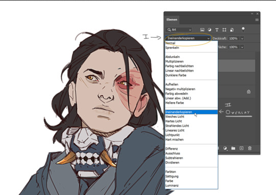
Click okay to exit the menu and set the layer on overlay.
ta-da! it is sharp and crisp!!!
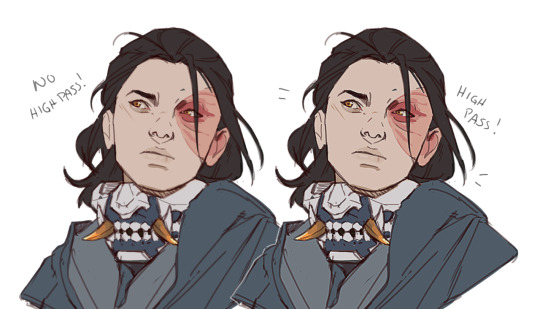
It's all a trick!!! vary subtle... i know but ehh i like it
I am sorry I don't know if other programs also have this option. I know CSP has a sharpening filter. but... you can keep images crisp by keeping resolution and dpi in mind too.
uhm... well so... -hides-
#chip!ask#chip!talks#i maybe overdid it here#but i ended wrtiting it and now i just... eh. i don't want to delate it... sorry!#zuko
984 notes
·
View notes
Text


Cheers, loveys!
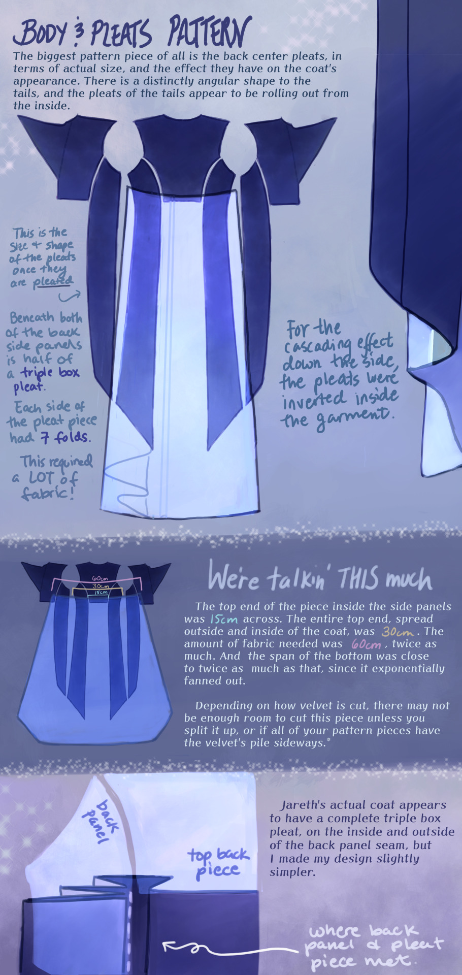
Here is post 1 of 3 about Pattern Construction. I’ll make a diagram post like this and then also take photos of my actual coat and with me in it.
I don’t remember how I started off doing the pattern, but I will guess that I took a tailcoat that I already possess and used it as a base, which in general seems to be a helpful way to start making clothes that fit if you’re not a master pattern maker (which I’m not, and I made plenty of mistakes which we’ll get into.)
There are two people I want to thank, and the first is Aria Couture [X] and their quality photos and observations, vocabulary and groundwork. They are the shoulders I stand on. Their photos were how I made all of the notes discussed in these diagrams, and how I discerned what kind of pattern needed to be made.
So the main changes that needed to happen to my base pattern was 1.) jacking up the shoulders to high heavens, 2.) elongating the side pieces (which I’ve come to call panels so go with me), 3.) adding pleats in that squared off spot in the back between them, 4.) adding a custom collar and cuffs, 5.) designing my own lining.
THE PLEATS were a nightmare. There was a lot of math involved, and math that was not necessary, but the most important thing was creating a shape that would fold together into a straight line on top, look cascading on the sides, and marry the rest of the coat in a reasonable place. After a lot of trial and error, I ended up with this rounded wedge that spreads out on the inside of the coat, but also folds backwards onto itself (like half of a box pleat), to reattach to the back side panels. This is what gives the coat its look of all this shiny velvet blossoming from beneath the back buttons and gushing out the sides.
As to why the pleat piece is rounded, all of the pleat lines were diagonal, so that the coat would flare out. Cutting this piece as a completely straight line on top meant it ran out of fabric in the top corners, and more of it needed to be pulled in, more and more sideways. Adding a sloped height to its corners helped it do what it was supposed to and become a mostly straight line when folded together.
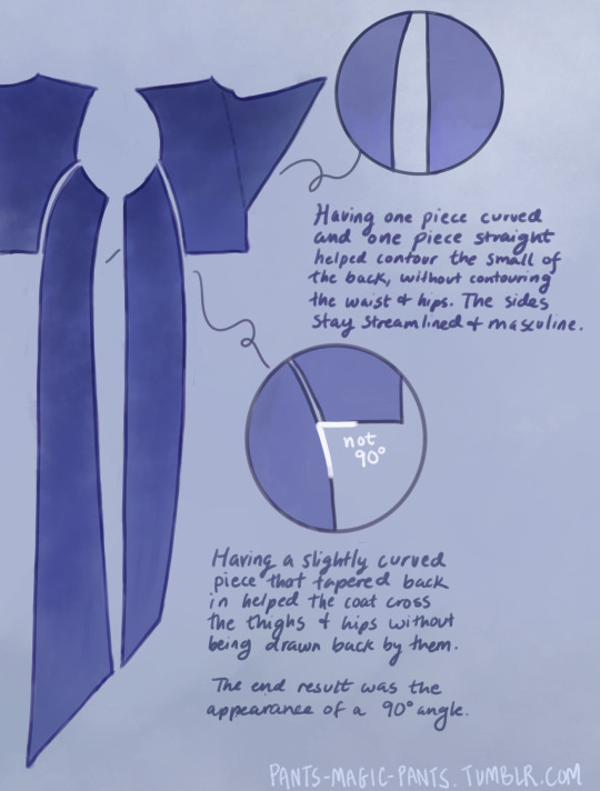
THE PANELS (second image), there are just a few notes about those which I think are important. As I am female cosplaying a male and wish to keep the masculine shape of the garment, some tricks needed to be pulled to hide my waist and hips, so this is what I came up with.
PROPORTIONS MATH. It’s a thing I started doing a couple cosplays ago, to get accurate shapes and lengths of garments, to give me the same silhouette as characters. It’s worked out really well for me. It’s been a real life application of algebra that I wasn’t expecting, as a former student who hated math. Now, I love math! Armed with a ruler and a protractor, I have taken down a lot of notes about such silly things as: what degrees the angles of the lapels are, and how wide are the shoulders compared to the head? (In Jareth’s coat’s case, the ratio of head:shoulders is 1:4.) With that knowledge, I took a photo of myself in the bathroom, measured my own head and shoulders in pixels, wearing a mock-up, and corrected shoulder span measurements to fit this ratio. It was a whooole thing, but I think it was worth it.
And I used proportions math for everything. How much of the arm do the cuffs take up? Where along the legs did the dramatic slope of Jareth’s “fishtail” start? Those things aren’t listed here, but hopefully this post gives you enough tools to figure it out on your own for your specific garment, or any garment you ever want to make.
THE COLLAR. Not much to say about it, but there’s how it looks.
SLEEVES. Dear God. I was stuck on sleeves for months because go ahead and look around online for detailed information about how to add basically football gear sized padding to your shoulders, and all of the intertwined modifications that needs. It isn’t out there.
One thing I can at least say is that it helps to start off with a great base, and the other person I have to thank is a tailor on YT called Chris Sartorial [X]. This guy hasn’t been active for years, but when he was, he was no nonsense, such a professional who knew what he was doing that he couldn’t even take the time to properly light his videos. Such a king. His channel helped me with my dress shirt, and also with making the base sleeves for this coat, which were of the “2 piece” variety. This kind of sleeve is used for blazers and coats so that it appears to fall in a nice boxy shape off the arm, usually from a shoulder pad, and then slightly turn at the elbow. While he doesn’t go into shoulder pads, this still halfway set me up for success, and knowing the relationship between shoulder and sleeve.
However, there are a few things I learned about shoulder+sleeve modification as shown above, and hopefully it’s a good “bouncing off” observation.
THE CUFFS. Again, not much to say, but this is how my pattern came out, to create that nice tear-drop shaped gap, with that sort of blooming and expanding height that his cuffs have, like a vase. The lace trim will be in another post. One thing I should mention is that the lace trim is tall enough that the bottom of the cuff won’t end on your wrist if you want to be able to see your own hands. The cuff needs to be measured so that it will end 2-3 inches up from your wrist.
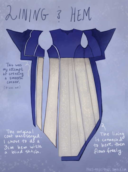
THE LINING
Dear God, she’s still writing. I am a huge fan of lining even though I’m not good at it, and my actual lining didn’t turn out looking as smooth as my drawings, but this is what I came up with, which in theory should look good. haha Any deviations from the norm that you see are just stylistic choices. I wanted the area in the top back to look sort of dripping like the back lace piece.
Was this interesting? I sure hope so. Please ask me questions if I’ve glossed over something.
53 notes
·
View notes
Text
Sticker (+ Coloring Book) Raffle!!!
OKAY I'VE BEEN WAITING FOREVER FOR THIS (like a week tops)
I've gone from 7 to 50 followers in genuinely like... 2 months. Which is insane for me! And all from posting FFVI things lol. Anyway, in honor of this, and also kind of as a test run for my shop I'm hosting a sticker raffle!
You can enter here!
and this is what the stickers look like:

(please forgive the meh photo quality, I don't currently have a good camera-- I'm working on borrowing my dad's for taking pictures of things before I actually have a shop! This is the best I could do with my phone atm. You can see the full pieces in high quality here)
and the coloring book:

Higher quality images here and here
------------------------------------------------------------------------------
THE DETAILS!
The only rule is that you're following me (and preferably that you actually, y'know, want to follow me and don't immediately unfollow after the results lol)
Other than that the process is this:
You want a cool sticker or a copy of the coolest coloring book of all time
You fill out the form for a chance to get said cool sticker or coloring book (You can enter for all of them but you can only win one)
The raffle closes April 11th at 7:00pm EST
I announce the winners! The current number is 3 winners, one for each thing. If there are enough people entering I'll up that to 6 winners, 2 for each thing.
If you win the coloring book I'll email you the PDF and DM you letting you know I emailed you.
If you win a sticker I'll DM you asking for an address to ship the sticker to. I'll also let you know when I'm able to ship it, and it should arrive within 8 business days if you're in the U.S.!
------------------------------------------------------------------------------
If you have any questions (or the link doesn't work......... hoping and praying it works the first time) let me know! Good luck and thank you to everyone who enters! Any and all updates about this raffle will be under my store update tag
#ffvi#final fantasy 6#final fantasy#celes chere#sabin rene figaro#edgar roni figaro#raffle#store update
18 notes
·
View notes
Note
Hello! I love your gifs! How do you make yours so clear and high quality/What's your process? <3
Hi!! Thank you so much!! I've never really had to explain out my process to anyone and I don't know how much detail you need, but I'll try my best and try to be as thorough as possible just in case!!
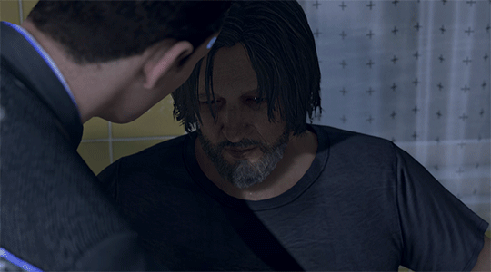
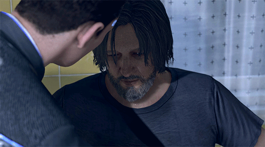
For my D:BH gifs, the process starts out with recording my own game play. I have a gaming computer that already had the GeForce Experience app downloaded, so I use that to record my game play. It records at 1920 × 1080p, 60 frames per second, so the files can get... rather large 😅 The video of my playthrough of the Russian Roulette chapter (~11 minutes long) was just under 4 GB. So its not light...
From there, I figure out what in particular I want to gif (for the timestamp roulette series, I let a random number generator figure out whereabouts I'm looking). Once I know that, I open up VLC and use it to isolate that particular shot + a little more on either end.
After I have the shot(s) I want to gif isolated, I open up Photoshop. I use "File" > "Import" > "Video Frames to Layers" and choose the video I want. You can do this straight from the video of your playthough, but I find that the shorter the video is, the easier it is to work with in this step. I trim my video more, to about a click or two outside of the specific shot I want. Like so:

From there I delete any extraneous frames from the "timeline" section that comes up.
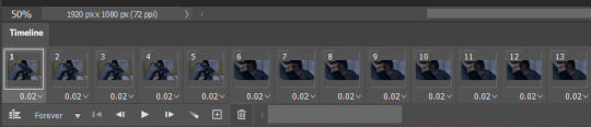
Then is cropping: my go-to crop uses the "W x H x Resolution" option - I put 540 px in the first box, 300 px in the second and leave the third blank.

After that, I have an action in Photoshop that does the next steps for me (to make things quicker), but what it does is sets the frame rate (which will have to be done again after saving the gif because Photoshop hates everyone apparently), converts all the layers into a single object, and sharpens the gif. I've only been gif-ing for about a year and a half, and before that I had exactly zero experience with Photoshop at all, so all the numbers from these steps are still the same as the numbers I pulled from the tutorial I used when trying to figure everything out. For those, you can look at this absolutely AMAZING tutorial, by hayaosmiyazaki, specifically steps 7. gif speed and 8. sharpening.
From there, I start adjusting the colors. From what I've noticed, I seem to do a good bit less color adjustment than some, or maybe even most, other gif makers. It's honestly all about personal preference, so play around with it and find what you like! I personally like to stick as close as possible to the original colors, while still brightening the image up enough to make it clearer and more legible. So, for a majority of my gifs, I only apply an "Exposure" layer, a "Brightness/Contrast" layer, and a "Hue/Saturation" layer (from the "Layer" > "New Adjustment Layer" menu.) The numbers here change dependent upon the lighting in the shot.
For example, here's a before and after of this shot I just did so I could type this out and make sure I got every step 😅 For this one, I did Exposure +1.0 (no change to Offset or Gamma Correction), Brightness +20, Contrast +10, and Saturation +5 (no change to Hue or Lightness).
Once I'm satisfied with my coloring, I go to "File" > "Export" > "Save for Web (Legacy)". I watch the gif there to make sure it looks how I want, maybe go back and do a few tweaks to the coloring if I'm not quite happy, check the file size and then save it!
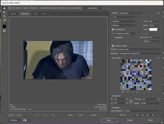
Tumblr's maximum file size is 10MB so if your gif is over that, you won't be able to use it on tumblr - in order to fix that, you may have to delete a few more frames. Or you can crop it to so there's less pixels in the "Save for Web" pop-up by changing the numbers in the "Image Size" section
And now, once I have my gif named and saved. I go back to "File" > "Open" and open up that gif. From there, I go to the little three lines icon in the top right corner of my "Timeline" section, click "Select All Frames" and then click the three dots on one of the frames and change the frame delay. For my DBH gifs, I do 0.02 seconds cause it looks best to me. Depending on how many frames per second your recording software does/what you personally like speed wise, this may be different for you. This is also different for gifs from live action or other media (for those, I prefer 0.05 seconds - it looks the most realistic to me.)
Then, I just save again, overriding the file from before I changed the speed, and voila! That's my process!
I hope this helps; if you have any more questions, my ask box is always open!! And again, thank you so so much 🥰 I'm so glad you like my gifs!!
21 notes
·
View notes
Text
Human Korvo but It's Real Dan Stevens (Made with Stable Diffusion/Photoshop/MTXX)
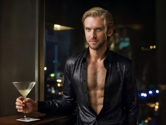
(Here is a screenshot of Solar Opposites S4E11 to compare)

First of all, I understand that there is some controversy on AIGC currently... However, I still decided to post this work here. Yes, I call it “work” because I had spent at least 5 hours to make this image, and I went through hundreds of small steps to achieve this effect. It's not perfect, of course, since I basically know nothing about drawing and photography…but I tried my best.
To make this post more "meaningful", here is the complete detailed workflow (FYI: It's VERY LONG. Here is a 1-minute summary video I made, in case you wanna save some time:)
Preparation stage:
①A base model (or base model+LoRA/Embedding, depending on your need). Normally people use LoRA for a specific person’s face, but I’m not using LoRA for Dan because small models don’t reconstruct his face very well. I’m using a base model (in my case, Serenity V1.0) trained on his photos with Dreambooth. I trained this model 3 weeks ago so it’s ready to use.
(If you’re wondering, “why not using Midjourney to generate celebrities?”, the answer is, Midjourney does a terrible job generating Dan’s face. Also it strictly forbids NSFW. Even just mild NSFW.)
②An OpenPose map and a Scribble image, to use in ControlNet (an extension on SD WebUI). I made a screenshot of the posed dummy from Magic Poser, and used this image to make an OpenPose map, and trace the outline of the dummy on Photoshop to make a Scribble image. Why do I need to make a Scribble? Because from my experience, all SD1.5 base models have a hard time generating “man wearing unbuttoned shirt”. So, only an OpenPose map is not enough. Gotta let it know what shape I want.
Base image making stage:
Step 1: Write a prompt.
I’m not good at writing prompt but it does the job:
Positive prompt:
full color photo of RLDAN, (wearing_unbuttoned_black_long-sleeve_glitter_shirt), BREAK, RLDAN, (long light blond hair), BREAK, RLDAN, (holding a martini glass), in a bar, looking to the right, (flat lighting), sharp focus, raw photo, 8k uhd, high resolution, DSLR, high quality, Fujifilm XT3
Negative prompt:
((woman, 1girl, female)), ((tattoo)), cartoon, 3D, (teeth), (mouth opened), (deformed iris), (deformed pupils), ((poorly drawn)), (extra limbs), (bad anatomy), painting, drawing, weird colors, blurry, watermark, text, high contrast, high saturation, (muscular)
About the prompt, I didn’t use any negative embeddings because sometimes they affect my trigger word; I add “muscular” in negative prompt because if I don’t, it’ll give me super buff man and it’ll look weird; “BREAK” is for separating groups of words.
Step 2: Choose a decent “raw” image
Editing the prompt and adjusting the ControlNet weights according to the results, and cherry-picking the better ones. The style of the clothing is the most important feature to imitate the original animation, so it has to be accurate enough. After cherry-picking the first okay-ish image, I reused its seed, and put this image into Lineart-realistic preprocessor to use the Lineart ControlNet model. The second cherry picked image looked more natural on lighting and background, so I saved this one for future use. I then used ADetailer (an extension) to swap face roughly, not good enough but that’s far from final.
Step 3: Upscale this image
Since SD1.5 was based on 512 resolution, my initial image size was 682 x 512, but that’s too small to make a higher quality face. Hence I used img2img+Tiled Diffusion+ControlNet Tile Resample to upscale x 2. So I get a 1364 x 1024 image to work on. I furthur upscaled it with MTXX, just 3 clicks.
Step 4: Inpaint the hair and face
I wasn’t satisfied with the hairstyle in the previous image. It doesn’t look natural and there’s no tendril near ear, so I gotta fix it. I masked the hair area and edited my prompt, and used a 0.55 denoising to get a better hair, and then used inpaint sketch to draw a blond strand near his ear, and used a 0.75 denoising to add a tendril. There were some artifacts in the image so I used Photoshop to remove those. Finally I used Adetailer again to change the face, this time it looked much more similar to the real Dan.
Post-processing(?) stage:
The Stable Diffusion part was complete. Now the Photoshop time. I changed the background (remove the wall-like thing and replace it with night view), martini glass bottom (it was really messed up), the shirt buttons (there weren’t any before), and of course the hand (I normally use OpenPose hand map to control it but this pose is rather complex, and I don’t like using depth/canny models so…) with Generative Fill. Also plenty of times of remove tool (and patch tool, color replacement tool, burn tool, liquify…yada yada yada). Then I used Neural Filters-Harmonization to match the color tone of the torso to the tone of face. Finally, I used MTXX to make some small adjustments on face and body.
And the picture is done.
Hope you guys like it :)
42 notes
·
View notes
Note
Heyy, I’ve been reading your wonderful one piece works for a while — and I couldn’t stop wondering how are you actually doing those magnificent headers?
Like… hello? The great quality, with additional 3D-alike details I could catch by my eyes? I got only Ibis Paint X on mobile, since I’m only a young man that literally two months ago went on a life-time ‘adventure’ of living alone in a small apartment.
In short — I got no money to pay for additional graphics/drawing programs, not yet at least
Hello!
Thank you! I'm glad you enjoy my writing - I'm curious to know what's your favorite piece / part? Also I'm so happy you like my headers? Makes it feel worth it to spend time on them! :D
I have excellent news for you, I used a mix of Canva and Photopea. They're both FREE!
I'll be explaining the process for making these two kinda? The full tutorial is below the cut, to be courteous to the other folks, hope you don't mind?
Though I am hearing that Canva has given people some grief. But Photopea is just *chefs kiss*
If you've ever used photoshop, Photopea is essentially a free photoshop, and it even has the automation tools! An absolute lifesaver when you have multiple layers you want to export (but that's for larger projects not this)
I'm going to assume you have basic knowledge of layers in digital drawing programs for this. If anything isn't clear: ask me, I'll clarify!
//-------------------------------------------------
My General Process is:
Search for official art / images
bring it into canva / photopea
crop / arrange images to match the dimensions
select a thematic color that is associated with the character
separate the foreground from the background
mess around and test things until they work
//--------------------------------------------------
Given "Louder than Words" is the latest one I've made, I'll start with the process for it.
Dimensions: 3000 x 1055 px
dpi: 96
//-------------------------------------------
Let's Get Crackin'
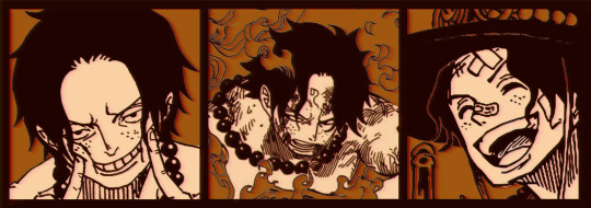
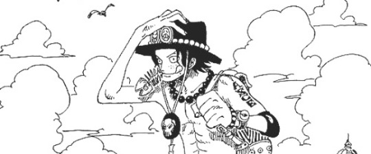
Alright let's grab some official art so we're not using any fanart without the artist's permission
I try to pick images that feel relevant enough to what I'm trying to make.
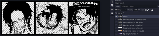
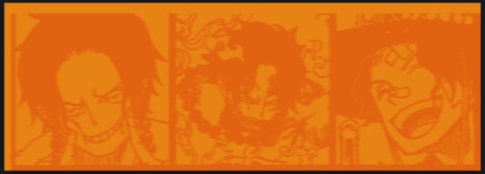
For example: the image for the Matching banner shows the ASCE tattoo which is super important in that fic
2. Let's arrange them onto a banner where each individual image has the same/similar dimensions to the rest
That's probably part of why you like these. To a certain extent they have similar dimensions, so they have a uniformity that's pleasing to the eye! (It's not perfect because I threw perfectionism to the wind because this is tumblr not my portfolio)
Tip: if you have 3 images and only 2 that have similar dimensions, and the 3rd one can't be cropped logically: but the one that's a different aspect ratio in the middle!
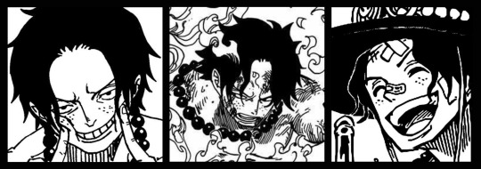
3. lets arrange them in such a way that the borders all feel like they're the same/equal width/thickness
you might find that you have to shrink some images for this, that's fine.
ALTERNATIVELY: if you're going with one image crop it so it's just the relevant info and it matches the dimensions (3000 x 1055 px)
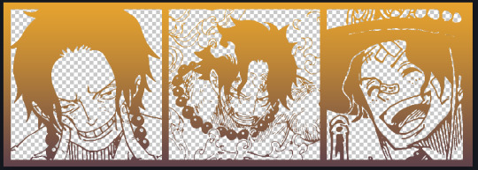
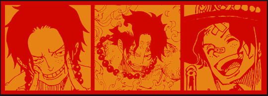
We have our base! Now let's add some color, and direct the viewer's eye together!
4. pick out a color that you think matches your character / vibe - that color is going to be your background
Given I'm making an Ace banner: orange is the color I'm going with
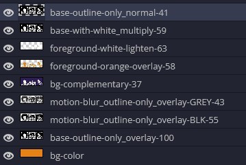
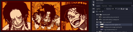
I went and named my layers for this lol. The numbers represent the opacity, and they aren't important. I just kept changing the opacity until I liked the way things looks. But here's the secret to the 3D feel:
Motionblur (+ moving it about)
Separating the foreground and background and dulling out the background.
I'm going to show you my process so you can see the effects, but first let's give you some quick skills:
//------------------------------------
SKILLS / THINGS I THINK ARE HELPFUL
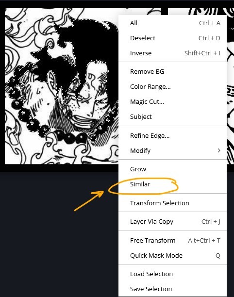
//------- Select Similar
magic wand -> select something -> right-click -> select similar
This works best when you have high contrast images (like manga panels that are black and white). You can select the black or the white areas. Depending on what works better for you.
TIP!
Invert selections with ctrl + i
Say you know that you want to select everything but Ace's face in the second panel. Select his face with the magic wand then ctrl + i, and that's the only thing NOT selected


TIP!!!!!!!!!!!!!!!
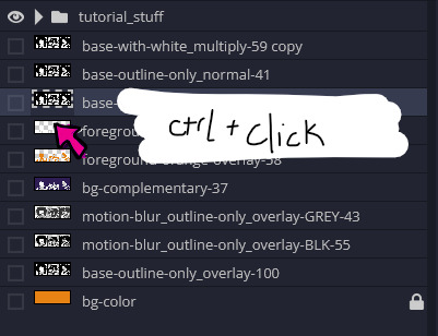
Please, please, please, duplicate your original image and work on the duplicate layer. This helps you SO much. !!!!!!!!!!!!!!!!!
TIP!
Check your selection tolerance! This could be why too little, or too much is being selected.

//------- The Move Tool
Shortcut key: v
While the move tool is active, you can nudge the stuff on whatever layer with your arrow keys
Shift + arrow key = 10 px move (generally)
//------- Layer Locking
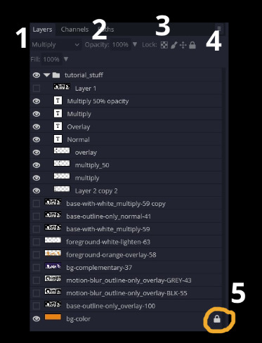
1- Layer Blending Mode (see Overlay vs Multiply vs Normal) for how this can affect results)
2- Opacity: how see through it is / isn't
3- Lock Transparency (it's the little checker board)
4- Lock Layer (looks like a lock)
5- Lock icon that appears when anything on the layer has been locked
More on 3 Lock Transparency: You can only paint on / modify what's on that layer. You CANNOT add anything to any area that is already transparent
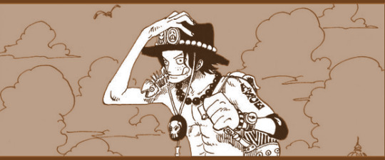
Here's a demo of what you can do with this power:
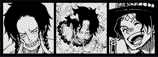
Here's the original Image - notice how it's just the lineart with a transparent background.
It's powerful: abuse it
//------- Overlay vs Multiply vs Normal
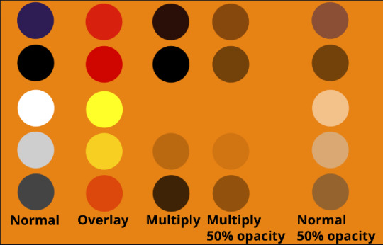
I think seeing this is the best way to visualize how different modes can affect the color.
//--------------------------------
Back to the Tutorial
!!I IMPORTANT NOTE !!
Please play around with the opacity slider to figure out what opacity works best for you on the multiple different layers we're about to make / work with. It's up to your own style to figure this out.
Next: please feel free to not follow all of it. Add more layers, add less layers, take the base principles and go wild! :D
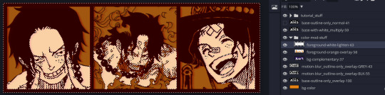
5. Separate the lineart from the background and save it as a new layer
6. Duplicate it and set it to overlay, or set it to overlay immediately
7. Duplicate that lineart layer twice and set the blending mode to overlay
8. lock transparency on the top one and change it to be a dark grey
9. Apply motion blur to both:
Main menu bar -> Filter -> Motion Blur
I made it so that the grey layer was blurrier than the black layer
10. More them around a little to give it a "3D effect" as you called it.
It creates shadows under the lines - I was aiming for an effect similar to chromatic aberration (chromatic aberration is a valid way to add punch to your stuff too!)
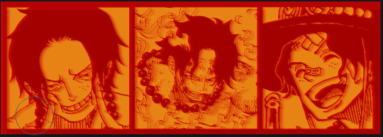
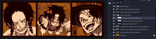
So this is what things look like now - painful, but let's keep going
11. Duplicate the ORIGINAL / BASE lineart layer, that you DID not apply motion blur to -> set the blend mode to multiply (reduce opacity for it to actually take effect)
okay that's less painful
here's what the layers look like right now:
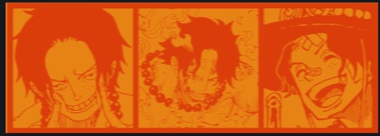
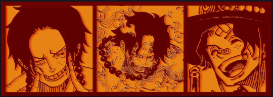
let's bring more focus to Ace's face, and push the background farther away:
12. Use the magic wand tool to quickly select large areas of the faces / focal area / foreground and the lasso tool to refine things
TIP!
Hold shift + click -> add to selection
Hold Alt + click -> subtract from selection
13. On a new layer with blending mode -> lighten, fill that selection to be white
If you look at it, you'll notice that it is ALREADY starting to draw our attention to his face, but the background is kinda aggressive, so let's dim that down
TIP!
Right-click on the gradient tool to find the paint-bucket tool

TIP!
Sample All Layers:
Turning this option off makes it so that you only work with the content on THAT specific layer. Turning it on makes it so that it is working while taking all other layers into consideration.
14. ctrl + click on the "white foreground" layer to select the contents of that specific layer (pink thing is your mouse)
15. ctrl + i to invert selection and ON A NEW LAYER (layer mode -> multiply) fill that with a complementary color
16. I did one last thing where I took the original base (before we separated the lineart) and added it to the very top and played with the opacity to get something less in your face (layer blend mode was set to NORMAL)
And that's it!
More considerations that I take:
I want the banner to be "thin" or not square, so it doesn't take up too much screen real estate on people's devices
I don't want readers having to scroll too much to get to my writing (which is the whole point of the post, let's not waste their time making them look for things)
I want the banner content to be relevant enough?
ie: with Matching: I wanted the ASCE tattoo to be visible. With matching I wanted Ace to not look too happy in some of them.
I'm also trying to avoid spoilers, I hated getting things spoiled, so I'm trying to be careful that the images I pick don't spoil anything really.
Congrats on starting life on your own! I did that whole living by myself thing too! Tip: keep the pantry stocked with lentils, beans, pastas, baking essentials, rice. They really come in a clutch when you're hungry.
#photopea resources#photopea psd#tutorial#tutorials#tumblr banner#photoshop#photoshop tutorial#digital art#fuck adobe#adobe photoshop
9 notes
·
View notes
Text
here's my ranking of some of the playline eugene dolls because the lack of top tier eugene dolls is so sick and twisted...
#1: disney store 2020
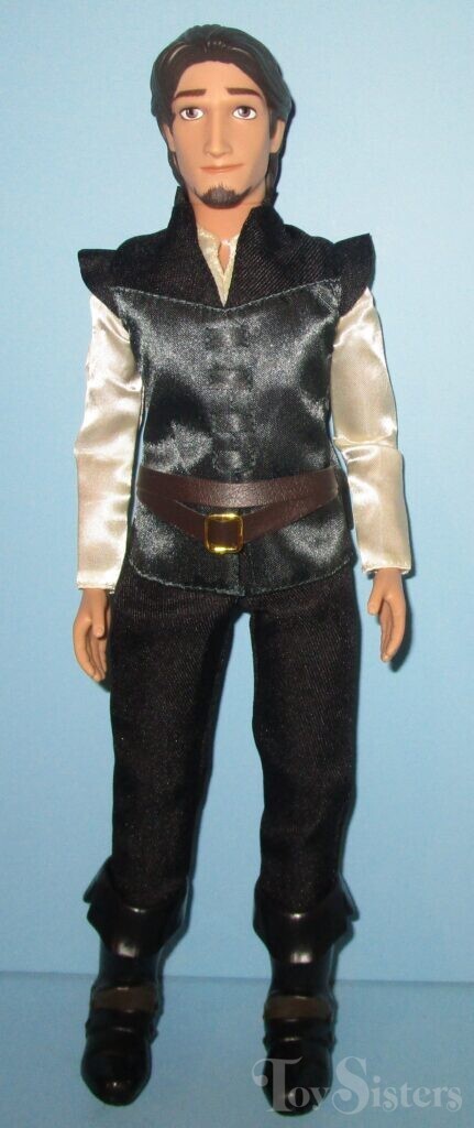
i really like this face mold and screening! the best eugene doll the bar is in hell. there's still something missing but i'm not going to be fussy. though they're significantly better than some, i'm not sure if i'm enjoying the clothes 100%. i like the pattern they used for his doublet to make it movie accurate, but i believe they could've gotten different fabrics for it and the belt. though we should thank god day and night that the details aren't printed on a paper like fabric. this is five stars for modern doll standards... there should be a classic doll like him. a shame that we've never seen this doll again... he gets a reluctant 10/10 from me.
#2: mattel (old)
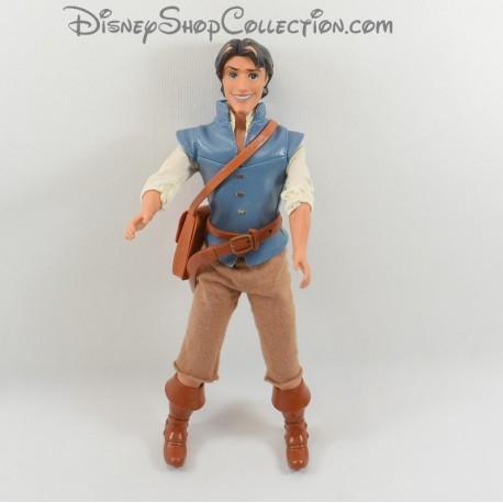
hate hate hate hateee that face mold + screening, fucking nasty. though he looks like he's gonna scam the fuck out of you so accurate for flynn rider i guess. why is he so high then if you hate him so fucking much you might ask. it's the clothes and his accessories. i really like that his doublet is movie accurate and (fake) leather. his belt is very detailed!! so is his satchel. like the boots, though it's kinda hard to fuck up the boots so not giving him any points for his boots. my only gripe is that his pants' aren't very great. should've been velcro or snaps instead of that elastic.. he's destined to give justin biebs circa 2010 but it's ok. can be fixed if you have trust in your sewing. also don't like that he has elastic hips.. he has GOLDEN ELASTICS tho. monster high ghouls.. eat your hearts out. 8/10. solely for how much i like his doublet and belt.
#3: older disney store variants
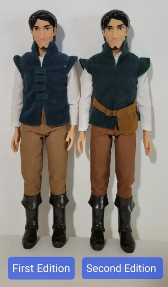
that hair naurrrr they didn't even bother with like carving some details. they couldn't get my man's visage right. his goatee is evil. the mold itself is fine, it's just the screening i don't like. clothes are mid :/ i don't hate them but i don't particularly like them. i definitely know at least 3 men that look like these dolls. not great but serviceable. 7/10.
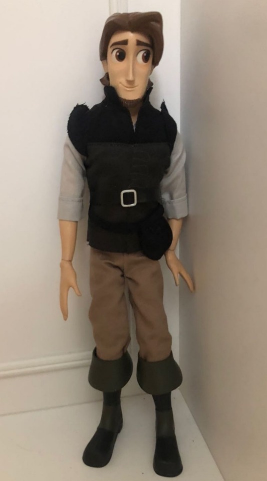
4: mattel (new)

THEEEE QUALITY DROP! CLAP FOR THE QUALITY DROP! the printed on details?? the painted on pants????? with a bad face mold & screening combo? JAILLLLLLLLLLLLL!! i like the hair, the belt with the pouch and the boots though. old mattel slays hard and this one def can't hold a candle to him... but i prefer this color palette i guess.. he looks marginally cuter than his stock image irl tho. 5.5/10
#5: simba toys

he's just a little boyyyy !! wandering around the cityyyyy :3 his proportions are... interesting. but he's cute enough so he can get away with it. his clothes are ok. at least it's not printed on details. i only want this doll because i want to display him with my simba toys rapunzel. she looks so fucked up (affectionate) i love her. this eugene gets a 5/10. though he's also a 10 if you get it you get it sorryyyyy
#6: disney collection/disney store tangled the series
he is show accurate, no doubt. but the show's art style doesn't always work for eugene and in the doll form.. he's just not it 💔 i like the clothes tho. he looks like a parrot (affectionate). i also have personal history with this doll. this set with rapunzel is my bleeding wound. 3/10!
#7: hasbro tangled the series
not enough words in the english language to describe my hatred for him -100/10... boooooo!!!! tomato tomato tomato
16 notes
·
View notes
Text


2023 COMMISSIONS: OPEN
Contact: [email protected] for inquiry and questions
In your message, please indicate either through the subject line or the opening line that you are inquiring about a commission. Please include the type of commission you want and all references you have for me (including previous art or small reference sketches). Anything beyond what I have on offer can be discussed, whether it’s a smaller/simpler piece or if it’s a full-blown illustration.
Will do: OCs, fan art, shipping, fursonas
Won't do: Mechs, p*rn, extreme gore
FLAT COLOR:
3/4: $90 per character
Full Body: $120 per character
Design Fee: $50-90 (details below cut)
RENDERED:
3/4: $110 per character
Full Body: $150 per character
Design Fee: $50-90 (details below cut)
COMMISSION TERMS OF SERVICE & DETAILS BELOW
DESIGN FEE: If I’m only given a written description, or if the images supplied do not give me enough of a starting point to which I don’t have to do much for my own research, a design fee will be applied to the final price. This is to reflect the time and effort that is spent on research and design. To avoid the fee, please be as precise with what you want as possible. Having to look up a few small things is fine, but it’s harder to build a design based on a “vibe.”
DETAILED FEE: If a design is incredibly complicated (such as intricate patterns, an overabundance of props, added background detail beyond a solid color/simple pattern etc) an extra fee maybe added to be discussed before the commission takes place. If I get creative afterwards of my own volition and you think my addition looks cool (or even if you’d prefer I keep it simple) an extra charge won’t be added.
PAYMENT: Invoice will be sent at the start, and half of full payment must be sent before work can begin. Once the design is finalized by screenshot preview, the final half of payment must be sent before hi-res files are distributed. Tips are welcome but not required. (See cancellation policy below for more info)
PROCESS: At each stage of the drawing, I will send an update to ensure it is going smoothly. If there are a lot of big changes being made, especially at the later stages, I may charge an extra $10 per subsequent change to reflect the additional time and effort.
FILE TYPES: I am able to accommodate most file type requests. If a CMYK file is needed, I can easily send a printable version (for personal use only).
USAGE: This commission is for personal use only. YOU MAY NOT: pass off the image as your work, use it on merch, remove the signature, sell the work/design, use for NFTs/crypto/AI practices in any capacity. The image may be shared on other social media sites, but you must provide credit and/or a link back to me. I will ask permission before I post the commission on my twitter and my website.
CANCELLATION POLICY: Full refunds are only acceptable at the sketching stage. At the line art stage and beyond, only half refunds are available. Once the product is mostly finished, no refund is available. If the project is cancelled at the half-refund stage, I will still send you high quality versions of what has been completed.
#art commission info#commissions open#commissions#oc#original character#dnd#dnd art#asheface commission info#asheface commissions
26 notes
·
View notes
Text
Alright kiddos, Daddy Jace is going to sit you all down for a long post. With twitter (and probably tumblr?) implementing genai i decided to take it upon myself to test both Nightshade and Glaze so you don't have to. Or to maybe clear some stuff up regarding both programs bc i myself was not able to find info on the quality in relation to stylized art! I'm risking my own butt for this lol
lets start with Glaze since that's just what i opened first. for clarity sake, this is what I'm chucking into it. i decided to go with 3 levels of images, starting with a basic no background fairly simplistic piece, a more detailed subject, and a full background piece from a long abandoned wip in favor of redoing it in a sense.


now there are 3 main settings I've noticed for glaze, its a default medium and high setting (there's render times too, but for this test I'm staying on the default render time which is medium and takes about 2 minutes per image)


For the most part it hasn't crazily distorted my images but you can still see some discoloration in the art. not a big deal for me personally, as you can still make out what's going on just fine. it gets pretty rough in some of the background on the big image, but thats probably the worst of it for this setting. next we will do medium!


haha ooookay just for your knowledge, I'm writing this in real time. OKAY yeah so, medium is where you will see the diminishing return it seems, while it probably really fucks with ai, unfortunately at this point my images look pretty distorted especially in backgrounds and high detail areas. but i will do high just in case anyway

Yeah so this is where the full distortion happens in all 3. again, you can still see the subject and key details, but its a bit unsavory isn't it?
now i want to make something clear. the program itself will give you feedback if the protection is enough, and for all of these tests it was fine so unless you aren't too worried about how the pictures look on social media (ie, if you share a full version in patreon/send the raw com to the owner) you can most likely choose default without any issues.
we are moving onto nightshade! in nightshade it has roughly the same UI, with the option to select a poison tag. we will come back to this later ass you can only use it on 1 image at a time. its settings are low, default, and high with similar rendering times and i will be using the same images to test them out :D starting with the low setting!


Now, i don't know if its just because I'm fresh out of the high settings from glaze, but i personally prefer this setting on my artwork. it doesn't have as much of the "oilspill" look that glaze has and is harder to notice the distortion at a glance. onto the default setting though!


Once again, prefer this over the medium for my style in particular. a lot less muddling and color distortion . obviously still there, but not effecting the details as much. High next!


This is definitely the too much gene lol however i would compare it to the medium of the glaze. Though, and this is important, please choose based off what you feel fits your needs. for me, nightshade is what i will use but it wont be the same for everyone. i just hope this gives a good comprehension on what each program does! now, to explain the tagging. in batches it will automatically tag, but it seems this is just to make an invisible coded footprint if you will in everything you do. you can overwrite them in your results, or if you do image by image (ie, if you make a new image, and put it through nightshade) you can tag it there. i will personally just be using my username as my tag going forward. and to show how that looks on an image with standard settings just to show that's its not effecting your image any extra on a visual front.

and that concludes Jace's decent into madness.
the biggest stipulation, is these are both windows/macos based applications for now
HOWEVER while I am able (given I'm not swarmed) i am more than happy to help those who would like to protect themselves and do not have the means to and i encourage others to do the same if they are comfortable. please reach out. FUCK AI ART
#digital art#fuck ai art#glaze#nightshade#protect your art#ai is theft#jace noises#this took forever#this was just a couple hours of messing around btw#if people need help using the application based on what ive learned#ill do what i can!#also if that tag info is incorrect please inform me#that is just what ive gathered from messing with it
2 notes
·
View notes
Text
Whumptember 10: "What are you doing to them
Part 2 of this snippet. Part 3 coming in a few days.
Rin stared helplessly at the wall-wide screen. It showed one of the holding cells in the villain's lab, empty save for a single man suspended from his wrists in the corner. The image quality was high enough to show all the details: the circles under his shut eyes, the chaffed skin on his lips, the way his bare chest rose and fell, just barely.
"What are you doing to him?" they whispered.
The villain's hands moved lightly over their shoulders, massaging out the tension in vain. "Nothing yet. I'm here with you, aren't I? But once I get to him, why—the same thing I did to you, of course!" There was uncontained glee in his voice. "You'll be happy to have a buddy here, I'm sure. The two of you will get to bitch about me behind my back... all the while doing exactly what I say. The chips won't have it otherwise, see."
Rin swallowed. "You're a fucking monster."
"Mm. That's part of my charm." The villain let go of them and stepped back. "Now, I have a quick surgery to perform, and you, my darling, are going to watch. Stay here. The cameras are programmed to follow your little friend. Feel free to fiddle with the monitor to zoom in, change the angle, do whatever. Just as long as you don't look away once."
The door shut softly behind his back. Rin glared helplessly at the screen. They didn't want to look away yet, but they knew they would soon—and they knew the behavior-modding chip wouldn't let them.
There had to be something they could do. There had to be. It was one thing to be kept a monster's prisoner, but to have Dale suffer the same fate alongside them? No. No, please, not Dale. Not their best friend.
Stay here. Don't look away.
Zoom in, change the angle, do whatever.
"Wait," they whispered. Their fingers lingered over the control pad.
Do whatever.
Could it be that the villain got sloppy, buzzed from his supposed success? All the chip did was compel them to follow the villain's commands exactly as issued. This one was pretty vague. Sure, it still needed to be taken in context: do whatever with the monitoring device, not in general. Still. Broadcasting the camera feeds outside of the villain's mansion could reasonably count as whatever, couldn't it?
It was worth trying. The worst thing that might happen was the chip knocking them out with a wave of pain and a seizure.
Considering the circumstances, that could hardly count as an unwelcome outcome.
#warden's random scribbles#whumptember2023#writeblr#writblr#my writing#writers on tumblr#original fiction#whump writing#captivity#brainwashing#(kinda)#cyberpunk#flash fiction#snippet#accidental series
3 notes
·
View notes
Note
1, 14, 15 :D
Oh these are particularly fitting for JP!! Thanks so much for the ask!
1. is about fashion, 14. is how F/O treats you, and 15. is about love languages, under the cut since it's long:
1. Gush about your F/O's sense of style/ fashion!
WOOO so, I love formal wear, if that wasn't obvious enough already. A bit too much, and frankly, without knowing much about suits other than 'they look nice'. But that doesn't stop me from loving how nicely put together JP is all the time, whether it be his bold orange vest, scarf and fedora fit, the Nayshalli robes, or even just plain ol' classic 3 piece suit we often see him in.
I've mentioned elsewhere but his character design with the playing cards/ 'King of No Country' title also reflects super well with what he's wearing in his default costume!! I really enjoyed digging into the details and finding that everything clicks together like that.
Otherwise it's also that, goodness, you can really admire his legs. Usually I don't think it's common to be able to have such... tight, form fitting suit pants look not-silly, but this is a game so they can do what they want with the models. So I'm allowed to admire his calves and butt lmao. NOT TO MENTION his gloves and shoes are just, WHAH. They modeled those with really nice details and for a good reason, since his intro scene focuses on his hands, and his win outro focuses on his shoes. It's just a crazy power move to not step on his opponents while showing he definitely could. While fighting in a pristine outfit. This is less about his fashion per se but rather how he maximally uses his good fashion as a weapon as much as his own fighting skills. It sends a message.
Oh and I haven't talked much about the arcade mode robes, and since we got a bit more art of what traditional, formal Nayshalli outfits look like in recent art, I can appreciate this outfit of his a bit more! This might be obvious or expected, idk, but I love that the patterns on it, the colors, and jewelry are all consistent with what other side characters are wearing too. It feels just a bit more believable as the traditional/ local style yknow?
Also, I REALLY like how his and Kimberly's arcade modes depict him almost as a supernatural monster or other, and the longer hair, glowy eyes, and gratuitous use of psycho power helps a lot with that image. The robes just add to the feel of 'an old and ancient evil' kinda vibe.
That said, I think it's amazing how well he manages to make such a wide range of colors and styles work for him. Of course the in game palettes can be pretty ostentatious sometimes, say with a golden yellow coat jacket (Outfit 2, Color 3). But overall nothing looks bad on him across all the outfits we've seen him in, he's just got that confidence and charisma.... and it helps he's built like a shit brickhouse underneath to support it.
14. Gush about how your F/O treats you (Are they protective? Loving? Are you the only person who gets to see their soft side?)!
HONESTLY for scenarios where he's interacting with me, it's hard to imagine anything other than his public facing "polite gentleman" persona;; I feel like I'd be a nervous wreck, just purely for the fact that he's authoritative and perceptive-- conversations with him would feel like I'm being interviewed and analyzed with every response, and I do not think I'd be getting high marks;;
So I guess he'd treat me with.. kindness?! Probably a lot of assurances that it's a pleasure to meet me, no problem at all, do sit down, all with a soft smile and untold calculations to steal my bank account clicking away in his head. Genuinely, I would never survive a social exchange with someone like JP lmFAO;;;;
15. Gush about your F/O's love language!
Had to remind myself which ones there were but I'd say acts of service and quality time!!
Logic being, process of elimination:
Gift giving - I feel could be a way he shows affection, but in a manipulative way. To him, the material and capitalistic are ways to control people, especially if it means gaining the affections of the other. I'm sure he can be honest and genuinely thoughtful with his gifts, but giving gifts to him is another story. I mean, just look at how he responds to the things we give him in World Tour: even with max friendship bond he opts for "I suppose I should thank you", and he talks about his old JOB when receiving the item he should 'love most'. So gift giving is not the strongest one for him.
Words of affirmation - similar thought process here with the above. He's a chronic liar and deceiver, so words are more of a tool to use to manipulate people. And again, I'm sure he can be quite honest with his feelings if he wants to, and he's not so obtuse to dismiss truly affectionate words towards him... But it probably isn't his most obvious way of showing or receiving affection. He probably gets empty compliments all the time with people trying to get on his good side, so yknow what? Maybe a real, raw emotional confession of admiration towards him might be refreshing for him for a change.
Physical touch - IDK maybe cause I'M not super keen on it, the author is projecting too much oh no But it's also rather difficult for me to see him too big on casually affectionate touch. Mostly based on how he doesn't like close combat, and is totally a neat freak about getting his clothes and hands dirty. As if he doesn't want to get his fingerprints on potential evidence cause of something so.. personal space invading, like touch. Maybe the key word here is causally affectionate: if it's deliberate, planned, and strictly under his terms, it could be nice who knows!!
I guess I could also make the argument that, because of all these reasons above (that so often he lies and is lied to, material wealth is meaningless to him, physical touch is a foreign concept) that those moments engaging with these 3 in particular are all the more valuable. It's just in comparison to the following 2, it's less obvious or, strong of a message of love for him IMO.
With all that said,
Acts of service - He probably respects people who go out of their way to seriously do the thing they promise, more so than the promise (words) themselves. And there's that conversation from World Tour with him, about free will and all (Libet's experiment, which is a whole other rabbit hole I won't get into;;), which tells me he's at the least intrigued by what compels us to act and do the things we do. So maybe he'd give actions and plans enacted a bit more credit, especially if he knows a lot went into accomplishing a certain action/plan with respect to resources, time, effort, etc.
Quality time - Similar vein with the above! He seems so busy and in the middle of something all the time, even as he's quietly looking out over the city at night... He could use a break now and then. Time is money and all that too so, any quality time you spend with him is inherently valuable. And even time spent working with him might be a way to show affection too. Goes hand in hand with acts of service, since it's about dedicating all resources to show how much you support him (and his criminal activities).
#sf6 jp#jp rambles#whoops i've said too much but these were fun!!#and ofc it's just my personal read on his character so i'm curious if anyone has a different take#or if you agree!
4 notes
·
View notes
Text
Are you looking to make $500 a day with affiliate marketing? This blog will provide you with 7 steps to help you reach your goal. From understanding the basics of affiliate marketing to the tips and tricks for maximizing your profits, this blog will provide all the information you need to start earning money from the comfort of your own home.
1. Introduction to Affiliate Marketing
Affiliate marketing is a great way to make a substantial income in a simple way. It's not a get-rich-quick scheme, but with the right approach, you can make up to $500 a day in passive income. To get started, follow these seven steps. First, identify the products you want to promote. Research the product in detail and make sure it's something you would genuinely recommend to your audience or customers. Second, sign up for an affiliate program that offers the products you want to promote. Third, create high-quality content to promote the products or services. Fourth, use social media and other online marketing channels to spread the word about your offers. Fifth, analyze the performance of your campaigns and adjust your strategies accordingly. Sixth, track your progress and make sure you’re meeting your goals. Finally, use email marketing to nurture relationships with existing and prospective customers. With these seven steps in mind, you can start making $500 a day with affiliate marketing.
2. Research Potential Niches
If you’re looking to make $500 a day through affiliate marketing, the key to success is to research potential niches that have potential to generate money. Finding the right niche is an important step in the process. You’ll need to look for niches that have enough traffic, products to promote, and commissions to make it worth your while. To help you get started, here are 7 steps to make $500 a day with affiliate marketing: 1. Brainstorm. Make a list of your interests and hobbies. Think about the topics that you’re passionate about and the things that you know a lot about. These are great starting points for your research. 2. Research. Use Google and other search engines to look for keywords related to your interests. Look for niches that have high search volumes and low competition. 3. Analyze. Once you’ve identified potential niches, look at the products that are being sold within those niches. Look for products with high commissions and good reviews. 4. Test. Test the waters by signing up with an affiliate program and promoting a few products. See how the products are converting and if you’re making money. 5. Track. Track your progress and adjust your strategy accordingly. Monitor your campaigns to make sure you’re getting the best return on your investment. 6. Optimize. Use tools like Google Analytics to optimize your campaigns for better results. Split test different ad copy, images, and landing pages to see what’s working best. 7. Scale. Once you’ve found success with a particular niche, scale up your campaigns to maximize your profits. Invest in paid advertising if you’re able to generate a good ROI. Following these steps can help you make $500 a day with affiliate marketing. Researching potential niches and testing different campaigns is the key to success. With a bit of patience and hard work, you can turn affiliate marketing into a lucrative income stream.
3. Choose the Right Products to Promote
From choosing the right products to managing your campaigns, it's important to have a well-developed plan if you're looking to make $500 a day with affiliate marketing. To help you get started, here are seven steps you can take to ensure success: 1. Research Affiliate Networks: Affiliate networks are a great way to find the right products to promote. Research different affiliate networks and determine which ones offer the best products for your niche. 2. Choose Quality Products: Once you've selected some affiliate networks, take the time to evaluate each product before selecting the one you want to promote. Look for quality products with a good track record and high customer satisfaction ratings. 3. Create an Affiliate Website: An effective way to promote your affiliate products is to create a website to showcase them. This will give you a platform to write blog posts, create videos, and share reviews that will help to drive traffic to your site. 4. Use Social Media Marketing: Social media is a powerful tool to promote affiliate products. Utilize platforms like Facebook, Instagram, and Twitter to share content and engage with potential customers. 5. Promote Your Products: Once you have your website and social media accounts set up, you can start promoting your affiliate products. Create engaging content that encourages users to click through to the product page. 6. Track Your Progress: Tracking your progress is essential for success with affiliate marketing. Use analytics to measure the effectiveness of your campaigns and make changes where necessary. 7. Re-Invest Your Earnings: Finally, use your earnings to reinvest in your business. This could include things like buying better equipment, hiring an expert, or even investing in paid advertising. By doing this, you can ensure that your business continues to grow and you can reach your goal of making $500 a day with affiliate marketing.
4. Create an Effective Website or Blog
To make money from affiliate marketing, you need to make sure your website or blog is optimized to increase its visibility and reach. Creating a website or blog can be a challenging but rewarding process. To make $500 a day with affiliate marketing, you need to follow these essential steps: 1. Create compelling content for your website or blog. Content should be engaging, informative, and relevant to the audience you are targeting. It should also include keywords related to your affiliate products. 2. Optimize your website or blog for search engines. This means making sure your content is keyword-rich, has proper title tags, and is optimized for mobile devices. 3. Promote your website or blog. Promote your website or blog on social media platforms such as Facebook, Twitter, and Instagram. Use relevant hashtags and keywords to reach your target audience. 4. Build relationships with other affiliate marketers. Network with other affiliate marketers to increase your visibility and reach. 5. Track your traffic and conversions. Use analytics tools to track your website’s or blog’s performance and measure conversions. 6. Automate your affiliate marketing. Use tools like email automation and autoresponders to streamline your affiliate marketing process. 7. Experiment and Optimize. Test different strategies and tactics to optimize your website or blog for maximum conversions and revenue. By following these steps, you can make $500 a day with affiliate marketing. With a little bit of effort and dedication, you can make money from your website or blog.
5. Generate Quality Traffic to Your Site
Affiliate marketing is a great way to generate consistent and quality traffic to your site. With the right strategy and consistent effort, you can easily make $500 a day with affiliate marketing. Here are seven simple steps to help you get started: 1. Research and choose the right products to promote. Choose products that offer high commissions and have a good reputation. 2. Create content that is relevant to your products. Content should include reviews, tutorials, and videos as well as helpful tips. 3. Build an email list. Start collecting email addresses from visitors to your website. You can use this list to send out newsletters and keep your customers updated on new products. 4. Promote your products on social media platforms. This can be done through posts, ads, and other forms of marketing. 5. Track the performance of your campaigns. Keep track of the clicks, conversions, and other metrics to determine which campaigns are performing the best. 6. Optimize your campaigns. Tweak and test your campaigns to get the most out of your efforts. 7. Grow your affiliate network. Reach out to new affiliates, create joint venture partnerships, and offer incentives to existing affiliates. By following these steps and putting in the effort, you can see great results from your affiliate marketing campaigns and generate quality traffic to your site.
6. Track and Analyze Your Results
Making $500 a day with affiliate marketing is an achievable goal, but it takes hard work and dedication to reach this level of success. To maximize the potential of your efforts, it is important to track and analyze your results. Here are 7 steps to help you reach your goal: 1. Identify and select the right affiliate programs for your needs. Research the various programs available, evaluate their commission structure, and select the ones that are most likely to bring you the highest returns. 2. Set realistic goals and targets. Decide how much money you want to make and establish specific milestones to reach. Design a plan that outlines the steps you need to take to reach your goal. 3. Track your progress. Use analytics tools and software to monitor your performance and measure the success of your campaigns. Look for trends and areas of improvement. 4. Invest in the right tools. Invest in the necessary tools and resources to ensure that you can execute your campaigns effectively and efficiently. 5. Take advantage of automation. Automate certain processes, such as email marketing, so that you can focus on the more important tasks. 6. Test and optimize. Regularly review your campaigns and analyze the data to identify areas of improvement. 7. Track your results and adjust your strategy. By monitoring your progress and analyzing the results, you can determine which strategies are effective and which ones need to be adjusted. By following these steps and tracking and analyzing your results, you can reach your goal of making $500 a day with affiliate marketing. With the right tools and strategies, you can maximize your chances of success and reach the level of income you desire.
To Learn More ways to make money online
CLICK HERE to get your FREE training.
#business#affiliatemarketing#makemoney#markting#moneymotivated#money#make money online#success#self impowerment
19 notes
·
View notes
Text
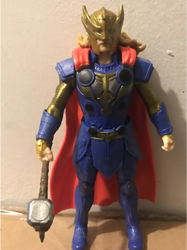
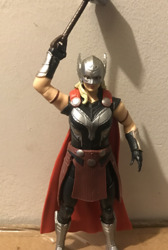
The Warriors Three
“Thor: Love And Thunder” is dropping soon, and I for one am absolutely pumped for it! Thor is my favorite MCU hero, thanks in large part to the cheer and warmth that Chris Helmsworth brings to the role, and “Thor: Ragnarok” is one of my favorite MCU movies. So as you can imagine, considering this is a toy blog, we’re gonna be talking about the toys! Specifically, 3 for the price of one, with the “Love and Thunder” Deluxe Action Figures of The Mighty Thor, King Valkyrie, and Thor!

So why are we doing a 3 for 1 deal? It’s because each figure is similar enough that it’s a good idea, especially since the similarities make the differences more striking. To do a good review of one, you need to compare it to the other two.
Thor himself is an icon of the MCU. He’s the Norse God of Thunder who was banished to Earth to learn humility and became a galaxy-traveling hero and founding Avenger. Valkyrie was introduced in the third “Thor” movie as a hard-drinking, jaded brawler with a heart who later becomes King of New Asgard during the events of “Avengers: Endgame.” The Mighty Thor is actually Thor’s ex, genius scientist Jane Foster, who now wields Thor’s old magic hammer, giving her all the powers of the original Thor. As the movie isn’t out yet, there’s not much else known of her heroic identity, but I’m excited.
Now, I normally don’t do this, but I want to talk about the figure packaging. Each figure comes in a package with an image of the toy on the box instead of a window on the box to see the actual toy you’re buying. On the one hand, that’s great, because the toy’s not getting exposed to germs during a very much still ongoing pandemic. On the other hand, this does make it hard to tell the quality of the figure you’re getting, so any paint errors or damage will be a surprise. Each figure is wrapped in tissue paper and tied to a cardboard insert to keep it safe, though this did still result in my Valkyrie’s swords getting bent a bit.
Each figure has a gimmick that’s triggered by squeezing their legs. Thor raises and swings his hammer, Stormbreaker, Mighty Thor spins her hammer, Mjolnir, and King Valkyrie swings her waist to to the right so she can do a slash with her twin swords, which look like her Dragonfang sword from her previous appearances. How good the gimmick is varies from toy to toy. With Thor, it works great. There’s no problem and everything goes as planned. Mighty Thor runs into a slight issue. You need to position her right arm just right to make the gimmick work, Otherwise, it will either start but get blocked by her cape, or just halfheartedly work, with all the enthusiasm of a high school senior taking a final, and the hammer will stop swinging about halfway across. With Valkyrie, you need to hold her upright to use her gimmick, or else the weight of her cape weighs her down a bit.
A full-body suit of armor seems like a good move, until Loki attacks with a giant magnet.
In terms of looks, Thor and Mighty Thor look great, like they just stepped out of the comics, which is good because that is how their in-film costumes are supposed to look. Mighty Thor honestly looks better, though, with more paint and details sculpted on, while Thor, despite also having great sculpting, feels like he’s a bit lacking on paint. As for King Valkyrie, while the figure mostly also looks great, I feel like Hasbro could have done better with her head. While it does look like her, and the hair’s really good, her head’s not quite in proportion to the rest of her. It’s just a little too big.
There’s one detail I absolutely love about all three toys; they have different body types. Thor’s a broader guy, with clear muscles and armor, but he’s not built like He-Man. His build’s very realistic, even with all the armor. Mighty Thor’s got some clear muscle and bulk to her, which matches how Natalie Portman worked out for the role, but it’s a more realistic build than we often see in female superhero toys. To quote my fiancee, “there’s a bit of idealism, but it’s not bad, honestly.” Valkyrie has a smaller build, which matches her actress, and has a completely unique body, instead of just a repaint of Mighty Thor’s. Considering how often toys just repaint character bodies, especially with female characters, it’s nice to see this toyline went out of its way to do better. It’s also depressing that “these two women got unique figures with different body types” is where the bar is.
The one pose she can be in if you want to use her gimmick.
So yes, the toys look great. On the other hand, all three figures are very limited in terms of articulation. Valkyrie has the best articulation, since both her wrists, her shoulders, and her head can move around nicely, though her hair can hinder the head sometimes. Mighty Thor is also decent, though her shoulders have a little less articulation and her hair can get bent by moving her head. Thor, meanwhile, is the weakest with articulation. His left arm has the same shoulder limits of Mighty Thor, and his hair and cape block his head from moving much, to an even greater extant than the other two figures. Also, unlike Mighty Thor, who can move her arm the gimmick is centered around without the gimmick being involved, Thor can’t move his gimmick-infused right arm without triggering his gimmick. The arm will just drop down. All three figures have no leg articulation, because you have to squeeze the legs to trigger the gimmick. I do give them a pass on this, though, even after looking at Laser Blade Buzz Lightyear’s leg-triggered gimmick, because these figures had a smaller budget than Buzz did, so it’s understandable their legs aren’t going to be an articulation hot spot.
Thor and Mighty Thor are the strongest figures in this line, though Valkyrie only loses points because her swords are very thin and can get bent very easily. Don’t put her in a box or set anything on top of her, or else those swords are gonna suffer.

Her sword got bent because I picked her up at a bad angle. BE CAREFUL!
The “Love And Thunder” deluxe figures are currently available at retail for about $16, which does feel like a little much until you account for the rising prices since the 90’s. By today’s standards, that isn’t bad. They’re very clearly aimed at kids, who will definitely enjoy them, and the gimmicks make for fun things to fidget with. I would definitely recommend them. Next time, we’re going to be looking at more “Thor” stuff, because I am PUMPED for this new movie, so be ready! This is JL, signing off and wishing you Happy Toy Hunting!
#thor#mcu#mighty thor#jane foster#valkyrie#king valkyrie#thor love and thunder#love and thunder#toy#toys#review#toy review#thor toys#marvel#disney
20 notes
·
View notes
Last Seen Blogs

iluvkvn
Untitled
ecmjoanne
Change-Making
roseabud24
mixedfandoms

unideal
the unideal ideal

swagvoidcollective
제목 없음