#photopea resources
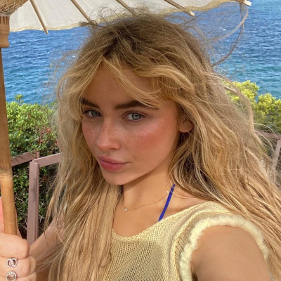
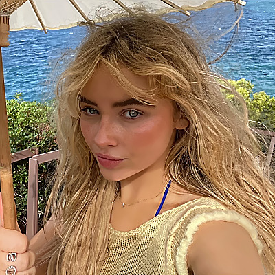
Text
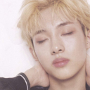
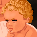
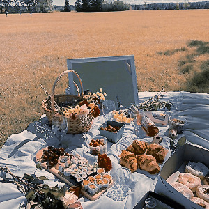
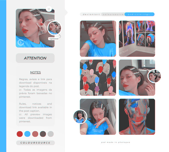
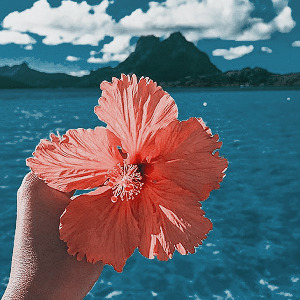
PHOTOPEA QUALITY ACTION SET by @loviestudio
This action set was made in Photopea, and it will work better on it. (The set works on Photoshop as well, but with tiny differences!)
CONTENT
1 Action file (ATN) with the set, containing four actions: 3 variations of the effect (light, medium and strong), and 1 sharpen action.
TERMS
Before/after preview here!
Like and/or reblog to help a creator.
Don’t repost, re-upload or put it on packs and/or google drive. Don’t claim my resources as your own.
Don’t use my resources as a base or copy them.
Credits are not mandatory, although I’d love to see your edits!
My resources are free for personal/non-commercial use only. For commercial use, you must pay for the download. If you paid for the download, you are authorized to use it commercially. Reach out to me for more info or if you have questions about my resources license.
Follow me for more resources! ♡
This is a free resource, but you can buy it with points on DeviantArt to help out a creator or download it for free on Ko-Fi. Thank you!
#dailyresources#allresources#completeresources#dearindies#photoshop resources#rp resources#rph resources#indie rph#rphelp#resources#photopea action#actions#action#sharpen action#action: sharpen#free resources#free#photopea resources#psd resources#sharpen actions#free: actions#photopea#quality action#action: blur#action: effect
94 notes
·
View notes
Text


♡。 ⏳ icon ノ 🩷 dividers 。♡

➳ 。 hi ! here's a masterlist of some of my favorite psd colorings i plan to use && already use ! hopefully this post will be useful to someone ! ♡
♡ elegant soothsayer by kiochisato
♡ sweet bubbles by kiochisato
♡ true heart by kiochisato
♡ blanket (( riamu yumemi )) by circuswhisprs
♡ psd dump by aogumis
♡ trick-or-treat (( huohuo )) by circuswhisprs
♡ empire (( furina )) by circuswhisprs
♡ plushie by essthereal / iv-ry
♡ cotton candy by essthereal / iv-ry
♡ valentine’s day by akiemuletter
♡ torabolt by normalsolutions
♡ stage director by normalsolutions
♡ mantichora by normalsolutions
♡ magnificent interlude by diaflan (( ← leads to ko-fi , it’s free tho !! ))
♡ dizzy worldz by diaflan (( ← same here !! ))
♡ night fever by rosendoru
♡ pink covers the pain by rosendoru
♡ chocolate mint by rosendoru
♡ unyielding flame by lumieron
♡ vivid bad squad pack by canarysage
♡ more more jump pack by canarysage
♡ latibule reverie by canarysage
♡ melted creamsicle by canarysage
♡ petrichor perfume by canarysage
♡ chocolate hearts by canarysage
♡ childish overload by diaflan
♡ fluttering by ii-nandesu
♡ pastel bloom by essthereal / iv-ry
♡ sapphire summer by essthereal / iv-ry
♡ marionette by essthereal / iv-ry
♡ nessa barett by dearlewis (( ← nessa = link to the drive , barett = preview ))
♡ my cotton candy exploded by demeurel (( a personal fav of mine btw ))
♡ psd by user (( ← base ))
ノ let me know if you'd like to have your psd((s)) removed from this list , thank you !

#❛ ANOTHER BEAUTIFUL VALENTINE ? 𓂃 ⏳ ❜#psd#psd coloring#coloring psd#edit#editing#editing resources#rentry resources#resource#rentry#masterlist#psd masterlist#psd download#photopea psd#photopea resources#free coloring#free psd#psd files#filter#filter resource#filter coloring#mine#← aka “my post”
87 notes
·
View notes
Text

ANALOG, texture pack
RULES: If you download/use, add to favorites and comment; Don't claim, repost, use to create other resources or share on other platforms and packages; Credits are required if you use this textures; For commercial use and to support our work, you have the option to purchase; Please contact us if you have problems downloading/using the material or prefer another purchasing platform (download)
#textures#texture pack#photoshop resources#photopea resources#vintage#vhs#aesthetic#psd#coloring#coloursource#pack texture#analog textures#vintage effect#free resources#resources
210 notes
·
View notes
Text

(143. yuzuki).psd coloring made by harupsds ©
This effect was made by me in photopea and it works better on it. Before downloading read all the rules and follow them, be honest. Don't forget to leave your feedback or suggestion.
Like or reblog if you download and follow me for more content.
Don’t repost, reupload or put on pack/google drive.
Don’t claim as your own.
Don’t recreate, use as base or steal layers.
Adjust the layers or add new ones if needed.
Give me credit if you use it.
Free for personal/non-commercial use. For commercial use pay the download.
Before/After.
▸ Download: Follow me + like or reblog + ask (logged) “psd 143. yuzuki, please?” UNTIL October 20, 2023 or pay the download on deviantart.
Thank you @miniepsds for amazing template. || This is our work done with effort and time spent. Please do not copy do not violate, and do not sell it as if it were yours. The Preview was made by me, being my own. Please, if your photo is here, talk to me. It is not my intention to violate the copyright rules.
#dailyresources#dailypsd#allresources#hisources#makersleague#psd*#psds*#psd#psds#psd coloring#coloring#image psd#psd download#psd for icon#for icon#photopea resources#photopea psd#photopea psds#photopea#harupsds#orange#blue#vibrant
74 notes
·
View notes
Text
01. sabrina action
⌗ action feita no photopea e funcionará melhor apenas nele
✦ uso ela em todos os icons do @twisabrina, então você pode olhar e se basear antes de baixar!!
♡ dê like ou reblog se você fizer o download!
› Download aqui. ‹
#icons#photopea action#action#sharpen action#photoshop action#atn#photopea#photopea icons#photopea resources#actions for icons#noise action
25 notes
·
View notes
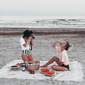
Text

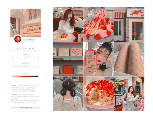
♡⃕ FRUIT SALAD, psd coloring #23
ENG RULES: Please encourage a resource creator! It is forbidden to modify, use as a base and repost this psd! Give proper credit if you like/use it. 𓆩♡𓆪 (link aqui)
PT REGRAS: Por favor, incentive uma criadora de recursos! É proibido modificar, usar de base e repostar esse psd! Dê os devidos créditos se gostar/usar. 𓆩♡𓆪 (link aqui)

#borboletart#borboletario#photoshop resources#icons#resources#photopea psd#effect#photopea effect#photopea resources#deviantart#psds#psd coloring#aesthetic#moodboard
21 notes
·
View notes
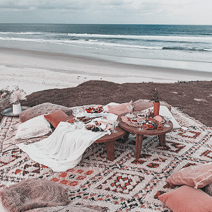
Text


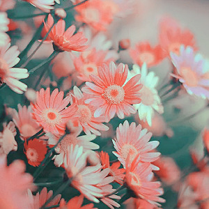
BRIZA psd coloring © gmfioart/gmfilters ♡
before you download: free for personal use. // gratuito para uso pessoal. don’t redistribute or claim as your own. // não reposte, copie ou divulgue como seu.
download ♡ DA.
#briza#psd#coloring#psd coloring#photopea#photopea psd#photopea resources#effect#effects#aesthetic#nature#moodboard#wild#wildlife#aesthetic moodboard#freedom#soft#pastel#dailypsd#vanillapsds#allresources#onlyresources#hisources#wasirauhlpsds#vintage#colorização#color#colorful#efeito#chaoticresources
47 notes
·
View notes
Text

⟡ ◞ ˚ UNIVERSITY! › a psd coloring.
A FREEBIE PSD BY #KAIJUCAT.
MADE IN PHOTOPEA. POC-FRIENDLY.
ADJUSTMENT LAYERS INCLUDED.
MEDIUM CONTRAST, COLORFUL AND CYAN FOCUSED.
CREDIT IS MANDATORY. TAG THIS BLOG!
LIKE & REBLOG IF YOU SAVE.
$0.00 – DOWNLOAD ON KO-FI!
#rp resources#my psds#roleplay psd#kaijucatedits#psd#mypsds#icon psd#kaijucatrph#roleplay resources#kittenkaiju#freebie#free psd#free resources#freebie psd#poc friendly psd#photopea#photopea resources#photopea psd
18 notes
·
View notes
Note
Heyy, I’ve been reading your wonderful one piece works for a while — and I couldn’t stop wondering how are you actually doing those magnificent headers?
Like… hello? The great quality, with additional 3D-alike details I could catch by my eyes? I got only Ibis Paint X on mobile, since I’m only a young man that literally two months ago went on a life-time ‘adventure’ of living alone in a small apartment.
In short — I got no money to pay for additional graphics/drawing programs, not yet at least
Hello!
Thank you! I'm glad you enjoy my writing - I'm curious to know what's your favorite piece / part? Also I'm so happy you like my headers? Makes it feel worth it to spend time on them! :D
I have excellent news for you, I used a mix of Canva and Photopea. They're both FREE!
I'll be explaining the process for making these two kinda? The full tutorial is below the cut, to be courteous to the other folks, hope you don't mind?
Though I am hearing that Canva has given people some grief. But Photopea is just *chefs kiss*
If you've ever used photoshop, Photopea is essentially a free photoshop, and it even has the automation tools! An absolute lifesaver when you have multiple layers you want to export (but that's for larger projects not this)
I'm going to assume you have basic knowledge of layers in digital drawing programs for this. If anything isn't clear: ask me, I'll clarify!
//-------------------------------------------------
My General Process is:
Search for official art / images
bring it into canva / photopea
crop / arrange images to match the dimensions
select a thematic color that is associated with the character
separate the foreground from the background
mess around and test things until they work
//--------------------------------------------------
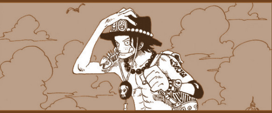
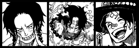
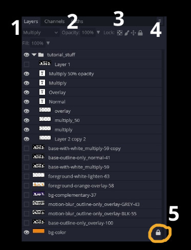
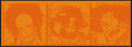
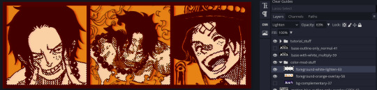
Given "Louder than Words" is the latest one I've made, I'll start with the process for it.
Dimensions: 3000 x 1055 px
dpi: 96
//-------------------------------------------
Let's Get Crackin'
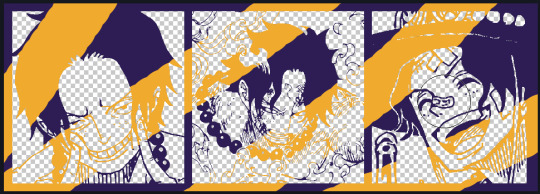
Alright let's grab some official art so we're not using any fanart without the artist's permission
I try to pick images that feel relevant enough to what I'm trying to make.
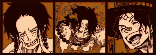
For example: the image for the Matching banner shows the ASCE tattoo which is super important in that fic
2. Let's arrange them onto a banner where each individual image has the same/similar dimensions to the rest
That's probably part of why you like these. To a certain extent they have similar dimensions, so they have a uniformity that's pleasing to the eye! (It's not perfect because I threw perfectionism to the wind because this is tumblr not my portfolio)
Tip: if you have 3 images and only 2 that have similar dimensions, and the 3rd one can't be cropped logically: but the one that's a different aspect ratio in the middle!
3. lets arrange them in such a way that the borders all feel like they're the same/equal width/thickness
you might find that you have to shrink some images for this, that's fine.
ALTERNATIVELY: if you're going with one image crop it so it's just the relevant info and it matches the dimensions (3000 x 1055 px)
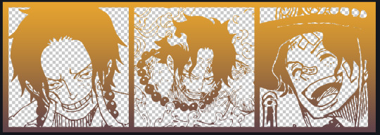
We have our base! Now let's add some color, and direct the viewer's eye together!
4. pick out a color that you think matches your character / vibe - that color is going to be your background
Given I'm making an Ace banner: orange is the color I'm going with
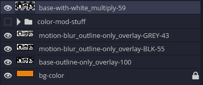
I went and named my layers for this lol. The numbers represent the opacity, and they aren't important. I just kept changing the opacity until I liked the way things looks. But here's the secret to the 3D feel:
Motionblur (+ moving it about)
Separating the foreground and background and dulling out the background.
I'm going to show you my process so you can see the effects, but first let's give you some quick skills:
//------------------------------------
SKILLS / THINGS I THINK ARE HELPFUL
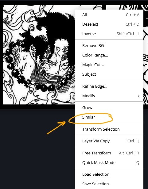
//------- Select Similar
magic wand -> select something -> right-click -> select similar
This works best when you have high contrast images (like manga panels that are black and white). You can select the black or the white areas. Depending on what works better for you.
TIP!
Invert selections with ctrl + i
Say you know that you want to select everything but Ace's face in the second panel. Select his face with the magic wand then ctrl + i, and that's the only thing NOT selected


TIP!!!!!!!!!!!!!!!
Please, please, please, duplicate your original image and work on the duplicate layer. This helps you SO much. !!!!!!!!!!!!!!!!!
TIP!
Check your selection tolerance! This could be why too little, or too much is being selected.

//------- The Move Tool
Shortcut key: v
While the move tool is active, you can nudge the stuff on whatever layer with your arrow keys
Shift + arrow key = 10 px move (generally)
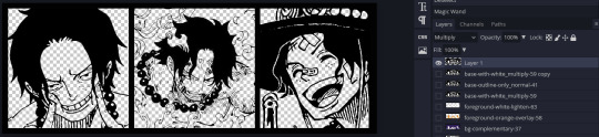
//------- Layer Locking
1- Layer Blending Mode (see Overlay vs Multiply vs Normal) for how this can affect results)
2- Opacity: how see through it is / isn't
3- Lock Transparency (it's the little checker board)
4- Lock Layer (looks like a lock)
5- Lock icon that appears when anything on the layer has been locked
More on 3 Lock Transparency: You can only paint on / modify what's on that layer. You CANNOT add anything to any area that is already transparent
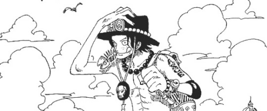
Here's a demo of what you can do with this power:
Here's the original Image - notice how it's just the lineart with a transparent background.
It's powerful: abuse it
//------- Overlay vs Multiply vs Normal
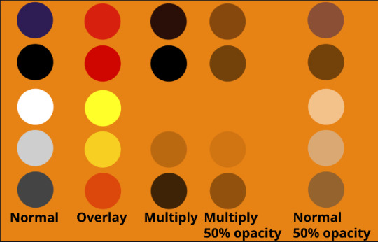
I think seeing this is the best way to visualize how different modes can affect the color.
//--------------------------------
Back to the Tutorial
!!I IMPORTANT NOTE !!
Please play around with the opacity slider to figure out what opacity works best for you on the multiple different layers we're about to make / work with. It's up to your own style to figure this out.
Next: please feel free to not follow all of it. Add more layers, add less layers, take the base principles and go wild! :D
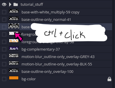
5. Separate the lineart from the background and save it as a new layer
6. Duplicate it and set it to overlay, or set it to overlay immediately
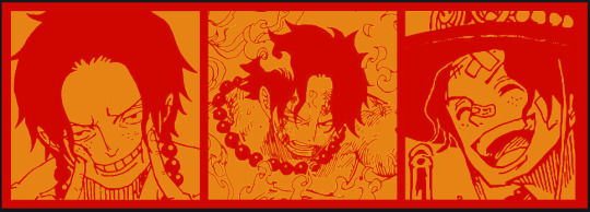
7. Duplicate that lineart layer twice and set the blending mode to overlay
8. lock transparency on the top one and change it to be a dark grey
9. Apply motion blur to both:
Main menu bar -> Filter -> Motion Blur
I made it so that the grey layer was blurrier than the black layer
10. More them around a little to give it a "3D effect" as you called it.
It creates shadows under the lines - I was aiming for an effect similar to chromatic aberration (chromatic aberration is a valid way to add punch to your stuff too!)
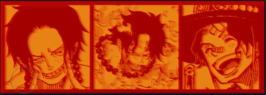
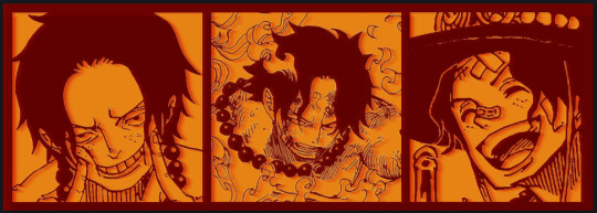
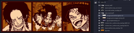
So this is what things look like now - painful, but let's keep going
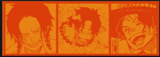
11. Duplicate the ORIGINAL / BASE lineart layer, that you DID not apply motion blur to -> set the blend mode to multiply (reduce opacity for it to actually take effect)
okay that's less painful
here's what the layers look like right now:
let's bring more focus to Ace's face, and push the background farther away:
12. Use the magic wand tool to quickly select large areas of the faces / focal area / foreground and the lasso tool to refine things
TIP!
Hold shift + click -> add to selection
Hold Alt + click -> subtract from selection
13. On a new layer with blending mode -> lighten, fill that selection to be white
If you look at it, you'll notice that it is ALREADY starting to draw our attention to his face, but the background is kinda aggressive, so let's dim that down
TIP!
Right-click on the gradient tool to find the paint-bucket tool

TIP!
Sample All Layers:
Turning this option off makes it so that you only work with the content on THAT specific layer. Turning it on makes it so that it is working while taking all other layers into consideration.
14. ctrl + click on the "white foreground" layer to select the contents of that specific layer (pink thing is your mouse)
15. ctrl + i to invert selection and ON A NEW LAYER (layer mode -> multiply) fill that with a complementary color
16. I did one last thing where I took the original base (before we separated the lineart) and added it to the very top and played with the opacity to get something less in your face (layer blend mode was set to NORMAL)
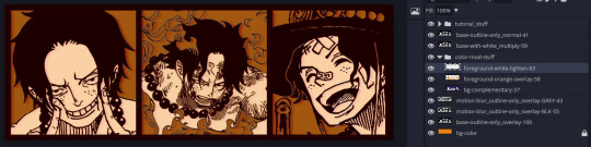
And that's it!
More considerations that I take:
I want the banner to be "thin" or not square, so it doesn't take up too much screen real estate on people's devices
I don't want readers having to scroll too much to get to my writing (which is the whole point of the post, let's not waste their time making them look for things)
I want the banner content to be relevant enough?
ie: with Matching: I wanted the ASCE tattoo to be visible. With matching I wanted Ace to not look too happy in some of them.
I'm also trying to avoid spoilers, I hated getting things spoiled, so I'm trying to be careful that the images I pick don't spoil anything really.
Congrats on starting life on your own! I did that whole living by myself thing too! Tip: keep the pantry stocked with lentils, beans, pastas, baking essentials, rice. They really come in a clutch when you're hungry.
#photopea resources#photopea psd#tutorial#tutorials#tumblr banner#photoshop#photoshop tutorial#digital art#fuck adobe#adobe photoshop
9 notes
·
View notes
Photo


» 08.photopea action
effect made by @harupsds ©
— please, like or reblog if you download; por favor, dê like ou reblogue se fizer download. — don’t repost or claim as yours; don’t copy! não reposte ou divulgue como seu. não copie! — for commercial use, please, contact us or buy from deviantart. para uso comercial, nos chame na ask por gentileza ou compre pelo deviantart.
↷ Download here: Deviantart.
#haru#harupsds#action#actions#photopea action#sharpen action#sharpen actions#image action#photopea-action#photopea resources#allresources#makersleague#dailyresources
39 notes
·
View notes
Text
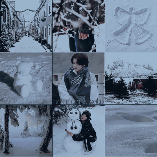
𖥻69 ᴘsᴅ — ᴅᴏɴ·ᴛ ɢᴇᴛ ᴀ ᴄᴏʟᴅ ༊*·˚
ᴅᴏᴡɴʟᴏᴀᴅ﹕
𑁍 ғᴏʟʟᴏᴡ ᴍᴇ
𑁍 ʟɪᴋᴇ ᴏʀ ʀᴇʙʟᴏɢ ᴛʜɪs ᴘᴏsᴛ
𑁍 sᴇɴᴅ ɪɴ ᴀsᴋ ··ᴅᴏɴ·ᴛ ɢᴇᴛ ᴀ ᴄᴏʟᴅ ᴘsᴅ ᴘʟᴇᴀsᴇ﹐ ᴛʜᴀɴᴋs··
𑁍 ᴛᴀɢ ᴍᴇ ɪɴ ᴜʀ ᴘᴏsᴛ ᴀɴᴅ ɪ ᴡɪʟʟ sᴜᴘᴘᴏʀᴛ ᴜ ‹3
❄ ᴅᴏɴ·ᴛ ʀᴇᴘᴏsᴛ ᴏʀ ʀᴇᴘᴀss ᴛʜᴇ ʟɪɴᴋ ⛸️
#psd#coloring#christmas#xmas#winter#psd coloring#soft coloring#psd colorings#cravity#minhee#cravity moodboard#minhee moodboard#ulzzang#ulzzang boy#winter aesthetic#winter moodboard#photopea resources#resources ps#resources photoshop#psd photoshop#photopea psd#photoshop#photopea#filters#filter#psd free#psd files#snow#kpop#kpop moodboard
46 notes
·
View notes
Text
— SYRA, psd coloring
ENG.RULES: This psd is free for personal use, for commercial use you have the option to purchase from KO-FI or deviantart. It is forbidden to repost, use this psd as a base for any other you make to post or include this material in resource packs. Like or reblog if you like/download. (dl.link) PT.REGRAS: Este psd é gratuito para uso pessoal, para uso comercial você tem a opção de comprar no KO-FI ou no deviantart. É proibido repostar, usar este psd como base para qualquer outro que você faça para postar ou incluir este material em packs de resources. Dê like ou reblog se gostar/baixar. (dl.link)
#psds#psd#psd coloring#psds colorings#effects#filters#moodboards#free resources#photoshop resources#photopea resources#psd for icons#coloring psd#free psds#free psd coloring#free photoshop resources#free psd filter#coloursource#icons#aesthetic
196 notes
·
View notes
Text
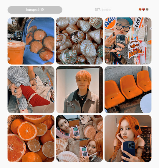
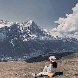
(157. laoise).psd coloring made by harupsds ©
This effect was made by me in photopea and it works better on it. Before downloading read all the rules and follow them, be honest. Don't forget to leave your feedback or suggestion.
Like or reblog if you download and follow me for more content.
Don’t repost, reupload or put on pack/google drive.
Don’t claim as your own.
Don’t recreate, use as base or steal layers.
Adjust the layers or add new ones if needed.
Give me credit if you use it.
Free for personal/non-commercial use. For commercial use pay the download.
Before/After.
▸ Download: Follow me + like or reblog + ask (logged) “psd 157. laoise, please?” UNTIL February 16, 2024 or pay the download on deviantart.
This is our work done with effort and time spent. Please do not copy do not violate, and do not sell it as if it were yours. The Preview was made by me, being my own. Please, if your photo is here, talk to me. It is not my intention to violate the copyright rules.
#dailyresources#allresources#hisources#makersleague#psd*#psds*#psd#psds#psd coloring#coloring#psd download#photopea#photopea psd#photopea psds#psd for icon#for icon#photopea resources#orange#vibrant#harupsds
37 notes
·
View notes
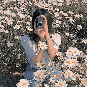
Photo


›› like + reblog.
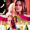
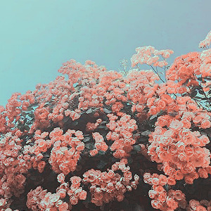
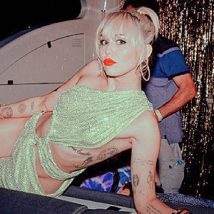
⌕ psd coloring effect BAMBIINA by @gmfioart
#miley cyrus#flowers#icons#icon#moodboard#psd#coloring#psd coloring#photopea#photopea resources#miley cyrus icons#ícone#photoshop#colorização#colorful#color#aesthetic#moodboard aesthetic#nature#dailypsd#allresources#hisources#vanillapsd#gmfioart#bambiina
31 notes
·
View notes
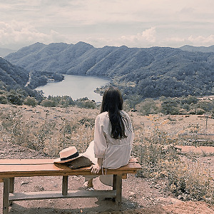
Photo


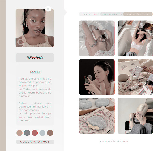
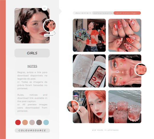
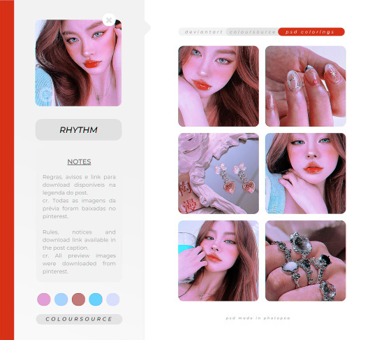
download: 28reasons, attention, killerqueen, rewind, girls e rhythm
#psds#psd#colorings#colourings#psd coloring#psd colouring#colorings psd#colourings psd#resources#photoshop resources#photopea resources#coloursource#free resources#free colorings#free psd colorings
60 notes
·
View notes
Text

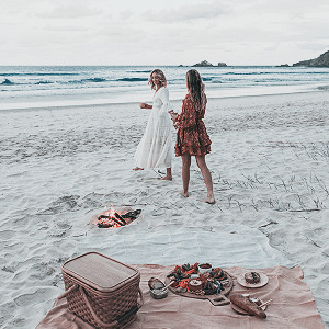

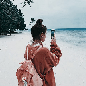

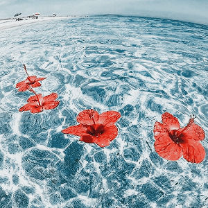
SWIMMI psd coloring © gmfioart/gmfilters ♡
before you download: free for personal use. // gratuito para uso pessoal. don’t redistribute or claim as your own. // não reposte, copie ou divulgue como seu.
download ♡ DA.
#nature#beach#swimmi#coloring#psd#psd coloring#coloring psd#photopea#effect#effects#photopea resources#photopea psd#blue#aesthetic#aesthetic blue#light blue#moodboard#beach moodboard#aesthetic psd#gmfioart#gmfilters#filter#color#hisources#dailypsd#vanillapsds#dailyresources#chaoticresources#completeresources#allresources
35 notes
·
View notes
Last Seen Blogs