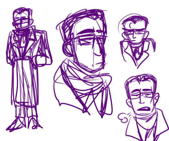
#grey art process
Text
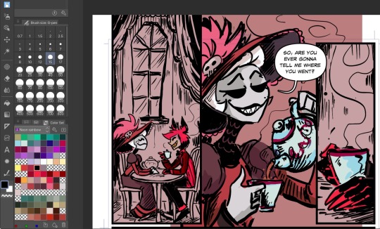
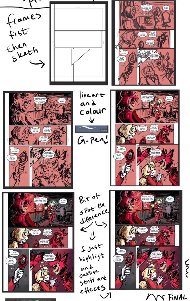
*knocking on the walls to alert the goblins* We are in the colouring stage!
Thought you guys might like getting small updates.
Nothing spoiler-y, just little peaks to keep you engaged.😜
#grey art#grey art process#hazbin comic wip#wip#comic wip#Grey decided that coloring is just gonna be a fun challenge#get better at it by just continuing to do it#bleghhhhhhh#hazbin hotel
1K notes
·
View notes
Text
I think 90% of my gripes with how modern anime looks comes down to flat color design/palettes.
Non-cohesive, washed-out color palettes can destroy lineart quality. I see this all the time when comparing an anime's lineart/layout to its colored/post-processed final product and it's heartbreaking. Compare this pre-color vs. final frame from Dungeon Meshi's OP.


So much sharpness and detail and weight gets washed out and flattened by 'meh' color design. I LOVE the flow and thickness and shadows in the fabrics on the left. The white against pastel really brings it out. Check out all the detail in their hair, the highlights in Rin's, the different hues to denote hair color, the blue tint in the clothes' shadows, and how all of that just gets... lost. It works, but it's not particularly good and does a disservice to the line-artist.
I'm using Dungeon Meshi as an example not because it's bad, I'm just especially disappointed because this is Studio Trigger we're talking about. The character animation is fantastic, but the color design is usually much more exciting. We're not seeing Trigger at their full potential, so I'm focusing on them.
Here's a very quick and messy color correct. Not meant to be taken seriously, just to provide comparison to see why colors can feel "washed out." Top is edit, bottom is original.
You can really see how desaturated and "white fluorescent lighting" the original color palettes are.
[Remember: the easiest way to make your colors more lively is to choose a warm or cool tint. From there, you can play around with bringing out complementary colors for a cohesive palette (I warmed Marcille's skintone and hair but made sure to bring out her deep blue clothes). Avoid using too many blend mode layers; hand-picking colors will really help you build your innate color sense and find a color style. Try using saturated colors in unexpected places! If you're coloring a night scene, try using deep blues or greens or magentas. You see these deep colors used all the time in older anime because they couldn't rely on a lightness scale to make colors darker, they had to use darker paints with specific hues. Don't overthink it, simpler is better!]
#not art#dungeon meshi#rant#i'm someone who can get obsessive over colors in my own art#will stare at the screen adjusting hues/saturation for hours#luckily i've gotten faster at color picking#but yeah modern anime's color design is saddening to me. the general trend leans towards white/grey desaturated palettes#simply because they're easier to pick digitally#this is not the colorists fault mind you. the anime industry's problems are also labor problems. artists are severely underpaid#and overworked. colorists literally aren't paid enough to do their best#there isn't a “creative drought” in the anime industry. this trend is widespread across studios purely BECAUSE it's not up to individuals#until work conditions improve anime will unfortunately continue to miss its fullest potential visually#don't even GET ME STARTED ON THE USE OF POST-PROCESSING FILTERS AND LIGHTING IN ANIME THOUGH#SOMEONE HOLD ME BACK. I HATE LENS FLARES I HATE GRADIENT SHADING I HATE CHROMATIC ABBERATION AND BLUR
2K notes
·
View notes
Text

GRAVE
#trying to reproduce the process i adopted for the GHOUL painting#worked ok it was fun#but tedious#dir en grey#京#fanart#procreate#digital art#visual kei#vkei#jrock#diru#dir en grey kyo#horror#horror art#concept art#painting#portrait#music#heavy metal#yellow#black#art#artists on tumblr#merrymakes
607 notes
·
View notes
Text

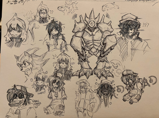
two sketch pages, produced at my friends house, and drawn before i started posting anything to this account.
#labyart#i don't have much to post from recent times since it's all been ocs and shit lmfao#i was looking through my art folder in my camera roll n like wow#after a while you're able to look at your own art like how other people see it#like you forget the process and you dont see so many little flaws#like how a third party would#anyway#time to tag this shit#pokemon#pokemon art#my art#pokepasta#pokepasta perdition#steven strangled red#glitchy red#lost silver#grey hypnos lullaby#grey fnf#hypnos lullaby grey#strangled red#unown king#sneasel#minor gore#tw body horror
173 notes
·
View notes
Text


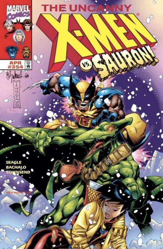
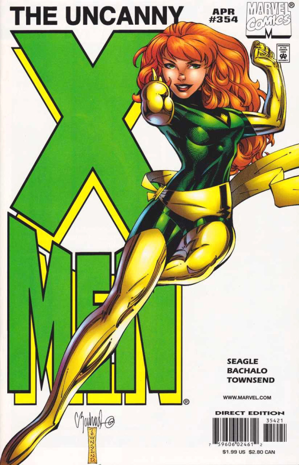
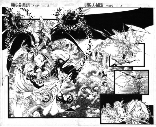
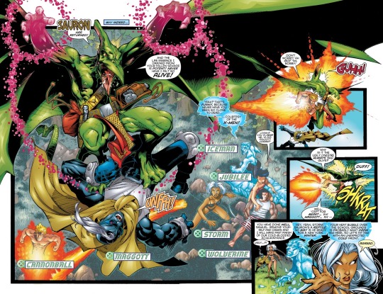
Uncanny X-Men, Vol. 1 # 354 by Chris Bachalo and Steve Seagle, with Inks by Tim Townsend, Letters by Richard Starkings, and Colors by Steve Buccellato.
the Jean Grey cover was a 1 in 4 George Petty homage variant.
#Chris Bachalo#Steve Seagle#Tim Townsend#Richard Starkings#Steve Buccellato#Uncanny X-Men#X-Men#Wolverine#Jean Grey#Sauron#George Petty#Homage#Cover Process#Process#Splash Page Process#Splash Page#Marvel#Marvel Comics#Comics#Art#Illustration
58 notes
·
View notes
Text
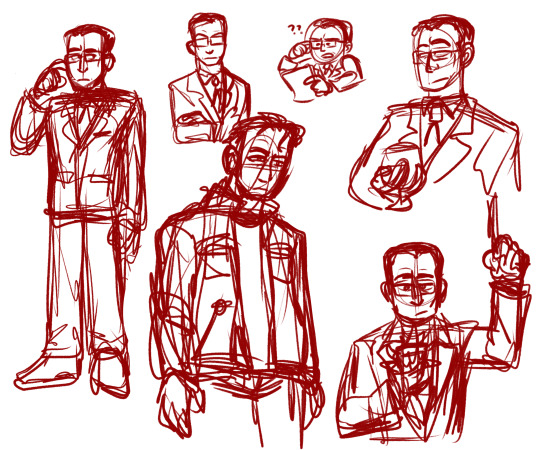
i'm not feeling my lineart today. you get scribblies
#ibis art#metalocalypse#charles offdensen#charles foster offdensen#buncha screencap redraws up top bc i want to like.#ok when i draw these guys im trying to crib the show style too much and it comes out looking kinda jank#i wanna get the Vibe of them down in my style. so i wanna do a lot of quick scribbly redraws that feel natural but still Capture the Essenc#the second one is bc i love his overcoat and scarf look so much. also ive seen vampire charles art. I Like That.#i like to imagine whatever the resurrection process was it didn't really. Fully work. he came back a little bit wrong#i think he's Extra pale and grey. skin's always cold to the touch. pulse is fluttery and hard to find. touch of grey at the temples#if he stays in one position for too long rigor mortis sets in and he makes some UNHOLY crunching and cracking noises when he moves#shaking his leg to get the bloodflow back in it while everyone looks on in horror. he shrugs. joints aren't what they used to be
29 notes
·
View notes
Text

Help, the pawn is taking on his master's ugly personality traits now.
I discovered short shorts with this outfit. It's now Lane's fate. Makes his legs look LONG

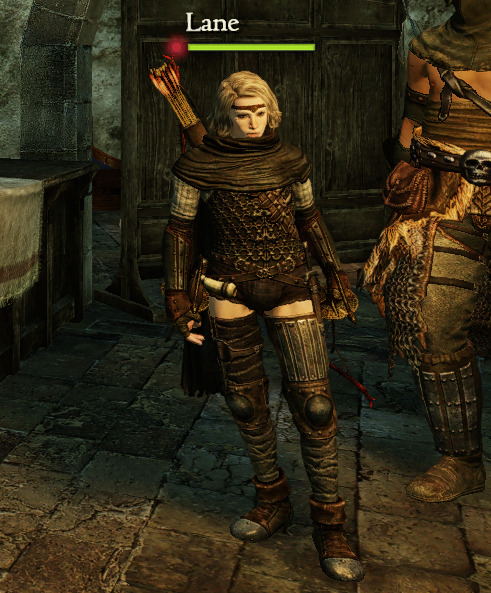
except drawing this took so long that by now he's already wearing something else.
#ritens-art#dragon's dogma#pawn-lane#decided against post-processing the colors this time to keep them clean if a bit grey. no more drawings turning washed out and yellow#ddda
28 notes
·
View notes
Text
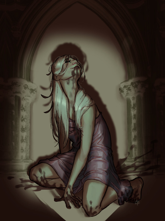
Get yourself a girl who eats her cav
#snsjskskaowoqmmmm🤤🤤🤤🤤#content blessing: Ianthe Tridentarius#how I ended GtN hating her is beyond me#I started drawing this as a doodle after I finished GtN thinking ‘ohhh I like that vibe but I hate her’ now look at me#she’s so disgusting and gross 🥵😍🥰🥰#god I love her so much she’s just a piece of shit#took me 100 years to decide on her hair colour lmaoooo#literally 90% of this was ‘trust the process’#I did all the colour details in the skin and dress in grey scale to adjust the colours later on#not going into this with an actual cohesive colour pallet#the I fucked around with shadows thinking ‘ohhhhh I wan it to be creepy’ and like landed on this as a joke#a lot of it is unrefined but I actually can’t be asked#💕#my art#ianthe tridentarius#the locked tomb#tlt#gideon the ninth#harrow the ninth#gideon the 9th#harrow the 9th#ianthe the first#ianthe the third#tlt fanart#cw blood#tamsyn muir
452 notes
·
View notes
Text
#art#artists on tumblr#illustration#the hobbit#the hobbit fanart#lotr#lotr fanart#bilbo baggins#gandalf the grey#art process video#art reveal#digital art#book cover illustration
35 notes
·
View notes
Note
have you ever shared your comic making process? im super interested in seeing how you go about everything from start to finish!

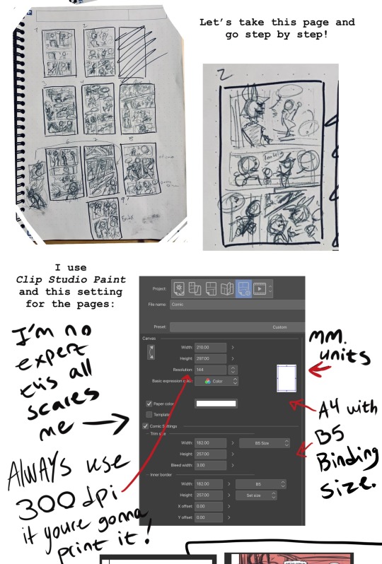

#grey answers#grey’s art process#grey will not gatekeep any knowledge!#this is all very messy and approachable !#come play in the mud with me kids!#comic process#comic making#kill your perfectionism kids!#😂😂😂#hazbin hotel#hazbin hotel comic#I should say I’ve been drawing non stop for like 20 years too and got a diploma in illustration#but still this is just twigs and mud nothing scary!
973 notes
·
View notes
Photo

#gray#grayscale#blackandwhite#peaceful#digital art#b&w#calming#aesthetic#processing#mesmerizing#grey#gif#art#artists on tumblr#gifs#beautiful#visuals#monochrome#stim#greyscale#RGB#*d21#*pfn e0 sp1 r73
44 notes
·
View notes
Text
AND HERE'S THE SECOND BATCH!!!!!!!! LYCAN AND CUBE!!!!!!!!

i am so happy with these...... lycan surprisingly took the LONGEST, mostly because i was thinking of a pose LOL
NEXT IS BOAT AND LYCANTHROPY!!!!!! i'll probably do those two when it's not so early in the morning (midnight to be precise)
sigh............and i still have to make big long reference sheets........cries
#the doodles of cross 2023#my jsab jamming au#jsab art#jsab au#jsab lycanthropy#jsab cube#this isn't a very long process.......#the pose sketch and then the line art#coloring the background grey and then adding the J#(it stands for Jamming btw :3)#and then coloring the shape and cropping the image#then resizing it to 200x200 (GROSS!)
6 notes
·
View notes
Text
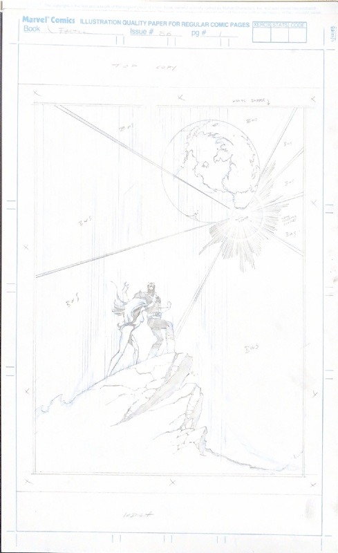


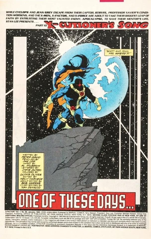
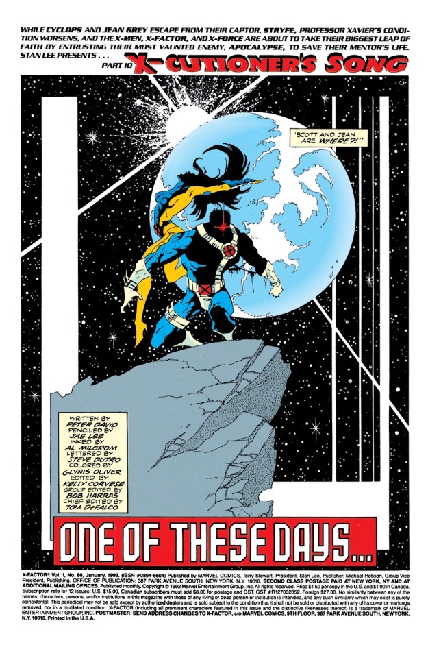
X-Factor, Vol. 1 # 86 Page 01 by Jae Lee, with Inks by Al Milgrom, Letters by Steve Dutro, Colors by Glynis Oliver, and a Script by Peter David.
My single favorite Jae Lee image ever, and one of the most iconic images in X-Men history.
GORGEOUS page.
#Jae Lee#Al Milgrom#Steve Dutro#Glynis Oliver#Peter David#Cyclops#Jean Grey#X-Cutioner’s Song#X-Factor#Splash Page Process#Splash Page#Process#Marvel Comics#Marvel#Comics#Art#Illustration
32 notes
·
View notes
Text

shh they’re sleeping
#thought process on this one was just ‘what if jeanlorna got a mini set way back when and they were That female friendship’#also i wanted to practice hair n shading. p proud of it all things considered#mine#jeanlorna#jean grey/lorna dane#lorna dane#jean grey#polaris#marvel girl#also yes the title is a ref to the incredibly true adventure of two girls in love#artists on tumblr#digital artist#procreate art#marvel fanart#x men fanart
76 notes
·
View notes
Text

"nosebleed" (2023)
12x17 mixed media
#art#artwork#francis bacon#dope shit#skull#skull art#mixed media#dark aesthetic#grey#art process#basquiat#jean michel basquiat
3 notes
·
View notes
Last Seen Blogs

linkmore242424
Link more 24

reaper3113
Untitled
thepowerpuffedits
powerpuff edits
sfsdfsdf21
dasfdsfsdfgj9

hellhunde
New kind of star