#graphic/typography
Text

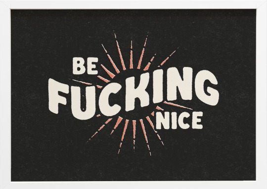
shoutout to the "foolproof" bread recipe I fucked up entirely for inspiring this
#something different from what I normally draw!#I said this when I realized the bread was NOT making it and I made myself laugh out loud#also...if you happen to really like this it's available in my threadless shop - acorn.threadless.com#tw: cursing#typography#lettering#graphic design#illustration#original art#digital drawing#digital illustration#comedy#humor#relatable
16K notes
·
View notes
Text

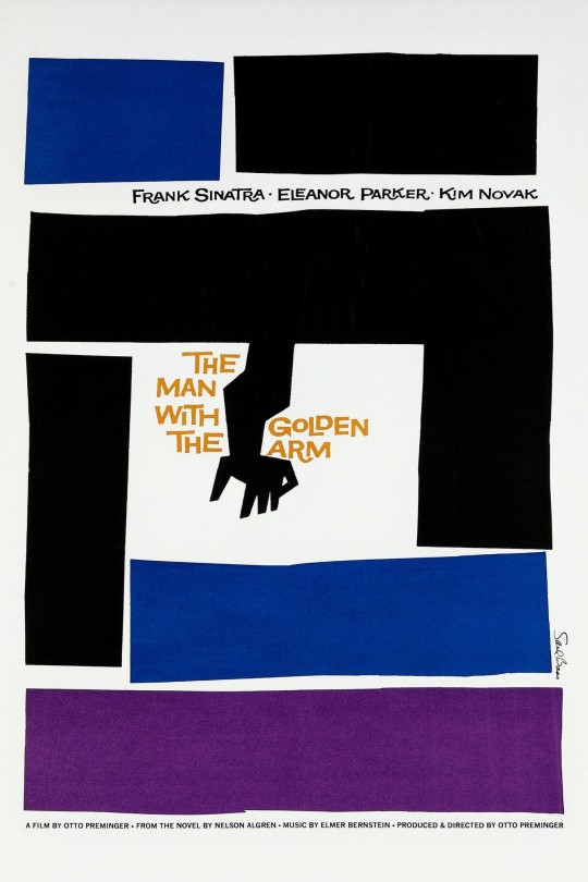

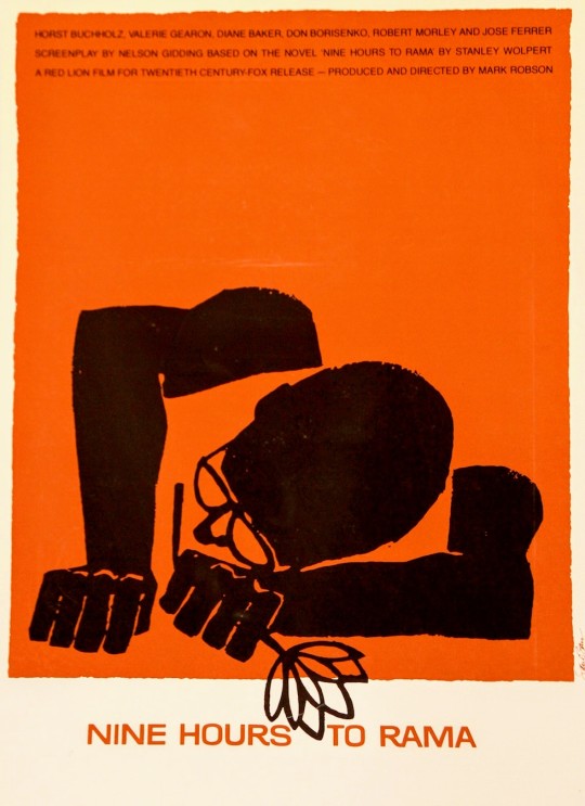
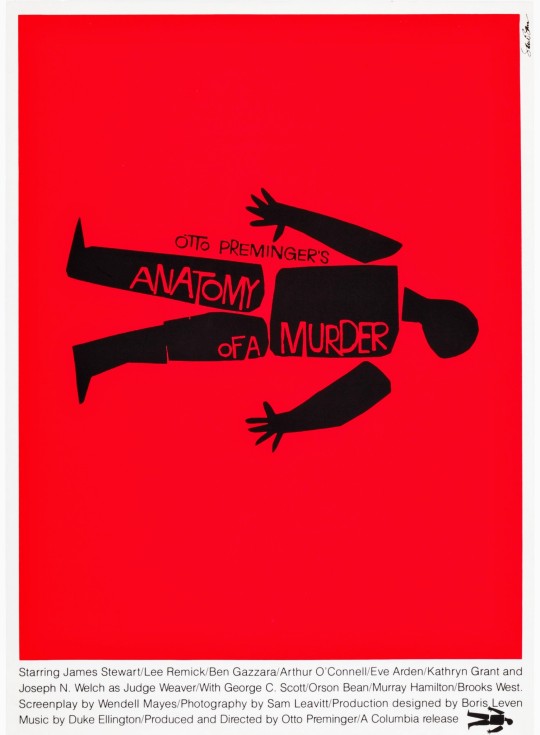

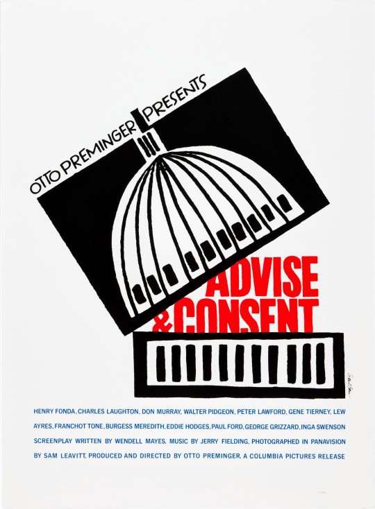
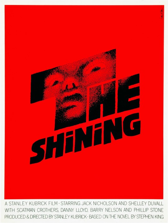

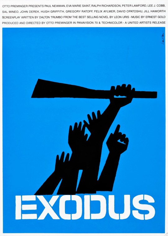
Saul Bass: 10 iconic movie posters.
#saul bass#vintage#posters#art#retro#art history#graphic design#1960s#movies#1950s#cinema#film#alfred hitchcock#hollywood#minimalism#the shining#design#history#aesthetic#typography#culture#style#🎨
5K notes
·
View notes
Text

Messing around with design ideas
#secret life smp#slsmp#mcyt#trafficblr#traffic smp#life series#I was aiming for ppg and fhfif style designs#and was reminded that scar's mayor outfit is literally just the ppg mayor outfit#struggled with the typography for way too long#graphic design is not my passion
5K notes
·
View notes
Text
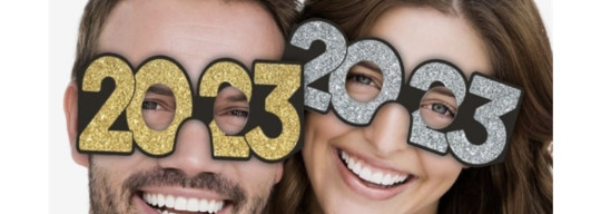
I’m not breaking any new ground here, but it’s obvious that the peak of novelty New Year’s Eve numerical eyewear was 2000-2009
10/10 for legibility, visibility, and typography
for years now, this industry has been stubbornly clinging to an idea that has become too cumbersome. if you will indulge me, I will now rate 2023’s new designs:


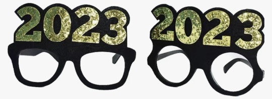
5/10 best I can say is “it gets the job done.” it does clearly read as 2023, but the typography is bad & the visibility leaves much to be desired.
2/10 happy 20?3, i guess. they started with a decent font, but these are illegible and everything about the eyehole placement sucks.
6/10 hear me out: this is an okay compromise. it’s a cop out, sure, but it’s a viable alternative. it satisfies the basic requirements of legibility, visibility, and typographical acceptability, yet it lacks all whimsy. this feels like when you don’t do a project the way the teacher intended but you pass anyway on a technicality. this isn’t school, though, so i’m failing this design.
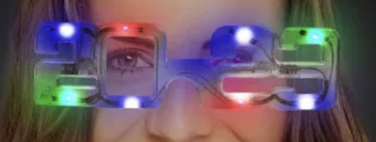
1/10 come on, guys. if you’re going to use the top of the 2 as an eyehole, at least use a font with a more open design, perhaps something art deco. at least when you look in the mirror with those LEDs directly in your line of sight, you won’t notice how bad the glasses look.

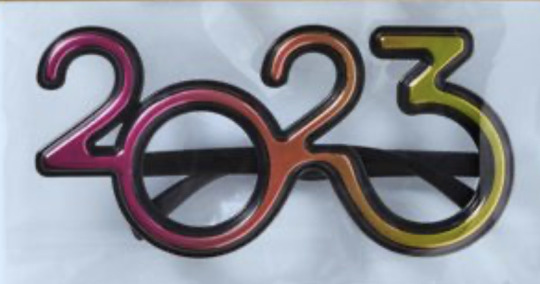
7/10 now we’re getting somewhere. like the first design, it uses the 3 as the second eyehole but it does so without compromising the shape of the number. unfortunately, the lack of outlines does negatively affect legibility and there may be some visibility issues for the left eye.
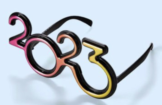
9/10 this is as good as it’s gonna get, folks. an actual graphic designer was clearly involved here. the typography is appealing, the color works, visibility looks good. nicely done.
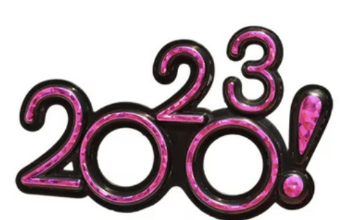
-1000000000000000/10 :(
30K notes
·
View notes
Text
"slut!" - t.s.
#taylor swift#tswiftedit#taylorswiftedit#edit#1989#1989 taylor's version#1989 tv#taylor swift 1989#candy swift#1989 era#1989 album#music#song#lyrics#track#1989 vault tracks#graphic#typography
3K notes
·
View notes
Text
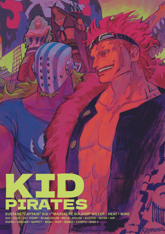
#one piece#kid pirates#eustass kid#killer one piece#op killer the guy ever#and the goober he picked off the street#eustass captain kid#ive been looking at the works of bob peak#i wanna get good like that one day…#also#is the lettering ok#or is it giving graphic design is my passion#let me know#all i learned in typography class was that i should be sorry for existing#and to never letterspace lowercase letterforms#thank u A type primer#i have design school trauma
1K notes
·
View notes
Text
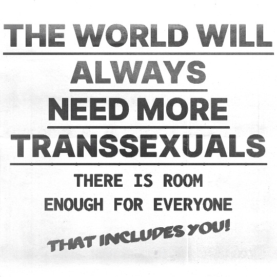
[Text ID: THE WORLD WILL ALWAYS NEED MORE TRANSSEXUALS. THERE IS ROOM ENOUGH FOR EVERYONE. THAT INCLUDES YOU! /End ID]
click for quality + do not remove caption
#baby's first copy scan type edit lmao#silas denver melvin#sweatermuppet#lgbt#pride#queer#trans#ftm#mtf#nonbinary#genderqueer#vintage queer#graphic design#typography#truisms#queer poetry#trans poetry
44K notes
·
View notes
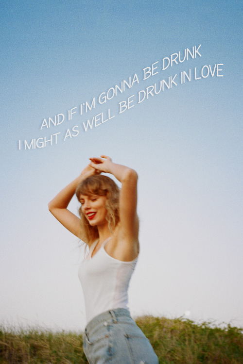
Text
it’s happening again, how did it end?
#taylor swift#my edit#edit#tsedit#tswiftedit#ttpd#the tortured poets department#lyric graphic#lyrics#ttpd era#how did it end?#black and white#typography edit#1k
2K notes
·
View notes
Text


There is a surprising amount of graphic joy in these Milwaukee transit passes from the 1940s-60s. They were featured in the last issue of ghostsign guru Sam Roberts' excellent BLAG magazine and can be examined in more detail at the Letterform Archive.
1K notes
·
View notes
Text

3K notes
·
View notes
Text
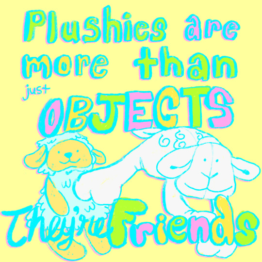
plushies are made to be loved! cuddle your stuffed animals!
#plushies#jellycat#stuffed animals#plushie art#plush#plush portrait#stuffies#plushie cuddles#plush artist#digital art#graphic design#artists on tumblr#kidcore#kidcore art#babycore#pastel aesthetic#lamb plush#typography#procreate art#drawings#radiofrogs#my jellies
1K notes
·
View notes
Text
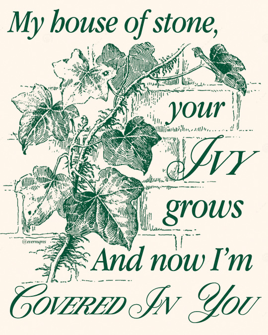
IVY — TAYLOR SWIFT
#taylor swift#evermore#lyrics#tswiftedit#tswift#tscreators#taylorswift#tswiftlyrics#taylor swift edit#typography#lyrics edit#candy swift#networkthirteen#tsuserjen#tsusermels#usersophie#hauntedbythelook#tsuservio#my graphics#my edits
2K notes
·
View notes
Text
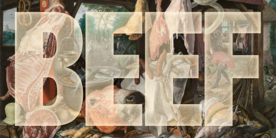
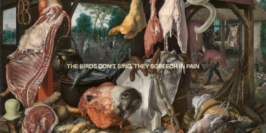
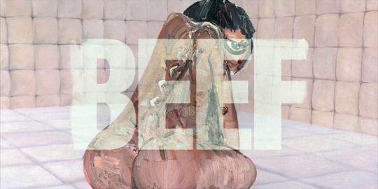
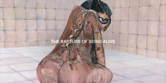
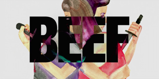


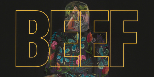
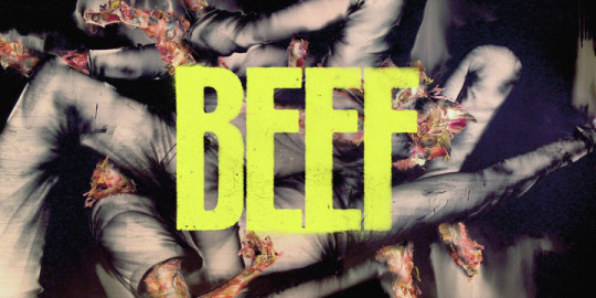
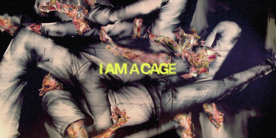
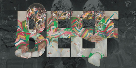
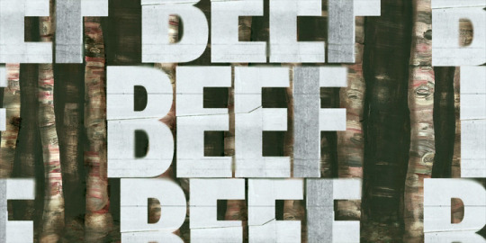
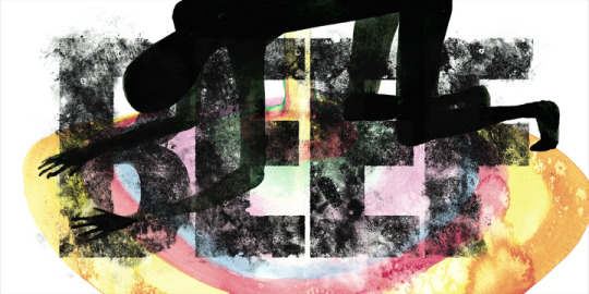

Episode title cards | BEEF (Netflix, 2023)
"A Meat Stall with the Holy Family Giving Alms" by Pieter Aertsen (Episode 1)
Artwork by David Choe (Episodes 2-10)
#beef#beef netflix#ali wong#steven yeun#david choe#art#title card#episode titles#a24#netflix#typography#graphic design
5K notes
·
View notes
Text

You might get some bread maybe 🐱🍞✨
#bread#cats#bread cat#cat bread#carbcat#carbcat bakery#baking#bakery#logos#vintage logos#typography#graphic design#logo design#carbs#food#loafing#loafing around#daily bread#feeling fine
3K notes
·
View notes
Text
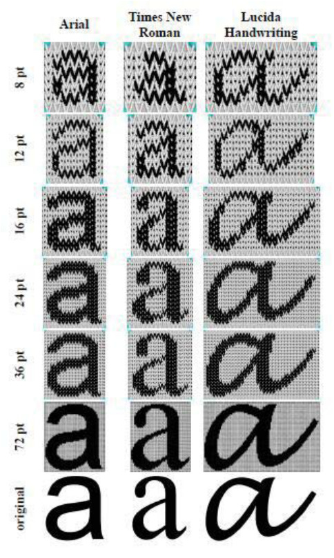
‘Typography and logos in knitted structures' presented at the International Symposium in Knitting and Apparel, 2013 by Andrej Vilar, Klementina Mozina and Alenka Pavko-Cuden.
#typography#knitwear#knitting#experimental type#graphic design#andrej vilar#klementina mozina#alenka pavko-cuden#pheere
6K notes
·
View notes
Last Seen Blogs

princessflamingo
So Far So Bad

d3moon
𝓪𝓷𝓰𝓮𝓵𝓲𝓬 𝓭𝓲𝓼𝓪𝓼𝓽𝓮𝓻
seongbyungjoo
上海 boy 。

generaljenobi
Hello There
sassy-un-classy-blog
Sassy-un-classy