#all i learned in typography class was that i should be sorry for existing
Text
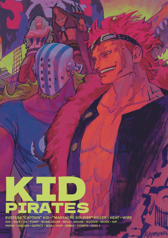
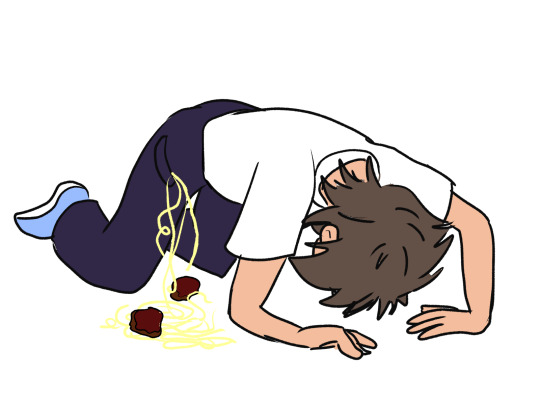
#one piece#kid pirates#eustass kid#killer one piece#op killer the guy ever#and the goober he picked off the street#eustass captain kid#ive been looking at the works of bob peak#i wanna get good like that one day…#also#is the lettering ok#or is it giving graphic design is my passion#let me know#all i learned in typography class was that i should be sorry for existing#and to never letterspace lowercase letterforms#thank u A type primer#i have design school trauma
1K notes
·
View notes
Photo
Evening study bugs!
Now that most kids are back at school (at least where I live), now is a good time to talk about revising content! As a freshly graduated eighteen-year-old, staying on top of content when I was at school was something that was imperative to staying afloat (especially doing as many content heavy subjects as I did). Whether you’re more visual or logistical in the way you learn, I’m sure there will be something for every type of student down below with my six tips to revising content.
One) Type to book revision! This method is a really good one to get into the habit of! I’m sure you’re all well aware of the rush of information being shovelled into your brains as you’re frantically taking down notes before the teacher changes the slide. As someone who loves having a tidy and clean workspace, I want my notes book to look the same as well. However, in class, you’re usually having to compromise the aesthetic value of notetaking for information to make sure you don’t miss out on anything (or vice versa)! So I like to use my computer or a spare book to messily write notes down in class to make sure I get all the information I need. This document or book does not exist to look pretty or make you feel inspired by its beautiful typography or its highlighted headings, but rather as a source of the information you learnt in class. The way I use this to revise is by retyping/rewriting these notes in a document/notebook at home where I have the time and energy to put effort into the aesthetics of my notetaking. When you’re retyping/rewriting notes from your class, you’re revisiting content that you earlier may have just had to briefly look over in order to not miss anything. Looking at a tidy and beautiful display of notes not only can help you visually learn a lot better, but it motivates you to keep learning. But just keep in mind that the appearance of notes does not equate to the quality of note taking and personally should not be valued over retaining information. Making pretty notes is fun but it can shift into procrastination if you let it overtake your ability to retain and revise the information!
Two) Cue cards and flash cards! All throughout high school, cue cards and flash cards were my absolute favourite form of revision! And many of you probably use it now as it’s such a popular way to test yourself and emulate the conditions of an exam or test. The difference I find between cue cards and flash cards is that cue cards provide the information in short summaries whilst flash cards prompt the information on one side, and show the answer on the other, hence testing you. Personally, I like to write down my content onto physical cue cards and test myself. That way, I’m also taking the time to revise the content when I’m writing them down onto the cards! If writing them down isn’t your thing (it can be pretty tedious, especially if there’s a lot of information!), there are plenty of online options to type your information out. Studyblue, Quizlet and making them yourself on Word or Pages are all great alternatives to writing down each bit of content! Before I move onto the next idea, I have two helpful tips in regards to cue/flashcards that may be beneficial when writing/typing them up. The first is to try and pace out your time between studying/homework so you can write up cue/flashcards throughout the year. Take it from me, it’s not a great idea to leave all the content to the last week to type up into cue card form. So, it’s a pretty good idea to gradually keep up with cue/flash card making throughout the year. Also, it’s always a wise idea to keep your cue/flash cards after a test/exam has been completed in case you need to revisit them later!
Three) Unusual reminders! Now this one probably isn’t quite as common or widely used, but it will help you remember information that you’re struggling to retain! I wouldn’t recommend using this tip for all of your information because it's rather suited for content that you’re repeatedly having trouble remembering. In the days or weeks leading up to a test or exam, it's a good idea to write down the content in short, summarised points on individual cards/paper and leave them in places/objects that you use regularly. For example, if you’re having trouble remembering a definition, you could write it down on a small piece of paper and tuck it into your shoes, socks, toothbrush holder, toilet door, wallet etc. Using this strategy will force your mind to view content more regularly (without staring at a book mindlessly) and it will often come to the natural conclusion of retaining that information out of the regularity of your habits!
Four) 5-minute rush! This next one is a good strategy you can do on your own, or with a study group! Create a few main topics that encompass all of the information you’ve learnt for a specific subject and give yourself 5 minutes to write down all of the information you can remember related to that topic on a piece of paper or a computer (but no cheating with notes because it defeats the purpose of the exercise!). After 5 minutes, it’s a good idea to compare and correct the information you wrote down to see the accuracy of your results. This is a good exercise to test your knowledge in time-sensitive conditions. However, if you don’t get all the information you aimed for, don’t be disheartened! Treat it as a learning opportunity to grow and learn more information!
Five) Glass and Mirror learning! This next one is fairly similar to tip three and four as it lends itself to some of the same approaches. However, I use this as a content revision technique because it requires a large surface for you to expand your ideas and knowledge on! What you’ll need for this strategy are some windows or mirrors (that aren’t super valuable, sentimental or dangerous for you to access!) and some window chalk! For those of you unaware of what window chalk is, it usually comes in marker-like tubes and will usually read something like ‘applicable to non-porous surfaces’ on the labelling. But again, probably just read the packaging for whether it is safe on your glass and mirror surface at home. I like using these markers on my long mirrors in my bedroom because they take up a large portion of my room and force me to read them. I find this as a good method a revising content because not only am I writing the information down (a great tool for revision), but I am placing that information in an area where I will regularly view it as opposed to a notebook where you can only view the information if you physically search it up. This strategy is great because the information is always at your disposal in plain sight for when you’re ready to do some light revision!
Six) Podcasts! I got this next tip off of one of my teachers when I was in year nine and it’s honestly a really good tip. At the end of each class when you get home at night, it’s a good idea to read over the notes you learnt in class today and record yourself reading it. Once you’ve done this, you can export it into an mp3 file and import it onto apps such as Spotify for your own personal listening! This is a really great method of revision when you’re in situations where it may not be ideal to whack out the books and start working. If you’re on the train or the bus to school, this is a really great way to revisit content learnt in the class prior so that you give yourself a mental refresher for the class ahead! It’s also a good way to get your mind focused for the day ahead (It’s okay, I sometimes have trouble getting my head into the working grind in the mornings too!) It’s a really great strategy all-round but you may just have to get over the obstacle of hearing your own voice in your ear whilst you get to school!
And that’s all for now folks! I hope you guys can perhaps find at least one thing useful in the above tips and that maybe you want to apply to your next study session! I understand not all of these tips will apply to everyone and that’s cool, but I find when studying something that’s not exactly stimulating, it’s nice to switch up your study method and shift your practice in accordance to the demands of what you are and/or having trouble with learning!
Sorry for the lack of upload as well guys! Just started University this week so uploads may be a tad sporadic from now on, but I’ve got some great ideas and posts coming out soon that have been planned for you all to look forward to!
kt xo
#study#student#revision#studygrind#work#school#content#studyblr#aesthetic#university#high school#studygram#tips#study help#workhard#inspiration#studyspo#motivation#study motivation#studying#notes#notebook#workbook#productivity#efficiency#effective#ktstudyblr
221 notes
·
View notes
Text
journal 1/ chapters 1-4 / the prologue to graphic design
initial thoughts
When I first received the textbook, the 6th edition of Meggs' History of Graphic Design (written by Philip B. Meggs and Alston W. Purvis) in the mail, I was immediately stressed out. I was unfortunately gifted the trait of being ultra stressed about a lot of things, but school always won first place in amount of stress. (My freshman year of high school I was so stressed I was getting a lot of gray hairs...so embarrassing!) In general, history has been my least favorite subject, and therefore was the subject I struggled with the most. Although I am passionate about graphic design, I wasn't super psyched to be reading about its history. Sorry Professor!
1 / the invention of writing
These terms! I believe I have only heard of pictographs and hieroglyphics before reading this. To read that there's petroglyphs, ideographs, cuneiform, and rebus writing. Wow.
"The symbol for sun...began to represent ideas such as "day" and "light"." (pg.9, Meggs.): You know, I never considered that. On my essay in quiz 1, I discussed how there were would be too many characters to represent every word, and that is why having an alphabet is more advantageous. Though I agree with my argument, I wonder how many symbols would have dual or more meanings, as that is the case for many words in the modern English language. For example, the word "die" could mean the verb of ceasing to exist, or it could mean the noun of a dot-marked playing cube / singular form of dice. So in cuneiform terms, would the symbol for "die" [noun] represent the idea of death? Probably not, but maybe with crazy English it might.
Whenever quarantine ends, I wonder how hard it would be to make my own cylinder seal. After reading this portion, I found the urge to make one. Obviously with modern technology, making a personalized stamp wouldn't be that hard, and I have seen some DIY artists make their wax seals. I think it would be fantastically ridiculous to have an obnoxious stone seal to go around "marking my territory" on.
Ah papyrus. I feel stupid for admitting this, but I didn't actually know papyrus was a plant. I didn't think it was not a plant, however I just never thought of it that deeply. I'm going to look up what it looks like right now. [...] Oh, okay. I suppose today is the appropriate day to say that it sort of looks like thin marijuana? Anyway, speaking of papyrus, the reason I never gave it much thought to it being a plant is because I have been too focused on everyone's hatred for the Papyrus typeface. Why does everyone hate it? I haven't found myself wanting to use it (yet), but I definitely feel this social pressure that I'm not allowed to use it.
I find superstition fascinating. I think if I could meet anyone from the past I would want to meet the illustrator of the Book of the Dead. That would be a morbidlly cool job to have, just feeling that some random guy named Bob has had enough days lived. AND WITH THE POWER OF THE PEN you kill hi- I mean let him enter the afterlife.
2 / alphabets
The definition of an alphabet is definetly something I have not thought about in depth. This definition makes sense, but I always took it for granted in terms of- well I know English, there's an alphabet. I tried to learn Spanish, there's an alphabet... it's almost the same except they're pronounced differently and there's another n- ñ. I tried to learn Japanese, and there's almost twice as many characters (as English), 2 for each sound.
Fascinating to learn that Hebrew and Arabic writing was the evolution of the Phoenician alphabet. I can very much see the resemblances. But it's crazier that different cultures took it in one direction, and then the Greeks took it in another direction, and the Romans took that alphabet in a completely different direction. It blows my mind to see how far we've come.
Ah yes, serifs. I love the whole argument over whether they originated at cleanup marks or sharpening-the-brush-tip marks. Can't we just be glad they exist? (I want to believe it's the sharpening origin, it sounds more efficient.)
Vellum paper feels amazing; no wonder it has to be made from that smooth baby skin. Yikes.
Scrolls are also an obnoxious thing I'd like to have. For instance, I probably will have my will written in a large scroll to represent how dramatic I am.
As someone who used to be obsessed with Kpop, I think it is absolutely amazing that Hangul is such a technical alphabet. It reminds me of how humans have that disk they threw into outer space teaching aliens how to speak English via the shape of your mouth and lips and what position your tongue should go for certain sounds. Obviously this is the origin and is way more impressive especially at such an early point in our history. It makes me appreciate the language and those that write in it much more.
3 / the asian contribution
I appreciated that this chapter starts off crediting the Chinese with creations forcertain things that I remember throughout middle school and high school, history class always seemed to gloss over. Like where did these Europeans know which way was north and to figure they could kill others by putting some powder in their guns. Paper also always came out of nowhere, but I'm glad I learned its origin sooner than reading this.
I have learned that Chinese calligraphy was more important that painting before, but in a different way. As I'm in a lot of art classes, I was taught that Chinese painters would usually also be calligraphers and viewers could tell that the same person who painted the painting wrote the calligraphy as the style of the strokes would match. Thinking about it more now, it would make sense why it would be more important as calligraphy was something you had to memorize AND learn where as with painting, anyone could technically learn how to visualize.
Referencing my earlier rant about cylinder seals, chops are also something I enjoy and would want to have one of my own. Personally I like cooler colors better, so maybe I would choose to have a blue ink instead... but I know that's not the point. I think this would make more sense to be the origin of printing as it is constructing something once and being able to reproduce it over and over just with the use of ink.
The Chinese also invented playing cards! How interesting that they were called sheet dice and a unique aspect of graphic design that you never realize until you actually think about it.
I agree with the authors, it is odd that languages with thousands of characters would decide to use such a tedious method like movable type. On the bright side, we wouldn't have our lovely lazy Susan's if it weren't for this tedious type!
4 / illuminated manuscripts
As someone who appreciates shiny things (my weakness is holographic) it was exciting to learn about illuminated manuscripts. I'm just imagining the gold leaf making the page glow from a couple meters away. Those kind of things make me like to pretend stuff is magical. And for your title to be an illuminator? Yes please. AND to learn that these were insanely portable for a lazy human like me? Perfection.
Earlier this year I learned about ascenders and descenders in typography, so it was nice to know their origin as well as how lowercase and uppercase letters came from minuscule and majuscule.
I am thankful for the Celtics for deciding to put spaces between words. Reading (especially something I'm not interested in) would be a much more painful task ifeverythinglookedlikethis. No wonder humans were evolving so slowly before this point. Howdoyouknowwhenonewordendsandanotherbegins?
All of these illustrations next to the text on the manuscripts make me wonder if they were still using hieroglyphics, would they even bother to illustrate these giant paintings or would it seem (or at least appear) to look repetitive? I particularly enjoy the page from Ormesby Psalter, a Gothic manuscript on page 61; it's very beautifully done.
While I'm not a religious person, I think the concept of aniconism is very interesting. Also how you could view illustrations of living things, but only inside. Can't deny that their commitment to an intricate and complex design in the Islamic manuscripts were not short of beauty.
The Limbourg brothers' story was interesting to me: how they were all illuminated book designers, how they all died before finishing their most well known project, just short of when the duc de Berry died.
This chapter was the roughest for me. I feel that it was a bit long for my tastes and it gave me a bit of anxiety that with it being so long that the professor told us to focus more on chapter 1 than this chapter. That's my issue though and it was still pretty insightful.
post thoughts
I understand the reviews for this book that I read, about how the writing is something I'm going to have to get used to. It is definitely informative, but oh my it is a lot. Will definetly not be doing this journal so late on Sunday night. Sorry professor...
Source: Meggs' History of Graphic Design, 6th Edition, Philip B. Meggs and Alston W. PurvisJohn Wiley & Sons publishers.
1 note
·
View note
Text
How Frontend Developers Can Help To Bridge The Gap Between Designers And Developers
New Post has been published on https://headacheshelp.com/awesome/how-frontend-developers-can-help-to-bridge-the-gap-between-designers-and-developers/
How Frontend Developers Can Help To Bridge The Gap Between Designers And Developers

How Frontend Developers Can Help To Bridge The Gap Between Designers And Developers
How Frontend Developers Can Help To Bridge The Gap Between Designers And Developers
Stefan Kaltenegger
2019 -0 5-14T12: 30:59+02: 00
2019 -0 5-14T13: 06:16+00: 00
Within the last nine years, almost every designer I used to work with carried their frustration to me about them often having to spend days giving feedback to developers to correct spacings, typeface sizes, visual as well as layout facets that is as simple as not been implemented correctly. This often lead to weakening the trust between decorators and developers, and caused unmotivated designers along with a bad atmosphere among the two disciplines.
A lot of days developers still seem to have the bad reputation of being overly technical and ignorant when it comes to being considerate about details the design team came up with. According to an article by Andy Budd, “ […] a lot of developers are in the same position about design — they just don’t realize it.” In reality though( as Paul Boag points out ), “developers[ need to] build design decisions all the time.”
In this article, I’ll offer practical phases of advice for frontend developers to avoid frustration and increase productivity when working with their creative counterpart.
Looking Through The Eyes Of A Designer
Let’s for one moment imagine you were a designer and expended the last weeks — if not months — to work out a design for a website. You and your teammates went through multiple internal revisions as well as client presentations, and set a solid endeavour into fine-tuning visual details such as white space, typeface styles, and sizes.( In a responsive epoch — for multiple screen sizes, of course .) The designs have been approved by the client and were handed off to the developers. You feel relieved and happy.
A few weeks later, you receive an email from your developer that says :P TAGEND
“Staging site is set up. Here’s the link. Can you please QA? ”
In a thrill of anticipation, you open that staging link and after scrolling through some of the pages, you notice that the site appears a little off. Spacings are not even close to what your design suggested and you notice some kinks in the layout: incorrect font faces and colors as well as incorrect interactions and hover states. Your excitement starts to slowly fade and turn into a feeling of frustration. You can’t help but ask yourself, “How could that have happened? ”
The Search For Reasons
Maybe there were just a lot of unfortunate misunderstandings in the communication between the designers and developers. Nevertheless, you continue asking yourself :P TAGEND
What did the the handover of designs look like? Were there just some PDFs, Photoshop or Sketch files shared via e-mail with some comments, or was there an actual handover meeting in which various aspects such as a possible design system, typography, responsive behavior, interactions and animations were discussed? Did interactive or motion prototypes that help to visualize certain interactions exist? Was a listing of important aspects with defined levels of priority generated? How many conversations took place — with both decorators and developers in the same room together?
Since communication and handover are two very important key points, let’s take a closer look at each.
Communication Is Key
Designers and developers, please talk to each other. Talk a lot. The earlier on in the project and the most often, the most wonderful. If possible, review design work in progress together early in the project( and regularly) in order to constantly evaluate feasibility and get cross-disciplinary input. Designers and developers naturally both focus on different aspects of the same part and therefore insure things from different slants and perspectives.
Checking in early on lets developers become familiarized with the project so they can start researching and planning ahead on technical terms and bring in their notions on how to perhaps optimize features. Having frequent check-ins also brings the team together on a personal and social level, and you learn how to approach each other to communicate effectively.
The Handover From Design To Development
Unless an organization follows a genuinely agile workflow, an initial handover of design comps and assets( from the design team to the developers) will likely happen at some phase in a project. This handover — if done thoroughly — can be a solid foundation of knowledge and agreements between both sides. Therefore, it is very important to not to rush through it and scheme some extra time.
Ask a lot of questions and talk through every requirement, page, component, feature, interaction, animation, anything — and take notes. If things are unclear, ask for clarification. For example, when working with external or contract-based squads, both designers and developers can sign off the notes taken as official documents of mutual agreement for future reference.
Flat and static design comps are good for showing graphical and layout aspects of a website but plainly absence the proper representation of interactions and animations. Asking for prototypes or running demos of complex animations will create a clearer vision of what needs to be built for everyone involved.
Nowadays, there’s is a wide range of prototyping tools available that designers can utilize to mockup flows and interactions in different levels of fidelity. Javier Cuello explains how to choose the right prototyping tool for your project in one of his comprehensive articles.
Every project is unique, and so are its requirements. Due to these requirements , not all conceptualized features can always be built. Often the available time and resources to build something can be a limiting factor. Furthermore, constraints can come from technological requirements such as feasibility, accessibility, performance, usability and cross-browser support, economic requirements like budget and license fees or personal constraints like the skill level and availability of developers.
So, what if these constraints cause conflicts between designers and developers?
Finding Compromises And Building Shared Knowledge
In order to successfully ship a project on time and gratify all defined requirements, observing compromises between the two disciplines is mostly inevitable. Developers need to learn to speak to designers in non-technical terms when they explain reasons why things need alters or can’t be built in a specific situation.
Instead of just saying, “Sorry, we can’t build this, ” developers should try to give an explanation that is understandable for decorators and — in the best case — prepare suggestions for an alternative solution that works within the known constraints. Backing your point with statistics, research, or articles, can help to emphasize your debate. Also, if timing is an issue, perhaps the implementation of some time-consuming proportions can be moved to a later phase of the project?
Even though it is not always possible, having decorators and developers sit next to each other can abbreviate feedback loops-the-loops and make it easier setting out a compromised answer. Adapting and prototyping can be done directly through coding and optimizing with DevTools open.
Show your fellow designers how to use DevTools in a browser so that they can alter basic information and preview small changes in their browser( e.g. paddings, margins, font sizes, class names) on the fly.
If the project and team structure allow it, building and prototyping in the browser as soon as possible can give everyone involved a better understanding of the responsive behaviour and can help eliminate bugs and errors in the early stage of the project.
The longer decorators and developers work together, the better decorators will understand what is easier and what is more difficult for the developers to build. Over time, they can eventually refer to answers that have worked for both sides in the past :P TAGEND
“We’ve utilized that solution to find a compromise in Project A. Can we use it for this project as well? ”
This also assists developers get a better sense of what details the designers are very specific about and what visual aspects are important to them.
Decorators Expect The Frontend To Look( And Function) Like Their Design
The Design File Vs. Browser Comparison
A helpful technique to prevent designers from frustration is to make a simple left-right comparison between the design file you got handed over and what your current state of developing looks like. This might sound trivial, but as a developer, you have to take care of so many things that need to function under the hood that you might have missed some visual details. If you insure some noticeable discrepancies, simply correct them.
Think of it this style: Every detail in your implementation that seems precisely as it was designed saves both you and the designer valuable time and headaches, and fosters trust. Not everyone might have the same level of attention to detail, but in order to train your eye to notification visual differences, a quick round of Can’t Unsee might be a good help.
( Image credits: Can’t Unsee)( Large preview)
This nostalgically reminds me of a game we used to play a long time ago called “Find it”. You got to find differences by comparing two apparently similar images in order to score points.
( Image credits: Mordillo find them)( Large preview)
Still, you may be thinking :P TAGEND
“What if there simply is no noticeable system of typeface sizes and spacings in the specific characteristics? ”
Well, good point! Experience has shown me that it can help to start a dialogue with the designer( s) by asking for clarification rather than radically starting to change things on your own and creating unwanted surprises for the designer( s) later.
Learn Basic Typographic And Design Rules
As Oliver Reichenstein states in one of his articles, 95% of the information on the web is written language. Therefore, typography plays a vital role not only in web design but also in development. Understanding basic terms and concepts of typography can help you communicate more effectively with decorators, and will also induce you more versatile as a developer. I recommend reading Oliver’s article as he elaborates the importance of typography on the web and explains words such as micro- and macro-typography.
In the “Reference Guide For Typography In Mobile Web Design”, Suzanne Scacca thoroughly encompasses typography nomenclature such as typeface, typeface, size, weight, kerning, resulting and tracking as well as the role of typography in modern web design.
If you would like to further expand your typographical horizon, Matthew Butterick’s book “Butterick’s Practical Typography” might be worth reading. It also provides a summary of key regulations of typography.
One thing I procured particularly useful in responsive web design is that one should aim for an average line duration( characters per line) of 45 to 90 characters since shorter lines are more comfortable to read than longer lines.

Comparing different line durations( Large preview)
Should Developers Design?
There has been a lot of discussion whether designers should learn to code, and you may be asking yourself the same question the other way around. I believe that one can hardly excel in both disciplines, and that’s entirely fine.
Rachel Andrew nicely outlines in her article “Working Together: How Designers And Developers Can Communicate To Create Better Projects” that in order to collaborate more effectively, we all need to learn something of the language, abilities, and priorities of our teammates so that we can create a shared speech and overlapping areas of expertise.
One way to become more knowledgable in the field of design is an online course known as “Design for Developers” that is offered by Sarah Drasner in which she talks about basic layout principles and color theory — two fundamental areas in web design.
“The more you learn outside of your own discipline, is actually better for you […] as a developer.” — Sarah Drasner
The Visual Center
By collaborating with designers, I learned the difference between the mathematical and visual center. When we want to draw the reader’s attention to a certain element, our eye’s natural focal point lies just slightly above the mathematical center of the page.
We can apply this concept, for example, to stance modals or any kinds of overlays. This technique helps us to naturally get the user’s attention and builds the specific characteristics appear more balanced :P TAGEND

( Large preview)
We’re All In This Together
In fast-paced and not-so-agile agency surroundings with tight deadlines, developers are often asked to implement fully functional responsive frontends based on a mobile and desktop mockup. This inevitably forces the developer to take design decisions throughout the process. Questions such as, “At what thicknes will we lessening the font size of headlines? ” or “When should we switch our three-column layout to a single column? ” may arise.
Also, in the heat of the moment, it may happen that details like error nations , notifications, loading countries, modals or styles of 404 pages simply fall through the fissures. In such situations, it’s easy to start finger-pointing and blaming the people who should have thought about this earlier on. Ideally, developers shouldn’t ever be put in such a situation, but what if that’s the instance?
When I listened to Ueno’s founder and CEO, Haraldur Thorleifsson, speak at a conference in San Francisco in 2018, he presented two of their core values :P TAGEND
“Nothing here is someone else’s problem.”
“We pick up the trash we didn’t put down.”
What if more developers proactively start mocking-up the above-mentioned missing components as good as they can in the first place, and then refine together with the designer sitting next to them? Websites live in the browser, so why not utilize it to build and refine?
While winging missing or forgotten parts might not always be ideal, I’ve learned in my past experiences that it has always helped us to move forward faster and eliminate faults on the fly — as a team.
Of course, this does not mean that decorators should be overruled in the process. It means that developers should try to respectfully meet designers halfway by showing initiative in problem-solving. Besides that, I as a developer was valued route more by the team simply for caring and taking on responsibility.
Building Trust Between Designers And Developers
Having a trustful and positive relationship between the creative and tech squad can strongly increase productivity and outcome of work. So what can we, as developers, do to increase trust between the two disciplines? Here are a few suggestions :P TAGEND
Show an eye for details.Building things precisely as they were designed will show the designers that you care and put a big smile on their faces. Communicate with respect.We’re all human beings in a professional environment striving for the best possible outcome. Showing respect for each other’s discipline should be the basis for all communication. Check in early on and regularly.Involving developers from the start can help to eliminate faults early on. Through frequent communication, team members can develop a shared speech and better understanding of each other’s positions. Make yourself available.Having at least an optional 30 -minute window a day when decorators can discuss ideas with developers can give designers a feeling of being supported. This also gives developers the opportunity to explain complex technological things in words that not-so-technical people can understand better.
The Result: A Win-Win Situation
Having to spend less time in QA through effective communication and a proper handover of designs devotes both the creative and dev team more time to focus on building actual things and less headaches. It ultimately makes a better atmosphere and builds trust between decorators and developers. The voice of frontend developers that show interest and knowledge in some design-related fields will be heard more in design meetings.
Proactively contributing to finding a compromise between designers and developers and problem-solving as a developer can give you a broader sense of ownership and involvement with the whole project. Even in today’s booming creative industry, it’s not easy to find developers who — besides their technical skillset — care about and have an eye for visual details. This is also available your opportunity to help bridge the gap in your team.
Related Resources
“How To Choose The Right Prototyping Tool, ” Javier Cuello “A Reference Guide For Typography In Mobile Web Design, ” Suzanne Scacca “Butterick’s Practical Typograhy, ” Matthew Butterick “Working Together: How Decorators And Developers Can Communicate To Create Better Projects, ” Rachel Andrew “Design For Developers, ” Sarah Drasner, Frontend Masters “Web Design is 95% Typography, ” Oliver Reichenstein “Can’t Unsee, ” A browser quiz to train your sense of recognizing visual details.

( dm, yk, il)
Read more: smashingmagazine.com
0 notes
Text
Digimon tri: Loss rant aka butthurt
So there are things that bothers me a lot about these Digimon tri movies and this movie, well lets just say its teh drop that tipped the glass. I dont really like rewieving things..but i am very passionate for digimon, so i suppose this will do.
So what is there to say about Digimon tri? or spesifically... loss? hehe loss..more like loss of my intrest in these movies..

TLDR; the movie is long, boring, little action, meiko is shit as always, the conflict with sora, tai and matt doesnt exist, some scenes go nowhere and are more filler then plot, still questions left unanswered, 02 kids are dead and gone and nobody cares at this point, and shitty, limited, boring, bland and dissapoiunting animation.
Anyhow where do i even start? first i suppose i should start off by saying the things i DO like about this movie. I did enjoy seeing tai more in the spotlight, and it was nice seeing tai, matt and sora talk again. And not to mention, digivolutions! Where most of the digis became ultimate! hell yeah! and my boi machinedramon, i always loved that fella. And more digi kaiser?? YES PLS FUEL MY NEEDS FOR FOOTAGE!! and of course, the animation was well done with the fight scenes and the action was really neat! My favorite part of the movie was the last part.
and now, onto the... MANY many problems these movies had, with none other then shitty animation, awkward scenes, bad art styles, scenes that go nowhere, meiko, and FILLER!! clench your asshole because this is going to be a long one...
Ok so we start off the movie strong. This flashback goes well with me because its this old timey wimey film effect, and we get to see the backstory of himekawa and black hair teacher typography mcgee, i forgot his name..anyway thats cool, we get plot! and then cuts to meiko being left out with her dark evil special digital device. GOOD. she has no way to enter now. she should be left out like the shitty written character she is. im glad shes out.. but would i be like this for long?? NOPE, NOT HERE IN DISSAPOINTMENT LAND I WONT!!
So then we get tehse cute bonding scenes, which are just very nice. its good they take their time with these, and boy....do they take their time :))))) the shitty happy music desu comes so abruplty that you just sit back and say “nice here it is.” so the rest of the digimon get along just fine with the kids again, which is nice i guess....except for pyokomon or whatever. For some reason she is the ONLY CONVENIENT one that wont like her. now, im fine with this, because things never happen the same way twice. however, she is THE ONLY ONE, and the others open very fast, so why?? eh whatever wont bother explaining too much about that ;))
so after this kawaii desuka moment, after toei “””””””””””””””animation”””””””””””””””” show us a slideshow of their best drawings of the kids just sitting there, with no movement, we get on with it.
There is one thing i learned in animation class, and that is that YOU NEVER HAVE ONE STILL FRAME in animation, and these movies have a lot of them, and so fucking shittly placed as well. Just sometimes to save time, or just because lazyness, the animators just pan a akward still filler frame. i know things are hard, and horrible in NEY-HON, especially with animation, but for gods sake i cant help but go “animation is hard XDDdDdDD” whenever watching these movies....because sometimes....SOMETIMES.......
anyway so onto the story, “special super powerful” meikoomon appears, crying because she is adult and remembers meiko. why, you ask?? WHY??????? WELL who cares stfu. so she runs away and jumps into a distortion. did she make it? did the digital world provide her with some? will we get answers??

so then, PTaiSD starts doubhting if we can save the special boy cat, and Yamaha has to of course get angry about every single little thing tai does, and walks off in a huff. Was this scene forced like all hell?? is yamiffedo being a bitch for no reason?? Yes. yes he was. at this point, it feels like they just put this here to give matt a reason to be angry because they have nothing left to bitch about to eachother, or yashitto just wont let up. either way, it is so frustrating..but i digress.
we also cut to black haired crocks wearing mcgee again, in and out, of him saying “i cant figure this out” and we get told this 2 times. ... ANYYYWAYYYY then the kids remember their personalities again and tai suggests we do something now, and the digimon digivolved. HURRAH!”
byomon is still not trusting sora, which is fine i guess bonds take time, and they did take their time, which was fine. so they keep cutting to this trolly, the one they slept in in digimon adventure. HEY GUYS, REMEMBER THE TROLLY???? REMEMBER DIGIMON 01?? WASNT THAT SERIES COOL???
special OP baby cat meikomon just sits and laments because she cant find meiko, so she gets all infected and fucks up everything again, making the reboot for NUFFIN if she keeps this up. BUTT WAIT, why does she still have this infection?????? OH NO SHE TURNED EVIL AGAIN!!!! but does the movie explain??

so here we are with the blank kids club as izzy expositions the shit out of the other kids, which is nice. its nice to get plot... BUT ITS NOT THE PLOT WE ACTUALLY NEED, just...just a little bit of it. just a little bit.......... anyway everyone cuberbullies meiko and basically says that she is a shit and wont fit in here because all she would do is cry or fuck up something beyond repair. that is what she would do.
so then sora walks off and sits by a trunk and is sad because her tamagotchi doesnt like her anymore. BUT.......and this is a big but...Taishit and Yaman come to the rescue. BUT...they are both stupidly blank and doesnt know waht the fuck to do or say, but they try. how will they tackle this point??

So basically sora is suprised to figure out that tai and matt cant read her mind, and just runs off and is understandably angry about the situation. so as tai and matt is visibly upset they cant fix this, which you couldnt tell because their expressions are about as vibrant as a piece of wood, Taichi basically says something good for once. Sora spends her times worrying about other people and doesnt say anything about her own worries. which is....good??????
im sorry but to me thats not good at all. if you fix everyone elses problem, and you shut your own problems inside, you are going to suffer. THIS IS NOT A GOOD THING HOLY FUCK WHAT KIND OF MESSAGE IS THAT??!?!?!?!? unless i am completly misunderstanding this kind of behaviour but to me, this is not good. fuck that shit. so that scene ends. nothing gets resolved.
then finally, after fucking FOREVER with filler scenes and awkward crappy animation, machinedramon finally appears and is here to fucking kill this second hand emberassment. they run from him, and the others see whats going on. so then they try to do something and fails, and then meikoomon isnt evil anymore...........????? and then something which i think is one of the biggest, STUPIDEST cop puts of all time happens.
macinedramon shoots them at point blank, and really hard and long too, like so long the camera makes sure to show ALL of their faces as they slowly burn to death by the giant super death cannon...and so they all get fucking obliterated and die...
EXCEPT THEY DONT!!!!!!!!!! A DISTORTION PORTAL APPEARS AND JUST... TROWS THEM ACROSS THE ENTIRE ISLAND!!!! AND THE KIDS ARE ALSO UNHARMED!?”!?”?!?

WHAT THE FUYCK IS THAT SHIT?!?!??! WHY DID THE DISTORITON APPEAR??? WHO MADE IT?? WAS IT MEIKOOMON??? EXPLAIN!!! EXPLAIN FOR FUCKS SAKE IM TOO AUTISTIC TO UNDERSTAND THIS DEEP LEVEL OF STORY TELLING!!!
oh and we get a cute flashback to actually knowing what himekawa wanted. she just wanter he digimon back.......which is why she acted this way all along? so she could get her stupid digimon back=??? thats why she had to act like she was secretly the one fucking everything up?? ....eh idk ANYWAY
byomon sees sora cry and decides wew lad....that changes everything.,..so that scene ends, and what does byomon find?????? WELL WOW ITS MEIKO WHO JUST FELL INTO THE DIGITAL WORLD JUST BECAUSE!!!!!!!!!!!!
it was at this point i got really upset with this crappy movie. The scenes drag on for too long, scenes just end and go nowhere, and GOD DAMN IT IM SORRY FOR SAYING THIS BUT MEIKO IS A FUCKING MARY SUE. she is such a classic example of shittily written self insert characters that it fucking hurts. if i wanted to read your shitty digimon fanfiction from 2008 then i would of done that. Its fucking insane to see this level of writing from a professional writing team, holy fuck.
and then........this.......this takes the cake.... fucking tai and kari are together. finally, they get to talk a little about things, like for example bringing up whats bothering tai all this time, or why he has to be such a tittybaby with yamato, or maybe have a little chat about character development. but no we dont get none of that. shitty sad music plays and....no tai just says “oh man im so angry i didnt make it” and kari says “its ok” and then tai just looks down.... AND THEN THATS IT!!! ....OK??
so then a whole lot of fucking nothing happens for a while, and i mean, they just.....dont say ANYTHING worthwhile. tai goes all “man i wish tai would read my mind and not be an asshole. my name IS MATT AND I JUST CANT TALK TO MY FRIENDS SO I WALK AROUND LIKE AN ANGRY PISSY BABY BECAUSE THATS MY TRAIT, WHICH IS NOT FRUSTRATING AND TIRED AT ALL”
and byomon being a little warmer, going to meiko just because shes a cunt at this point, like now shes just being a dick, and generally everyone just walking around having a grand ol time. i guess its nice, and cool and all...but it drags ON FOR TOO LONG WE DONT NEED THIS LEVEL OF CALM WHEN YOU HAD ONE ACTION SCENE TROUGHOUT THE ENTIRE MOVIE!!!!! and just generally....just stuff that goes NOWHERE!! like that train scene???? literally filler. was it a trowback to 02 where agumon came back on the train after being with the dark master?? i dont know!! fuck!!
then expositionmon comes, and its vague, and leaves. and then whatever anyway
meikomon cries and when she gets back to meiko again she tries to slit her troat, and meiko supringly tells her that she isnt good.....wow..thats nice. but they reuine and FINALLY gennai arrives again. in his kaiser disguise. why does he have that avatar to go back and forth troughout the world? why did he chose to use kaiser?? my guess is just to be a dick to the others, because thats the only good explanation at this point.
and sora does say “oh hi ken please dont” but thats it. im sorry but at this point, the 02 kids are oficcially dead and gone. there is no logical explanation to why they act like this anymore. none that are actually good. forget about them, the others have. just....forget about it.
so distortions appear again and everyone reunites again, because hell we needed SOME explanation to them meeting again. so action happens, and everything is nice and fine and then gennai just


hes so insane im kind of liking it..... ANYWAY stuff happens and so they run away while gennai talks to them about some answers to our questions, which they might not hear because of the BIG HEAVY STOMPS AND ROARS from the digimons but whatever... yuggrasil i dont remember who is and at this point i just wanted the movie to be over, so this last part, there isnt much to say because i liked it.
however sora getting BTFO by a giant mountain and machinedramons claw should have killed her, but nah whatever. and the scene with tai and matt drowning??? i jsut... dont understand it. what the fuck happened??? why did they just not drown anymore?? what?????? did the power of magic save them or somethin? I DONT GET IT!! and i mean...they should have drowned at that point jfc
then half the movie is the digimon digivolving and now im so god damn sick of writing, but meikomon fucks everything up again and NOW IT ENDS ON A CLIFFHANGER!! REEEEEEEEEEEEE
SOOOO yeah thats it...the movie was slow, boring, fun, and overall awkwards. the kids had ALMOST no personality, and the scenes that the movie advertized, like the conflict with sora, tai and matt was nonexistant, and just....i myself, and a lot of people, are fucking dissapointed.
if you read this far, thank you. but i have no big hypes for the rest of the movies anymore because the shitty animation, no facial expressions, crappy storytelling, boring character interactions, and MEIKO makes me hate these movies more and more...........and that makes me sad.

13 notes
·
View notes
Last Seen Blogs

supload791
Untitled
sadist1224
sadist~
colorful-porcelain
the enchanted wood

pochove
Ver,Comer y Saber

willyismybicycle
such a sucker for this fucking team