#from the colour grading to the styling to the cinematography?
Text


they can't deny our love
they can't divide us
we'll survive the test of time
i promise i'll be right here
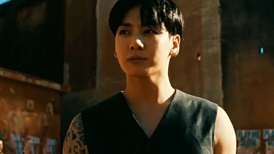
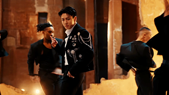
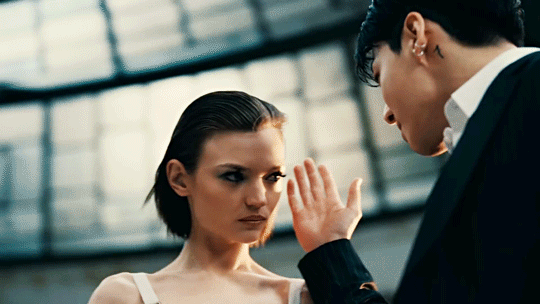
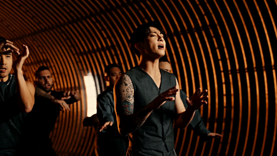
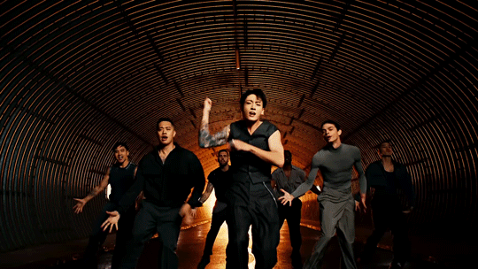
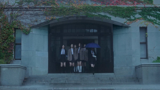
#btsedit#btsgif#jungkookedit#dailybts#usersky#userpat#userines#userdimple#uservans#raplineuser#annietrack#useremmeline#rjshope#nuggettracks#usermizuoka#trackofthesoul#jungkook#*mine#*scheduled#naturally we knew i'd gif this#it's easily the best one of his solo era wbk#from the colour grading to the styling to the cinematography?#one of my favourite things is how the mvs progress from cooler tones (as seen in seven & 3d) to the deep warm tones in this one#we love intent in everything#also the reference to baz luhrmann's romeo & juliet?#this whole thing is stunning#and i don't need to mention how fine he is do i? didn't think so lol
338 notes
·
View notes
Text
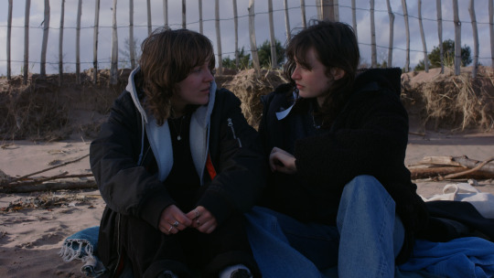
Where Currents Meet Reflection on the Final Film
This project was a challenge for me because I was pushing myself out of my comfort zone, but I'm so happy I did this. I know I have an eye and intuition that are good for cinematography, I just need my confidence and then experience to follow suit, but both are of course things that come with time. I feel we worked well as a group and everyone tried their best to get us to where we are now. I believe we made the film we set out to make on our own terms and true to our creative dreams. I hope we have created what Bethany wanted and that she knows she can be proud of the world she has created.
I did my best and I am happy with that and I'm very happy with the shots themselves and how they turned out. I am less happy with the grade, but this again was a learning curve with many things to take away with me.
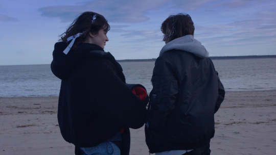
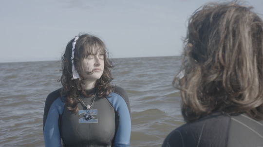
I feel scenes 1 and 2 at the beach did not turn out quite how I hoped in terms of lighting consistency and colour grading, but as I have previously mentioned this is due to different positions to the sun that were unavoidable due to positioning in relation to the water from a narrative point of view.
I feel scenes 3 and 4 at the bus stop and pavement were both quite different, the lighting in scene 3 at the bus stop was rather cloudy and thus easier to manipulate both on camera and in the edit. The only shot here that I was unhappy with was of Kallie where I feel she is over-saturated and over-contrasted. In scene 4 on the pavement the sunshine was beautiful but there was an inconsistency in sunshine as it kept moving in and out of the clouds, this meant it was not fully consistent when it came to the grade, however here I feel like the grade is letting the image down a little bit because the shots are very pretty, I just couldn't seem to find the right balance and again have a little too much contrast.
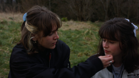
Scene 5 in the woods is a little inconsistent in the grade, here again, I am happy with the shots especially the two-shot from behind as they are walking. Sadly as I said the grade is a little inconsistent and has a clear difference in wash and tone to the previous scene and thus has a different style. I feel the grade between shots here does not quite match.
For scene 6 part one at the river and part two at the bridge, I am overall happy with the grade. I feel like the river scene would have benefited more with a two-shot as it would have shown the actors interacting with each other. However, the two-shot that I did as shown above (ungraded) is much lower than and does not match the singles. I had done this with the intention of being the water that they looked into, but this did not edit with the other shots how I thought it would. So I had thought it through but it did not turn out as planned. For part two at the bridge, I am happy with the shots and the edit even though I feel it again shifts in tone with the colour grade in a lighter wash than the rest of the scenes.
For scene 7 in the bedroom, I am pleasantly surprised with how it has turned out, I think in spite of poor lighting the scene is exactly what I hoped for it to be. The grade is far from perfect here but it definitely aids the image a lot.
Scene 8 is my favourite scene and I think it has turned out very beautifully, but I'm afraid the grade is again quite different to the rest of the film, but I feel it is very pretty by itself. I think I missed a shot here in the shot list where there could have been a closer two-shot of the two of them for more of the scene.
Here is an ungraded example of what I mean:
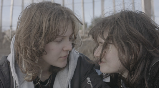


It is a shame that we removed the final part of scene 8 even though I understand this choice was made for its reasons which is very valid as one of the leads was too cold and could barely hide it, this is where we removed both actresses from the water and brought them home to warm up. This was for their safety and would have felt unethical otherwise. I do understand the decision, but feel it greatly affects the film losing this scene.
Overall I wish there would have been more of the two shots because I like seeing them in frame together and how they respond to each other. I understand that this was a conscientious choice due to both creative and necessity reasons where there were issues with some of the two-shots. I personally prefer the two-shots, and I think it would have greatly improved the film overall if these had been usable in the final edit.
I appreciated working with the team of Where Currents Meet and I feel on set we really came together when we needed each other and I felt we were all supporting each other.

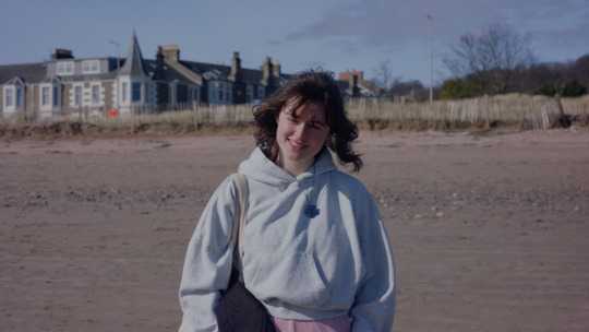
Here is my headshot for the project. I appear much more confident than I felt, but I have definitely gained some confidence from this project that I will be taking forward from here.
0 notes
Text
Lola’s Room: Colour Grade
I was the colorist on Lola’s Room.
I didn’t design a LUT for Lola’s Room, as we did test shoots the day before the shoot, and I didn’t have time to use it to build a look for the film. This is something I regret and really helped on The Man who Fell in Love with the Sky, and I wish I’d spent time on for Lola’s Room in pre-production.
I spent 2 & 1/2 12 hour days on the grade for Lola’s Room. The grade was a good opportunity for me to compensate for any problems I had with the images I shot, and I am significantly happier with my cinematography post-grade. A lot of the work was spent on directing the eye, and balancing the levels of exposure and saturation across the scenes, which used quite different lighting setups.
The node tree I used was the same for Lola’s Room as The Man who Fell in Love with the Sky. I was colour grading them at the same time, so using the same workflow avoided any confusion and sped up the process significantly.

The first row of nodes balances the images in exposure, contrast, temperature, saturation and skin-tone, allowing for controlled and easy manipulation of the colour. In the parallel nodes I highlighted areas of each shot, and used them for more specific changes to individual elements of the image.
The opening scene was the most consistent, and fits the soft but saturated intentions I had with the cinematography. It was relatively easy to grade. I made use of tracked masks on faces, with inverted versions to lower the exposure of anything that wasn’t the faces, directing the eye to the action and making the lighting feel more placed and deliberate. I am not entirely happy with the bathroom scene and the following scene, which stand out from the rest of the film due to different lighting, a none of the pink hue which dominates the rest of the film. The final results don’t feel out of place, but aren’t consistent with the visual style.
I added the Kodak 65 film look Davinci LUT preset at 20% intensity across the film, as it separates the luminosity scale towards a filmic look, as well as altering the hues into gently complementary positions. I added varying amounts of noise reduction to deal with some of the grain of the corrupted cards, as well as the colour noise of the grade itself.
I worked through various drafts of the grade. Paula met me at screen academy to work through the grade and give feedback on the consistency of the images. A second opinion really helps, as my eyes adjust to the current conditions of the grade, leading to the picture getting more and more contrasting and saturated.
Log Footage -> Final Image


0 notes
Text
Inception
Directed by Christopher Nolan

Image from Pinterest
This film is a masterpiece of visuals, storytelling and cinematography. This two and half hour long film did not have one dull moment in site. From the very beginning I was intrigued and quite sucked into the storyline.
I noticed myself not questioning anything, I was just trying to understand what was happening and going with the flow of the film. It presented us with lots of information but in such a simple manner, I was stunned. Making a movie as complex as this one, yet being able to connect with the audience, takes a lot of work and talent.
Watching the film, I couldn't move from my seat. At the end I was sad that it had to end, yet happy that it did? to an extent.
It was a way of emotion, that crashed onto me, I needed to step out for a while just to process it all
so well done.

Now I will never be able to see a top with the same mindset again, and I am not mad about it.

I lost the ability to blink in this scene, I did not want to miss anything, there was so much happening, quite a site to see.
There is a lot to unpack in this movie, I could watch it a few more times just to admire the shooting style, colour grading and editing.
And still not be sick of watching it.
#action#Inception#leonardo#leo#leonardo decaprio#movies#movies review#reaction#movie reaction#fiction#hollywood#blockbuster#christopher nolan#cillian murphy#fim#english film#cinematography#cinema#visuals#storyline#family#emotions#direction#film review#film direction
0 notes
Text
Blog - The Last Snack
On November 11th, I decided to create a short video after becoming inspired by a friend of mine. A 3D short form video was something I had wanted to created for a while, for my own personal interests, and for my portfolio for university also.
The idea to have it be fully 3D appealed to me as I had done similar projects in the past, but in film.
I started off by blocking out my general idea. I knew I wanted a short ~1 minute long video. I wanted to explore the idea of taking a mundane or uneventful theme, and turning it into an interesting opportunity for cinematography. I wanted to really exaggerate a simple theme to it’s absolute maximum potential. My idea was a character, dropping a donut, and becoming distraught. While the idea is simple, the way it is conveyed is the part I am focussing on.
Creating the video utilised two types of animation. Keyframe, and mocap. The mocap data was captured and was used for scenes involving full body movements like walking. This data was collected using 6 point tracking, (head, hands, waist and legs.) This tracking also incorporates eye tracking data, determining the angle of the character's gaze, and how open the eyes are. I was able to create blendshapes for each of these states, which are then mirrored in real time onto the character.
The keyframe animation was done in blender, and involved me manually recording movements onto the character's rig. This allowed for a more in depth control of the final shot, meaning I could fine-tune my camera and character movements. Recording the mocap data was good fun as it allowed me to be expressive with the character by acting rather than animating, but keyframing the animation allowed for a more refined look.
The wolf character used was one I modelled, rigged and textured myself over the past few months, and was intended to help me learn the 3D process.
Once I had all my footage rendered and recorded, I took to Premiere Pro adding music, foley, voice acting, colour grading, whilst also editing together the final piece. The video came out to be 50 seconds long.
After posting the video to youtube, titled “The Last Snack,” the video amassed 27,000 views, and 3,000 likes over the span of a month before slowing down. Comments from the video expressed praise for the animation style, comparing it to that of “Beastars,” an anime I referenced when creating the character, which was excellent to hear. I definitely plan to make more content of a similar nature soon.
1 note
·
View note
Text
Digital Skills with Kalina Pulit
Concept + Storyboarding

NewJeans - Ditto
Wes Anderson - The French Dispatch
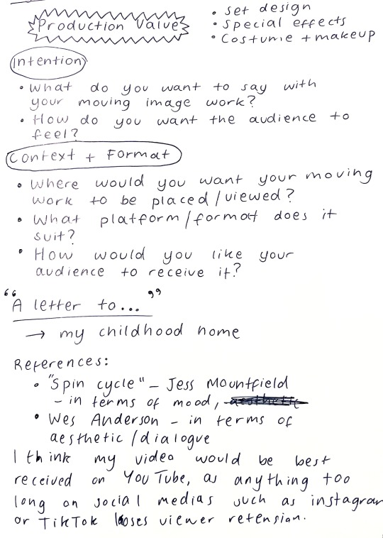
During Kalina’s lessons, we considered context and format and how the placement of our work affects the audiences perspective on it. For the “A letter to...” brief I considered writing to my childhood home using camcorder footage and nostaglic imagery and music. Above are the visual references I considered for the potential production of this piece. I planned to use a mix media of film, and child-like drawn animation.
Pre production
This class talked us through all elements of pre production and planning.
Staff roles in Production:
Writer (sometimes also a Director)
Director (sometimes also a Writer)
Production Company
Executive Producer
Producer
Production Assistant (PA)
Director of Photography / Cinematographer
Art Director, Set Designer, Prop Stylist
Costume Designer / Stylist
Hair and Make Up Artist, Nail Technician, Prosthetics Artist, Special Effects
Planning involved in Pre-production:
Collating references
Creating a budget
Making a schedule
Casting – scouting and booking talent
Legal docus - any permits required
Testing – camera, costume fitting, make up, audio
Team brief
Rehearsals
Contracts
"A video treatment is a document that presents your idea for a music video, short film, or video project in a way that's easy to understand, visualize, and sell. A good treatment is a roadmap that outlines your vision, showcases your creativity, and demonstrates your ability to execute the project."
Video treatments contains:
Inspiration + refs
Concept
Storyboard
Character description
Cinematography
Location, set design
Casting, performance direction
Costume, hair and make up
Plot diagram + narrative arc:
Post production and Editing
Case study Nike - 'You Can’t Stop Us’ campaign.
youtube
voice over
storyline
cross cutting
colour grading + colour correction
building audio to build tension
Post production roles:
Editor
Post Producer
Animator
Colourist
VFX Artist
Motion Graphics Designer, Graphic Designer, Titles Designer
Sound Editor
Composer, Sound Designer, Foley Artist
Sound Mix Engineer
Types of editing such as:
Cross Cutting
L Cut
J Cut

Solange - 'Crane in the Sky'
We were asked to consider for our own work:
Editing style – pace, overlays, cuts or transitions
Colour grade/ colour correcting
Animation/ VFX
Motion graphics
Sound design including soundtrack, dialogue and foley sounds.
My response to the task:
I want my film to take a slower pace, as I have decided it would be targeted to youtube. I think the slow place is necessary in order to create the relaxed nostalgic vibe. I want there to be a very gentle monologue, of myself reading the letter over the top of the film.
In terms of colour grading, I was thinking of using both a combination of the Wes Anderson bright and vibrant grading and the NewJeans 'Ditto' nostaglic darker and fuzzier aesthetic. I'm not certain if these will work together well but I want to use them in contrast to show the past (bright) and the present (dark).
Animated drawings or scribbles over the top of the footage to add movement to more still shots.
I am debating whether to add subtitles onto the video or not.
I will do a voiceover using a written script and then create a soundscape by filming general outdoor sounds. I don't want to use any music but in areas of film that have actions such as footsteps, I want there to be gentle footsteps in the background.
I feel like I have learnt a lot of new terminology from Kalina's lessons and it has given me an insight into filmmaking. Overall, I wish I had had more time to see this project through to the end, as the concept planning was very enjoyable. Film is definitley a skill I would like to develop and I will consider it for the future.
1 note
·
View note
Text
Film Adaptation
Crit Feedback & Reflection
Firstly, here is our final film:
youtube
Feedback:
Generally our feedback was really positive. The production design and props were especially liked and the colour grade, which helped these elements stand out and highlighted colours like red throughout the whole film. Our visual style was consistent and fit exactly what we planned to display. Overall we portrayed the dog POV well.
However, we were told that we broke our own rules that we set up in the world of the film. For example, we established that the dog can understand human language (even that which he hasn’t heard before as seen in the ‘I love you’ scene) as a result, the ‘bla bla bla’s’ used as a replacement for dialogue do not work with the established rules. Also in one scene we see the dog being passed to the woman, however, the camera (POV) doesn’t follow in the way it should, taking the audience out of the scene and creating a confusing moment. It was also suggested that we could include more dog-like elements to the sound design, for example breathing, to give more depth and make it more realistic.
Reflection:
I am happy with the feedback we were given. Most of it was positive and the criticism we were given made a lot of sense and I agree that it would make the film even better. I think we done well at producing our idea as we explained in the pitch (of course taking on any feedback we were given along the way). I think we did really well at achieving a challenging idea – particularly the dog POV.
This has been my best filming experience. The group has been amazing and we have all had a great time through the whole development and filming process. Everything flowed well and turned out exactly how we wanted. Sophie’s ideas were so engaging and visually appealing that it felt easy to produce this film. Every element of this film worked incredibly well together from production design, script, cinematography, editing, sound and colour grading. I am proud to be part of this project and am so happy with the final product.
0 notes
Text
Critical reflection
FF 29/04/23
Making this film has been a great experience from beginning to end. For starters, our group worked extremely well together, getting on as friends as well as respecting each other’s talents and roles in production. As a first time producer, I was quite nervous and frankly a bit overwhelmed with all the responsibility in pre production, but with the support of my group members (a few who had produced themselves before) I felt more confident. From my past project in Film Genre, we had quite an unorganised production, therefore I was keen to learn from these mistakes and ensure that the same thing doesn’t happen again. This is because a lot of these mistakes led to large, unfixable problems on set and in post production, sadly leaving us with a film which could have been so much better. However, for Juli, I enjoyed producing, and the fact that it gave me authority on set and the ability to make key decisions in order to keep everything running smoothly. I created a tight shooting schedule which I attempted to follow on shoot day 1, however as everyone knows, shooting always runs behind schedule. Instead, on days 2 and 3, I made windows of time where getting a particular shot would be most efficient, giving us more flexibility and freedom over time. As well as keeping an eye on the time on set, I also took on the role of first AD, shouting the calls and using the clapper board - making sure Robbie was aware of which shot or take was which, ensuring a smooth editing process. I helped out with production design, shopping for costumes with Abbie as we built the perfect look for each character, keeping in mind how this would look on location and on camera. The location definitely did a lot for how the film looked, and we took advantage of the big space in which we had this opportunity. We took some time blocking and figuring out where each scene was going to take place, and I think we chose the best setups practically and logically. I think our largest obstacle on set was probably working with the actors. As grateful as I am for them, and additionally being part of the team in making a great film, there were parts of John’s acting performance which weren’t quite what we wanted. He was less inclined to listen to the schedule, he didn’t know his lines at all (even though he had the script for quite some time). This led to a lot of time wasting - a producer’s nightmare. This performance issue was picked up on in the crit, as in the edit Robbie had to cut a lot around it, resulting in a lot of the shots focusing on Juli. Some shots were unusable due to lines being incorrect, or wrong eyeline. This was not the case for the whole shoot however. By the end, the actors had really embodied their characters and it was hard to imagine anyone else playing them.
In regards to the crit, I was pretty happy with the feedback we were given. Personally, I think our final film is original and funny, with brilliant cinematography and a bold colour grade to finish it off. The biggest problems that came up were the jumps in style, and practical issues such as fridges turning on between takes. I think the most praise we got was from the success in cinematography, and how this establishes the mood between the characters well. The characters were also well rounded and bounced off each other nicely - this is due to the clever writing from Abbie. Another thing which I thought we succeeded well with was establishing the mood with the score, which was a stylish opening to the film along with the long shot. But the film as a whole definitely reflected on how we worked well together as a group, starting with the original idea and actually making things happen. I’ve been more ambitious than I’ve been in the past with this project, thanks to a group who wants to make a memorable film. We hope to submit it to festivals and gain a small recognition for it.
0 notes
Text
Moth! - cinematography research
Inspiration
A huge part of my research this semester was looking at both film stills/photography and scenes from films that centred around similar subject matter to scenes from Moth! (i.e., the note burning, kitchen argument, Sophia’s bedroom). It was good for me to see the way other people within my field tackled the subject matter – did they capture it from afar? Up close? Was the lighting moody and dark or bright and inviting? By looking at lots of different types of media and seeing what I was most drawn too, I got a feel for the way in which I would like to bring Moth! to life visually.
I put together a big mood board that I plan to keep adding to right up until I finalise my own ideas for the proper Moth! shoot, but until then, it has been a good way of showing the rest of the crew what I have in mind to make sure I am on the same page as our director Lilith. Lilith was happy with the mood boards – claiming it was as if I had “climbed inside her brain” – which is always high praise when first showing a writer/director how you visually perceive their work.
Here is an example of some images from the mood board:

The key elements I have been looking at for now are lighting and framing.
Cinematographers
I have also been looking at cinematographers who have worked on projects that are similar in tone or have similar characters/subject matter to moth!.
One person who’s work I really admire is Rina Yang. Much of her work revolves around lots of handheld and dolly work and has been described as “a subtle style that doesn’t require brash composition, nor does it force you to consider ‘The Cinematographer’”. One project of hers that I looked to most for inspiration both for the test shoot and the film as a whole, was Yang’s cinematography on ‘All Too Well: The Short Film’. A lot of the visual elements I want to include in the cinematography for Moth! have been used in this project – especially the handheld work. It was interesting for me to see how she had shot some of the longer scenes using handheld camera. It was interesting to see the blocking se used when holding the camera on each subject during an argument in a similar setting to one included in our own film’s script.
Another cinematographer who’s work I found to be a relevant source for inspiration was Oli Russell. While the work of his I looked at was for TV instead of film, it was still relevant. He worked as cinematographer for both Sex Education and Derry Girls – two shows which have a similar mix of comedy and drama to the script for Moth!, as well as having a cast of young characters going through strong teenage emotions like our main character Sophia. It was good for me to see his approach to bringing this type of story to life visually. While the cinematography for Derry Girls was more set in social-realism, Sex Education had a brighter approach. The colour grade had pops of saturated colour. This is something our director Lilith said she wanted in the grade for our film because, when watching teen films for inspiration when first writing the script, she noticed films like Mean Girls and Legally Blonde incorporated this look.
Here are some stills from Sex Education and Derry Girls:


0 notes
Text
Editing Lecture notes
What an editor should look for when reading script:
Objects of importance, for example a cup of tea being stirred by main character.
Who is the protagonist and is the story being told from their point of view
Coverage, is there enough shot options for a scene
Character reactions that might be useful for edit

Director/Writer relationship with Editor:
Editing prompts in script such as ‘CUT TO’ can create a stop and start rhythm
Communicate with director about how they like to work
Set daily expectations, helps track progress and keep the end goal in sight.
Director rough cut can sometimes allow them to communicate ideas more clearly
Keeping the tag line or the log line of the story fresh in your mind can prevent straying from the films intended meaning and can help communicate the pace of the edit.

General Editing notes:
Hard drives supplied need to be consider based on; cameras used, days shooting, compression, regularity of file offload, budget etc.
Post it notes for editing are useful for keeping track of workflow as things can stack up and be forgotten.
DOP should always do colour grade
Try and understand directors’ style before editing with them
Coverage of any reaction is important to the editor, CU reactions for anything are better than nothing
If there’s jumps in the script in terms of cinematography e.g. MS-CU try and account for more coverage to give the editor more options.
Keep organised log of shots
0 notes
Text
Joel Aron Fan Club Meeting - Dissecting the Lighting of 'Rescue on Ryloth'
Main Masterlist
Star Wars Masterlist
Get ready for a semi-cohesive rant disguised as a dissection on the lighting of Rescue on Ryloth, mainly just me fangirling over the man, the myth, the legend, Joel Aron.
If you don't know, Aron was the CG VFX and lighting supervisor for The Clone Wars, Rebels, and The Bad Batch, and holds the position of cinematography, lighting, and VFX director of Lucas Films.
He was also one of the frequent cryptic tweeters when TBB episodes were airing.
~ ~
Intro
So I went back to Rescue on Ryloth earlier today to find frames for the background of my laptop. I have to go through the episode second by second to get the right frames and I fell into a rabbit hole of examining individual shots could you tell I have adhd.
~ ~
NUMBER 1
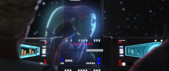
We all know this scene as the one Hera calls for the help of TBB Leia Organa style.
First off, I absolutely love how Hera's projection isn't just all shadows, the light from whatever screen Chopper probably has out is reflecting on her face. The contrast between her left side verses her right is gorgeous and so effective in telling us she's somewhere dark, perhaps in hiding, which contributes to the storytelling as well.
As well, the minimal (but strong) light showing on her right lekku is much warmer than the cool lighting of the screen reflecting on her face, which also tells us she's somewhere dark but with access to natural light. Perhaps a cave?
Something not related to lighting, but this whole scene was beautifully framed. The natural leading lines of the ship console unconsciously guide our eyes to Hera, the subject of the scene. This is one of the main things my art teachers love to yell at my grade for: why don't you have any leading lines to draw attention to the subject?! It's free real estate! The design of the cockpit makes so much sense from a visual and storytelling standpoint which I appreciate a lot.
I go to an art high school, so we have enhanced programs that you have to audition for. I have a visual arts major (like uni majors and minors) that I auditioned for, so I get the highest level of arts education my school has to offer, unlike a visual arts minor or the general arts courses of the Canadian curriculum, so when I'm talking about my art teachers yelling at us about things, they fuckin yell cause they know we know better.
~ ~
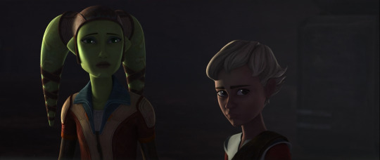
NUMBER 2

A theme you'll start to see in this rant is that I'm a huge fuckin fan of harsh contrast. Dark darks, light lights, that kinda thing (Spoons, if you see this, 😎. If you know, you know). I incorporate it into my own art to make it more effective in the vibe I'm trying to convey.
Joel Aron's style is hard, hard contrast and accentuating natural outlines, he even confirmed that in an interview when talking about season 7 of TCW, and he's incredible at executing this! The small sections of light reaching Hera are making her character stand out even more against the background and grounds her even more in the space. Harsh black outlines usually used to make something stand out don't appear naturally, so finding other ways to naturally outline or highlight a character against the environment is a must, and Aron is so fuckin good at this, his style contributing tremendously to it as well.
Plus the light is much warmer than the shadows which I appreciate a lot. Natural sunlight is always going to come off in warm tones on any surface, so thank god this guy knows colours and basic lighting 🤣
~ ~
NUMBER 3


Again, just more amazing contrast and separating a subject from the surrounding environment using light.
As well, the 2 bottom images really resemble Crosshair in the second last episode when he's being all edgy and saying "Don't make the same mistake twice, don't become my enemy" and like- bruh, this man is fuckin typing up non-existent loose ends through the fucking lighting of all things doing better then the writers, but that's none of my business >kermit sipping tea meme<.
He also said somewhere that it was definitely his intention of lighting Crosshair much darker than the rest of the Batch to show his alignment with the Empire or some shit, so I don't know what he's doing here, but as a dark Omega fan, I approve 👀👀
~ ~
NUMBER 4
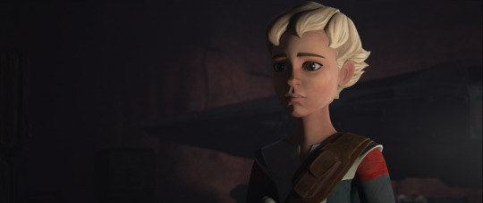
Even more beautiful contrast. Something my photography teacher also drilled into our heads is the triangle rule (at least that's what she called it), which is actually called rembrandt lighting. When you photograph portraits, you usually want a small triangle on the opposite side of the main light source to balance out the shadows or some shit.
But Aron didn't do that here. Remember, his style is much more dramatic and heightened. He used split lighting here, where half the subject's face is completely shadows and the other completely light, a demonstration of the stylistic choices he made for this show.
~ ~
NUMBER 5 (you made it to the end! Gold star to you bestie)


More cool and warm highlights being used, the warm coming from within the ship which is also positioned towards her friends and the planning of rescuing her parents which I find kinda cute and the cool light from space outside the windshield?, both beautifully outlining her face and kind of showing what she's fighting for: her family (warm light) and the freedom of space and the galaxy (cool light), but I'm totally reading into this, so take it with a grain of salt 🤣, he probably didn't mean anything by that.
~ ~
END
So yeah, that's my rant on the lighting of Rescue on Ryloth.
Hey, you know what's a good idea, if you want me to dissect a specific scene or episode of any series/movie in Star Wars based on an art student's perspective and 'expertise', just ask! I love talking about Star Wars and art techniques, plus I'd get to use my schooling for something useful.
There'll definitely be more of these as I go through the episodes to find more backgrounds, but if you ask for a certain episode, I'll definitely get to that ep. first!
#the bad batch#tbb#bad batch#star wars#sw#the clone wars#tcw#star wars rebels#sw rebels#hera syndulla#omega#hunter#echo#crosshair#wrecker#tech#hera#clone wars#joel aron fan club meeting 1
8 notes
·
View notes
Text
Critical Reflection
Max Brodbeck - 40536303
LMD09166 - On Set Production
Critical Reflection – 2023
Critique of Process
When I signed on to The Hands of Men as Director of Photography, there was already a finished screenplay and cast and crew. After familiarizing myself with the script, I had one meeting with the director to discuss visual references and style, before immediately storyboarding, which worked quickly and efficiently, with almost no creative disputes. We filmed a rehearsal of scene three, which was great practice for working with our actors and gave me an opportunity to think more specifically about lighting, whilst also putting our storyboards into practice, confirming that our plan would work well to tell the story.
We shot the film over two days, in our producer Abbie’s bedroom. The shoot was a lot of fun, and everything went roughly to plan. The biggest problem for me was the small location and entirely white walls. I was using only halogens of upwards of 650W, which bounced all over the room and lit our space evenly wherever I pointed them. This made it incredibly challenging to create the dark, surreal and cinematic look that we wanted from our image. The small space meant that I was often not able to use as long lenses as I had originally wanted and had to empty the room between setups to move around equipment. In retrospect, I wish we had practiced lighting in the location so that I had longer to problem solve and didn’t have to come up with solutions on set. I’ve learnt that in future I must make sure to not exclusively use halogens and hire a more diverse range of lights. The dolly zoom was a struggle to perfect and took 17 takes, over 90 minutes to achieve, but I am very happy with its final form and would have loved to experiment with more unusual cinematic techniques like this as I think it is one of the film’s most interesting features.
Later in the production, I did the sound design and colour grade for The Hands of Men. This meant I was able to fix a lot of the problems I had on set with flat lighting and made a huge difference to the look of the final film. The sound design works alongside the picture to construct the tone of the film and reinforces the Lynchian aesthetic.
I am very happy with the result of our film. It matches the creative vision I had going in, and I think it is very effective in its own weird and surreal manner. I am really pleased with my own personal creative contributions to the project, in both the cinematography and the sound design. I would love to work with almost every member of the crew again and I can’t wait to screen our film in front of an audience.
Critique of Final Film
I was the Director of Photograpy on The Hands of Men. Whilst there are some notable problems with the cinematography, I think that overall, the picture works very well to tell the story. The visuals somewhat embody the guilt, betrayal and physical pain that we watch Richard and Violet go through, as well as highlighting the performances. The Hands of Men is shot largely on the 50mm prime lens. This choice lends itself to the characters faces and works with the 4:3 aspect ratio to focus entirely on expression and performance. It also means that the entire film is a little tighter and closer than you’d expect, which establishes a claustrophobic feel, especially as the space is never really established. The masters are in medium two shots, and it often doesn’t attempt to imply a world outside of what is in frame. I believe this is consistent with the screenplay and direction, as the audience is forced to watch and experience the events and feelings the characters go through.
The lighting is low-key throughout. It acts to highlight faces and darkens the background, one to three sources per setup to augment the effects of practical lamps seen in the production design. The tungsten or warmer colour temperatures make the film feel hot, internal and domestic, while the lighting’s placement and direction create a surreal and unsettling aura around the action. The lighting changes at 2:04 and 2:51 work well as additional surreal elements. They add visual intrigue, but the first happens at a far more significant moment than the other, and they work towards different purposes. I think there needs to be one or two more spotlight moments throughout to establish it as a stylistic feature, as currently the second one feels rather out of place and takes away from the tension of the final scene.
The camerawork could certainly be more varied. The static and stable feel to it doesn’t work in tandem with the established tone, and each moment could do with a little more time to leave the audience with their unsettling feelings. Scenes two and five deliberately parallel each other, but the result of this is just that the picture isn’t diverse enough. The Dolly Zoom at 2:05 is very effective and completely stands out against the rest of the film, which works perfectly as it is at the story’s most significant moment. I think this could have been made a recurring feature, and returned later to help personify the hand, or to out you in Richard's headspace during the amputation. Despite these things, I think The Hands of Men stands up quite successfully as a film. I think the cinematography is beautiful in places, disturbing in others, and tells the story well.
0 notes
Text
25 more movies (and one miniseries) you can watch on youtube
I posted 11 movies that are on youtube yesterday (Part 1) but since things are really starting to get shut down here’s more worthwhile movies and a miniseries you can watch for free on youtube right now
Leave Her To Heaven (1945): Gene Tierney is Ellen, a woman whose only crime is “loving too much,” and also all the other crimes she commits to make sure there are no competitors for husband Cornel Wilde’s affections in John M. Stahl’s incredibly lurid and entertaining technicolor melodrama.
M (1931): Fritz Lang’s masterpiece is the basis for every subsequent movie about hunting a serial killer and it’s still the best one.
The Naked Kiss (1964): Here’s the jacket copy from Criterion: “The setup is pure pulp: A former prostitute (a crackerjack Constance Towers) relocates to a buttoned-down suburb, determined to fit in with mainstream society. But in the strange, hallucinatory territory of writer-director-producer Samuel Fuller, perverse secrets simmer beneath the wholesome surface. Featuring radical visual touches, full-throttle performances, brilliant cinematography by Stanley Cortez, and one bizarrely beautiful musical number, The Naked Kiss is among Fuller’s greatest, boldest entertainments.”
Underworld USA (1961): Dave Kehr on the film: “Sam Fuller's harsh, obsessional 1960 crime drama is narrated in the style of a comic book gone berserk. Cliff Robertson is the neurotic hero, bent on avenging his father's death by infiltrating and destroying a crime syndicate that operates under the redolent name “National Projects.” Corruption is all-pervasive in this vision of America, and Fuller disturbingly suggests that only a madman can make a difference. One image from Underworld—of a heavy striking straight at the camera—prompted Jean-Luc Godard to describe Fuller's films as “cinema-fist.” There is no more apt phrase.”
Pickup on South Street (1953): Another Sam Fuller. Here’s Georgia Hubley of Yo La Tengo on the film: “Richard Widmark manages to portray himself as twisted, conniving, pathological, sleazy, tragic, vulnerable, and handsome all at once in most of the movies I’ve seen him in, and never more exquisitely than in this, one of my favorite film noirs.“
Journey to Italy (1954): Richard Brody on the film: “One of the most quietly revolutionary works in the history of cinema, Roberto Rossellini’s third feature starring Ingrid Bergman (his wife at the time), from 1953, turns romantic melodrama into intellectual adventure. [...] From Rossellini’s example, the young French New Wave critics learned to fuse studio style with documentary methods, and to make high-relief drama on a low budget.”
The Spook Who Sat By The Door (1973): A satirical thriller based on the Sam Greenlee novel about the CIA recruiting a token black agent who quickly realizes they have no intention of letting him advance to a meaningful position and decides to head back to Chicago to teach the black revolutionaries all the latest guerrilla warfare tactics. Despite playing to packed houses the film was quickly pulled from theaters with little explanation and remained out of circulation until a DVD was issued in 2004.
The Big Combo (1955): Dave Kehr’s capsule: “This 1955 film noir borders on total abstraction for most of its length and then achieves it in an astonishing final scene—a shoot-out in the fog that suggests an armed and dangerous Michelangelo Antonioni. Where the usual noir takes place in a nightmare world, this one seems to inhabit a dream: there's no longer fear in the images, but rather a distanced, idealized beauty. With Cornel Wilde, Jean Wallace, Brian Donlevy, and Richard Conte; the director is Joseph H. Lewis (Gun Crazy).”
The Stranger (1946): Orson Welles’s film concerns an FBI agent (Edward G. Robinson) tracking Nazi war criminals whose search takes him to a small Connecticut town where the local schoolteacher (Orson Welles) is not what he seems. It’s the most conventional Welles film, reportedly intended to prove he could turn in a movie on time and on budget, but it’s still plenty entertaining.
F For Fake (1973): Orson Welles documentary/essay/whatsit about forgers and frauds, specifically Elmyr de Hory, who became famous as an art forger because instead of forging existing paintings he painted new ones in the style of famous artists, and Clifford Irving, who wrote a best-selling book on Elmyr and then was busted for a fraud of his own, the fake Howard Hughes autobiography. A wildly enjoyable, incredibly edited, one of a kind mindbender.
Citizen Kane (1941): It’s Citizen Kane. You just have to put up with hardcoded Korean subs.
Detour (1945): Roger Ebert on the film: “Detour is a movie so filled with imperfections that it would not earn the director a passing grade in film school. This movie from Hollywood's poverty row, shot in six days, filled with technical errors and ham-handed narrative, starring a man who can only pout and a woman who can only sneer, should have faded from sight soon after it was released in 1945. And yet it lives on, haunting and creepy, an embodiment of the guilty soul of film noir. No one who has seen it has easily forgotten it.”
A Woman Under The Influence (1974): Dave Kehr: “John Cassavetes's 1974 masterpiece, and one of the best films of its decade. Cassavetes stretches the limits of his narrative—it's the story of a married couple, with the wife hedging into madness—to the point where it obliterates the narrator: it's one of those extremely rare movies that seem found rather than made, in which the internal dynamics of the drama are completely allowed to dictate the shape and structure of the film. The lurching, probing camera finds the same fascination in moments of high drama and utter triviality alike—and all of those moments are suspended painfully, endlessly. Still, Cassavetes makes the viewer's frustration work as part of the film's expressiveness; it has an emotional rhythm unlike anything else I've ever seen.”
Opening Night (1977): Another Cassavetes masterpiece, again starring the great Gena Rowlands, with Gena as an actress mentally disintegrating as she tries to prepare for an upcoming play. Easier to start with this one than A Woman Under The Influence. Richard Brody on the film: “Though there isn’t a movie camera anywhere to be seen—and Cassavetes, with his tightly sculpted, uninhibitedly intimate images, is a master of the camera—Opening Night captures with astonishment and boundless admiration the uninhibited ferocity of the art that brings life onto the screen. (In fact, Cassavetes had originally planned to take the role of the play’s director.) It’s one of the greatest tributes ever paid by a director to an actress.“
Magnificent Obsession (1954): It’s not necessarily Douglas Sirk’s best technicolor melodrama but this adaptation of Lloyd C. Douglas’s ridiculous bestseller is the most melodramatic one. From Cine-File: “Produced in the wake of Henry Koster's CinemaScope adaptation of Douglas' THE ROBE, Sirk's 1954 remake of MAGNIFICENT OBSESSION is, by any standard, an absolutely batshit movie. (It's the kind of film where a lecture about the radical power of kindness compares the crucifixion of Christ to the act of turning on a light bulb.) It's not so much an adaptation of Douglas as a third-hand amplification of his aura. "Ross Hunter gave me the book," Sirk recalled, "and I tried to read it, but I just couldn't. It is the most confused book you can imagine.” As Geoffrey O'Brien asserts in his essay for the film's Criterion release, Sirk earnestly examines that which he admits to finding absurd, forcing such questions as, "What if this weren't crazy? What if it were real? What sort of a world would that be, and how different would it be from the one we inhabit?" Therein lies the genius of Sirk's glorious melodrama, one certainly worth seeing in all its Technicolor magnificence.
All That Heaven Allows (1955): Geoff Andrew on the film: “On the surface a glossy tearjerker about the problems besetting a love affair between an attractive middle class widow and her younger, 'bohemian' gardener, Sirk's film is in fact a scathing attack on all those facets of the American Dream widely held dear. Wealth produces snobbery and intolerance; family togetherness creates xenophobia and the cult of the dead; cosy kindness can be stultifyingly patronising; and materialism results in alienation from natural feelings. Beneath the stunningly lovely visuals - all expressionist colours, reflections, and frames-within-frames, used to produce a precise symbolism - lies a kernel of terrifying despair created by lives dedicated to respectability and security, given its most harrowing expression when Wyman, having given up her affair with Hudson in order to protect her children from gossip, is presented with a television set as a replacement companion. Hardly surprising that Fassbinder chose to remake the film as Fear Eats the Soul.“
Written on the Wind (1956): Dave Kehr: “One of the most remarkable and unaccountable films ever made in Hollywood, Douglas Sirk's 1957 masterpiece turns a lurid, melodramatic script into a screaming Brechtian essay on the shared impotence of American family and business life. Sirk's highly imaginative use of color—to accent, undermine, and sometimes even nullify the drama—remains years ahead of contemporary technique. The degree of stylization is high and impeccable: one is made to understand the characters as icons as well as psychologically complex creations.“
His Girl Friday (1940): Geoff Andrew’s capsule: “Charles Lederer’s frantic script needs to be heard at least a dozen times for all the gags to be caught; Russell’s Hildy more than equals Burns in cunning and speed; and Hawks transcends the piece’s stage origins effortlessly, framing with brilliance, conducting numerous conversations simultaneously, and even allowing the film’s political and emotional thrust to remain upfront alongside the laughs. Quite simply a masterpiece.“
Bringing Up Baby (1938): Ignatiy Vishnevetsky on the film: “Possessed by an overwhelming sense of comic energy, Howard Hawks’ screwball masterpiece heaps on misunderstandings, misadventures, perfectly timed jokes, and patter to the point that it’s easy to overlook how rich and fluid it is a piece of filmmaking, effortlessly transitioning from one thing into the next.”
Underworld (1927): Dave Kehr: “The first full-fledged gangster movie and still an effective mood piece, this 1927 milestone was directed by the master of delirious melodrama, Josef von Sternberg. George Bancroft is the hard-boiled hero, granted tragic status in his final sacrifice. Ben Hecht wrote the script, and many of the same ideas turn up, in a very different moral context, in his screenplay for Howard Hawks's 1932 masterpiece, Scarface.“
Q - The Winged Serpent (1982): In Larry Cohen’s cheapo classic, Quetzelcoatl terrorizes New York. Michael Moriarty plays a bumbling, unlucky small time crook (the robbery he participates in goes hilariously wrong; losing the keys to the getaway car is just the start) who accidentally discovers the monster’s nest and realizes he’s stumbled into the opportunity of a lifetime. He’s willing to help the authorities, including cops played by David Carradine and Richard Roundtree, but they’re gonna have to pay for it. Very goofy and very fun.
Stalag 17 (1953): Billy Wilder’s classic mixes POW drama with comedy as a group of prisoners in a German POW camp try to figure out who in their barracks is a rat while they plan their escape.
Hellzapoppin (1941): Ignatiy Vishnevetsky: “The opening reel may be the most manic stretch of go-for-broke gonzo comedy to come out of studio-era Hollywood, with the zoot-suited duo of Olsen and Johnson introduced tumbling out of a New York taxi into the bowels of hell (“That’s the first taxi driver that ever went straight where I told him to!”) in the midst of a musical number about how “Anything can happen / And it probably will.” Dozens of throwaway gags—including the first Citizen Kane reference in film history—and an argument with the projectionist (once and future Stooge Shemp Howard) follow, before the movie snaps into something vaguely resembling sanity. From there, Hellzapoppin’ finds Olsen and Johnson wandering in and out of a musical comedy that’s seems to be on the verge of falling apart and tussling with such comedy ringers as Martha Raye and Mischa Auer, the latter cast as a real Russian nobleman who’s trying to pass as a fake Russian nobleman. It’s like a Marx Brothers movie playing at triple speed; it eludes easy summary—it’s a real “you have to see it to believe it” kind of movie—and often stretches the limits of the Production Code. True to its absurdist sensibility, Hellzapoppin’ ended up getting nominated for an Oscar by mistake, for a song that doesn’t appear in the movie.”
Outrage (1950): Directed and cowritten by Ida Lupino, this was one of the first Hollywood movies after the implementation of the production code to deal with rape and one of the first to tackle its psychological aftermath (the censor office actually made them take the word “rape” out of the script so it’s never uttered in the film). Richard Broday on the film: “Outrage is a special artistic achievement. Lupino approaches the subject of rape with a wide view of the societal tributaries that it involves. She integrates an inward, deeply compassionate depiction of a woman who is the victim of rape with an incisive view of the many societal failures that contribute to the crime, including legal failure to face the prevalence of rape, and the over-all prudishness and sexual censoriousness that make the crime unspeakable in the literal sense and end up shaming the victim. Above all, she reveals a profound understanding of the widespread and unquestioned male aggression that women face in ordinary and ostensibly non-violent and consensual courtship.“
The Hitch-Hiker (1953): Another Ida Lupino joint, this one a lean and mean film noir. J. Hoberman on the film: “The “Hitch-Hiker” script, written (uncredited) by the socially conscious journalist Daniel Mainwaring, was inspired by an actual case: Two buddies (Frank Lovejoy and Edmond O’Brien) pick up a murderous psychopath (William Talman) who forces them to drive him to Mexico. It’s a brutal story handled by Ms. Lupino, one of Hollywood’s very few female directors, with the same steely determination and emotional sensitivity found in her strongest performances.”
And the miniseries:
The Singing Detective (1986): Here’s the entry from the BBC’s list of the top 100 British television programs, where it placed number 20: “For many Potter's masterpiece, this extended six-part filmed drama series mixes flashback and fantasy to create a psychological profile of a writer of detective fiction hospitalised by a crippling skin disease. Though not, the writer stressed, autobiographical, the drama features many elements from both Potter's own life (the disease, the childhood setting) and his body of work (particularly the use of popular music from the war years). As usual with Potter, it also caused controversy at the time for the frankness of its sex scenes, though its position as one of the most challenging and inventive of all TV dramas is secure.“
180 notes
·
View notes
Text
Week 15 (Final Post) - Film Narrative 2
I am very happy with not just the final film, but also the feedback received.
I have here, links to all the pre-production documents created -
Director’s Statement: https://docs.google.com/document/d/19KVLVP1G5PCHiTcOcuI42VNU3CzjQ-Uh27faf96X02I/edit?usp=sharing
Cinematography Inspirations: https://docs.google.com/document/d/1ZAWA3FF3YeOQn3VqHEBN_6C3yC1WWfhOKDWFjL5WBCI/edit?usp=sharing
Sound Inspirations (By Ben): https://docs.google.com/document/d/1i1niHwm45eJ-LQtVOWEpiWR155wuORDjDG6cc0EBA-Y/edit?usp=sharing
Beat Sheet: https://docs.google.com/document/d/1xVBByh6u8C-cQZO0nG65Zt3IF0KEeKnuQBg9kd1i3FQ/edit?usp=sharing
Shot List: https://docs.google.com/document/d/12Y1BPXi3voIXwtFhmsp5M-eM5n_J9Unp_4nNOjFuEZI/edit?usp=sharing
Sound Design Beats: https://docs.google.com/document/d/1QAIHZPzOK-rHGhCxNoNqa2GJyWID6QGytfaAu-d4fJQ/edit?usp=sharing
Cinematography Guide (By Sam): https://docs.google.com/document/d/17wrpN92vydYefwTokgifcrhaxfGPjHqjLt9uKBhHFME/edit?usp=sharing
Roles
Producer/AD: James Fox
Cinematographer/Colourist: Samuel Tabotta
Camera Operator/Sound Recordist/Sound Designer: Ben Anstruther
Editor: Rowen Henderson
Director: Alex Caldow
Critical Reflection
While these documents and my previous blog posts detail a lot of the work done throughout the project, I will quickly recap before responding to the critiques.
Pre-Production
We began with a group call, brainstorming. By the end of that call, we were leaning toward James’ idea - an intense, emotional scene with a comedic twist. We reconvened, I think, after a week for another brainstorm. Ben and Sam had been chatting and came to pitch a film about two mobsters carrying a body across a bridge. The idea had some logistical issues so we pivoted, keeping the noir aesthetics and tense sound design but changing to a chase scene through the alleyways of old-town Edinburgh. We wanted to create a surreal landscape, editing the different locations to give the sense of one long maze (a great idea from Ben). We all chipped in, bouncing ideas of each other, creating an in-depth idea of the film.
Excited to get started, we all went off to create inspiration documents as we had already talked about possible inspirations during the call. Sam gathered images, Ben wrote about sound and I created a list of inspirations more based on tone and storytelling. This worked out well as, while we didn’t have concrete roles to begin with, these lined up well with our final roles.
Next, Ben, James and I (who are living in Edinburgh) went on a location scout around the old town, mainly on the Royal Mile. Some issues came from this in terms of realising our idea. Firstly, the alleyways were a little samey, very straight and often too short to hide the busy streets outside. Also a problem were the lights. We had originally planned o use warm dirty natural streetlights to light our scenes. However, many alleyways had colder, almost green-ish, lights which would clash with the orange tones as well as creating a strange skin tone.
We had a lengthy discussion after this recce about the practicalities of accomplishing our vision. To get over the hurdles, we decided to shoot in black and white as it added to our aesthetic and hid the clashing colours. Sam did a mock grade on some of the recce photos and we decided that they looked good.
I felt that the locations would cut together well so I created a flow chart matched to a beat sheet (that was developed from James’ original rough beat sheet) to communicate how it would all work. This lead to us taking on roles as Sam was very keen to take on the cinematography. Rowen, being away from Edinburgh, took on editing; Ben shared the cinematography, camera-operating on set. James and I weren’t too sure about roles, but Ben suggested, as I seemed to have the clearest idea of how the film would work, that I direct the film, leaving James as producer.
To better communicate the flow of the film, James and I went out again to our locations, taking example shots for my shot list - this is one thing I regret, I made a shot list without properly talking to Sam which is a (forgive my language) dick move. I did ask if there were any other shots Sam would like, but I think it’s hard to come up with shots when not at the location. The shot list with the location photos better showed how the locations would edit together.
We started casting, with Sam suggesting Theo who he had worked with before. I’d seen him in Sam’s tableau from last term where he put in a charming and believable performance. I knew he could play anxious and afraid and he had a strong look, with searching eyes. I think he was a good choice while also being very easy to get in touch with.
Production
The day of the shoot, things began to take a turn. First, the lenses were broken. The 17mm lens could not focus properly which limited one idea we had had - using increasingly longer lenses throughout the chase to minimise how much of the location was shown and emphasise the feeling of being trapped. Sam and Ben are not keen on shooting on the 12mm so we were down to just the 25mm and the 35mm. Then, the gimbal was acting up which took up a lot of time. This meant that the lighting had changed dramatically from our opening tripod shot as the sun had completely set by then and the lamppost had turned on.
Working with Theo was interesting. I’m not the most experienced with working with actors, most of my previous films star family, friends or child actors. The action was quite simple and I think I was able to clearly communicate what I wanted. I am happy with the final performance but would also quite like a little more over-acting.
Overall, I was very happy with the shoot, there isn’t much that I would go back and change - we got all the shots we wanted and got enough takes of each.
Post-Production
I am not a technologically capable person. This is a definite weakness for me. I left Sam, a very technologically capable person, to organise the workflow. My contributions past this point were all just notes. We went through three picture edits before locking and two sound edits. Rowen used some interesting techniques and the development was very cool to see. He went from more classic, continuity editing to a looser, more expressive rhythm that really brought the best out of the material. Ben’s sound edit developed, mainly through the time spent on it, becoming more layered and interesting. There’s still small sections where there are issues which were highlighted in the crit, which I agree with, but nothing major and overall, it is really great, adding a lot to the atmosphere and the story.
Feedback
I agree with all the feedback given and it was just great to see how positive the response was from the class as well as the lecturers. All the issues raised I think would have been eliminated through time and more edits. Ben was a bit pushed for time and I think he could have easily polished the sound design with a little more time.
My Role
I have many mixed feelings about myself as a director. In all honesty, I don’t like myself when I am a director - it brings out the worst in me. I have specific control issues I think. I want things exactly how they are in my head and am just a tiny bit massively irritating when trying to get to that point. This leads me to push over into others’ roles like the cinematography which I’ve already highlighted. Having read Sam’s blog, where he mentions feeling ignored and left behind, I am thinking a lot about my directing and my style. If I decide to do more directing in the future, I will keep this in mind and try to be more open in the creative process and let other ideas in, because everything that people contributed that were outside my original vision were just great and added so much to the film. I am much happier working towards another’s vision and this will only However, all the work I did myself, I was pretty happy with. I really enjoyed the pre-production work and crafting the story. The final film, as well, is something I am proud of and I think, while it is not entirely the type of film I’m most interested in making, it has allowed me to be creative and craft a good story.
As a group, I think we worked well. We had our moments as I think Ben and Sam are much like me in terms of having very particular visions. But we talked through all the different issues (this was one aspect that was also impacted by mainly communicating through a group chat) and came to a conclusion each time.
Changes
There isn’t too much I’d change about our film, aside from my directorial style. The film is not quite what the original idea could have been, however, it is what iworking within certain limitations. The main things I’d change would be more close-ups in the chase to tie us into the character’s fear, more expressive performance and more range in the sound design to guide the audience through the emotional beats.
Overall, I am really happy with this project, the process and the outcome. Lots to mull over and process going forward.
1 note
·
View note
Text
bullet journal spread masterpost
Over 250+ spread ideas!🎊
hoping your dreams are fulfilled, your grades are awesome and your skin is glowing in 2019! (and 2020)
my tips for bullet journalling
Year in Review
highlights / reflection
achievements this year
lessons learnt / growth as a person
things you want to improve on
advice you’ve received / given
best music/movies/tv shows/etc of the past year
friends made during this past year
commonplace journal pages
things you’ve discovered during the past year
useful tips during the past year
odd facts and trivia during the past year
topics to explore during the past year
questions to ask during the past year
New Year, New You
calendar / future log / yearly or monthly logs
things to look forward to this year
upcoming books/music/movies/tv shows being released this year
maslow’s hierarchy of needs self-reflection spread
goals / new year’s resolutions + steps to put it into action
skills you want to learn this year e.g. coding
habits you want to break / habits you want to pick up
diary: day-to-day happenings
budgets: monthly/yearly budgets
inspiration spread for new projects
level 10 life: rate areas (academic, personal, mental, physical, spiritual, social, financial) of your life out of 10, and write down goals to improve that rating!
monthly overviews (e.g. progress on goals)
assignment due dates calendar
18 things to do by the end of 2018
Special Pages for Special Friends
memories / moments they were there for you
how you met
moments you want to share in the future
their mbti/hogwarts house
their best qualities
Trackers/Logs/______ of the Day
gratitude journal - # things you’re grateful for every day
habit trackers
motivational quotes
news headlines / this day in history
daily affirmations
currently reading / watching / listening to / feeling / eating / wanting etc.
time usage (read: wastage) tracker
k-drama or tv show episode tracker (always forget what ep I’m up to :S)
expenses tracker / tax deductibles
dream diary (tracker, plot(?), lucid or not, dream meanings)
new album or song releases
photo diary / sketch diary
weather
follower milestones
social media post tracker
household duties/chores tracker
grades tracker
year in pixels
TIL (today I learned)
civics
appointments: dentist, optometrist, doctor, therapist, etc.
bills: car / internet / rent etc
tax: income statements and work expenses receipts
membership/licence renewals
health
weight tracker
resting heart rate tracker (gives general idea of cardio fitness)
water intake tracker
sleep log / time to bed / time awake / total hours slept
exercise log: number of reps / steps / minutes
mood trackers
period tracker
Various Creative Spread Ideas
day-to-day / life planning spreads
skincare routines
perfect/ideal morning routine
self-care reminders
exercise routines
wishlist
bucket list
firsts: kiss, date, house, vacation, car, concert, etc.
DIYs to attempt
savings jar (doodle it!)
yearly / monthly recurring tasks
usernames/passwords (hints only for security!)
5 or 10 year plans
dream job
dream house
planning for moving houses
dream wedding / planning
date ideas
make a worse case scenarios primer
summary tutorials for your reference e.g. step-by-step tax returns
academic
studyblr ideas
topics I need to revise
finals study timetable/plan
aspirations: what you want to be and why / how to get there
class timetable
assignment ideas
project schedules / team meeting dates
professors’ emails/office hours
assessment results
anti-procrastination page
motivations to study
skills you want to learn or are useful e.g. coding
formulas page
courses you want to take and their pre-reqs
college comparisons
back to school shopping list
textbook list with prices
language learning
vocabulary lists
grammar structures
media (books/tv shows/movies) to consume in that language
self-reflection / personality traits
best and worst characteristics
what to be mindful of / what you need to work on
mbti types you’re most compatible with
fears and how you want to overcome them
letters to your future self (include hopes and dreams)
letters to your past self (include achievements and things to be proud of!)
inspirational people
stress management tips
charities to donate to and why you support them
volunteering activities
fun, cute, and aesthetic spread ideas
things worth staying alive for / getting out of bed for
a spread with all the things you were worried about which turned out fine
message page from your friends to you
“i can’t live without ______”
creative crafts spread: tips / equipment / tutorials
aesthetic colour moodboards
happy / comforting / relaxing / funny things spread
seasons (summer/autumn/winter/spring) spread
rainy day spread
holidays spreads: christmas / easter / halloween / thanksgiving
idioms and proverbs from all different cultures
flowers spread: fav flowers, meanings, bouquet/arrangements, press ‘em!
crystals spread: fav gemstones (doodle ‘em), meanings
succulents spread: fav succulents, terrarium layout ideas
coffee/tea spread: paint with coffee / fav blends / best cafes
what’s in my bag (doodle it!)
outfit ideas / polyvore style collections
magazine clippings
shower thoughts / hypothetical ideas spread
draw my life spread / personal timeline
favourite characters e.g. gudetama, kumamon, etc. (doodle ‘em!)
interesting words list (ephemeral, mellifluous, serendipity, scintillating etc)
ideal date ideas
wedding anniversary ideas (like 1st is paper, 25th silver, 30th pearl, 40th ruby, 50th gold, 60th diamond)
baby animals spread (duckies, puppies, bunnies!!)
#just bullet journal things
bujo spread layouts and devices to try out (e.g. chronodex, parallel time ladder)
key/legend (keep it simple!)
colour palettes/swatches
washi tape / pens / markers swatches
banners / fonts
doodles
ticket stubs / receipts
stickers / stamps
cutouts of info brochures
pressed flowers
calligraphy / brush lettering / handwriting practice
favourite stationery
activities
_______ that you want to do* / have done* (kind of bucket list)
*watch, read, listen to, try, taste, cook, play etc.
books
movies
tv shows
music
hobbies
arts/crafts e.g. paper quilling
sports e.g. archery
how to play / equipment / etc.
video games
foods
activities
board games
books / movies / tv shows
best descriptive passages
best cinematography
best action scenes
best use of soundtracks
(basically moments that make it deserving of awards)
music
album reviews
favourite songs
playlists for every mood and all seasons
meaningful lyrics
songs you shazamed
favourite genres and exemplar songs
kpop
reasons why i love my bias / bias wrecker / group
letter to your bias
comeback concepts / favourite outfits
visual/picture tutorials for makeup styles
calendar of your favs’ schedules during comeback season
in-jokes/memes
awards / achievements / records broken / milestones
translated lyrics
kpop songs vocab lists
upcoming releases
on this day
art
pics of your favourite artworks/artists + write about it
art styles you want to emulate
explain techniques for different media e.g. watercolour wet-on-wet
doodle ideas
astrology
natal chart readings/aspects/placements
solar return reading for the incoming year / transits
synastry / compatibility chart readings
constellation/star charts
symbol reference page for planets, zodiac signs, aspects
food
recipes
meal plans
shopping lists
interesting foods: (doodle ‘em!) taste / texture / smell (e.g. truffles, caviar)
cafes/restaurants you want to go to + their specialty dish (photo)
cocktails you want to mix/taste (doodle ‘em!)
media
interesting articles + moral/ethical issues it prompted you to think about
controversial topics on the news and for/against arguments/your thoughts
on this day in history
fav websites / blogs
jokes / puns / pickup lines
favourite poems / quotes / short stories
kinaesthetic
burn book - write things that make you angry/sad and rip the page out
wreck it journal - e.g. colour, scribble, stickers all over this page
travel
places to visit
travel itinerary
cultural parables
useful phrases in the language and their meaning
travel memories spread: things you did / places you went / selfies
postcard collection
packing list
friendly and not-so-friendly people that you met in foreign lands
writing
short story ideas
plot brainstorming spreads
journal prompts
drabbles
character designs
foreign words which can’t be directly translated into english
68 notes
·
View notes
Text
Joanna Kustra
A polish retoucher and photographer, Joanna Kustra’s area of expertise lies in commercial and fashion photographs with beauty and portraiture in the mix as well. She discovered her passion around 15 years ago beginning in Krakow before moving to London to expand her portfolio.
Colour is one of the most important things to Kustra, praising “the immense meaning in photography” that it can have. Working intuitively, she was able to learn about why certain colour combinations were successful and other were not after a period of falling to understand. Post production has also allowed Kustra to experiment further with colour in line with colour grading.
Inspired by the artwork of the 17th and 18th century, this photographer and retoucher was able to connect with the various textures and details that the colours not only enhanced but also the colours themselves within the creations. Building on the inspiration she found when visiting National Portrait Museum, Kustra went on to create her own series of images in a similar style. Within this project, she always left room for improvement and growth but successfully created the atmosphere, lighting and colour she had hoped for, influenced by what she had seen. All of her pieces were well recognised, she subjectively put this as a result of the tonality and colours that she had taken influence from within the art as previously mentioned.
In her secrets of colour grading webinar, one of the things that Kustra discuses is the significance of quality computer monitors. Stressing the importance of using a quality monitor, she illustrates the investment that this can be in our photographic work. For without a monitor of good quality, post production undoes a lot of the work we have already done and the colours and details are lost. She also talks about the importance of calibration to reiterate this significance.
Colour Psychology:
In this segment, Kustra references a 500 year old book written by a person named Johan Wolfgang von Goete that details the concept that “colours evoke emotions and are rooted in our cultural and personal experiences”.
The meaning of colours:
Red - Love, passion, anger, blood, danger and aggression
Blue - Trust, confidence, harmony, loyalty and compassion ( the most popular colour )
Yellow - Good and evil, jealousy, optimism and betrayal
These are the three primary colours
Green - Peace, health, nature, freshness, jealousy and envy
Orange - Warmth, fun and youthful connotations
Purple - Calming affects, mystery, science fiction and fantasy and things unattainable
These are the secondary colours
Black - Elegant, durable, regret, despair, overwhelming
White - Innocence, purity or virginity and delicacy but has the same connections as black in some cultures
Moods:
Pastels - Calm
Saturated - Passion and dynamics
Warm and cold pallets are also possible
Another piece of information to factor in is the scientific evidence that shows that “hues and saturation greatly affect the emotional perception” of photographs. This tells us the importance of considering the desired mood and atmosphere of our images, reiterating the role that colour and colour palettes play. By honing in our focus on one colour its is easier to achieve the desired aethestics.
Colour Harmonies:
- Combinations of colours that work well together and are nice to look at collectively
Artist Cheat Sheet:
- How to choose colour sets that affect emotion, catch the viewers attention and encourage the eye to certain aspects of the image
Monochromatic- Different tones, shades and tints of the same hue that are pleasing to the eye and work cohesively, often used in Cinematography.
Analogus- Colours sitting next to each other within the colour wheel, relating to each other while creating pleasing and relaxed visuals. Close to monochromatic harmony however skin tones have more of a yellowish tint but a limited range of hues overall. Allows for a focus on the emotion within an image instead of a specific colour because they aren't jarred, clashing, opposite or that stand out from each other.
Analogous Complimentary or Accented- Related hues that are adjacent on the colour wheel and add an accent. This is affective in paring warm colours with cool colours and vice versa.
Complementary- Colours on opposite sides of the wheel and considered to be complimentary. With a high contrast, the pair creates a vibrant look working particularly well with full saturation.
Split Complementary- A variation of the previous, it uses two colours adjacent to the compliment providing the same visual contrast as the Complementary with less tension.
Triadic- Using three evenly spaced colours on the colour wheel but does prove to be less vibrant, regardless of saturation and hue variation.
Double Split Complimentary- Two pairs of complimentary colours which come together to form an X on the wheel. This scheme provides a lot of colour contrast and is therefore one of the more complex sets while continuing to work in harmony and is common in the industry of fashion. As long as they remain as complimentary companions, the two pairs can move up and down the colour wheel. Can also be referred to as Quadric or Tetrad Harmony because of the shapes made when when the different hues move across the wheel.
Dyad Colour Harmony or Dyadic- Less common and found more in amongst nature rather than portraiture. Two colours close to each other but separated one other colour on the wheel or two hues.
These are the basic colour harmonies, neither good or bad but “less is better” therefore it can be considered easier to start with the ones that consist of fewer colours and combinations. After outlining these, Kustra acknowledges one of the important things to remember about working with colour harmonies is that the human eye is capable of recognising the relationship between different colours and with organisation within the relationships, a consistency to the scheme. But this method only works with hue and does not recognise the other components to colour.
Optical Weight:
Determining factors- Size of the area of the colour, saturation and brightness
Dyad & Complementary- 75% of the main colour, 25% complementing
Analogous, Split Complementary & Triadic- 50%, 25%, 25%
Analogous Complementary & Double Complementary- 40% of the main colour, 20%, 20%, 20% of the rest of the hues
Disharmony with other colours causes an undesirable affect and vice versa as a result of the human mind’s need to create and maintain balance
Where to find colour wheels:
- Adobe
- Paletton
Definitions:
Hue- Pure colours
Saturation- Richness of colours
Luminosity- Brightness or lightness
HSL:
Tone- Hue + Grey
Tint- Hue + White
Shade- Hue + Black
HSL allows artists to consider saturation and hue rather than additive and subtractive colour components. Whereas RBG made up of Red, Blue and Green is additive and used in light displaying technologies.
Colour Profiles/Models:
RBG- When combined at different intensities can create millions of different colours, found on sRGB, Profit and Adobe RGB
CMYK- Composed of Cyan, Magenta, Yellow and Black, is subtractive
CIE/LAB- The range of the human eye, the scope called Gamut is bigger than CYMK or RBG allowing us to distinguish 10 million colours according to experts which are “part of the range or scope available in a certain colour space”.
Colour Management:
Controlling the way that colours are represented across devices like cameras and computers
1 note
·
View note
Last Seen Blogs

sidzurlazuardi-blog
On ma way to Hijrah
ophii
swinging through fixations like a pendulum

jumatberkah1
Jumat Berkah
jumatberkah1
Jumat Berkah

fala-alfredo-pasta
Rare Pairs R' Us