#flags in use
Note
Panty Anarchy anon here.
Here's a guide for flags in use from this blog that are fine for photosensitives as far as I can tell. Keep in mind that this is just based on my experiences, and may not apply to all photosensitives. There's just a really big problem with flags not being friendly to photosensitives and accessibility with flag coining posts in general. I have a blue light filter on all devices I use to try to mitigate the eyestrain as well as my job being staring at computers all day.
Hypersexual + Hyperromantic (flag-mashups) - Headaches from the bright pinks. Combination flag is very visually busy and hard to actually tell what it is supposed to be combining.
Hyperromantic (luvlydevil) - Headaches from the bright pinks.
Hypersexual + Hyperromantic + combo (viraldoll) - The hypersexual one looks fine, as well as the hyperromantic one. The combo one has the yellow and white stripe a bit of a struggle to tell between the two of them.
Hypersexual (akumaii) - Colors are way too dark to be able to tell them apart easily at a glance, like the same issue as the first two but dark.
Questioning hypersexual (blood-moon-night-coining) - This one is fine.
Questioning hyperromantic (blood-moon-night-coining) - This one is fine.
Hypersexual redesign (dragoneating) - This is fine.
Hyperromantic aro (kiruliom) - No issues.
Hyperaromantic, hyperaroace, and hyperasexual (local-yurei) - The symbol is very dark and with the contrast of the colors behind it makes it hard to see with that middle stripe. The second one is dark and even harder to see than the first. Same problem with the last one.
Aroace hyperose and demirose hyperose (blood-moon-night-coining) - Mostly fine. I can see the first two stripes under the white stripe being hard to differentiate. It's very visually busy and can be overwhelming to look at.
Hyperromantic (caninophobia) - It's fine.
Hypersexual (epikulupu) - No issues. This is generally the one I prefer because of the lack of issues and it being very easy on the eyes.
Hyperrose/Hyperose (blood-moon-night-coining) - Very visually busy with the symbols, but the contrast and colors makes everything distinct enough.
The epikulupu flag is a good one as a default for hypersexuality due to how recognizable it is and lack of photosensitivity issues. It's just frustrating that so many of these flags either have issues with color contrast, visual business, etc that make them hard to look at and understand as a distinct flag at a glance.
Hi! I'll say now I am the person who made the Hyperose/Hyperrose (blood-moon-night-coining) flag, so I apologize for not making it very photosensitive. /gen
Are there any proper tips you could give me to make any/all the flags used photosensitive-friendly? Such as would dulling colors help, adjusting the contrast, etc. I wish for everyone to be able to enjoy this blog and if just doing as simple as adjusting the colors on Hyperose (and or just making a version of the flag to be photosensitive), then I would willingly do it.
For flags I didn't make, I don't know if they are comfortable with adjusting flag colors or things. So I sadly don't know what I should do for those.
7 notes
·
View notes
Text
can't believe we're all adults being forced into the club penguin level of censorship in 2024
#ramble#if you say unalive in front of me i will personally kill you with my hands#you just can't muffle and censor and hold someone's hand through some things#some things are horrible. and they should be spoken aloud and they should upset you. because they are horrible#the second we started kidzbopifying the world was the end of taking anything seriously i think#i'm not even joking i've spoken to people older than me who won't even say the world sex#this isn't the playground you're not going to get in trouble just let us say the word!!!!!!#how am i supposed to listen to you when you won't even say the thing you're supposed to be talking about#yes this is the fault of the platforms with their censorship rules but the fact that we all just go along with it like it's not dystopian#you do know it doesn't stop with cursing right. people are already having to censor queer terms because they get flagged as inappropriate
46K notes
·
View notes
Text
Gay people will be like “this is my comfort show!” And then show you the most emotionally devastating, stress-inducing, tragic piece of media you have ever witnessed
#good omens#our flag meets death#a league of their own#Heartstopper#young royals#dead poets society#fleabag#doctor who#Merlin#the last of us#what we do in the shadows#haunting of bly manor#i am not okay with this#stranger things#shadow and bone#lady bird#yellowjackets#she ra#lockwood & co#dead boy detectives#the sandman
22K notes
·
View notes
Text
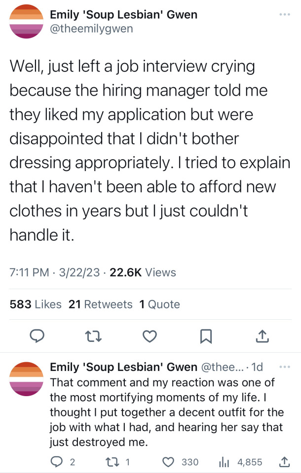
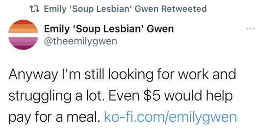
[ID: Tweets from Emily 'Soup Lesbian' Gwen (@theemilygwen) on twitter with the following text:
Well, just left a job interview crying because the hiring manager told me they liked my application but were disappointed that I didn't bother dressing appropriately. I tried to explain that I haven't been able to afford new clothes in years but I just couldn't handle it.
That comment and my reaction was one of the most mortifying moments of my life. I thought I put together a decent outfit for the job with what I had, and hearing her say that just destroyed me.
Anyway I'm still looking for work and struggling a lot. Even $5 would help pay for a meal. ko-fi.com/emilygwen
End ID]
Please help Emily Gwen, the creator of the lesbian flag. If you show me that you donated any amount I will draw you something. You can also support them by buying something from their Threadless store!
#emily gwen has been so influential to me and i would really appreciate any donations sent their way 💖#BEFORE ANYONE SAYS ANYTHING: emily gwen uses they/them pronouns. their flag is intended to be trans+nonbinary inclusive AND ace inclusive.#please do not spread rumors about them to avoid donating :( support lesbians! especially one who has been so influential#anis gaymer moments
28K notes
·
View notes
Text
When Palestinian’s say “From the river to the sea, Palestine will be free,” they are not calling for the ethnic cleansing of Israeli Jews/all Jewish people entirely. They are just asking for decolonisation.
Between the river (the Jordan River) and the sea (the Mediterranean Sea) lies Palestine, which has been occupied by Israel for the past 75 years. When they say Palestine will be free, they mean exactly that- for decolonisation; to end the illegal occupation of land that was theirs first.
I don’t know where the idea that this motto means genocide or is a “rallying cry for terrorists” came from, but all sources I have seen that spread this message are all pro-Israel and have unreliable propaganda filled articles. There is one article specifically that says that the Palestine flag emoji is used as shorthand for this phrase, and using it is antisemitic.
I hope people keep using this motto, keep chanting it at protests, and know that it does not making them antisemitic, pro-genocide, or an ignorant person. For it to not be obvious at this point that no Palestinian wants an ethnic cleansing of any kind, is shocking.
decolonizepalestine has an amazing article with more details about the history of the phrase and the myths surrounding it.
#if I can’t even use the emoji of my country’s flag what can I use???#the misinformation being spread about this motto is horrifying and quite honestly all of these claims are a projection from people#who support Israel#palestine#from the river to the sea palestine will be free#🦢
7K notes
·
View notes
Text

Sheep from Old School RuneScape / RuneScape 2
#sheep#old school runescape#runescape 2#brought to my attention by the other post#i can't believe Jagex did this to us!!#screaming crying throwing up colours of the Welsh flag rn#fav
4K notes
·
View notes
Text


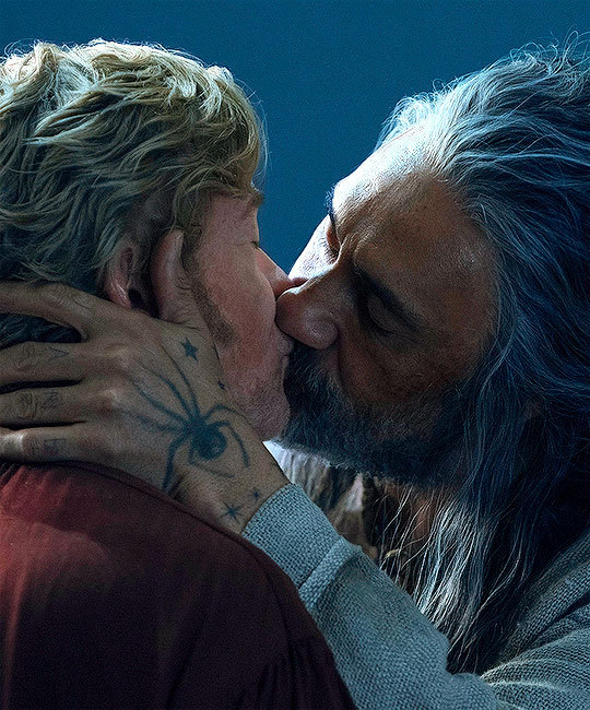
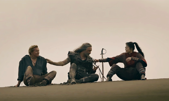
Stede: Is this alright? 🥺👉👈
Ed: 🥹🫠🫠
#ofmd#our flag means death#ofmd bts#edward teach#stede bonnet#ed/stede#thank you samba for blessing us with that scene#boyfriend 🥹
3K notes
·
View notes
Text
me consuming every piece of queer media instead of having a social life:

#vamplire#edits#house md#hannibal#what we do in the shadows#interview with the vampire#shadowhunters#red white and royal blue#our flag means death#carmilla#the last of us#good omens#young royals#heartstopper#yellowjackets#fellow travelers#shadow and bone#killing eve#first kill#the witcher
5K notes
·
View notes
Text
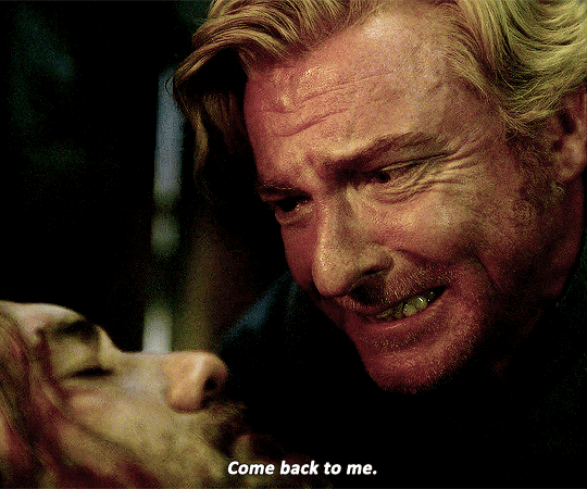

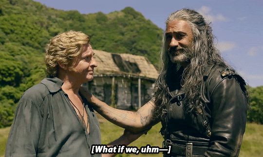
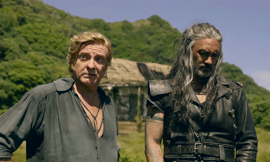
#they will always come back to each other
#ofmd#our flag means death#stede bonnet#edward teach#blackbeard#gentlebeard#blackstede#ofmdedit#ofmd spoilers#my gifs#they should go to jail for all the tropes and parallels they hit us with
6K notes
·
View notes
Photo

happy pride! get absolutely silly with it.
+ a flag color-picked directly from this very worm.
#more flags on the way!#pride month#pride#worm on a string#gay#lgbtq#also you're free to do absolutely anything with the pictures i post. they're good to use as banners or profile pictures#you're good to edit them
10K notes
·
View notes
Text
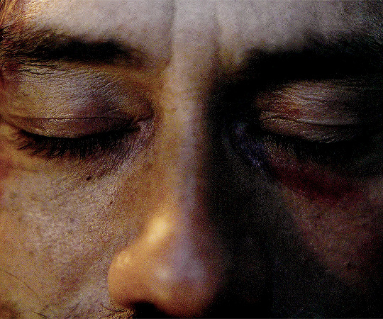
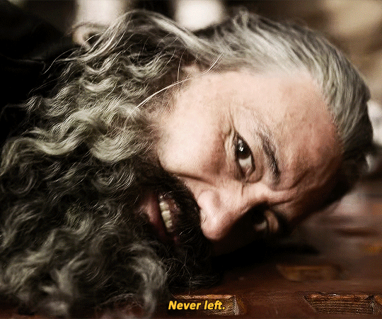
x
#our flag means death#ofmd#ofmdedit#ofmd s2 spoilers#blackbonnet#blackbonnetedit#gentlebeard#gentlebeardedit#edward teach#blackbeard#stede bonnet#taika waititi#rhys darby#literally what do i do with this#WHAT DO I DO WITH ANY OF IT#THERE'S TOO MUCH STUFF MY BRAIN REFUSES TO PROCESS IT#im not even capable of reblogging things yet bc my chest feels like i've been gargling and swallowing glass#i keep having to get up and just walk in circles#i've hyperventilated 73 times since yesterday#i knew david was gonna give us everything we ever wanted but that doesn't mean i was ready to see any of it#anyway i just needed this in the highest resolution on my blog#my stuff
4K notes
·
View notes
Text

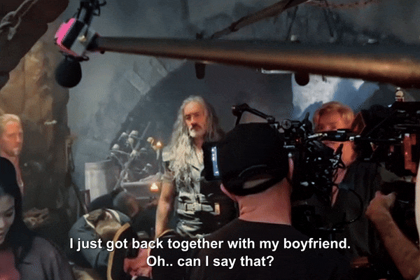
LOSING MY MIND THEY ARE SO TOGETHER (x)
bonus:

#THE WAY THEY TOUCH EACH OTHER????#can't believe they keep giving us clips like these akdhfdjs#ofmd#ofmd s2#ofmd s2 spoilers#our flag means death#ofmd gifs#ida.stuff#i was too fast and forgot the bonus clip at first akdfhdjsk#ofmd s2 future
5K notes
·
View notes
Text
Meditation by Yoong Bae
#star trek#star wars#merlin#atlantis#noragami#the letter for the king#altered carbon#over the garden wall#the power#our flag means death#raised by wolves#the last of us#killing eve#the bear#arcane#miracle workers#black mirror#love death + robots#marco polo#the midnight gospel#blue eye samurai#voltron#intergalactic#natsume yuujinchou#steven universe#my memes#alien worlds#gen v#avatar#interview with the vampire
4K notes
·
View notes
Text

#doink#ofmd#ofmd s2#ofmd s2 trailer#ofmd season 2#ofmd season 2 trailer#our flag means death#ofmd stede#stede bonnet#rhys darby#izzy hands#con o'neill#stizzy#i made a gif#use it wisely… or not
6K notes
·
View notes
Text
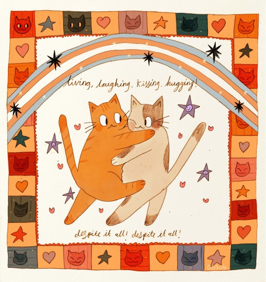
despite, despite, despite!!
#mine#original#fun fact when i first started colouring this i like couldnt remember what th trans flag looked like#i just like. did it then was like . hmm. that is the flag of slovakia i think#anyway#i missed tdov by a mile but. hello#i missed th day bc i was at my bfs house. thats t4t love baby#i hope u hve all had a good easter!!#thank u to everyone who inquired abt commissions i am surprised abt th amount of interest!!#when this batch is done i will open more. will probably b a regular thing :3#i will now do exercise and have a bath i thinky#i need to make myself read this book...im so not use to horror anytime i read anything remotely unsettling im like oohoohohohmmhhmm n#dont read for like. 4 days#ive read like 200 pages in 10 days KSFBSBJ get a GRIP#anyway. good evening
12K notes
·
View notes
Text
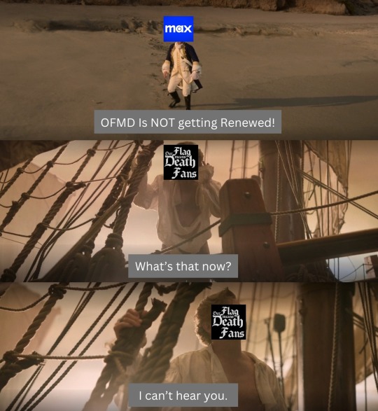
"I can't hear you."
[Image Description:
First Panel: Nigel Badmintons face is covered by the HBOMax Logo. He is standing on the beach in his captains uniform and yelling at the boat leaving. Caption Reads: "OFMD Is NOT getting Renewed!" End First Panel
Second Panel: Stede Bonnet's face is replaced by an icon that says "Our Flag Means Death Fans". He has a white shirt thats been cut open and his hand up to his ear, pretending to listen. Caption Reads: What's that now? End Second Panel
Third Panel: Stede Bonnet's face is replaced by an icon that says "Our Flag Means Death Fans" and he holds onto the rigging of the ship. Caption Reads: "I can't hear you" End Third Panel]
#ofmd#our flag means death#stede bonnet#save our flag means death#save ofmd#renew as a crew#renew ofmd#our flag means us#our flag means edits#my edits#my memes#sorry if someone did this already#just lemmy know
2K notes
·
View notes
Last Seen Blogs