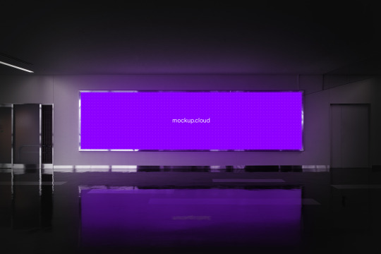
#digital screen
Text
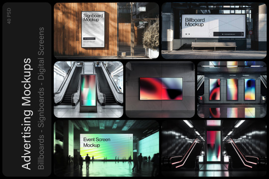
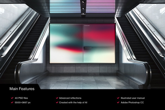
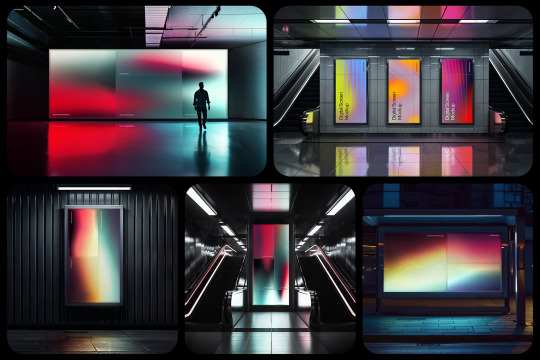
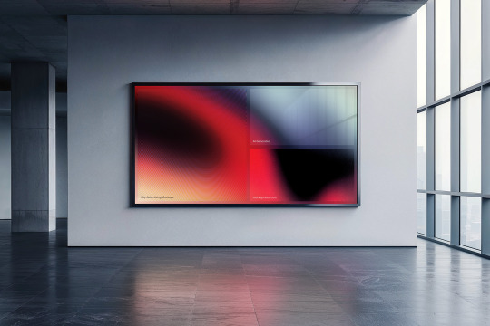
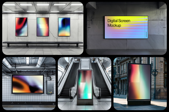

NEW! City Advertising Mockups Bundle
40 advertising PSD mockup templates featuring billboards, signboards, digital screens, and posters. Unique locations, advanced lighting, and reflections.
Available now at ⚡Mockup Cloud
#mockup#branding#psd#mockupcloud#download#free#freebie#billboard#signboard#digital screen#advertising#sign#urban#mockups#mockup cloud#display#screen#subway#outdoor#surface#city
8 notes
·
View notes
Text
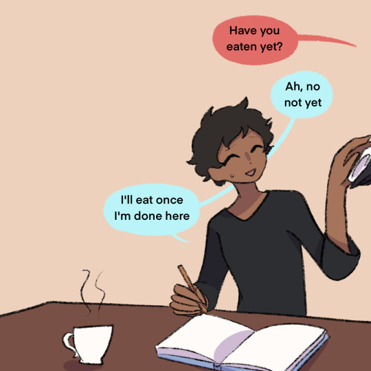
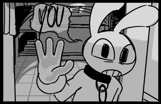
If you skip a meal Senshi will materialize next to you w/ food at the ready
#(rins the one talking off-screen btw)#kabru is shit at taking care of himself and regularly forgets to eat#once senshi finds out he is gonna make it his duty to feed that boy bc god knows hes not gonna do it himself#whats kabru gonna do. stop him? lol. lmao even.#kabru#kabru of utaya#senshi of izganda#dungeon meshi#delicious in dungeon#dungeon meshi spoilers#this is intended to take place post-canon so like. its implied i guess?#dunmeshi spoilers#art#my art#xanders art#digital art#fan art
25K notes
·
View notes
Text

#good omens#aziraphale#crowley#ineffable husbands#aziracrow#illustration#illustrator#procreate#digital art#fanart#my art#(you can use it as your own lock screen if you want to#a better HD version is available on Twitter
23K notes
·
View notes
Text
Replacing physical buttons and controls with touchscreens also means removing accessibility features. Physical buttons can be textured or have Braille and can be located by touch and don't need to be pressed with a bare finger. Touchscreens usually require precise taps and hand-eye coordination for the same task.
Many point-of-sale machines now are essentially just a smartphone with a card reader attached and the interface. The control layout can change at a moment's notice and there are no physical boundaries between buttons. With a keypad-style machine, the buttons are always in the same place and can be located by touch, especially since the middle button has a raised ridge on it.
Buttons can also be located by touch without activating them, which enables a "locate then press" style of interaction which is not possible on touchscreens, where even light touches will register as presses and the buttons must be located visually rather than by touch.
When elevator or door controls are replaced by touch screens, will existing accessibility features be preserved, or will some people no longer be able to use those controls?
Who is allowed to control the physical world, and who is making that decision?
#i get why this is happening; it's way cheaper to buy an off-the-shelf touch kiosk or tablet and run your ui on a web server#rather than integrating with custom hardware and physical inputs#but that should not just removing accessibility features#and I know that digital devices can help a lot with accessibility: e.g. screen readers#but I wouldn't rely on any of those being installed on someone else's device
47K notes
·
View notes
Text


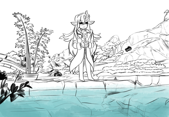
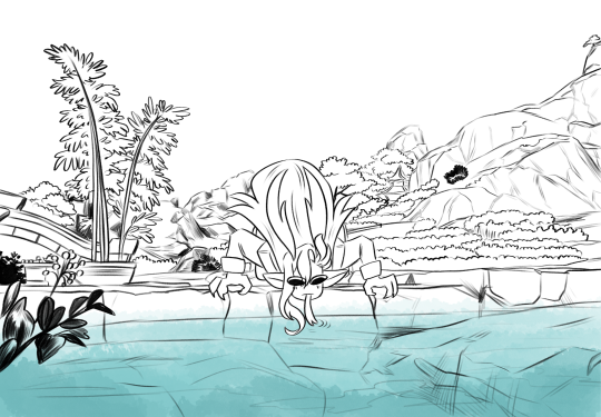
I don't know why but when he said he sampled the water of Qiaoying Village I just imagined him lapping it up on all fours when no one was looking so I doodled this up 💀💀
#OK BUT THE LAST PART OF THE LANTERN RITE QUEST WAS SO FUN AND CUTE I COULD NOT STOP TAKING SCREENSHOTS#BUT ALSO MAN PLEASE LET ZHONGLI AND NEUVILLETTE INTERACT ON SCREEN ONE DAY#genshin impact#neuvillette#hoyoverse#art#fanart#digital art#lantern rite quest spoilers ig#zhongli#hu tao#furina#clorinde#navia
13K notes
·
View notes
Text
Buy Digital Screen Display | Blue Rhine Industries LLC
When considering the purchase of a digital screen display, whether for personal or business use, several factors should be taken into account to ensure that the chosen display meets your specific requirements. Brisigns consider the total cost of ownership, including the initial purchase price, installation, maintenance, and energy costs. They provide a warranty period and the availability of technical support from the team.
Visit: https://brisigns.com/led-display-screen-manufacturers/

1 note
·
View note
Text

I like the silly little new indie show
Someone give Pomni a cookie
#Yeah I've watched the pilot a lot more than I'd like to admit#So decided I should draw something instead of permanently staring at the screen of my phone#Jax is such an ass#Still love him tho#derpiedoxie#digital art#digital artwork#the amazing digital circus#tadc#amazing digital circus#tadc fanart#tadc pomni#tadc jax#the amazing digital circus jax#pomni fanart#jax tadc#pomni tadc#there are waaaaayy to many tags here-#congrats if you got this far lmao
20K notes
·
View notes
Text
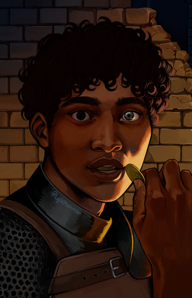
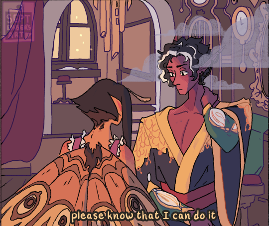
Kabru 💎
#it's like. unbelievable how much worse this piece looks on my laptop screen vs my tablet LDKFH;LDFH#but idk how to fix that so I'm just gonna avert my eyes 🙈#dungeon meshi#delicious in dungeon#kabru#kabru of utaya#my art#digital painting#digital art#illustration
5K notes
·
View notes
Text
if you use multiple, pick the one you use the most, not your preferred one.
#polls#digital art#plz reblog this ive been wanting to make this poll for so long im so curious#glubs#i use a screen tablet and non screen tablet but ive been using the screen one more lately#and have been doing digital art for 15 years
5K notes
·
View notes
Text

Carnival Jax by @sm-baby
I had LOTS of fun drawing him
5K notes
·
View notes
Text


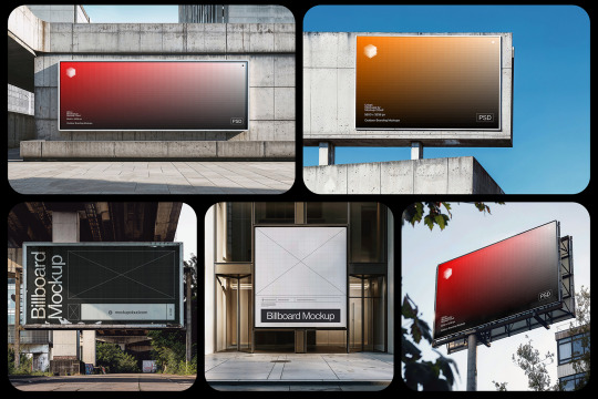
Urban Advertising Mockups
36 advertising PSD mockup templates featuring billboards, signboards, light boxes, digital screens, and posters: natural photography, unique locations, advanced lighting, and reflections.
⚡️ Download
#mockup#branding#psd#template#mockupcloud#download#billboard#screen#digital signage#digital screen#advertising#subway#free#freebie#sign#signboard#neon#urban
5 notes
·
View notes
Text
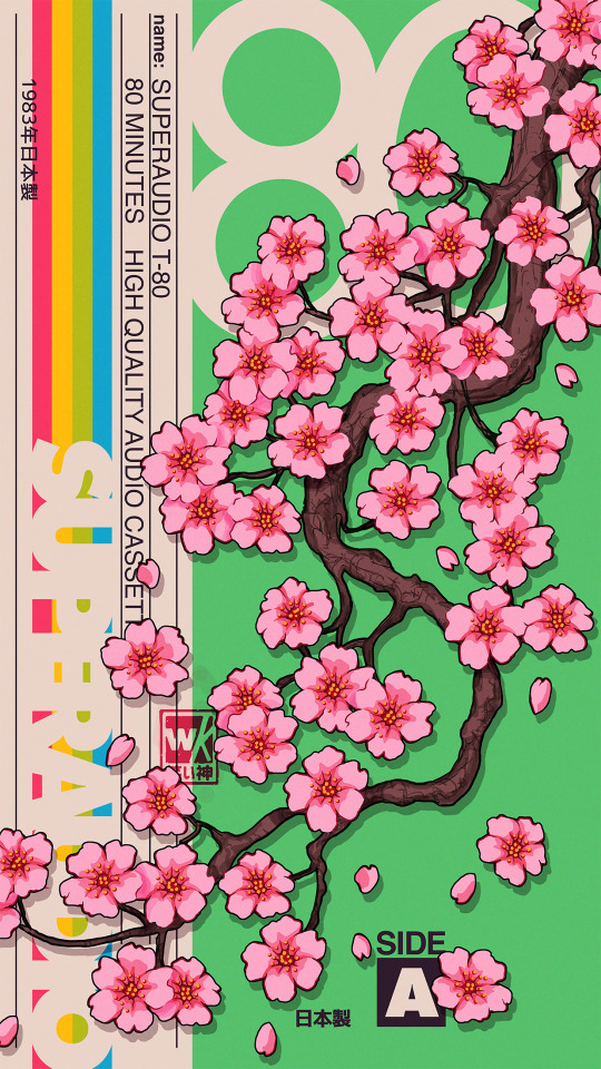
Superaudio Matcha 83 (wallpaper version)
#vaporwave#wallpaper#artists on tumblr#graphic design#graphic art#art#artwork#retro#photoshop#nostalgia#digital#lockscreen#wallpapers#lockscreens#digital artist#phone wallpaper#lock screen#phone background#80s#1000
3K notes
·
View notes
Text
last night I had a dream that there was a tumblr update and the only thing it changed was that for two minutes straight you could sprinkle shredded cheese on other blogs and their posts, and everyone's dashboard was just pandemonium as everyone cheesed each other. two minutes of abominable amounts of shredded cheese raining from the dash. tumblr at its finest. get cheesed
#mutuals I'd cheese you <3#shitpost#listen it's a shitpost but it was an actual dream#two minutes of cheesing was free. if you wanted to cheese someone longer you had to pay#but my god did people make the most of their two free minutes#there was shredded cheese all over the posts on my dash#it was both real and digital cheese at the same time I don't know how to explain it#it was entirely contained within the screen. but was somehow real actual shredded cheddar cheese#i don't dream often but when I do...
37K notes
·
View notes
Text
I think 90% of my gripes with how modern anime looks comes down to flat color design/palettes.
Non-cohesive, washed-out color palettes can destroy lineart quality. I see this all the time when comparing an anime's lineart/layout to its colored/post-processed final product and it's heartbreaking. Compare this pre-color vs. final frame from Dungeon Meshi's OP.


So much sharpness and detail and weight gets washed out and flattened by 'meh' color design. I LOVE the flow and thickness and shadows in the fabrics on the left. The white against pastel really brings it out. Check out all the detail in their hair, the highlights in Rin's, the different hues to denote hair color, the blue tint in the clothes' shadows, and how all of that just gets... lost. It works, but it's not particularly good and does a disservice to the line-artist.
I'm using Dungeon Meshi as an example not because it's bad, I'm just especially disappointed because this is Studio Trigger we're talking about. The character animation is fantastic, but the color design is usually much more exciting. We're not seeing Trigger at their full potential, so I'm focusing on them.
Here's a very quick and messy color correct. Not meant to be taken seriously, just to provide comparison to see why colors can feel "washed out." Top is edit, bottom is original.
You can really see how desaturated and "white fluorescent lighting" the original color palettes are.
[Remember: the easiest way to make your colors more lively is to choose a warm or cool tint. From there, you can play around with bringing out complementary colors for a cohesive palette (I warmed Marcille's skintone and hair but made sure to bring out her deep blue clothes). Avoid using too many blend mode layers; hand-picking colors will really help you build your innate color sense and find a color style. Try using saturated colors in unexpected places! If you're coloring a night scene, try using deep blues or greens or magentas. You see these deep colors used all the time in older anime because they couldn't rely on a lightness scale to make colors darker, they had to use darker paints with specific hues. Don't overthink it, simpler is better!]
#not art#dungeon meshi#rant#i'm someone who can get obsessive over colors in my own art#will stare at the screen adjusting hues/saturation for hours#luckily i've gotten faster at color picking#but yeah modern anime's color design is saddening to me. the general trend leans towards white/grey desaturated palettes#simply because they're easier to pick digitally#this is not the colorists fault mind you. the anime industry's problems are also labor problems. artists are severely underpaid#and overworked. colorists literally aren't paid enough to do their best#there isn't a “creative drought” in the anime industry. this trend is widespread across studios purely BECAUSE it's not up to individuals#until work conditions improve anime will unfortunately continue to miss its fullest potential visually#don't even GET ME STARTED ON THE USE OF POST-PROCESSING FILTERS AND LIGHTING IN ANIME THOUGH#SOMEONE HOLD ME BACK. I HATE LENS FLARES I HATE GRADIENT SHADING I HATE CHROMATIC ABBERATION AND BLUR
2K notes
·
View notes
Text
Regretevator Doodle Dump!!

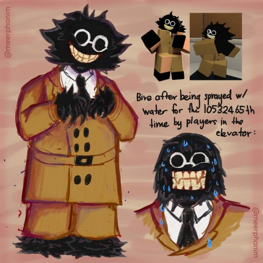
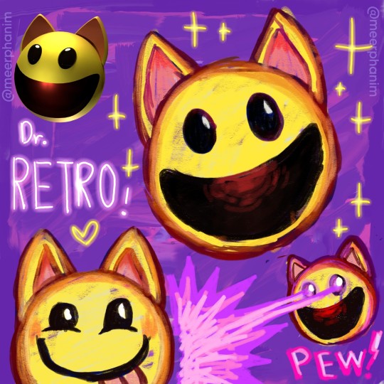
Scag's the most recent I drew, Bive and DrRETRO were drawn weeks ago.
Also not in my regular style this time!
I (accidentally) developed this style from the DrRETRO doodles (who's also the first NPC I drew). I really like doodling this way and I wanna share these because whale🐳... I really love these! A lot!
💜 [ Reblogs help me a lot. Thank you! ] 💜
#regretevator#regretevator bive#bive regretevator#bive#scag regretevator#digital doodle#regretevator scag#scag#regretevator drretro#roblox#digital art#digital fanart#digital artist#artists on tumblr#Shoutout to my friends who are the reason I got into Regretevator ^^#I love this game a lot and it made me play Roblox again#I love all the NPCs so much... I can't pick a favourite because they're all so good!!!#Scag's instantly my new favourite NPC; I love a character who's a tech with a screen for a face#Scaaaag... Scag save me.. Save me Scag... ily#Also I drew these in Autodesk Sketchbook aka Sketchbook instead of my usual; IbisPaint X#Though don't expect art like this regularly though#doodle page#doodle dump
2K notes
·
View notes

Last Seen Blogs

twink-flags
Requests Are Open!!

fintasso
just appreciating life.

shreeramsteelmart
Shree Ram Steel Mart

sacrificim-a
SEMI HIATUS