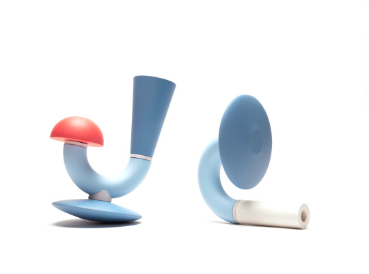
#design language
Text
Something that stands out to be about how Murder Drones does horror, is its relationship to organic matter, especially in contrast to how machinery is portrayed.
The main characters are as the title would imply, drones- they live in a cold wasteland, trapped behind doors upon doors of mechanical creations. In a way Murder Drones establishes machinery and robots as its baseline, it's what's comfortable and familiar. Which I find interesting because we as humans are more familiar with the organic, what scares me is a future dystopia dominated by machines, where life struggles to survive.
However in Murder Drones- the moments I find the most freaky are always those where something looks.... Human... Or, alive.
This moment from episode 2 where J goes eldritch horror and Solver appears, the hand that crawls in to grab Thad looks human.
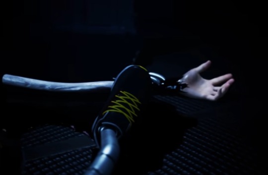
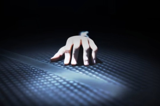
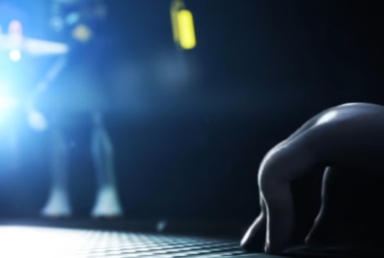
[image description: human looking hand crawling on the ground, but it's revealed to not be attached to an actual human, but instead a long mechanical wire]
This honestly was really freaky to me, because it's so... Wrong. Even when we see actual humans, it's as shadow thingies, or in the case of Tessa, completely covered up by clothing. We see skeletons too, but they're dead, which I feel doesn't really qualify for the horror of something looking... Alive.
I feel like it's mostly with Solver's portrayal that things look... Organic. For example whenever Uzi loses control of her quirky powers, a black hole thingy appears and leaves gooey flesh looking stuff- honestly very gross
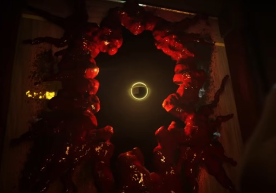
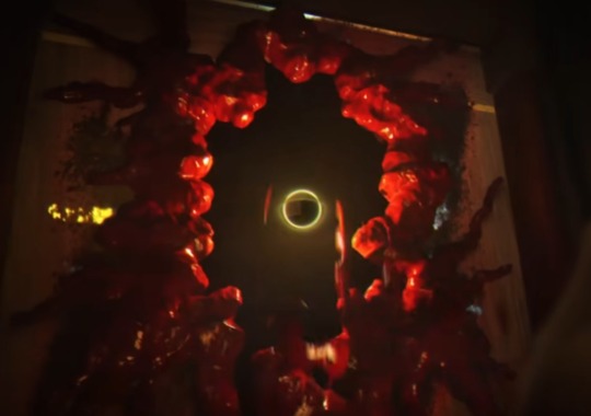
[Image description: There's a hole in the wall, with the edges covered in organic looking goo, spreading across the wall. There's a black orb in the center of the hole]
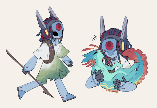
It's also very apparent when comparing Solver Uzi's wing design to the disassembly drones' wing designs. Uzi's are bat-like, with tears and they look more reminiscent of something organically created.


[image description: Uzi looking silly with her bat wings]
Meanwhile Disassembly drone wings are 100% metallic and look like blades, there's a pretty big contrast. Especially when you think of how Uzi actually does start to develop average disassembly drone characteristics, like the mouth, burning in sunlight, and the X for eyes.

Might be besides the point but Uzi's wings look like hands, meanwhile the others' wings don't have that shape really built in anywhere.
Freaky little guy

Something something design language of Solver being completely different to other things in the show.
Anyways I've completely run out of brain juice, hopefully this makes sense
#murder drones analysis#text post#murder drones uzi#murder drones solver#murder drones spoilers#murder drones cyn#murder drones v#murder drones n#serial designation n#serial designation v#murder drones tessa#murder drones j#murder drones#design language#horror#horror anslysis
143 notes
·
View notes
Note
Do u know any reason why the Dodge Durango and Dodge Charger look kinda similar?
I see them on the streets all the time and I've noticed (at least the newer ones) have the same headlight and tail light design
Well, the short answer to that is "design language". The explanation of that short answer, however, is a bit more complicated than that, and is about why cars look the way they look - what makes them different, what makes them similar, what makes them change and how to tell them apart. So hop on under the Read More and come learn all that!
Design language is the sum of design rules and guidelines that make a brand's product range both distinct from others and coherent within itself. If you've ever recognized whose commercial it was, who printed the book, who manufactured the device, who designed the car, that was design language doing its job!
You know those "If [brand] made [thing]" renders you see out there? That's following a brand language: crossing what [thing] looks like, which is usually pretty well determined, with the much more nebulous concept of what [brand] looks like. Defining a design language is defining the answer to that second question.
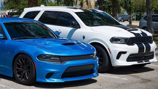
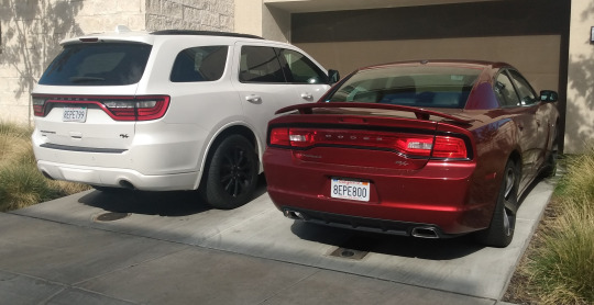
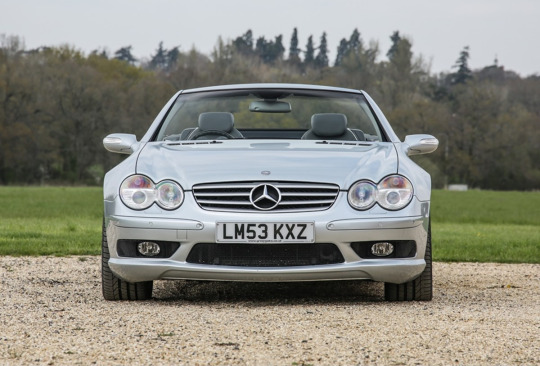
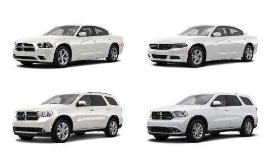
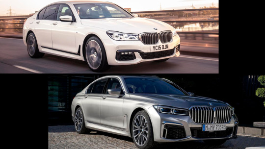
So, let's look at the Dodge lineup in 2011 (the first year with both current Charger and current Durango).
There's a couple of key shared traits: the trapezoidal grille (facing downwards in 'friendly' cars and upwards in 'aggressive' ones), the small indentation in the middle of the hood, the single angular headlight housing containing two round lighting elements, and some more minute stuff.
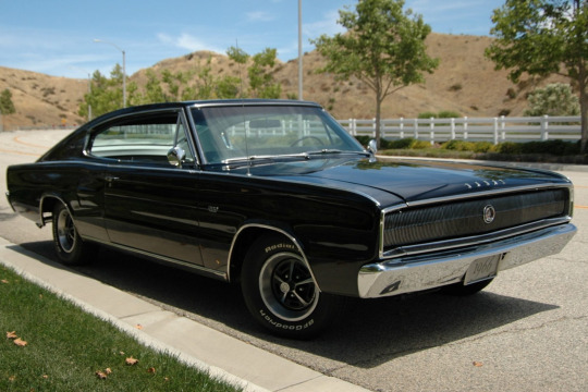
Except one of these cars features none of that, because sometimes, when updating (and, especially, when bringing back) a model, the design traits of its ancestors are taken into account, and for the Challenger, Dodge's then-current design language was almost totally disregarded in favor of faithfulness to its 1970 ancestor.


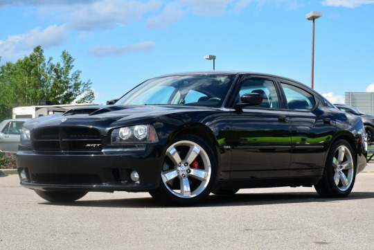
Whereas the new Charger did the exact opposite, its 2006 revival being completely based on 2006 Dodge's design language, with extremely little left of the '60s original (I see the rear window shape and the beltline if I'm being Christmas generous). Of course, this already works towards the similarity we're getting at.
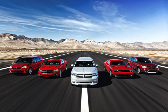
But the bulk of a car's design decisions are not about design language, but about the kind of car it has to be. A designer must contend with aerodynamics, safety requirements, customer needs and expectations, with the end result being that cars of the same segment will usually end up having the same basic proportions and largely overlapping silhouettes. See the cars below:
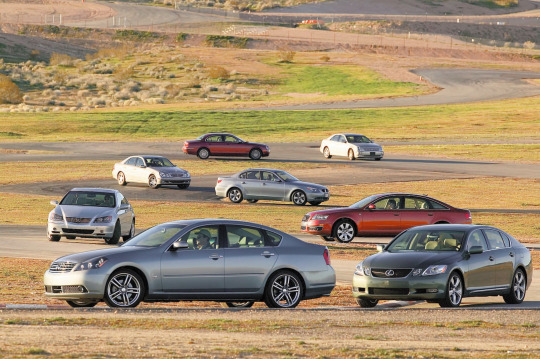
Sure, very different styles can produce a more angular or more soft outline (see the two cars in the background), but within the same era and segment many completely different cars will be almost indistinguishable between the wheels (see the two cars in the foreground).
So the most design freedom is usually found in lights and grilles, since those can be quite radically altered in shape and proportions without interfering much with functionality (unlike for example window shapes or rooflines), and even slight changes in them can alter the look and perception of a car, because we parse them similarly to faces, and thus they can make a car looks angry, sad, silly, goofy, or adorably gleeful.
So most often, the most distinctive features of a car -and by extension of a design language- are found in lights and grilles (the outline of the headlights, the inside arrangement, the grille's shape, proportion, pattern, etc.), with the rest of the car being shaped by general principles like "angular design", "simple, smooth lines" or the likes. So if you want to learn to recognize cars, lights and grilles are usually what you should focus on, as you need to be an expert for your average car's overall shape to tell you much more than its segment and decade (and perhaps market, but that's a longer conversation). That does explain, doesn't it, why lights and grilles are similar in Charger and Durango, two cars in very different segments designed to look aggressive in a distinctly Dodge way.
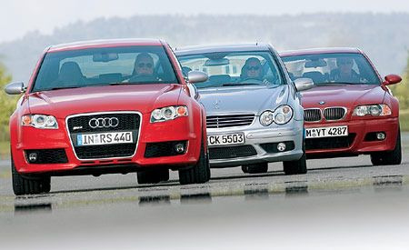
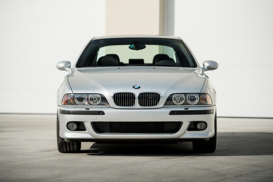
Let's exemplify this principle with three cars from the same segment, decade and country:
In the mid-00s, Audi introduced a tall, chrome-lined downward trapezoid grille that contained the number plate;
Mercedes had their classic grille -with the thick top chrome strip, small silver accents and the underlying middle line- and “merging circles” headlights;
BMWs still had their staple "kidney grilles" and their quad circular headlights now contained in a wide, flat shape with round, downwards curving edges.
So even when these brands made different cars in different segments, those key traits kept them perfectly recognizable as theirs.
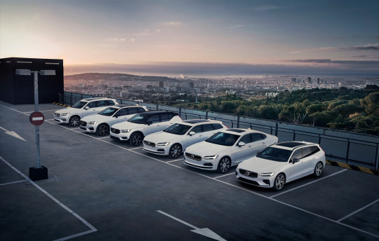
As you see in Mercedes, a brand's designs can get very consistent - but it can also get very inconsistent, too. For one, you don't design for a manufacturer, you design for buyers, so the design will change with who the buyers are, what they want, what they're attracted to - and when that is pretty consistent within a brand you get a lineup like Volvo's...
...whereas if you have a brand whose buyers vary wildly in all metrics that matter, you get a lineup like Kia's.
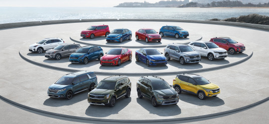
(I love this picture because you keep thinking "Well those two look similar at least" and they keep turning out to be two versions of the same car.)
The lineup's styling is also going to be more cohesive the more precious brand recognition is for it: a Ferrari needs to look like a Ferrari because that's most of why people buy a Ferrari to begin with, whereas the last time a Skoda didn't look like a Skoda it literally called for advertising.
Design languages also change and evolve with time, of course, and that's an element at play in the observation that spurred this post: Charger and Durango look similar not just because they were designed with the intention of looking similar, but also because they were updated with the goal of remaining similar, and were made even more so by the use of similar solutions to modernize their looks.
You'll notice that this was just an update of lights, bumpers and grilles - and indeed, these are what's known as "facelifts": where a new generation is usually redesigned from the ground up or retains little more than the core structure, facelifts are instead intragenerational updates that stay clear of radical changes (at most, things like hood and fenders can get updated if new headlight shapes require it).
But as we covered, those are the parts that matter - so while something as little as a facelift can be absolutely impossible to notice...

(seriously, two of my neighbors have these and it took me weeks of seeing them side by side to notice differences)
...it can also be effective enough to carry a model into a new decade...

...ore even powerful enough to completely salvage a car's design, and by extension its fortunes.
However, of course, it can wield the opposite power just as well.
Christ.
Welp, no mistaking that for not a BMW now, is there.
But to be clear, while BMW's styling has completely gone down the gutter lately, don't get the impression that any brand at any time is beyond a miss in this regard.
So, to close, while there is merit to the claim that cars today seem all the same, as we've discussed that's only true -and for good reasons- when looking at them from a distance. But when a landscape seems depressingly monotonous, you just have to look closer. And so, getting closer, analyzing the traits that weren't dictated by their nature, the decisions that weren't made for them by external factors, looking at what of them was shaped by agency and not necessity, they will all reveal themselves to all be different and to all have a personality of their own (bland as it may be). And that personality will change over time: changes are normal within a life, and actually good - they're a sign that life has been long enough to outlive the trends and ideas that shaped it, and that it's open to the new ones that have blossomed since. Trying too hard to fit in or stand out or seeking change for its own sake without a clear direction can ruin something good, sure, but change can also be very positive: it can allow keeping up with the times, or even a transformation for the better that lets go of what didn't work and accentuates what was good - and often, when it's done right, the world rewards it. And none of this requires a distancing from heritage or family, or even identity. In fact, as seen with our two cars, change can make a family bond even tighter.
This year will bring lots of change. Here's hoping we all manage to make it change for the better.
So yeah, hopefully that answers your question, anonymous asker who may well have fucked off to Hollywood in the over month and a half it took me to get to this (whoopsie)!
Immense thanks to @ldub0775 for the effort and thought he joined me in pouring into this post, and to all followers reading this for sticking around into 2024 to witness that effort's fruits. Trust me, you will really like what's coming.
Links in blue are posts of mine about the topic in question: if you liked this post, you might like those - or the blog’s Discord server, linked in the pinned post!
#design language#car design#dodge charger#dodge durango#dodge challenger#audi#mercedes#bmw#volvo#kia#the great catchup
38 notes
·
View notes
Text
youtube
What's with the 'Tom Holland Face'...? | A Video Essay by DazzReviews
#cartoons#animation#movies#same face syndrome#stylized art style#another reason to have more women and POC protagonists#surprised vid didn't mention Nimona's male characters completely avoiding the TomHolland look#then again Nimona movie didn't have the unintimidating spindley male protagonist archetype#Youtube#character design#design language#tom holland
2 notes
·
View notes
Text


Imaginary Language | Alessandra Fumagalli Romario
5 notes
·
View notes
Text
Stop using “dark patterns”
That term associates dark with bad, and light with good. It’s a concept rooted in white supremecy and should be completely ripped out of our professions language.
Instead, use “deceptive patterns”
It’s more accurate, less jargony, and clearly conveys the unethical intentions of the company / designers behind it.
Before putting others on blast for being morally bankrupt, let’s do a little reflecting of our own, huh?
2 notes
·
View notes
Text
WOII Summary
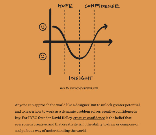
My focus in WOII was viewing the world from various perspectives and identifying the connections between the world, myself, and design. This allowed me to understand my interactions with the world and to have an attitude of finding learning opportunities in everyday life.
Every week, I explored various references related to the topics. I applied the insights I gained from this experience to my design process. For instance, while analysing resources that could deepen my grasp of the project, I observed works from multiple perspectives. Furthermore, instead of just archiving works I found impressive, I strived to understand why they were effective. I aimed to identify 'which design elements were performing what role and conveying what message effectively'.
I also felt the importance of language while writing tumblr posts. I believe language is crucial not just as a means of expressing my ideas, but also in relation to the depth of my thoughts and design.
My perception of the world, shaped by my values, experiences, thoughts, and emotions is directly connected with my perception. I realised that the way I see the world is entirely within my control. Since my experience and perception shapes who I am, I would like to expand my understanding of design by observing various well-designed works and enriching my design learning.
(216 words)
References:
IDEO. "Design Thinking." IDEO, https://designthinking.ideo.com. Accessed 10 Apr, 2024.
#WOII#interaction#connection#multiple perspectives#design#design language#thinking skills#perception of the world#creativity#self exploration
0 notes
Text
Rivian Introduces R2, R3, and R3X Built on New Midsize Platform
LAGUNA BEACH, Calif. March 7, 2024 – Rivian today unveiled its new midsize platform which underpins R2 and R3 product lines.
R2 is Rivian’s all-new midsize SUV delivering a combination of performance, capability and utility in a five-seat package optimized for big adventures and everyday use. The silhouette and face of R2 are distinctly Rivian. The powered rear glass fully drops into the…

View On WordPress
#acceleration#adventure#Adventure Gear#affordability#all-new platform#automotive engineering#Automotive Technology#autonomous capabilities#autonomous driving#battery#capital efficiency#cash visibility#commercial vehicles#consumer services#cost savings#crossover#design innovation#design language#direct sales#drive unit#Durability#electric mobility#electric vehicles#emission reduction#energy density#environmental preservation#fast charging#feature growth#global transition#haptic controls
0 notes
Text
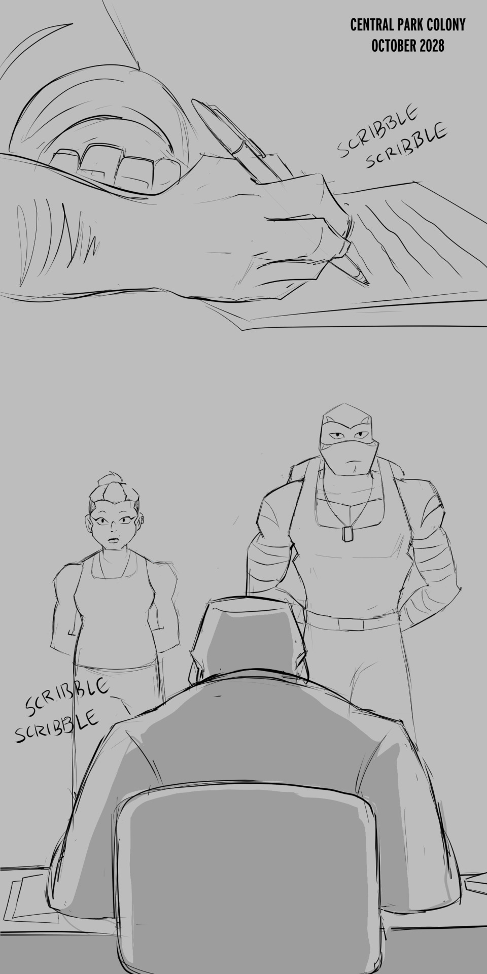


BEGINNING || PREVIOUS || NEXT
MASTER POST
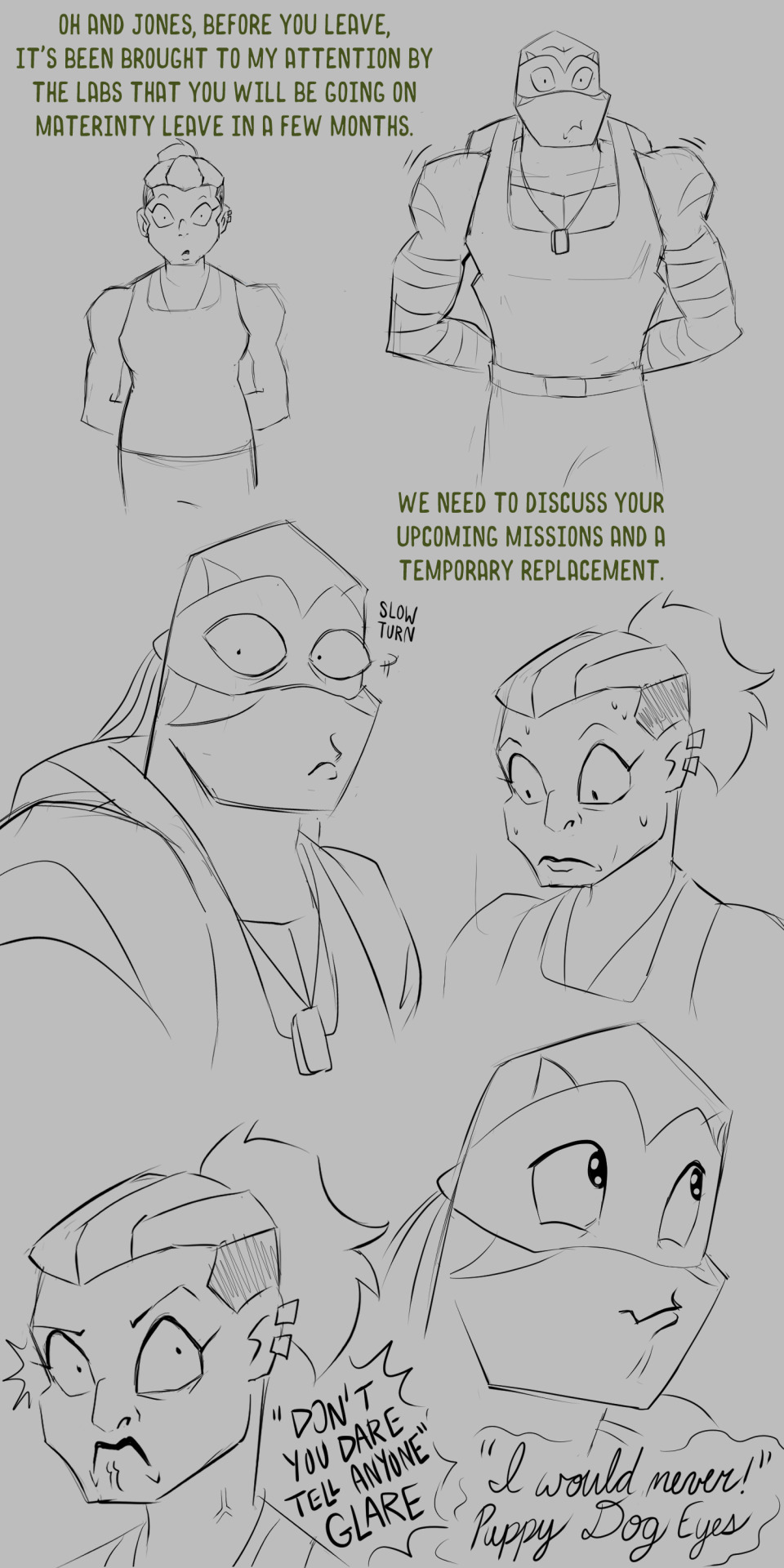
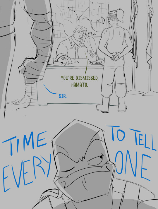
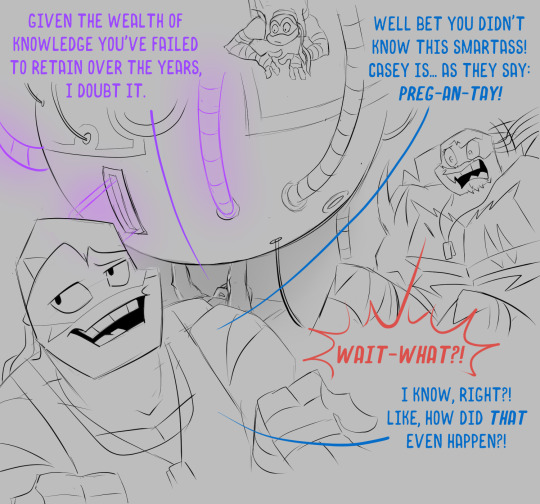
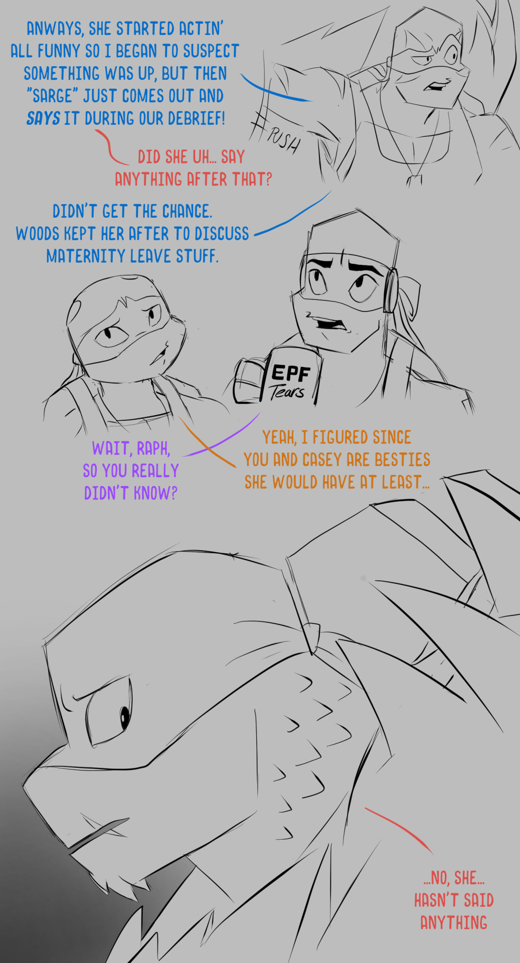
What, you thought there wasn't going to be some drama in this holiday special?? Do you even know me???
Also, see?? Leo’s doing fine! It’s been a few years since the last post so he’s had plenty of time to set up all his unhealthy coping mechanisms.
Whew, I have to say this special is easily the most extensive thing I've done so far for Replica. This is the only time we'll probably see the Central Park Colony in its hay day so wanted to make the effort to show what I could. I love visual story telling, but hate doing backgrounds haha, it's a problem! I'll admit this is a lot messier than what I've been doing as of late but we're just going to have to deal since we have so much ground to cover. It might get messier, I make no promises. Next up, I think Casey and Raph need to have a talk.
#I kind of want to design Donnie's mug#should I?#EPF would be crying if they knew how much Donnie was getting away with#rottmnt replica#replica#rottmnt#replica holiday special#kathaynesart#save rottmnt#rise of the teenage mutant ninja turtles#unpause rise of the tmnt#unpause rottmnt#future bootyyy shaker 9000#preg-an-tay!#language cw#sorry Mikey has no filter
4K notes
·
View notes
Text
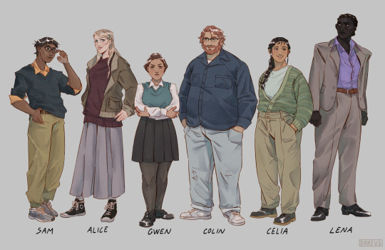
My take on the new cast!
#maybe Lena’s design is just a bit too self indulgent#but I’m the one holding the apple pencil#I can do what I want#I hope I didn’t miss any canon descriptions#if I did I blame it on the fact that english isn’t my first language#my art#tmagp#tmagp fanart#tmagp cast#the magnus protocol#digital art#character design
2K notes
·
View notes
Text
Falin has been nearsighted since she was little, and has a habit of squinting when she's looking at things.
—Delicious in Dungeon World Guide: The Adventurer's Bible
she should have been at the optometrist's
(ID in alt text)
#dungeon meshi#delicious in dungeon#falin touden#marcille donato#laios touden#doodles#mine#falin's closed eyes canonically just being squinting is one of the funniest word of god additions to a story ever#noticing how she started keeping them open post-rez n being like ''wow that's such a cool way to introduce a disconnect between the falin w#heard of n the falin we're meeting now. i wonder how this plays into the dragon thing'' and it's just. it's just. She Can See Now#i do think if she ever did get glasses they'd be no use bc she doesn't like wearing them. marcille has to wrestle them onto her face#after wrestling them out of laios's hands#protip: they're in their flashback designs bc that chapter is burned into my brain permanently. laimar one-sided enemies to besties +#farcille cheek-pinching as a love language 5ever
2K notes
·
View notes
Text

FLEUR DE LYS-SHAPED BOOK OF HOURS, in Latin, use of Rome (Paris, c. 1553). Illuminated manuscript on paper.
180 x 80mm. i + 117 leaves, each page with 24 lines written in a 'roman' hand in black ink within a liquid gold border in the shape of a half fleur de lys, spaces infilled with liquid gold fronds on blue or red grounds, line-fillers and one- and two-line initials of the same colours, eleven lobe-shaped miniatures. Nineteenth-century brown morocco gilt, semé with fleur de lys, doublures of red morocco gilt, edges gauffered and gilt (upper cover detached). [Christies Auction House, 2006 catalog]
source
#beautiful books#book blog#books books books#book cover#books#shaped book#fleur de lis#book of hours#latin language#treasure book#book design#book binding#old books
651 notes
·
View notes
Text
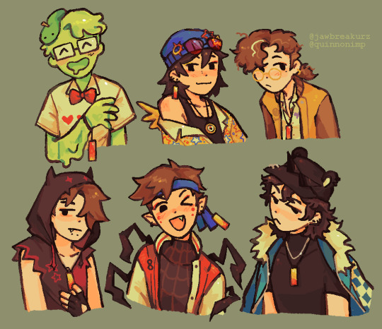
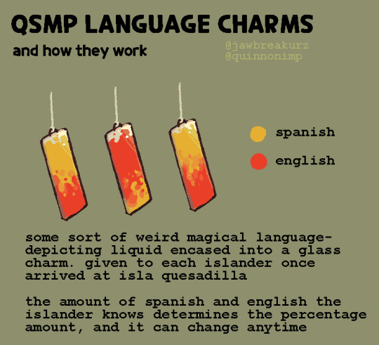

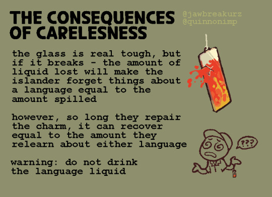
qsmp language charms !! a little headcanon of mine ive had since the start that i finally like enough to talk about
#i was very lazy with the rendering on the character art lmfao#also i made charlie luzu roier and spreens designs completely on the spot so i may change them later on#qsmp#qsmp fanart#slimecicle#quackity#wilbur soot#luzuvlogs#roier#spreen#slimecicle fanart#wilbur soot fanart#quackity fanart#luzuvlogs fanart#roier fanart#spreen fanart#art#qsmp language charms#< for organization#quinnotalk#tumblrimp
5K notes
·
View notes
Text
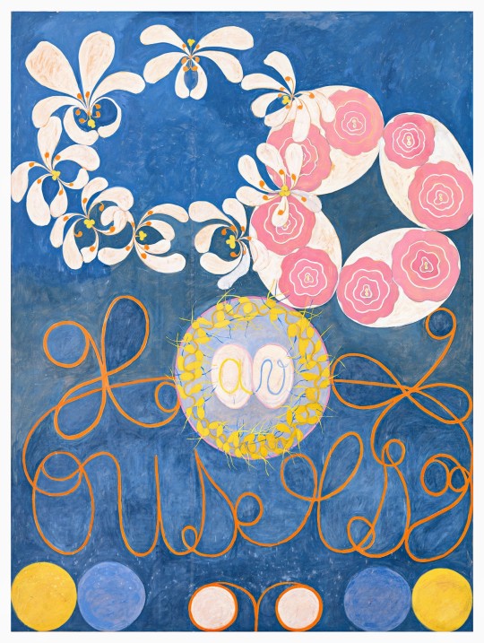
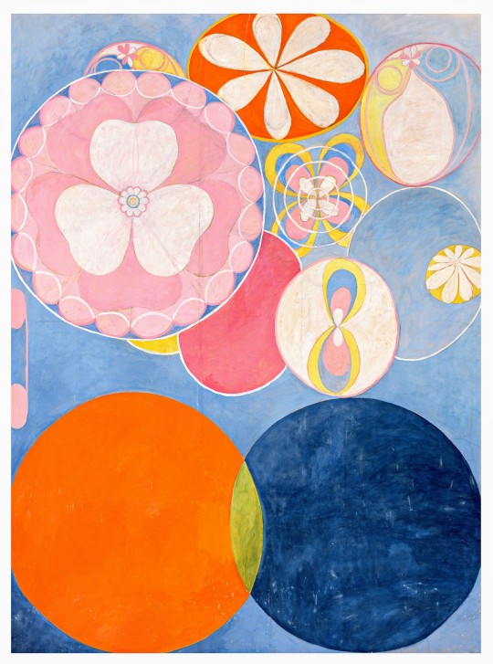
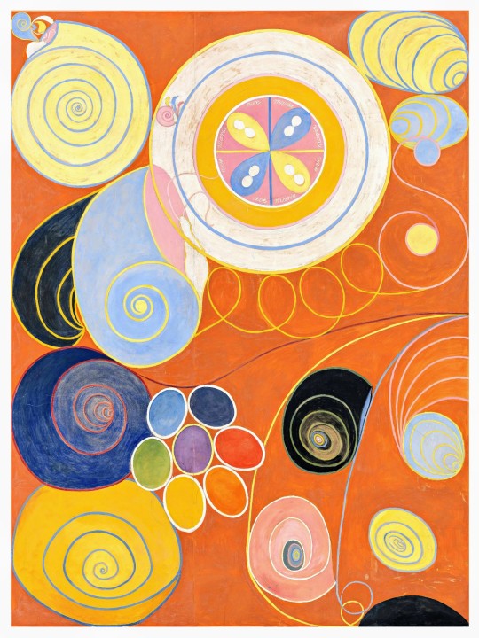
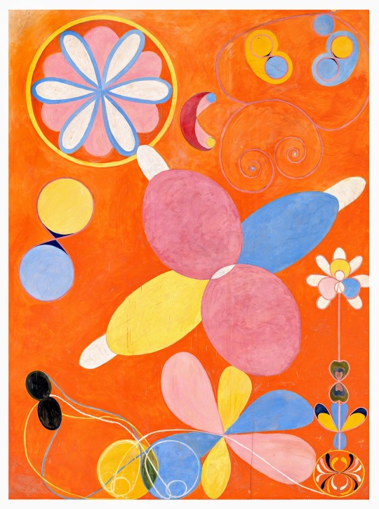
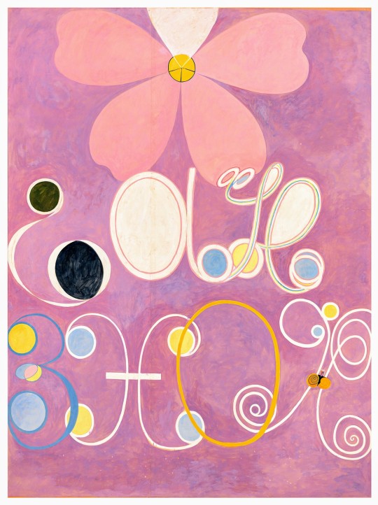
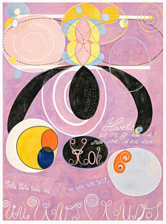
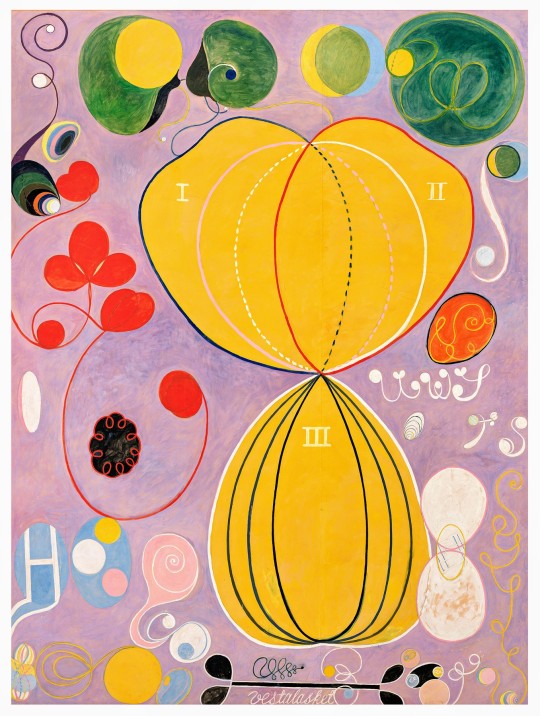


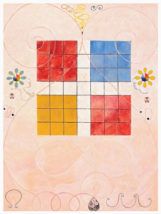
Hilma af Klint The Ten Largest. 1907. Oil on canvas, each piece is 129 × 94 in. (328 × 240 cm). The paintings depict ten stages of human life: Nos. 1 & 2 are Childhood; Nos. 3 & 4 are Youth; Nos. 5, 6, 7 & 8 are Adulthood; Nos. 9 & 10 are Old Age.
#spirituality#art#retro#1900s#life#age#sociology#art history#science#words#time#society#language#futurism#geometry#abstract#feminism#design#birthday#hilma af klint#🎨 📚#paintings for the temple
4K notes
·
View notes
Note
I don't know if you've already been asked this before, but would it be okay to make tintin fanart with your chang design?
Absolutely! I'd love to see what people make with my design! Be sure to tag me so I can see it!
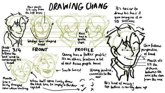
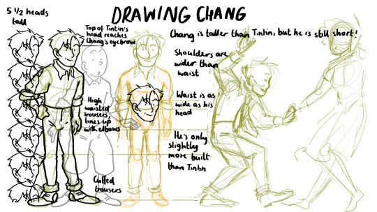
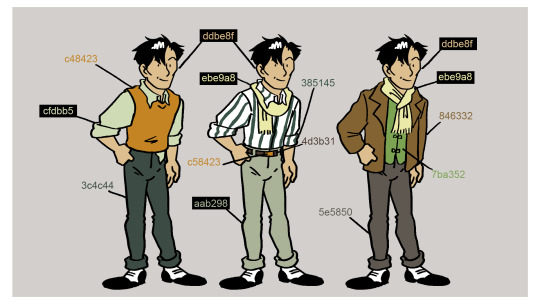
He's a little tricky to draw so here's a sort of model sheet/style guide for him. Even though this is my own design I struggle getting him right half the time! This is what his design has become after I've spent ages drawing him so you will find plenty of examples of my own art breaking these "rules." I've done one for Tintin some time ago here
You don't have to adhere to this strictly in order to draw him! This is only a guide if you want to emulate my way of drawing him! Have fun with it. Chang would want you to.
#asks#fanart#tintin#adventures of tintin#chang#model sheets!!!#id love to see more chang fanart!#he was so underused in the canon#my design for him is essentially an aged up version of the 90s cartoon#i wanted him to have a different shape language to tintin#drawing handsome characters is difficult#have fun!
575 notes
·
View notes
Text
Saw a video about how Duolingo works and apparently the weird sentences are made by actual people on purpose, because 1- it's fun, 2- something unusual is easier to remember and 3- even if you're not gonna use "the bear talks with a lawyer" in real life you're probably gonna remember the grammar structure when using actual sentences. So whenever you see a Duolingo phrase that maker you go "WTF?!" Know that someone probably had a lot o fun adding it to the app
#i think its really funny actually#and it makes sense in a way#dont get me wrong#i still don't like the new design of the app#but this little detail made me appreciate it more#duolingo#language#langblr#language learning#langblog#studyblr#spanish#spanish langblr
1K notes
·
View notes
Note
Does Robot Moon still have the same personality or is she not the Moon we mostly know?
Oh dont worry robo moon is still the same as gijinka moon
I just think robo and gijinka Moon should have different vibes. When I design gijinka Moon its to cater to the idea she will look human. So when I design robo Moon, i wanted to add a lil extra since canon Moon is kinda just... blue, and when i designed her its to cater to the idea I want her to look alien yet friendly since Rain World basically takes place in an alien world that differs from ours.
#idk man im not good with design language#like gestures at how people can make iterator designs looks super dynamic and expressive even as robots#so i settle with a middle ground#lyss art#my art#rain world#looks to the moon#rw looks to the moon#rw rivulet#character design
490 notes
·
View notes
Last Seen Blogs