#but they are easier to do for me
Text

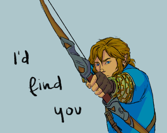
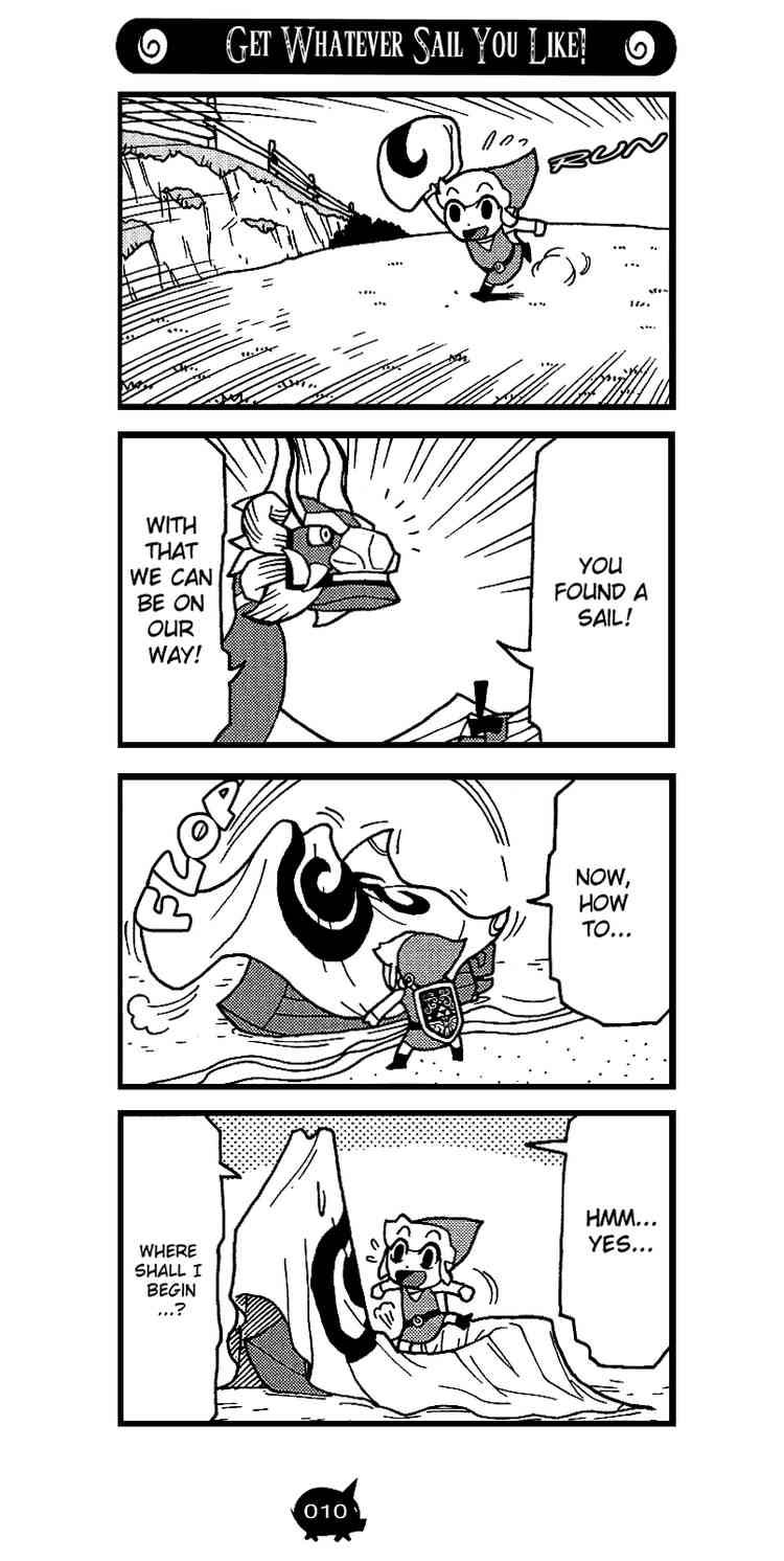
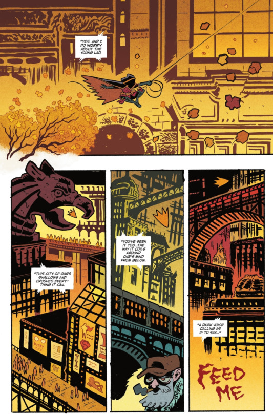
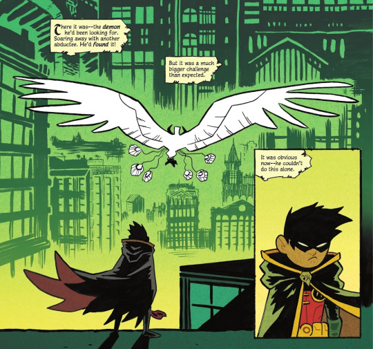
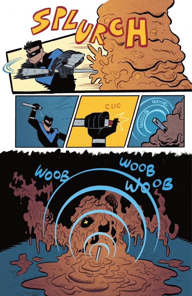
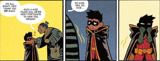
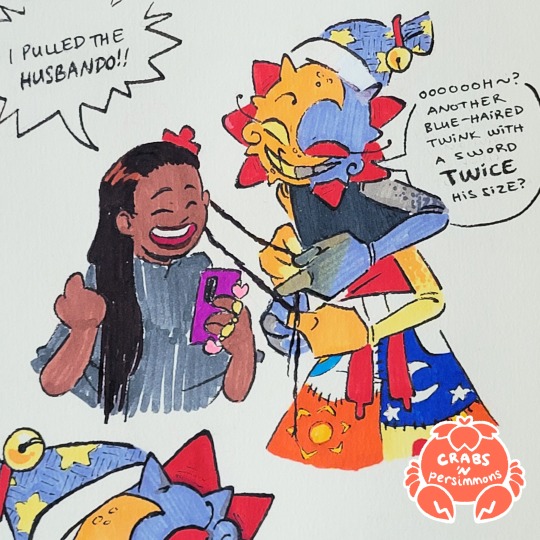
rough concept for the cutscene before the last phase of the final fight; in a desperate attempt to avoid being imprisoned again (despite zelda not wanting that) he snatches the enigma stone and transforms, wrecking havoc on the ground before going for link and zelda (i like to think that a sudden transformation like that, especially when wounded, doesnt make you immediately all in control so hes kinda .. writhing in pain on the ground for a few seconds at least)
the stone is located inside of him instead of on his head again somehow and at the end of the fight link will have to fall straight into his maw to reach it and use the remedy to remove it and reverse the transformation (not gonna go into full detail again but im trying really to make it work in the most sensical way)
(totk rewritten project)
#ganondoodles#zelda#art#ganondoodles rewrites totk#ganondorf#technically#i know sketches like these with the lines still there wont gather as much attention#but they are easier to do for me#they are still just concepts after all#and i know zelda games are really afraid to show any kind of blood or actual open wound#but this is my territory now so i get to decide that#anyway i found the image of him writhing around on the ground uncontrolled for a little bit really impactful#like to show hey that transformation thing isnt anything you should do actually
456 notes
·
View notes
Text
did you guys know that octoroks appear in every zelda title except Twilight Princess
#the BANE of my EXISTENCE#when I started playing the ORIGINAL 1986 GAME and these motherfuckers were ALREADY the biggest nuisance in the game#forget ganon what fucking octopus cursed all of hyrule to a thousand thousand years of death by octorok#zelda#legend of zelda#skyward sword#a link to the past#ocarina of time#link#totk#botw#my art#side note i've decided to start post any fan art I do on this blog instead of my little art side blog because it's just easier for me
13K notes
·
View notes
Text
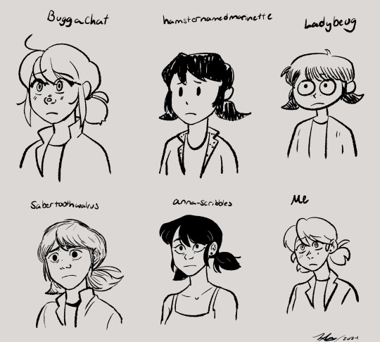
Drew a bunch of Marinettes in a bunch of different artists styles it was a lot of fun!!
Artists who's styles I mimicked: @buggachat @hamsternamedmarinette @ladybeug @sabertoothwalrus and @anna-scribbles all epic artists 🤟😎
#my art#marinette dupain cheng#miraculous ladybug#miraculous fanart#style mimic#sorry for the @s btw#yall should go follow those artists if you dont already also#this was sort of inspired by a post the three artists on the top row made#i think they all got together and drew with one another#which is really cool#but i was genuinely confused because i mimic styles a lot#and ive seen others do it too so i was just like#wow they really know each others styles really well#until i thought about it and read their posts some more#style mimicking is really freaking fun and i think its really good practice#and a good way to explore other ways of doing things#like you really have to learn new techniques and get out of your comfort zone#also anna scribbles i could not find a recent pic of marinette in her main outfit#so thats the only marinette i drew in different clothes cuz i couldnt find a more recent ref of you drawing it#anna scribble marinette has privileges thats the others dont#but ye#i also threw my own style in there as a frame of reference to what me draw like#ive drawn marinette before just not in a loooong while#sabertooth walrus was the hardest for me to mimic cuz they have a broad range in their style#so its like which sabertooth do i wanna be in this pic#Buggachat has such a distinct style thats very clean and consistent which is amazing so they were easy#being easy or hard arent bad things either it also has to do with like styles meeting up with one another#buggachats and mine arent too too different in some shapes and aspects#so yeah itd be easier plus they drew marinette like 3 sec ago so i have more recent of a ref#as opposed to sabertooth who i have a recent ref of ladybug but not marinette so we got two diff styles in one
3K notes
·
View notes
Text
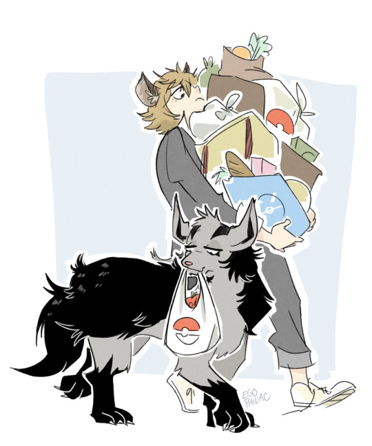
couple more of the pokemon crossover! Mightyena for Ruggie (someone suggested a shiny because of the colors, which I did originally do...but I ended up liking the look of the darker colors with him better? all the browns were like...TOO much somehow) and Rockruff + Maractus for Jack (ultimately went with Maractus over Cacnea because I feel like it's a more decorative plant-type cactus, but I also kind of want Jack to just have a very round pokemon. the decisions -- the decisions are just too hard sometimes 😭)
#art#twisted wonderland#pokemon#'i'm only doing one or two per character because that'll make it easier :)'#whoops now it's impossible to narrow it down#good job me#(rockruff becomes a midday lycanroc)#poketwst
5K notes
·
View notes
Text

i miss them a little if im gonna be honest
#mp100#mob psycho 100#kageyama shigeo#kageyama ritsu#hanazawa teruki#tome kurata#tsubomi takane#shou suzuki#deliart#i meant for the image to be like. after the end but i also didnt think about the hairstyle changes. sorry......#also i know i was like shou 100% has dwarf hamsters since he got 2 but u know what i dont care. golden hamster stan for life#im planning on getting one i've been checking out breeders near me so i can get a proper healthy one. there are so many good ones here too#i already am thinking on what color im gonna go for..getting picky even. something like offwhite.. silver pearl.. silver dove.. silver mink#jurys still out on wether im gonna get another female or not#i do love how big ladies get and their intense energy and work ethic. truly the most passionate creatures i've ever come across. inspiring.#but a lazy fluffy guy that just sits around and washes his balls all day does seem easier. less likely to climb my curtains.#i got distracted i love hamsters so much. look at my mop drawing now everyone
3K notes
·
View notes
Text


it's national draw your sibling day
#id in alt text#avatar the last airbender#atla#katara#sokka#katara&sokka#art#mart#oldergaang#portraitgaang#i like to think they get less antagonistic once theyre in their twenties#i also firmly believe w every fibre of my soul that sokka improves his art#(and im coming for anyone who says otherwise in the comments of this post with hammers. jsyk)#also drawing w charcoal is way easier than ink painting. so maybe he realizes that too#also apologies if i butchered the spelling of katara's name i was just working w the wiki but . if its bad u can say its intentional#bc sokka is stupid or whatever idk 😭#anyway. this ACTUALLY started bc i was thinking about how we never actually see katara draw#but i just KNOW that she would have the most anime art style#dont ask me how i know these things ok i just do#so this whole thing was just an excuse to showcase that . lmao#i worked so hard on this tho. pls clap
3K notes
·
View notes
Text
After months of research and development and market testing and perfecting the first item I feel confident selling online, I have realized... that it is an incredibly niche item that only a specific subset of absolute nerds would want to buy, and I will have to do a ton of explaining the basic idea over and over again before people generally get what it is I'm even selling. RIP me
#this is like the time I spraypainted a bunch of screw heads gold#because I was putting up gold spraypainted shelf brackets and wanted these black screws to not stand out#and to make it easier I took a piece of thin cardboard and cut a series of Xes in it#then pushed the screws in a little bit and positioned it over the gap between boards on the back deck#and used my hammer to just plonk those screws into place so I could spraypaint them!#i felt so clever I posted a video of it#(gold spraypaint makes me feel giddy and childlike)#and everyone was like#“GIRL NO YOU CAN'T DO THAT DON'T TRY TO *HAMMER* YOUR *SCREWS* INTO A DECK!”#it took like. so much work to try to explain to people why this was a problem I wanted to solve#much less the mechanism by which i solved it#my brain is just. HIGHLY WEIRD SOMETIMES
6K notes
·
View notes
Text
do i have to post an in-depth tutorial on how i make my frappes at home if it'll get people to stop going to fucking starbucks
#ramble#boycotting is not hard!!!! it says nothing other than you're a selfish fucking arsehole!!!!!!!#people are dying i don't care if you miss your $12 milkshake#'it's annoying' half of a fucking country is dead#anyway it's so much easier than you think and saves you SO much money#also better for me with ibs because i know exactly what's going into it#i will do this if you want i just have to wait for my new frappe base to arrive bc i've run out
2K notes
·
View notes
Text
I know it's a comedy manga, but the ww manga probably has one of my favorite manga interpretations of Link. Mainly because he feels accurate to his games. He's quiet, he can talk, but he mostly just communicates his thoughts through his actions and body language. He's also just a silly little guy.


#wind waker#loz ww#the legend of zelda#my favorite autism creature#this isnt any shade towards the other manga links it's hard making a whole character out of a silent protagonist and its def a lot easier i#this style of manga#i mean i love the fs manga#this is just the only one for me that nails his character on the head especially for this iteration#i look at him and go “yeah thats link in the game”#theres a part where Medli is waiting for Link to come over as part of the main quest and you just know hes goofing off#hes probably doing the mail minigame
5K notes
·
View notes
Text
I think 90% of my gripes with how modern anime looks comes down to flat color design/palettes.
Non-cohesive, washed-out color palettes can destroy lineart quality. I see this all the time when comparing an anime's lineart/layout to its colored/post-processed final product and it's heartbreaking. Compare this pre-color vs. final frame from Dungeon Meshi's OP.


So much sharpness and detail and weight gets washed out and flattened by 'meh' color design. I LOVE the flow and thickness and shadows in the fabrics on the left. The white against pastel really brings it out. Check out all the detail in their hair, the highlights in Rin's, the different hues to denote hair color, the blue tint in the clothes' shadows, and how all of that just gets... lost. It works, but it's not particularly good and does a disservice to the line-artist.
I'm using Dungeon Meshi as an example not because it's bad, I'm just especially disappointed because this is Studio Trigger we're talking about. The character animation is fantastic, but the color design is usually much more exciting. We're not seeing Trigger at their full potential, so I'm focusing on them.
Here's a very quick and messy color correct. Not meant to be taken seriously, just to provide comparison to see why colors can feel "washed out." Top is edit, bottom is original.
You can really see how desaturated and "white fluorescent lighting" the original color palettes are.
[Remember: the easiest way to make your colors more lively is to choose a warm or cool tint. From there, you can play around with bringing out complementary colors for a cohesive palette (I warmed Marcille's skintone and hair but made sure to bring out her deep blue clothes). Avoid using too many blend mode layers; hand-picking colors will really help you build your innate color sense and find a color style. Try using saturated colors in unexpected places! If you're coloring a night scene, try using deep blues or greens or magentas. You see these deep colors used all the time in older anime because they couldn't rely on a lightness scale to make colors darker, they had to use darker paints with specific hues. Don't overthink it, simpler is better!]
#not art#dungeon meshi#rant#i'm someone who can get obsessive over colors in my own art#will stare at the screen adjusting hues/saturation for hours#luckily i've gotten faster at color picking#but yeah modern anime's color design is saddening to me. the general trend leans towards white/grey desaturated palettes#simply because they're easier to pick digitally#this is not the colorists fault mind you. the anime industry's problems are also labor problems. artists are severely underpaid#and overworked. colorists literally aren't paid enough to do their best#there isn't a “creative drought” in the anime industry. this trend is widespread across studios purely BECAUSE it's not up to individuals#until work conditions improve anime will unfortunately continue to miss its fullest potential visually#don't even GET ME STARTED ON THE USE OF POST-PROCESSING FILTERS AND LIGHTING IN ANIME THOUGH#SOMEONE HOLD ME BACK. I HATE LENS FLARES I HATE GRADIENT SHADING I HATE CHROMATIC ABBERATION AND BLUR
2K notes
·
View notes
Text
I know some dickheads have now decided that Judaism is the "bad, violent, terrorist religion" and Islam is the "good, peaceful" one, which is only to be expected of white people, but how much of an issue is it currently? Like I've seen some USAmericans sharing how the Islamic faith shapes Gazans values and perseverance (good) except with that distinct white hippie "I'm about to imprint on this like the world's most racist duck" vibe (bad), but I didn't think they're already turning on Judaism in numbers.
Do they realize that Christianity is also the same kind of comfort to Christian minorities in Asia and Africa? That it was Buddhists that genocided the Rohingyas in Myanmar and Tamils in Sri Lanka? That Hindu fundamentalists are even now trying to ethnically cleanse Muslims in India? How Hindus and Christians are terrorized and persecuted in Pakistan? That Muslims have a history of persecuting and ethnically cleansing Jews too?
Really tired of asking y'all to be normal about people's religions man. There's no religion that's inherently violent or exceptionally peaceful. It's just like any other ideology that becomes a weapon in the hands of ethnic power. Interrogate power, not religion, and respect people's belief systems insofar as they aren't in your business.
Edit: I've amended the "long history" of Muslim persecution of Jews because it might be misleading in the current political climate. Zionism and antisemitic Arab nationalism are twin births resulting directly from Christian colonization, and Islamic empires tended to actually be more tolerant of other religions compared to Christianity, especially Judaism, which was considered a sibling religion. Antisemitism wasn't ideologically entrenched in Islamic tradition. It's simply that ethno-religious power will lead to ethno religious domination and intermittent cleansing of minorities, and Islam is no exception. Humans be humaning always.
#Edit: please boost the edit#why can't white people just be fuckin normal for once#tbh this site was so weird about Judaism that it felt almost culty#I had several crises about whether I was being antisemitic before I realized no I'm just reacting to the idealization-demonization binary#that seems to be all western leftists know how to do#white queers are the worst about this#and now some of the asks I've been getting gives me the impression that the west thinks ''Islamist'' is some kind of dangerous cryptid#y'all attach insane levels of importance to people's choice of headgear#the only common denominator of all the Muslims I know is their fixation on biriyani idk#a lot of white lefties just want to use religion to distance yourself from your white privilege#same reason as why communism is so attractive to you#y'all want to share in a legacy of oppression because it's easier than self-reflection and unlearning#antisemitism#anti Zionism#Islamphobia#philosemitism#white queers#western leftists#racism#religious fundamentalism#genocide#religious violence#knee of huss
2K notes
·
View notes
Text
i keep thinking about hobbies and how i often spill over myself to pick up new ones. i have adhd, i end up trying something for like a month and then just getting far enough in it that i move on, satisfied.
and that should be fine; but it's never fine.
i am a pretty decent artist; but i can't just make art for my dnd campaign, i should be selling dnd maps and character designs and scene setting pieces. i can't just make my friends matching earrings, i need to get an etsy and ship them internationally and take bulk orders. i make pretty good props and decorations and use them to throw my friends parties - but i should be running a party planning business and start taking paying clients and networking and putting my skills to actual use.
for some reason, i never figured out the specifics of pottery. it was a fun class and i enjoyed myself - and still, i'm embarrassed, years later, that i put in all that useless effort. everything i make has to be stunning. stellar. i should have applied myself more. maybe i'm too lazy. maybe i'm broken and selfish and needy. actually creative people would have kept going; they would be bettering themselves at every possible opportunity.
we find ourselves in this trap, even accidentally: we need to commodify our time, because it is a commodity. if we spend our efforts and our time not earning, isn't that the same thing as burning free money? and god forbid you ever take up a hobby that ends up being more expensive than you thought. you sit in your car and you look at the receipt and in your head you hear a conversation that isn't even happening - your mom or your friend or your partner all saying oh great. not this shit again. it's always something with you, and it never actually means anything.
i have realized this horrible thing, recently - i'll get excited to start a project, pick up a new hobby. and then i just... stop myself. i start thinking about the amount of time it will take, and how it'll look in my monthly budget. what if i can't even produce a good enough final product. sure, it's exciting to think about how i could make my friend her own custom dice. but i'm just polluting the earth if i don't get it right. better not bother. better not try.
restless, i get caught in the negative space. the feeling that oh god, i want to create. and that horrible sense - yeah, but i don't have the time to just put to waste.
#hobbies#writeblr#what stage of weirdness to write about hobbies on my hobby writing blog#although i know OBJECTIVELY i am a creative person#i often forget to label myself that bc i don't feel im an ARTISTIC person bc i don't do anything like that professionally#writing doesn't even feel like a hobby i think that surprises nobody for me to be like#it would be easier for me to stop . like. breathing.#which feels cheesy and trite but listen im running late for a meeting and all i really want to say is like#i couldn't even consider writing my hobby bc it makes my skin crawl bc it makes it sound like it's not important to me#bc we really devalue hobbies. like entirely.#it HAS to be a job. it must#also idk if this is clear but i personally get stuck in this space where i CANT create bc i am putting so much pressure on myself#to make it RIGHT#and im like ... idk i only have an hour#so probably shouldnt get involved in this thing
5K notes
·
View notes
Text
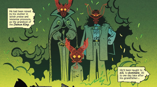
The Boy Wonder #1 by Juni Ba rambling about why every time i open this book, i stare in wonder...HAHA and ofc!! how cute Damian is!!
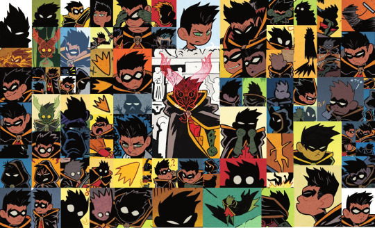
Juni Ba’s style is so absurdly effective in telling a fairy tale for the ages. It’s a stunning blend of simplicity and complexity I'M GRIPPING THE PAGES AGAINST MY EYES…
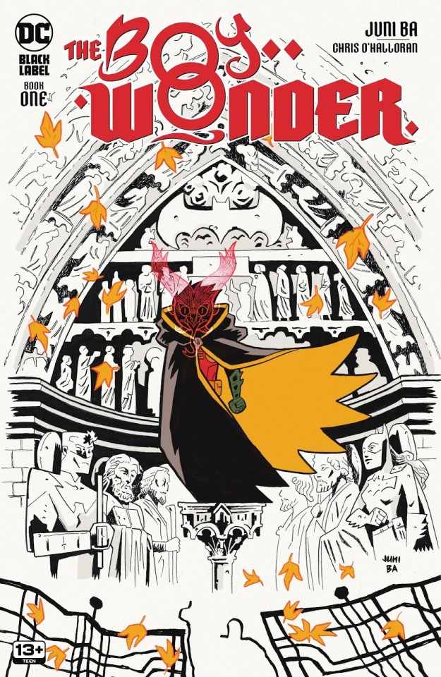
Before getting into the interiors, THE COVER!! It associates autumn leaves to Damian's Robin title through the iconic cape shape/color; and on top of that, for a Robin going through a big transition in his life...a season of change one might say...Juni Ba your brain...
Damian and the leaves being the only colored parts of this cover is nice in focusing on those elements, but i also like to think by not coloring the background it prepares you to expect impressive inkwork in this book.
On that note, the interiors!! Starting off with Ba's backgrounds of Gotham as it establishes the strange new world that our young hero has been thrust into:
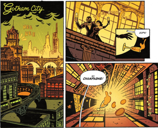
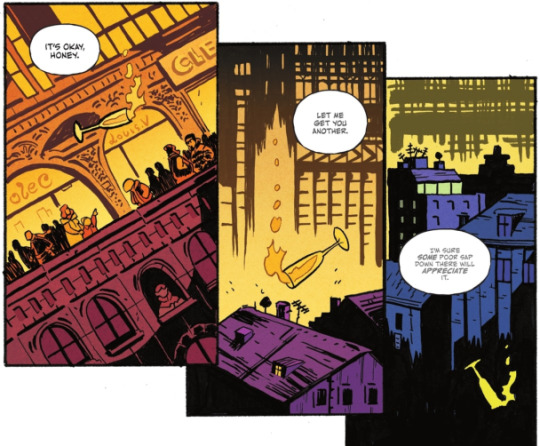
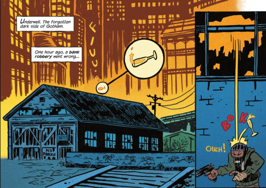
We get a neat tracking shot following a champagne glass that gives us a glimpse of Gotham from the upper echelons to the downtrodden in "Underwell"
This opening sequence quickly lays out the environment Damian will be traveling through in this series! It also sets the tone for some silliness with the cute zoom on the champagne glass before it BOKs the robber lol. Along with Ba's inks, O'Halloran's colors makes every part of Gotham pop - especially love the golds of the higher society shifting into the blues of the underbelly!!
Besides Damian’s personal conflict, Gotham feels like its own entity that he has to contend with. The dialogue speaks for itself, but within the art as well!!
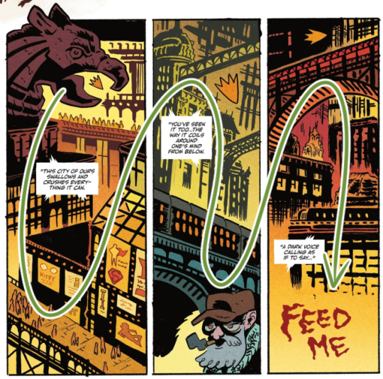
"This city of ours swallows and crushes everything it can" -> a gargoyle's beak over Damian, crowds of people, and walls of advertising
"You've seen it too...the way it coils around one's mind from below." -> bridges and a passing train on a rail viaduct towering over a civilian
"A dark voice calling as if to say..." -> literally, "FEED ME"
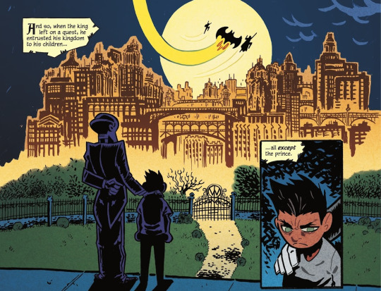
LOVELY SHOT OF MOVEMENT... and i love how Damian's venture into Gotham opens with him passing a tree - its branches and leaves are the most organic element on the page before getting into the gritty details of the city! Some yammering because the inks are. so cool: the delicate lines of the leaves in the tree to the thicker/bigger lined ones closer to the camera on the right; the background inks allowing space around Damian's form + the fine line of his grapple!! More O'Halloran praise - PRETTY, and love his coloring over Ba's bg lines, particularly here, keeping the leaves darker on the right.
It's not only a pretty page it's just a really clean layout!! Ba exhibits this throughout the book but i really enjoy it here - from Damian nyooming, we head into these last 3 panels. his cute lil "Robin" shape easily draws the eye to the tops of the panels as we take in Gotham's liveliness alongside the lettering/narration
and the "Robin" shape?? SO CUTE. it's instantly familiar to us as Robin!! bold outline and filled with yellow...it's a Robin in movement!!...AN AUTUMN LEAF IN THE WIND... yeah, still not over that 😭
Damian's inciting incident is introduced in the former panel with a gorgeous backdrop of Gotham in the distance (plus itty bitty Trinity cameo haha). The shot parallels!! beautifully!! in the final page!! Damian is now in the depths of Gotham, his objective out of reach. The colors are of note too, where the familiar yellows of Gotham are suddenly a startling green after the demon makes its appearance. The Gotham land looks even more unfamiliar, which prompts Damian to seek help.
Some speculation, but the green could also be associated with the more mythical side of demons and such (like the ghost?? of the thief), but it could even imply there's a connection to the Al Ghuls themselves as it's the only other time green is so prominently used.
Now that the land of Gotham is established, popping in other fav bgs!
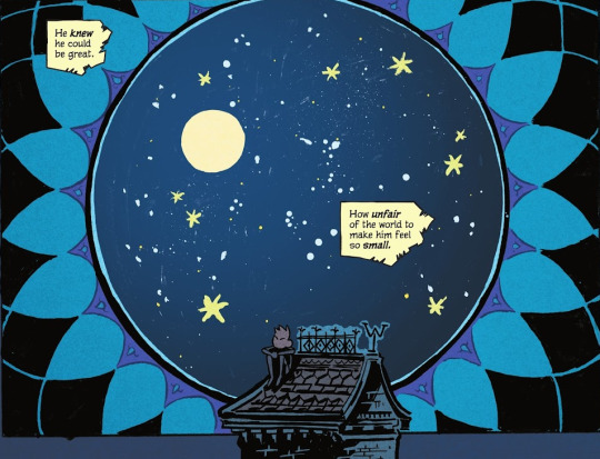
More lovely mix of Ba's inks and O'Halloran's colors!! especially allowing some of the brush/marker strokes to show faintly as part of the twinkling sky...STUNNING!! 😭 i love this whole page but this panel gets me weepy, SMALL DAMIAN IN THE VAST UNIVERSE COMBINED WITH THIS LINE "He knew he could be great. How unfair of the world to make him feel so small." KICKS MY ASS... i need to lie down
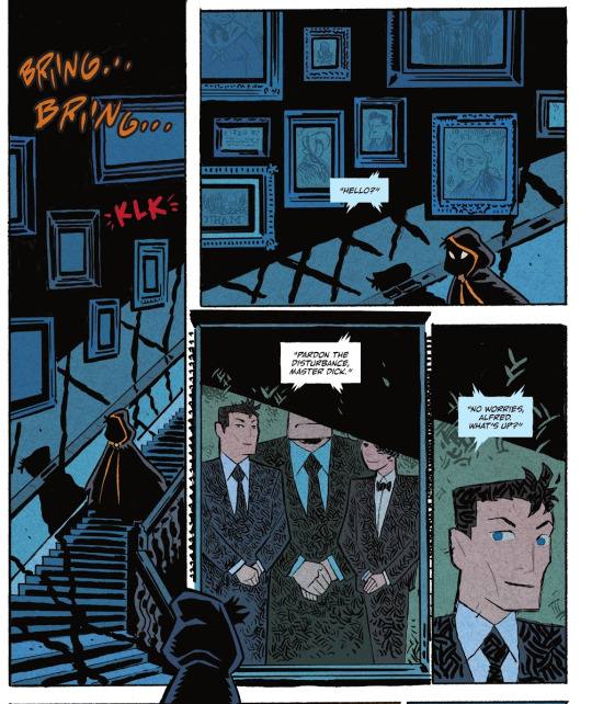
YAPPING AT MORE WONDERFUL INKING: the suggestion of windows offscreen from the frames casting these thick lines over the walls and stairwell; the minute shadow details over the railing; the hatching on the suits in the portrait; the framed portrait being its own panel!! cute hooded Damian in the gutter space looking in on the portrait/panel!! CUTE HOODED DAMIANS!!
SPEAKING OF PANELS, along with general effectiveness and efficiency, there's more whimsy in others!! like this kickass page of Nightwing whipping his escrima from first panel -> afterimage lines going POWPOWPOW hitting demons from a distance to ones closer to the camera -> and back into his hand!! IT'S SO GOOD AND SO FUN!!
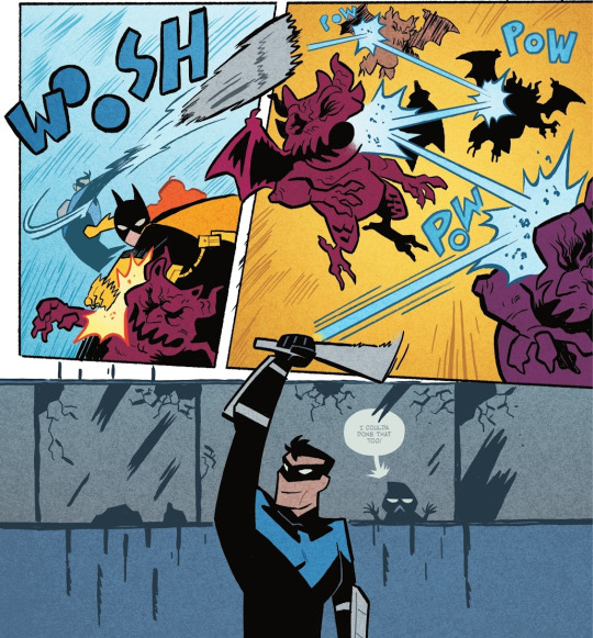
Ba's action employs more diagonal panels, and characters are less restrained within boxes - there's more energy and freedom across the page!
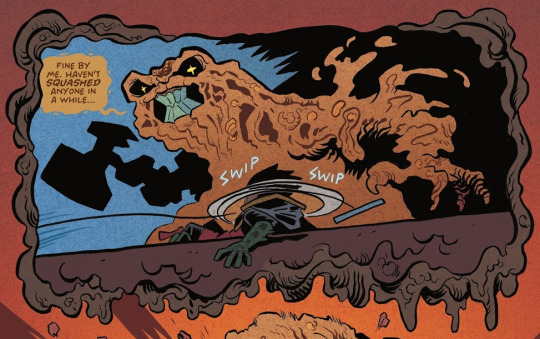
not necessarily focusing on the action for this one, but THE WHIMSY!! the border itself is goop!! Also gotta point out that looming hammer shape!!
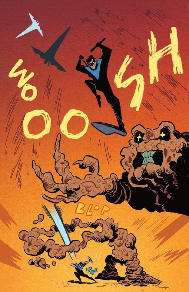
Nightwing's critical hit spans the entire page!! from silhouettes of a flip -> flashy stomping pose/Clayface -> to a distant shot of Dick landing
and a smooth finisher page!! love the motion lines on Dick's arms and waist + his head and arc effects popping outside of the borders; then the smaller panels for quick activity, and the final WOOB WOOB WOOB LOL i can hear this sound effect just as much as i can see it
Along with O'Halloran on colors, Aditya Bidikar on lettering works seamlessly with Ba's vision!! The text boxes for the fairy tale narration are like strips of yellowing pages from an old storybook!! Had to look up the term for this lol, but also reminiscent of those storybooks, there's even a use of "drop caps" - the big fancy capital letter!
Smaller things of note, but the bit of "Weakness" text from Ra's has a kind of. grandiose feel to it. Then the cute B< Damian behind the window!! Love how the bubble and text are faded behind the glass too! The end of the bubble tail is a nice touch as it matches well with Ba's bg inking :0
Otherwise, it seems Ba has done a majority of the lettering - dropping a couple of my favs below!!
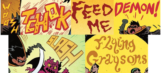
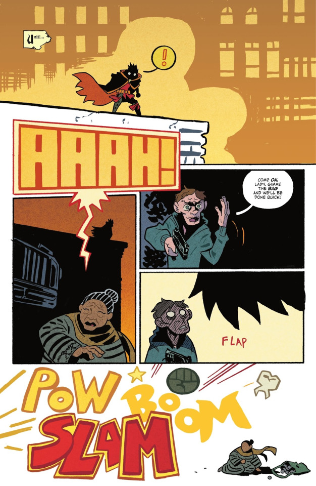
also just this whole page: the very loud AAAH! text draws both Damian's and the reader's attention to the panel below!! it's a cool transition to a new shot where you can see Damian's silhouette on the building! The final panel is cartoony violence off-page through the bold POW BOOM SLAM haha + DAMIAN'S LIL FIST!!🥺 and the guy's tooth RIP
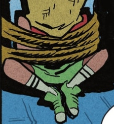
Pure speculation - Juni Ba's concept art included Carrie Kelley, so i'm wondering if the hostage in the beginning could be her and we'll be returning to this moment in time by the end. The worn Robin colors are similar to the design + their head is conveniently covered.
In terms of story, I'm obviously heavily biased, but the initial read got me rolling in emotions with how it has you caring for Damian. Damian as a character is so fantastical in essence - it’s part of his individual charm in the batfam cast! an heir of two kingdoms, born and raised with great expectations suddenly thrust into an unfamiliar land. he has a sword. he has a dragon bat for a companion. he is haunted by the sins he has committed. he is two apples tall. he's truly fairytale material!!
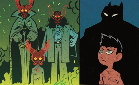
LIKE...past the panels of only his silhouettes, this is our introductory appearances of Damian. It's laid out clearly in the narration, but this parallel is SO GOOD: from the powerful and ornate visuals of Damian and the Al Ghuls -> to a simple panel of Batman's shadow behind a boy littered in scars, stripped of his home and status
Damian is out of his element and proves himself in the way he knows how!!
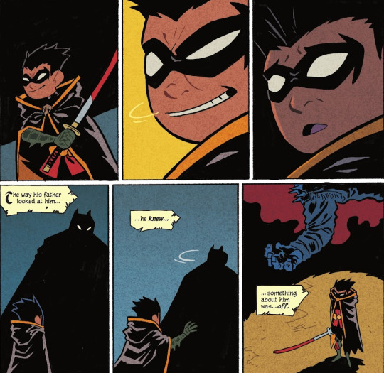
just kick me down a flight of stairs why don't you. i don't know which messes me up more, the top 3 or bottom 3 panels. His facial expressions!! his expectations for approval dashed!! Damian's hand reaching for his father!! only to be left alone with the body. The page after this is the final nail in the coffin in feeling just how lost he is in the world before he acts on it. And you root for him the entire way!!😭
Despite Damian's fanciful background there's so much heart to be shown in his struggles and discoveries - and this classic form of a fairy tale lays it out so brilliantly!! It's shaping up to be an amazing balance of heavier elements and whimsy based on this first issue, and it leaves you wanting more!!
Besides being a thoroughly enjoyable read, it's inspiring work!! i've ordered Juni Ba's other books to consume more of his storytelling, and here's the ones i've found so far if you're interested in checking them out as well!!
Mobilis: My Life with Captain Nemo
Monkey Meat
Djeliya: A West African Fantasy Epic
The Unlikely Story of Felix and Macabber
okay shockingly, i didn't blab about how cute Damian is as much as i thought i would, but i think the collage at the top speaks for itself lol
this is all you need to know how cute Damian is in this!! his cheeks are so pinchable, it was done on page!! 🥺 these panels obliterate me
#rambling#damian wayne#it's been 2 weeks since this issue came out and i'm still cracking it open every other day#throwing my chattering into his tag to possibly get more people into the series especially if you're a fan of Damian!!#i even used capitalization for slightly easier reading LOLL#the Damian collage was taking so long i was laughing how i'm taking more time to do that than the actual ramble#then i started rambling and then i realized i couldn't shut up sdfgh#feel like i sound delusional most of the time so these are maybe my most coherent thoughts LOL#pointing at pages over my brother's shoulder 'love that...so cool...look how pretty that is...' articulating WHY makes me sound insane😭#the boy wonder
484 notes
·
View notes
Text

"Hair dyes or perms or just a quick snip, you can always count on your ol' pal Clip!"
it's about time i officially shared my design for Clip from my hairdresser au! here's the silly boi himself!
a.k.a. the most complicated character i've ever designed...
close ups and additional comments under the cut!
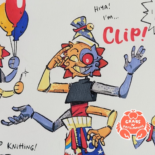
that's my boi, despite his crazy design, i love him. his silly top knot hat, the horn-like points around his faceplate, his speckled colours, his four arms, and his funky pants. he's just soooooo fun.
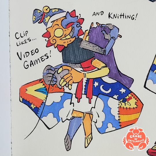
Clip likes to play games and knit! he even made the patchwork pants he wears (he made Sun and Moon a pair too, but they're too precious for them to wear... also a little gaudy to wear in public—doesn't stop Clip tho!). He actually makes everything the boys wear, since there's not a lot of things in their size/shape.
instead of resting at night, he can be found in their living room, playing Kirby 64 for the nth time and/or knitting something. he's just too restless to stay still, he's always gotta be doing something and if it isn't gaming, knitting, or hairdressing, then he's up to No GoodTM.
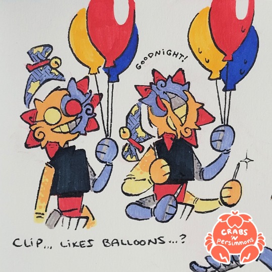
Clip... likes popping balloons. he says "Goodnight!" with each popped balloon and once he's done, he tosses up the scraps like confetti all while giggling joyfully.
needless to say, he is not fun at parties. Sun and Moon don't let him near balloons for this reason.
and yes, he has sewing needles on hand at all times. for fashion emergencies... and for unsuspecting balloons.
Clip's not allowed to have a phone (just imagine all the in-app purchases Sun and Moon would have to deal with), but he likes to keep up with his customers and their games, even if he doesn't get their fixation over bluenets he'll never openly admit it but he prefers curly-haired blond hunks that look sweet in soft pastels but could also squash him like the spider he is
also, he's great at microbraiding! though i imagine if Sun and Moon are free, they'd come help to shorten the wait but also to compete and see who braids the most (Clip always wins of course—make anything into a game, and he's winning)
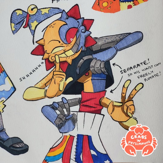
aaaaand there's this! i wanted to make sure Clip would be able to freely rotate his waist so his arms could have their full range of motion, and this was the solution i came up with: a crop top on top and a wrap around his waist. and Clip here is being a sneaky little scamp about it.
#fnaf eclipse#fnaf dca#dca fandom#fnaf oc#Clip New Do Same You AU#New Do Same You AU#“but crabs YOU designed him you could have made him easier for you to draw”#but everything is just SO FUN and/or lore-relevant!#like the points around his faceplate give me oni vibes i love it#i hate drawing so many hands but man he's just so silly and he needs every last one#and HIS PANTS#LOOK ME IN THE EYE AND TELL ME THE DCA WOULDN'T WEAR PATCHWORK PANTS IF THEY COULD#legit the pants were a major breakthrough in his design#he's just a silly guy#honestly i have been on a bit of an artblock lately#and maybe drawing Clip wasn't the best way to ease myself out of it#but it worked i think?#i dunno just been overthinking things a lot lately#that's kinda why i've been quiet again on tumblr#i just need to let loose and just let myself have fun yknow?#like this sketch page has a lot of mistakes in it#but i tried not to dwell on those and kept moving forward#it doesn't need to be perfect it just needs to be#bright colours#cw bright colours#crab art#traditional art
887 notes
·
View notes
Text
#marble hornets#tim wright#timothy wright#tim mh#mh#...i couldnt think of a caption that wasnt just 'AAAAAAAAAAAAAAH'#anyways. can you tell my favorite entry is 65 :)#virgil arts#went back and forth on whether i wanted this to be day time like in the entry or not#still not 100% on that decision but whatever doing darkness is easier#and making a day time sky look overexposed like itd show up on camera is weirdly difficult for me#idk maybe ill do another couple of entry 65 drawings and actually try that out#also this was meant to be perspective + painting practice so if things look weird dw about it <3#its been so long since i did a full forced perspective drawing and i remember why i dont usually do it!
3K notes
·
View notes
Text
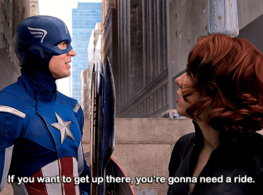
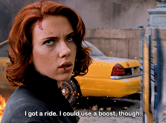
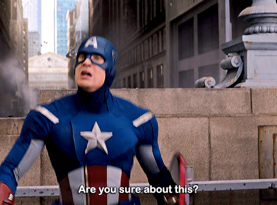
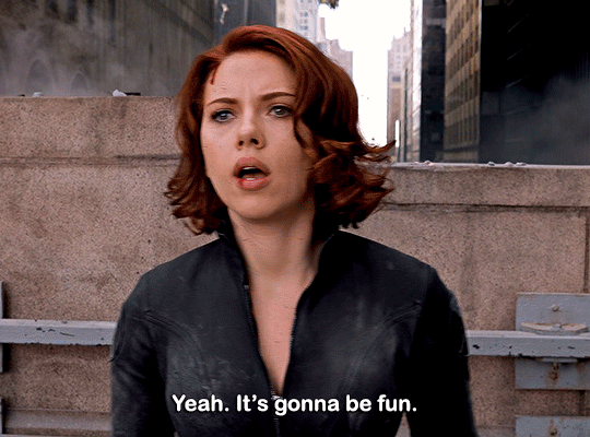
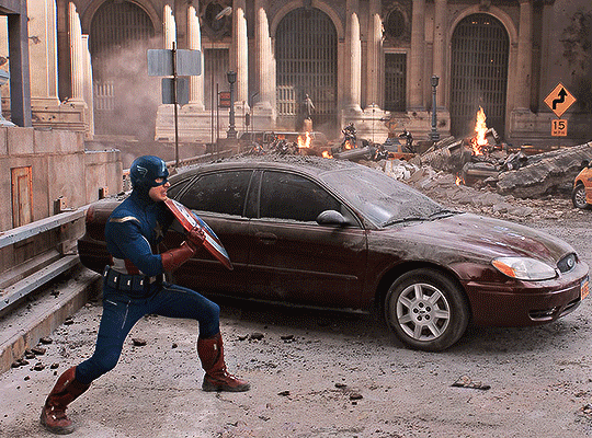
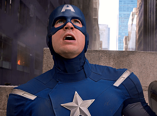
Steve Rogers & Natasha Romanoff
The Avengers (2012)
matching each others freak
#marveledit#dailymarvelgifs#steverogersedit#blackwidowedit#steve rogers#natasha romanoff#black widow#captain america#the avengers#my gifs#another one baby#this came along a lot easier and faster#helps that it was all one scene so i could do basically the same coloring and stuff#anyways i love this scene it makes me fucking crazy#i love these two im so sad about what happened to them individually but also as a duo#they barely know each other at this point in the avengers but steve totally goes with her completely bonkers idea to hitch a ride on one#of the aliens?? like shes out of her mind#shes not enhanced or anything either the way steve is like yeah shes a badass and very capable but shes also very much human#but he doesnt argue with her at all he sees her throughline and is like well she wouldnt suggest it if she couldnt pull it off#and his like.... awestruck look as she zooms away...... i know he thinks shes so cool#i just love them i love nat and steve as friends i love their dynamic#i dont ship them romantically but like. i do get it
455 notes
·
View notes
Last Seen Blogs

deomartin1
Untitled
luckycchi
Lucky
the-stars-in-your-eyes-if
The Stars In Your Eyes
felitidae
JustIronyThings
ellaxpeters-blog
ella peters