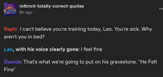
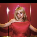
#bucket wanted me to redraw this
Text

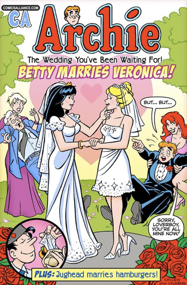
the wedding you've been waiting for!
#bucket wanted me to redraw this#my art#spider-man#comics#gwenmj#gwemj#mary jane watson#gwen stacy#peter parker#felicia hardy#flash thompson#harry osborn#aunt may
2K notes
·
View notes
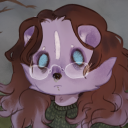
Text
soo I wanted to try my own Vanny/Vanessa design..
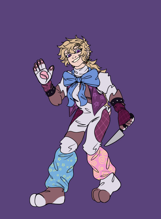

It was super fun! I wanna refine this design a bit and re-draw this as a render- I haven't done lineless in a while and I figure Vanny's a good design to attempt it with.
If you like this design be sure to check out @dykevanny ! Its design inspired me a lot with mine and I hope the two are different enough it's alright. If you want inspiration credit when I post this design in the future lmk
anyway time to ramble about this design
I saw some posts recently about enjoying when Vanny designs look similar to glamrocks to blend in and tbh I agree, but the more I thought about it I realize one of the reasons I enjoy it. If you look at the cast of SB her design sticks out soo much, which it's supposed to, for sure. But if she was following in Glitchtrap/William's footsteps and using the suit not just as a disguise but also to lure victims.. it'd be a lot more convincing to lure if she was more believable as just another character, yk?
If you can't tell I like the legwarmers on the glamrocks and wanted to give her some too lol.. plus I thought giving her a modified design of Glitchtrap's vest is a nice nod to his influence. Overall this design was really fun to work with, if you like Vanny and character design I encourage trying an attempt of your own lol.
This was a bit more lazy than what I'm used to so dw I'm gonna redraw this better lol, if you can't tell it's pretty visible when you look at the lineart, and up close you can tell I just used the bucket tool instead of fully coloring in the lines.
#fnaf sb#fnaf security breach#fnaf security breach fanart#fnaf sb vanny#fnaf vanny#vanny#fnaf vanessa#fnaf sb vanessa#my vanny design
93 notes
·
View notes
Note
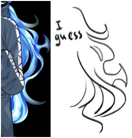
How do you draw Idia’s hair so good?? I struggle with the basic shapes so much!
Sorry for the late reply! Your ask got us excited because Idia’s hair is such a pain to draw, but also such a fun detail, and I’m very happy that you like the way I draw it <3
Katsu suggested to me to record a speedpaint, and uhh, here it is. Please, don’t mind the wonky anatomy and me horsing around with zooming in and out randomly. As you can see, I struggle with Idia’s hair myself and constantly redraw it until I’m satisfied or at least tired enough to say “eh, that’ll do”. In case you’re wondering, it took me ~25-30 minutes to do the hair, and the original video was 59 min long lol I always spend a lot of time moving, reshaping and redrawing details when I draw Idia…
youtube
I’ll also list some tips and thoughts about it based on the way I draw it…
The shape of Idia’s hair is not at all consistent. Even in Toboso’s art it looks slightly different sometimes, which makes sense, because Idia has magical fire hair and technically you could do whatever you want with it.
But some rules tend to apply each time. For example, even though Idia’s hair is long and seems naturally “heavy” because of it, the individual strands tend to be turned upwards, like fire would. Not every single one, but the shorter ones and the ones closer to Idia’s head tend to do so.
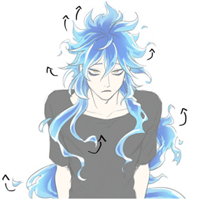
It’s wavy, but not too wavy. If the hair starts looking too “soft”, add sharp edges, random strands sticking out, rough shapes, etc.
Oh, and it’s important to remember that it floats. This means, it doesn’t just go straight down, it does this weird “S” shape. It’s also hella long, I always forget just how long Idia’s hair is. If the magic fire logic didn’t apply to it, it would reach the ground easily. The volume of his hair is much bigger than I tend to remember too: it's quite thick and luscious lol So please give him lots of hair!

Tiny little flames + “holes” in the main ehh body of hair (wow there must be a way to phrase it better) make everything look good and more believable. Have fun with it. You might’ve noticed, I draw and redraw and move them around a lot in my speedpaint.
Obviously, I am no expert, and every artist I know draws Idia’s hair a little bit differently. The speedpaint doesn’t show it, but I always have some of Toboso’s artworks of Idia open when I draw him, just to make sure his design is not too off. I would definitely recommend looking at refs while drawing Idia (or anyone), and maybe even trying to redraw the hair from Toboso’s artworks once or twice as a study, it’ll probably make it easier to understand how Idia’s hair works.
You haven’t asked about the colouring, but I love colouring Idia’s hair, so I’ll talk about it a little. Colouring Idia’s hair is simultaneously the most fun and the most tedious part of drawing him lol 15 minutes of my hour long video is just me filling Idia’s hair with the base blue colour with a lasso (I refuse to use a bucket tool…)

But once you’re done with the base, this is where the fun begins. Because at this stage you can be pretty rough, just add in darker and deeper blues near the middle/core(?) of the hair mass. It doesn’t have to be very even or pretty, add some smaller dark spots; we personally really love it when Idia has this round little blob on his bangs. In the video you can see that I added it later on because I forgot about it lol
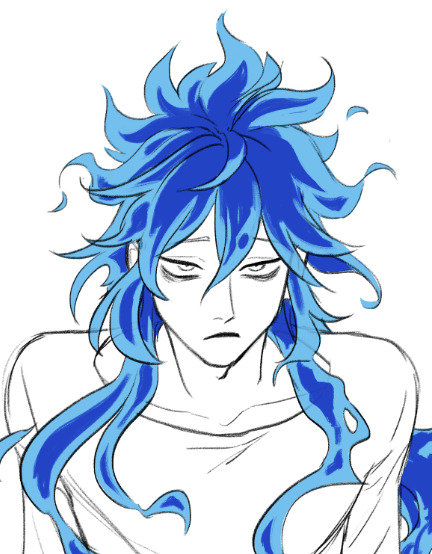
After the dark part is done, erase the ends of it a little bit with a soft brush. Not too much, we should still be able to see the shapes.
Then, on a separate layer set on overlay mode, with the same soft brush add some additional brighter spots, to make the hair look glowy. I used the same light blue as the base colour, and the overlay gives it a pretty hue.

And finally, add some white highlights at the ends of the strands. This is the stage when everything stops looking wrong and weird and starts looking like Idia, at least to me.
Phew, I think this is everything I wanted to say… I hope it was at least somewhat helpful.
Sorry for the long post, I just love talking about the drawing process. And about Idia too!
Once again, thank you for your kind words; I’m very happy that you like my art.
Have a good day!
265 notes
·
View notes
Text
It took me a minute to finally get my notes straight so I could answer this— I hope it was worth the wait! I’ll give some bullet points of tips I use to help boost my production speed in addition to the strategies I use to try to keep characters consistent. Let’s get into it!

First up: How I draw faster!
Note that these mostly apply to digital art, as that’s my preferred medium.
If your art program has them, experiment with brush stabilization levels. My hands shake really bad, especially while I’m drawing, so I put a lot of effort into finding a stabilizer level that works with my need to control lines while also smoothing out the tremors in my hands. It’s made it so much easier to draw lines like I want to, and therefore lets me move on instead of redrawing the same line over and over again.
Creating templates for your art helps so much— setting up things like canvas size, color profile, DPI, background colors and images like the paper texture PNGs that I love to use ahead of time helps me get drawing faster, while I’m excited and inspired! Similarly, having a naming system for your art files is useful for speed as well as finding and organizing old pieces easier.
Having premade color palettes of local colors for characters is also super helpful for speed, as well as keeping characters on model :>
Personally, I use a single brush for lineart and rely on the selection tool and bucket fill for coloring when I actually bother to color things in. My lines are pretty loose nowadays, and the same goes for when I color things— I don't abide exactly by the lineart I draw, and get pretty messy with the selection tool and bucket fill!
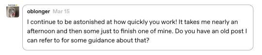
I simplify character designs as much as possible— the standard design of a sigilyph, for example, is pretty complex. But I made Sen a lot simpler (and also forgot the spikes on her torso in this panel. Oops)
As for keeping characters on-model…
I’m very flattered that you feel otherwise, but I actually don't keep characters very on-model between different drawings— just look at the different ways I've drawn Ark below— however, I'm improving over time as I become more familiar with how I want to draw the characters! A big part of my process of keeping characters on model is drawing characters over and over to familiarize myself with how they should look through trial and error.

Learning common angles and poses I will draw characters in is very helpful for making sure they look consistent. As a bit of a downside, though, it makes wonkier angles stick out like a sore thumb! Drawing Ark with his head slightly angled downward was really hard, and I don't think I communicated it that well here:
I try to have the characters broken down into as many simple shapes that fit into each other as I possibly can, like Twig’s head (circle + rectangle snout + angled rectangle horn) Ark's hair (that weird bangs shape) and Dusknoir's upper body (beanbag shape / slightly elongated circle torso, arms coming out of his frill that comes in a very particular arcing line). This makes it way easier to draw characters quickly and consistently, because I can learn those lines and shapes and get the motion of drawing them into muscle memory.

Also, knowing the ways characters emote is like knowing cheat codes. Giving characters things like a signature comedic expression of shock or grin that they make when they're happy are very helpful!
The biggest tip I can give on the topic of keeping characters on-model (at least without model sheets— model sheets are THE way to go. Don’t be like Sofie and neglect those pieces of gold) is really just to practice. Build up familiarity with the shapes and proportions of characters, get a feel for how your hand and wrist moves to get the lines right.

#creativity tips with sofie#art tips#drawing tips#drawing advice#art advice#stuff by sofie#sofie answers asks#(kinda)
19 notes
·
View notes
Text
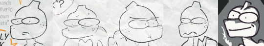
Cyberchase Comics: The Great Cyber-skate by Ron Barrett
Here is the first of a group of three one-shot Cyberchase comics produced by Ron Barrett for the pbskids.org website sometime in 2011. They were placed under the "activites" section, but they have since been removed. I will transcribe the dialog.

The Hacker: This museum is all about me! I love it!
Caption #1: Buzz ironing my lovely cape
Caption #2: Generous me giving toys to Delete
The Hacker: Only one thing is missing...
The Hacker: A pedestal for my statue!
Buzz: Hey boss, look! There's a skateboard contest on Radopolis!
Cyber News: Trophy to be awarded to winner
The Hacker: That's it! The perfect pedestal! I'm going to win that trophy
Buzz: Too late! Entries are closed. Besides, you don't own a skateboard and you don't know how to skate.
The Hacker: FEH! I never let ignorance stop me!
The Hacker: I'll put together the ironing board and bunnies...
The Hacker: Presto! - A skateboard!
The Hacker: OOOOPS!
Narration: On Radopolis...
Jackie: Ouch! I hit my thumb!
Slider: Let me take a look at that.
Nezzie: Oh Slider, you did a terrific job designing this skateboard challenge.
Matt: Hey, guys! Can we finish building it?
Matt: Why do I suddenly feel invisible?
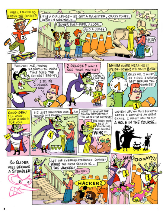
Slider: Well, I'm off to enter the contest!
Jackie: It is a challenge - It's got a banister, crazy cones, broken sidewalk...
Inez: Sewer half-pipe, a loop...
Matt: and a judge.
King Dudicus: Judge Dude.
The Hacker: Pardon me, young Radopolite, what time does the contest begin?
Young Radopolite: 2:30, its 2 O'clock now.
The Hacker: 2 O'Clock? May i see your watch?
Young Radopolite: Sure, mister.
The Hacker: Ah-ha! You're wearing it upside-down! It's only 8:30!
Young Radopolite: Silly me. I must be tired. I should rest before the contest.
The Hacker: Good idea! I'll hold your number for you.
Young Radopolite: Thanks.
The Hacker: He just dropped out. I am taking his place.
King Dudicus: You, dude?
The Hacker: Want to give me the trophy now or wait 'til after the contest?
King Dudicus: The dude who's best at finishing the course wins it.
The Hacker: Listen up, you bolts buckets - after I complete my great skate, I want you to cut a hole on the course...
The Hacker: So Slider will become a stumbler!
King Dudicus: Let the cyberskateboard contest begin! The first skater is... The Hacker!
King Dudicus: Go dude!
Jackie, Inez, and Matt: Hacker?
The Hacker: Whooooayy!!
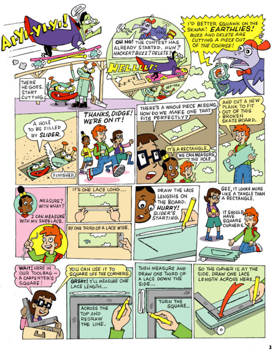
The Hacker: Ai-yi-yi-yi!
Buzz: There he goes. Start cutting.
Digit: Oh no! The contest has already started. Huh? Hacker? Buzz? Delete?
The Hacker: HELLLLP!
Buzz: Heh-heh
Digit: I'd better squawk on the Sqwak! Earthlies! Buzz and Delete are cutting a piece out of the course!
Buzz: A hole to be filled by Slider.
Delete: Finished.
Jackie, Inez, and Matt: Thanks Didge! We're on it!
Inez: There's a whole piece missing. How do we make one that fits perfectly?
Jackie: It's a rectangle.
Matt: We can measure the hole...
Matt: and cut a new plank to fit out of this broken skateboard.
Jackie: measure with what?
Matt: I can measure with my shoelace.
Matt: It's one lace long...
Matt: by one third of a lace wide.
Jackie: Draw the lace lengths on the board. Hurry! Slider's starting.
Inez: Gee, it looks more like a tangle than a rectangle.
Matt: It should have square corners.
Inez: Wait! Here in our toolbag - A carpenter's square!
Inez: You can use it to square off the corners.
Matt: Great! I'll measure one lace length...
Matt: across the top and redraw the line.
Matt: Then measure and draw one third of a lace down the side...
Matt: turn the square...
Matt: so the corner is at the side. Draw one lace length across here...
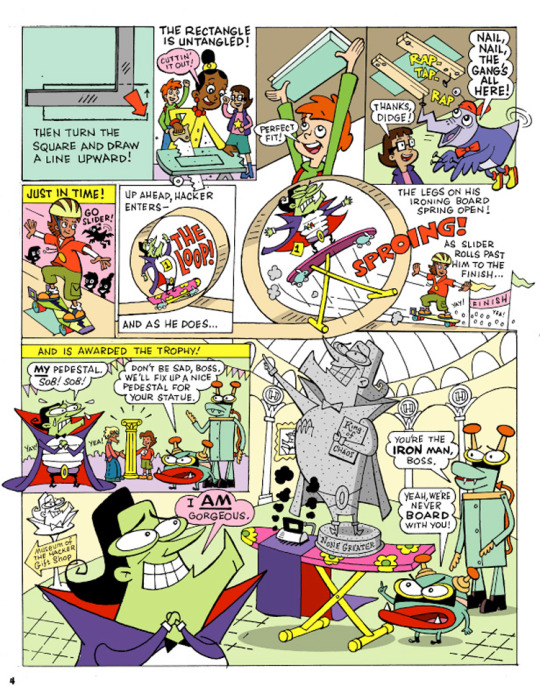
Matt: Then turn the square and draw a line upward!
Jackie, Inez, and Matt: The rectangle is untangled!
Jackie: Cuttin' it out!
Matt: Perfect fit!
Digit: Nail! Nail! The gang's all here!
Inez: Thanks, Didge!
Narration: Just in time!
Digit: Go Slider!
Narration: Up ahead, Hacker enters - the loop!
Narration: And as he does...
Narration: The legs on his ironing board spring open!
Ironing Board: Sproing!
Narration: As Slider rolls past him to the finish!
Narration: And is awarded the trophy!
The Hacker: My pedestal! Sob! Sob!
Buzz: Don't be sad, boss. We'll fix up a nice pedestal for your statue.
The Hacker: I am gorgeous.
Delete: You're the iron man, boss.
Buzz: Yeah, we're never board with you!
That is the end of the comic.
So, what did I think about it?
Slider is great, but why is he entering a skating contest on a course that he built himself? That gives him an unfair advantage. Why did they keep the contest running while the kids tried to fix the sabotaged ramp?
We now know that citizens of Cybersite Radopolis are called Radopolites. Buzz's line about making a hole to be filled my Slider creeps me out.
#cartoon#cyberchase#2000s#nostalgia#pbs kids#2000s childhood#inez#jackie#matt#digit#hacker#buzz#delete#web comic#longpost#archived web content
10 notes
·
View notes
Note
Hi. As someone who hopes to one day start my own webcomic, I'm fascinated by how your deleted scenes archive features almost complete art that follows a widly different route that that of the final narrative. It's a bit mindblowing to me, honestly.
If I may ask, how does your process work? Do you follow the conventional script -> sketch -> final art workflow and just take "kill your darlings" to heart regardless of which step you're in, or do you use the art itself as part of your writing (and consequently rewriting) process?
My process is very unconventional and also very flawed in a lot of ways. But it's the process that works for me. Sometimes.
(This is gonna be really long by the way and also it's probably gonna be wonky and messy so be warned lol)
When it comes to making a chilli issue, and just most of my comics in general, I don't write scripts. Would making comics be a lot easier if I did? Probably. Certainly. Absolutely. But it's not my process. At some point I'd like to start writing scripts before I work on an issue, but it always just felt easier not to.
Instead of a script, I write a very rough outline in my sketchbook, with notes so illegible only I could read them. I often deviate from these notes as I'm making pages however. Sometimes I'm about to hit a story beat and I decide it can be done in a slightly different way, so I do that instead. But I don't differ too much from these notes. For the most part.
When it comes to dialogue, it's very on the fly. I may have specific character quotes in my head when I'm planning out an issue, but most of it is only written in the moment when I'm actually making the page.
In terms of art, Chilli has a very "simple" style, and that was on purpose. I used to draw final lineart in my webcomics, and I found it very tedious. What I'd often find is I'd like the undersketch of a panel more than the final art. So when I started making Chilli, I just used the undersketch AS the final lineart, and I developed and refined that style as time went on.
When actually making an issue, I start off by figuring out the panel layout of a page. Sometimes this can be edited as I work on a page, but this is where I visualize the panels ahead of time. Once the border is done, I begin to draw the lineart. Sometimes I make a rough undersketch for a panel if it's particularly complicated, but usually I don't do that.
Once the lineart's done, I go back and give a thick outline to all the characters, and any other elements in panel, to make them pop from the background. It also makes it easier to color the page. Because the coloring process in Chilli is so simple, I often just use the paint bucket tool.
Now for dialogue! Again, this is usually only written at this point in the process. Even if I know what HAS to be said, HOW I say it can be tricky to figure out. Once the dialogue's done, I create the speech bubbles, and then boom! Finished page.
On an average day, I can draw four pages of an issue, but this is far from my limit. If i really wanted to, I could make 5-6 pages a day, but my wrist would absolutely not like that lmao.
And so day by day, I work through an issue, four pages at a time, until eventually, I have a finished draft! Does this mean the issue is finished? Nope!
Once a draft is complete, I do a mini "round of edits," where go through and make little changes fit to my liking. This could range from editing dialogue to make it less clunky, to redoing an entire panel. Once this round is finished, I set the issue aside. I don't work on it. I don't even look at it. I need it fresh out of my mind.
Eventually, usually about a couple weeks before it's released, I go through the issue and do an even bigger "round of edits," rewriting even more dialogue and redrawing even more panels. I do at least a few more rounds of edits until I'm finally satisfied, and that's when the issue's released.
Sometimes however, things can go horribly wrong.
Issue 12 was supposed to be a completely different issue. It was supposed to be the start of a new arc, but as I was making the issue, I just found myself unsatisfied and not that confident in the story I was setting up. So I scrapped that attempt halfway through, and instead began work on the issue 12 that would eventually release.
"Red Meat" in particular was a very troubling arc to make. I made probably about 300+ pages for that arc, and I ended up scrapping over a third of that. I did not do a good job at planning out the story for that arc, and it ended up biting me in the ass later when I realized I didn't like where the arc was headed.
Issues 25 & 26 were both drafted at this point, and I didn't like either of them, issue 26 specifically. The problems they had couldn't really be fixed in rounds of edits either, they were fundamental problems. If I wanted to fix them, I'd have to scrap a lot of what I'd already made.
So I did.
I redid a lot of issue 25, and I scrapped that version of issue 26 entirely. It was for the best ultimately, but in the moment it felt very demoralizing having to scrap so many finished pages.
Issue 27 also ended up being way too long (like almost 70 pages) so I had to cut a lot of (finished) pages in that one too to keep the pacing up. I cut out a lot of good stuff from that issue, but it was for the best. Even after those cuts the issue's still tied with issue 12 as the longest chilli issue.
What happened in Red Meat was a worst case scenario though, and going forward, im gonna make sure that something like that never happens again. Because, fuck. It didn't feel good scrapping those finished pages lol.
My process is very messy and slightly taxing, but it's the process I'm familiar with. I would not recommend doing what I do, especially if you've never made a webcomic before, but instead to try and develop your own method that works for you! Different processes work for different people
Thank you for your ask! Good luck on your webcomic journey, wherever it takes ya!
5 notes
·
View notes
Note
Hello! I was wondering if u wouldn’t mind sharing a tutorial on how u making ur icons?
Hi sure thing! This is long and screenshot heavy so the tutorial is below the cut :)
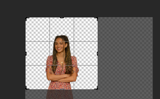
First I find a shot of the character I want for the icon and take a screenshot of it. Typically I look for shots where the character isn't obstructed by anything/anyone and make sure nothing is cut off in the cap
Then I put the screencap into this website and it removes the background for me. This works pretty well for most images :)
Then I open the image with the removed background into photoshop and crop it into a square.
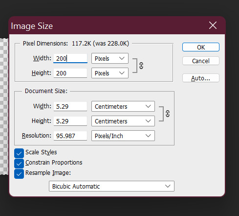
after cropping I resize the square to 200 x 200 pixels
after resizing I run my sharpening on the image so it becomes clearer.

After sharpening, I colour the image with curves and vibrance (as per my basic gif tutorial)
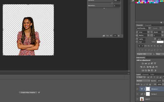
I then select all the layers and Convert to a Smart Object - this step isn't necessary but I just find it is easier for me.

After that I create a new layer underneath for the background and I use the gradient tool to add the background in.

^ that is the gradient tool - if you can't find it right click on the paint bucket and you should be able to switch to it.
The settings for the gradient look like this. To change the colour click on the coloured gradient bar.

After clicking the gradient you will get a dialog box like this:

basically just click on the little colour tabs on the gradient bar to change your colour. Typically with my icons I like to go from the colour to black or white.
For this icon I am doing pink :)
After you have picked your colour click the ok button
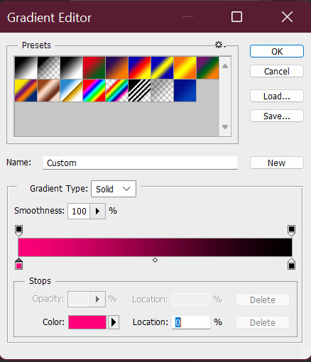
To draw you gradient click and drag a line on your canvas

This gives you comething like this:

I prefer the dark spot to be on the bottom of the icon so I'm going to redraw over it in the opposite direction

this gives us something that looks like this:
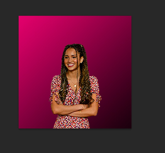
did it a couple of times to end up with this:

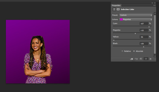
I like the colour background of my icon to match the clothes (I just think it's cute). So I'm going to use a bit of selective colour to make Gina's dress more pink.

So I create a selective colour layer (the one I've hovered over with the two triangles).

After making the layer I right click on it and select "Create Clipping Mask" so that the layer only changes the colours on Gina and not the background. Yow will know this has worked because there will be a little arrow pointing down.

Given Gina's dress is red I will be changing the reds in this image. When changing reds and yellow you have to be careful because they are the undertones of skin tones (why I chose this one as an example). As you can see below Gina's skin has changed with the dress and we obviously don't want that.

To fix this we use a layer mask so only the dress changes colour. The layer mask is the white square that shows up next to the layer name Selective Colour. We basically just grab a black paint brush and draw over the parts we don't want changed on the selective colour layer.

Then basically the icon is ready to be saved as a png for use!
If you want to make different colour versions of the same icon what I like to do is add another selective colour layer on top (no clipping mask this time) and change the colours again :)
So for example to turn this icon purple I adjusted the Magentas in the image like so:
To turn it more of a blue-purple I added another Selective Colour on top and adjusted the Magentas again like so:

and basically I just play around until I get the colours I like :)
You can also add textures on top of the background if you like - typically I will just google something like "grunge icon texture" or "cute icon doodles" or whatever I might want to put on top and find one I like and use it.
So I copy and paste it and put it on top of our gradient layer and adjust the blending mode of the layer as I see fit. This is the texture on top without the blend mode adjusted.

Here I've changed it to Exclusion, which I like - but usually I just play around with the blend modes until I find one that looks good

Here's a heart one I found and put on. For this one I used the magic wand tool to remove the white bits of the background and then set it to Exclusion.

And that's my basic process - I hope it makes sense :)
#asks#resources#ps help#usergif#allresources#yeahps#completeresources#resourcemarket#dailyresources#tutorials#photoshop tutorial#*mine#ok hope this helps :)
57 notes
·
View notes
Text
I posted 225 times in 2022
That's 225 more posts than 2021!
88 posts created (39%)
137 posts reblogged (61%)
Blogs I reblogged the most:
@waytoobsessed
@iaminlovewithdonnie
@cosmoshard
@kidswithautism
I tagged 196 of my posts in 2022
Only 13% of my posts had no tags
#reblogged - 76 posts
#k2007tmnt - 39 posts
#tmnt 2007 - 38 posts
#ops tags now - 37 posts
#rottmnt - 33 posts
#not my art - 28 posts
#random crap - 26 posts
#tmnt - 22 posts
#rise of the teenage mutant ninja turtles - 20 posts
#rise of the tmnt - 16 posts
Longest Tag: 131 characters
#when the bees in the bucket be bees in a bucket and they be bees in a bucket of bees do they be bees in a bee bucket of bucket bees
My Top Posts in 2022:
#5
H E L P !
Which Rise of the TMNT character does this fit the best?
I'm kind of thinking Leo, but I need other opinions
43 notes - Posted October 25, 2022
#4
Alright, I know it's Thanksgiving in America right now, but here's a little Christmas thing because no one can stop me.
Leo: What do you get when you eat Christmas decorations?
Donnie: Dead.
Leo: Tinselitis!
Donnie: You get dead. If you ate Christmas decorations, you'd be dead.
Leo: Wow.
Original (me and my brother)
49 notes - Posted November 24, 2022
#3
Neon Leon
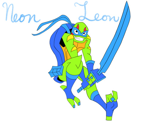
Neon coloured Leon (actually turned out really nice!)

And Neon sign Leon (I recommend clicking because it looks kinda weird when it's small)
128 notes - Posted October 10, 2022
#2
NOPE I'M DONE
WHY DID I THINK OF THIS, AND WHY DID I HAVE TO BE RIGHT
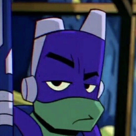
^ Donnie's big, beautiful eyebrows that we all know and love ^
See the full post
157 notes - Posted October 11, 2022
My #1 post of 2022
Lazy drawing, but I just wanted to do this one so bad as soon as I saw it!! Might redraw later though, I don't know..
@rottmnt-totally-correct-quotes
Didn't feel like drawing Raph twice for different expressions, idrk why.. Wobbly Leo though 😂 Also thought about drawing long snoot Donnie, but decided otherwise because I already struggle to draw him normally..
418 notes - Posted October 29, 2022
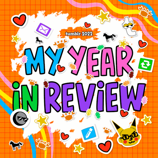
Get your Tumblr 2022 Year in Review →
#tumblr2022#year in review#my 2022 tumblr year in review#your tumblr year in review#BEES#also I'm pretty sure I only joined tumblr in like#idk maybe september? october?#I'm surprised this much happened in like 3 months though#I'd say I'm not usually very active online though so idk that might just be me
5 notes
·
View notes
Text
Update on the comic
I was just thinking about making an update post yesterday, and getting an ask just solidified that thought.
(tl;dr, life was a mess, I’m not going to continue the comic for a while so it’s on a hiatus for who knows how long, and when I do return, i’m going to redo what currently exists of the comic before continuing officially. Asks will be turned off, use replies if you want more info)
I haven’t done much with the comic because I was dealing with depression without fully realizing it was depression. I finally got it diagnosed, so I’m working on it, but it’s still slow going. In the middle of making epitale, I was dealing with it, leading to weeks where I would post nothing. it was also not helped that at one point, my hard drive kicked the bucket, making me lose all my files, and then there was also an issue with the old hunk of junk i used until I got a new computer which caused a number of the layers to outright disappear (you can see this best with the comics in grillbys where we started on one side of the counter and moved to the other because i didn’t want to remake the old scene and not work right.)
I’ve seen a number of fan comics go the route of ‘hey, I don’t really want to work on this anymore, but here’s what would have happened’ and while this was half ask blog, half story comic blog, I don’t entirely want to do that. Sure, I’m going to give some details later in this post, but I’m not going to give the whole thing. Why? Well....
Making the comic with the stints of depression wasn’t so much I wasn’t doing art, more so, the comic felt less like something i wanted to do and more something that was expected, which made it feel forced sometimes. And then there was also the issue that since I was still doing art, my style evolved and I changed how I would draw things. (blob gaster into full skele gaster as an example). this made me less want to come back because I didn’t want to be changing style every page as well as the fact that the way I was doing it before wasn’t the best way, and even a single panel could take a while, or I would just alter the heads or hands slightly.
so all together, depression, art changes, complexity of art, fun, etc all made me not want to work on it. at least not publically. The other mods that were listed around here (mod bun, kiwi and bear) were all friends who sort of helped out with some of the ideas, but the story, blog running, art, etc was all mine (mod cat) one of the mods helped me the most with idea stuff, so much so that we have a full discord group we used for it, but it ended up evolving into stuff that’s... very non canon. I could potentially share tidbits from that eventually if anyone wants that, but I doubt that would happen. I’m going to turn asks off though, so turn to replies to request those.
as it currently stands, i have no clue when I would work on the comic again. that being said, when I do, I won’t be continuing the story. Not exactly. I won’t be deleting anything, just tagging them as old, but when I bring back the comic, I’m going to be... sort of restarting. I’m going to be redrawing the pages in an art style I can more easily do as well as fixing up things I’m no longer happy with (like how I draw undyne, and I might not redo the starting scene with sans and papyrus and the mod cat annoying dog substitute.)
One thing I will be slightly redoing is Dee, which i will just explain in a following post as when I first made them, I had a slightly different idea from what they are now (and what I have thought of them for a few years.
2 notes
·
View notes
Text
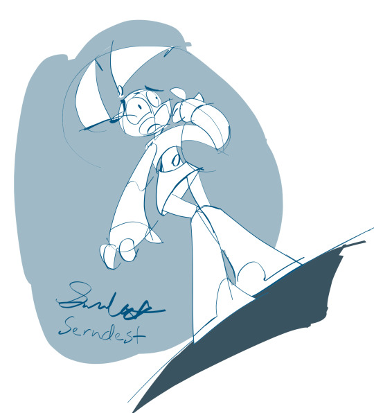
Vector redraws (full-color, greyscale, & blue shades): Jenny Anxious
Art Timelapse
From throughout the past 2 weeks
Vector redraws of my Jenny Anxious fanart
One of the first published times of me doing a sketch-over/draw-over/tracing of my own art.😲
MINI JOURNAL
Wanted it to be quick & low-stakes. Actually didn't intend to publish these artworks. Still wanted to post at least the art timelapse (on my YouTube at the end of the thread).
Tbh, was really afraid of posting the actual art.😰 Afraid could be like that commercialization Andy Warhol satirizes (with his color variations).
BEHIND THE SCENES
Purposes:
Practice of a different-looking medium (One reason why I was ok with "tracing" it—it’s more a test of a medium *look* rather than a test of my ideas/a completely new medium, the latter demoed with my "Jenny expression draws" series. https://twitter.com/Serndests_Art/status/1723521485976039498)
Possible full-color version of my sketchy illustration style. Maybe even what my storyboarding style could be (with the greyscale vector version).
Process: Re-drew the vector sketch-over…3 times😳
-On first 2 times, went with my usual 7-9px Flat vector brush (with Size controlled by Tilt), but didn't like how coloring book-like they both looked.
-Then, before 3rd time, after looking at some professional storyboard artist work, I thought it looked like they started their sketches with a small-sized brush instead of a larger one like I do .🤔
(--My latter-mentioned habit is a carry-over from me personally preferring brushes with darkness variation & size mostly controlled by tilt, like pencils.)
-On the 3rd time, I re-drew it starting off with a small brush (3-4px) & adding some thicker lines to show distance/depth & dimensionality (...which ended up not being as many thicker lines as I expected, with me wanting to avoid coloring-book-like linework😳).
SELF CRITIQUES
(-) On the character matte layer & when the linework is set as a reference, don't use bucket-fill on the linework. Produces a white halo effect
-(*) make the character matte layer transparent, to more easily check
(-) bc the L side of her mouth is elliptical instead of more circular, looks more like an awkward smile
(-) forgot to erase the light blue over L pigtail screw
(-) fine w/ boot reflection as single, no-contact curve instead of one line right below L boot & partial curve below R boot
ART SUPPLIES
Hardware: iPad mini 5 & Apple Pencil (1st gen)
Software: Adobe Fresco (art & timelapse)
-Brushes: My Flat [my tweaked Flat vector brush]
–Parameters: 50% Roundness, 0 degree Angle, Taper Mode: Length (0% on Begin & End Taper), Pressure dynamics (100%), Velocity dynamics (-25%), & Tilt & rotation
0 notes
Note
You're drawing very good! Very!
And art classes.... oh God. Idk if they're good where you live, but I had a lot of bad experience with art classes. I came here for for around 5 years, and it didn't helped a bit and only did worse. I mean, my parents paid a lot, like 600$a month for these when after 8 hours of school having a lot of homework I needed to go to art classes where teachers just gave us task to draw cube with pencil for 3 hours, and since classes were small, exacly me was thrown to the front door hall, it was very small, smaller than normal room, and it was cold in winter, like it's - 20°C outside and so inside, and they forced us to take off our outwear but there was no heating so we just were frosing, mostly me and one dude cause we were mostly outside. And then they just made us to pour dirty water from bucket to bucket with flat yogurt package. And then I realised that these classes needed to be passed to enter artcollege, and it's same people here, and now I just want to burn it cause so much pain and what you got after? You won't be able to find work fast or well payed work, and just redrawing someone's art in case of be one of frame making dudes when there are hunders of same like you is no art. Being designer also isnt possible cause there are a lot of them and you need a lot of money to overthrow them and chances to succeed are so low, cause there are thousands of people like you, and drawing commissions is what person can do without degree. I only saw people using their art degree for forcing to other to buy their product cause look, they spend a lot of money and time for learning this and someone need to pay for all this now.
Thanks for the reply, I’m my own worst enemy, but that’s the norm for artists.
As for art classes where I live… it’s nonexistent and only found in college so kids here don’t really have art classes. But, yours sounds worse than my experience because that is a ton of money to spend on art that might not be worth it for you. Like, sure art college sounds cool, but with the problem arising from AI, it’s probably not worth it now and if you’re just hating your art then that’s worse because then you’re left with no reason to even want to do art. And the market itself is full of them, and I myself am taking graphic design class just to understand more about digital art, but really I took it because I wanted a relaxing class compared to my science classes.
Bottom line, the art world is not an easy place to be in and it might not be worthwhile for some people if they don’t want to do anymore art.
0 notes
Text
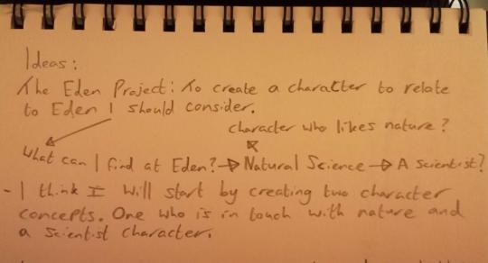
Project #2: Eden Project Moving Image. (pt.2) (Idea Generation.)


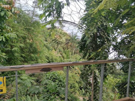
During my time at The Eden Project, I took multiple pictures like these where I had space to insert the character I had yet to design. I had also taken a timelapse of the waterfall in the rainforest dome in case I was unable to follow through with this idea.
I started planning my character by thinking of how I was going to relate to The Eden Project. My first thought was to break down what Eden was and concluded that I should be looking into a character related to natural science. Following this, I broke it down further into two ideas, the first was a scientist who was studying The Eden Project and the second was a character who was in touch with nature.

This is a sketch of my scientist character, I decided to go with the recognizable style of a scientist with the white lab coat, shirt, tied up hair and glasses. After making this sketch I took a look at my images and decided that the character would most likely not work with the pictures I collected.
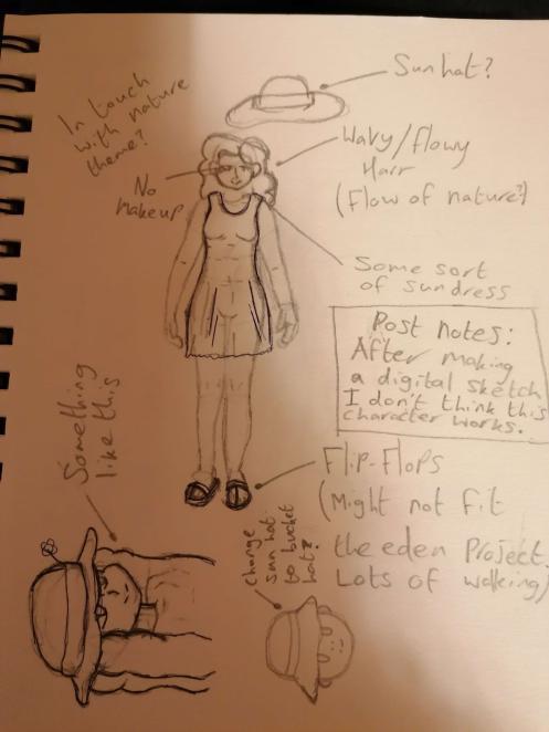
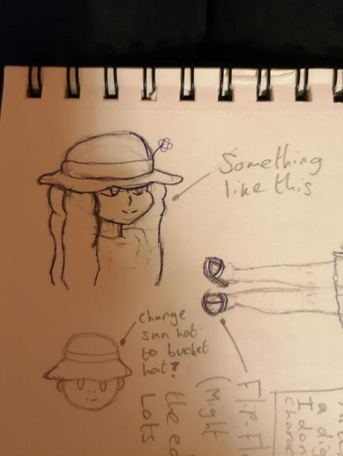
This is the character sketch and concept for my second character idea. My idea was to create a natural, nature loving character. I decided to take this idea further as it felt more fitting than the scientist character.

I decided to use my graphics tablet and digitally sketch this character. I started with this basic body shape and continued to draw the character's features and clothing.
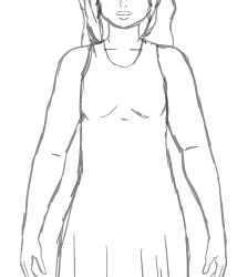
This is how the digital sketch of this character went. After doing this, I decided that this idea wasn't really working for me either, so I decided to go back a step and think of a new character concept.

After going back to researching, I changed my thinking and instead of creating a character that would directly relate to The Eden Project, I could also create a character based on the main group I saw at The Eden Project. As I saw many students other than the ones from my course there, I decided to create a student character.
I originally found it quite hard to design a character who is a student because of the wide variety of styles that can be found across students. Due to this, I decided to go to Pinterest and look for trendy clothing and hairstyles that I could use for my character.

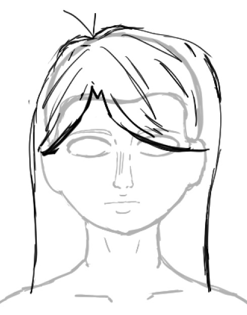
Due to running low on time, I decided to use the body that I had drawn for my other character for this one as well. While researching, I found two hairstyles that fit the kind of character I was going for and decided to compare them side by side. I chose the second option as I believed it to be easier to draw.
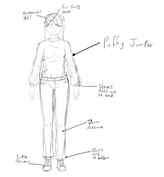
As for clothing, I decided to use quite a puffy jumper tucked into Jeans that flair out at the bottom as this design was quite easy to draw and still fit the trendy clothing I wanted to replicate on Pinterest.
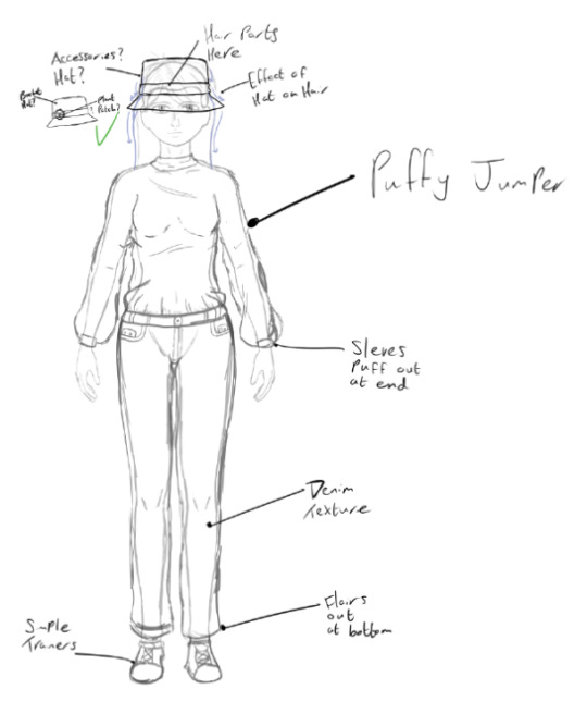
I decided to give them a bucket hat with a patch depicting a sapling on it. I did this because I recalled a lot of students that I have personally seen having hand sewn patches on their clothing.
It was now time to redraw this character in one of my images of The Eden Project. I decided to use one of the ones that overlooked the domes and the rest of Eden as I believed it was the most visually pleasing of my images.
0 notes
Text
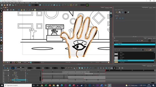
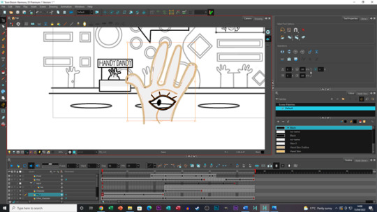
AX2002 - University - Dimensions - Animation Production Phase 3
Before starting to animate my segment for our group project being the “Dimensions” project, I planned on how to approach animating my work by splitting everything into four phases, I would do each phase on every shot/ file before moving onto the next phase of development. In this post I will be explaining what I have done for the third phase of development being the character colouring phase.
After finishing blocking, animating and inbetweening my animated work so far, it was time to begin the clean up phase of development and colouring my characters. I wanted to focus primarily on everything relating to my characters during this phase as I felt that doing this as well as any background work could overload me on the work I needed to do, as well as potentially letting mistakes slip through the cracks of my work. So, I began by colouring in my characters first and then adjusting and cleaning up second, as I felt that being able to clean up within the lines of the characters would be easier than just erasing everything.


During the colouring stage of this phase I was finally able to fully apricate an aspect of Toon boom I had always forgot to use prior, and I feel foolish for not fully utilising it sooner, the aspect in question is the colour layer. I have always been aware of this feature existence within toon boom, but I have usually been so fixated on my work that I would forget toggle this feature, and I made it a key point for myself to use and experiment with this during this project. Now fully understanding that I don’t have to carefully follow the line work when colouring and filling the interior of a character like I have always done previously but could instead colour over the line work and the line work would still appear on top took a massive weight off my shoulders, as well as speeding up production time drastically. This made the colouring phase much faster for me and although I would still use the paint bucket tool on the line art layer to see if I could fill in areas of the character correctly, if it didn’t work, I could simply switch to the colour layer and work within there with no issue.

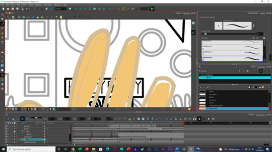
A re-occurring issue I faced during this phase is when trying to clean up some lines on the Witch (the witch’s outline in particular), some lines would overlap resulting in unorganised and overlay stacked lines. At first, I tried to redraw over where outlines would collide such as the top of the head and hair line and although this worked, it did take up quite a bit of time. After doing this for a while, I thought that there should be an easier way to do this and there was, by right clicking on a selected piece of line art and click “Arrange” you could bring the line selected to the front or back of the other overlaying line. This approach worked and then realising that I could speed up this process by using CTRL + Shift + Page up or Page down made this issue much easier to manage. This would still cause some slight tweaking I would have to make to some of the line work, such as some of the newly revealed lines not being the same colour as the rest of the line (E.g., A skin line would have the newly brought forward section of line be black and not skin coloured like the rest of it) and would need to be filled with the paint bucket tool so the entire line would be the same colour. After fixing this issue, most of the remain clean up was done with the eraser tool and making further adjustments within the colour layer and any areas I had missed during this phase were cleaned up during later phases of development.


One more issue I had was with the design of the Wisp, I realised that in a few people’s work I had seen had the wisp with a blur node attached to it giving it a more ghoulish look. This would prove to be a debatable design choice for myself as I knew in the next phase of development, there would be a lot of colours as I was advised to make my world look “Trippy” and my worry was if the Wisp was blurred, it may get lost in the background. After taking this thought into consideration and thinking it over, I have decided to leave the Wisp looking mostly solid, the wisp will still retain its colour scheme from the master design and its characteristics such as looking like a flame when it moves. But in fear of it being lost to the design and look in future phases of development, I am going to leave the wisp as it is.


Overall, I felt this phase like the previous phase had its ups and downs in terms of development, I learned new things and had to learn new methods of overcoming issues. In some cases, I don’t think this phase is ever truly finished when it comes to the clean up aspect of this phase, as I feel almost certain that I will spot an error or an area of line art that needs touching further down the line. But within this phase, I feel confident in saying that I feel like I have managed to iron out most of the clean up and colouring. The next phase of the development is the fourth and final phase, creating and colouring in the backgrounds.
0 notes
Text
I am in the process of drawing Unicorn Wizard, and I am ashamed to say last night I spent 2 hours on it and only got as far as finishing the line art for his head, horn, ears, and other facial features, plus completely finishing his mane and tail.
#i'm a bit of a perfectionist so i redraw every line like 20 times before i'm happy with it#the mane and tail are actually really pretty i basically just googled a cool space bg#and then erased it into the shapes i wanted#i just need to do the rest of the line art now and then tbe coloring#the coloring is somewhat easier because i can kind of cheat and use the paint bucket for certain things#it's line art that usually takes me the longest
3 notes
·
View notes
Text
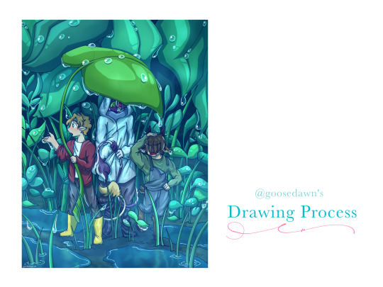
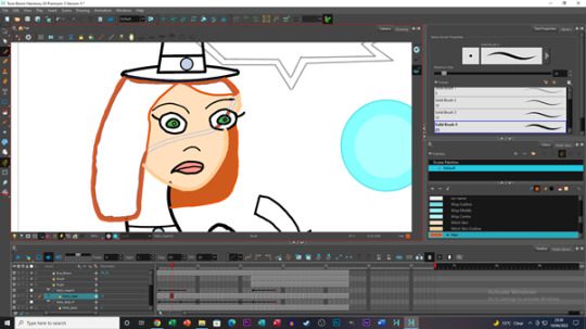
original artwork: [x]
how did i put this together? find out... under the cut!
with a lot of difficulty.
joking aside lets get into it! i... gave up on uploading the speedpaint because both tumblr and youtube werent responding to me but if you would REALLY like to see it i can figure something out ;P
The steps may not entirely be in order, but I tried to keep this as simple and as streamlined as possible because otherwise I will just. Keep Going.
-----
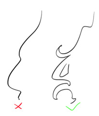
Usually when I start drawing I already have a composition in mind, and would just sketch out something like the image on the right side. Regardless, I started out with a few criteria:
- tiny bench trio in the rain
- leaf umbrellas
- tommy getting distracted by the rain and ending up with tubbo getting dripped on
- teal-blue colour scheme
At first I had planned a longer composition with two umbrellas, but I liked the idea of all 3 of them stuck under one leaf!
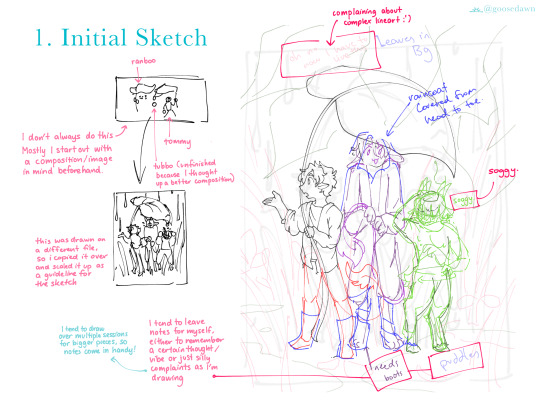
INITIAL SKETCHES
I used the thumbnail sketch I had done to guide my larger sketch, adding in more details and the background.
Since I tend to draw over multiple sessions and/or get distracted by drawing something else while working, I like to leave little notes for myself! I also just use them to lament over difficult things sometimes though shdjfbsjbf
Personally I like to sketch each character on their own layer with a different colour so its easy to identify who's who, and it makes it easier to seperate certain areas if I'm not sure if I want to redraw them (e.g. Tommy's boots, Ranboo's raincoat)
I also tend to do the same when lining characters and/or different items or background layers, as seen in the next image on the left!
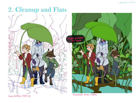
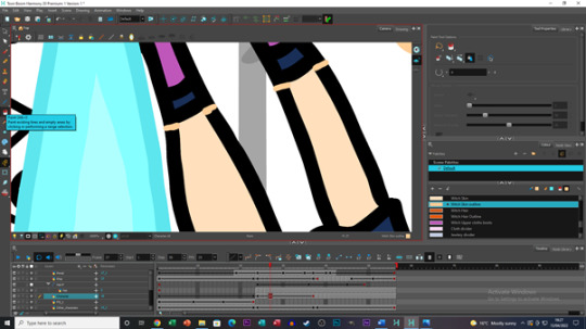
CLEANUP
I ended up filling in the colours for the characters first just because I didn't want to worry about erasing lines behind the characters :'D
Around this point I also added a dark blue background at the very base layer to catch any areas I may miss when colouring!
FLATS
Fill/Bucket tool my beloved. Especially when I use the pixel/digital pen, it is a lifesaver.
When putting down the colours for the background, I kept to using 3 colours/distinct shades so the foliage would have better contrast and be easier to see, while also not varying too far from each other.
I also added small gradients like blushes over faces and hands, and some gradients in the background to add some depth.
I tend to do each colour on a seperate layer, so I can adjust each part until I'm satisfied with it, then I merge them all into one (e.g. Tommy's colours are all on one layer in the end, but his jacket and pants were different initially). The same goes for the plants in the background!
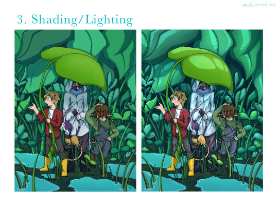
SHADING/LIGHTING
I tend to draw shadows first on a Multiply layer and then go back and do all the lighting in a seperate Add layer.
The lighting, as is everything else was also split into foreground/middle/background. I use one main lighting layer with low opacity, and then go back on another layer with a blurry/soft brush to add some light gradients on both shadow and light layers.
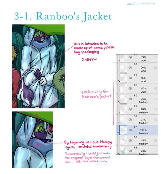
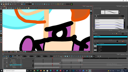
RANBOOS JACKET
When rendering plastic I like to make it Super Shiny. So, I used around 3 layers with cell shading/lighting, all layered on top of each other with various opacities.
For some reason I also decided instead of making the base raincoat transparent, i was just going to draw over the top to emulate transparency...? It worked the way I wanted anyway, so I can't complain ;P
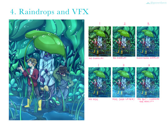
RAINDROPS
Raindrops! Straight up I just searched up "arietty rain" and stared at Ghibli screenshots until I figured out what was going on. I put a lot of thought into where the raindrops would sit (e.g. the leaf at back on the right is bent, and raindrops would gather in that crease) as well as trying not to overwhelm the piece.
OVERLAYS/VFX
I actually set up the overlays a lot earlier, but this is the best way to showcase the difference they make. There are 2 seperate overlays in images 2 and 3 (marked above), one being just for the background, and another over the entire image.
The overlay shown in 3 was added as soon as I started colouring, so I could get an idea of what everything would look like as I went along.
The fog in the second row of images was done with a blurry/soft brush at low opacity on another Add layer! Some parts of the fog are thicker than others.
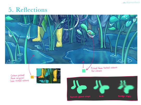
REFLECTIONS
The box in the bottom right explains it all really. I also replicated Ranboo and Tubbo's legs in the puddles, but they are mostly covered up by other leaves. They are still there though!
For the water I also ended up erasing some of the middle, to make it seem deeper/more realistically like water. Once again this can be attributed to Ghibli rain puddles.
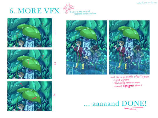
MORE VFX
The left column of images is focused on the raindrops, while the right is just smaller details, adjusting contrasts and adding a slight vignette. In each of the raindrop images I've drawn arrows pointing out particularly clear examples of what I added!
1. The raindrops are ever so slightly opaque, with a highlight opposite to the very shiny white glint.
2. I added shadows (2 Multiply layers) one with sharp cell shading, and that same layer copied and blurred slightly.
3. I went back with a blurry/soft brush and added some shadows INSIDE the drops, just to add some contrast and make them pop a little more. Give them a little more depth.
I... forgot to draw in the highlighted areas. But if you look to the left of Ranboo's head you can see the background is slightly darker in the second/final image! I added areas like that through the background just to give a little extra contrast/depth!
And DONE! :D
-----
After finishing this piece I do think there are some things I want to change/improve on next time (e.g. Tommy's posing/positioning, maybe trying more realistic leaf shape/s, amongst other things) but I'm very happy with how it turned out!! :D
If you read all the way down to here, thank you for taking the time to do so!! Please let me know if you would like to see more of these, and if there is anything in particular you want to see me cover ^^
I've never done this before so if you have any feedback/thoughts they are much appreciated <3
30 notes
·
View notes
Photo

#adventure time#adventure time spoilers // three buckets#hey so uhm#hey#this fucked me up#i want to do a redraw..
117 notes
·
View notes
Last Seen Blogs
petewenstz
now @17chains

alkhatice
Hatice
mauffiie
Mauffiie🗡
jigglypufftravels-blog
Jigglypuff Travels
monsterboyfriend
I Don't Even Know