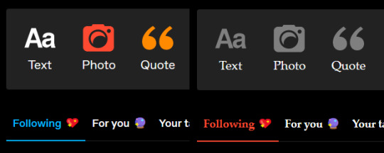
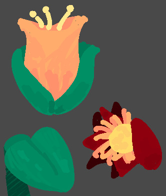
#blue and yellow color schemes my beloved
Text

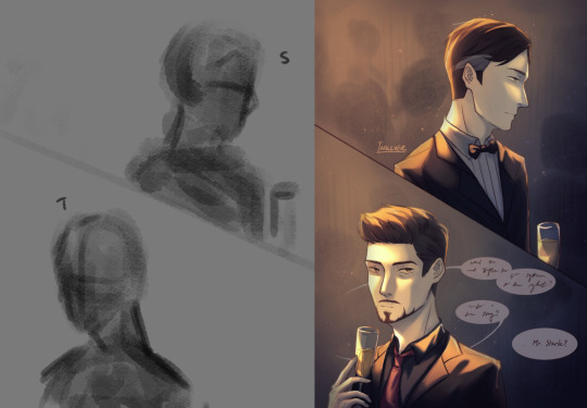
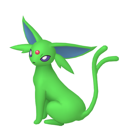
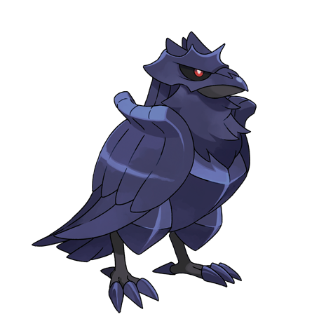
Have I ever mentioned how much I fucking LOVE robots?? Like oh my god every time I see a robot I’m like THAT’S A ROBOT!!! And it’s instant serotonin for my little brain.
This is Scrapheap, basically I made it for a cyberpunk rp server my friend made, and it’s like a janitor robot who was made to clean a rich person’s mansion but then it malfunctioned or something like that, I’m not entirely sure yet cause I’m still working on it, but it was tossed out onto the streets and now it’s tryna figure out how to live a life full of partying and fun while also being extremely poor and scrounging for whatever change it can find lying around.
#blue and yellow color schemes my beloved#I’m such a sucker for smug robots stg#looking at P03 from inscryption and Tobor from MySims Kingdom#did y’all ever play MySims that shit fucking rocked#I had the HUGEST crush on Tobor like I would leave plates of spaghetti out on the table so he could eat them#that is not even remotely what this post is about my bad#hopefully I’ll draw more of it and won’t get bored and immediately just move onto something else#original character#my art#got TWO drawings out tonight I have been very productive :)
6 notes
·
View notes
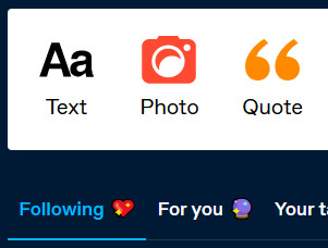
Text
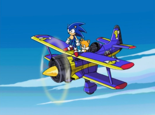
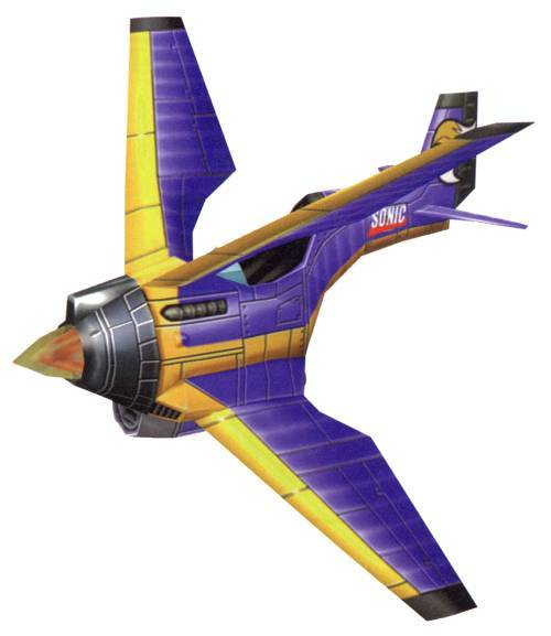
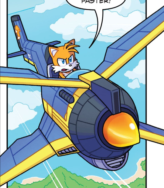
Ever notice how tails' tech sometimes has a blue and yellow color scheme. Do you ever think of why (Unbreakable bond)
Tornado 2 my beloved
172 notes
·
View notes
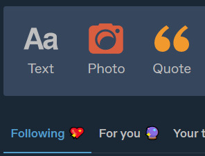
Text
something about how mike starts off s1 wearing blue, has blue and yellow on the next day (once will goes missing and mike is "the only one who cares about will"), wears subtle blue and yellow with a large section of red once he's getting to know el, but then is back to wearing solely blue and yellow as his color scheme for the rest of the show... color theory my beloved <3
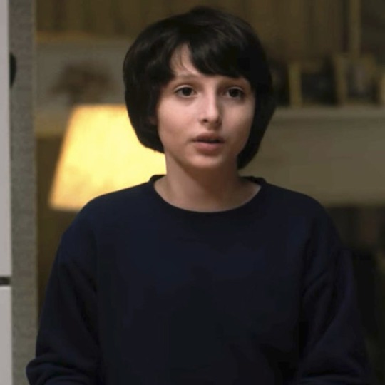
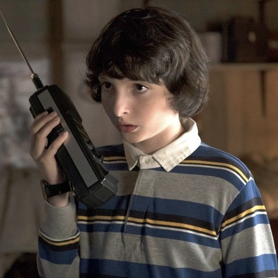
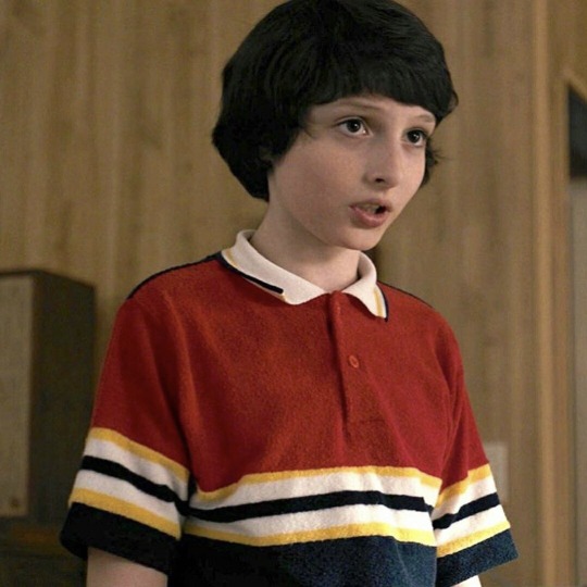
#like. i'll never shut up about the shirts i'm sorry#mike is a walking byler advertisement#mike wheeler#byler#sarah.txt#color theory activated
420 notes
·
View notes
Text
💛🖤❤️🖤❤️🖤❤️💛
so this post is stuck in my mind and somehow spurred a hellfire club mike wheeler/cali mike wheeler breakdown! i’m really excited to talk about this one bc it appears so intentional! and i get to combine 2 of my truest loves: costume design and gay ppl.
let’s discuss.
🖤🖤🖤🖤🖤🖤🖤🖤🖤
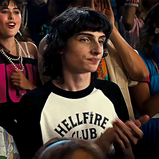
from 4x4 thru 4x8, i think we’re lowkey seeing… single mike, right? like, he thinks him and el are basically done? so during this post, keep that thought in ur back pocket like eddie’s black handkerchief <3
~~~🌵❤️🔥🌙~~~
something i find striking about the burying the body/top of car desert scenes, during this period of “yeah me and el are prob broken up,” is that mike is back in his hellfire color scheme—he’s wearing black&white, with red, orange, gold and metallic tones everywhere.
there’s no red/gold/metallic tones on mike (except his silver belt!!), but it’s everywhere behind mike & will, especially as they dig the grave. the shovels they’re holding have metal handles; the rusting cars behind both mike and will during their staring shots are red & orange; the desert sand/hills behind mike are red-orange; will’s color palette for his cali crew outfit is yellow/gold; i even noticed on first watch that byler’s cheeks/lips are super flushed during that triple take moment.
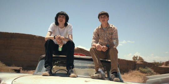
tldr; key byler scene where they stare at each other for several shots, and they also open up to each other. hellfire mike color palette everywhere, and it’s the only time in the show we see mike associated w these colors except for 4x1 and 4x8. coincidence? no way.
~~~🏴☠️🕷📓~~~
let’s take a trip to 4x1. hellfire mike, my beloved.
i love hellfire mike bc he was so Himself. i don’t even think that version of mike, even tho it was only a day apart, would’ve snapped at will in rink o mania. it’s literally just when mike is trying to force himself into his cookie cutter straight relationship, wearing pastels and shit, that he gets frustrated. “shitty knockoff” mike wheeler, not his authentic self.
i could talk about eddie and hellfire’s impact on mike all day. it’s not explored through substantial screentime the way dustin’s bond with eddie is, bc it’s a different bond, but visually it’s clear the connection they wanted us to make—mike is evolving into a mini eddie.
from a costume/hair/makeup design perspective, there’s certainly a reason joe quinn has long, dark hair and a pale, fresh face in the cafeteria scene just like finn, and that same black&white color scheme as mike does w the hellfire shirt (just w a jean jacket over top and jewelry on, the only major differences—mike doesn’t have all the embellishments yet bc he’s just coming into himself—still getting used to not wearing “whatever his mommy bought him from the goddamn gap”. i find it interesting that clothing specifically is brought up in this scene; they want us to notice).
and then that night at the hellfire game, eddie doesn’t have his jacket anymore, so he and mike have essentially the same exact visual, w the exception of eddie’s tattoos, rings, and other jewelry (long dark hair, bangs, hellfire shirt. it’s giving clones). eddie even wears a black watch :-) basically, they are trying to show us that aesthetically, mike is growing into eddie but isn’t quite there yet, isn’t quite as unhinged and bold.
this visual parallel contrasts dustin’s bond w eddie; dustin wears that colorful/bright white shirt over his hellfire tshirt, blocking out most of the black sleeves, and they put him in his blue and white “thinking cap” hat rather than a black or red one. this is bc dustin’s bond w eddie is more emotional and bright, while mike is inspired by eddie’s darker look and vibe in an aesthetic and personality sense, and i think we’re supposed to notice that because their looks are designed so similarly.

like, they could’ve put joe quinn in any wig to be eddie, but they gave him one that reminds us of mike wheeler. i’m pretty sure they even straightened finn’s hair this season, which they weren’t doing as much previously (remember how fluffy it was in s3). i mean, look at this pic. this is the exact same queer mf and their token straight best friend.
~💥🍒🎸~
mike under the influence of eddie/hellfire is his truest form and you can’t convince me otherwise:
he takes risks. he doesn’t listen to his parents, doesn’t care if he stays out too late playing hellfire (it’s giving bathroom stall graffiti mike wheeler from s2). he goes around school and asks everyone & their mother to play hellfire, barging into science labs and wrestling team practice and the school newspaper. he puts himself out there, passionately, talking with his hands about the game he loves, which he didn’t even want to play last season when el was around—growth and a return to his more authentic self thanks to hellfire.
he talks about “bullshit media propaganda,” which is something we just watched him learn from eddie in the cafeteria scene. he’s vibing hard with eddie’s values. this is not the mike wheeler we see arriving in california or snapping at will in rink o mania, but it is the one we get a glimpse of again in the desert.
🖤♥️⭐️ hellfire mike = hawkins/dnd dungeon master mike vibes. the mike that will fell in love with. ⭐️♥️🖤
mike + will + hawkins/dnd = mike’s happy place—“it’s not the same without you.”
~♟♣️📞~
back in the desert in 4x5, the use of this color palette shows us that mike feels at home and like himself again, because he’s with will. the longer he’s away from el, the more he’s shedding this artificial skin…

…until will mentions “what if they don’t like the truth.” that resonates with mike and he gets scared of what that means. he retreats. he covers back up, goes back to wearing Ted Wheeler Turquoise™️
but we almost reached something there, in the above pic. (i also like the green plants & 7up can—green = byler reconciliation in sight 🌿)
~🚨🪓🩸~
the next time we see red associated w mike wheeler, it’s the painting scene.
and of course the bright red resonates with him. of course his smile can light up a room in this moment, of course he finds it stunning—this is who he is. the dragon is bright red. the shadows and outlines are black. the crown on the shield is gold. and the weapons are metallic…
💔▪️👑 hellfire colors. 👑 ▪️💔

this visual thread suggests that mike feels truly like himself, and truly at home, when he sees will’s stunning canvas. (god i feel like i got punched in the throat, that’s so fucking beautiful.)
not to mention we’ve got tons of green in there for the forest background, which we can think of as not only a byler reconciliation symbol, but also the forest is a major symbol of hawkins—where will was kidnapped, where el was hiding out, where we see eddie and jason run to when they’re in distress. so this forest imagery calls back to hawkins mike, dnd dungeon master mike, looking for will in the woods mike, “it’s not the same without you” mike.
💛🖤❤️🖤❤️🖤❤️💛
in conclusion: s4 uses the hellfire club color palette—black, white, red, gold/flame orange/yellow, & metallic—to show us that mike looks up to eddie munson and is starting to form independent, subversive ideas—“bullshit media propaganda.”
🍭🧢🚙🍬 = ❌❌❌👎👎👎
it also shows us (via mike’s cali outfit and the bright, candy colored rink o mania setting) that this self actualization of mike’s only regresses when he tries to be el’s boyfriend.
🌲🌲🌲🏡👾 = 🎱🖤🏴☠️‼️💌🐝🌼☀️
mike’s only place he feels he can be himself is playing dnd, in hawkins, with will—but based on what we saw in the s3 fight, there’s some elusive reason mike doesn’t let himself have all 3 at the same time. he clings to his relationship with el, but it only holds him back.
and based on the desert scene, the with will aspect is the most important part. the callback to the hellfire color palette in the desert w/ will & in the painting scene shows us that mike can feel at home anywhere in the world with will—hence the soft looks in the van scene, hence thanks, i needed that.
🖤🖤🖤🖤🖤🖤🖤🖤
212 notes
·
View notes
Text
Why Pumpkin is the Best Palette
There is a poll going around now that leads me to believe this site is MASSIVELY undervaluing the inherent superiority of the pumpkin palette. I have no choice but to speak out on this manner.
Let’s break down the main features of Pumpkin:
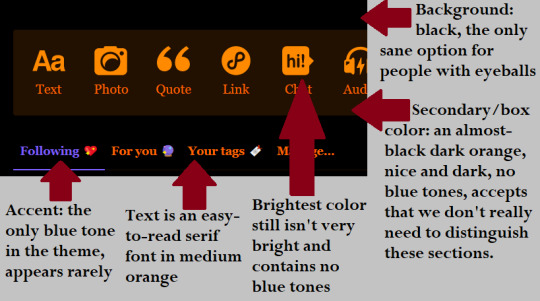
I don’t know about you, but if I didn’t need to read anything, my ideal color scheme would be a black screen. This is a close substitute. Importantly, there are almost no blue tones, which we all know is the evil electronics light color that is poisoning our brains and making us insane. Pumpkin with soothe your brain and make you sane again. Pumpkin can fix everything that’s wrong with you. When your computer shifts into the sunset digital wellness mode that you enabled months ago in a fit of desperation to have a sleep schedule, you can’t even tell the difference in pumpkin mode because it is Perpetual Sunset Digital Wellness.
Also, pumpkin theme has this guy:

That’s your messages button.
Compare this to some of the glaring (pun intended) issues with the other themes:
Snow Bright/Cement/Canary/Ghost:

Deranged themes for deranged people who have something wrong with them. People actively attempting to burn their own eyes out of their skulls. People who haven’t blinked since 2007. They hunch in front of their computers, their faces flooded in light as if they are being interrogated in an old film noir. Remember when they told us not to look at the eclipse? These people did. And they liked it. An addiction formed and now they simply cannot stop abusing their eyes.
Oh, and the messages button on ghost?

Fuck off. A) That doesn’t even look like a chat bubble, it’s literally just a ghost. B) Turning a second button into a ghost also? Lame.
And while we’re talking about that, let’s talk about vampire palette having the EXACT same ghost icon next to the (admitted cool) vampire messages bubble.

You’re not ghost theme!! Why is there a ghost!!
But that does lead us into our usual dark mode options.
Dark Mode/Vampire:
The really disappointing thing about dark modes like this is they come SO close. But the white of the text is absolutely blinding. And guess what part of the page you spend most of your time focusing on!! The text!! It’s like having room darkening curtains with a bunch of little pinpricks in them and the bat signal shining directly at the window.
True Blue:
This falls somewhere between the cursed light modes and the dark modes. The background is fine!! But the White secondary and text colors are a crime against me personally!!
Low Contrast Classic:
This one COULD have rights if you just lowered the brightness on this entire palette until the background was black. Loses points for being blue though.
Cybernetic/Goth Rave:

Let’s talk about everyone’s beloved Goth Rave, which I lump in the same category as Cybernetic. Those text colors are WAY TOO BRIGHT! The black background almost makes it worse because it just accentuates the eye-gouging vibrance of the other colors.
Cybernetic COULD have scored points if it actually committed to the Courier Sans text it promises in the palette toggle:

But no other palettes are willing to make the bold font choices you see in Pumpkin and Vampire.
Finally,
Pride
deserves a special shaming. I am not proud of this palette. This palette makes me want to comphet.

Hell is real.
WHAT IS THIS??? Yellow on pink?? I can’t see that! I’ve been blinded by the bright colors AND it’s already impossible to see!! The blue! That horrible blue!
Anyway, I hope I’ve opened some minds and hearts to the truth today. Pumpkin is love. Pumpkin is life.

The account button has a little witch hat <3
25 notes
·
View notes
Text
just because i feel like it:
some random thoughts about the art i made for ironstrange week + the very rough thumbnails for each piece (putting this under the read more so this doesn't take up too much space bc this is a Very long post)
day 1 - red/wrath

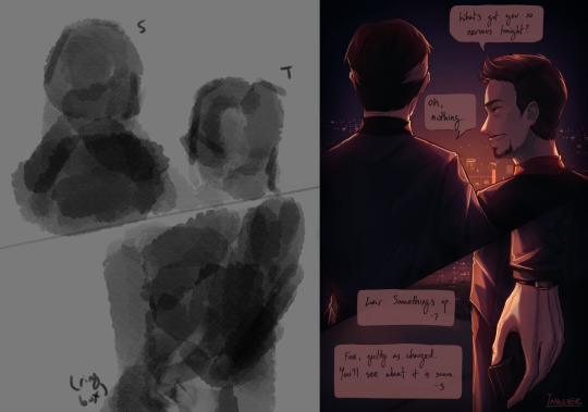
first fanart for this fandom! there are a few things i don't like about this piece (questionable anatomy, use of values could be improved, + stephen's hair makes him look like a wet cat /hj) but i do like the lighting and the theme of red spider lilies. i've always wanted to draw them and i love their symbolism of death and final goodbyes—feels very fitting for these goofs :b
i started working on this a good amount of time in advance, and i'm glad i did—this was one of the only pieces i used a painterly style for despite it being my preferred style; it takes me a lot longer than lineart + color, so i didn't get the chance to use it again throughout the event (with the exception of day 6)
day 2 - nervous/orange
i struggled with the anatomy on this one—i don't draw back views often (or, at all really) so the first panel was pure pain. the second panel wasn't much better; it took several attempts to pose the hand in a way that looked somewhat natural. pretty pleased with how this turned out all things considered, though! my only qualm with this is the rushed shading, but that's what happens when you're a slow artist on a time constraint :,)
day 3 - yellow/cheerful

i think this may be one of my favorites from this event. i'm very very happy with the lighting and overall atmosphere of the piece :)
i realize now that i used flowers as a theme for every color prompt—anyways, like i said in the tags of the original post for this, i very loosely referenced yellow primrose (symbol of happiness, warmth, & love, conventionally given to those in long-term relationships or someone who has always been there for you through thick and thin)
day 4 - intrigued/green
i ended up liking this better than i expected to! i had to play around a lot with the lighting/color scheme before i was satisfied with it, though that's on me for not having much of a plan for it beforehand (with most pieces, i already have an idea of the color scheme when i start working on them). not much else to say about this one except surgeon stephen my beloved <3
day 5 - blue/serene

this was the first time i've properly drawn a kiss and holy hell how do ship artists do it. that shit is so difficult. i struggled a lot with the anatomy and ended up changing the poses a bit; i also flipped the composition because 1. it looked slightly better that way and 2. i could include tony's ring <3
and yes stephen's mug says 'cunt' (with the handle being painted in black to form the 'c'—very much inspired by jacksepticeye's mug); for tony's i had to search for funny mug designs lmfao
i was going for a very domestic/warm atmosphere, which i think was more or less accomplished, so i'm pretty happy with this overall :)
also, not really pertinent but i was listening to sweater weather on loop while drawing this so. make of that what you will.
day 6 - grief/indigo

ah, this piece. definitely my favorite of the 7, love how this turned out despite ripping my own heart out a bit while making it :,) listening to hyacinthus on repeat didn't help
my initial idea for this—the thumbnail in the top left—was going to be one of them bleeding out in the other's arms, but i had another idea that i felt more drawn to so i chose that instead (this was a very last minute change so the thumbnail is pretty much just a couple of stick figures pfft).
i decided to go back to the painterly style since it felt more fitting for this & i'm glad i did, although it was a little rushed towards the end when i was adding in the final details (the butterflies are pretty much just lasso tool + glow layer). this was also my first time drawing stephen's robes and. man that was a pain to figure out. get a simpler outfit stephen.
day 7 - purple/disdain

had to end the event on a happy note! this was very rushed but i still like how it looks, though the bg petals are a bit janky.
the prompt 'purple' immediately made me think of violets, which were used as gifts for newlyweds so. here we are (they also happen to be symbolic of faith, mystical awareness, and spiritual passion—pretty fitting for our favorite wizard)
i didn't dedicate as much time i should've to actually making the violets look like violets instead of some generic flower but again, slow artist under time constraint. i did spend a lot of time with the expressions in this one though! i really wanted to convey a sense of pure joy and love, and i'm very happy with the result in that regard :)
something that i noticed was that it had become a lot easier for me to draw these two by this point. suppose it makes sense considering i'd literally been drawing them nonstop for 2 weeks lmao, but it was still pretty cool to see how quickly i managed to finish a sketch i was happy with, compared to when i was working on the first few days (good lord was it difficult drawing stephen in the first piece, especially at that angle)
anyway, prepare to see more of them in the near future because the brainrot is far from over. if i am this attached to them without having seen the majority of marvel movies featuring them (i'd literally only watched ds1 until yesterday when i watched im1—yes i started shipping them without knowing who tony was, i don't know how either), i think i'd be a puddle by the time i catch up on everything :D
whoo that was a lot—if you've read this far, thank you and have a cookie 🍪
#ink rambles#ironstrange#not gonna use any other tags bc there's no art i haven't posted already pfft
15 notes
·
View notes
Note
Okay a.) love the color scheme of your blog and b.) RETURN OF THE HOT GUY
WE LOVE HOT BOY ALEXANDER SUMMERS IN THIS HOUSEHOLD
Also thank you 😌 yellow and blue my beloved
#a man of true gender#just realised that’s actually our harem colours#love referring to alex as Alexander because it’s so unnerving#like that is not an Alexander but yet it is#Alex summers#blog theme#ask S#the moots#Jamie 💙
7 notes
·
View notes
Text
I DID IT I DESIGNED CHARACTERS!!!!!! SPECIFICALLY JEKYLL AND HYDE CHARACRERS!!!!!!!! EVERYBODY LOOK I DID IT!!!!!!!!
And now, for my thought process~
Dr Henry Jekyll: Man's is built like a fuckin TANK bro. Idk why everybody draws him as a twink he's CLEARLY meant to be MASSIVE(/pos). Anyways, as you've probably noticed, I leaned HEAVILY into the color coding for this one. I chose red for Jekyll mostly- uh, mostly just because I already associated Hyde with green and I wanted them to be complimentary colors? But also he has red character vibes in the musical to me. Probably because the poster is very red. I gave him tiny glasses cuz I thought it looked cool lol. I uh, I don't really know why he's the only character with visible pockets? I guess I just thought it looked best on his design or something. He was originally gonna have a ponytail but I thought it made him look to much like he was from the American Revolution so I changed it to the shorter, poofier style shown in the picture. Also his vest was originally brown but I decided I wanted more red in his design so I changed it.
Gabriel John Utterson: SQUARE. SQUARE SHAPED MAN. He's repeatedly described as like the most boring man alive so I decided to reflect that in his design by making him really rigid and almost statue-like. Hence all the grays. I wanted to add a dash of color though, so I gave him a blue tie(also the strappy thingy around his hat is blue but that isn't visible here). He's also super pale to go with the cold/stoney vibe of the rest of his color scheme.
Dr Hastie Lanyon: God this one took me FOREVER to figure out omfg. I didn't have a very good idea of what he looked like while reading the novel and until I started actually searching for them I didn't see very many fan designs for him. All I knew is I wanted him to wear yellow bcuz primary color trios RULE. But theeeeeen I started looking up other peoples designs, and picked out a couple of contants I liked (ex; short, dark skin, gray streaks), then boom! I knew what I wanted to do! Anyways yeah, once I had an idea I just went for it and uh, I dont have much else to say :)
Edit: WAIT SHIT I FORGOT LANYON HAS LIKE A MASSIVE WHITE STREAK IN HIS HAIR OMFG-
Edit 2 Electric Boogaloo: Okay so my Lanyon design was driving me SO crazy I felt the need to update the ref, so now he's a little taller and has the afformentioned white streak aornfoemdk
Edward Hyde: Fun fact, Hyde was originally going to be 4'6, but I just kept making him shorter and shorter until he lost the 6 inches entirely lol. The only description we got of Hyde in the book was that he was small, hairy and had an "unexpressed deformity", so I guess I just took that to mean he is a Creature and ran with it lmao. I made him SUPER pointy, just the sharpest man. Mostly to contrast with the round shapes of Jekyll, but also he's kinda just that kinda dude, y'know? I also made sure his silhouette was super uneven, in contrast to all of the classy characters have(mostly) symmetrical silhouettes. OBVIOUSLY he needed to have a cloak and top hat, because really, what Hyde design is complete without a cloak and top hat? There are 3 reasons I decided to make his color green: 1; the potion Jekyll uses to become Hyde is green. 2; Green, at least in my mind, means sick, and Hyde is supposed to look sickly and unpleasant. And 3; The Ghost of Mr Hyde from Scooby Doo is green and he was the first version of the character I ever saw, so I've kinda just associated him with it ever since. Speaking of the Ghost of Mr Hyde, the mud on his shoes is actually an homage to that episode! I tried to get the color as close to the weird, off redish the mud on Dr Jekyll's shoes was in that episode. Why? Because Scooby Doo my beloved <3. Also since this section is already so fucking long, the reason he has that silver tooth is because the original got knocked out in a fight. In this version, Hyde's injuries do NOT carry over to Jekyll, and vice versa, so he needs to take out the tooth before he transforms back and put it back in when he's Hyde again. Idk why I put the most thought into Hyde's design but whatever-
So yeah! Those are my designs and the thoughts behind them! Hope yall like em :)
#jekyll and hyde#the strange case of dr jekyll and mr hyde#gothic literature#gothic lit#henry jekyll#dr henry jekyll#dr jekyll#gabriel john utterson#mr utterson#hastie lanyon#dr hastie lanyon#dr lanyon#edward hyde#mr hyde#character design#drawing#art#fan art#goth lit
14 notes
·
View notes
Text
so one of my big hangups over Nailah right now is the lack of an ingame model for her, so this post will be talking about how i see her vague cloud self and ideas for how she could look as well as general female hrothgar rambles. (it’s long and all speculative and incredibly self indulgent)
okay so to start, i’m gonna reference this art (from the shadowbringers artbook)

this is, to my knowledge, one of the few images we have for femhroth, outside of the bozja mural seen in a STQ cutscene. it’s concept art for the queen we fight at the end of delubrum reginae, which is a female roegadyn in the final game (due to lack of female hroth models). there understandably isn’t a lot of detail to her, as the artist was probably more concerned with the queen’s throne doodads, but from what we can see she has a more humanoid face than male hroth have. is this intentional? is it just placeholder? why does this image interest me so much? well...
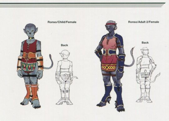
this is a female ronso from ffx. while ffxiv’s hrothgar are distinct from ronso, they were used as inspiration (one of the male faces has a horn option to call back to kimahri as well as the lost’s color palette being similar to ronso palettes). female ronso have less bestial faces than male ronso (to my eyes) and i expect this to carry over into ffxiv’s female hrothgar as well. do i like this hypothetical decision of less bestial femhroth? i don’t know. i don’t have much faith in the developers going through with a full monster girl. i do know that female au ra had a massive shift towards their current more petite appearance compared to some of their concepts (included in the heavensward artbook) and i wouldn’t be surprised if the developers wanted a more cutesy or conventionally attractive model for femhroth. i’m rooting for the more bestial model ideas personally, but i’ve made peace with the potential for something else. i’ll work with whatever they give me. a good example of the more bestial look i’m thinking of is karmaho’s work, check them out here. their scholar design is beautiful! another look that feels likely to me is the below image.
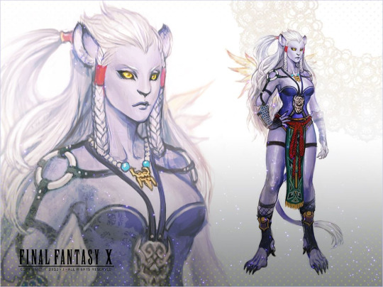
this is fanart of a genderbent kimahri (artist credit here). this image feels closest to what we’re getting for two (relatively arbitrary) reasons: her skin color and ear placement matches the queen in the shadowbringers concept art and she’s quite human compared to kimahri’s original design. the art is also just really cool and i wanted to show it to y’all.
so how does this tie into Nailah?
there is a pretty big difference between the two potentials for female hrothgar, which makes it weird to decide a face for her. i have a few color palettes i’m between though! and no matter what, she will have glorious fluffy hair. i’m not budging on that. her potential color palettes include genderbent kimahri (its so soft! and pretty! and her eyes work so well!) or something like a snow leopard (white fur with dark markings and striking blue/yellow eyes! monochrome color scheme my beloved!) or a dark blue concept (dark blue/purple skin with black hair and golden eyes! close to a panther!) or something like a pale calico (pale markings that you can barely see! she looks so gentle!) or... who knows! maybe the character creator will hit me with something new! there could be fur patterns that capture my imagination! until then, she’s just my vague cloud child of infinite possibilities and i love her.
#female hrothgar#its nailahposting hours#...that'll be my headcanon tag lmao#this post is long and unhinged#but really fun to make#i'm on the biggest copium for fanfest y'all have no idea
3 notes
·
View notes
Note
53%. If your character could only wear clothing of one color, which would they choose?
Oooooh, amazing. Assigning color schemes to my characters my beloved 😍😍😍
I'll do my top characters that I use the most, and that I have colors practically assigned to.
Unaek: Pink. Like a baby pink. Especially floral pattern. If not pink, then her second choice is green.
Eleni: Black. She is the resident goth pirate captain. Bonus if there are hints of purple, she loves that shit.
Jocasta: Also black, but not for goth reasons. For stealth reasons. If shes allowed one colorful accessory, then she would wear a scarf of varying colors
Phaedra: Pink, but like an obnoxious hot pink to match her hair
Amaryllis: Any earth tones, specifically yellow or brown
Vidra: Blue! Matches her hair and eyes!
Ziona: I havent talked about her in AGES but she was my OG, and she always was in purple. So I had to include her!
#Oc tag#Oc questions#Unaek Seveer#Flower Child#Jocasta#Bonfire Girl#Eleni Santiana#Captain El#Phaedra#Skull Kicker#Ziona#Vidra#Amaryllis
3 notes
·
View notes
Text
Today I'm doing a list on shiny Pokemon! But this time they're on shinies that are either ridiculous or just make no sense in any matter of the word sense.
-------------
No 1. Garchomp/and it's catastrophic mega form


(Normal is far left while shiny normal is middle and mega shiny is right)
Whoever designed normal shiny Garchomp deserves a slap in the face and whoever designed this monstrosity of a mega Pokemon's color scheme deserves a real whack in the face. I love Garchomp to bits but why did they have to almost make it look so pale it puts me and my naturally pasty skin to shame? And or make it look like it's possibly unwell?
And to make matters worse and rub salt into the open wound it gets even worse with its mega, who designed these? I figured they'd want to make Garchomp's shiny memorable considering many struggled with Cynthia's, but it turns out they really couldn't care less about such a badass of a pokemon.
Pure disaster and I HATE IT

-----------
No 2. Glaceon

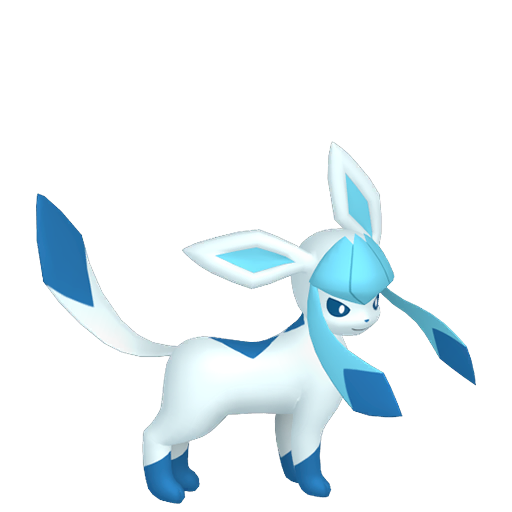
(shiny is right while normal is left)
I love all of the Eeveelutions, but Glaceon and Leafeon's shinies almost are indistinguishable from their normal counterparts if you don't know, or even if you do know you might miss them... Like Garchomp who is no 1 on here.
Why are the designers so bored with designing shiny pokemon?! Don't do the job if you don't put in enough effort for it to shine at least. (no pun intended)
Needs more shine

-----------------
No 3. Leafeon
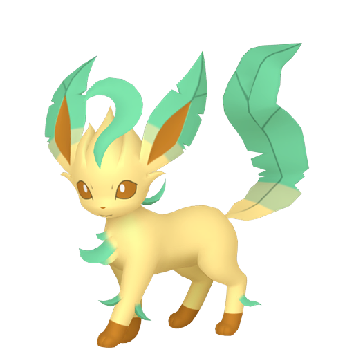
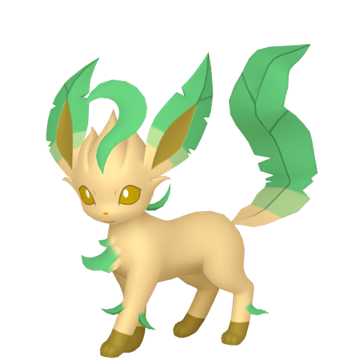
(Normal is left while shiny is right)
Even in editing of this post I'm struggling to see a real difference on my laptop screen, it only looks like the Leafeon got a slight tan and that is really it. Besides the more verdant green going on which I get but the tan doesn't, even if it is a grass type.
Pure lazy and stop tanning

-----------------
No 4. Pikachu


(Normal is on the left while shiny is on the right)
Pikachu is, and has always been the mascot of Nintendo and Pokemon since it's debut and everyone would assume and expect they'd treat the cute but annoying mouse with respect? Nope.
Just give it the Leafeon treatment and give it a tan. Expect here Pikachu look's like he got covered in cheeto or twistie dust and now looks like a living, breathing, and electrifying cheeto who you cannot eat.
I will eat pikachu if i'm not careful and caught on a bad day

-------------------
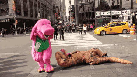
No 5. Dragonite
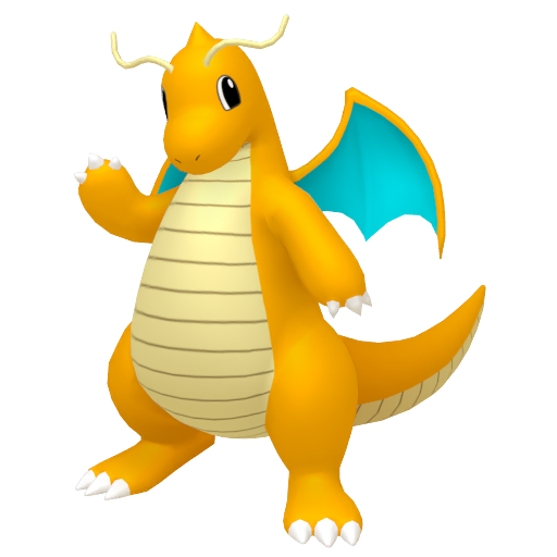

(Normal is on the left while shiny is on the right)
Everyone knows Barney the dinosaur, and Dragonite from Pokemon. And Gamefreak and Nintendo decided to combine them when doing Dragonite's shiny. It almost look's like Barney expect replace the green body with purple and the purple on his wings with green and that'd literally be Barney down to a capital T.
Dragonite is cute and cuddly while Barney isn't. At least to me, and is more scary than anything and I can think of more cooler color schemes for him.
Someone beat up the shiny pokemon designers
--------------------
No 6. Lucario/his disgusting shiny mega form

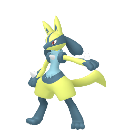
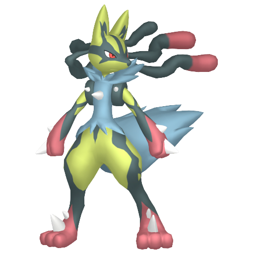
(Normal is on the left while normal shiny is in the middle and mega is on the right)
I love Lucario- so much so I have a statue of it which is still sitting in its box due to the fact i don't have a place for it currently. But regardless; Did they really have to treat such a beloved pokemon such as Lucario with such disrespect? Am I really seeing these shinies right? Normal is a very unflattering yellow which makes my eyes hurt and his mega form gets more worse although is very close to shiny mega garchomp on awfulness and unflattering colors which hurt my eyes.
His middle part which is usually beige goes to... BLUE? WHY BLUE? and it get worse in his mega form. If his whole shiny was blue it would've looks fine but with the eye-watering yellow it looks... eugh.

------------------
No 7. Gengar (not the mega or gigantamax)


(Normal on the left while shiny is on the right)
Gengar is one of the many favourite ghost types of mine, it fluctuates how much I like it at times. The difference between a shiny gengar is the blue in its mouth???
Not sure if that is still the case as I don't have one, at least, as of writing this (25/06/23) But doesn't change the fact shiny Gengar normally is the living embodiment of disappointment. Like Garchomp from earlier.
Rest in peace the pokemon whose shinies make them either indistinguishable or sick.

--------------
No 8. Mamoswine

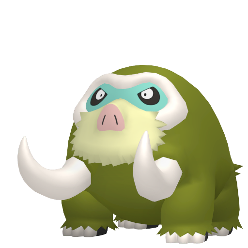
(Normal is on left while shiny's on right)
Mamoswine is a good pokemon, it's shiny though? No. I have one too if you wanted any reason to feel bad, or laugh at me, I caught it as a Piloswine with yellow hair (?) in PLA and decided to catch it as it's a shiny and anyone would kill for one. But this???? NO.
It's color scheme is a disgusting almost sewer green which is almost like Lucario's eye-watering yellow illness/plague that I really wish to never come into contact with.

-------------
No 8. Espeon

(Normal on left and shiny on right)
I love cats, there's no way I'm going to deny it as I have been brought up around them but... This one makes me want to try and spend as little time with it as possible due to the fact it is the color of toxicity and i don't want my character to get ill and die.
I still love Espeon, but... Why? Umbreon got the better end of the stick, but why did Espeon get the short end of it? Why are most of the eevee's considered poor color-wise on the scale of shininess??? Did they seriously give up on everything else besides Umbreon, Sylveon, Eevee, alongside Vaporeon who all stick out for the better reason then the rest?
Long story short I want it sent back to Chernobyl before I catch something

-------------
Image post limit is the reason this is not any longer, but yep. More to come of me shaming Nintendo and Gamefreak for their shitty color schemes
I was inspired to do this due to some youtube videos. But it's me on tumblr and my smart-ass
#ashestoshadows#long post#list#pokemon#shiny pokemon#nintendo#random post#lol#hate them#ugly shiny pokemon#wtf#shinies that make no sense
2 notes
·
View notes
Text
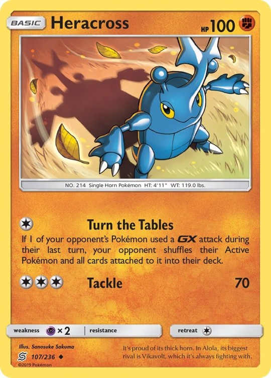
Heracross
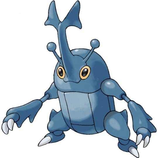
Let me just open by saying Heracross is probably my third favorite Pokemon of all time. I’ll of course elaborate on that as the article goes on, but I wanted to set that down nice and clear before really starting. Good? Good.
So, Heracross is Pokemon’s resident rhinoceros beetle, which also instantly made it a rival counterpart to Pinsir, the local stag beetle! In Japan, rhinoceros beetles and stag beetles are seen as natural competitors, and are often pitted against one another in fights. It’s interesting that while Scyther, Pinsir’s original counterpart, was given an evolution in Gen 2, Pinsir instead got a new rival in Heracross here.
And what a delightfully stylized cartoon bug Heracross is! Its solid dark blue color scheme is wonderfully simplistic, and allows the various lines segmenting its body to look nicely detailed without being too distracting or gaudy. Heracross also retains enough pleasant buggy qualities while also being generally appealing enough to not upset any insectophobes.
I really enjoy its elongated rugged clawed arms, and the goofy little antenna on its head. Despite how small its legs are in comparison, Heracross wears its bipedal proportions well. I love how slightly dopey its expression is too, with its big yellow eyes and charming cat-like smile. That horn is excellently shaped too, I really enjoy the sharp fork it comes to up top. If Heracross is female, though, it becomes heart shaped, which is cute enough.
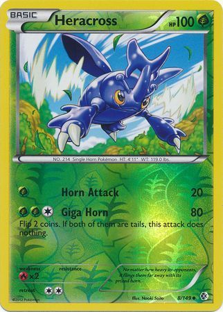
Since Heracross is a beetle, it does have a pair of wings hidden under its elytra, but instead of being a Flying type, it’s actually the series’ first Bug/Fighting type! When looking at a list of Fighting types, it is always kind of funny to see Heracross sitting alongside various humanoid martial artists, but that’s part of the appeal.
Heracross was also unique in its debut generation for having the exclusive move Megahorn, a monstrously powerful base 120 power Bug-type attack that was a clear sign of the raw power Heracross brought to the table. It speaks volumes that the second-strongest Bug-type attack of the generation had 50 base power at best.
I also think it’s worth mentioning that despite its raw power, Heracross is often portrayed as a relatively peaceful, sweet soul in most of its appearances. Heracross leads a simple life, only wishing to find sweet tree sap to feed on, only using its horn to fling away anything that tries to prevent it from getting more sap. Heracross is by no means greedy, though, as the anime has shown it’s perfectly willing to let other bugs feed if it isn’t being bothered by them. Just look at Heracross’s face, there’s no malice in that head. Definitely the face to Pinsir’s heel.
Score: 5/5 - PERFECT!

My very most beloved bug.
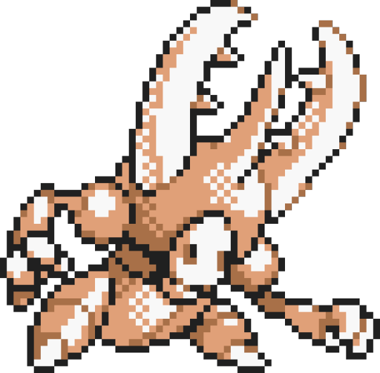
I will say before moving on that Pinsir was originally slated to get an evolution like Scyther, but was ultimately scrapped. This is a pretty neat design, even if it’s nothing more than a bigger Pinsir with a new central horn. The oddest feature though is the new face it seems to have, a pale little doll-like head where its toothy mouth used to be. What was the idea here??? I do wonder what it would’ve looked like had it come to fruition. It almost looks like the masks from Hollow Knight, of all things, despite being made 20 years prior.
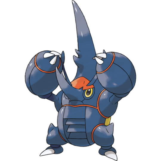
Anyways, just like its rival, Heracross too would receive a Mega Evolution, now becoming a full-on hercules beetle! It even has yellow elytra to reflect this, which is a neat little touch.
It’s a little unfortunate, though, that I like Mega Heracross just less enough to give it a different ranking than regular Heracross. I still like it quite a bit, don’t get me wrong, but there’s just a handful of little things that really keep me from falling in love with it the same way. The thing that feels most objectively at fault is how bloated and bulky its forearms are, I really just don’t get that part of its design. Why are they so round??
Its larger horn I do like quite a bit, but wish it kept something similar to the fork the original had. The smaller horn, while being accurate to a real hercules beetle, does come off as some sort of goofy elongated nose.
Mega Heracross also comes with the ability Skill Link which ensures that weak multi-hit moves like Pin Missile and Rock Blast hit a maximum of five times. It is quite powerful, don’t get me wrong, but does kind of lock Mega Heracross into a specific moveset to make full use of the ability which sadly excludes Megahorn from its arsenal. Heracross without Megahorn is just wrong.
Still, I do enjoy the fact that Heracross becomes a gigantic hercules beetle once given all that Mega energy, and a ferociously strong one at that with a base 185 Attack stat. You love to see it.
Score: 5/5

Can’t go wrong with a big beetle in these games.
[Gen 2 Archive]
9 notes
·
View notes
Text
Something I sometimes do for fun is find pokemon to associate with characters. This can be just one or a full "team" of pokemon I can imagine with or as that character,
And it was while doing this I discovered that the Corviknight line is literally so perfect for Anakin/Vader and maybe I'm not looking hard enough but I'm deeply disappointed I haven't seen anyone connect the two yet. Like. Look at them
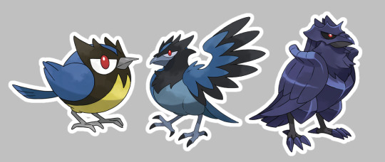
I'm gonna write my rambles on this here, they're not perfect and im going to sleep immediately after but I just want to like, vaguely explain my thoughts. Pokedex entires will be included too but they don't always add something
.

Rookidee
"It will bravely challenge any opponent, no matter how powerful. This Pokémon benefits from every battle—even a defeat increases its strength a bit."
"Jumping nimbly about, this small-bodied Pokémon takes advantage of even the slightest opportunity to disorient larger opponents."
Rookidee is a pure flying type which is perfect for Anakin as he's commonly referred to as the best pilot
Plus the blue and yellow color scheme here definitely reminds me of Anakin's podracer!
.

Corvisquire
"Smart enough to use tools in battle, these Pokémon have been seen picking up rocks and flinging them or using ropes to wrap up enemies."
"The lessons of many harsh battles have taught it how to accurately judge an opponent's strength."
The darker colors,,, more black in the design overall,,, the eye marking no longer being quite the pure white it was before,,, this my friends is the perfect pokémon to represent Anakin as an older teen and adult
Some lighter colors than he had pre-evolution, but teetering that much more closely to the dark
The yellow is gone, you could definitely find some symbolism in that if so desired. And blue is still a color that is easily associated with Anakin (and the light side of the force in general)
.
Corviknight
"This Pokémon reigns supreme in the skies of the Galar region. The black luster of its steel body could drive terror into the heart of any foe."
"With their great intellect and flying skills, these Pokémon very successfully act as the Galar region's airborne taxi service."
Corviknight my beloved. The reason I looked into this line in the first place after seeing its perfection as Vader
The evolution is flying/steel type, which suits very well. The armored look of this 'mon is absolutely perfect
Now completely consumed by darkness it looks like there's no hope, but he still has that small bit of light in his eye
Also, Corviknight's weaknesses are fire and electric. Which is very appropriate considering Vader's history with lava and sith lightning
#star wars#darth vader#anakin skywalker#star wars pokemon#or whatever i should tag this as#the weaknesses of rookidee and corvisquire and electric. ice. and ground. which i couldn't quite as easily connect with something#pokémon#pokemon#potato rambles n speaks#if star wars can use environmental storytelling to explain to you that a character weaking black clothes is how theyre close to darkness#then dangit i can use to convince you of rookidee
12 notes
·
View notes
Note
hi ghosty !! okay so i swear i respond to everything by tomorrow its actually pretty late for me but i might get it sent later !! i just wanted to say yes yes yes please show your art !! id love to see /gen :D
also thoughts on squishes ?? meaning platonic crushes ?? /genq /nftq
- ramble anon
[ID: a a pixelated digital painting of 2 tall buildings, looking as if they are made out of glass. the building on the left isn't entirely on the canvas, but is a vertical rectangle the ends in a point. the building on the right is a tower that becomes circular before ending in a point. the background is a blue sky gradient. End ID]
I remember this tower VERY clearly from heaven, so either it was very unique or important, but I can't remember what it's for. most buildings looked like this, with white and light blue color schemes (idk if the buildings were mainly made of glass, but a few were made of marble) heaven was very bright and a giant city with lots to do.
[ID: a a pixelated digital painting of a room with a window and what's outside it visible. the room is dark, but a bed with a pillow, 2 nightstands with on both sides of the bed, and a lamp on the left nightstand is visible. outside the window is a cityscape at night. visible is 7 buildings, most being rectangular with one being a tower that becomes more circular before ending in a point. light windows.can be seen on all except the tower and most left building. End ID]
heaven hotels my beloved. the softest beds I've ever been in. I remember having at one point a room with a great view of the city, it looked a lot more glowy though.
[ID: a a pixelated digital painting of a building underneath a ledge. the ledge, ground, and walls are a dark red color, and painted to look like rock. the building is small, with a door on the very right and 3 semi light windows to the left of the door. soft light is coming from the windows and lighting the ground in front of them. the sky is visible from the top and is a dark dull red. End ID]
this is hell, the sky was always some shade of dull or dark red. most buildings were underneath ledges and stuff, and you'd find entire stripes of lights and buildings with lots to do. a few buildings (mainly for working in the sin system) would be really tall. we more or less had districts (shopping/trading district, business district, housing district, etc.)
[ID: a a pixelated digital painting of 3 plants, on in the bottom left, the bottom right, and top left. the bottom left paint is a big leaf with a stem. the bottom right plant is a red petaled flower with yellow insides, and 2 shades of orange stamen. the top left flower is orange and cup-like with 2 green leaves on either side, and yellow stamen coming from inside. End ID]
I remember that leaf so much but don't remember what it was attached to. that red petal plant would come in many colors and was the size of a basketball, and the orange plant is taller then me (so over 5ft). hell had tall trees with lots of vines but I don't remember those as clearly.
I love squishes :] /gen. platonic and romantic feelings are practically the same for me, but I prefer to view it as platonic. so lots of squishes from this guy /lh
6 notes
·
View notes
Text
2022: a summary
Post your favourite or most popular edit from each month this year (it’s okay to skip months!)
tagged by krishna @i-got-the-feels ♥ thank you, thank you, thank you~
January
Popular - my tribute for the ending of bad buddy and my journey with patpran ♥ am happy ppl liked both the typography and the color scheme in this.
Favorite - i started obsessing over lang leav’s poetry + patpran with this one. i love the blues and the middle images with the shattered yous all over. it was a pain to do but worth it.
February
Popular - this one patpran edit that still makes rounds at times. it’s probably one of my most popular edits in general and i am very happy it is bc i adore it myself ♥
Favorite(s) - i am bad at choosing for this month so i have to mention both this bb edit bc i love the violet and the shots i chose, and this seanwhite edit bc the lang leav poem is Perfect and i think this one looks amazing.
March
Popular - this very quickly made ptpran edit with the sun and moon quote from my country i had stuck in my head for ages. i never really thought that anyone would notice this but i guess we all were into the same symbolism?
Favorite - very very tough choice once again but i was very passionate about this danyok edit that i made while hoping praying begging that they would get a happy ending
honorary mentions:
not me characters + problems x
not me characters as seven deadly sins x
April
Popular - this seanwhite edit for the not me celebration was a pain to make bc i felt like nothing of it worked like i hoped it would but i did love the final result ♥
Favorite - watching dew the movie changed me somehow and making both the edit for that absolute piece of art of a movie was a true joy. i made those edits only for myself bc i had to get some of that feeling off my chest and the first one owns my heart.
May
Popular - more lang leav with patpran. i adored this layout even if it, once again, was a huge pain to make
Favorite - had a field day planning this whole edit bc i haven’t done anything with as much detail and meaning in a while. tried new things and was very satisfied with the outcome. also loved making something darker and more focused on symbolism.
June
Popular - cheering at the fact that ppl felt as insane about the official vice versa trailer as i did! i have never felt that strongly about a starting show. vv really is just so special to me and this first edit feels so dear ♥
Favorite - of course it’s my pride month edit! i still return to this one at times, it was so much fun to make.
July
Popular - we were all hoes for kinnporsche the series and especially vegaspete during the summer so am not at all surprised that my first (and for the longest time only) vegaspete set got a bit more popular heh
Favorite - this vv set for the trailer is my beloved bc the colors were good, the pics worked, th flowers looked good. i love the style of this one and it just makes me so emotional to even look at it.
August
Popular - not blaming ppl for liking the fire yellow episode edit the most bc it is my favorite too (with soft blush and cloudy gray). also ep 6 is my favorite episode in vice versa so even more fitting.
Favorite - i spent a huge amount of time researching the mbti types for this and had so much fun with it plus i loooove the pastel looks for all the pics.
September
Popular - the cloudy gray episode edit is the one with most notes for this month which, once again, i do not blame anyone for! i personally love the b&w + pops of color look.
Favorite - the fah + prince introduction edit i made for asianlgbtnet. i enjoyed making this one a lot even if i knew it wouldn’t get that much attention with sky in your heart never really... taking off... sadness ;;
October
Popular - the last vice versa episode edit! which always reminds me of the struggle with my laptop... noodle accident, you will forever be famous
Favorite(s) - all of my bad buddy week entries!
favorite character: pran parakul x
favorite episode: episode 11 x
favorite dynamic: pranwai x
November
Popular - the impromptu last twilight trailer edit i made bc that trailer really just stole my heart and soul. i still watch it occasonally just to feel something
Favorite - the lang leav + puentalay edit i finally managed to make. i planned this one for a long while and currently it’s one of my personal favorite edits of mine
December
bc of traveling, the holidays, and me mostly just waiting for ppl to drop me prompts throughout this time, i only made two edits during december so mentioning both of them.
vice versa x bad buddy parallels as flipped lives x
puen babygirl x
i adore both and never expected either of them to be famous ♥
this was a cool look at all of the things i made last year. there have been quite many? i think october had the most with me finally surviving my laptop crisis and then just going wild :’D
tagging: @oswlld @wanderlust-in-my-soul @ardentlytess @spicyvampire @liyazaki @dimpledpran @snimeat ♥ link me if you’ve already done this bc i think am kind of late...
#tag game#this feels actually quite insane#also idk i guess i should reblog my own stuff more#if i wanted more popular posts#but well i've never liked advertising myself lol#find my stuff if it so happens#but this was a lot of fun ^^#thanks a lot krishna you're the best#and your edits are so pretty too!!#i will go through your list one of these days when i have a better moment
3 notes
·
View notes
Text
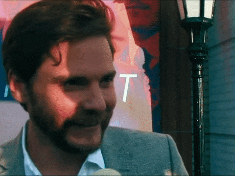


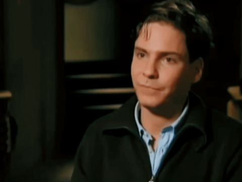
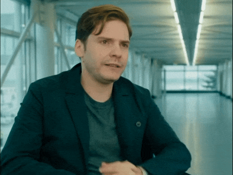
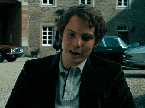
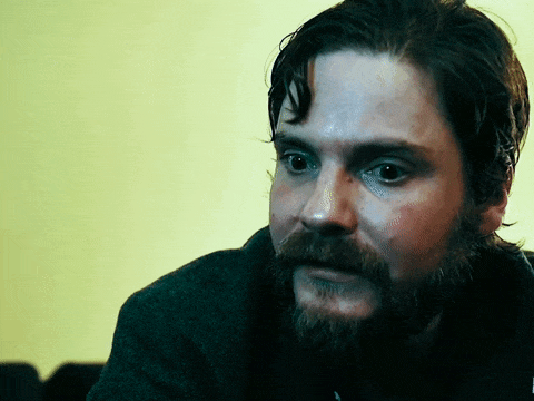
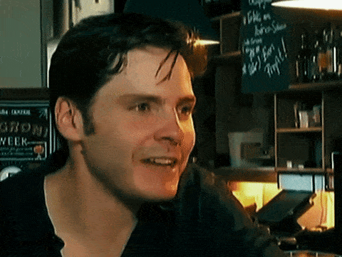
Curls™
#daniel brühl#daniel bruhl#daniel bruehl#interview#the alienist#ca:cw#cacw#rush 2013#7 days in entebbe#the color scheme is questionable but thank you i take no critic#i'm talking about you 7 days in entebbe daniel#wtf#why is he looking so yellow and blue at the same time#like spongebob underwater but instead water underspongebob#niki lauda my beloved#ily#baron zemo#laszlo kreizler#niki lauda#twwcs
707 notes
·
View notes
Last Seen Blogs