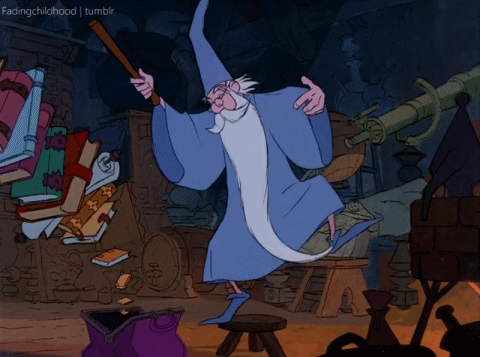
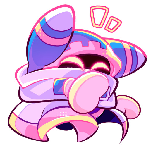
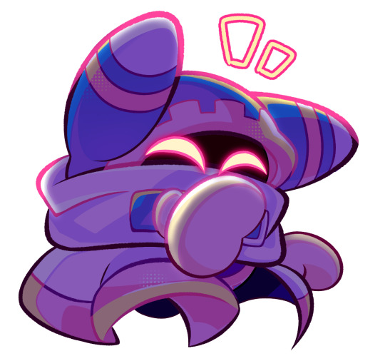
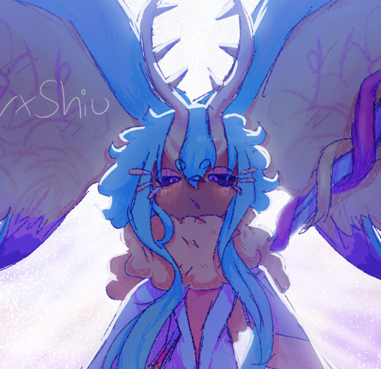
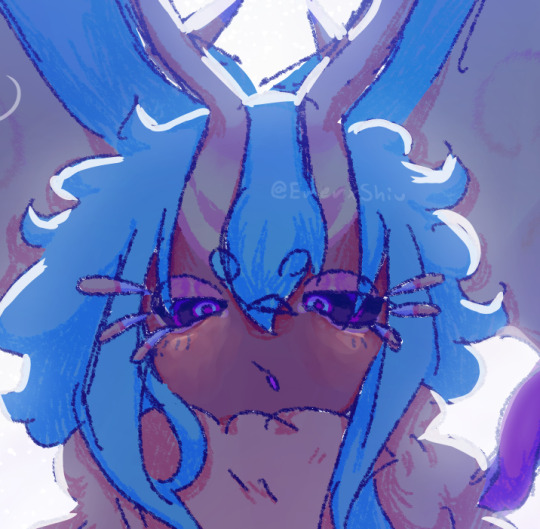
#because its fun to lineart them
Text

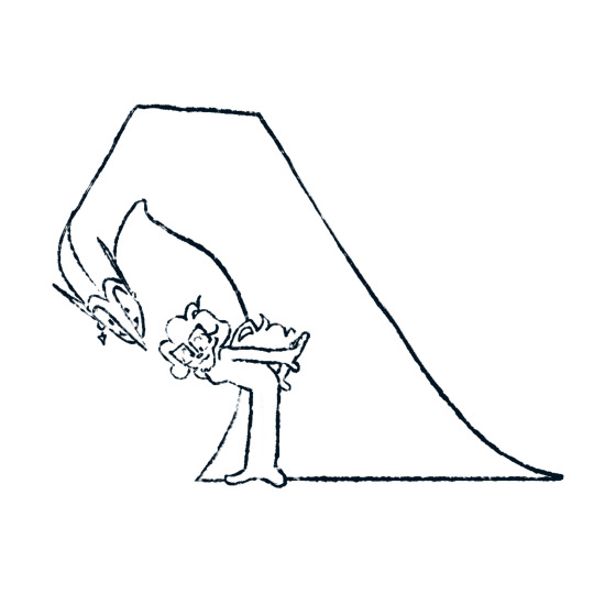
Yelena will always find a way to be nice (by sharing the coolest vest) in the most annoying way possible. True younger sis (in law) vibes >:3
sketch for another overcrowded drawing done! I'm actually proud of myself for properly sketching out the furniture and not halfassing it as usual
#sketch#wip#yelena belova#natasha romanoff#black widow#bucky barnes#winter soldier#buckynat#winterwidow#liho the cat#alpine the cat#fanny the dog#i kinda think buckys side doesn't have enough stuff in it#i'm open for suggestions :)#the dumber the better!#i mean i know i can balance it out by moving things from yelena and nat's side#but I want as many details as possible#because its fun to lineart them#so who cares if the end result is perfect
270 notes
·
View notes
Text
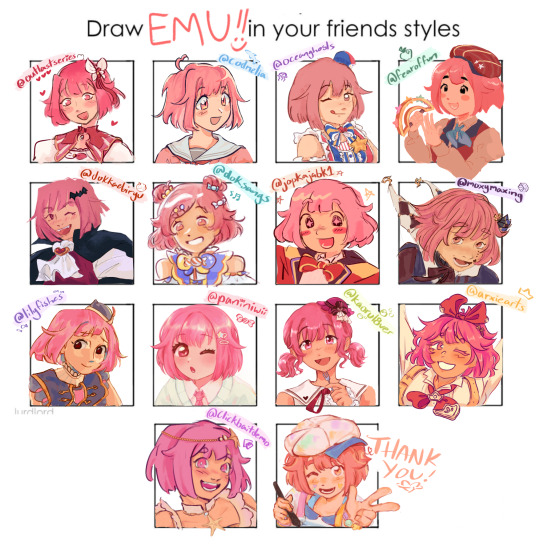
a mob of emus for an artstyle game on twt! ^_^
#project sekai#emu otori#the usernames are all their public twts so if you use that evil platform check out their art ^_^#many of them are on here with the same users even.. be gone from my sight vile bird#the one on the bottom right is Mine but ive never had an artstyle in my life so it may not be obvious to the viewers. sorry.#pjsk#prsk#proseka#only my beautiful mutuals beautiful art can make me do LINEART#i was going to ask on here but realized i dont have mutuals bc this is a side blog. sniffle. hell on earth#I dont have much to scream in the tags. semester is almost over. Im sleepy. I designed emu a huge seord for an assignment#but the 3d model turned out Bad. it looks ok from the top but you turn it and see Problems.#its been a month or so since i modelled that and i have gotten better so i want to try again with no time crunch + pressure#its a fun looking sword. magical girl sword type shit#EVERY TIME I THINK ABOUT THE LITTLE PRINCE WXS STUFF I END UP AWAKE UNTIL 3AM BECAUse it GETS TO ME#WAAAAAAAAAUHGH. I HAVE CLASS IN 11 HOURS#GOODNIGHT. IT WILL BE AS IF ALL THE STARS WERE LAUGHING.#oh my god wait i did this this weekend bc i was like yaay i have a weekend without any assignments due#I just forgot abt one. Bc my email hasnt been working properly and didnt send me the reminder for it. i will spend my tuesdah drawing a gun
403 notes
·
View notes
Photo
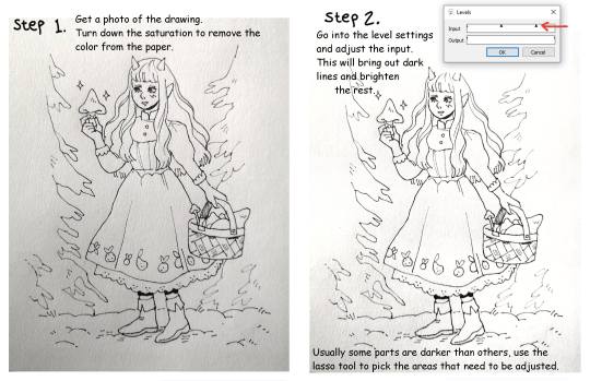

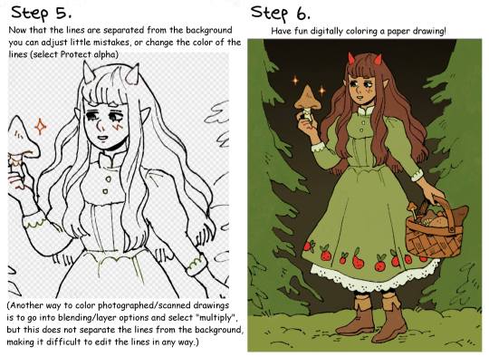
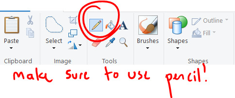
Quick lineart extraction tutorial!
The program used in this example is Firealpaca, but as far as I know these type of settings exist in most basic art programs (firealpaca is like the most basic of all anyway lmao). I dont own a scanner so a lot of the time I simply take a photo of the drawing with my phone, cleaning and extracting the lines still only takes a few minutes! Hope this is helpful :)
#The moment I learned this from a friend I pretty much stopped doing lineart digitally#because its just comfier to draw with actual pencils#but coloring digitally is fun and way faster so combining them is peak for me#art tutorial#lineart#inks
2K notes
·
View notes
Text

caught in your own web, just like your mother
#murder drones#murder drones fanart#murder drones uzi#md uzi#uzi doorman#murder drones nori#nori doorman#glasswingdraws#i've mentioned before how the parallels between nori and uzi are interesting to me#and i really hope we get to see more of what nori was like when she was alive#or just more nori in general because we've all gone insane over the implications of her lmao#most of uzi's papers are copied directly from her conspiracy board#i had to make up/copy most of nori's because we don't know what info she actually had#i had a lot of fun writing articles for the fake newsletters :)#its a shame i made 85% of them too small to fucking read :)#and text editing in medibang paint is a fucking hassle so i'd have to go back and rewrite all of them :)#it's fine i'm fine#also this piece taught me a valuable lesson about layer management#the entire time i was like where is that layer why is that in the lineart folder why is that in the background folder#anyway. hopefully lesson learned#see ya'll after ep 4 drops
344 notes
·
View notes
Text
imagine the shade was like a hat
(a silly one for sure- here I wanted to draw them with more detailed limbs. mainly inspired by a point on this post but also by some other forehead jokes i vaguely remember.)
#art#artists on tumblr#hfjone#airy hfjone#liam hfjone#and my commenting on the drawing process:#this is actually a bit of a mix with different things#for one the limb thing- though it is a bit more character specific i kinda like the idea of limbs a bit more based on their object material#though i might throw ideas of object-specific customizations and some more animal features into the mix because they seem fun :D#for lineart its kind of a compromise between wanting clean looking lines but also not having to go through the pains of ctrl + z...#...and just letting lines be sketchy but also cleaning them up where i wanted#while not exactly new the shading for the characters is based a bit on the shading method ive used before that i had forgotten completely#and i think i could be trying this method again more its a nice shading method and i think it looks nice here#and hey! a background#something ill admittedly need more practice with to get a better sense of characters interacting with their environment#plus landscape arts are quite pretty. id like to make at least one this year maybe.#i rambled on here long enough so ill be cutting it off here-! <:D
30 notes
·
View notes
Text
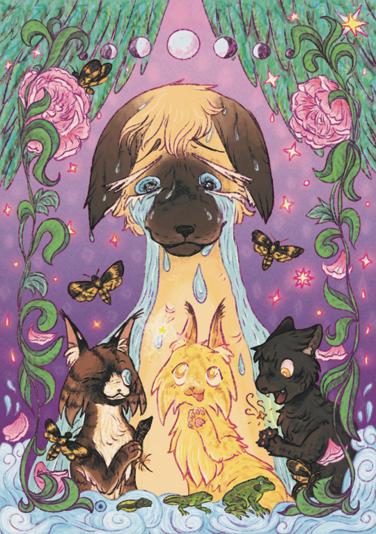
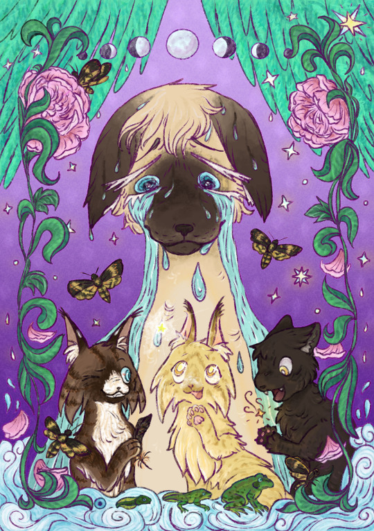
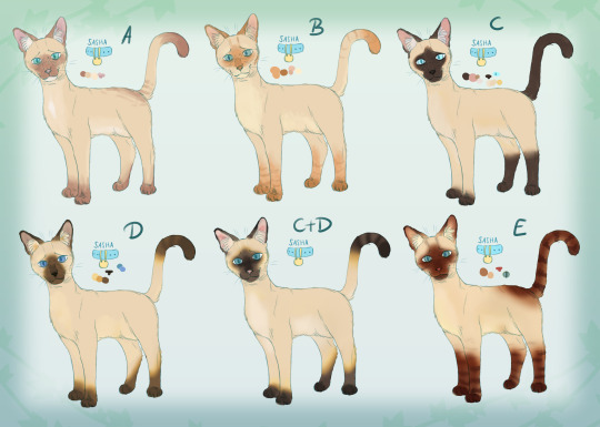
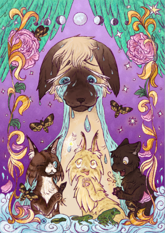
My Piece for @harriertail 's Ultimate Guide Zine!
I got Sasha and her kits <3 I had sooo so much fun!!
Below are some wip pictures + my thoughts behind the piece!!!
the RGB Version! The lineart isn't colored in properly here.
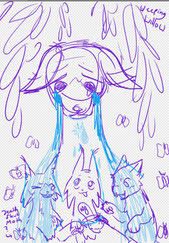
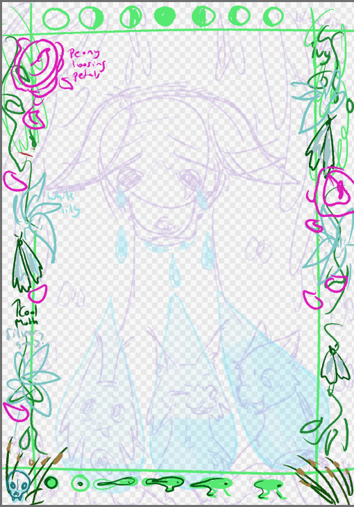

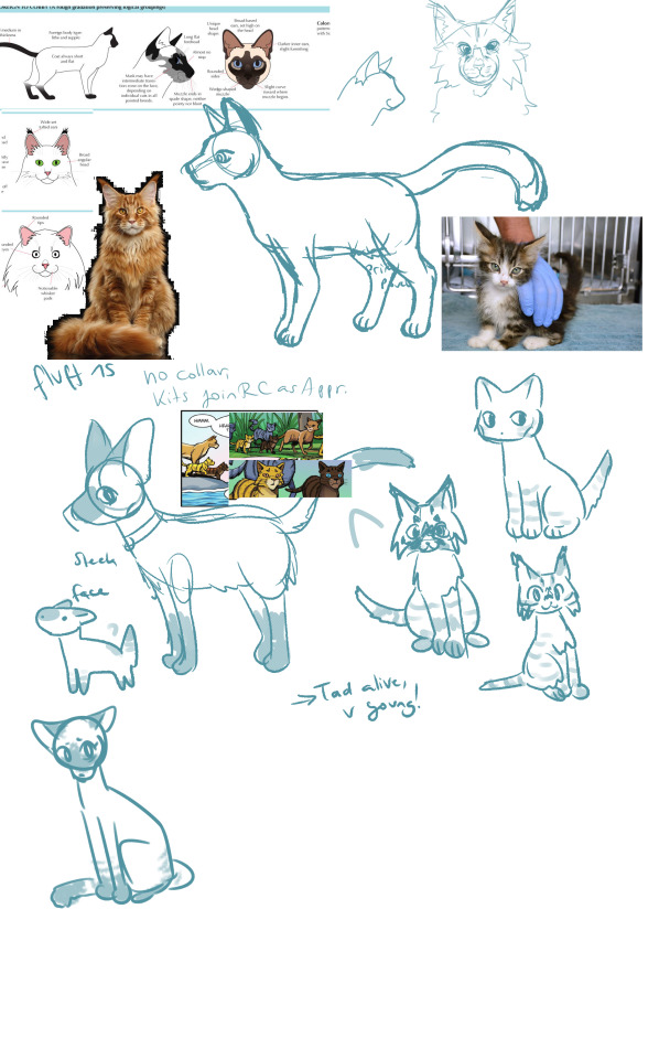
Some earlier Concepts + sketches!
Many Sashas.. and originally the leaves were supposed to be golden, but it didn't fit well.
Some thoughts:
What i love about Sasha is just how tied to water her life is-yes i enjoyed her Manga a lot, my poor little miserable women <3
First off all, she leaves her happy life as a ships-cat to raise her children. Tadpole drowns early in their lives, putting a Shadow over their happiness. They leave for RIVERclan- where Hawkfrost will die in the Lake while Mothwing lives out a life she is not the happiest with. Its why she is looking at a Star-she may be the last one alive and at first, a life as a medicine cat seemed to be everything she wanted, until she found out about Hawkfrosts Manipulation.
Tadpole holds a star because he is the strongest kit, yet dies first.
The three are symbolised by a feather, the evolution of the frog and death's-head hawkmoth- symbols of death, obviously.
Willows grow around bodies of water and are often symbols of grief.
Meanwhile Sasha can only look down and with the passage of time (-> moon phases changing) see and know that in the end, her trying to save her children doomed them, and do nothing about it but cry.
Kinda depressing stuff for a little kitty in a book :,D
if you read my thoughts, thank you so much! I hope everyone enjoys their copy of the Ultimate guide zine. Heres a treat for you: 🐱🌿 (catnip)
#warriorcats#warrior cats ultimate guide zine#warriors#warrior cats#mothwing#hawkfrost#Sasha#sasha warrior cats#warriors sasha#wc sasha#tadpole wc#warriors tadpole#warriorcats tadpole#zine#zine art#warriorcats art#zine artist#warrior cats mothwing#warriorcats hawkfrost#hawkkit#mothkit
2K notes
·
View notes
Text
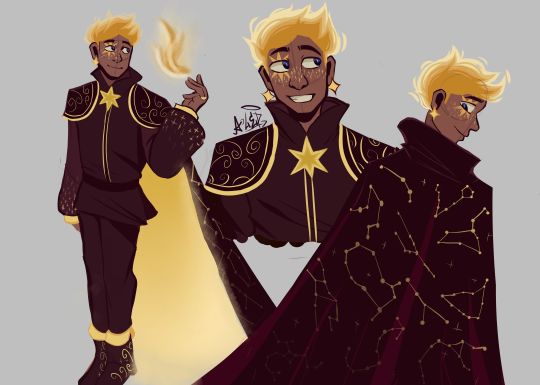
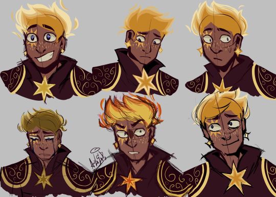
THE MOMENT WE WERE ALL WAITING FOR, FINALLY FINISHED THE DESIGN OF ASTER YESSSSSS ✨✨✨✨✨✨❤❤
This design belongs to the Wish rewrite called "The kingdom of wishes" (Written by @annymation and soon illustrated by @emillyverse and me)
Sorry for the delay, but this guy had so many things to draw and I also had a thousand ideas that it took me a while to capture them all (4 drawings wow, even I'm surprised lol)
Now after this introduction I will tell you the procedure of its design :]
2D MODEL:
-Maybe some don't notice it, but for the 2D drawing of Aster I didn't add many shadows, because in the classic Disney movies the animation doesn't have many shadows if we look closely, this is for several reasons (at that time they had to inking FRAME BY FRAME, can you imagine how much longer it would have taken to add detailed shadows? I really have respect for the animators)

(Here are some examples of what I'm trying to explain)
-As I said before, I didn't detach myself much from the concept art of the movie, I just added some other details that occurred to me, Anny and Emy.
-We decided that his cape would have the constellations of the signs of the zodiac (It was Emy's idea), which in the final result are on the cape, the constellations are noticeable more or less depending on Aster's mood.
-In the Wish rewrite it is mentioned that Aster's hair is like a candle (Reference to Hades) so I decided not to add the lineart in that part
His hair changes depending on his emotions, but not only that, but also his lineart, the calmer he is, the cleaner his animation will be, however with strong emotions (anger, sadness, nervousness) his details will be more neglected, especially when He is REALLY angry, by the way I made his hair look like a flame to give more drama to his design and also make a reference to Ember from Elemental
And as a final detail, the star-shaped gem that she has as a brooch changes color, just like her earrings.
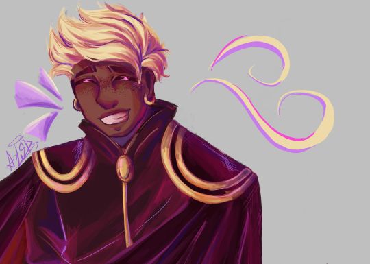
3D MODEL:
-When Aster disguises himself as a human, his details on his clothes would disappear and the shape of his accessories would change to ones without a star shape, also the tone of yellow would look duller, you know so as not to draw attention (although he is dressed like a prince with a giant cape, the boy doesn't know how to hide the truth very well lmao)
-In general, it's just that the design becomes simpler, the only thing that changes is her hair that is no longer a flame, her freckles that are no longer little stars, her clothes no longer have so many details and her mark on her eye disappears( ̄▽ ̄) .
By the way, I wanted to thank @the-autistic-idiot for giving us the great idea of Aster having a star-shaped mark on his eye :D.
-Also, I think that those who have seen my other Wish redesigns are wondering why it seems like I had spit a rainbow at Aster's 3D drawings, what happened is that when I was painting my neurons said ✨Change your coloring✨ and well, The drawing in the end came out like this, although I honestly like it better, it better represents how I draw in a traditional way
Yes, basically the coloring of my drawings is as if a unicorn had spit on them lol
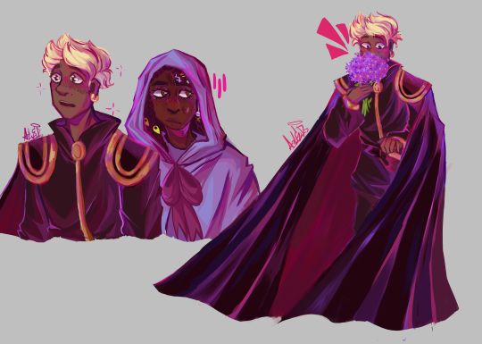
FINAL COMMENTS:
-It was very fun to draw Aster! The boy really has a lot of changes, but thanks to him I already discovered my digital drawing style so I am satisfied.
-Again sorry for the delay, I know that for many Aster must be their favorite character so I hope your wait was worth it :]
See you next time!✨✨
#disney wish#wish 2023#disney#wish movie#sketch#wish#art#artists on tumblr#artwork#drawing#star wish#starboy#human star#wish star#starsha#star redesing#the kingdom of wishes#the kingdom of wishes fandom#the kingdom of wishes au#starboy wish#starboy x asha#asha and starboy#wish concept art#asha x star#wish asha#wish disney#disney fanart#disney movies#disney animation#walt disney animation studios
351 notes
·
View notes
Text
Okay so last night I was having an "art style panic"? I guess you could call it that? But I was feeling really bad, so i started drawing other peoples art styles and picking points and peaces out of it!
I did this last night when I was really tired and i used a pen so the drawings may not be how i usually do my drawings haha
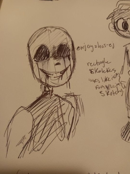
Ok so first up we have @emjoyzhos-ej !! I recently just found your account but you have a very cool style!!
•Your skull shape is very unique, very rectangle
•your lines are very sketchy (most people I follow have this trait in their art..)
•when you color it looks like you mayy have rook inspiration from itsxroxannex? Idk i wrote that down, maybe it's not true but I guess i thought that last night
But I love your style! Your art is so cool and I had fun trying to replicate it!
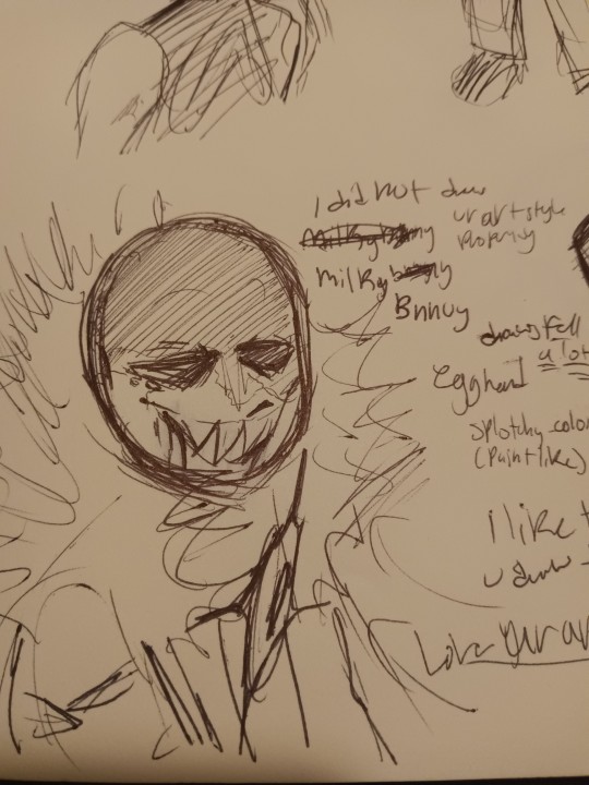
Next we have @milkybnnuy ! Omg so I really like you!! Your art is sooo good
•You draw a lot of fell, so i made the drawing of killer like how you made that one fell killer drawing
•when you color you have a very paintly-style and that's cool!!
•your skull shape reminds me of an egg (i guess thats why i said "egg head" last night)
Up in the top I wrote "I did not replicate your art properly enough," and that's true! Your art is so unique and different from what i usually drew so i had a hard time replicating it! But nonetheless, i had a fun time trying and hope you ain't disappointed lol
Btw- I really like the way you draw your fuzz on hoods!! So satisfying to look at!
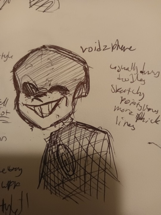
And now we go onto @voidzphere !
I've followed you for a while, and you're cool to be around and I like when you post! Though i had a hard time finding the art hidden around, I still was able to replicate it (luckily i chose to draw killer for this haha)
•so I see that you usually draw/post doodles, unless i just didn't scroll down far enough haha (plz tell me if you have drawn something big i wanna see)
•I noticed you have more pointy and thicker lines
•you have a certain way you draw your Skulls, I can't really put a shape or object here to describe it
Even though I couldn't find more drawings, I still tried! I hope you like it, friend, cause u cool
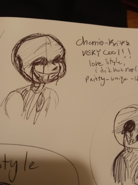
Here is @cherrio-krispz ! I just started following you last night, like seriously I had to search you up just now to figure out who you were cuz I forgot, but when i saw your art I immediately recognized you
•you have a very recognizable style!
•again, i did not replicate well.
•very painty-like when color
•sketchy lines, seems like you don't do line art?
•I like ur skulls, they look like skulls
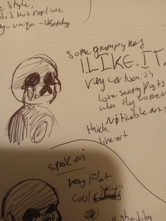
OMG I'VE BEEN WAITING TO TALK ABOUT YOU. YOU. YOUUU. @somegrumpynerd OMG YOUUUUUU. I REALLY LIKE YOUR ARTTT.
•I LIKE IT
•very cartoonish
• noticable art style
•thick lineart
I LOVE seeing posts when they come out!!! They're really really cool and make me feel so happy when I see them! Keep going because you're so cool!
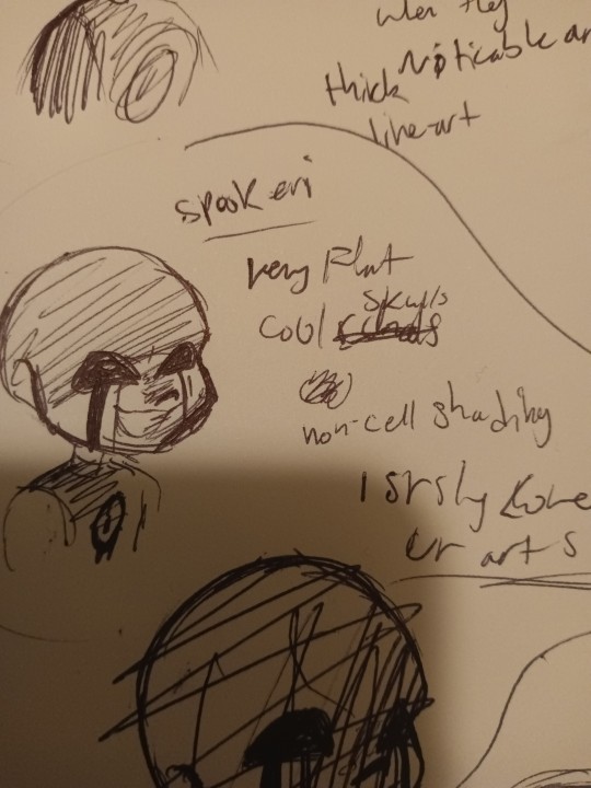
@spookeri haiiii
You're here tooo
i like ur art :)))))) a LOT . Same as the last guy, I get very excited when you post. Your DTIYS were fun, and yeye... Yeah
•Very flat colors
•flat lines
•cool looking skulls
•you have an "air-brush" shading style (i guess you could call it), which isn't a bad thing! Do what you want to do! But maybe try out cell-shading? Idk you don't have to, but idk i feel like cell-shading fits your art style
Also if you look in the bottom you can see a scratched out drawing, that was my first attempt haha
You can see it in the drawing below

@wyllaztopia !! I like your art :)) you have a very noticeable style and when you post I get excited as well!
•clean lines
•you make skulls longer than how other people make their skulls in this last
•I liked replicating it
Idk what else to say ... Its just all really cool!!
And last but not the worst
My art style!
My art style is
•cool
•easy to draw
•and funny lookin'
What did i learn from this whole thing i did? That everyone has a unique style, that even if they try to change it it still stays theirs and it's still unique
I also found out that everyone, small artists and big artists, has flaws! It's comforting to know that everyone has flaws so I know I'm just learning and getting better everyday
Another thing I got from this is that everyone's styles are always changing and warping. But thats fine! Because everyone's moving and changing, and the worlds always moving and changing!
So, don't be so hard on yourself if you're struggling to draw or find an art style, how you draw is unique to you and you'll like it one day
Just keep drawing everyday and you'll get there.
I suggest doing this challenge, on paper or digital, wether you color it or not, or post ot or not!
It's great to try out.
182 notes
·
View notes
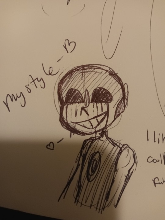
Text
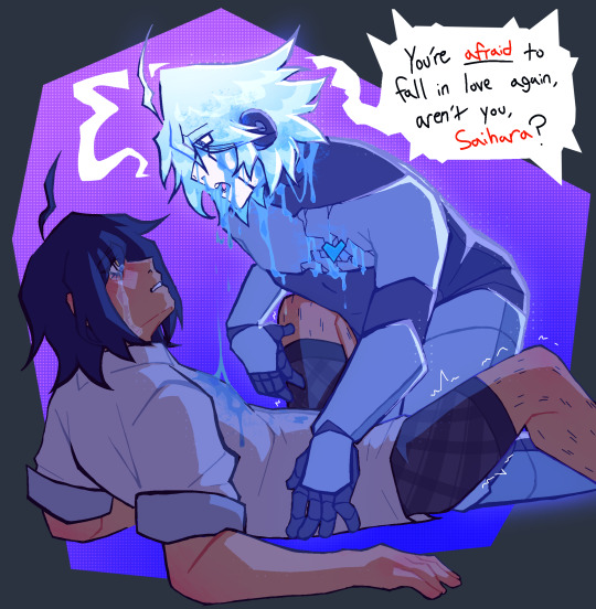
“You’re scared. Because you know deep down, I’ll end up just like the others. Why ever get close, when you’ll just lose me in the end, right?”
HIII TUMBLR IM BACK WITH MORE FUN CRYPTIC SYMBOLISTIC ART (MY FAVORITE) went out of my usual comfort zone with this one (PEEP THE LINEART?? FINALLY FIGURED OUT HOW TO MAKE LINEART WORK FOR ME!! STILL WONT BE A THING I DO OFTEN THOUGH LMAOOO) BUT I HAD LOADS OF FUNWITH IT!!
basically the story here,
I got reminded of my like. over half a year old symbolistic intimacy kiibo piece (that instagram almost snipped me for bc artistic nudity is so scary or whatever over there) and was inspired to sort of make a shuichi parallel! kind of!!! cuz I’m still really fond of the kiibo centric piece!!
so obviously, like the other piece, this is in like. a dream scape in shuichis head, and that ghost-like kiibo is more of a reflection of his pushing AWAY of feelings, as opposed to curiousity and doubts, like the kiibo piece was. this killing game has taken everyone shuichi has gotten the chance to love, and crushed them in the palms of its hands, leaving him to weep. this ghosty kiibo is basically a manifestation of how badly he wants to pursue his feelings but he can’t bare to go through the same thing ALL over again.
oh! and heres that half year old kiibo symbolistic piece i was talking about! with its original caption too!, cuz I don’t think I ever got to sharing it here!! cw for non explicit nudity!!
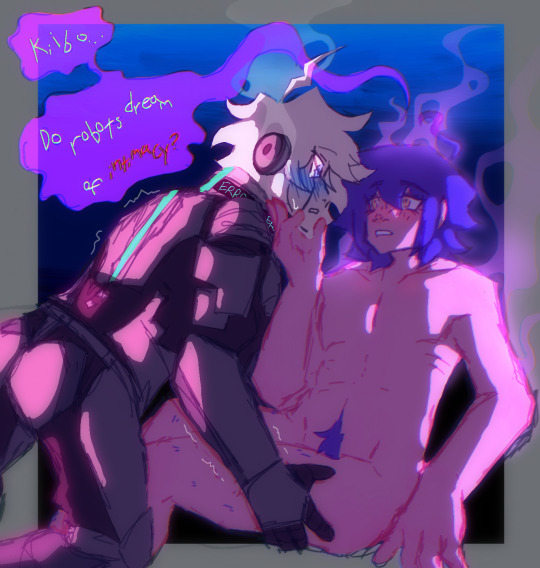
"or are you just programmed to feel this way?"
the idea of this piece was centered around kiibo and his first experiences of feeling love and intimacy, how confused he'd be and how vivid it'd feel, I wanted to try and express that in a physical way, this almost ghost-like version of shuichi being a manifestation of all those feelings piled up, how he has no idea how to deal with them while simultaneously wanting so badly to pursue them, it's rly interesting to think about!!!
ANYWAYYSSS these two are so fucking fun for more intimate type symbolism idk. their relationship is so much more. complex when you look at all the layers to each side and each of their responses to things and etc etc EXPLODES IDK THOUGHTS AND BRAIN JUICES EVERYWHERE
#cw nudity#past the keep reading line !!#forgot I hadn’t shared the initial piece here yet pfhfh#ITS CRUTIAL#THEY MUST GO TOGETHER!!#CONTEXT MATTERS YADDA YADDA I LIKE DEEP RELATIONSHIP SAIIBO SYMBOLISM#saiibo#shuichi saihara#k1 b0#kiibo#keebo#danganronpa v3#danganronpa#drv3#danganronpa kiibo#danganronpa shuichi#saihara shuichi#danganronpa v3 killing harmony#danganronpa fanart#danganronpa art#danganronpa ships
90 notes
·
View notes
Text
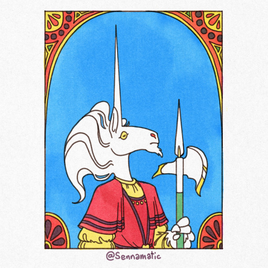


Every New Years, I like to show off some of the art that never got posted during the year! I think its important to know not everything makes it through to the final stage, but its always good to keep track of your work!
Explanations under the read more!
One of the many unicorn drawings I made this year, I was SUPER dedicated to making something that echoes the design of a halberd. When I was making it, it ended up feeling like I was going through the motions and I lost sight of the original idea. It ended up being finished, but I never posted it because it felt like it wasn't good enough to stand alongside my other works in the series!
A little doodle of Uncle Stinky and I from early January! I really DO like this one, and would have posted it if it were more substantial. I'm hoping to maybe repurpose it into a bigger collection of my diary comics instead of letting it rot on my hard drive for no reason!
Another Uncle Stinky drawing. I actually think I might've posted this one somewhere on twitter or Instagram, but it didn't seem to make it to tumblr for the same reason as the previous drawing. But fun fact! This was one of the first drawings I made with the Kolormarc brushes that ended up shaping my unicorn art during the year!
Another unfinished Unicorn drawing. This one went through a ton of differently thumbnails over quite a few weeks. I got all the way to the lineart before I burned out on it. I just couldn't decide how I wanted to color it and other work ended up piling up. I would really like to see it through to the finish line in the future.
A collection of photobashed weapons from a DnD campaign. This was the campaign my friend DMed and the same campaign that created Romeo. I made this drawing for a zine we've been working on for a few months. If it ever makes it to finish, I'd love the share the zine with you guys! The weapons are (in order from left to right) a lethal squirt gun, owned by Romeo, a glittery mace owned by Hugh Mongus, a temperature-controlled hook for Captain Hook, and a feather-light sword for Hickory.
The very first thing i made in the Womp 3D software! I don't have much experience with 3D modeling, but it was pretty easy to latch onto the mechanics of this! It was just a simple beast, I still kind of like it!
Another DnD drawing for the same zine as #5. This is a little drawing of an NPC named Rumple, who's some fancy fashion designer who's crossed paths with Romeo in the past. Rumple was really fun to interact with, and the snazziest dresser in the campaign!
A itty bitty Uncle Stinky I made for a super bare-bones pet game i found somewhere? It was so barebones that it's pretty much useless. But hey! If you wanna try it out, I'm hosting it on my (practically unused) neocities page
Some drawings of my friend @finnimate 's DnD character from the same campaign as Zoltan! His name is Angel, and he's a big sturdy triceratops. I love a good dinosaur, but Triceratops are notoriously awkward to draw. I threw this page together just to try it out and see if I could help them settle on a design. I don't think I succeeded, but I like getting to draw Angel anyways :D
#art tag#digital art#art#illustration#happy new year#artists on tumblr#drawing#artwork#oc#original character#my art#new years#new years eve#new years resolution#fantasy art#drawings#illlustration#unicorn#furry#uncle stinky#unicorn art#kolormarc#the kingdom of lattice#dnd#dnd art#dnd character#dnd oc#dungeons and dragons#dragonborn#triceratops
125 notes
·
View notes
Note
hello! do you have any tips for drawing in paint?
I ended up making a little tutorial so. .
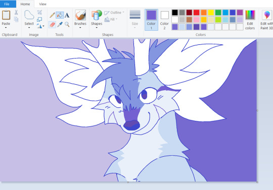
My MSpaint workflow!
(not applicable to everyone each person has their own way to use each program)

Start with a sketch!

Do lineart over sketch, and make sure its in a DIFFERENT COLOR!

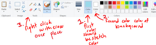
From here you can isolate the lineart by just erasing the lineart color! (and ctrl + makes the tool your using bigger)

Now we have just the lineart!
From here I color, just using the paint bucket tool and drawing the markings on
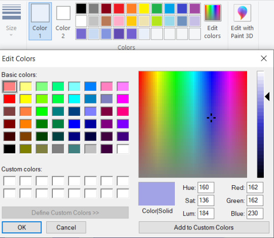
Adding the shading, I choose the colors I chose, then use the edit colors tool to make them darker and a slightly different tint.

Now for the painting process, I use this to mix my colors together. Basically find two colors, paint a line inbetween them using this paint brush tool and one of the colors, then select the inbetween color. This is mostly the same as how I paint in other programs.

COLOR TANGENT!! When digitally paintings it is sometimes better to just choose a color that would be inbetween, ESPECIALLY with yellow and blue. Its kinda complicated but how the computer does its calculations it can grey out your colors.

But I basically do the painting mixing and coloring all around the piece, choosing inbetweens everywhere, and smoothing out the shading lines, I tend to go over my lineart here

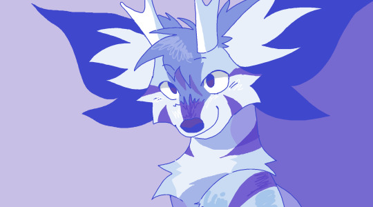
And Im done!
Just adding a lot of details + I tend to do the bg last
My style depends on which piece im working on, sometimes I use the paint brush for all of the piece so its a lot smoother
This was done with the paint brush in MS Paint (the one I used in the mixing section) but it is still the same process, I would just use the paint brush instead of the pencil

but this one was done entirely with the pencil tool, so its up to you which style your going for
Hope that was helpful, and at least taught some fun ms paint tricks heh. Its really fun to work with because it forces you to work on one layer
#long post#ms paint#tutorial#ms paint tutorial#painting tutorial#digital painting#digital painting tutorial#i hope this makes any sense at all LMAO#i can never tell with tutorials#but i thought it would be fun : D
651 notes
·
View notes
Text
im so sorry it took me so long to answer these oml but YES i'd be happy to show how i draw and color :)
— SKETCHING
please note that i almost always sketch traditionally first lol it's just a lot easier for me to determine how the drawing is placed that way, but i always go over and re-sketch it digitally
for magolor i always start with a basic egg shape (lmao) and then i add his ears. then I draw the scarf; it's easy to determine the shape and dynamicism based on where the bottoms of the ears are located
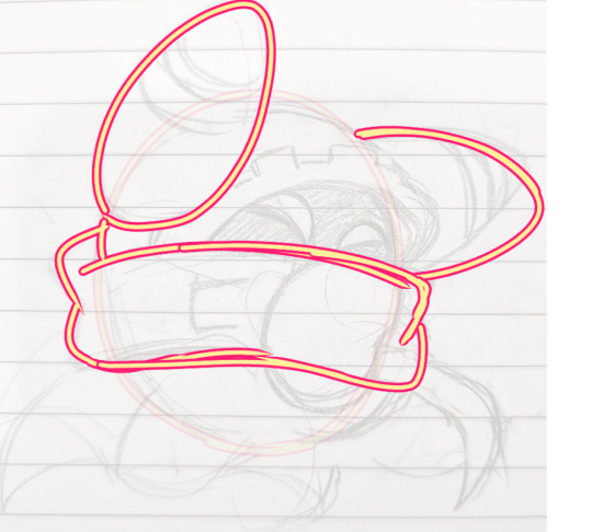
then i usually add the cape and hood together. where and how these are placed and what these look like in general are very important because they're the main area that perspective is directed to (the ears and everything else is important too ofc!! but the hood and cape usually help demonstrate where he is looking and how he is moving the most). then i add everything else, usually his hands last!
— LINEART
ohhhhhh god my worst enemy. Hope youre sitting down because this will be embarrassing LMAO
lineart is easily what i struggle with most and is more often than not the most time consuming and grating step for me. If i had a choice i would drop it in a heartbeat, but my style is so dependent on thick lines and shapes that it's difficult to 😭 a hole i dug myself into unfortunately ITS FINE THOUGH. ANYWAYS I'm getting sidetracked
i use my finger to draw all my digital art, which means i usually have to use a Heavy stabilizer to avoid shakiness and staggered lines. Unfortunately ibis paint's stabilizer is actually dog water and doesn't even stabilize more than half the time (in which case i have to repeat lines over. And over. And over again until i get it right) but when it does like me and works properly it's very helpful!
i always use the soft school pen bleed brush as my main tool for lineart. This brush has been my best friend for everything, i even use it for sketching idk it just really like the way it looks lol. sometimes i change the aspect if i want the lines to look more ,, chalky?? or smoother depending on the work

i don't really use this tool much but for this specific piece, force fade was my partner in crime
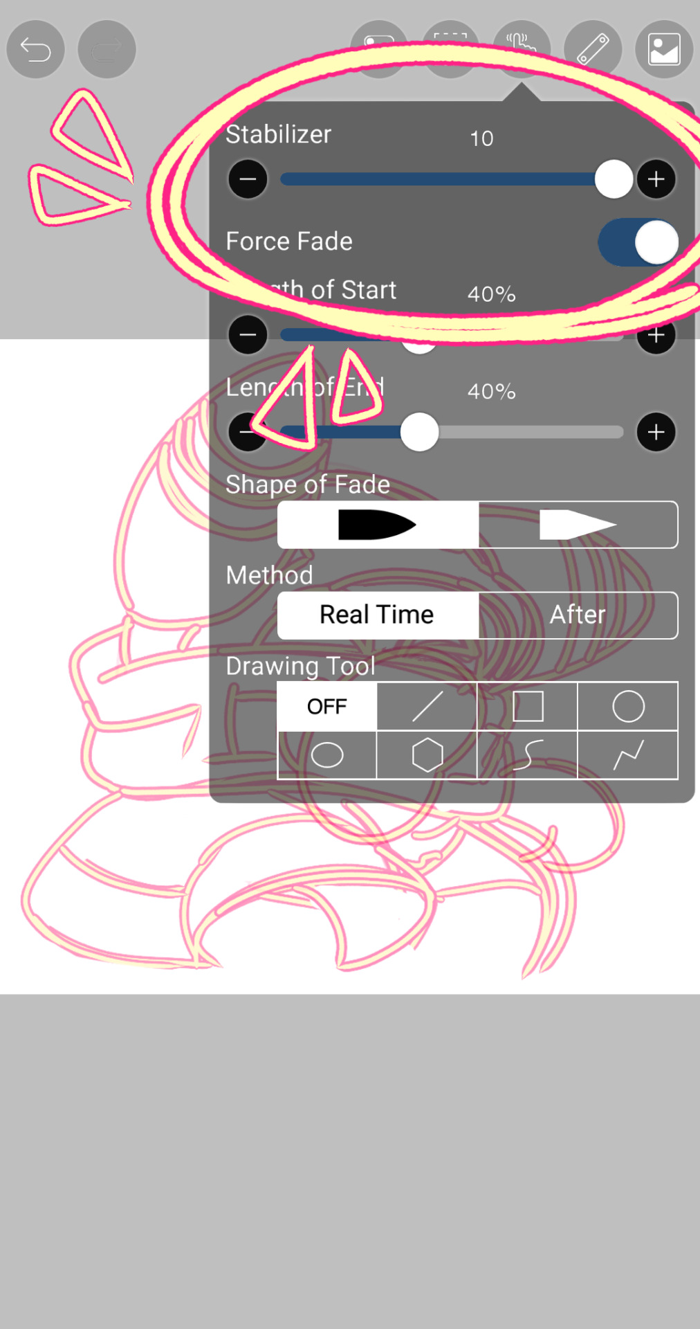
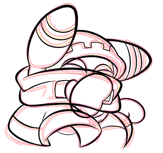
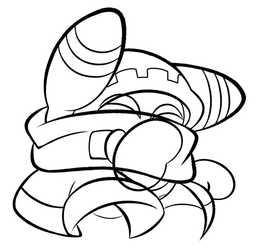
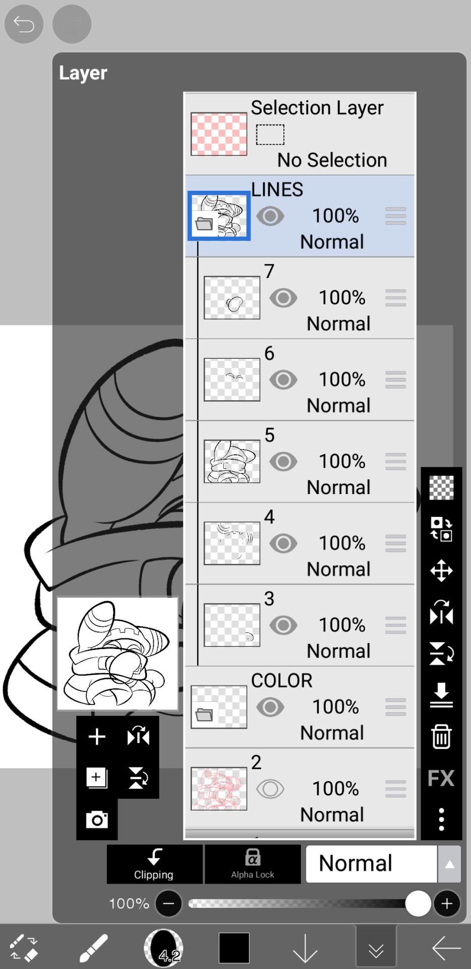
also i think i need to mention that i use so many layers for this. So many layers lol like to the point it's embarrassing. and at the end i merge most of them (except for the gear patterns, rings on his ear, and eyes + hands, which usually need to be by themselves as they're colored separately) Thank you for layers
and i end up with this!
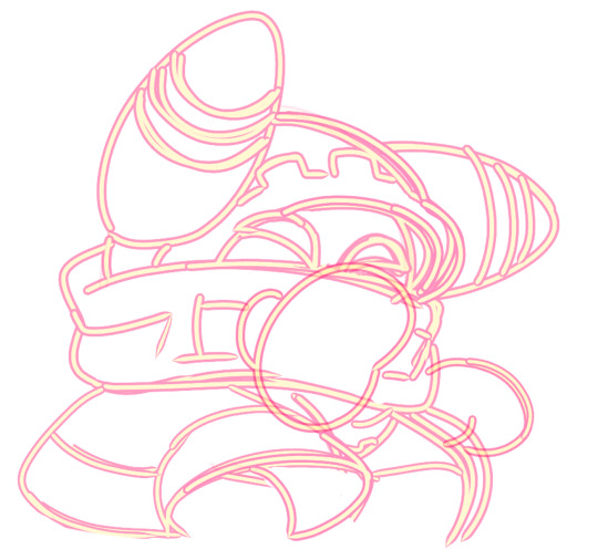
— COLORING && SHADING
yippee yahoo the fun part !!! the part that i love the most
at this point, if i havent already, i always create a folder for convenience in organization because this is the part that i stress the most about what details are on which layers lmao
then i add ANOTHER layer below that for the color, then i put every single color used on their own separate layer!
now, for shading, if im working on larger pieces with more complex shading, i'll usually plan it all out. normally when just drawing magolor, i don't really need to do this anymore because i'm so used to it lol, but for funsies i did it here anyways
then i use the bucket tool to fill them all in
i usually have a set color palette for all the characters i draw (though the way i shade white differs. A lot between my work as you can probably tell fhdfgf). For every color, i have two specific tones that are associated with the shading. for example, indigo + violet are shaded with my blue, pink + light orange (or lighter pink depending on my mood lol) are shaded with yellow, etc.
so, i shade the other areas with the 2nd shading color
a big tip i can give for coloring is to look at a color wheel when you draw. i know that sounds like. Such basic advice LMAO but that seriously was a huge help for me when developing my shading and something i learned while studying — if you notice, in all of the shading in my work, all of the colors used are analogous on the color wheel. note that not ALL combinations will work together like others obv !! but it's a huge step in knowing where to go with it
then i add other extra details like extra lighting, halftones (if i feel like it // if it fits the work), glow to his eyes, and color the lines and ta-da!
another tool i use a lot especially with my more recent art are blending modes, especially multiply. i use a clipping layer to add a dark color (usually a dark blue or purple) and set it to multiply, then erase the areas that emit light

and this is the end result! this is a very very basic demonstration of it fhdjg i was a pretty messy with the lighting and erasing in this example but you get the general idea right
and that's how i draw :) i hope this was helpful, and thanks for asking and being so patient with the response!
#ask#magolor#kirby#macdraws#ive wanted to make a tutorial for So long and finally found a bit of time to do it lmao
138 notes
·
View notes
Note
Request: Saint sleeping while hanging by their tongue.
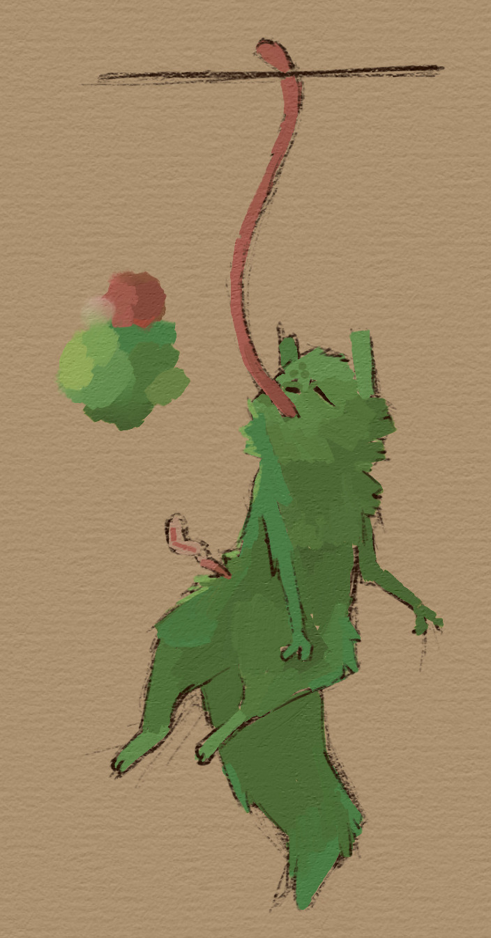
Ok so this one was a fun one, because I remembered how it looks in the sleep screen as meditating instead, so forcing to sleep it is, but that doesn't keep them in place compared to dying for some reason.
Sorry if you wanted something more cozy. Rambles of art under the cut
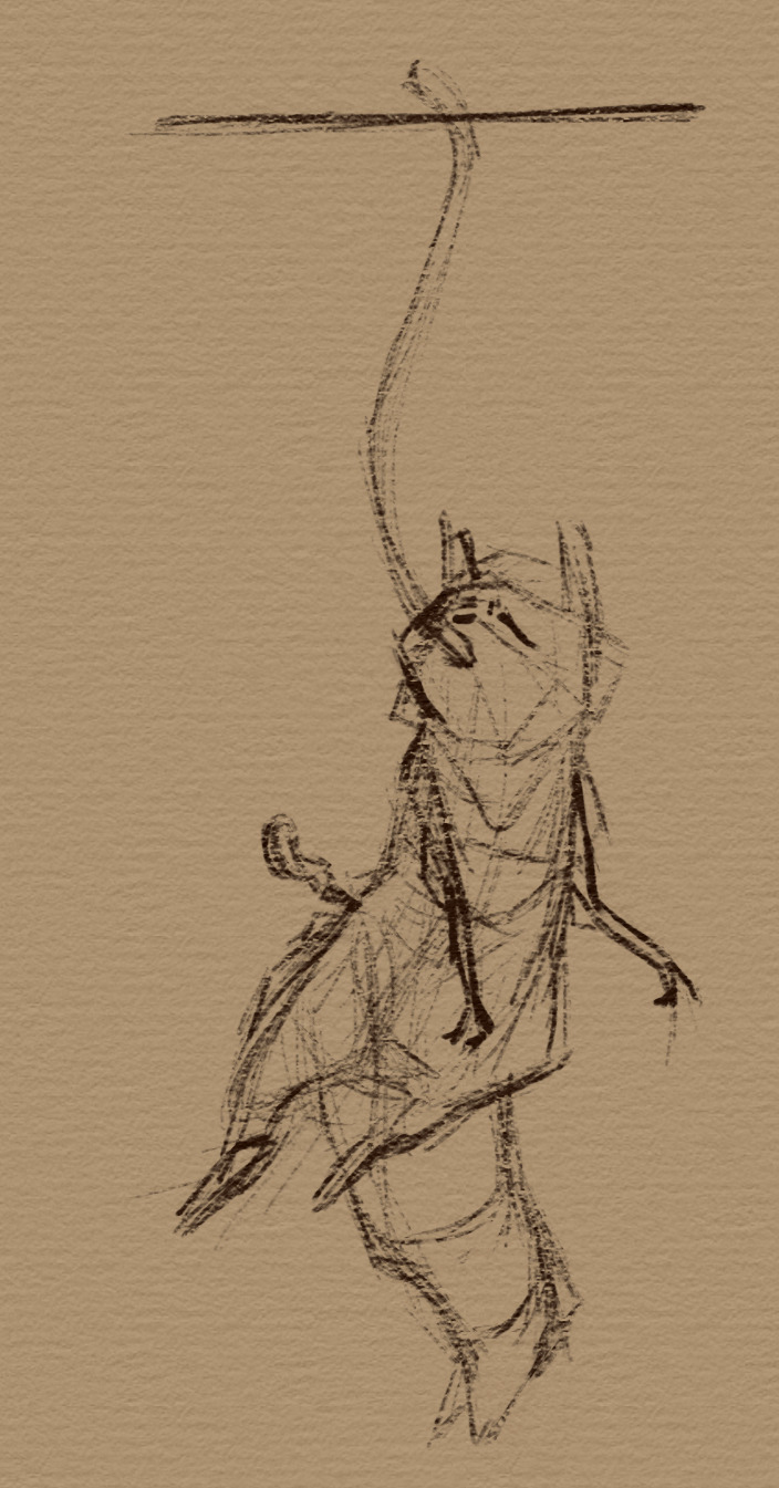

this one was mostly figuring out where saint fur is, instead of making them a big fur beast like the second piece (where I totally could figure out the anatomy yes sir) most of the art tends to go light on the fur as if its short, but with longer parts near the face, tail and probably elbows, still my favorite piece must be the downpour saint screen, the light passing by the green fur is awesome, other than that just figuring out how saint would sleep until the realization that we don't really tend to get much sleeping saint other than spoiler territory.
Personally I liked how this one turned out, didn't take much longer than the spearmaster request and reminds me of some of my old art without dying to rendering, I am a very sketchy lines person myself and tend to not do any lineart.
51 notes
·
View notes
Text
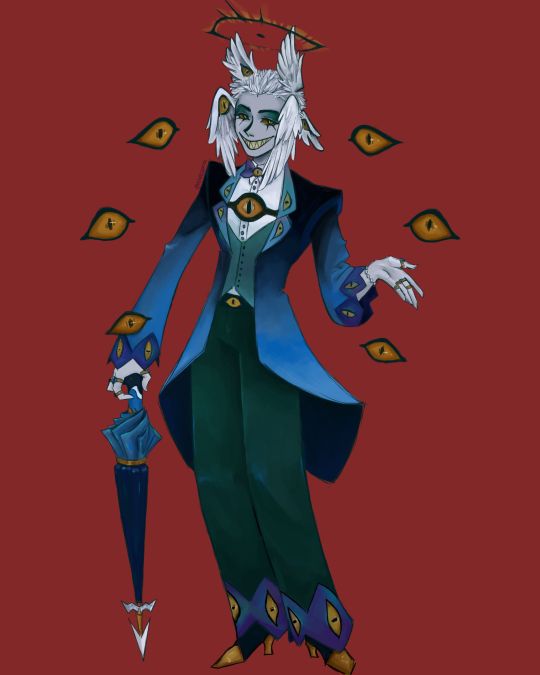
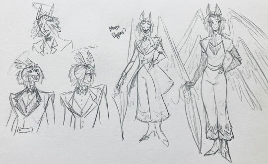
I finally finished the piece for @prince-liest's OC, Tzafael! this really reminded me of how fun character design is (and also that I've completely forgotten how to make digital art, but that's besides the point...) <3
credit to @hogbogglerspirits for the umbrella design! I kind of butchered it so please look at the original and throw lots of love at them
LOTS of notes, draft sketches, brainstorming, etc. below the cut. enjoy!
(note: a lot of what I'm talking about is based on posts prince made under their #tzafael tag, so take a look at those if you haven't yet!)
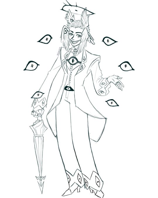
thanks for joining me below the cut! here's the sketch without the colors as a treat (in case you want to color it yourself or something, idk).
notes about making the digital drawing:
holy shit this took me forever -- I was not kidding about forgetting how to make digital art lmao. I forgot how much less forgiving digital lines are and genuinely lost the spoons to even attempt lineart, hence just a sketch below the colors.
some of you might've seen the original sketch I sent to prince, which the digital version diverges from just a little. it's mostly the halo which I'll explain later, and I finally caved and drew the sixth eye (you can tell I drew and erased it multiple times in the sketch lmao -- still don't know if I prefer it with or without)
here's the original color ref by the lovely @gendermeh! my color scheme ended up looking really different, so some notes about that:
I was looking at references for magpies like this
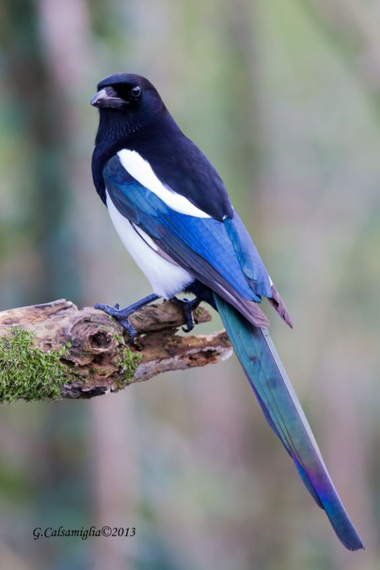
and I wanted to basically follow that color scheme while also being somewhat similar to the original -- dark head/shoulders --> dark top of the jacket, bright blue wings --> bright blue bottom of the jacket, greenish tailfeathers --> green pants, hints of purple --> purplish sleeve and pant ends
I also tried (and mostly failed, let's be real) to capture the iridescence of the feathers -- they look like oil spilled on the pavement or iridescent hematite to me! I think the key ended up being adding bright greens/purples and roughly blending them into the blues or vice versa but I didn't really figure that out until I got to the pants lol.
I'm gonna be honest; I don't remember why I went with this shape for the tailcoat. I just remember being unhappy with the sketch and then trying a bunch of different shapes that mostly looked worse lol -- I think I landed on this because a split tail kind of looks like wings?
KEPT the shoes -- absolutely magnifique. I wish I knew how to color gold better.
added lots of jewelry! they like shiny things :)
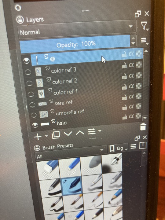
ALSO PLEASE LOOK AND APPLAUD ME. I FINALLY REMEMBERED TO LABEL MY LAYERS!! NO I DON'T REMEMBER WHY THE HALO HAS ITS OWN LAYER.
alright, time for some more design notes/explanations + draft sketches!
but first, a couple disclaimers:
I want to make it very clear that I LOVE everything about the original design. I made a lot of changes based on personal preference/the way I interpreted the character. I was actually planning on making a digital piece that was more faithful to the original design too, but I was just out of spoons for it cause of life stuff.
you probably shouldn't try to read the notes I made in the sketches I'm about to show you unless I say otherwise. most of it is incoherent brain vomit in illegible artist handwriting and I'll transcribe/explain the stuff I think is important :) (the stuff in quotes are direct transcriptions of my notes)
I know my sketches are very messy lol. I only draw for fun, so I usually don't force myself to make stuff any neater than necessary unless it's supposed to be a formal piece. try to bear with me.
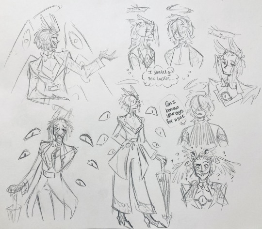
1:
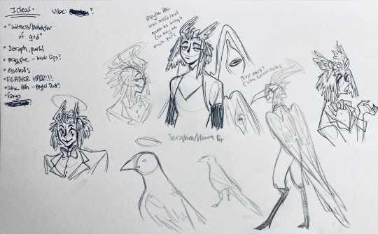
my first few sketches of them! (I think?) this was before I sent prince a laundry list of questions so I was still trying to get a vibe
"magpie -- beak lips?" -- you'll see this in a few sketches; I considered giving them the lipstick design that velvette has since it looks like a beak. I still kind of think it's cute, but 1) I'm pretty sure velvette is the only character that has them, so I didn't want to make it seem like they were related somehow and 2) I thought it might be distracting with how much other crazy stuff I ended up including in their head/face
also, sidenote since it's relevant to what I said about vel: something I realized was important is how one character's design relates to the designs of the rest of the cast. I wasn't sure how much I should've gone for what looked good in a vacuum, how much should be based on what other characters looked like canonically, or what other characters would look like if I also designed them. it ended up being mostly the second option, but it was honestly still a struggle. should I take away some of the tumblr-sexyman-ness (no shade to tumblr sexymen; I love them) because there are other characters that already have it? should I relate their design to sera's and emily's in the show or should I think about how I would've designed sera and emily? should I follow some of the design philosophy of the original show and just throw stuff on there because it looks cool (the answer is yes btw)? decisions, decisions ...
I don't think this showed up really well in most of the drawings, but they actually have a black line down their nose! let's take a look at sera:
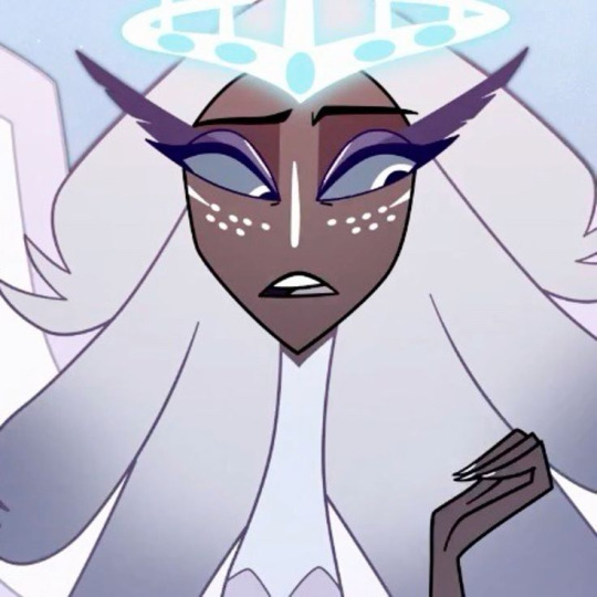
since they're siblings, I wanted to include some similar facial markings. the nose line ended up being the only thing I kept though -- I was going to include freckles, but I have a compulsive need to give every character giant bottom lashes so there ended up being no room T.T I like that the magpie's hints of purple kind of match hers tho!
the wingification of the hair begins! I was still unsure of it at this point, but it was an idea I had since I was kind of struggling with how straight the feathers were in the original.
"maybe the ones on their head count as wings (so only one main pair)" -- I originally just had the 2 pairs of wings on their head, so I was thinking of just giving them 1 pair on their back so there would be still be 6 total. also this middle drawing of them is meant to be their exorcist outfit (I wanted it to be a cross between what the other exorcists wear and sera's outfit)
at this stage, I was thinking of giving them more magpie-like characteristics, so I looked at some references and tried to emulate them in a more human design. this ended up being really awkward so I scrapped it, but I still like the idea that their exorcist mask looks like a bird (kind of like a plague doctor's)
2:
peekaboo! I love the idea of them using the wing hair to cover their eyes lol. (ended up using that idea for my own seraph OC since that's their biblically accurate purpose: to cover their eyes/faces in reverence/humility -- doesn't really fit with tzafael tho lol, so they show their face most of the time)
an eyeball in the bowtie -- pretty self-explanatory. the eyeball motif is important.
the one in the middle is just me practicing drawing the original design, and the one on the right is another exorcist outfit I think. I wanted to include the diamond motif/points that sera has on her dress (the diamonds on the bottom turn into eyeballs, which is why the final design also has eyeballs on tzafael's sleeves/pants)

3:
lots of notes on the side based on what prince said in response to my ask
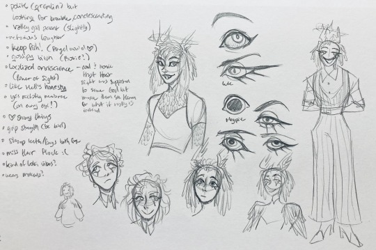
"localized omniscience (power of sight) -- cool + ironic that their sight was supposed to serve God but made them see Heaven for what it really is instead"
another exorcist outfit, this time including the feathers
I was also experimenting with the halo; I was trying to make it look sort of like sera's crown, but that didn't feel right ...
some practice with eyes -- my style is pretty flexible with eye shapes, so I try to make them suit the character. I drew lute's eye and also an actual magpie's as references -- lute's because of the exorcist background and also because they looked appropriately sharp, magpie's for obvious reasons. once again, my compulsive need for giant bottom lashes strikes
there was honestly a lot to balance with the eyes -- I wanted them to look condescending/bored (lowered top lid) but also amused (raised bottom lid) and like a magpie (round) but also harsh/mischievous (sharp, maybe slit pupils like a snake) and similar to sera's (but not too decorated -- also does it make sense for them to look like sera's if emily's don't even look like sera's?)
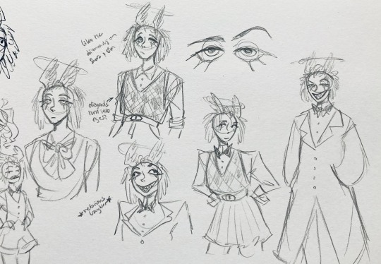
considered having wings on the shoulders -- the magpie pattern is super cool, so it would've been nice to have that somewhere more explicitly in the design. I still think that might fit in an outfit they would wear in heaven (maybe for formal occasions)
the introduction of the sweatervest! honestly I kind of love this for the way it captures more of the preppy, spoiled old-money upper-class vibe some heaven residents have, but it was scrapped since I couldn't imagine them wearing that while trying to scare the denizens of hell. maybe something they wear casually though.
"yes nictating membrane (on every eye!)" -- AHH I'm so sad I didn't end up putting this to use. I just feel like the whole effect is based on actually seeing them blink, and I don't animate lol.
4:
ugh, the nefarious laughter one ... don't worry I tried harder on a sketch later on lol.
"like the diamonds on Sera + Em" + "diamonds turn into eyes?" -- I draw the diamonds on the sweatervest turning into eyes later.
tried an actual bow instead of a bowtie -- very cute but didn't fit the vibe.
a skirt! I think they would wear a skirt sometimes.
5:
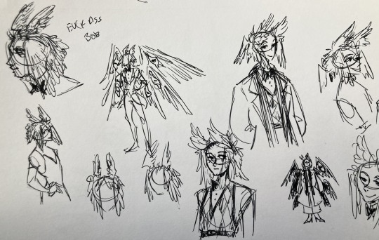
"FUCK ASS BOB" -- asghdk the wingification of the hair continues. unfortunately, I'm realizing at this point that the silhouette of the hair is starting to look a lot like alastor's. I gave a very half-hearted attempt at mitigating this, but it goes back to the thing of how much I am obligated to the original show's designs and what looks cool to me -- I think the wing hair fits them and I didn't want to change it because of alastor, plus my alastor design actually has completely different hair anyway. I did add a third pair to the back to look like a ponytail though.
introduction of the scarf! I was actually going to include this in the final design but uh,,, I forgor. are you starting to see a pattern.
the reason for the scarf is that the "tzafael going to places they know they'll draw attention/can incite chaos" reminded me of that scene in avengers where loki walks into a fancy building looking pretentious af and just casually stabs a guy's eye out. not really the same thing but I felt like the vibe matched. hence, loki's funny little scarf fit.

6:
uaoughdfjh it was SO FUN to draw the wing hair, and it was at this point that I realized they had to stay even though I wasn't sure if it was too different from the original.
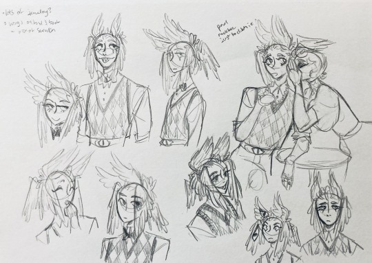
gossiping with rosie cause that's the first person I thought of -- tzafael also summoned a pearl necklace to clutch because of the sheer drama of it all (your ex-husband did what??)
also started drawing the rings on their hands. magpie like shiny.
7:
lots of notes cause I was trying to compile the things I still needed to think about/incorporate into the final (I thought this was gonna be the last draft ... haha)
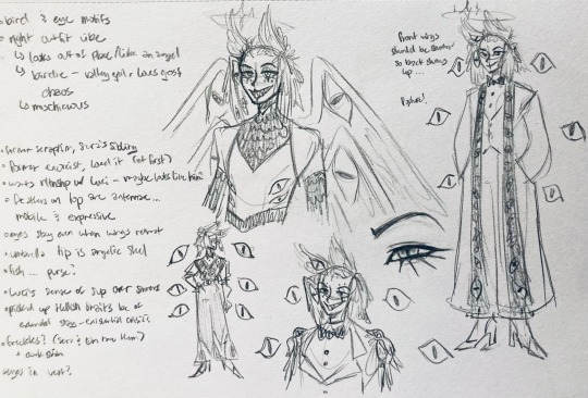
trying to include more bird/eye motifs
"fish ... purse?" -- ha! I forgot I was gonna give them a fish purse. I think I drew that in a later sketch, but not them wearing it.
"picked up Hellish traits bc of extended stay -- existential crisis?" -- I asked prince about the sharp teeth, and their answer implied that they became sharp as they stayed in hell longer, which got me thinking ... I feel like that's actually a great body horror concept. lucifer falling and looking like a normal angel at first, eventually waking up to more and more devilish features and feeling more and more like he's lost his home and his past self ... spooky.
another exorcist outfit -- I actually really like the eyes on the ribs! I never made a final draft for the exorcist uniform, but it would probably look close to what I drew here.
the one on the bottom was meant to be similar to the feathered shoulder pad idea, but this time with the whole magpie (with giant eyes). tried putting the "freckles" (really just dots in this case) over their brows, but that ended up looking kinda weird.
the eye is pretty close to the final design
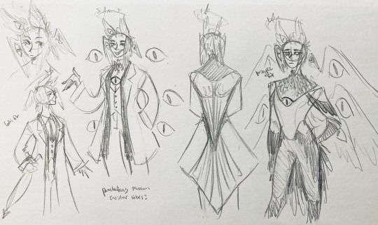
the one on the right was supposed to be the full final design, but I was totally off lol -- the long trench coat really doesn't give off the right vibe at all
8:
playing around more with the loki vibes of the scarf, also added an eyeball to the chest
I never got happy with the design of the back of the coat -- I think it should probably just be blank at this point. but the sketch here is meant to look like wings/tailfeathers.
yet another exorcist outfit, this time with more magpie motifs. I actually like this one a lot, but I probably should've added the eyes on the ribs from the last sketch. I think I also considered giving them actual tailfeathers at this point.
9:
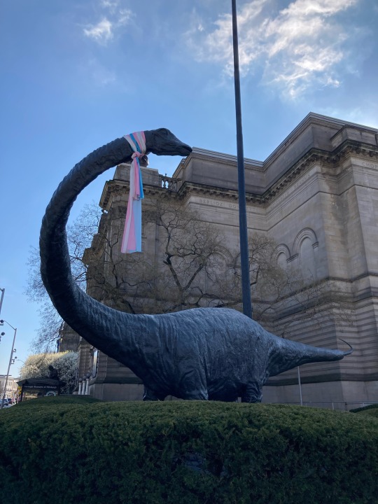
thanks for sticking with me! I promise we're almost done. have a trans dinosaur I saw while I was travelling as a treat <3
10:
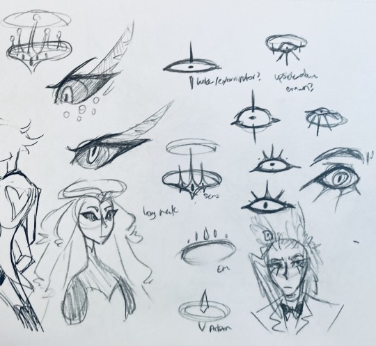
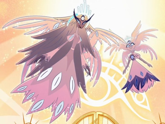
this is after I finished the sketch for the final piece and realized I didn't like the halo design. I drew lute's, sera's, em's, and adam's as refs. (honestly I love the show's idea that each person/people of each rank have a different kind of halo -- I wonder if they can switch them out?)
my main inspiration ended up being the exorcist halo, but I made it look more like an eyeball -- since it always points toward heaven, we can say it's always "looking" at heaven.
(also sera's feather lashes! they're so cute)
11:
EVEN MORE EXORCIST DOODLES
12:
tzafael shooing away my fox demon OC
13:
these are actually sketches for my own seraph OC (raguel), but I wanted to include it since it has even more wing/feather hair variations. I also think the idea of the eyelashes being feather-like could've been cool for tzafael.
14:
some more OG design doodles
tzafael and raguel together because self-indulgence is the name of the game babey (also wanted to draw tzafael freaked out with their wings flared)
(raguel's blind btw, hence asking for eyes -- tzafael has so many!)
you can probably read the dialogue here so give it a shot. I believe in you.
15:
you know what? the fish purse deserves some doodles
16:
putting them in Situations! I was reading over prince's posts again and I realized there were some funny things I could draw them doing/saying
again you can probably read the words here
angel dust also loves fish (but is apparently bad at taking care of them, hence the suffocating blobfish), so tzafael shows him their aquarium (complete with live fish and flora ofc)
I thought alastor was 8 ft but apparently he's 7.3 ft? so tzafael is enjoying the .2 ft they have on him
trying and failing again to come up with a design for the back of the jacket lol
THE crowley quote
apparently the halo still sends signals from the exorcists -- thought their reaction to the battle at the hotel would be funny
the nefarious laughter (take 2) that I promised -- based on a doodle of alastor viv did that I found
them being sad and curling up in a pile of shiny things like a dragon
OKAY I'M DONE. huge, huge thank you to prince for sharing their OC! this was a lot of fun and clearly inspired me a lot haha. please check out their writing; it's literally so good that I can't read anything else these days. I am chewing on their thoughts constantly.
this was an absolute monster of a post, so if you're still reading, I am both impressed and bewildered at your patience. I hope you enjoyed! (I certainly did!)
#prince (because they are very sweet): I'm excited to see your thoughts!#my thoughts: magpie like shiny hehe#hazbin hotel oc#prince-liest#hazbin hotel#my art#character design#sera hazbin hotel#em hazbin hotel
45 notes
·
View notes
Text
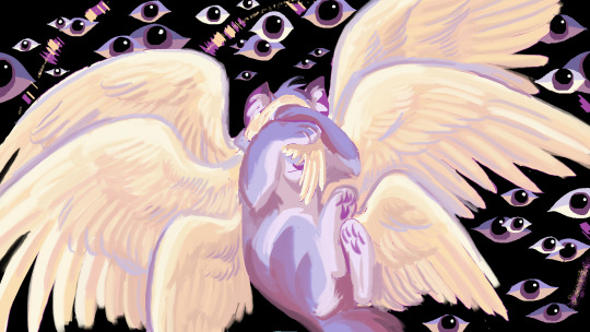
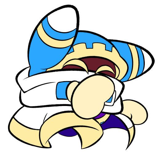
FORGOTTEN LAND'S SECOND ANNIVERSARY :3
I AM SOOOO BACK
I started this drawing yesterday around afternoon and finished it just a few minutes earlier.
I went with a messier type of drawing instead of more clean like the elfilin one from yesterday, i find it fun doing it like this, mostly cause i dont have to worry about making it perfectly so i dont get as frustrated as normal. Id place this one as my second best digital drawing. im pretty sure i havent posted what i consider my best digital drawing here, tho i do have it in instagram, i might post it here one day, tho these two are way too tied up, i love how this came out, its not exactly like how i imagined it but its really close to it, and also itd say that since i dont tend to play around lighting that much, this was such a joy to draw and i cant help but stare at it a lot, at least until i start hating it because i made quite a lot of errors. i also changed my elfilis gijinka just a tad bit from last time, but its not that big of a difference, mostly.
ofc i had to draw elfilis for forgotten land's anniversary, i tend to deny it in my head but yeah they're my fave of the kirby characters even tho i hate them a bit. I wanted to draw some more doodles, like, elfilis eating cake, kirby car, a bunch of other stuff (not elfilin cuz i already drew him yesterday) but when i tried i couldnt draw anything more, guess this drawing burned me out a lot, huh?
you can definitly tell i spent all the efforts on him cuz if you look a bit closer to the bottom part you'll see its almost barely detailed, but i mean, they're the focus so make sense i guess for me not add that much detail there. um also, maybe because i dunno i had OVER 130 LAYERS jeez no wonder firealpaca was slowing down so much, i need to manage my layers better next time, tho i did do something i keep forgetting, wich is naming them (most of them at least) that was a real life saver
Also, antares (fecto elfilis' spear/cadaceus), as always, was a pain to draw, but this time its probably been draw the most accurate out of every other drawing ive made with it in it, i didnt notice it was like, a little curved when it reached the blade
some close ups since his face is a bit hard to see
silly :3
fun fact! actually, this is technically a redraw, somewhere around between february and march i started a fecto elfilis drawing for the first anniversary, but i couldnt finish it in time, and i never finished it
thats...quite the improvement! (i remember being so proud of it)
also his wings are like that cuz i did not want to draw the pattern, its way too hard, i literally copy pasted it, wait, i was talking about the 2024 version but i looked at the 2023 one and i just noticed it also has the pattern copy pasted, i guess some stuff never changes since i still abuse the ctrl+c ctrl+v to this day
Also i ended up making a huge error there, i was planing to add the phantom spears from orbital pulsar (the attack he does first when you battle them at lab discovera) but theres an innacuracy, when they do the attack, they always close their eyes, i had actually sketched him (well i mean both these drawings are basically the first sketch (2023) or second sketch(2024) with some color, shadows and lighting. i didnt do lineart in the 2024 one cuz i wanted to be a bit like the og i made (too bad i sketched that one with black since the og was sketched with white due to me drawing the bg first)) with his eyes closed but them decided to make them open for a reason i cant remember, maybe i thought itd look nicer? idk
ive had the idea of redrawing this for quite some month now so it was kinda already planned
background cuz i think it came out really pretty
doesnt have the little stars since without elfilis and the structures it looks fucked up. the actual sky in game is more blue, but the clouds have some orange, in the 2023 ver. i made the sky orange, and in the 2024 ver i wanted it more accurate, but i didnt wanna loose the orange sky, so i did a gradient. pretty...
also here's a screenshot i took when i was like halfway trough it, its barely noticeable but i changed his mouth in the final drawing
I really love katfl, like a buncha whole lot, its basically almost my first mainline kirby game. 100% the demo, finished the game in almost one day, i literally play it monthly, like, every month i put the card in my switch, start it up, get morpho sword, and go shred elfilis in lab discovera. i would probably not even be here on tumblr and the kirby fandom if it werent for it. and i love it so much i genuinly cannot express how much i like it and treasure it with words or anything
Thank you for reading my unnecesarily long rambles lol
I hope i'll post tomorrow and dont forget like usual
Jambuhbye!
#art#fanart#kirby#kirby fanart#kirby gijinka#silly#digital art#firealpaca#fecto elfilis#fecto elfilis gijinka#my wife fecto elfilis and his new drip#yep changed them again#fecto elfilis lives in my head rent free 24/7#fecto elfilis fanart#kirby and the forgotten land#katfl#katfl spoilers#katfl second anniversary#kirby and the forgotten land second anniversary#katfl fanart#kirby and the forgotten land fanart#please reach a lot of people i spent way too much effort on this drawing#kirby series#kirby elfilis#kirby of the stars#:3333#:3#digital artist#artists on tumblr#small artist
44 notes
·
View notes
Note
Do you have any tips or tricks on how to start a comic like this? Or even just how you got started?? I've had my own au for years that I so badly wanna put out into the world but I've been struggling with finding a good way to start it!!!!
Hm!! Ok!! This is a tough question with many different answers even just from me. I'll do my best to answer tho!! 😮
The main bit of advice I want to give, and which I think is vital to anyone creating anything:
☆ Know yourself.
When looking up advice for creating, people love to tell you that by doing things a specific way is the best and only way to go. Often advice of this sort has solid points, you should plan ahead, you should have easy character designs, buut... You don't have to.
I do not work well with outlines or scripts. I dislike sketching. You'd think that'd make being a long form comic artist impossible for me, but nope.
I know theres things I cannot do, so I've put all my practise to what I can do. My lineart style allows me to almost skip sketching completely, my scripts are more of an A to B structure than law. I improv 90% of the time when making pages. It's kinda like dnd with myself.
I would absolutely not reccomend what I'm doing to others, but I know it works for me. People can tell me I'm doing it wrong but its either wrong or no comic at all, SO. Suck it. 👍
Er. Rambling now.
My point is, figure out what you can and cant do, and do your best to give yourself the ideal work enviorment and process.
☆ Deal with being overwhelmed
Making just a few panels and suddenly realising its gonna take years to get anywhere is SO demoralising. It's gonna happen and its gonna happen again, and again, and—
But continuing with the earlier advice, you gotta ask yourself what would help you. Are you willing to sacrifice quality? Do you just need a break? Maybe you're like me and like to include smth you love in every update so you'll have something to get excited about making.
That feeling of overwhelm is trying to tell you something, so figure out what that is so it wont end the project for you.
☆ Start it
You wont like what you make when starting. I've never heard of an artist who has.
I'm not saying start this instant, not everyone is as into improv and flailing around as me. But I will say you'll never feel ready. Figure out the minimun of what you need to start and do it. Show friends first if youre afraid to post.
Also where to start? Well sure there's lots of good advice online about that, but you can also just doodle random stuff until you feel like diving deeper. That's what LV started with, just Twi and Wild hanging out with animals and some headcanons. It may not be the most tightly written work but theres beauty in the humanity of a mess.
☆ Extras
A "failed project" or "forgotten WIP" is only a failure if you let yourself feel that way. Yea it can be a hauntingly strong feeling thats hard to deal with... But it can be beaten. WIPS are proof you tried and not everyone can say they have.
Lv is far from done and I have no intention of dropping it, but because the journey has been so nice I'd satisfied even if I had to call it here. Its smth that helps me with the overwhelm... What I've made is beautiful even now.
Comparing yourself to others is gonna rip your heart out. I love that theres other links meet aus out there and hope the best for those artists but I caNNot follow any of them or I'll crumble to dust.
So Uhm.
Basically. Have fun and be yourself. 👍
Ps. Readability is basically the most important thing for a comic artist to pay attention to, that and not destroying yourself with details and rendering. 🙌 Good luck out there!
#Ask#I love discussing stuff like that but it always ends up so rambly and long ahsjjdjr#I hope I said at least smth slightly concrete
84 notes
·
View notes
Last Seen Blogs
softstraykidsimagines
Soft Stray Kids Imagines

techufo
Govt Job Blog
warhammer-fantasy-muses-archived
Warhammer: Fantasy Muses

xexosodulib
Untitled