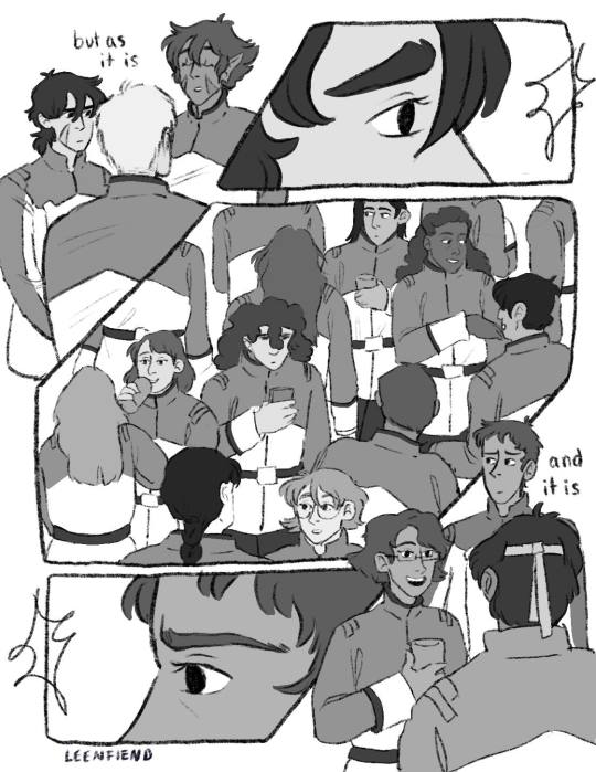
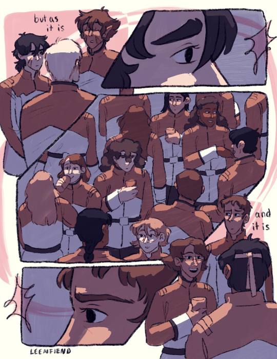
#and i had to redo all my coloring and shading because i wanted a more neutral sterile science look than what i originally had
Text
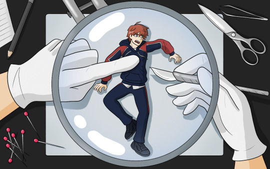

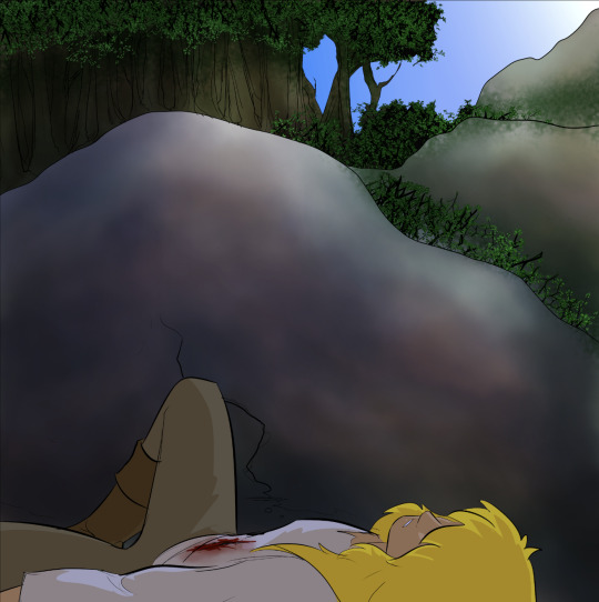
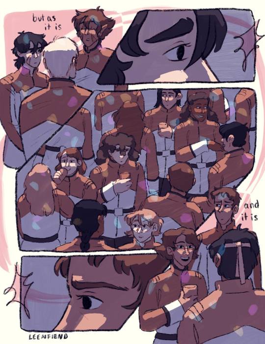
Mutual left this tag on one of my Fuuta analyses and yeah...
Part two of "Fuuta’s central theme is invasion of privacy and he has extreme anxiety over being watched, so it's interesting that we get to pick him apart and see all his worst, most private thoughts" :(

#milgram#fuuta kajiyama#i didnt want to be annoying with a tag but thank you trinipopkt for the original tag :3#ive never posted something like this so let me know if i need to tag anything#my writing brain may be struggling rn but you can bet im still over here drawing fuuta 😅👍#part one was the lil moodboard on main#this also had slight oc connections (my brain was going brrr having a scientist oc) but once again its general to the audience overall#plus i was really proud of the composition/posing/colors i switched to -- i was excited to share!!#it took me like 80 years to pick a composition/pose that worked asdfsadsg#and i had to redo all my coloring and shading because i wanted a more neutral sterile science look than what i originally had#anyway it wasnt my usual type of drawing so it was a lot of fun to see it come together!#i did the first version and my partner said it was mean (and against procedure) to keep him awake#but then the second version felt equally mean :(((( so in conclusion rip fuuta#he is my little bug and i am going to figure out what makes him tick
85 notes
·
View notes
Note
Less about OCs, but I'm interested to know what your process is like when creating a piece as detailed as that one you posted for Valentine's Day. How do you go about it? And do you happen to do time-lapse videos?
hmm can't say I can give an explanation that's terribly interesting or satisfying lol... I'm almost entirely self-taught, so "process" is a very loose and nebulous concept for me, and it changes from piece to piece. the one common thread among my works is that they all involve obscene amounts of trial and error. I don't have any recent time-lapses because I never think to record them, but if I did you would definitely see how often I feel the need to adjust and redo every little thing.
for the Valentine's Day piece, because it was a "remake" I had the benefit of a much more solid foundation than usual to start out with. however you can still see where I ended up deviating from the sketch phase - most obvious being her pose, the design of her hair, and the details of her sandals. (there were also meant to be candles on the dresser, but I forgot and didn't feel like adding them back in later and so I decided a vague suggestion of candlelight was enough lmao)
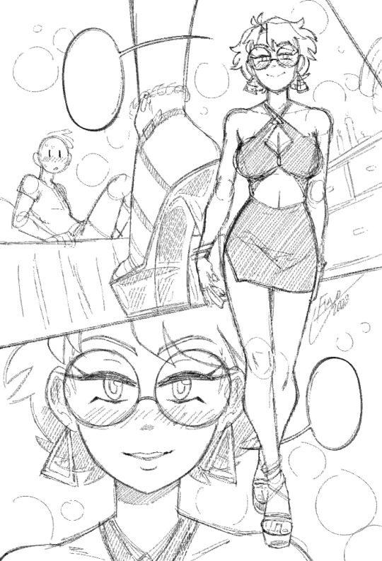
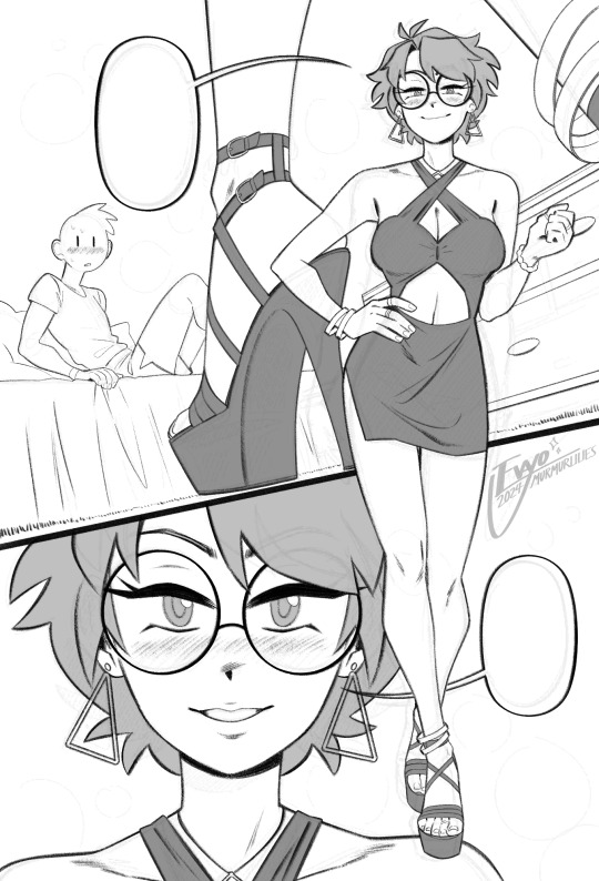
anyways, compared to everything else, sketching and linework are fairly straightforward and come most easily to me. there really isn't much to say, just scribble some messy lines and then whittle away at and draw over them till they magically become less messy!
when it comes to coloring and shading, things get a lot weirder and more complicated. this is where my process tends to vary the most, because it really depends on the mood of the piece. for this one I wanted something dark and seductive, so I covered the whole image in a layer of burgundy red, then painted the "lighting" on top across several Overlay layers. additional shadow details were brushed in on Multiply layers using deep purple instead of straight black, but ultimately I didn't want them to be too dark, as that initial layer of red was meant to serve as the primary "shadow" of the piece.
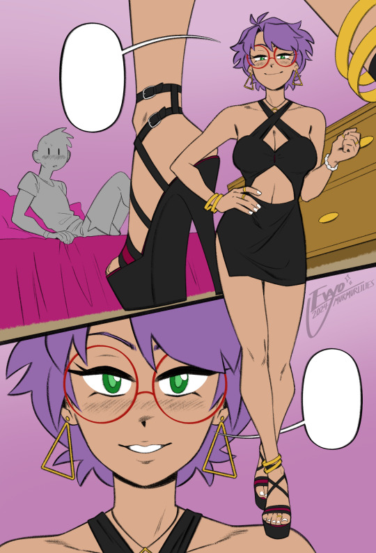
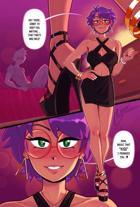
this is also usually where I decide which lines I want to "color" with clipping masks, which can either make certain elements pop or feel softer. it sorta brings the whole image together, giving it a much more painterly look overall. from there all that's left is to keep making adjustments and adding little details - the glittery effect on her dress was one of the last things I added, I thought it looked really nice!
...ok now take everything I just said and throw it all in a blender. because even though it might sound fairly orderly, the truth is I'm constantly making changes to all stages of my works, even the earliest ones, all the way to the end. I'll still be making adjustments to the linework and such after I've already put so much effort into the lights and shading! it's not the most efficient way of doing things... but again, trial and error. my perfectionism gets the better of me...
anyways I apologize if NONE of this made any sense, like I said I never had any formal training in art, so I'm not very good at teaching or explaining it!! at the end of the day my process is less about what makes logical sense and more about finding what feels right in a given moment. at the very least I hope it was a fun read lmao 🥳
#evayo asks#evayo art#glassborn#ocs#fun fact: i had no idea what to put in those dialogue bubbles till like an hour before upload LMAO... she could've been saying anything 🙊
37 notes
·
View notes
Note
What program do you use to make your fanart? Is it on just an average ipad or is there special ones just for art? Your work looks so good! I’m wanting to try digital art but unsure where to start :)
I use the Procreate app for all of my digital art! ✨
It should be available on any iPad 💗 I personally invested for my birthday this past year and I have the 12.9" M2 iPad Pro, but I'll even occasionally use my fiancé's iPad Mini and the Procreate app on there in a pinch since it's so small and portable~
The only real difference is that performance might suffer a bit, the larger an art piece is or how many layers your work has, depending on the iPad. But if you're just starting out, I probably wouldn't find that to be much of an issue!
(More rambling about digital art origins under cut ✨)
There's definitely a learning curve, especially if you're more used to drawing traditionally! It can help to still sketch traditionally (if that's what you're used to) and then upload a photo of your drawing to your tablet to work over digitally (this is personally how I started out and I used to just make little digital doodles by tracing and coloring over my traditional sketches.)
A small doodle from my sketchbook that I traced and colored digitally, from around 2011-2012, I think? Uh, happy Doctor Who day today!
My very first digital art set up was actually a tiny Wacom Bamboo tablet where the drawing space probably wasn't even bigger than my hand, and a super old bootleg version of Photoshop CS2 which was already a version that was 7 years too old for the time (CS5/CS6 was the most updated version by the time I had started on digital art).

Everyone else in my class had the bigger/fancier/professional-grade Wacom Intuos and I remember my professor taking one look at my baby tablet and just going like "how tf are you drawing on that" lmao.
But still! Experimenting and doing little exercises can get you a long way – I would say to approach it with similar exercises you would do as if you were learning to draw traditionally for the first time.
Shade in circles/nail down basic lighting. Gesture drawings. Random scribbles. Just things that help you get used to the feel of digital art!
Test out different textures you can achieve with one brush, then expand it to see how other different types of brushes can behave and add to the experience.
For proof that even just one brush and not the best/most updated tools can work: these are two of my first more "serious" digital art projects I did in college (with my tiny tablet and mega outdated version of Photoshop) and 99% of the rendering was just done with the "soft airbrush" brush.

But even then, we were taught to create our base sketches traditionally and upload them to the program to work over.
Then one day I decided I wanted to just be able to also do all my sketches digitally and just worked on getting used to sketching straight on my digital program. It was then that besides the all-powerful undo-redo buttons, I started to really make use of the transform/canvas flip/liquify features which I don't think I can live without now lol.
(Caveat: I'm now a little too dependent on those features so I keep a traditional sketchbook to do silly doodles in occasionally to exercise my hand because sketching traditionally without the buffer of those digital tools is pretty difficult for me now lol.)
That was a little long-winded, I'm so sorry hahaha. I hope something in this rambling could be taken as somewhat helpful for starting out on digital art!! 💗
34 notes
·
View notes
Text
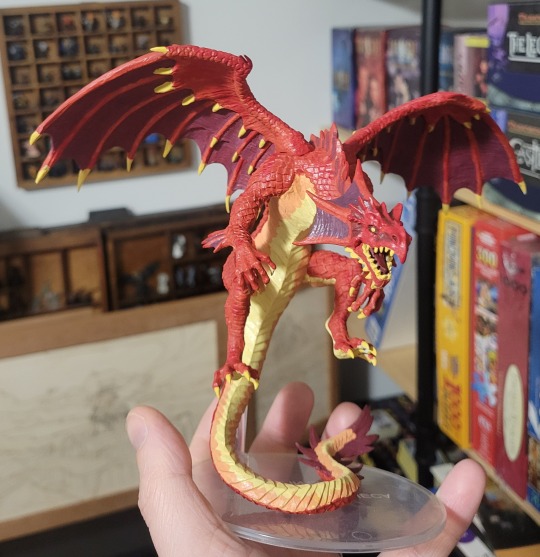
I just finished painting a Green Dragon and am so happy with how it turned out!

This beefy lad is probably the heaviest mini I have and definitely the tallest. I colored the scales with Malachite in mind and tried to tackle the wings thinking of chrysocolla.
I'm also just really happy with my growth in mini painting over the last year? Below the cut are more pics I've done if you are interested.
This was the first big miniature I painted last July. The colors ended up good with fair line work but like. I didn't experiment much with the colors and it ended up looking so cartoony and I continuously want to redo it (even though I think it was a fine first attempt).
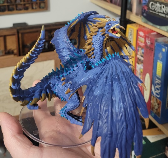
Next was a Blue Dragon. I did mess around with colors and shading a little more and still find it really pleasing to look at even though the end result is still a little cartoony. The old 3.5 edition Blue Dragon had turquoise spots I adapted into the spikes and its still one of my favorite touches in any mini I've done.
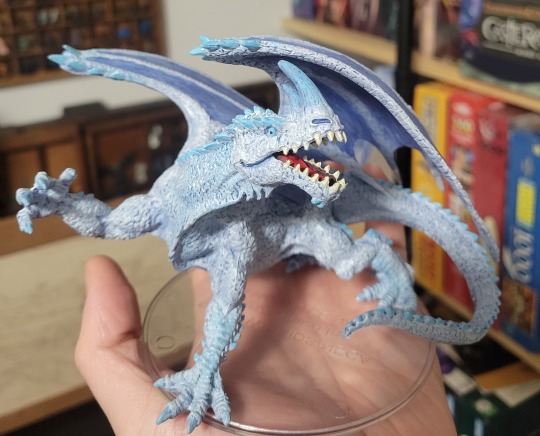
Next up was a White Dragon. By now I learned about washes and dry brushing techniques and think the extra effort here really shows. I ended up leaning more heavy on "ice" rather than "snow" for the motifs and it is very light blue because of it, but I think it turned out well overall.

Which leads me to the Green. I went all out here. The body has a dark green wash and no less than 5 additional shades of green across the body. The fin webbing and wings have several shades of azure and turquoise the create a Mottled look. The eyes are a deep azurite blue to complement the other stone looks. I even used a shiny clearcoat on the tongue to make it look wet. I am SO THRILLED with the end result.
Eventually I need to paint a Black Dragon to round out the list of Chromatics. I can't wait to see how that one will turn out!
26 notes
·
View notes
Note
Heyo, it's the fool who wants to make a comic with zero experience in drawing or finishing stories again. A lot of people, including you, I think, mentioned that "Your first work will be bad". Any tips how…not to do that? I don't expect it to be a magnum opus or smth, but I at least want to make something people would genuinely unironically enjoy, and "first story is always not good" notion everywhere is very discouraging
It's not like I never tried anything creative ever, but this is my first attempt of putting it down on paper with intention of completing it, instead of having vague ideas of "I know what would be so cool when I make it a thing" in my head for months without acting upon any of these ideas
It's definitely a disheartening adage, even if it's supposed to take the pressure off young creators.
Unfortunately, no matter how good your starting point gets - and you can get it very good, don't get me wrong - you are still going to find it unbearably bad when you look back on it with experienced eyes. You might eventually circle back around to finding it impressive, considering it was your absolute first starting point and you had no experience, but you still won't be able to see its merit the way your audience will.
The thing is, your first project is going to teach you a lot of things you couldn't have known you needed to learn beforehand. This means everything you make after learning those things is going to be smoother in process and better in result. There's also just the fact that the more you do this sort of thing the more practiced you'll get at the mechanical side of it, making it faster and easier for you and leaving you with more energy to punch things up. Compare the Big Fight Scene from chapter 3 with the one from chapter 17 in terms of visual complexity:
Particle effects, ambient glow, soft lighting, atmospheric depth, metallic effects, light and shadow. The seeds of these ideas are present in the earlier shot, but executed in a much clumsier way. Fourteen chapters of gradually increasing complexity and just raw practice got me to the point where drawing that second panel was fun rather than exhausting. If I'd tried that in the first chapter I would've probably been so worn out just trying to finish the lineart that the quality of the rest of the image would've suffered from sheer exhaustion.
And even before that, those first chapters only flowed as well as they did because I'd been drawing hundreds and hundreds of video frames for years at this point, which had gotten my lineart muscle memory polished enough that I wasn't agonizing over every single stroke.
I was absolutely determined to start this comic off at the best level of quality I could, and that determination kept me kicking the can down the road for a decade. I think this was a good thing; if I'd started it any earlier I think I would've been a slow enough learner that the quality increase over those first few chapters wouldn't have been as steep as it was. And that first chapter was as good as I could've made it at the time; I didn't take any shortcuts or laze around, and I used every skill I'd learned over the previous decade of physical and digital art. Of course, if I knew then what I knew now there's loads of stuff I'd have changed about the way I handled the intro. In fact, I'm going to break my One Rule about "never going back or redoing things" and I'm going to walk you all through chapter 1 and what I would change/fix if I was drawing it now.
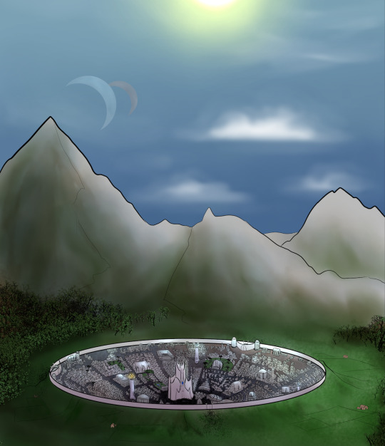
Remove the outline on the background mountains, add color variance to the further mountains so they appear farther in the background, un-muddy the color of the sky and make those clouds a little more impressive; this could've looked like a full glorious noonday sun. The forest was drawn with an experimental brush I'd created for foliage that I ended up deciding didn't produce the effect I wanted; I'd probably go through and use the technique I developed for Gleicann's forest to cel shade blocks of foliage.
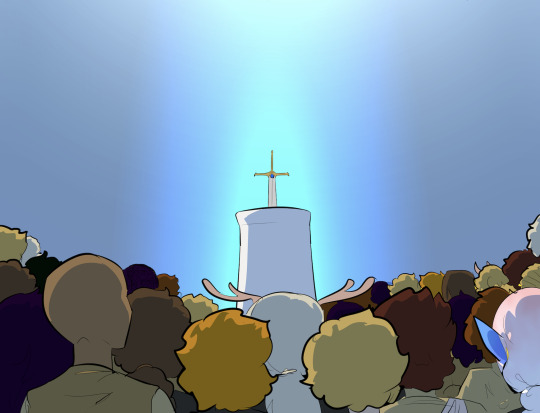
Add at least the bare hint of buildings behind the sword pedestal - just gradient outlines would be fine, similar to the extended backgrounds in Zuurith. Also slap some blue cinder-y particle effects coming up off the sword. Clean up the shading layer so there aren't as many holes. Add metallic shine to the blade and marbling/stone texture to the pedestal.
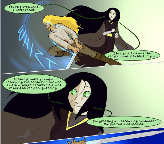
Un-muddy the colors on this background; they match The Collector's color palette but that matters less than looking nice. The background needs something - speed lines, the implication of foliage - etc. The poses could also be more dynamic and drawn with more confidence. To show the power behind the blows, re-choreographs the fight to show more of the damage it does to the environment - the sword carving through rocks, ploughing furrows into the ground, starting to spark with starfire, etc.
Same problem with the foliage; the special brush adds too much detail, drawing the eye away from the important parts of the scene, and the colors are muddy to cover that up. Brighter greens and cel-shaded layers would produce the effect I actually wanted and be faster than hand-drawing every treetrunk and then shading them so they're indistinguishable anyway. Also, more intense shading on the foreground figure - a neutral tan shadow layer is functional, but it could look a lot more dramatic, and he's shaded much more lightly than the extremely muddied background is.
Of course, "if I knew then what I know now" is a meaningless turn of phrase. I needed to draw these pages this way in order to learn what I know now. If I had jumped straight into the shortcuts I've painstakingly developed without having had that intervening practice, the end result would've been just as bad - if not worse, because it would've been executed shakily, without the confidence that accompanies muscle memory. The techniques I used in this first chapter had served me well up til that point. The techniques I use now were built on these foundations. Lamenting that I could've done it better if I'd started now is like saying the pyramids would be so much taller if they'd laid the foundations at the top part instead.
There's a degree to which this work is sisyphusian. You do your best, you push yourself, and then your "best" gets better. At some point you have to accept that what was your best is still okay, even if you can't see it that way.
When I was working on this comic in the pre-actually-drawing-it years, I came to a realization that helped me get unstuck: "good enough" is a mask that "perfect" wears. Striving for perfection is a pointless task, and this is pretty well known, but it seems a lot more reasonable to just try to get "good enough" at art to guarantee that your work will be good enough. But if you unpack that concept, you likely find that your definition of "good enough" is basically "without flaws." Which is "perfect." Which is, as mentioned, unattainable. Those pages are as good as I could've possibly made them at the time, and they aren't perfect, and I never thought they were perfect, because I knew if I waited for them to be perfect in my eyes I'd never make them. I just had to grit my teeth, make them public and hope that people got something out of them that I couldn't.
There is a baseline level of artistic skill and preparation that I do recommend cultivating - figure and life drawing, anatomy studies, landscapes, reading Scott McCloud's "Understanding Comics" cover to cover - but there is no hardline starting point at which you are guaranteed to be good enough to make the story and art good. This is because "good" is subjective, and as long as you are improving as an artist, your own perspective on your old work will never be that it is "good." You have to trust that the audience that likes your story likes it for their own valid reasons.
The thing is, I know this is a bummer. This whole thing is a bummer perspective. Artists want to make good art and the nature of artistic creation is being unable to see your own art as good for long. If you believe that your art must be a certain baseline level of Good to be worthy of existing, this truth seems to be a condemnation to an eternal and pointless purgatorial struggle.
The most valuable skill an artist can develop at this stage is strangling that insecurity with their bare hands.
Trust your audience! Trust that they enjoy what they enjoy, and trust that they see something in your art, even if all you can see are the critiques you'd use to polish it! "Perfect" and "good enough" will tell you that your creation will always be hideously unlovable and must be hidden from scrutiny until it's "ready", but like all insecurities, underpinning this is the axiom that anyone who likes you or your work is lying. Strangle this falsehood, trust freely and openly that your audience is being honest with you, and while you work to improve on the creation side of things, trust that in the eyes of the people who like your work, it is Good Enough.
244 notes
·
View notes
Text
more stories
ok since telling myself stories of how my day was gonna go worked yesterday i'm gonna do it again today
i did get... a lot of what i wanted to do yesterday done, but i could have done more and just plain didn't. so.
i do have a photo of paint colors behind the cut.
I went to the hardware store and they don't do little sample paint pots. I had to buy a $6 quart of paint in order for them to mix it. I'd grabbed a handful of paint chips, and picked one at random for them, and it's a color I love and think is gorgeous and also almost immediately realized that I super Do Not Want on my kitchen wall, but it was too late to stop the guy so. now i have a quart of this beautiful Sandhill Crane color. (It's PL266, for the record, by Pratt and Lambert.)
I painted a swatch of it inside the basement hallway, which adjoins the kitchen and is going to need redoing anyway.
And then I used some of it to paint a "floor cloth" shelf liner, which is drying now and I plan to sew a backing to and then install today.
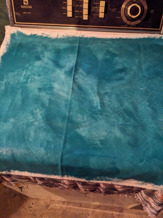
[Image caption/description: a chunk of white canvas mottled with a deep blue-green color. I got this effect by priming it and then letting the primer only partially dry before I went at it with the final color, because I wanted a mottled effect. I then went and added a second layer of color when the first layer wasn't entirely dry either, not just out of impatience but because this is what I was going for. I'm then going to sew the hem on an old sewing machine I'm reasonably confident can handle the paint-stiffened fabric; I'm backing it with an old sheet. And then it will be done. I'm not coating it in polyurethane because this is a temporary/low traffic kind of solution.]
And here's the color, swatched, on the wall:

[image description/caption: The background, to the left, is my kitchen, with the stainless steel fridge and grayish cabinets, the floor still covered in taped-down cardboard. The foreground, to the right, is my basement hallway, formerly blue, now bordered in white primer where they replaced the plaster with drywall and fixed the doorway. And in the middle is the swatch of Pratt & Lambert's "Sandhill Crane", which is a blue/green kind of teal color, rather dark but vivid.]
It's not the color I want. it's too... well it's just a little muddy somehow, IDK. It's beautiful and I want to look at it at lot, but I don't want a big expanse of it anywhere. And it's too dark I think. I want bold and vivid but I want it to reflect into the space and change the grays, I don't want it to absorb light into itself.
So here's all the swatches I grabbed, which all look really dark too. The vertical ones are what I'm thinking for main colors, the horizontal for accent colors. The two ones that are the gradient paint chips are because there was literally not a single shade of scarlet or orange in the single-color chips, and because I liked the green one.

I was standing there in the aisle with my scribbled list of colors, confronted by the fact that the paint chips aisle is not organized by any criteria I can understand. It's not like a color wheel. THey don't even put similar colors together. So when I say, "i'm looking for like an ultramarine blue", there's no such thing, I have to take my idea of what I think ultramarine looks like, and I pick up the chip and it's called "soft lavender" or something and i'm like wtf this isn't purple, and it's not, but. wtf.
All of these are too dark and not bright enough, and I have to go back and try again, but I was just trying to get something to start with. I should pair the accent colors with the mains I was thinking of them with. But whatever, it's a start; if nothing else it's something for Dude to disagree with.
So today I need to go out I think. I'm going to measure the cabinets and look at what I'm putting in them, and then go to Homegoods and see if they have any discount shelf rack spacer things, and then find if anyone has any shelf liners in stock. The idea of getting colorful fun ones is great, but those are not sold anywhere, so that idea isn't going to work. I can have gray, white, beige, and if I order online I can have patterns of gray, white, and beige. I'm not going to buy stick-on wallpaper because the point is to not damage the shelves, not to coat the shelves in adhesive that will strip the finish if I decide to remove them.
So I'm just going to go to Target and buy whatever they have, for the shelves I can't see anyway.
I am going to make liners for the lazy susan cupboard, still. but that's how i'm getting started.
so: get the cat off me. Change clothes. Put another load of laundry in, that'll be two down out of the four I probably have built up to do. Put away the dry laundry from yesterday, it should be dry by now.
Go over to the house. Measure specifically which cabinets you want racks and bins for, and compile a coherent list of those.
Go to Homegoods. (please, god, get there before ten am. ugh.) Look for racks/bins/baskets only to fit specifically the dimensions on your list. Don't buy anything else unless it's specifically suited to your needs.
Go to Target. Buy an under-sink liner, you already know which ones they carry. Note what you did and did not get. Go home, order online for whatever they did not have in stock. Buy shelf liners if they have them and Homegoods didn't.
Lunch.
Finish the shelf liner and install the microwave, so you can feel like you're accomplishing something. Install shelf liners in shelves. Begin to move dishes over into the kitchen cupboards Jim said were ready to be used. (Uppers, not lowers, as lowers still have countertop guys to contend with.)
Perhaps find fabric and other materials for the turny-cupboard shelf liners? Cut those out? See how it's going. Play that by ear.
Come home and make dinner.
Oh yeah I was trying to get a chapter update up this morning. I'm like, so close, but it needs another editing pass and I just don't have time.
18 notes
·
View notes
Text
NEW ART !? It's more likely than you think !
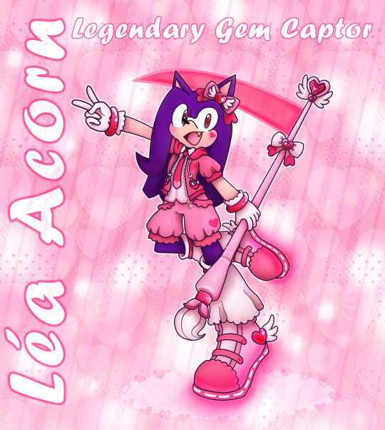
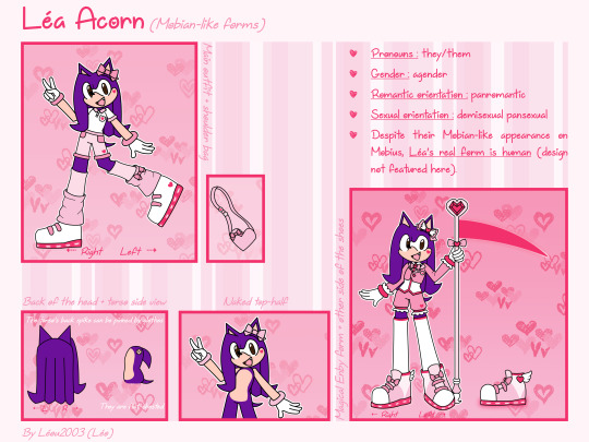
I've redesigned Léa's Magical form again, but this time around I've actually colored (& shaded) the whole thing ; I'll share more of my process under the read more.
Feel free to reblog this (but it's ok if you don't) !
(Léa use they/them pronouns and are agender)
So this is Léa's old Magical form, or at least the last art of it I had completed before the 2024 version :

I was going for a fancy, somewhat ouji inspired outfit that'd still be comfortable to wear, as Léa Acorn's style is all about being cute yet comfy. Their body saw no change from their regular form.
I think I was already not fully satisfied with this design by the end of 2021, but as time went on my list of grievances kept growing longer.
I started to dislike how much of the design was pure white ; it's not really something I like on Magical Girl designs but for some reason I included it here, probably because I was trying to branch out and take inspiration from series like Lolirock & Pretty Cure for once.
I also ended up finding the jacket kinda dumb, or at least the way it fit on top of the shirt seemed off.
I had no idea how to color the shoes when I drew this design and it was bugging me more and more over time.
But while I fell out of love with the outfit, my main grievance was the staff-paintbrush-scythe hybrid, which was not only drawn poorly but also pretty boring. I couldn't help but try to redesign it just a month or two after completing the new ref, but I didn't want to redo the whole thing as back then I still made my refs in Microsoft Publisher with the help of Photofiltre, which was a slow and painful process I dreaded.
(Léa's Mobian forms 2021 ref, for... Reference)
So between my laziness, art block and the general state of my life I wasn't able to complete any new design before this year (2024).
Let's break down this new design, shall we ?
This was my main inspo board this time around :
As you can see I kept the lolita/ouji influence but added some streetwear elements to it.
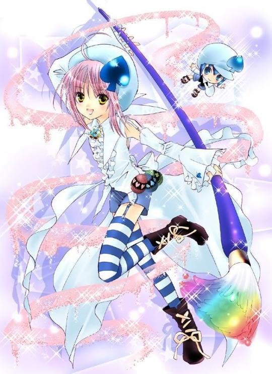
I felt like the previous design didn't do a great job showcasing the mix of preppy prince & comfy fashion Léa are supposed to encapsulate, so I brought up pictures of a character that had only influenced their story and personality so far : Sora from Kingdom Hearts !
It's not something I bring up a lot anymore, but I used to be well-versed in Kingdom Hearts lore and Léa's story was heavily influenced by it ; they were even supposed to fight with a keyblade at one point !
Design-wise, I borrowed the length of Sora's shorts/jumpsuit for Léa's bloomers, and replaced their cropped suit jacket by a short-sleeved hoodie (which also mirrors some of their Sonic.exe world designs). I mixed these elements with lolita items for a cuter look.

Léa share my love of ties, so I've replaced their bow tie by a regular one ; it's somewhat short to showcase their shirt, which is a revamped version of the old one.
For the legwear I took inspiration from some long flowy legwarmers I saw in a few fairy kei coords, and also the shoes from this CocoPPaDolls screenshot I've taken years ago, back when the game was still up :
(I miss this game every day)
And of course I needed the shoes to be velcro LED shoes, because that's just the Léa Acorn way.
The rounded pink heart-shaped gems throughout the outfit were somewhat inspired by Amulet Heart from Shugo Chara.
Talking about gems, time to talk about the staff ! It was inspired by Amulet Spade's paintbrush, some Lolirock items, and a bunch of bootleg Magical Girl wands.
Why reference bootleg wands, you might ask ? Well, since they're already off compared to the real deals, they allow me to not design wands that are too similar to ones from well-known properties.
I've been meaning to make Léa's eyes pink in their magical form for years but didn't actually follow through for a while. I ended up making their eyes brownish pink to not make their eyes too light, as I felt like it'd remove some of their charm (I already felt guilty for not keeping their eyes brown in this form). And of course, I had to bedazzle their eyes to hell and back.
Actually all this shininess and sparkling was inspired by the original drawing of Léa's Magical Form drawn all the way back in 2017 and redrawn in 2018 :

For some reason I took a lot of inspiration from Sailor Moon for these despite Léa's role being inspired by Card Captor Sakura (and Kingdom Hearts). Also Wish Gems used to be called "Magical Chaos Emeralds" and look just like the regular Chaos Emeralds, which was kinda dumb. But I loved the energy of these pieces so I've tried to recapture the "sparkly pink magical transformation void" vibes they had ; I hope I've succeeded on that front.
Anyway, thank you for reading this all the way through ! I hope this was an interesting read, somewhat.
#my berry own art#sth#sonic oc#magical transformation#magical girl#magical boy#magical enby#mobian oc#mobian#Léa Acorn#sonic fan character#kawaii#artists on tumblr#art#digital art#sonic fc#sonic original character#oc redesign#scythe
11 notes
·
View notes
Text
I caught you burning photographs
Like that could save you from your past
History is like gravity
It holds you down away from me
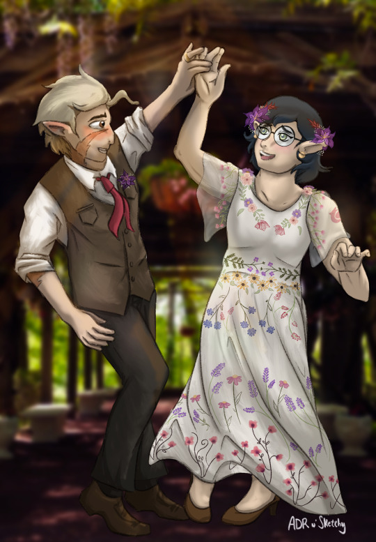
I saw @muzarry’s Huntlow Wedding Waltz art challenge and I wanted a piece of the action. I hope this wasn’t too far off from the initial prompt of a ballroom waltz but I imagined them having and outdoor cottagecore-esc celebration.
Some of my reference materials are below the cut along with me rambling way too much about what I’m nitpicking about the piece now that it's posted and all my mistakes are glaringly obvious (ah the power of publishing your art).
Thanks again for the fun prompt!! I already have ideas of how I’d like to redo this bc they’re just so fun to draw
Materials/references - Willow’s dress was a combination of many many Pinterest searches of embroidered flowers and about three dress ideas smushed together

First things first how obvious is it that I hate drawing shoes? Lol if I’d planned this better, I probably would’ve just cropped the pose around their calves but then I was too far in to fix it.
This piece was really fun!! I’ve been on the procreate tutorial side of tiktok while I’m still figuring it out and I actually got to try out some lighting tips on this. Idk if I did them right but it was fun to try. I fish I'd gotten the colors a little warmer like the initial prompt image. Also still figuring out different shading techniques and styles I like. I'd like to title this piece's strategy "slap on a shading layer and then smudge the shit out of it until you get something passable."
I definitely did not draw enough flowers as a child and was running out of ways to draw leaves and petals lol. Phew that dress was a slog, but also so so fun. I have a little headcanon that it was embroidered by Darius and Camila. I've never illustrated any sheer fabrics, so this was me BSing myself throughout the entire thing, but I can't say I'm mad at the response. Clothing folds are still a headache for me, but somehow this is, better?
Also, Willow’s flower crown is made up of the red grass and flowers that Willow first greets when they get back to the demon realm — y’know, the adorable gesture that squeezes the first smile out of Hunter post Flapjack. Also, Flapjack-red tie for Hunter because obvi.
I'm afraid I made Hunter's outfit a little too close to Caleb's, but from the references of outfits and background, we ended here. So maybe his ability to wear things this close is proof of therapy and progress? y'know, if you squint past my blatant art and fashion block. I also just realized I think I was supposed to color the buttons on Hunter's vest but now I'm pretending that was purposeful
Another thing I'm weirdly nitpicky about it Hunter's hair noodle. Idk there's been something that's bothered me about it throughout the entire process but could never quite put my finger on it/fix it.
I had the idea that Willow and Hunter's rings would look like elongated versions of each other's palismen. Kind of like those little dragon rings that look like they're clinging to your finger, but I couldn't get the shape right, and Willow's ring isn't visible anyway. So maybe next time.
That may be it. Might add more as I find more and more things that annoy me. If you made it to the end of my perfectionist rambling, congratulations!! Your service and sacrifice is noted lol.
Don't forget to hydrate yourselves and have a lovely day!!
#huntlow#winter toh#willow x hunter#willow park#toh willow#hunter park#toh hunter#hunter deamonne#the owl house#toh#muzarry1kdtiys#art challenge#my art#come to me#the goo goo dolls
46 notes
·
View notes
Text
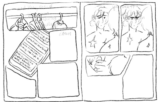
I thought the Two Slow Dancers comic would be a fun opportunity to break down my process a lil bit cause this was a lot of undoing and redoing and adding so for any ppl curious it will be under the cut!!
So to start off I actually only thumbnailed what is now page five and six, the original image in my mind was them reaching out to each other in different seasons clothing, I considered just making an animated version of that but then I connected it to the two slow dancers scene I had imagined in my head a month or so back and wanted to make it part of a small narrative:

(I actually did page six first - u can tell by the way my writing is nearly incomprehensible that this idea came to me like a vision in the night)
But then looking at that i said - well surely that doesn’t tell the story enough. I need more. And then I played two slow dancers on repeat for probably an hour while I thumbnailed a surrounding narrative for those two pages and ended up with this mess:
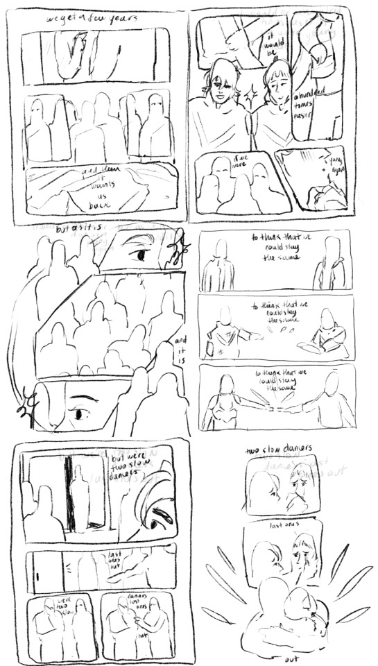
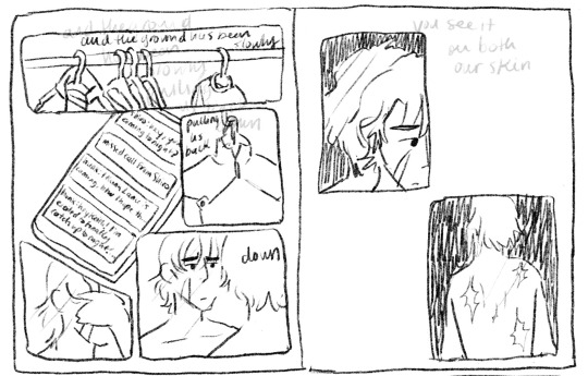
And from there I actually started working on the lineart two pages at a time - I like working on freakishly large two page spreads because to me it helps the flow feel more cohesive, I don’t look at them as isolated pages until I get to the shading part of the process.

But once I sent it to some ppl for feedback and reread it myself a million times I felt like the story still wasn’t reading the way I wanted it to - two out of six pages were “flashbacks/memories” pages and that ratio didn’t really allow for the other four pages to read as a cohesive story in my opinion so I kept trying to workshop two more pages for the front and I went through a few iterations:
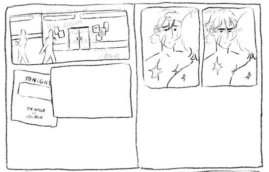
I thought at first I would show the outside of the garrison, give the audience more of a setting, and then show the flyer so we know Keith is getting ready for this celebration. But it was too literal for me (even though what I ended up doing was still pretty literal lmao). So then I started with the phone/text messages as a story telling device:
Also this is an example of how I almost always draw the comic panels before I decide what goes in them haha, unless I’m really sure what images I plan on focusing in on the panels almost always end up informing what goes inside if that makes sense. But I finally ended up here when I decided “that’s good enough”
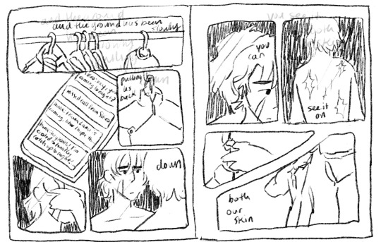
I even did most of the lineart for this composition before I decided the imagery of the jacket was just too repetitive, like we don’t need THREE PAGES of keith putting on a jacket.
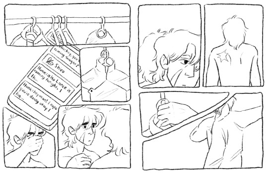
So i kind of just moved the left page over to the right, and left the right page blank for most of the rest of the comic process. I finished most of the lineart on the rest of it before I finally circled back and decided to go with a tweak of what I originally thought was a lame idea (I had this image in my head of the lions silhouette against the glow of the Earth for the first page, but with the lyrics “the ground has been slowly pulling us back down” I thought it was just too cheesy, especially because that’s not what the lyrics mean either in the song or in the context of this comic and I didn’t want them to be perceived as so literal)

So this is the thumbnail I landed on for that which eventually turned into the actual final page.
Once I had all of the thumbnailing done the rest was pretty fun work! Just lots of going back in and detailing out the scribbles I had first put down. Now in terms of color, I actually have a secret. Most times I don’t color much at all? It depends on the piece but for most of my comics what I do is this -
I flat greyscale color everything and then use a color curve adjuster inside of procreate to pick a color pallet:
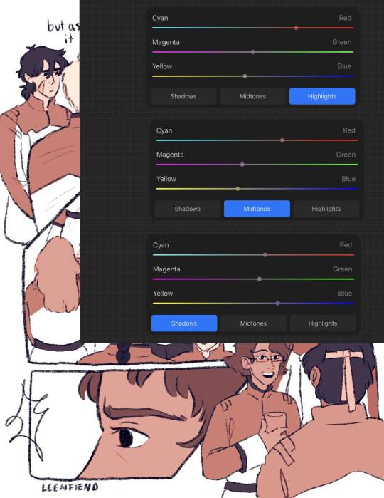
color adjusters are ur friend for picking color pallets i'm TELLING YOU!! I used to have a lot of trouble with cohesive color comps but it's a lot easier for me even without using this method now. Anyway I usually leave it here, in my other comics I don't have any shading or background elements outside of the panels but I figured since I was working so much on this comic anyway, I might as well light it a bit.
So I basically just scribbled over the whole composition with a purple marker set on a multiply layer and then erased out the places I wanted light to hit, and then added a soft light layer with colored lights to give it more of a party look:
The only hang up I had during the coloring process of all this was how to color the "memory" pages. I originally just wanted them to be more pastel/blue, I thought that would make them look distinct enough. So I painted/shaded this whole page before looking at it within the rest of the composition and deciding it didn't read well at all and ended up sliding the saturation down to zero and calling it a day:
But I'm happy with that decision because it allowed for the "coming into color" moment with the other memory page and I think it connects better to the rest of the comic visually that way.
And that was the whole process! There were tons of other little adjustments I made along the way and other composition things I tried out but I do tend to erase instead of iterate in layers so this is the process I have to show you!
As a little bonus behind the scenes, here's the time lapse replay of that initial thumbnail for all eight pages! (it is sideways just because it's so large so if you're on a phone/tablet/laptop just turn ur screen sideways otherwise I'm so sorry lmao)
#my art#this is so long but i like 2 talk about process stuff lol#i also would love to see anyone else do a breakdown like this i LOOOVEEE seeing how other people work.#and feel free to steal any way I do anything ever (it is not stealing it's simply learning and using artistic practices that u are drawn to#colleen thoughts#also i use the 6B pencil in procreate for all of my linework ever and all of my thumbnailing im a one brush type of person#and it's like a default brush too lmao
23 notes
·
View notes
Text
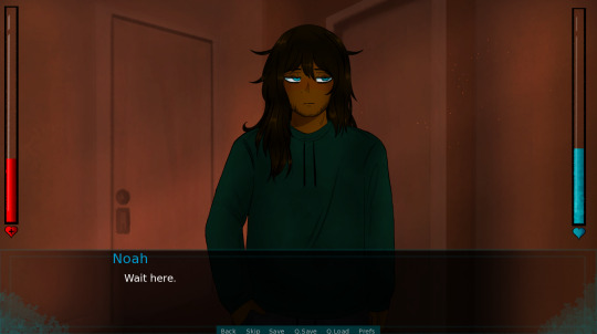
Game development Trembling Essence update:
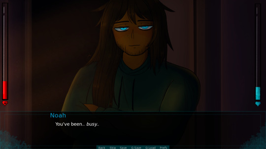
Hello and welcome new followers, I am here with another update to share today! :]
This week mainly focused on sprite rework!
This was something that I thought would happen later into development but I'm finally looking forward to doing this since I like how my art style has been developing. :]
The old files for his sprites were very unorganized and hard to follow so I redrew everything from scratch!
My coloring/shading has improved since early January-March so I wanted to fix certain details to define him but nothing that would drastically change him.

So to go into a bit more detail and add some more lore:
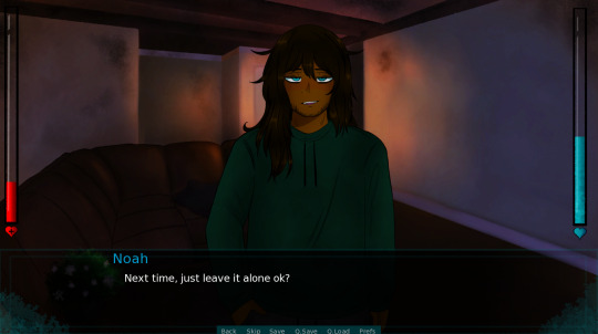
Noah's hair is healthy and well taken care of but still recovering from damage which makes it uneven. The hair on his right side that's over his shoulder is very long and reaches down towards his chest while his left side is shorter and slightly inches over his shoulder. The center part of his hair reaches down to the mid part of his back! :]
It's more noticeable in most of the CG's since his old sprites didn't show that too well.
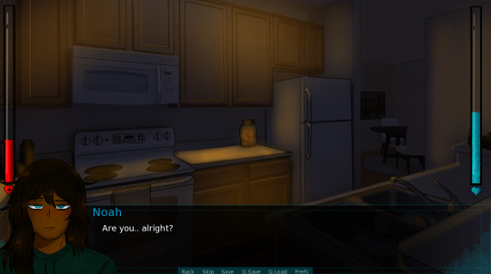
In very early development for sprites, I was going for a sort of "anime" shading style and used a very small brush and minimal shading. The line art was too thin and didn't transfer well into the game so I redid them. In the second attempt, the main sprite from the demo that you would see on the screen had more details but I overlooked adding that same type of shading towards his side sprite in the bottom left corner in the demo. I didn't notice any of this until the early summer so it was something on my radar to redo.
I even changed the way his over-sized hoodie looked since I didn't know how to properly draw them at the time. Everything ended up taking a couple of tries before I was able to finally get what I wanted.
It took longer than expected to restore the new sprites when I first started adding them because I tried using the "replace" method and it messed up what I was trying to do. I wasn't really too bothered by this so I combed through everything one by one instead which helped me catch a few more grammar mistakes/do some minor quality of life changes.
Speaking of quality of life, Noah also has more sprite expressions too, It went from about 10 to 17 so far! Some of his original expressions didn't line up the way I wanted them to in the demo/full game and now they fit a lot better this time around. :]
There will also be alternate sprites being used when he's in what he considers his pajamas! I had some old sprites of this but I really did not like them as time went on and his sprite expressions no longer fit what I'm trying to go for anymore. This will be something I'll talk about in the next update post! :]
With that being said, that's all I have to share for right now!
Thank you very much for all of your support and constant encouragement on what I've been working on! I will always wholeheartedly appreciate it! This week was really productive and I'm very happy with how much got done with the games' development! :,]
#get to know: noah#te updates#trembling essence#visual novel#male yandere#itch.io#dating sim#game development#illustration#yandere#indiegamedev#horror game#digital art#murder sim#indiedev#indie developer#indie game#renpy visual novel#renpy#renpy game#vndev#vn development#interactive fiction
22 notes
·
View notes
Text
Tips for those who are planing to Edit your Clangen Cat Files (From someone who has suffered)
1. Check if you can actually edit your Clangen Cat Files
I have been playing Clangen for a very long time so I have downloaded many older versions. The Clangen I was editing had a simple saves folder and it seems that the newer version on itch don't have that so, I have no idea how to help you. I'm not a developer and I fell ass backwards onto these tips because I was having so much trouble. Also, I only own a Windows so if stuff is not working and your on another devise, I really don't know how to help you there. I have tried, boy have I tried but I can't figure it out, so Sorry.
Now to the many Lessons from my suffering.
Make a back up, And Please, make more than just one
When you mess something up, and you will mess something up, make a backup of the file you are going to edit. If you don't do this than you might delete something that you don't know how to fix. And then you will have to start with a whole to save file. And do not make just one backup, make at least Three, Two that you will actually use and One to make infinite copes from, you will mess up a lot and you will need those extra copies.
2. Download a program that can actually edit the code with out making it unusable
Opening up the code in any program and placing it back in will not work. The new file will probably be unreadable to the game and you will have to start all over again. The software I used is called (notepad++) If the download page looks weird to you it is probably because this program may be older than google. But don't you worry, this oldy was made to ready all kinds of code and can let you see inside of the files while not braking the game.
Once you have this fully downloaded, when you right click on your Clan's Cat list file, Right under open, there should be (Open with notepad++) After you edit the files you should still be able to enter your save.
3. Write out the Edits you plain to make to your cats
If you have the Clangen Cat Maker, you probably know what you want to make your new cat look like. But the code will look very different from the Clangen Cat Maker. There are some words that are different in the Code and formatted differently. So I suggest that you set up a word or text doc to write out the Cat you are going to Try and code in. This is my format for writing for you to use:
Name: (For Tip 6)
Age: Age
Pelt Length: Length
Reversed: True or False
Shading: True or False
Base Color: COLOR
Base Pattern: Pattern
White Patches: Pattern
Eye Color: COLOR
Heterochromia: True or False
Other Eye Color: Null, unless you want Heterochromia if so; OTHER COLOR
Skin Color: COLOR
Tint: Color
Tortie: True or False
Scar 1: Null or Scar Name
Scar 2: Null or Scar Name
Scar 3: Null or Scar Name
Scar 4: Null or Scar Name
Accessory: Null or Accessory Name
5. Know the Difference between GREY and Gray.
If you did not know, in the vision of Clangen I was using gray eyes were not chosen for a cat by just editing their eye color to GRAY, but rather to GREY.
Is GREY the correct spelling for the color; no. Did this annoy me for hours after finding this out; yes. Could this be a funny inside joke between the coders; probably. How long did it take me to find out that this is why that one cat was not working; Five Very Stressed Filled Hours. Other things in the cat code like tints are just called gray so, know the difference.
6. If you are going to change the cat's name, DO THAT FIRST
If you made a save and you want to make all the cats in the save different names but you want to do that later, DO IT FIRST. When you are in the depths of the code,it is hard to tell which cat is which. It can be so easy for you to change the wrong cat and then you have to redo everything again. This can also happen multiple times when you don't learn the first time you do this.
If you have a name in mind for your new cat, Write it in the Name section of Tip 3.
As much as I want to say these tips will make things easier, they just worked really well for me. There is still going to be a lot of trial and error in the actually editing process. But I hope that this helps someone. Now if you don't mind me, I am going back into my hole. I Wish You All Good Luck. You will need it.
#clangen#clan generator#warrior cats clangen#clangen edits#I have suffered#Here are some tips so you can hopefully suffer less#good luck
9 notes
·
View notes
Note
I went to Home Depot a long time ago with my parents (when I still lived with them) because my dad was remodeling the outside and wanted to repaint the house and so he brought me and my mom so we can decide a color and bring some second opinions. Well, me and my mom couldn't pick between a color which were both an orange color, but to us, were different shades. And me and my mom were trying to convince my dad that they different colors.
And right now I just imagined the same happening with the moon boys. Like I can imagine that they want to redo a room and bring you because "She knows best and would be a good second opinion.". And like, you get to the paint aisle and come back with colors that look different to you and so you go to them to see what they think, but to them it looks like the same color.
Jake is standing ground that they're the same color and goes "Just pick, amor. It's fine." and there's this light hearted bickering about the colors that's more so just you two teasing each other.
Marc just goes "We can get samples of both and we can see if you like it when we get home.". He's been married before, he knows this whole song and dance and he's not gonna play it so he just goes by the neutral option.
Steven, bless his whipped heart, would pretend to see a difference and just pick one randomly. He doesn't want to say that they look the same to him, not because he's scared to but actually because he's sort of like that one quote from John Mulaney "I listen to everything my girlfriend says". So Steven's just picking one because it won't really effect him because he sees the same color, but if you see different ones and can't pick then that means you see different ones and just need him to be a second opinion. Even if his comes from a shot in the dark.
This might be weird and specific and long but it's just been living in my brain.
Omg Nonnie no I love this.
Sometimes I like thinking about the boys in a domestic sense and like thinking about what they would do in certain situations.
You're so right about all of these things ugh. They'd act EXACTLY like this. My ONLY pushback might be on Jake. I think he's the most observant and would probably be able to tell the differences in color AND have an opinion on what one he thinks is best, but wouldn't really argue with you if you had one that you favored over the other hehe.
#moon knight#steven grant#jake lockley#marc spector#nonnie are you a writer in the community?#maybe you should be?#This is wonderful and I love it
12 notes
·
View notes
Note
who are your biggest artistic influences my furry friend? we had art classes together for years but i still feel like i don’t know 😭
😭😭😭 honestly thats probably cus a lot of my artistic influences are specifically internet artists that ive been following for several years and not things i couldve brought up in art class. you know that lame ass mr smith wouldve hated me if i said 'yeah i draw like this cus of some bts fanart girlie on twitter'. thankfully i have the Archivist's Temperament and save like literally everything thats had an effect on my style... so below is a journey thru my artistic influences (and various insp folders on my computer) as far as i can remember
of course the most basal Dorian Influence is disney movies. you are my brother in arms in the lion king fandom so you know this. whenever i am feeling extremely artistically bankrupt i try to revitalize myself by rewatching the lion king, atlantis, and treasure planet. and also the prince of egypt but thats dreamworks LOL
in 2016 i found the first "online" artists i distinctly remember wanting to imitate, which were sara kipin and celia lowenthal because i was obsessed with how they used color to block out their illustrations. ive also been following dimetrodone(/dimetrodrawn/deinocheirus) on here since 2016 and love all the shapes and colors in her work
in 2017 i started doing more detailed shading because i saw bts fanart by the artist tyu_naxx on twitter and loved how they did it (below is like THE piece that made me change my whole shit up)
around then is also when i started trending towards using limited palettes and that was mostly inspired by various national parks promo artworks that would only have like 5 colors in them. wish i remembered who made these but heres ancient scans of some postcards i got at sequoia national park that changed me

in early 2019 i started wanting my style to be more cartoony so i would constantly peruse the backlogs of kiwi, officialspec, skunkes and mimiadraws to get whatever inspiration i could from them
in late 2019 i completely pivoted for some reason and started doing lineless rendered semirealistic stuff instead. i think that was mostly cus i hated doing lineart. one of my biggest inspirations in that era was atissi
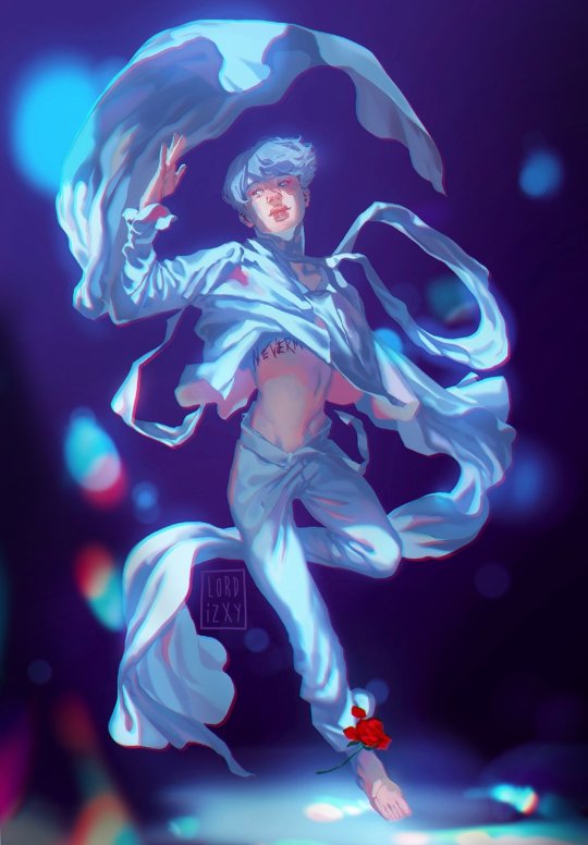
in 2020 i remember i went crazy stupid on using glow effects and chromatic aberration on stuff and i genuinely think all of it can be traced to this ONE piece of bts fanart by lordizxy on twitter like i was fully obsessed (putting it below also in case it gets deleted somehow)
mid 2021 was when i got tired of semirealism and thought it was too amorphous and restricting so i went back to cartoony shit. i was still looking at the artists i listed for early 2019 but i also added artists like iplidl, catmunches, and chunkysoup22 to the mix
2022 was an inspirationless nightmare i have no clue what i was doing for that entire year. the artblock was BAD. i mostly just looked at art from all the artists i mentioned before while artistically wandering in circles. a lot of this was me trying and failing to figure out whether i wanted to do more dynamic yet less rendered art or... the opposite of that
thankfully in 2023 i finally FIGURED THAT SHIT OUT. i would say the current dorian art era started with this silly drawing of graydon and riley hivemind as a dogboy and a catboy ⬇️

you can kinda see the influences of all the cartoonists i listed above but a lot of the way i draw now is just. me trying to not make myself hate doing art. ive always hated redoing a line 30000000 times for clean lineart so now its sketchy. rendering my art was making my drawings feel super stiff so now thats all messy too. etc etc
i think Right Now the artists i go to for inspiration the most are still kiwi and skunkes, but i also found the artist robottoast recently who makes RIDICULOUSLY good furry art, its so full of life and personality and i definitely need to commission them someday. the most recent singular piece thats changed my whole shit up is this scott pilgrim fanart by benadieshekiel (also below) because i really liked how the clothes were fully rendered while the skin and hair are less detailed with clear lineart. so sometimes i do that too

ok i think that is as full of a chronicle of Dorian Influences that i can give you rn. i was not lying when i said i wanted to yap. hope you enjoy <3
#ask#saintsdead#also obviously have influences for the themes in my original work but i do not feel like going into all that tbh#how my art Looks is MUCH easier to trace
6 notes
·
View notes
Text
Weekly Update March 1, 2024
I’m not doing the best this week but I’m also not doing the worst. I’ve not been sleeping well and I think it’s culminating today so slightly early update post just in case I fall asleep early tonight. I’ve had on and off moodiness and flareups but not a whole lot of surgery sickness, hoping next week will be the same. I think this week was a lot of semester stress, which makes it hard to take care of myself. I just ate three applesauces and next week is spring break, so I should have a bit of breathing room for more art stuff. Just in time for my art block to maybe be giving way. All I gotta do is get caught up on sleep, which I’ll try to start tonight.
So I’ve been trying to put more brain power into actual Oc story writing stuff this week. I have the little comic I’m working on in the background and that’s going a bit slower than I’d like but I’m still making progress and reviewing over it there’s fewer older pages needing redo than I’d thought. I’m also now officially through the second act of the episode/chapter/ w/e, so the third should move smoothly. Scenes are flowing nicer than I thought they would, generally going pretty good.
I also finally think my animation art block is giving way. Clip studio is good for flowier animation so I’d like to combine it with flash for any actual big animation projects I try to pick up but on it’s own it’s fine for smaller ones. I might do some more sketch style test animations for unfamiliar movements, and eventually I’ll need to do a test for one with lineart and color layers. The interface is not user friendly at all but I did figure out how to do it the way I had wanted. Not planning on doing any shaded animations though, shading will have to be done with after effects somehow. I’ll round up ideas for test animations tonight because I’m very headfoggy today so I doubt I’ll be able to throw music together.
I’ll definitely do a quick little gif for the bigger song I finished, I’ll try to get going on the next one, but for the time being I might finish up some half baked covers. I’ve fiddled with vocaloid more now, have two half finished vocal parts I’m using to test out how the English and Japanese banks work with English songs. Japanese bank is working better than I thought, but it’s annoying having to play with the dynamic and exciter settings for certain consonants, and the limited vowel selection also sucks, but it’s not like the English banks have basically the same issues too. I just need to play with settings a bit more, finish writing out the vocal parts (should basically be copy paste at this point, I’m already through one chorus of each), and throw together instrumentals to go with them, but I picked songs with simple instrumentals anyway, so it shouldn’t be too hard to get a skeletal structure ready, then I can fill it in with piano or violin because I can’t go two songs without either I’m addicted.
Music comic and animation are the main things I did this week but I am slowly getting my updated commission sheet together. I’ll probably start timing myself on smaller songs so I can try to add music options properly. Animation comms would be nice too but that’ll definitely be a ways off.
I did make unexpected progress writing an epithet TTRPG campaign, it’s like mostly structured, but maps minis and some encounters still need to get written. I might sit down to do that over break. I’m more certain now that I’ll need to take people online as players but I’ll wait until I’m closer to run before I make a google form for that
I’m going to try to either spend tonight with friends or go to bed early or both. I’m a bit worried about my body because flareups have been getting bad but tomorrow I don’t have to move my legs at all beyond doing laundry so I should be fine. If plans for both fall through I’ll either watch a movie or cartoon (I don’t do very often but if I indulge in media I can improve my writing skills) or draw or both. Tomorrow is walled off for homework though I don’t think I’ll be able to do much else.
2 notes
·
View notes
Note
If this is rude to ask please please ignore, this is from the perspective of someone in pre-planning stages of my own comic:
How long did it take you to shrink from the 30(?) page buffer I think you said you started with to 10 pages? I assume starting with that big buffer meant that this is less impactful to the comic and thus less stressful, but do you have breaks planned for yourself so you can re-up that backlog or do you intend to try to do it in-time with the comic? You're a powerhouse who I only ascribe to half the output of, but I'd love to know a little more about your backlog ethos. (When you have time of course!)
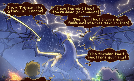
Heh, oh boy. The biggest bite got taken out of the buffer during Falst's intro arc. I had boarded something like a dozen pages when I decided I didn't like the direction they'd taken and I scrapped them back to blanks. I don't do this as a rule, but I could tell this one was a problem - I can't even remember why now, but there was something there that just wasn't working. I thus had a time-loss redoing those pages that made up the better part of a chapter, and my storyboard buffer shrank pretty significantly, though it's since recovered in a big way.
More of the buffer got worn down during the back half of the Zuurith arc and the Tynan fight, since every page was so complicated. Alongside the environmental fog and rain effects and the eight different kinds of glow, it was also a lot of characters on every page, and that increased the lineart and coloring time significantly. If I recall correctly, the buffer shrank to the low single digits a few times during that arc.
At some point I might take a break, but I kind of don't want to. I've kept up a solid pace this long and I don't wanna break my streak. I've been able to build the buffer back up to 20 pages before, but the problem is I tend to then take the following week or two off on the comic progress front because in my head I've made a good chunk of progress and thus should take a break. I'm getting better at incremental scene-by-scene progress, and I think chapter 20 is going to be good for rebuilding the buffer, because - spoiler alert - a lot of these scenes are one or two characters only, and most of them have fairly dark featureless backgrounds. I suspect I'll be able to get a healthy headstart just working through this chapter. This was my reward to myself for constantly making the Tynan fight increasingly complicated and ridiculous, and it's honestly a breath of fresh air to make these pages so much simpler.
My rule for comic-making is set a pace you can keep up. If you need to take a break, that's fine - my own unwillingness to do so is a me thing I'm working through. not a policy to emulate. I've been able to keep this up for three years with minimal buffer-loss, and as the story progresses my own art gets better and faster, making it easier for me to maintain this pace. That's why I made sure to start with such a hefty buffer - to give myself time to pick up speed and get better, time to have the occasional crash-and-burn week or even month where nothing gets done, and time to rewrite things that were being problems. Basically, the buffer is 100% working as intended so far, because all of those things have happened at least once.
The math is pretty favorable. With a three-page-a-week upload schedule, if I can finish three pages in under a week I'm guaranteed to keep the buffer going. At peak performance I can do five or six pages in one day, though that's dependent on complexity and that pace isn't sustainable for long - but of course it doesn't have to be, because that buys me two weeks to recover and do all the other stuff I couldn't do during the hellride. The block of pages I'm going to color tonight is five pages, which will buy me nearly two weeks. I lined and shaded those five pages on Friday, and I'd blocked out the backgrounds for this whole scene and the following one in one afternoon the previous week. It's not hellride-pace because it doesn't have to be, but if I needed to push it I could buy myself a week in under a day. Because of this, rebuilding the buffer back up to 20+ is a lower priority than keeping a steady pace that won't hurt my drawing hand or my writing brain.
But if I take too big of a hit I'll announce a two-week break or something. I have things arranged so hopefully I never have to, but ya never know, and it's important to be okay with taking the occasional unexpected hit!
174 notes
·
View notes
Text
A Peter Parker blurb for y'all :) hope you enjoy! Masterlist is linked in bio, requests are open for all fandoms in my list (or you can request something from another fandom and if i like the request and know the fandom i will do it)
And yes a spongebob gif for this blurb because it mentions the show!
Peter Parker x Reader [Established Relationship/Fluff]
Word Count: 800
Warnings: mention of future pregnancy for Reader
Redoing the office space in the new apartment you two rented out was much needed. Today, you and Peter decided to work on painting the room after picking up the paint from the store. It was a pearly tone and you laughed at the name again when Peter held it up in front of you.
"Stop, you might drop some on the floor!" You laughed out, and Peter shook his head, giggles pouring out as he reread the name again.
"It's called the bubbles of Bikini Bottom!" He spoke out loud, now gripping onto his stomach as more laughs came out. You two could barely stop laughing at the name. It was a little dumb but a cute name for a paint. Once you two quieted down a bit, Peter set the paint can down on the floor.
"When we have a daughter, I vote calling her Sandy or Pearl! From Spongebob." Peter suggested, glancing over to you with a sweet smile. You paused, eyes widening at what he just said. It was something you didn't realize that Peter had thought about, but now you knew he was so sure about it, that it made you want to cry happily.
"When?" You mumbled back, still a bit surprised and shocked in a way you would be when you'd hear good news. It was so sweet of the way he said it as well. Like you two were going to have a daughter for sure, no doubt about it.
Peter's face dipped into morbid shock, and he shook his head frantically, "I'm so sorry. Uh, if - and you know, like if you want to talk about having kids and getting married or not, we can anytime." His ramble was full of his nervous emotion, and you almost pouted at him.
"I guess we probably should have talked about it way sooner..." You trailed off with a short nod before adding, "I like Pearl for a name. Maybe a middle name." It was quiet once you finished up, and Peter's eyes never left your face.
"Yeah, me too." The agreement in his tone made you smile even more as you handed him one of the brushes. He held onto the other end of the brush but didn't pull it away. Instead, he leaned closer to you and pressed a soft kiss onto your cheek.
"I was so nervous. I should have asked you sooner about what you want in your life." He admitted quietly as he pulled away.
“I should’ve asked as well, I kind of just kept waiting for the right time.” You responded, shrugging as you looked at the wall. Then you glanced over to him with a grin, “But seriously, when we have a daughter, we should paint her bedroom with this and then,” You paused and laughed a little, “Like the accent wall can be right there,” You pointed out something on the wall.
“And it can be like a darker shade? Or maybe just a completely different color and oh! She would probably like a bunk bed, or have you seen those beds with the slides? That would be great!” You continued to get more excited as you started to envision it all and Peter’s smile was bigger than ever before.
“Maybe we can have a desk in that corner and then have like those hanging shelves with her favorite old childhood toys when she’s older.” He agreed and continued on, and you laughed happily and pulled him into a hug.
“When she moves out and gets a job or maybe go to college, we could bring in that arcade machine you always wanted! Remember? You looked it up once a while ago, it’s not a Pac Man machine… was it a pinball one?" You asked and Peter just hugged you as tight as he could. He couldn’t believe how far you two have been thinking of life together and somehow never spoke about it.
And the fact you brought up the arcade machine – that was something he’s wanted since he was a kid. It was so overwhelming that his eyes started to tear up and you quieted down and pulled him back into a hug.
“What’s going on?” You whispered to him, but he shook his head and smiled.
“I just really love you so much.” He mumbled into your shoulder, and you rubbed his back to comfort him a bit more, “I love you too.” You whispered and somehow those words made him cry even more, happily.
“Aw, Pete,” You paused as he interrupted your sentence with a kiss to your cheek.
“I know now that you love me the way I love you.” He sighed, wiping away at some of his tears and you laughed softly, agreeing with him. He pouted in a silly way and tears started to flow down again and you frowned towards him, shaking your head.
“Peter, honey, why are you crying?” Your question made him laugh a bit and then cry some more.
“Because I know our lives are going to be good together.” He replied quietly. You smiled at the words, nodding to him.
"Aw, yeah we'll live good lives and raise a happy family."
28 notes
·
View notes
Last Seen Blogs

lgb-positivi-t
Positivity!

simtanglement-blog
Simtanglement
moepuppy0
Untitled
babydolldaydreams
🧸BabyDollDaydreams🧸💒

engineering
Tumblr Engineering