#all you need is the most basic gif making tutorial you can find
Note
hi i'm sorry to bother you but do you have any tips on giffing dark indoor scenes? yours always look so good!
hi there! not a bother at all :) i can definitely try to explain the steps i usually take under the cut!
this tutorial will assume that you already know the basic steps of gif-making — if you don't, there are lots of great tutorials floating around on this site that can help you out! :)
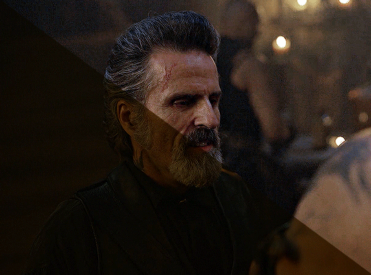
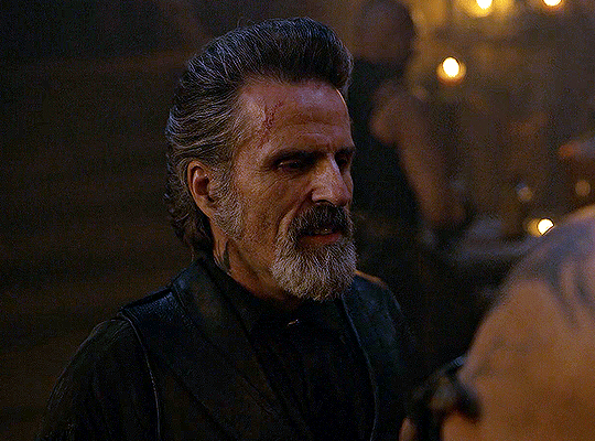
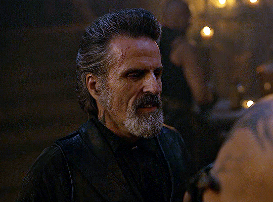
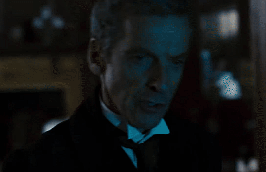
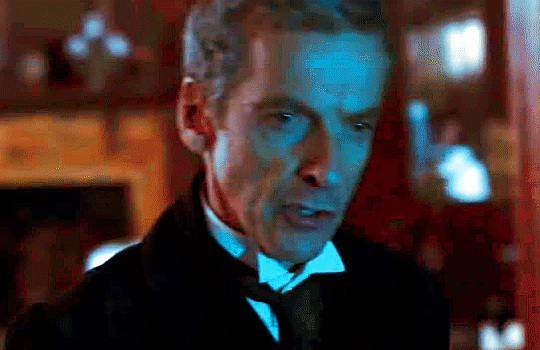
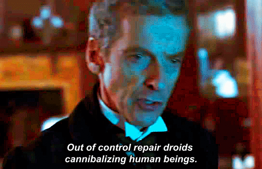
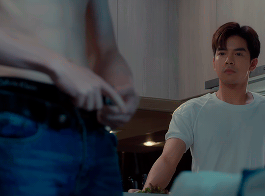
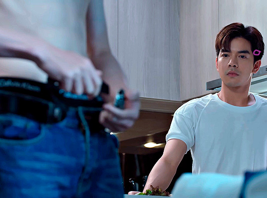
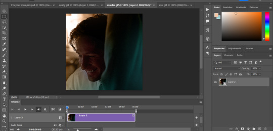
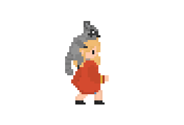
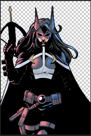
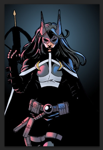
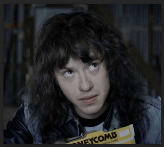
here's the gif i'll work with to explain my steps, the bottom being the original and the top being the coloured/brightened version.
before we start, a general tip i recommend keeping in mind: if you want to brighten a dark scene, you'll want to get your hands on the highest quality download you can find. 1080p is decent, but if your laptop can handle 2160p 4k hdr files* without sounding like it's about to explode, that'll get you even better results!
(*colouring hdr 4k files requires a different set of steps — the scene will appear washed-out on photoshop, so you need to make sure that you don't end up whitewashing anyone if you do choose to work with this type of file.)
since most of my downloads are 1080p, i'll use this type of file in this tutorial.
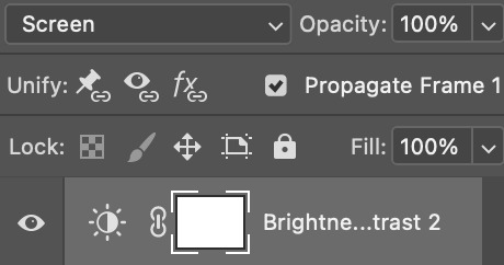
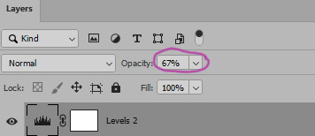
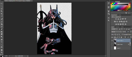
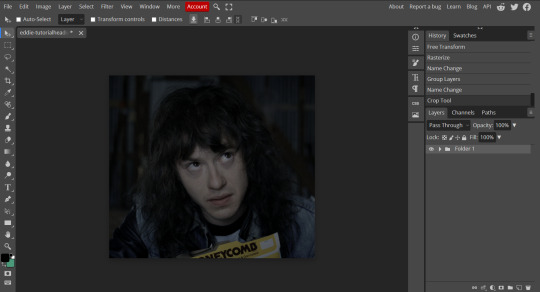
the first step of my gifmaking process with 1080p files is almost always the same no matter what scene i'm giffing. i make a brightness/contrast layer and set the blending mode to screen:
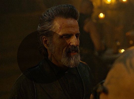
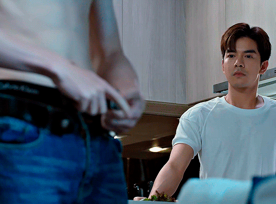
now my gif looks like this:
depending on the scene and how washed out it looks after this layer, i'll play around with the opacity. for this gif, i didn't touch the opacity at all. use your best judgement for this, because every scene is different!
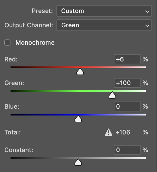
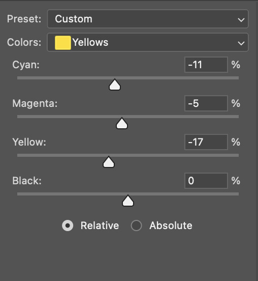
i find that dark indoor scenes are usually tinted in yellow or green. one of my first goals is to try to fix the undertone of this scene before focusing on brightening it any further. i go to colour balance for this, and play around with the midtones, shadows, and highlights.
again, every scene is different, so the amount to which you use colour balance will differ, but for this specific scene, my goal was to neutralize the yellow. i focused particularly on the midtones and shadows of the colour balance layer, moving the scales to the opposite of the reds.
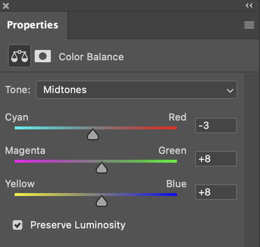
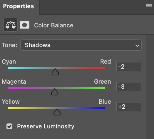
doing so will help with neutralizing the yellow. the only reason i moved the scales towards magenta and blue (therefore making it a bit more red than less) rather than green and yellow in shadows was because i wanted a darker contrast in the blacks. moving them to green and yellow made the overall scene more yellow since there were so many dark spots that shadows affected. (you'll see what i mean when you start experimenting with your own gif — this part of the process really just depends on your preferences!)
our gif might not look that much better yet, but it will soon! our best friend channel mixer is gonna help us out. for an in-depth post about how to use this adjustment layer, i recommend checking out this tutorial.
i'm someone who prefers to make more than one layer for the same adjustment layer for a reason i can't even explain (i just find that it helps me stay more organized). so don't think of this process like i can only use this layer once so i MUST fix it NOW. you can create multiple layers of the same adjustment layer, because every layer on top will affect the ones underneath it.
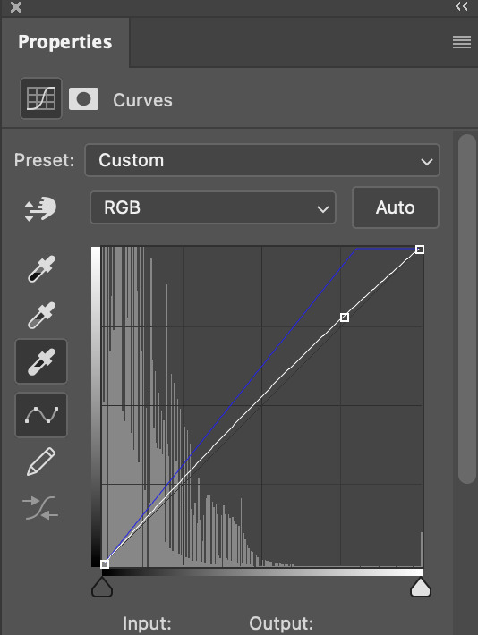
since my priority is getting rid of the yellow tint, i went to the Blue section of the channel mixer and increased it in all of the scales:
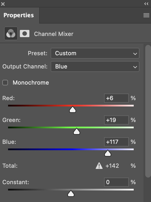
this step alone has helped us out so much, because look at our gif now!
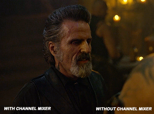
not only does the background look less yellow, but so does izzy's skintone.
now i'm going to focus on trying to brighten the scene even more without destroying the quality. the levels layer can actually help out a lot with this.
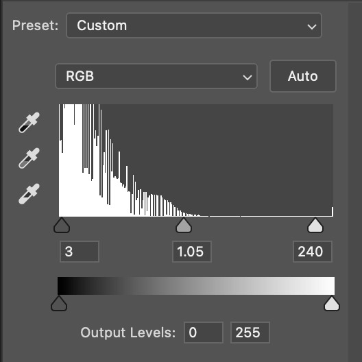
the amount to which i move each toggle differs per scene, and i think experimenting depending on your gif works best for this layer.
side note: i prefer not to use the ink droppers on the side because the contrast in the result usually ends up feeling too strong for my preferences, but if you find that this works better for you, then go for it! basically, the first dropper with the black ink should be clicked before you select the darkest part of the scene that you can find, and vice versa for the third dropper with the white ink — click it, and then select the brightest part of your scene.
curves is the next layer that does fantastic work! unlike the levels layer, i do actually use the ink droppers for this. it's the same concept, with the first dropper being used on the darkest part of the scene, and the third dropper on the brightest.
try to think of curves as something that not only further brightens your scene, but also helps with the colour neutralizing process.
i grab the first dropper, then click the darkest parts of the gif that i can see. depending on the undertone of the blacks that you're clicking on, the tint of your gif might actually change significantly. this is why i prefer to click once, then undo the action if i don't like what it gives me. izzy's leather jacket was the sweet spot for this gif.
when i'm satisfied, i make another curves layer and use the third dropper to click the bright/white parts of the scene. for this gif in particular, the lights in the background were a good fit because they carried a yellow undertone — this meant that my curves layer actually helped to further neutralize the yellows in the scene as a whole!
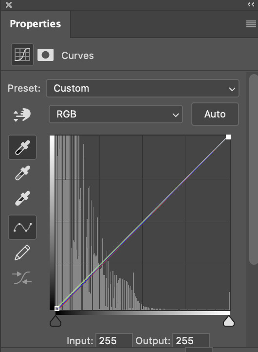
(i manually dragged the curves graph upwards for the third dropper to make it brighter. i don't need to do this if the dropper does this for me automatically, but since the lights were pretty bright, it only changed the tone of the scene and didn't increase the brightness — hence the manual step.)
pat yourself on the back, because this is what our gif looks like now!
this is good, but it's not great — there's still just a bit too much yellow in the scene for my liking (sorry, i'm picky! :P)
i created another channel mixer layer and played with the toggles until i was satisfied:
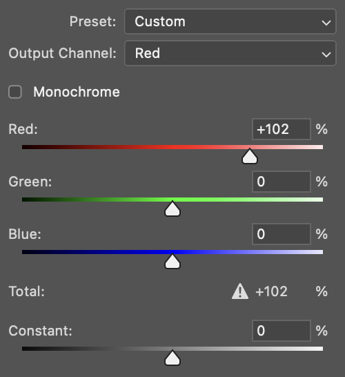
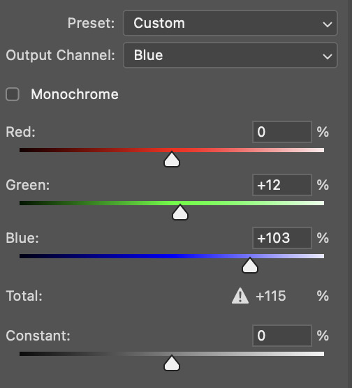
ta-da! the gif as a whole is much less red/yellow now:
this is when i start fixing the colouring now — namely, his skin tone. selective colour will be your best friend here. i wanted to make his face just a tad brighter and less of a yellow-ish magenta shade, so i focused on the reds and yellows.
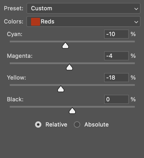
then, out of habit, i created another selective colour layer and took out more of the "yellow" in the whites to make them whiter, and increased the black (just by +1, since the contrast is pretty good enough already).
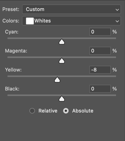
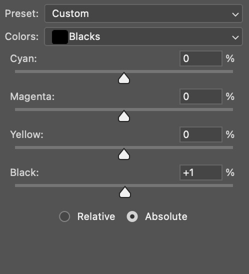
note: i switched to "absolute" for these two colours. basically, relative = less vibrant colour manipulation, and absolute = more vibrant/stronger colour manipulation. i prefer to stick to "relative" for fixing skin-tone since "absolute" can be a bit too strong for that.
our gif looks like this now!

his face looks brighter and much less yellow, so i'm satisfied!
this next step is not mandatory at all — again, i'm just picky and despise yellow-tinted scenes. i personally believe that indoor scenes that are yellow/green tinted make them look more dark than they actually are, so i do my best to get rid of these colours.
i also don't always do this, but for this gif, i just simply went to hue/saturation, selected the yellows from the drop-down menu and decreased its saturation.
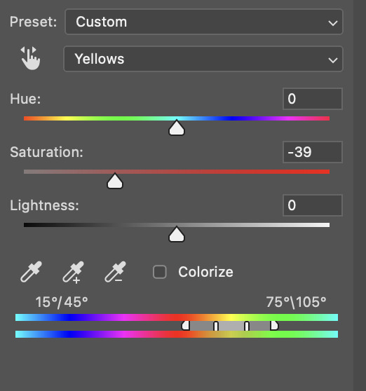
be careful not to do this too much. depending on the quality of your download, this can significantly decrease your gif quality. i tend to worry less about this when i'm working with 2160p files, but again, those files require an entirely different set of steps when it comes to brightening/colouring.
since this was a 1080p file download (and one that was actually less than 1GB, oops, don't do that), i played it safe and decreased it by -39 only.
note: you also want to be cautious of colour-washing skintone when it comes to this step. i find that another selective colour layer can help perfect the skintone in case the yellow drains out of it too much, but skip the hue/saturation step if it's too difficult to work with — better to be safe than sorry.
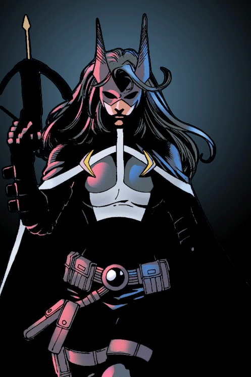
anyway, this is the final gif!
that's usually what i do when it comes to colouring dark indoor scenes! i hope this tutorial makes sense, and if you have any further questions, don't hesitate to reach out! :)
#tutorial#gif tutorial#resources#completeresources#coloring tutorial#allresources#dailyresources#userraffa#userdean#uservivaldi#alielook#usercats#usermoonchild#usernaureen#userbarrow#userabs#useraish#useralison#userisaiah#*mytutorials#i am so sorry if this is incoherent#it’s so hard to explain things coherently 😫
634 notes
·
View notes
Note
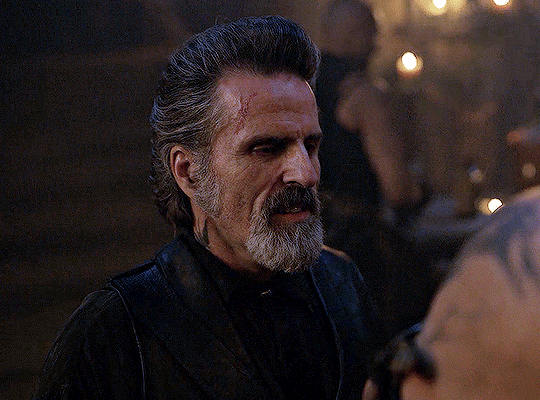
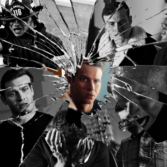
alie! I absolutely adore this mirrorball x buck set that you made last year! (/post/701462848238403584/) (also I can't believe it's been a year, like seriously what is time?) I was wondering how you did the shattered glass effect in the first gif? in particular how you made the black and white gifs appear distorted within the glass if that makes sense? thank you!!!
ahhh thank you so much renee! literally what is time lol, this gifset is still one of my faves that i made. the shattered glass effect is mostly just a lot of layer masks to be honest hahaha. i'm so glad i still have the psd, so here's how i did it under the cut~
(this tutorial assumes you know how to put multiple gifs in the same canvas and are familiar with layer groups and masks)
I. PREPARATION
first things first, create an empty canvas of your desired size. mine was 540x540 px.
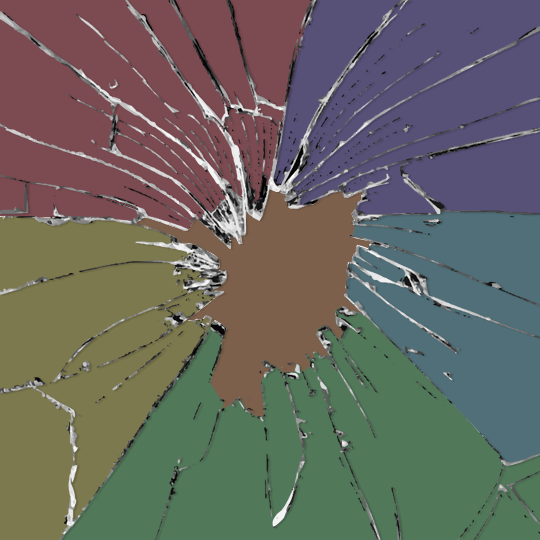
then, you need to find a cracked glass texture. if i remember correctly i simply googled something like "broken glass png", "cracked glass png", because i wanted something already transparent.
(a texture that's something like black lines over a white background definitely works too, you'll just have to put that layer's blending mode to darken or multiply.)
here's the png i used (and a download link for best quality):
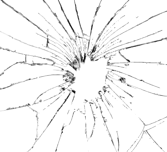
and after positioning it into my canvas.

II. CREATING MAIN SECTIONS FOR GIFS
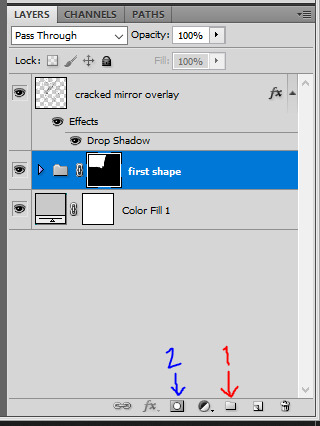
so basically when i did is i sectioned parts of the texture for each gif that i wanted to put. following the texture's lines, i zoomed in and carefuly drew a first shape along the lines with the polygon tool. you can also put a color fill layer behind the cracked glass layer so it's easier to see, like i did.
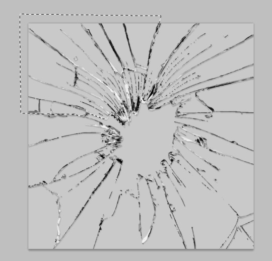
once you have your shape selected, click on the folder icon (1), then on the layer mask icon (2). it should give you a nice masked group to put gifs in hehe
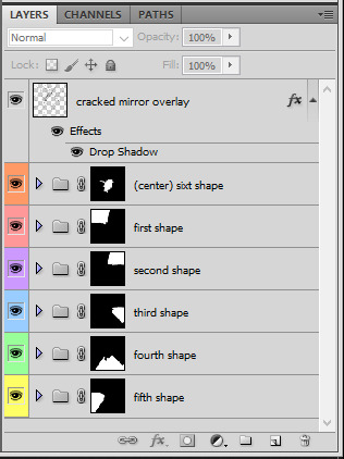
then i repeated the process until i had all of my desired shapes. i've put some color layers so it's easier to see, but here are my 6 main shapes and how my layer groups look like so far:
III. GIFFING TIME
after screencaping and making all 6 gifs required for each section, you need to put all of them in the same canvas. i simply put one smart object gif layer in each group created earlier. then, i resized and rotated each gif to fit its group (by hitting ctrl + T while selecting the gif layer), as you can see with the gif labeled 6x02 in the layers preview. for the coloring, i went simple with black and white for most of them.
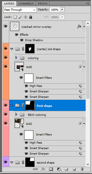
once i have all six gifs sharpened, colored, and placed in each shape group, the gif looks like this. the broken glass texture does most of the work to be honest:


obviously the center gif doesn't have any kind of effect, it's just colored as usual, so i'm not gonna go over it. it's just one gif layer in a masked group.
IV. SUBSECTIONS FOR DISRTORTED EFFECT
okay so for the distorted effect it's even more layer masks! basically i created more smaller sections within each main shapes already, still following the cracked glass texture's lines with the polygon tool and put them in individual masked groups like i did in the second step. here's how i ended up dividing each main sections:
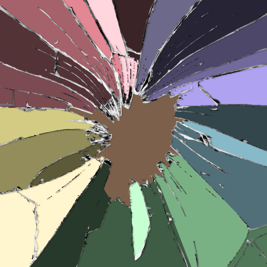
yep, each color here is a different masked group, for example the 2nd and 3rd shape sections:
for each main shape section, you want to duplicate your gif layer the same amount of times as you have subsections within that shape. so if the main shape has 5 smaller subsections, i want 5 layers of that same gif. just make sure to not change its duration or position yet, and make sure the coloring layers/group stays on top of the groups in its shape section. then, simply put one gif layer duplicate in each group. example of my layers for the second shape so far:
then just repeat this until all subsections have its own gif layer.
V. DISTORTED EFFECT
this is the best part! and it's really easy. basically you want to slightly move each subsection by a few pixels, so they're in a slightly different position than the ones next to it.
to do so, select one of the gif layers and with the arrows on your keyboard, move it left or right, and even up or down if it looks good. i do this for all duplicated gif layers, making sure it looks like they're all slightly offset. focus on the cracked glass overlay's lines while nudging the gif layers, it's easy to see how the shapes break when you move them. for example here:
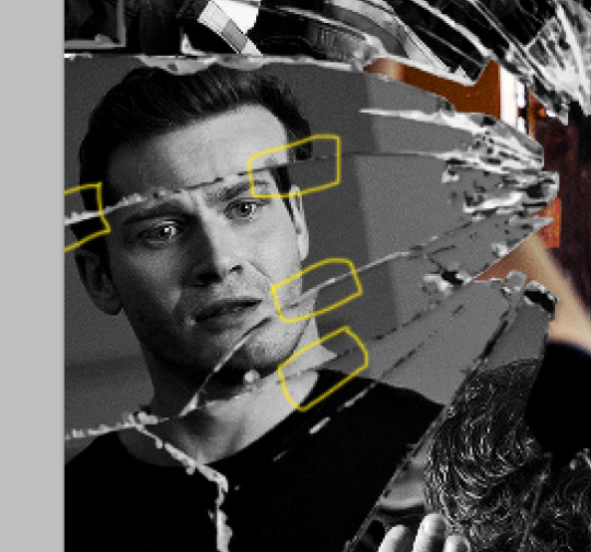
this is really just all trial and error, you just need to move each subsection gif layer by a few pixels with the keyboard arrows until it looks good to you.
here's my result once i've done this for all (23!!) subsections:
VI. FINAL TOUCHES
i don't think i did much else to this before typography besides adding a bit of contrast overall and a thin drop shadow to the cracked layer texture on top of everything. if you have a transparent png this definitely helps to give a bit more dimension to the effect. so here's the final result:
i hope that was clear enough hehe :D
#alie replies#tutorial#photoshop#resource#*ps help#completeresrouces#allresources#userhella#userabs#userkarolina#userdena#tuserheidi#usercats#userrainbow#userbunneis#usersmia#tuserabbie#usertreena#usernik#swearphil
383 notes
·
View notes
Text
photopea gif tutorial!
i recently started learning the craft of gifmaking with the free software photopea. when i first started, i had to piece together several different tutorials as well as extrapolate from some photoshop tutorials because-- no one uses photopea.
but they should! it's free! it can run in your browser! it can do most everything photoshop can do and you don't have to deal with adobe or torrenting. so i'm making a tutorial of my photopea gifmaking process because that's what i needed a couple months ago, and i hope it can be of use to some others. let's go!
1: PREPARING
source the scene you want to gif. it's best to download your video when you can, but screen recording can work in a pinch. this is the video downloader software i use.
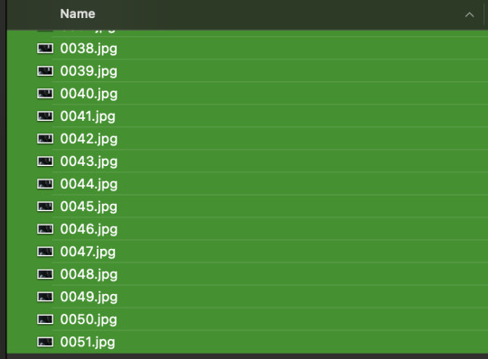
once the source video is downloaded, i like to pick out the specific moments i'm going to gif and save them as their own files-- this makes future steps easier. an individual gif shouldn't be more than 4ish seconds, so limit your selections to about that. name your files in a way that makes sense to you:

2: CONVERTING TO .JPG
i like to convert my video clips to .jpg format. it is possible to load video clips directly into photopea, but unless it is a very short <30fps clip, it is likely to freeze or crash in my experience. i use this website as it downloads a higher framerate (~25fps) than others i've used.
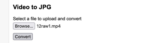
convert your video files and download the .zip folder containing your frames. make sure to unzip them and name them something helpful if you need to.
3: OPENING YOUR FRAMES IN PHOTOPEA
photopea looks like this when you open it:

select "open from computer" and select only the first frame of your first gif:
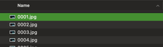
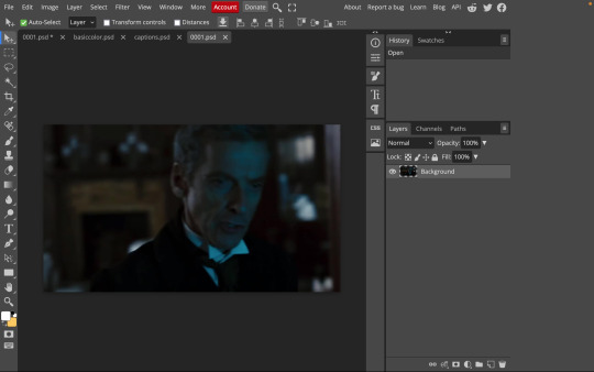
your environment should look like this (ignore the other projects i have open, you should just have 0001.psd or similar):
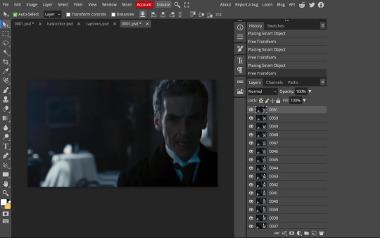
go to file> open and place, and select ALL of the rest of the frames from your first clip:
they'll load in one by one, and your environment should look like this:
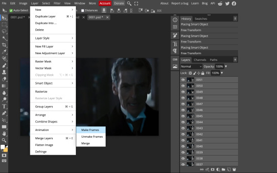
notice how all the frames have a little square in the corner? that means they are smart objects, and we need them to not be for our purposes. select all of your frames, right click, and choose rasterize:

in order to make the series of jpgs move as a gif upon download, select all of your frames and go to layer> animation> make frames:
all your layer names should now start with _a_. you can really do this at any point in the process so it's not a big deal if you forget at the beginning.
finally, you want to limit the frames in individual gifs to around 50 or less. if you find you have more, delete some frames off of the beginning or end by right clicking and selecting delete.
4: CROPPING AND RESIZING
select the crop tool on the left hand panel:

at the top bar, select fixed size:
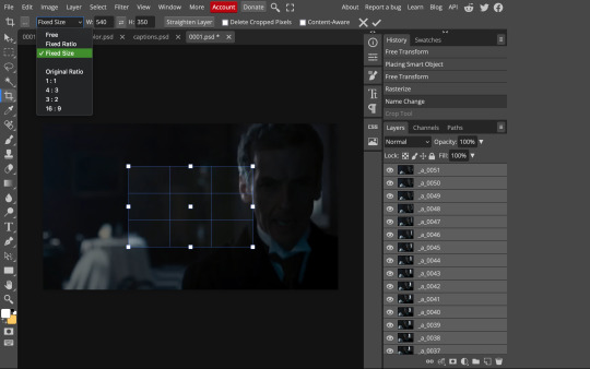
gifs on tumblr are limited to 540px wide for single column gifs, 268px for two columns, and 178px for three columns. the height is up to you; i like to use 350px height with the 540px width.
enter your values into the W and H fields and do not press enter yet. drag the cropped area to where you want it to be-- try to line up the top and bottom edges so as not to lose too much of your image. once you're satisfied with the selection, press enter. your gif is now cropped and resized to tumblr standards.
5: SHARPENING
(if you are working with low-qual video, check out this tutorial by @hellboys before sharpening. basically filter> filter gallery > grain, select soft and play with the settings. then proceed!)
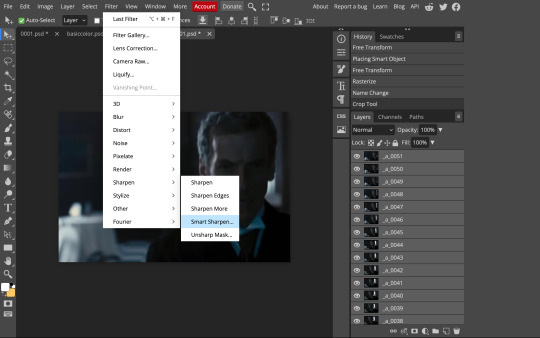
still making sure all of your layers are selected, navigate to filter> sharpen > smart sharpen:
you should see this dialog box:
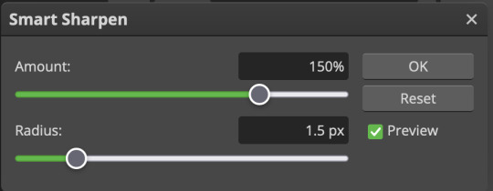
these are the settings i like to use, but you can play around to see what you like. here's the before and after of my sharpening settings:
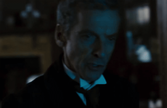
the difference will be more noticeable once we complete the next step-- brightening and coloring.
6: BRIGHTENING & COLORING
navigate to layer > new adjustment layer:
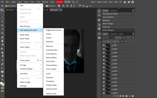
at any time, you can edit your adjustment layers by clicking this button in the right hand panel:

for each edit you make to your gif, you will add a new adjustment layer. always make sure they're at the top of your layer stack. i like to start with adjusting the brightness and exposure, which are both pretty straightforward.
additionally ,you can select a curves adjustment layer, choose the RGB channel, and drag the curve just slightly upwards to further brighten your gif, like so:
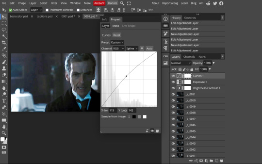
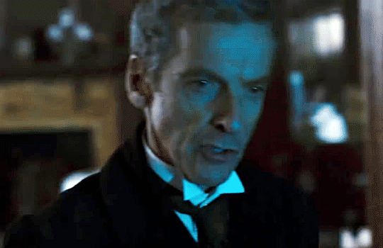
here's a before and after:
now for coloring-- i mostly use the saturation/vibrance, curves, color balance, and selective color adjustment layers. just play around with all of these until you find a style you like. i like my gifs to look really bright and colorful, so i push the saturation and try to draw out warmer tones in the color balance:
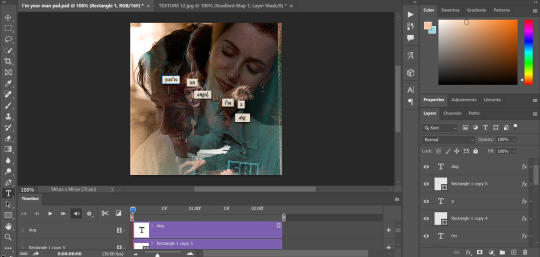
7: CAPTIONS
the font i like to use for captions is arial bold italic. you can download it (or any font of your choosing) from pretty much any free font website. if you choose to download a font not in photopea, go to file> open and select your font; it will now show up in the list of fonts.
navigate to the text button in the left hand panel:

and type in the captions for your gif. i make the font size 20 for 540px gifs.
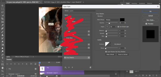
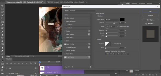
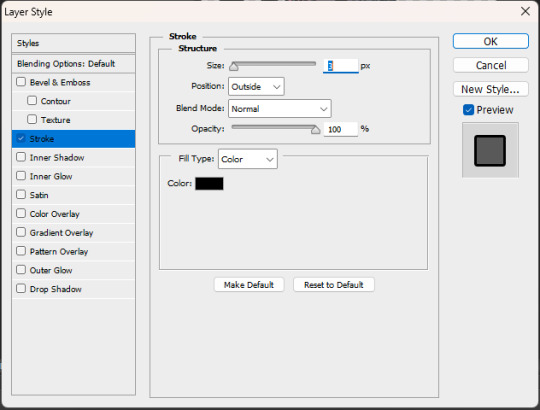
next, while only your text layer is selected, navigate to layer> layer style > blending options:
click on drop shadow, and play around with the settings until you get something you like. here's mine:

next, click on stroke and do the same thing:
when you're done, make sure your text is your top-most layer.
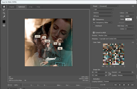
8: EXPORTING
you're done! head to file> export as> GIF. you'll be prompted with a dialog that looks like this, with your gif playing (you can also do these steps without saving if you want a preview of your gif during editing):
the only thing you should need to adjust is speed. this is the main difference between photopea and photoshop. the only way to specifically adjust the delay in photopea is to manually enter "_05" (or whatever amount of delay) at the end of every layer name. if you're like me you'll agree that is simply too much and settle for the speed slider.
i don't really know what logic governs the speed slider. it doesn't seem to be consistent across gifs, so play with it until it looks right. i've had it on 200% lately which seems insane but looks visually normal.
once the speed is adjusted, hit save and you're done! here's a final before and after of all the work:
BONUS: SAVING .PSD PRESETS
did you think manually creating and editing all those adjustment layers was a lot of work? here's how to streamline it for next time.
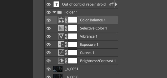
at the very bottom of your screen, below your layers, select the icon that looks like a folder (third from the right).
it will create another layer called folder 1. drag your adjustment layers into this folder, making sure they stay in the same order. your layers should look like this when you're done:
ONLY ONCE YOU HAVE SAVED YOUR GIF, delete all other layers that are not in the folder. then select file> save as PSD. save it somewhere convenient.
next time you're making gifs, after you've cropped and sharpened your frames, select file > open and choose your .psd file. it will open as another project. select the layer that says folder 1, and drag it to whatever project you're working on at the top bar. voila! your adjustment layers are applied to your new gif!
i still like to play with the settings, as coloring and brightness needs will differ from gif to gif.
thanks for reading! here's the gifset i made while making this tutorial :-)
#milk post#gif tutorial#doctor who#photopea#i can't tell if i went too detailed or not enough lol. tag me if you use this i want to see ppl's gifs!!
213 notes
·
View notes
Text
Duplicate Frame Deletion: A Likely Unnecessary Tutorial
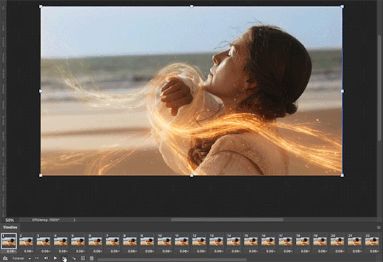
So… you updated to MacOS Sonoma, and–while it is amazing in many regards for photoshop things–it is a dang bummer and mood killer if you use MPV. However, after slamming my head into a wall trying to change the code on my own, I realized there is a much, much simpler solution to this.
In this tutorial, I will be showing you all how to delete duplicate frames from your gifs, with two options:
duplicate finder
within photoshop
Under the cut because pictures are a visual learner’s best friend!
A quick note:
MPV is odd with this. I’ve not had to do this on 4k capping, but have had to on anything under that. I don’t know the full reasoning, but it mostly looks to be something with the way it is reading frame rate. I know it’s in the code, but could not pinpoint it myself, and these were the only tricks that worked. If you find a better solution, please let me know! It has been rough, otherwise.
Step 1: Cap in MPV as normal
Now, this may be obvious, but make your caps in MPV. For a full tutorial on this, I highly recommend this one by kylos. The only difference between our software and their suggestion is going to be using the newest version of MPV (.0.36 at the time of this), and not the older. This is because there is an issue with MacOS Sonoma and older versions of MPV that prevent it from opening for… Some reason.
Step 2: Make sure you have your caps
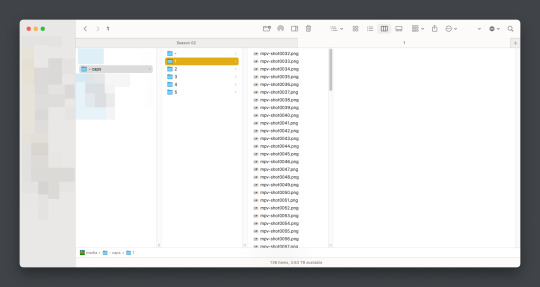
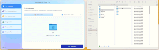
I recommend moving your caps to whatever folder you like for your own ease of use. My biggest rec is to have it in its own folder, with no older folders within the folder. Not really a requirement, but in my mind, it makes the process faster (only true depending on number of files in other folders). You should have something like this (I am doing a scene from TWOT, as it’s one I’ve tested this method on a few times in several instances):
Once there, it’s time for the line split. I recommend option 1 the most (it’s faster, IMO), but again, this is a two option thing.
Option 1: Duplicate File Finder
So, duplicate finders are what they sound like. They are pieces of software that can be used to scan your device (or specific sections of said device), for duplicate files. It does not matter the title of the file, if the system reads it as a copy, it will find it.
There are a number of varieties for this, paid and free. I will not lie, the one I use is a paid version, because I had a huge issue with duplicate files taking up space when I moved to a new device. This also helps a lot with cloud file keeping, in my opinion. But that is beside the point.
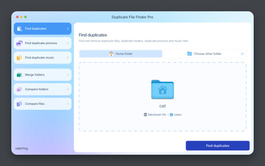
This is Duplicate File Finder Pro, which I got for other reasons, but has been very useful since this became an issue. The free version is sufficient for removing duplicate files found in folders, and that is why I still suggest it. You only need to get the pro if you have other intentions.
Now, onto the next step…
Step 3: Drag and drop the folder
With our folder full of caps, we simply drag and drop it into the application to begin.
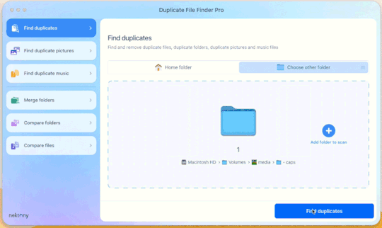
Step 4: Click “Find duplicates” and watch the pretty graph roll.
Step 5: Select the duplicate images
You can see here it found the duplicates.
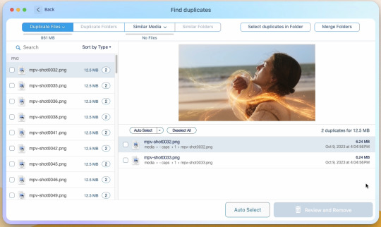
Now, I could go through by hand and click them, but… that’s a lot of time I don’t want to waste. I let it auto select them instead (you can tweak the settings for auto-select, but this is not that tutorial).
Step 6: Select review & remove, complete!
Wham bam! You’re completely set and good to go. Gif as normal~ (all final results at bottom)
Now, of course, maybe you don’t want a duplicate remover. Understandable, so what then? Well…
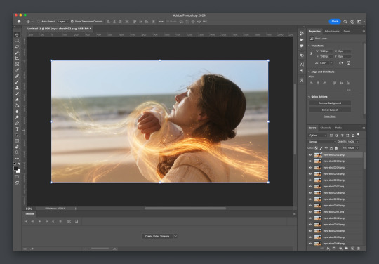
Option 2: Photoshop & the Changing Frame rate
So, this one is a little more technical. I suggest basic giffing and Photoshop knowledge before attempting.
Step 3: Import folder as you normally would
I believe this works as it would for import video, but I don’t want to say that and be wrong. But load your files in and you’ll be here:
Now create video timeline, make frames from layers, yada yada (kylos’ guide is very good with this if you need help, it’s the same that was linked at the beginning of this). You’ll now be here:
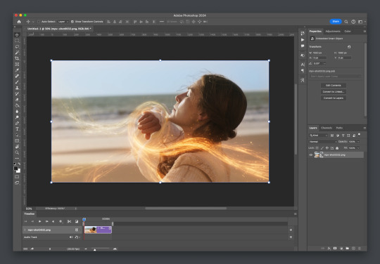
And the actual part of the tutorial you all came here for...
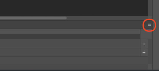
Step 4: Change the frame rate
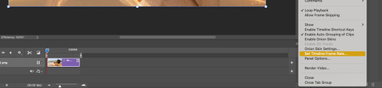
So, in the bottom, next to the mountains for zooming in on the timeline, you’ll see it reads “30.00 fps.” We need to change this to 60. How? Easy! Click the three lines circled here:
Then click “Set Timeline Frame Rate…”
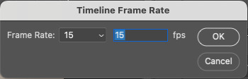
A little box will pop up, change the 30 to 15 (dropdown or typing, it works the same) and click “OK.”
Your timeline will now be cut in half for length. That’s OKAY. DO NOT PANIC.
(Optional) Step 5: Double Checking
Click play on your gif, and you’ll notice it is no longer duplicate framed! To verify, let’s convert back to frames, just to see…
And it did, success! So make the rest of your gif as normal.
Your final results for the gif will be the following, with the gifs all labeled on what option was taken (or not). These were cropped for uploading and sharpened because of how I am. No coloring applied.
If anything was confusing, please don't hesitate to reach out! I'm happy to help in any way I can on this. My ask is always open. Happy Giffing!
#alielook#singinprincess#sophiedevreaux#tuserabbie#tuserheidi#userace#userairi#useraish#userbarrow#userdorksinlove#userhella#userkayjay#userkraina#usermadita#usernik#userrobin#usershale#usersmia#usersray#usertj#c*tutorials#photoshop shenanigans
159 notes
·
View notes
Note
love love LOVE your The Sign gifsets. im still a newbie in giffing lmao and your gifs are like reaaally pretty so i was wondering how you do your gifs? i really like how it's sharp and the colors pop up beautifully (only if you don't mind sharing ofcc <333)
bun this is the kindest thing you could have said to me, thank you so much <3 i wanted to write down my giffing process for a while in case anyone would find anything in it helpful, so thanks for giving me a push!
guzhu-furen's photoshop gifmaking process (kinda oriented on saving up time)
from
to
1. Downloading a video. i prefer to download video files instead of making screen recordings because the latter usually leaves watermarks/captions and makes image quality lower. i will not be linking the downloading websites themselves directly, but they are all easy to find through search engines if you know what to search for! i download ql dramas from:
youtube:
if the video you need is above 1080p quality, search for youtube4kdownloader
if the video is age restricted, search for 9xbuddy
both these websites work for normal videos too!
mkvdrama usually has 1080p episodes of most asian dramas.
dramacool also has downloading options in case the show is not available on other websites!
2. Screencapping (i learned it through this tutorial)
i screencap using KMPlayer. here is the installer i used, but you can find versions of this program on various websites and torrents too! install the program and proceed.
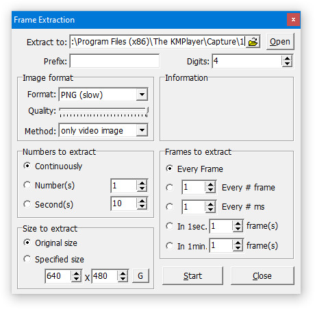
screencapping steps: open KMPlayer > press "CTRL + G" to summon the Frame Extraction window > set identical settings to these:
note which computer folder the screencaps will go to (it has a label "Extract to") > go to that folder on your computer and create a bunch of numbered folders there, for example ten folders named from 1 to 10, these would be our separate folders for ten gifs > write "1" or a name of another numbered folder after the backslash in "Extract to" bar in kmplayer > go the timestamp that will be the beginning of your gif in KMPlayer > press "Start" in the Frame Extraction window and press play on the video > when the moment you need to gif is over, press pause on the video and press "Stop" in the Frame Extraction window. great, you now have your folder of screencaps!
3. Importing screencaps to Photoshop
i use Adobe Photoshop 2023, but had used Adobe Photoshop CS5 for a long time before that, so you can use any version you have or find! it's available on various websites and torrents.
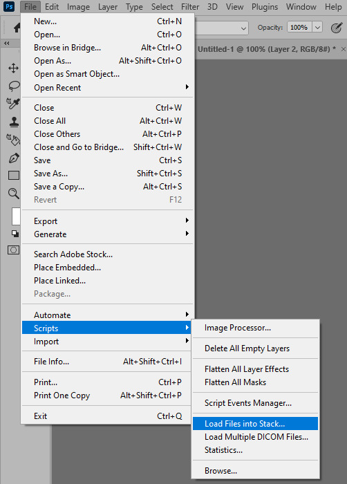
open Photoshop > Scripts > Load Files into Stack > press Browse in the "Load Layers" window that was opened
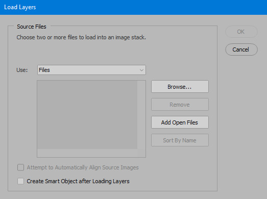
open your screencaps folder (and pin the KMPlayer Capture folder for faster future access) > pick the screencaps you want for your gif by clicking on the first one, and then clicking on the finishing one while pressing Shift on the keyboard > click OK and let them load for some time! i have 65 screencaps loading at the moment
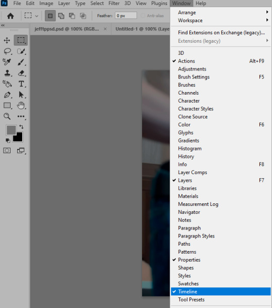
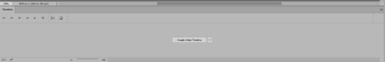
when the screencaps finish loading go to Window > press Timeline > press Create Video Timeline in the opened sidebar > press three dots that will say "Convert to frame animation"

4. Sizing & making the base of a gif
next part will be automatic. i use actions for almost everything from this moment. download the basic action pack here and my additional action pack that we will need here. load them in your photoshop actions window (Actions > Load Actions).
play the Script action to create frames.
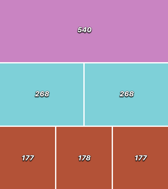
now onto sizing your gif. these are tumblr's width dimensions for 3 types of gifs
my gifs are usually 540 px in width and 640, 400 or 345 px in height. i added a 400 px action (Sizing 400) in the action pack, you can use it! or you can follow the steps by hand:
Image > Image Size > put in the height you want and add 4-6 pixels there (mine will be 406 for a 400 px high gif) > OK

now we need to crop the gif for it to fit tumblr's dimensions:
Image > Canvas Size > change Width to 540 (or 268 or 177) and take away the 4-6 pixels that we left in the previous step in Height
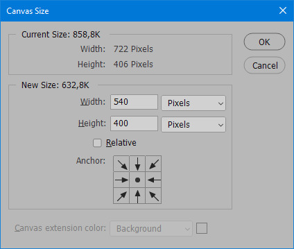
when you figure out which gif dimensions work best for you, record an action and use it to save up time!
after sizing use the action Smart Object. now we have the base of our gif!

you can move your gif left or right if you want! i will be doing this because i would like to show more hips in the gif.
press Ctrl + T > move the layer however you need (not in height though) > press Enter to save
i moved it to the right and my gif looks like this now:
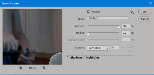
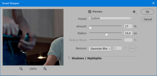
5. Sharpening (i use Tan's sharpening settings explained here)
i added two sharpening actions in the pack, they are called Sharpen Spicy and Sharpen Spicy 12. you can use one of them or you can sharpen your gif by hand, i will explain how to do it below.
Filter > Sharpen > Smart Sharpen > 500% amount, 0,2 px radius > OK
Filter > Sharpen > Smart Sharpen > 17% amount, 10,0 px radius > OK (you can change 17% to lesser or bigger, depending how intense you want your sharpening to look. i use 17% for 4k footage and 12% for 1080 px or less videos)
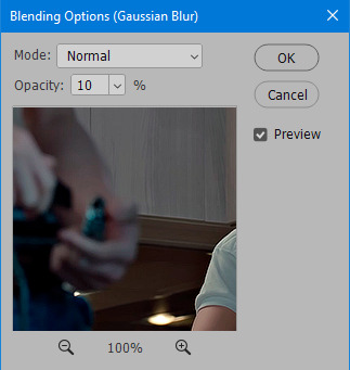
to smooth the sharpening a bit i use Gaussian Blur (this is optional, you can leave the sharpening as it is if you want your gif to be sharper).
Filter > Blur > Gaussian Blur > Radius 1,0 pixels > OK
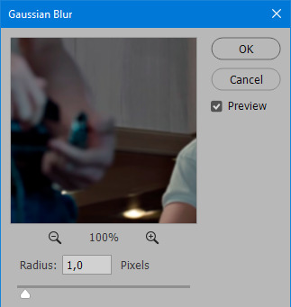
now change blending intensity to let only a bit of the blurring effect stay (you need to change this by hand if you used the sharpening action also).
press Blending Options (the highlighted place) twice > change Opacity to 10%

this is what my gifs looks like with sharpening now!

6. Colouring (i learned how to colour the way i do through this tutorial)
to make it easier for you to learn i will share my blank colouring file. i created it to save as much time while giffing as possible, so whenever i need to colour a gif i simply duplicate all the blank adjustment layers to the base of my every gif and start colouring! once you figure out which adjustment layers work for you best, i recommend creating a blank colouring file too to save time.
if you want to go the easy way, open my colouring file and duplicate selected layers to your gif file by Layer > Duplicate Layer > insert gif's document name

if you want to learn by hand, create the adjustment layers that i will be naming in the process on your own, you can find them all in Layer > New Adjustment Layer
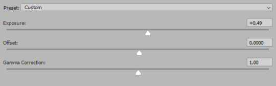
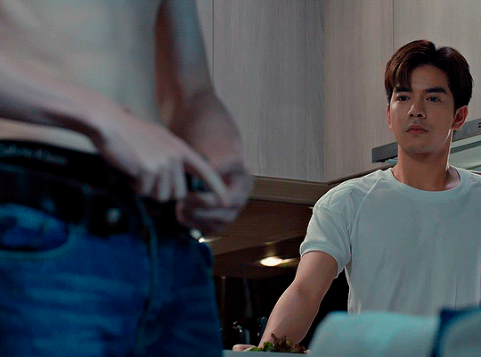
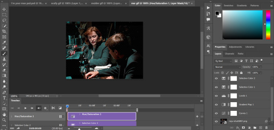
now we will use adjustment layers for our colouring from the bottom to the top! first, Exposure layer to add a bit of light to the gif. i don't always use Exposure because sometimes shots are bright enough on their own. i will, however, use it here. don't use it on your gif too much, because in the next few steps we will also be brightening the gif with other adjustment layers. i added +0,49:
next, Hue/Saturation layer. i use it in gifs with neon lighting to color correct overly bright colours. for example if your characters are standing in neon pink, you might want to lessen Saturation in Magentas and Reds to make the final gif less pixelated, and etc. i will not use Hue/Saturation on this gif, cause it doesn't need it.
proceed to the layer Levels. this layer usually does most of my colouring. click on the lowest white dropper in your Levels window:
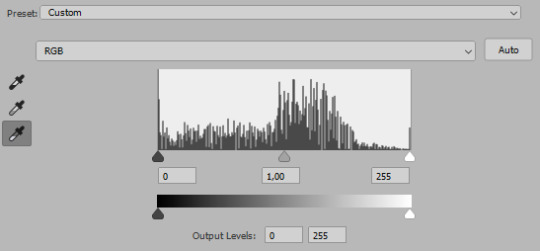
now choose a light place on your gif and click on it with the white dropper. it works especially well if you use the white dropper on the lightened parts of face skin. you can play around by choosing different bright spots and seeing what works best. here is the spot i chose and the resulting colouring:


this is too light, so now we need to balance it out with the black dropper:

choose one of the darkest places this time and click it with black dropper! once again, you can play around and click different spot to see what works best. i will be clicking the highlighted spot and you can see what my gif will look like with this Levels settings

as you can see, darkest places became darker and other colours were corrected a bit! now, this is still too bright, so i will be decreasing the opacity of Levels layer from 100% to a smaller number:
i will have to continue in another post because tumblr only allows 30 pictures per one post in the new editor now and i'd like to explain everything in visuals. click to continue
79 notes
·
View notes
Text
gif tutorial
@bakedbakermom requested a tutorial on how i made the gifs in this set, so i've put together a little walkthrough of the process for this gif under the cut!
(disclaimer: this tutorial assumes that you already have basic photoshop/giffing knowledge - i.e. how to make and colour gifs using correction layers, how to use things like layer masks, etc. if you don't, i recommend these tutorials, they're very comprehensive)
alright! so as stated before, i'm not going to go in-depth here on the basics of gifmaking. for this one in particular, i blended three gifs, but we'll get into the third one later.
(i should also mention that blending gifs as i did here is usually easier if you have scenes with shadowed/dark areas like the ones above, so to keep that in mind when picking your scenes! i also find it easier to use scenes where there isn't a whole ton of movement going on- again, not a requirement but it's easier to plan and position gifs if the characters aren't moving across the whole canvas)
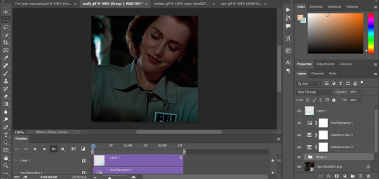
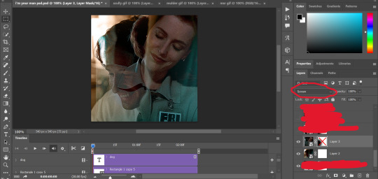
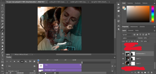
first, i started by making the base gifs of mulder and scully in "paper hearts". both are cropped to 540x540 px, and the same length (around 50 frames). i did some standard sharpening, brightening, and adding contrast (my usual process is curves, a b/w gradient map set to "soft light" at around 20% opacity, and messing with the levels a bit) before using selective colour and hue/saturation layers to highlight the teal and peach colours in the gif. sometimes this is enough colouring on its own, depending on the gif and the look you're going for, but in my case i wanted to add more.
so, on top of my colouring, i used a combination of layers set to "colour" and "hard light" to paint over the background of my gifs in teal and peach. on mulder's gif i also used a gradient fill layer in the two colours set to "colour" and used a layer mask to erase anywhere i didn't want the colour to be. the opacity levels for all of these layers again just depends on how vibrant you want your colours, i just mess with that on a gif-to-gif basis.
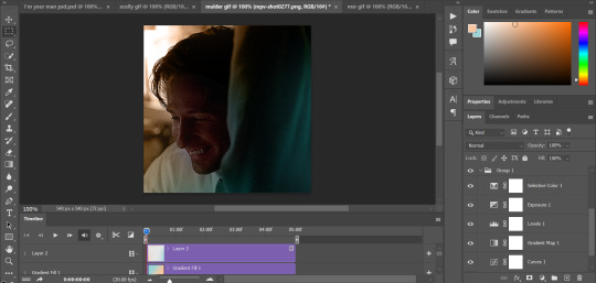
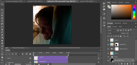
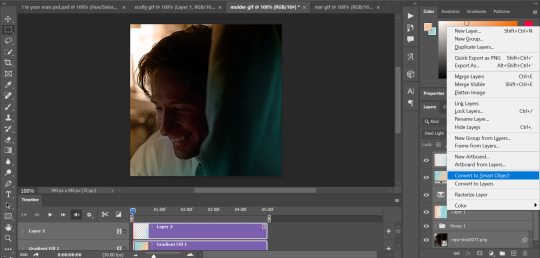
so we have our two gifs, cropped and coloured to fit the palette we want. next, i converted each coloured gif into a smart object, by selecting all my layers, right clicking, and hitting "convert to smart object."
once that's done, you should be able to click and drag one of the gifs onto the other gif's canvas, so that it's sitting on top. then change the blending mode of the top gif- most people use lighten or screen, this again depends on the look you want and the gifs you're using. for this one, i used screen. it'll probably look something like this:
at this point you can move your gifs around and position them as you like. for mine, i just moved scully a little off to the right, as you can see. in order to get rid of the part that's covering mulder's face, i added a layer mask to the scully gif and used a large, soft brush set to black to erase it.
(another note: i didn't need to do it here, but if you want to move/erase parts of your bottom gif, add a layer of solid black underneath both gifs.)
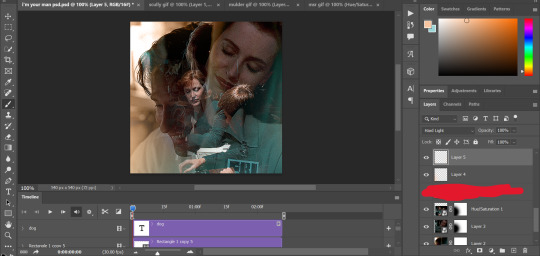
usually i would stop blending here, but for this set i decided to add a third gif, so i made and coloured the gif of mulder and scully holding hands, using the same methods as the first two. this one was cropped to 540x405 px to make it fit better on the canvas, since i knew i only wanted it to cover the bottom part.
i converted it to a smart object and dragged it onto the same canvas as the other two gifs. this time i used "lighten" as my blending mode, positioned it in the bottom right corner, and again used a layer mask to brush away the parts i didn't want.
on top of all three gifs, i then used layers set to "normal" and "hard light" to brush some extra colour onto the gif. this part i also just play around with on a gif-to-gif basis, but for this set i mostly used a combo of colour, hard light, and normal layers at varying opacities until i got the look i was going for. i generally just like to use big soft brushes to add colour around the edges, as i did here.
now, i have a bunch of texture/grain pngs saved on my laptop that i like to add to gifs for some extra flair, so i opened one of those and cropped it down to 540x540px. i then added a gradient map to give it that peach colour. (any textured png/jpg should work fine for this, as long as you have your gradient map set to black and white/your accent colour)
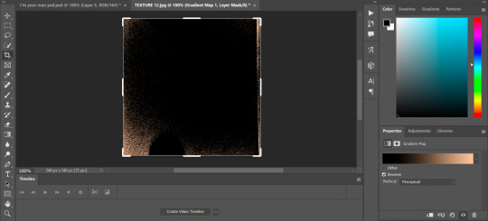
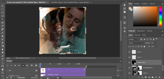
like i did with my gifs, i converted the texture + gradient map to a smart object and dragged it onto the shared canvas. i set the blending mode to "screen", with the opacity at 70%. i like to put these textures underneath the extra colouring i've done on the gif, as seen here. i don't always do this, but i feel like it sometimes helps the texture blend into the finished gif. you can also use a layer mask if needed to erase any unwanted parts of the texture.
now for the text!
for these gifs i used the font "IM FELL DW Pica" in both regular and italic, in black, at 16px. i didn't do anything fancy with the text itself besides adding a drop shadow in the blending options (right click on the text layer and hit "blending options).
then, underneath the text layer (i was working one word at a time) i used the rectangle tool to draw a small rectangle around the text- i wasn't too picky about the size or evenness since i was going for a collaged look. i set the colour of the rectangle to a light cream colour, and added a drop shadow in the blending options.
then i just selected both the text and rectangle and duplicated them using ctrl+j, changing the text for each word and adjusting the size of the rectangles as needed. once i had all of the words on my canvas, i just moved them around until i found a positioning i liked. again, since i was going for a purposefully scrapbooked look, i didn't overthink this part.
i exported my gif the way i usually do, with these settings:
and that's it! i used pretty much the same process for all the gifs in this set, give or take. hopefully this little walkthrough made sense, but i know i'm not always the best at explaining my process, so if anything needs clarifying feel free to shoot me an ask or dm!
70 notes
·
View notes
Text
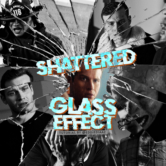
How To Gif: Glass Shatter Effect
By popular demand (ie, 7 people who voted in this poll), here is a tutorial on how to do the glass shatter effect I used to create the first gif in this set.
I use Photoshop CC 2015 (yes I know it's old) for my gifmaking, but you should be able to apply everything to newer versions of Photoshop. For this tutorial I'll be assuming you know the gifmaking basics, but if not, I would recommend this tutorial, which is the process I use to make gifs. Note that this particular process involves saving all of the frames, importing those frames into Photoshop, and then using an action to convert to a smart object.
Keep reading below the cut to learn how to do this effect!
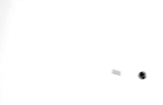
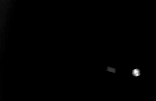
Before I could start making this gif, I needed three things; the two scenes that I wanted to use, and a video of the glass shattering effect. I already knew the scenes I wanted, so then I took to YouTube to find a video which I can't for the life of me find again, but it looked like this:
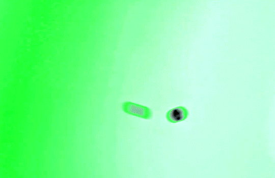
Something like this is what you want. Ideally the green part would be entirely white, but as long as there are two clearly different colours you can usually work with it.
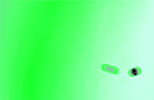
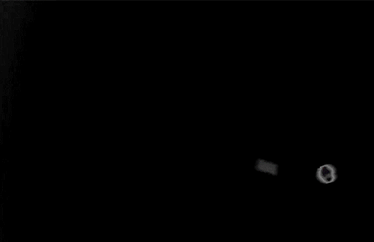
This looks a lot slower than the gif that I made, but that's not because of the frame rate - which is exactly the same above as in the final gif - it's just because there are extra frames in this slower one that I cut out. In the video I used, the glass shattering happened very slowly. I didn't want that, so I ended up skipping several frames when I loaded the frames into Photoshop before using my gifmaking action. I just did this by manually selecting one frame, skipping the next several before selecting another frame, and repeating this until I had selected 60 frames.
After using my gif action, I had a smart object of the glass shatter effect that looked like this:
That's a much better speed! It still wasn't quite where I needed it to be though. I needed this in black and white, so I slapped a hue/saturation adjustment on the smart object and set the saturation all the way down to -100.
Okay great, I could start putting the gif together now.
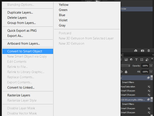
First, I made a copy of the glass shatter smart object, because I'll need that later. Then, I pulled in frames from the scene that I wanted to appear in the hole after the glass shatters, and I used those to create a new smart object with my gif action (we'll call it Scene-bg). I pulled Scene-bg into the same window as the glass shatter objects. Then I created a new smart object by combining one of the glass shatter objects with Scene-bg, which I did by selecting both layers right clicking, and selecting "Convert to Smart Object".
I renamed this smart object to Shatter-fg. I opened it by clicking on the little icon next to the layer name in the layers window here:
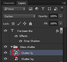
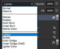
The most important thing here is that the shatter effect object should be the top layer, and I set the mode to "lighten". This will make sure that the lightest colour of either this layer and the layer behind it is displayed; that means that anywhere that's white in our shatter animation will still show up, but anywhere that's black we'll see what's in the layer(s) behind it.
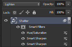
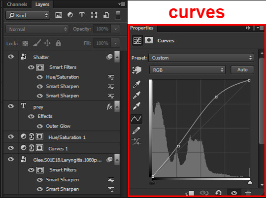
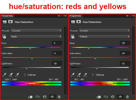
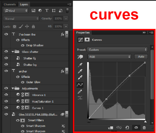
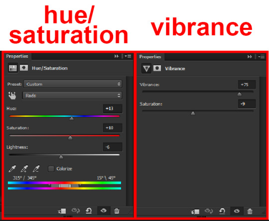
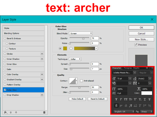
Then I threw some adjustment layers between them to get the colouring I wanted. I used a curves layer, a hue/saturation layer, and I also added text with an outer glow layer effect. Here's what the layer order looked like and the settings I used for each layer:
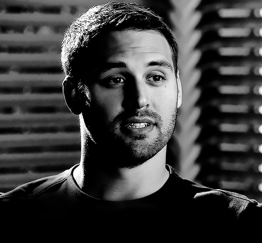
After this process, Shatter-fg looked like this:

Okay nice, this is starting to look like something! I saved this and went back to the main file with the other glass shatter object.
I needed to invert that other glass shatter object. There's a weird quirk with the version of Photoshop that I use where it doesn't like it when I apply specifically an invert adjustment to a smart object (it appears correctly when editing, but not on export) so I did this by creating a new smart object which included a separate invert layer, but if you have a newer version of Photoshop you can probably just apply the invert adjustment directly. Just note that you'll need to do one of these options; it won't work if you add a separate adjustment layer in the main file, it needs to be applied specifically to the smart object (which we'll now be calling Shatter-bg). It looked like this after I inverted it:
Once that's done, I made sure Shatter-fg was the layer directly above Shatter-bg, and set the mode of Shatter-fg to "darken" and Shatter-bg to "lighten". Since Shatter-fg is set to darken, it will be visible only when it is darker than the layer behind it. By setting Shatter-bg to lighten, I've guaranteed that the layer behind it will always be lighter (ie, white) in the places we want Shatter-fg to be visible, and will be black otherwise. Once I update those settings, this is what the gif looked like:
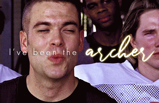
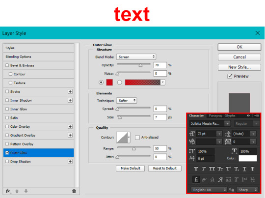
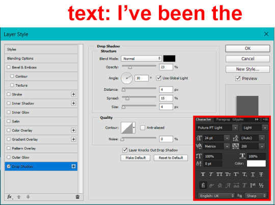
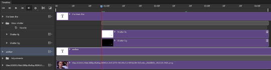
This is all there is to the glass shatter effect itself. Next I pulled in frames from the second scene to fill in the black areas. This layer needed to go below both glass shatter layers, so that it only shows through where the black. Then I added adjustment layers and some text. I used curves, hue/saturation, and vibrance adjustment layers, and I also added the "archer" text below the glass shatter layers so that it would be hidden to reveal the "prey" text. The other text I added above all of the layers, since I wanted this to be visible all the time. Here is the layer order and all of the settings I used for each of the layers:
I also grouped Shatter-bg and Shatter-fg and shifted them on the timeline so there would be some time to see the background gif before the shatter effect starts.
And that's all! Then it''s just a matter of exporting the finished product:
This is the first gifmaking tutorial I've ever made, so I hope I was able to be reasonably coherent and helpful! I'd love to hear if you make anything by following these steps, or even if you just feel like you've learned something reading through this. And if you have any outstanding questions, feel free to reply or send me an ask and I'd be happy to answer!
#gifmaking#tutorials#gifmaking tutorial#gif tutorial#photoshop#photoshop tutorial#usergif#gleesource#my tutorials#mine#how to gif#tw mark salling#mark salling tw#not tagging as glee because it's not actually about that but wanted the tw tags just in case#this was so much more effort to put together than I thought it would be lmao#I was like oh yeah I've already made the whole gif I just need to go back and explain how I did that...#it took A WHILE#anywayyyy it was fun though so I'm glad I did it#would love to know if anyone finds this helpful or interesting or tries out the effect or something similar!#you can also just grab the black/white gif I included above if you want to do the effect since I can't find the video... sorry lol#but yeah you have my permission to steal the black/white gifs for gifmaking purposes if you would like#just don't like. post your own tutorial claiming you made it or something?? but like you don't need to credit me or anything obviously.#ANYWAYYYY#I feel like... a LITTLE pretentious thinking I'm good enough at making gifs to be qualified to make a tutorial#but like it's fineeee everything is fine#gonna finally post this now enjoy byeeee
100 notes
·
View notes
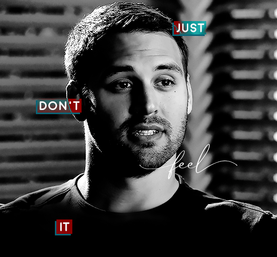
Note
Hi!
I was just wondering if you have a tutorial on how you created this effect in your gifset, it's something I'd like to try but have no idea where to start. Your set is so pretty! Any helps appreciated x
https://www.tumblr.com/tawaifeddiediaz/712911415428743168/ill-take-you-with-me-then-well-both-die-you?source=share
Hey Nonnie, thank you! This is super late, but I don't actually have the psd for this set anymore (I delete them as soon as I post them), so we're just gonna wing it with a gif I made the other day. I think this ask is about the text, but if it's anything else, just drop me another line and I'll get to it when I can!
I'm pretty sure I got this tutorial from the wonderful @eddiediaaz but I then turned it into Lazy Girl Hours :)) anywho, here we go!
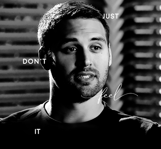
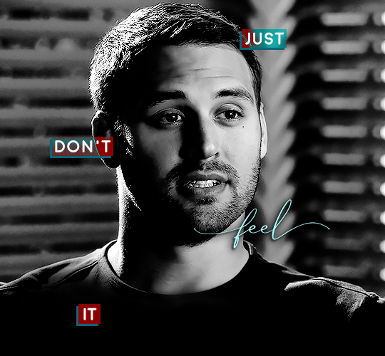
We’ll be making this gif:

This tutorial assumes basic knowledge of gif-making, Photoshop, and coloring. I’ve only described the typography tutorial in this, but you can reach out if you have any questions.
Tutorial under the cut:
Couple things to note beforehand:
There is a lot of trial and error involved when doing any sort of effect, and this is no exception! You might have to play around with the colors and the settings before you find something that looks good and readable and that fits your set!
This text effect works better on big gifs (540px width).
For this, I find that a simple font works better than a fully-cursive one, but play around with what you like. The boxes may need some adjusting if you use a font with too many tall or tail letters (i.e. text where all the letters aren't on one uniform line - that's why capital letters work so well.)
Movement works really well with effects like these, but again, it depends on your gif + readability. If you have a blended gif, it may take a little more trial and error.
I work in frame animation for all my text effects, but this works just as well in timeline as well.
We’re going to start with this gif:
First, I like to put my text on the gif. You can obviously move this around later so don't worry too much about how it looks right now.
The dialogue is "Just don't feel it." "Feel" is one of those Big Words for this quote, so I'm going to emphasize it with cursive text.
I am using Moon for the sans serif text, and Santa Fe Spring for the cursive text. Keep both of these in white for now:
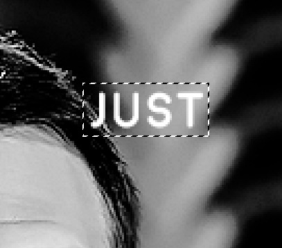
Next, we're going to use the rectangular marquee tool to draw our rectangles around the capital letters (we're not touching the cursive text right now). I just eyeball this, and then try to center it as much as possible.
(The rectangular marquee tool has a keyboard shortcut of M, and it's the second tool in that little toolbar on the left of most people's Photoshop.)
This is what that'll look like:
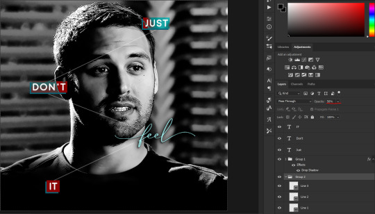
Next, we're going to go down to the icons at the bottom right of the layers panel and select the half-black half-white circle > Color Fill.... You should get a color dialogue box. Choose your color - I'm using #8d0000. Then, we're going to move that layer below the corresponding text layer, and set its blending mode to Difference. This is what that looks like (click the image for better quality):
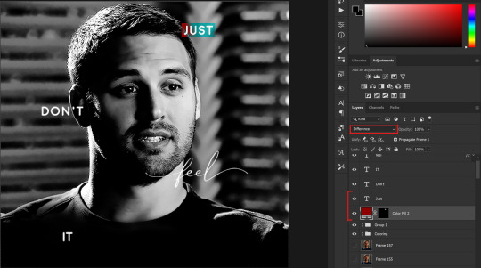
I'm going to repeat that with the other two boxes as well, using the same color. The boxes will look different with the Difference blending mode because of the shadows underneath.
For example, the box with "it" looks like a solid red square because it's against a completely black background, while the other two have some blue shading to them since there are some highlights behind them.
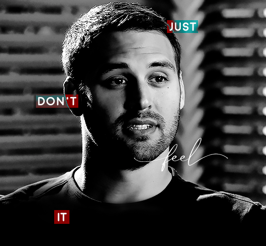
This is what my gif looks like now:
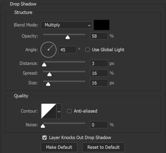
Next, I like to go The Lazy Girl™ route and put all three color-fill layers into one group underneath all the text layers. This just lets me edit the drop shadow of all three of them at the same time.
Right-click the group and open up the Blending Options. In Drop Shadow, these are the settings I'm using. The drop shadow color is #0c6477:
(Note: uncheck "Use Global Light" especially if you're working in frame animation to make sure all the drop shadow has the same angle on all frames.)
This is what my gif looks like now:
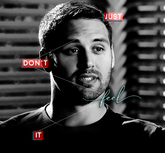
Now that we've finished that, time to move on to the cursive text.
I usually match the cursive text to the palette of the rest of the text, and since the drop shadow is our "accent" color, so to speak, I'm going to use a lighter version of that color. I am also going to add a drop shadow for readability.
The color I used for the text is #acfffe and I actually ended up adding two drop shadows, just because I needed something subtle that doesn't overwhelm the text, especially since it's a delicate font. Here are the settings for both layers:
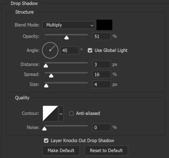
And here's what my gif looks like now:
Now, before we move on to the lines, just check the adjustment of all these text layers, see if there's anything you want to change. It's easier to change now than after the lines are added, since you'll most likely have to redraw them if you move the boxes after the fact.
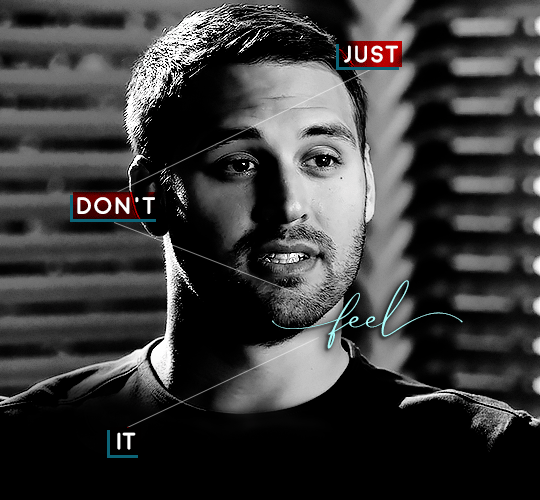
To draw the lines, we're going to use the Line Tool. I just freehand all of this, and I try to go from center to center of the boxes when I can. It all depends on your angles.
My lines are 2px thick, but you can change these depending on your preference. Here's what mine look like right now:

We're going to do the same lazy hack that we did for the color fill, and put all three line layers into a group. Move this group below the text layer and the color fill layers. The reason for this is so that the lines look like they're coming seamlessly from the box, rather than from on top of them or something.
Then, set the group to opacity 50%. I like more subtle, simple looks in my gifs, so I don't like super high opacities.
And that's it! This is our final gif:
Some final notes:
Absolutely play around with the blending modes of the color fill layers for this effect. These two gifs are the exact same color we've been using, just two different blending modes. You can see how drastically different they look. The first one is Linear Dodge (Add) and the second one is Vivid Light:
It can change how your gif looks in a BIG way, so play around with it, see what you like, especially if you don't really like the "two toned" thing going on.
Sometimes, I also like playing with the width and height of the text in the font settings, making it shorter and wider, or making it taller and more compact. You can play with the letter spacing as well. The world is your oyster, etc etc.
One other thing I've started doing is erasing the lines with a big brush, just to fade them from his face a little, like this:

To do that, use a layer mask on the line layer folder, and a brush that's 0% hardness, and at least 200px big. For this gif, I also changed the opacity of the lines back to 100% so the fading effect is a little more pronounced:
(this gif isn't the best example for this, but oh well. Anywho, hope this helps, Nonnie! Let me know if you have any questions.
Enjoy!
#zee's tutorials#tutorials#gif tutorial#photoshop tutorial#resources#dailyresources#completeresources#itsphotoshop#allresources#dailypsd#userisha#userdahlias#alielook#userabs#tuserheidi#userelio#userjaelyn#userisaiah#usermorgan#usergert#zee answers#im so pissed at myself for losing the tutorial the first time like you do not know how mad i am right now#i didn't even do anything tumblr just hates us all
194 notes
·
View notes
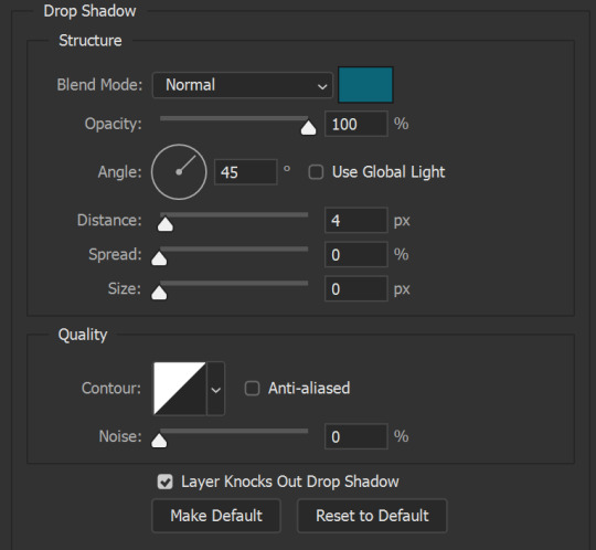
Text
ALLRIGHTT I AM HAPPY AND PROUD TO ANNOUNCE MY FIRST EVER DEMO FOR MY GAME SOULSHATTERED IS COMING OUT VERY VERY SOON!!!
I am not sure if its actually a demo? or a gametest? BUT I'M RELEASING SOMETHING!!!!!!!!
I have been getting more and more close to finishing the main combat mechanics in my game!!!! And to make sure the main mechanics are all functioning i am planning on releasing a super itty bitty demo to see if people like it!!! I will try and gain as much advice, critique, tips and any other kind of help to improve the main combat system!!!!!!!!!!!!!!!! And just the game in general!! any art tips as well!!
It will take a bit of time before that is ready tho! Here is a tiny list of things that i will need to add/fix before i will release this demo!!!!
- All player animations are finished and added!!
- All attack code is written and functioning! (I am expecting massive amounts of gamebreaking bugs and glitches so i will try to find some stuff myself before i post this demo just to minimize the insane amount of bugreports.)
- At least 1 functioning enemy with all their animations (Already have this! just need to fine tune the animations to be less ugly and fix the ai a tinyyyyy bit!)
- An Hp system and a death screen!!
- A small tutorial to explain all the attacks and mechanics!!
- A small play area where you can spawn new enemies and test out the game!
Most of these things are already 75% finished but still need to be completed!!!
And besides those things i also would like to add these things but they aren't rly that important and could be skipped if y'all think it isn't that important.
-A short repeating music track!
-A title-screen!
IF YOU ARE INTERESTED IN THIS GAME AND THE FIRST EVER DEMO/PLAYTEST!!! AND WANNA KEEP YOURSELF UPDATED FOR WHEN THE DEMO IS COMING OUT FOLLOW ME CAUS I GIVE BASICALLY DAILY UPDATES ON ART, WRITING AND PROGRAMMING FOR MY GAME SOULSHATTERED!!
and thank y'all so much for following me so far already!!! i would have NEVER been able to get this far without the support i have had from all of you!!
#pixel game#pixelart#pixel illustration#game development#indie game dev#coding#game design#pixel art#programming#game dev update#game dev stuff#game dev blog#game dev#game developers#indiegamedev#indie dev#indie game#sprites#sprite#animated sprite#sprite art#aseprite#my sprites#pixel sprite#sprite edit#pixel#pixel animation#pixel graphics#pixel aesthetic#pixel artist
45 notes
·
View notes
Photo
* simplistic flower / free non-contained all-in-one multimuse theme.
This is a simplistic / non-contained version of the flowered sky theme. This theme includes:
A tab for the askbox.
A tab for rules.
A tab for a canon muse list with short summaries of each muse, including links to a tabs page for each individual muse page, with stats, verses, and mains / exclusives.
A tab for ocs with the same tabs pages for each individual muse.
A tab for links and tags.
I used various free base codes to make this, so I do not claim to have made this from scratch. You can see the credits below, as well as in the code of the actual theme! I have, however, put a lot of time to customize all the base codes to make it functional for a multimuse blog, and I have made the background and links and the PSD I used on those myself.
You’re going to need a bit of html coding knowledge to customize / use this theme, although I have tried to leave in enough tutorials within the code to help you with the most important things. If you’re still having trouble, I recommend checking out the plenty of tutorials on how to customize themes and html coding created by others! On the off-chance that I should’ve forgotten to give credit to someone, or have credited the wrong person, please kindly let me know so I can update the code as fast as possible to include the right credits! Same goes if you find any errors with the theme that makes it not work as it should.
BASE CODE AND TUTORIAL CREDITS:
All-in-One Base Code by neonbikethemes
Customizing tutorials and bouncing links from octomoosey
Basic tooltips tutorial from this post
Editing of base codes / design, creation of the theme background and bouncy link images and creation of the PSD by yours truly, @vampiremakes
TERMS OF USE:
Do not remove any of the credits at the top of the code.
Don’t remove the credits in the bottom right corner of the theme.
Do not claim as your own.
Other than that, feel free to customize and use as you wish! Have fun!
LIVE PREVIEW. | CODE.
#rp theme#multimuse theme#rp resources#rp help#roleplay theme#roleplay resources#roleplay help#tumblr theme#theme
653 notes
·
View notes
Note
hello, i am a big fan of your gifs & am teaching myself to make my own! just wondering - when you want to make a gif that is one column wide (540px for tumblr) how do you keep them looking so crisp? i find that im struggling with landscape videos because they are so wide, i'd like a more square shaped gif but it ends up as a rectangle. if i try to size it down to a square the quality is skewed 🙃 hopefully this makes sense! xx
anon im so honored here is a little Gif Sharpening Tutorial !!!

this is the first gif making question ive ever gotten so unfortunately this will also be the first time i try to verbalize these gif making stuff. if there are things i haven't explained clearly please do follow up (my dm is open too!!)
the thing with wide (3:2, 16:9) gifs is that you normally obtain this kind of ratio by shrinking the clip (1920px width and up) down to 540px without any cutting, which is about 1/4 of it's original width that you'd end up with, which means you're losing 3/4 of the pixels in it's width, which is a LOT of details lost in the process, which is why we can't sharpen wide gifs the same way we sharpen square/squarer gifs, and i feel like we should talk about these two scenarios separately. (with square gifs, assuming we're working with 1080p, we'll cut it from 1920x1080 to 1080x1080 or less, and then shrink it down to 540px. this way we'd only lose less than half of the pixels. it's a lot less details we're losing here. as a result it's more tolerating towards sharpening techniques)
ok this is where i take a pause and ask myself when tf did i get so technical about moving picture making on tumblr dot com... ok let's keep going...
Basic Sharpening
soo how i normally sharpen my gifs (which are more often on the squarer side) is based on this awesome gif tutorial, the idea here is that we smart sharpen our gifs first, which will inevitably result in pixelation (over sharpening) to some extent, so then we use a semi transparent gaussian blurred layer to repair these pixelation and hopefully make it smooth and sharp. in addition to following this tutorial you'll also want to play around w the parameters (radius, transparency, sharpening amount, etc) as there is no one size fits all.
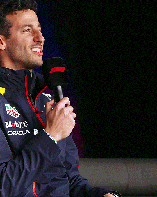
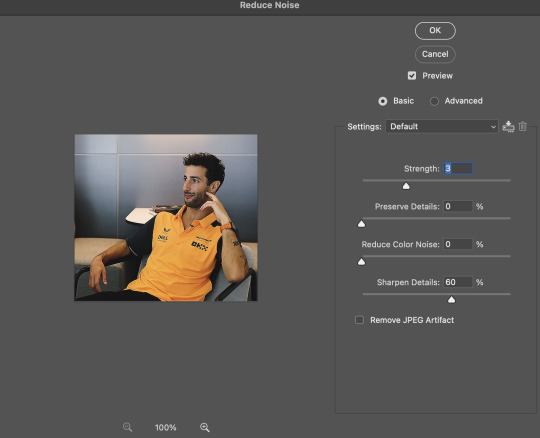
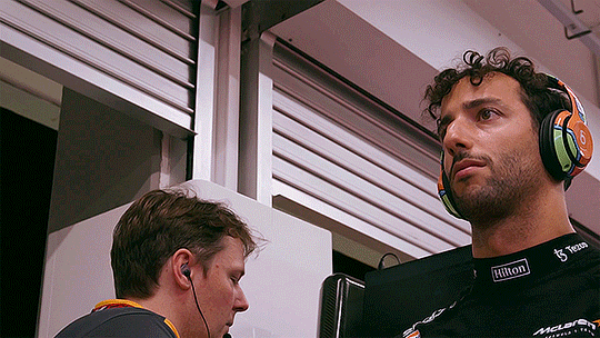
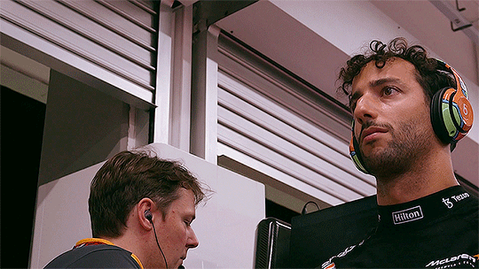
after following these steps, if i want to smooth things out even more, i'll use a layer of denoise (see below for setting i normally go with). if i want things even sharper, I will add another small amount of sharpening (again, see below). these two methods can be used together. imo they are what make a gif go from "omg it's crisp" to "i feel like im looking at daniel ricciardo in person what the fuck". the two gifs i attached at the beginning can hopefully showcase the difference <3

2. Sharpening Wide/Landscape Gifs
ok, at this point you've imported a 1920x1080px footage into ps and made it into a timeline, you've resized it to 540p and if you're using the gif tutorial above, you'll start off your sharpening process by doing a 500% 0.4px smart sharpen. after the basic gif making steps, this is gonna be the result:

it's pretty sharp, but it doesn't look as good as the ones at the beginning of this post. in this part we'll attempt to minimize this difference as much as possible.
first we take a closer look at how 'radius' in photoshop's smart sharpen works. to my understanding, radius is the width at which photoshop recognize an edge as "an edge that needs sharpened". in this example, you'll see that at 0.4px, the edges stand out the most, but the gif is not as crisp/fine as that of 0.3px (since a 0.4px edge is thicker than a 0.3 px edge). a 0.4px radius for this gif is what i'd say is over sharpened. on the other hand, if we go further down to 0.2px, the image is basically left unsharpened bc photoshop failed to recognize most of the edges this image contains (as they're mostly 0.3px and up)
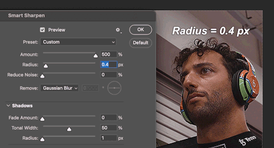
so in the next step, we set the initial smart sharpen radius to 0.3px instead of 0.4px:
which is much better. but still doesn't solve the loss of detail problem as it's still pretty far away from top left. so then what i would do is that, when shrinking the image down from 1920px, i don't go to 540px directly. i will instead go to 1080px or 720px first, sharpen as i normally do to preserve as much detail as possible, then further downsize to 540px, and then add a small amount of sharpening to finish off. it'll look something like this:
720px w/ regular sharpening ⬇️

resize to 540px ⬇️

smart sharpen, amount: 90%, radius: 0.9px ⬇️
which will be the end result!!
this gives us way finer edges than what we started with (500% 0.4px) let me actually insert that one again ⬇️
however... (this is gonna be the last part i swear). even tho this is how i would do a 540px wide landscape gif, i feel like with 16:9 or similar ratio gifs, tumblr gif size limit is rarely a concern so why not leave the gifs at 720p so there isn't even additional detail loss to begin with. ik every gif tutorial is likely telling you to resize to 540p but, in a lot of the cases the less extremely you shrink down an image, the less detail you lose, the better it's gonna look on the screen. here is a comparison between the 720px gif (top) and the 540px gif (bottom) we ended up with where the 720px one looks a lot nicer (esp around the curls)
to sum up! with larger ratio/wide gifs, if the original video is of nice quality, i would stick to large sizes (720px and up) as much as i can. if that's not doable, i will sharpen the gifs at a larger size before shrinking it down to 540px so the details are better preserved.
---
Hope this is helpful! again ty for this ask and my ask box and dm are always open <3
112 notes
·
View notes
Note
Hi! Do you happen to have basic/simple/easy tutorials for editing comic panels to recommend?
i do not actually have one to refer you to, but i’m happy to write some things up! i’m assuming this is just for removing backgrounds and creating icons; if you want a how-to on the way i animate panels, that lives here.
i use photoshop cs6, but the same general principles should work in other editors. also, there are probably easier or faster ways to do the things i do. i like my methods and i’m comfortable with them, but i’d recommend experimenting to find what works best for you.
and... yeah! let's get into it.
step one: finding a panel
i save panels as i’m reading comics. they all live in one PSD file named “panels,” and i make a new one for each run. anything that seems pretty or thematically resonant gets copied and pasted in there. this way, i don’t have to dig through endless comic issues to find a specific image that stuck with me. i usually save the full page just so the edges are clean and everything is included.
let’s go with this page from birds of prey:
step two: cropping
the way i crop the image depends on two things: what i’m hoping to make, and what the image looks like. here, i’m just doing a basic portrait, and helena is taller than she is wide. that makes it easy; let’s crop it so she takes up most of the frame.

(my preferred ratios are 4x6 for smaller panel edits like this; for banners, i usually do 2x1, but if the framing works better as 3x2, I have done that, too. just feel it out. actual pixel sizes depend on the size of the original image.)
step three: removing the background
this part is, I think, the area with the most room for personal preference. we need to erase the background, and there are a LOT of tools to do this. each one varies depending on what the image itself looks like. there’s the magic selection tool, the eraser, or the lasso or magnetic selection tool.
(i don’t use the lasso or magnet because they’re evil, to me, but they work reasonably well when you have a character on a mostly solid background and art with thick, defined lines. i have no real advice other than that.)
here, we can mix and match some things. i’m going to start by using the magic selection tool to grab all the white or solid colors and remove them with the delete key, like so:

surprise! gone.
after that, for the more finicky areas, i am a perfectionist and i go in and erase pixels using the eraser tool at 4-5px width. i start by outlining the character, like so:

from there, you can use the lasso tool to select all of the remaining background and delete it. i usually hide the white background layer at this step, too. (i'm also going to color the smoke and the man in the foreground black and redraw the crossbow string with the paintbrush tool. this ain't about him.)
you should end up with something like this:

step four: cleaning the linework
this part is mostly using the layer style stroke and the tool refine edge.
so, because of how selection tools and erasers work, there are a bunch of hidden pixels throughout the image you can’t really see. this drives me absolutely bonkers. at this point, i combine all the layers of the paint i've done so far -- everything except for the transparent background. select the layer with the character — Helena — and apply the layer style stroke, set to “outside” at 3px.

those little black dots are what we're after. there aren't too many right now, because this was a fairly clean edit; sometimes, it looks scary and messy, but that’s okay. the layer style has just outlined all those invisible pixels. i go through and erase them — especially in tight places like corners. for example, this pesky area between strands of hair:

(before vs. after)
once you’ve erased all of those pixels and cleaned up the image, you can go back into the stroke layer style.
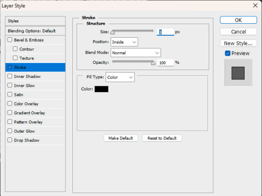
you’ve done a lot of erasing and feathering and cleaning up, so chances are, the line work is not nearly as crisp as it looked in the original panel. that’s fine! shift the settings to “inside” and 1px, like so:
sometimes it’ll need to be 2-3 px, sometimes it’ll need to be center-aligned, and sometimes you might even decide it looks better outside or without the stroke style at all! this is all personal preference. do whatever you like.
once it's where you want it to be, i like to duplicate the layer -- to save the one without the new outline in case anything goes wonky. then right click the copy of the layer and "rasterize style" to get a flat image with new linework.
your workspace should look something like this:
if it happens to feel like the edges are a little harsh — which happens sometimes! especially when using selection instead of eraser — you can select the whole image and use refine edge. this softens it. you don’t need to do much; i usually do 2-3px of feathering, a couple pixels of smoothing, and some contrast, depending on how it looks. see below:


you'll have three layers now. it gets confusing, so try to keep track of which one is your active layer. you can delete old ones, if you want; i generally don't, just in case.
there isn’t a hard and fast rule for this part. do what you think looks good. and if you want to refine the edge before you add the new linework, that can work! do another stroke layer style after the first round! test things out and find out what you like. most of the time, it depends on the image and your preference.
after all that, this is the helena we now have:
step five: creating a new background!
this part is easy. create a new layer, pick a color you like — i tend to pull from the actual background using an eye dropper tool, or if it’s for a multiple-part edit, I use the swatches i’ve decided on for the color scheme of the whole thing — and paint bucket that thing right on there. this is some of the blue that was behind her originally:

i don’t like flat colors, pretty much ever, because they feel harsh to me. so i go back and add artistic touches and mess around with the filters a lot. sometimes i pull text or accents from other panels and follow the same steps as above to incorporate them into the edit; sometimes, i don’t. no rules just vibes.
in this case, i want it to be pretty simple. so i’ll make a new layer, then fill it in with a gradient tool. i usually make a custom gradient; one side is the color of the background and the other side is either black or white, depending on the vibe I want.

i do an orbital gradient most of the time — circles are your friend — and focus the center on something that I want to draw the eye to. here, i’m going to do helena’s face.

then i mess around with the opacity until it looks the way i want it to. like this:
step six: final steps
congrats! you have an edited panel! you’re perfectly fine to post/share/use it at this point, but there are a couple other things i like to do to give it that final polish:
if you want to jazz up your edits, try messing around with outer glow, or drop shadow. both of those layer styles can add some emphasis to your focal point. (i prefer those be kept at a low opacity, when i use them, which isn’t often.)
i'd also recommend messing around with gradient maps if you want to superimpose a larger silhouette over the background. that would take more room than i have left in this already far too long guide, but it does add something to have it in there.
i dislike having text bubbles in my edits unless i specifically put them there, so i do have a process for removing them, much like the smoke or the man in the foreground. again, we are running long already, so i won't get into that here. my recommendation if you don't want to deal with entirely removing a bubble is to just paint over the text inside with white so you have an empty text box or speech bubble instead. it's simpler, quicker, and honestly the more common practice based on what i've seen.
that being said, if you want to know how i paint over them -- or how to do anything i didn't get into here -- feel free to ask. i don't mind writing these up.
i have a guide on how i size my images here, which walks through the exporting process. it’s not strictly necessary, but i like for my edits to remain consistent in size, so i do usually follow it.
and that’s it! you’re now ready to edit comic panels to your heart’s content. happy cropping and so on, and thanks for asking me. <3
#how to#ask.tb#anonymous#i hope this answered your question#and i especially hope it did so in a simple and easy to follow manner. despite how lengthy it got. i tried to stick to basics here.#but yeah! thank you for asking#best of luck!
32 notes
·
View notes
Photo

GIF COLORING TUTORIAL by kai @heroeddiemunson
hey y’all! many months ago, i made a giffing & coloring tutorial for photopea. while i still use photopea to gif, the way i make gifs has evolved greatly and i think it was time for myself to make a new tutorial to show y’all the new process! once again, it is very long, but i tried to go as in depth as possible and explain what i did in each step of this tutorial :)
what you need:
photopea (basically photoshop in your browser, completely free!)
basic giffing knowledge, because i won’t be covering it in depth in this tutorial
for me, when i make gifs, i use @ashleysolsen sai’s tutorial, which you can find here, for getting clips to gif, how to gif them, and how to crop/resize the gif. if you remember from my last tutorial, i used to use @benoitblanc arwen’s tutorial (here!), so feel free to use that one for your giffing if you’d like!
i also want to add that i recommend saving your progress throughout your giffing process, just in case something happens (your internet goes out, photopea crashes, etc), that way you don’t lose all your progress. to do this, go to file > save as psd, and choose to save your psd somewhere you can find it again. :)
but for now, lets move onto the fun stuff!
STEP 1: BRIGHTENING THE GIF & ADDING CONTRAST
so, after loading my gif into photopea, cropping it (this particular gif is cropped with a 9x8 ratio, which resizes to 540x480), and resizing it, this is what my photopea dashboard looks like. this will be our base!
from here, i go to layer > adjustment layer > brightening/contrast. from here, i change the blending mode to screen, which instantly brightens your gif. here’s the settings below, where i have highlighted in blue what you need to change:

now our gif looks like this:
from here, i want to add more contrast to my gif to add dimension to places of the gif (such as eddie’s face and the creases of his vest). to do this, i go to layer > adjustment layer > levels and make the following adjustments:

when i do this step, i always change that right number to 230 to help retain some of the brightening from the step before. the middle number varies from gif to gif, but since i wanted to deepen the contrast, i made it a lower number (under 1.0, the default); this layer is up to you and what you think looks good for your gif!
as of now, our gif looks like this.
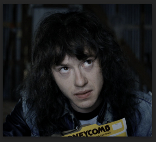
now that our gif has been successfully brightened and we’ve added some nice contrast, we can move onto step 2, which is our base coloring!
STEP 2: BASE COLORING: CHANNEL MIXER & SELECTIVE COLOR
now, to me, this gif is very blue, and i know that in a step or so from now, eddie’s face will get washed out since it’s so pale at the moment. to fix these issues, i use the method outlined in this tutorial by @nobodynocrime with channel mixer.
going under layer > adjustment layer > channel mixer, i personally make the following changes to this particular gif in order to offset the blue of this gif as it is. this step will always change depending on your gif and what it looks like after step 1, so feel free to play around with the different parts of channel mixer and find what works best for you!

with these adjustments, our gif now looks like this:

and now the coloring of this gif is more even, and makes it wayyyy easier to color going forward!
now go to layer > adjusting layer > selective color, and make the following adjustments.

while these adjustments will sometimes vary depending on the gif you’re working on, i generally try to keep the white and black adjustments the same. the neutrals change the most often; since the last thing we did was work to remove the blue, i removed a bit of the cyan that remained after those adjustments, and also removed some neutrals to brighten the gif up a bit more.
after these steps, this is what our gif looks like now:

great work so far! now we can do some more base coloring that isn’t quite as boring :)
STEP 3: BASE COLORING: HUE/SATURATION & PHOTO FILTERS
so now that the very bare bones of this gif are figured out, this is where the tutorial gets a little less wordy and a little more show-y. these steps are consistent throughout my process, but vary wildly depending on what type of gifs im trying to make, so feel free to experiment from here on out!
now that we’re here, go to layer > adjustment layer > hue/saturation. here, i usually make sure that the master tab (which changes the saturation of all the colors of your gif) has +30 saturation and -2 lightness.
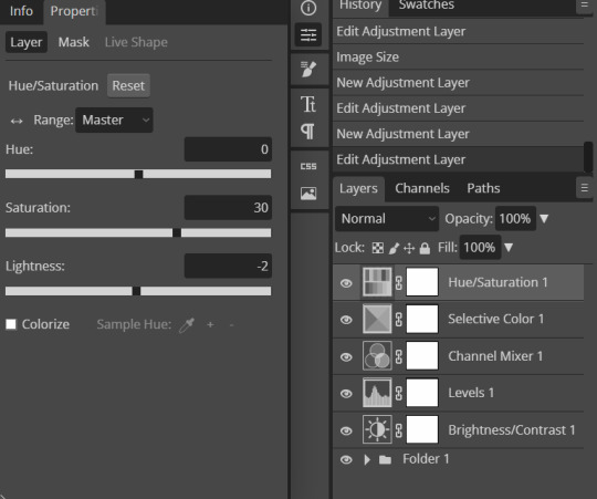
from here, go wild! while you can use the hue slider to make different colors in your gif to something else (like making the blues into purples, for example), i wouldn’t recommend doing that. i have a better way to do that, in my opinion, looks nicer and also doesn’t make your gif lose quality. for now, just keep your adjustments to the saturation and lightness sliders!
after messing around with my sliders, my gif now looks like this:

nice! we’re getting somewhere, and the gif’s colors don’t feel so flat anymore.
now, while i did want to warm up this gif from how we started out, i do think this gif has become a little too yellow in eddie’s face and parts of the background. this is why i use photo filters, which can help cool off or warm up parts of your gif pretty easily without affecting other bits too dramatically.
to do this, go to layer > adjustment layer > photo filter. if you would like to warm up your gif, keep the orange (#ec8a00) that the photo filter generates for you and simply turn the density to 10%. or, if you’re like me and you want to cool off your gif, insert blue (#0200fe) to the color of the photo filter and change the density to 10%. now, my gif looks like this:

and thats it for all of the base coloring, so we can move on to our more fun coloring!
STEP 4: COLORING WITH SELECTIVE COLOR
like the last step, feel free to experiment, since this varies wildly from gif to gif and what you’re trying to do. now, in my case, i want to make the blues in this gif purple, so let me show you how to do that using selective color.
remember how i said to not mess with the hues in hue/saturation? this is the step i mentioned where we play around with changing colors! go to layer > adjustment layer > selective color — instead of messing around with the whites, neutrals, and blacks, though, head to whatever color you’re trying to change. in my case, like i said, i want to change the blues, so i’m going to be in the cyans and blues tabs.
below are the ways that i make the blues into purples, but feel free to play around with these adjustments and the different tabs for different colors. maybe you want to turn the blues green, or the yellows red, or something else! go as wild as you’d like with your coloring; like i said, this is the fun coloring!

now that i have made those blues purple like i wanted, and i’ve adjusted some of my other layers to make the yellows/reds of eddie’s face stick out more, my gif looks like this:

the fun thing about the selective color portion of this tutorial is that you can add however many layers of selective color that you’d like! if your purples aren’t purple enough, or the greens aren’t green enough, or you just can’t get the coloring quite right on your gif with one selective color layer, feel free to add more to get your coloring how you want it!
for me, this purple isn’t the type of purple i was looking for, so i’ve added another layer to make it more of the purple i want it to be, and ended up with my gif looking like this:

so, at this point, if you’ve been messing with the blues like me, and you have a person’s face like i do, you may have noticed that the whites of their eyes have ever so slightly changed to the color you’ve changed the blue to.
if your gif has the person being relatively still or standing in the same place witihn your gif’s cropping, follow me into the next step to get rid of that weird color. if this isn’t a problem for you, or someone’s moving too much in your gif, then feel free to skip the next step and move to the one after!
STEP 4.5: FIXING THE WHITES OF PEOPLE’S EYES
so, when i find this problem happening with my gifs, i know that it’s more difficult to fix this problem on top of the selective color layers i’ve done. instead, click on the photo filter layer from step 3 to make sure your next steps happen between the photo filter layer and all your selective color layers.
from here, go to your toolbar on the left and click the lasso select tool. with the lasso select tool, circle the subject’s eyes and/or any other part of your gif that needs to be white. below is a visual tutorial of what i’ve done:

now that what needs to be white has been selected, go to layer > adjustment layer > hue/saturation. with this new layer, you should notice that everything except the section(s) you’ve lasso selected is black on the vector mask (white block beside all of your layers). mine looks like this:

this means that any changes we make to this specific layer will only affect the places that are in white, which is exactly what we want! from here, i go under the blue tab (because our problem happened when i changed the blues to purple, so now im going back and fixing the blues so that the problem isnt a problem anymore) and make the following changes. please note that these may change depending on what your gif looks like and what colors you need to change!
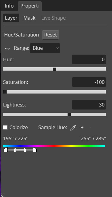
and with this adjustment, eddie’s eyes are now more white! it’s a very subtle change, but i feel as though you can see it when i put the gifs side by side as they are now:

while it was a subtle change in this gif, i have giffed scenes where this difference was more prevalent and really bothered me. if you have a case like that, now you know how to fix it! :)
STEP 5: CURVES LAYER
and we’re here at the home stretch! on top of all your selective color layers, go to layer > adjustment layer > curves. i always click the ‘auto’ button to give me a baseline of where to start, and then adjust my layers until i have my gif looking how i want it to. below are what i did to this particular gif’s curves layer:
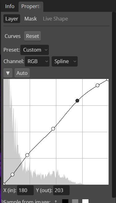
and this is what the gif looks like now:

and woo, you’re done with coloring your gif!............... maybe.
see, if you’re like me, maybe you want to make everything in the background of this gif one specific color. if so, follow me into the next step; if not, feel free to skip ahead!
STEP 5.5: MORE COLORFUL BACKGROUND
so this step only works if your gif has minimal movement of your subject, much like this gif of eddie. as you can see, parts of the background of this gif aren’t purple, and i would like them to be. instead of playing around with more selective color layers and the lasso select tool, i’ve found the easier way to do this is to use fill layers and vector masks. (btw, in this section of the tutorial, i’ve put all of the above adjustment layers into a folder. if you’d like to do the same, click the first adjustment layer (brightening/contrast), and then scroll up and press shift while clicking the top adjustment layer (curves). with these layers selected, click the little folder button at the bottom of your layers panel).
to do this, go to layer > fill layer > color fill. outside of the color picker pop up that shows up, your mouse cursor would be a crosshair, meaning that if you click on any section within your gif, you can pick up whatever colors are there and use it for the fill layer! in my case, i’m going to be picking up the purple from eddie’s shirt. now my gif looks like this:

......which isn’t exactly what we want. what we wanna do is use a brush and cut out the parts of this gif that we don’t want this color (such as eddie’s face, in my case). how do we fix this?
first, on your left toolbar, click the brush tool. towards the top, you should have a circle with a number underneath it and an arrow pointing down; clicking this box should reveal a bunch of options, including a size and hardness slider. change these sliders to be 0% hardness and however large (or small) of a brush size you may need for your particular gif. finally, on your right with the fill layer that is now there, click the vector mask/white box linked to the fill layer. also make sure that the colors in the bottom left have black as the foreground/up front, and if you need to, change the opacity of the fill layer so you can see under it!
i know that was a lot of information, so feel free to look at this visual guide to help explain things better:

like with the lasso layer from step 4.5, using black on vector masks makes parts of the gif be unaffected by the layer the vector mask if linked to; thus, when you use black on this vector mask (which is white), you’re basically erasing from the vector mask so your gif underneath it may show through. feel free to use different brush sizes, or to use the color white if you erased something you didn’t mean to, to perfect your fill layer so you can get it how you want it to look.
this is how mine looks with nothing but the layer opacity changed so i could see what i was/wasn’t erasing:

which, while pretty, isn’t exactly what i’m looking for. instead, change the blending mode of your color fill layer to color, like so:

which now makes my gif look like this:
if, when you change the blending mode to color, you notice that maybe you missed something you meant/didn’t mean to color, feel free to go back into the vector mask and fix it.
again, while this is pretty, i’m extra when it comes to colorful gifs, so i’m not quite done. i duplicate my fill layer twice, and then make a couple changes. i keep the middle layer with its blending mode set to color and opacity at 100%. however, i change the bottom fill layer’s blending to multiply, and change the opacity to 30%. then, with the top fill layer, i change its blending to soft light, and change the opacity to 15%. my layers look like this:

which makes my gif look like this:
while it may not be necessary, i like the way it looks better than just with the one color fill layer, so that’s why i do it. :)
from here you can do things like add text, which i won’t go into detail with in this tutorial because it really is just playing around with the different buttons and fonts you may have loaded into photopea.
STEP 6: SHARPENING & EXPORTING YOUR GIF
and oh my god, finally, we are at the last steps before we can export this gif!
when i gif, i like to leave my sharpening until the end because, just in case my gif is too large when it’s being exported, i don’t have to lose a bunch of my work trying to make the gif a smaller file size if i need to adjust my sharpening.
so, to sharpen your gif, click your top frame of the gif, scroll down, and shift click the last frame of the gif. now that all of these frames are selected, any sharpening you changes will be applied to all of them!
this style of sharpening is new to me, and follows closely with @do-revenge este’s own tutorial, which you can find here. with all your frames selected, go to filter > sharpen > smart sharpen. i personally keep the default numbers that photopea has on the popup that shows up, but you can feel free to change these numbers however you like. once you’re happy with whatever numbers you have, click “OK”.

now that your smart sharpening has been done, with all your frames still selected, go to filter > sharpen > unsharp mask. when the popup loads, it may look something like this:

if you like what this looks like with the unsharp mask, feel free to keep these numbers! i personally like to change these numbers so they aren’t quite as intense; i find that i like what my gifs look like with the amount changed to 135% and the radius changed to 3.5px, which makes my gif look like this:
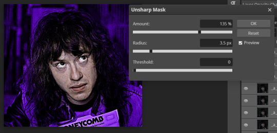
once you’re happy with your unsharp mask, click “OK”, and boom! you’ve made a gif, congrats! now it’s time to export. to do so, go to file > export as > .GIF. you should get a pop up that lets you preview what your gif looks like, colored and sharpened in all its glory. make sure that when exporting, the number at the bottom stays under 10mb, because that’s tumblr’s size limit for gifs!

click “SAVE”, and viola, you’ve done it! you’ve made a gif! congrats, bestie! :) <3
this is, once again, just the way that i personally make gifs. feel free to use only parts of this tutorial if you’d like, or change parts of it with other tutorials you may like more than mine! play around with different layers and find what works best for you. have fun, and happy giffing! :) <3
#photopea tutorial#photopea gif tutorial#completeresources#allresources#userars#userzesty#tusersai#dailyresources#gif tutorial#photopea#mystuff#mytutorials#i spent like two hours making this tutorial i hope its helpful SJBFDKJL
224 notes
·
View notes
Photo
allelitewrestlings’ gifmaking tutorial #1
hey there! this is a brief tutorial with technical tips for making wrestling/aew gifs. i won’t go through the basics of gifmaking, so some photoshop knowledge is expected. i hope this will help any new gifmakers in the wrestling fandom, or anyone who is interested 😊
tutorial content:
choosing the footage
gif dimensions
duplicated frames
sharpening and timing
colouring*
the full tutorial is under the cut! enjoy!
intro. as i mentioned, this is a very basic, very simple tutorial that goes through issues i have encountered since i first started giffing wrestling stuff. keep in mind that i am by no means an expert, and there must be better/easier ways of doing the things i do, but these are my methods.
*note: i will not be talking in-detail about how to colour aew gifs because it’d take most of the tutorial. but if anyone’s interested about a veeery basic colouring tutorial that focuses on aew, let me know 😊
1. choosing the footage
when it comes to making gifs, the rule of thumb is to always choose 1080p footage or higher. this makes your gifs look more hd. when it comes to wrestling/aew (in my personal experience) even 1080p can look pretty terrible sometimes.
this is a screencap from a young bucks entrance. you can see how even when the video “is 1080p”, the image looks super pixelated and blurry. to me that’s a no can do, sorry young bucks. i often try to go for clear frames, but it’s a challenge when it comes to aew 😅 (unless it’s close-ups or backstage segments).
once you have your footage and once you’re exporting your video to frames on photoshop, remember not to limit the frames (unless you’re working with 1080p60, in which it’s totally fine to limit 2 frames if you don’t want your gif to look too “smooth”).
for the purpose of this tutorial, i will be working with backstage segments.
2. gif dimensions
now that you have your footage, you have to decide what kind of layout you’ll be working with. most set layouts consist of one, two, or three columns. depending on the layout you choose, the width of your gif will be different (the height can be whatever you want, just remember to keep the proportions). as of 2022 the tumblr width dimensions are as follow:
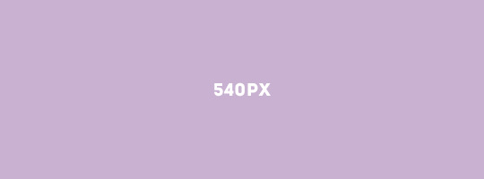
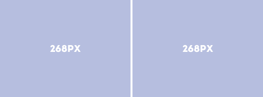

i usually crop my gifs using the crop tool (but there are other methods for sizing your gifs). this time i’ll be making a 540x450 one column gif
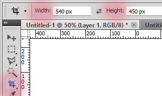

personally, i never fully select the bottom 3-4 pixels because (for some reason?) you’ll find a black line at the bottom of aew footage like 80% of the time. but feel free to crop the gif as you please! there are other ways of cropping and sizing your gif, this is just one :)
3. sharpening and timing
once you have your gif cropped, it’s time for sharpening. it’s important not to skip this step! i’d say that sharpening is as important as selecting the correct width/colouring your gif. there are many ways to sharpen your gif and it all depends on whether you work with timeline/smart object or you choose to sharpen each frame individually. both of these can be achieved through actions or manually. personally, i prefer actions. there are many great action packs available here on tumblr for free! they’ll make your life easier. one of my favourite action packs is @anyataylorjoy’s action pack #1. this action pack has two different sharpening actions and they’re both quite useful (and look good on my dated photoshop), but what i love the most is the save action.
this is when we need to talk about timing. i’ve been making gifs for a while, and it took me a long time to realise that 95% of the time, the correct timing for gifs is 0.05. the issue here is that when you save your gif and you’re still working with it as timeline/smart object, 0.05 is converted to 0.07, so it slows the gif down. sometimes it doesn’t seem like a big deal, but fixing the timing makes a huuuuge difference in what your gif will end up looking like. by using the save action, your work will automatically be converted back into frames and the timing will be fixed.
let’s look at examples.
this is what happens if you change the speed to 0.05 before converting the frames to timeline/smart object to sharpen it. (when you save it, the gif will automatically be 0.07. we don’t want this).
what we want is to convert the timeline back into frames and change the speed to 0.05 (so you can use the save option for this and save yourself some time!). after that, your gif will move way smoother/better:

4. duplicate frames
i didn’t know whether to talk about duplicates or sharpening first, but i decided to leave this for last. something that no one told me/i didn’t really notice when i started making gifs is that there can be a lot of duplicates in the footage you’re working with. if duplicate frames don’t bother you, you can just ignore this bit! it’s mostly a preference.
so, with aew/wrestling footage, you’ll mostly encounter duplicate frames in two occasions:
- backstage segments: this is the most common way of finding duplicate frames, and 98% of the time it’s a 1 in 5 duplicate frame. i usually fix this manually, but i know that avisynth has a very fast, very effective way of removing these duplicate frames. (i found this avisynth tutorial if anyone’s interested!). so, these kind of duplicates will show once every 5 frames. i’ve...memorised? by now that if the 1 and 2 frames are duplicated, then the 6 and 7 will be. so i manually delete every frame that ends with 1 and 6 (or 2-7, 3-8, 4-9, 0-5). it’s... complicated to explain haha.
most of the backstage segments and slow-motion videos found in, for example, all the roads to and countdowns to are likely to have 1-in-5 duplicates. “hey ew”, and those kinds of videos also have duplicates. as an example, let’s take a look at these:
this is a gif with 1-in-5 duplicates (which has been sharpened, and its speed is 0.05).
and now this is what the same gif looks like once you fix the issue with the duplicates.

- screen recording:
now when it comes to screen recording, it’s very likely that you’ll have duplicate frames. in my experience, unless you’ve just turned your computer on and you don’t have too many tabs/apps open, you’ll find random duplicates throughout the footage you’re working with. sometimes screen recording can also lead to skipping frames, so keep that in mind. to know whether or not your screen recorded footage has duplicates, it’ll look something like this even after you’ve sharpened it and fixed the timing:

the only way (that i’m aware of?) that you can deal with this if you’re using screen recordings is to manually delete the frames. that is, go one by one trying to spot duplicates and delete them. (yeah i’ve done it and yeah it’s a nightmare). so... my advice here is to try to download your footage whenever you can or try to screen record without having too many tabs/apps open 😅
5. colouring
the last step for me when i make gifs is deal with the colouring. some people prefer to do colouring before converting timeline to frames, but it’s just a preference (unless you’re making a gif that requires you to use timeline, etc). what’s important to know if you’re going to add your colouring when working with frames is that you have to always edit the layers on the first frame (so that the changes apply to the rest of the frames).
in-ring action is definitely a nightmare to colour because every shot will look different and aew does a very bad job when it comes to offering contrasted/colour balanced footage. as i mentioned earlier, i’m not gonna spend too much talking about colouring this time. if you struggle with your own colouring, we have shared a couple of psds in the past, which you can use as bases if you’re just getting started or if you find them useful! but there are a lot of good photoshop resources blogs where you can find brightening/base psds as well.
these are the two gifs i have been working with, now with a very basic colouring:
****
now the only thing you need to remember when saving is that your gifs need to be under 10mb! most of the time my saving settings are adaptive - pattern - bicubic sharper.
and... i think that’s all! 😊 hope this can help someone. and feel free to message us (or me @jonmoxleys) if there’s anything you’d like to ask.
#gif tutorial#resources#completeresources#wrestlingedit#aewedit#aew#ours: resources#ours: tutorials#*
373 notes
·
View notes
Photo
HOW TO: Make an Animated Sound Wave Overlay
In this tutorial, I’ll show you a quick and easy way to get this animated sound wave effect that’s unique to any song you choose! (You can check out a similar effect in my Obi-Wan Kenobi and Miles Morales gifsets too.) Disclaimer: This tutorial assumes you have a basic understanding of gif-making in Photoshop.
PHASE 1: Make Sound Waves Using VEED.IO
You can do this using several methods like downloading sound wave videos on YouTube and making them into gifs (which I’ve done before too!). But I’m going to show you how to make sound waves specific to the song of your choice using a free site called VEED.IO
1.1 – Upload a YouTube link of your song to VEED.IO
Open VEED.IO and click Choose Video! Try to find a studio recording if you can, instead of a clip of the film/tv scene which might have distracting background audio that could influence the sound waves.

UPDATE 09/17/23: At the time of writing this tutorial, VEED.IO allowed you to upload a YouTube link directly. However, I’ve been made aware that this doesn’t always work with the new version of VEED.IO. As an alternative, you can instead download the YouTube video using any video downloader and use the “Upload a File” method instead!
1.2 – Make the video a black screen.
If the video you used isn’t already fully black, click on your media in the timeline and toggle over to the Adjust tab. Pull the Brightness slider all the way down to -100 until the screen is completely black. This black background is key to getting a seamless blend on your gif later!
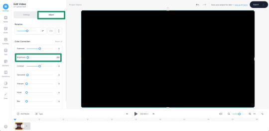
1.3 – Insert sound waves.
Click Elements in the left sidebar and navigate to Sound Waves. Select any sound wave design you prefer! I like the vertical, rounded orange bars. Don’t worry about the color when you choose, we’re going to change it to white later!
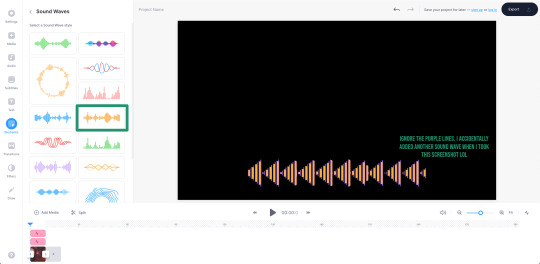
1.4 – Trim your audio clip.
It’ll depend on the amount of frames in your gif, but you shouldn’t need more than 10 seconds of your song. You can choose to trim based on the scene of your gif, the lyrics you’re going to type on the gif, or even just choose a section where the music goes wild and the sound waves move a lot. In this Max gif, I took a clip toward the end where the lyrics are: “I’d be running up that road, running up that hill, with no problems” because it matched the main clip I giffed.
Use the white parallel lines to drag the clip where you want it to start and end:

1.5 – Adjust the audio decibel controls.
(Disclaimer: As with most things, I know almost nothing about what I’m doing here. 🤡) I just know that I don’t want the bars of my sound wave to be clipped like they are below, so I have to change the decibel range so the loudest part of my audio doesn’t go “outside the lines.”
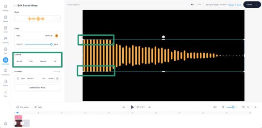
I changed my minimum to -100 and my maximum to 25:
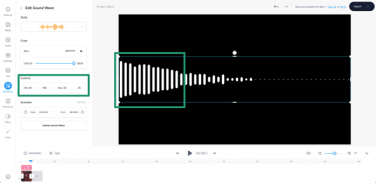
1.6 – Make your sound wave white.
Still in the Edit Sound Wave window, change the color of the bars to white. It doesn’t matter what color you want your sound wave to be in your final gif — we’ll change it later! White is the best base for any color, especially if you want the gradient/exclusion effect in the overlay.

1.7 – Resize the sound wave to your liking.
Use the corner sliders to enlarge the sound waves. I always prefer making a big gif smaller than trying to make a small gif bigger (and grappling with a low quality image). So I like to resize my sound wave as big as possible, cutting out any bars that don’t move so I can have a high-quality animation in the end. :)

1.8 – Export as a gif.
One of the most convenient things about VEED.IO is that you can export the sound wave as a GIF! So you don’t have to screencap it yourself. Click the export button in the top right corner, select Export Video, and then download it as a GIF.
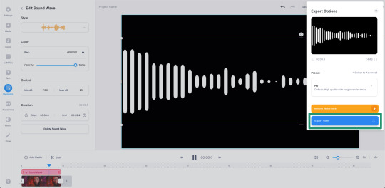
And here’s the sound wave gif I got:
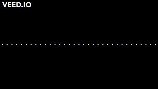
Don’t worry about the watermark, we’ll take care of that in Phase 2. :)
PHASE 2: Overlay Sound Waves On Your Gif
Note: I’ll be working in Video Timeline for the most part of this section! If you want to see my process in Video Timeline, here’s my step-by-step gif-making tutorial.
2.1 – Make your base gif.
This is all up to you and your style! I like to make my sound wave gifs color-focused and I think blending adds a nice touch. Also, my gif is 540x540px.
Now, one of the most important things to remember is this: make sure your frame delay starts out at 0.05 seconds, even if you work in Video Timeline like me. This is crucial to make sure you don’t get duplicate frames when adding the sound wave gif.
2.2 – Import your sound wave gif.
Create a new file by opening the gif you exported from VEED.IO. Change the gif’s frame delay to 0.05. This is to match the base gif so that when you convert to Timeline, you don’t get duplicate frames! (Note: I also deleted the first frame of mine because all of the waves weren’t moving.)
2.3 – Resize the VEED.IO gif and convert to Video Timeline.
For my gif, I resized the sound waves to 505px width and then I used the Sharper action in this action pack to convert to Video Timeline. (You can read more about how I use these actions in the gif tutorial I linked above!) You can also remove the sharpen filters if you feel you don’t need them!
2.4 – Hide the watermark.
Create a layer on top of the gif layer and use the Marquee tool to make a box around the watermark. Use the Paint Bucket tool to fill that box with black so the watermark disappears.
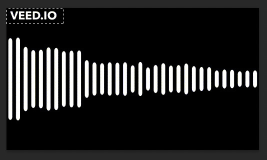
Select both layers (the black box layer and your gif layer), right-click, and select Convert to Smart Object to merge the layers together.
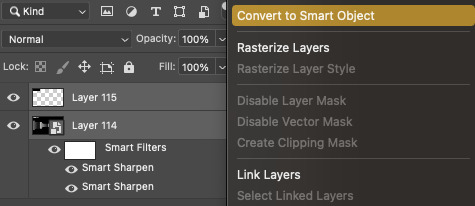
2.5 – Drag/duplicate the sound wave gif over to your base gif.
Either click and drag the sound wave layer into the tab with your base gif OR right-click the layer, select Duplicate Layer, and choose the document you want to paste the gif to! Make sure the sound wave layer is above your base gif!
2.6 – *OPTIONAL* Create a music player overlay.
This is just a style I came up with because I’m currently obsessed with rounded shapes. But you don’t need to have the semi-circle music player for the sound waves! I just like how it looks. For my design, I just made a white ellipse, created my own shapes for the play and skip buttons and masked them out, set the blending mode to difference, and added a gradient overlay.
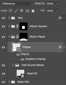
I won’t go into my design in a lot of detail here because this is a style choice that’ll be unique to how you want your gifs to look. Plus, this is just a tutorial on how to make animated sound waves. But if you have specific questions about my gif style for these kinds of sets, feel free to ask me at my main @sith-maul :)
2.7 – Set the blend modes.
Put your sound wave gif in a folder and set the folder’s blend mode to Exclusion. Put that folder inside another folder, and set this folder’s blend mode to Pass Through (it should do this by default). Here’s a screenshot that hopefully explains this clearer:

Now, your sound waves should have gone from looking like this:
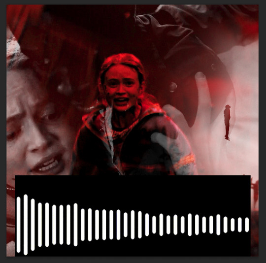
To this:

You can totally stop here if you like this look! But I want my sound waves’ color to match the rest of my gif, so...
2.8 – Add a gradient map.
Within the sound wave gif folder (the one set to Exclusion), add a Gradient Map layer above the sound wave gif:

I recommend going for a Black to Color gradient because the black will help the background of the sound waves stay dark and fully blended with the rest of your gif. I went with this Black to Red gradient:
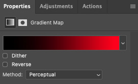
Now my sound wave gif looks like this:

But I don’t like how there’s now some cyan peeking through where the bars touch the lighter gray parts of my gif. So, let’s add one more adjustment layer.
2.9 – Add a Hue/Saturation layer.
In the outer folder (the one set to Pass Through), add a Hue/Saturation layer so it’s above the other Exclusion folder:

Decide what color you want to get rid of (in my case, cyan), go to that color channel, and adjust the hue slider until that color matches your main color as best as possible!
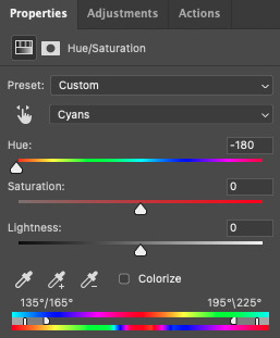
PHASE 3: Export Your Gif!
As always, when you convert your gif back to frames, do a quick double-check that you didn’t end up with any duplicate frames before saving your gif. Again, you can read more about how I do these steps in my gif tutorial here.
Finally, with just a little extra nudging layers around, my gif looks like this now:
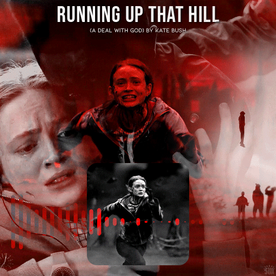
Of course, for my actual gif, I created a music player design — so I decided to only use the upper half of my sound waves to fit inside the half circle.
I’m sure you know how I did this already, but in case you don’t, just move the sound wave gif down the canvas to your liking until only half of the waves are visible! I like using this method where my sound wave gif is under a gradient overlay because of how dark it makes the sound wave bars and how I don’t have to get rid of any cyan colors:
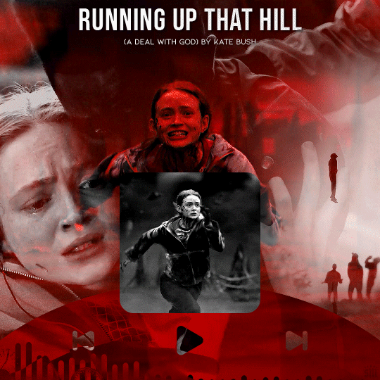
But that’s it! I hope you found this tutorial helpful and easy to follow! If you have any questions, my main inbox is open @sith-maul. If you decide to try out this effect, feel free to tag me with #usernik or tag us with #usergif ! Thanks for reading :)
#gif tutorial#completeresources#userkosmos#usershreyu#uservalentina#useralison#usernums#tuserkay#usercim#userannalise#useryoshi#userelio#tuserabbie#uservivaldi#userstar#usernorah#usersole#*usergif#*tutorial#by nik#stranger things spoilers#flashing gif
449 notes
·
View notes
Note
please could you do a tutorial on how you enhance the colouring of a gif to be really vibrant in one colour without it changing the coloring of the rest of the gif? you do it really well and it looks great!!
hii, thank you anon!! and yes, i will grab different psds i have around my laptop and explain how i achieved that coloring. very long tutorial under the cut!
it's a bit hard for me to explain how my brain works when it comes to selecting the type of coloring/scenes i want to gif so please bear with me lmao. okay so first things first, i always try to choose scenes that are in the same section of the color wheel, this makes things easier in photoshop.
i will use this gif as an example
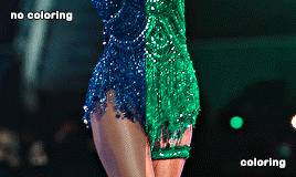
i chose this particular scene to turn it green because blues and cyans are close to the green tones in the color wheel, so that's gonna make things WAY easier in photoshop, especially if the subject is moving. another tip is to find scenes where there's a color that's really separated or isolated from the rest, that helps me so much in ps because then i can basically change its color without worrying about turning her legs the color i chose.
i don't apply all these tips at the same time because it truly depends on the case but i tried changing the color of the same gif to red with hue/saturation and it looks quite good as well since the blue is really separated from the rest:

now things get a bit more complicated, because now that taylor's bodysuit has the same tones as her skin tone editing everything gets a bit harder, bc let's say i want her legs to look a bit more purple-ish since they're a bit yellow and i want to tone that down (another tip: look at the color wheel to figure out which opposite color you need to cancel out a particular one you want to get rid of) i usually go liiiittle by little with selective color and i only work in the yellows and reds (sometimes magentas), this is trial and error, drag the tiny arrows in each color to see what looks best or what looks somewhat decent lol. this is how the finished psd would look like, i only had to tweak the yellow section in selective color, and that worked out well!

that's usually what i do 90% of the time. other times i try to edit the color just a bit, so i can further separate it more in case it still picks up similar tones that are around it.
_
other tip i have is that most of the times i choose scenes where the subject doesn't move that much, especially if i'm changing the color of something in particular.

like this lwymmd gif, it's a very radical change in color so i had to use a brush and stuff to make the red turn white, but see how there's barely any movement? that's the type of scenes you want to use when you want to change its color (especially if it's something as contrasting and different as white) this one had a combination of hue/saturation and using a brush with a green color for the most part and selective color to finish tweaking her skin tone.

for example since the red was super isolated i didn't have to tweak much, but for example when you want to include a bunch of colors you can play with the slides that are circled in teal to tell photoshop "i want you to include this specific tone in your color selection" so then you can desaturate it and increase the lightness (that's how you turn anything to white) or change it to another color, whatever you choose. that's what i did for the midnights bodysuit:

i dragged the shit out of those sliders lmfao, but it's how i got to change the color in a uniform and faster way.
-
hue/saturation is my favorite adjustment because i loooove turning things white/black bc of two reasons: makes the scene so unique, bc no one has seen the red dress from lwymmd white, so it automatically stands out AND if for example you're making an orange set and you have a random color that you don't need (like blue, or green, etc,. again, make sure they're a bit isolated at least and that they are not close in the color wheel) you can always turn them white or black to enhance even more the orange! it's what i did with this gif. my focus were pinks, yellows and oranges, so i got rid of the blues/purples/cyans by desaturating them and add lightness to them (like i did with the rep gif)

when it comes to enhancing a color that already exists in the scene i take some liberties, but it might not apply to every single scene. sometimes i do discard gifs bc it's not working how i want to. i just use selective color to adjust anything and again i go little by little.
-
another example of me changing the color and using a different technique: halsey isn't moving at all so that gives me the chance to change the background to anything i want, in this case i used hue/saturation but in a different way, i selected colorize and increased the saturation. that way you're turning your gif whatever color you choose. with a layer mask i then got rid of the parts i didn't want to be affected by this change.

-
and same with this one, got rid of the green because it's a very isolated color so that makes things easier when it comes to change its color or get rid of it. and for this set i went for an all pink color palette so see how me desaturating it and turn it into white makes the pink pop even more? it always depends on what your set is going to look like, i could've changed it to blue or purple depending on the color combo.
i think this is everything i can think of, since i color every gif from scratch one case might not apply to another one, so pls if you have any doubts about a particular gif i colored don't hesitate and ask! i'd be happy to help and explain!
17 notes
·
View notes
Last Seen Blogs

barovia-buddies
Horrid Vamp Man

yadurajrealty
Untitled
tigerpriestess
Alhaitham
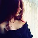
xxxdreamscapexxx
~ ŠêcRêt ŁoVê ~
