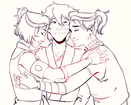
#mytutorials
Photo

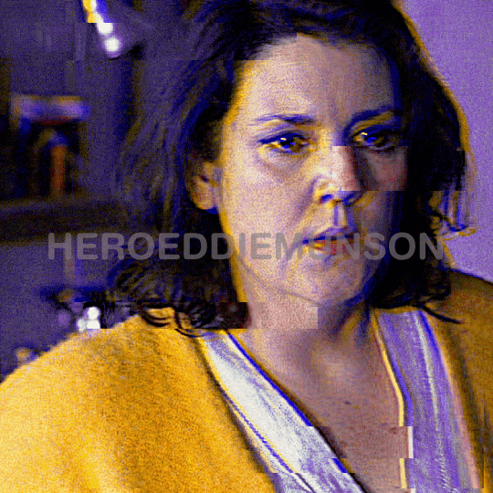
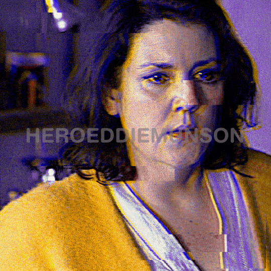
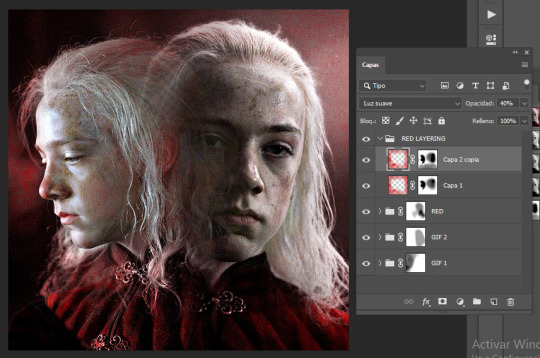
PHOTOPEA GLITCH TRANSITION TUTORIAL by kai @heroeddiemunson
howdy! so i’ve recently come to realize that i haven’t come across any tutorials for creating a glitch transition on photopea. as someone who has done this transition many times in photopea, i figured that i should create a tutorial to show how i personally do this effect!
what you need:
photopea (basically photoshop in your browser, completely free!)
basic giffing knowledge, because i won’t cover it in this tutorial (other tutorials: tutorial by @benoitblanc, tutorial by @ashleysolsen)
i also recommend watching this youtube video for a real time visual of what i’m going to be describing in this tutorial. this video is what taught me how to do this glitch effect, so if how i’m describing it is at all confusing, check out the video to see it in action!
without further ado, make sure you save your psds regularly and let’s begin the tutorial :)
step one: making your gifs
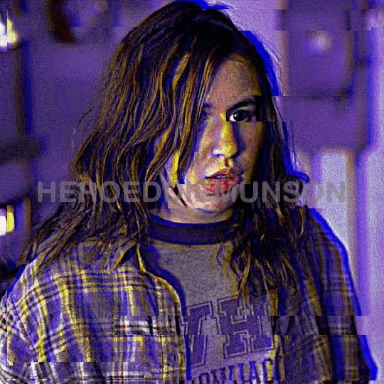
before we do anything, you have to first make the gifs that you are going to doing the glitch in between. for the sake of this tutorial, i will be transitioning between two gifs, but this tutorial works for however many gifs you want to glitch between for your edit. here are my two gifs that i will be transitioning between:

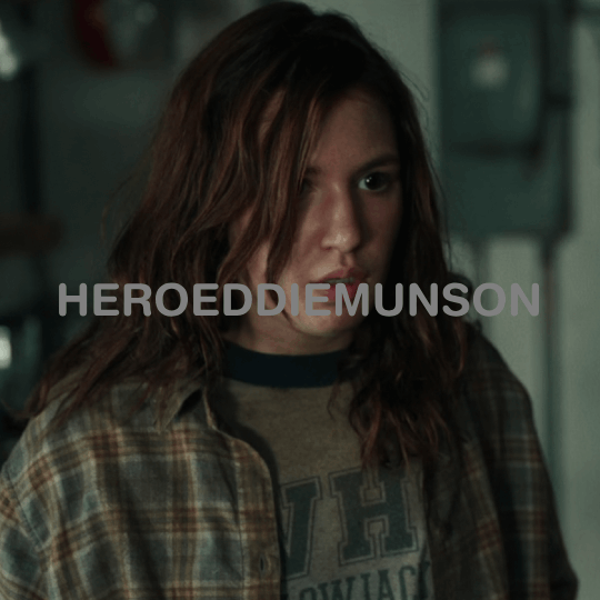
i highly recommend keeping these individual gifs small in their frame count to make sure your final gif doesn’t go over tumblr’s size limit. the gifs i am working with are both 22 frames; you dont have to make the gifs have the same amount of frames, but i do it because i think it looks cleaner.
with your two gifs, edit them however you would like. if you have a specific order you’d like the gifs to look/a way that your finished product will look like (ex: black and white with a transition to fully colored), then you should color them accordingly. here are what my gifs look like after fully editing them:
once you’re happy with your editing, go to file > export as > GIF and save your gifs. now that we have our gifs to transition between, let’s make our canvas!
step two: making your gifs’ canvas
now that we have the gifs we’re going to be transitioning between, we need to make a “canvas”, or place where we put these two gifs in order to transition between them. so, going to file > new…, create a new canvas. here are the specifications for my canvas (size of your canvas may vary, depending on your cropping for your gifs):

the background for this canvas doesn’t really matter like it does when you’re blending two gifs, but i still made my canvas’s background black because it contrasts the brightness of the gifs i’m placing onto it.
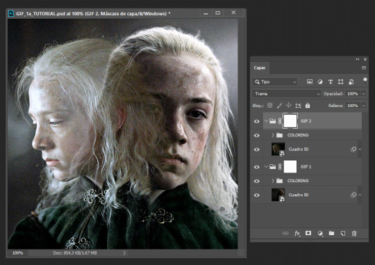
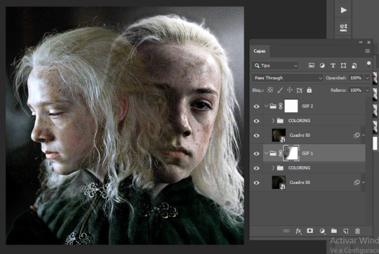
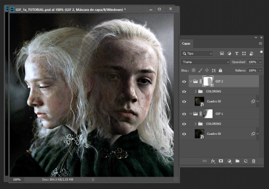
with your canvas now created after clicking “Create”, open up the two gifs that you will be transitioning between. right click the gif’s folder in the layers panel on the right, and select duplicate into… and choose the canvas you just created. once your gifs have been duplicated into the canvas, your layer panel should look something like this:

if you didn’t duplicate your gifs in order, arrange your gifs however you want them to appear. from here, we can now get to the purpose of the tutorial, creating the glitch effect!
step three: creating the glitch effect
generally, with any transition effect, i like to make my gifs seem like they are endlessly looping. while this is a little more work when it comes to giffing, i do think it gives the gifs a nice polish and doesn’t make it feel like there’s a harsh transition between the gif’s looping cycle.
click the eye next to your top most gif(s) in order to make it invisible, as we will worry about it later. scroll down to the layer titled “_a_frm0,50”, right click, and select “duplicate layer”. this should create a new layer, “_a_frm0,50 copy”, on top of the original layer. double click on the copy, and you should see this pop up:
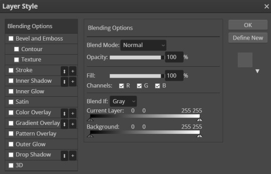
below the fill slider, you should see something titled “channel” with three checkboxes with R, G, and B next to each checkbox. you can uncheck any one of these checkboxes for a different effect; unchecking the R box creates the stereotypical red/blue glitch effect, unchecking the G box creates a green/pink glitch effect, and unchecking the B box creates a blue/yellow glitch effect. for my transition, i have chosen to go with the blue/yellow glitch effect by unchecking the B box. however, you can play around with whatever effect you prefer for your gif.
once you have chosen what checkbox to uncheck, click “OK”. with the “_a_frm0,50 copy” still selected, make sure you have the move tool selected (the curser at the top of the left toolbar), and choose the direction you want your glitch to go and move the layer using the arrow keys on your keyboard. it can move as much or as little as you want, whatever looks good to you! i chose to move this first layer 10 clicks to the left and 5 clicks up, which creates this effect for my first layer:
which looks cool, right? now, you could stop here with the glitch effect, but me being me, i’m extra, so i’m going to include the next half-step that you don’t have to follow unless you want to.
step 3.5: the glitch effect, advanced
with “_a_frm0,50 copy” still selected, go to the left toolbar and find the rectangle select tool (right under the move tool from before). this part is a bit tedious, but i like the results, so i feel that the work is worth it.
using the rectangle select tool, make a shape around part of the layer, and then go back to your toolbar and select the move tool again so we can move the selected section. do you remember how many clicks you used to move your layer and in what direction it goes in? well, now, do the opposite; since i moved 10 clicks to the left and 5 clicks up, my selected section needs to go 10 clicks right and 5 clicks down. below is what this looks like before and after moving the selected area:
once you’re happy with the moved selection, go to the top bar and go to select > deselect so that you are no longer selecting the section you just moved. repeat this step however many times you like; i tend to do this about 5 times for each layer of varying sizes/lengths to allow variety. here is what the final product looks like for this first layer:
and viola! your fully glitched layer one. now we can move on with the rest of the tutorial.
step three, continued: creating the glitch effect
now that you have finished this layer, make sure you have selected both frames “_a_frm0,50” and “_a_frm0,50 copy” by left clicking while holding down CTRL on your keyboard. with both layers selected, right click and choose the “merge layers” option in the popup; this ensures that the glitch effect that you have created stays as one frame.
now we get to do this many more times! make your next layer, “_a_frm1,50”, visible by clicking the little box next to it in the layer panel, and repeat the before steps. i personally alternate between what direction my glitches go in to add more variety and interest for my gifs. so, for example, with my “_a_frm0,50” frame, i moved it 10 clicks to the left and 5 clicks up; this means, for “_a_frm1,50”, i’m going to move it 10 clicks to the right and 5 clicks down, so on and so forth.
i do this for the first 3 frame layers and the last 3 frame layers for both gifs. when your gifs are finished with their individual gif transitions, they should (individually) look like this:
and together, they should look something like this:
and that’s the hard part done! congratulations, you just made a glitch transition!
step four: finishing touches
now, this entire step is optional, as if you already did stuff like add text to the individual gifs you are using this transition with, you’re probably already done. however, if you’re like me and you’re making a gif where the text remains stationary on top as the gif itself transitions underneath, take this time now to do so.
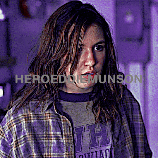
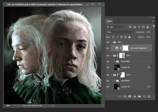
i will also note that if you want your gif transition to match with the rest of your gifs, you can do that in this layer. for example, i want the blue in the transition to be purple like in the rest of my gif; to accomplish this, i will use a combination of a hue/saturation layer and a selective color layer to make the blue be purple (which does change the purple a little from how it was originally, but i don’t mind). i would put these layers on top of both of my gif layers so that the transition layers in both gifs get the same coloring. doing so creates this effect:

(that isn’t a step that’s required by any means (nor do i do it all the time), but in case you wanted to do that, now you know!)
now that i am fully happy with how the gif looks, i will add my finalized text and end up with this as my final product:
now, if you run into the problem of your gif being a little too large for tumblr’s size limit (for example, my finished gif was 10.7MB, and the limit for 540x540 gifs is 10MB) and don’t want to redo all of the process of doing the glitch effect after deleting some frames, i recommend using ezgif’s gif optimizer. it helps shrink the size of your gif without costing you the quality of your gifs. :) i dont normally recommend that for other types of gifs where it’s easier to delete frames, but in this case i know that deleting frames and having to recreate the glitch effect may be annoying!
other than that, this is the end of the tutorial — congrats, you know how to make a glitch transition in photopea! good for you! :) if you ever need any help with photopea, or have a request for how i have done an effect, please feel free to shoot me an ask and i’ll do my best to explain or make another tutorial to help!
#photopea tutorial#photopea gif tutorial#gif tutorial#glitch transition tutorial#photopea#dailyresources#allresources#completeresources#usergif#userars#tusergeo#userlace#tusersai#mystuff#mytutorials#eyestrain#pulsing lights
386 notes
·
View notes
Note
Hope you don’t mind me asking this, but do you have tips to drawing Octoling hair? Whether short or long is fine.
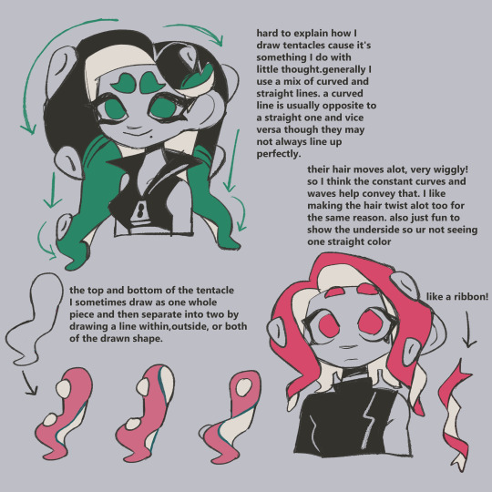
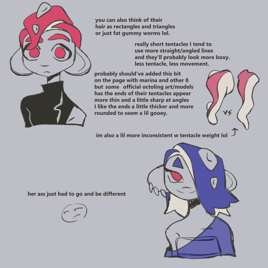
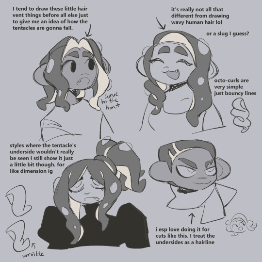
this is from a lil while ago and i didnt put the mooost thought into it so if it's not specific enough nd you have other questions lmk !
460 notes
·
View notes
Note
i wanna start making comics but like. i dont really know how??? are there any tips that you could give me perhaps?
hi!
i've been working on trying to compile a list of resources for people (@aangsfrogs--i didn't forget!) who want to make comics for a long time. It would consist of some of my personal tips and a lot of links to other people's PDFs and youtubes. But that's...a hefty project, so if you had any specific questions for the meantime, my askbox is open!
But, for just beginning, here would be my tips:
Read comics. Read manga and webcomics and cartoons and medical comics. There is so much out there, and reading is such a big way to learn. If you see something you like, take a moment to think about why you like it. Are the expressions or colors appealing? Did it make you feel a certain emotion? Analyze what the artist may have done to get across what they did. (Is it the camera angle? the style they chose to draw in? the paneling? the pacing? the color? etc.) Doing this over time will help you recognize the tools available for telling stories through this medium, and you'll be able to put them in your own work.
Try to think about what you want to make comics about. What moves you? What topics interest you? What ideas or tropes do you love in media or think about often? What do you hate and wish was done better? What characters are you drawn to, or what characters do you want to create? (What about them compels you?) I find it's hard to create an idea out of thin air, but if you start writing down random ideas you have, you'll start thinking about them, and over time, you'll have a bank of things to pull from when you want to create.
Lastly, anatomical skill or knowledge of color does not a comic make! You don't have to know much to begin, and there aren't rules. Just start drawing what is meaningful to you!
This is just cursory and doesn't get into super specifics like paneling or scripts or plotting or colors or thumbnailing or....etc, but I'll try to expand my list of resources and get that out! And, hmu if you have any specific questions on topics!
happy drawing~
Book list under readmore:
Scott McCloud's Understanding Comics and his Making Comics. These books are taught in like, every comic class ever. While not my complete favorite, they do a good job of showing some history and fundamentals, and how easy it is to make comics even if you don't have a lot of drawing experience.
99 Ways to Tell a Story: Exercises in Style by Matt Madden: Really good if you don't know how to start analyzing comics. (Also it's just a fun visual exercise.) It shows the same short story done in 99 different styles with different emphasis on different moods and points of view.
The PreHistory of The Far Side: A 10th Anniversary Exhibit by Gary Larson and The Calvin and Hobbes: Tenth Anniversary Book by Bill Watterson: Two great books with work from my two favorite cartoonists. They both have writings from the author about getting ideas, developing stories, and being a comic artist.
Uncanny Bodies: Superhero Comics and Disability, edited by Scott T. Smith and José Alaniz and Black Comics: Politics of Race and Representation, edited by Sheena C. Howard and Ronald L. Jackson II: These two aren't really about making comics, but they are great collections of analysis about old and new comics alike.
By no means a complete list, but some good ones that I can think of off the top of my head.
There's also the book Webtoon School: Everything you need to know about webtoon creation and story writing. To be honest, I didn't read this completely through because it was a bit more fundamental than I was expecting, but it gives a good cursory look of how to write comics if you're just starting out! It covers some history, how to write stories and arcs, etc.
Also, look to your favorite writers! A lot of webtoon/webcomic artists do tutorials or youtube videos. for instance, velnxi has this great tutorial up I really suggest looking at here.
#how to make comics#mytutorials#comics tutorials#asks#i also want to do a post on how to analyze comics#because analysis is often talked about in english or writing classes#but most dont talk about how to analyze a comic which i think can be a bit different#if people would be interested in that lmk#can yall tell i almost went to school to teach comics lmao. i love talking about this stuff
35 notes
·
View notes
Text
hi! thank you so much, i really appreciate your words 😌❤ and yeah the set did take me some time to make like around two days asdfghjkl but i love how it turned out especially the green gif, and sorry for deleting the ask! i answered it but got anxiety of it not being the answer you expected so i decided to make a tutorial instead on how i did that set (blending and color manipulation), but first i’ll leave some links to some great blending and coloring tutorials down below :)
- blending tutorials
becca’s, soph’s (which taught me how to blend) and alie’s
- coloring tutorials
becca’s, hella’s and sam’s
(personally i use becca’s tutorials bc we work in a similar way and they’re super amazing and were a huge inspiration and help me out on how to make this tutorial)
okay so lil blending and color manipulation tutorial under the cut
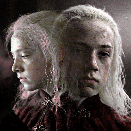
i’ll be using the first gif of the set you mentioned because it’s the one that needed the most color adjustments to get the red, other gifs didn’t need that much work and were fairly easy to get the color i wanted, so i’ll be going from this
to this
so starting, i work on each gif separately (crop, resize and color). the base gif will be the one where young aemond is looking to the front, tho honestly it doesn’t matter which gif you use as your base. once we’re satisfied with both of their colorings we go to the second gif which is the one of young aemond looking to the side, select both gif and coloring and click on the little folder on the bottom right corner highlighted with the red circle or just press ctrl+g on pc (cmd+g on mac i think)
we name it as ‘gif 2′ to know which gif is it and to not get confused. then we add a vector mask by clicking the little figure highlighted again with a red circle. do these steps for all the gifs you’re planning to blend, as it will group them all separately without their individual colorings overlapping each other
then we duplicate it and send it to the base gif and set the second gif to ‘screen’, though sometimes setting it to ‘lighten’ works too, it all depends on the gif so play with both to see which one looks better (trama = screen)
now is time to blend! for this i use a big brush like 200px, set to 0% hardness and 50% opacity, the bigger the brush and the lower the hardness, the softer the blending it’ll be, while using a smaller brush with an increased hardness, the blending will be sharper. we’re going to click on the base gif’s vector mask and with the brush set to black we’ll start to erase the left side of it, if we mess up then we set the brush to white by pressing ‘x’ and paint on it to correct anything. it should look like this
then we do the same with the second gif by erasing the right side and a little over aemond’s eye. personally i like to leave traces of both gifs so the blending looks smooth and nice. the end result should look like this
now is time to change aemond’s clothes to red! there are several ways to do this which is by using selective colors, hue/saturation, a gradient map or a new layer and paint over the gif, you can use one of these methods or several or all of them depending on your gif and the result you want to achieve. so we create a new folder atop our gifs and name it ‘red’ and create a selective colors layer, though the color isn’t that bright or strong i can see some green and maybe some cyan/blue tones on lil aemond’s clothes, so we adjust those colors to make the green pop up and set the selective colors layer to ‘color’, it should look like this
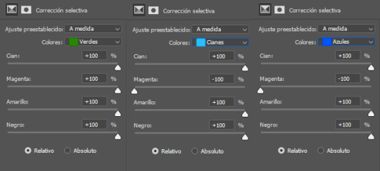
don’t worry too much if aemond’s face gets green and then red, we’ll fixed this later. now we create a hue/saturation layer, on the drop down menu we change the color to ‘green’ and drag the hue bar until the green changes to red or as close as possible to it, we do this for cyan and blues too (verde = green, cianes = cyan, azules = blue, sorry for ps being on spanish tho)
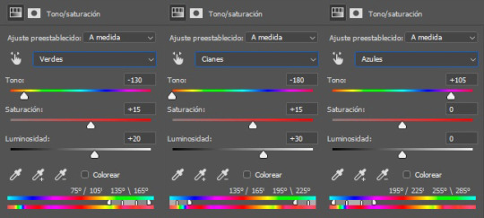
and voila! the green and cyan/blues had turned red
because the red looks dull and sad and needs to be brigthen up, we’re going to create a new selective colors layer and adjust the reds and yellows, like so:
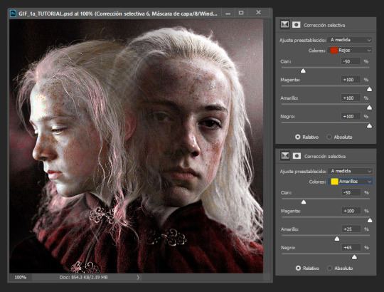
you’ll notice that lil aemond’s face and hair has turned red, to get rid of that we’re going to pick up our brush, set it to black and start erasing those parts on the vector mask on our latest selective color layer. once you’re done duplicate twice that layer and drag one of its vector masks to our first selective color layer and the second one to our hue/saturation layer and delete the duplicates without vector masks, that way you don’t have to erase on each one of the vector masks again, just tweak each one to your liking, repeat this step for future layers
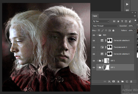
because i can see some yellow on left aemond’s hair and i want for it to be red so it blends with the rest of the color we then create a new hue/saturation layer, change the color to ‘yellow’ and set the hue to -65 and the lightness to +30. then we add a new selective colors layer and only work on the reds, we set everything to +100 though the cyan to -50. and lastly we add a new hue/saturation layer, change the color to ‘red’ and increase the saturation to +25. this will be the result. i’ve already done the step mentioned above about duplicating the vector masks
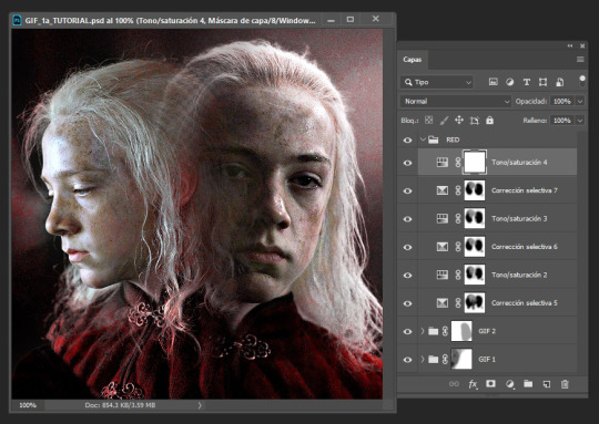
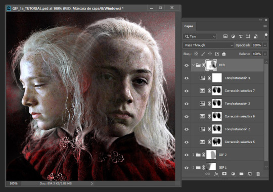
because there’s still some red on his hair and face and i’m lazy i select the folder named ‘red’, add a vector mask to it and just erased on it because i didn’t want to go and erase on each vector mask, too much work lol
i could very much leave the gif as it is but i felt it needed like a pop of color around it because the background is kinda dull and not that vibrant, so we create a new folder and name it ‘red layering’ (i need to name things or else i get confused), create a new layer, choose a vibrant yet deep shade of red (i’m using #b80505), pick up our brush (200px, 0% hardness, 50% opacity) and paint the background and a little over aemond’s clothes, set the layer to ‘tone’ and add a vector mask, like so:
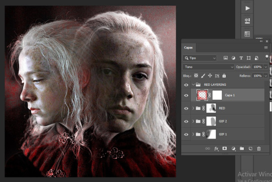
i like how setting the layer to ‘tone’ gives his hair a soft red outline on places that didn’t change to red, like around the top of his hair. so next we duplicate the layer, set it to ‘soft light’ and the opacity to 40%, and with our brush set to black erase any parts we don’t want, like a little on his hair, his face and over his clothes, and apply the step i mentioned about duplicated vector masks and tweak to your liking
for this type of gifs i like to set the speed to 0.06, and voila! the gif is done! you can add in some typography if you want to c:
worth mentioning that other gifs won’t need that many adjustment layers, like the purple and green ones for example they only needed two selective colors layers and a little bit of painting on a new layer to achieve those colors. hope this tutorial was of any help :3c
#usergif#completeresources#allresources#userwolfkissed#usernik#userbecca#tusercora#userelio#coloring tutorial#gif tutorial#tutorials#mytutorials#ps help
176 notes
·
View notes
Photo
TS4 Procreate Hair Editing Walkthrough (Subtitled + Voice Over)
The long-awaited hair editing kind-of-tutorial is here! I'm genuinely sorry for how long it has taken me to make this. My hair editing process is just not organized at all, which you can probably tell after watching this. This video is also unscripted, which I probably shouldn't do ever again lol! I hope that this video helps.
This video took over a week to put together, caption, and edit. My hair editing is also something I hold dearly to myself as part of a huge essence of my Sims editing style, and I’m really proud of how far I’ve come with hair editing/painting. I hope that you appreciate me sharing this with you!
✨ PLEASE CONSIDER SUPPORTING ME ON KOFI! ✨
Find the video below! Feel free to speed it up if you need to.
youtube
#myedits#mytutorials#ts4#simblr#sims#sims edit#sims tutorial#ts4 tutorial#ts4 editing#ts4 editing tutorial#hair painting tutorial#procreate#the sims 4#sims art#solstice-sims#procreate tutorial#digital art
251 notes
·
View notes
Text
Tutorial: Creating a Modal/Popup using <dialog>
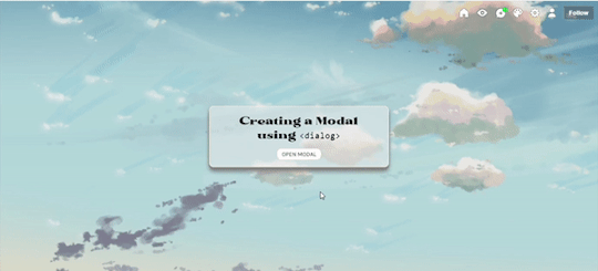
In this tutorial, I'll be sharing with you on how to create a popup/modal (herein states as modal) using <dialog>. Base code shall be provided for you to practise. Also, while it is rather a straightforward tutorial, it is recommended for you to have some knowledge of CSS and HTML as I will assume that you know a little bit about them.
[DEMO] [BASE CODE]
To create a modal, there are five parts that I'll be explaining which are:
The script
The open button
The modal + the close button
The backdrop
The Fade effect [Optional]
1. The Script
To ensure that your modal works, we need to add a script into our code. All you need to do is copy the code below and paste it before </body>:
<script> /// MODAL SCRIPT BY JASMIN @ https://phantasyreign.tumblr.com/ const body = document.querySelector("body"); const popup = document.querySelector("#modal"); const openModal = document.querySelector(".open-modal"); const closeModal = document.querySelector(".close-modal"); openModal.addEventListener("click", () => { modal.showModal(); body.style.overflow = "hidden"; }); modal.addEventListener("keydown", e => { if(e.keyCode === 27){ e.preventDefault() } }) closeModal.addEventListener("click", () => { modal.close(); body.style.overflow = "auto"; }); </script>
This script tells us three things:
When you click the open button, the modal will appear and you cannot scroll down the contents behind the modal;
When you press the esc key, it won't work;*
When you click the close button, the modal will disappear and you can scroll the blog as per usual.
*The reason why I include this part is because in the event if the blog contains a scroll bar, if a person press the esc key instead of clicking the close button, such scroll bar will not appear.
2. The Open Button
HTML
To add an open button, simply add the code below and paste it at the desired placement:
<button class="button open-modal">Open Modal</button>
Tips: If the design of your open and close button are the same, then I recommend if you include another class value of button inside your class attribute so that it'll be easier for you to code.
TAKE NOTE: Do not change the name of the open-modal.
CSS
If you know CSS, there are many ways to code a button. Nevertheless, for the purpose of this tutorial, I have customised the button (both the open and close button) as follows:
.button{ /*BASIC*/ background-color:white; border:1px solid #eee; border-radius:inherit; width:100px; outline:0; padding:.25rem .5rem; /*FONTS*/ font-family:karla; text-transform:uppercase; /*DO NOT TOUCH UNLESS YOU KNOW WHAT YOU'RE DOING*/ cursor:pointer; }
You can also use .open-modal instead of .button if you want to.
3. The Modal + The Close Button
HTML
To create the modal, we will be using <dialog>. To achieve it, we need to add the HTML before </body> and the <script>. Don't worry if you're confused, you can refer back to the base code to understand what I mean by before </body> and the <script>.
<dialog id="modal"> <p>This is your content <button class="button close-modal"> Close Modal </button> </dialog>
Depending on where you want to position your close button, you may need to change the position of your close button's HTML code before or after the content.
CSS
By default, the modal will not be shown without the open button and the script. However, since we have included the script as well as the open button, you can see that once you click the open button, the modal appears! To beautify it a little bit more, you can customise the modal as follow:
/*MODAL CONTENT*/ #modal{ /*BASICS*/ width:50%; background:rgb(238 238 238 / 0.9); border:1px solid lightyellow; border-radius:10px; padding:1rem 2rem; outline:0; /*DO NOT TOUCH UNLESS YOU KNOW WHAT YOU'RE DOING*/ max-height:50vh; overflow:auto; position:absolute; top:50%; left:50%; transform:translate(-50%, -50%); }
For the close button, feel free to use your own creativity to customise it! You can also use the same design as your open button as what you've seen inside the demo. If the position of your close button is the same as what has been shown in the demo, to center it, I added the following code:
.close-modal{ margin:0 auto; display:block; }
4. The Backdrop
We can think of backdrop as something similar as a lightbox in a photoset. By default, you can see that when a modal is opened, everything except for the modal turns darker. To customise the said backdrop, all you need to do is add this code:
/*MODAL BACKGROUND*/ #modal::backdrop{ backdrop-filter:blur(10px); background:rgb(238 238 238 / 0.25); }
Of course, you can also add background image and the likes if you know how to do so.
The Fade Effect [Optional]
In order to create the fade effect, we need to use the animation property. As such simply add the following code inside #modal and #modal::backdrop:
animation:1s fade ease-in-out;
As such, the both codes will look like this:
/*MODAL CONTENT*/ #modal{ /*BASICS*/ width:50%; background:rgb(238 238 238 / 0.9); border:1px solid #eee; border-radius:10px; padding:1rem 2rem; outline:0; /*DO NOT TOUCH UNLESS YOU KNOW WHAT YOU'RE DOING*/ max-height:50vh; overflow:auto; position:absolute; top:50%; left:50%; transform:translate(-50%, -50%); animation:1s fade ease-in-out; } /*MODAL BACKGROUND*/ #modal::backdrop{ backdrop-filter:blur(10px); background:rgb(238 238 238 / 0.25); animation:1s fade ease-in-out; }
After that, add this code after #modal::backdrop :
@keyframes fade{0%{opacity:0;}50%{opacity:1;}}
With that, you're done! Please like and/or reblog this if you found this tutorial helpful! Kindly credit me if you use this tutorial :)
65 notes
·
View notes
Note
Hi! I adore your gifsets! Could you please tell me if there’s any tutorial I could follow for the ripped book page effect like on your Rhaenyra and Alicent gifset?
hi thank you so much!! <3
i don't know if there's a tutorial for it but it's fairly easy if you're familiar with photoshop. all you need is a texture that resembles old paper (or you can just use a white layer) & a ripped paper edge brush. (link to the gifset)
1, first you'll type out your text to know how big your texture needs to be, then put the texture you choose under the text layer
2, create a group of the text layer & your texture and add a layer mask to the group
3, make sure your layer mask is selected, click on the brush tool (B) pick one of the ripped edge brushes and with black click on where you want the ripped effect to be. repeat this on every side, it should look something like this:
4. now comes the most important step in my opinion. you’re going to right click on the group, select blending options then inner shadow. this is going to give it depth. play around with the opacity & the angle to find what you like most

click okay and you’re done! i hope it was clear and i could help, if you have any more questions feel free to ask <3
18 notes
·
View notes
Text
Text Tone/ Ringtone
Open GarageBand
Click on the plus sign
Clcik Audio Recorder
Click on the Square Block (Third Icon from the left)
Click on the loop
Turn off Metronome
Click on files
Click on Brows Items from the Files App
Hard click on the mp3 that shows up on the menu and drag to work station
Click the small plus on the far right
Make Bars less than 30 for ring tone, 4 for text tone
Click on the down facing triangle and click my songs
Rename the file
Share to Ringtones
0 notes
Note
hi i'm sorry to bother you but do you have any tips on giffing dark indoor scenes? yours always look so good!
hi there! not a bother at all :) i can definitely try to explain the steps i usually take under the cut!
this tutorial will assume that you already know the basic steps of gif-making — if you don't, there are lots of great tutorials floating around on this site that can help you out! :)
here's the gif i'll work with to explain my steps, the bottom being the original and the top being the coloured/brightened version.
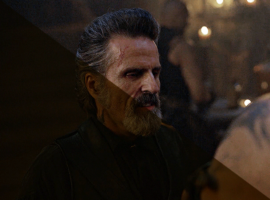
before we start, a general tip i recommend keeping in mind: if you want to brighten a dark scene, you'll want to get your hands on the highest quality download you can find. 1080p is decent, but if your laptop can handle 2160p 4k hdr files* without sounding like it's about to explode, that'll get you even better results!
(*colouring hdr 4k files requires a different set of steps — the scene will appear washed-out on photoshop, so you need to make sure that you don't end up whitewashing anyone if you do choose to work with this type of file.)
since most of my downloads are 1080p, i'll use this type of file in this tutorial.
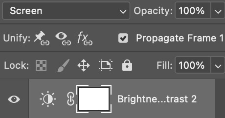
the first step of my gifmaking process with 1080p files is almost always the same no matter what scene i'm giffing. i make a brightness/contrast layer and set the blending mode to screen:
now my gif looks like this:
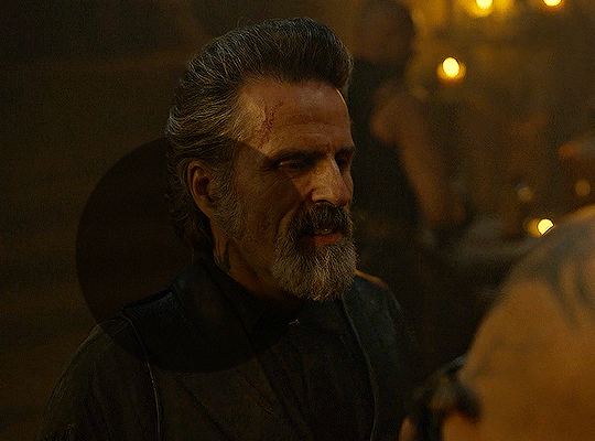
depending on the scene and how washed out it looks after this layer, i'll play around with the opacity. for this gif, i didn't touch the opacity at all. use your best judgement for this, because every scene is different!
i find that dark indoor scenes are usually tinted in yellow or green. one of my first goals is to try to fix the undertone of this scene before focusing on brightening it any further. i go to colour balance for this, and play around with the midtones, shadows, and highlights.
again, every scene is different, so the amount to which you use colour balance will differ, but for this specific scene, my goal was to neutralize the yellow. i focused particularly on the midtones and shadows of the colour balance layer, moving the scales to the opposite of the reds.
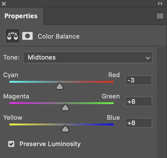
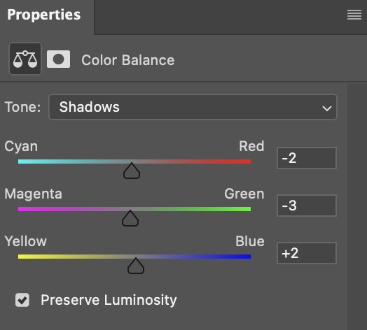
doing so will help with neutralizing the yellow. the only reason i moved the scales towards magenta and blue (therefore making it a bit more red than less) rather than green and yellow in shadows was because i wanted a darker contrast in the blacks. moving them to green and yellow made the overall scene more yellow since there were so many dark spots that shadows affected. (you'll see what i mean when you start experimenting with your own gif — this part of the process really just depends on your preferences!)
our gif might not look that much better yet, but it will soon! our best friend channel mixer is gonna help us out. for an in-depth post about how to use this adjustment layer, i recommend checking out this tutorial.
i'm someone who prefers to make more than one layer for the same adjustment layer for a reason i can't even explain (i just find that it helps me stay more organized). so don't think of this process like i can only use this layer once so i MUST fix it NOW. you can create multiple layers of the same adjustment layer, because every layer on top will affect the ones underneath it.
since my priority is getting rid of the yellow tint, i went to the Blue section of the channel mixer and increased it in all of the scales:
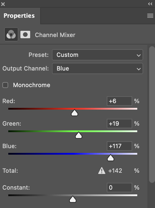
this step alone has helped us out so much, because look at our gif now!
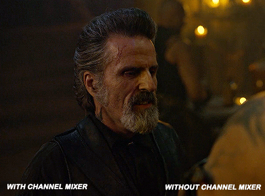
not only does the background look less yellow, but so does izzy's skintone.
now i'm going to focus on trying to brighten the scene even more without destroying the quality. the levels layer can actually help out a lot with this.
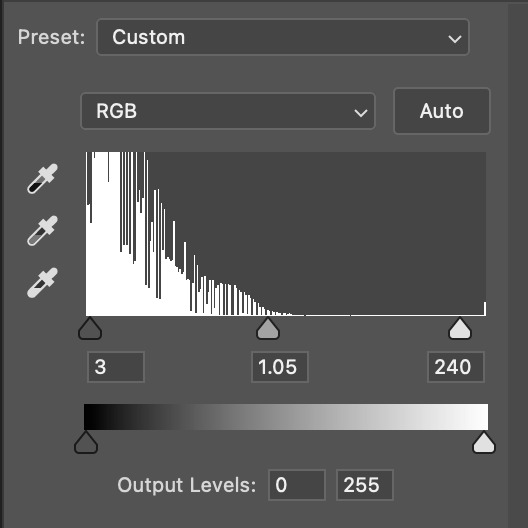
the amount to which i move each toggle differs per scene, and i think experimenting depending on your gif works best for this layer.
side note: i prefer not to use the ink droppers on the side because the contrast in the result usually ends up feeling too strong for my preferences, but if you find that this works better for you, then go for it! basically, the first dropper with the black ink should be clicked before you select the darkest part of the scene that you can find, and vice versa for the third dropper with the white ink — click it, and then select the brightest part of your scene.
curves is the next layer that does fantastic work! unlike the levels layer, i do actually use the ink droppers for this. it's the same concept, with the first dropper being used on the darkest part of the scene, and the third dropper on the brightest.
try to think of curves as something that not only further brightens your scene, but also helps with the colour neutralizing process.
i grab the first dropper, then click the darkest parts of the gif that i can see. depending on the undertone of the blacks that you're clicking on, the tint of your gif might actually change significantly. this is why i prefer to click once, then undo the action if i don't like what it gives me. izzy's leather jacket was the sweet spot for this gif.
when i'm satisfied, i make another curves layer and use the third dropper to click the bright/white parts of the scene. for this gif in particular, the lights in the background were a good fit because they carried a yellow undertone — this meant that my curves layer actually helped to further neutralize the yellows in the scene as a whole!
(i manually dragged the curves graph upwards for the third dropper to make it brighter. i don't need to do this if the dropper does this for me automatically, but since the lights were pretty bright, it only changed the tone of the scene and didn't increase the brightness — hence the manual step.)
pat yourself on the back, because this is what our gif looks like now!
this is good, but it's not great — there's still just a bit too much yellow in the scene for my liking (sorry, i'm picky! :P)
i created another channel mixer layer and played with the toggles until i was satisfied:
ta-da! the gif as a whole is much less red/yellow now:
this is when i start fixing the colouring now — namely, his skin tone. selective colour will be your best friend here. i wanted to make his face just a tad brighter and less of a yellow-ish magenta shade, so i focused on the reds and yellows.
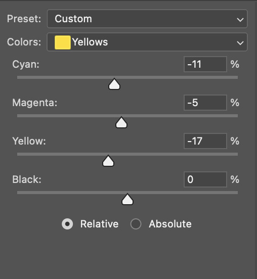
then, out of habit, i created another selective colour layer and took out more of the "yellow" in the whites to make them whiter, and increased the black (just by +1, since the contrast is pretty good enough already).
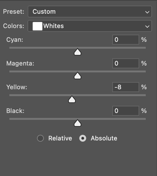
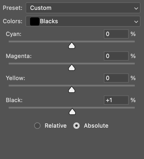
note: i switched to "absolute" for these two colours. basically, relative = less vibrant colour manipulation, and absolute = more vibrant/stronger colour manipulation. i prefer to stick to "relative" for fixing skin-tone since "absolute" can be a bit too strong for that.
our gif looks like this now!

his face looks brighter and much less yellow, so i'm satisfied!
this next step is not mandatory at all — again, i'm just picky and despise yellow-tinted scenes. i personally believe that indoor scenes that are yellow/green tinted make them look more dark than they actually are, so i do my best to get rid of these colours.
i also don't always do this, but for this gif, i just simply went to hue/saturation, selected the yellows from the drop-down menu and decreased its saturation.
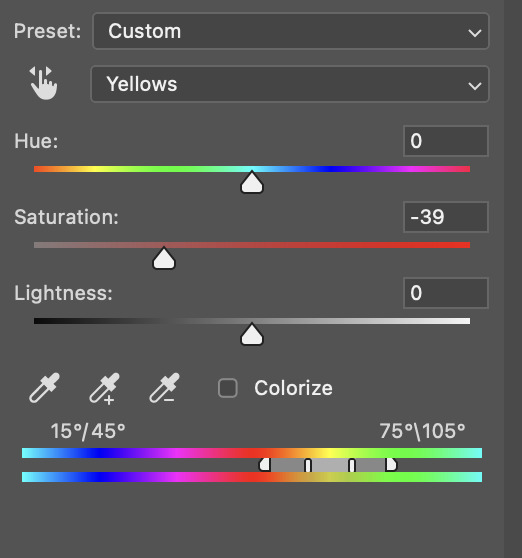
be careful not to do this too much. depending on the quality of your download, this can significantly decrease your gif quality. i tend to worry less about this when i'm working with 2160p files, but again, those files require an entirely different set of steps when it comes to brightening/colouring.
since this was a 1080p file download (and one that was actually less than 1GB, oops, don't do that), i played it safe and decreased it by -39 only.
note: you also want to be cautious of colour-washing skintone when it comes to this step. i find that another selective colour layer can help perfect the skintone in case the yellow drains out of it too much, but skip the hue/saturation step if it's too difficult to work with — better to be safe than sorry.
anyway, this is the final gif!
that's usually what i do when it comes to colouring dark indoor scenes! i hope this tutorial makes sense, and if you have any further questions, don't hesitate to reach out! :)
#tutorial#gif tutorial#resources#completeresources#coloring tutorial#allresources#dailyresources#userraffa#userdean#uservivaldi#alielook#usercats#usermoonchild#usernaureen#userbarrow#userabs#useraish#useralison#userisaiah#*mytutorials#i am so sorry if this is incoherent#it’s so hard to explain things coherently 😫
613 notes
·
View notes
Text

✦ Okay, I give in. Let's upload our gifs on the beta editor to prepare for a gif pack page. Resources are available at the bottom, so lets get started !!
So first things first, you can only upload 30 gifs at a time. Now for me, I will always upload as I gif, around every 20 gifs, then upload to the page (this also ensures I don't skip any or have doubles) and keep gifing. That used to mean that I don't have to wait for tumblr to load 300 gifs and die from impatience. For the rest of y'all that means you're going to have to batch upload. I know, I'm sorry.
Note: With the help of @nataliealynlind we discovered that the daily limit is 250 gifs! So if you have more than that, prepare to upload your gifs over the course of a couple days or use a second blog. (imo this is another great reason to upload as you gif! that way you don't have to get stuck at 250!)
So after you upload your gifs (in this case I only did 10)*, you're going to go to the gear at the top of your post and click it. Then scroll all the way to the bottom where it says Text Editor. This looks familiar, right?
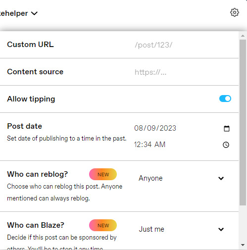
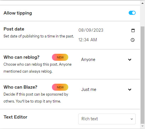
*Note: If you don't save it as a draft first, your gifs will be in .gif format, not .gifv. This means you can skip removing this tag later on, but I'm not sure if gifs that are uploaded but never saved/drafted will later disappear at some point. To be safe, I would save it as a draft. I just forgot at this part tbh
Well the good news is, you only have to change this once! The bad news is, we don't do Markdown then HTML anymore bc Markdown doesn't strip any of the code anymore 🙃 So just change it to HTML
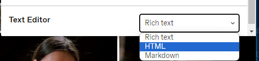
Now it should look like this! Fun!
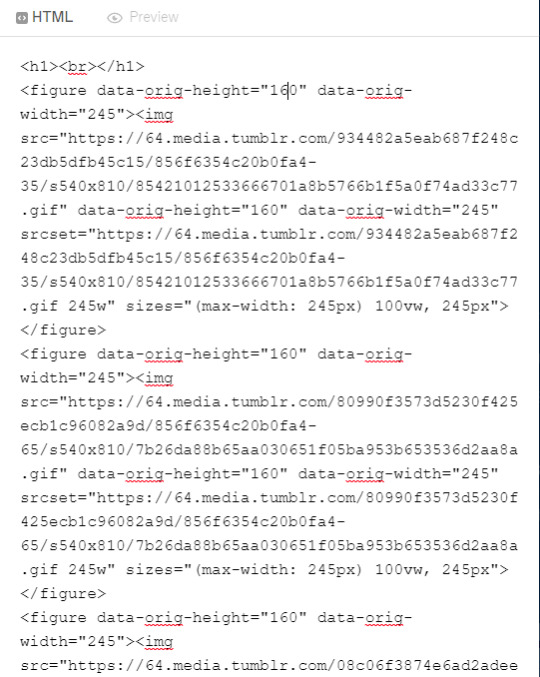
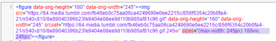
Okay, now we're going to copy that text and take it on over to our new best friend, the HTML Cleaner! So you're going to want to paste it on the right side of the screen. Your gifs should appear on the left side. If both sides have text, that's how you know you pasted it on the left.
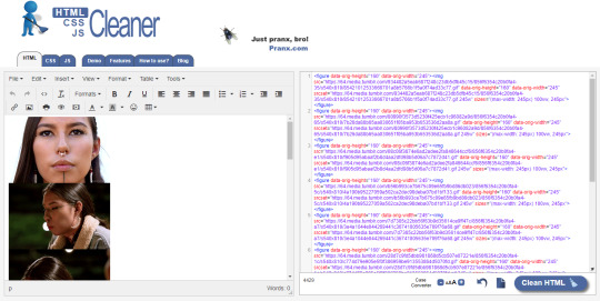
So in order to get ride of all this extra code, it's going to take a couple extra steps. First, you're going to check these boxes on the left hand side.
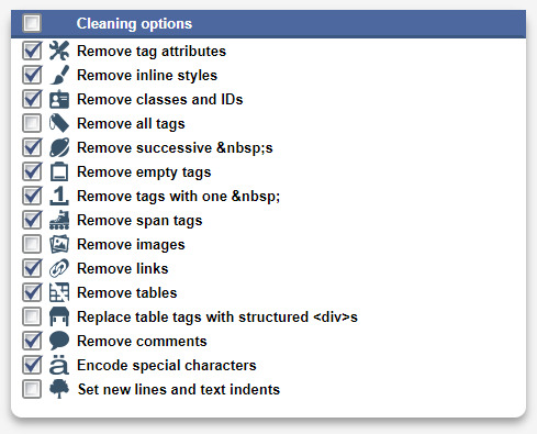
Now, on the right hand side, you're going to enter these under Find and Replace (copy/paste section below!!). I know you're like, uh what? Where the hell did you get those numbers? Well, I got them from our gif post code!
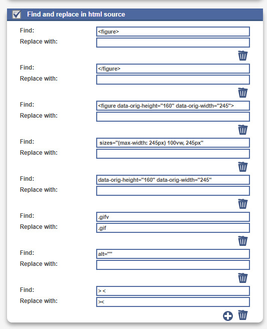

For easy copy pasting:
Find: <figure>
Replace: (leave blank)
Find: </figure>
Replace: (leave blank)
So after you add the specific widths for your gifs, you're also going to want to add the following:
Find: .gifv
Replace: .gif
Find: alt=""
Replace: (leave blank)
Find: /> <
Replace: /><
NOTE: If your gifs are usually the same size, I would recommend saving these snippits above on your computer's sticky notes or a draft to copy/paste for future uploads! While I do appreciate the viewer traffic, I'm sure coming to this tutorial every time is gonna get old real fast.
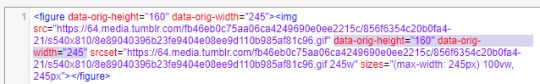
After all that, click Clean HTML
And now, your code should look like this! If there's still a space between your image links, just click Clean HTML again and it should get rid of it!

Now your code is nice and clean to put into your gif pages! Not quite sure how to do that? Read the Setting Up Your Sidepage section in this older tutorial!!
Resources
HTML Cleaner
My Gif Pack Page Codes
Recommended Gif Pack Page Codes (tag)
Previous Tutorial (How to upload to a Standard Sidepage)
Barebones Code (for previous tutorial)
#rpc#rph#gif pack tutorial#uploading gifs on beta#rp tutorial#beta editor tutorial#mytutorial#rp guide#me: i'm tired of this (remaking this tutorial every other year) grandpa#tumblr changing posts every five minutes: that's too damn bad!
159 notes
·
View notes
Note
hii! <333 how do u make ur gifs look pretty and with different colors?
hello nonny!! this is really nice!
i assume you mean something like what i did on this or this gifset?
i usually refer back to some great tutorials, such as this one or this one. and then there's this.
i do use adobe photoshop, but there's also some great tutorials on how to use the free photopea software by @heroeddiemunson tagged /mytutorials
i hope this is what you had in mind, otherwise feel free to ask again!!
5 notes
·
View notes
Photo
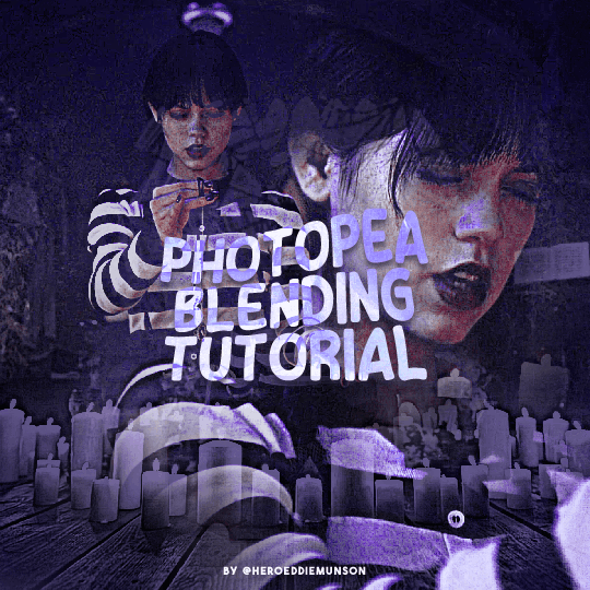
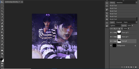
PHOTOPEA BLENDING TUTORIAL by kai @heroeddiemunson
howdy! i’m back with another tutorial for photopea :) nobody asked for this one, but i have noticed people who have reblogged my gifsets commenting on my blending, and i thought it’d be cool to have a tutorial on how i do it!
what you need:
photopea (basically photoshop in your browser, completely free!)
basic giffing knowledge, because i won’t cover it in this tutorial (other tutorials: tutorial by @benoitblanc, tutorial by @ashleysolsen)
decide what scenes you’re going to be blending; i don’t recommend blending more than three gifs together, just for the sake of being able to see what all your gifs are. for this tutorial, i will blending three gifs together. also make sure that all of your gifs are the same amount of frames as well, otherwise this blending tutorial won’t work!
step one: making your individual gifs
first thing’s first: you need to make the individual gifs you’re going to be blending. make sure when you’re cropping these gifs, you have a sort of understanding of what they will look like together; you can check this by right clicking on one gif, selecting duplicate to, and choosing the gif you’re going to be blending it with. on the other gif, you should have the duplicated version of the first gif on top. here’s what my work station looks like after i’ve duplicated two of my three gifs onto the third gif’s canvas:

now you can change the opacity of the gif(s) you have layered. here’s an example of what my three gifs may look like when they’re blended together (the middle gif is at 50% opacity, and the top gif is at 30% opacity):

since none of these gifs have been colored yet, it may be a little hard to see, so feel free to play around with the opacities of your gifs to make sure that you cropped them how you want them to be blended. i like my crops, so now i can color each of these gifs individually!
when i’m blending gifs, i like to think of them as my “base” and “flavor” gifs. “base” gifs i tend to keep simple, usually with some sort of color overlay on top of them to make the “flavor” gifs pop out more. below is what my “base” and “flavor” gifs look like individually before i’ve sharpened/blended them:

for my “base” gif, i colored it as normal, and then went to layer > new adjustment layer > gradient map; from here, i clicked the black to white gradient in the pop up, and then chose the white color and changed it to the color that i wanted (in this case, the hex code #b7a6ff). my “flavor” gifs are colored as i would color any other gif i’d make that isn’t blended.
save your psds of these gifs, sharpen, and go to file > export as > GIF. now you have the gifs you’re going to blend! great job! :)
step two: making your blended gifs’ canvas
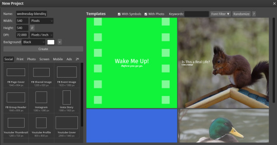
now that we have our gifs we’re going to blend, we have to have a “canvas” to put them on. to do this, go to file > new… and make a new canvas. make sure the canvas is the same size as your crops, and your background is set to black! below is what i did for the gifs i’m going to be blending:
now to put our gifs that we made onto this canvas! unfortunately, photopea doesn’t allow you to use the open & place feature for gifs, so we’ll have to go to file > open and open our gifs individually. similarly to what we did in step one, right click your gifs and select duplicate to and duplicate the gifs you will be blending into your new canvas.
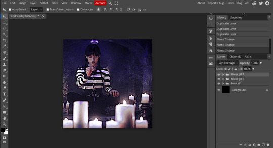
now your canvas will look something like this:
and we can move on to the fun part, which is actually blending the gifs together!
step three: blending!
so, when blending gifs, there’s a lot of ways to do it. i’ve found that blending gifs is a lot of experimentation, since you’ll probably never find yourself blending two gifs the same way every time.
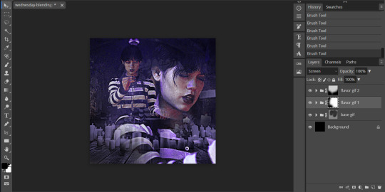
for now, let’s change the blending modes (drop down menu above the layers panel; it should say “pass through” right now) for each of the gifs, that we can actually see them as we blend them.
for my “base” gif, i always set the blending mode to “lighten” no matter what. but the fun thing about your flavor gifs is you actually have a fun choice of choosing either “lighten” or “screen”, depending on what you want the gif to look like. below i show the difference of what “lighten” or “screen” look like for each of my flavor gifs:

i personally really like what it looks like with my first “flavor” gif with the “screen” blending mode and the second “flavor” gif with the “lighten” blending mode, so that’s what i’ll be doing; but it always depends on your gifs that you’re blending and what you want it to look like, so do what works best for you!
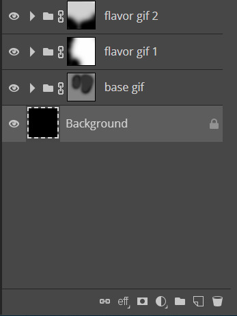
so as you could probably see from my screenshots or your own gifs, sometimes it gets a little hard to see your gifs. to fix this (and probably my favorite part of the blending process), select one of your gifs, and then look below your layer panel to click the “add raster mask” button (it looks like a little rectangle with a circle in the middle of it). do this same step for each of the gifs you will be blending, and your layers panel should look something like this (i’ve also highlighted the “add raster mask” button):

the raster masks are white, which means anything white is something you can see. using black with the brush tool gets rid of parts of the gif that may be visible. for example, this is what my gif looks like after playing around with getting rid of some of the stuff that was covering the parts of other gifs i wanted visible:
but to me, the black is a little too intense, as it gets rid of a lot of the gifs. but we’re in luck: the best thing about raster masks is that you can use various shades of grey to really blend your gifs together in unique ways by changing the colors in the bottom left corner. below i have a couple screenshots of what my blending for these gifs look like, as well as what my layers look like with the different shades of grey i used:
and now, our gif is almost finished! make sure to save your canvas as a psd, just so you don’t lose any of the work you’ve done.
step four: finishing touches
before we save this gif as a gif, i want to do some finishing touches. as we all know about me, i love myself some very colorful gifs, and i want the purple to stand out more in this gif. to do this, go to layer > add adjustment layer > gradient map and do like what we did for the “base” gif to make the same black to purple gradient we did before.
on the gradient map layer’s raster mask, use your brush tool like you used for erasing parts of your gif in order to erase part of this layer. i personally make my brush 1000px large and with 0% hardness into what i like to call my “big fluffy brush” (which makes no sense, because it isn’t fluffy, but it’s what i call it anyway). doing your best to center your brush in the middle of your gif and left clicking once should get rid of most of the gradient map’s color, but feel free to click again if you’d like. here’s what my gif looks like after two clicks of my big fluffy brush:

that doesn’t add much more color, but that’s okay, because it does add more contrast for us. go to layer > add fill layer > color fill and put in the color you have been using (in my case, that purple color). like the last layer, do your best to center your big fluffy brush and left click until you’re satisfied. here’s what my gif looks like after two clicks:

from here, i change the blending mode to “color”, and set the opacity at 50%. i then right click and choose duplicate layer, and with this new layer, change the blending mode again to “soft light” and set the opacity at 25%. now my gif looks like this:

now my gif is much more colorful! from here, i’ll add some typography and whatever else to my finishing touches before i once again save this psd so i don’t lose my progress. and now we can move to the final step!
step five: exporting
before we can export our gif, we have to combine our gifs together so they act as one singular blended gif rather than multiple separate gifs on one canvas. go to layer > animation > merge, and your individual gifs should be combined into one gif on your layers panel something like this:

and now, you can go to file > export as > GIF. make sure your gifs move together as you want them to, as well as that it’s until 10MB, and viola! congrats, you’ve just blended together a gif! :)
#photopea tutorial#photopea gif tutorial#completeresources#allresources#userars#userzesty#tusersai#dailyresources#gif tutorial#photopea#mystuff#mytutorials#hopefully i explained this good enough#feel free to send me asks if i said something confusing sjdhldsf
349 notes
·
View notes
Note
Do you have any tips/tutorials on how to draw legs?
idk things r hard to explain cause i learn by lookin at stuff rather than reading so this might not be anything

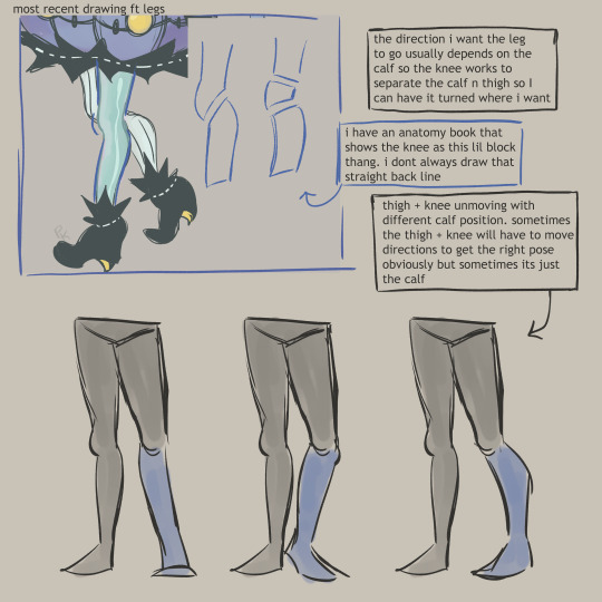

#my art is like always emulating other ppls styles but i cant even give u urls cause i always forget em.....#i know i didnt always draw legs like this hmmmmm#asks#anon#mytutorials#myart
209 notes
·
View notes
Note
how is your lineart so clean? your art in general is so smooth and pretty!
ah, thank you so much! lineart is my fave step <333
usually what I do to get clean lineart is:
long "confident" strokes (something I still work on)
i have a pen with tapered opacity, so i can overlap strokes and they don't look as messy*
the most important step to me: having a really detailed sketch. for me, my sketch has everything in place, so that when I get to lineart, it's completely mindless. I'm not having to do much "creating" at this stage, because all the heavy lifting was done in my sketch. this means i'm not redrawing things (most of the time) or trying to get them perfect at the lineart stage and i can just ink
(secret step 4) it's not actually that clean all the time:
*this is my most beloved method of doing lineart, but i'm not sure i recommend it because having an pressure sensitive brush is really making my hand hurt from pressing too hard, so I'm trying to find other ways to get the same effect without giving myself wrist problems 😭😭 so maybe try velocity sensitive for your opacity
#im not sure if this was a rhetorical compliment or if you really wanted an answer.......um#thank you for the ask though!!! so sweet :')#im happy people like my lineart because i love doing it and sometimes it gets covered so this makes my day :))#asks#mytutorials
82 notes
·
View notes
Photo
An anon recently asked me what process I use to color my gifs, and the short answer is: gradient maps! But since that process is a bit difficult to explain succinctly, I thought it was best to turn it into a tutorial. I don’t color all my gifs this way, but it is my favorite and most frequently-used method.
This tutorial assumes you have a basic understanding of gifmaking (cropping, sharpening, etc), and are using the timeline in photoshop. Tutorial under the cut!
1. Basic Adjustments
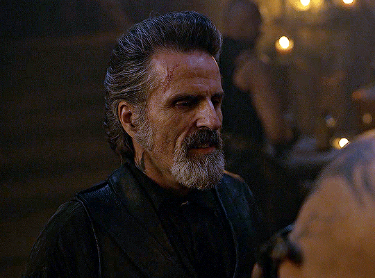
Alright, so here is what I’m starting with - the gif after just being cropped and sharpened, no coloring yet:
Before I start any coloring, I do a couple basic adjustment layers. I usually start with brightness/contrast, then curves (using the dark and light eyedropper tool), and levels. Here’s the gif now, after applying those basic adjustments:
2. Channel Mixer (if necessary)
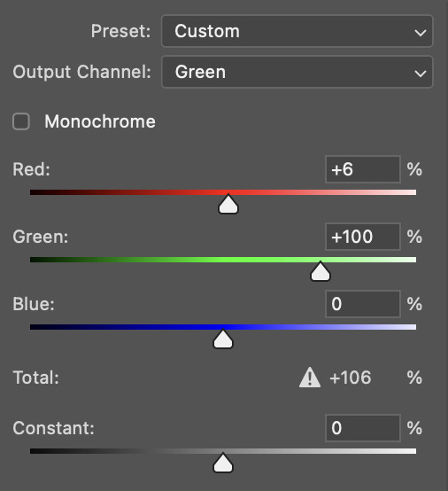
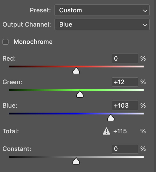
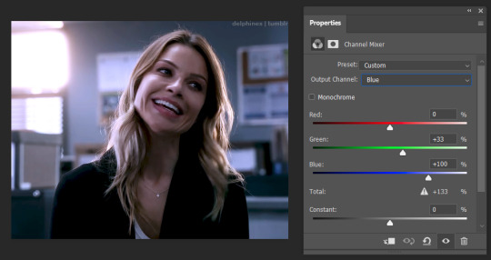
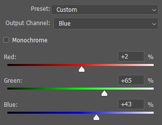
Some shows/scenes have very strong filters put on them already, a fact most gifmakers are painfully aware of. These filters can make scenes challenging to color because you’re not starting from a neutral base, but thankfully there is a solution: the channel mixer! This adjustment layer is explained in more detail in this wonderful tutorial by @selinakyle, but essentially it allows you to isolate certain colors to correct them more accurately.
For this scene, I’ll be using the channel mixer to counteract the strong yellow-green filter that’s already baked into the footage. As you can see from my settings below, I’ve set the output channel to “blue” and then adjusted the “green” slider. That means that I’m adding blue into the green tones in the image. This will remove that yellow-green tint from my gif and allow me to start coloring with a better base.
3. Color Balance
Next, I add a color balance layer. This layer allows you to adjust the color of the shadows, midtones, and highlights of your gif separately. To be honest, I feel like this layer is all about experimentation; you never know what’s going to look good until you test it. You can see me testing out the sliders below.
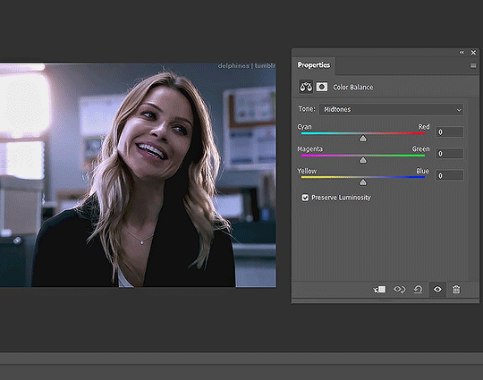
It’s not usually a good idea to move the sliders around as drastically as I did here, I did that to give you a visual of how much the color balance layer can change the look of your gif.
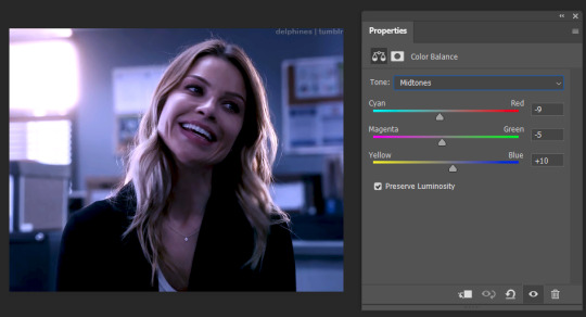
The color balance settings I ended up going with are below. You can only see my midtone settings here, but my shadow and highlight settings are similar.
4. Adding the Gradient Map
After the basic coloring’s done, I add a gradient map, which is also located in the adjustment layer panel.

When you first add a gradient map, it will automatically add a gradient of your foreground and background colors, which is usually not the look you’re going for. To edit the gradient, simply click on the gradient itself in the properties panel and it will open up the gradient editor.
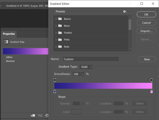
In the gradient editor, click the tiny squares on the bottom of the gradient to edit each side of it. You can also add more colors to the gradient as well if you want more than two. It’s usually a good idea to put the darker color(s) on the left and the lighter color(s) on the right so that they correspond to the shadows and highlights properly.
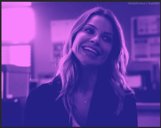
Now that my gradient is added and the colors changed to my liking, my gif looks like this:
5. Adjusting the Gradient Map
The colors are nice, but I don’t like the way they just sit on top of the image, I want the gradient to look more natural. So it’s time to adjust the gradient map’s blending mode.
Every adjustment layer’s blending mode is set to normal by default. Adjusting it is easy - simply go to the layers panel, click the button that says “normal,” and scroll through the choices in the drop-down menu.

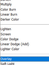
Like so many parts of coloring, which blending mode works best really depends on the scene and the look you’re going for. I usually start with overlay and see how it looks, but other popular blending modes are multiply, soft light, and color. I’ve also used hue and color burn.
For this gif, I decided to use overlay. Now that it’s been changed, my gif looks like this:
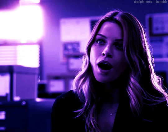
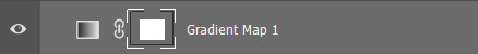
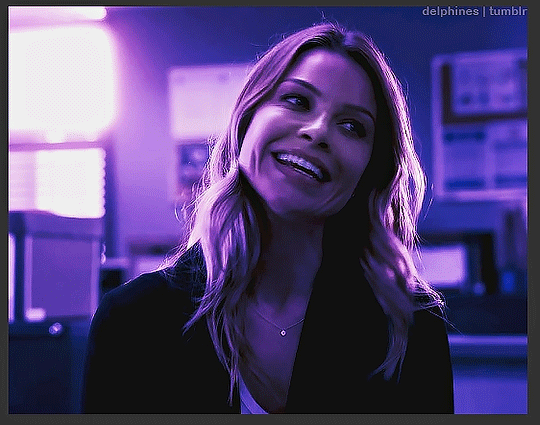
6. Adding a Layer Mask
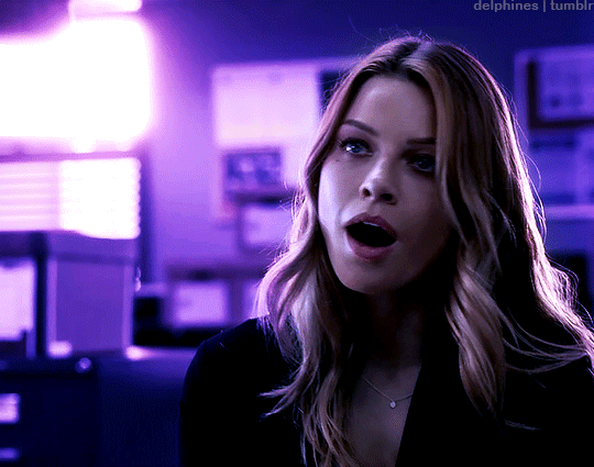
The purple color looks great, but now the character looks unnaturally purple as well. In order to remove the purple from her face and hair, we’ll need to add a layer mask.
To add a layer mask, select the gradient map layer and then click the icon at the bottom of the layers panel that looks like a box with a circle in it.

After you click it, a small white box should appear beside your layer’s name.
Make sure it’s selected, then select the brush tool. Set the brush to black, increase the size if necessary, then start painting over the character’s face. Painting on the layer mask will obscure part of the gradient map layer itself, so that only the basic coloring we did before is visible. The darker the brush, the more opaquely it will remove the gradient map. Also, the larger the brush, the softer the look. Since I want a soft edge to my layer mask, I’m using a larger brush.
This is what a layer mask in progress looks like:
7. Keyframes
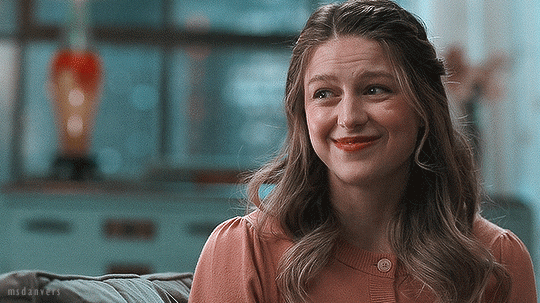
Now I’ve successfully removed the purple from the character’s face - so I should be done, right? Well, let’s export the gif and see:
Nope, still not ready. The layer mask I added is stationary, but the gif itself is not. This character moves around quite a bit, and since the layer mask stays still, it means that she dips in and out of the purple and sometimes reveals spots of the basic coloring on the wall behind her.
To fix this, we have to animate the layer mask so that it moves with her. We’ll do this using keyframes. To add keyframes, you’ll first need to unlink the layer mask. Go into the layers panel and click the little chain icon next to the mask.


Once the chain icon has disappeared, the mask is unlinked from the layer.
Next, go into the timeline, find the proper layer, and click the drop down arrow on the left side. This should show you a list of properties with little stopwatch icons beside them.
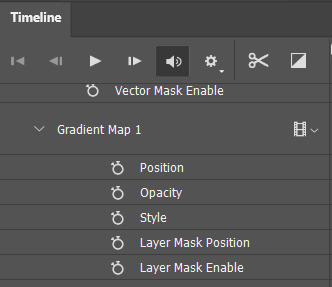
Each stopwatch toggles the keyframes for their respective property. Since we want to animate the layer mask position, we’ll want to click the stopwatch beside “layer mask position.” Now, it should show a small diamond beside the stopwatch - this means that keyframes have been enabled.
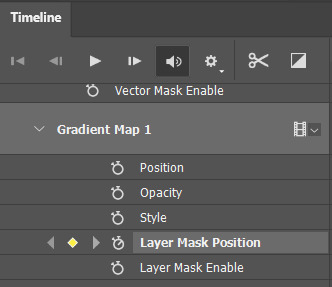
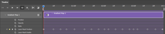
To animate the mask, make sure the timeline slider is placed at the very beginning of the gif. Drag it slowly across the timeline and stop as soon as the character moves beyond the mask. When this happens, use the move tool (do NOT use the transform tool/ctrl + t!) to drag the layer mask into the proper position.

Since keyframes are already enabled, every time you move the layer mask, you will create a new keyframe. This means that photoshop will animate the space between the two keyframes automatically. You’ll know that you’ve added a new keyframe when a small diamond shape appears at your slider’s position in the timeline.
Continue doing this throughout the whole gif, being careful to move slowly, as it’s very easy to miss a spot if you go too fast. This is how many keyframes I ended up creating for this gif:
Once you’ve gone through the entire gif, you’re done!
8. Exporting the Gif
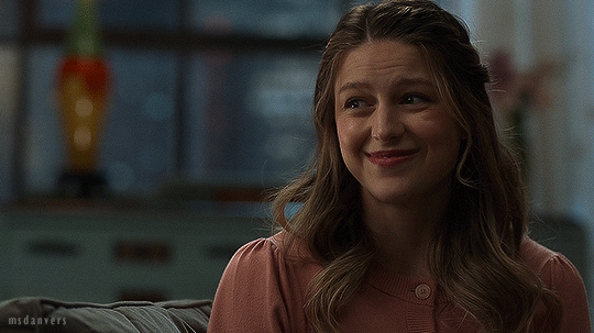
Something that’s annoying about using keyframes is that, when you either convert back to frames or save and open the gif separately to adjust the frame delay, your frames will be duplicated. What does this mean? It means your gif will look like this:

Not great. The solution is easy, but tedious. Simply select every other frame and delete them before changing the frame delay (0.05 is the standard) and exporting. Now the gif should animate at the proper speed:

And you’re done!
I feel like a lot of coloring/keyframes/etc is really hard to explain, especially through text, so feel free to send me an ask if you need further clarification. Also, my lovely friend Sole (@fionagallaqher) recently made this tutorial using a very, very similar coloring method, where she explains both how to use keyframes and how to color frame by frame. Please check that out if you’re interested in learning more!
#mytutorials#rambling#usersole#useralison#userannalise#useryoshi#userelio#tusersoph#usershreyu#uservalentina#userfnuggi#uservivaldi#supervalcsi#usernums#tuserkay#userkarolina#tuserrex#userdean#usercera#usernorah#tuserjen
434 notes
·
View notes
Note
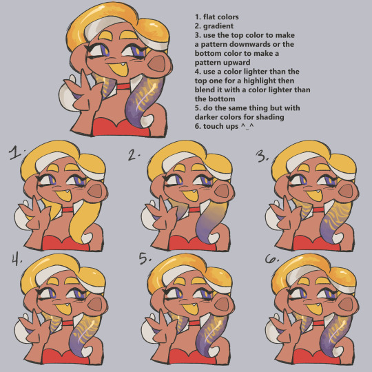
Helloooo! Your header and gifs in general are very pretty could you please make a tutorial on how you colour them?
oh hi!! thank you!! you can check out these posts in which i explain some other things and give some tips!!
but since you asked about the header, i'll do a quick tutorial for that as well. if you have any questions, don't hesitate to ask!
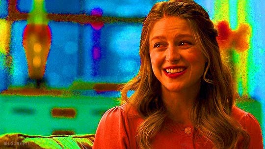
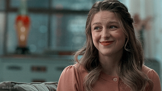
step 1. make your gif & sharpen it! (you can do the sharpening at the end too, i don't think it matters). for reference, this is what it looks like:
step 2. exposure! i used three adjustment layers:
a) levels. these are my settings:

b) exposure: +0,29 and gamma correction 1,01.
c) brightness/contrast: brightness +27.
step 3. let's start coloring! first, i often check which colors i'm working with in a gif by adding a hue/saturation layer and moving the saturation slider all the way to +100, like this:
(pretty isn't she)
so as you can see there's a lot of greens in the lower half, the windows are mostly blue/cyan and kara herself is yellow/red. it's good to know this because when you start changing colors, you gotta know which part of your gif is actually going to be affected!
okay, now turn that layer off! you can keep it at the top of your layers the whole time you're working on your gif so you can turn it on to check on your colors every once in a while.
step 4. color balance. making the shadows more cyan and blue and the highlights (or midtones) more red and yellow adds a little contrast to your colors that can look good!
what i did for this one: midtones cyan-red slider +9, yellow-blue slider -7, shadows cyan-red slider -14, yellow-blue slider +1.
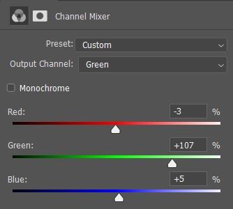
step 5. channel mixer (my beloved). here's a very good tutorial for coloring tinted shots, with a link in it to another tutorial that explains channel mixer very well! i used two channel mixer layers, this is the first one (with the opacity set to 55 percent, otherwise the changes would be too intense):
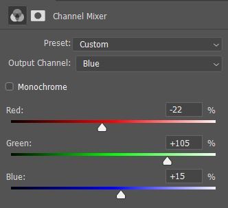
and the second one, opacity set to 58:
this is what the gif looks like rn:
see how the windows and the lower half of the background are kind of the same color now?
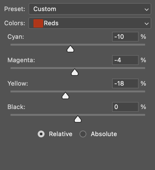
step 6. selective color: go to reds, and move the black slider to +8 (this will make the reds darker)
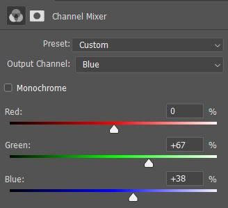
step 7. another channel mixer, to make the background less green and more blue/cyan, opacity set to 26 percent:
step 8. vibrance!! move the vibrance slider to +58 (vibrance, not saturation! saturation affects all pixels and vibrance only affects the less dominant colors, so it's more subtle)
step 9. final adjustments - does it look bright enough? vibrant enough? does it need more contrast? and, check which colors are in your gif by clicking on that hue/saturation layer from step 3 again. for example, if there are stray green pixels in the background, it could look better if you remove all green saturation. removing colors is a good way to put the focus on the colors that you do want to show!
and we're done!
#good luck :) and have a good weekend!!!#answered#anonymous#mytutorials#tumblr only allowed 10 pictures so i had to remove some of them </3 hope those parts still make sense!!
26 notes
·
View notes
Last Seen Blogs

frenchcoilbuilder-blog
Sans titre
swallowingobscurity
gloom
tynot4long
Untytled
sarahturnbulluniverse
SarahC1995