#all colors are good it just depends on visual context
Text
unfortunately beige can be a really nice color actually but rich people are so fucking bad at it
#all colors are good it just depends on visual context#anyone who's like 'ugh i hate yellow' okay you hate the shining golden yolk of a runny egg? you hate dandelions in the spring??#anyway. my preference for earthy tones has expanded to include what people call 'neutrals' i.e. a lot of white and brown shades#this is not apologism for the rich people minimalism/neutrals hellscape theyre soo bad#kardashian all white house or whatever special circle of hell. die. but white itself can be nice color we dont need to renounce it entirely
88 notes
·
View notes
Text
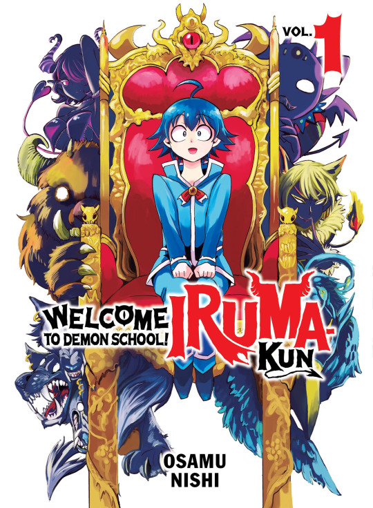
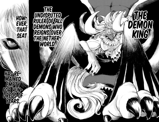
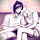
Welcome To Demon School! Iruma-Kun Volume 1: The Misfits
It's been several years at this point since I stumbled across Iruma-Kun as an anime. Three seasons deep with all sorts of content and arcs, and a mountain of manga chapters and volumes I never thought I'd get in English. But it's here. Somehow, it's made it here and I'm endlessly excited about that. How does it measure up to the anime? How does the source material differ? What's the art style like? Is there any dropped content? How does the pacing compare? So, so many questions that I can finally answer.
The short of it though? People should absolutely be picking up this manga. It's friendly and welcoming for all ages without feeling too childish or mature, Kodansha's giving it a nice and quick release schedule, it's got 3 Seasons of anime to watch to see if you'll like it, and there's plenty of spinoffs that have a chance to make it over here if this release does well!
⚠️Warning: Spoilers Ahead⚠️
I think the most noticeable difference is in the art. To summarize it, Nishi's style in the manga is rather different to the anime. It's what you might call malleable. The proportions, lighting, even aspects of the core character design ebb and flow depending on the scene they're in. Line thickness and texture moves around, shading and color differs from character to character, and even chibi designs have wiggle room in how they're shown.
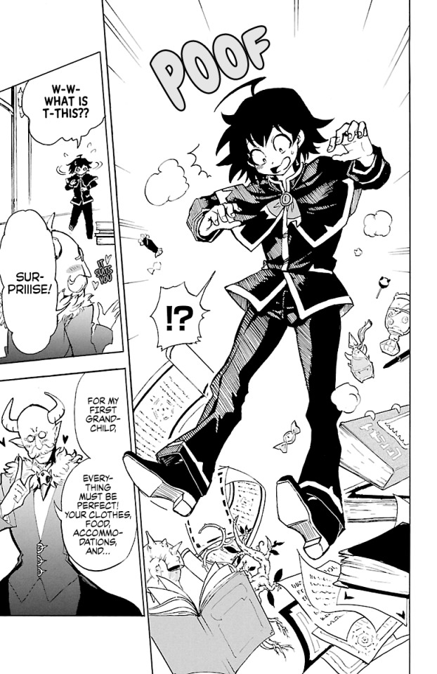
It's really interesting, because through these 4 panels, there's not really a stellar amount of visual similarity in how things are drawn. The shading on Iruma's (top left) clothes vs Kalego's (bottom right) is different, and Kalego's hair has shading and texture while Iruma's doesn't. Azz-Kun (bottom left) has heavy line weight while Sullivan (top right) is a far lighter line weight. It's incredibly curious, because I wouldn't say any of these pages bear much resemblance to one another in how they're drawn, but they're undeniably all from the same artist. It's a really great feat to provide so much consistent variance in art style for the series.
Alongside that, I must say I'm impressed with the paneling as well. You can get a really solid grasp of it from Iruma and Azz-Kun's pages above. There's a lot of variance and different approaches to similar content.
There's different perspectives, angles, and everything keep it all fresh and interesting, and the shapes of the panels are really commendable. It constantly refuses to use clear cut rectangles and squares, and tries its damnedest to put a creative spin on it. Even in pages like this one, all of the panels have an irregular side. At least one line in the rectangle is angled or cut off. It's such a simple thing, but it makes it such a more interesting read as you're not constantly looking at a bunch of plain squares.
Though, I guess I should take a break from the visual stuff, and talk about story, yeah?
I'm pretty surprised, there's a lot of great moments from the anime that were extrapolated from very minimal context or interaction, and even some that don't appear in the manga. Inconsequential pieces in terms of story, but really great work to expand on the nature and feel of the manga.
Saying that though, there's just as many moments that go shot for shot between the two, like Iruma and Azz-Kun's fight.
Or Iruma's entrance into the Misfit's classroom.

In addition to that, it's really cool to see how well planned this story is. Being a manga you get to soak up those pieces a lot better, and notice background details and things like that. Just take a look at this panel. Yes, Clara's in it, but there's somebody on the left side as well. Jazz makes an appearance here, and for good reason! Such a fun little detail, and just one example of many that exist within the manga that either didn't make it to the anime, or that I didn't notice in the anime.

Now, the elephant in the room: Lied. His early design is certainly something. I wouldn't say I hate it, but I also wouldn't deny that I vastly prefer his newer/current design a hundred times over. Basically the only design that sees noticeable change through the story, and for good reason. Also, Kerori in the background.

Also, I really just have to give it up for Nishi's art. You get a taste of it in the anime, but it feels so much stronger throughout this first volume of the manga. They like their perspective pieces, and they really like playing with heaver line weight to create tension and energy, and I'm all for it. It's a really fluid experience overall, and is great at selling readers on a more dynamic feel to the art and characters.
Pieces like this where the lines of the panels begin to warp and change, just such cool details that really show how pervasive Nishi's style is to the overall work, how when the style shifts, the whole perception of the sequence does.
I also feel like this spread is a really great example of why I like Nishi's character designs. They're all incredibly unique, and share very little to tie them to one another. All different outfits, proportions, and features. Clara's got a completely different style to Iruma, who's got a completely different style to Azz-Kun. It's a world of characters in a single story, and really never gets old.

And lastly, here's one of those perspective pieces I was talking about earlier. Nishi doesn't blindly use it to make for cool and more 3 dimensional panels or pages, but to convey something. A stretched out panel of Iruma fretting over being a human at a demon school, or in this case, a skewed perspective to sell the scale and grandeur of the Demon King. We're only at his feet, out of the entirety of his presence, Nishi is showing us where we're at in the story currently. It's a really great idea that just blends implicitly with "big Demon King is cool as hell".
So, at the end of this first volume, I'm thoroughly impressed with both the anime and the manga. The anime really grasps the material well and finds a way to heighten a lot of it, while the manga loses very little expression despite its relative handicap to the anime. Both are undeniably great, and both are certainly worth experiencing.
The energy remains apparent, the story is untouched and in its purest form, the art is all over the place in the best way, and the feel of Iruma-Kun is still so wonderfully strong. The silly nature that will have you breaking out in a laugh at the smallest things remains, and that warm feeling you get from the cuter moments is still there. It's still the same Iruma-Kun I know and love from the anime, and still places at the top of shounen manga that everybody should give a chance.
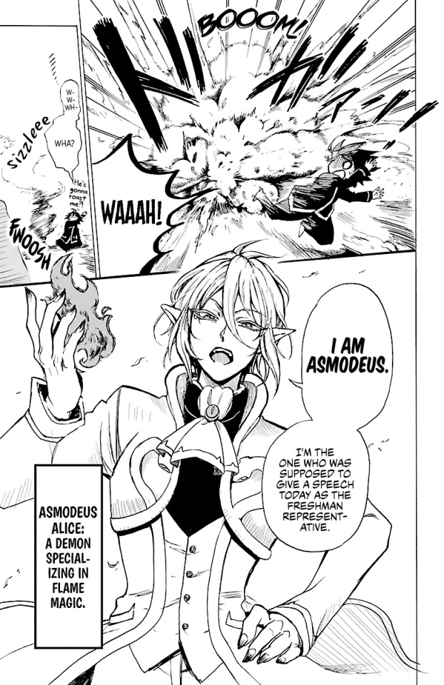
#mairimashita! iruma kun#welcome to demon school iruma kun#iruma kun#iruma suzuki#魔入りました!入間くん#mairuma#asmodeus alice#clara valac#sabnock sabro#naberius kalego#anime and manga#manga#manga review#manga recommendation#shounen manga#shonen manga
78 notes
·
View notes
Text
Another reason why I dropped gender abolition:
Red isn't inherently an angry or lustful color. it's a shade of light, it can't feel rage or desire. we associate it with those things largely because we associate red with heat, and anger and lust make you physically feel hot (and flushed with blood, which is red). But red doesn't have emotions, and it isn't intrinsically tied to any human feelings.
Yet, I think it would be pretty stupid to try to abolish color theory and say that we should never use colors to symbolize emotion because colors can't have emotion.
Now, if you say that you can apply the color red to things that are angry or lustful, or blue to things that are sad, that would be pretty stupid as well. Because, hey, those are colors, they aren't tied to any emotion by virtue of existing. Colors can have a lot of different meanings depending on your culture; red is associated with luck in some places. Black means death and mourning in the West but others associate white with those things. So trying to be "color essentialist" is stupid because colors aren't inherently anything and their meanings shift a lot based on the social context they are in. Hell, even the colors themselves are constructed to some degree; what's the border between pink and red? Why do group so many shades into the overall category of blue? Because we decided to.
But again, just because colors aren't inherently any emotion doesn't mean using them to describe emotions is bad. If we tried to completely disconnect color from emotion, 1. it would be insanely difficult and result in very little material good, and 2. it would really dull (literally) our art. No more "the curtains are blue" symbolism, no more bisexual lighting, no more use of color to explore people and feeling and culture and life.
That's how I feel about gender. Yes, clothing isn't inherently gendered- it's stupid to act like they are! And gender roles can vary wildly between cultures because they are constructs, and rely heavily on social context. And when they are constricting, it's extremely harmful.
But we really are throwing the baby out with the bathwater by saying that since gender roles can be constrictive, gender itself needs to be done away with entirely because it's all bad all the time everywhere.
I like that suits are masculine and dresses are feminine. Because that means I can play with them! I can wear a suit and makeup or a skirt with facial hair and it's playing with meaning and expectation. I frequently use abstract art with lots of color to express inexpressible emotions, and I do the same when I perform gender. I use red and black and yellow and white to turn into visuals what I feel; I use shirts and lipstick and skirts and boots to do the same.
Masculinity and femininity are concepts we made up, there isn't anything inherently masculine about suits or short hair, or anything feminine about skirts and long hair. If you showed a painting full of pinks and reds to someone, they may not think it's expressing affection, because those colors don't inherently mean affection or love or desire. But that doesn't make the painting meaningless. The painter used color to express emotion, using the social construct of those colors to communicate something.
I very much feel like an artist when I'm putting together my daily gender performance; I'm asking myself, what do I want to express to others? What do I want to communicate about my internal feelings? Patriarchal gender roles constrict expression by saying that only some people are allowed to communicate some feelings through certain gender performances. Gender abolition, to me, also restricts expression by saying that it's bad to try and express these things at all. Must our gender performances be hyperindividualistic, completely detached from social context?
I don't want to paint with clear water. I want to paint with color, and I want my painting to be inextricably tied to myself as a person and the cultural context I am painting in.
188 notes
·
View notes
Text
When I go to answer a serious ask, I usually type out my initial ideas, save it to drafts, and craft a response after I've had time to think. But recently, some of the asks have just disappeared. Unfortunately, this was one of those instances. (I'm recalling to the best of my ability).
Anon said they felt like the only one noticing how Maneskin use people as props in their photos, usually People of Color.
This topic touches on some of the most historically and currently relevant subsects of society. Race & ethnicity. Social development & communication, (now in the age of social media). Entertainment & representation. Plus, others I'm not thinking of. I want to acknowledge how deserving of an in depth discussion this topic is, while also acknowledging that I'm not informed enough to broach it. So this is gonna be pretty surface, anon, and I'm sorry for that.
What does it even mean to use somebody as a prop?
Props are used to add detail and context which make the subject or background more interesting. As inanimate objects, they only exist to enhance the scene. Therefore, to treat someone like a prop is to prioritize the way they can improve your image over that person's autonomy. Sure, both the prop and subject can both have individuality, as long as one serves to make the other look interesting.
So who's culpable? The subject, the photographer/videographer, perhaps a director of sorts? Personally, I think the blame is shared and situationally dependent.
Below are the most obvious examples of Maneskin using a person as a prop, posted to their insta pages. The trend anon pointed out is evident. Admittedly, I don't have a good sample size here, though. A ton of Maneskin's content is only available on their stories. Especially content with non-band members (which is what anon is referencing), since Maneskin's publicist prefers to post just the band.
I wonder how many of the people in these photos gave informed consent. (Not necessarily to a band member, just someone). As in "This photo will be posted without your name and seen by millions, but you won't receive royalties." Because some of these images Maneskin (the brand) can profit from via merchandise and copyrights. Conversely, most of the folks in the photos will experience poverty in their lifetime. Some of Maneskin's outfits are worth more than the other person makes in a year and they're treating them like a plant. There's also the safety concern. If any of these people have someone in the whole world that wishes them harm, that person can now find their job/neighborhood.
I know these photos aren't all bad. Victoria probably got consent to post pic #5, just a harmless prank. The woman in pic #3 was likely thrilled to be sitting next to such a handsome young man and thinks all social media is Facebook (which she hates). But why take pictures with the Black men in photos #2 & #4? What about the Latinas in #1 & #12? They're are using POCs as visually compelling markers of cultural and ethnic differences to say something meaningful about themselves. Look how far I've come! Look how successful my music is! You envy me, right?


#if this take is too nuanced for you ✨move along✨#yes ANON maybe it wasn't their idea/*insert plausible deniability here*#maybe Maneskin are faultless & culpable for nothing & never make mistakes & above all critique & you will shun me forever OH NO#and they'll eventually ascend to heaven while angels sing Supermodel in a white column of light parting the clouds plus a double rainbow#as max Martin performs fellatio on Vic's strap and a thousand virgins part their legs above as a thousand MILFs part their legs below#THE GREAT SCISSORING. but barring that they are fallible and I'm opinionated so plz exit at the block button. you'll find friends there.
12 notes
·
View notes
Text
#4 - Pac-Man (Coleco Tabletop) (1981)

Now now, sweetie. We have Pac-Man at home.
Remember last week, when we said we were playing something that was officially sanctioned by Namco? Weeeell... We never said it was developed by Namco, just licensed.
Oh yeah, if Galaxian Hardware was us dipping our toes into the world of odd hardware, this is us full-on taking the plunge into the depths of the weird, obscure stuff we have to play. Behold, ladies and germs, the first official home port of Pac-Man! ...Technically, anyways.
For a tiny bit of background context, the Coleco Tabletops were Coleco's own foray into the handheld gaming market. Yes, handheld, albeit maybe only on technicality. These things were no larger than something you could rest on your desk, though you could perhaps hold them directly if you really had the dexterity for it; they were approximately the size of a lunchbox, though, so uh, good luck! Oh, and these were shaped like tabletop arcade cabinets. Coleco had the pedigree to handle electronic games by this point--after all, they made the ColecoVision console just a year after this, so we sure hope they would--so this isn't too shocking to see them here.
As for hardware... Look, we're not gonna sugarcoat it--these are Game & Watch-esque, Tiger Electronics-esque "sheet that lights up certain segments depending on the gameplay" graphics. This is why we had to expressly define what "video elements" meant, because if we didn't, we'd have to decide for ourselves whether to either include or exclude these sorts of games. Ultimately, we decided there was no harm in including these even if there aren't exactly any liquid crystal display elements to the display.
Now, you may be asking--how the heck do we plan to play this thing. This is a full on physical unit, and these things are like, 60-to-100 US bucks secondhand nowadays. And sure, this thing is definitely fair game for emulation, but how would you go about emulating this sort of device?
The answer's a little easier than you might've been expecting.

Thanks, Internet Archive! They have been and are continuing to be invaluable for this project. Case-in-point, they have several pre-configured setups powered by MAME right for you to use in-browser. Handy!
Let's zoom in a bit, and start the main game up.

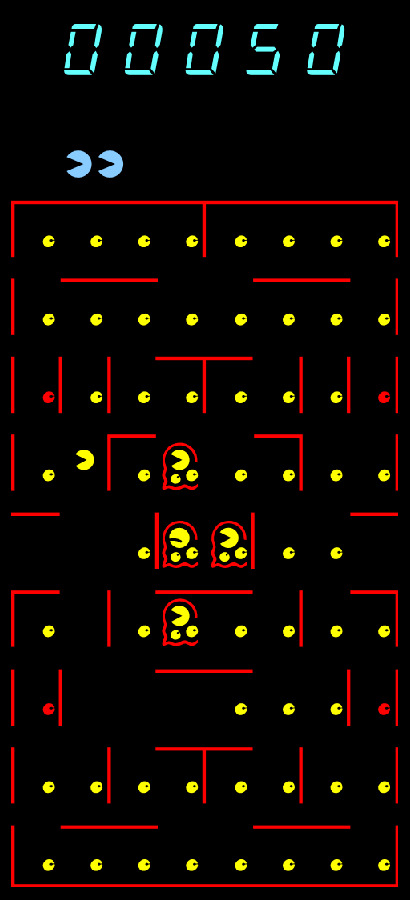
...Gross. And we're not talking about the visuals, but... Maybe we are, because look at those ghosts! While the original Pac-Man hinted that the ghosts may have secretly been slug monsters, here they look more like... amoebas. It doesn't help that one of their eyes is just identical to the slice they're using for pellets, and inside their foreheads is... Pac-Man??? These look a lot like they're gelatinous blob monsters that already ate a Pac-Man! This is NOT how we expected the first game to display multiple concurrent Pac-Men (Pac-Mans?) would go.
As you can imagine from a game that looks this rudimentary, its sounds and gameplay are also pretty bare-bones. Pac-Man, the Ghosts, everything moves with strict adherence to the grid, as you can expect from a Game & Watch-style game. The maze has been simplified--so much so one of the ghosts has been kicked out of the pen and starts the game outside of it! Yet there's also dots immediately surrounding the ghost pen, and with that, zero spot for a Bonus Fruit whatsoever (We'd guess there was just no way to put it on the display, to be fair...)--fundamentally, this game does not, in fact, score like the Arcade version. Which we wouldn't remark upon if the manual didn't brazenly declare it scores like the arcade version. (More on the manual in a bit.) And yet they still somehow got Pac-Man starting by moving left perfectly intact? How baffling, but we're not complaining.
And, perhaps most importantly, the ghosts/amoebas lack unique colors... And indeed, unique behaviors of any kind. The colors are understandable, but the AI is definitely a major downgrade. Now they all act more-or-less the same, and seem to behave a bit like a reverse Clyde, wandering around aimlessly but trying their best to get to Pac-Man when he's nearby.
Probably the biggest change is the fact that these ghosts/amoebas can turn around 180 degrees. In Pac-Man, the ghosts will never reverse directions unless the player eats a Power Pellet--otherwise, they will only make 90 degree turns. Here, however? They will gladly turn around entirely and you have to be careful to avoid that. Being able to turn around freely when the ghosts couldn't was a huge advantage that the player had, but now it's gone! This definitely makes things more frustrating, and while this behavior is often associated with unofficial clones of the game, if you can believe it, this won't be the last time we see this in an official version of the game.


For whatever reason, when you eat a Power Pellet--er, a red pellet, seeing as there's only one type of pellet, just two colors for it--the Pac-Man inside the ghosts vanish? This is what actually clued us in those little dots were meant to be eyes, but then that raises a whole new conundrum... The pellets have pupils now.
Admittedly, this is kind of a Morton's Fork situation that naturally comes from trying to represent every game state in a little drawing like this--either one of the ghosts' eyes would not have a pupil, or now the dots have pupils--but honestly, we feel like maybe the former would've been better, because the latter just kinda looks plain creepy!
In any case, that's the end of the main game, but if you paid attention to the header, you'd know we have two entire other game modes to cover! Yep, this was technically the first Pac-Man game with side content to it.

The second mode, described as Head-to-Head Pac-Man, is... Weird. Another first for the series is concurrent multiplayer! Yep, it debuted here, and we guess a second player mode that happens simultaneously was seen as so impressive that they just had to call it a whole new mode. Fittingly, the handheld has a second joystick just for this.
But... y'know, it's not really all that incredible, mostly for no fault of its own, just because Coleco Tabletop Pac-Man just isn't exactly powerful to do this concept justice. Still, very strange to see simultaneous co-op Pac-Man on this dinky thing from 1981!
The third game mode, Eat & Run, is perhaps a little more interesting, though...


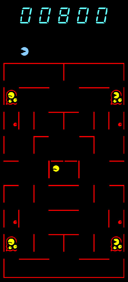
So, a lot of firsts here. Pac-Man has entered the ghost pen--er, the "base" if the manual is to be trusted--for the first time! Not only that, he starts in the base. And the ghosts are in the four corners with four power pellets, with zero normal pellets in sight! This is definitely weird to see so early on in the series, alright.
So, in this mode, you effectively have to play Capture the Flag. The ghosts are already out, and they're guarding the four power pellets--your flags, so to speak. Leave the base when it's open, grab as many of the pellets as you can, but victory doesn't happen when you eat all four. No, victory is only called depending on if you make it back to the base, and the more pellets you have, the more points you get! This means it's actually possible to die with zero pellets left in the maze.
And, of course, the base isn't always open--sometimes, its doors will open and shut, so you have to make it over where while it's open, unless you want to try surviving a cycle until it re-opens. This is a pretty interesting take on the game, and to be honest... It's probably as complex as this thing can handle. We kinda wish we saw a version of this with proper ghost AI and a proper maze (and if that's coming up, don't spoil us.), because it's a fun concept! It's just bogged down by this game and its... eccentricities.
...Oh, right, let's talk about the manual. We never had a better time to elaborate on this, but uhh... It's more than a little flowery, which is a double edged sword. The upside is that it's extremely funny for it! The downside is that it takes a bit of trial-and-error to learn how to work this thing on the Internet Archive's embedded emulator, because instead of clarifying how to start a game, it...
Okay, um. Let's just. Show you a collage of some of the headers in this manual. You'll see what we mean when we say it's extremely funny unintentionally, but also unhelpful when you're trying to find something about, say, how to play the game.
Goodness. Overdramatic, much?! It's just a Game & Watch-esque downscaling of Pac-Man! It's really not that heartfelt, adrenaline-filled, and sobering! Just tell me the button to press to start Eat & Run mode! ...Though, this could serve as a great fodder for blackout poetry, if anything, and as you can see above, it definitely makes for great snippets.
...Well, that's about it for the Coleco Tabletop Pac-Man. But we're not quite out of the woods just yet. So, um, next time around, expect something... Well, a little similar to this, but also a bit different. It's published by Bally Midway themselves, too! ...Technically, anyways. Look, it's complicated. We'll just be seein' you around.
#all the pacs#pacman#pac man#coleco tabletop#1981#man if halloween wasn't last week we'd totally consider those amoeba ghost things to be a fitting halloween thing#unfortunately that's not what we got. or maybe extremely fortunately depending on how you view things!
10 notes
·
View notes
Text
15 Questions for "15" Friends
Tagged by @greypetrel - thank you! :*
Are you named after anyone?
50%-50%? My parents swear that they weren't influenced by Greta Garbo in any way or form - they just liked the name. Stella is for my great-grandmother (hungarian origins, archetype of the "strong woman of the family definitely born in the wrong era").
When was the last time you cried?
Last week. <- Same, wohoo! But it wasn't a big cathartic cry - kind of a disappointing one, really.
Yes, I'm a Pisces, of course I sort the act of crying in different categories.
Do you have kids?
Premise: I don't hate kids, and I feel strongly about the fact that they should be more respected as individuals / human beings with their own agency.
That being said, I'd rather torn my uterus apart with my bare hands. Or gift it to somebody who wants it.
So no: I never wanted any.
What sports do you play/have you played?
Various - tennis for a few years, soccer at school, some athletics. But my love was (is?) dancing - I did modern jazz and then contemporary dance for about seven years. Currently I'm taking hatha yoga classes, which is quite painful most of the time - but necessary, since I have a full time office job and I'm glued to the chair.
Do you use sarcasm?
Me? Never ;)
What’s the first thing you notice about people?
How they move/occupy the space they are in: if they use a lot their hands while talking, how they laugh, their voice etc.
I'm a "I first see the broader context and then the single detail" person. And no, I don't judge.
What’s your eye color?
Green/grey
Scary movies or happy endings comedies?
It depends on the definition of 'scary', I suppose. Since that's ambiguous, I'll go with comedies.
The right answer is: period dramas, obviously.
Any talents?
I have a very strong memory (name/surname and voice and things they confessed to me of my classmates from Scuola Media, and that was 15+ years ago), which is both useful and anxiety-inducing. I have a pretty good balance, and with some stretching I think I can still put my foot behind my neck?
Where were you born?
In a hospital ;)
What are your hobbies?
Painting/drawing, swimming, photography, reading, trying to find plants that I won't manage to kill. And listening to music - I'm useless with instruments, tho. BUT I do have an electric guitar that my father gave me and I'd love to try to learn something, as soon as I'm not renting and I have a proper place.
Do you have any pets?
Does a seaweed (yes, a marimo) count as a pet?
I grew up with a dog, and he died many years ago. Since then I had no pets. Now that I live on my own (very discreet flatmate aside) I'd like to have a cat, but I think it would be better to have a bigger flat, and just more space in general. I'd hate for them to feel bored and costricted, it doesn't feel fair.
Right now I don't plan on getting another dog, for various reasons.
How tall are you?
My ID cards have different ideas: the new one says 168 cm, the old one said 170 cm. We shall never know!
Favorite subject in school?
Art history, history, philosophy, biology, and chemistry applied to fine arts.
Dream job?
AHAHA
Anyway! Illustrator or teacher. Ideally both. I'd love to work in a museum too, since I already have some experience in that field. Overall, I guess that I need a mentally stimulating job that makes me feel like I'm doing something meaningful - in a way or another. (This is why I briefly considered looking into art therapy, but knowing myself I'd just feel like a huge fraud).
...and I just noticed that all my dream jobs are based on communication (either through visual arts or...talking?) and relating to other people, which is hilarious considering my whole self.
Tag time! :D Maybe @birdkeeperklink - @pyritefes2 & @mafaldinablabla could be interested? Absolutely no pressure tho, feel free to skip this if it's not your thing!
Byeeee
#sorry people the oversharing is strong when i'm tired#and i always end up doing these in the evening#ops#things i've been tagged on
4 notes
·
View notes
Text
i have a very specific artstyle idea for Kokichi- hear me out
so Kokichi, i think we all can agree he's the kind of guy who draws characters in a fairly visually simple style, yes? he's a cartoonist, he gives them simple designs and puts all the characterization into odd proportions and shape language. the characters always look fucking wild with their absolutly uncanny proportions and insanely exagerated (but still simple) expressions, and the lineart is always chaotic and sketchy too.
colors wise he does one of two things depending on the nature of the drawing. he either draws in full, bright ass neon colors- or he draws in greyscale with only one overly satruatate color on a specific part of each character.
backgrounds are more.... interesting- well- not really. they're actually quite normal bacgrounds, but within the context of his artstyle it becomes very interesting. he's insanely good at backgrounds as he spends alot of time drawing blueprints for Miu and/or DICE to use, and they're highly detailed and true to life. the only thing making them feel less so is when he draws for fun instead of for blueprints he allows his lineart to be a bit messy and sketched instead of crisp and carefully placed.
his backgrounds, are also usually done in a watercolor type coloring style, with soft muted colors bleeding together. he doesn't always draw backgrounds, but when he does they're fucking beautiful. when he doesn't draw backgrounds it's usually for a silly comic he doesn't want to spend hours on, but even then he slips some of his detailed ass work in there by drawing overly detailed props for the characters to use.
i just love the concept of him having this jarring difference between his characters and the enviroments there in, it's just so much fun. got a weird little guy who's design can only be described as greebely and skrengkley, and it's sitting on a bench and sipping a drink of questionable content in the most gorgeous park scene you've ever layed eyes on.
13 notes
·
View notes
Note
1, 13, 16, 18, 24 for the fic asks!
1. Share a song that makes you think of [fic title]
Gonna go ahead and recommend "Orgasm of Death" by the Growlers as an "Insatiable" song. I've had that on repeat, rotating those weirdos in my head, for the past couple of weeks.
13. How much planning do you do before writing?
Very little! I usually sit down with an idea for a scene or a feeling I want to convey, write that out, and see if I vibe with it. Then the whole begins to take shape from there.
Unfortunately, the more serious planning I do, the harder it sometimes is for me to get a project started (until I find a scene or moment that sparks). I've been putting a lot of thought into the plot of this fem!Strahm AU but hadn't written a word until I considered a little tertiary scene between Hoffman and Larry and my brain went "oh, that's the vibe." And now we've got a stew going.
16. At what point in the process do you come up with titles?
It depends, but generally it happens seconds before I post the thing (and it's usually whatever Coheed and Cambria lyric I've got rolling around in my head). "Insatiable" is an exception in that the concept for the fic was conceived at the exact same moment as its title (while I was in the bath listening to "Killer Queen" by Queen).
"Color all days blue" is another exception in that I wanted to use the title (was going through a Flowers in the Attic mini hyperfixation) but didn't have a fic to go with it. Then I started writing the summer camp au and thought it fit well.
18. What's one of your favorite lines you've written in a fic?
Hmm. It's hard to choose a line in isolation. I'm not sure any of them are particularly sonorous or meaningful out of context. Nabokov I am not!
24. Share a moodboard for (one of) your current WIP(s)
I don't make visual mood boards, but I do make heinous playlists that are literally just for vibes, so I guess I'll part the curtain and share the one for the fem!Strahm AU. Be warned, though, it's not, like, good quality in any respect. Only vibes here ✨
2 notes
·
View notes
Note
Thoughts on the Donkey Kong Country series? Didnt grew up in the SNES platformer days so it's hard for me to get the high place its heldnup on my own
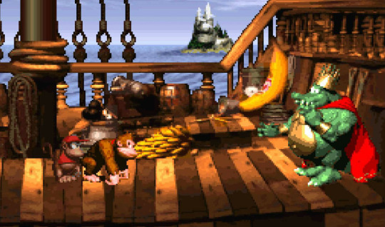
I feel like there are some people who are even from that era that don't like Donkey Kong Country. There's a lot of focus on whether or not the graphics have aged well or not and whether the gameplay was even any good to begin with.
Maybe I'm a bad person to ask, because I still think those SNES games look incredible. I'd hold them up as some of the best uses of pre-rendered CGI sprites. Later games (usually GBA) used pre-rendered sprites as a lazy shortcut, but DKC was doing it as a deliberate graphical advancement, and that kind of "bleeding edge" vibe still helps the game a lot, I think. They were doing something almost totally brand new, and went out of their way to make it look as rich, vibrant and detailed as they could manage.
Like, we should put this in perspective. Most 2D games, even now, are made using "tiles" which are square chunks of landscape. For instance, in Super Mario World, all of the levels are made out of 16x16 tiles. That's 16 pixels tall and 16 pixels wide.

In this image, there are only 4-6 tiles being used on the foreground layer, depending on how you count them.
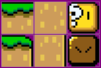
Most levels in Super Mario World probably don't go over a dozen tiles. And this is how it was for a lot of games back then. It was efficient, easily compressed, didn't require too much memory, etc.

By comparison, there are so many tiles in Donkey Kong Country I can't even easily line up where one tile begins or ends. Every level is made up of thousands of individual tiles assembled to create a complex image. And that's just tiles. That's not counting the hundreds of frames of animation in characters, collectibles and enemies, either.
DKC stretches the SNES to every limit it has. It has the most colors, the most animation, the most complex art of basically any SNES game ever made.
Usually, that's where the conversation on Donkey Kong Country ends, because people go "oh well yeah this was impressive tech for 1995 but that doesn't mean anything anymore, it was a flash in the pan and the gameplay doesn't hold up."
I'd argue that it still does. The notable thing about Donkey Kong Country to me, especially in the first game, is how its levels were designed. Levels in DKC are designed with an almost rhythmic kind of flow to them. Every enemy, collectable, platform, and obstacle is usually timed in such a way that you can hit a kind of "perfect sequence" where you tear through entire levels in one unbroken motion.
Or, in short, the entire game is custom-built to be perfect for speed running, years before the concept of "speed running" had ever been coined or popularized. Some games let you do that, but sort of by accident. Donkey Kong Country was designed that way on purpose. It's the intended way to play.
youtube
It's just on you whether or not you can keep up with the game's expectations and maintain that unbroken flow.
That daredevil style of "don't stop for nothing" gameplay style is very appealing to me and even now, close to 30 years later, I still find it a tremendous amount of fun! That first Donkey Kong Country is an all-time great for me.
Later DKC games improve on the visual elements while making the gameplay increasingly more complex to mixed results. DKC2 is a much longer, much more complicated game, and mostly that's a good thing, but it does wear me out a lot faster than DKC1.
And DKC3... has its fans. But I am not one of them.
Does any of this give you proper context? I don't know. It's just why I think the game is neat.
12 notes
·
View notes
Note
In your opinion, what are the most basics of basics to look for when analysing a piece of media (be it visual or written)? In other words, what's your framework for analysis, and how do you flesh out your interpretation of a work? (By the way, your blog posts are wonderful and informative and I for one am happy to read them, regardless of the length.)
Thanks, Anon! I'm hoping this one will be worth the read to...anyone. And it's taking way longer than expected, so hopefully in that regard, too.
Now this question.
This is interesting, because I don’t think what I do to start is necessarily the best way for a beginner to start, for a lot of reasons, some related to my own personality and some related to the fact that I have just been doing this for a long time now. That is, I’m not sure the way I start framing things to myself is really dedicated to the basics—I think a lot of people with experience in something are kind of that way. At some point, the basics become second nature.
Analyzing a piece of media really starts with critical thinking and critical close reading. And while these are important skills, they’re not skills everyone has or everyone is taught. I don’t know if I would even know how to teach these properly, but I do hope that my blog posts giving advice, analyzing things, laying out my thought processes and evidence as it were, is helpful in that regard. Especially when we’re talking about something maybe a little sillier and more accessible than things you might read in school. Enjoyment is an important part of getting good at anything.
So first, you start with what’s actually in the text (“text” here referring to the actual material contained in the piece of media). It will be easy to connect it to other things in other media you’ve seen or your own ideas because humans are pattern-seekers, but it’s really important to try to discard a lot of that, especially when you’re getting started.
The text is the text, and while it’s definitely going to get connected to other media and culture because no text can stand on its own, beginners especially and people who aren’t being careful will draw lines that aren’t necessarily strong, good, or accurate, just because It Seemed Right at the time. And then they might get attached to something pretty wrong.
This is a thing that happens. Finding good connections and comparisons, finding meaning in things, takes a lot of practice and experience and exposure to different kinds of things. But it’s very important that those connections are rooted in something in the text, that there’s a real reason for something. That it makes sense in context of the work itself.
…Kind of. This obviously doesn’t apply to the kind of fun reinterpretive fan work that isn’t actually trying to say what a piece of media says. Like. It just does not matter if fanfiction or fanart or shitposts or whatever are rooted in canon. Some people (me) prefer that, some people don’t, and it doesn’t really matter. But if you’re trying to read and analyze something, it’s important that the text is the focus. All of those connections that get drawn? Those are interpretations. Those are analysis.
And some interpretations and analyses are just. Stronger than others. Some are simpler. If I say William is blond, that’s an interpretation based on what the word “Blond” means (to most English speakers, blond would be something like “having hair with a yellowish tone”, but even just slightly adjusting that definition can include or exclude a lot of things). It depends on my determination of what color William’s hair is (not all cultures or people will draw the lines between colors the same way, as they all actually blend together in a spectrum and lines between the definitions are arbitrary). But me saying William is blond is an interpretation that…well…I think…just about everyone who speaks English would agree with.
This wouldn’t be an interpretation if, say, a character explicitly said, “William, the blond man—” because then it would be a thing in the text. But because William’s hair is a visual cue, turning it into words is an adaptive, interpretive action. So it’s important also to remember some interpretation is happening just because humans need it to communicate anything.
And remember, too, that sometimes multiple interpretations are valid. Me saying, “William is a redhead,” is…uh, not a valid interpretation. But if William happened to be strawberry blond (he is not), that probably would be.
There are multiple lenses to view things through, and there’s often multiple things a piece in canon could mean. You know how some people have told me they really like how I try to cover multiple angles of a topic? That’s because a lot of them are valid, even if I have specific ones I’m more attached to and believe in more. My preferring one interpretation doesn’t make another wrong. The interpretation not being rooted in the text makes it wrong. The interpretation being connected to something else that’s misinterpreted makes it wrong.
So. Start with what’s in the text. Try to look at it as clear-eyed and clear-headed as you can before trying to figure out what it means.
And that brings me to how I start my framework for meta: I actually really need a thesis statement. I need a point. I need something I am trying to say. Mentioning a list of things that happen, or a list of symbols connected to a thing just…doesn’t do it for me. I don’t see the point.
This is hilariously not at all how I write fiction, but shh. This is why I have notes and notes for meta, and why I go off the cuff with so many long meta posts based on asks that give me something to focus on.
But my analysis posts tend to be about, “This is how this piece of media uses this trope, compared to how it’s used in other media,” or, “Here is an interesting way that this media decided to convey this specific thing!” or, “Here is a really interesting theme in this media and all the ways it comes up.” I need to know what I’m saying before I can really do anything. I need to know what my topic statement is. I need a thesis.
Now, this works for me because I am very good and realizing these theses at least sort of accurately from the start. But it also works because I have a number of posts saved on my computer that will never be posted because as I wrote them, I realized I was just plain wrong, or couldn’t really back up what I was saying, or the argument seemed weak to me, or I didn’t really end up having a point.
To be perfectly honest, I don’t want to embarrass myself by posting that, nor do I want to really share a bunch of bad and weak argumentation with people who might buy into it. I am good at setting things aside and I try to be good at realizing I’m wrong. I have practice doing this and analyzing my own writing to be able to do this. I appreciate corrections most of the time, and I try to edit posts when I fuck up.
A lot of beginners might get caught up in the “I did a thing! I wrote it! Let’s share and convince myself it’s great!” because that’s what excited beginners do. Which is fine. You have to be bad at things to get better at things. But it’s also good to learn how to filter your own wheat and chaff.
As for how I flesh out my analysis ideas: well, I think about the thing I’m analyzing as a creator and a writer myself. I prefer a genetic approach to literary criticism (note: this is apparently harder to google than I anticipated, having learned it in university, so: a genetic literary criticism angle is one focused on the author and their intent and process), and I really like to consider what the author was trying to do and how well it worked and why they might have done a thing. What their cultural context is and who they are. What they probably didn’t consider. Those are angles that really fascinate me, and I find them most useful, because it’s helpful for me to grow as my own writer.
And, I really like character stuff and thematic stuff because it’s my favorite things to write. I’m trying to get better about writing things about pacing, structure, etc. because I’d like to focus on it more myself.
Annnnd now I have written over 1k words about how to approach this, but it’s something I’ve been doing for a long time! It’s something I studied how to do in college! It’s something I think about a lot!
I have a lot of thoughts!
22 notes
·
View notes
Text
Call It Love
Watched: 12.04.2023
Enjoying the angst that comes from misplaced revenge.
Call It Love was emotionally aesthetically pleasing. What I mean is, even the sadness, anger, frustration, regret - all were presented in a way that did not make me feel emotionally exhausted and tired. I was relating to and appreciating the sorrow.
What the show did an amazing job with was showing different sides of psychological issues - for some people it makes them completely detached from social interaction, for some it makes them forget about their needs, others would focus on the negative emotions as their driving force, some would be able to accommodate their lives around their issues. Depending on the character, their personality and past experiences, we saw all the different sides of how we as humans deal with difficult emotions.
About the cast - we got blessed with some well written and complex characters and well delivered portrayals of them. How the same people could be victims and perpetrators. How everyone had to learn from their mistakes and figure out how to set boundaries, but also respect the boundaries others set. How to understand yourself and be able to communicate with others. How to move on from past, how to move forward with the future, how to find happiness and peace.
Were all the characters well written, with many layers? Not quite. While Ahn Hee Yeon did a good job with her performance, Kang Min Young did not exactly have much to offer except from being yet another external factor the leads had to deal with. Similarly, Choi Sun Woo existed only in the context of leads’ issues and struggles, and presented no personal plotlines.
Cast wise, Kim Young Kwang ate the role. One of the most versatile actors we get in mainstream shows. Can do drama, action, comedy, romance, thriller - you name it and you will get it in one of his roles. In Call It Love he presented so many raw emotions from Han Dong Jin. Even though the character was not an open book, not the most expressive guy out there, it was still clear for the viewers what he was going through, what he was thinking and feeling.
At the same time, while for most scenes Lee Sung Kyung did great (it’s a role we have not seen her in yet), there were just a few moments where her delivery was too monotone and at times felt empty.
As for the production - I loved it, but I can see why someone else could hate it. The colors were not saturated enough and the whole show was presented in this pink/purple filter. For me, it perfectly fitted the overall mood of the drama, adding to the melancholic and stoic feeling. What also caught my attention was how the shots were centered vertically. In many the characters were presented in only 1/3rd of the screen. For me it seemed like the same way they were not centered in the frame, they were also not centered in their lives - still unsure about their place, a bit lost in their surroundings.
All that said, it’s a typical “you either vibe with it or not” drama. The same visual aspects I loved could look ugly and weird for others. The same characters I related to and enjoyed analyzing could be frustrating and unrealistic for others. The same dialogues I found touching, others could see as faking profoundness with no depth.
Why not a perfect 10 from me? I did not like some of the conclusions and I wished a few characters were developed better. For such a complex situation the drama presents, some aspects just lacked nuance.
Overall, I already miss this drama.
7 notes
·
View notes
Note
hello there, its me! i'd like to ask for your opinion on the designs i made recently. for context, these four main characters are henchmen to a big supervillain who is also the boss of a secret corporation. every single henchmen there has been brainwashed and forced to work, however one day, the brainwash on these four henchmen somehow expired. before they could get their freedom back they have to pretend like they're still brainwashed to gain their boss's trust.
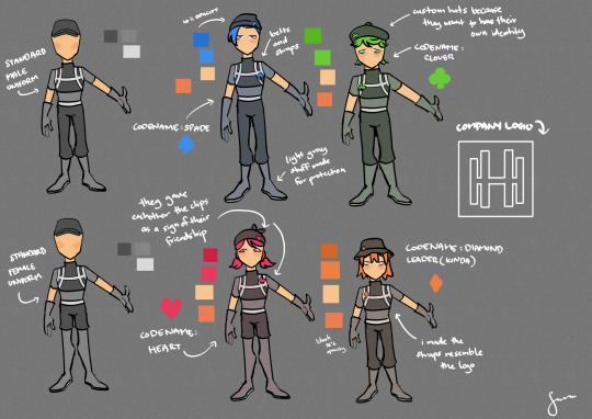
those two blank people are wearing the standard male uniform and standard female uniform.
these four wear a clip on their hats and suits because they gave eachother clips as a sign of their friendship. they wear belts and straps on their chest that resemble the logo of their company. all four of them wear a hat different than the standard uniform because they want to have their own identity and not just be part of a set. i tried to make them all as different as possible without changing the uniform too much because the company is strict. i'd love to hear your suggestions or changes! feel free! (and if you're not interested i'll be totally okay if you ignore this, either way, have a good day!!)
Oh wow, cool idea! I guess my first question is, if they want everyone to think they're still brainwashed, why change the uniforms at all? Wouldn't that raise suspicion? If they need an outlet to express their own identities, maybe they could meet in a secret place outside of the organization and wear their own street clothes. They could also keep the pins hidden under their uniforms so they'd still have those tokens of friendship, but they wouldn't stick out like sore thumbs.
It'd be helpful to think about what this company's function is. Is it a factory? A lab? A headquarters for espionage? What kind of work do the henchfolks do every day, and how do their uniforms contribute to that? I'm also not clear on why the female uniform has shorts rather than pants like the male one. Seems like some pointless gendering on the organization's part. Giving everyone the same uniform would feel more logical and efficient, and it'd hammer home how much the company values total conformity.
Speaking of which, I wonder what the company policy on hair is. Maybe there's a small list of approved hairstyles, or maybe they just make everyone shave it off so they all look the same, depending on just how strict their practices are. The US military recently relaxed its hairstyle regulations and other grooming standards (which are still gendered as fuck but more flexible than they were in the past) so maybe taking a look at those (or another country's military standards depending on where this company's located) could help you gauge where the organization falls on the lenience spectrum. And if this is an anime where people are born with crazy hair colors, I could see this company possibly being okay with the ones these characters are sporting. If that's dye, though- NAH.
So if the characters have to wear the same uniforms around their coworkers in order to avoid detection (and possibly have to change their hairstyles and color to fit the company’s regulations), what would make them visually unique? I’d suggest making them stand out through their face shapes and body types. Even when following the same strict diet and training regimen as everyone else, no two bodies will be exactly the same, and no two faces will be, either (unless the company’s so obsessed with conformity it requires plastic surgery for all its recruits. Sheesh, this place is sounding like a dystopian hellscape).
The characters’ codenames gave me an idea: What if each one’s basic shapes were inspired by their card suit?

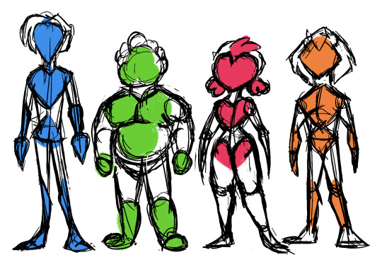
Some different skin tones would help differentiate them, as well. I know it’s kind of an anime trope to give every character the same skin color, but in real life, even skin from two people of the same race won’t look exactly alike. This will give the characters a greater sense of individuality despite having to wear the same uniforms as dozens of other recruits.

Just a few ideas. Hope that helps!
18 notes
·
View notes
Note
As an artist, do you find it easier to capture ideas in a visual medium over a written medium?
Thank you for asking! :D
I apologize for the possibly obnoxious answer but the short version is - it really depends on what I'm trying to show!
If you'd like to read a fic that I also drew art to go along with, I have a Fallout whump fic: (here on Ao3.)
If I'm trying to show a character's state of mind or delve into their motivations (or be excessively philosophical), it's usually easier to do that in fic because it comes with the benefit of being able to write out their thoughts directly. A single line can offer very specific insight into how a character is feeling.
And in romance or action scenes, or plot turning points, where a lot is happening and the progression from one moment to the next is significant, writing is also easier by a long shot.
But in writing, for the sake of flow, I often also have to omit certain details to keep the focus on the main point of whatever is being conveyed, and allow the reader to fill in the gaps where necessary.
It's a lot of fun sometimes, seeing how a reader's perspective takes a scene based on what information is given, and a good challenge trying to decide what is important enough to make mention of to convey an idea, but there's always a lotta room for interpretation in written word, I feel like.
In art, I still struggle I feel with composition, lighting, and color, which can all go a long way toward establishing a scene. So in that regard you could say I find writing easier most of the time, because it's less difficult to write about the ominous blood red sunset silhouetting the character against the ruins of an ancient city than it is to draw that. The reader's mind can visualize that better than I can paint it.
But there are some moments, some intense "heartbeats", that art is really good for capturing and if I'm just trying to get out a very specific scene that doesn't need a buildup of context to understand, art can be better for that.

EDIT: I would also say that, casually, art is easier if I'm not trying to do anything profound. I can let my brain run on autopilot to hack out some shapes and give a rough idea of a character or landscape which can be relaxing. I can draw while I'm watching tv, talking on the phone, or listening to music, to have something to do with my hands.
With writing, I have to be a lot more actively engaged and focused to do it. I can't usually have music playing (at least with lyrics), or too much else happening around me because I lose my train of thought.
#wish i had 900 more hours in a day and the patience to animate or draw comics#best of both worlds#wyn gabs#ask#writing#text#art#my art#wolf
10 notes
·
View notes
Note
3,4,17 for the ask game
Thank you for the ask - here we go!
a specific color that gives you the ick? Not per se, no - it all depends on context. Like, pus yellow is icky, but if it's combined with other colors that take the focus away from it and form a harmonious ensemble, I don't mind it.
mythical creature you think/believe is real? Okay, so real talk for a moment - I don't have a good filter for what is real and what isn't, when it comes to visual media (film, tv, even videogames). When I see something, even though part of me knows it's just a special effect, to the larger part of me it's real in that moment, and often beyond. As in, if I wake up in the night, my almost asleep brain populates the dark with all that stuff. So I consciously have to tell myself, this isn't real, this doesn't exist, this is just a movie thing someone made. That makes it kind of important for me to distinguish very clearly between mythical and actual, and so I *need* to say "none". I'd love if there was some magic to life - but on the other hand, there is. Take butterflies and how they develop! Or the coherence of the dance of a murmuration of starlings!
an anxious compulsion you do everyday? Plenty of things I do every day, but not out of anxiety! I do have massive Covid anxiety these days, but that just means I feel even more justified to be a hermit as much as I can.
Again, thanks for asking! Those were some deep questions! 🙂
1 note
·
View note
Text
I've been tagged on a tag game! Yay!
tagged by: @seimsisk
last song I listened to: Jawbone by Me Rex
(I've been listening to this album [Giant Elk] for, like, 6 months now; also Hellmode by Jeff Rosenstock, and Alt. Account by Equipment)
currently watching: Nothing / Twitch? I kinda got way behind on actual TV / Web series. I usually just watch speedruns and casual streams by former speedrunners. That's if I'm not playing games myself.
currently reading: Lately, lots of papers describing fossil cranes and close relatives that I need for calibrating a divergence time analysis I'm running... again (shoutouts to Gerald Mayr for doing an excellent job summarizing this body of literature in several of his papers and providing opinions that I wouldn't be able to form on my own.). I also read several webcomics, notably Gunnerkrigg Court and Nature of Nature's Art)
currently obsessed with: Outside of work? Not really obsession, but I've been learning to play Risk of Rain 2 lately in the evenings (I'm not very good... yet; in my defense, the game doesn't do a great job of describing how certain effects/items stack, so it's difficult to intuit what's "good").
favorite color: I usually answer this with "dark red / maroon", but it's hard to justify it being my favorite color? I do like that color, but I find myself wearing browns and greens and greys most of the time rather than reds. So, highly context dependent question, really.
five things that make me happy:
"Solving the Problem" Moments - Like, in a very general sense, having figured something out. I've recently had an opportunity to work on a couple of things outside of what I normally work on, and I've really enjoyed figuring out new things lately. Also had one of these during the solar eclipse when I noticed Venus during totality and had a moment of understanding where I could clearly visualize the relative positions of the Earth, sun, moon, and Venus just based on what I was seeing. A very "oh, I live on a celestial body" moment. Point being there's a difference between knowing something is true and getting it, and it's the latter I'm after.
Pictures of my parents' cats. I can't keep pets in my current apartment, and I really appreciate getting cat pics from my parents (and visiting them twice a year and bothering the cats myself).
Spring / Summer warmth - I do not enjoy winter at all for several reasons, so I'm really enjoying the warmer weather we've had here recently. Even after a relatively mild winter, it's refreshing. Love being outside in the sun.
Teaching, when my students get it. I feel like I'm not a great teacher, but I do sometimes get to see that moment where my students connect the dots and really understand something, and that rules. I'm also realizing this relates back to #1 that I've listed here, but getting to see someone else experience it. I just like those moments a lot.
Video games. It wouldn't be right for me to not list something I'm really passionate about (when I have time). Love games and how people experience them (hence, why I watch Twitch).
Seeing the cool art people post here. I’ve never had the patience with myself to practice and to push through the “I suck” phase of making art, so I really appreciate seeing what others create.
I'm not going to tag anyone, because I'd feel a bit awkward doing so, but feel free to do this if you see it.
#@seimsisk#thank you for tagging me!#also I still have your ask from a while back#I promise I haven't forgotten and will answer it#hopefully soon#I had originally planned on answering it after I published or at least submitted something I'm working on#but that has taken months longer than I anticipated#I'm so sorry for not answering it but I will
1 note
·
View note
Text
Branding in the Digital Marketplace - Your Comprehensive Logo Design Guide

How Do I Create a Logo for My eCommerce Website?
Hello there, fellow readers! My name is Sumeet Shroff, and if you're anything like me, you realize the value of digital branding. Setting up an internet business entails more than just constructing a website and uploading products; it also entails developing a brand identity that connects with your target audience. One of the most important aspects of that identity? A logo.
Your eCommerce site's logo is frequently the first thing your customers notice. It's your brand's face, the emblem that will come to embody all you stand for. Whether you're starting a new internet business or rebranding an existing one, creating the perfect logo can be a daunting endeavor.
But don't be concerned! In this blog, I'll walk you through the processes I took to develop a logo that both symbolizes my company and stands out in the congested digital marketplace. Let's get started!
What is an eCommerce Logo?
A logo is essentially a combination of text and visual images that serves two purposes: it informs people about the name of your company and it provides a visual symbol that represents your brand. Because of the virtual aspect of the platform, the relevance of a logo is enhanced in the context of eCommerce. So, what distinguishes an eCommerce logo from others?
Digital Presence:
In contrast to brick-and-mortar stores, where a logo may be painted on the storefront, an eCommerce logo exists primarily in the digital arena. This implies it must be web-optimized, which means it must appear good on multiple platforms, load quickly, and integrate well inside various site design features.
Instant Recognition:
The user experience is everything in eCommerce. Your logo should express the spirit of your company in a single glance. In a congested digital arena, a distinct and memorable logo might be the difference between a potential customer clicking on your website or a competitor's.
Trustworthiness:
In online transactions, trust is essential. A professional and well-designed logo may create trust in customers by assuring them of the legitimacy and dependability of your eCommerce business.
Brand Consistency:
As an eCommerce company, your online presence extends beyond your website. Your logo will appear in a variety of areas, including social media, email campaigns, and digital advertisements. This means that the logo must be adaptable, preserving clarity and impact across multiple mediums.
Storytelling:
A effective eCommerce logo will frequently convey a narrative. Every aspect, whether color, design, or typography, can be used to represent the brand's values, objective, or unique selling proposition.
Read More
https://prateeksha.com/blog/branding-in-the-digital-marketplace-your-comprehensive-logo-design-guide/
0 notes
Last Seen Blogs
ntrlily
consider maybe donating blood if you can
sleepyy-jayy
im so sleepyy

hendrabobon-blog
Happy Story
tatsuhak
crossbridge
cavesalamander
caveSalamander