#What is the concept of retro design
Text
Exploring the Quirky Charm of Retro Internet Designs
Exploring the Quirky Charm of Retro Internet Designs. The internet has come a long way since its inception, evolving into the sleek and modern designs we see today. However, there is an undeniable charm to the early days of the internet, with its nostalgic websites that boasted vibrant backgrounds, animated GIFs, and an overall quirky aesthetic.
Continue reading Untitled

View On WordPress
#70s website design#80s retro website#best retro websites#evolving into the sleek and modern designs we see today.#Exploring the Quirky Charm of Retro Internet Designs. The internet has come a long way since its inception#modern retro website design#retro website design#retro website examples#retro website templates free#retro websites inspired by the 90s#What are the characteristics of retro design#What is retro website design#What is the concept of retro design#Why do people like retro designs
0 notes
Text
somehow, beyond all human comprehension, circumstances and health be damned, i successfully submitted my first complete, on time project sekai design entry! i present to you… dashing daisy!

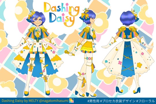

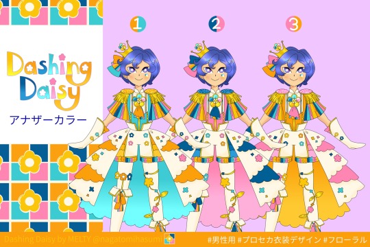
#project sekai#proseka#kaito#more more jump#プロセカ#it probably seems like me making a big deal out of nothing but I’ve tried hard at this contest for maybe a year maybe more or less#I’ve always failed#I have wips and sketches of lots of contests going back months that I couldn’t bring myself to. finish but are worth keeping for later#i love all my designs a lot but the art and the hard work takes a toll on me#often I do one big last push for the deadline and am unable to finish due to my poor health or almost passing out from tiredness lol#it’s a lot#and there’s more I could’ve done with this but I kept the shading anatomy drawing etc to a minimum so I could succeed#I also had a freak incident where I stayed up for like 40 hours#my body was like jelly and random still images and part of my art started moving but I was somehow ok to finish and post#like two hours early#which is insane#anyway it’s scuffed but I tried really hard to get across the presentation and what this concept means to me#I wrote a whole thing on twitter about the inspirations and stuff#think early 2010s idol stage costumes and also my love of 1960s retropop and Showa retro in general#if this wins which it probably won’t but if it does#I also partly wanted it so boys have more cute things to wear with idol style mvs and stages#and so kaito has more matching outfits for mmj#and so you can make any character a True Idol#my suggested mvs are dream place tenshi no clover and journey 3d#anyway kaito the world my final message goodbye#mmj#I like the double meaning of dashing as princely and handsome but also running#kinda like how every akb48 mv starts with idols running#you know it’s gonna be iconic when the center is running as the mv is about to start#imagine him running with his golden mic and stepping onto stage…uwa
14 notes
·
View notes
Text

For my first ever @d20exchange I got paired with someone who loves Margret encino as much as I do… so I swung for the fences coming up with the most insane “what would I lose my mind over” design concept I’ve ever made.
And what I have in excess of creativity I have a lack of in drawing talent. Enter @greatpistachiopie who has all the talent and creativity in the world, mine would not have been needed. They were an absolute dream of a commission creator because I had a specific dream and they nailed all the parts, including the phone and the “d list character poster in an ensemble cast” with a future retro vibe. I cannot sing their praises enough and I urge you to hire them for any commission needs you have.
Side note; this is intended to be a shirt design and I am planning on sending one to Ally Beardsley bc they’re the one who created Margret to start with. If anyone has a lead on Ally’s shirt size, let me know (:
#dimension 20#d20 exchange#a starstruck odyssey#d20 starstruck#dimension 20 starstruck#starstruck#dropout#Margret encino#margaret encino#ally beardsley#d20 fan edit#d20 fanart#d20
356 notes
·
View notes
Text
The Direct reports this September sees the release of not one, but three special edition releases for WandaVision from third-party collectors media company Manta Labs. It marks the first time an MCU streaming project has received a physical release in such a capacity—even sans the involvement of Disney’s own home release team, as confirmed by the Digital Bits—except it doesn’t, because all three versions are literally just empty cases that do not come with discs or even digital copies of WandaVision at all.
For as low as $37 and as high as almost $90 thanks to Manta Lab, you too could own various states of extravagant boxes for thin air. Each edition comes with a steelbook with a different design inspired by the show, and a slipcase to go over that steelbook, as well as extra accoutrements like postcards inspired by artwork from the show’s retro-styled opening credits, and character cards featuring poster art. Have we mentioned that none of these come with a copy of WandaVision yet? We probably should. None of these come with a copy of WandaVision!
I'm trying to become less judgemental, but if you pay money for this, I'm contemptuous of you.
716 notes
·
View notes
Note
Mortasheen
Given that I think your Mortasheen page has over 700 monsters while the latest Kickstarter update said you'd have 100 included, what should we think of those not included? Are they still 'canon' to the setting? Will the whole website page need to be revamped?
The book was never meant to be a one-off project but was always planned as the introduction to an entire tabletop gaming brand meant to keep adding content every year, at least in smaller batches. Like Pokemon the goal is to release playable monsters as "generations," and they'll always be a mix of old, new, or reinvented concepts, though @gutsygills who took over a lot of essential work doesn't want to leave a single one behind and stops me from completely scrapping any unless they truly just won't work.
The Mortasheen archive on bogleech.com is just there for posterity now and might never be modified again, except to add links to where people will eventually be able to buy the books or visit a more dedicated official website. I guess you could say the release of the RPG will be a "reboot," especially since a lot of aspects of its world had to evolve a little to make more cohesive sense as a game setting.
I'll still share my own new monster art and concepts as I go along but some will be book exclusives while some might get released with their gameplay stats for free, it'll vary with the monster. This is supposed to be basically my new job from here on out, it may be an independent project but it's being run as a serious business endeavor in partnership with the gameplay devs.
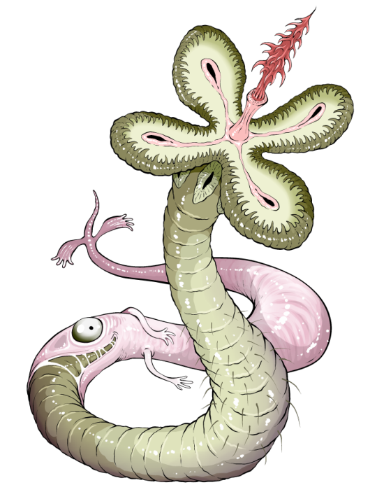
Here's one new monster I did for this first book though, its name is Pestode and it was designed to be the most basic common Wormbrain class monster, the Rattata of Wormbrains, just a large deadly parasitic worm whose "host" is reduced to barely more than a second skin it can contract into.
Every monster also has a "retro sprite" from an imaginary nonexistent gameboy game and in many cases I'm using that to show a monster's other possible poses or configurations; Pestode can scrunch up like a frog if it wants

159 notes
·
View notes
Text
Julia is sick of working late. She's sick of being disrespected, and most of all she's sick of her boss. Lance is a burned out, smooth-talking playboy, but he also happens to be the son of the CEO.
When Lance pushes her buttons once too often, Julia is tempted to put him in his place – but is it worth throwing away her career for a moment of satisfaction?
Content:
-F/M
-dom
-degradation
-small penis humiliation
-directed masturbation
-power play
5k words, EPUB and PDF format
Only $3, Releases later tonight! you can go read the first two pages on the shop page!
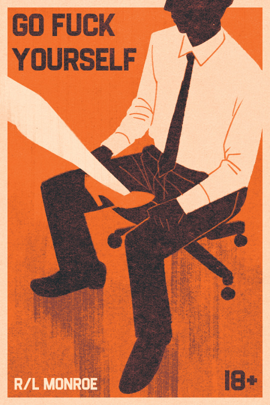
i've mentioned a couple times now that my editor and the author of roger crenshaw: the dogs at duskfall @mortalityplays is now available for freelance work for people other than me, but i don't think i've made as big of a deal how he's ALSO going to start releasing his own smut shorts on the last friday of every month! he is SUCH a talented writer on top of being an excellent editor and it's my absolute delight to work with him on the cover for his first release. FINALLY i have a great answer when asked "is there anyone else writing smut like you?"
and since this was the first time in a while i went through a cover design process that wasn't just me making one for myself, i thought i would go into how it went!
The Prompt
R/L wanted something that didn't visually describe the characters, because he had deliberately avoided that himself in the text. these characters are archetypes, ideas of characters: a woman who works in an office and her playboy burnout boss. for an erotic fantasy scenario, not going into detail can be ideal, as it allows the reader to project their own fantasies onto the characters. but what does that mean for a cover, when showing off the characters is often the point?
The Thumbnails
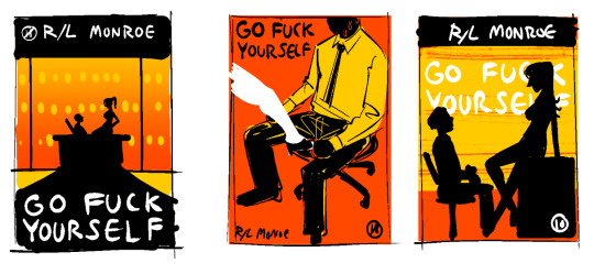
it means silhouettes, babie! if you're a reader of romance you've probably seen this approach a few times. silhouettes allow you to give the impression of a character without actually specifying them. HOWEVER! that can only go so far. note the female silhouettes in the left and right thumbnails--one with a pony tail, one with her hair down. these two very minor design elements say completely different things about the character, and pin her design down into something specific. (there is a whole line of feminist thought about this, that there is no such thing as an "unmarked" woman, or rather a woman whose presentation does not say something about her, ie a woman not wearing makeup is not perceived as neutral the way a man not wearing makeup is).
so anyway including her in the cover in full doesn't work for the prompt, because how she wears her hair or how she dresses would say something about her that we don't want to say. thus: we chose the middle design!
a man in a shirt and tie are super archetypal, and """neutral""" enough to not say anything specific about lance, our male protagonist, other than he has a job and is of average size (which are of course not technically truly neutral, but for our purposes, are functional as symbols). and while a long, narrow, leg does still say something about julia, it is abstracted enough to simply represent the concept of "woman" without projecting an overall image of her in the reader's head. she has a leg, and she wears high heels. that's all you get!
The Sketch
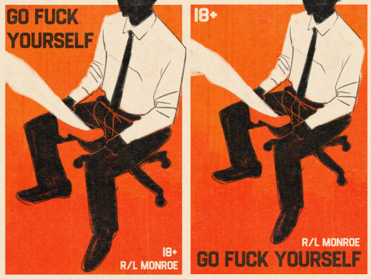
now we can move on to the sketch stage! this is the point at which the palette and text are figured out. i tried a few fonts before landing on one that had the retro paperback all-caps feel that i liked, and i used what i believe to have been a risograph print texture from retrosupply.
we went with the text up top rather than at the bottom, because it lends weight to the shoe and balances out the blacks in the pants. it also allows the figure to take up more of the cover, which is ideal. honestly, not a whole lot to say about this bit that i didn't cover in thumbnails: which is the point of doing thumbnails in the first place!
The Finish
well you can just scroll up to see that one. the final colors ended up a little less saturated, a little cooler, to bring it home to the retro paperback look i was going for and tie the colors together. i'm very pleased with it and had a lot of fun. cover design is one of my favorite parts of putting out books, and it was especially fun working with someone else to bring their vision to life.
anyway, you should go buy this book! it's only three dollars and i want to make more covers for these! your purchases would prove that i am a very good investment as a cover artist >:)
76 notes
·
View notes
Text
Masterlist! (Requests are welcome!)
Vox x Reader:
Can’t sleep - I’m not cute! - Mute!reader - White noise - Obvious - Besties - Reader w/Hypnosis - Shark Sinner - Computer head reader - Game Over - Upgrades - Drabble - Caged - Immunity - Touché - Nightmares - Savoir
Vox x Val x Reader:
Baking - With Retro - Attention - Glitched Footage - Val fucks up
I don’t know how ‘open’ AUs or concepts work, I kind of assumed that by posting it here and asking for requests on it, that inherently meant it was open but I guess not. I have a lot to learn lol. Anyway, everything I write is open for anyone else to use! Just be sure to tag me or @ me or whatever, because I’d love to see what you do with it <333
Retro!Reader (open, just tag me):
The original post - Valentinos Wardrobe - Twinsies - Meeting the Vees - Attentive - Shark Tank - First Visit To V Tower (Shit Post) - Embarrassed - Couple Dynamics - Jealous - Kidnapped - Day In The Life - Retros opinion on Val (Initial) - Alastor Adopting People On Sight - Habits - Vox’s thoughts - Getting Caught - Dad Alastor - Chaos with Rose, Alastor, and Niffty - What Vs do When Retro is Hurt - Vox’s Habits When Someone Flirts With Retro - Charlie, Spying, and Lucifer - Attending Overlord Meetings - Hypnosis on Retro - Overlord Retro - First Date - Problems - Success and Order - Meeting the Vees (Official) - The wedding - Retros Apperance - Retros Fashion Dump (1, 2, 3, 4) - Aquarium Date - Dancing Lessons - Eerie Melody - Mammon The Menace - Cooking Show - Rotting For Old Times Sake - Vees React to Retros Murders - Val fucks up - Workers at V Tower - A Problem - Something New - Rest - Retros death - retro!reader masterlist (part 2)
Be A Doll AU (open, just tag me):
Snippets - Origins - Conditioning - Be a doll (everything you need to know) - Better of Two Evils - His favourite toy - Antique Beauty - I Know - Tell Me - Foul mood - Worship Me
Misc.
Shitpost TV Host He’s not bulletproof Shapeshifter Sick Fic Ideas Gamer/Game Designer Fluff! When His Hypnosis Doesn’t work Hells Got (no) Talent - Antics
Asks, Requests, etc.
Other Accounts
This masterlist has too many links, so here’s part 2!
57 notes
·
View notes
Note
Hello again! New questions bc im really curious!
How much do you all identify with your puppets and their appearances? Are they more of a tool for you or are they significant for your sense of self? I've noticed that your appearances somewhat reflect your personalities, was this a design choice made by your architects or have you been adjusting looks along the way by yourselves? (I know Habitually Stargazing did a little, the dress looks really pretty on you btw!) Im particularily fascinated by the antennas! Im guessing you don't use them much having a hard-wire connection to the rest of your superstructures, right? (perhaps they would be more practical when communicating with visitors in your chambers? I don't know..) Im seeing a sort of analogy between animal motifs in ancient art and masks and those retro-looking antenna resembling those used with older technology, though I might be wrong.. I'd be thrilled to know whether these hold any cultural / traditional signifincance among machines alike!
Also I'd love to know more about your serial numbers! What do they mean, and do you more identify with them or with your names?
Finally, Flowers - a creature for you

It's an umbrella slug, hiding under it's umbrella!
Hope you all have a wonderfull day, looking forward to hear from you!

SDA: Oh! While the exact details might vary from case to case, I would say that it's a bit of both - the puppet is a tool tied to an iterator's sense of self.
SDA: The puppet is only a small part of yourself, but it represents you as a whole. You .. used it to communicate with your citizens, you use it to communicate with your peers. Others start to see *you* in this form. The more you use it, the more you begin to identify with it. With time, its image truly becomes yours.
SDA: From our creators' perspective, it might have been a matter of needing an interface to interact with us. It seemed to be more natural to speak with something that you can actually look in the face.
SDA: Another important fact is that the puppet is by far the most expressive part of our bodies. Our biological elements can be somewhat controlled by our programming, but it cannot fully override them - there will always be a living, sentient being deep below.
SDA: One that has its own emotions, preferences, opinions; one that wants to express itself. The puppet serves as an outlet for that. It can gesticulate, it allows you to convey how you feel in a way that's understandable to most.
TFB: It would've probably been easier for them if we couldn't think for ourselves. Just tell us what to do and we do it until the end of time, no questions asked.
TFB: Instead, they chose to fully depend on something with an *attitude*! Some really tried their best to keep good relations with their iterator, afraid of putting it in a bad mood...
SDA: Yes, I suppose...
SDA: Some of us might pay greater attention to the puppet's appearance, adjusting it to our own tastes, mostly with clothes and accessories. Fashion was important in our creators' culture, so it wasn't out of the ordinary for an iterator to request a new robe or a necklace. Some took matters into their own hands.
SDA: ... I'm sorry, I didn't mean to ramble on like this.
BROS: Don't you dare, it's always nice hearing you so passionate about something~
BROS: About the antennae - you're right, they're not as powerful as the equipment in the rest of the structure! They're decent for close-range stuff, and they're what you'd resort to in case of an emergency.
BROS: Like, somehow losing access to the rest of your body. The puppet can't do much on its own, but thanks to these, it would be able to communicate with anything near it.
BROS: Aaand they were mostly another way for the architect to visualize whatever concept they had for a puppet.
HS: I'm almost offended by the "retro" remark. As far as I'm concerned, these are state-of-the-art.
BROS: Sure, sure~
BROS: Finally, as for the model numbers. They represent the architect's name, the cycle when the project was officially completed, and the name of the project at that time, like this:

BROS: Nobody really identifies with this, it's mostly used in paperwork - maybe some database stuff. Even if two iterators were given the same name, it's extremely unlikely they also had the same creator *and* creation date, so it allows for telling us apart that way.
HS: The name that appears in your model number isn't truly binding either. Such as...
TFB: Come on now, don't put them on the spot like that.
SDA: ...
SDA: It's fine...
SDA: Originally, I was called "Visions of Serenity", you'll see me in databases as GTIAOT672005VOS.
SDA: I was renamed shortly after, due to some... rather unfortunate coincidence.
SDA: It really doesn't matter now.
---
TFB: Also, thank you so much!! I don't get to see many marine species around these parts, this is lovely!
HS: (...and thank you...)
#UMBRACULUM UMBRACULUM SWEEEP 403-418 i love your questions so much . 10/10 thank you so much#also. the drawing quality's gonna drop on days when i Want To Answer but have no energy to draw properly!! sorry :^)#a: sda#a: bros#a: hs#a: tfb#rain world oc
65 notes
·
View notes
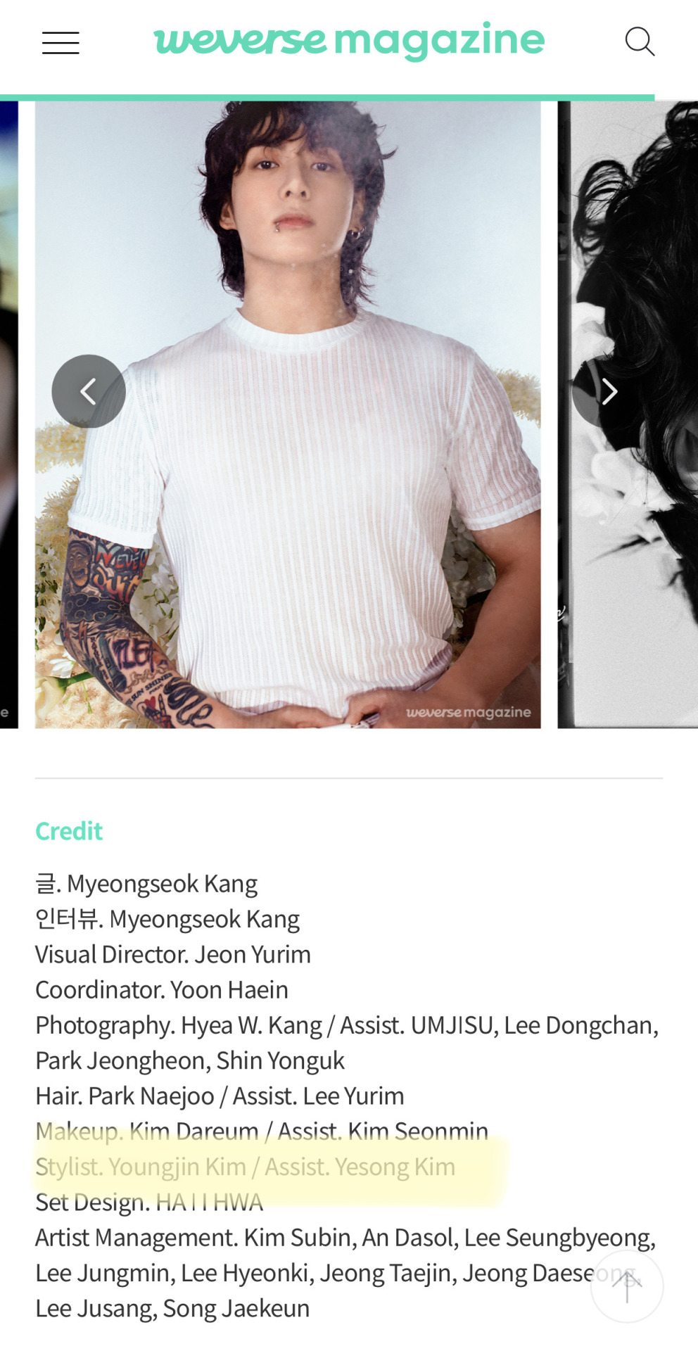
Text
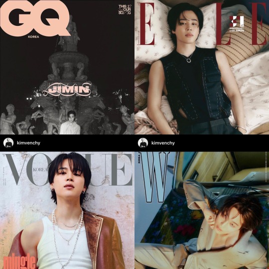
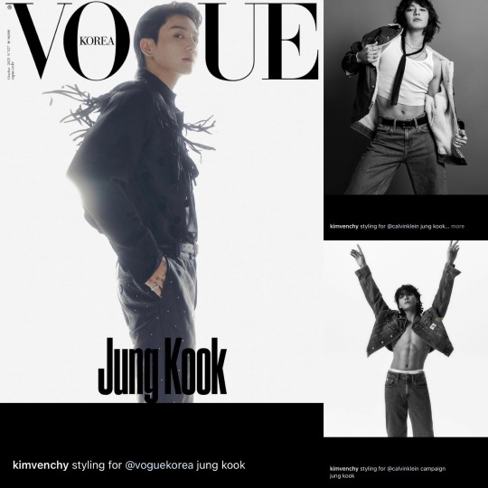
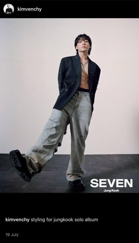
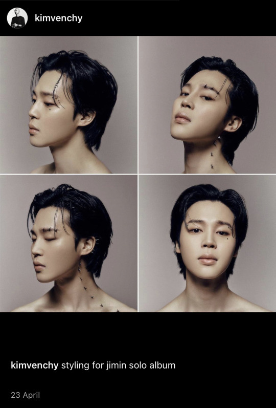
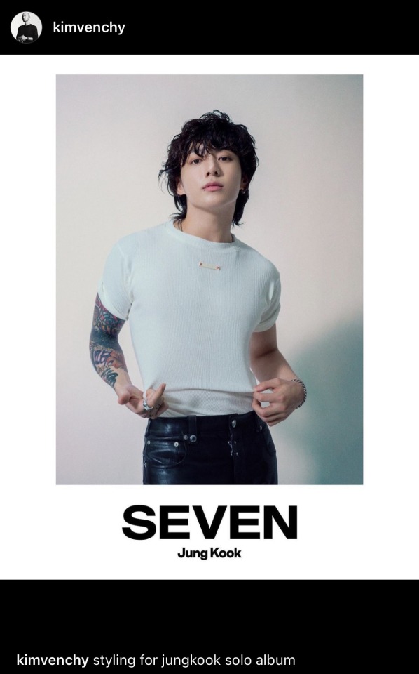
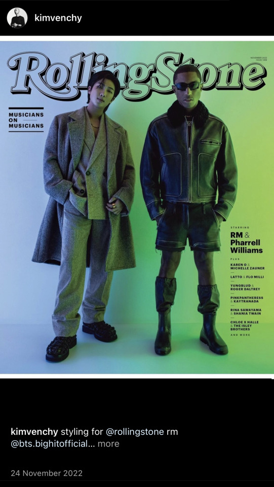
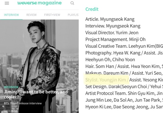
Who is Kim Young Jin?

The man behind the looks, bringing BTS' vision to life, from photo-folios, to music videos to high fashion magazine photoshoots.
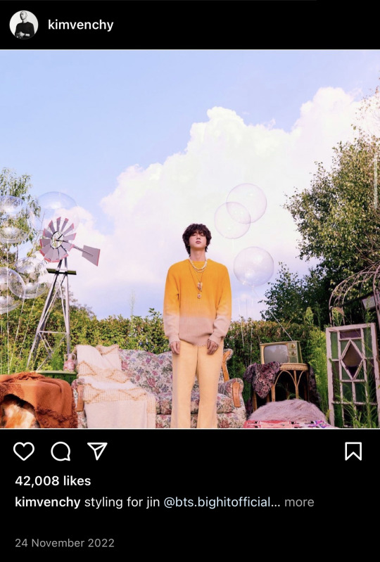
Kim YoungJin and his team have worked with the members as a group and as individuals on their concerts and everything in between.
“Seoul-based stylist Youngjin Kim has been obsessed with fashion since he was a child, saving up his pocket money to buy magazines. “It was so special to me,” he remembers. After majoring in photography at college but leaning into the looks just as heavily, somebody suggested he give styling a go and well, the rest is history. These days, he’s working with BTS, but can also be found dressing the likes of NCT 127, Super M and Daniel Kang for cover features, campaigns and album artwork.”
ID Magazine - VICE Interview (March 2022)
👤What was your entry point to styling?
“I worked as an assistant to [Korean actor] Jin Oh Jeon’s stylist for about five years and came to understand the overall system of the Korean fashion scene. Looking back, that time was so precious; time that brought me to this moment, I guess.”
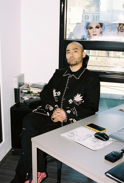
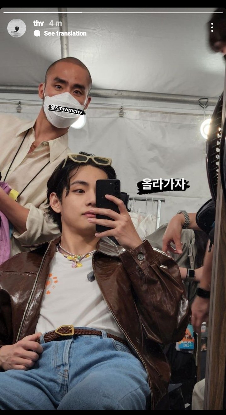
The man himself, Stylist @kimvinchey on IG
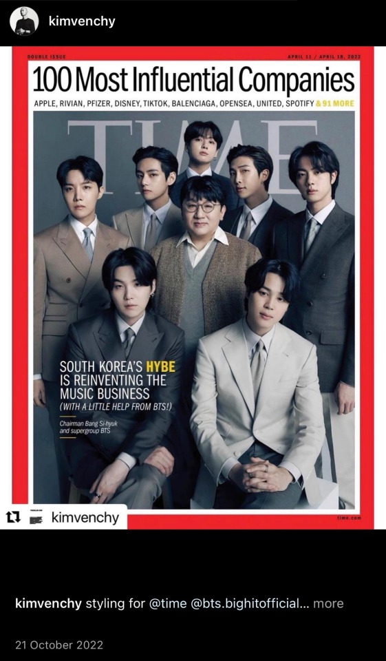
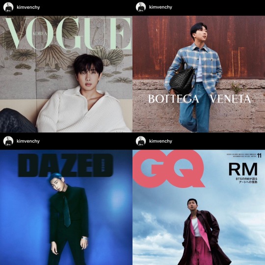
Kim YoungJin styled BTS and Bang SiHyuk for their TIME Magazine 2022 photos.
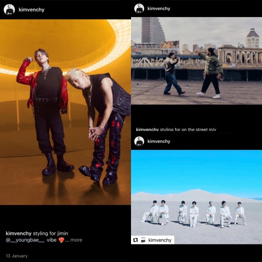
Kim YoungJin has been head stylist for MVs such as 'My Universe', styling Jimin for 'Vibe', j-hope for 'On The Street' to name but a few MVs
👤Tell us about the type of work you do.
“Styling for albums and projects such as “My Universe” by BTS and Coldplay is receiving tremendous attention on a global scale. Whenever I style an idol group, I think of a designer creating a collection. I mix and match clothes from different Japanese brands such as Comme des Garçons and Yohji Yamamoto, and I express my own aesthetic with styling to fit each concept. I also style various editorials for fashion magazines. I consider myself a fashion stylist, and when I first took on the role of an idol stylist, I was proud of demonstrating what kind of visuals could be created if a fashion stylist takes on an idol.”
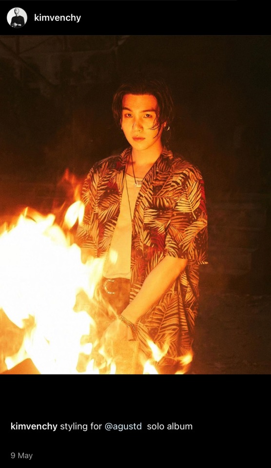
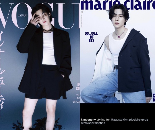
Kim Youngjin has worked with the members on the brand ambassadorship endeavours, such as styling for mag shoots like the Valentino photoshoot with SUGA
👤Of course, a stylist doesn’t just ‘style’. You’re often a bridge between celebrities and brands — a look you introduce to an idol could quickly become a trend.
“Exactly. In many cases, celebrities or models with good momentum are recommended to brands or magazines, and if the celebrity is an ambassador of a fashion house, they communicate more closely with the fashion brand.”
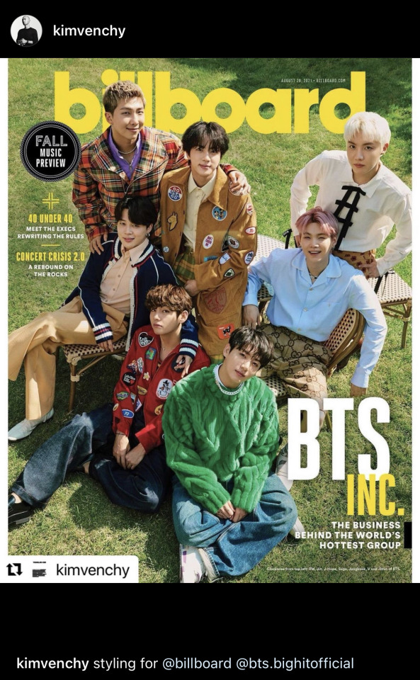
👤What do you think is the most important thing in styling?
“I try to combine the latest fashion trends with classic items. For instance, I like pairing Levi's denim and casual sneakers with a Saint Laurent blazer. As details are crucial for men's clothes, the overall outfit is often impacted by details such as perfect length and sleeves.”
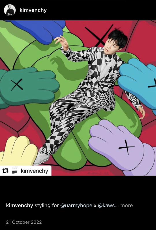
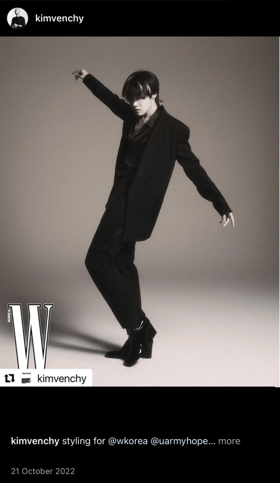
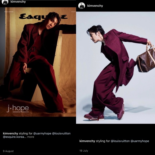
In Chapter 2 of BTS' journey, Kim YounJin has been part of many of the members solo projects that were even released post enlistment for some, such as j-hope LV campaign and styling for Esquire Magazine
👤Do you have a favourite brand or designer?
“I’ve always loved Givenchy by Riccardo Tisci, which has had a huge impact on me as a stylist. I have such respect for a person who has accomplished what they’ve wanted to do for a long time — I think Miuccia Prada and Raf Simons are both great in that regard too.”
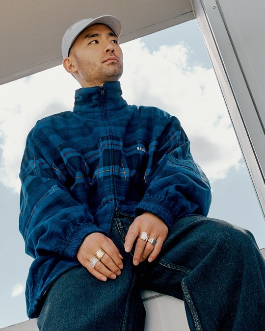
“I’m 32, so I was in elementary and middle school in the 1990s, which was when I started getting into fashion. Since I was really young, like 10 years old, I used to go downtown to buy clothes by myself. In elementary school, I wore baggy sweatshirts and jeans like this Balenciaga ensemble. I liked hip-hop and K-pop even back then and would dress up like this and dance at school festivals. Retro fashion is back in style, so it doesn’t at all look out of place or time to dress like this again.”
Mr Porter - The Journal Interview (Oct 2020)
💜
Special Mention:
**Though Taehyung has worked with Kim YoungJin with group projects the Head Stylist for Taehyung (V) during Chapter 2, in particular his Layover Era has been @HIJIBIN, Taehyung's personal stylist.
Info on Kim YoungJin:
https://www.mrporter.com/en-sg/journal/fashion/youngjin-kim-contemporary-fashion-classic-style-k-pop-1445414
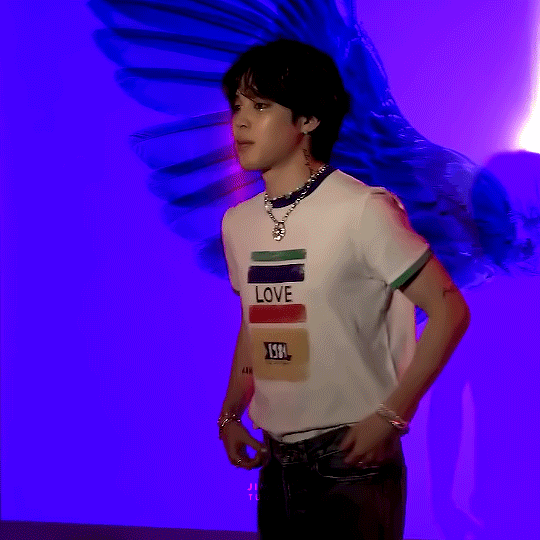
#Jimin#Jungkook#Jikook#Kookmin#BTS#RM#Namjoon#Jin#SUGA#Yoongi#Hoseok#j-hope#Taehyung#V#Kim YoungJin#Fashion#Stylist
117 notes
·
View notes
Text
canto V speculation/spoilers, featuring discussion of moby dick and lots of guessing.
a note that with my predictions, i am just spitballing here.
still fascinated with the fact that queequeg is a former member of the middle. i would assume she was one of the more skilled members as well, even if only just to play off her original counterpart's position as nobility in his tribe. lest we forget his strong proficiency in harpooning. i wonder if we will have ishmael reference queequeg in being instrumental to her skills with a harpoon?
given ishmael mentioning in the blubbering toad's logs having someone long ago comfort her while crying over something, i have to wonder if this was queequeg, and if queequeg ended up being a mentor to her. the way the members of the middle are referred to as either "big brother" or "big sister" makes me think of a shield/protector sort of role being advertised by them, even if it ends up being a farce. perhaps queequeg had some disillusionment with the operations of the middle? a contrast between the middle's (probable) brutality and queequeg's (if we go by the source) kind-hearted nature?
i think often on source queequeg's sentiment that his exposure to the white christian world have become a taint in his soul, and that he feels unworthy of returning to his home. the world of the city being, for better and definitely for worse "aracial" makes much of the relevance and themes of moby dick a little tricky to translate, imo. for those who might not have read moby dick, my favorite thing to say about it is: "the whale is white for a reason."
schools in the united states often teach that the lesson about race to take away from moby dick are simply not to judge another person by the color of their skin, but that is a vast oversimplification. moby dick was released pre-civil war and asserted that the very concept of whiteness is an inherent evil. it condemned slavery, argued against the merits of the very-popular-at-the-time "scientific" school of phrenology. most importantly, it suggests that the glorification of whiteness as a designation of purity and the reason to guide the "lesser non-white races" is the source of all of christianity's evils. with this in mind, i'd like to bring up that sometimes people nowadays make a show of "wow, moby dick was a commercial failure, but now it's considered one of the greatest american books ever written. thank goodness we discovered it." what actually happened is that moby dick was critically panned in virtually all liberal (in the classical/socialist sense) media circles, but celebrated in socialist ones. you can probably guess why.
perhaps that gives context to my skepticism of how queequeg will be handled in a thematic sense. some people point to queequeg in moby dick as a progenitor of the harmful "noble savage" trope, and i don't think that's entirely without basis. but the difference between moby dick and many other media with "noble savages" is that queequeg was created as a philosophical counter to the very notion of white (and christian) supremacy, whereas the majority examples use this to show the virtues of white society. there is also the fact that queequeg and his fictional home were based on actual indigenous polynesians whom the author, herman melville, actually lived with for several years and maintained strong friendships with. i personally believe that matters.
so how will project moon translate that to queequeg? i don't really know. perhaps her home was a smaller syndicate in the backstreets. maybe she's even an outsider, especially given that ishmael has spent a lot of time exploring the outskirts. ishmael seems to be a blend of the character and a biographical account of herman melville's well-recorded life and philosophical quandaries. i am definitely curious and trying to be optimistic.
there's also the presence of tanya, who was obsessed with strength and survival of the fittest to the point of distortion. maybe she will end up being retroactively made a foil to queequeg? human!tanya in a flashback, maybe? i think she can be a very interesting point to develop PJM's take on queequeg, since queequeg abandoned the middle entirely.
so yeah. needless to say. i have been Pondering. there's a lot left to discover and understand, and i'm excited to see where they take it.
72 notes
·
View notes
Photo


you're not listening
Substance Designer, using my own retro pixel art colorizers, but at full resolution. lighting is baked into the albedo for an oldschool look.
Substance Designer is a visual scripting program made for procedurally creating textures. it doesn't use machine learning; instead artists direct the look and functionality of every aspect of the art, and enables them to parameterize them to create flexible custom tools to use in an art pipeline. it's a program that was made for artists, by artists and engineers, to take the tedium out of creating tiling textures. what we have is now a powerful tool that has made texturing a joy, more than it's ever been. this is what an art tool does, it's what an actual art tool looks like. we still create art from start to finish, it's not a make-art-button.
I'm so tired. again and again technology we never asked for is pushed upon us. AI image art, like NFTs, is an initially promising tech that upon further inspection reveals itself to be built on a foundation of dishonesty, and exists not to truly to ease the problems of artists but rather to exploit and capitalize on us.
ethical AI can exist. but I'm not holding out hope that day will ever come. until then, art remains a joy to create, and I happily embrace technology that makes the process of art less tedious, and lets me focus on actually making art.
Articles about the protest:
On VICE https://www.vice.com/en/article/ake9me/artists-are-revolt-against-ai-art-on-artstation
On KOTAKU https://kotaku.com/artstation-ai-art-generated-images-epic-games-protest-1849891085
On Kotaku AGAIN https://kotaku.com/artstation-ai-art-generated-image-protest-controversy-1849895978
a GOFUNDME for hiring a lobbyist to represent concept artists
https://www.gofundme.com/f/protecting-artists-from-ai-technologies?utm_campaign=p_cp+share-sheet&utm_content=undefined&utm_medium=copy_link_all&utm_source=customer&utm_term=undefined
253 notes
·
View notes
Note
I just wanted to say I adore your y2k Sora and I'm so happy there's a finished version. It encapsulates what I think of when I picture f!Sora and then Tsumugi and Natsume hunting down retro gaming stuff for her to make her happy ;-;
WAAAAHHHHH I'm so glad you like it!!!!! 😭 😭 😭 😭 💟 💕 ❣️ 💙 🧡 ❤️ 💖 💝 💘 I wasn't going to finish it tbh I saw so many things that I wanted to fix but didn't have the energy to... 😔 but i also needed to post smth new this week since I'll be a little busy with comms the next few weeks, so I decided to finish and post it anyways JKSHFDJKHFDJF
AND OHHHHHHHHHHHHHHHH THIS IS. ACTUALLY SUCH A CUTE IDEA?????????? This would be such a cute concept for a gacha/event 😭😭😭 i can totally imagine them singing a song with an arcade type beat while wearing y2k inspired fits............... IM SCREAMING CRYING I NEED THIS RIGHT NOWWWWWWWWWWWW
also a little fun fact, i actually designed their outfits, they're supposed to look like this (ignore the fact that i didn't properly finished them bc i was feeling super lazy lmao this is from 2 months ago):

#ask#ensemble stars#femstars#natsume sakasaki#tsumugi aoba#sora harukawa#i was listening to poppy by stayc and shooting stars by xg for like 3 days straight when i decided to make this#it's just inspired bc im not the biggest fan of actual y2k outfits LMFAO but i like the colorful and fun aesthetic!!!!!!!#gonna post the actual art later :33
74 notes
·
View notes
Text
Williams "Robotron 2084" arcade - attract mode
Reviewing Williams' "Robotron: 2084" from a deep philosophical perspective invites a fascinating exploration of the game's underlying themes, aesthetics, and the existential questions it raises, both intentionally and inadvertently.
1. Man vs. Machine - A Reflection on Technological Progress:
"Robotron: 2084" centers around the classic theme of humanity's struggle against its own creations - the robots. Philosophically, this can be viewed as a commentary on the anxieties and paradoxes of technological advancement. As players fight against a relentless horde of machines, the game echoes fears of technology becoming uncontrollable or turning against its creators. This mirrors existential concerns about the role of technology in human life and its potential to both enhance and undermine the human experience.
2. The Individual vs. The Collective:
The game's premise, where a single protagonist battles against an overwhelming collective force, touches on philosophical debates about individualism versus collectivism. The player's lone character, constantly battling overwhelming odds, can be seen as a metaphor for the individual's struggle to maintain identity and autonomy in the face of societal or technological collectives that threaten to subsume individuality.
3. The Sisyphean Struggle and Absurdism:
"Robotron: 2084" offers no end, only an ongoing battle against an endless stream of enemies. This can be philosophically interpreted through the lens of Albert Camus' concept of the absurd hero, akin to Sisyphus' eternal struggle. The game's never-ending nature and the player's inevitable defeat reflect the absurdity of life and the idea that meaning and value come from struggle itself, rather than any final victory or conclusion.
4. Ethical Implications of Artificial Intelligence:
On a more contemporary note, "Robotron: 2084" raises ethical questions about artificial intelligence and its implications for humanity. The robots, originally designed to serve humans but now their adversaries, symbolize the ethical dilemmas and potential dangers associated with AI. This aspect of the game prompts philosophical inquiry into the responsibilities of creators towards their creations and the ethical limits of artificial intelligence.
5. Nostalgia and the Human Psyche:
From a more psychological perspective, the game's retro style and enduring popularity can be seen as an embodiment of nostalgia and a longing for simpler times. This raises questions about the human tendency to idealize the past and whether such nostalgia is a comforting escape or a barrier to confronting current realities.
6. Aesthetics and the Nature of Video Games as Art:
"Robotron: 2084," with its distinctive 1980s arcade graphics and sound, contributes to the philosophical discussion about video games as a form of art. The game's style, gameplay, and enduring appeal challenge traditional notions of what constitutes artistic merit and invite players to consider the artistic value inherent in game design and the interactive experience.
In conclusion, "Robotron: 2084," while ostensibly a simple arcade game, offers rich material for philosophical exploration. Themes of man versus machine, individual versus collective, the absurdity of endless struggle, ethical considerations of AI, the role of nostalgia, and the nature of video games as art all converge in this classic game, demonstrating the profound potential for video games to engage with deep philosophical concepts and questions.
23 notes
·
View notes
Text
I'm aware Wapeach had been happening since late last year when Waluigi's character designer posted her concept art and 3D model for Mario Tennis Gamecube. So much glorious fanart for me to savour 👌👌👌
I thought: Why not I take a spin of this character by making her a bratty Mareach baby? Since from my observance, Rosalina shares her hair shape and the fact the fandom had been theorizing about Rosie being a Mareach daughter.

Chanterelle before she went through her goth emo phase too prematurely XD
Her pre "fallen angel" princess design inspirations:
Rosalina's beta design

As well as Peach's retro/initial appearances before Youchi Kotabe made her who she is iconically:
What do you guys think? Like, reblog and comment! It would mean so much to me! ❤️❤️❤️
#super mario bros#wapeach#mareach#implied from my AU's take on the character#was considering naming her Apricot since it's symbolic to Peach (original idea by @drspade) but settled on a mushroom name#Chanterelle#my art#bowuigi#since she is Valentina and Rossa's cousin in my AU#she's an ABSOLUTE NIGHTMARE to them#she's the one cousin they do NOT look forward meeting again at every family reunion/gathering/sport event
15 notes
·
View notes
Text
Spy x Family x Chairs Vol. 4 - 5 -6
Previously, I did an analysis of the covers of the SxF Vol 1,2 and 3 manga volumes. I saw that it had a great reception, and that motivated me to continue analyzing these particular chairs and the possible background. I hope you like it! :D
Context:
Due to the wars and the multiple consequences, many architects who went through these times of change, sought new alternatives from labor sources, leaning towards the industrial area and furniture design, in this specific case, chairs. As a way to exhibit pieces of art, architecture that were part of the everyday life of the citizen. Although each architect has its own history, and each chair has its own concept. Interestingly, in SxF the consequences of war is a fundamental element governing history, and the covers were no exception. Each chair not only represents a comfortable seat for the character, it reflects aspects of his personality, of the time with a very interesting background story. So I come to give you my little analysis and opinion about it.
SxF Vol 4 · Bond Forger - Ball Chair by Eero Aarnio
The Ball Chair was designed by Eero Aarnio in 1963. The Ball Chair is also known as the globe chair and is famous for its unconventional shape. It is considered a classic of industrial design.

The Ball Chair is not a simple piece of furniture, it is conceived more as an architectural piece than as a chair. The chair was presented in 1966 at the International Furniture Show in Cologne with great success, becoming part of the favourite retro chairs of the public and thus one of the best designs of the second half of the XXth Century. The Ball Chair is a room within a room, a shaded atmosphere is created within the chair, a totally different concept to what a chair was until the arrival of Silla Ball. This atmosphere, protected from external noises, is perfect for reading a book or making a call.
This chair with futuristic features, was handcrafted in small quantities with fiberglass. Being his concept of modernist furniture
Bond: Worf! Worf!
Although it is a chair made in the last century, we can see the futuristic vision of Eero, as an ancient element can fit perfectly with the minimalist design of the present. Obviously, this is an allusion to the "imperfect precognition" of subject 8. Bond can see the future, and this allows him to adapt to the possible circumstances that may happen.
It is also designed to generate a quiet space for the user, an imperturbable space. Which would be best for our canine friend if he wants to take a nap in peace. I love the reference to television with antennas, which is a way of interpreting Bond's powers, being diffuse images that are captured briefly, very similar to his sporadic and involuntary visions to black and white. Agent Bond Forger just found his ideal chair.
SxF Vol 5 · Yuri Briar - Barcelona Chair
Is a chair designed by Lilly Reich and Ludwig Mies van der Rohe for the German Pavilion at the International Exposition of 1929.

The design was developed at a time of reconstruction after World War I. The designers who prepared the German pavilion had the responsibility of showing the resurgence of German culture. Having to take advantage of new technologies and materials developed during the war. In this sense, the design of the chair is a cutting-edge proposal for domestic use.
Its form is based on the "sella curulis," a type of chair used by Roman magistrates. The connection to the view of the structural frame and the seat dampers as separate components, and the use of traditional and modern materials, adjusting to their functional purpose, perfectly adapt to Mies' conception of the international style.
Lilly Reich was a modern German designer.Because of the First World War she focused on fashion and furniture and set up her workshop as a shop. Its production was highlighted in the newspaper Fachblatt für Holzarbeiter in 1915. That same year she organized the Exhibition for the Fashion Industry in Berlin.
Unlike you, I love my family. I love my sister. And I will do whatever it takes to protect this country that she lives in
It is curious how this chair represents fundamental elements of Yuri's personality, which many people ignore because they focus on his flaws but do not see the background of the character
The Barcelona chair was inspired by sella curulis, which was used by the "Roman magistrates": Which, were positions and powers to perform functions related to the administration and political direction of the city. Which fits perfectly with Yuri's work in the SSS as a secret police, along with elements such as tape recorders, handcuffs and the gun. And while this chair also evidently represents the German trans-world war reconstruction, it is interesting how these elements give a clear outline of what the SSS stands for in Ostania, and thus Yuri. In his work hunting spy and traitors.
But there is a totally opposite and contrasting element. The white orchids, which in the symbology of flowers symbolizes the purity of intentions, elegance, eternal love through time, and full of innocence. They are a popular gift for people you love and admire, can be given to friends, family and of course couples. But this is considered a symbol of admiration and good intentions
Which, represents perfectly, that although Yuri is an extremist person, crooked and erratic behaviors. Love for his family is sincere, pure, and full of admiration. It is obvious that the way Yuri demonstrates his love is obsessive, and strange (we can say it is wrong), but he does so not because he is "someone evil," but because he is someone who does not know the boundaries between the "normal" and the non-normal. (I regret veryyyy much, that in the anime they changed for roses, because they completely change the meaning of Endo in the manga and on the cover… but well…)
One detail that makes me imperdible, is that this chair was designed primarily by a woman- Lilly Reich. Who was one of those few women's representatives in Germany, especially exalting the work of women at home.
Why does this represent Yuri? Because Yuri values the work of the woman, or in this case, the work of Yor that she did over the years that she tried to raise him. Being a pillar in the personality of Yuri, who lives conscious of the dark world where they live, and the number of people (men) unfaithful to their wives, who use them and do not value them. Yuri lives with constant guilt, remorse and fear for having been the "cause" because Yor had to sacrifice her life, and in his immaturity not knowing how to live with this feeling of "hatred" of himself ends up unleashing this guilt on other people who cast away their family.
I will be brief with this mention, as I would like to touch this topic further in a separate post.
In the light novel, Yuri feels a deep hatred for a man (in a child role-playing game testing professions) who says (playing a character) that he "beat his wife" for not knowing how to cook. This shows how aware Yuri becomes that he and his sister are not normal people, especially, that Yor is not perfect in the imposed social roles given to a mother. and he lives in fear that a man might attack his sister.
While it is not right for him to have these problems of self-control and his mind frequently distorts reality (he comes to channel that fear and imagines the face of Loid Forger in that actor) - I understands perfectly his fear in a society with people who blindly create prejudices about "social and family roles." Where they believe it is justification for verbally and physically assaulting someone who does not meet these expectations. The known domestic violence
Yuri really values and loves his sister with pure intentions. And he hates a cruel (machista) society that weighs the value of the woman (his sister) for simple everyday functions. And so he carries this fear to such an extent that he wants to eradicate all this evil so that his sister can live in a society, a country, where she is safe.
(We are all clear that Loid (Twilight) would NEVER do something like this. But this is part of what Yuri must learn. Not all people are evil)
It makes me very transcendent that Endo chooses a chair that was designed mainly by a woman, in collaboration with an architect Mies van der Rohe. And just be the furniture that represents very well every feature in Yuri.
.
SxF Vol 6 · Ninghtfall/Fiona Frost - Heart Cone Chair
Designed by Verner Panton in the late 1950s

As an armchair that relays a certain joy of living, it is especially suitable for informal spaces or to give a fun touch to an excessively sober environment. However, on a decorative level it is a piece that takes the focus of all the looks by itself, so it must be clear that it channels the rest of the decoration.
In the words of his designer:
«"Most people spend their lives living in a sad grey-beige conformity, with a deadly fear of wearing colors. By experimenting with lighting, colors, fabrics and furniture, and using the latest technologies, he tried to show new ways to encourage people to use their imagination and make their surroundings more exciting. "»
"What a wonderful man you are, Twilight. I'll achieve peace between East and West. And I’ll do it all for you"
I think, although this armchair is too obvious, it doesn't stop being interesting.
It is curious how the function of this chair is to contrast with a sober and dark space. This happens aesthetically on the cover, seeing the color red, a warm and passionate color, contrast with the cold and sober appearance of Nightfall, and its cold tones. In fact, this goes from being merely aesthetic, to representing Nightfall's personality.
Who although outside is a cold woman, would be, ruthless that she does not mind using tricks to achieve her goals. Deep down is a tender woman, thirsty for romantic love, sweet and a life of fairy tales. The function of this chair is to manifest joy and feelings, despite being in a place with minimal decoration.
Which is perfect, considering that Nightfall (being so extreme) took to the letter Twilight's instructions to "show no emotions," becoming an inexpressive woman but wanting to shout to the whole world her desires to "love"
As mentioned, this chair should "channel" the rest of the home decoration. Which alludes to Nightfall's every action being channeled by her fervent desires to get love from twilight. Desiring to find world peace only for him
I'd say I worry about seeing Yor's photograph with a scissors nailed to her forehead. But knowing that Endo clarified that Ninghtfall is very weak to Yor and that she could with a finger send her to outer space if she wanted to… well… let the agent live in her fantasy "xD
This is the right chair for a passionate (and obsessive) woman who appears to be cold and calculating
.
.
.
I hope you like this little contribution from me. I really love the idea of Endo doing such a detailed study of his characters and the way he symbolically represents them. The chairs being not only an aesthetic element, but something significant!
.
What did you think?
You can see the first part here
You can read the next part here
#spyxfamily theories#spy x family#yuri briar#bond forger#nightfall#spy x family manga spoilers#spy x family manga#the forgers#forger family#spyxfamily twilight#yor forger#loid forger#yor briar#twilight#anya forger#spyxfamilyxchairs#chairs#furniture#character analysis#twiyor#character motivation#spy x family vol#sxf#loid x yor#fiona frost#spy x family x chairs#SxF Small theories
200 notes
·
View notes
Text
Special Update!
New Years is on the way. So,I’ve been planning a few things!
I don’t know if y’all can tell, but I’m a very big project person. I love creating the concepts, drawings and rough drafts of my own projects. It fuels me with so much creativity and ideas it's not even funny. The only unfortunate part of this, is the fact that I never finish them.💀
They always get STUCK in the middle of something and there’s never an ending for them. I want to change that by doing some projects of mine I’ve been itching to get to. I’m only giving myself 3 for now.
TWST Character Resurrection:
A task where I revive my old TWST characters I abandoned by giving them new designs and backstories! Rekindling their relationships with one another while giving them a fresh new look at their personalities and how they became that way.
Also because there’s a lot of improvement that needs to be done with all of them.
The characters that are going to be resurrected are:
- Sullivan Laguna
- Kai Ramsey
- Photios Diamandis
- Malachi Fotea
- Blaze
They can finally be free from the grave!
Unfortunately, Raizel and Orval must stay inside the grave. May they rest in piece.
TWST Retro AU:
A Twisted Wonderland alternate universe set in the 80’s where everyone can still use magic. Cable TV, the rise of different subcultures, rock bands, fun food courts and full of the bright youths of tomorrow trying to make a change in the world they live in. But, every dreamer has to have a start somewhere. And that all begins in High School.
I’m still drafting some designs for the OG cast but this is definitely going to be the last project on my list of things I want to do this year. This is an AU I've been loving for quite sometime. So many clothing ideas and cliques/groups in here it's not even funny. Hopefully you guys will love it too.
The Melancholy Case of Kei Yoshihiko:
OK! This last project on the list, is the most biggest one by far. BUT! It will be so worth it. As you could probably tell from the header, I will be making something big for Kei. A birthday event that will have a few chapters and a possible new character to be added to the Ramshackle Dorm. The story will mostly focus on Kei feeling worthless, homeless and finally deciding to tell the truth about not actually being who he said he was, a detective.
I won't say too much as to not spoil what I'm trying to cook up. But as of right now, I have a very good feeling about this project. It may take a while and that's ok. <--- I'm coping.
Of course these projects will come out when they come out. I wouldn't dare give myself a schedule because I know for a fact that I would not make it. I need to pace myself and not force the creativity out. I'm really excited and passionate about this. EVEN IF IT TAKES SOME TIME THESE WILL BE FINISHED! That's all! \( ̄▽ ̄)/
19 notes
·
View notes
Last Seen Blogs
abcdefgeorg-blog
abcdefgeorg: Photo A Day

wtflorienlegacies
digging through the interstellar trainwreck
rule-anyone
Untitled
adventuresofnelly-blog
The Adventures of Nelly
delusionalpolo
Fan-fiction scenarios. Anime/Manga