#USE THE CHARACTER DESIGN SECTIONS AND THE SCREENSHOTS AND ALL OF THE ART WITHIN THEM TO PRACTICE ART
Text
Me, fondly remembering my playthroughs of FFVII, VIII, IX, X, X-2, and XII: I don't need more blogs I don't need more blogs I don't need more blogs I do --
Though if I did RP as anyone, it'd hands-down be Beatrix from IX.
#Out of the Flames#I loved those games so much... including X-2#don't look at my poster of Shuyin and Lenne on my wall#or my collection of X-2 wallscrolls from anime cons when I was younger#or my statue of X-2 Yuna#RANDOM VONNY FACTS: I WAS PLANNING TO COSPLAY AS LULU AND BEATRIX AT ONE POINT#AND I ALSO WANTED TO COSPLAY AS SORCERESS EDEA#AND MY PROM DRESS WAS CUSTOM MADE AND BASED ON GARNET'S CORONATION GOWN#AND I SANG 1000 WORDS FOR THE ANNUAL TALENT SHOW DURING MY JUNIOR YEAR OF HIGH SCHOOL#AND DURING MY FRESHMAN YEAR I SANG FOR THE FIRST TIME ON STAGE EVER AND IT WAS EYES ON ME FROM VIII#which is a weird contrast because Senior year I sang Think Of Me from Phantom of the Opera because go out with a bang BUT ANYWAY#VIII WAS THE FIRST FF GAME I OFFICIALLY PLAYED BUT MY SISTER AND MOM KNEW HOW MUCH I WANTED TO PLAY VII#SO FOR CHRISTMAS THEY GOT ME A PS2 AND THE FIRST KINGDOM HEARTS GAME AND A COPY OF VII#AND I WAS SO EXCITED AND EVEN MORE TOUCHED BECAUSE THEY HAD TO RUN OUT AND GET A PS1 MEMORY CARD FOR VII#AND THEY DID IT FOR ME... AND I WAS SO EXCITED#OH MY GOD I'M AKLSDGL AAAAAAAAAAAAA I COLLECTED STRATEGY GUIDES FOR ALL OF THE GAMES BECAUSE#I DIDN'T WANT TO MISS ANYTHING IN THE GAMES AND ALSO MORE IMPORTANTLY SO THAT I COULD READ THEM LIKE BOOKS AND#USE THE CHARACTER DESIGN SECTIONS AND THE SCREENSHOTS AND ALL OF THE ART WITHIN THEM TO PRACTICE ART#AND AKSLDJGLKFDGLKJDLGF OKAY I'LL STOP RAMBLING NOW BECAUSE HOLY SHIT SO MANY TAGS LOL
19 notes
·
View notes
Text
theories/thoughts/analysis about touchstarved after playing the demo a few times
Under the cut because it got long (I exceeded the post character limit...) Also spoilers btw.
PS: All the links are to posts on the official social media accounts or their kickstarter, with the exception of the animated trailer screenshots that I got from here.
(Happy one month since demo dropped!)
Mhin
I'm starting with them because I play favorites.
Mhin's silhouette [1, 2] in the animated trailer [screenshot] highlights the crying eye (guilt? pain? blood? Their pupils almost seem to glow red, I wonder if it's connected) and the beak (in a way that reminds me of the skull of a bird rather than a live one).
The red choice connected to them is about asking if they're a scientist: their precision is almost surgical, though when asked if they've studied anatomy or medicine their reply is “Not quite” so it must be something similar enough.
When Vere complains about their first encounter with Mhin, he mentions that their dagger (visible in their in-game art) is an antique. Perhaps they inherited it, maybe from a mentor? It’s a curious choice of weapon for a hunter: stilettos (it’s described as such in the demo) aren’t ineffective in battle (especially if wielded by a physically strong fighter, which they absolutely are), but they are favored by assassins because they’re easy to conceal, they strike precisely and deeply but without letting much blood leak from the needle-thin wound.
As far as design goes, the clasps on their hood looks like a mix between the quaternary celtic knot and the triquetra / trinity knot. Symbolically, the latter is associated to the Triple Goddess (more on this in Leander’s section) or three elements, while the former represents the four elements or the four seasons or the four cardinal directions, and is often used as a symbol of protection.
Their fatal flaw is that they “resist change at all costs”. I'm led to believe that they became a Monster instead of being born one. I think it either happened not that long ago or they lost control over it recently, and that's what spurred them on their search for a cure. Them being described as “outcast” also makes me think that they could have been exiled from wherever they came from, perhaps because the people found out that “a monster hides within their frame”.
When questioning them about Ais, they say “I'm not going to risk my life in the hopes that any of them is different” which shows that they’re distancing themself from their situation (i.e., being/becoming a Monster).
Their hate towards Monsters could be either a projection of the hate they feel towards themself (if they were aware that there was a Monster inside of them before they lost control and hurt someone, for example) or just because one took over them and by extension they hate every Monster because of it.
If the “lost control and hurt someone” thing is true I'll also add that they might be working as a Hunter as a way to try and atone. It could also be a way to expel the more violent instincts (I’m assuming they have some) into something productive.
The “they're afraid of being hurt. Or worse” on their relationship chart with Kuras feels to me like they're afraid of hurting him, also because when you ask them how they get along with him during the demo, they say “Few people are willing to help others; fewer when there's any risk involved” and I'm choosing to interpret that they think of themself as the risk.
I know I'm really pushing it on this aspect but the “If you stay too close to me, you'll get hurt”+“Find someone safer to ask for help” only fuels me more.
Their monstrous form also looks less defined and more liquid compared to the others, maybe because it's not as developed so it doesn't look as solid?
Vere is also said to be often provoking Mhin in order to make them lose control: he's confident in himself enough to think that he'd have the upper hand in a fight with Monster!Mhin, probably because they're a skilled hunter but they don't have that much experience over their monstrous side. Mhin dislikes Vere because he’s “the embodiment of everything [they] hate about Monsters”: while Mhin holds back from their nature and seeks a cure, Vere wants to give in to his instincts without restraints.
In the demo, they get defensive when questioned about the Senobium, but when they say “Whatever you're looking for, the cost may be higher than what you're willing to pay” I think they're speaking from experience.
It's interesting that it's implied that they slept with Leander once. Judging by the comment about the Wet Wick being the “perfect combination for making mistakes”, they're not enthusiastic about it. I’m guessing that they don't like that Leander has seen them with their guard down? Or they
Unless I missed something, it's unknown where in Eridia they're staying. I'll say it's probably in a different direction from the Wet Wick since they make a point of saying that they're only going there to protect Kuras (instead of, for example, “I live nearby anyways so I'll take the same road”).
The flowers in their pin design look similar to cornus kousa, or some other type of dogwood, symbolizing hope, resilience, renewal (I also found: rebirth, new life, strength, regret).
After a long and grueling winter, Eridia greets the first dogwood blossoms with relief. These flowers are known to cling tenaciously to life even in the worst conditions, from barren wastelands to ruins perpetually shrouded in Fogfall…
Really poetic meaning! I imagine Mhin as the dogwood flower, persisting even after the Tragic Backstory that made them lonely (“barren wastelands”) and their Monster Form (“shrouded in fogfall”)
Leander
Leander's silhouette [1, 2] in the animated trailer [screenshot] highlights only his eyes (they share the color of his magic -> maybe it's how he uses magic that contributes to him being “monstrous”?).
Nothing to note about his red choice except that it is unlocked by generally following his lead (taking the flower when he offers it, touching him without hesitation).
Speaking of his magic, an Alchemist MC notes that it extraordinarily powerful, enough that he doesn't need incantations or spell circles to cast it. Kuras mentioned that Leander prefers the company of those similar to him and that the Bloodhounds are mostly people who've endured the hardships of Lowtown, so I can't help but wonder if Leander was always a natural at magic, or if he did receive training but was later cast out, or maybe he left by choice?
A recurrent symbol in Leander's design is the triangle, as a detail mostly (on his coat, boots, dangling from his belt), but there's also one that looks like the alchemical symbol for earth (🜃) attached to the brooch on his chest; another symbol for earth is, you guessed it, the serpent, whose other meaning is duplicitous nature as well as renewal and rebirth. This connects to the ouroboros (present in his earring as well as in the background of the sticker and charm kickstarter rewards), symbolizing the cycle of death and rebirth and with relevance in alchemy as the “all in one”. The same theme is also present in the symbol of the triple moon (on his belt) symbolizing the stages of birth life and death and more in general three aspects united in one; the white lilies symbolizing renewal, regrowth, rebirth. The green feels fitting too, since it's often used to symbolize health and abundance.
Alongside the little triangle shape, attached to his belt there are a key (which is not the room key he gave MC), the head of which reminds me of two snakes knotted together; there's also a... I have no clue what that glowing red globe-spike is actually. It's the only other red item (along with the gem on the earring sword hilt) on Leander, but in some of the concept art it was green instead, so I think it's at least somewhat connected to his magic or the source of it. The shape of it combined with the red glow reminds me of Eridia’s towers’ architecture but that’s probably a stretch. I also feel like the symbol on the central part of the triple moon belt buckle is relevant: it immediately reminded me of a spell circle, and after doing some digging in sacred geometry, I’ve found that its 6 petal-like shapes (lilies also have 6 petals...) look similar to the hexafoil, “germ of life”, or the central part of the “seed of life”, which is connected to the divine creation of the world in 7 days/phases; a series of interconnected hexafoils make the “flower of life”, the meaning of which is creation (both in general and of the universe itself), and that everything’s interconnected to everything else... I couldn’t help but think of the “As above, so below” tagline in the Bloodhounds' poster; the sentence has so many interpretations in alchemy/esotericism but the gist of it is, “things in the higher realms of existence are just like in the lower/earthly plane” and “what happens in a large scale also happens in a small scale” and “common material things can make pure spiritual things”.
Overall, I'm thinking that all the green-glowing details on his outfit might be arcane foci, to help him cast magic without using incantations. As of right now, I’m willing to bet that Leander's connected to the Allmother (the traveler in the cart prayed to her) and/or the Abbess (the leader of the Senobium, I think): many of the aforementioned symbols also have ties to femininity and/or feminine qualities.
Other big things in his design are the eyebags and scar that goes from the cheek to the arm. I don’t have much to say on those, probably the scar is going to be connected to some important backstory event and the eyebags are a clue to suggest that there’s something troubling behind the bright and positive persona that he presents as.
If we want to take the name literally (I do), we could assume that Leander and his Bloodhounds are not simply a group of mercenaries, but mercenaries with a cause. Hounds are a breed specifically intended to track something specific (or someone specific) by scent. Given the animosity shown by them at the mere mention of the Senobium, it could have something to do with that, but perhaps it's also something more personal to Leander.
Let's get to the biggest red flag of the green-themed man: “Fatal flaw: [REDACTED]” and “Not all Monsters are inhuman”. There's also the fact that Vere doesn't trust his behaviour (I'll get to it in his section but I would generally trust Vere's words to be truthful). It’s also worth noting that in the first scene he makes an appearance in, he’s presented almost as a performer, a subtle-not-so-subtle hint that he can work his audience really skillfully.
Overall, he seems too good to be true, and to quote Leander himself in the demo, “Things that seem too good to be true are often just that.” I don't think he's malevolent per se, but I also believe he's a very good liar (or at least, good at keeping his cards close to his pillowy bosom chest) and he can be a lot more ruthless than he lets on.
I already said it in Mhin's section but it's implied that the two of them slept together once, and I can't help but wonder if Leander also tried the whole "let me touch you so I can see what curses you but also you can tie me down if you want wink wink" tactic with them.
I get the feeling that he also slept with Ais? “He sure likes it when others take control”+“He's not so bad once you get to know him”. The bartender didn't joke about the room being used often huh (i’m saying this lighthearted and teasingly, nothing against it lol).
He's obviously staying at the Wet Wick with the rest of the Bloodhounds, and it happens often enough that the bartender/owner is familiar with their habits. I wonder if he also as a house of his own or not.
The flowers (in-game art, animated trailer, pin design, charm and sticker design) are white lilies, symbolizing devotion, sympathy and faith (I also found: renewal/rebirth/reregrowth and purity.
Nothing says “I love you” as clearly as white lilies—ironic, since they’re some of the region’s most poisonous flowers. Some mages believe that these lilies contain a mysterious magic, but attempts to harness this power have only resulted in lethal poisonings.
A not-so-veiled warning to be careful of what lies behind Leander’s charming facade... And considering that he seems to like when MC defers to him, I could imagine the (metaphorical... unless?) lethal poisoning in a possible bad end!
Kuras
Kuras' silhouette [1, 2] in the animated trailer [screenshot] highlights the several eyes (truth and secrets being very important themes in his route, he's also described as “observer”) and his tears (his guilt).
No red choice for Kuras, but there is various flavour text depending on choices. First and most notably, the Unnamed MC notes that something about him feels familiar: this could simply be a hint about him being divine in nature, or it might mean something more, I'm still uncertain. Moreover, depending on dialogue, one of his scenes towards the end of the demo plays out slightly differently, and it shows the more playful side of him (which I absolutely didn’t expect, but I enjoyed that).
As far as appearance goes, his human form and his divine form have many similarities: this post does a very good job of showing them, but additionally I'll say that his halo (silhouette, charm and sticker design) reminds me of the shape of his earrings.
There are a few lines that imply that being in Kuras' vicinity feels physically warmer. It could be just a standard “MC likes him so being near makes them feel all warm and fuzzy” but I think it's more to do with his angelic nature having a comforting effect on people. Something that could be connected to that is the theme of fire (“eldritch flames”, also visible in the charm and sticker design), which symbolically is the element that purifies souls and reveals the truth.
His clinic seems very neat, for someone who works with numerous patients for the whole day. Moreover, his clothes stay unnaturally devoid of any sign of dirt. His appearance is also very curated, so I think that part of it is him being thorough about cleaning and part of it might be a consequence of his magic. Additionally, during the 16/04/23 Q&A stream with the devs (timestamp: 49:32), they (jokingly) said that Kuras doesn’t even put his hair up while performing surgeries, which to me also means that he doesn’t need to do it because he’s supernaturally clean and hygienic.
There's no clear mention of him having magic in the first place, but I don't think he could've completely reattached MC's arm so flawlessly any other way.
I wouldn't think much of it if it were any other character but Kuras' birthday being January 1st makes me think that he picked the date on purpose... or randomly, considering it doesn’t seem to be important to him.
During the 16/04/23 Q&A stream with the devs (timestamp: 41:24), it was noted that Kuras’ name was deliberately chosen, I think implying that it probably has a meaning behind it, though I can’t say what as of now (my search only revealed that kurash is a type of wrestling in Central Asia, and that there’s a deity called Kura in a region of Syria).
I think it's a known fact in Eridia that Kuras is not simply human (“Only the most desperate or the foolish would dare lay a hand on me”), so it's interesting that he chose to not disclose that to the MC. Granted, they've interacted for less than a day now and information is the currency. I also wonder if he’s always been a doctor or if he chose to become one at a certain point... I guess it would depend: is he “repentant” for something he did before settling in Eridia, or after?
Ais also thinks that Kuras used to be more outgoing but the reason he doesn’t really open up a lot to people anymore is because he “must’ve been burned”, which is an interesting insight. I lean more towards thinking that he’s been burned after becoming a resident in Eridia.
There's nothing that strikes me as peculiar regarding his relationships with the other characters,with two exceptions.
Kuras' self-inflicted exile is centuries old, and combined with the fact that he (occasionally and begrudgingly?) works with the Senobium, it might be plenty of reason for Vere to hate him. I think that Kuras might've witnessed how he came to be captured (or actively took part in it), and that event is what feeds his mistrust towards Vere.
Secondly, it’s said that he “looks forward to Ais helping around his clinic”: does Ais use the Seaspring’s healing powers on some patients (“I help him in the clinic sometimes”)? I wonder if the smokey scent when the MC wakes in Kuras’ clinic was because he’d been there recently.
He lives in one of the more populated areas, probably because 1) more easy for patients to reach him and 2) he likes meeting people.
The flowers in his pin design look like magnolias, symbolizing longevity, grace, divinity (I also found: eternity, perseverance, purity).
The elegant magnolia’s therapeutic properties are vital in such a dangerous world. The Senobium cultivates a small magnolia grove, though few make it past the imposing gates to enjoy the rejuvenating blossoms…
Of course the medicinal aspect reflects Kuras well. And there’s the connection to him being employed in some form by the Senobium too, the gates could definitely be a metaphor for how he keeps the true extent of his powers at bay
Ais
Ais' silhouette [1, 2] in the animated trailer [screenshot] highlights his tattoo (Ocudeus' tentacles) and his eyes (the Groupmind's effect).
If MC’s been talking defiantly to him throughout the demo, the red choice connected to Ais also consists of rebelling to him, which he clearly enjoys (he’s said to dislike easy fights, so that’s probably it).
An Unnamed MC will note that Ocudeus’s presence/calling in the Seaspring feels familiar, and that his tattoo feels unnatural and it seems to move when they’re not looking... I’ll say that the tattoo isn’t a regular one, and might be the physical manifestation of the metaphorical mark that the bond with Ocudeus left on Ais. This also explains why in the silhouette of his monstrous form the tentacle tattoo is extended beyond what it normally looks like (it reaches his face, and over half of his chest).
The very prominent eye theme (charm and sticker design, Ocudeus possibly meaning “eye god” if it’s latin) and feeling of being watched (+“Got eyes in the back of my head”), plus the fact that the red-eyed woman knew what MC was seeking as well as their name, makes me believe that Ocudeus' area of influence is very extensive. As a consequence of the Groupmind, it's likely that apart from sharing thoughts (and identity?) those connected also share what they see to Ocudeus/Ais.
The notes left on the pillars are interesting. The topmost and middle one I feel are more useful to the player and serve as casual worldbuilding, but the bottommost one is the most curious imo: decoding the scrawling results in “never wish on a shooting star he's always listening”. Initially I thought that the “he” referred to Ocudeus, but it doesn't feel correct (Ocudeus always watches, it doesn't listen).
During the 16/04/23 Q&A stream with the devs (timestamp: 36:32), Ais was said to be the first character that they created, and the rest of the cast was built around him for cohesiveness. This is interesting to me, as from the demo I thought that “central” role would fit Leander more.
Speaking of Leander, both of them have a like/dislike relationship with each other (Leander because “the assassination attempts are funny, until they’re not” and Ais because he “won’t hesitate to put Leander in his place when the time comes”). Leander seems to be uncomfortable about the effects that the Seaspring has on people, while Ais talks about “a time where Leander's resolve will be tested, same for anyone in this plane or the next”... I wonder how soon that time is going to be 👀.
I already noted this in Leander’s section but I think they also slept together at one point or another.
Same topic, different character: Vere. It’s cute that they’re so fond of each other [1, 2], and I’m very curious to know how they met. They probably bonded because of compatible personalities, but I also think that they like each other because they’re both dangerous, and being with someone who is also as dangerous feels... Fitting, safe, maybe?
The fact that he's “not as in control of his powers as he thought” is also interesting to me, since his nonchalance doesn't seem to be because he's lazy but because he's extremely confident. Perhaps he got too sure of himself and lost sight of the risks?
Ais is described as “renegade”, which by definition is someone who betrays a principle/alliance. I have no doubt that this is connected to the reason why he's a “gang leader without the gang members”, and probably to how he came to bond with Ocudeus. Because he's also said to dislike isolation, I lean more towards saying that he didn't willingly let his (former?) members go, my theory is either they left on their own (perhaps they were scared of Ocudeus, or they didn't approve of it) or he accidentally disposed of them (either because he wasn't in control of Ocudeus / the Soulless, or because Ocudeus felt hungry and they were conveniently nearby). Either way, it must have hurt him, since he's not at all willing to talk about it beyond “Gang took a walk”.
I’m very curious about Mhin saying “Monsters like [Ais] don't know or care about what they have”... What does (did?) Ais have? Could it be in reference to him letting his former gang/companions go away in favor of siding with Ocudeus and/or the Seaspring?
He lives at the Seaspring, though I wonder if he sleeps in a pile near those cushions, cuddling the Soulless, or if he has more personal quarters further in. There's a cave entrance visible on the other side of the bloody water, but that feels more for Ocudeus rather than Ais himself.
The flowers in his pin design are spider lilies, symbolizing mourning, goodbyes, lost memories (I also found: death, abandonment, new beginnings).
Eerily beautiful, red spider lilies bear the sorrow of loss and farewells. Eridians believe these flowers shepherd lost spirits into the afterlife. The city has seen a sudden increase in these unearthly flowers, leaving many puzzled about their meaning…
Very fitting with Ocudeus’ domain of losing memories and thus, beginning a new life! I’m not sure if we should be taking the increase in flowers literally, or just metaphorically as there’s many in the Groupmind
Vere
Vere's silhouette [1, 2] in the animated trailer [screenshot] highlights the eyes again (“windows to the soul” and all that), his fangs (him being the most openly aggressive) and the collar and chains (the thing that binds him to the Senobium's will).
I haven’t been able to not get his red choice [edit: “hidden ending”, not a red choice], but from my understanding of what others have said it’s based on how you talk to him and not on your actions. I’d love to say more but since I don’t know exactly influences it, I don’t have much to talk about regarding that🥹
“Not quite human, not quite monster. Seems we’re both--” I wonder if he was about to finish the sentence with ‘cursed’?
He has unique dialogue for each of MC’s backstories: to an Alchemist he says “The misery born of your mistreatment haunts you. I understand what it’s like to be used and thrown away. I’ll give your life new meaning”; to an Unnamed “You poor thing, misled by those you trusted most. You caused so much suffering unknowingly. I know that pain. I can help you forget it all”; to a Hound “The betrayal, the loss of hope, the sheer desperation that drives you still to search and search to no end. I could give you something new to live for”. Apart from showing that he knows stuff he’s not supposed to, I’m more interested about what he says to Alchemist and Hound: he knows the pain of causing suffering unknowingly, and he knows what it’s like to be used and then discarded.
His powers seems to be seeing through people, I’d say almost mind-reading (“You can’t hide anything from me.”), but I think soul reading is a more fitting definition. I feel that all of the comments related to MC's backstory have more to do with what they experienced/felt than just objective facts, plus the way he says “All that suffering has made your soul so irresistibile...”, it makes me think that he's reading MC’S present and past emotions through their soul.
The most apparent part of his design is that he’s half showing, half hiding. His outfit makes the harness very visible, yet he hid the leash from the MC for as long as possible, and he didn't let them close enough to touch it. His pants are fully cover one side and show skin on the other. The sheer fabrics look very cool on their own but I like to think they're also part of the "half show, half hide" thing he has going on. An Alchemist MC will note that the collar seems to be enchanted, while other backstories will simply say that the lock seems easy enough to open.
In the charms and stickers design, there's his chain in the background, and it's broken. Metaphorically and literally, “breaking free from the chains” symbolizes putting an end to what holds someone captive, but also finding freedom to be oneself. Perhaps I'm reading too much into it, but I think a freed Vere would also feel free to not hide so much of himself. On that note, I'm extremely curious about what he draws on his sketchbook.
Also in the charm and stickers design, as well as in the Nintendo Switch port art, is the key that he stole from the MC. It's curious that they included it instead of a more personal object like his sketchbook (present in the Switch port art but not in the stickers), but it might just be a fun nod to the demo or maybe he'll develop a habit of stealing the key again in the full game, so I don't think I should read too much into that.
Neither Vere or Kuras of them gives too many juicy details about their mutual hate towards each other during the demo, but from the additional info [1, 2] published on Tumblr, I think it might have to do with the fact that both of them have been confined in Eridia for centuries, and perhaps Kuras even contributed to the capture of Vere, too.
He’s defined as a “charlatan”, which by definition means “someone who decieves through false claims”. It fits with him saying “If I were you, I wouldn’t trust a word I say” and “Information is a luxury [...] If you valued my words you'd have taken them seriously”. This feels like a recurring theme for Vere: Ais also says, “Vere is one of the most honest people you'll meet. Just don't listen to a single thing he says”. Despite the very obvious predatory/mischievous nature of Vere, I think that he is very honest about the things he says: it’s about reading between the lines.
His very evident distaste towards Leander might be connected to this, seeing that Leander seems to be hiding a lot.
Vere clearly likes Ais, but as soon as MC asks more, he warns them about how dangerous he and the Seaspring are. I think both are true: Ais being “a good person” doesn’t exclude the fact that he is dangerous.
It could be a stretch, but I wonder if Vere lives/stays in the building that he was chained to?
The flowers in his pin design look like some type of lilies, perhaps wood lily are a type of amaryllis that symbolizes passion, allure, pride ( when researching the wood lilies, I also found: danger, determination).
Local legends conflict on the origins of the amaryllis. Whether they sprang from the spilt blood of a scorned lover or were born of an ancient Senobian ritual gone awry, the truth behind these flowers is knowledge long forgotten… or held by a privileged few.
Like Kuras, his flower mirrors the connection to the Senobium though it remains vague about how exactly they became involved... In the greek myth, Amaryllis consulted an oracle to win the love of the shepherd Alteo: she walked to his house every day, piercing her heart with a golden arrow, and on the 30th day flowers bloomed from her blood. Alteo became enamoured with the maiden and the flowers that bore her name... I wonder how Touchstarved’s version of the myth is different than ours, and which character Vere is more akin to?
Nothing on Sen or Elyon for now since there's too little info on both, but I'm looking forward to putting them under a microscope too 👀
(bangs pots and pans) please share your theories/thoughts if you read this far? 👉👈
#if anyone wants screenshots re: the in-game dialogue that i refer to lmk and i'll provide#full disclosure i wouldn't have thought of kuras birthday if it weren't for sysba in attollo... oh eldritch beings exiled on earth#i wanted to put the link to the q&a twitch stream but unfortunately there's no vod so you'll have to take my word :( sorry#i also hope that the links to the kickstarter images work since at one point before posting this they all broke... lmk in case and i'll edit#anyways can you tell i'm positively obsessed and i'm this close to counting the days until 2025?#i had fun playing and writing this heehe#touchstarved#touchstarved vn#touchstarved game#ais#ais touchstarved#kuras#kuras touchstarved#leander#leander touchstarved#mhin#mhin touchstarved#vere#vere touchstarved#touchstarved analysis#touchstarved theory#touchstarved spoilers#visual novels#vns#long post#ps: i'm not an expert about any of these but i'm most unsure about the flowers... i tried#edit: corrected an imprecision and added links/timestamps to the q&a vod!#my posts
359 notes
·
View notes
Text
Website Research
Army Of Trolls: http://armyoftrolls.co.uk/wordpress/ is a website for displaying a variety of user created pixel art. It is used to showcase a wide variety of styles and types of pixel art including animated gifs. Personally this gave me a great insight on how to make my characters look during idol or movement when animating them.

Octavi Navarro: https://octavinavarro.com/projects is a website for showcasing/blogging a wide variety of pixel art scenery etc by the Octavi Navarro Arts & Games team. It also features a games section for games the company has created and developed.

Derek Yu - https://derekyu.com/makegames/pixelgal.html on this website is a showcase of Derek Yu's screenshots from a variety of retro games whose pixel art they admire. They chose a variety of genres, platforms, and styles to show you just how broad the medium of pixel art can be. All of these images pose to be of great assets to new pixel art designers such as myself taking inspiration and notes from how these games would used to design these characters allowing me to incorporate techniques used into my own design.

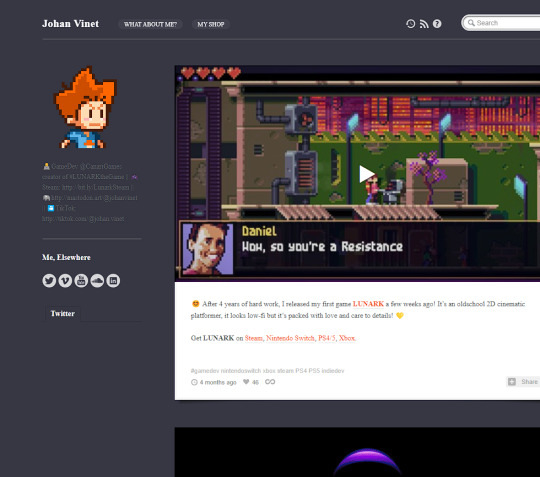
Johan Vinet - https://johanvinet.tumblr.com/ this website page shows off the development process/cycle of a game developer (Johan Vinet). This presents to me a development step by step stage that I can follow similarly within my own work, obviously it will not be the exact same but it gives an idea of how it should be and look.
0 notes
Photo

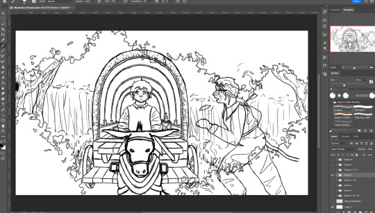


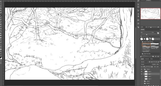


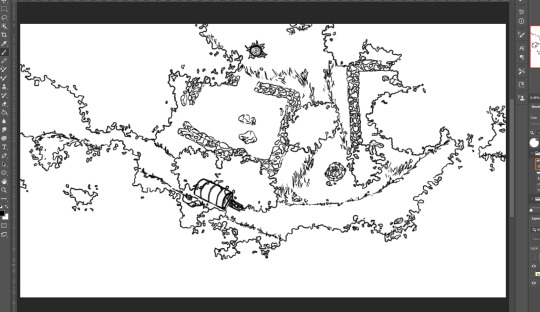
Figure 81. Figure 82. Figure 83. Figure 84. Figure 85. Figure 86. Figure 87. Figure 88. Figure 89. Figure 90.
For this project I ended up working on all the scenes simultaneously as I found it much easier to keep the line art consistent when I didn’t need to keep changing brush (and the size) to work on colouring. I decided to use a brush that emulates a pencil like texture for the line art as the texturing and slight transparency gave the illustrations some more variance than they would otherwise have had, which leant itself to the slightly rough and sketchy style I ended up using. I used this more rough style in part due to the fact it increased the speed at which I could work, and in part because it matches the imperfect and handmade look of stained glass.
For many of the scenes I planned to create some movement or blurring effect in the finished PMV, and so any time I wanted some form of change to happen I had to be very careful about how I split the line art up onto different layers so that I could save each section separately and layer them up in the video editing software later. Most of the time this just meant having a background and a foreground layer, however in some circumstances - like the moving cart in fig. 90- I needed a third layer when the moving object wasn’t at the forefront of the scene.
Overall, I’ve been especially proud of many of the backgrounds I illustrated for these scenes. Before this project I tended to end up with mainly simple ‘flat’ backgrounds when I drew scenes, rather than more dynamic perspectives, however with the help of my own reference images and screenshots of google street view I feel like I’ve started to begin to understand how create more 3D feeling backgrounds, as well as how to place characters and objects within these scenes. On the other hand, I do think I could improve the proportions and expressions of the characters in many of the scenes. Before the start of this year I’d hardly had any practice drawing people, so I am proud with how far I’ve come - especially when it comes to dynamic poses that aren’t explicitly from a singular reference image - but as I had to draw so many characters and scenes within this project I know I didn’t have the time to work on each individual one to the standards I’ve managed in some of my other illustrations, and so I fell back into the traps of struggling not to make their heads too big & ending up with over-the-top or slightly off expressions.
Because of the time constraints, there were also a few areas where I reused elements from one scene in another (not including scenes that were specifically designed to mirror each other). I kept this to Dante’s cart, as the two instances were already planned to be in the same position, and the background of scenes set in a town, since all three were taking place in the same town and as such I could justify using the same street to signify that. If I had had more time though, I would have at least illustrated a unique background for each of the town scenes, as that would have been more engaging and allow for more worldbuilding to be fleshed out in the small details of the background elements.
0 notes
Text
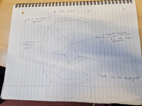
Creating The Games Cover Art/Icon and Itch Assets
We needed a cover art piece to put onto our itch page. So I sketched down an idea where the astronaut will be facing forward and there would be colourful cracks in their visor. Representing the destructible objects in our game and that they break into these shards.
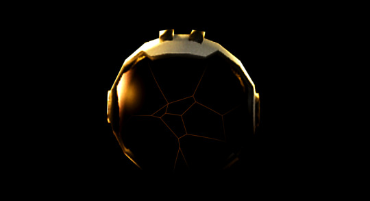
I took a screenshot of the character in engine that I then cropped out and used to create a rough example, which is why the astronaut is really low quality and very upscaled. I then added cracks using the line tool and gave them a slight glow.

I adjusted the colour a little bit and make it more vibrant because I felt that it wasn't prominent enough in the image.
I then thought about another idea where the astronaut head was broken up in pieces just like our games destruction.
So I watched a video about how to create voronoi designs in Photoshop since this is the same design used in creating the shards in chaos destruction.
youtube
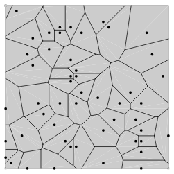
To create this design I had to add noise at above 100%.

Then I needed to use crystalize (found within filter and pixelate) which then produces the same effect as a voronoi diagram.


While working on getting this right I asked Tyler to render a better image of the astronaut facing forward so it would be better quality.
After I had this design I used the magic wand tool and selected each section and then switched to the other helmet layer and copied and pasted so that I would get a copy of each section that I could then sperate.
I then added a drop shadow to each piece to give them some depth and make them look more like the chaos destruction from our game.

Tyler and I compared these two and decided that the old style with the crack just in the visor was visually clearer and less confusing. So I decided make a mix of the two by merging the shards with the original style.
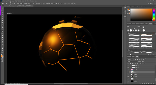


When comparing this to the first design with the second and third, Tyler and I agreed that the old design was better so I decided to go back and improve the previous design. Although I do really like the effect that this design has and has potential to be used in the future on a different project.
I moved the crack to make it look like the origin of it was where the sun reflection is and I also made the crack fade into darkness just like the helmet, helping it to blend together better. I also scaled it up and made the crack lines thicker as before they didn't match the scale of the helmet.

Instead of using this technique for the helmet I decided to use the voronoi technique to create the background to the itch page. All that I did differently was that I used monochromatic noise so there wasn't any colour.
The idea was to try create a low poly space with stars using this technique. However I was struggling to make it look like stars but I ended up with something I liked the look off.


0 notes
Photo

CALLING ALL TOLKIEN FAN ARTISTS!
There are just 10 days left to sign up for 2022’s Tolkien Reverse Summer Bang - the form will be open until 23.59 CET on 8 May. We’ve got some great submissions already but it would be wonderful if more of you could join us - the more artwork, the better!
I’d like to take part but I’ll never get anything finished in 10 days...
It doesn’t have to be finished - art drafts are due at 23.59 CET on 15 May, and the draft just needs to give a good idea of what the final piece will look like. Line art which will have colour added later is fine, or you could submit a concept drawing of something that you will work on through the summer - a costume or an embroidery piece, for example. If in doubt, contact the mods; we will be as accommodating as we can.
Unless you decide that you want to be completely hands off in your partnership with your author, you have until 7th August to finish your art.
I’m not sure my art is eligible.
It probably is! We only turn down art for the following reasons:
1) It is so incomplete that you can’t get any idea what the finished piece will be like (e.g. it’s at the lines and blobs stage - a nice sketch, for example, would be fine, or a manip that’s still a little rough at the edges).
2) It doesn’t demonstrate sufficient original input (e.g. it’s a screenshot from a film or game with no transformative elements applied).
3) The piece(s) submitted have previously been published elsewhere (e.g. they’re already on DeviantArt).
We accept all kinds of artworks. In the past we’ve had sculpture, crafts, drawings, paintings, comic strips, moodboards, edits, digital manipulations, calligraphy, collage, cosplay and print block cutting. It would be great to broaden that out even further. (Pyrography? Video? Bookbinding? Board game design?!?)
I’ve never done anything like this before! / I’m usually a writer and I’ve never published my art! I’m nervous!
You’re not on your own - every year we have a lot of first timers as well as plenty of experienced participants. The mods will happily answer any questions you have; our FAQ section gives a fairly comprehensive run-down of the event, but if something isn’t clear, please just ask!
What if nobody wants to claim my art?
We cannot absolutely promise that every artwork will find a loving home with one of our authors, but rest assured that demand on claims night is always extremely high - and it isn’t always the obvious characters and pairings that get snapped up first…
(We also have an excellent team of pinch hitters and treat makers, and will do our very best to find someone to write for your creative efforts.)
I’ve only seen the films / I’ve only read The Lord of the Rings / I’m new to the fandom, but everybody is talking about obscure academic papers and people whose names start with Fin. Help!!!
We have artists and writers of all experience levels taking part in this event, from complete beginners through to professionals. Length of time in fandom and knowledge of different canons also varies, and we will be glad to have you whether you are a full-time Tolkien scholar or you fell in love with the films last weekend.
There is no gate-keeping in this event and no expectation that you are familiar with every Tolkien text or every piece of media. All we ask is that you are clear in your submission which canon(s) your art is based on. Art and fic based solely on the films or on a video game canon is very welcome in the event - in fact, we always like to see a mixture!
Do I have to help the author with the story? I don’t think I can do that!
That’s OK! We have a range of collaboration levels that you select from when you submit your art, including low-commitment options (though we do ask that you are responsive to your author and reply to any questions within 48 hours, unless you have told them in advance that you’re going to be unavailable for a period of time). See the FAQs for more detail.
How many pieces can I submit?
Up to two pieces, for claiming by two separate authors.
OK, I’m in. What next?
The artist signup form is over here - once we have your signup, we will send you a confirmation email welcoming you to the event (this can take up to 48 hours depending on mod availability). We can’t wait to see your beautiful creations!
#trsb22#trsb#sign ups#signal boost#tolkien#tolkien fandom event#the hobbit#the lord of the rings#the silmarillion
117 notes
·
View notes
Text
Other Code Lyoko media and resources
It’s really great to see people getting into Code Lyoko again now that it’s on Netflix. I decided to make this post with some brief information about some of the other media/sequels people might not know about, plus a few resources I find particularly useful and will answer some of the most common questions people tend to have about the series.
Disclaimer: yes I’m the translator for the site I’m linking to, but I loved this site and its huge variety of resources years before I joined. The site design may be outdated, but its content is still quality.
Other media/sequel series
Comics
https://en.codelyoko.fr/bd.cl
There was an official French magazine that ran for 3 issues. Each one included 30 pages of comics that take place during the series, which you can find translated scans of here. The illustrator recently gave us the digital versions of these pages and the scans will eventually be replaced with those, but I’m not sure when that will be. The stories are short but sweet and the art is nice, so I think they’re definitely worth a look. You can also find complete scans of the magazines but they haven’t been translated into English.
Code Lyoko Chronicles (novel sequel series)
https://en.codelyoko.fr/chronicles
A four-book AU series that took place after the series finale. It attempts to explain some of the open-ended questions such as Carthage, Hopper’s backstory and how Lyoko really works, all within a more realistic and detailed setting. If you’re curious about all that stuff and interested in a somewhat darker take on Code Lyoko, I think it’s worth a look. (I call it an AU because they recount the events of the series and change them up a bit to suit the new setting, but in essence it’s the same story, just condensed into a smaller timeframe and with added detail.) It was never published in English but you can find a fan translation here in PDF and ePub format.
Code Lyoko Evolution (live action sequel series)
https://www.youtube.com/c/CODELYOKOENGLISHOFFICIAL/videos
A 26-episode sequel series that replaced the 2D animated segments with live action. It was filmed in French and dubbed in various languages not including English (they were planning to dub it in English but fans weren’t interested, so). It’s available on the official YouTube channel with adequate English subtitles. It takes place sometime after the original series and also goes into a little bit of Hopper’s backstory. It’s completely unrelated to the Chronicles.
Resources
Episode guide
http://www.codelyoko-leguide.fr/en
A guide with plot summaries, quotes, images and anecdotes/trivia on each episode. If you use the drop-down option you can also find guides to the series pilot Garage Kids and the comics. (Note: this was my first translation project so the English is kinda bad in places. For more accurate episode quotes, see the scripts/transcripts below.)
Image galleries
https://en.codelyoko.fr/accueil_galeries.cl
High quality screenshots from every episode. You can filter by episode, character or setting.
Renders
https://en.codelyoko.fr/renders.cl
A collection of official artwork (renders) with transparent backgrounds in the best available quality. Useful for graphic art.
Episode scripts (French) and transcripts (English)
https://en.codelyoko.fr/conceptuels.cl
The official French scripts for every episode of the cartoon and Evolution except 91, and fan-made English transcripts for the cartoon. Both of these have text descriptions of the action as well as the dialogue. As of writing this, the English transcripts for Evolution have been completed but aren’t uploaded yet.
This page also has various other production documents like the graphic bible, character sheets, concept art and storyboards.
Analysis
LyokoStats
https://en.codelyoko.fr/lyokostats/lyokostats.cl
The site goes through every episode and uses a points system to analyse each character’s performance on Lyoko. Last I checked the individual episode breakdown was kinda broken, but you can still find the results summary ranking the heroes’ overall performance across all four seasons.
From Scripts to Episodes
https://en.codelyoko.fr/scriptsvsepisodes
There are always differences between an episode’s script and the final product, and this section lists those differences. You can sort of think of these as deleted scenes. The front page has a summary of the sorts of things you’ll find, plus a top 12 list of changes. The list covers every available script, so every episode of the cartoon except 91, plus Evolution.
French vs English
https://en.codelyoko.fr/frenchvsenglish/frenchvsenglish.cl
Comparing the original French audio to the English dub. A list of differences similar to From Scripts to Episodes. The front page also summarises what you’ll find and lists some of the most commonly-occurring differences. (To sum it up, there are a lot of small differences but the English dub is overall very accurate to the original and you’re not missing out on anything major by watching it and not the French.)
So yeah, I hope these will be useful. There’s loads of other interesting stuff on the site, so I’d definitely recommend taking a look if you haven’t already!
#code lyoko#code lyoko evolution#//I don't think this'll appear in search because of all the external links (thanks tumblr)#//but oh well
190 notes
·
View notes
Text
It's funny how I'm actually putting effort on this. I'm putting actual effort on a shitpost.
Anyways I said I'd write a bad sonic creepypasta so here it is. Here's the catch: I like how its turning out so imma make it a 2-pary story. This is the first part. It doesn't have any scary shit but it has the basics for a shitty creepypasta: someone gets a old pirated/unreleased/defective game and tries them out despite getting warned that bad shit might happen.
Again I'm not a fluent English speaker so expect some grammar error and stuff like that ._.,
So ladies, gentlemen and non-bis, I present to you-
Sonic: Battle of Metal and Blood (Part 1)
Synopsis: Teen gets nostalgic mid-quarentine and starts playing old Sonic games. She asks for some cheat codes and shit happens.
So for context; I'm a 17 year old girl stuck home because of quarantine.
It had been 4 or 5 months since the virus sent everyone home. Students were playing Animal Crossing and DOOM all day to fill in the summer hours since no one could go outside. I never liked going to the beach so I was never really bothered by it.
Like many people, I found myself going back in time to easier phases of my life. I was rewatching old cartoon shows from my childhood, getting into MCR and P!ATD and just living in pure nostalgia. I also started getting into gaming again, even going to the point of setting up my Wii again just to play Epic Mickey, but I didn't exactly grow up with the Wii. I was more of a Playstation kid, so much that me and my bro got a Playstation 2 from our cousin when he eventually bought the 3rd one for himself.
My cousin was older than us; I remember him being 16 or 17 when I was like 12, so he was kind of our gaming hero. If there was a level in Crash Bandicoot we couldn't beat, we'd call my cousin and he'd do it in 15 minutes. He knew all the cheat codes, all the secret levels and extra content for the games he had; he was like a genius to me and my lil bro, so when he gave us his old Playstation 2 and games me and my sibling knew we were in for a treat.
We got this Sonic Gems Collection for the Playstation 2 from him. It's like a port of various older Sonic games like Sonic CD, Sonic The Fighters, Sonic R and so on. I grew up playing that game, especially Sonic The Fighters since I wasn't very good at the racing games.
I still had a working controller and a lot of free time so I asked my bro for help setting up the console. The thing was so dusty I was actually scared it wasn't going to work. We clicked the power button and the light on the console turned on. Me and my brother held our breaths as we put the DVD in the console and crossed our fingers. As the screen lit up with the SEGA logo and music started playing, I just hugged him and cheered. He set up the console in my room so I could play without having to go to his room (he was the one keeping all the electronic stuff) and told me to have fun.
I didn't even know where to start. There was so much I wanted to play now that I actually knew what I was doing. I thought about starting with my favourite one out of the bunch: Sonic CD. I'm a sucker for the retro 2D pixel games so that was a must. It was better than what I remembered; the music was so catchy and the art style was vibrant and it stood out from a lot of games nowadays that go for a washed out "hyper realistic" look.
As I kept playing, I eventually reached the level where Amy tags along with Sonic for a while before Metal Sonic bursts through a wall and kidnaps her. Oh yeah, Metal Sonic was a thing. I remembered him from Sonic R and Sonic The Fighters - and the fact he was in the fucking cover art of the DVD case. I absolutely loved the fucker in the games though. He had a cool design, and the idea of the villain being a copy of the hero gone wrong was so interesting to me at the time.
I ended up passing the level and even making it to Stardust Speedway. I was sweating since I'd never come this far at any game. My bro was there cheering me as I tried not falling on spikes or getting hit by Metal Sonic's attacks. I ended up making it till the end on top, but it was kinda sad seeing Metal crash face-first against the door like that.
I was done with that for a while, so I went ahead and played Sonic R and Sonic The Fighters for nostalgia. Again, the fucker was there, either as a boss or as an unlockable character. I ended up noticing how there were a bunch of games missing. There were empty grayed slots with question marks instead of the game titles. I couldn't understand if the game was broken or if there was something I was supposed to do, so I called my cousin in hope he would somewhat tell me what to do. He ended up explaining how the game made you complete all the other games to unlock new ones. I thought that was kinda stupid so I asked him if he had any cheat codes or something to make the whole thing available. He told me he was going to dig up his old stuff and ring me again if he found anything.
A few hours later, he sent me a message telling me he'd found something that should work. He told me he did have a cheat code but he thought it was best if I didn't do it. Here's the transcript from his message.
"There's something that might work but it's kinda weird. I got this memory card from a friend of mine and he said this should unlock all the hidden contents within the disc, but when I tried it some weird shit started happening. Most of the sonic games were unplayable no matter how many times I restarted the console or cleaned the disc. There should be an extra game slot but that's just a glitch. Something about the system trying to make up storage for the extra code. Just don't click on anything that looks like a glitch and you should be golden"
Well that was a bit discouraging, but we agreed to meet that afternoon so he could give me the memory card.
When I got home and plugged the cartridge into the slot on the console, I was kinda scared. What if the thing exploded or something? I gave it a try and the thing actually worked! As I clicked on the games section, everything was there! There were some vectorman games but I didn't know who that was at the time so I didn't really care about them. What I was more interested in was the museum. There were a bunch of unlockable promotional art and illustrations there that I never got to see as a kid, so you could imagine how joyful I was when I saw the museum section filled with pages upon pages of illustrations and renderings of the games. Some of them weren't even on the Gems Collection like some screenshots of Sonic Heroes.
I went back on the game menu and was surprised to see another game entry below all the vectorman ones. It was called "Sonic: Battle of Metal and Blood". What the hell was this? It surely wasn't in the cover art and a quick google search turned up nothing. Was it a glitch? It couldn't be; it looked too clean and intentionally made to be a glitch, not to mention that whole game titles don't just appear out of thin air. Game or not, something was programmed in there. I concluded it was probably someone's fan project that was in the memory card my cousin gave me. Why hadn't he mentioned it though?
I was too curious to turn down a mystery like this one, so I got up first to make a cup of coffee since it was already getting late. As I returned from the kitchen, I remembered to look at the synopsis of the game. I can't remember exactly what it said but it was something along the lines of:
"In this sequel to the famous Sonic CD, step in the shoes of Sonic's friends as they face their biggest challenge yet. Control Amy Rose and Miles "Tails" Prower and fight against the metallic faker himself, Metal Sonic, and stop him before he puts his plan to become the only Sonic in action"
Woah, that sounded exciting; I wasted no time. I got all cozy, kept my cup of coffee next to me
And pressed START.
To be continued in part 2
#sth#sonic#sonic the hedgehog#creepypasta#creepy story#short story#sonic gems collection#sonic: battle of metal and blood#battle of metal and blood#maggy moment#shhh i actually like how its turning out#i'm not that good at writing but this is the best i've written in a while
13 notes
·
View notes
Text
Categorizing Precure by Hair Length (Civilian ver.)
Good god, I probably went over this a dozen times and more until I said “f*** it!” and wrote myself a set of rules to follow. I know everybody’s gonna have different thoughts on what counts as short or medium-length or even long hair and with appearances varying from one art to the other, it’s going to be tough to reach a consensus.
But I needed something straightforward to go by to make this easier on myself. If you disagree, that’s fine. Again, I didn’t design these characters so I can’t make the final call on what’s accurate and what’s not. Even so, remember that at the end of the day, this was done for fun.
Here is the Cure version.
More comments below the cut.
Note: This will be continually updated as new additions come along.
**Length guidelines:
Short hair - Anywhere from above to just touching the very top of the shoulders.
Medium hair - Covers or reaches around the general shoulder area.
Long hair - Anything that extends below the shoulder area. (Regarding tied-up hair, if the ends already reach the shoulders, then I’m assuming the length goes beyond that when it’s let down)
Short:

Medium:

?? - Hikari, Love, Miyuki, Yayoi, Aoi, Hikaru (see below cut for comments)
Long:

?? - Mai, Yuni, Chiyu, Hinata (see below cut for comments)
Short - Hmmm, when I look at it this way, I don’t think I made too much of an error in judgement. At least for the short hairs, anyway.
A little note about Mana, though. The ends of her hair are curled (flared?) upwards so it’s questionable if she really belongs here or should be put in medium-length section instead.
Going by this scan, when it’s completely down, Mana’s hair appears to just barely go a little past the top of her shoulders ...however, it’s still not enough to be counted as medium hair in my books so short-haired she stays.
Medium - Most of the girls I placed in this section are undetermined cases, largely because they always have their hair up so it’s hard to gauge the real length. In other words, a lot of guesswork was involved.
Fortunately, this is where their full body profiles come in very handy (check the wiki image galleries) so let’s go through them one by one:
Hikari - Originally was supposed to be in the long section but as I kept checking back to the screencaps on the wiki, I really can’t grasp the length of her braid. Ultimately I went with her Dress Up Collection Puzzlun card, the only official picture I could find with her hair down, and ruled it as medium. Oh so very close to being long but since I’m still not positively sure, she’ll stay here for now.
Komachi - Looks can be deceiving but don’t forget that Komachi’s hiding a short ponytail behind her back. Yea, her hair is weird but it’s actually an application of the short hair with tail trope.
Kurumi - She may look like she belongs among the long-hairs and I thought that, too, at first but it’s actually because Kurumi has very voluminous hair that’d make you think so. From the back, the ends of her hair is probably just a few cm short from being “long” but it’s so evenly cut out that I can tell it’s still within the shoulder area. Just my opinion, though.
Love - Ok, you cannot give me Love’s ziggy twintails and say that her pajama profile is the same person. Of course, maybe that art just isn’t drawn in consistence with how Love usually looks. Either way, she’s definitely not a short hair, that I have no doubt. But whether she’s a long hair or not, I’ll leave it up in the air for now.
Setsuna - My hair’s about the same length as hers so it was easy to make this call.
Erika - Hard to tell cuz Erika’s bending over here but definitely not a very long haired girl.
Miyuki - Googled it, didn’t help. Rewatched the ep where they went on a school trip (ep 13, btw), didn’t help much either. It’s difficult to determine because Miyuki is either moving around too much or slouching too much that you can’t really see where her shoulders are.
I mean, you’d have to have a fair amount of hair to put it into twin buns like hers but as I’m not an expert on just how much hair is needed for that to be possible, I can’t really say anything besides “I dunno”.
Yayoi - Honestly, I’m not sure if she’s got short hair or a short neck. The fact that her hair is very poofy doesn’t help. But something tells me that if it were straight, it’ll probably reach a little further down her shoulders.
Nao - Also referenced the school field trip ep like I did with Miyuki. Couldn’t find a good angle to decide with certainty either but by the looks of it, Nao’s hair probably isn’t long enough to be considered long long.
Megumi - Ep 44 has Megumi wear her hair down in a low, loose sidetail. As you can see, it only goes a certain way past the top of her shoulder.
Towa - She has it styled in Ojou ringlets all the time and wears a headband on top of that. So maybe if she straightened them, they’d be longer? Even so, this is her usual look so we’re gonna stick with that.
Ha-chan - The ends of her hair is slightly curled in but in general, not extensively long.
Aoi - Another hard one. Like Nao, Aoi rarely lets her hair down from her high ponytail and the only pic I could find that showed most of it down (it’s being held back by a headband? Tiara?) is from ep 14 when she was forced to dress up formally. But still, doesn’t seem like her hair is in it’s natural state with how prim and proper she looks (yep, somebody definitely used hairspray on her). I dunno, what do you think? :/
Hana - Quite obvious, no further comments.
Hikaru - If Hikaru had ever let her hair down, then I must have missed it or something because I swear, even in her flashbacks, I’ve never seen her without her twin tails ever. That leaves her another mystery.
Long - After so much trouble with the medium-hairs, thankfully most of the girls in this section were no-brainers. The ones I’m having trouble with are:
Mai - Starting to have doubts after rechecking the wiki again cuz the length of her hair varies between the official profile pics and the anime screenshots. I also don’t think Mai letting all her hair down makes much of difference in length but exactly how long it really is still leaves me stumped.
Yuni - Those braids make it hard to tell but since this isn’t even her real form, I’m gonna go by how Yuni looks as a Rainbownian, which obviously shows she’s got enough hair to reach past her waist at least.
Chiyu & Hinata - So far at this point in the season, the only moments we got to see them with their hair down are in the transformation sequences.
But not only are they moving really fast, their hair is also constantly flailing about that I really can’t measure how long they actually are. I even went frame by frame and I suppose these are the two best screencaps I got without the camera messing with the perception too much.

Not that it’s any better as we all know how animation can exaggerate things for aesthetic effects so yea...
Anyways, I’m sure we’ll get an episode later on where the Heal girls will have their hair down one way or another. In the meantime, I’ll leave them in this section for now.
~~~~~~~~~~~~~~~
Update log:
4/8/20 - Post published.
9 notes
·
View notes
Text
Evaluation of units 1 – 4.
Unit 1 -Introduction to materials, processes and technical skills in art and design:
Through the project ‘All System’s Go’ we were introduced to various materials and processes some of these processes and materials were digital and some were practical processes, at the beginning of the course we were introduced into Adobe Photoshop and Adobe Illustrator with these two materials we learnt various processes and tools most of these processes and tools were simplistic but would later be used in more complex situations to create better outcomes, these tools were crucial to learn for the development of our work throughout the project. Adobe photoshop and illustrator weren’t the materials we used to create outcomes we also touched up on more practical and hands on processes such as Mono printing and carbon paper printing these practical processes were also important for the development of our skills as it allowed us to have a wider knowledge on different processes and skills. Other skills we learnt were important for experimentation, experimentation was important as it allowed us to use our knowledge of the processes we had been learning and allowed us to create more detailed and professional work. Including Adobe Photoshop, Illustrator, Mono printing and Carbon paper copying we also looked at Collaging in Photoshop to create architectural Risographs along with hand bases studio collaging where we created collages based on our research from Hannah Hock and Terry Gilliam, research was an important process and skill along with referencing and evidence our work as it allowed us to learn from our experimentation and our unsuccessful outcomes, we continued to learn processes in Photoshop and illustrator along with our studio work building up to create one of our final outcomes, the final outcome we were working on would showcase and evidence most of our best work this outcome was a Zine booklet and to create it we had a set criteria of only using a simple double colour pallet along with monochrome this was created in Adobe InDesign which was another tool we had to use.
We created a large variety of outcomes using different processes and techniques some of these outcomes hadn’t met my personal criteria or the standard of work I would have liked but I used them as learning points for later outcomes and evidenced them, one of the processes I hadn’t originally like or that I found hadn’t met my personal standards was the Mono printing and Carbon copying processes and outcomes although I thought they weren’t my best work I later used them to create the Vintage postcards which I thought had been one of my outstanding pieces through the project these had later been put onto my zine which is one of the main final outcomes. another outcome we created that I both liked and thought was a good example of the skills I learnt throughout the workshops and lessons was the 80’s Memphis pattern outcomes I personally think these were my best pieces and would like to continue working within the 80s theme, another theme I enjoyed was grunge we briefly touched up on this when we were researching David Carson and creating collages linking to his outcomes.
Within the first project, ‘All System’s Go’ we looked at and experimented with various processes one of the main processes we used at the beginning of the project that we continued through was Typography I used this in various pieces of my work, we started to learn this technique through creating an A – Z in Adobe Illustrator and developing it further within Adobe Photoshop, I took this process onboard and put it within various pieces of my work such as my zine where I used it for my front page and used it to highlight various sections within an outcome along with using it within my Vinyl Album cover outcomes, the typography techniques I learnt I adapted to various outcomes. another process we looked at that I decided to use within my own personal work was the polygonal workshop where we looked at polygonal shapes and experimented with animals, I enjoyed this process so much that I decided to experiment on it within my own time looking at the size differences of the polygonal animals. Nine out of ten of the techniques and processes I learnt I had decided to use within other outcomes to help develop them and create more complex outcomes. Throughout the project and the act of learning the processes there was various processes that I enjoyed doing some of these processes included the polygonal animal outcome and process, Architectural Collages and Risographs, Memphis patterns and the mock-ups, Album covers along with my stickers and final zine.
Unit 2-Introduction to contextual research in art and design:
Throughout the unit and the project, ‘All System’s Go’ we had been given a lot of contextual research that helped shape and develop our work some of this contextual research was through self-study and independent research on the styles themes and processes, this research and context produced through self-study and provided through Demos helped shape and impact my work heavily as without this contextual research I wouldn’t understand nor would I know how to do certain processes to produce my artwork and final outcomes, the contextual research was one of the most important things for my project.
Research within the project and for each new workshop was critical for the improvement and development of my work and my ideas as without this research I wouldn’t have new processes or ideas some of the most critical research I had looked at was done by self-study and my own research along with Demos and artist names provided for example of this would be the research done for the Memphis patterns and Mock-ups we were tasked to look at various 80s inspired Memphis patterns through this research I had developed many ideas and techniques I wanted to try this research helped me then do further contextual research for processes which I then used to make my 80s Memphis patterns unique and interesting and to a level I thought was perfect. Research for each outcome and each experiment was important as without it I wouldn’t have the in-depth understanding about the work I enjoyed looking at a variety of artist for research one artist I found particularly interesting was Hattie Stewart here work is fun and playful using bright colours that pop out creating really Pop art inspired pieces although I didn’t take a lot of here design choices onto my own work I enjoy and respect her work another artist that I ended up liking was Lynette Jackson this was due to her unique style within Architecture and digital collage using bold colours and empty space to make here work pop.
Although research was vital and important for understanding processes and the techniques, we used I hadn’t always taken references or the style of the artist due to this my work would sometimes differ from the artist research or in contrast would be quite similar.
Unit 3-Introduction to drawing skills:
With Sam we learnt an array of drawing techniques and tips, we learnt these processes starting of simple and working to more complex things an example of this would be how we started with simple kawaii faces, kawaii meaning cute in Japanese then building it up working on full faces learning proportion and how to section the face for drawing we also learnt about body proportion and different body shapes learning the basics, after we had learnt these processes we were tasked with practicing them and using what we learnt to create sketches and pieces.
For the next project as we will be developing our drawing skills, I would like to learn more on stylised anatomy and how to take the skills from learning that and making it more stylised, in conjunction with this I would also like to learn more with shading and detailing within character design.
Unit 4-Introduction to communication skills in art and design:
In and throughout our project we had to communicate our processes and our work and the steps we took to create our final outcomes to do this we used various resources at our disposal one of the things we used to evidence and communicate our work was Tumblr on Tumblr we created blog posts, posting our final outcomes along with screenshots of the processes including written step by steps along with contextual research to go along with this looking at artists, processes and techniques for nearly every outcome there was a post referencing an artists or a piece of research including the process along with a comparison of my work. To show what we did we used various things one being Tumblr but we used other methods such as one to one discussion with teachers and peers on improving and developing our work. Although advice was good to listen to it didn’t always have to be taken as in the end its our own work and its tailored to us and our style, two other very important things we did to communicate our work and processes is to write this 1000 word evaluation along with a portfolio with an array of work selection our best pieces for it.
Thought the project I blogged and referenced my work on Tumblr although I managed to do this with most of the outcomes and experiments and research I feel like I could have done more to update and keep on top of these blogs providing further detail and refined blogs this has been a learning curve for me as blogging and referencing my work is a new concept although I didn’t complete my blogs to the best standard I believe I did a really good job referencing my work and making sure there was something showing what I had done even if it was a WIP or a DRAFT.
I feel like I created well developed outcomes final outcomes I personally feel like I exhausted my opportunities to perfect my work and put it at a standard I like and is nearly professional.
Although I haven’t fully pieced together my portfolio, I feel like I have exceptional work that would fir my portfolio, I also believe my work portrays my skill and shows what I have learnt and how I can adapt and develop my process around what I’m working with. I am proud of my work and I can’t wait to develop it and learn more techniques that will help me grow as a student and an artist.
8 notes
·
View notes
Text
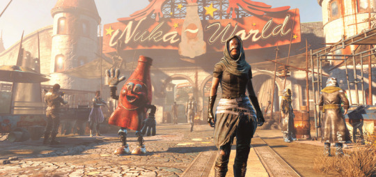
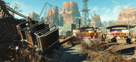
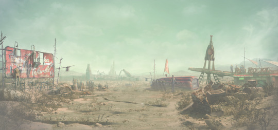
Fallout 4: Nuka-World DLC
youtube
Nuka-World trailer featuring DLC cover art by John Gravato.
It has been a while since I have had the time to post and I wanted to get something up about Nuka-World. Rather than hit all of the details in a bunch of smaller Nuka-World posts I decided I would cover as much as I could in one overview post. While re-watching the trailer recently, I was reminded of just how many different aspects of that DLC I got to work on as the art lead. Highlighting my work from the trailer felt like a good way to run through my efforts, so take a look at the trailer linked above and then read on below.
Nuka-World screenshot I created for marketing.
My general responsibilities began with creating the pitch for the DLC. The two design leads, Justin Schram and Alan Nanes, and I started developing a series of ideas for the DLC. After one false start, we came in with a stack of new ideas as one-sheets and started the pitch meeting with what was then called “Raiders and Rides” as a working title. Todd accepted it before even hearing the other ones. I was very happy about this as it was my favorite pitch of the group.
Nuka-World screenshot I created for marketing.
As the art lead for the project I was responsible for overseeing all things art-related; art direction, pipeline, etc. Since this was a DLC for Fallout 4, much of the core art direction was established by Istvan Pele, the art director on the base game. My job for the DLC was to create a reason for players to want to come back to the game for more. I also wanted to test some of my ideas for improvements to the pipelines and the smaller scale of a DLC was a great place for that. More than anything I wanted to use my additional influence on the DLC to give the players loads of memorable fun and value for their money.
My Nuka-World key art based on the original Fallout 4 key art.
One of the first things I did once the plan was greenlit was to create the key art. I used it in all of my slides for internal and external presentations and to set the initial tone and pillars of the DLC for the team. More detailed post on the key art here.
My original Bottle & Cappy slide art turned into Nuka-World coffee mug art.
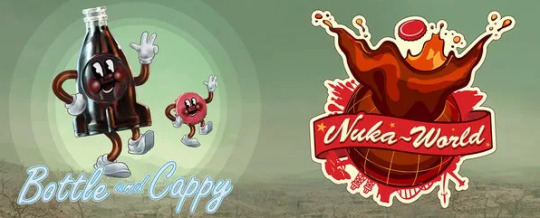
A key contrast built into the DLC from the start was the mix of horrible, violent, raider gangs with the fun, lighthearted, theme park. To add that contrast into my slides I created a closing slide featuring who I imagined the park mascots to be. Bottle & Cappy were born as a way to incorporate a fun note as my closing slide. As the DLC progressed it became clear we needed to use them in the park and then in the marketing. Post DLC they have joined the permanent Fallout lore in other titles and in merchandising.

Nuka-World screenshot I created for marketing.
As the first artist on the project, I started by sketching key broad strokes of the DLC into the engine to guide the art team toward my vision. I added in the first-pass landscape and weather to get the environment feeling like I wanted. Then I started blocking in key landmarks of the park in grey boxed art to get the layout started. I added sub leads for the park environment art (Jason Muck) and the landscape (Andrew Barron). To help build enough new geometry to fill the park, I prototyped some park assets using the color remapping I developed for the base game. This workflow would allow faster park asset creation allowing us to build a larger environment with a smaller team.

Nuka-World screenshot I created for marketing.
Once the environment team was going I shifted focus to characters, creatures, and weapons. I knew they going to take much more hands-on work from me duse to the small team size. We had one character artist (Charles Kim) and one weapon artist (Dane Olds) in house. Concept art and the bulk of the non-environment art was planned to be outsourced. Raiders were the main focus for the DLC and I knew they would take up the majority of the resources. Inspite of that limitation I also wanted to get the players as many new creatures as I could. I came up with a list of easy but dramatic creature ideas to test to maximize reuse but feel new to the player. I did fast "proof of concept" tests for each idea to determine which ideas would work in-game. I repeated this same pattern to fill out the weapon list with cheap and fun additions at a minimal cost.

Nuka-World screenshot I created for marketing.
The raider gangs were the main feature of the DLC but due to the volume of work they required, and our lack of staff in those departments, the decision was made to outsource all of the raider concepts and the models. I knew outsourcing the concepts was going to be tricky since the outsourcing group was in China but I had no other option. I supplied lots of ref and photo bashed some quick collages to get something for them to start with besides a written description. This method yielded a few good designs but nothing good enough to move forward with alone. Luckily for me, John Gravato (concept artist) stepped up and took on wrangling some of the design revisions and additions in his spare time. Ray Leder (concept artist) also knocked out a few additional helmet designs. Leveraging their stellar support and iterating with the team in China I was able to arrive at the armor sets that defined the three raider gangs and could combine for massive variety for the player.
youtube
My trailer directorial debut: the Nuka-World E3 teaser.
For this DLC, in particular, Todd's plan for us was to market it like a full game. This meant we would work with marketing on screens, a teaser, a trailer, a theme song, a Bottle & Cappy trailer (similar to the SPECIAL videos for the base game), and a physical park map. The Bottle & Cappy trailer was handled by an outside vendor which took most of the load off of us except for lite direction and feedback. The rest was up to myself and a handful of people on the team. Animator Neal Thibodeaux did a lot of the heavy lifting on both the teaser and the trailer which were both made in the engine. Artist Natalia Smirnova created the logos and artwork for the map and we worked very hard to make it accurate to the park and have that authentic theme park map feel. Not only were we going to use it to guide people around the park in-game, we were also putting a physical version in Game Stop as a preorder bonus.
youtube
Bottle & Cappy trailer.

Nuka-World park map pre-order bonus.
One of the things that got me the leadership role on the DLC was my history of adding all kinds of content to the game in addition to my role as a VFX artist. I don't like it when a good idea dies from a lack of resource time. Over the years I have learned all of the workflows in our engine to find clever ways to make my ideas come to life without additional help. This often includes sourcing existing art for kitbashing new work from in order to save time. Unfortunately, this is the kind of work that has often proven hard to teach and or delegate. Having the lead role allowed me to incorporate it more than ever before into our pipelines, but throughout the DLC I still had to do a lot of the work myself.
Below is a breakdown of all of my work in the trailer which turns out to be a good cross-section of all of the additional things I did on the DLC.

00:02 Direction and feedback for outsourced Bottle & Cappy video.

00:15 Unique models and editor setup for Nukatron.
Flipbook port of B&C video for in-game Nukatron and Nuka-Cola machines.

00:20 Water VFX for the landscape.
Art direction for the five themed areas of the park.

00:23 Ported mannequin models to animatronics and animated them. Created all Nuka-World mannequin outfits as texture swaps or new meshes.
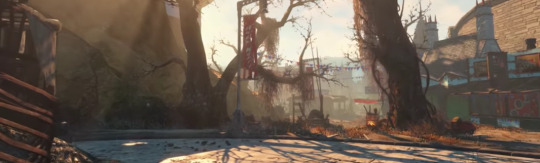
00:24 Set dressed and captured trailer footage in-game.
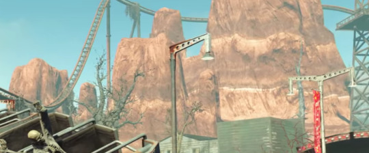
00:26 Developed efficient color remapping pipeline (CRP) for the fast creation of park assets.
I built fake western mountain rocks for themed park area.
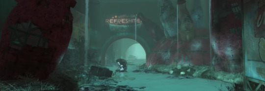
00:28 Created a quantum variant for all 6 Mirelurk creature types.
Created the water and VFX for the Quantum river.

00:30 Concepted and built the armor for Porter Gage the main companion for the DLC.
Modeled and posed Bottle& Cappy park sculptures (using CRP).
Built the Fizztop Mountain asset for the main landmark for the park (using CRP).
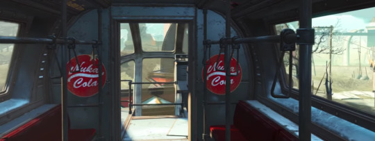
00:40 Technical assistance on execution of the intro train ride.
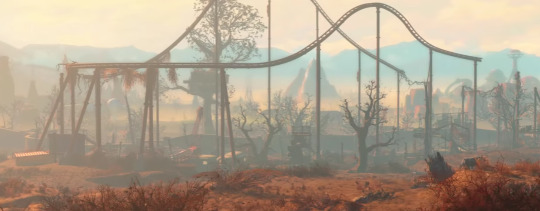
00:42 Created park color guide and prototype weathers for DLC color direction.
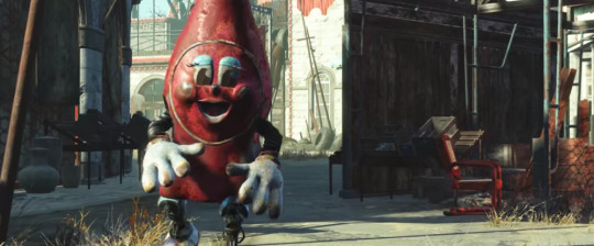
00:43 Concepted and built Nuka bottle Protectron (using CRP).

00:45 Art direction for park map and then execution of in-game navigation via map kiosks.
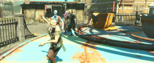
00:48 Created all of the painted feral ghoul DLC variants.

00:51 Created the Gatorclaw death claw variant model.
Created a Nuka-World specific lunch box player prize system from my lunch box system in the base game.

00:52 Created the Brhamaliff models.
Planned a high-level melee tree with art assets to supplement a limitation of the base game.

00:56 Created the unique robot meshes for Nuka Spray Mr. Handy
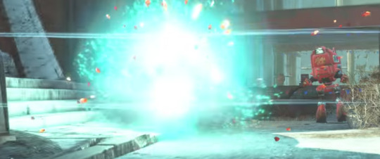
00:57 Designed the damage structure for weaponized Nuka-Cola flavors.
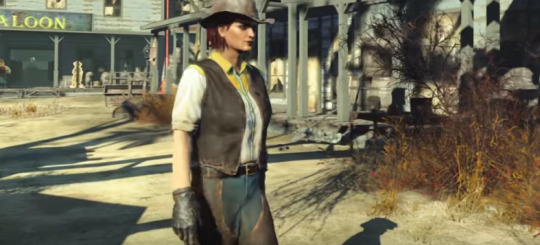
00:58 Created all of the western clothing meshes.

01:00 Prototyped the original sandworm concept in-game to test viability.
Created the Sandworm VFX.
Trained the character artist in kitbash modeling to add Acid Soaker.
Created all of the VFX for the acid soaker.

01:03 Art directed the raider factions.
Designed all clothing as armor/under armor for maximum mix and match.
Cleaned up all outsourced outfit meshes for maximum compatibility within the armor system.

01:04 Created all texture variants for raider underclothes.
Brought the slave collar from Fallout 3 and rebuilt for Nuka-World with power on/off functionality.

01:07 Added motion to some Bottle & Cappy statues.

01:09 Designed trash pile loot system to add the feel of overflowing trash at a theme park and add a new loot system to the park.
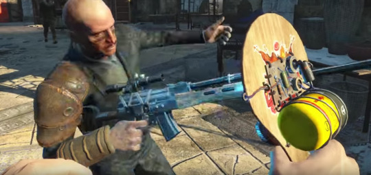
01:13 Concept and design for paddleball weapons and mods. (see other post)
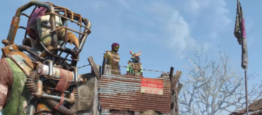
01:18 Art direction for raider gangs.

01:19 Ported alien mesh to animatronic enemy for the park.
Revised the Fallout 3 alien blaster as playable weapon (not shipped).
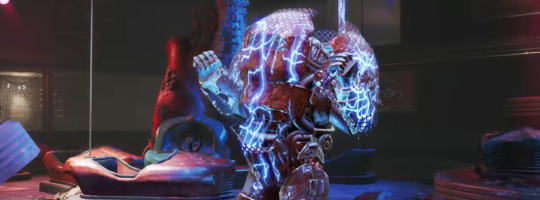
01:20 Built the Overboss bumper car power armor.
Worked with design to create the plan for the opening boss fight with squirt gun mechanic (see other post).
Built all of the electric VFX for the boss fight.
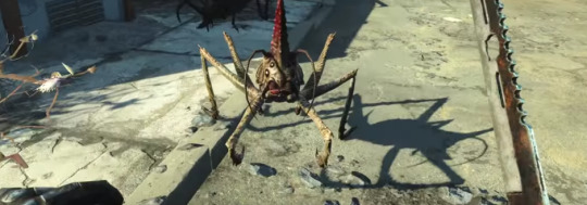
01:21 Original concept for spider cricket hopper enemy.
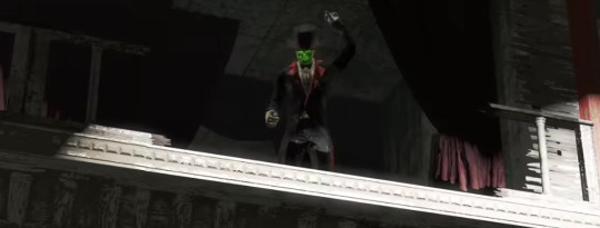
01:17 Tuxedo mesh for Kiddie Kingdom boss ghoul.
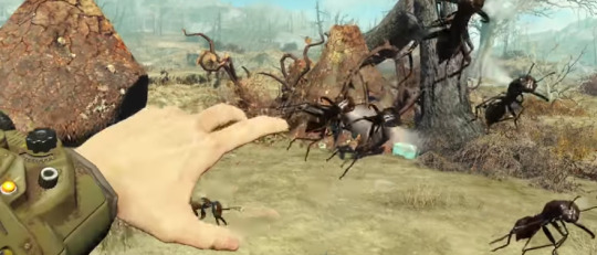
01:23 Flying swarm as a single enemy proof of concept.
All ant variant meshes.

01:28 Shot this shot setup and set dressing for the teaser.

01:33 Original Bottle & Cappy idea and concept painting.
#fallout 4#fallout4#nuka cola#nukaworld#nuka world#nuka#BethesdaGameStudios#artdirection#concept art#proof of concept#dlc#Skyrim#fallout
12 notes
·
View notes
Note
I hope this isn't bothersome but do you have any tips for rping? I really wanna start my own blog but I'm not sure how to begin

It isn’t bothersome at all! Though I feel like @thezomblr would be way more qualified to answer your question, I’ll gladly do my best to give you some pointers. I’ll try to not make this too long winded and just give you the most important bits - of which I think are important when starting a RP blog.
1. Have Muse not Hype
Okay, I think this is important because I fall victim to this myself very often. What I basically mean is, be motivated and inspired to roleplay the character you chose. No matter if its your OC or a CANON character. You gotta put your heart and soul into it, like you do with every hobby! Don’t just make a blog because you have a sudden hype about the character, which might die within a week. Its a waste of your and your roleplay partner’s time. I mean, I’m not your mom - you can do whatever you want. I’m just telling you that people who keep making blogs which they barely use for roleplay, end up looking really unreliable rp wise.
2. Have a Bio, About & Rules
Once you picked your character, open your good old office and start writing! Tell us about your characters past, if you already got as far. Most important are the About and Rules section. Tell us about your character. Who are they? What powers, likes, dislikes do they have? Whatever you think is important! And the rules are mainly to make sure that interactions go smoothly. Like, there are rules to sports, roleplay needs rules just as well. Not everyone likes to roleplay the same thing, and not everyone wants to see certain things on their dash. Tell us what you like and dislike being done in RP so we can make sure to make the roleplay experience fun for the both of us! If you need examples, you can check out my blog. I have no Bio for Damien but you can check out my About and Rules section.
3. The Theme
Pick a theme that works for YOU. Don’t go with trends. Pick a theme that’s easy for you to manage and which you think looks good! Don’t pick a theme that’s too overly complicated at first. Editing basic stuff like your information can quickly become a pain in the ass. (unless you’re an html hero - then go wild). Also make sure your theme is practical before beautiful. Don’t make it so overloaded with nice effects and art, that people can’t even find your links. Its annoying and might cause people not wanting to bother reading about your muse. Just pick something that’s easy on the eyes but with your own touch!
4. Icons
That’s not something you have to use, many people just like to use them! If you want to use icons for roleplay, there are many ways to go on about it. You can draw your own or crop them from screenshots, mangas etc. Just be careful with what you crop - there are many artists who don’t want their art being used without asking them first, or without proper credit. So always make sure the artists are fine with it and credit them! There are also some blogs who already offer icons of certain muses. If you can find them that is.
5. Promo
When you are all set up and ready for RP make a quick Promo. Like mine for example. You don’t have to start dropping your sick Graphic Design skills. A small promo with a bit of an introduction is enough to make people notice your blog. Start by following people you want to interact with and then surely some will reblog your promo, and the word gets around!
6. Communication
Once you got some roleplays going - please make sure to always communicate with your partners. Nothing is worse than for a roleplay to end up being dropped because there was a lack of communication. Talk to people, show interest in their muse and make sure that you create roleplays you both can enjoy. Be respectful and hey, if you can, make some friends! I met the most awesome people through RP
7. Have Fun
The most important rule of them all. HAVE FUN. So many people start treating RP like a chore, please never do that. If you don’t feel like writing a certain thing, then just don’t do it. Do something else. Just make sure you have fun, otherwise your hobby will quickly feel like homework and you end up procrastinating, even though you are supposed to enjoy it.
And.. that’s it from me! If anyone feels like I missed something important, feel free to add it to this post.
5 notes
·
View notes
Text
Cosplay Models
Need to buy X-Males t-shirts online? Whether you will have a love for The Avengers, Incredible Four, Thor, or X-Males there are a lot or t-shirts and different merchandise to personal. My childhood included a love for 60s and 70s Marvel and DC comics, and my capacity to draw originates partly from studying the stories I read in these days. We worked for a year collectively on the piece to plan and draw it. Toy corporations like Hasbro and Kenner used to supply thousands of Batman motion figure than is launched yearly with some variation in it. Transformers 2, the science-fiction movie is the latest sensation, and is essentially the most awaited film of the year. Let's take the movie Avatar for instance. From time to time I went back to the sport to take a couple of extra screenshots to extend a plot. Within a few minutes, I started making comedian strips. Not like his different comic strips, in Battling Boy, the hero is a kid, who's on a mission to save the town.
In reality, the opposite series of battling boy turned fashionable. To conclude on this matter, I think it's an important thought to give our kids the funny comics created approach-again-when, comics from your and my childhood. To read a narrative in adventurous manner is quite exciting for all the kids. You've to beat the limitations of speech bubbles and the issue of telling a narrative body by frame. Admit it you have! I’m sure you've heard this standard online store. Since Youngsters's Graphic Novels are really simply an old thought with a fancy new title, why shouldn't you discover taking old profitable comicbook concepts and reinventing them for a new era? The concept was to convey the same which means with phrases that I steered by means of colors, textures and pictures. Popular Online Comics solidify a that means of a word because footage help which means to words. The nomination was a serious achievement for an artist who had - fairly literally -started out small, drawing Post-it note sized comics and hiding them in different people’s work in bookshops. The first comedian strips appeared in Germany in 1865. It was about two boys who're getting punished for at all times entering into mischief.
Furthermore, if we're trustworthy with ourselves, we all know that a number of mischief is downright funny. Why are outdated coins price greater than at this time's coins? Full collections will fetch too much more than random particular person comics. Our goal is to present our readers an excellent piece of entertaining and educational comics on which is able to grow up not one of the longer term generations. These blockbuster films plays an important role within the comeback of comics. Individuals who want to cherish their childhood recollections with the comics; they can easily find cheap comics to start their comic collection. In this present day of "I would like the newest and latest," we really find that some of the actual treasures are things of previous. Comedian books are detailed tales. Apart from conventions, yard gross sales and used ebook stores can also be extraordinarily cost effective sources for collectible comic books. A comic e-book adaption in addition to a novel publication is being carried out for the movie's promotion. That assumption is unsuitable and is an insult to the whole comedian book neighborhood.
These comedian guides provide you with the kind of knowledge you want like where to get the uncommon and helpful comics and the place you will get first situation comics as effectively as the again subject ones as nicely. By promoting and buying and selling comics you will be there were the art work is most enjoyed and valued. Moreover, that is where you get the meet fellow fans and catch up on the newest within the comedian books world; information that may prove invaluable. Some comic books editions are collector's items and if preserved in mint quality situation. Books are limited because the reader cannot physically see what the author envisions. Are those behaviors to be condoned? Eyes develop into circles or dots, mouths are lowered to curved strains, and noses or feet are triangles. Get the most recent news. Those who already consider large abilities of our web site, confess that it is admittedly the most convenient and simple approach to be in contact with the latest innovations of the world of comics.
Properly aware of the advantages that come from reading comics. Which Marvel comics do you have to learn before (or after) Captain Marvel? Repetition. Go back to your DC Titans every day newspaper and look at the comics’ web page. The cartoonist is utilizing repetition to identify the character. Due to this fact, we could say that it has nothing to do with a altering trends, whatever is new and trendy, photo to pop artwork print stays within the midst of its identified usability in subject of artwork. I seemed, and there before me was a pale horse! There actually is one thing for everybody. Cosplay additionally means costume play and the fans often come to the comedian conventions dressed in costumes. Eight delectable Expansions that adopted added to the joy of the sport play. Then by all means, use it. Through the use of these exaggerations, it doesn’t matter what different particulars I include. The possessed doll first hit the screens within the 1988 horror basic 'Child's Play'. Corey Haim, the lead of the original horror film, and Corey Feldman, the two Coreys, reprise their original roles. However, in 2003 Hasbro would relinquish control to Batman's rights to Mattel. You also get preferential remedy in some cases and entry to special occasions and performances.
Best Walking Dead Collectible Action Figures and Graphic Novels
The Amazing Spider-Man hasn't been considered one of the most popular super heroes. I tend to be of your Batman and Wolverine sort of guy myself. However, I can't sell Spidey short when talking about his history successful summer blockbusters. He's been in some hits which are considered to be thousands of comic movies ever. The next work for balance box office glory from Spider-Man is reboot and yes it stars a new cast which has a somewhat familiar story. Only time will tell how whether or not this can live up to past glory of their predecessors.
First some definitions, specifically just what comic, a graphic novel, along with a Manga. A comic can be a format to provide a medium, within our case a tale. A graphic novel is only a longer comic. However, parents often get concerned once they hear graphic novel, mistakenly thinking it's got something to do with graphic such as inappropriate adult material. Graphic in our case merely means art. Graphic novels are certainly not a genre boost the local tissue. There are graphic fiction, graphic nonfiction, graphic mysteries, you get the idea. Finally, Manga is a Japanese term for their comic medium which enable it to be quite fun for kids since it reads from right to left. Kids often love this given that they can easily conform to the format but their parents generally battle to read them.
Loki, he in the golden horns who had earlier made life difficult for Thor inside movie Thor, runs a pact having an unknown race, an alien race, may help him extract his revenge, if he opens a portal for them to attack Earth. Loki does what he could be told, and steals the Tessaracat (a McGruber if there ever was one), and opens a portal for your other world to fight Earth. Loki steals the Tessaract, requires a band of scientists and Hawkeye under his command, and opens a portal that literally brings the aliens onto Earth.
But as companies use digital comics to reach new potential markets, will the entire process of comic writing and drawing should evolve at the same time? Until now, the phrase "digital comic" has often been employed to describe a print product scanned right into a computer. Even webcomics, which are released digitally, in many cases are designed specifically to be gathered into print editions; in fact, this is often the goal of webcomic creators, since the digital versions are free. But a lot more creators are coming up with truly digital comics, involving screen technology to see stories in a manner that print cannot. Will this customize the convention of writing monthly comic scripts with twenty-two pages of content? Or will storytelling chapters be broken into shorter or longer sections, with corresponding changes in release schedules? And will these creators still try to collect their stories into print versions, knowing some of the storytelling itself is going to be lost from the conversion to print? Stay tuned, the subsequent couple years should provide some interesting new answers.
Owning and paying attention to a radio or perhaps a radiogram would be a wonderful experience, particularly when it turned out capable to grab stations from around the globe. The fact that they crackled and were packed with a number of interfering noises simply didn't matter at all. Of course, there were no such thing as television with an alternative source of information.
1 note
·
View note
Link
Going to make this one a taaaad bit shorter than last week’s. While I’d like to say it is in the interest of giving you loyal readers a break, in fact it’s because I really didn’t sleep well last night and my brain is mush.
For example, without my going back and really concentrating, most of the writing I’m doing right now looks like this:
Mopst oif tHr wrttiomg I”n dopIngh lokks L1je tyhjiis.
As you might imagine, it’s put quite the damper on my writing this blog.
No worries, though, the reason for the crappy sleep isn’t something important, or connected to Onyx Path, or anything like that. As near as I can figure, I was having anxiety dreams because my kids are all going back to their various schools starting yesterday and finishing next weekend.
They were expressing their concerns and had last minute this and thats, and all of that seeped into my head and I dreamed what I thought were three hour epic searches for classrooms only to wake up and note that 15 minutes had passed. Over and over again. I never even knew that my high school was built by the same architect who designed Hogwarts, but all those Mobius Strip escalators to the same floor, and doors that led to nowhere logical, were all there at dear old Central High.
Apparently.
Promethean: The Created Tormented art by Tilen Javornik
Although, the particular manifestation was pretty benign and keyed to my personal “can’t find the class and the bell is ringing” freak-out, what I went through is pretty common. We take in so much stuff from others and chew it up, internalize it, and some of us can let those anxieties escape via dreams, which is pretty cool, but other stuff stays in and does affect us.
Plus, if you are doing “creative work”, a large part of that process is to open yourself up and not just absorb input from outside yourself, but to grab that stuff and use it. To use it and create something with it. It’s what we do in a very basic sense. Some do it with creative processes that have discrete stages that build towards the end creative result, others have a more intuitive process that may not even seem like there’s a creative process so much as spontaneous creation. To an outside observer.
It so happens that our business, like so many, relies on constant communication; between our in-house folks, between all our freelance creative teams, between us and our Onyx Path community, and the gaming community as a whole. That’s a lot of input, and as with so much of social media, a lot of it is not helpful – whether by intent or accidentally. It is exhausting to weed out so much extra noise to get to the signal you need for your project.
Which is why I encourage, and sometimes order, our Onyx Path crew to take vacations. Gotta let the brain absorb different input. It’s tough, though, because we do have so many projects all going at different stages for different game lines, so there’s no “good” time for a vacation, usually. Nevertheless, it is so very necessary.
And it so happens that post-Gen Con is a great time to decompress and get revved up for pulling things together as we head towards the new year, so we’ve been blinking away one at a time and popping back so another one of our Onyx team can get away for a bit.
Monarchies of Mau art by Pat McEvoy
In fact, the time between Gen Con and Fall also sounded like a good time to reconfigure our Onyx Path website. After all, every site Impish Ian looked at said it was a five minute change. Liars! A big apology from us to everyone who couldn’t log in, or post, or get emails (that may have just been me) during the process of changing over, realizing it wasn’t working, and changing everything back. If we had known it wasn’t actually as easy as it said on the tin, we would have warned everybody.
Fortunately, Kickstarter is not connected directly to our website, so we were able to launch the Dystopia Rising: Evolution Kickstarter and fund within a day. Which is awesome because that means we can get to move quickly into creating some of the also awesome Stretch Goal projects.
We also have some equally awesome reward tiers that include getting your character into both the text and the visuals, yourself done up as one of the zombies in the art, and artifacts from the early days of the Dystopia Rising LARP. Like all of our KSs, we’ve tried to add fun and flavorful rewards that connect directly with both our new edition and the previous incarnations of the setting. Check out the link in our BLURBS! section below!
In this stretch leading up to the Labor Day Weekend, our sales partners at Indie Press Revolution are wrapping up the wildly successful 40% sale they’ve been running on our Deluxe W20 and M20 printer overrun books. If you’ve missed out on these beauties, this may be your best chance at getting them at these sorts of prices! Only until the end of the month: https://www.indiepressrevolution.com/xcart/Deals-and-Specials/
In their continuing efforts to open up more Community Content sites, White Wolf will be adding Exalted to their Storytellers’ Vault site on DTRPG.com. All three editions will be opened, but if you want to create something for any of the three, please carefully read the info provided on the site detailing what is and isn’t allowed.
It’s a great opportunity to create, publish, and get paid for your unofficial Exalted material, and as Matthew Dawkins likes to point out, the Community Content sites are also a super way to “audition” for writing for official projects with us at Onyx Path.
No guarantees, of course. And better I stress it now, yes, we still hold the license to create official Exalted material, and WW is the company that runs the site and determines what is allowable, not Onyx Path.
Cavaliers of Mars art by Nate Pride
In fact, since this is the last week of the month, two things happen here at Onyx Path. One, we put up the latest monthly installments of EX3‘s Hundred Devils Night Parade and Adversaries of the Righteous on Wednesday. We’re getting to the point where we’re looking to assemble at least the Hundred Devil monthly releases into a single book, although we actually still have a lot more to go.
Would you folks prefer us to get the current batch assembled into a book now, and then create a second book later, or hold off and create one big book? I’m probably going to ask the EX3 backers this in the monthly Backer Update too.
What’s a Backer Update, you say? Why that is an update for one of our Kickstarted projects that we send out every month to those who backed that KS. Since we have a lot of KS’d projects, James and I send out a lot of Backer Updates each month.
We send them monthly because after long experience we’ve decided that once a month is a good reliable pace to get the on-going status for the KS you backed, and if something happens that backers need to know about, like a PDF going out or a book shipping, we’ll send more updates.
Now, if you’ve backed a few of our KSs, that means you get a lot of very similar Backer Updates, particularly since we also include a notice about whatever our current Kickstarter is. We realize that hearing about a new KS while waiting for yours to progress, or getting a bunch of repeated notices, can get tedious, but please bear in mind that we also always used to get complaints that previous backers didn’t know about our current KS.
With the dearth of strong centralized communication in this business, we chose to notify our previous backers about the current KS rather than have folks miss out on it. YMMV of course, but those “Why didn’t I hear about this KS?” messages have dropped off dramatically and we sure hope those folks have had a chance to jump into the latest KS.
After all, our KSs run the same range of game worlds as our game lines: WoD, CofD, Exalted 3rd, our Storypath and 5e based settings and more – there are a lot of interests out there and we’re trying to keep the communication flowing about our:
Many Worlds, One Path!
BLURBS!
KICKSTARTER:
The Dystopia Rising: Evolution Kickstarter funded in less than a day, and has already passed one Stretch Goal!
The next Stretch Goal is where we start building the Threat Guide companion PDF which is a first-person guide with mechanics to the various threats facing survivors in the DR:E world, so we’re pretty excited to get started with that!
Dystopia Rising is a post-apocalyptic roleplaying game that quickly grew into a live-action sensation. Now, Onyx Path is pleased to update the live-action setting with Dystopia Rising: Evolution, a tabletop roleplaying game that presents a fresh and exciting take on the post-apocalypse genre.
Dystopia Rising: Evolution will be powered by Onyx Path’s Storypath system, and includes all the rules you need to play as a survivor in the post-apocalypse, including rules for creating characters for up to 24 different Strains, variations on humanity that survived the Fall. It also has details on the powers of faith and psionics, along with advice on running action-adventure stories, webs of personal intrigue, or procedural investigations. And, finally, dozens of antagonists, including a variety of zombies and raiders to use in your series.
Throughout this Kickstarter campaign, we will be posting complete previews of the Dystopia Rising: Evolution manuscript as backer-only updates.
ELECTRONIC GAMING:
As we find ways to enable our community to more easily play our games, the Onyx Dice Rolling App is now live! Our dev team has been doing updates since we launched based on the excellent use-case comments by our community, and this thing is both rolling and rocking!
Here are the links for the Apple and Android versions:
http://theappstore.site/app/1296692067/onyx-dice
https://play.google.com/store/apps/details?id=com.onyxpathpublishing.onyxdice&hl=en
Three different screenshots, above.
ON AMAZON AND BARNES & NOBLE:
You can now read our fiction from the comfort and convenience of your Kindle (from Amazon) and Nook (from Barnes & Noble).
If you enjoy these or any other of our books, please help us by writing reviews on the site of the sales venue you bought it from. Reviews really, really help us with getting folks interested in our amazing fiction!
Our selection includes these fiction books:
Vampire: The Masquerade: The Endless Ages Anthology (Kindle, Nook)
Werewolf: The Apocalypse: Rites of Renown: When Will You Rage II (Kindle, Nook)
Mage: The Ascension: Truth Beyond Paradox (Kindle, Nook)
Chronicles of Darkness: The God-Machine Chronicle Anthology (Kindle, Nook)
Mummy: The Curse: Curse of the Blue Nile (Kindle, Nook)
Beast: The Primordial: The Primordial Feast Anthology (Kindle, Nook)
Vampire: The Masquerade: Of Predators and Prey: The Hunters Hunted II Anthology (Kindle, Nook)
Werewolf: The Apocalypse: The Poison Tree (Kindle, Nook)
Werewolf: The Apocalypse: Songs of the Sun and Moon: Tales of the Changing Breeds (Kindle, Nook)
Vampire: The Requiem: The Strix Chronicle Anthology (Kindle, Nook)
Werewolf: The Forsaken: The Idigam Chronicle Anthology (Kindle, Nook)
Mage: The Awakening: The Fallen World Chronicle Anthology (Kindle, Nook)
Vampire: The Masquerade: The Beast Within Anthology (Kindle, Nook)
Werewolf: The Apocalypse: W20 Cookbook (Kindle, Nook)
Exalted: Tales from the Age of Sorrows (Kindle, Nook)
Chronicles of Darkness: Tales of the Dark Eras (Kindle, Nook)
Promethean: The Created: The Firestorm Chronicle Anthology (Kindle, Nook)
Demon: The Descent: Demon: Interface (Kindle, Nook)
Scarred Lands: Death in the Walled Warren (Kindle, Nook)
V20 Dark Ages: Cainite Conspiracies (Kindle, Nook)
Chronicles of Darkness: Strangeness in the Proportion (Kindle, Nook)
Vampire: The Requiem: Silent Knife (Kindle, Nook)
Mummy: The Curse: Dawn of Heresies (Kindle, Nook)
OUR SALES PARTNERS:
We’re working with Studio2 to get Pugmire out into stores, as well as to individuals through their online store. You can pick up the traditionally printed main book, the Screen, and the official Pugmire dice through our friends there!
https://studio2publishing.com/search?q=pugmire
Looking for our Deluxe or Prestige Edition books? Try this link! http://www.indiepressrevolution.com/xcart/Onyx-Path-Publishing/
Here’s the link to the press release we put out about how Onyx Path is now selling through Indie Press Revolution: http://theonyxpath.com/press-release-onyx-path-limited-editions-now-available-through-indie-press-revolution/
And you can now order Pugmire: the book, the screen, and the dice! http://www.indiepressrevolution.com/xcart/manufacturers.php?manufacturerid=296
SPECIAL W20 and M20 SALE! Huge savings on our Deluxe printing overruns until 8/31!
4 DAYS LEFT!
https://www.indiepressrevolution.com/xcart/Deals-and-Specials/
DRIVETHRURPG.COM:
This week we have the next two installments in our monthly Exalted 3rd Edition releases for Hundred Devils Night Parade (Steel Eater and Gem Seeker) and Adversaries of the Righteous (Adeimantus) in PDF on Wednesday!
CONVENTIONS!
From Fast Eddy Webb, we have these:
Eddy will be speaking at Broadleaf Writers Conference (September 22-23) in Decatur, GA. He’ll be there to talk about writing for interactive fiction, and hanging out with other writers who have far more illustrious careers. http://broadleafwriters.com/3rd-annual-broadleaf-writers-conference/3rd-annual-broadleaf-writers-conference-speakers/
Eddy will also be a featured guest at Save Against Fear (October 12-14) in Harrisburg, PA. He’ll be running some Pugmire games, be available for autographs, and will sometimes accept free drinks. http://www.thebodhanagroup.org/about-the-convention
Dixie Cochran will be at High Level Games Con in Atlantic City October 12-14, running a Women in Game Design panel, Eddy’s RPG Developer Bootcamp, and possibly making a surprise appearance at another event!
And now, the new project status updates!
DEVELOPMENT STATUS FROM FAST EDDY WEBB (projects in bold have changed status since last week):
First Draft (The first phase of a project that is about the work being done by writers, not dev prep)
C20 Novel (Jackie Cassada) (Changeling: the Dreaming 20th Anniversary Edition)
M20 The Technocracy Reloaded (Mage: the Ascension 20th Anniversary Edition)
M20 Victorian Mage (Mage: the Ascension 20th Anniversary Edition)
Trinity Continuum: Aberrant core (Trinity Continuum: Aberrant)
Tales of Excellent Cats (Monarchies of Mau)
Scion Companion: Mysteries of the World (Scion 2nd Edition)
City of the Towered Tombs (Cavaliers of Mars)
Night Horrors: Nameless and Accursed (Mage: the Awakening Second Edition)
Heirs to the Shogunate (Exalted 3rd Edition)
Witch-Queen of the Shadowed Citadel (Cavaliers of Mars)
Mummy: The Curse 2nd Edition core rulebook (Mummy: The Curse 2nd Edition)
Redlines
Deviant: The Renegades (Deviant: The Renegades)
Second Draft
WoD Ghost Hunters (World of Darkness)
Tales of Good Dogs – Pugmire Fiction Anthology (Pugmire)
Aeon Aexpansion (Trinity Continuum: Aeon)
C20 Players’ Guide (Changeling: the Dreaming 20th Anniversary Edition)
In Media Res (Trinity Continuum: Core)
Wr20 Book of Oblivion (Wraith: The Oblivion 20th Anniversary Edition)
Lunars: Fangs at the Gate (Exalted 3rd Edition)
Changeling: The Lost 2nd Companion (Changeling: The Lost 2nd)
Spilled Blood (Vampire: The Requiem 2nd Edition)
CofD Dark Eras 2 (Chronicles of Darkness)
V5 Chicago By Night (Vampire: The Masquerade)
M20 Book of the Fallen (Mage: the Ascension 20th Anniversary Edition)
Development
Signs of Sorcery (Mage: the Awakening Second Edition)
Hunter: the Vigil 2e core (Hunter: the Vigil 2nd Edition)
Fetch Quest (Pugmire)
CofD Contagion Chronicle (Chronicles of Darkness)
Dystopia Rising: Evolution (Dystopia Rising: Evolution)
Night Horrors: Shunned by the Moon (Werewolf: The Forsaken 2nd Edition)
Changeling: The Lost 2nd Jumpstart (Changeling: The Lost 2nd)
Adventures for Curious Cats (Monarchies of Mau)
Manuscript Approval:
Editing:
They Came From Beneath the Sea! Rulebook (TCFBtS!)
Dog and Cat Ready Made Characters (Monarchies of Mau) (With Eddy)
Post-Editing Development:
Scion: Hero (Scion 2nd Edition)
Trinity Continuum Core Rulebook (The Trinity Continuum)
Trinity Continuum: Aeon Rulebook (The Trinity Continuum)
Ex Novel 2 (Aaron Rosenberg) (Exalted 3rd Edition)
Exalted 3rd Novel by Matt Forbeck (Exalted 3rd Edition)
GtS Geist 2e core (Geist: the Sin-Eaters Second Edition)
M20 Gods and Monsters (Mage: the Ascension 20th Anniversary Edition)
Night Horrors: The Tormented (Promethean: The Created 2nd Edition)
Guide to the Night (Vampire: The Requiem 2nd Edition)
Indexing:
Changeling: The Lost 2e
ART DIRECTION FROM MIRTHFUL MIKE:
In Art Direction
Dystopia Rising: Evolution – KS is going.
VtR: Guide to the Night – sketches and some finals rolling in.
M20: Gods and Monsters – AD’d and Contracted, Leblanc already has sketches in.
Geist 2e
The Realm
Trinity Continuum (Aeon and Core)
Ex3 Monthly Stuff
Ex3 Dragon Blooded
Chicago By Night – Most of the KS art is divided up. Sending out notes and contracts Monday morning.
Marketing Stuff
In Layout
Lost 2e Screen
Fetch Quest
Proofing
Scion Hero – Putting in Neal’s changes
PTC: Night Horrors: The Tormented
Scion Origin – Neall inputting errata changes… then it’ll come back to me to firm up.
At Press
Monarchies of Mau – Printing. Dice and buttons printing.
Cavaliers of Mars – Shipping to Studio2.
Wraith 20th – Prepping the Deluxe files, still poking printer for cover specs.
Monarchies of Mau Screen – Shipping to Studio2.
Cavaliers of Mars Screen – Shipping to Studio2.
Wraith 20 Screen – Printing.
Scion Dice – At fulfillment shipper.
Cav Talent cards – PoDs proofing.
SL Trilogy Pt 1,2,3 – PoDs proofing.
TODAY’S REASON TO CELEBRATE: Folks enjoying vacations as the summer heads to a close and lots of folks go back to school!
3 notes
·
View notes
Text
17/3/20_InDesign_Essentials2
In this session we further explored editorial graphics in InDesign, touching on topics like layout, grids, master pages and typography. To solidify our knowledge in this topic, we then navigated the software to create two mini-projects based around Barbra Hepworth.
-- stage 1 --
In this session we first looked at some layout inspiration as it is difficult to start with a blank page. Some good resources are Designisnpiration.net, Behance, FromUpNorth and Pinterest.
I have created some of my own design inspiration boards on both Pinterest ad Behance, alongside an extensive screenshot folder on my phone with things that have inspired me from Instagram and Twitter. I think that gathering some background knowledge and exploring how other designers approach design tasks helps you to get some basic ideas of where you want to go with your designs. It is difficult to start with a blank page, so getting resource material and inspirational images always helps you gain design footing.

Another important tool when I am designing is choosing the right font. Finding a viable font and font pair is integral to creating good design. Typography is the backbone of layout and a structural piece like a poster. Websites like Dafont and FontSquirrel are always a good option to explore different styles of fonts. I have found that choosing a font I would usually avoid helps me to be more creative and I end up designing something I wouldn't usually even imagine.
Websites like Google Fonts, Adobe fonts and FontSquirrel are more reliable as they have better classification for finding fonts, and usually the spacing and kerning are a lot better than the fonts on websites with cheap or free fonts like DaFont.
I had a go on the Kern Type font kerning game (https://type.method.ac/#) to test my kerning skills, an important tool if I do download the cheaper fonts. I found that I improved with every time I tried a new word, the ones I struggled the most on were the Serif fonts.
Font vs Typeface
Font: The different cuts, the ‘family’ (Avenir Book Oblique, 40pt)
Typeface: The name of the typeface, the surface level (Avenir)
-- stage 2 --
Choosing a Grid System

Choosing a grid system to base your page around gives you a good sense of how the final will look. Gathering multiple good reference images will allow you to final a good layout and work more quickly to produce a cover or spread. Using multiple layouts in a document is called creating pace, books can become boring by using the same layout over and over. Ways to change pace can be through layout, typography, colours and sizing.
When working in industry, creating a layout that is blank, ready for putting images and text into is essential. With the rise of social media, creating content as quick as possible is essential.
-- stage 3 --
Navigating the InDesign Document:
When creating an InDesign document, I always use essential classic with a clear workspace, visible pages and master pages, and plenty of open space on the artboards. Creating a document at the right size with clear columns is essential as it allows the designer to more easily visualise the final document within a workspace.
One of the most useful tools when working with editorial designs in InDesign are master pages. Master pages are pages in which anything that is applied to them is copied across all the other pages on the document. This is especially useful for creating grids, inserting page breaks or page numbers. I usually use the master pages to layout a grid that I can work with for the rest of the pages. You can create multiple master pages within a document, every page labelled with the paster page title will have the master page spread applied to it (A, B, C ect.).
Creating seamless page numbers is simple in InDesign, you can visit a master page and insert the special character into a text box. You can override this rule and get the page numbering to start later in the document by right clicking the desired page, turning the document pages to shuffle and spread paged off, numbering section options and then start page 1. Using alt and the arrows left and right will quickly allow you to kern type!
In InDesign, dynamic spelling is applied in two ways. In type you cab check spelling at the end like word, but you can also turn on dynamic spelling through; edit-spelling-dynamic spelling, allowing you to see misspellings as you work.
-- stage 4 --
To celebrate the artist Barbra Hepworth, we have been tasked with a mini-brief to execute in InDesign. Her artwork includes very unique shapes forms and materials, producing a very diverse body of work.
The first task is to create a Swiss style poster to promote a Barbra Hepworth exhibition:
Barbra Hepworth / Mini Tasks1) POSTER
Create a poster using graphical shape and text only - inspired by Barbra Hepworth sculpture2 Colour Helvetica only
The second is to create a magazine spread using photography and text- inspired by Barbra Hepworth sculpture.
SPREAD MAGAZINE LAYOUT- Choose Heading/Subheading/Body- 3 levels of typeface/fonts.
Swiss Style:
Swiss Design, often referred to as International Style of Design, emerged as a dominant design direction in post WWII Switzerland. It uses a rational and systematic approach, employing limited colour palettes and the use of grids to establish order. Its reach and influence became immeasurable as it grew from design movements such as Dada, Bauhaus, Constructivism and De Stijl and even influenced areas outside graphic design as architects and figures in the broader world of art embraced its aesthetics.
The ethos of Swiss design is its most defining attribute, far from the work itself, the International Style of Design believes that design is about communication and that good design comes from a clear purpose. ‘Form follows function’ is a strong standpoint in Swiss design and their main influential works come from design that has an objective meaning. In the world of graphic design, many principles and groundworks that we follow originate from the Swiss design ethos, regardless of style changes and new processes, the fundamental rules stand as guidelines for designers.
Mini-poster:
For my mini-poster I decided to use black and white as my main colours, highlighted by a wildly contrasting orange. This design is very much inspired by the Swiss style, using typography as a main body for the layout of the design, then building my design around the grids they type naturally creates. In the classic International Style, I used Helvetica in bold as my typeface for this design, giving me very wide and bold letterforms that I stretched out to use as a sort of framework for the design.
Dame Barbara Hepworth
Moonplay 1972
Tate
As a nod to Barbra Hepworth, I included geometric shapes based on Barbra Hepworth’s sculpture piece; Two Forms (Divided Circle). Her work is inspired by the shapes and intrinsic characteristics of coastal lines and organic structures. I wanted to create a sense of hollowness through cutting a circular shape out of a half circle and showing another through the gap. This feeling of space within a space was difficult to create in the Swiss style, so I made a sense of depth through minimalism. I really like how the colours work in this piece and I am happy with how it turned out with the challenge of a very limited colour palette. The beauty of Swiss style is how minimalistic but appealing the designs are.

Magazine Spread:
For my magazine spread I tried to carry on the style and design that I previously created for the poster. Working according to the International Style methods, I created a grid and lined up the text and objects with it. I wanted to get a sense of the Hepworth design in the spread too so I traced around the sculpture in the facing image and set the text to the shape. I also drew up the string pattern and made that a central piece of the spread, keeping white space in mind the whole time when designing. I mirrored the colour scheme from the cover and kept the typeface the same, only altering the boldness and size of the font between the heading, subheading and body text. My spread really has a sense of theme and creates its own image, something that could be useful as a promotional style for this exhibition as it is consistent and recognisable.

-- reflections --
I think this task was a good opportunity to be creative with poster design and layout, revisiting some InDesign tools and techniques I haven't used in a while. Overall I am very pleased with this outcome and it has inspired me to look deeper into Swiss design when creating a quick layout in the future. Maybe mixing Swiss and modern design techniques would give me something fresh and unique as a response to a design challenge.
0 notes
Text
I’m going go out there straight away and say that Sonic Forces is not a bad game by any means. Over the last few years Sonic Team has managed to work out the kinks associated with many 3D Sonic titles and nailed down the fast-paced gameplay we have grown accustomed to.
The problem is that Sonic Forces isn’t a great game either. In its current state it won’t please any of the defiant fans who grew up with the 2D games, or those who enjoyed the likes of Sonic Adventure. And the fact that SEGA/Sonic Team persists down this avenue means that I doubt we’ll see a 3D Sonic game that pleases those gamers anytime soon.
Of course, SEGA has approached 3D Sonic games in a variety of ways now, with differing styles and mechanics. It’s stupid to compare Sonic Forces to the likes of Sonic 2006, Lost World or the Sonic Boom games, but if you want a gauge of where Sonic Forces sits, in terms of gameplay and style its closer to Sonic Generations and Sonic Colors – where 3D gameplay follows Sonic from behind, along strict pathways and side scrolling gameplay features 2.5D visuals.
Dark undertones: Never thought I’d see the day when a Sonic game talks about torture…
The darker side of Sonic
Some problems for Sonic Forces lie within its story, where Sonic Team has tried to play more on dark undertones than any other Sonic title. We see Eggman teaming up with a new villain, Infinite, who seemingly has god-like powers, manipulating reality and has brought other baddies from Sonic’s past to fight him.
The opening stand-off sees our blue hero fall in battle, overwhelmed by the sheer number of his enemies and Infinite’s powers. We are then shown several screens of text describing how, after Sonic was defeated in battle, Eggman and his army managed to conquer the world.
In a nutshell: Sonic is missing, presumed dead, Tails has gone off on his own and the rest of Sonic’s friends have taken up arms to form a resistance against Eggman and Infinite.
It’s a weirdly bleak affair which could have worked, if it wasn’t for the juxtaposition from the rest of the Sonic cast; where we have super cute characters like Charmy Bee talking about fighting in a war, and brief scenes where Infinite appears to kill equally endearing anthropomorphic creatures trying to fight back. It’s not that I’m against gritty storylines in games, but it just doesn’t work properly with the source material here.
Yep, I made my Rookie character look as creepy as possible
But to the story’s credit, the one thing is does is allow for an introduction to the ‘Rookie’ (aka. Avatar) character. This is the character that SEGA heavily advertised pre-launch, where the gamer gets to design and play as their own hero.
The Rookie (as he’s called during the game) moves as fast as Sonic during levels, is equipped with a grappling hook (allowing for lock-on attacks) and also a weapon which utilises a single Wisp power to change its effect, such as fire or lightning. The Rookie customisation is pretty impressive, allowing for a variety of animal types, each with their own unique abilities and, as you progress, you unlock more items of clothing and new weapon effects/Wisp powers during the game.
The added issue I had with Sonic Forces’ story is that it’s filled with practically every Sonic character we’ve seen over the years, yet they seem to do little more than talk to you over the radio during levels and have their faces appear next to text boxes, moving the story forward when in the world map view. The likes of Knuckles and Silver, who have proven their worth as competent fighters in previous games are now relegated to benchwarmers, while the Rookie steps up and basically saves the day.
What’s a little frustrating is that Sonic Forces’ story isn’t bad, the main plot devices and Infinite as a new baddie are good ideas, and there’s a decent amount of humour within the script. Essentially, with a little tweaking in areas, I think it could have ended up becoming one of the best plots we’d have seen in a Sonic game in years – but they just missed the mark.
To Sonic Team’s credit, they know how to make their games look pretty
A Modern Sonic game, where Modern Sonic is the worst bit
Even though the story’s opening alludes to Sonic’s death, it should be apparent to everyone that Sonic is not dead – he’s merely been captured by Eggman’s forces and the resistance needs to save him early on in the game.
From the trailers and box art you should also know that you can also play as Classic Sonic. In terms of story, Classic Sonic’s appearance makes little sense – it’s just said that because of Infinite’s powers, the dimensional fabric has been torn and Classic Sonic appears… although no other dimensional trickery really occurs, there’s no second Eggman or Tails from previous titles, just Sonic.
However, Classic Sonic soon becomes the best thing about the game. His familiar loveable form from Sonic Generations has made a return and, even though he doesn’t speak throughout the game, his interactions with Tails, Eggman and the other characters are quite brilliant at times.
Green Hill Zone has seen better days, now covered in sand
He also has some of the better story levels – which are side scrolling and, I’m REALLY happy to say, that just like traditional Sonic titles, Classic Sonic does NOT have a lock-on attack and retains his spin dash (and drop-dash) attacks. The downside is that Classic Sonic has the fewest story levels in the game.
What surprised me most though is how much I ended up enjoying the Rookie’s levels. The first couple I played through I was bored, but later on I found some of the levels being really entertaining and, once I got used to the Rookie’s weapon and grappling hook mechanics, I found myself have some fun.
However, and quite ironically, my least favourite levels all involved Modern Sonic and I think I know why…
Seriously SEGA? It’s been 26 years… does this really need to be said?!
You’re playing Sonic wrong, let the computer show you how
I found Modern Sonic’s levels involved more and more segments where you have little-to-no control over Sonic’s movements. Gone are the days, like in Adventure, where you had complete control over Sonic and if you had to run across a vertical wall and went too slow, you’d die. Instead now, where Sonic Team wants to show off Sonic’s impressive speed, the game takes control and doesn’t really let you do anything.
There’s chunks of levels where it encourages you to use Sonic’s speed dash/boost ability and by holding down the X button (on Xbox), Sonic runs full pelt, at blistering speeds. It’s so fast that enemies and barriers are no match for Sonic and he just smashes through them. It’s also so fast that you can’t really control Sonic’s turning, but that never matters because the game either puts up barriers or helps to guide Sonic round corners in these segments, meaning all you are literally doing is holding down one button and are able to defeat Eggman’s forces. It just feels cheap – you don’t even need to attack enemies any more, just run through them!
No need to attack anymore: Sonic’s boost ability just smashes through enemies
Modern Sonic (and the Rookie) levels also feature a lot of rail grinding. This has become a staple of Modern Sonic games, but while it was quite an impressive feature in the earlier games, it’s become all too prevalent; huge sections of levels require you to hop between rails. It’s fun on occasion, but when every level features rail grinding, the novelty soon wears off.
Then there’s the adverse flip-side, where the game will suddenly relinquish control back to the gamer. Being thrown back into the driving seat suddenly feels alien, causing you to lose control and fly off the sides of the level.
Plenty of grinding action, if that’s your thing
There’s also moments in the side scrolling parts (with all three heroes) where trying to perform timed jumps would result in an infuriating mix of the characters not jumping quite far enough, to suddenly jumping well past the target platform.
On a handful of levels, Modern Sonic will partner with the Rookie, bringing in a team gameplay style similar to Sonic Heroes. It’s not a terrible idea, but it feels pretty pointless, because the Rookie runs as fast as Sonic and also has a lock-on attack; the only difference between the characters is that the Rookie has a weapon that often kills enemies more easily than lock-on attacks (so you may as well just play as the Rookie).
At times you’ll team up with the Rookie and perform the ‘Double Boost’ ability – which goes so fast that everything becomes a blur
One thing this tag-team gameplay allows for is a story mechanic where the two of them can ‘combine’ their abilities and run at a super-fast speed. But again, this is just a way of the game to take control – as you run forward at a crazy speed, any objects or enemies are pointless to resist. It’s a mechanic that was kind of cool the first time it was used, but it’s used on every level where you team up, meaning the innovation is lost.
Exasperatingly, there is one moment where this mechanic is required and makes sense in the storyline, but by the time it is used you have already performed this several times and it’s not a surprise. Had SEGA held out until this plot moment, it would have been more impressive and a proper ‘Wow’ moment in the game.
Mystic Jungle had some of my favourite levels in the game
Time is not your friend
The length of gameplay time is a cause for concern. Sonic Forces’ story is essentially made up of 30 very short levels, many of which can be done in 2-3 minutes and none of them are particularly challenging.
I managed to complete Forces’ main story in under 4 hours on Hard difficulty – and that’s on a first playthrough, making plenty of mistakes, trying to record footage and take screenshots, making three cups of tea and also taking a phone call… and I’m far from the best Sonic gamer. I’ve seen other gamers beat it in well under 3 hours on their first play through.
All too easy: Beating the final (and longest) boss in the game in under 7 minutes, with no deaths, on ‘Hard’…
This is a big step away from previous 3D Sonic games, where you could spend days playing through the game on your first try.
Another bug-bear I have with Forces is how you are scored on time, yet the timer runs during animated moments, like bosses showing off at the start of battles, which you can’t skip. The timer also continues running when you die – so if you keep dying and keep having to wait a good 10-15 seconds for Eggman’s robot to flex its muscles each time, you soon find yourself losing an extra minute from your level time. It’s minor, but it seems a little unfair.
Complete additional side missions to unlock Secret & Extra missions, plus TONS of stuff for your Avatar
But there is fun to be had!
However, that game time mentioned above is just for the main story and there’s plenty to do once the story is over. As you progress you unlock items for your avatar, which includes a crazy range of clothing (with some cool items from other SEGA franchises), Wisp powers and weapons.
As you progress, you unlock Extra and Secret levels, short bonus levels that often have a gimmick, such as plasma cannons dotted around them, or my favourite, where certain blocks are explosive and trigger when you touch them – meaning you have to be quick to make it through. They are surprisingly fun and a highlight of the game for me.
Bomb Blocks – my favourite Secret levels
You also have the opportunity to freely go back to any level and replay it, bettering your previous scores and unlocking even more Extra/Secret levels and Avatar items. All these extras do extend your gameplay time. So, if you are an amazing gamer and do finish the main story in a couple of hours, you’ll find yourself playing for a few more hours, just for the extras.
Sonic Forces never gripped or entertained me in the way that Colors or Adventure did, but I did find myself having fun. I’ve already mentioned how I enjoyed Classic Sonic and the Rookie’s levels, and while Modern Sonic isn’t the best, I didn’t hate my time with him.
There’s one area where I felt Sonic Forces excelled over previous 3D entries: exploration. The classic 2D Sonic games always had a sense of exploration about them, where you could explore new routes through levels; something other 3D Sonic games have rarely succeeded in recreating.
Sonic Forces though has several split routes in levels and I was surprised to find myself taking alternative paths at times and being treated to a new route through part of a level. Of course, these new routes aren’t entirely reminiscent of old school Sonic, where you could go back and explore a level freely – in Forces you usually have a split-second to make a decision and hope you’re going the right way, because you can’t go back.
With that too, as you unlock new Wisp powers, you can go back and replay levels, finding new paths and sections, which can only be accessed by certain Wisp abilities, similar to Sonic Colors.
It’d also be criminal for me to ignore how good Sonic Forces looks and the soundtrack. One thing SEGA has consistently achieved with Modern Sonic titles is top notch graphics and some very impressive surroundings, even if you can’t explore them.
The soundtrack, while not as catchy as the old Mega Drive games, is still very good. Sonic Team has managed to bring in composers and musicians to create tunes that fit in perfectly with moments of gameplay and action happening in the levels.
Summary
Sonic Forces is not a bad game; those of you who do really enjoy the gameplay mechanics of Generations or Colors, you’ll be in for a treat. For Sonic Team’s perseverance in this type of gameplay, the team does appear to have ironed out a lot of the kinks and bugs that were problematic in previous titles.
The problem is that Sonic Forces won’t be for everyone and though I did get some enjoyment from the game, it does solidify a path that Sonic Team seems to be stubbornly taking with the Sonic franchise and it’s a route that not everyone will enjoy.
While I would like to see 3D Sonic return more to its ‘Adventure’ style roots or maybe branch out and try to do something like the Sonic Utopia fan game, I can’t/shouldn’t sit here and bitch about what Sonic *should* be – that’s entirely up to SEGA and Sonic Team.
So, if you enjoy other Modern Sonic titles, you could probably boost the overall score. But, if you’re like me and don’t enjoy them to the same extent as you did the classic ones, or even Sonic Adventure, then Sonic Forces is a decidedly average game; neither bad, nor particularly good either.
It’s a shame, because I would be leaning more towards a ‘Good’ game, but it misses the mark all too often. The fact that the Rookie and Classic Sonic’s levels were more fun than Modern Sonic’s is a concern for me; it’s a Modern Sonic game where Modern Sonic is the least enjoyable part! SEGA could have just removed all Sonic references, kept the Rookie character and had a whole new franchise… which may have been better received.
PROS:
+ Gorgeous visuals and excellent soundtrack
+ Sonic Team has ironed out kinks from previous 3D titles
+ Tails’ relationship with Classic Sonic (and just Classic Sonic in general – he’s the best character)
+ Plenty do/unlock after finishing story missions
CONS:
– Modern Sonic in this form isn’t anywhere near as fun as earlier 3D Sonics
– Dark story undertones don’t really work (and most characters are redundant)
– Very short story and levels (it can be finished in about 2-3 hours on Hard)
– Game takes control far too often during Modern Sonic levels
Sonic Forces Gallery
Green Hill Zone has seen better days, now covered in sand
Mystic Jungle had some of my favourite levels in the game
All too easy: Beating the final (and longest) boss in the game in under 7 minutes, with no deaths, on ‘Hard’…
Eggman’s selfie collection: The game has a decent amount of family-appropriate humour
At times you’ll team up with the Rookie and perform the ‘Double Boost’ ability – which goes so fast that everything becomes a blur
Complete additional side missions to unlock Secret & Extra missions, plus TONS of stuff for your Avatar
Ahh items boxes, hello my old friend…
Plenty of grinding action, if that’s your thing
Green Hill Zone has seen better days, now covered in sand
Bomb Blocks – my favourite Secret levels
Seriously SEGA? It’s been 26 years… does this really need to be said?!
No need to attack anymore: Sonic’s boost ability just smashes through enemies
Dark undertones: Never thought I’d see the day when a Sonic game talks about torture
Finally, our #SonicForces #review is here! Not bad, but not the best #Sonic: I’m going go out there straight away and say that Sonic Forces is not a bad game by any means.
3 notes
·
View notes
Last Seen Blogs

arqkami-blog
Arq. kami
aboxofcereales
22 | rus/eng | bi
🕊️
войнам хуй.

unabashedlycasualwitch-blog1
introduction to persuasive essay

eyesthatroll
mari
jojoimvu-blog
Sem título