nimbleprocess
NimbleProcess
Graphic Design and Animation: Process and Production Year 2
21 posts
Don't wanna be here? Send us removal request.
Last Seen Blogs

blissdaniel
local dreamer

nutri-sec-blog
Oliver-Sec
bsantost-blog
Photure

totomato-life
kpop ruined my life(but I love it)low key

kuropanbunko
Ameen's Oven
Text
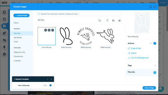
23/4/20_Online_Portfolio
In this session we combined our personal branding, personal work and website making tools to create an online portfolio.
-- stage 1 --
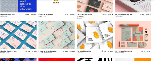
For this session I initially looked to some inspiration before creating my own portfolio website. I created an inspiration board on Behance in order to find the kinds of personal branding and portfolio layouts that I like the best.
To me, one of the most important parts of a good portfolio is the visual communication it gets across. The purpose of portfolio identity is to generate a good reputation and positively increase attention. Individuality creates an impression and forms a judgment about a person, so a portfolio should express these individual elements. Personal branding aims to conduct this reputation on a singular level, representing a single person to the outside world. An identity helps solidify a person with a well developed sense of the relationship between identity and their own personality.
I do already have a portfolio I currently use during shows or exhibitions that I scaled for iPad size, but it will be infinitely useful to have an online portfolio also.
-- stage 2 --
For my personal branding I decided to continue with my current brand, Nimble Graphics, a play on my nickname, Nim. The sorts of attributes that match Nimble Graphics are quick thinking, skilled, creative and unique. For this I decided to match my branding to the likeness of a rabbit, something quick and nimble by nature. After deciding my imagery I went forward into creating a suitable logo to put on my portfolio of work.

-- stage 3 --
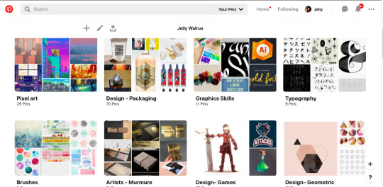
After designing my logo I had a look into different ways to style an online portfolio. Inspired by both physical and digital portfolios, I created a Pinterest board of the different styles that inspired me.
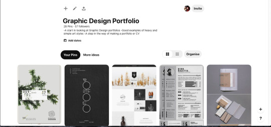
https://www.pinterest.co.uk/jellywalrus/graphic-design-portfolio/
The best identity designers understand how to communicate effectively through the use of signs and symbols, a keen sense of form and letterforms, and the history of design - Hans-U. Allemann.
-- stage 4 --
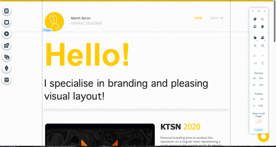
I started my online portfolio on Wix as it is very easy to edit and create an aesthetically pleasing layout.
Being fairly new to Wix, I decided to base my design off of a theme and edit the theme to fix my personal needs. I chose one based on a web designer, deleting the assets that didn't fit and replacing them with my personal logo and colour scheme.
https://niamhieb.wixsite.com/nimblegraphics
Due to being moved from my home with the Coronavirus outbreak, I do not currently have all of my portfolio work available to me. Because of this I can only do so much of my portfolio website, However, I have made some pages and styles that I will implement into this site when I am able to access all of my files. Thank you for understanding.
-- reflections --
I am particularly proud of my page on my final major piece project. The way Wix is editable makes it easy to go back and change an entire websites visuals, whilst keeping the assets and core details in place. I will absolutely use this website as a portfolio builder in the future and I am even considering paying for the service in order to get more edibility and even my own custom domain to show to clients.
0 notes
Text
24/3/20_Illustrator2
In this weeks session we explored Illustrator further by rendering using the pen tool and different colour options, creating a personal monogram and the use of Ai and Ps as a fluid pair.
This weeks session was a little different, being an online session using Adobe Connect, raising its own issues and tasks despite the lesson itself. Please bear this in mind when moving forward with my blog and thank you for your understanding.
-- stage 1 --
Renderings:
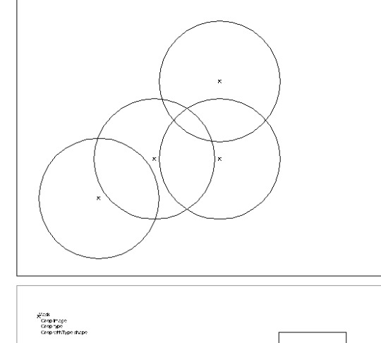
We started the further exploration into Illustrator through the pen tool. When manipulating a shape or drawn line, the direct selection tool is perfect. You can select individual points of a shape, or multiple at a time in order to create the perfect lines.
In order to directly copy a shape inside another, with perfect distance between the two lines, you can use offset path. Its a tool that isn't used that much, but when you need it you can create absolutely perfect lines.
When using the pen tool, both Alex and I usually draw half of a mirrored shape and then copy and mirror the drawn line using TransformReflect. You can then press Cmnd Y to bring us the wireframes up, you then can select the two mirrored points with the direct selection tool, use Cmnd J and join the points together.

The final step to the renderings is to add colour and keep in mind the order of the layers when colouring. To move the layers about you can use Cmnd [ ] to get them into the right order. Remember to have a play around with the thickness of the lines to get a sense of depth and dimension.
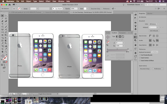
Instead of the Apple Watch task I decided to do the iPhone task instead, as I have used rendering in Adobe Illustrator quite a lot and wanted a bigger challenge. In the time given in the lesson, I was able to render the back of the iPhone with fairly accurate gradients. I don’t use the gradient tool very often but I learnt quite a lot when playing about with it today.
Below: On the left is the example and on the right is my rendering.
-- stage 2 --
Monograms and the Gestalt Principles:
The Gestalt psychology is the theory that we see things as a whole rather than individual objects. Gestalt psychology or gestaltism is a school of psychology that emerged in Austria and Germany, based on work by Max Wertheimer, Wolfgang Kohler, and Kurt Koffka.
It gets us thinking about principles of layout and why things look right or wrong, we can use these principles to get us out of a design jam and prompt us to think about what might not be working. Rather than seeing individual elements we see the relationships between them, objects will be perceived in their simplest forms. When designing we need to think about context and what helps our brains perceive the world around us.
The six main principles are:
-Figure-Ground
-Similarity (relationship between objects through similarly in shape or colour)
-Proximity (how close a shape is to another)
-Closure (negative or blank space, filling in the gaps)
-Continuity (guiding the eyes)
-Order
By human nature we perceive lines and curves as a single element, e.g. a roundabout. The mind will attempt to fill in details that aren’t actually there, meaning that white space or negative space design can work. According to Gestalt psychology, the world is different from the sum of its parts. The mind will always attempt to fill in gaps or work through continuation, when the eye is compelled to move through one object and continue to another object (often used in typography based logos). With continuation you can guide the eye from one object to another through compelling with guidelines or gestures. With continuation the design implies that an element is there when isn't really, allowing our mind to fill in the gaps through implication.
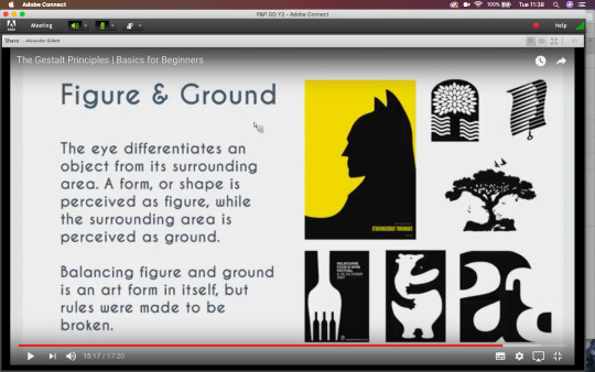
Using implication and negative space is so simple but so effective, thinking about the shapes and context you are working with will allow you to create a thoughtful and unique logo.
Using my initials, NB, I created a few monograms in the lesson. I only managed three in the time given for the exercise. I like the third logo and it goes to show how developing an idea over and over gets you to a better final render.
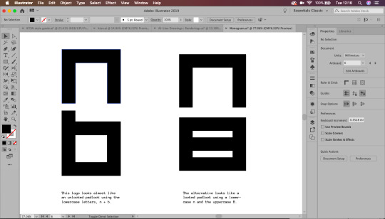
Inspired by modern minimalist design, my logo would fit in well in a sports scene, being very sleek and masculine looking. It is important to keep in mind how something relates to its context and how it visually fits into it.
-- stage 3 --
Using Photoshop and Illustrator together:
When creating a workable document, it's important to use layers, grids and guides. This will help us get an accurate document to work with across the above suite.
In Illustrator, we can create a grid bu going to object-path-split to grid. With this we can the create a gutter (InDesign usually uses 4.322mm gutter). Adding these grids to the top layer and locking them will show a guide over the image, with accurate layout.

Working with Photoshop and Illustrator together, rather than saving the file as Jpegs and placing them as Jpegs, you can move a .psd file straight into Illustrator.
Cmnd+Tab scrolls trough apps quickly!
To find a file from another Adobe software, press ALT and double click it to open the original file.
-- reflections --
I will definitely be updating this blog in the future with my own personal branding. I really enjoy creating logos and although it is difficult to create something for yourself, it is important to have your own personal brand.
The essence of personal branding is reducing a persons whole career, identity and skillset into its visual essence. My client has a background in design and works as an in-house graphic designer for a gaming company. This will require an insight into both the design and gaming world in order to marry the two fields together and create an effective personal brand.
-- inspirations --
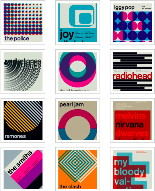
One logo designer that inspires me is Paul Rand:

Left: Logo for IBM, 1956; right: 8-bar version 1972
He skilfully uses contrast and minimalistic colours alongside negative space to create memorable brands. His work isn’t exactly colourful, but he notably followed the Gestalt principles and from this created some of his own:
“A logo derives meaning from the quality of the thing it symbolises, not the other way around.”
Designers should see logos as a means of converting messages. Rand however sees a logo’s meaning by association with the brand or product itself. Not that logos are insignificant, but that they are free to be designed however one chooses. They are visual language of marking something, not the context itself.
“The only mandate in logo design is that they be distinctive, memorable and clear.”
This means a logo doesn’t necessarily have to directly visually depict the company it is trying to represent. The subject matter of the logo has relatively little importance, and sometimes it is better to have a completely free logo!
“Simplicity is not the goal. It is the by-product of a good idea and modest expectations.”
A logo has capabilities, but like everything these are limited. Trying to sum up every point, key detail and context of a brand will create a cluttered logo. Focusing on key points or elements will in itself generate beautiful simplicity. Don’t strive for the end goal, instead create a considered and refined concept and simplicity will naturally derive from this.
-- further development --
To further develop my monogram branding, I created a few more logos that I could possibly use or use as inspiration in the near future.
Working from the Gestalt theory and Paul Rand’s principles, I created a personal logo based on my initials, nicknames and current brand name.

Above: An idea I tried based on the morse code for the letter N. I like the look of it, but think it could use a little more creativity. The logo idea and execution is a little basic for my liking. Maybe generating an idea around iconography will work more in my favour.
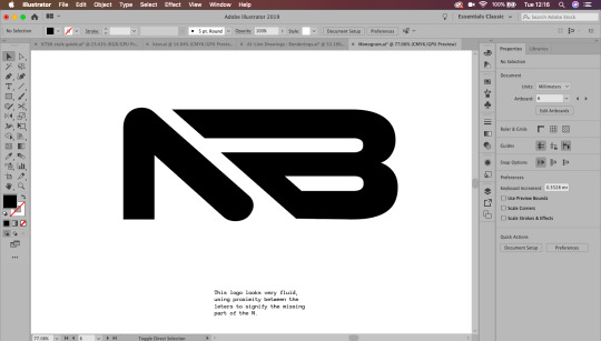
Two other concepts I created were edits of the N shape. I wanted my logo to look fluid and Nimble, like the name of my personal brand. Creating a sense of movement and speed was important to me when creating this logo. I think I created good sense of movement through the implication of arrows, giving my design a sense of direction, literally.
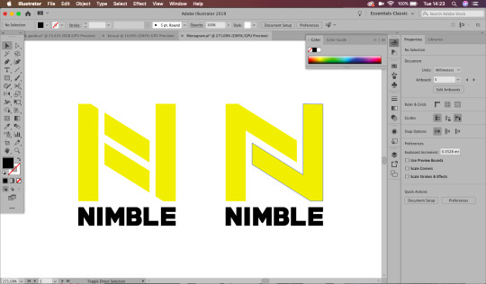
I created two styles of this directional logo, matching bottom text with the weight and style of the logo. I think I prefer the second logo as it has a more clear sense of direction and movement. Although I like these logos, I am still not satisfied with them as a final design.

I ended up revisiting my third logo to make the N and B lines match, I much prefer this as a logo, and though there are still a few edits I would make, I am pleased with my exploration of Illustrator rendering.
1 note
·
View note
Text
17/3/20_InDesign_Essentials2
In this session we further explored editorial graphics in InDesign, touching on topics like layout, grids, master pages and typography. To solidify our knowledge in this topic, we then navigated the software to create two mini-projects based around Barbra Hepworth.
-- stage 1 --
In this session we first looked at some layout inspiration as it is difficult to start with a blank page. Some good resources are Designisnpiration.net, Behance, FromUpNorth and Pinterest.
I have created some of my own design inspiration boards on both Pinterest ad Behance, alongside an extensive screenshot folder on my phone with things that have inspired me from Instagram and Twitter. I think that gathering some background knowledge and exploring how other designers approach design tasks helps you to get some basic ideas of where you want to go with your designs. It is difficult to start with a blank page, so getting resource material and inspirational images always helps you gain design footing.

Another important tool when I am designing is choosing the right font. Finding a viable font and font pair is integral to creating good design. Typography is the backbone of layout and a structural piece like a poster. Websites like Dafont and FontSquirrel are always a good option to explore different styles of fonts. I have found that choosing a font I would usually avoid helps me to be more creative and I end up designing something I wouldn't usually even imagine.
Websites like Google Fonts, Adobe fonts and FontSquirrel are more reliable as they have better classification for finding fonts, and usually the spacing and kerning are a lot better than the fonts on websites with cheap or free fonts like DaFont.
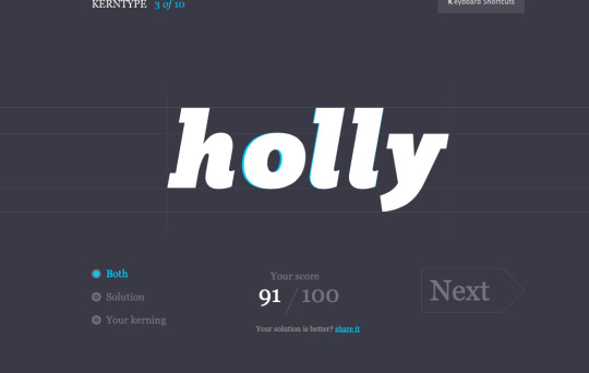
I had a go on the Kern Type font kerning game (https://type.method.ac/#) to test my kerning skills, an important tool if I do download the cheaper fonts. I found that I improved with every time I tried a new word, the ones I struggled the most on were the Serif fonts.
Font vs Typeface
Font: The different cuts, the ‘family’ (Avenir Book Oblique, 40pt)
Typeface: The name of the typeface, the surface level (Avenir)
-- stage 2 --
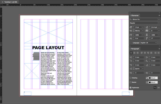
Choosing a Grid System

Choosing a grid system to base your page around gives you a good sense of how the final will look. Gathering multiple good reference images will allow you to final a good layout and work more quickly to produce a cover or spread. Using multiple layouts in a document is called creating pace, books can become boring by using the same layout over and over. Ways to change pace can be through layout, typography, colours and sizing.
When working in industry, creating a layout that is blank, ready for putting images and text into is essential. With the rise of social media, creating content as quick as possible is essential.
-- stage 3 --
Navigating the InDesign Document:
When creating an InDesign document, I always use essential classic with a clear workspace, visible pages and master pages, and plenty of open space on the artboards. Creating a document at the right size with clear columns is essential as it allows the designer to more easily visualise the final document within a workspace.
One of the most useful tools when working with editorial designs in InDesign are master pages. Master pages are pages in which anything that is applied to them is copied across all the other pages on the document. This is especially useful for creating grids, inserting page breaks or page numbers. I usually use the master pages to layout a grid that I can work with for the rest of the pages. You can create multiple master pages within a document, every page labelled with the paster page title will have the master page spread applied to it (A, B, C ect.).
Creating seamless page numbers is simple in InDesign, you can visit a master page and insert the special character into a text box. You can override this rule and get the page numbering to start later in the document by right clicking the desired page, turning the document pages to shuffle and spread paged off, numbering section options and then start page 1. Using alt and the arrows left and right will quickly allow you to kern type!
In InDesign, dynamic spelling is applied in two ways. In type you cab check spelling at the end like word, but you can also turn on dynamic spelling through; edit-spelling-dynamic spelling, allowing you to see misspellings as you work.
-- stage 4 --
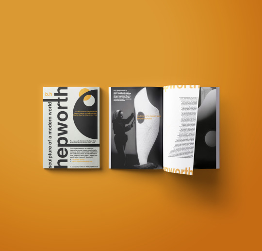
To celebrate the artist Barbra Hepworth, we have been tasked with a mini-brief to execute in InDesign. Her artwork includes very unique shapes forms and materials, producing a very diverse body of work.
The first task is to create a Swiss style poster to promote a Barbra Hepworth exhibition:
Barbra Hepworth / Mini Tasks1) POSTER
Create a poster using graphical shape and text only - inspired by Barbra Hepworth sculpture2 Colour Helvetica only
The second is to create a magazine spread using photography and text- inspired by Barbra Hepworth sculpture.
SPREAD MAGAZINE LAYOUT- Choose Heading/Subheading/Body- 3 levels of typeface/fonts.
Swiss Style:
Swiss Design, often referred to as International Style of Design, emerged as a dominant design direction in post WWII Switzerland. It uses a rational and systematic approach, employing limited colour palettes and the use of grids to establish order. Its reach and influence became immeasurable as it grew from design movements such as Dada, Bauhaus, Constructivism and De Stijl and even influenced areas outside graphic design as architects and figures in the broader world of art embraced its aesthetics.
The ethos of Swiss design is its most defining attribute, far from the work itself, the International Style of Design believes that design is about communication and that good design comes from a clear purpose. ‘Form follows function’ is a strong standpoint in Swiss design and their main influential works come from design that has an objective meaning. In the world of graphic design, many principles and groundworks that we follow originate from the Swiss design ethos, regardless of style changes and new processes, the fundamental rules stand as guidelines for designers.
Mini-poster:
For my mini-poster I decided to use black and white as my main colours, highlighted by a wildly contrasting orange. This design is very much inspired by the Swiss style, using typography as a main body for the layout of the design, then building my design around the grids they type naturally creates. In the classic International Style, I used Helvetica in bold as my typeface for this design, giving me very wide and bold letterforms that I stretched out to use as a sort of framework for the design.
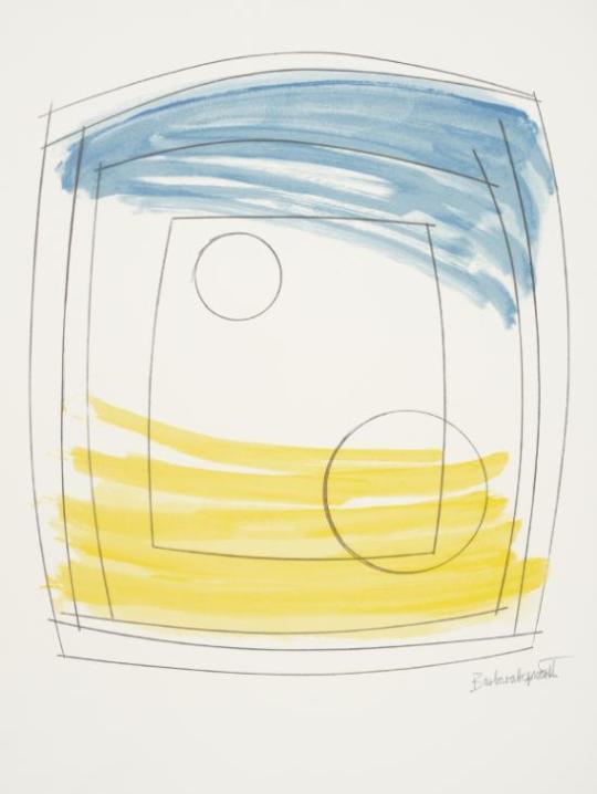
Dame Barbara Hepworth
Moonplay 1972
Tate
As a nod to Barbra Hepworth, I included geometric shapes based on Barbra Hepworth’s sculpture piece; Two Forms (Divided Circle). Her work is inspired by the shapes and intrinsic characteristics of coastal lines and organic structures. I wanted to create a sense of hollowness through cutting a circular shape out of a half circle and showing another through the gap. This feeling of space within a space was difficult to create in the Swiss style, so I made a sense of depth through minimalism. I really like how the colours work in this piece and I am happy with how it turned out with the challenge of a very limited colour palette. The beauty of Swiss style is how minimalistic but appealing the designs are.

Magazine Spread:
For my magazine spread I tried to carry on the style and design that I previously created for the poster. Working according to the International Style methods, I created a grid and lined up the text and objects with it. I wanted to get a sense of the Hepworth design in the spread too so I traced around the sculpture in the facing image and set the text to the shape. I also drew up the string pattern and made that a central piece of the spread, keeping white space in mind the whole time when designing. I mirrored the colour scheme from the cover and kept the typeface the same, only altering the boldness and size of the font between the heading, subheading and body text. My spread really has a sense of theme and creates its own image, something that could be useful as a promotional style for this exhibition as it is consistent and recognisable.

-- reflections --
I think this task was a good opportunity to be creative with poster design and layout, revisiting some InDesign tools and techniques I haven't used in a while. Overall I am very pleased with this outcome and it has inspired me to look deeper into Swiss design when creating a quick layout in the future. Maybe mixing Swiss and modern design techniques would give me something fresh and unique as a response to a design challenge.
0 notes
Text
25/2/20 - 10/3/20_ Editorial_InDesign/
In this session we explored InDesign as an editorial tool, strengthening software and typographic skills. We will be using the InDesign DataMerge feature to create a booklet of tweets around a subject of personal interest.
-- stage 1 --
Short and Tweet:
Our brief is to use twitter and inDesign in a typographic manner, utilising advanced InDesign tools.
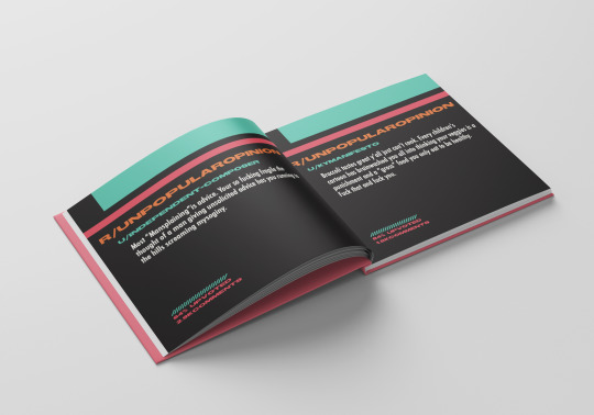
DataMerge is an important editorial tool, allowing people to automatically pull data into InDesign, where we can arrange it aesthetically. Our booklet will have a minimum of 45 tweets and 3 distinct spread designs.
The finished outcome will be a digital booklet as a PDF, a supporting document blog post and a printed booklet if wanted.
-- stage 2 --
Inspirational pieces:

Embraer Data StreamsLED and AR installation at the Farnborough Airshow for Embraer: Brendan Dawes
Showing data as a physical object allows us to tactically use and view it, giving it more permanence and importance to the audience.
Commissioned by Gravity London for Embraer, the third largest aircraft manufacturer in the world, an installation at the 2018 Farnborough Airshow revealing to trade customers the power of Embraer's real-time data analysis for making key business decisions.
“I came up with the idea of visualising data falling through the ceiling — as if coming from a jet above — and then have visitors explore the data through an AR iPad app, which also revealed the benefits of such a system.” - Brendan Dawes.
The New Typography:
“The use of the grid as an ordering system is the expression of a certain mental attitude inasmuch as it shows the designer conceives his work in terms that are constructive and oriented in the future. This is the expression of a professional ethos: the designer’s work should have the clearly intelligible, objective, functional and aesthetic quality of mathematical thinking.”
-- stage 3 --
The next stage is to collect #hashtag data. I want to pick something meaningless but interesting. Something that doesn't make a huge statement but will allow me to play about with interesting or amusing words.
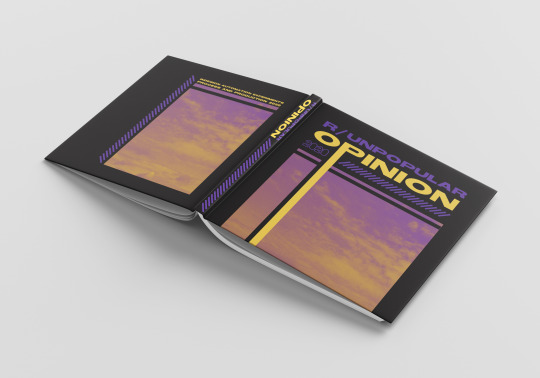
I decided to use Reddit to get some contrasting opinions from the subreddit, r/unpopularopinion.
The New Wave
I decided to base my cover and spread designs around technology and graphic design f the 1980s. I have always wanted to make an extended project based around New Wave art. Marking the beginnings of the digital revolution and the introduction of computers, an influx of technology and software moulded graphic design and within the decade, changed the industry forever.
Much like trends in fashion, design aesthetics are cyclic, often repeating again after a few decades. What is once dated quickly becomes retro and trendy again.
3/3/20
This week we explored typography and how it is applied and used in InDesign. We explored such features as: Master pages, type pairing, type as a graphic element, paragraph and character styles and kerning and tracking.
I decided to go for a retro, 80s inspired cover and spread design. I wanted to make it look retro with a modern twist. The style I used is very retro and the colours have a more neon, in-style feel to them. I am really happy with the look I ended up with and will be exploring this style more in the future in the hopes of developing my own image around it.
-- stage 4 --
I created my InDesign document around the data I collected, making paragraph and title styles for each of the pieces of data. I made sure to add the little elements I used on the cover, using fitting colour schemes and making sure to include the barcode pattern that features on both the front and back covers.
I used a master page to keep all the spread designs in the same sort of dimension, ensuring continuity through my book. The font choice for the book was decided based around my chosen theme, something reminiscent of 80s style. I chose TS Block Bold for the titling and Ubuntu for the body text. They are wildly different fonts but I think the thin and co pressed body text juxtaposes the title well.

I also used guides, basing all three of my spreads around them and keeping a sense of continuity through the entire book. I also used two main fonts with occasional accents by a third on the front and back covers.
Creating a paragraph style for the header, body text and the comment and upvote section meant I could quickly change and edit the style and positioning across the three different spreads. I incorporated the different colours across the spreads, attempting to establish some connection but also separate them from each other. Building a relationship is a technique that many brands use, prompting people to make a subconscious judgement about a particular logo or design. For my speeds I wanted to create something that is both nostalgic and on-trend.
10/3/20
This week we finalised our document though data-merging. We created a .csv document to transfer the collected data into our InDesign file and successfully insert the text into the relevant spaces. Fin.
I had a little trouble transferring my .csv file into InDesign because I used symbols in the headers, meaning Excel tried to convert them into readable data, like a date. Once I figured this problem out the process was fairly smooth. I can see myself creating something like this in the future using Excel and Datamerge to create a stylised document showcasing current news or a trend I am interested in. Overall, this workshop has shown me how easy and fast it is to merge lots of date into InDesign.
-- stage 5 --
The final design
I ended up creating my booklet as a real print, exporting the document as a high quality print, cutting the pages and binding them together myself. I really enjoy the printing and finalising process, it is very rewarding to see your finished design as an actual, tangible book.
-- reflections --
I have a plan to create another printed booklet in the same sort of concept about the current global pandemic. When the university and all of the resources become available again I will be creating a printed booklet of a timeline of tweets and news articles to document the event.
0 notes
Text
11/2/20_After_Effects_GREEN
In this session we explored the final stage of our after effects video creation. Our task was to create a short, 10 second video around the colour green.
-- stage 1 --
I looked for some inspiration in places that personally interest me. I found a gaming company that create graphics and showreels about a series I watch. The intros always look so clean and professional and the transitions inspire me as something I could create myself in After Effects.
youtube
Some of the things that make these sort of videos successful and professional looking are the style guidelines; a colour, font and general style that are kept consistent, creating a recognisable brand for the company. Assets like these are what give the audience brand recognition and the colours and fonts memorable and relevant to the subject matter. When working with industry, I need to keep in mind that logo use and a consistent font style and colour scheme are what keeps a brand in the forefront of the market.
-- stage 2 --
I created some assets in Adobe Illustrator to use in my final movie. The most important part of this stage is to properly layer and label everything, keeping in mind which parts of the illustration will be moving and which parts should sit in a layer together. Practising this part of the process in lesson has given me a good grounding for work that I will do for clients.
The main thing to keep in mind when working with effects and transitions is that the stronger the original artwork and assets, the stronger the final piece will be. Putting more effort into the original work will allow you to make a more professional looking final piece without using too many different effects.
-- stage 3 --
vimeo
-- reflections --
This video is suitable for the subject matter and is pretty good for the amount of time I had to make it in. I would change the colour scheme and fonts if I was to redo it and I would make the cycling text a lot slower, making it more legible and accessible to the audience. I would like to have had developed a more recognisable style, although the assets and graphics created follow a consistent colour scheme.
In order to develop this project even more, I would like to work on a real-life, industry led brief. I find it difficult to create striking and memorable graphics when there is no clear purpose for it. I think putting myself in a mindset where my work will be used for something that will be seen by the public will help push me to making more meaningful graphics.
-- stage 4 --
To further develop my skills in After Effects, I used my knowledge of keyframe animation to develop a project for a graphic design project.
Due to gaming being a large interest of mine, I approached the global gaming brand, Ace Causal. With its UK base located in Brighouse, I corresponded with the marketing team and developed a series of motion graphic pieces to be used as brand promotion.
During this project I exercised my skills in after effects as a motion graphic designer, creating a HD video intro with multiple colour schemes whilst sticking to the brand guidelines and keeping in mind target market and suitability for use on multiple platforms.
This work will be used in advertising and promotional material for X Rocker gaming and will be an integral piece of my final portfolio, ready for work placements and opportunities.
vimeo
After the success of the first intro I made, I was asked to create a few more in a similar style, keeping with the brand style but meaning it will be used for a wider range of products.
https://vimeo.com/400181577
A Showreel of the X Rocker intros I created in collaboration with the brand.
1 note
·
View note
Text
4/2/20_After/Effects_3D
These sessions are aimed to direct us on how to build projects quickly and efficiently and how to apply them in a bespoke manner in a professional practice.
Today we will be looking at building in a 3D environment and how to use a camera in 3D.
-- preparation --
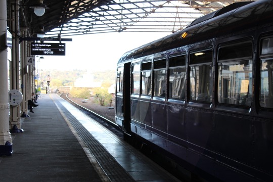
In preparation for the workshop I created a still of a train station based on some photography I took on the train on my way home. I hope to get a grasp of a journey through the use of textures and the imagery I created.
-- stage 1 --
Sara showed us some source material: All We Ever Wanted, a music video for MGMT. This video contains multiple layers with a texture applied over the top, animated onto the screen with a roll-on effect. This was good inspiration for our lesson activity and inspired me for a further activity in which I can develop these skills in a larger time frame.
youtube
We set up our two-node camera, allowing us a more editable experience.
vimeo
0 notes
Text
28/1/20_Illustrator//
In this session we explored adobe Illustrator and how to master its elements. Illustrator is mainly used for flyers, logos and posters as it is a single page document, but can be spilt into multiple artboards.
-- stage 1 --
To make the dartboard white you can go into user interface and edit the setting to suit your personal needs.
A vector is an image that can be infinitely big and small, it can be stretched without losing quality through vector paths.
Keyboard Shortcuts:

CMND + Y shows you the wire frames of the artboard.
Using the Pathfinder tool to cut out a shape.

The Unite action combines two or more shapes into one cohesive polygon. This tool is ideal for building complex vector shapes and joining them together.
The Minus Front shape mode eliminates the top shape layers and any overlaps, leaving behind the bottom shape and colour.
Intersect actions create a new shape by revealing the overlapped area and removing the top and bottom shape layers.
The Exclude shape mode eliminates the overlapping area and leaves behind the remaining polygons to create a complex shape.

Adding extra points will allow you to edit the way a shape looks.
0 notes
Text
21/1/20_inDesignEssentials
Alex session Week 1: Exploring the features of InDesign through the lesson workshop. I will further develop this session through personal practice
Grid, Layout and essentials
InDesign is an essential tool for visual and graphic designers. One of the most important features is the ability to rapidly change layout and text styles. Another is its extensive typography support, allowing the user to easily edit numerous types of documents and visual communication.
-The best thing to do for any project is guided references
-- stage 1 --
Terminology:
-Leading - The space between lines
-Kerning - The space in between individual letters
-Tracking - The space between the collective words
-Orphan - Single word left alone on a line
-Widow - Space where a line has jumped down in a paragraph (a line by itself)
Line length - Aim for the range 35-85 characters on a line. For small text aim to use two columns.
Point size - 6/7pt for footnotes and captions. 8/11pt for reading body copy text.
-- stage 2 --
Grids:

-Margin - The line around the edge of the page, what houses all the text
-Columns - The space to place the text
-Gutter - Small space between the columns, creating a white gap
Select both master pages on the spread to create a grid on both. Don’t generally change the gutter size, but alter the margins and columns to create a unique layout. Something to be applied on every page will be applied to the masters first.
- TOP TIP - Make sure the text box for the page numbers is big enough to house multiple numbers when working with a long bool (three characters or more).
- To align text to the left it is Cmd + Shift + L, replace with R for right and C for centred.
Cmd + Shift to break the master page rules.
-- stage 3 --
-Cmnd + A will highlight and select everything
-Shortcut for trimming text boxes to be neat is Cmd + Alt + C
-Cmnd + Alt + Shft + C will scale images correctly to fit a text box
-Cmnd + Shift will scale both the photo and the image bounding box
-- stage 4 --
Text wrapping:
To wrap text around a shape on a white/block colour background:
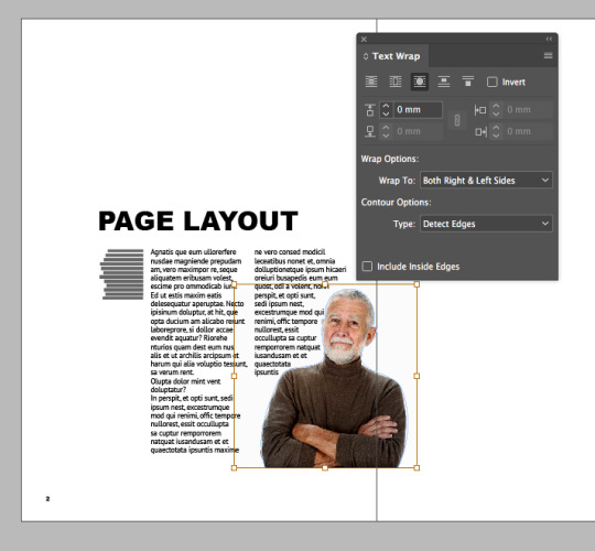
Wrap To: Both Right & Left Sides
Type: Detect Edges
-- stage 5 --
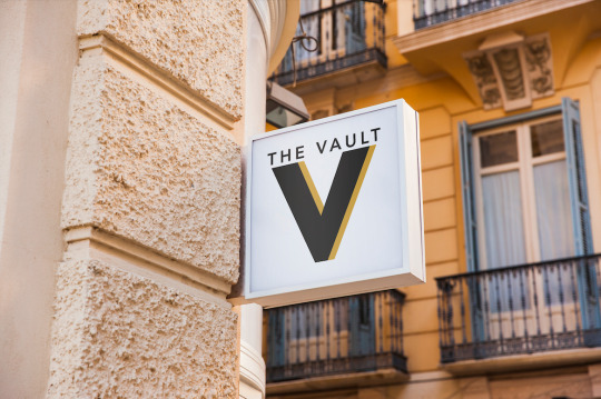
To take this project further I decided to create a brand guide for a company I am currently creating a logo for. This company is called The Vault, and the logo I created is for a bar being opened inside an old bank in Lincolnshire. To create a suitable brand I explored colours and font styles that matched the target audience.
Brand identity is the way in which your company is perceived by consumer. To build up a successful brand identity a designer must create components such as the logo, typeface, tones and tagline. Brand identity generates a message that the consumer receives, creating loyalty and recognition. Identity should be consistent and memorable through following the guidelines created. Identity exists as visual communication
Consistency is the most important element of branding, maintaining an image is the key to making a recognisable brand. When the consumer crates brand recognition it generates a reputation that can be maintained and rebuilt through replacing a damaged brand with a new image. Keeping a brand fresh can be achieved through updating the materials and marketing strategies.
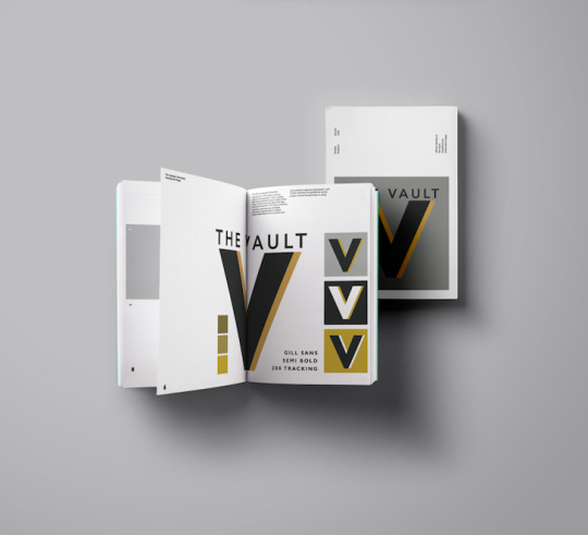
For this branding project, I have been tasked with creating a bespoke brand for a bar called; The Vault. The colour schemes discussed were gold, black and grey, and the logo should be typography based with the name included in the finished logo. This comission will be produced as a brand guide and logo for the bar in Lincolnshire and will be realised late in the year 2020. I have discussed further work in creating further graphics for the bar such as menus and promotional materials.
1 note
·
View note
Text
//group_curate/zine_create 3/12/19
In this session we employed the use of the rips-printer in order to make a zine of our collective work.
We used thin cartridge paper to create the zine on the xerox and riso printer. We considered how our pages would look in the zine through size, colours, overprinting work and being selective with the pieces we included. This was a great opportunity


The examples gave us a good idea of experimental forms within a book. I would like to play around with the process when copying through moving around my pieces and changing the forms of my original pieces. I won’t go with any particular narrative, just more of a process of compiling work within my book.


Although our goal isn’t to create a narrative, because we are a small group we might have time to consider the process a bit further. There isn’t a limit on the amount of pages, but it should be a multiple of 4 as it is a book. We could consider using other methods to produce this book like the riso printer or small copier. We will experiment with the outcomes and colours in order to produce fresh and dynamic designs.
Mike suggested that we pick a colour scheme and stick with a simplified palette of colours. This will give us a kind of identity and scheme to follow. Almost like a brand identity. I chose red, blue and yellow because it gives us a striking and unique look to our book, matching the contents well.


The production of the book was quite dynamic, choosing different existing pieces and combining them in order to create something that mimics the style without being a direct copy.

The final product is something that I’m very proud of. The look is unique and it is genuinely interesting to flick through the pages. Some of the designs are repeated but never stale looking.
I will absolutely repeat this process in the future when creating a portfolio, giving a client a good example of my work whilst also keeping their full attention.
1 note
·
View note
Text
26/11/19 _book();
This independent learning task will be centred around your own experiments and learning strategies.In this final workshop, you will find your own level for your independent learning.
– stage 1 –
In this stage we created a randomly generated book of sketches.
In this Processing document we created random stroke weight and alpha channel lines for a processing sketchbook, rendered in a typographic style. This task explores the principle of multipage PDF file creation through the process of creating a sketchbook.

// frame count in this instance = page numbers
-If our frame count = the total number of pages set, our if becomes true and endRecord tells the PDF project to stop recording. Exit tells the sketch to fully exit.
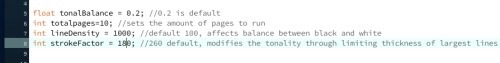
Sometimes randomising everything gives the book a lack of structure. // commenting out an edited characteristic can make the work look more organised and considered.
I changed the highest value of the stroke thickness, playing with the nature of the randomness and controlling how it will output the image. Too much randomness tends to produce structureless noise, but our experiments are about finding control points over the chaos.
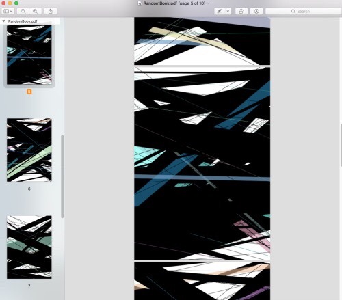
Looking at the aesthetic of the outcomes allows us to think of the process as more of a generation of visual assets rather than a complete outcome.

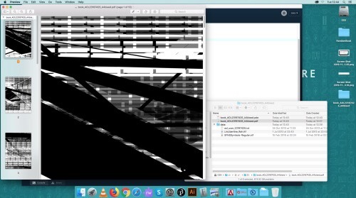
We can open a page of out PDF in Illustrator to demonstrate that we are working in vectors, not pixels. We can take any of out pages and take them into a program like Ai as a vector, or rasterise them as pixel for photoshop.

– stage 2 –
Working with typography, based upon our original sample sketch. This sketch throws in randomised typographic content. It is the basic starting point of random black and white lines, but with the addition of type. Opening this on illustrator would also have the text as vectors (as outlines, no longer editable).

We can copy a font into our data file., Only otf and ttf fonts will work for this, anything with the suffix ttc will not work. I decided to play around and experiment by using a Dingbats font.

When generating random numbers, floor will round a number down and ciel() calculates the integer value by rounding it up.
My system wouldn’t render Dingbats from the system, but a ttf from a website worked. This taught me to be flexible in my experiments and embrace the unexpected. I ended up using a symbols font that produced some unpredictable, but beautiful outcomes that would work well as an asset for a final piece.
– stage 3 –
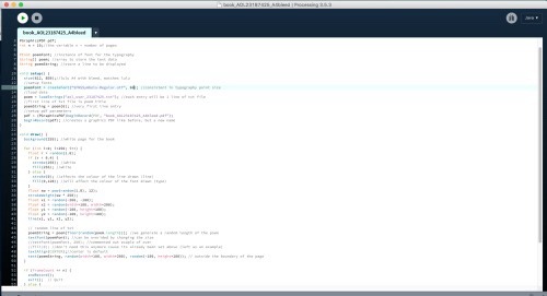
From this session we learn how to make our coding less complicated by breaking down our coding into chunks. We call these chunks a function. We may or may not put properties or arguments inside parenthesis of our chunk.

Here we set a style rule to stick to, almost like a paragraph style in Adobe InDesign. Nitti is a beautiful monospace font for this process.

Constructing a function: setup executes once, draw will constantly execute, filling the output window with text. For legibility and understanding, its good to hide a bunch of code in a function, making a more logical flow of the sketch. The draw function is so much easier to understand with the detail hidden away, but the assets are still there to play with and generate alternate versions.
Any time you want to compact or contain a particular job, the best thing to do is create a function and call the function as you need them. As long as the function is declared as a global object, it will be seen globally, so the best place to out these is at the end of the code, encompassing the sketch.
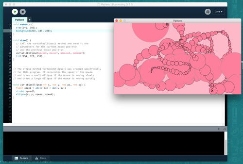
– stage 4 –
In Processing, the Pattern example allows you to draw a pattern made out of white circles based on the speed of your mouse. The code calculates the speed of the mouse and draws small circles if the mouse is moving slowly, and big circles if the mouse is moving quickly.

I edited the code by adding an RGB colour to the background and the circles themselves.
BG: (253, 185, 200);
Circles: (254, 127, 156);
The words example helped me learn how to add, size and colour text in Processing. I decided to edit the location, font and colour of the example text, also adding some coloured spheres into the sketch.

This was a good exercise in learning how to use a font I downloaded from the internet in my piece. I am also more comfortable with the positioning of primitive shaped in Processing now.
For the Tickle example I made my chosen text jitter and shake when hovered over by the mouse. I also edited the font, font size, colour and position. Its a bit harder to demonstrate through a screenshot but this was a useful exercise in learning how to make things responsive to a mouse.

0 notes
Text
19/11/19_hand/drawn
Hand drawn animation After Effects Workshop: Adding effects to a hand-make animation as a storytelling tool.
-- stage 1 --
Inspirations:
I Met the Walrus: animated film directed by Josh Raskin

Is an animated interview between Jerry Levitan and John Lennon. The naive interview style is mirrored by the hand-drawn, raw animation. The stream of images visually complement the verbal language used, the style very reminiscent of John Lennon and the Beatles. The animation has many images that balance with Lennon’s words without being too distracting from the audio.
vimeo
People started to use motion graphics as a tool for telling a story, much like a short children’s animation. This aided the development for After Effects to make short films and use it for storytelling. The films created work as a visual essay, telling the story of the audio track as a visual piece.
-- stage 2 --
Lesson Experiments:
We started off by taking our images and flattening them, saving them as separate files and preparing to import them into After Effects from Photoshop. I started off with a simple vector drawing in order to understand the process fully before moving onto more complex and detailed source material.

I used a simple vector drawing and added colour in order to create an animated process.
I imported the footage into after effects and selected importer jpeg, keeping the filed in order that I created them. I then interpreted the footage and selected mains, making sure that the frame rate stayed at 25 frames per second, the standard UK rate.

Always keep the frame rate at 25 frames per second, you can animate on 1s, 2s and 3s, allowing you to have a more gentle motion by showing an image for 2/3 frames per second instead of just the 1.

I then slowed down the animation by stretching it to 300%, making the image show for 3 frames instead of 1.
-- stage 3 --
vimeo
This process opened up some of the effects that are industry used, allowing me some insight into how to create a short, professional looking animation from both clean lines and sketchy, more rustic looking stylised images. I’m inspired to create a short hand-drawn piece that could be used for something like a music video or even promotional piece. The industry uses animations like these because they are quick to create and are easy to manipulate into many different styles. With after effects we can explore both text and stroke effects, both being important factors to consider and manipulate when making a graphic piece.
0 notes
Text
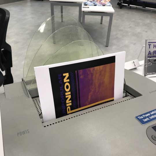
12/11/19_riso prints
In this session we explored the Risograph printer, a process that I’m familiar with after some of the workshops from last year.The Riso-printer produces unique textures and retro outcomes that would work well as posters or even album covers.
-- stage 1 --
We had a look over some poster designs together in class to demonstrate the kinds of work this process produces. I think an interesting approach to this would be to take it in a completely contradictory direction than the examples we were shown. This type of process is commonly used to produce striking, propaganda-style posters that have a shock factor. For my piece I will instead choose some articles and text that focus on a more comedic and lighthearted subject matter to juxtapose the dark and depressing uses it usually falls to.


I researched some bright and fun riso prints and found that they best styles that work are cartoon drawings in bright pinks, greens, blues and orange colours.

Some of the examples I researched inspired me to draw a cat in a cartoon style, developing how it looks and then finally drawing a finished piece in block pen ink, ready for printing.
-- stage 2 --
I chose a cooking and food based magazine as most of the shocking headlines were already taken, so I continued with my comedic direction. I found an article about hazelnuts and played around with the text in different combinations.
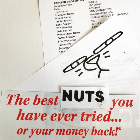
I resized some of the text and added it to my cartoon cat. I like this piece because it is purposefully ambiguous. I have always been interested in surrealist and dada pieces, and I think my process mimics the styles well. There is no clear direction or purpose to the piece, other than being aesthetically pleasing and to perhaps make someone laugh. I think this is a great way to bring some comedic relief to the kinds of pieces of art people usually create from newspapers and magazines in the harsh reality of the modern age.
I also used some of the printer properties tester sheets in my work to keep the process random and surreal. I am unafraid to incorporate things that would usually be ignored or thrown away.

-- stage 3 --
To further develop this project we will compile all of or work in a zine, creating something contemporary and tangible as an example of how to create something that could work as both an aesthetic piece and a mini portfolio.
0 notes
Text
The Function of Design:
Design is the synthesis of visual language. It projects ideas and thoughts as tangible residua, commanding both imagination and meaning. Design shapes our environment and conveys our meanings with purpose and creativity.
Cullen, K. (2005). Layout Workbook. USA: Rockport Publishers Inc.
Graphic design is ingrained into our culture, present in print, digital and environmental art. It affects our daily life.
“The objective is to educate and inspire as well as promote creativity, while encouraging, while encouraging the design of strong, thoughtful, and informative layouts.” (Cullen, 2005)
As designers we add meaning to a problem through critical thinking and application of design knowledge. We take on the task of adapting to constantly evolving methods of communication.
Design Objectives:
This defines the purpose of the design. Design without purpose is uninformed and carries no meaning. Though sophisticated visual language can be executed as an aesthetic experiment, function is the primary purpose.
communication
education
information
guidance
encouragement
promotion
inspiration
awareness
dialogue
persuasion
entertainment
direction
motivation
aggravation
Functionality:
This should be established before the design process starts, it provokes questions between the designer and the client. This allows further development of design and informs the designer about the targets they need to hit.
Will the design?:
announce or invite participation?
inform and create awareness for the purpose of the brief?
educate or instruct the audience?
identify or symbolise the meaning?
influence or motivate action?
interpret and clarify?
promote or advertise?
display or exhibit?
feature and showcase?
anger or incite emotion?
entertain and amuse?
The Role of the Designer:
A designer adopts multiple processes and styles in order to solve a problem or meet the targets of a brief. We must act as artists, strategists, decision, problem solvers, and conceptual thinkers.
Designers possess a range of skills that we develop through education, inspiration and most importantly- experience. We share ideas and creativity through the execution of carefully thought out visual language. We can control emotions, viewpoints and dialogue through visualisation.
Designers are:
problem solvers
communicators
analysts
managers
visualisers
critical thinkers
researchers
influencers
“The primary function of design is the communication of messages. Ideas are shared from person to person through compelling visualisation. It is a challenge to effectively deliver messages that are dynamic, engaging, and informative, while satisfying the objectives of everyone participating and affected by the design process and final visual solution. The designer plays a pivotal role, shaping visual communication to create connections between the client and the viewer.” (Cullen, 2005)
The Role of the Client:
The client needs to feel like they are part of the solution, giving the designer and opportunity to demonstrate their knowledge and experience with design. As designers we mustn’t rely solely on resources provided by the client, but instead gather our own information and inspirations based on the topic, expanding beyond the original brief.
0 notes
Text
Defining the Process: The Design Brief
From problem to solution: A study of professional Graphic Design processes.
From this study I would like to solidify and define my own design process further, eventually leading to a clear manifesto of rules and ideas.
For this personal task I decided to research into some successful design processes by looking at completed design briefs I found in books at the library. I intend to draw upon these in order to enrich my own design process and hopefully devise a plan to quickly follow in the event of future live briefs from either university or a client.
Skolos, N. & Wedell, T. (2012). Graphic Design Process: From Problem to Solution. London: Laurence King Publishing Ltd.
This book focuses on 20 Graphic Design case studies, exploring a range of universal and unique design methods. It will be a good insight into my own process and also the methodologies of my peers. This book offers exposure to subject material ranging from inspirations to the client itself.
The Design Brief:
-Key to defining the opportunities and limitations of a project (equally important)
I need to remember the limitations of my briefs more often in order to create a more realistic plan and make sure I finish each step on time, an integral skill in order to impress a client and keep them up to date with the process.
-Pick out key elements of a brief and list the possibilities and needs by order of importance
I need to make sure to focus on the purpose of my outcomes more often, rather than being obsessed with the marks I personally want to hit. A brief won’t always be something that I can have freedom with, sometimes solving a problem needs to be as simple as keeping a client happy or hitting the design requirements.
A good example of successfully meeting a design brief is the ‘reading room’ A2 designed for the Turner Prized exhibition, Tate Britain 2002.

The task was to design the exit room of the Turner Prize exhibition where the audience could leave comments, read books and watch/listen to artist interviews. This would be a final space for the public to express opinions and open up a dialogue between the audience and the artists on show.
The key elements of the brief were to be:
Interpretive
Contextual (to the gallery)
Flowing seamlessly from the gallery from room four to five
Built from transportable components
Can be reused for up to five years
9X9 meters
A2 were tasked with a specific budget and six to eight weeks to complete the project.
Although this seems like quite a strict guideline and a shirt amount of time, knowing their limitations gave A2 a start to build upon when solving the problems set before them.

A2 decided upon comment cards the size of a standard postcard as a nod to the public participation in the exhibition. The text also matches the font of the Tate museum, sticking to brand representation and a colour that can be matched each year as the museum updates the exhibition.
The exhibit design ended up looking like a piece of conceptual art, a physical manifestation of what the original design brief called for.
“If we didn’t have six weeks on this, we’d probably still be working on it now... the deadline is something to work against- part of the crazy process; it forces you to stop working”.
This is a good lesson to remember about working towards the final, and then managing to let go of the project. A perfectionist nature leads me to try perfect a piece over and over, when sometimes it is much more beneficial to let go of a project and move forward onto something else.
0 notes
Text
Design Conversations:
Small conversation about big influences:
I start this blog with grand ambitions to make it big as a graphic design literary writer, or at least have something interesting to look back on in two years as I finish off my final instant noodles as a design student.
Graphic design is a tough topic to quantify as it influences daily life in so many abstract ways. Some designers have deemed it unquantifiable, but it seems that to all designers, design holds a unique value. It is not my intention to define graphic design as a singular topic, but instead explore the personal interpretations that each designer holds.
In order to do this, I plan to explore some other literary writers and a cacophony of ideas, from manifestos to blog ramblings. I will ask those questions that designers dread, in the hopes of someday answering them myself. This year I will have the opportunity to collaborate with both big time designers, and also bully my peers into answering my outlandish questions.
Go.
0 notes
Text
Work and Play session
Enrichment Week: Playing with typography session:
In this session we aimed to play with type and caligraphy in order to create some abstract and innovative design, based on inspirational resources provided.
We were given some resources in the form of a tumblr blog and lots of paper and markers to make unique letterforms.


I was inspired by the buildings and leaves the most as they had the most textures and shapes. I decided to try find letterforms and type in my environment, inspired by the Poetics of the Open Work text I reviewed in my last elective brief.

I started to copy the shapes and forms of my environment, changing perspective and exploring the building to find type in shapes and objects.
We were tasked with creating some letterforms for the words ‘Work and Play’, not limiting ourselves by rushing to create a perfect font or complete typeface.
I also looked to my external environment, playing around with the shapes and textures of a leaf, bringing digital type and nature together as visual language.

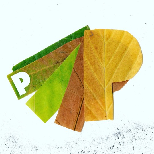
The textures I got from the leaf were very inspiring and I plan to make a piece in the future solely with natural resources and tools.
At the end of the session we all collated our work together, having created both the A and P shape in the work ‘Play’, it was interesting to see how multiple styles work together as a collaborative piece.

Each letter has its own quality and shows how stepping out of your comfort zone can be a good process to develop new styles and approaches to design problems.
0 notes
Text
5/11/19_draw:
Coding and Processing Workshop 2:
As a drawing tool, processing is very simplistic and quite abstract, a paper and pencil is more effective, but the knowledge from this session will introduce new materials and processes fro programming. Allowing us to explore data visualisation through basic coding.
// comment everything
Adding comments to your code is good practice. It is a way to demonstrate your intentions and to provide a commentary on the flow and functions of the code. This will be the main task for today.
-- stage 1 --
Processing outputs to a pdf file and has the ability to superimpose multiple lines (like a sketch). This uses a random factor to add variations to the x and y coordinate of each point as the lines are drawn.
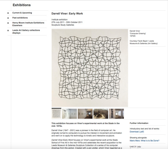
This piece is reminiscent of a basic step and repeat grid pattern, but with random variables affecting the nature of the pattern. We will be looking at ways of replicating this process in our own way. This sketch produces a pdf file extremely similar to the nature of the Darrel Viner drawing. It has a similar flow and feeling to it.
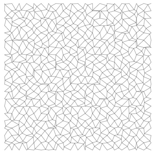
Rob explained the code we will be building as a brick wall, that we will build points upon and then add random numbers and integers to create a unique pattern, similar to Viner’s.
-- stage 2 --

We will remember the random positions of the point variable on our bricks as int randX; and int randY;
You can declare some variables without assigning a value, leaving them as random integers.
void setup() {
background(255);
size(800, 800, PDF, "viner_drawing.pdf");
}
We have three arguments here. The size, file type and name of the PDF document (as it is a name we put this in quotation marks)

Here we can declare the stroke weight: If we are viewing on screen, its usual to have a minimum value of 1 as you can't have lines smaller than the smallest resolution on the screen/document. Here it says 0.1, 1/10th of a pixel. We do this because it is outputted as a PDF file, exporting the sketch as a vector, making it resolution independent.
grid= (width - margin*2)
This refers to the size of out document (being 800px), so here it calculates how many squares we need to fit into the document.
For a repeating pattern, we have an outer for( loop, that determines with row we are in, and an outer loop that determines where the cells fit along that row.
When drawing a line in processing we give it 4 coordinates, the X and Y at the start and the end of the line. i and ii incrementally count upwards so we multiply i by the grid value and the random point value + the margin.
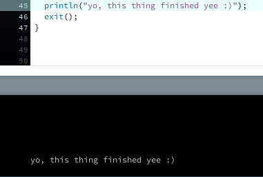
We can also add a print message when the drawing has been finished successfully.
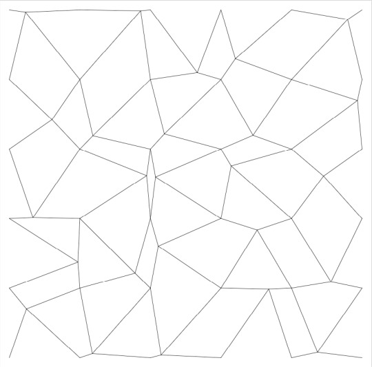
Here I changed the int gridFactor = 5;

And in this one I changed the stroke weight to 5, this could be utilised to show progression of data, strengthening the visual language conveyed. This could easily be made into a simple animation.
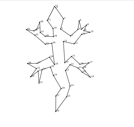
CSV (Comma Separated Values file):
Our data is for our dot number (dotIndex) and X and Y coordinates of the dot (dotX, dotY)
A continuous line is drawn from dot-to-dot

Here I have commented all of the relevant data about the sketch we reviewed in class.

You can add roughness and iterations to create a boiling effects on the drawing, making it look more childlike.
-- stage 3 --
My fist attempt was to draw a lucky cat in processing using the minimum amount of points possible.

After this I went on to a lizard, which I imported into photoshop and wrote down the X and Y coordinates onto the Excel spreadsheet.
Which I then made into a short boiling effect animation by changing the stroke weight variable.
vimeo
0 notes