#It wasn't just a font color issue
Note
Your river post is basically impossible to read on dark mode
How bizarre. After some fixes, it now looks good on dark mode locally; please do let me know if there's still a problem on other devices.
And thanks for flagging the problem! You receive one Toggle point.
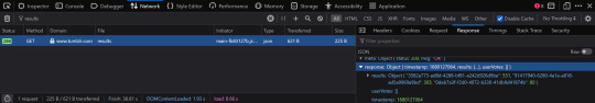
#my anons are better than your anons#for the curious#I compose the long essays in gDrive#and somehow Tumblr started classifying blocks of text as...#IDK#something else?#I just nuked the formatting data by copying it formatting-free in to a different editor#and then re-did all the italics by hand#Thus demonstrating how badly I overuse italics for emphasis#It wasn't just a font color issue#I have no idea what was going on#The tumblr editor wouldn't let me delete individual text strings either#I had to delete paragraphs one at a time like they were pictures?#blue hellsite#dark hellsite
6 notes
·
View notes
Text
Feathered Inconvenience (a tumblr x twitter fanfic)
i lost a bet, have at it kiddos!! posting chapter 2 when this hits 5K :]
~ chapter 1
Escaping to a forest after a midlife crisis wasn’t what Tumblr had on his to-do list, especially not after flunking his presentation. It’s not like his presentations were bad, they were excellent, he detailed what his company asked for and brought in ideas that filled their blanks. Another note, having his rival, Twitter, taking a trip away from the office made it easy for him to excel and succeed, it was all going perfectly. So, what was the issue?
Simple, he was bored, and it felt like shit. He loved his job, but it was getting boring, with the same circulation of events but in different fonts and colors. He needed inspiration, something that would bring fascination back into his vision. Tumblr’s back slid against a huge tree, speckles of light shining through the leaves and branches. He closed his eyes and begged his mind to be quiet.
“Maybe I just need to change the office theme again.” Tumblr told himself, crossing his arms while deep in thought.
The suited gent shook his head, rejecting his own idea and kept thinking. He always knew what to do, what to make out of an issue. He was great, that’s why some higher ups favored him. It was also the reason he stuck around for such a long time too. Tumblr loved his job, but this, being stuck due to the lack of anyone qualified to be in his place, is slowly crushing him.
Tumblr’s chest rose as he took a deep breath in. He needed an escape. No, he needed to stay. No, he needed…
What did he need?
Tumblr, with his head hanging in defeat, pushed himself off of the tree, squinting his eyes as he stepped away from the shade. He’s just going to go back to his apartment, and take a day off to really get himself far away from this rut. But a small noise stopped him in his tracks.
A bird chirped to itself on the ground, one of its wings appearing to be hurt. Tumblr simply tilted his head and walked to the feathered guy. He was a tall shadow to the bird, so it was normal of the bird to try and scramble away. Tumblr crouched down, and lent his arm out with his hand open, inviting the bird to just hop on.
“Not gonna hurt you, I promise.” Tumblr said calmly, a tinge of a tired smile appears. The man must’ve been really weary, because the bird really seemed to be considering his help.
After careful consideration, the bird hopped onto the palm of Tumblr’s hand, and flattened in a relaxed way. Tumblr hummed and stood back up, a hand hovering over the bird in case the sun was too bright for it.
“What’s wrong with your wings, lil guy?” Tumblr asked while slowly inspecting. He didn’t really expect a bird to understand or reply but it did; the bird’s beak pointed at its wing, crooked, ouch. While checking for any more injuries, Tumblr noticed the mud and leaves covering the bird’s exquisite light blue feathers. He admired it and smiled to himself. Blue was his favorite color, unironically.
“Good thing I caught you before any firefoxes did, huh?” Tumblr chuckled, as the bird shivered at the fact it could have already been eaten up.
Without any introductions or directions, Tumblr walked out of the forest, not only with a temporary distraction, but also a feathery friend. Yes, it wasn't the best answer to his crisis, but it was something to get his mind off of it. Maybe after helping this bird, his mind would clear up.
Unbeknownst to him, there was a group of people looking for the very thing he was determined to take care of.
— — — — — — — — — — — — — — — — — — — — —
Tumblr dug around his pockets to look for keys to his apartment, all while still cupping the blue puff of feathers on his other hand. If anyone walked by him, they’d shoot a confused look. It’s not like this was the first time Tumblr brought home an animal, he almost brought a horse up once because it looked goofy.
The jingles of his keys echoed through the hall, Tumblr paid no mind, but the bird was shifting and peeking around at the tiniest of noises. “Chill, it’s just my keys.” Tumblr replied to his jittery feathered friend.
Entering the apartment, Tumblr flickered a lamp that was by the door, the once dark room was painted with a warm orange hue. His place was nice, packed with folders and papers, and a weirdly large amount of red yarn. Tumblr’s humble abode is catastrophically homey.
Tumblr threw his keys on the cluttered coffee table and flopped on the couch, and placed the small bird on his chest. He sighed and threw his head back, exhausted. This day was tiring, but he had a friend with him.
He could barely take care of himself, but he really was looking forward to nursing his new friend back to health. As he yawned, Tumblr grabbed a pillow and scooped the bird off of him and on the pillow. He patted his feathered friend on the head with his finger and stood up.
“I’m taking a nap, little guy, you better rest up too.” Tumblr’s voice faintly heard as he walked to his bedroom. Within minutes, Tumblr’s snores comically seeped out of the slight agar door of his room.
Tumblr was having a good nap, even in his work shirt and pants on, maybe this was what he needed, a nap, that was until he got woken up by the sound of folders falling. He sat up aggressively, fumbled around to get his trusty baseball bat on the floor. Tumblr’s mind was too tired to think of something intimidating to yell out to whoever was making the noise.
As he creeped to the door of his bedroom with the bat, Tumblr took a shaky breath in and peeked out. He swung the door open and raised his bat to aim, but froze in his place. He didn't expect much, maybe an intruder who wanted to steal his magic wand set or his valuable shoe laces.
What Tumblr saw before his eyes was the very reason he was doing great at work, the reason other people in his office were doing good; he saw Twitter in the middle of his clutter, looking as shocked as Tumblr was.
“What the absolute fuck…” Tumblr pointed the tip of the bat at Twitter, “...Is going on?”
#yes i raised the bar from 100 notes to 5K GOOD LUCK SUCKERS#twitblr#tumblr x twitter#twitter x tumblr#fanfic#lord save me#enemies to lovers#rivals to lovers
3K notes
·
View notes
Text
oh yeah, now that it's closed, here's the post i wanted to make about that rt rebrand poll i made last week. this will be pretty long and kinda rambly, so feel free to just blacklist the "long post" tag :)
so like, i made the poll because of 2 main reasons: 1. because of a mix of comments i saw on other sites from people who also didn't know what color it was supposed to be, and 2. because of myself confidently believing it was some shade of orange until i switched from looking at it from my laptop screen to my phone screen.
it being a godawful shade of red/red-orange was mentioned in the article itself, which is why my question was phrased "what color do you guys think it is?" since either red or orange is both technically correct. going more into the specifics of the poll numbers:
tumblr doesn't show the specific number of people who voted for any given poll option by default, just the percentage, so i went digging and followed this tutorial to get the raw data using firefox's inspect tool. the final results are, with 934 votes total, red at 551 votes (59%), orange at 303 votes (~32.4%), and other/a secret third thing at 80 votes (~8.6%).
red winning wasn't a surprise, really, but i was pleasantly surprised at how many people didn't have a definite answer or switched between answers like i did. i can't exactly pin down why that is, but if i had to wager some guesses...
the color scheme has a high chance of being a callback to rooster teeth's Popular Web Series Red Versus Blue™:

and with a want/need for rt to rebrand, the idea of keeping the color scheme while also making it modern and pop out is really cool, but its execution is uh...
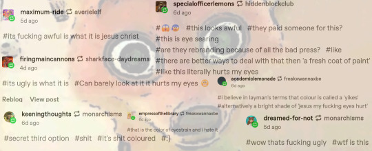
i couldn't fit everyone's tags, but you get the gist. it fucking sucks, man.
as @god-of-arts-and-crafts has pointed out:


orange and blue are complementary colors, with them being opposite each other on a color wheel except the people who made the rebrand chose a deeper shade of blue??? they couldn't even get that right, oh my fucking god, so while its technical color is red-orange, it can be overwhelmingly orange when paired with a similarly bright shade of blue, which is what's causing many people eyestrain. hell, the first time i looked at the picture when the news dropped, it literally gave me a headache lol
finally, as i've said in the tags of a different post about this eyesore, this is an accessibility nightmare. with the worst color combination possible, the colors used for the new font and logo are definitely not ada-compliant. there are free sites out there to test images for general accessibility issues. contrastchecker is what i use sometimes, and below is what i got using red-orange as the background and blue as the foreground, and vice versa:
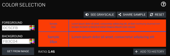


(both versions had the same ratio and color difference lmao)
the americans with disabilities act recommends that the contrast ratio be 7 at the lowest, but should ideally be higher than that, if possible. this is objectively and subjectively a very bad corporate rebrand, and i really, really want rt to break their "no jokes on april 1st because that's our anniversary" rule this year. if for nothing else, then just so that people who haven't read the variety article and/or the reactions on social media aren't jumpscared once the new intros/endcards/whatever else start rolling in.
#i almost made the third poll option be ''it's bad/ugly whatever it is''#but i knew that would win by a landslide#roosterteeth#rooster teeth#achievement hunter#funhaus#rvb#red vs blue#rwby#eyestrain tw#this is a joke buut i hope whoever finalized this got fired#i would say someone in-house could've designed a better one#but given how many people got their roles dissolved or voluntarily chose to quit last year#i genuinely don't know how many graphic designers are left at rt hgfdhhgfdxgh#long post
53 notes
·
View notes
Text

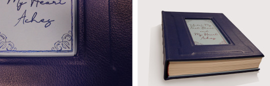

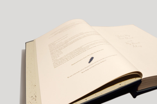

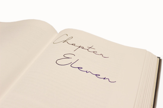
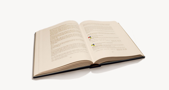
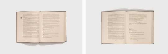

My first completed fanbinding! There were so many fun typesetting elements I had trouble narrowing the photos down but I didn't include everything. My favorites are definitely the music QR codes and the meta AO3 fics.
Until My Feet Bleed and My Heart Aches by @kazliin
‘…Of all the rivalries in the world of sports over the years, perhaps none has become so legendary as that of Russian figure skater Viktor Nikiforov and his rival, Japanese Yuuri Katsuki…’
A single event changes the course of Yuuri’s life, throwing him into a bitter rivalry with Viktor Nikiforov that spans across his entire skating career. But as the years go on, rivalry and hatred begin to develop into something very different and Yuuri doesn’t seem to be able to stay away, no matter how hard he tries.
Hatred and love are two sides of the same coin and even though everything changes, some things are still meant to be.
Technical stuff and bonus photos below the cut.
General
197,692 Words / 11 x 8.5 Paper / 500 pgs
Title Font & Chapter Number Font: Just Signature
Chapter Title & Body Font: Adobe Caslon Pro
Misc Fonts: Georgia, Lucida Sans, Zilla Slab, PT Serif, Segoe UI
Designed, typeset, and bound by me.
Programs used: InDesign and BookletCreator.
Anyone who knows me knows I am a sucker for enemies to lovers and this fic executes the trope beautifully. It was one of my very first fics on AO3 and since then I have read it countless times. The fic diverges from canon in a single moment and what proceeds is one of the best Victuuri fics of all time.
Materials
This was the first ficbinding project that made it off of my computer. The original plan was to keep the book thinner by scaling the page size up to 11 x 8.5, but obviously that didn't work. I ordered short grain 11 x 17 sheets from Nicole Nikolas Modern Paper Goods and printed with my large-format inkjet printer (which used more cyan and magenta than I would have expected).
Once my signatures were printed I realized just how massive this thing was, and in that moment I decided the casing was going to be leather. I ordered Royal Blue leathers from Peggy Sue Also Leather's Dutchess Collection. And while I waited for that to come in I hand-painted the chapter numbers using Dreamland Watercolor's Beta and a fluid writer. The color changing effect wasn't as dramatic as I hoped but it still turned out gorgeous.
I decided not to complicate things too much and left the spine flat and the edges deckled. I used the basic method of sewing tapes and spaced five of them out across the spine. The headbands are actually Vintage Petersham Grosgrain Magenta ribbons from Fini Ribbon that I folded over some string I had laying around. I also made my own endpapers from Strathmore drawing sheets and more of the Beta watercolor which I sprayed over the sheets using a cheap paintbrush.
I created an embossed frame on the cover by layering chipboard on top of the 0.098" Davey Binder's Board I ordered from Talas. Then I cut out a window so that I could do the title out of watercolor. I didn't have a pairing knife for the leather so I tried sanding down the edges to help minimize the thickness of the folds. I am actually not sure if this helped or not but the leather turned out better than I thought. The only issue was that I didn't have enough of an overlap at the top and bottom on the inside of the book board, and the endpapers couldn't cover the seam properly. I came up with the solution of adding a second layer of chipboard that I covered in light blue construction paper. I made it to the same dimensions as the Davey Board and then glued everything together with pva. I really like the effect it has and it also worked out as a base to paint the title onto.
Typesetting
Typesetting this fic was a lot of fun because of all the social media aspects included in the fic. This included articles, Reddit threads, Twitter posts, Instagram posts, Youtube videos, Tumblr posts, and even meta AO3 fic summaries. I did my best to match the real-life counterparts as best as I could. I ended up using Segoe UI for most of the social media typesetting. The articles used Zilla Slab for the title and PT Serif for the body. The AO3 summaries were the most complicated as they used Georgia and Lucida Sans fonts and jpeg graphics.
The other really exciting element I incorporated was the music. Kaz used music throughout the fic as a very imporvictant part of the storytelling. Yuuri and Victor communicate through their skating and their routines and the music is what brings those routines to life. I placed QR codes in the margins at the start of each routine. It is so cool to hold your camera up and suddenly have the music playing from your phone as you read! I also included an appendix of the music so that when QR codes become obsolete the music is still accessible.

277 notes
·
View notes
Text
On "heavy inspiration"
First, I'd like to apologize for the contents of this post. I do not wish to be a blog that just complains about matters, but I feel like I need to say this at least once.
If you don't agree with what I say, that's perfectly fine. We can agree to disagree, that is all.
It never fails to anger me when I see any issue related to tracing and "heavy inspiration." These are definitely tools when it comes to learning more about art, but there's definitely a line that dictates whether the use of those methods are acceptable or not.
I will not be naming names, but back then there was a blog which was "heavily inspired" by me. I'm flattered that I inspire people out there, but this case was truly something else.
[NOTE: If you recognize the account I'm referring to, please don't bring them up. I don't want this to escalate, nor do I want to stir up any issues. This is just to discuss what happened.]
There was a time where I've made a character sheet/template for one of my OCs, intending it to be for her specifically; every element about it reflected her as a character in general. A few days later, I see that a certain blog had done the same with their own sheet. The only difference was that it was all mirrored. I commend them for giving me credit, however I was not on board with what they did.


DISCLAIMER #1: Yes, I am aware that I may sound like a whiny baby for being possessive over a character template. It truly sounds absurd, and even now I don't know if what I felt was valid. But my reason for it was that I had specifically designed that sheet for THAT character. It was completely original, as I had made it all from scratch. It took me a while to conceptualize it all. Then someone comes along, taking and running with it without asking me? Can you blame me for being upset?
I didn't want to cause an issue, so I privately settled this issue with them. I made it clear with them that they should've asked me first before doing it, but also added in that they don't have to take the post down. I may be protective of my works, but I'm not a jerk to force someone to take down their own hard work. Plus, I didn't want to cause any drama nor controversy over a character sheet, so I just kept my mouth shut.
Additionally, I made a post as a measure to make sure this incident doesn't repeat.
You'd think this would all stop, but it surprisingly didn't! A few months later, I released a Birthday Union Card for one of my characters. I took some creative liberties with it and added my own twist to things. So, I gave my OC a different kind of bow and nail polish. A few weeks later and what do I see? The same kind of bow and nail polish are on their own birthday card too!!
DISCLAIMER #2: I am aware I don't own these "creative liberties" or certain aspects of design. I would've brushed this off as a coincidence if they hadn't taken "major inspiration" from me before, but this was the second time it all happened. I was beginning to get paranoid; I felt like they were keeping note of everything I do so they could do the same. damn. thing. Plus from what I know, I don't think anyone has done this before? Maybe that's just me...
Don't get me even started with the post formats! I did things a certain way back then, mixing up the font styles, incorporating colors, cringeworthy quotes- you name it. Would you believe me that they got inspired by me to this degree? That they would format posts that contained similar content as me IN A SIMILAR WAY?

DISCLAIMER #3: I am aware that I don't own post formats. My point here is that they were truly coming across as a copycat. I believe they could've changed things up for the sake of originality. But I suppose you can't have everything nice in life.
Every time they post something, the first thing that comes to mind is "what did they copy from me this time?" And it's truly a shame. Any slight resemblance or similarity to what I did stirred panic within me. It wasn't healthy, and I felt like I couldn't do anything about it.
Though, I must admit I'm not entirely in the right for this. Thinking about it, I may have enabled them due to my lack of communication.
FAULT #1: I must acknowledge my fault for not telling them off enough. I really thought they'd just eventually stop and learn from their mistakes. I just didn't have the heart to tell them any more. Being accused of copying is not a great thing, and I didn't really want to be that person. Unfortunately, look where that got me.
FAULT #2: It's also my fault I decided to follow them back despite the first instance and didn't block them. Admittedly, I have a bad habit of wanting to see the good in people. So I assumed that they would change in the long run.
Things only stopped when I finally blocked them and notified them about it. I don't think they're active on here anymore, and sometimes I worry if I was the reason for that. I wished it didn't come to this point.
This is a cautionary tale for fellow artists out there. Please, don't take things without permission. This whole incident took a toll on me for months, and I still fear instances of these. Some artists may be more lenient and wouldn't mind, but there are definitely others who are not okay with "heavy inspiration." Always, ALWAYS ask.
#random rambling#please be civil if you have any comments on this#I do not condone any hate sent to this person despite what they did#I'd also like to apologize for showing their work (which may lead to them being identified)#but I really needed the evidence to back up what I'm saying#I'm calling it heavy inspiration and not copying because I feel like an ass for saying that#sorry if this isn't the usual things you'd want to see#but I really needed this to be brought up#also sorry for the typos and errors I'll fix them later-
10 notes
·
View notes
Text
The hardest thing to do is to update the website theme for Noxporium, really. I am not a designer and it shows, and I am very concerned that design choices that makes sense to me will anger search engine algorithms or worse, make the site unusable for folks using visual aids.
A long time ago there was a musician who made his music available for free but only if downloaded directly from his website. His website was beautiful. Javascript and Shockwave Flash had just been unleashed upon the naïve masses and there wasn't a single static anything to be had once the site loaded.
But first, it had to load.
And then, it had to run.
And after that, you had to navigate through the digital forests and digital caves to the digital clearing where a disembodied voice told you to click on the flickering digital fire to download ONE of the twelve-track album. After that download finished, you would be sent along another path to reach the next track.
So beautiful.
It triggered the heat alarms on my struggling netbook every time and I couldn't finish the first track download before the system shut down.
I emailed him after watching my netbook shut down for the fifth time after five attempts, explained that the beautiful artistry of the website was causing a thermal issue, and asked if it was possible to step through a less intense version, text only version, or if it was possible to even purchase the entire album in one shot without having to go through the website experience.
I thought the music was worth paying for with cash as I had access to a few of the tracks already and liked them and so was glad to pay.
No, the artist responded. The website experience was integral to the enjoyment of the audio and by the way where did I get the unauthorized tracks from because if I don't tell he's gonna sue me for infringement and if I do tell, he won't sue me but he's gonna sue the person I got the music from.
Naïve as I was, I responded. I told him that I would not divulge my contacts, but, here's the point, I WANTED TO GIVE HIM MONEY FOR HIS MUSIC. But first, the music had to be accessible. Wouldn't he at least consider an accessible version of his website for those that can't see the pretty pictures?
I have forgotten his name. I have forgotten his music. I have forgotten almost everything about this encounter except his response: "People that can't perceive all of my art don't deserve to have any of my art. If you can't afford a better computer that can run my website, then you don't deserve my music because you don't have the culture to appreciate it. If you can't see my website, then you can't see how my music is supposed to be approached. I don't make music for cripples."
Needless to say, not only have I never given him money for his music, but I deleted the tracks and notified the person I got the tracks from. I don't know if he rose to relevance in his corner of the world, because he has been all but scrubbed from mine.
When I made Noxporium, his words came to mind. I wanted the site to be a rebuttal to him. Pleasing to look at, but not to the point where the decorations overwhelmed the text. Easy to navigate with color shifts to highlight, but that color would NOT be required to navigate. Content that would be flagged properly as content so screen readers would not suddenly announce HTML code in the middle of a paragraph. And crucially, the site had to be parsable in a plain-text window.
I found that with the current theme, but I had to tweak it a bit to get the right fonts but that tweak is now broken. The current theme was the Hot Shit™ nine years ago. Because reasons, I need to replace that theme soon.
But for all the whizbangs and doodads and blinken-sparkle-thingies that even the cheapest of current smartphones can successfully load, I still want the site to be accessible. And I want the site to be pleasant. And while I can do the former to a passing degree, I have no idea how to do the latter.
But I tell you what I certainly do: I read cards for everyone. If there is a feature on Noxporium (or on my main blog for that matter) that is not working for you, that you can't access, that is causing problems with your aids please let me know and I will fix it.
I want to make you as comfortable as possible before my cards rip your ego to shreds.
#I have been nursing a grudge against that guy since 2009.#May he only be remembered as unmemorable.
6 notes
·
View notes
Text

Today it's time for "paper reviews with Killian" aka using fountain pens has made me utterly pretentious about what paper is in my notebooks. And since my favorite paper, Tomoe River, was discontinued at the end of 2021, I've been desperately searching for a replacement.
Which has lead me here! Endless Recorder is probably my favorite notebook on the market right now. The original uses 68gsm white Tomoe River paper, available in dot grid, square grid, lined, or blank- with a table of contents and numbered pages for all but the blank version. It's hard back with a buttery smooth cover, available in 5 different colors, and has two bookmarks inside. I prefer lined notebooks, which is much harder to find (compared to blank or dot grid) when it comes to Tomoe River paper, and they're just really well made notebooks.
BUT since the paper is getting discontinued, they switched to a new paper- 80gsm Regalia paper. Everything else is the same, but I'm very hesitant about change >_> The fountain pen community has touted Cosmo Air Light as a great replacement for Tomoe River, so I tried it...and absolutely hated it. So I've been very nervous about my favorite notebooks changing. Let's move on before I admit just how many of the originals I've hoarded...

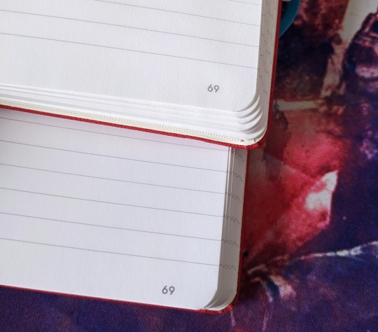
New on the left, original on the right
The covers look pretty much the same - save for a font change - but the width is the first real sign that something's different. 80gsm paper is thicker than 68gsm, so the new Recorder is a bit heftier than the original. Same two bookmarks, though!

Original on the left, new on the right
The inside of the covers look almost identical, except for more small font changes. The ink seems more saturated as well, though I wasn't sure if that was just the lighting.

Original on the top, new on the bottom
The ink is definitely more saturated on the new paper. I'm not sure if it's because of the way the paper is made - I never promised to understand the science behind paper - but I do know it looks nice.
Original on the top, new on the bottom
The page numbers and lines are nice and crisp in both, and once again more saturated in the new version.
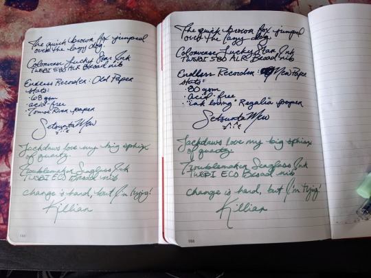
Original on the left, new on the right
And now, the actual important part: how does it write? I tested it with two pens & inks. The dark blue is shimmery with very little variation in color while the muted mint looks a bit different depending on how saturated it is. The pictures don't quite capture it (probably because I used my phone camera for all of this), though I can still talk about it.
For the most part, the new one behaved very similarly!! It's got just a bit more tooth than Tomoe River, though most papers do; TR is just incredibly smooth. The new paper is also wetter, somehow. I was using a broad nib in both pens, and while my TWSBI 580 is pretty juicy, it was particularly so on the Regalia paper. I'm not complaining, though- I like broad lines that show off as many dimensions of my inks as possible. It does mean that ink takes longer to dry- though part of the smearing also came from my sweaty hands. It was really hot the day I worked on this, and the air conditioning isn't working right in my house ><
So, I'm left-handed, which means I usually rest my hands on the paper in weird ways to avoid smearing wet ink. I've found that paper can hold onto oils from the skin and interfere with how ink lays on the page, and the amount it happens depends on the paper. It usually isn't that noticeable on Tomoe River paper, except in very dark inks (with obvious spots missing from words) and very light inks (where words can be much harder to read due to less ink being put down). My biggest issue with Cosmo Air Light was how prevalent this was. It was inescapable; it felt like if I even breathed on the paper, it would misbehave. Any time I want to use it, I have to rest my hand on a separate sheet of paper or risk angering the paper.
As for Endless Recorder's new paper, I am delighted to find that it doesn't seem affect it at all. I made sure to press my hand against the paper and write over it, and it doesn't mess with the ink in the slightest. It seems like such a small thing, but to me, it matters a lot.
Overall, I'm still fussy about having to change, but I'm looking forward to using Regalia paper more regularly- I just have to finish my current notebook. After that, I'm using my brand new Endless Recorder, and I'm hopeful it'll bring me just as much joy as the original.
Endless Recorder can be found on Endless Stationary, as well as many fountain pen friendly stationary stores. Their website currently has both the original and new version, but they won't be restocking the Tomoe River version once their current stock runs out.
#fountain pens#paper#endless stationary#endless recorder#tomoe river#tomoe river paper#also this post isn't sponsored I swear I just really love these notebooks XD#long post
9 notes
·
View notes
Text
Sprint number 2-
Sprint recap-
This second sprint was a bit of a roller coaster for us as a group. We definitely had to problem solve and get across some obstacles. We wanted to make the cathedral and sidewalk work out but it was far too difficult and would take us too long to complete in just one semester. Nevertheless, we were able to get into contact with people from VCU and we asked them if they could help us out with this project. After making some suggestions we were finally able to steer in another direction and keep the project going! This was definitely a little frustrating, just because we had our eyes set on trying to physically fix the sidewalk but it is alright in the end.
As to what I did for this sprint, I really wanted to make the whole church situation work but it just wasn't possible. I went a couple of times to try and see if I could speak to someone but the church is under construction and their schedule was a little hectic. They were only open for mass and no one seemed to be in their offices when I would swing by. We went as a group as well and they were closed. I also kept an eye out for the reddit post I made to see if I got anymore feedback.
What is next for us?-
Our next steps are very exciting, in my opinion. It is getting more creative! We have decided to approach this issue of the sidewalks by attacking something else that makes it difficult to walk. One of the people Aiden got into contact with said that we should bring awareness to the matter instead of fixing the sidewalk. They suggested we bring awareness to the scooters that people leave on the sidewalks instead. We are currently working on making some sort of visual to spread our message. We might go with posters but we were also discussing stickers. We are trying to figure out what is it that will gravitate people toward reading/looking at our visual. We are discussing design options and we want to specifically focus on cool looking font, definitely big font and fresh colors. We also want to use some sort of slogan. I am overall excited to see what we come up with.
Reflection-
Through out this process I have learned that I really like group work! it is very exciting to see how people's brains work. I have learned that I get quite anxious when things start to go wrong, but this is also why I love teamwork. My teammates have such bright brains and they have great ideas that we are able to figure it out. I think that being around creative and knowledgeable people rubs off on me and it makes me think more creatively, so that is really cool to me. This continues to be a very exciting process for me and I can't wait to see what happens next!
0 notes
Note
What are the trends when it comes to writing that you adore?
questions for the mun
well , i love seeing the simplicity of writing again . i have zero issue with people who write flowery , purple - prosey language and over editing their font . is it my cup of tea ? not really . but we all start somewhere and have a penchant to gravitate to what feels natural for us . for those who do it , if it makes you happy then keep doing it . we won't always vibe with everyone we come across here and we'll find the people whose writing and energy matches our own !! it just takes time .
i , myself , am guilty of editing my posts with colored text and whatnot , but tbh , i much prefer to just write without all the aesthetic . then again i'm not sure if it makes me hypocritical to what i just said , but i want to maintain a certain aesthetic to my blog so i don't mind the extra effort on my part . however , seeing people go iconless or no longer putting an obscene amount of spaces between words has been rather nice . i wasn't around for photoshop replies and all that but i have seen them and yeesh ... funny how fast trends move here on this site .
another trend i adore is that more people are going iconless . not everyone has access to photoshop or possesses the funds to buy icon psds . heck , some people just don't want to . and to be honest , some of the best writers i've come across here whose prose i absolutely fell in love with are iconless . i am a supporter of aesthetic , but i am an even bigger supporter of quality prose .
1 note
·
View note
Note
thank you for explaining! do you never run into the issue of 'difference' changing your color to much once you set that to the blending mode? cause i have actually used a similar method, sometimes it comes out great but sometimes the colors are totally wrong. it usually happens if the background is a similar color. not sure how to fix that.
you’re welcome!
and yes i definitely know what you’re talking about with “difference” changing the color!! this tutorial explains why it happens better than i can, but basically what happens is the blend mode is inverting the color, and that inverted color is what looks wrong. unfortunately, i can't remember exactly what ive done in the past to fix it (definitely depends on exactly what you're trying to do) but the color overlay should hopefully be able to cover that, even if you’re just choosing a color to neutralize it
i think the simplest way to try to fix it is by changing the font color. this might take a little trial and error, and also depends on exactly what the issue is
another option is using “overlay” as your blend mode instead of difference. it still gives the transparent look, but without the weird color transformation. this works best with lighter gifs, as it can be very hard to see over darker colors. i used that in this gifset for the all pink row
another alternative would be mixing and matching? maybe? so if part of the text looks good keep that, and make another layer for the part that doesn’t and try to play around with it until it matches. i haven’t done that for this particular issue, but i have done it for other things. this definitely works best in gifs with minimal movement, at least in the area where the text is
i tried doing some examples to show what i mean, hopefully they make sense:
using this gif as an example again, i moved the text so that it was overlapping with a color similar to what i want to use. the color of the “transparent” text changed from blue to green:

for reference, here's what it looks like using the same process as before (difference + color overlay)

and here's a color overlay in white to just neutralize the green, in case you wanted to keep just the white text for the transparent part
first thing i tried was changing the color of the text. this was the closest i got to the original color overlay color, and i got there by changing the font color from white to a shade of pink

its a little darker than i wanted, but still pretty close. the biggest difference is now theres now white contrast. you can see the shade of pink used for the font on her hair at the end of the gif
and here's the overlay gif:

personally, i think this looks the best of the alternative options. i could’ve easily moved the text back over to the side, and it wouldve been close to perfect, but i wanted to show how it looks over the darker colors.
(i tried to do an example of using multiple methods, but with the contrast between light and dark and the movement in this gif, it wasn't coming out right)
overall, adding the color overlay gave me the best result. when the colors are so similar, you won't get much of the white text showing through, but ignoring that, this is what works for me. after that, i would say try using overlay, or other blend modes even, just to test it out. changing the font can also work, but how it works will depend on exactly what you’re gifing
i hope this helps!! let me know if i can try to help anymore :)
0 notes
Text

I think he'd feel guilty.
#omori#omori game#my art#fanart#someone saw the squiggly font from Hero after Basil died and thought#oooh he's next#and like talk about a cycle holy heck#like if sunny died after the omori fight im willing to bet Hero would have some Heckin Guilt like he felt for Mari#because he doesnt know it wasn't a suicide!! he'll think he'd neglected another friend - worse#worse he'd neglected the baby brother of the girl he cared so much about that he didnt notice the pain of#so i dont think he'd exactly form Sunny's White Space but certainly he'd have a nightmarish headspace of his own#just like anyone who goes through trauma and has ensuing psychological issues#i just meant to draw this in a visual metaphor saying hero's gonna have a guilty conscience like Sunny#so sunny you damned idiot dont. jump. think of hero#get out of your head sunny you STUPIDHEAD#have i mentioned i dont color things#spoilers#cant draw wrinkles for anything#angst#blood#suicide#kitscribbles
1K notes
·
View notes
Text
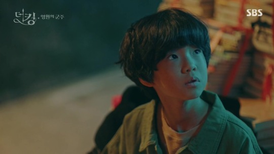
THE KING: ETERNAL MONARCH REVIEW
EDIT: I AM SO SORRY, THIS IS A SECONDARY BLOG AND I JUST LEARNED THAT I CAN'T REPLY TO COMMENTS. PLEASE CHECK MY PINNED BLOG WHERE I WROTE ABOUT THIS PROBLEM. THANK YOU!
Spoilers ahead!!! Read at your own risk. Once again, I am not an expert and these are my personal opinions. If you have disagreements, let's talk it over. Don't judge me, let's judge the show together instead and have an understanding.
For the first drama that I am going to review, I chose The King: Eternal Monarch. A lot of viewers who supported the show with all of their hearts could still not get over its ending. Others who like to binge-watch are relieved because they can finally watch the entire series without waiting for a new episode to air. While some are still mulling over about watching it. Well, I hope I could help you with this review.
• Introduction to the Drama
Short gist:
The story revolves around Lee Gon, present King of Kingdom of Corea. He witnessed his father’s death when he was young, an incident that haunted him until he grew older. Due to unfortunate circumstances, a legendary flute with powers called Manpasikjeok that can open different worlds was cut in half. He was able to get hold half of the flute, while the other half was obtained by Lee Lim, his uncle who killed his father. Lee Lim had been going back and forth two different worlds, plotting foul pursuits to fulfill his evil desires, and disrupting the peace between the two worlds. In order to restore balance and order, Lee Gon also traveled between worlds, meeting Jeong Tae Eul who soon became a significant person in his life.
If you've been watching Korean Dramas for quite a while now, you must be familiar with some of the characters of The King: Eternal Monarch, especially the lead.
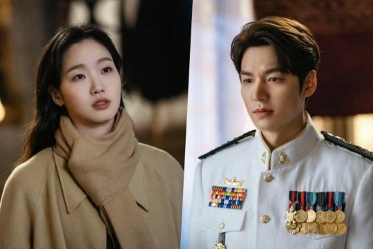
If you call yourself a k-drama fan and you don't know who Lee Minho is, give yourself a slap (just kidding, please don't take that seriously). Lee Minho has a good reputation because of his experience, acting skills and obviously, his gorgeous face. He has an impressive list of successful dramas and movies! Most of us probably knew him through his breakthrough role in Boys Over Flowers.
Meanwhile, Kim Go Eun, despite being fairly new to small screen (she first started appearing in movies), is also highly distinguished by a lot of k-drama fans. In all three dramas she starred in, including The King, she always got the lead role. His leading men are no joke either. And because of Kim Go Eun, many of us still wants to be the goblin's bride.
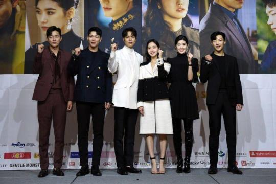
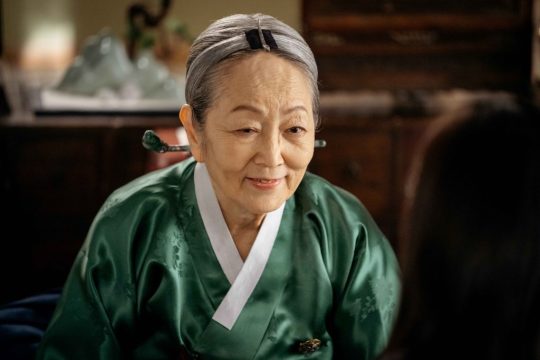
Among the cast also includes the familiar faces of Woo Do Hwan, Kim Kyung Nam, Jung Eun Chae, and Lee Jung Jin.
Anyway, I'll try to share every thought I have from the first time I watched it until it ended. I will also try not to give so much spoilers because the drama just ended. I will talk first about my experience watching it and then I will list at the very bottom some of the issues I have and that list contains major spoilers so watch out for that. As you notice, I always warn you with spoilers using red font color.
• The Experience
When I watched the first teaser of the drama, I got intrigued and a little confused. What worlds are they talking about? Do they have super powers? Is this a historical drama? Questions were instantly formed in my head.
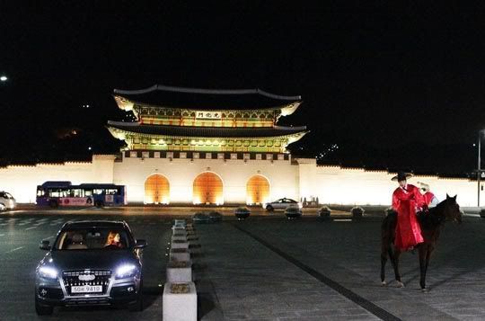
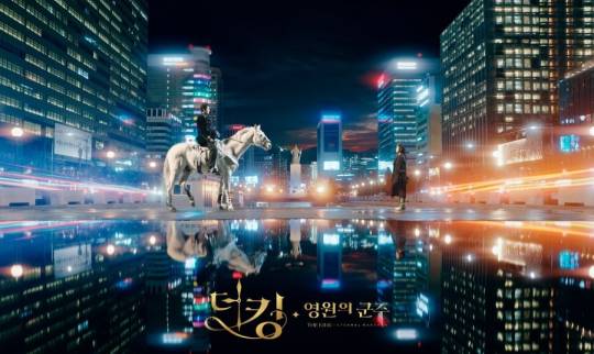
It also reminded me of the drama Queen In Hyun's Man because of a similar scene where the leading man is riding his horse in the middle of the city and finding his woman. But that's just it, the two dramas are completely different. I just mentioned it because others may have felt the same way.
I don't usually watch dramas while it's still fresh. I wait for about two to three weeks before the schedule of the ending so I can binge watch without waiting so much. When I watched The King, there were already 12 episodes available on Netflix. Usually, I would finish 12 episodes in 1-3 days, and if the drama is really good and it's MY STYLE (i said that in an obviously fake Korean accent), I could watch it for an entire day.
However, I finished those 12 episodes in 2 weeks...
Why??? Why did it take me that long???
I wouldn't say I was bored, it's just that during the first few episodes, nothing caught my interest yet. I wasn't convinced that it was a good drama. There was nothing special and I didn't know what to look forward to that's why I couldn't watch it continuously. I got lazy. The pace was slow and the story build up was a little stagnant. It was too slow that I even started watching a long length saeguk just so I can watch something else.
I could have skipped some parts and dropped it but I continued watching and gave it a chance. Though it was a good thing that I didn't stop because as I watched more episodes, the story actually became more exciting. Finally, I saw some progress. I started to get invested in the drama after the eighth episode. That's when the story felt more alive. Finally, there were revelations, more conflicts arose, more emotions were shown, and the story got deeper. I began to appreciate the drama. However, I still don't like the fact that it took me 8 episodes before I started to like it.
• Points that I Liked About the Drama
1. The plot seemed like it's going to be too science fiction-y but it's just the right amount. I was worried that it might be too much for me to handle but it was just okay (i am a potato who dislikes thinking so much, but that depends on my mood lololol). I liked how there's a mix of history in the drama, as well as of politics but it still feels modern. There is a balance.
2. The distinction between the Kingdom of Corea and Republic of Korea is impressive. It's obvious that they put a lot of effort in building their vision of KOC to life.
3. Many people were saying that it's hella confusing and so much was going on. I don't think so. They actually made it easy for viewers to understand about parallel worlds. You don't have to study science facts just to get this drama's concept. I think the slow pace did its job well in this part.
4. The story is unpredictable. You never know what's going to happen next, that's the strength of The King's concept. Because of the two different worlds and the crazy number of characters, there could be a lot of possibilities and backstories.
5. The action scenes are commmendable. I liked the action scenes, the one during the last episode is probably my favorite.
• Points that I Didn't Like About the Drama
1. The slow pace. I don't think I still need to explain more but it totally ruined my whole experience of watching the drama.
2. Many characters didn't leave much impact. Their acting was great, however, I don't see a lot of personalities that standout. The most remarkable ones for me are the characters played by Woo Do Hwan. The other characters, especially the lead, the prime minister and the traitor were okay, too. The others were just bland and years from now, I probably won't remember most of them.
• The Ending (spoiler alert!)
The ending was good. It didn't feel rushed and everyone had a separate ending of their own. I just wished there was more Nari and Eunsup / Yeong and Seung A moment in the end, the conclusion was fine though. I don't like that Prime Minister Koo ended up in jail but Luna became a cop...
I just have one issue regarding the ending that they decided on. In the end they didn't show if Tae Eul became a queen. Well, it would be weird if she became one considering there is Luna in KOC. They can't be together in ROK, too because Gon's counterpart was able to live. So... what? They just kept traveling whenever they have time? Because if that's the case, doesn't that mean they will hide their relationship forever??? I liked that they ended up together but I wish they also kept this in mind. Because it kinda makes me sad. Lol.
• Final Thoughts
Overall, it was alright. It was over-hyped by netizens due to the amazing casting and promotions, but it's not bad at all.
Would I watch it again? No.
Would I recommend it? Yes. Give it a try! I honestly thought I wouldn't like it but I still did, even if it took me 8 episodes, I wouldn't say it wasn't worth it. If you enjoy fantasy dramas with complicated twists and conflicts, this drama is for you. Just have patience and prepare yourself mentally when you've reached the middle. This drama is gloomy and a little heavy, too. It was serious and has a very few humorous scenes.
I am giving The King: Eternal Monarch a 7/10. ⭐⭐⭐⭐⭐⭐⭐
• The King: Eternal Monarch OST Top 5
There are 13 songs in total and everything is so good! I wish I got to hear more of the songs in the drama, some were just played briefly. I swear every song makes me feel things. Choosing just 5 songs is really hard. If you don't watch dramas but love music, give these a listen!!!
My Day Is Full Of You by Zico, Wendy
Orbit by Hwasa
I Fall In Love by Ha Sungwoon
I Just Want To Stay With You by Zion.T
Please Don't Cry by Davichi
Now I'll move on to some of my "issues". This section isn't really what you think. The word "issues" is just intriguing ㅋㅋㅋ but this is just a compilation of my opinions, observations, feelings and other stuff no one might care about in the series. If you have answers for my questions or if you can explain it for me, please enlighten me. Major spoiler ahead!!!
• Issues
1. During the time when Lee Gon was time traveling and finally got back to Repuplic of Korea, it probably took him a lot of time, right? He even took his time to take care of Tae Eul in the hospital. I wish they also showed what was happening in Kingdom of Corea during that time because he's a king and his absence might have caused a ruckus in his kingdom. I can even picture the palace lady Noh getting really worried as Lee Gon travels. The moment he came back, they only gave him updates as if everything was okay.
But since they didn't show it, I guess it is safe to assume that nothing much happened in his kingdom back then. 🤷♀️
2. When Gon and Tae Eul met again in Gwanghwamun, why did Tae Eul hug him? In my understanding, at that period of time, Tae Eul only met him twice—once when she was 5 and once when she was 27. So why did she hug him suddenly as if she knows he's going to be a significant person in her life? Their dialogue when they met again when she was 27 wasn't even enough for her to act that way.
3. I hope they also gave Nari more lines and importance. Maybe it's just me, but at first, I thought she and her KOC counterpart would have more significant roles. When I think of it, even without her, the story could still go on. Though this is just a minor issue. ✌

4. Prime Minister Koo. She was a villain, but I didn't really hate her until the last 4-5 episodes (can't recall the exact episode, sorry), though I wouldn't say I hated her so much. I actually liked her at first! She's ambitious, fierce, independent and intelligent. She just got blinded by greed.
My issue here is, am I really supposed to feel like that? In my opinion, her character has the potential to become more heinous and despiteful. I was wondering why they didn't turn her into someone like that? She was just greedy, bitchy, a little sly and annoying.
5. Lee Gon's and Tae Eul's love for each other was a little shallow. Sure, the man who saved Lee Gon when he was a child, had Tae Eul's ID. But how sure was Lee Gon that the woman who owns the I.D. is not a villain? The woman in the ID could lead him to the man who saved him, yes, but it still bugs me how easily they fell in love especially on Lee Gon's part. Maybe I'm just thinking too much. I am sorry. 😅
In spite of that, I still liked their love progression. I didn't ship them that hard but their chemistry wasn't cringey and forced.
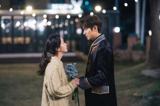
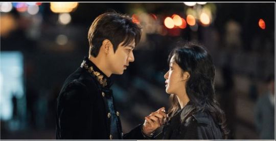
6. The scene where Lee Gon gave Tae Eul flowers and then left, was a little confusing. It didn't break my heart, too. I just felt a little sad while watching that scene because Kim Go Eun's acting was good.
7. Who the f is thay yoyo boy??? My guts tell me he's a part of the flute or something because he knows a lot. But I wish it was explained more. It looked weird how he just suddenly appears sometimes and suddenly talks some sense. He remains a mystery.
8. Why the f is Jeong Tae Eul a flat earther??? Well, at least she had a character development in the end. It just annoyed me lmao
9. I don't get why people keep comparing The King: Eternal Monarch to Goblin. Why??? They don't even have the same plot or concept.
10. Court lady Noh was from Republic of Korea... What? Was that necessary?
Don't mind me. Don't mind me. Don't mind me.
Anyway I hate how tumblr wasn't able to save my draft when I was writing additional content. I lost half of it and it makes me furious!!! I had to redo the draft but I can no longer remember some of the things I wrote. I am sad because I lost something that can't be brought back again. This experience earned me a lesson.
That's it for my first review. What are your thoughts? I am a horrible reviewer, I know, but I will do better in the future. Thank you for reading!!!
#the king: eternal monarch#the king#kdrama#korean drama#korean series#lee minho#kim go eun#woo dohwan#kim kyungnam#jung eunchae#lee jung jin#goblin#queen inhyun's man
16 notes
·
View notes
Photo

Is there really not a perfect 11.5-13.5" Windows tablet choice?!
Hello guys. For the past week i've been researching to find the perfect windows tablet choice for my specific application need. However it seems there isn't even one device that doesn't have some type of throwback. I'm not asking for everything, but it seems it is either hit or miss, even if you take into account overpriced products. Please hear me out and let me know your thoughts.
I am essentially looking for a WINDOWS TABLET which its primary purpose is to be fitted to my car as a secondary "dash" per say so i can use it to interact with my aftermarket motorsports ecu. It will function as a monitoring dash for the most of the time, but can be used to datalog (aka record data) or for direct tuning (so i don't have to bring my laptop everytime i need to make changes to my engine calibration). I wouldn't mind using it at home as well since i will have it, but mostly will work as a travel/trip companion since i have a PC at home. It has to be a WINDOWS tablet as the software that interfaces with the ecu is only windows based.
After thinking and revising my requirements several times after getting disappointed by what is available here is the break down:
Dimensions: Height needs to be around ~205mm +10mm max so the tablet can be secured in the glove box when not in use. Ideally height should be maximized so that the display area is maximized as well. Length larger than 300mm is not a problem but would get annoying to fit to the car since it will extend more towards the passenger side. This effectively limits me to ~11.8-13.3" tablets, so Microsoft Surface Pro can be used as a reference design (since i haven't seen bezel-less windows tablets yet) Display: This is the most important attribute of the tablet. 1080p absolute minimum resolution, 2K ideally, 3K is probably not gonna be noticeable at the usage distance. Here is a screenshot from my 1080p laptop so you can see the ECU software in datalog mode (slightly cropped but so you can get an idea: http://content.invisioncic.com/r260425/monthly_2017_09/fuel_pressure_link.png.bc827c0a96fe120632f1d7c168e66a64.png However let's not forget brightness and contrast. Brightness should be ~400nits or better for a glossy display, and contrast should be considered over color accuracy. Viewing angle in the length span should be at least 150deg but i think it is hard nowadays to find such a bad display panel. Finally a fully laminated panel is recommended. Physical interfaces: I essentially need a single full size USB port so i can connect my ECU to the tablet. After my research i decided to allow for USB-C assuming that i can get a dongle that will allow me to interface without any issues; but it's best not to allow for that route due to possible incompatibility issues (like what happened when usb3.0 was released). Extra USB ports, USB-C that allows charging and data, video output port, headphone jack, m.2 expansion slot, sd card slot are all pluses. Wireless interfaces: Min wifi and bluetooth. 802.11AC and bluetooth v4.2 or better all pluses. CPU/GPU performance: Generally something better than N3450 (tested my brother's CHUWI surbook mini) and more recent will help, GPU performance is irrelevant for the task so the majority of intergrated GPU's will do fine. RAM: 4GB absolute minimum, 8gb ideal Cooling: I prefer passive cooling, but usually the cooling solution used is sh*t. At least in some cases it can be modded (i'm experienced and willing to do) Battery: 4 hours light use with full display brightness as minimum. If charging is performed over USB-C i hope it is not the stupid kind of power->battery->device like in phones and can work like in laptops where the battery is not used when power is supplied to the laptop. This way you don't wear out the battery since the device will be connected to power most of the time it is operated. Storage: 64gb absolute min, ideal min should be 128gb, speed is relative but i think at least m.2 sata interface ssd; NVME huge + Others: Pen support and attachable keyboard are pluses, but i plan on using a good bluetooth keyboard with backlight (required) so it makes them irrelevant if the tablet is good, Thunderbolt 3 is a +, unlocked bios +, kickstand should work on a lap without cutting your pants off and stay in one place, sd card reader + Reliability: From what i read most chinese tablets are pretty bad with both hardware and software issues out of the box. Backcover should be metal to act as heatsink and be stiff enough, weight and thickness is not that important Condition: New or used. I believe some products offer better value when bought used and others because have been discontinued Pricing: My budget is flexible but depending on the features lots of them are overpriced especially bought new. I would say ~500eur for a new tablet with min features required and 1000eur for one with better hardware. Considering i'm building a 7nm PC in a couple of months the market pricing is really unacceptable for most windows tablets. Blame Apple for it, but i'm not a rich consumer neither i am a sheep. Performance to value is what i always look for.
I literally checked every windows tablet and 2-in-1 i believe. Here some potential picks and what i didn't like.
Microsoft Surface Pro (4 - 5 - 6): At first glance it is a good base candidate..but..really Microsoft? It's 2019 and no USB-C? Proprietary connector and overpriced hardware? Questionable reliability? Get the f*ck out of here. Unless you find a good used deal i don't think it would be worth it. Another Apple wannabe. Eve-tech EVE V: This is one tablet that hits all the boxes, kinda, since by now it is almost obsolete in terms of CPU performance..sadly while i'm greek-cypriot i would go with the stereotypical view for greeks because the CEO is a "malakas" and i'm really sorry to all the people that were scammed. On the other hand i believe there is some truth to the Paypal issues he had since my friend had similar issues (because of not much experience) and even I couldn't help him get them fixed as Paypal is run by assholes as well which need a punch to the face (their excuse it is the system and they can't do anything about it - like wtf). I still use it but the time a different payment system reaches similar adoption i would gladly switch. Chuwi Surbook: Slow CPU, screen is not fully laminated, mediocre specs but was good price at some time ago. Maybe the announced "surbook pro" would fair better? Voyo Vbook i5/i7 Plus: Nice screen, fair pricing? Not the most quality build, shitty battery, i7 model throttles? Teclast X6 Pro: A slightly better vbook i5? No full detailed reviews yet, and i wasn't that impressed from the previous X5 review Alldocube Knote 8: Seems good on paper, but no type-A usb ports Jumper EZpad 6: Possibly the only windows tablet in stock with a good value, however i need something with a better and larger display Acer Switch 3/5: Mediocre screens, single type-A port on the right side (since my car is RHD and the ecu is on the left side i would prefer it on the left side), shitty battery performance, a little overpriced Dell XPS 12 9290/Latitude 5290/Latitude 7285: Great displays, powerful, only 5290 has type-A port, mediocre battery life, overpriced but there are good used deals Asus Transformer 3 Pro T303UA/T304UA: Premium specs but discontinued, expensive, only 1 type-A port and it is on the right side (again), T304 is a huge step backwards even though newer (what the heck Asus, are you drunk?) Lenovo ThinkPad X1: Overpriced, no type-A ports, Gen3 is too big and has display coating issues, Gen2 is more suitable due to size and type-a interface but older and screen brightness not that good - all too tall Lenovo MIIX series: new 630 uses an ARM processor so no go (since i can't force the software developpers to re-compile), 720 rates very high in the features i need, 2 usb type-A ports, nice display, etc. 520 is a little newer with weaker hardware but still good for its price HP Pro X2/Envy X2/Elite X2 1012: HP's other offerings like the Elite X2 1013 are too tall for my needs, and while they have good displays and good build quality i am not font of their design decisions. I have a Zbook 17 G5 workstation at work we bought new and not even 6 months passed and the CPU fan now rattles like crazy..here's my 1st day rant about it: https://h30434.www3.hp.com/t5/Notebook-Hardware-and-Upgrade-Questions/Note-to-HP-Zbook-17-G5-design-engineers-Please-read-and/td-p/6914797 Also they are overpriced like crazy. I wouldn't ever think of buying again from them. Also the power supply is proprietary as some of the internal hardware. F*ck HP Huawei MateBook E: Aside the lack of ports it is a pretty good designed device, display is perfect but slightly smaller than the biggest i can fit - depending on price it might be a good consideration assuming i can run a USB-C dock i can charge within the car Samsung Galaxy Book 12: Similar to the Huawei above, just a little faster but with a worse display, extra usb-C port. Older and more expensive than the Huawei Toshiba Portege X30T and others: Ports are on the keyboard and not on the tablet, won't work for me.
I think i've covered 99% of the options but i may could have missed 1 or 2. To be honest i won't need this tablet for another 3-6months i would guess but at least i've done my research so i will be prepared when the time comes to buy one. What do you think? I know i went a little crazy but i'm that type of person that never regrets his purchasing choices because i don't buy blindly.
1 note
·
View note
Text
the folder up paper, crafted into a sleek little plane, comes to a surprisingly soft landing on the wooden desk surface next to the arm she has laid out on the same surface. it catches her attention immediately out of suddenness and she makes to grab and unfold it. behind her dark goggles, her eyes scan the note that had been disguised as a plane to see exactly what the writing on it read. when every word had been examined, she pivoted on her seat to look at the kid sitting two rows above her. that had to be who wrote it. she vaguely remembered his handwriting from when he had to answer something on the board at the front of class.
'wanna be friends?' the words had said, written nearly in a bronze colored font. where did he even get a own with that color ink? odd yet impressive.
she sighed through her nose as she looked up at him, he'd waved shyly at her as soon as he noted she was looking. this was certainly an unusual situation. if he wanted to get her attention so bad, shouldn't he have just called out to her? it's not like he sat across the room so he wouldn't have even had to be loud. a paper airplane, really? it wasn't a huge deal but it did leave her perplexed and curious as to his reasoning so she went forth with asking him some things.
"what's with the plane? you know I can hear you from this close, right?"
Rai, holding his dignity, made to quickly sign in response to her. it's not her fault that she forgot that no, actually, he could not just call out to her even from that distance. they'd only been in class three weeks so everyone was still learning what made each other tick. 'I apologize for the plane. it was my only way of getting your attention unless you turned around to face me.'
realization dawned on her then and he could almost see the lightbulb go on as everything came together in her head. oh that's right, this was the Yamanaka boy who was mute, Rai. she felt like an ass in the next moment for forgetting this simple fact and made to apologize. "I'm so sorry for forgetting about that."
the two of them were so focused on each other that when the sensei called out to Mikia to snap them both back to attention, each wore a matching light pink blush of embracement. Rai quickly grabbed another sheet of paper and his fancy pen and scrawled a note to send her way the next chance he got. explaining that he was sorry for the suddenness and awkwardness and if he acted funny because he was so unused to people responding to him with words. she probably didn't know signs well so he couldn't fault her for it. it would probably be fine later on and they could forget this was ever an issue. after class he'd fold the paper into another plane and send it floating her way. that was more fun than just handing it to her on his way out. hopefully she'd be okay with such an action.
the moment that class ended and their classmates started filtering out of the room, he made quick work of folding up the plane before sending it on its way. she had turned around again to face him just as he launched it so she got to witness its little journey across two rows of seating. as it came to a stop on her desk, she carefully picked it up and unfolded it gingerly, reading all the words written within. her best response, she considered then, would best be conveyed just as his reaching out was. written down for him to take in at his own speed. unfortunately making a plane out of it wasn't going to work as new folds on a paper that had already been folded offset its trajectory so this time she would only be able to hand the paper back to him personally once she finished her reply and walked up to him with it.
and now, in the following moments, he was sat as his desk looking up at her standing beside him. the paper was gently placed in front of him and he took the time to take in what was written on it. 'friends :) sorry I do not know signing yet. would you be able to teach me some?'
the previously folded and well received letter that had gone between them was set down and he looked up at her again, a smile lighting up his features before he nodded and offered a hand. she met his with her own, their fingers locking in the unison sign despite this not being the resolution to a fight, as it felt right between them then. he rose from his seat at last and followed her down towards the exit from the classroom. both of them stopped there before going out into the hall and then later leaving the building to head home.
"do you wanna talk more tomorrow?" because of his limited options, on response to her inquiry he nodded happily. she still felt bad there was a bit of a wall between them in communication but she'd figure it out somehow. "I will see you, then. bye Rai."
both shared a mutually pleasant look before she took her leave first. he lingered a moment in the class doorway before making for the building exit himself. thankfully that had gone a lot easier than expected and now the prospect of having a friend in class seemed very real. at least it would be a good way to pass boredom time and then later they could hang out once all their daily classes were over. he was sure his family wouldn't mind if she came over, either side of it actually, so that was a lot of good to took forward to. it made his trek home easy and his outlook for the coming days bright.
1 note
·
View note
Text
Peggy - A Responsive WordPress Blog Theme
New Post has been published on https://intramate.com/wordpress-themes/peggy-a-responsive-wordpress-blog-theme/
Peggy - A Responsive WordPress Blog Theme
LIVE PREVIEWGet it now for only $45
Don’t forget to follow us
About Peggy
We’ve used only the best pixels for Peggy. We’ve created a clean and nonsense free blog theme, full of all the things you need and none of the things you don’t. Choose whether you want your sticky content in a simple carousel, you can even switch from circles to squares for sticky and related content with just one click in the theme customizer and on top of that you can have a nice big hero image + message on the homepage.
As well as a widgetized sidebar, we have a header widget area and a footer widget area that adapt to the amount of widgets you have. For example, only using 1 widget, we’ll make it 100% and centered – perfect for a web banner.
We’ve kept things clean and simple with this one, using the Theme Customizer you can control layouts (sidebar right, no sidebar, sticky menu) and show and hide most of the elements of the theme.
So what are you waiting for, give Peggy a spin.
Peggy’s Main features
NEW! Gutenberg editor support (WordPress 5)
Fully responsive design
Sidebar layout (left or right)
Switch from circles to squares for sticky and related
Carousel on/off for sticky posts
Homepage Hero control
Custom About You widget
Custom Social Widget
Social link enabled author pages
ALL post formats supported
5 widget areas (Header, footer, sidebar, top socials, footer socials)
Hide/Show almost everything from comments to social share
Translation ready
Custom logo uploads including retina logo
Google and Typekit fonts compatible
Advanced Font Options
You can add any font from Google Web Fonts, Typekit or Adobe Web fonts using our custom controls in the WordPress Theme Customizer. You’ll need a Typekit account and also a subscription dependent on font usage.
You can control all of the font sizes through the Theme Customizer.
Did we mention, we love support?
We want to make sure you are happy with your purchase, if you have a question about how to do something or think you have found a bug, head over to our support system and we’ll get back in touch.
MeanThemes Support
Full feature list
Gutenberg editor support
Show homepage hero
Show/hide back to top
Show/hide related blog items
Switch sidebar on/off
Google Maps API v3 integration
Switch sidebar to left or right
Turn menu on/off in sidebar
Control all font sizes
Enhanced Author biographies
Fully responsive design
Built mobile first
All templates are HTML5 compliant
Child theme supplied
Full control of colours
Carousel on/off for sticky posts
Square or circles for sticky and related posts
Minified JavaScript files for increased performance, we provide un-compressed versions of the 2 core files if you want to tweak functionality.
JavaScript Analytics code paste in
Show/hide plain text logo
MeanThemes Social Widget built-in via MeanThemes Tools plugin
MeanThemes “About You” Widget built-in via MeanThemes Tools plugin
Sharing on/off on posts
Share via twitter including your username
Change footer credit, logo text, logo alt all from Theme Customizer
Control excerpt length on blog
Auto excerpt on blog
MeanThemes Tools plugin included
Logo upload
Retina logo upload
Apple touch icon upload
Favicon upload
Contact 7 Form support and styling built-in
Localisation support with provided .mo and .po files
Custom Menu
Featured image support
Shortcodes for columns and buttons, toggles and tabs
Shortcodes for social icons including: Twitter, App.net, Facebook, Linked In, Google+, Zerply, Vimeo, YouTube, Pinterest, Dribbble, Github, Instagram, Flickr, Behance, Mixcloud, Soundcloud, Good reads, RSS
Shortcode for quotes including quote source and ratings
Shortcode dropdown straight from the content editor
Fully responsive (optimised for iPad and iPhone with retina graphics)
Zilla likes support
Extensive documentation
Update History
## Version 1.1.1 - Fix - for legacy Google Analytics settings migration ## Version 1.1.0 - WordPress 5.1 update. - Add Gutenberg editor support. - Updated TGM Plugin Activation - Updated footer copyright year to display current year automatically. - Removal of Google Analytics settings as they are now in the MeanThemes Tools plugin (please update MeanThemes Tools to 3.1.0+ - you will be prompted to update once the Theme Update completes). - Small tweaks. ## Version 1.0.9 - Fix - For duplicate function causing compatibility in WordPress 4.6. ## Version 1.0.8 - Fix - CSS for sticky carousel post title not wrapping when truncation is off. - Tweak - To homepage carousel to put a slight load delay on it whilst it builds. ## Version 1.0.7 - Fix - for sticky carousel amount being set incorrectly in 1.0.6, sorry about that! - Fix - for sticky posts position when homepage hero is off but fixed header is on. ## Version 1.0.6 - Fix - for top meta not always being centered. - New - option added to control the main navigation size through theme customizer. - Updated translations. ## Version 1.0.5 - Fix - for auto excerpt "read more" not being centred. ## Version 1.0.4 - New - Big update! You now have greater control over your featured images. You can turn these off globally via the Customizer or on a page / post basis. Please make sure you read the updated documentation. The new options will be highlighted the next time you go to Appearance > Customize. Fix - for home hero height not applying. - Fix - for max-width on WP Caption. - Tweak - Hero load and scroll improvements. - Tweak - Removed underlines from linked images. - Updated documentation. - Updated language files. ## Version 1.0.3 - Fixed sticky posts volume not applying on homepage sticky posts area. - Updated TGM Activation class for XSS vulnerability fix. - Removed WP updates plugin due to lack of third party developer support. [Read more on this blog post about the new update process](http://www.meanthemes.com/2015/04/21/installing-theme-updates/). ## Version 1.0.2 - Fixed theme options bug not applying accent color to heading borders and read more link. ## Version 1.0.1 - Fixed bug when using the homepage with sticky area on not setting the pagination correctly on the non-sticky posts. - Fixed padding issue when sticky posts was on but hero wasn't and vice versa. ## Version 1.0.0 - Initial release.
LIVE PREVIEWGet it now for only $45
0 notes
Last Seen Blogs

corezipzap-blog
Untitled

oospiqk-blog
Yagev

kastelluccia
Francesco Castelluccia

commercialcarrier-blog
Commercial Carrier

theidlewords
Idle Words