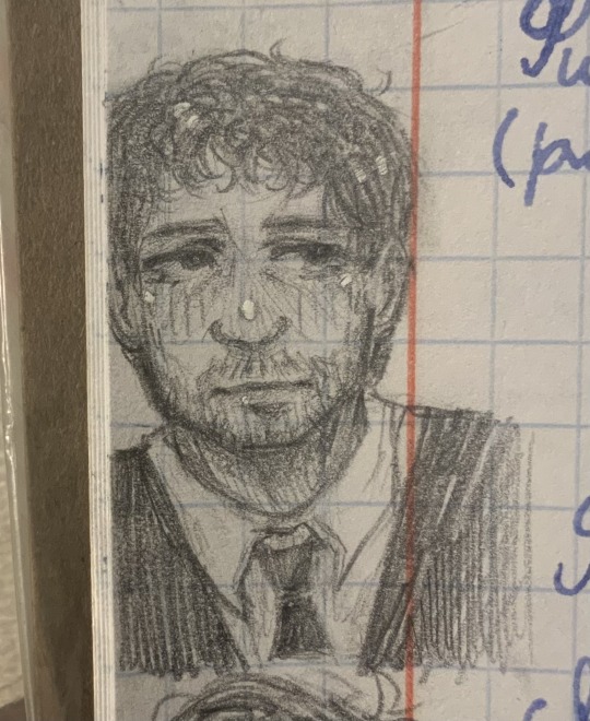
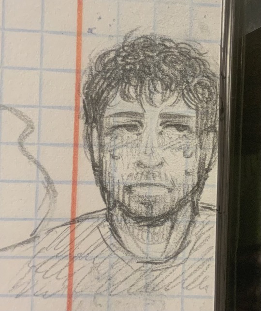
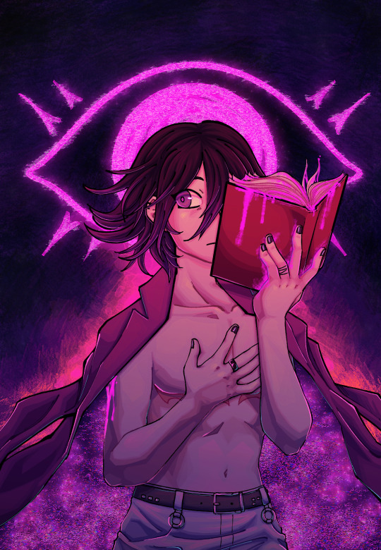
#you are literally in the shade
Text


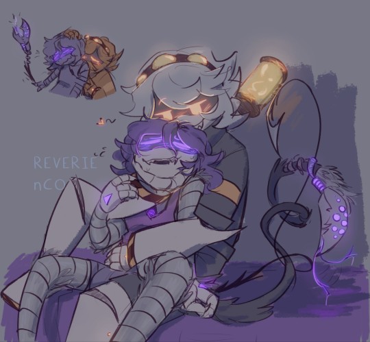
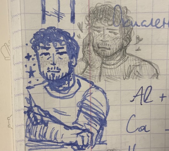
Aelswith & Alfred (being cute as hell) in 2x02
For @aethelreds, @kingslionheart, @volvaaslaug
#the last kingdom#sevenkingsmustdie#god#g o d#your honor i love them#they mean so much to me#I know I say this a lot#but its true they do#and I am OBSESSED#though alfred#why did your face turn out so red#what the hell#you are literally in the shade#why are you sunburnt#anyway#they mean everything to me#its missing them hours#tlk aelswith#tlk alfred#aelswith x alfred#alfred x aelswith
20 notes
·
View notes
Text
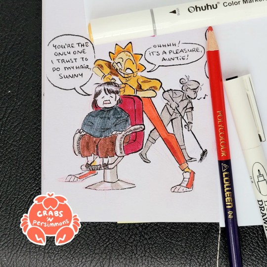
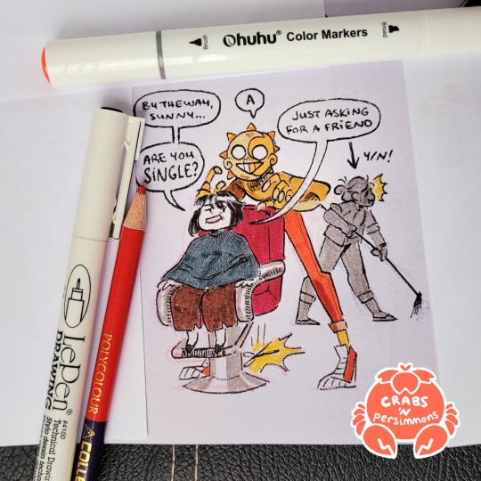
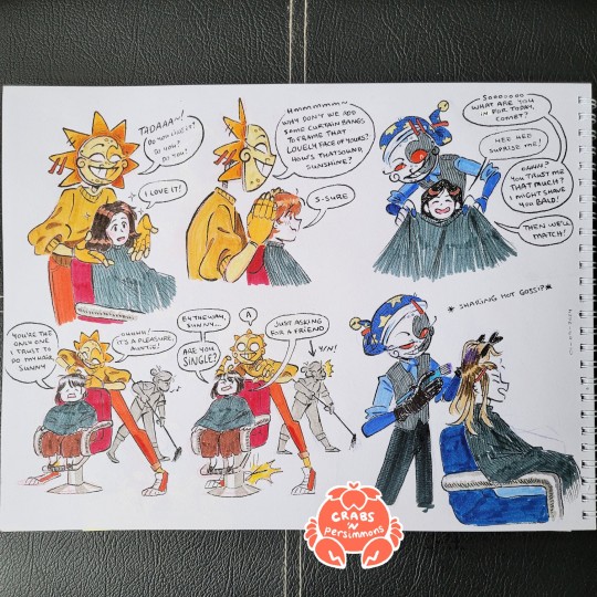
I got my hair cut the other day and of course I had to draw the dca boys running a hair salon:


Sun would be so effortlessly charming. Always chatting away with customers, explaining each product he uses and how to best maintain and style their hair.
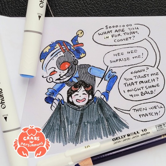

Moon I can see being popular with the less chattier customers (like me) but over time they begin to open up. I imagine he hums while working. Otherwise, he's all ears for the newest gossip.
(The clipped up hat idea came from @bamsara's solar lunacy doodles!)
Also I love the popular headcanon that the dca can speak other languages, so I can imagine them being a hit with the aunties.
The full sketch page under cut! And some of my other thoughts
Other thoughts about this... AU? Can I call it an AU? Feels kinda small for an AU, but whatever:
Eclipse works there too! Haven't decided if it would be canon or fanon Eclipse, though I really like the image of 4-armed Eclipse working on 2 clients at once (plus, the nickname Clip is perfect for this scenario)
of course they're great with kids! They'd be able to console kids that get scared of getting their hair cut. Sun would do a little trick and tell them how good and brave they are all the way through. Moon would console them and hum a soothing song (or hey maybe they notice the kid's wearing a disney shirt and starts humming some showtunes). Every kid gets a candydrop and a balloon on their way out.
y/n works at the hair salon as a part-timer and does tasks around the salon like sweeping, arranging bookings, washing hair, etc. They don't really care too much about their own hair, but the boys are always offering to style it, dye it, braid it. With y/n's permission, the boys always toy with their hair—patting it, combing their hands through it, brushing it over y/n's ear, ruffling it.
#fnaf sun#fnaf moon#fnaf dca#dca fandom#this idea has been running rampant in my brain while I've been trying to focus on my modules these past few days#I can't take any credit for their outfits tho these were literally just what the hairdressers at my local salon we wearing that day#this all started because my hairdresser was wearing a delightfully yellow sweater#and just ohmygosh hairdresser sunny popped into my mind#this was also an experimentation with colouring with markers#need more colouring practice especially with shading#also learned the hard way that none of my fineliners are waterproof#or at least they don't play well with my markers! they seem to work with my watercolour paints just fine#sighhhhhh#crab art#New Do Same You AU
3K notes
·
View notes
Text
I think 90% of my gripes with how modern anime looks comes down to flat color design/palettes.
Non-cohesive, washed-out color palettes can destroy lineart quality. I see this all the time when comparing an anime's lineart/layout to its colored/post-processed final product and it's heartbreaking. Compare this pre-color vs. final frame from Dungeon Meshi's OP.


So much sharpness and detail and weight gets washed out and flattened by 'meh' color design. I LOVE the flow and thickness and shadows in the fabrics on the left. The white against pastel really brings it out. Check out all the detail in their hair, the highlights in Rin's, the different hues to denote hair color, the blue tint in the clothes' shadows, and how all of that just gets... lost. It works, but it's not particularly good and does a disservice to the line-artist.
I'm using Dungeon Meshi as an example not because it's bad, I'm just especially disappointed because this is Studio Trigger we're talking about. The character animation is fantastic, but the color design is usually much more exciting. We're not seeing Trigger at their full potential, so I'm focusing on them.
Here's a very quick and messy color correct. Not meant to be taken seriously, just to provide comparison to see why colors can feel "washed out." Top is edit, bottom is original.
You can really see how desaturated and "white fluorescent lighting" the original color palettes are.
[Remember: the easiest way to make your colors more lively is to choose a warm or cool tint. From there, you can play around with bringing out complementary colors for a cohesive palette (I warmed Marcille's skintone and hair but made sure to bring out her deep blue clothes). Avoid using too many blend mode layers; hand-picking colors will really help you build your innate color sense and find a color style. Try using saturated colors in unexpected places! If you're coloring a night scene, try using deep blues or greens or magentas. You see these deep colors used all the time in older anime because they couldn't rely on a lightness scale to make colors darker, they had to use darker paints with specific hues. Don't overthink it, simpler is better!]
#not art#dungeon meshi#rant#i'm someone who can get obsessive over colors in my own art#will stare at the screen adjusting hues/saturation for hours#luckily i've gotten faster at color picking#but yeah modern anime's color design is saddening to me. the general trend leans towards white/grey desaturated palettes#simply because they're easier to pick digitally#this is not the colorists fault mind you. the anime industry's problems are also labor problems. artists are severely underpaid#and overworked. colorists literally aren't paid enough to do their best#there isn't a “creative drought” in the anime industry. this trend is widespread across studios purely BECAUSE it's not up to individuals#until work conditions improve anime will unfortunately continue to miss its fullest potential visually#don't even GET ME STARTED ON THE USE OF POST-PROCESSING FILTERS AND LIGHTING IN ANIME THOUGH#SOMEONE HOLD ME BACK. I HATE LENS FLARES I HATE GRADIENT SHADING I HATE CHROMATIC ABBERATION AND BLUR
2K notes
·
View notes
Text
what the fuck am i doing. scheduling this at 1am.
#MD personality shift au#murder drones#murder drones fanart#murder drones N#murder drones uzi#serial designation N#uzi doorman#murder drones Nuzi#Nuzi#enzi#biscuit bites#tw suggestive#??? i guess#no one actually notices it but he's slightly lifting her shirt. lol. lmao.#being aroace is making suggestive/nsfw art that you gradually lose interest in because you just don't feel it yknow? LMAO#it starts out like “oh boy! this one's SPICY!!” and then it devolves into “oh yeah whatever. gotta color here and shade there.”#“dang i fucked up the anatomy there. wait what was i drawing?”#shoutout to my fellow aroacers who do this full-time cuz i could not I'd literally die of boredom LMAO#its . 1am and im jsut rambling in the tags
1K notes
·
View notes
Text
uh oh
#art#obey me#obey me raphael#jtta ik#forcing myself to have a go at shading things. if i never try i will never get better!!!!!!!#mind if i brain dump real quick bc i've been thinking lately about how i refer to myself as a writer but never an artist#whenever i mention it i always say 'i draw stuff' or 'illustrate' instead#it's not like i feel particularly inferior about how i draw bc of course! i haven't gotten around to even touching an art course!!#but to me 'artist' encapsulates a sort of abstract skill and i always feel like i draw much more objectively#it is just The Thing That I Am Depicting and that's prob why i have such trouble with shading and any non-literal colouring#the best thing i've made so far is that one satan thing and i have yet to remember how i managed that#anyway i've been trying some new stuff out!! slowly but surely#that's all mostly stuff i'll keep to myself though#anyway if you actually read through all that Thank you i love you
434 notes
·
View notes
Text
For those who don't have Twilight Princess but would like to know:
The move Twilight performed while fighting Dink is called the helm splitter. It's one of the Hidden Skills that the Hero's Shade, aka Time (but as a skeleton oof) taught him
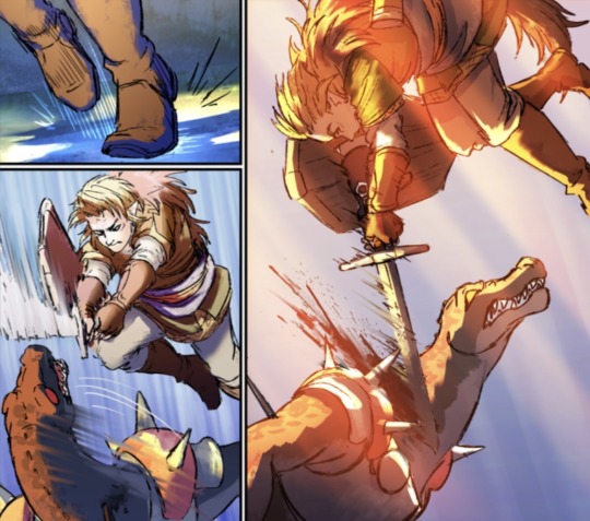

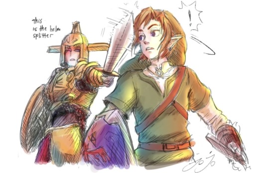
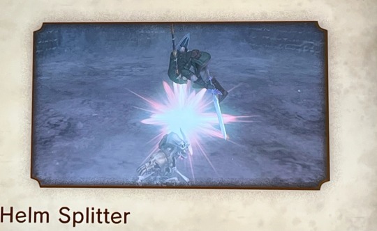
This move is often an instant kill. It is harder against Lizalfos, so the goal is to quickly turn around and deliver a slash. He lands with his back to the enemy- which made Dink grab him from behind (and bit Twi's arm ouch). But it's one of the most powerful moves Shade taught him- he practically ripped out Dink's shoulder.
One of the art screenshots is not Lu, but art Jojo did of shade teaching him to do it. (Can confirm it was terrifying- bro stopped the blade an inch from Twi's head- after telling him it's called the helm splitter)
#love that Twi's using the skills Time taught him#also doing this move in game feels really badass tbh#run away dink#linked universe#linkeduniverse#lu#lu twilight#hero's shade#Lu time#lu dink#twilight princess#I know that many have already pointed this out and or already know#I wanted to include videos and stuff but never want to imply I know things that others don't#and if you have the links (heh. pun) to posts where others pointed out similar or the same stuff I want to see them!!! because!!#literally everyone's thoughts are so cool and valuable? I love you guys never stop creating#and if I ever say or imply anything offensive let me know because I want to learn always#:)
598 notes
·
View notes
Text
Ramune :]
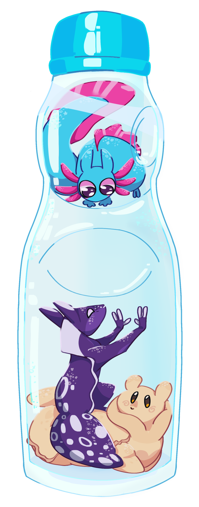
(oops image is kinda big)
alternates under
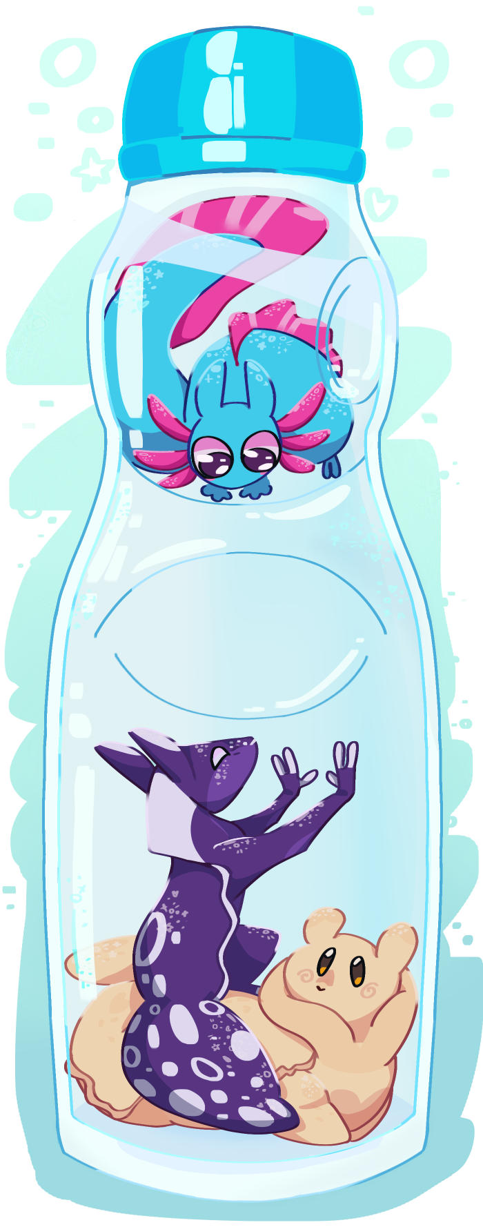
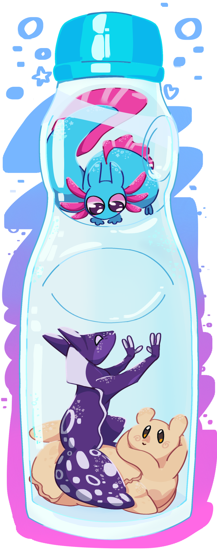
I couldn’t decide which one was best, I’m just a sucker for blue->purple->pink blend hue whatever you want to call it
#weeblr’s insane ramblings#rain world fanart#rw gourmand#rw spearmaster#rw rivulet#rw cream soda#rw ramune#First off#thanks for the 100+ followers :D#I’ll make a post on that soon#And now I can explain why I call this ship ramune#it’s literally because I like ramune and like to collect the bottles#(Although I only have two right now)#and I had one of my ramune bottles next to me#and I thought “well gourm and spear are already soda themed what if we just make riv like the marble”#and so heres ramune because I refuse to follow the other ship names#this also took me 4 days to make when it really could’ve taken me one if I had the time#:(#anyway I hope you like it#sry the image is so big#also my designs are getting a revamp which makes me a little sad since this one has the old ones#but I just really liked this idea#maybe Ill do it again another time#God I have no idea how lighting and shading works#Shhhhh no one saw my mistake shhhhh#mocha art
541 notes
·
View notes
Text


tobito again !! ✧。٩(ˊωˋ)و✧*。
gave him a new jacket. i want this jacket irl fdsjafdasfdsa i need to learn to sew
#painting this literally took me all day for some reason which is super odd bc i never take so long?? shading that fur aged me by 20 years#i did NOT want to paint the goggles and you can tell LOL#creepypasta#ticci toby#creepypasta ticci toby#creepypasta fandom#creepypasta fanart#creepypasta art#creepypasta toby#tobias rogers#tobias erin rogers
645 notes
·
View notes
Note
I just skimmed through the art part of your blog and holy bajeebus your LMK art is so beautiful and the headcanon ideas you come up with are so good I wanna steal em-
Kinda wanna see like a part 2 of the little angst you did between MK and Macaque a while ago. It's so interesting and I wanna see Macaque's reaction in your art style. (You don't have to of course, it's just a suggestion [idk if i spelled that right])
Thanks for reading and hope you have a good day/night!


Hope this is to your liking ^^
Part one here
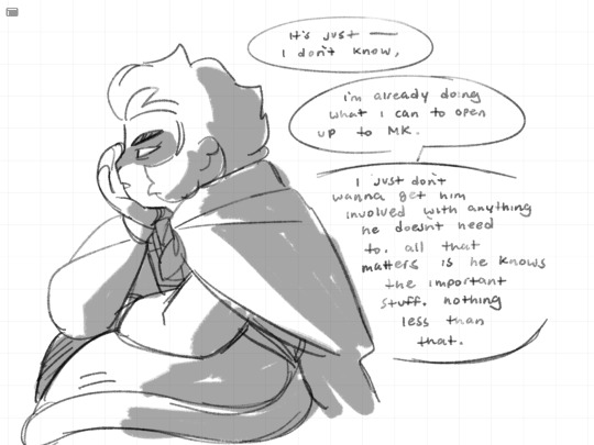
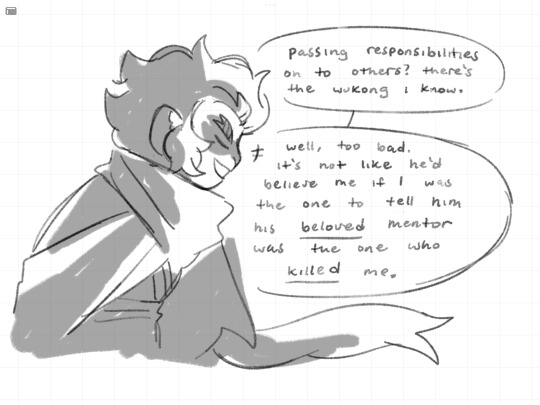
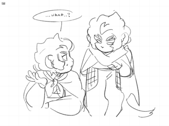
#I’m sure there are some character nuances im forgetting but well 🤷🏽#I want their misunderstanding or whatever they have going on between then come to a head. literally just going ‘wait what’#for me I think it’s entirely possible that there was an actual fight and maybe tension leading up to that point#cause I feel like macaque is not just bitter about thinking he died to wukong but maybe some stuff that built up to that#maybe the fight was just the breaking point. maybe they’re idiots who don’t talk about it because they think they’re on the same page idk#chipper-smol wrote a cool theory abt them using macaques ‘you’re nothing’ line in s4ep1. from what I understand it could be a direct parall#parallel to when he said that to MK right before MK regained his nerve and hit macaque in the eye.. since flying bark foreshadowed monkey mk#waaaay back in season 1 (where his shadow is his monkey form in the opening) i think that could be deliberate#and they could have gotten billy to voice an entirely different line for that scene. but they reused his line from s3#in a very specific scene with wukongs narrative foil. hm#that aside I would have liked to hear billy voice the ‘you abandoned me’ line that would have killed me. but that’s just me lol#also looking at this I should have shaded the last frame to make it look more dramatic and serious but I ran out of time :(#if anything I want to see MK try and help them get back together. poor kid tries so hard to understand people so I think it would be cool to#see that happen. that’s what I like about him.. he asked macaque why he was working for LBD instead of accusing him of dooming everyone bc#he wants to and he tried to comfort spider queen by admitting he was scared of LBD too 😭😭#my art#myart#Lego Monkie kid#lmk#Monkie kid#lmk spoilers#Lego Monkie kid spoilers#lmk macaque#six eared macaque#lmk sun wukong#lmk swk#lmk MK#lmk xiaotian#lmk season 4#Lego Monkie kid s4
1K notes
·
View notes
Text
mmmike :) he’s fun to draw
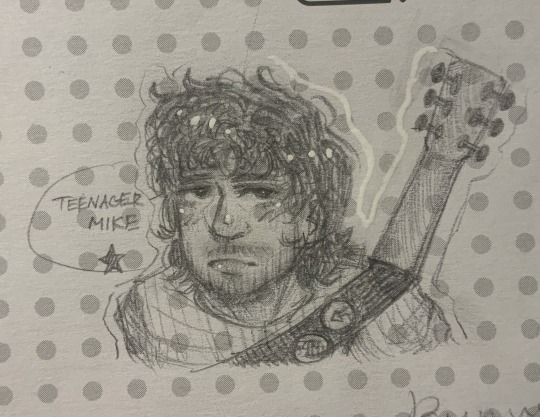
#Can you tell that I don’t pay attention in class#Every little space on any paper has to be filled with a doodle or I’ll die#I call this “Fifty Shades Of Jhutch”#because mofo REFUSES to look the same every time I draw him#He’s literally “how can I be different today?”#But I still love drawing this silly guy#Also I can’t stop thinking about the last smiley I drew today#He’s so majestic#-🫐#future man#jhutch#josh futturman#josh hutcherson#rp account#josh futturman rp#josh futterman#jhutch1992#josh futturman art#josh hutcherson art#josh hutcherson fanart#artwork#art#my art#artists on tumblr#drawings#drawing#traditional art#doodle#doodles#art dump
178 notes
·
View notes
Text
I am cruel I am gentle I can make you laugh
#ninjago#lego ninjago#ninjago morro#ninjago art#ninjago fanart#ninjago drawing#cop car by mitski was on repeat in my head and i couldn't stop thinking about morro#its literally him right there that song there is literally morro#guys i still hate him i hate this litttle creature i hate him#:33#honestly i just started experimenting with shading later on#if you see a :3 in the drawing thats a sign im going crazy and i need help but i highly doubt that i put a :3 there :3333
182 notes
·
View notes
Text
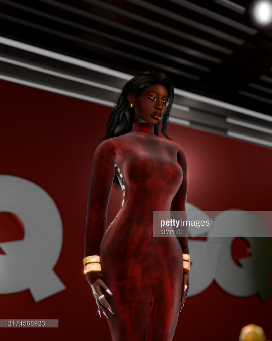

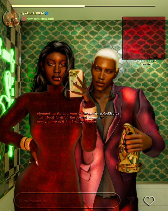
Yas attends the 2024 GQ MOTY Awards, honoring her stylist (and best-friend), Rodney Karter, Via pettyimages
#ts4 render#sims 4 render#simblr#black simmer#ts4 edit#sims 4#tt baby first carpet#they played it safe for the first carpet no shade#they get money they body tea literally#rod with his award for stylist of the year... clock tea#camp orji got a nice ring.. thank you sza <3#buttttt i cant wait to post the next set that goes along with this “story”#oc: rod#oc: yassah#click for hq o.0?
157 notes
·
View notes
Photo
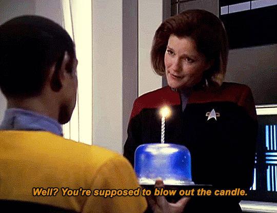
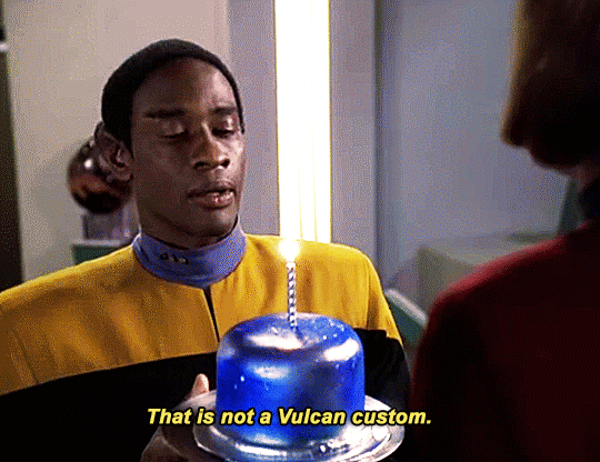


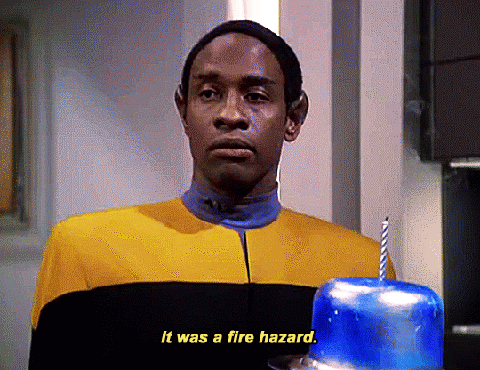
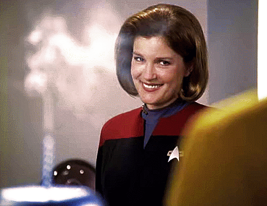
It took exhaustive research, sifting through teraquads of data, separating fact from rumour... but eventually, I arrived at the truth.
Captain...?
Happy Birthday.
#star trek#star trek voyager#kathryn janeway#tuvok#commander tuvok#s06e03#fury#would you believe me if i said it took a lot of work to make sure the cake was the same shade of blue in every shot#i love them both your honour#janeway's smile gets me every time#this scene is literally too adorable#just imagining all the hard work janeway had to put into finding out when tuvok's birthday was is both hilarious and so so cute#found family on a spaceship stuck in another galaxy ftw every time
3K notes
·
View notes
Text
hbd clown boy sorry for being almost a week late or whatever
#kokichi ouma#danganronpa#danganronpa v3#ndrv3#i don't remember my art tag hold on#it's been literal years#wrench draws#that'll probably change and maybe perhaps i'll make a secondary art blog#anyways i'm sick of looking at this i haven't cell shaded in a long time and it shows but that's fine#my son is trash and also tubby custard but he's still my son#also inflicting you all with my headcanons bc do i really like a character if im not casting a transgenderification beam at them?#last thing before i shut up but i'm grinding my teeth together bc my new laptops colors are weird so i had to keep checking this on my phon#the tragedy and woes of it all... this looks so much moodier on my screen
737 notes
·
View notes
Text
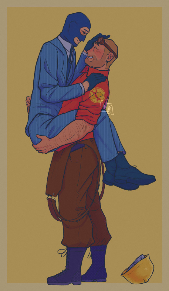
mercenaries the typa person to say "is anyone gonna fall in love with that?" and then not wait for an answer
reblogs > likes btw \(^_^)/
zoom-ins under cut :3
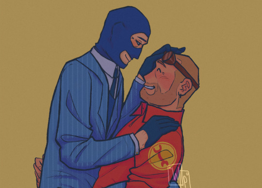

the polka dot brush texture was made by ggutinho on DeviantArt btw!!
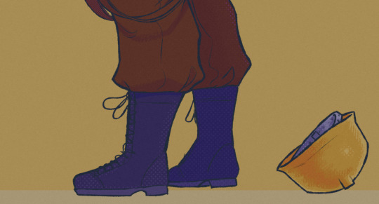
#i know Dell's hand positioning looks wrong but i literally didnt know where else to put them so i guess he's grabbin spys ass#i'm trying out a new style of shading because i hate the way i shade and i need to change something#also experimenting with colours and filters#i think i like it#tf2#tf2 fanart#engineer tf2#spy tf2#practical espionage#EngieSpy#napoleon complex#don't tell anyone but i had to trace my own legs when drawing spys because i couldn't get the perspective right FUEGFES#do you guys like my shoes FSFGES#it looks kinda off since they're so detailed and shit but i make this for myself so <3#also hi i gues i'm back :*
334 notes
·
View notes
Text
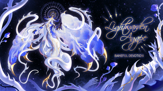
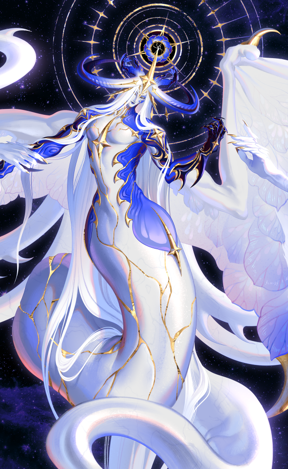
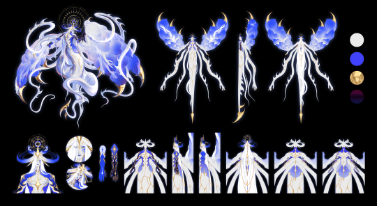
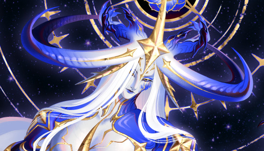
Lightwarden Agape - Baneful Devotion 💙🗡
character design commission for @queenofnohr
support me on pixiv fanbox - melontoyo.fanbox.cc
#artists on tumblr#character design#ffxiv oc#ffxiv art#ffxiv commission#melontoyo's art#thank you dei for being literally the kindest and most patient person on this earth 🥺🥺🥺#also I've always loved this shade of ultramarine blue and I was so happy to be able to use lots of it... blue!! blue everywhere
387 notes
·
View notes
Last Seen Blogs

warriach
Untitled

peyton-harrow
Dancing to the beat of my own drum
helieanmail
Talios

gufyresthere
Rest In The Nest

smartcitydholera
Dholera Smart City Project By Smart Homes