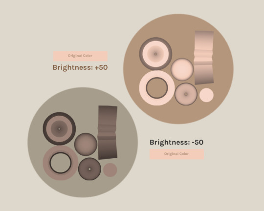
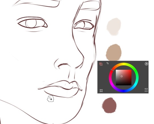
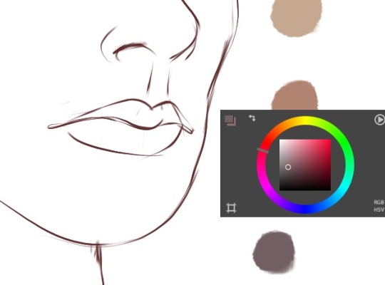
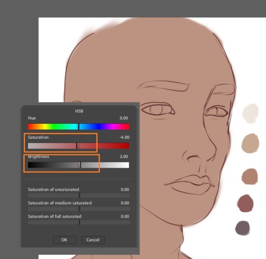
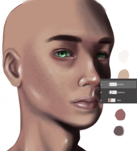
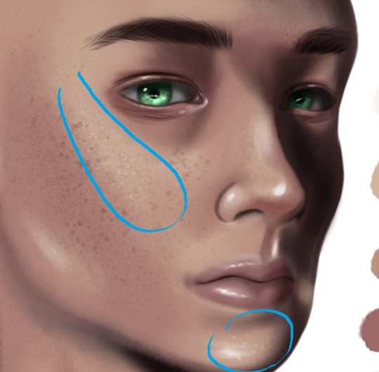
#using brightness on a dark and saturated color clipped onto a color layer
Text
argghhhh the desire to share a wip but also fearing the wip will be more seen than the actual finished piece
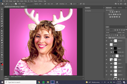
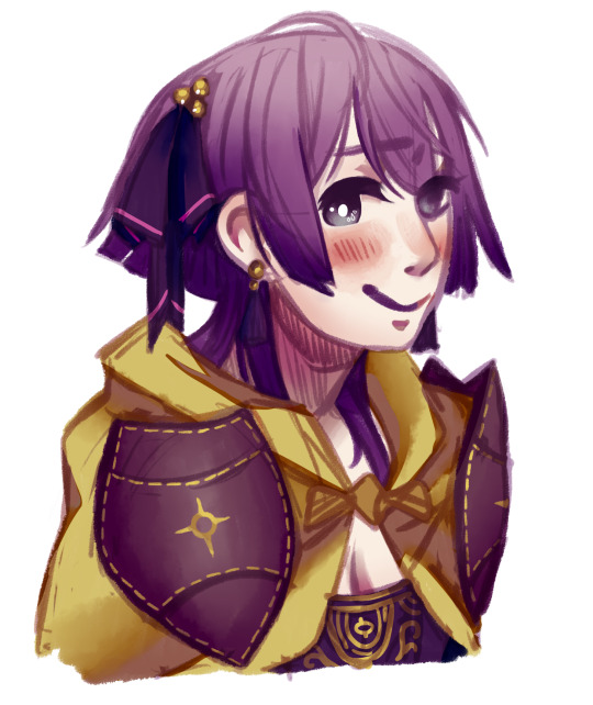
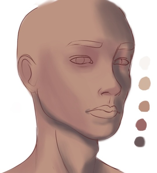
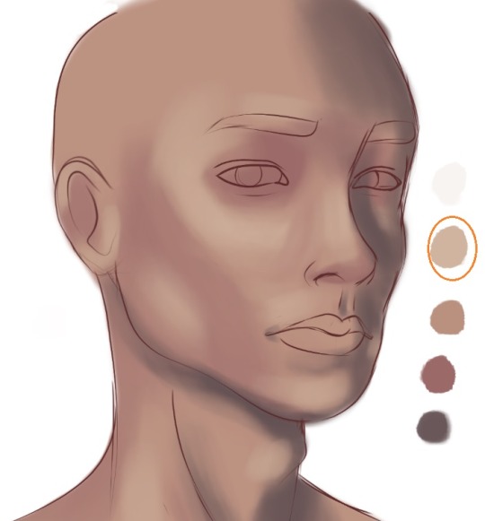
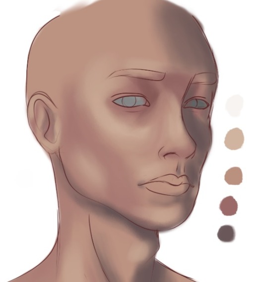
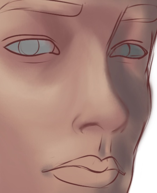
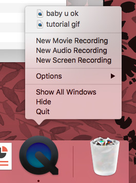
#limon talks#its happened before#cool that eyes are on my art#but it sucks when the thing you put a lot of effort into doesnt get the same amount of attention#anyways#for anyone who's played katfl know how theres a crazy background in the second phase of the final fight#im drawing it#didnt match it 1:1 but smudging a circular rainbow gradient got close enough#i think it looks sick af#and then i tried out some filters ive never used before to great effect#using brightness on a dark and saturated color clipped onto a color layer#oh my my does it create such an awesome contrast#and then specific to elfilis using divide for the lighting gives them such a delightfully nasty hue >:)#even tho its taken me over a month to work on this piece im still having fun with it
2 notes
·
View notes
Note
Hey mik! what's the process you use to make lands? They all look super amazing btw
i follow this tutorial but i dont follow it word-for-word
here i can do a quick lil thang
i like to use photoshop for this, idk how to translate it to other programs
i start w a canvas 1000x1000pixels, that way u can get a lotta detail in and then it looks even better when u inevitably shrink it for whatever ur using it for
use shape tool to make a circle. hold shift + click while dragging the tool to make a perfectly symmetrical circle. (or dont im not ur mom)

merge the shape layer down onto a raster layer.
turns into

now ur basically just adding textures n shit. i like doing it Hussie Style and using google images to add texture, basically just taking that shit and bastardizing the hell out of them through fucking around w/ the contrast/exposure/colors/etc. u can also use the photoshop generative tool to generate random texture shit (i love putting in nonsensical prompts to confuse the hell out of it--my favorite results are the really shitty ones that look like terrible collages), but its the same process for each one.
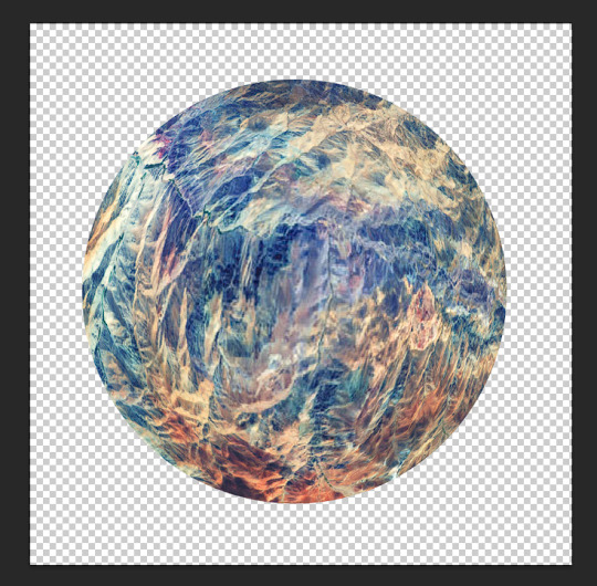
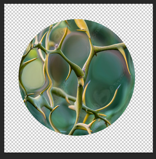
lets make up a planet. Land of Horns and Thorns.
i like to use satellite images to get that planet-y texture. i try to think of a relevant land-type. thorns are triangular, so are mountains. lets grab this image

next what we're about to do is called "transformative use"
copy+paste image on a new layer

right click on the image's layer, select "create clipping mask"
this should be the result:

but its a little flat. so lets make it rounder. i use the Liquefy tool in photoshop, but im sure theres other ways of doing it.
click filter > liquefy, then make sure u have the bloat tool selected. now bloat that mfer to ur liking. its ok if it looks a bit shit right now. when uve bloated it as much as u want, click ok. now u have smth like this
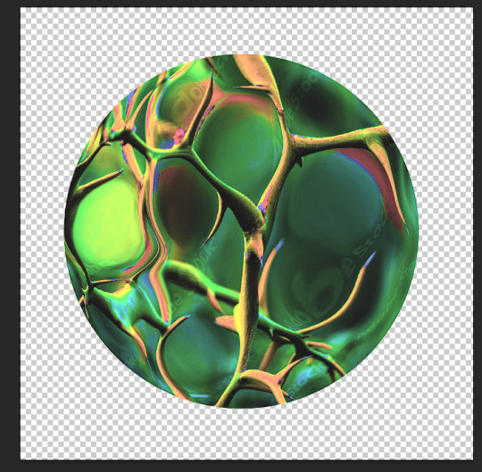
now start messing w/ filters and colors. i try to ascertain the mood im going for with a planet. Land of Horns and Thorns sounds a bit whimsical, but maybe subtly dangerous? so, translating that to color, maybe it's fun and colorful, but like, in the same way those deadly poisonous frogs are fun and colorful. maybe there will be some dark pits as well. lets see what we can do
i start w/ messing around w/ contrast. go to image > adjustments > brightness/contrast. fuck around w it to ur liking. this is what it looks like now
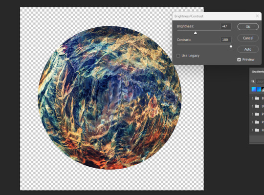
already we're starting to get some of those dark pits i wanted. lets make the colors pop a little more by messing w the exposure.

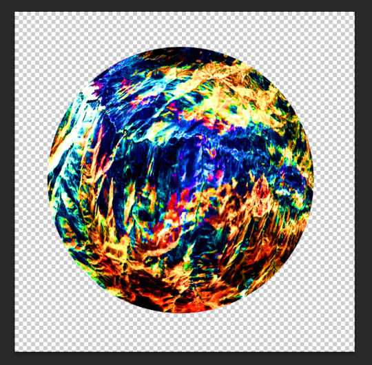
u can also mess w/ the vibrance, hue, saturation, etc. basically all those lil tools in the image > adjustments are ur best friends now. i like to increase the saturation to get that shit-jpeg look u see in homestuck sometimes
now create a new layer. we go back to google images. im gonna look up some closeups of thorns

this works fine. copy & paste. create clipping mask. bastardize the image however u want, similar to the first one. using the liquefy tool helps to get shit into place where u want it.
made it a little more abstract.
played w/ the color settings. i dont want this one to be as vibrant b/c im going to be using the layer modes. however, i do want to posterize the hell outta this
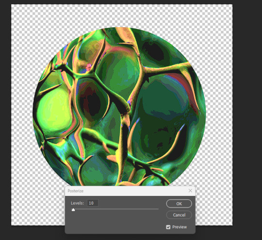
ok i like how it looks in luminosity mode.
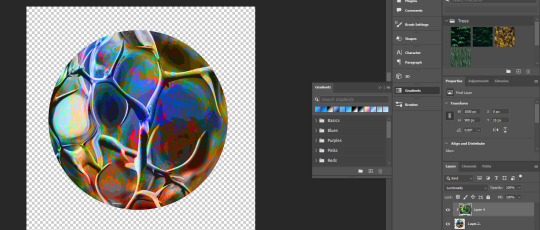
however, i kinda wanna change the colors of the bottom layer now. lets use a gradient map (image > adjustments > gradient map). just hit ok when the prompt comes up, we can detail it in the side panel.
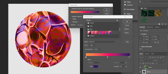
if u just click the actual gradient bar itself, itll open up the gradient editor. there u can make ur own custom gradient and specify the colors n shit. theres also a bunch to choose from.
so, i think that looks pretty fucking cool. i love the contrast, but i kind of want to see what it looks like in other colors too. we head to the hue/saturation tool.

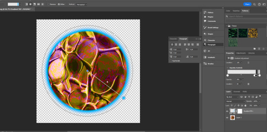
there, i like that. a bright, poisonous color with the threatening blotches of red. now lets make this mfer look like a planet. merge everything into one layer if ya want
the gradient tool is now ur best friend. i like to fuck w the gradients, one of my favorite effects is making a sorta halo gradient (basically just copy the opacity controls i have, im sure u can also google how to do it) and merge the gradient to an empty layer
and, yknow, just mess with the settings
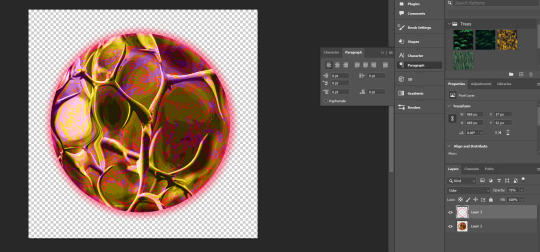
u can add gradients to make it look more like a 3d object. mess w the colors and settings n shit

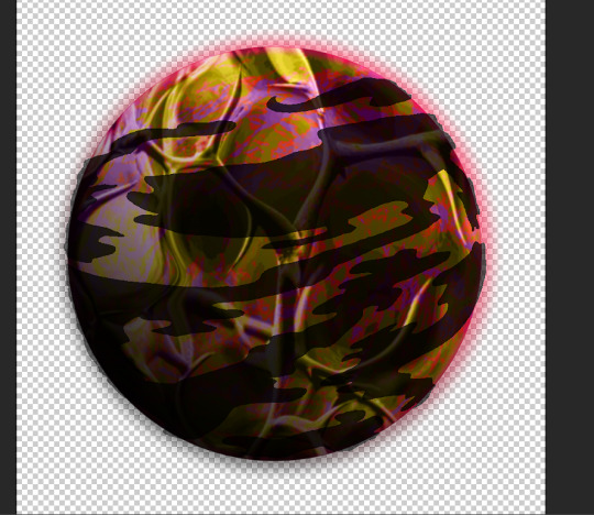
we add some clouds now. i just use 1px pencil tool. try to use the curvature of the planet to inform how u draw the clouds. think about how u want them to be formed (swirling around the center? stretched out? etc) and think about what u think the atmosphere would be like on ur planet. a completely barren planet like mercury may have no clouds at all. or maybe its like jupiter, where its nothing but clouds? also think about the anemology of the planet. how do the winds form, what directions do they go?
i think the Land of Horns and Thorns sounds like a place that would have a good amount of thunderstorms, so lets make the clouds black. mountains are pretty windy, so maybe the clouds will sporadic but dense.
fuck around w/ it til ur tired of looking at it. then make that fucker smaller (the average mspa panel is 650x450. unless ur planet is taking up the entire page, u can probably get away with smt smaller.) **make sure u have interpolation set to bicubic or nearest neighbor.
and then ur done.
side notes: literally do whatever u want tbh, u can do as many layers as u want, use whatever tools u want. thats pretty much the basic format ive got.
6 notes
·
View notes
Note
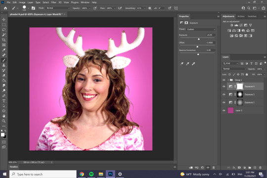
girl your christmas icons all turned out so good, i can barely choose from them! bless you <3 also what's your secret, is there a tutorial you used to make them 👀
shure! i will guide you along the making of one. the crucial first step for me at least is just downloading a random ep and scrubbing for smiles then grabbing screencaps, just because they're a higher quality than most images you'll find online + they're caps not everyone has seen before. so that being said, we're gonna open ps

welcome :^)
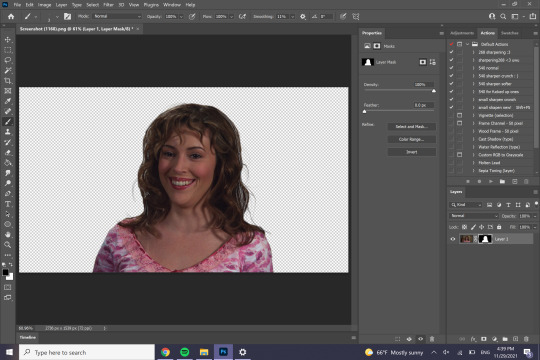
so the cap i'll be working with is this phoebe one from 3x16 "Death Takes a Halliwell"

look at her <3
first thing i'm going to do is erase the background while the image is still really large. i take a brush pen set to like really being and 100% hardness to first remove phoebe
i should state you add a layer mask by clicking this button here

#black (#000) erases and white (#fff) adds

she's gone 😲
then you invert the mask (bottom button on the properties) and make your brush a lot smaller and make the hardness around 40ish% and erase what isn't phoebe

wallah!
but what's this?

hair scragglies because it's a free flowing curly do! now, you could just ignore them which is the normal option but if ur bonkers like me ur like no i must get them in.
change your brush to soft round pressure opacity (a note! this only works if you have a stylus, otherwise your device can't detect pressure changes. the alternative is just to work in dark gray and build, rather than str8 up erase/add like you would in black or white). you also wanna make your brush real small, and then work to incorporate the wispies

i also like to reinvert the image again and erase out bits, just so the wispies aren't so stark
now. you might be looking at this like chief. i love & trust you but um. them wispies are still looking pretty stark. fear not! this image is fucking huge. let's crop it down to icon size, anywhere from 300 x 300 to 150 x 150 (pixels)

now the hair just has a slight see through quality. as a note, a usually crop my holiday headers with a bit more headroom just because i often place stuff on their heads. but before we do that, we adjust the lighting. i usually do curves then exposure then levels

i like making icons really bright because i think it makes them easier to see.
now i'm gonna pick what to put on her head. i'm thinking a reindeer headband, so i'm going to google reindeer headband and scroll through til i find one i like.
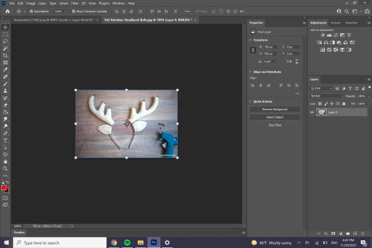
next we’re just gonna erase everything that isn’t the headband.

whether or not u actually grab the band is up to you, i don’t if it’s too skinny like with this on. we can now convert this to a smart object by right clicking the layer and clicking “Covert to Smart Object”. we’re mainly just doing this for convenience. then we’re gonna copy/paste that onto our phoebe layer. we’re also going to realize we haven’t saved our icon yet so we’ll do that.

so we wanna get these to look like their actually on her head, so once you've modified them to roughly her size, we’re going to employ a roughly threefold process. while you’re transforming the image (ctrl+t), right click on it and click perspective, then modify that.

next is distort

then warp

now with antlers like these where they’re really in a different color range than the person, i’ll usually open up a color balance layer

create clipping mask so it only affects the headband, then adjust til it looks like it’s part of the photo

alright that’s fine. now we can add a background. first thing were going to want to do is make all the layer we have right now into a group, and then set the group to normal, Not pass through

then you can open a layer below the group and color it in. i like giving the subject a backlight, so i’ll brighten it with a couple exposure layers like so


the final step i did which is so not necessary but i do it on all my icons anyway is i add makeup. i always do lips first, so we’re going to go back into the group and add a hue/saturation layer, then click colorize

mask it so it only applies to the lips

then set it to a blend setting or whatever it’s called to make it more natural

next up to bat is blush. we start with the same hue saturation layer, i usually try to get the hue to match the lips
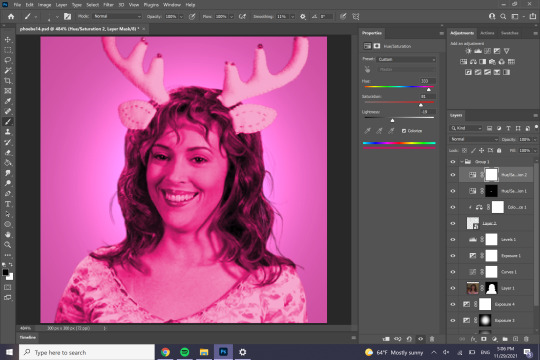
scribble it on over the cheeks (& i like to ad the nose too)

then feather out that mask. for 300x300, i feather it out to 9px
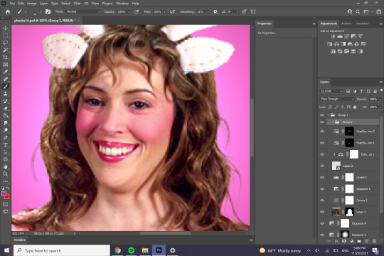
the next thing we’re gonna do it add this to it’s own group

tuck that bad boy in there then add a mask to that new group

invert it + add tiny scribbles to the cheeks
feather that layer out and kind of just add/erase lil pieces til ur happy with it

so we’re done with the makeup? haha, maybe if i was normal!! we’re drawing on eyelashes.
add a layer. set ur brush to 1px soft round pressure opacity. eyedrop a color from the already present lashes scribble on some lashes


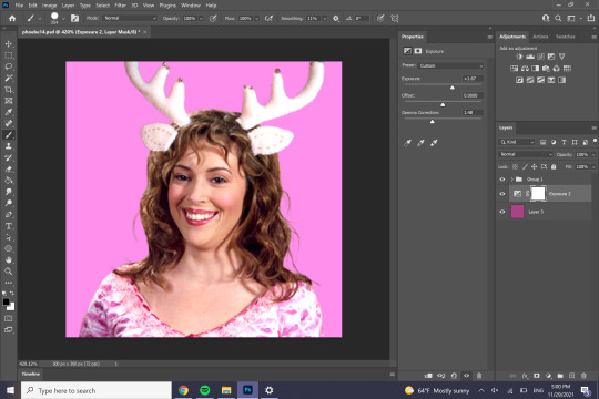
she’s been aptly yassified
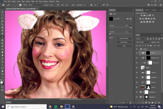
now’s the time to make any final adjustments; i’m just gonna make phoebe a lil brighter bc those anters are really bright. i’m also gonna slightly erase the base of the antlers to make it look more like it’s in her hair
alright! welcome to the final step:


sharpen her.
since icons are so tiny you usually wanna make them a lil bit more crispy crunchy that normal. my method is usually sharpen, then a light smart sharpening, then a gaussian blur of 2-3px, then sharpen usually at like 50% ish opacity
then decide you wanna make the bells on her antlers pop more

then say okay yeah yeah no that looks good yeah i like it. then export as a png

then marvel & your work & be really proud of urself 💕💞 you have reached the end of this tutorial
66 notes
·
View notes
Photo
I received a request from an anon to do a tutorial on how I colored this set, so here is a pastel coloring tutorial! This is the first time I’m doing a tutorial so please bear with me and feel free to ask any questions if you need further clarification!!
Difficulty: Easy (requires basic gif and photoshop knowledge)
Step 1 (This is the most important step!): Make your gif. BUT what’s really important is that you chose a scene that is very bright/lightly colored, one that has a lot of natural light and/or the subject is in a very open area. If you tried to make a super dark scene pastel, it’ll look unnatural/low quality because you’re trying to force light colors into a dark scene. So chose a scene that has lots of natural light!
Step 2: Now that you’ve created your basic gif, it’s time for coloring! I used a basic curves layer where I used the white point tool to select the whitest point of the gif (in this case, the top left hand corner), a levels layer to enhance the contrast and lighten the whiter parts, and a color balance layer to make Jyn’s face less dull. There are a lot of ways you can experiment with this but I like to make the coloring as natural as possible.

Step 3: After your gif is colored, create a new blank layer and set it to overlay. Then take your paintbrush tool and use the eyedropper tool to pick the color you want most prominently featured in your gif. Since I was going for a pink/purple scheme, I chose a shade of pink. Then, with a very large, soft brush, I carefully painted the background with the pink, adding some on her clothes and hair to make it look more smooth.

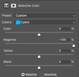
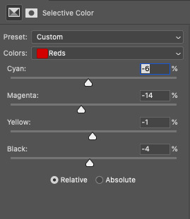
I then used another levels layer to increase the contrast and lighten the background. Then, I added a selective color layer and set the magentas in cyan to +100, and set a vibrance layer as a clipping mask to that selective color layer and increased the vibrance by +36

Then I used a vibrance layer to massively increase the vibrance and saturation of the pastel colors.
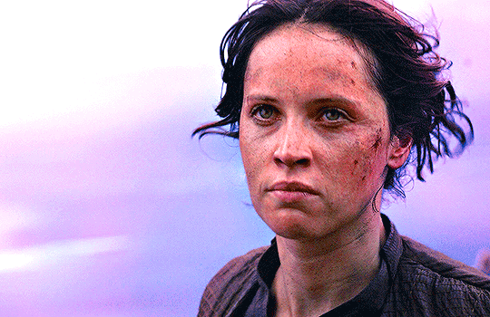
Note how Jyn’s face is really red here? I didn’t like that, so I used a selective color layer and increased the cyans in the red.

There, much better. Technically you can stop here if you want, but if you want to go further, I added a saturation layer set to magentas and increased the saturation of magentas to make the purple pop out even more. I also painted more pink around her with a layer set to hard light, and some purple in the really white part of the gif in the left hand corner with the layer set to normal. After that, I topped off the gif with some more selective color layers to make some minor tweaks in Jyn’s skin tone (aka just making it less red). Pro-tip: if you want your reds to be less red, increase the cyan in it or decrease the magentas.
And your final gif should look like something similar to this:

Please note that this tutorial isn’t going to guarantee the same results on every scene used, but most often you will have to paint some colors onto the gif yourself if you’re going for a pastel theme. There are lots of other ways to do it, like using a gradient or adjusting the white in a selective color layer, but for this gifset, I painted the colors on myself. I’m no pro at Photoshop and learn new things everyday, and usually end up with these kinds of things through lots of experimentation.
I hope this was helpful, and don’t hesitate to send me an ask if you have further questions!!!
#allison answers#gif tutorial#photoshop tutorial#coloring tutorial#completeresources#allresources#fyeahps#dailypsd#dailyresources#chaoticresources
214 notes
·
View notes
Photo

- recoloring tutorial -
WHAT YOU’LL LEARN:
how to recolor with solid colors, patterns, and graphics
how to find patterns & import them into photoshop
how to recolor an item that doesn’t have a white or solid swatch
WHAT YOU NEED:
sims 4 studio
any photo editing software (i’ll be using photoshop cs6)
dds plug-in
difficulty level: beginner
1. open the clothing you want to recolor in sims 4 studio (s4s) and find the white swatch.
if there’s no solid swatch at all, skip to the very end of this tutorial where i’ll show you how to fix this! (look for the pink line)
if there are solid swatches but no white swatch, find the lightest color you can. even though there’s a white swatch in my example top, i’ll use a colorful one to show you how to fix it.

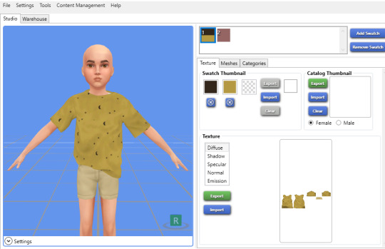
[for this tutorial, i’ll be using simiracle’s judd shirt.]
2. click the green “export” button. save it as “white swatch”.
3. open it in photoshop.
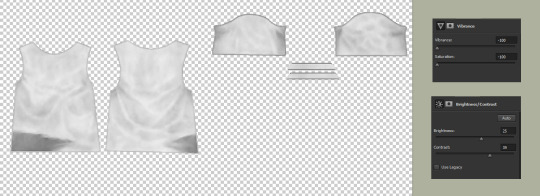
optional; if your swatch is already white, skip this step: to get rid of the color, simply decrease the saturation & vibrance all the way down. if it still looks too grey or dark, increase the brightness & contrast. finally, merge your layers. here are my settings and what i ended up with:
4. create a new layer and check “use previous layer to create clipping mask”. color everything in completely with a pure white brush.

5. on the layer tab towards the right side of your screen, change “normal” to “multiply”.

now your texture should look exactly like it did back in step 3! (i promise you didn’t just waste your time lol)
optional: if you have recoloring actions ready, now would be the time to apply them. if not, carry on!
6. right click on your new layer and click “blending options” at the top. here, you can either click “color overlay” or “pattern overlay”.
either way, you’ll want to change the blending mode to “multiply”.
here’s an example of what you can do with color overlay:

and here’s an example of pattern overlay:

but wait! you might be thinking “where do i get cute patterns like that?” and my answer is... everywhere. try searching for things like “seamless patterns”, “tileable patterns”, “fabric swatches”, etc. it’s even easier if they come in a .pat file (here’s a quick guide to using .pat files!)
here are some good patterns or places to find them:
my patterns pinterest board
mothz patterns
free pattern site
deviantart patterns
free .pat files
more .pat files
even more .pat files
yeah... more .pat files
okay, now that you’re all loaded up with patterns, let’s get back to the tutorial!
7. adjust to your liking. i prefer my recolors to be more faded and worn-looking, so i turn down the opacity a bit and i tend to use patterns that already have a vintage look to them. but do whatever you prefer! you can even mix color overlay & pattern overlay together to create an entirely new design.
8. save as a PSD!! trust me, you’ll be really sorry if photoshop crashes and you have to do all of this over again.
9. merge your layers and save as dds.

optional: now i’m going to show you how to add graphics. if you’re not interested in this, skip ahead to the next green line.
1. find your graphic. preferably, it’ll be flat, on a plain colored background, with minimal wrinkles.
2. i like to use the website 6 dollar shirts because they have a nice worn look already!
here’s the image i’ll be using for now:

3. make it transparent. there’s many ways to do this! if your image is really simple, you can outline it with the lasso tool and delete everything outside of it. but my image is a bit more complicated than that, and i don’t have all day... so let’s use the color range tool. (select → color range)
click on the color you’re trying to get rid of (in this case, the light tan color) and crank up the fuzziness to the max. press OK.

now all of your background color should be selected. press ctrl + X to delete it.
4. make it look nicer, depending on the image. if it’s blurry, try sharpening it. if it’s crunchy, try using topaz clean. if there are still some spots of color, use the color range tool again as many times as you want. make it black and white. decrease the brightness & increase the contrast to the max. it all varies, just try new things and see how it looks!
5. when you’re done adjusting, copy your image and paste it onto your shirt. you can do this on a solid color shirt or, if you really want to go crazy (lol), paste it onto a patterned shirt. adjust the opacity settings so it looks like it’s blending into the shirt nicely, not just sitting on top of it.
ta-da! you now have a cheesy graphic tee :-)

BONUS TIP: if your graphic doesn’t look worn, but you want it to, you can use these free overlays to roughen up the design! there’s even a little tutorial on the page.
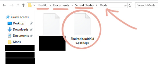
10. if you haven’t already, add the file you’re recoloring to your sims 4 studio mods folder. here’s what it looks like:
11. reload s4s. under “cas” click “create cas standalone”.

12. sort by custom content, click the first swatch of whatever item you’re recoloring, and click next. name your file.
13. now click the blue “import” button and import your first texture. then click “add swatch” and import again for all your other swatches.
BONUS TIP: for the swatch thumbnails, you can right click one of the empty boxes and it will pull up a dropper tool that you can use to match the color of your cc.
14. save!
you’re done!!

if the item you’re recoloring doesn’t have a solid swatch...
1. find the simplest swatch you can. some swatches won’t work no matter how hard you try, but it’s always worth a shot!
i’ll use the yellow moon-patterned recolor i just made as an example.
2. turn the saturation & vibrance all the way down. increase your brightness & contrast. increase curves (if necessary). here are my settings and what i ended up with:
now comes the tedious part...
3. use the patch tool to remove the pattern, piece by piece.
here’s a demonstration:

here’s my progress so far:

you may notice that the patch tool doesn’t work well on the outer edges of your clothing. for that part, i use the clone tool.
i can’t screenshot this part, but basically all you do is hold alt and select a blank spot directly next to the pattern you’re covering up. then hover over the pattern and click down. make sure you move your cursor in a completely straight line, otherwise the seam will look wiggly.
we’re finally done! here’s what my final image looks like:
now that you have a white swatch, jump back to step 4 to continue the tutorial ♡
#my god i spent my entire night on this..... :o#tutorial#sims 4#ts4#recolor#recoloring#recolor tutorial#graphics#graphic tutorial#just trying to make sure this shows up when someone searches my blog for it lmao
1K notes
·
View notes
Note
Have you thought about ever doing a step by step video/tutorial on how you make skins? Or record your process? I'm trying to start doing skins but there's a lot of stuff I don't understand that the site's tutorial doesn't really explain and speed paints aren't exactly great to look for answers, so I was wondering if you would ever do something of the sort, it would be cool
I’m kinda dumb and terribad at video recording but I can totes make a process with some screenies :0 Hopefully the following helps a bit. There is gonna be an assumption of basic knowledge on layers and whatnot just fyi! Perhaps someday I’ll actually record myself making a skin if I don’t get distracted and/or forget lol.
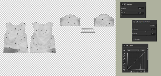
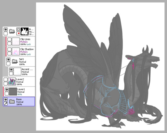
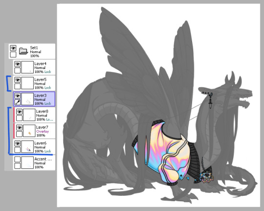
1) This is pretty much how I start my layers. I don’t change much from the default skin file provided by FR other than adding a mask to the skin folder so I don’t draw outside of the lines and then a gray overlay on top of the base just so it’s easier for me to see my sketch. I use bright colors like blue and pink to help me differentiate details. I turn off the clip lines/shadow as I don’t wanna see those atm.
The layer that says “Accent” is where I start my sketch.
If I’m making a skin for a particular dragon, I’ll often have them added in the file (note the hidden layer above the gray box). To do so, I save out a transparent version of the dragon and blow it up to 700px in waifu2x or something. Then I bump it up to 750px so it fits in the skin file. It’ll be a lil blurry but it’s good enough.
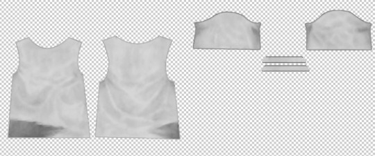
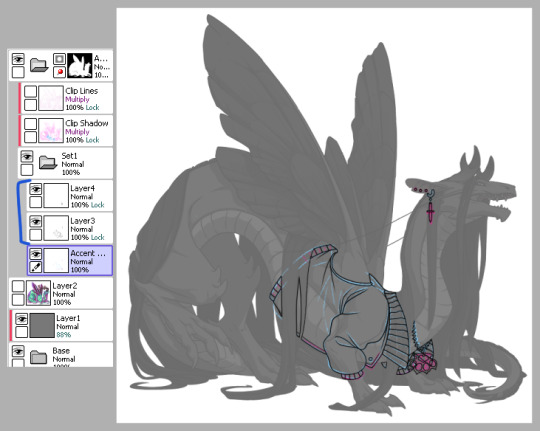
2) Next is line art - I have 2 layers for this skin: one for the jacket and another for the knuckle dusters and chains. Personally I like to close off all gaps in my line art, including drawing on the edges as you can see on the top of the collar by the wings or the gap formed by the hair on the midsection. This is just something I prefer doing as I find it makes my coloring less messy and annoying later on. But you can do it however it’s most comfortable.
At this stage, I’ll also either zoom out to 50% or resize to 50%, whichever works because it’s important to remember that the file size is 750 while the actual size you’ll have to save out will be 350 - details will shrink so make sure what you’re drawing will show up appropriately.
3) Now onto colors. Since I closed the gaps in the line art, I just fill bucket everything. For this skin, I drew the jacket’s colors on one layer because I’m trash and have 1 braincell but you can use as many layers as you need. In this case, the overlay layer was for extra saturation and the layer above that was for the black stripes. Be sure to clip additional color layers onto your base color so you keep things tidy and avoid coloring beyond the lines.
Again don’t forget to resize or zoom out to make sure your skin is looking as it should!
4) Finally I do some recoloring of the line art - in this case mostly the arm of the jacket. I lock the line art layer and go over it with colors darker than the surrounding colors - up to preference here. I don’t usually change the very edges just because I prefer a darker color there personally and my default is black. It’s also totally ok to have darker line art - again up to you.
Then I turn on the clip lines/shadow since you have to make sure those show up in the final piece. Clip lines is usually set to normal but I change it to multiply because I feel it turns out better for recoloring. When I recolor, I try to match the colors of the skin while also making sure it’s dark enough to be seen. Same goes for shadows.
*If you ever get a skin rejected, it’ll usually be how visible you make the original shadows and line art. There’s not really a hard rule on what counts as “passing” since it’s up to staff but I try to make it obviously visible without ruining my skin. So here you can still see the belly scales for example, but it’s not so pronounced that it takes away from the jacket. It’s a lil uggo imo but it is what it is.
*Something to note when you color: be careful how dark you make your base colors! Too dark and you won’t be able to see the clip lines/shadow very well in the future. Note how the collar of the jacket is light enough that the shadows and lines beneath are still visible.
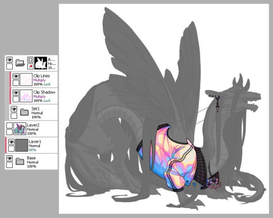
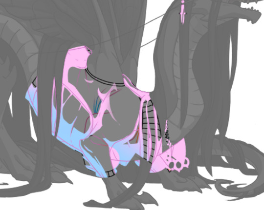
This is how my clip lines/shadow layers look on normal mode so you can see what colors I made them. Play around with the values to make sure you achieve some balance between your skin looking good while still showing off the base lines and shadows of the dragon. I used pink and blue here since it matched well with the skin. By default, the lines and shadows are gray and if you don’t recolor those, your skin will end up looking muddy.
*Other than recoloring, do not touch the clip lines/shadows at all. Do not edit them or erase them otherwise that’s a quick ticket to rejection.
5) Finally, turn off everything but your accent folder and save that sucker out and resize to 350px. At this point you can test it on your actual dragon by either pasting the skin onto a pic of the dragon or by using FR Tools. Reminder that you should not use/mention FR Tools on the official site cuz staff doesn’t like it. However on FR Tools you can also test the coverage of your skin when you select “upload skin.” Less than 30% and it’s an accent. Above that and it’s a skin. There’s other ways to test coverage but FR’s gimp tutorial sucks and is outdated and I don’t have photoshop so lol.
*I often go through several iterations of a skin just in case I see weird flaws or missing details. Testing is very important once you finish as major changes to your skin after submission is not a fun process so be sure to get it all squared away the first time.
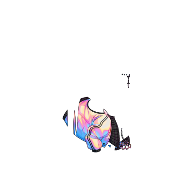
^ Your final product should look like this: transparent png (32bit) at 350px.
*Now this was the technical side of making skins using the tools at hand. If you have further questions I didn’t cover here, pls do feel free to ask! I’m no expert by any means but I can impart what I’ve learned after making a few.
#tutorial#fr skins and accents#flight rising#Anonymous#long post#sorry if it's a bit wordy#skin making isn't super hard but there's just a lotta rules and things to keep in mind
123 notes
·
View notes
Text

For this gif tutorial I’m going to try to keep it as basic as possible, I may add a few tips for coloring at the end, but for the most part this is going to be how I make my basic gif. Also I’m not going to use my vapoursynth to process the video beforehand, just because I know not everyone uses it and it’s harder to learn. This is going to be just a downloaded mp4 video through the gif process. Don’t let the idea that this is a BASIC TUTORIAL fool you, I’m going to try to teach you a lot of things. It’s gonna get wordy, but i will try my hardest to keep the process easy. I’m just going to explain what things do instead of having you just copy + paste my method and not know what it means. okay? okay.
Before we start though, if you plan of giffing live stages you either need to accept the they will not be super crisp and clear OR learn how to use avisynth/vapoursynth to resize the videos without quality loss.
If you just want to gif music videos or variety shows then this should still give you HQ gifs.
Other notes:
try to ONLY use 1080p and up video if possible, maybe 720p if you’re really desperate, but anything under that... it’s not going to look good at all, so try to avoid using them.
The Photoshop I am using is PS 2020, so all my screenshots will be from that version and with my weird set up. But I’ve been using pretty much the same method since cc 2015 so other than the fact that some placements and names are tweaked, it’s the same. (If you can’t find something on your version shoot me an ask and I’ll try to help! And asks I get on this tutorial I’ll link HERE for future reference)
CUTTING VIDEO
To cut videos I’ll just use my quicktime player.
I use edit > trim to select the portion of the video I plan to gif and save that as it’s own new mov file.
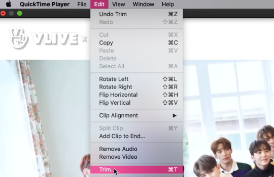
which pops up this tab

that you just slide until the part you want to gif is selected

then just save it as a new video and your done with part 1
ENTER PHOTOSHOP
Now what we’ll do is open our photoshop and import that clip into layers
FILE > IMPORT > VIDEO FRAMES TO LAYERS and select your video.
A small pop up will appear to show the clip you’re opening, you can trim it further here or just keep going by clicking okay
my setup is weird for drawing BUT you should have it looking remotely like this:
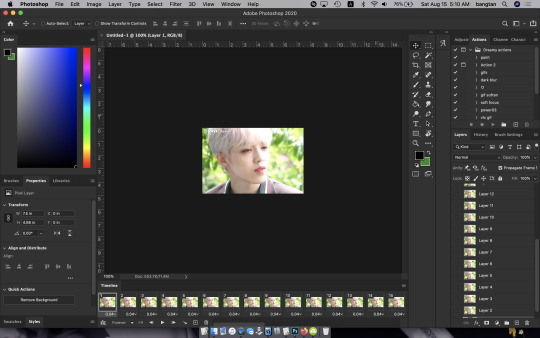
The things you will DEFINITELY need to see are TIMELINE, LAYERS, ADJUSTMENTS. If you don’t have these sections you can add them to your screen by clicking on the WINDOW tab at the very top menu bar and clicking on them

LAYERS - this is pretty self explanatory but each row is a layer in the gif. the more layers the bigger the gif will end up, the longer it plays. So bigger clips will have more layers and end up as larger gifs in the end.
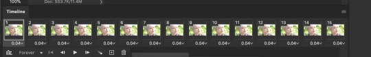
TIMELINE - This is where you can edit the gifs timing (make it faster or slower)
We’ll be doing a bit of work with it so it’s important to know it well
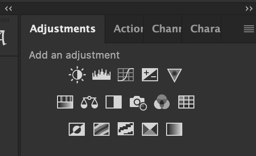
ADJUSTMENTS - Best friend and worst nightmare. this is where ALL the tedious recoloring is done. VERY rarely would you not use these. 99.9% of kpop things are filmed through a green or blue lense so you’ll want to fix that to not have ghost idols
So, Let’s make a gif
Step 1 - In the top right corner of your timeline is a set of lines, click there and then click SELECT ALL FRAMES
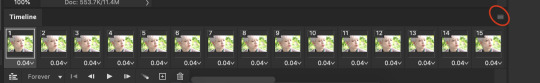
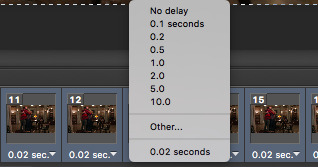
under each frame is a time stamp (this video’s is 0.04) this decides how fast each clip goes by, or how quickly the gif moves. Personally I prefer slower gifs, but I say anywhere between 0.04-0.06 is a decent speed.
Step 2 - with all the frames selected, click on the small down arrow next to any of the frames and change the speed to your liking. (I’m going to use .06)
Step 3 - in that same tab of lines we’ll now click CONVERT TO VIDEO TIMELINE, which will change our Timeline to look like this:

Step 4 - Back in our very TOP menu we’ll click SELECT > ALL LAYERS, then on the TOP menu click FILTER > CONVERT FOR SMART FILTERS (this might take your computer a minute since our File is still pretty large.) Now our Time line will look like this:

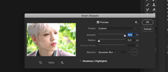
Step 5 - Sharpening
This one is VERY MUCH something you’re going to have to play with to get your settings to be how you like them. It’s also where I’d use topaz adjustments, BUT since I said we’re doing basic PS gif we’re just going to be using smart sharpening. SO:
in the TOP munu again, click FILTER > SHARPEN > SMART SHARPEN
A pop up window will appear and you can edit the settings to your liking. Mine:
Step 6 - Resize your gif or crop it to tumblrs standards: big singal gifs have a 540px width || Two gifs use 268px || and three gifs use 177/178px
To do this we’ll use the crop tool and type in our dimensions in the menu bar:

and then crop to your liking. (this doesnt resize the gif it just crops to the correct ratio so we still have to shrink the gif)
Next, we’ll resize the gif to that size in the TOP menu click IMAGE > IMAGE SIZE a pop up menu will appear and you’ll type in your resize ratio and click enter.
Now technically thats a gif. it’s TECHNICALLY done. but mine is white washed and there are words on it that I dont want so onto the coloring and blurring.
First I’m going to show you how I blur text on gifs. because text is EVERYWHERE in kpop content and it’s hideous and I hate it. so lets kill it.
BLURRING LETTERING
First we’re going to add a new blank layer to our LAYER TAB by clicking the little box with the + inside at the bottom
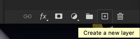
Sometimes doing this can mess up the timeline’s selection but its SUPER easy to fix so lets do that.
So in our timeline we have these two bars on each side that select what part of the gif will play. this is also where you can readjust your gif if it has extra frames at the end, or it ends up being too large and you have to make the gif smaller to save it. Just click and drag the bars back to where our gif actually ends, and all is fixed!

Now on our new layer we’re gonna take a paint brush (one of the ones with a lot of fade NOT the solid circle ) and paint over where the words are like so:

MAKE SURE ITS ON OUR BLANK LAYER AND NOT THE GIF LAYER!!
I know it looks stupid but trust me okay.
Now in your LAYER tab we’re going to duplicate our gif layer by right clicking on it and selecting duplicate.
Then we’re going to drag the new gif layer so that it’s above the paint layer in our LAYER tab :
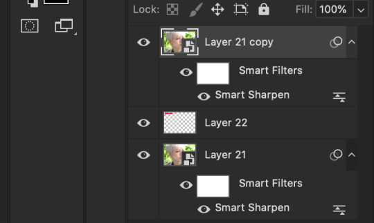
Now, right click on the top gif layer and select CREATE CLIPPING MASK. it should put a little down arrow to the left of the picture, toward the paint layer. This means the gif is ONLY visible where that paint is now.
So we’re going to click on FILTER in the TOP menu again (while we still have that top gif selected!) and Go to BLUR > GAUSSIAN BLUR. a pop up menu will appear and you can just drag the radius until the text is as blurry as you want it to be. (also IF you missed part of the text, you can just go add more paint to your paint layer and it will blur wherever you paint!)
so now my gif is like so:
So now we’ll color him, because he’s pretty washed out.
ADJUSTMENTS
This is where I’m going to be the least specific about what I do and more about what tools do, so that you can learn how to color things the way you like them!
The Adjustment tab on Photoshop has 16 options but I’m really only going to talk about 6 of them. We’ll do it in order though. All the actual adjustment tools will open in the PROPERTIES tab
Brightness / Contrast - Pretty self explanatory, but definitely should be toward the end of your coloring, as if can effect the quality a lot. Small adjustments do A LOT so don’t go crazy,
Levels - Levels is all about the balance of how dar or light your gifs will be if you adjust in the RGB layer it will adjust for the entire image, but if you change the selection to RED/GREEN/BLUE it will adjust just those colors hues. Also there are three small droppers to the left of the graph. using those you can select which part of the gif you want the image to recognize as the lightest/darkest part of the gif, and the tool will adjust the gifs coloring to that point. ( play with those droppers! magic happens i swear!)
Curves - Kind of like levels but instead of how light or dark the entire image is it works more on contrast. REALLY play with the curves options, i’m sure most things you can do with other tools can also just be done in curves if you’re patient enough to learn
Vibrance / Saturation - Vibrance will make duller parts of an image higher contract and brighter and saturation will make everything a more neon shade. or in reverse lowering vibrance will dull out the things that were already neutral and saturation will dull out the more vibrant parts of the image (usually reds)
Color Balance - Good for fixing tones. so if a live stage is SUPER BLUE!!!!! you can readjust and calm down the blues to dull them out or get rid of them completely. Again play with this its insane what it can do
Selective Color - adjusts the different colors in your image without touching the other colors. if you wanna touch the reds, make them pinker but not change the blues and greens, you do it here
If you want MORE drawn out explanations of what each of the 16 adjustment layers do here and here are actual articles you can look at. But it’s all about practice. playing with all the adjustments alone and together. Finding out what you like to do!
Now when you gif is ALLLLL colored and you’re ready to save it we do FILE > EXPORT > SAVE FOR THE WEB and a whole new window of options pops up. I’ll give you two examples of how to play with those options and then we’re done!

keep in MIND tumblr’s gif limit is 10MB which is pretty huge now, but still watch your gif size!!!!
AND SAVE your done!

I hope this was helpful! Let me know if you have any questions,again I’ll have an ask tag for it and it’ll get linked HERE if people end up needing help!
Happy giffing!!!
#drm.pst#drm.txt#Gif tutorial#this is LONG okay please be aware of that before you open it#als i did NOT reread it because it took me 3 hours to type out so it's probably a grammatic nightmare#BUT i'm JUST under a new milestone so i'm gifting this early because i had the patience to do it today lmao
97 notes
·
View notes
Text
「 dsco class | recolor like a pro 」

I never really recolor, and if I were to be honest, the only items I ever recolored were ones I released in my downloads. I don’t know if people are aware of this method, but personally, I like to bake shadows onto my meshes, so you will find that if you do recolor my meshes, you might lose said shadows if you are a beginner at photoshop (which is totally fine!)
Fair warning, I never looked up recoloring tutorials so I don’t really know if anyone’s ever taught this, but I just figured that this might come in handy to some, especially if they don’t have the time to message me for the psd of my meshes. If anybody is still confused, feel free to shoot me an ask or pm me here on tumblr or through email so I can send high quality screenshots if needed ([email protected]).
more tutorials here.

step one: making the diffuse map gray
First step is to, of course, export the diffuse map from s4studio. I am using this tiered tray I made for a commission as an example. When choosing which diffuse map to export, pick the simplest or most plain one. Unfortunately, I don’t know an easy way on how to convert a patterned diffuse map into a plain one (ie. shadowed wooden map to shadowed plain map).

pictured above: exporting the diffuse map
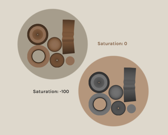
After exporting, load the diffuse map in Photoshop. Once it is loaded, put the saturation of the map all the way down until it is only gray. If you do not see the Adjustments window (usually on the right side) then enable it through going to the tabs at the top of Photoshop, then click Window > Adjustments. Click the Hue/Saturation logo and decrease Saturation to -100.
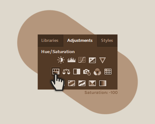
pictured above: hue/saturation button in ‘Adjustments’
This is completely optional but I like to merge both layers, just because it’s more convenient to have one layer. To do so, click on the diffuse map layer, shift + click on the Saturation filter, right click, and click ‘Merge Layers.’
pictured above: how the results should appear
An optional step is to increase or decrease the Brightness. Take note that if the gray is too dark, the color you want to recolor it to will be a bit darker, and if the gray is too light, the color you want will be lighter.
pictured above: sample results if the brightness settings were adjusted
Merge the Brightness filter with the Diffuse Map if you made any changes. And that should be it for step one.
step two: selecting the diffuse map
Add a new layer. Take note that it has to be above the grayed out diffuse map. This is the layer where we will be doing the recoloring.
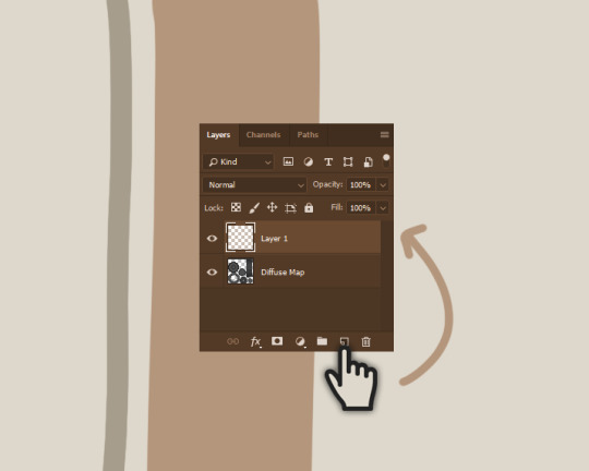
pictured above: how to add a layer
Next step is to hold CTRL while clicking on the IMAGE of the diffuse map, next to the name. This will select the diffuse map, minus the transparent parts. You have to make sure that the highlighted or selected layer is Layer 1, like the picture below, so that when you paint on the layer, the diffuse map will remain untouched.
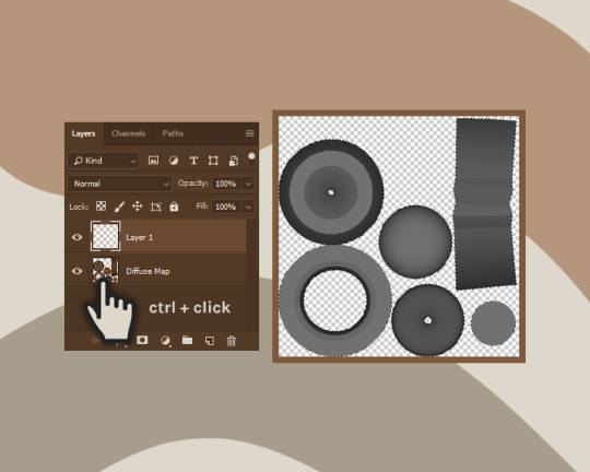
pictured above: the diffuse map now has broken lines surrounding the edges, meaning it has been selected
Here’s a tip. If you want one part of the object to be a different color, you can deselect everything except that part of the mesh by using the SUBTRACT MODE of marquee tools and/or the lasso tools that can be found on the left side, with all the other tools.

pictured above: types of marquee and lasso tools
step three: adding color with shadows
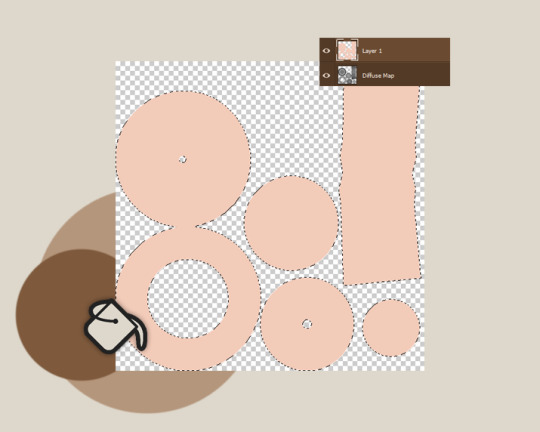
With the paint bucket tool, which you will see on the left side, you are now going to paint on Layer 1 by clicking anywhere on the layer. You will observe that it only painted within the broken lines. This is due to the selection of the Diffuse Map. After painting over it, you can now press CTRL + D to deselect the map.
pictured above: painted over the diffuse map in the new layer with pink
After deselecting and the broken lines are gone, the next step is to edit the blend mode to ‘Overlay.’ This can be done in the same box where you see the layers. You will see a little box that says ‘Normal.’ Click on that until the drop down menu pops up, and click Overlay. You will observe that the shadow have now been integrated to the color. You can change the color or adjust it however you want, as long as it is in a new layer with the Overlay blend mode applied.

pictured above: applying the overlay blend mode
alternative step two: clipping mask method
I don’t usually use this method because most of the time I use different colors on other parts of the mesh. But this is handy to use if you will be using a pattern (ex: wood, marble, etc.) to recolor the mesh with. For this I will be using a marble texture as an example. Load the patterned texture into Photoshop. To transfer the texture into the diffuse map page, go to the texture page and press CTRL + A to select the entire image, then CTRL + C to copy. Go back to the diffuse map page and click CTRL + V to paste. To resize the texture to fit the diffuse map, press CTRL + T to resize and stretch to fit the map.

pictured above: resizing texture to fit diffuse map
Once the texture map has been resized and is covering the diffuse map, the next step is to right click on the texture’s layer (not the image but the name itself), and select Create Clipping Mask, this will morph the texture into the diffuse map. Then apply once again the Overlay blend mode.

pictured above: clipping mask and overlay blend mode results
Save your recolor and import the new texture through s4studio. Repeat as much as you’d like.
pictured above: what the recolored object must look like in game
That’s it for this tutorial. Like I said, if anybody is still confused, feel free to pm or email me at [email protected].
126 notes
·
View notes
Note
Hi! I just found you through @revolutionaryduelist and I just wanna say 1, I LOVE your art, and 2, could I ask a lil’ about your art? What program(s) do you use? What brush do you use for your AMAZING lineart and how do you choose lineart colors?? What dark magic do you use to shade??? I find your use of color phenomenal! Have an amazing day! :-D
thanks for this nice ask! i use paint tool sai, specifically the anglicized version that you can find online.
lets draw bernie fire emblem and go through my process.
first off, my brushes.
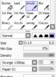
this is the brush i use for sketching, coloring, and cleaning. sometimes for highlights in the eyes or the rough first patch of shading, i also use ink pen, just the default settings.
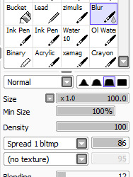
this is my blending brush. if you give it a texture, blending stuff wont look as boring as it otherwise might.
now, let’s draw bernadetta.
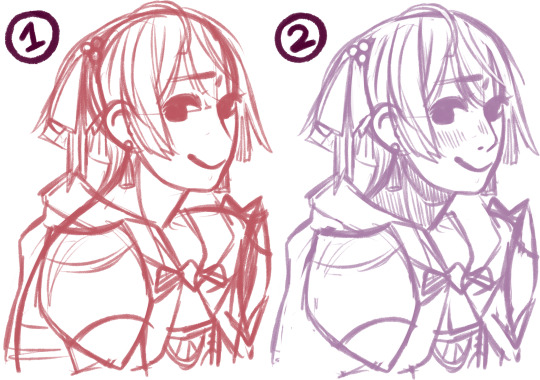
(1) first of all, the rough sketch. i start out with just shapes and then just keep going, all on one layer.
(2) then, i clean that sketch up a little - not too much, you dont need it to look perfect. i dont like drawing lineart at all, so this is what i work with - the sketch, a bit cleaned up, put on multiply. i change the color of the sketch according to what im drawing. for example, if i draw a character like inigo, whos got brown skin and hair, ill end up with yellow, orange or red lineart. if i draw a character during the night, ill use blue lineart. if its dusk, maybe a strong purple. you can change this later, as well.

next, below, i fill in the colors, usually about a layer for each color i use. i usually start out with the hair and end with skin, but it doesnt really matter. try to use colors that vary in saturation and brightness - if everything is very saturated, things end up looking blinding, but if everything is desaturated, it might be boring to look at. this isnt a hard rule, of course, but for this kind of normal illustration with neutral lighting conditions, its good to keep in mind.

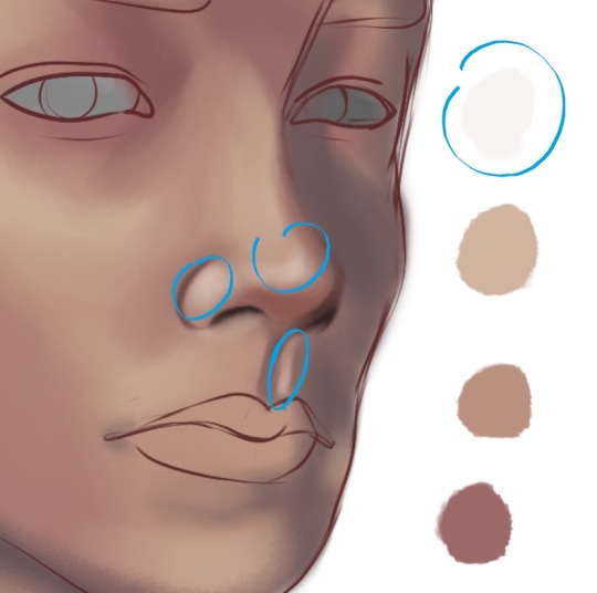
now, onto shading. here i used the ink pen for a moment. take your base color, in this case bernies purple hair. the highlight is less saturated, and moves up the color wheel, more toward a reddish tone. the shadow is more saturated, and moves down, toward a blue-ish purple. you can also make the highlight more saturated than the base and the shadow less saturated than the base, but i think its best to decide on one or the other. moving along the color wheel rather than just decreasing or increasing brightness will also help making the picture more vivid.
for hair and gauntlets, i just put on the shadow and highlight and blend it out with the blend tool. for skin and fabric, i use a different method.

first, add blush. blush should be far more saturated than the skin color. i added a touch of deep red in the middle as well for depth. this should be blended.
the shadows on the skin, however, i fill in with ink pen. some parts of this need hard lines, like the outside of the ear shadow, the lower side of the nose shadow, etc. you dont just want an airbrushed look, but a defined line. for this, i use a shade that is slightly more saturated than the base color, but not as saturated as the blush.

then, i add a lowlight color to make the shadow feel more dynamic and interesting. you can go many ways with this - if you check the coat in the next few images, youll see that i used a less saturated color to counteract the very orange shadow. in the case of her skin, i used a more saturated color that is very pink to mimic her hair. i cant really explain this step well, because most of the time, i get to that shade through experimenting.

blend some of the lowlight, but make sure not to ruin the harder lines of the shadow. i did it on the same layer as the base color because im lazy, but you could easily make a clipped layer, add the shadow, and then preserve opacity to make sure everything stays clean. for my purpes it doesnt really matter though since ill be going over the whole thing during cleaning again.
in the circled areas, i took the blush color and gently airbrushed some on for depth and warmth.
heres the rest of the shading. as i said, i used a less saturated reddish tone for the lowlight in the cape. for the bow and cape, i opted out of highlight, because i imagine them as made out of a sort of thick, unreflective fabric.
now, all thats left to do is clean! i make a new layer atop everything, zoom in a bit, and go over it all with my brush and the eyedrop tool. a lot of my WIPs look like this, with a part of it very crisp and clean and most of it still sketchy and vague lol. colordrop from everywhere, and create something nice!
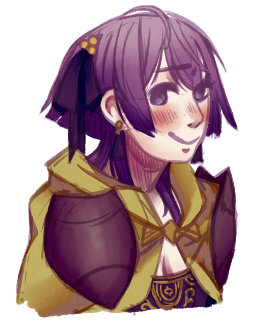
in the end, this is the finished picture! i turn the blend on my brush up and down depending on what im doing and what i need. the cleaning process takes the longest by far.
anyways, i hope this was helpful. if you have other questions, feel free to ask ‘em.
#art tips#is the tag i used for a similar ask before i think#anyways today i drew bernie just for this lol#t1mmytim#long post
191 notes
·
View notes
Text

STEP 1 - NEW ICON
Create a new canvas in Photoshop that is 150 x 150 pixels.
STEP 2 - IMAGE PREP
Select the photo you want to use. Photos of one or two people/things work best (For this tutorial I chose a photo of Eleanor from The Good Place!). More than that and the details will be too small to see once you upload the icon. Open the image file in Photoshop and then copy and paste it onto the canvas you created in Step 1.
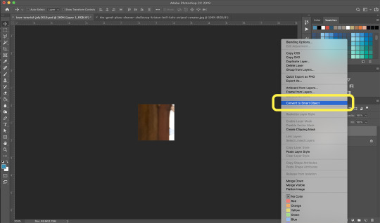
STEP 3 - SMART OBJECT
Right click on the image layer and click “Convert to Smart Object”. Select Edit > Free Transform from the top bar and drag the corners that appear until all of your image is visible in your little icon canvas.
Smart Objects are layers that contain image data from raster or vector images, such as Photoshop or Illustrator files. Smart Objects preserve an image's source content with all its original characteristics, enabling you to perform nondestructive editing to the layer. In this case, they allow you to make edits to a larger version of the image in your icon that will then apply to the small icon canvas instead of shrinking the image and loosing a lot of the detail and editing capabilities.
STEP 4 - BACKGROUND SELECTION
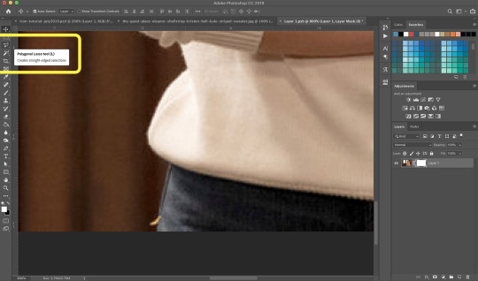
Double click on the layer thumbnail and a new Photoshop window will open. This new window should contain a copy of your image. (Tip: Make sure to close the original image file in order to avoid confusion!) Zoom in to around 800% magnification and select the Polygonal Lasso from the toolbar to the left. Slowly and carefully use the Lasso to select the edges of the person/thing in the image. If the selection isn’t perfect, don’t stress! You will be able to edit it once you do the next step.
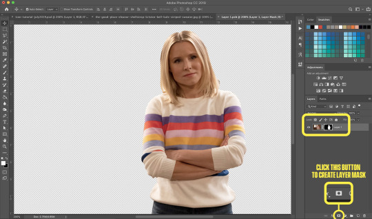
STEP 5 - BACKGROUND REMOVAL
Once your selection has been made, click the button at the bottom of the layer panel that looks like a rectangle with a circle inside. This will create a mask on your image layer and remove the background (as seen in the example).
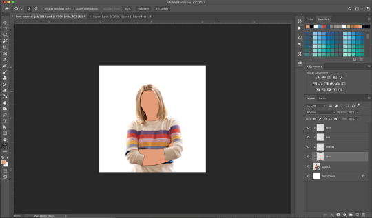
STEP 6 - CLEAN UP
This is where the mask comes in handy! In the layer panel, make sure you have the mask selected and not the layer itself. Use the Brush Tool (I use a regular round brush at 100% hardness) to soften any edges or remove parts of the background you missed. You can use either black or white to remove or add to the mask. This will cause parts of your image to disappear and reappear, depending on how you want it to look. In this case, we want to isolate the person in the image by removing the background.
Save the layer file and the changes should apply to your icon file as well.
STEP 7 - COLOURING
I will usually colour icons one of two different ways, depending on the quality and lighting of the photo. For dark, crappy screen caps, I go with the colouring in STEP 7-A. For nice, high-res photos with good light I go with STEP 7-B.
STEP 7-A
For dark, crappy screen caps
Brighten the image as much as possible using Layer > New Adjustment Layer > Brightness/Contrast.
Create new layers for skin, clothes, hair, and face - 4 in total. Select those layers, right click and select Create Clipping Mask so you don’t have to worry about colouring inside the lines.

Zoom in to around 600% and use the Polygonal Lasso to select the skin. Fill the selection using the Brush Tool with a skin tone that will match the character(s) in the image. Here is an example of some you could use: https://www.color-hex.com/color-palette/547 Set the blending mode of the layer to “Colour”.
Do the same for the other three layers, using colours that will match their hair and clothes. For the clothes layer, I use the background colour so it matches. On the face layer, I subtly colour the lips, cheeks, and eyes.

Tip: I will often choose colours that I know will be too saturated and adjust them later using the Hue/Saturation panel. It’s easier to see what works once everything is coloured in.
STEP 7-B
For nice, high-res photos
Unfortunately, I have no set values to give for these. I mess around until the photo looks the way I want it to and every image is different. What you’re aiming to do is bump up the vibrancy of the colours in the image so they really stand out at such a small size. Pay attention to the background colour you want to use for the icon and make sure it blends well.
Create the following layers and adjust to your best discretion:
Layer > New Adjustment Layer > Brightness/Contrast
You want a fair bit of contrast so the details stand out, but be careful not to wash out the skin or lighter colours of the subject
Layer > New Adjustment Layer > Colour Balance
If an image is too red/yellow/blue looking, you can use this to even it out
Layer > New Adjustment Layer > Selective Colour
Make adjustments to the Black, Neutral, and White sliders to impact contrast; Red, Magenta, and Yellow sliders will usually help even out skin tones
Layer > New Adjustment Layer > Vibrance
Fiddle with the Vibrance toggle and not the Saturation one as the effect is generally too intense and looks cheesy

STEP 8 - BACKGROUND
Add a background colour of your choosing by clicking Layer > New Fill Layer > Solid Colour.

You can use a solid colour or add textures/patterns, depending on the look you’re going for. I often go to unsplash.com and search for things like “light texture”, “watercolour” or “grunge texture”. I don’t like using Google search for this because you can almost be guaranteed you’ll be stealing a texture made by someone else, but everything on that site is free to use! Experiment with different blending modes and textures. You can use more than one and try moving it above the photo as well for different effects.
If you want to use a solid colour but feel it looks too flat, create a blank layer and use the Brush Tool in white (#FFFFFF) at around 230px/0% hardness to make a halo behind your image. Set the layer to “Soft Light” for a subtle glow.

STEP 9 - SHARPEN
The final touch - Copy the canvas by clicking Command/Ctrl + A, then paste it as a new layer by clicking Command/Ctrl + Shift + C then Command/Ctrl + V. Select Filter > Sharpen > Smart Sharpen
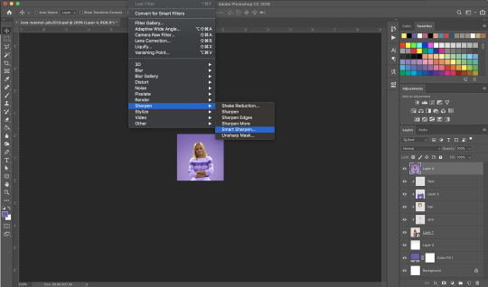
and set it up like so:

Save the icon as a .png file by clicking File > Save As. Aaaaand you’re done!
I wish I could be more specific about certain steps, but what I do changes a lot from icon to icon. Hopefully this helps! I’m here if you have any questions. :)
47 notes
·
View notes
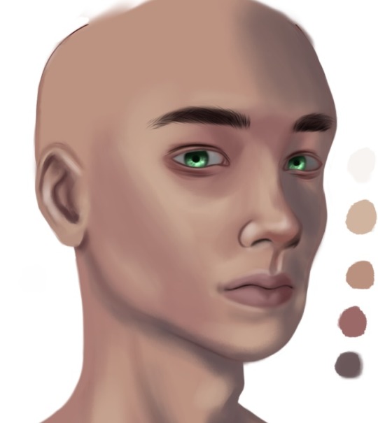
Photo
Hey guys! I’ve decided to make a “how I paint skin” tutorial. It is quite a detailed step by step tutorial so strap yourselves in for this one! Also, it’s step by step because I want to teach you how to pick your own skin color palettes and shading, and take no shortcuts!! This will go a long way, guys!
Just a disclaimer: I am no expert in painting skin realistically but these are just different things I’ve picked up from my fav artists and tweaked them to suit my style.
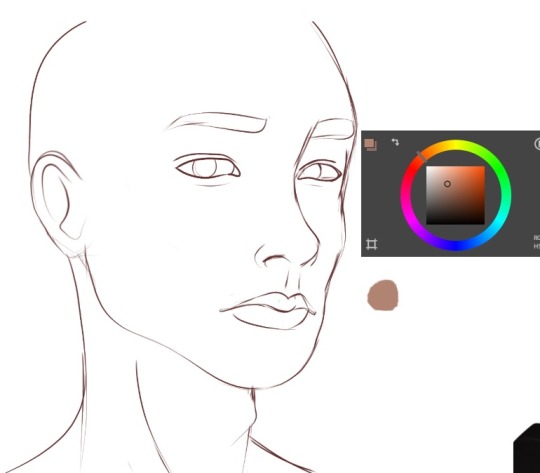
1. First step is to make your sketch. I suggest that you also use a reference of a real person for this practice. References help a lot! Don’t be afraid to also use the eyedropper tool as this will teach you a lot about skin color palettes!
(I know my ref image is not a real person, shush. XD He still looks realistic enough. Haha.)
2. Now, usually, I will duplicate the sketch layer and paint it dark red. I will turn off the original sketch layer and use it for back up later just in case we need it.
Okay! Let’s get started with picking your color palette! I pretty much don’t have a standard skin palette as I’m someone who likes to do things from scratch and then just go with the flow. I’ll go through more on that later on in this tutorial.
I usually start with this kinda desaturated orange. This will be our base for now.
3. Now, this next color will be, I would say the slightly lighter parts of the skin (but not quite the highlights). This color will slightly be even less saturated compared to the previous color.
Also, it will be more towards yellow.
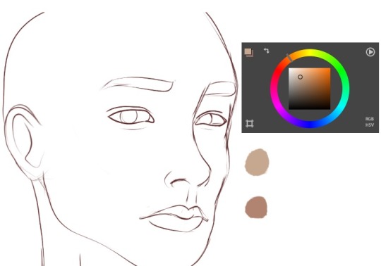
4. Next color is the highlight. This is pretty much close to white and ever so slightly to yellow.

5. For the dark shadows of the skin, there’s two types: The more reddish tones and the more ‘bluish’ tones.
For the red ones, I would put my color wheel closer to red and darker than the base color.
6. For the dark cold shadows, I will move the color wheel even more closer to magenta and then make it very desaturated, almost like a gray.
Quick Summary:
Here’s a simple annotation of what my color picking looks like most of the time for a normal portrait with normal lighting.
As a rule of thumb, the dark shadows and highlights will be almost desaturated, and the base color is the most saturated.
7. Alright. Now, let’s make a new layer below the sketch layer. Paint in the base color.
8. Now, personally, since I want my character to have a fairer skin, I think my base color is a bit too ‘tanned’. This is why I say, I tend to just go with the flow and not always use a fixed skin palette.
But anyways, I will just desaturate it a bit (remember, the lighter the skin color, the more desaturated it will be).
Then, I just increase the brightness a bit.
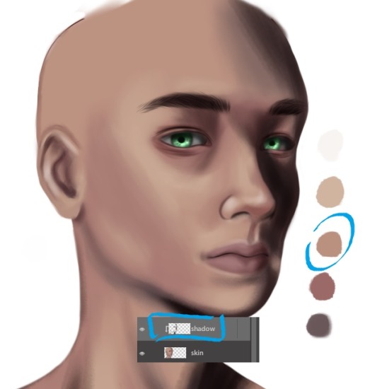
9. Let’s start with painting the dark red parts. These are the parts where you can see the blood underneath the skin more visibly. So, around the eyes, below the cheeks and at the tip of the nose. Not the cast shadow of the nose, though!!
10. Now, let’s paint the cast shadows. Cast shadows tend to have that cold bluish shadow we picked out just now. So like below the neck, below the nose (or any cast shadow from the nose).
Over here, I feel like the tone is a bit too bluish and almost too light (since we did increase the brightness just now).
After adjusting the tone:
So, I will just adjust is a bit to be darker and maybe slightly a bit more red. Isn’t it weird how it looks cold but if you use the color picker, it’s actually in the reds? Skin colors be crazy, y’all. Our eyes like to play tricks with us. -.-
11. Now, that I’ve adjusted the cast shadow color, let’s start painting over the shadows.
12. Now, paint in the lighter color from the base color over the cheekbones, the bridge of the nose, chin, and above the eyebrows. Please refer to your reference for this!
13. Let’s start blending. Now, I have made my own blending brush here. It kinda creates a textured skin look. You can play around with ‘jitter’ or ‘spacing’ in your program to get this kinda texture.
As I go along, I will add in more shadows where I see fit. For example, my character is a male, so he has more cast shadows below his eyebrow (around his eye socket). I also use a gray to paint in the eyes.
14. This next step is gonna be a bit scary for some of you especially if you’re a beginner! And that is merging your sketch layer with the colored skin.
But don’t be afraid and just try! Remember, we still have the original sketch layer that we kept. So in case you want to revert, you have that layer to copy again.
Anyways, here, I will use a softer round blending brush (not one with jitter) and just blend in the sketch layer softly.
Again, adding more shadows and form as I go along. Like over here, I’ve used a darker red for the bottom of the tip of the nose (remember, the tip of the nose is red!)
I’ve also used the highlight color to add in the very bright highlights (sorry it’s a bit hard to see in the pic cuz it’s almost white like the canvas!) but at this point, we still want to keep it very soft and blended. We will add in the details later. There’s highlights at the tip of the nose and the side of the nostrils, for eg.
QUICK TIP: Make a new layer with a medium gray color and put the layer mode on “Color” or “Hue”. This will allow you to check the values quickly.
As you can see, I still have a lot more dark parts missing.
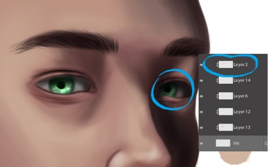
When I’m going to add darker tones, I tend to put them on a new layer and change it to “Multiply”. Making these type of changes on a new layer will allow more flexibility without you ruining the base painting.
This is what my drawing looks like now after all the touching up. I’ve colored the iris and brows too (on a new layer).
15. This is where I will add in the shadow. Do it on a new layer and use a clipping mask so it won’t go outside your base. I’m also using the base color but put the layer mode to “Multiply” to really darken it.
16. Remember to do it for the iris as well, if need be!
17. Now, time to put in the sharper highlights! These highlights are usually around the eye lids and eye corners (near the tear ducts), nose tip, cupid’s bow, lips, chin.
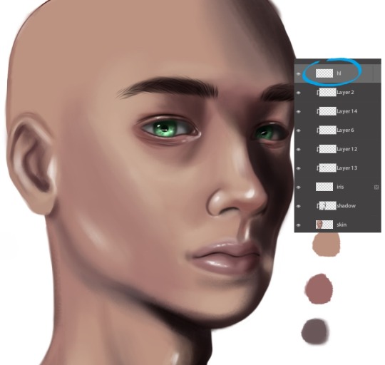
18. Next, let’s add some details. Do this on a new layer and put the layer mode to “Multiply”. You can also use this as a clipping mask onto your base layer.
The brush I use has a spotted tip. And then just use jitter or huge spacing to really spread out these dots. I mainly paint these over the cheeks and the forehead.
19. Make another layer and using the same brush, just make it bigger so the spots look bigger. Use a soft eraser to erase some of the freckles/blemishes.

20. Lastly, go back to your highlight layer and using that same brush, just brush over the cheeks and chin where the light hits.
21. Do some final adjustments. Like, again, I feel like my character needs to be a tad bit more pale. So what should I do?
(Correct answer: Desaturate the color and brighten it overall.)
Remember, the lighter you go, the less saturated the color should look! Also, remember that shadows are also desaturated!
And that’s it! I hope you learn something new today in terms of coloring and shading. :)
28 notes
·
View notes
Text
lyndsey’s first ever gif tutorial!!!
hello world, it’s me, lynds! by request, I’m gonna walk you through how I make my gifs! I’m going to just show a basic gif tutorial (like the one below). This tutorial will walk through the steps of getting the footage, creating the gif, editing it with some minimal coloring, and then exporting! :) let me know if you have any questions, I hope you enjoy!

I use the following programs:
Photoshop CS6 (mac download tutorial)
QuickTime Player
let’s get started!!!
step one: find what you want to gif
For me, my first stop is almost always netflix. I make supernatural gifs, and I am lucky enough to have 13 seasons right at my fingertips. But Lyndsey, how do you get netflix video onto your laptop?! Well, that’s where QuickTime Player comes into play. For purposes of this tutorial, I’m going to gif a nice little family hug from episode 12x22. So first step, find the part you want to gif and pause the video about 10 seconds before you would want your gif to start, and make it full screen . Like so:
It’s important to start the recording before the actual first gif frame because you want all the extra things to go away (the play button, the rating that pops up in the right corner, etc) before you get to the actual moment you want to gif.
step two: begin recording
Open up QuickTime Player. On mac, it should pop up in your toolbar. A quick trick I use is to do a spotlight search (Command + Spacebar) and search for Quicktime Player. This will begin to run the program. Two finger click on the icon, and a small menu will pop up. It should look like this
Select New Screen Recording. A box should pop up on your screen that looks like this:
Click the red record button. Another box will appear that looks like this:

Click anywhere on your screen and boom! Your laptop is recording your entire screen! Now you can swipe over to your browser tab and it will continue recording your show as you watch! Make sure you move your mouse so all those annoying menus and things go away and it’s just the show on your screen.
Once you have finished recording the whole part you want to gif (make sure it’s short!!), swipe back over and open the menu again. It will have changed slightly to look like this:
Click on Stop Screen Recording. A box will appear where you can play the video you just recorded. Now, click the red x to exit the window that just appeared (trust me on this one) and it will bring up a new box like so:

Title your clip whatever you like and save it wherever! Now you have your clip! Hoorah for you, you’re doing great!!!
step three: getting it into photoshop
Now we’re ready to make our actual gif! Yay! Open up photoshop and then click on File -> Import -> Video Frames to Layers like so:

A new window will pop up where you can browse through your files. Go find the video clip you just recorded and select it. Now, your screen should look like this:

I always select the “Limit to Every 2 Frames” option to fit more content into my gif. I also toggle until I find only the part I want to gif (since we had to record a little extra to get to rid of the menu bars and such. Do this by dragging the small, dark pieces below the gray line until the image you’re looking for pops up on the little mini screen. Make sure to do both sides! Then, press okay!
step four: finding duplicate frames
No technology is perfect, but photoshop is far from it. Often, there are duplicate frames in gifs, which makes them look choppy and sad :( So, after completing step three your screen should look like this:

All the little boxes at the bottom are frames, while the list on the side are the layers. We’ll worry about the layers later. For now, click through each individual frame one by one, and if you find a duplicate, delete it (click the little trashcan below all the frames)!
tip: I’m not sure if this is universal, but in my program, every fifth frame is a duplicate. idk why. but, I can go through and delete frames until one of the duplicates are on a multiple of 5 (i.e, frame 15 and 16 are the same) and then I select all the ‘5′ frames (Hit command and click frame 15, then frame 20, then frame 25 and so on and so forth). It minimizes the constant clicking. But, this might be confusing to some, so if it doesn’t make sense, just click through and delete the duplicates!
step five: cropping
Now that all those pesky frames are gone, it’s time to crop! Select the crop tool from the side toolbar (it’s selected in the next frame) and drag until you’re satisfied with what you have!
tip: for individual gifs, it doesn’t matter too much, but if you’re doing gifsets, they need to all be the same size. I recommend using one of the preset ratios, which you can find if you click on “unconstrained” in the top left hand corner
Now, it looks like this! Double click and it will crop the image to the selected size!

step six: coloring
Now comes the fun part! Coloring/Adjustments! For me, I usually up the brightness, lower the contrast and lower the saturation. I will post the settings I used below:


Make sure these layers are above all your other ones (you can drag them up to change the order). This is totally up to you! Click the buttons and mess around, see what they all do! You can always delete the layer you created and your gif will go back to normal :)
step seven: frames per second
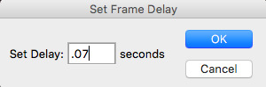
The final step before export for me is to change the frames per second. By default, mine go to .02 seconds, which is much too fast. The frame rate is shown at the bottom of the frames. I usually set my gifs to .07 seconds. The easiest way to that is to select all frames, by clicking on the small menu on your timeline (the little three lines with the arrow in the top right corner)

And then select “select all frames” from the menu. This will highlight all your frames! Next, click on one of the arrows (next to the timestamp) on any of your frames. A window will appear like so:
Click on “other...” and type in “.07″
Now we’re ready for export! Woo hoo!!
step eight: export
This is the most tedious, and my least favorite part of gifing. Sigh. Anyways, first you will go back to file and open the menu, then select “Save for Web”

The next page it will bring you to is very important:

The most important part of this window is the GIF size, shown here:

Tumblr has a gif size of 3M, so obviously this gif is way too big. Never fear! It’s time to change the image size. If you just change the width, it will keep your gif in proportion and minimize the size. I changed my width to 475px, and now we are at 2.763M, which means we’re good to go for tumblr!

Now, it’s time to save! it will automatically save as a .gif file, and you’re golden! time to upload your beautiful creation to tumblr!

I hope you found this helpful, please like it or reblog it if it helped, mainly so I don’t feel like I did all this for nothing haha. Happy gifing everyone!!! -lynds
#here you go beans!#hope this makes sense#please feel free to ask questions if you have them!!!#gif tutorial#my gifs
42 notes
·
View notes
Photo
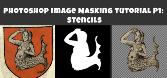
Photoshop Image Masking Tutorial Part 1: Simple Layer Masking to Image with Alpha, for Stencils and Overlays
As promised to a few people now, here is a (probably overly long) tutorial on masking in photoshop. Masking is where you use another image to show what parts of the main image you want to be visible and which parts invisible (or transparent). White = visible. Black = invisibile. Gray = various degrees of transparency. Alpha layers in DDS images do this for the entire image. Masks of individual layers do this for individual layers. This is a really really helpful skill for making textures.
This is all aimed at people who enjoy using Photoshop but are primarily beginners at it. I think I can safely say that masking is a “hump” skill for people who are otherwise pretty handy at Photoshop. I’m told it is a tricky thing to learn and an easy thing to forget, and it doesn’t help that there are several ways to approach it. This is the way I learned that actually stuck for me, so maybe it will make sense for you, too.
Part 1 (below) walks you through how I do overlays/stencils with transparency, from an image that is NOT neatly clipped.
Part 2 will cover RGB masks.
Part 3 will be masking of paint layers and other things in Create A World.
Part 4 will be masking in World Machine.
Part 5 will venture away from masking to cover novel uses of CAW, World Machine, and Crazy Bump for making textures, primarily normal maps, for CC objects and CAS (yes really!).
This is written for TS3 modders, but TS4 and TS2 modders might find it useful as well.
Skills covered:
Select --> Color Range, Inverse
Edit --> fill
Image --> adjustment --> Hue/Saturation(/Lightness), Brightness/Contrast
Filter --> Blur --> Gaussian Blur
Layers: New Layer, Merge Layers, Delete Layers, Mask Layer, Apply Mask
Channels: Edit Mask of Layer, Create Alpha Channel, Edit Alpha Channel
Save as DDS with transparency, Save as PNG for opening in Gimp with transparency
Importing into TSRW stencil OR package file via S3PE
If you already use photoshop, you probably have done some form of creating layers with transparency. You may have selected a portion of your image and copied it, or erased everything but the parts of your image you want. That is all VALID, but working with masks instead has two advantages: first, it is non-destructive. Your image remains intact in case you delete something you might want later. Second, you can make softer transitions with greater detail than is ever possible from hand selecting or using the magic wand tool.
To begin, you can open your image directly in photoshop and just start working with it as is, or if you prefer you can copy it over to a document of the right size for your final texture (ie. 1024x1024 at 72 px per inch ARGB). You might want to do that if you already have other elements of your texture going on, but if you edit this image separately you don’t risk accidentally messing up your existing work. So:
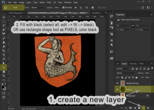
1. Open your image. In Layers, right click your background to create a copy. Please leave the background layer there for now, or make a second copy to save for later. You need TWO layers with your image in, because the layer we are working with is going to be transformed into a masking layer.

2. I’m aiming to isolate the mermaid. I definitely don’t need any of the beige background and I don’t care about the shape of the shield, so I’m just going to use the marquee tool to select the areas I don’t want and delete the. I select the area I want to keep, then go to select --> inverse selection to select the surrounding areas. I can then hit delete and place a black layer underneath to merge down on OR I can go to the edit menu --> fill --> black. The goal here is to gradually make the areas we don’t want BLACK and the areas we do want WHITE.


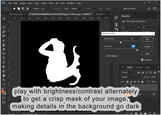
3. We now have our mermaid on the red shield sitting surrounded by black. This is a pretty good image to work with because what I want to isolate is a different color than the part I don’t want to keep. I’m going to now use the select --> color range tool to select red, and then the hue/saturation adjustment to make all of the red go black:


If you haven’t already merged your image with a black background, you can do that now.
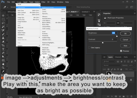
4. Before proceeding, make sure your image is entirely desturated (in grayscale). If you haven’t already, go to image --> adjustments --> hue/saturation, and drag the saturation levels all the way down. Now we go into the Image menu --> Adjustments --> Brightness/Contrast and start playing with these to make the area inside the mermaid as white as possible and the areas surrounding the mermaid as dark as possible. I find it helps to adjust brightness first to bring the areas I want to go to white above a 50% gray and then use the contrast to drive those values apart. This might sound weird, but just play around, and you will get the idea.
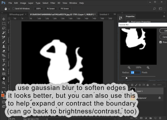
You likely will find that the image has too much detail. The scales on the mermaid I don’t want to be transparent. I want those dark details on my image to show! So, I go into Filter --> Blur --> gaussian blur to help make those details more light gray. This also make the white outline leftover from the shield shape darker by blurring the surrounding black into it.

I can then go back into brightness/contrast. You can jump back and forth between the two tools until you get a nice, crisp mask.
You can then go back into gaussian blur one more time to make the edges a little smoother.
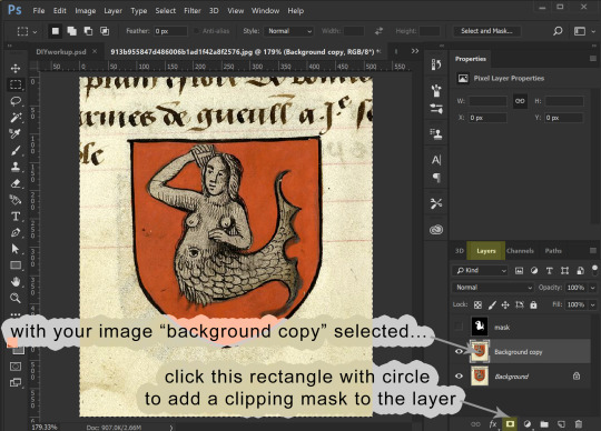
5. I now am going to copy this black and white image and add it as a masking layer of my original image. You need to be working with a copy layer of your original image. This will not work with the background layer (unless you want the mask to be the alpha of the entire image).

You have your black and white “mask” layer copied. Now you select the layer with your original colored image and add a masking layer to it. From within the Layers panel (really important to be in the Layers panel, NOT channels) click the rectangle with the circle in it. This will add a masking image to your layer.

For that layer, click the channels panel, then click the “eye” visibility to the left of each channel to turn off the visibility of the RGB channels and turn on the visibility of the Mask channel. Select the mask channel and paste your mask image into it. Click back on the “eyes” to make everything visible, then go back to the Layers panel to see your image, now transparent because of the added mask. Note that from within the layers panel you can select either the image or the mask (the little “link” symbol in between can be turned on and off to link them or not, but you can ignore that for our purposes.)
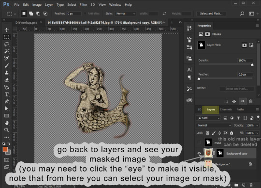
6. Now we are going to edit the mask. I like to make a layer of a contrasting color to my image and place it underneath, so I can better see what the mask leaves and keeps.

Making sure your layer with your masked image is selected in the layers panel, go back to the channels panel, and select the mask channel to work with. You can leave the RGB/red/green/blue channels enabled and edit the mask directly, using either brightness/contrast OR a paint brush with black or white color. As you paint black on the mask you will see this “erases” the image (but it isn’t actually erasing the image, just adjusting the mask).


Playing with brightness will push the boundaries of your mask in and out, and contrast will make the boundary crisper. You can always adjust the layer with blur, too.
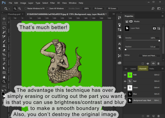
7. OK, cool! The mask is how I want it. Now I can prepare it for use. At this point you only need the layers with your image and its mask.
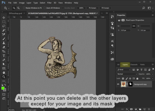
Assuming that you now want to transfer this image elsewhere and perhaps edit its shape to fit something else, you can then right-click the mask and select “apply mask”. This will delete the parts of your image that are masked out. Now you can copy your image and past it wherever you want it to go.
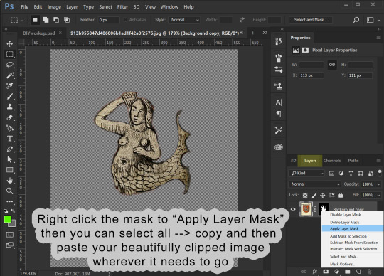
8. I’m making an overlay for a banner deco object. I already have a template made showing me where the banner is. I past the image into it and adjust its shape to look how I want.

9. Once you have it looking how you want, the final step is to prep it for saving as a DDS file. Assuming your image is the correct size (ie 1024x1024), we are once again going to use our image to make a mask. Only, this time, it already is at the correct opacity and transparency. So, duplicate your image. You can also at this point create a solid black background layer underneath it (new layer, fill it with edit/fill or with a the rectangle (pixel) tool). Choose one of your two image layers to make the new mask from. Select that layer, and go to image --> adjustments --> hue saturation. Drag the lightness ALL the way up (+100). You will see all of your image turn white. Click ok, then merge your all-white image down onto the black layer! Presto! This is your image mask again, only adjusted to fit your final image. In fact, this is what is going to become the mask of the entire image, the Alpha channel.


In my example below I’ve renamed that layer “alpha”. This does NOT make it the alpha channel, it is just to remind myself this layer will become the alpha channel. Now I make a layer behind my primary image filled with a color that matches the overall hue of my primary image. The point of this is so that any transparency created by the alpha layer will catch this color instead of filling it with white. You can then merge your primary image down onto this color layer, making it a solid image with no transparency.
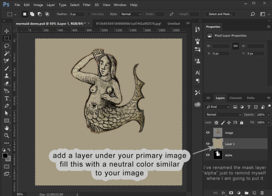
Now we COPY your “alpha” layer in its entirety, and go back into Channels panel. At the bottom of the channels panel, click the “new channel” (same image as “new layer” in the layers panel. This now creates the ALPHA channel for the ENTIRE IMAGE (not just whatever layer). Make sure that just the Alpha channel is selected and paste your copied “alpha” layer into it. Make sure that your entire image is still visible when the RGB channels are all visible.
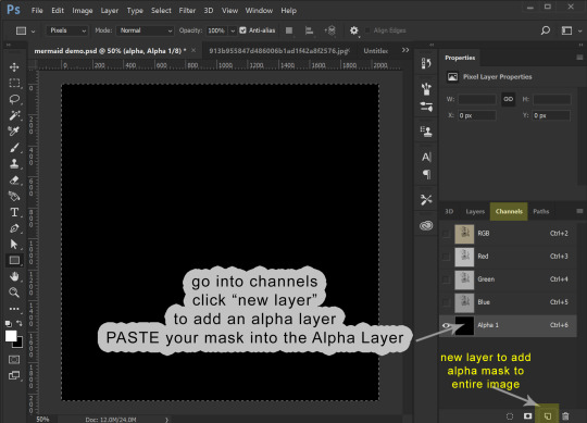
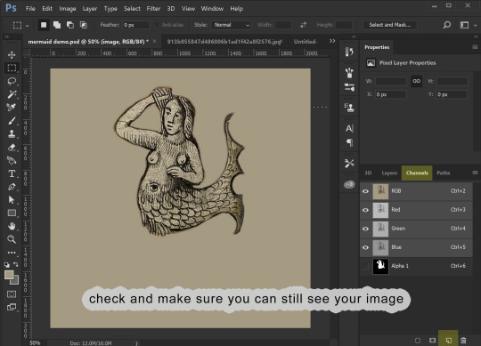
10. We can now save this image. (If you don’t have the NVIDIA plug in or it doesn’t work for you, you can use this plugin: https://software.intel.com/en-us/articles/intel-texture-works-plugin OR you can save the image as a PNG with transparency and open it in GIMP to save it as a DDS. JPEG formating does NOT carry the Alpha channel transparency!). The correct format is DXT5 ARB 8 with interpolated alpha. You can name it whatever you want.
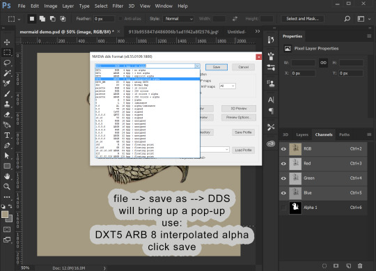
11. To use this stencil in TSRW, simply open up your project, go to the texture variation you want, go to stencil, and import the DDS image. You could also import it as an overlay.

To import it is a default override of an image for an object you have as a package, open the package in S3PE (clone it first with S3OC if you want to make a NEW non-default object) and then right-click the _IMG you want to replace, select replace, and then navigate to your saved image. S3PE will automatically change to file name to whatever the name of the image you are replacing is. And that is it!
Alternately, you can use Texture Tweaker to create new texture variations and add new stencils. But, I’m not going to explain that here.


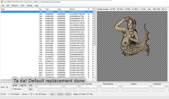
That is all I’ve got for now!
29 notes
·
View notes
Text
Updated gif-making tutorial:
making and using actions to make hq gifs quickly and efficiently, watermarking, adding text/subtitle, sharpening, coloring for natural base coloring on videos
I do not use .ts files for kpop performances (just .mp4 720 or 1080), nor do I use topaz to sharpen.
You will need:
A computer (I use a PC so the hot keys i’ve listed aren’t the same as on macs)
A video editing program that can split your video into smaller sections (DVDvideosoft’s free studio is what I use, but anything similar will do)
Photoshop CS6 extended or a more recent version (you need to have the video timeline function)
a half hour or an hour to make your first set with all the actions specific to your blog url, afterwards full 4-8 piece gifsets should take around 15 minutes or less to make (if your computer is cooperating lol)
We will make actions to:
watermark
convert to timeline and smart object
add a text box with stroke and drop shadow for both 268px and 540px wide gifs for w/e font you want to use
video used // link to finished gifset // there are some images to help in the tutorial, you can ask if you have any questions!!
Result:

my sharpening action (directions in tutorial)
download
Full tutorial under the cut
after the first run of the tutorial where you make your actions, your process should be:
Cut your video into a clip short enough to import into photoshop
Import your frames
Split your frames into multiple documents, one for each gif in the set
crop and resize your gifs
Color your gifs
watermark (action)
convert to video timeline and smart object (action)
add text (action)
sharpen (action)
save for web
1. Cut your video into a clip short enough to import into photoshop:
For most youtube videos which are either 24fps or 29fps you can import up to 15 seconds at a time, for those that are 60fps the limit is around 7 seconds
2. Import your frames:
If you’re making gifs from a performance or a short drama scene, it’s faster to import all of your frames onto one document at once and then copy the frames on to multiple separate documents for the multiple gifs in the set
file -> import -> video frames to layers
make sure that the “Make Frame Animation” option is checked
3. Split your frames into multiple documents, one for each gif in the set
select the frames you want for your first gif (click first frame you want -> hold shift and click the last frame you want)
copy frames (go to the drop down menu for the timeline window -> copy frames)
duplicate any layer from the first document onto a new separate document (right click any layer -> duplicate layer -> document: new -> name the document “[your gifset name] [gif number]”
create frame animation on your new document (timeline window -> create frame animation) (if it says create video timeline instead, use the dropdown menu next to the button to change it to frame animation)
paste the frames onto this new document (timeline drop down menu -> paste frames -> replace frames)
change your frames’ timing (select all frames -> click the time under one of the individual frames -> other -> put your time) for 24 or 29 fps video I use .06; for 60fps I use .03
delete the frames from the original document, repeat for the next gif within the remaining frames on your original document

4. crop and resize your gifs
select the crop tool
chose your dimensions
crop all your gifs to the same dimension ratio
resize your gifs (ctrl + alt + i) for 3 columns it’s 177,178,177; for 2 columns it’s 268px, for 1 column it’s 540px
5. Color your gifs
I usually color to make everything as neutral as possible before doing anything specific so this is just telling how to make a neutral coloring.
make a curves layer on top of all your other layers (layer -> new adjustment layer -> curves)
color adjust for black click the black eyedropper on the curves layer and then find a spot on your gif that should be black and click it (if it becomes too dark, hold alt and click on a spot that comes up black until most of the image is now white) (image below)
color adjust for white do the same with the white eyedropper (if it’s too light, hold alt and click the white areas until the image is mostly black) (adobe’s tutorial to help you out if you need)
make a brightness/contrast layer (layer -> new adjustment layer -> brightness contrast) and add a little bit more contrast depending on your image
add vibrance (layer -> new adjustment layer -> vibrance/saturation) boost the vibrance slightly
(personal taste to make skin tone clearer and the whites of eyes brighter) make midtones warmer; highlights and shadows cooler (layer -> new adjustment layer -> color balance -> adjust layer according to your image)
brighten highlights and darken shadows (layer -> new adjustment layer -> selective color -> blacks: add black -> whites: subtract black)
group all your coloring layers together (select your coloring layers -> create group -> leave the name as “group 1″)
duplicate this group onto all of your open gif documents (right click -> duplicate group -> document: [your next gif file name] -> repeat for all)

6. watermark + recording your watermark action
people on tumblr suck, people on the internet suck, people on other websites suck, weheartit sucks, etc...... you want to have your url on the things you make so people don’t steal your work right?!! we’re gonna watermark EVERYTHING we make ever
(this is going to be the first action we make!! woo hoo!! you don’t want to have to be remaking this layer every time you make gifs do you)
making the action:
open your actions window (window -> actions)
create new actions set (click the icon that looks like a folder on the actions window -> name this set “gifs” or something else you’ll remember)
make sure you’re not on the first frame of your animation, any other will do
record new action (hit the circular icon on the actions menu -> name this action “watermark”)
select first frame of animation
create new text layer at the top left corner (click the text tool -> click the top left corner of your canvas)
type your url in an nice and easy to read font (I use myriad pro semibold italic at 9px height)
click the check on the text editing panel to finish making the layer
change the opacity to 30% in the layers panel
stop recording the action (click the square on the actions window)

using the action:
click the “watermark” action in your “gifs” action set
make sure you’ve selected your top layer (which should be your color group)
click the play button in the actions window (now your watermark is on your first gif)
duplicate this layer onto the rest of your gifs, always as the top layer
7: convert to timeline and smart object (action)
we’re gonna be making another action to this (yay less work for future us)
making the action:
before you make the action make sure you’re not on your first frame
record a new action, name it convert
select all layers (ctrl + alt + a)
deselect your watermark layer (ctrl + click the text layer named [your url])
select your first frame
convert to timeline (click the convert to video timeline icon at the bottom of the timeline window)
convert to smart object (right click your layers -> convert to smart object)
stop recording, you should be left with a timeline animation with two layers, one is the animation smart object which will now be named “group 1″ and the other is your watermark layer on top

using the action:
play the action (that’s all)
you should be left with a timeline animation with two layers, one is the animation smart object which will now be named “group 1″ and the other is your watermark layer on top
do this on every document for your gif set
8. adding text (action)
make the action for 268px gifs:
on a 268px wide document with a video timeline make a guide at 134px vertical (view -> new guide -> “134px” vertical)
start recording the action, name it “text 268″
create a new text layer on the guide at the top of the box, centered text, 12point font (I use myriad pro semibold italic with tracking at 50)
double click the layer, add stroke at 2px, add drop shadow
stop recording
make the action for 540 px gifs:
on a 540px wide document with a video timeline make a guide at 270px vertical (view -> new guide -> “270px” vertical)
start recording the action, name it “text 540″
create a new text layer on the guide at the top of the box, centered text, 12point font (I use myriad pro semibold italic with tracking at 50)
double click the layer, add stroke at 2px, add drop shadow
stop recording
using the actions:
use the appropriate sized action for what you’re making, play the action after steps 1-7 of your gif are done
use your text tool to put in the text for your gif
hold shift and click to slide the subtitle to the spot you want either at the top or bottom of your gif while keeping it centered
9: sharpening:
everyone sharpens differently, so you might want to change this up a bit and make a new sharpen action on your own, but this is mine [download]
there’s a low opacity motion blur layer in there so it adds a bit of softness to the edges
to use the one that I included a download of, select the smart object named “group 1″, return to the start of your video timeline, play the action on all the documents for your gifs
10. save for web
file -> save for web
set looping to forever
save all the gifs
these are my settings:

and you’re done!!!! boom post your super nice gifset with your watermarks so no one will steal it and it’s urs and u love it!!! yay!
#photoshop tutorial#itsphotoshop#yeahps#completeresources#gif tutorial#*tutorial#i'll make a quick template gif tutorial next week#and then one for my basic gfx bc ppl occasionally ask when i'm not being a lazy butt to make them LOL#ceohan
25 notes
·
View notes
Photo

D.va Line Art Tutorial: Basic Level
I’ve been wanting to create some art tutorial for some time and I’ve finally did it! I hope there is some wisdom you get from this Tutorial, so let’s start!
Now this is a simple tutorial, so there wouldn’t be many advanced techniques, but the good thing is, it is simple, so that almost everyone can follow through, of course in the future, I will create even better tutorials that are easier to learn and understand.
I’ve always like illustrative art, and with my passion in digital painting, sometimes I try to combine them both together, and this is one of the result. In the future, I will try to constantly create many such illustrative art.
Software Used: Photoshop CS6, Corel Painter (optional)
Dimension: Approx 3000px x 3000px
1. Drawing stage
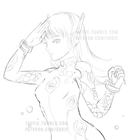
Now this is the part that I cannot teach you here: drawing.
It really depends on your drawing skills, and for those who can;t draw so well, my strong advice is: draw on paper.
While I did this in digital out of convenience, nothing beats drawing straight on paper. Drawing digitally will hardly improve your drawing skills at all if any (my observation & exp), but drawing on paper will improve your accuracy and drawing memory much much faster and better.
Take your time drawing, if you have a good base drawing, then everything else will be nice and easy, so don’t rush it.
2. Outlining Digitally
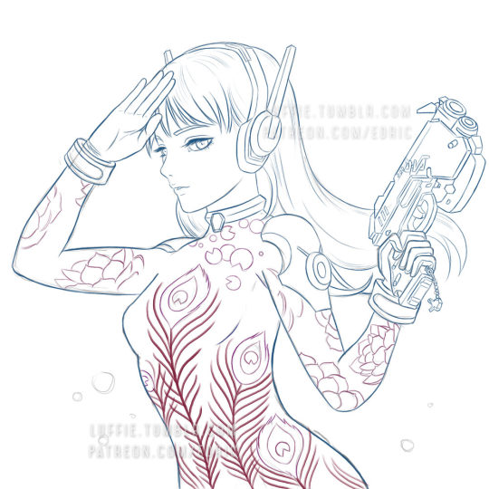
Depending on your preferences, you can just draw any patterns, but my design here is about Peacock & Lotus design, with the Peacock symbolizing Dva’s penchant for showing off, as for the Lotus... well it’s pretty!
As you can see here, some of my outlines are pretty sleek and smooth, and that’s because I create a new clean outline on top of my previous rough drawing. This is usually quite important in terms of line drawing/painting. It makes the process easier and the whole image more clean and finished.
Painter Technique: Now, I create my drawing in my favorite app Photoshop, but Photoshop it’s not for being very bad in making smooth lines, so you have to use another program to do that.
Currently, my favorite program for creating such smooth lines is Corel Painter. You can search for “Brush Smoothing” setting, and set the “Damping” to around 80 for a good line stabilization.
While I forgot which brush I use for this, I now recommend the 2B pencil with 100% opacity (The blue lines). Make them on a different layer.
Try and create the lines with as little strokes as possible. For long curved lines like the hair, you can utilized Painter’s awesome “Paint on a path” feature, just check it on the top toolbar settings. It allows you to create a path and paint straight onto it, thus saving the frustration of redrawing again and again to get that smooth long lines.
For the red lines, “Concept Art Jitter Smooth” Under the Chalk section.
Other Software Technique: This line art technique can also be done with other software with brush stabilization feature like SAI, or Clip Paint Studio, and many others, so don’t worry if you don’t have Painter.
3. Base Colors
Now the next step is to bring the image back to Photoshop for coloring. Use the pen tool and create the basic shapes and fill them with block colors in different layers.
Now it is tempting to use the Lasso or the Paint bucket to fill, but don’t. The lasso tool has problem in creating smooth lines (which we need), and also the paint bucket (I’ll explain next time how to use it in another Tutorial).
If you have created the paths and shapes in different layers, then you can lock the layer transparency and start painting with the real desired colors.
Here I used the soft Airbrush in PS to paint it some reddish hue around her cheeks and forehead. Don’t worry about getting the colors very accurate for now, since you have separated them to different layers, it is very easy to make adjustments later on. Also, don’t forget to add a background, preferably grey or some neutral colors. It helps better to gauge the value of the colors later on, if you put white, most colors seem too dark, and of you put black, colors will seem too bright.
4. Start Painting

On a layer above the body, I painted the peacock leaves by using the Lasso tool, fill colors, and use airbrush to paint it highlights and shadow.
For the Lotus leaves, I use the Lasso, but I don’t fill it, since I want the blackness of the suit to come through. And instead of using the Airbrush, I use the PS standard round brush, with shape dynamic off and opacity pressure on, I painted with downward strokes lightly to create the leaf textures, and painted the same way again with brighter colors, and add a final highlight and the tip of most leafs.
5. More Painting
Continue painting the leafs, and the the shoulders, before moving to other parts like the gun. I’ve also added more leafs underneath the original leaf layer, since I felt it looked a bit empty. For the glow of the feathers, I simply create a layer on top of the outline layer, and set it to “color dodge”, and add some bright colors.
If the colors look weird/off, simply use Hue/Saturation to edit them till it looks right, then color pick from that section and paint the rest.
6. Finishing/Editing
As you can see, I changed the hair, since I wasn’t satisfied with the previous color. To get the bright look, you need to start with a white base. And as with the gloves, shoulders and hair, I changed their base colors to white.
Then with my texture brush, I simply painted according to the form, and leave some white shining through in the middle. This will created those “white sheen” you see here. Then for the hair, I painted darker colors near the tip/end of the hairs. I’ve also brighten the her face in the process.
For the background, I was actually a little clueless on what to paint. So I just painted some light strokes using the same textured brush and add a design element on it. Maybe next time, with better planning, I will create better backgrounds.
End Note:
So there you have it, and as you have learnt, there isn’t any complicated techniques behind this picture, and if you have prepared each stage accordingly step by step, everything later will become easier. Of course this is not the most detailed tutorial as some steps can be broken down even further to make it clearer, but that is for future tutorials!
If you like my work and would like to learn more and support me, please do consider supporting me at Patreon.com/edric . It truly helps me a lot to devote more time to create this tutorials and art, plus you will also get my custom brushes and PSD file so that you learn better, and of course, Patrons receive special tutorials. Every bit of support helps, and are truly truly appreciated!!!
Or you can buy me a coffee for late night painting too here :https://ko-fi.com/edricartist
53 notes
·
View notes
Text
How to Create a Haunting Fantasy Digital Art Photo Manipulation in Adobe Photoshop
What You'll Be Creating
In this tutorial, I'll show you how to create a fantasy digital art piece featuring a ghost woman looking at ghostly flying fish.
First, we'll build the base scene with images of a forest, pond, and bridge. After that, we'll add the model and retouch her, invert her hair's color, and paint more hair. Later we'll import the fish and add a ghostly effect to them. We'll paint glowing light and sparkling dots and use several adjustment layers to complete the final effect.
Tutorial Assets
The following assets were used during the production of this tutorial:
Forest
Pond
Bridge
Model
Fish
1. How to Import the Forest
Step 1
Create a new 2000 x 1516 px document in Photoshop with the given settings:
Step 2
Open the forest image and drag it into the white canvas using the Move Tool (V). Use the Free Transform Tool (Control-T) to resize it to fit the canvas.
Step 3
Go to Layer > New Adjustment Layer > Hue Saturation and set it as Clipping Mask. Change the Hue values a bit to -8:
Step 4
Create a Curves adjustment layer and reduce the lightness. On this layer mask, activate the Brush Tool (B) and select a soft round one with black color. Use this brush to remove the dark effect on the left side as we're aiming to add a light source there.
Step 5
Make a new layer, change the mode to Overlay 100%, and fill with 50% gray.
Activate the Dodge and Burn Tool (O) with Midtones Range, Exposure about 20% to darken some details on the right of the trees and brighten their left side to fit the light source. You can see how I did it with Normal and the result with Overlay mode.
2. How to Add the Pond and Bridge
Step 1
Place the pond image in the bottom left of the canvas and use Control-T to resize it to be much smaller.
Add a mask to this layer and use a soft black brush to remove the hard edges and sky in this, leaving only the pond visible.
Step 2
Create a Curves adjustment layer to darken the pond.
Step 3
Make a Levels adjustment layer to darken both sides of the pond more. On the layer mask, paint on the middle to reveal some light there.
Step 4
Add a Hue/Saturation adjustment layer and decrease the Saturation values to -83:
Step 5
Create a Color Balance adjustment layer to make the color of the pond match the forest.
Step 6
Now let's make a reflection on the surface of the pond for the tree above it. On the forest layer, use the Polygonal Lasso Tool (L) to select the lower part of this tree and hit Control-C to copy this selection. Make a new layer on top of the other layers and hit Control-V to paste the selection onto this new layer. Convert this layer to a Smart Object and flip it vertically (Edit > Transform > Flip Vertical), and then move this part below the tree.
Step 7
Add a mask to this layer to remove the hard edges of the tree and blend it with the water. Go to Filter > Blur > Gaussian Blur and set the Radius to 2 px to soften this reflection.
Step 8
Create a Hue/Saturation adjustment layer and a Curves adjustment layer with the same settings as for the forest. On the Curves layer mask, use a soft black brush with Opacity of about 20% to paint on some details of the root to keep some lightness there.
Step 9
Cut out the bridge and place it at the bottom of the canvas. Flip it horizontally to make it fit the direction of the light source. Add a mask to this layer to remove the front of the bridge.
Step 10
Make a reflection for the bridge as we did with the tree's reflection (duplicate, flip vertically, mask, and apply a Gaussian Blur of 2 px).
Step 11
Select the bridge and its reflection layers and hit Control-G to make a group for them. Change this group's mode to Normal 100% and add a Curves adjustment layer to darken the bridge. On this layer mask, use a soft black brush to erase the middle parts to reveal some lightness as we're aiming to add a ghost with glowing light there.
Step 12
Use a Brightness/Contrast adjustment layer to darken the lower section of the bridge more. Paint on the rest so it won't be affected by this adjustment layer.
Step 13
Create a Hue/Saturation adjustment layer and reduce the Saturation to -93:
Step 14
Make a Color Balance adjustment layer and change the Midtones and Highlights settings:
3. How to Retouch the Model
Step 1
Isolate the model and place her in the middle of the bridge. Go to Filter > Liquify and use the Forward Warp Tool (W) to enlarge the bottom of the dress, following the direction of the bridge.
Step 2
Add a mask to the model's layer and use a hard black brush to remove the part of the dress outside the steps. After that, select a soft black brush with Opacity of about 30-40% to reduce the visibility of the bottom of the dress, to make it appear semi-transparent.
Step 3
Create a Hue/Saturation adjustment layer and decrease the Saturation values to -56:
Step 4
Make a Color Balance adjustment layer to change the model's color:
Step 5
To change the color of the model's hair from black to white (we're making a ghost!), use the Polygonal Lasso Tool to select only the hair, and then go to Layer > New Adjustment Layer > Invert.
Step 6
Use a Curves adjustment layer to darken the model. On the layer mask, paint on the bright details, especially the wrinkles, to reveal the lightness there.
Step 7
Use another Curves adjustment layer to increase some haze and reduce the dark contrast on the upper part of the model's body, face, and hair. On the layer mask, paint on the lower part of the model's dress to keep its contrast and lightness.
Step 8
Select only the hair part and use a Hue/Saturation adjustment layer to change its tone a bit.
Step 9
Make a new layer and use a soft small brush with the color #c4c7ca to strengthen the wrinkles on her dress, making these details more visible.
Step 10
Create two new layers and use a small brush with the color #b8bdc2 and #c3c9ce to paint more hair for the model.
4. How to Make the Ghost Fish
Step 1
Open the image of the fish and download the angles you want (I've chosen the ones shown in the screenshot below) or use your own. Set them around the model, including one that fits the direction of the model's gaze. Convert all of these layers to Smart Object.
Duplicate the one beside the bridge and flip him vertically. Move him into the water's area and lower the Opacity of this layer to 50% to make the reflection fade into the water.
Step 2
Apply a Gaussian Blur of 2 px to this reflection layer to soften it.
Step 3
Double-click each of the fish layers, and apply an Inner Shadow and Outer Glow. Set the color of the shadow to #e8f1f7 and the color of the glow to #c4c7ca.
Step 4
Add a mask to each of these layers and use a soft black brush with Opacity of about 30% to reduce their visibility.
Step 5
Create a group for the fish layers and add a Black and White adjustment layer, using the default values:
Step 6
Use an Invert adjustment layer to make them darker. Don't worry as we'll fix it later.
Step 7
Use a Color Balance adjustment layer to change the fish's color a bit:
Step 8
Create a Curves adjustment layer to bring the light effect back to the fish. Use a soft black brush with a lowered opacity (about 20%) to reduce the light on the details you feel are too bright.
5. How to Paint the Glowing Light and Dots
Step 1
Make a new layer on top of the other layers, and use a soft brush with the color #c9d1d7 and Opacity about 15% to paint some glow for the fish.
Add another layer, and use the same brush to strengthen the light/glow around the fish. Change this layer mode to Overlay 100%.
Step 2
Create a new layer, change the mode to Overlay 100%, and fill with 50% gray. Use the Dodge and Burn Tool to refine the light and shadow on the tree, model, tree reflection, and details for the dress.
Step 3
On a new layer, use a soft brush with the color #c9d6da to paint a glow around the ghost. Change this layer mode to Hard Light 100% and use a layer mask to reduce the light around it, making it appear more subtle.
Use the same brush with an Opacity of about 50% to paint a glow around the contour of the model to increase the ghostly effect. Alter this layer mode to Linear Dodge 100%.
Step 4
In this step, we'll make sparkling dots. Make a new layer on top of the other layers, and change the brush's color to #c4c7ca. Press F5 to change the settings of this brush:
Use this brush to add tiny, sparkling dots around the model, bridge, and fish. Press [ and ] to easily change the brush's size while painting.
Step 5
Hit Control-G to make a group for this layer and change this group's mode to Color Dodge 100%. Now the effect looks much better!
Step 6
Apply the Outer Glow effect for the dots layer. Set the color of the glow to #c4c7ca.
6. How to Make the Final Adjustments
Step 1
Create a Gradient Map adjustment layer on top of the other layers and pick the colors #e10019 and #00601b. Lower the Opacity of this layer to 20%.
Step 2
Make a Color Balance adjustment layer and change the Midtones and Highlights settings:
Step 3
Create another Color Balance adjustment layer to alter the model's color a bit. Paint on the rest so it won't be affected by this adjustment layer.
Step 4
Use a Curves adjustment layer to increase the light and contrast of the whole scene. On the layer mask, use a soft black brush to erase the effect on the bridge so it won't become too bright.
Step 5
Use a soft brush with the color #7cb3b2 to change the color of the bright details on the root a bit to fit the rest of the scene. Alter this layer mode to Color 10%.
Congratulations, You're Done!
I hope that you've enjoyed the process of creating this fantasy digital art photo manipulation and learned something new for your own projects. Feel free to share your results or leave comments in the box below. Enjoy Photoshopping!
Enjoy more of our tutorials below:
How to Add Lights to a Tree With a Photoshop Action
In this beginner's tutorial, you will learn how to create an amazing sparkling light effect in Adobe Photoshop.
Marko Kožokar
14 Dec 2017
Photo Manipulation
How to Create a Fantasy Jellyfish Photo Manipulation With Adobe Photoshop
Learn how to use Adobe Photoshop to create a fantasy scene featuring a woman watching flying jellyfish. First, we'll build the base scene using several stock...
Jenny Le
11 Jun 2018
Photo Manipulation
from Envato Tuts+ Design & Illustration https://ift.tt/2L9PL9o via http://www.webmasterforum.ws/rankwyz-discount-code-2015-coupons/
0 notes
Last Seen Blogs
lapetitesayo
Wormwood Creek's News
bkfoamy2
Simply What I Like

thelostmagicians
I Get Butterflies Thinking About You
peregrine-str
ISHIBASHI BREAKING
internetdecay
world wide web