#they're my screenshots just for reference
Text
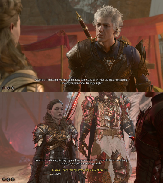

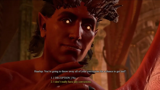
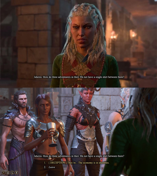
Its Always Sunny in Philadelphia quotes + BG3
#pro tip#if you want your text to look like bg3 dialog without too many steps#times new roman#drop shadow#I'm sure it's not exactly what they use but it's close enough for meee#baldurs gate 3#bg3#bg3 raphael#bg3 haarlep#they're my screenshots just for reference#please look at how pretty my tavs are
98 notes
·
View notes
Text
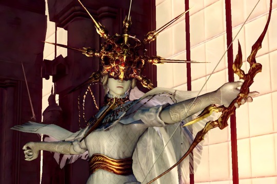
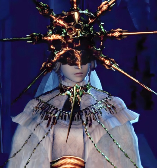


Dark Sun Gwyndolin
#dark sun gwyndolin#dark souls#I tried to clean these up#you know decrease noise make them sharper and clearer#since when I looked for good reference images they're quite dark and blurry#so they are just screenshots from google that I modified#but I hope that the higher quality is helpful for artists 😊#... unless you are on mobile then they are really compressed :(#my stuff#screenshot
179 notes
·
View notes
Text


Fake anime screenshots with Olive & Ambrose!!!! :3 i'm pretty happy with them
(he/him for both characters)
#my art#oc art#digital art#trans artist#oc artist#fake anime screenshot#they're so sweet aah..#i just love them so much#“trust me okay?” DONT TRUST HIM#oh they really are. very cute.#im normal about them#normal!!!!#i just mixed a bunch of references for the style btw#i looked at some romance anime and uuh i just tried#Olive#Ambrose
65 notes
·
View notes
Text
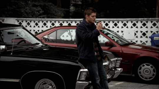
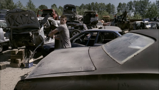
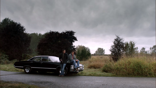
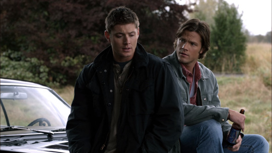


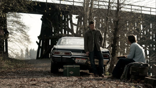

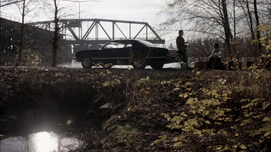
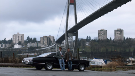


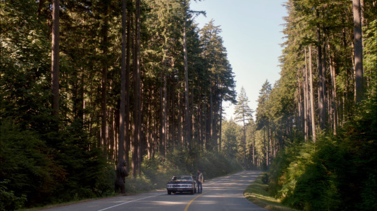

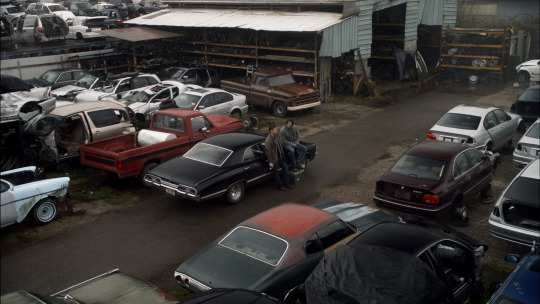
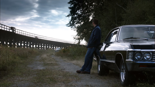


supernatural and baby (s1-s8 ish) a very not comprehensive collection
#supernatural#organizing screenshots for my next project and wanted references when they're sitting on or leaning on the impala#so this is just a some of the bunch of ones i took while watching through s8 because i'm a compulsive screenshot taker#impala 67#dean winchester#sam winchester#spn baby
47 notes
·
View notes
Text
do any pathologic artists out there have a folder of reference screenshots of Danill Dankovskey that i can have. getting them myself is going to take weeks and i want to draw his dumbshit face NOW
#google is very bad for this#surely there are artists out there who've taken 360 screenshots of the man for reference purposes#to those artists: hello. can i offer you a cookie in exchange for images#pathologic#pathologic fanart#danill dankovsky#i need to practice his face#having some nice screenshots from various angles would really help me out here#i promise to post all of the things i draw even if they're bad#soliloquy#pathologic classic hd#although i'd take patho 2 screenshots as well#pathologic 2#scrabbling at the walls of my enclosure#what if i just scroll the patho fanart tab and message people. would that be insane#might be faster
14 notes
·
View notes
Text
I'm really excited for Ahsoka Ep5 tonight, but my brain keeps drifting back to those ruins from the premiere and I gotta get it out in a post before the new episode probably takes over my every thought.
I love the ancient tech in this show. I mean, yes, the map is like straight out of Treasure Planet so I will always love it for that, but the tech just looks so Zeffo! I wonder if it was intentional. Like I think a lot of the design for Force-related stuff we see now is influenced by Rebels and TCW and stuff like the compass from The Last Jedi (which Filoni designed, so it basically all goes back to him) but the potential in-universe explanation for why this ancient Dathomirian site and technology seems so reminiscent of the Zeffo (to me at least) fascinates me.
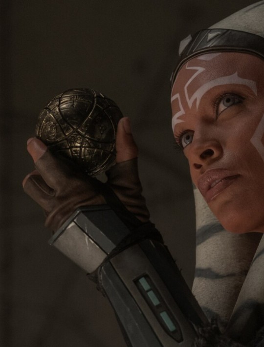

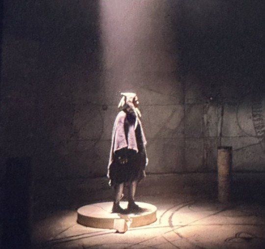

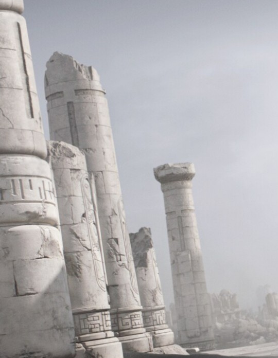

We know there's a Zeffo sage tomb on Dathomir, so the cultures had contact at one point. Did Dathomir intentionally take design influence from Zeffo culture, like how ancient Roman architecture took heavy design inspiration from Greek architecture for their building facades and then it evolved into its own thing? Or was there like a whole cultural exchange there? Were there Dathomirians that studied the Life Wind and Zeffo that dabbled with magick?! I feel like Eno Cordova. I WANNA KNOW MORE ABOUT THE ZEFFO DANGIT. WERE THEY LIKE RAKATA/KWA CONTEMPORARIES OR DID THEY COME BEFORE? AFTER? DID ONE'S STUDY OF THE FORCE INFLUENCE THE OTHER? I WANNA KNOOOOOOOW.
(I could write an entirely different essay post about how much I love Fallen Order/Survivor, but the hyperfixation gremlin is focusing on Ahsoka right now so I can't articulate at this moment beyond I LOVE JEDI FALLEN ORDER/JEDI SURVIVOR)
#K8 Rambles about Star Wars#star wars#ahsoka#ahsoka series#ahsoka spoilers#(just in case)#star wars jedi fallen order#star wars jedi survivor#Zeffo#Dathomir#Eno Cordova#(i do mention him so)#I would have posted a pic of the orb things you have to Force push around in the tombs for JFO (I forgot what they're called)#but I didn't have a screenshot on hand and. y'know. I forgot what they're called#so looking on Wookieepedia for an article image to reference would be a whole thing#and I was doing this while my brain was drifting doing something else and whenever I open Wookieepedia when I'm like this#I end up deep-diving for like three hours. I can tell you SO MUCH about obscure Jedi Masters from the Old Republic era#I can't do basic math but I can do that! 🤣🤣🤣🤣🤣🤣
6 notes
·
View notes
Text

[Photo ID: a Tumblr reply from kitsuneluvuh that reads: "No, JC calls him Wei Wuxian, but it's still fun." End ID]
Something something something about WWX calling JC by his birth name and JC calling WXX by his courtesy name
#there's two ways to take it: wwx thinking they're closer than they actually are or smth#and the difference of values/position#there's something there but IDK what. someone make post for me pls /lh#I first took it the first way but there's some literacy thing at work that my head hurts too much to understand#'why's the screenshot in dark mode' head hurty#mdzs#mo dao zu shi#the grandmaster of demonic cultivation#godc#the untamed#the founder of diabolism#yunmeng bros#wei wuxian#wwx#jiang cheng#also I think jc was one of the few ppl who were called by their birthnames but I could be wrong (also wen ning)#my posts#edit: I forgot the third and most likely option - wwx just likes to call ppl by their birthnames#he doesn't refer to lwj as lan zhan like he does with jc or jyl and we don’t even know nhs's birth name#(pretty sure nhs is his courtesy name)#*tho#not a quote
27 notes
·
View notes
Text
good morning and marcy crimble i just woke up to some Nonsense
#jess rambles#jess's rage is building#yeah you can probably guess this is about my last post#because someone decided to take what was meant to be a placeholder phrase for inserting any event that may be upsetting to the reader#which was in my tag ramble no less and not part of the Main Post (which was phrased to reference dangeresque to add some brevity)#and get angry at *me* for what *they* put in the placeholder#and if someone's gonna get angry at me i'd rather they get angry at me for something i actually did/intended to do yannow?#and screenshotting my tags so that i ''can't hide'' doesn't do anything when i wasn't hiding to begin with#like congratulations you made sure everyone could find the ostrich egg in the bag of potting soil#shoulda made that post unrebloggable in the first place tbh because of these ''how dare you piss on the poor'' types#on the plus side i think i finally found my hate anon#if they didn't just make a brand new blog specifically for doing that i didn't exactly bother going through their whole blog to check#i'm not gonna name 'em cuz i'm not That asshole#and i believe people have the right to express when they're angry at something (even if it's their own misinterpretation)#but what little i saw of their post before blocking implied they had a history with me and I Don't Know Who This Is#and i can't imagine more than one or two sending me anon hate with how infrequent it's historically been for me
1 note
·
View note
Text
📚 A List Of Useful Websites When Making An RPG 📚
My timeloop RPG In Stars and Time is done! Which means I can clear all my ISAT gamedev related bookmarks. But I figured I would show them here, in case they can be useful to someone. These range from "useful to write a story/characters/world" to "these are SUPER rpgmaker focused and will help with the terrible math that comes with making a game".
This is what I used to make my RPG game, but it could be useful for writers, game devs of all genres, DMs, artists, what have you. YIPPEE
Writing (Names)
Behind The Name - Why don't you have this bookmarked already. Search for names and their meanings from all over the world!
Medieval Names Archive - Medieval names. Useful. For ME
City and Town Name Generator - Create "fake" names for cities, generated from datasets from any country you desire! I used those for the couple city names in ISAT. I say "fake" in quotes because some of them do end up being actual city names, especially for french generated ones. Don't forget to double check you're not 1. just taking a real city name or 2. using a word that's like, Very Bad, especially if you don't know the country you're taking inspiration from! Don't want to end up with Poopaville, USA
Writing (Words)
Onym - A website full of websites that are full of words. And by that I mean dictionaries, thesauruses, translators, glossaries, ways to mix up words, and way more. HIGHLY recommend checking this website out!!!
Moby Thesaurus - My thesaurus of choice!
Rhyme Zone - Find words that rhyme with others. Perfect for poets, lyricists, punmasters.
In Different Languages - Search for a word, have it translated in MANY different languages in one page.
ASSETS
In general, I will say: just look up what you want on itch.io. There are SO MANY assets for you to buy on itch.io. You want a font? You want a background? You want a sound effect? You want a plugin? A pixel base? An attack animation? A cool UI?!?!?! JUST GO ON ITCH.IO!!!!!!
Visual Assets (General)
Creative Market - Shop for all kinds of assets, from fonts to mockups to templates to brushes to WHATEVER YOU WANT
Velvetyne - Cool and weird fonts
Chevy Ray's Pixel Fonts - They're good fonts.
Contrast Checker - Stop making your text white when your background is lime green no one can read that shit babe!!!!!!
Visual Assets (Game Focused)
Interface In Game - Screenshots of UI (User Interfaces) from SO MANY GAMES. Shows you everything and you can just look at what every single menu in a game looks like. You can also sort them by game genre! GREAT reference!
Game UI Database - Same as above!
Sound Assets
Zapsplat, Freesound - There are many sound effect websites out there but those are the ones I saved. Royalty free!
Shapeforms - Paid packs for music and sounds and stuff.
Other
CloudConvert - Convert files into other files. MAKE THAT .AVI A .MOV
EZGifs - Make those gifs bigger. Smaller. Optimize them. Take a video and make it a gif. The Sky Is The Limit
Marketing
Press Kitty - Did not end up needing this- this will help with creating a press kit! Useful for ANY indie dev. Yes, even if you're making a tiny game, you should have a press kit. You never know!!!
presskit() - Same as above, but a different one.
Itch.io Page Image Guide and Templates - Make your project pages on itch.io look nice.
MOOMANiBE's IGF post - If you're making indie games, you might wanna try and submit your game to the Independent Game Festival at some point. Here are some tips on how, and why you should.
Game Design (General)
An insightful thread where game developers discuss hidden mechanics designed to make games feel more interesting - Title says it all. Check those comments too.
Game Design (RPGs)
Yanfly "Let's Make a Game" Comics - INCREDIBLY useful tips on how to make RPGs, going from dungeons to towns to enemy stats!!!!
Attack Patterns - A nice post on enemy attack patterns, and what attacks you should give your enemies to make them challenging (but not TOO challenging!) A very good starting point.
How To Balance An RPG - Twitter thread on how to balance player stats VS enemy stats.
Nobody Cares About It But It’s The Only Thing That Matters: Pacing And Level Design In JRPGs - a Good Post.
Game Design (Visual Novels)
Feniks Renpy Tutorials - They're good tutorials.
I played over 100 visual novels in one month and here’s my advice to devs. - General VN advice. Also highly recommend this whole blog for help on marketing your games.
I hope that was useful! If it was. Maybe. You'd like to buy me a coffee. Or maybe you could check out my comics and games. Or just my new critically acclaimed game In Stars and Time. If you want. Ok bye
#reference#tutorial#writing#rpgmaker#renpy#video games#game design#i had this in my drafts for a while so you get it now. sorry its so long#long post
4K notes
·
View notes
Text
why Aurora's art is genius
It's break for me, and I've been meaning to sit down and read the Aurora webcomic (https://comicaurora.com/, @comicaurora on Tumblr) for quite a bit. So I did that over the last few days.
And… y'know. I can't actually say "I should've read this earlier," because otherwise I would've been up at 2:30-3am when I had responsibilities in the morning and I couldn't have properly enjoyed it, but. Holy shit guys THIS COMIC.
I intended to just do a generalized "hello this is all the things I love about this story," and I wrote a paragraph or two about art style. …and then another. And another. And I realized I needed to actually reference things so I would stop being too vague. I was reading the comic on my tablet or phone, because I wanted to stay curled up in my chair, but I type at a big monitor and so I saw more details… aaaaaand it turned into its own giant-ass post.
SO. Enjoy a few thousand words of me nerding out about this insanely cool art style and how fucking gorgeous this comic is? (There are screenshots, I promise it isn't just a wall of text.) In my defense, I just spent two semesters in graphic design classes focusing on the Adobe Suite, so… I get to be a nerd about pretty things…???
All positive feedback btw! No downers here. <3
---
I cannot emphasize enough how much I love the beautiful, simple stylistic method of drawing characters and figures. It is absolutely stunning and effortless and utterly graceful—it is so hard to capture the sheer beauty and fluidity of the human form in such a fashion. Even a simple outline of a character feels dynamic! It's gorgeous!
Though I do have a love-hate relationship with this, because my artistic side looks at that lovely simplicity, goes "I CAN DO THAT!" and then I sit down and go to the paper and realize that no, in fact, I cannot do that yet, because that simplicity is born of a hell of a lot of practice and understanding of bodies and actually is really hard to do. It's a very developed style that only looks simple because the artist knows what they're doing. The human body is hard to pull off, and this comic does so beautifully and makes it look effortless.
Also: line weight line weight line weight. It's especially important in simplified shapes and figures like this, and hoo boy is it used excellently. It's especially apparent the newer the pages get—I love watching that improvement over time—but with simpler figures and lines, you get nice light lines to emphasize both smaller details, like in the draping of clothing and the curls of hair—which, hello, yes—and thicker lines to emphasize bigger and more important details and silhouettes. It's the sort of thing that's essential to most illustrations, but I wanted to make a note of it because it's so vital to this art style.
THE USE OF LAYER BLENDING MODES OH MY GODS. (...uhhh, apologies to the people who don't know what that means, it's a digital art program thing? This article explains it for beginners.)
Bear with me, I just finished my second Photoshop course, I spent months and months working on projects with this shit so I see the genius use of Screen and/or its siblings (of which there are many—if I say "Screen" here, assume I mean the entire umbrella of Screen blending modes and possibly Overlay) and go nuts, but seriously it's so clever and also fucking gorgeous:
Firstly: the use of screened-on sound effect words over an action? A "CRACK" written over a branch and then put on Screen in glowy green so that it's subtle enough that it doesn't disrupt the visual flow, but still sticks out enough to make itself heard? Little "scritches" that are transparent where they're laid on without outlines to emphasize the sound without disrupting the underlying image? FUCK YES. I haven't seen this done literally anywhere else—granted, I haven't read a massive amount of comics, but I've read enough—and it is so clever and I adore it. Examples:


Secondly: The beautiful lighting effects. The curling leaves, all the magic, the various glowing eyes, the fog, the way it's all so vividly colored but doesn't burn your eyeballs out—a balance that's way harder to achieve than you'd think—and the soft glows around them, eeeee it's so pretty so pretty SO PRETTY. Not sure if some of these are Outer/Inner Glow/Shadow layer effects or if it's entirely hand-drawn, but major kudos either way; I can see the beautiful use of blending modes and I SALUTE YOUR GENIUS.
I keep looking at some of this stuff and go "is that a layer effect or is it done by hand?" Because you can make some similar things with the Satin layer effect in Photoshop (I don't know if other programs have this? I'm gonna have to find out since I won't have access to PS for much longer ;-;) that resembles some of the swirly inner bits on some of the lit effects, but I'm not sure if it is that or not. Or you could mask over textures? There's... many ways to do it.
If done by hand: oh my gods the patience, how. If done with layer effects: really clever work that knows how to stop said effects from looking wonky, because ugh those things get temperamental. If done with a layer of texture that's been masked over: very, very good masking work. No matter the method, pretty shimmers and swirly bits inside the bigger pretty swirls!
Next: The way color contrast is used! I will never be over the glowy green-on-black Primordial Life vibes when Alinua gets dropped into that… unconscious space?? with Life, for example, and the sharp contrast of vines and crack and branches and leaves against pitch black is just visually stunning. The way the roots sink into the ground and the three-dimensional sensation of it is particularly badass here:

Friggin. How does this imply depth like that. HOW. IT'S SO FREAKING COOL.
A huge point here is also color language and use! Everybody has their own particular shade, generally matching their eyes, magic, and personality, and I adore how this is used to make it clear who's talking or who's doing an action. That was especially apparent to me with Dainix and Falst in the caves—their colors are both fairly warm, but quite distinct, and I love how this clarifies who's doing what in panels with a lot of action from both of them. There is a particular bit that stuck out to me, so I dug up the panels (see this page and the following one https://comicaurora.com/aurora/1-20-30/):

(Gods it looks even prettier now that I put it against a plain background. Also, appreciation to Falst for managing a bridal-carry midair, damn.)
The way that their colors MERGE here! And the immense attention to detail in doing so—Dainix is higher up than Falst is in the first panel, so Dainix's orange fades into Falst's orange at the base. The next panel has gold up top and orange on bottom; we can't really tell in that panel where each of them are, but that's carried over to the next panel—
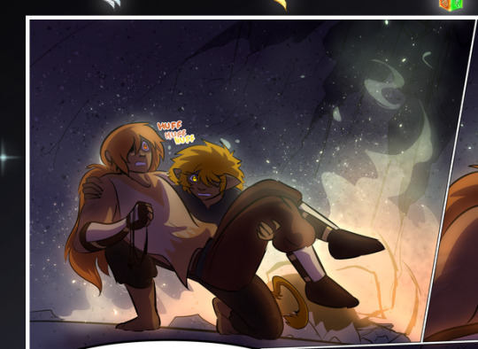
—where we now see that Falst's position is raised above Dainix's due to the way he's carrying him. (Points for continuity!) And, of course, we see the little "huffs" flowing from orange to yellow over their heads (where Dainix's head is higher than Falst's) to merge the sound of their breathing, which is absurdly clever because it emphasizes to the viewer how we hear two sets of huffing overlaying each other, not one. Absolutely brilliant.
(A few other notes of appreciation to that panel: beautiful glows around them, the sparks, the jagged silhouette of the spider legs, the lovely colors that have no right to make the area around a spider corpse that pretty, the excellent texturing on the cave walls plus perspective, the way Falst's movements imply Dainix's hefty weight, the natural posing of the characters, their on-point expressions that convey exactly how fuckin terrifying everything is right now, the slight glows to their eyes, and also they're just handsome boys <3)
Next up: Rain!!!! So well done! It's subtle enough that it never ever disrupts the impact of the focal point, but evident enough you can tell! And more importantly: THE MIST OFF THE CHARACTERS. Rain does this irl, it has that little vapor that comes off you and makes that little misty effect that plays with lighting, it's so cool-looking and here it's used to such pretty effect!
One of the panel captions says something about it blurring out all the injuries on the characters but like THAT AIN'T TOO BIG OF A PROBLEM when it gets across the environmental vibes, and also that'd be how it would look in real life too so like… outside viewer's angle is the same as the characters', mostly? my point is: that's the environment!!! that's the vibes, that's the feel! It gets it across and it does so in the most pretty way possible!
And another thing re: rain, the use of it to establish perspective, particularly in panels like this—

—where we can tell we're looking down at Tynan due to the perspective on the rain and where it's pointing. Excellent. (Also, kudos for looking down and emphasizing how Tynan's losing his advantage—lovely use of visual storytelling.)
Additionally, the misting here:
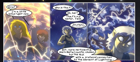
We see it most heavily in the leftmost panel, where it's quite foggy as you would expect in a rainstorm, especially in an environment with a lot of heat, but it's also lightly powdered on in the following two panels and tends to follow light sources, which makes complete sense given how light bounces off particles in the air.
A major point of strength in these too is a thorough understanding of lighting, like rim lighting, the various hues and shades, and an intricate understanding of how light bounces off surfaces even when they're in shadow (we'll see a faint glow in spots where characters are half in shadow, but that's how it would work in real life, because of how light bounces around).
Bringing some of these points together: the fluidity of the lines in magic, and the way simple glowing lines are used to emphasize motion and the magic itself, is deeply clever. I'm basically pulling at random from panels and there's definitely even better examples, but here's one (see this page https://comicaurora.com/aurora/1-16-33/):

First panel, listed in numbers because these build on each other:
The tension of the lines in Tess's magic here. This works on a couple levels: first, the way she's holding her fists, as if she's pulling a rope taut.
The way there's one primary line, emphasizing the rope feeling, accompanied by smaller ones.
The additional lines starbursting around her hands, to indicate the energy crackling in her hands and how she's doing a good bit more than just holding it. (That combined with the fists suggests some tension to the magic, too.) Also the variations in brightness, a feature you'll find in actual lightning. :D Additional kudos for how the lightning sparks and breaks off the metal of the sword.
A handful of miscellaneous notes on the second panel:
The reflection of the flames in Erin's typically dark blue eyes (which bears a remarkable resemblance to Dainix, incidentally—almost a thematic sort of parallel given Erin's using the same magic Dainix specializes in?)
The flowing of fabric in the wind and associated variation in the lineart
The way Erin's tattoos interact with the fire he's pulling to his hand
The way the rain overlays some of the fainter areas of fire (attention! to! detail! hell yeah!)
I could go on. I won't because this is a lot of writing already.
Third panel gets paragraphs, not bullets:
Erin's giant-ass "FWOOM" of fire there, and the way the outline of the word is puffy-edged and gradated to feel almost three-dimensional, plus once again using Screen or a variation on it so that the stars show up in the background. All this against that stunning plume of fire, which ripples and sparks so gorgeously, and the ending "om" of the onomatopoeia is emphasized incredibly brightly against that, adding to the punch of it and making the plume feel even brighter.
Also, once again, rain helping establish perspective, especially in how it's very angular in the left side of the panel and then slowly becomes more like a point to the right to indicate it's falling directly down on the viewer. Add in the bright, beautiful glow effects, fainter but no less important black lines beneath them to emphasize the sky and smoke and the like, and the stunningly beautiful lighting and gradated glows surrounding Erin plus the lightning jagging up at him from below, and you get one hell of an impactful panel right there. (And there is definitely more in there I could break down, this is just a lot already.)
And in general: The colors in this? Incredible. The blues and purples and oranges and golds compliment so well, and it's all so rich.
Like, seriously, just throughout the whole comic, the use of gradients, blending modes, color balance and hues, all the things, all the things, it makes for the most beautiful effects and glows and such a rich environment. There's a very distinct style to this comic in its simplified backgrounds (which I recognize are done partly because it's way easier and also backgrounds are so time-consuming dear gods but lemme say this) and vivid, smoothly drawn characters; the simplicity lets them come to the front and gives room for those beautiful, richly saturated focal points, letting the stylized designs of the magic and characters shine. The use of distinct silhouettes is insanely good. Honestly, complex backgrounds might run the risk of making everything too visually busy in this case. It's just, augh, so GORGEOUS.
Another bit, take a look at this page (https://comicaurora.com/aurora/1-15-28/):
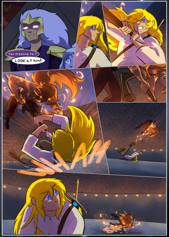
It's not quite as evident here as it is in the next page, but this one does some other fun things so I'm grabbing it. Points:
Once again, using different colors to represent different character actions. The "WHAM" of Kendal hitting the ground is caused by Dainix's force, so it's orange (and kudos for doubling the word over to add a shake effect). But we see blue layered underneath, which could be an environmental choice, but might also be because it's Kendal, whose color is blue.
And speaking off, take a look at the right-most panel on top, where Kendal grabs the spear: his motion is, again, illustrated in bright blue, versus the atmospheric screened-on orange lines that point toward him around the whole panel (I'm sure these have a name, I think they might be more of a manga thing though and the only experience I have in manga is reading a bit of Fullmetal Alchemist). Those lines emphasize the weight of the spear being shoved at him, and their color tells us Dainix is responsible for it.
One of my all-time favorite effects in this comic is the way cracks manifest across Dainix's body to represent when he starts to lose control; it is utterly gorgeous and wonderfully thematic. These are more evident in the page before and after this one, but you get a decent idea here. I love the way they glow softly, the way the fire juuuust flickers through at the start and then becomes more evident over time, and the cracks feel so realistic, like his skin is made of pottery. Additional points for how fire begins to creep into his hair.
A small detail that's generally consistent across the comic, but which I want to make note of here because you can see it pretty well: Kendal's eyes glow about the same as the jewel in his sword, mirroring his connection to said sword and calling back to how the jewel became Vash's eye temporarily and thus was once Kendal's eye. You can always see this connection (though there might be some spots where this also changes in a symbolic manner; I went through it quickly on the first time around, so I'll pay more attention when I inevitably reread this), where Kendal's always got that little shine of blue in his eyes the same as the jewel. It's a beautiful visual parallel that encourages the reader to subconsciously link them together, especially since the lines used to illustrate character movements typically mirror their eye color. It's an extension of Kendal.
Did I mention how ABSOLUTELY BEAUTIFUL the colors in this are?
Also, the mythological/legend-type scenes are illustrated in familiar style often used for that type of story, a simple and heavily symbolic two-dimensional cave-painting-like look. They are absolutely beautiful on many levels, employing simple, lovely gradients, slightly rougher and thicker lineart that is nonetheless smoothly beautiful, and working with clear silhouettes (a major strength of this art style, but also a strength in the comic overall). But in particular, I wanted to call attention to a particular thing (see this page https://comicaurora.com/aurora/1-12-4/):
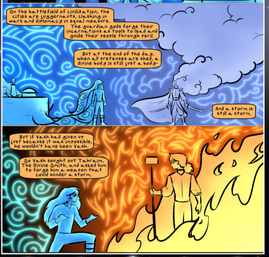
The flowing symbolic lineart surrounding each character. This is actually quite consistent across characters—see also Life's typical lines and how they curl:
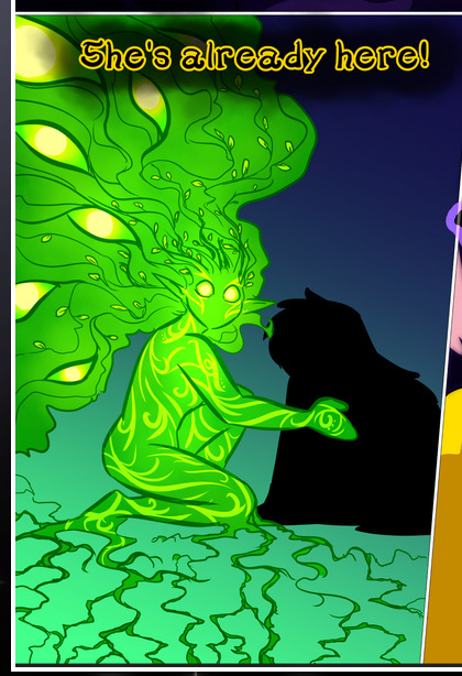
What's particularly interesting here is how these symbols are often similar, but not the same. Vash's lines are always smooth, clean curls, often playing off each other and echoing one another like ripples in a pond. You'd think they'd look too similar to Life's—but they don't. Life's curl like vines, and they remain connected; where one curve might echo another but exist entirely detached from each other in Vash's, Life's lines still remain wound together, because vines are continuous and don't float around. :P
Tahraim's are less continuous, often breaking up with significantly smaller bits and pieces floating around like—of course—sparks, and come to sharper points. These are also constants: we see the vines repeated over and over in Alinua's dreams of Life, and the echoing ripples of Vash are consistent wherever we encounter him. Kendal's dream of the ghost citizens of the city of Vash in the last few chapters is filled with these rippling, echoing patterns, to beautiful effect (https://comicaurora.com/aurora/1-20-14/):
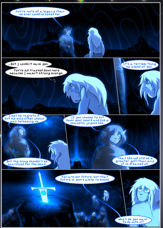
They ripple and spiral, often in long, sinuous curves, with smooth elegance. It reminds me a great deal of images of space and sine waves and the like. This establishes a definite feel to these different characters and their magic. And the thing is, that's not something that had to be done—the colors are good at emphasizing who's who. But it was done, and it adds a whole other dimension to the story. Whenever you're in a deity's domain, you know whose it is no matter the color.
Regarding that shape language, I wanted to make another note, too—Vash is sometimes described as chaotic and doing what he likes, which is interesting to me, because smooth, elegant curves and the color blue aren't generally associated with chaos. So while Vash might behave like that on the surface, I'm guessing he's got a lot more going on underneath; he's probably much more intentional in his actions than you'd think at a glance, and he is certainly quite caring with his city. The other thing is that this suits Kendal perfectly. He's a paragon character; he is kind, virtuous, and self-sacrificing, and often we see him aiming to calm others and keep them safe. Blue is such a good color for him. There is… probably more to this, but I'm not deep enough in yet to say.
And here's the thing: I'm only scratching the surface. There is so much more here I'm not covering (color palettes! outfits! character design! environment! the deities! so much more!) and a lot more I can't cover, because I don't have the experience; this is me as a hobbyist artist who happened to take a couple design classes because I wanted to. The art style to this comic is so clever and creative and beautiful, though, I just had to go off about it. <3
...brownie points for getting all the way down here? Have a cookie.
#aurora comic#aurora webcomic#comicaurora#art analysis#...I hope those are the right tags???#new fandom new tagging practices to learn ig#much thanks for something to read while I try to rest my wrists. carpal tunnel BAD. (ignore that I wrote this I've got braces ok it's fine)#anyway! I HAVE. MANY MORE THOUGHTS. ON THE STORY ITSELF. THIS LOVELY STORY#also a collection of reactions to a chunk of the comic before I hit the point where I was too busy reading to write anything down#idk how to format those tho#...yeet them into one post...???#eh I usually don't go off this much these days but this seems like a smaller tight-knit fandom so... might as well help build it?#and I have a little more time thanks to break so#oh yes also shoutout to my insanely awesome professor for teaching me all the technical stuff from this he is LOVELY#made an incredibly complex program into something comprehensible <3#synapse talks
744 notes
·
View notes
Text
Raisedeyebrowemojii Scamming information post
So as some of you know, it's been revealed that @raisedeyebrowemojii was a scammer, and for those of you that don't know, I'm sorry you had to find out this way. This is going to be an information post on raisedeyebrowemojii's scamming, lies, the evidence, and where they stole from, and the debunking of all their claims as comprehensively as possible to help the people they scammed and manipulated get some closure, and hopefully to provide insight on how you might spot them again.
I carried out an investigation on the now confirmed scammer, and now deactivated user @blktransdyke, who deleted within hours of my callout post. On that post I connected blktransdyke as being the same person behind raisedeyebrowemojii due to the information both of them had posted for alleged fundraisers, which you can see in the post here. For a short recap, both blktransdyke and raisedeyebrowemojii "Jay" both had the exact same story of allegedly being trans/homeless/disabled and posted photos of the exact same brown tabby cat named "Trouble", both claiming that it was their "best friend's cat" and raisedeyebrowemojii created a patreon for Trouble the cat, only for me to find that Trouble the cat is a hyperpopular cat vlogging/fanpage with 42K followers on facebook, and both of these blogs stole from this page and neither of them were affiliated with this famous facebook.
Moving on, with some help, ive also found more evidence that raisedeyebrowemojii was a scammer. I know many people were already convinced by the callout post I already did, but I think it's important to debunk a lot of raisedeyebrowemojii's claims due to the fact that so many people thought they were genuine, that they had died, and due to the fact that they stole pretty much every detail of their alleged life from somewhere else, and I can prove it, so I want to clear things up, and maybe allow some people to gain peace in the knowledge that "Jay" did not die, and was never in danger of dying to begin with.
The rest of this post will be under the cut because again, this is going to get long. I encourage everyone who was approached by or donated to raisedeyebrowemojii to reblog to help get the word out, thank you. Image descriptions will be available in alt text.
For starters, raisedeyebrowemojii went by the name "Jay", and on the donation posts of theirs (scams), they used the paypal name "Jay Baldwin", and Jay claimed to be disabled (allegedly they had tourettes, autism, cerebral palsey, were deaf, in a wheelchair, had a terminal kidney disease, and allegedly other undisclosed disabilities), Canadian, that they lived in the city of Toronto (in Ontario, Canada), and a trans lesbian. Screenshots for that below

Misuse of terminology & racefaking
Let's talk about their bio first. I suspect that the scammer behind this blog is neither Black nor Canadian, due to the fact that, as I mentioned in this post, 1. Black Canadians don't really refer to themselves as "African American" as much here in Canada, partly due to the fact that a lot of Black Canadians actually have roots from the Caribbean & not directly from Africa or America, 2. "Jay" claimed to be Canadian but also said they had an uncle & grandparents still living in South Africa, which means they're implying they're either a first or second generation African Canadian immigrant, so why would they call themselves "African American" if they have no national/ethnic ties to America, and they are Canadian? So, like the blktransdyke blog, who i proved is most likely the same person as raisedeyebrowemojii, both of these blogs are using incorrect/strange terminology for the ethnicities they claim to be, thus indicating racefaking and a falsified Nationality.
Falsified Nationality
Here I also have reason to believe this person is not Canadian, or in the very least, did not live in the city of Toronto, or likely the province of Ontario. Partly due to the evidence ive just given above, but also due to the reasons I'm about to give & the connected next point I'll get to soon. For one example, "Jay" made the donation post in the first screenshot i gave where they claimed they were scared they were going to freeze to death, and that they could hardly even type on their phone due to the absolute insane cold temperatures of Toronto.
However, I took a look at the Toronto weather forecast for the day that raisedeyebrowemojii posted that update (February 12th, 2023) and found that the temperature had gotten up to 6°C (or 42.8°F), with very little wind, and it didn't even get below freezing temperatures that day, and only got two degrees below freezing the night before (which is when they claim they were staying in a shelter). Canadians will know that this type of temperature in FEBRUARY is actually very very warm and pleasant. Like, unseasonably, weirdly warm. Screenshot for that below.
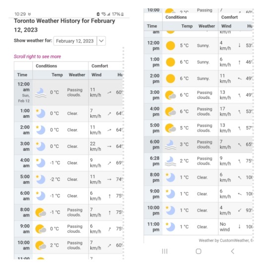
Now, for an actual homeless person, being outside in the cold, even if it's warmer than usual, this is still difficult and harsh conditions to live under. However, this is still a large exaggeration from what Raisedeyebrowemojii claimed it was, and youre not very likely to freeze to death in this kind of weather compared to the usual Canadian temperatures. The way "Jay" described it makes me think that it is not a Canadian who made this post, and is someone who was not in Toronto to actually know what temperature it was that day, but just assumed it would be very cold.
Impersonation of the real Jay Baldwin
Thanks to some help (of people whom I will keep anonymous for their safety & as a precaution of the scammer harassing them), i managed to locate the identity of the REAL Jay Baldwin, and was able to concretely find out that this person is who raisedeyebrowemojii was impersonating. So, who is the real Jay Baldwin you ask?
Jay Baldwin is a Black, disabled (who uses a wheelchair and has Cerebral Palsey) nonbinary Canadian and the founder of the private Facebook support group "Disabled, Queer, and Fabulous" with over 1.1K members, and is a student at Carleton university in Ontario, Canada, and this Jay Baldwin has actually been doing really well for themselves, and has gotten pretty famous in the Ottawa area. And, as you can see, the raisedeyebrowemojii "Jay" apparently has a lot in common with THIS Jay Baldwin, including their names, being Black, a disabled wheelchair user with Cerebral palsey, nonbinary, Canadian living in Ontario, and both use they/them pronouns. But let me show you how I know they've been stealing from this person.
One way I can tell that raisedeyebrowemojii definitely was not THIS Jay Baldwin is their faces. On the screenshot to the left is the icon that raisedeyebrowemojii (of allegedly "themselves") used for their blog, taken from the webarchive screenshot of their blog, and to the right is a cropped portrait photo of the real Jay Baldwin, taken from this information page on the official Carleton University website, which also lists most of the information I just listed about the REAL Jay.

Obviously these two people look absolutely nothing alike. And we can tell that raisedeyebrowemojii meant for their scamsona to look like the person on the left, because they also used a photo of another dark-skinned Black person in ANOTHER donation post. So they stole these selfies from a different person altogether, although I haven't yet been able to locate where they'd stolen them.
One of the reasons that raisedeyebrowemojii's lies were so convincing though is that they were stealing or misconstruing some of Jay Baldwin's life experiences almost in real time, and I believe that raisedeyebrowemojii was keeping tabs on Jay in order to harvest their life details. For example, on a Facebook post, Jay Baldwin mentioned the death of their father a few times, but also on June 26th 2022, made the memorial post below about the death of their uncle
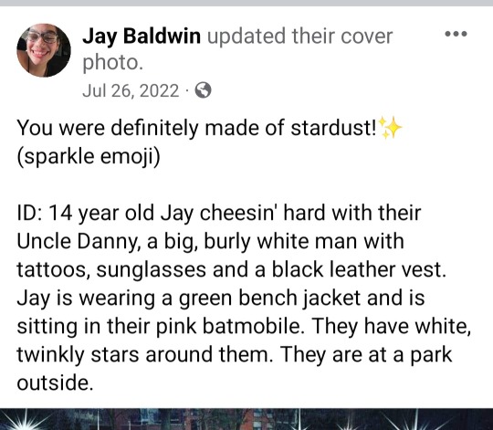
and meanwhile, on August 25th 2022, raisedeyebrowemojii ALSO suddenly started saying that their dad died, which you can see on the screenshot of their tumblr profile, which as webarchive screenshot shows, was not there before. While they changed the dates, raisedeyebrowemojii was clearly pulling from the real Jay's life, so it looks like we can see around the time that the dcammer decided to randomly incorporate this into their scamsona. As far as I can find, raisedeyebrowemojii never made a donation post regarding their "Father" and said that he was abusive, so adding this detail from the real Jay's life shows that it was unnecessary except to look more real and to manipulate people into believing them.
In the ways that raisedeyebrowemojii misconstrued things, they also of course constantly used the story that they were either homeless or on the verge of being homeless. Where Jay would post facebook updates of doing very well and being happy in life and even doing & hosting events for disability rights, raisedeyebrowemojii around the same time would post about needing money due to either allegedly starving, of dying, needing medical attention, or being homeless.
Below are screenshots of, in the order that they appear (so we're going chronologically in time that these were posted by both raisedeyebrowemojii and Jay Baldwin respectively) from left to right, raisedeyebrowemojii asking for money on February 16th 2023 talking about being in allegedly horrific conditions, then Jay Baldwin posting a peppy update on facebook, looking very happy and having a drink with the caption "Cheers to life!" on February 22nd, and then another donation scam post by raisedeyebrowemojii begging for money saying they're "on the streets" and "will die", posted on February 26th 2023.
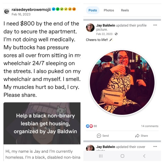
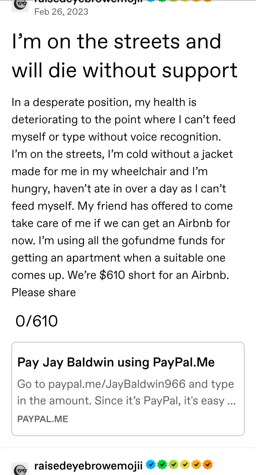
You'll be happy to know that the real Jay Baldwin is not homeless or food insecure, and seems to have had a good relationship with both of their parents and is in an accepting home, unlike what raisedeyebrowemojii claimed THEY had, and claimed they were being abused. Raisedeyebrowemojii likely falsified all that while still impersonating Jay and keeping tabs on them in order to create a false sense of urgency whenever they wanted money at random.
Normally I wouldn't go into this much detail about the people who were stolen from in scams, but I feel like this case in particular it was important to point out where the scammer was pulling from to debunk their lies, but also because the real Jay Baldwin has become quite an iconic figure in their area, and all this information was taken from multiple publicly available sources, and so I can only assume that Jay is comfortable with this personal information being known.
Little to no life details, interests, or personality outside of the impersonating Jay Baldwin, and manipulation
As I'm sure many of you know by now (as ive mentioned it in previous posts, and that some of you currently reading this were victims of the scammer), but raisedeyebrowemojii contacted multiple, predominantly Black users to attempt to befriend them, and they did this in order to appear more legitimate, and most likely so that they had "friends" to call upon should any of their scams have been questioned. We've also seen this with multiple other scammers where a new blog will appear and suddenly start tagging mostly Black users to ask them to (unknowingly) reblog their scam posts.
And as a more famous example, we've seen this with the famed scammer Laura Deramas where she befriended multiple users to get them to stick up for her.
But to get down to the title's point, outside of the life details they were stealing or misconstruing from the real Jay, Raisedeyebrowemojii didn't have much of their own personality or traits, which is common in scams. Say, for example, a scammer will create a scamsona who is a lesbian and loves cats and is making a fake donation post for a sick cat, and so in order to make their blog look more convincing, they will randomly reblog popular posts from tags about cats or lesbianism.
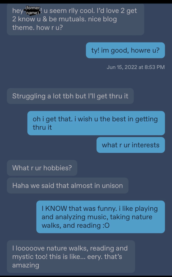
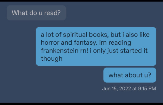
In Raisedeyebrowemojii's case, we had one user mention that while Raisedeyebrowemojii was trying to "befriend" them, Raisedeyebrowemojii would only answer very generic questions asked of them despite the fact that they sent the messages first appearing to try to get to know that user, like answering "I like reading!" Instead of answering what their favorite books are if asked about their interests. Below is a screenshot of that conversation. This user emphasizes that they never got an answer to the last question they asked.
"Kidney disease" and alleged "death"
I stated on my blog that I believe raisedeyebrowemojii randomly said that they were diagnosed with a "terminal kidney disease" (allegedly chronic kidney disease) specifically with the view that they could leave, deactivate, or abandon their blog and then move onto ANOTHER scam blog (and likely this was the blktransdyke blog) without looking suspicious or weird, because then people would just assume they had died, which is exactly what happened.
Raisedeyebrowemojii stopped posting around June 2023, and the blktransdyke blog appeared in early April 2023, which makes me think this is when they started to move to that blog or potentially even another blog we don't yet know about. Funeral scams, or scams where the scammer pretends their persona has "died" in general is not new and is actually pretty common. It's possible that raisedeyebrowemojii was going to (or may still attempt) to return on another blog and pretend to be a family member or "friend" of the raisedeyebrowemojii in order to ask for alleged "funeral money", which we've seen with blogs like the now deleted blog @destrawberry.
But the main reason I think why they stopped posting in specifically June is because that is around the time the real Jay Baldwin was gaining popularity again, doing multiple public events, and was doing very very well, so I think the scammer became aware there was now more of a chance of people discovering their scam. In June, Jay won an award at an LGBT film festival for a documentary they had made ("Supporting Out Selves") and an Academic Hospital wrote a piece on their success, and in August they announced that they teamed up with ASE Community Foundation for Black Canadians with Disabities to host their 3rd student summit in September. You can find evidence of this by googling or by looking at Jay Baldwin's facebook, but of course, please give respect to the real Jay Baldwin & do not pester them.
Conclusion
All in all I hope that this clarifies a lot of things for those of you that were confused by all this, and again, I extend my dearest sympathies to those who donated to raisedeyebrowemojii and were manipulated by them, I know the feeling and I'm so terribly sorry that it's happened to you too. I advise any Black users especially to be very cautious about any new blogs with a donation post up that is new, and this new blog is trying to ask you to reblog their donation post: it's common for scammers to retarget anybody who may have donated to them, talked to them, or even just barely interacted with them before.
I'll put some of raisedeyebrowemojii's old paypals, gfm accounts, etc in either the replies or another reblog, because for now I'm running out of space. If you donated to them at any point, i suggest you report their accounts where you did the donating. And in the mean time, my colleague @kyra45 is taking testimonies on raisedeyebrowemojii, so if you have an experience with this scammer and would like to share that experience with us so we can document this scammer's behavior, please send Kyra an ask.
356 notes
·
View notes
Text
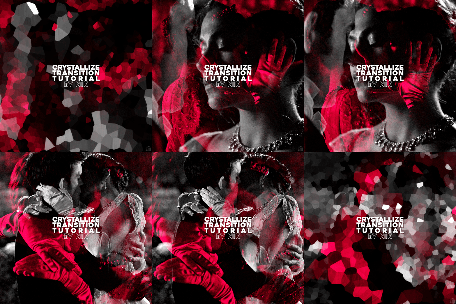
HOW TO: Do A Crystallize Gif Transition
Hi! I was asked to explain how I did the transition effect in this gifset, so here's a quick tutorial! Disclaimer: This tutorial assumes you have an intermediate understanding of gif-making in Photoshop using Video Timeline and requires the use of keyframes.

PHASE 1: THE GIFS
1.1 – Determine how many frames you need.
Since you need at least 2 scenes for a transition, consider limiting the amount of frames you'll use per scene. For a transition between 2 scenes that's 540x540px, I would recommend no more than 30 frames per scene (for a final gif that's 60 frames). Even that may be pushing it depending on your coloring. Just be sure to consider the dimensions and colors of your gifs in relation to the amount of frames to keep your final gif under Tumblr's 10MB limit.
1.2 – Import frames, crop, resize, convert to smart object for Video Timeline, color, blend, etc.
Do this as you normally would! If you need a tutorial for the basics, here's my tutorial. :) Please note, the methods in this tutorial only work with gifs that are converted into smart objects in the Video Timeline workspace.
Tip A: I recommend using scenes where there's a lot of one color (or scenes where you can manipulate it to look like that). The crystallize filter on a gif creates A LOT of movement that can feel a bit chaotic. Having your gif be primarily one color reduces the eye strain a bit imo.
Tip B: I like how this effect looks with blended scenes because it allows me to use different "crystal" sizes (more on this in Step 2.2). Check out the USERGIF Resource Directory for plenty of blending tutorials!
1.3 – Move all your gifs into one document, group into folders, and arrange.
Once everything's in one doc, keep everything organized in a group folder! I have just two scenes, so that's Folder 1 & 2. Within those folders are the gifs I blended, which I labeled by gif color. Then, simply drag Folder 2 so it continues right after Folder 1. (Make sure none of your adjustment layers from Folder 2 accidentally affect Folder 1! You can do this by clipping your adjustment layers to match the length of the gif as I did, or using clipping masks.)
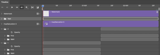
(Ignore that lone Hue/Saturation layer lol. I decided last-minute that I wanted my gif to lean more pink than red.)
PHASE 2: THE FILTERS
2.1 – Duplicate each scene.
We're going to use opacity keyframe animations on these duplicated scenes that allow it to go from "normal" to "effect" and vice versa. The filters will only be applied to the duplicates. In the screenshot below, all of my duplicates are highlighted:

2.2 – Apply the Crystallize Filter.
Above your sharpening settings, apply this filter by going to Filter → Pixelate → Crystallize. On the pink gifs, I made the crystals bigger (cell size: 45), and on the black and white gifs, I did a cell size of 25.
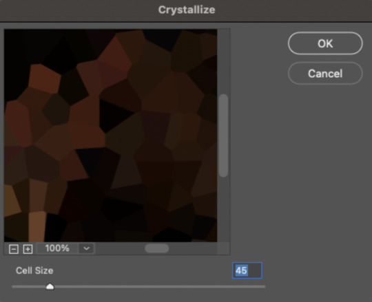
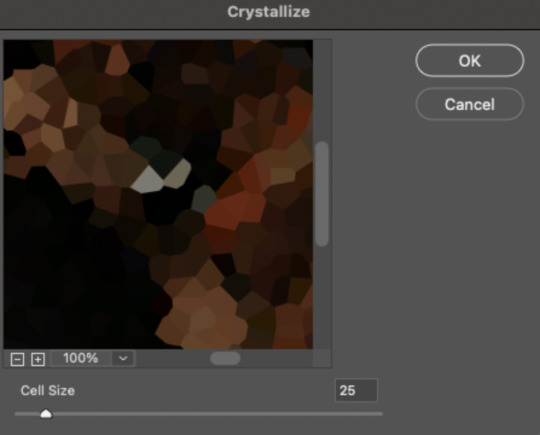
The different sizes help break up the uniformity of the crystals imo, creating more of a mosaic-like look, which is what I wanted to match my gifset concept.
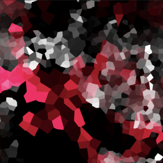
2.3 – Apply the Oil Paint Filter (Optional).
Filter > Stylize > Oil Paint. Here are my settings (they're the same for both crystal cell sizes):
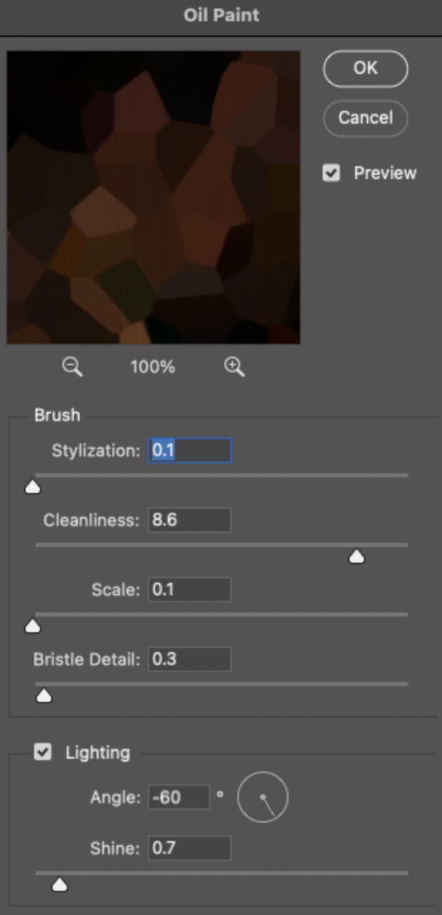
Brush – Stylization: 0.1, Cleanliness: 8.6, Scale: 0.1, Bristle Detail: 0.3
Lighting – Angle: -60, Shine: 0.7
This filter helps soften the cells a bit while adding some texture (left: no oil paint; right: with oil paint):


2.4 – Repeat steps 2.2 & 2.3 on all duplicated scenes.
PHASE 3: THE KEYFRAMES
3.1 – Add opacity keyframes.
The very start and end of each scene needs an opacity keyframe set to 100% opacity. Move 0.09 seconds from each of those points, and place another opacity keyframe, this time set to 0% opacity. We're basically making the crystals fade in and out. Please reference the screenshot below for keyframe placement:

If you need more info on opacity keyframes, check out Phase 2 from this fade transition tutorial I did on usergif.
3.2 – Repeat step 3.1 on all duplicated scenes.
All the keyframes in Folder 1 should line up exactly and all the keyframes in Folder 2 should line up exactly!
PHASE 4: THE DUPLICATES
4.1 – Convert back to Frame Animation.
If you're not sure how to do this, I've written out the steps here. I rec the action linked in my general gif tutorial which I shared earlier!
4.2 – Delete duplicate frames.
Whenever you use keyframe animations, you'll get duplicate frames. That's just how it works, unfortunately. If you follow my steps exactly (specifically the 0.09-second spacing, which follows my tried-and-true 0.03-second rule), you'll have a total of 12 duplicate frames exactly — 3 duplicates per keyframe section. Just manually delete them! You can spot the duplicates by eye, but with this spacing, it's usually the 2nd, 5th, and 8th frame for each transition section. The selected frames below were my duplicates:

If you want to learn more about why there are duplicates and the math behind it all, I explained it in more detail in this ask.
4.3 – Export and you're done!

I hope this tutorial helps! Let me know if you have any questions :)
#gif tutorial#completeresources#usershreyu#usernanda#useryoshi#userzaynab#userrobin#usersalty#userhella#alielook#uservivaldi#tuserabbie#useraish#userabs#tuserlucie#mialook#resource*#gfx*
280 notes
·
View notes
Text
i don't really have any solid conclusions about this yet but i noticed A Thing in a rewatch and i haven't found it mentioned elsewhere yet so here we go
(apologies for the appalling image quality you're about to see, i can't screenshot easily rn pls bear with)
OKAY so in the scene where crowley confronts gabriel about "shut up and die", something about the arrangement of book stacks caught my eye a little
the majority of the books are angled so that we mostly just see the page edges and not the spines clearly, EXCEPT for a particularly shiny and familiar colour combo right here-
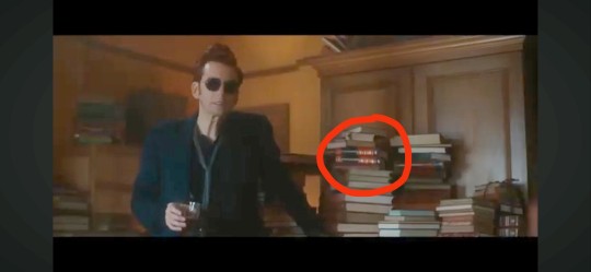
but nothing too weird going on there, i thought, crowley coloured books in a bookshop so what? right up until i registered crowley's line when we get a closer look-
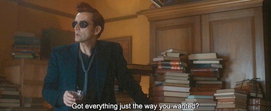
hhhhmmmmMMmmmm yes yes "everything just the way you wanted" huh, very interesting considering that we know how much thought goes into props huh
and for most of the shots we get of crowley in this position those freaking books are just quietly nestled right there in the corner-
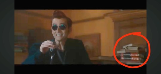
look at that god damn framing i fuckin see you, you glorious bastards
so i paused to see if i could figure out what the hell was up with those fuckers and this is when i absolutely lost my mind, your honour
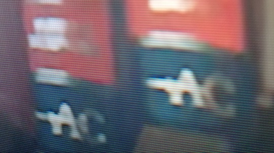
A and C you say?? in crowley colours???? framed like this?????? localised entirely within your kitchen???
anyway long story short they're two books from an Agatha Christie Crime Collection set (24 volumes, three stories per volume) and guess whats on the mfing front covers I'm-
(its a rant for another post but when paired with this other set of initials spotted in s2 i want to scream actually)
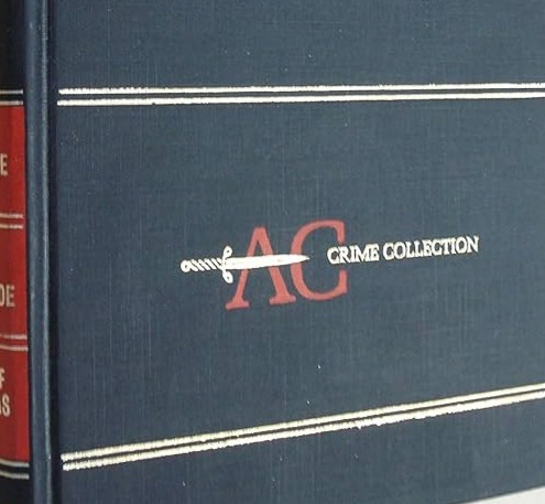
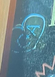
ANYWAY back to the books, through an absolutely unhinged comparison of the formatting of gold text blobs i reckon the two we have here are:
(on top) The Pale Horse; The Big Four, The Secret Adversary
(on bottom) 4:50 From Paddington, Lord Edgeware Dies, Murder in Mesopotamia
(I'm fairly confident but if anyone has a better image to confirm/correct this pls do)
now here is where I'll need a bunch of help from some Christie-heads out there bc I haven't read any of these and I've only seen the tv adaptation of one of them, so i dont know for sure if these are like A Clue, or A Cool Thing, or if I've just fully brainrotted myself into a fun lil corner here? wa-hoo
but here's some initial stuff that jumped out at me after skimming the basics:
(some of) the titles: Pale Horse/Big Four - death's horse ofc, the four horsemen mayb? the them+adam?? ; Mesopotamia is a very biblical choice bbz ; 4:50 From Paddington- azi likes trains i guess? idk that one's tenuous lmao ; honestly no idea with the other two but Secret Adversary feels a tad ominous
iirc Big Four just has kind of an unusual history, it was initially twelve short stories that she later compiled into one, and it was published fairly soon after christie's mysterious disappearance/reappearance
in Big Four, poirot fakes his death at one point and doesnt even let hastings in on it and I'm hoping sure its totally irrelevant to the ineffable bois
part of the Pale Horse story is a group of assassins that basically try to pass off all their murders as being actually caused by like ✨satanic powers✨ which is interesting
christie knew a fUCkton about poisonings thats why she wrote so many into her work and, while i don't believe the poison coffee theory myself, it sure is an interesting link with how cyanide is associated with almond smell/flavour and that metatron chooses almond syrup in particular
(ALSO random side note that is mostly meaningless but I've worked in a good few uk coffee shops and have never worked anywhere that stocks almond syrup; almond milk yes, hazelnut syrup yes, but never almond syrup...? prob just the places i worked though lmao)
EDIT forgotten point: I've seen some speculation that the bently's plate reading "CURTAIN" could be a reference to poirot's last story, along side that alternate scene of crowley ordering the sherry for "miss marple", its just one too many agatha christie references for my melted brain to handle and I'm SUS
so this is where i run out of idea steam and hand it over to you lot because i have no clue what this could mean, if it even means anything other than a cool set feature
is there something here actually or am i yelling into the void just for fun?
who knows, who cares!
#good omens#good omens 2#good omens spoilers#good omens 2 spoilers#good omens meta#ineffable husbands#ineffable idiots#agatha christie#hercule poirot#miss marple#can't wait to hear y'alls thoughts#SO WHY IS THERE A KNIFE THROUGH THE 'A' HUH#AND WHY IS THE 'C' ON THE CHALKBOARD SO FADED HMMM#GAIMAN EXPLAIN#things that make me go ngkk
237 notes
·
View notes
Text
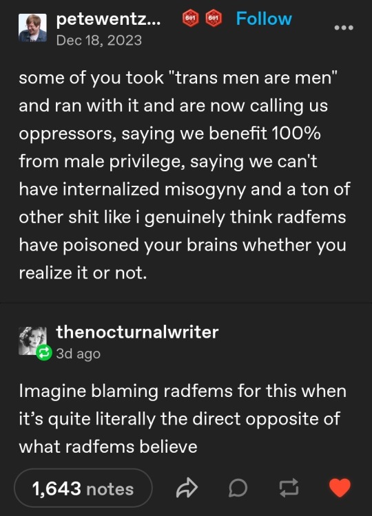
as you can see, reblogs and replies are now turned off for this mind-numbingly braindead post, but I couldn't resist sharing some of the batshit content in the notes.
typing in color so it's easier to tell my commentary apart from the screenshots
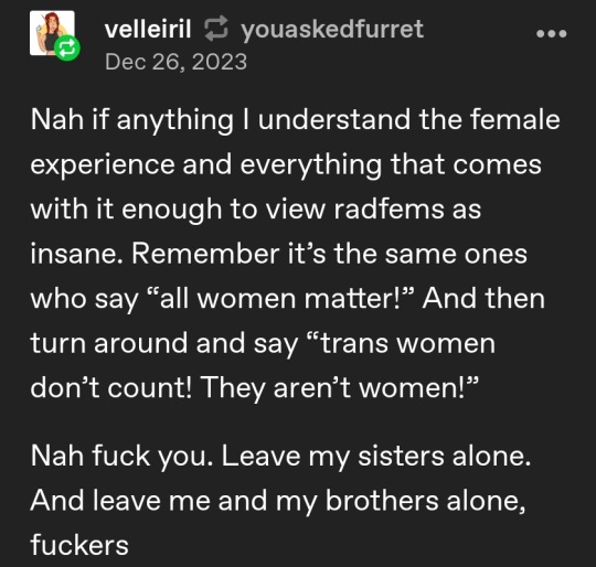
radfems are insane because... we think "all women matter" doesn't include males. incredible insight. I also love "leave my sisters alone. and leave me and my brothers alone, fuckers," as if that's the direction the harassment is typically occuring in. as if radfems are hunting trans people for sport simply by not believing in or supporting the gender construct. yes. we are clearly the insane party here.
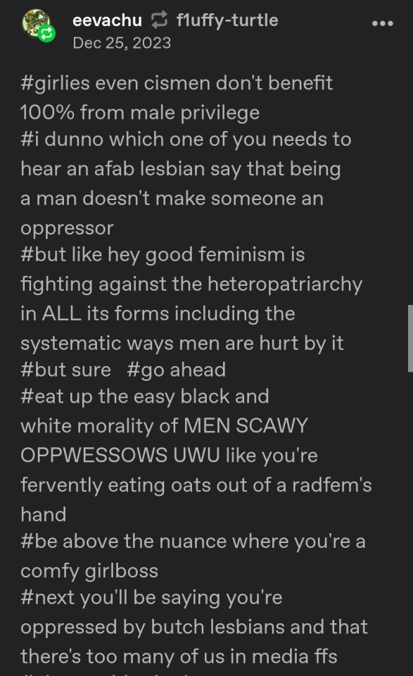
more evidence we're the insane ones, as this person claims men aren't an oppressor class and that somehow believing that they are will lead to... believing butch lesbians are an oppressor 💀 this is your brain on gender - completely unable to even consider sex, only "masc presentation," which is how they come to the batshit conclusion that acknowledging men are an oppressor class will ultimately come to include butch lesbians.
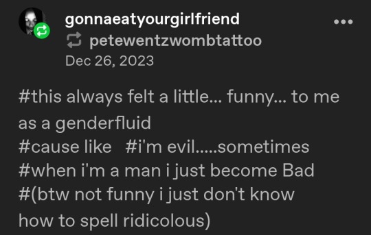
... girl. what.
however........ there's one reblog that really stands above all others. It is so long and so unhinged that it surpasses tumblr's image cap, so I'm going to have to do a part 2 of this post. but here's a sneak peek:

Gender worshippers learn what gender essentialism & bioessentialism actually mean challenge: impossible
Seriously. Y'all loooove redefining shit so much, but these terms were created for specific reasons and you can't just rewrite any word or term you want to suit your beliefs. Gender essentialism refers to the commonly held belief that gendered traits are biologically determined by sex rather than learned. The idea that women are "naturally" or "biologically" homemakers, more nurturing, less confrontational, and more emotional, that little girls "naturally" or "biologically" prefer dolls over toy trucks, that women "naturally" or "biologically" feel driven to have babies and there's no such thing as a happy childfree woman, that sex is inherently more emotional and meaningful for women, that men are more logical, better at STEM subjects, better drivers, that it's "natural" for men to cheat but not for women to, that men are "naturally" or "biologically" more aggressive, that paintball and Call of Duty are naturally "for boys," and a thousand other ridiculous things way too many people believe.
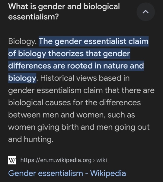
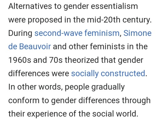
But oh shit, what's that? The people who really started fighting back against gender essentialism and arguing that gender is a social construct were... second wave feminists???!!! the very movement radical feminism is born from and shares most of its tenets with???!!! it's... it's almost like... radfems are the literal opposite of essentialists 😱
Meanwhile, today's trans community will tell gender-nonconforming people they're "eggs" and "totally going to come out as trans any day now" while simultaneously claiming not to define gender by stereotypes 🤡 like, OK...
check notes for Part 2!
#mine#tra reciepts#peak trans#trans activism#gender identity#gender ideology#radblr#radical feminism#misinformation#gender essentialism#bioessentialism
305 notes
·
View notes
Note
What's wrong with using a pose ref lol, didn't you just redraw a screencap from a tv show
See this is why I prefaced it by saying it's not objectively "wrong", it's a personal take and a grey area. Ultimately if an artist tells you they're uncomfortable with something and you choose to do it anyway it's on you if they then complain about it or ask you to reconsider, it's not the law. You can always tell them they're wrong but then don't be surprised if they take issue with that lol
But for a more detailed answer, I know I've said this a thousand times but I'll always hammer it in. I think there's definitely leeway to do redraws of things across media (so if you redraw a screenshot from an animated show and link said redraw etc, I see it as more of a transformative thing and a tribute than just straight up copying. Same for live action or even photographs - the same way that if someone took one of my drawings and decided to replicate it in photography or animation with a very clear link to it I would see it as more of a tribute because it's transformative) but even then if anyone was shown to take an issue with it I'd just Not Do It. Also the vast majority of the time these things are memes and very obviously a nod to the original one rather than me saying "look this is totally something canonical to the characters I'm drawing and didn't originate elsewhere"
There's times when I don't take an issue with people using my poses as inspiration or reference but a lot of my work does sort of just work as pieces of a comic or a scene that I don't like seeing repurposed for other characters. But that's the keyword: I don't like it. Not gonna send the police after you for it or claim copyright or even force you to take it down but I may *ask* you to reconsider it and think about it. And if it's a recurrent thing and I see you do it a lot I may insist 🤷♂️ it's a boundary I established but others are free to feel differently
ALSO I'm not referring to accidentally creating shit that's too similar. We all take inspiration from each other so that's bound to happen. I'm mostly referring to when it's very obvious a single artwork was used as a direct reference - and again, no shade if people do it without realising the artist might feel bad about it. I never assume ill intent from the get go
#ask#im not the only artist feeling this way too#so I think it's just something to keep in mind you know
171 notes
·
View notes
Text
OMG!?!??! I WANT TO TALK ABOUT THIS SONG (and AU), RIGHT NOW!!!
(By Lydia the bard
TINKERBELL VILLAIN SONG - Fall Little Wendy Bird Fall | Song by Lydia the Bard and Tony | Animatic
The title^)
youtube
First of all the cover art is AMAZING, Tink is SO pretty, the sparkle and lines on the wings, her grin, HER HAIR, HER EARS, HER DRESS,
Also, "Fall Little Wendy Bird Fall" is a great title
Now the video itself and its lyrics, i really REALLY want to just compliment every single frame of this video, its so beautiful, so well done, its like it was blessed by The Muses of greek mythology,
Okay so the lyrics at 0:45
"You dont seem to quite understand what is at stake,
This messed up little family that i had to make"
Not only is this line so beautiful with the way her voice sounds, its pretty much a nod to the fact Tink and her friends kidnapped peter pan and the lost kids to keep her and her friends alive
(0:55) \/
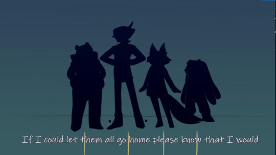
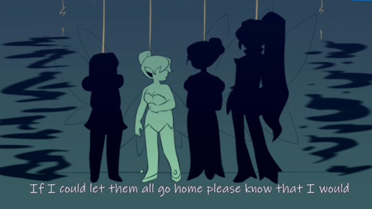
"If i could let them all go home please know that i would
But it'd do more harm than good"
Just Tink expressing her guilt that she and her friends kidnapped the lost boys so that they could keep existing, but like, JWHSEAJKHWED, she ofc doesn't want her or her friends to die, and since people are slowly not believing in fairies anymore, they're slowly going extinct, ALSO, Fawn and Silvermist are DEAD, so yeah, that messes with someones head
AAAALSOOOO, i LOVE their silhouettes, the height and weight differences instead of them all having the same height and weight like in the movies, plus, i LOVE that despite not looking like how they do in the movies, you can probably still tell who is who,
ALSO
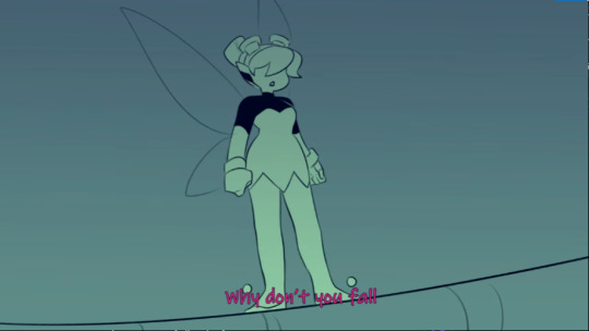
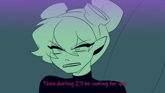
Even if it wasnt intentional, i like how in kinda faraway shots, Tink has a more cuter roundish look, while in closer shots shes more edgy and more intimidating(? if that's the right word), kinda showing how others view her (kinda?) as a cute fairy, maybe underestimated, but yknow, close up, shes plotting to kill a child
(1:15)

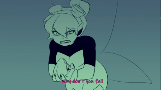
I love how Tink is gesturing in this scene, cause 1. It conveys to the audience what she wants from the lost boys and 2. Canonically, when fairies talk, people usually just hear jingling of bells, so shes gesturing because shes also conveying what she wants to the lost boys
1:23
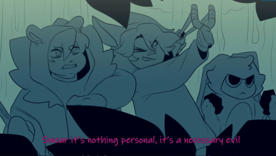
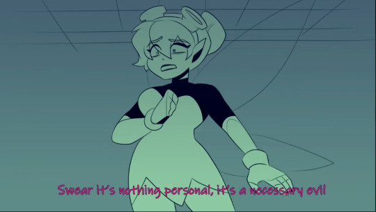
"Swear its nothing personal, its a necessary evil"
I just love this line because it is a necessary evil, she needs the lost boys and peter pan in neverland to believe in fairies so that they exist, and Wendy is pretty much a threat, since she makes the lost boys want to grow up with families,
Also, the lost boys look so cute in here, i cant remember their names tho, one is holding a slingshot, aiming at wendy, one is holding rocks , and one has a stick , so Tink just told these children to assassinate Wendy, or at least attack her.
1:35
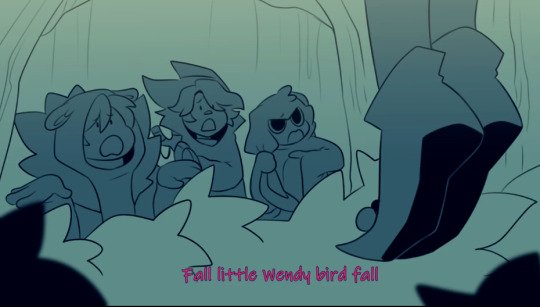
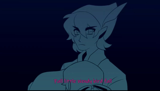
I love how the kids explain that Tink make them do it, and Peter Pan just glares at Tink, and i love that I'm pretty sure that Peter isn't mad/doesnt blame the lost boys
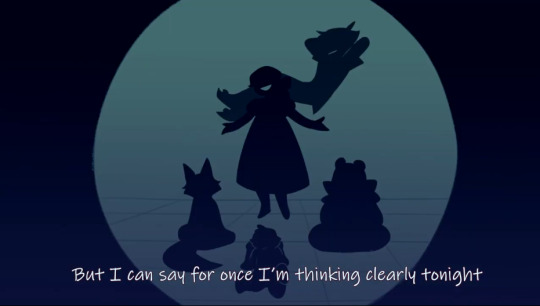
As seen in this scene where Pete is smiling and stuff at the Lost Boys and/or at Wendy
1:55
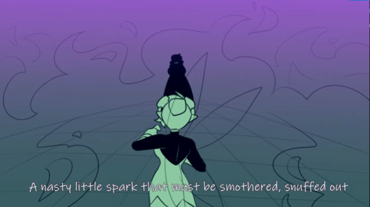
I love how Tink refers to Wendy as a "Nasty little spark" because, a spark can turn into a fire, damaging a lot of stuff and people, pretty much saying that Wendy has to be snuffed out before she causes a fire,

"Setting fires inside my house is just not allowed"
Pretty much referring to the fact that Wendy, the spark, is creating a fire, aka, making the lost boys want to grow up and go back to the real world, making them not believe in fairies anymore, thus, making her and her friends die, which is, not allowed.
Also. the fear in Tink's eyes is so fear, her expression is on point, the mix of concern and fear is just, so beautiful, also i love her pointed ears
2:17

First of all, this screenshot does not do justice to the actual design of the mermaid (siren?), cause they are AMAZING, BEAUTIFUL, GORGEUS.
Also, the fact that Tink is persuasive enough to convince someone to kill Wendy in such a short amount of time is impressive, and the fact that the mermaids agreed so quickly is also impressive,
When it failed, the absolute horror and shock on Tink's face? Shes horrified that another plan of hers failed, and shes scared that her friends might die, like, wow
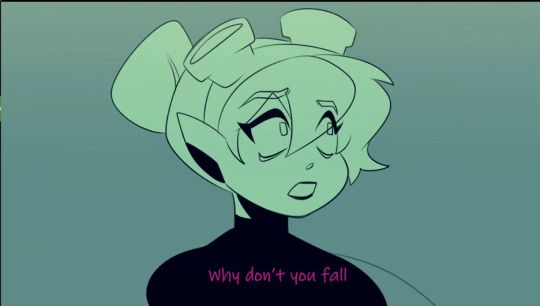
The despair on her face is just so...asdjwoaijdoiwajd
3:38
The fact that Peter Pan (i cant even give him a nickname cause Pete sounds different and P.P. is just wrong and Pan is just A Thing), first at the gust of wind that blows away the pixie dust (which keeps the ship afloat) he covered his eyes, maybe cause the dust or his hair in his eyes, then he looks at Tink in anger and shock and probably some confusion, then looks at Wendy, in concern and fear,
Theory: Pan knows that, since Tink doesnt want the lost boys to leave, and he knows that gust of wind was from the fairies, and Tink's dislike and hatred to WEndy, that Wendy was probably the only one not going to be saved, which is why he only looks at her and tries to save her (that or he's a SIMPPPPPPP /j)
3:50

The fact that you can see Wendy screaming??? Chills,
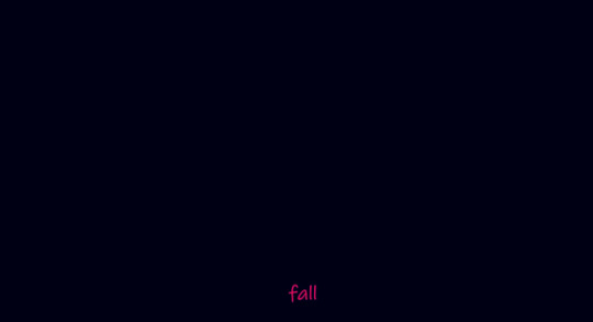
And the black screen right after, signalling Wendy's death is just amazing
Anyways, overall, what im saying is
THIS SONG IS AMAZING GO CHECK IT OUT, GO CHECK OUT THIS PERSONS CHANNEL, THEY HAVE GOOD VILLAIN SONGS, THEY EVEN HAVE ENCANTO!!!!
#Lydia the Bard#Villain Song#Villain Songs#Fall Little Wendy Bird Fall#song analysis#Though i did little analyzing but idk#GREAT SONG#TInkerbell#?#Youtube
176 notes
·
View notes