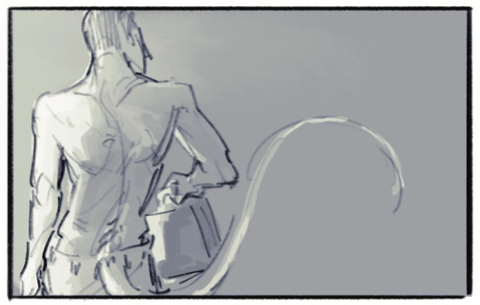
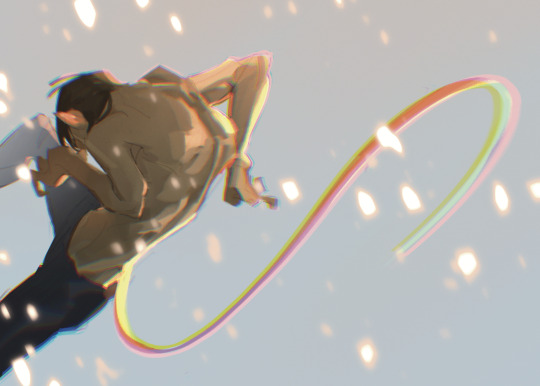
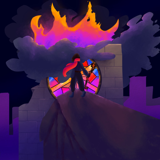
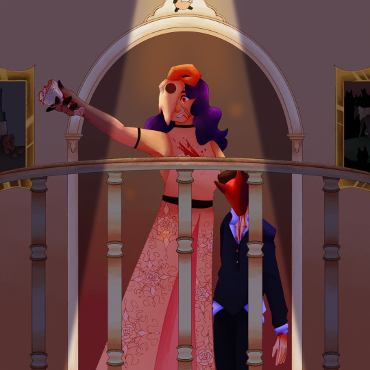
#so i had to redraw it! i tried to make the lighting feel like the sun
Text

why? i batted a run in
#i cant explain how insane i am about this scene#to u guys who are unfamiliar imagine the person u idolize telling u to ur face ur not doing enough#imagine they are right too#so i had to redraw it! i tried to make the lighting feel like the sun#then panicked like WAS IT RAINING nope can confirm it was sunny#hanai azusa#tajima yuuichirou#oofuri#ookiku furikabutte#big windup#my art
226 notes
·
View notes
Text
I wrote this on twitter but I thought I'd put it here too, since I occasionally get asks on how I draw/any tips I might have. On twitter I also made the caveat that I don't feel I'm qualified to give anyone tips, LOL, but I was drawing today for an assignment and felt like this is worth noting to any beginner artists who have a tendency of clinging onto sketches that they feel like they finally got right! (A.K.A, a habit I still have years later HA!) This isn't so much of a tutorial as expressing my thought process in this discovery of how to draw more dynamic pieces. I found it to be satisfying on my end, seeing it unravel, so hopefully it can help someone who may be struggling with the same thing I am.
MAKING MORE DYNAMIC PIECES, A PERSONAL STUDY!:
I wasn't upset by this drawing, but I could tell there was something stagnant about it so I ended up pushing it and redrawing it a million times to see if I could somehow make it look more dynamic.

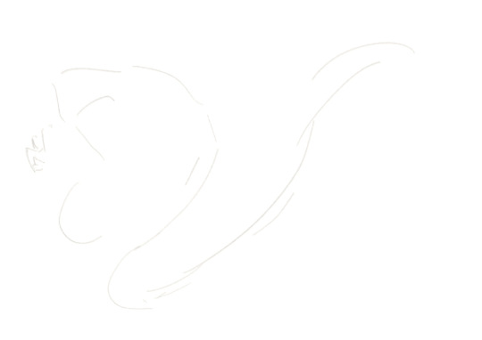
Here's one part of the timelapse - I'm clearly adamant on trying to make this pose/composition work but while the sketch itself may look better, the stagnation hasn't changed. Perhaps this works for some people, but anyone seeking a dynamic visual will be able to spot that this simply isn't working as anything more than a semi-decent anatomy study attempting to be applied.
I changed the position of both arms, I tried to play around with the angle of the head, I tried to just the hips forward more so that the spine had increased curvature, but the main issue, really, was that the initial composition lacked the dynamism in general. It prioritised dramaticism over dynamism. Both can exist in the same piece - it did not, in this one.
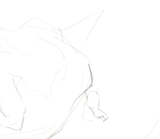
This was the new sketch I started with. Less rigid base to go off of. Just getting down the general shape I wanted to score - make the spine and tail take a sort of mid-whip path, shoulders hunched, hips cant forwards, as if he's curling in on himself. I think for a dynamic piece, it's more helpful that your initial sketch uses the body as a general marker as opposed to something to do lineart over (granted, I don't really do lineart anyway, my sketch is usually the extent of my "lineart", but since this is just looking at creating a more dynamic composition, I think it still applies!)
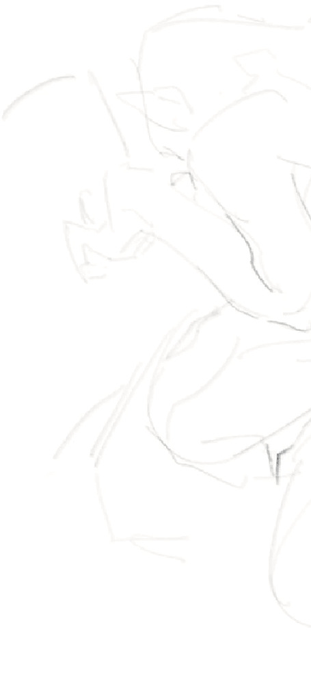
Here it's the same principle. For the left image (the legs) I've established where the knee of the right leg goes, and where the hip that precedes the left leg will sit. These are just base anatomical structures that help me figure out 1. Whether or not the mere idea of this composition will work, and 2. where I have to stop once I start drawing. For me, having some sort of limitation for the body helps me stay within range of proportionate anatomy (not that I particularly care for the anatomy to be realistic, just proportionate to the style I'm drawing in)
On the right image is also the same principle. Establishing the movement of the arm, the elbow/arm bend, and the hand. (If you see the full sketch before the two above, I established the hand in that one too - it really is helpful figuring out the placement of the hand ahead of time.) If it looks atrocious afterwards I always have the lasso tool/eraser to save me.
The new attempt brings me to this. While preference in art is subjective, I do think I'd be staying in SOME realm of objectivity when I say this is more dynamic than my initial sketch, LOL. Of course, lighting/rendering choices help push the composition a little more, but this achieves what I couldn't do with that first sketch. I had a general idea, but it's important to know when to let go of something that clearly isn't working.
Would love for anyone to add their own tips or ideas to this post - I'm not particularly known for dynamic pieces so I'm always looking to learn. This was a really valuable study for me so I wanted to share it, but everyone has their own method and what works for me may not work for the next person!
There's a few other asks that asked me for tips on general anatomy, and more specifically legs (oh dear god, I'M going to need to study for that before writing out any sort of resource guide for that, lol) that I hope to get around to doing in the near future. Thank you for your guys' vote of confidence, haha! ❤️
#nc111 tutorials and studies#sketch#art tips#art help#study#I had a lot of fun with this piece so while part of this was definitely to passively respond to my inbox requests#a big part was also just me wanting to talk about my brain expanding as I realised how to Push A Composition#I can't wait to try more things in the future to try and get more dynamic compositions#let me know if this was helpful let me know if it was utterly useless#I'm not a great teacher but I used to tutor my neighbours 7 year old daughter and she found my methods boring but hey she got better
65 notes
·
View notes
Text

I've gotten an absolute spike of motivation lately so I've been drawing a ton lol. I figured it might be nice to draw fanart based on the more recent events since they're pretty fresh in my mind, and others. This post might have a bit more words than I try to put on my art posts so I'll just start it off by showing the panel of @somerandomdudelmao 's comic I redrew.
Ok so the main thing I wanted to talk about more in this post is- I'm not great with backgrounds and stuff, working off the gray is hard for me, which is why the last fanart I posted didn't have a background lol. I thought about making the lighting more inspired by one of the screenshots of the Hidden City. (Since I assume that's where this scene takes place. Funny enough I tried to find screenshots of any trees for the leaves blowing but I could only find glowing mushrooms haha.)
At the end of the day while I was getting ready to start working on the redraw, I clicked the link for the post that helped inspire the next update, too. And oh boy I was absolutely inspired as well.
https://www.tumblr.com/tapakah0/722593112900403200/somerandomdudelmao-cass-sensei-this-is-the
@tapakah0
Mayybe this type of ramble is better saved for a reblog but I absolutely fell in love with the environment she created in this scene, and that's why I chose to go with that color palette for the environment. Considering my initial plan was the bright yellows, oranges and greens typically used for the hidden city- I gotta say I don't think it would've come across with the same vibe it intended to. With the post I was heavily inspired by, it's just such amazing art, really. I struggle to put it into words but the bright blues really just help give it the calming atmosphere while also keeping the uplifted/hopeful nature of the environment I feel in the recent updates. If you can't tell from some of my votes I really like to work with glows and dramatic lighting lol, and the lighting in this was just amazing, I feel like it worked so well. Wished I could've worded my praise better but unfortunately I am not the best at describing things, especially when they get technical..
If you haven't already I highly encourage checking out Cass' AU and Tapakah's post I linked to especially. I plan to check out her AU too but I haven't gotten around to it yet, but the work I have seen from her is amazing as well.
Sorry for getting really rambly on this one. I had a lot to say I guess lol.
#rottmnt#rottmnt fanart#save rise of the tmnt#save rottmnt#unpause rise of the tmnt#unpause rottmnt#redraw#rise of the tmnt#rottmnt future raph#digital art#cass fanart tag#cas fanart tag#somerandomdudelmao#tapakah0#cass apocalyptic series#cass apocalypse series
326 notes
·
View notes
Text
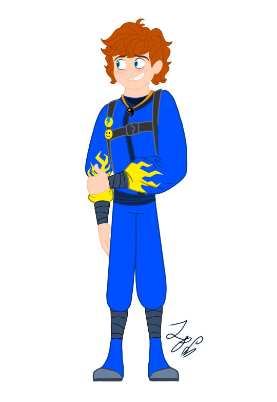
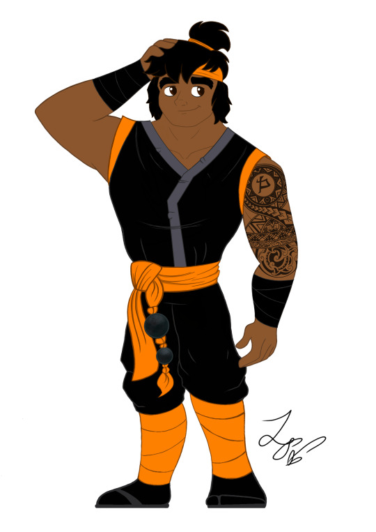
Ninjago Remastered Designs!

THEY'RE DONE! After months of work!!! They are DOOOOOOOOOOONE. WOOOOOOOOOOO! Lol! Welp, these are my Ninjago designs! Basically, this is my take on the Ninja if they were in a 2d animated cartoon! And yes! I will be drawing more characters. Tumblr butchered the quality, so close ups and design notes are below the cut. They're pretty detailed, so I highly recommend checking them out. Feel free to ask questions about the designs! ⬇️⬇️⬇️ - ��️🐉


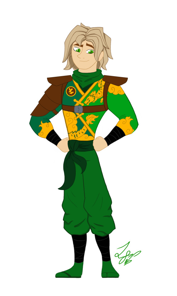
When designing these outfits, I tried to take inspiration from the ones in the show. And in terms of art style, drew inspiration from early 2000s cartoons, (Action Adventure ones specifically,) Anime inspired shows, and even a hint of traditional Disney animation. And while I designed them with a 2d cartoon in mind, most of the designs would most likely have to be simplified for them to be used in animation. So let's get started!
Kai: Kai was a pretty fun to work with. I actually didn't plan on giving him a sleeveless outfit. But it happened! And I like it! If you'll notice, the flame pattern on his vest mirrors the pattern on his sister Nya's outfit. I thought that would be a cool detail to include. It was inspired by their March of The Oni outfits. I also made sure to include his scar and bandaid. And gave him reddish brown eyes to signify his elemental power. Him and sister I imagine being Brazilian/Taiwanese. So I hope I captured their ethnicity properly. I'm pretty happy with this design. Especially his hair, which was hard to replicate.
Jay: Jay was a hard one for sure. I wasn't too sure how to vamp up his outfit. So I started by giving him some lightning patterns on his Gi. (At least I think that's what it's called?) And I decided to make it look a little baggy and soft. It just seemed to suit him. I tried something a little more form fitting and didn't look right. Also! A fun detail I included was his half the Yin Yang pendent around his neck! And of course Nya has her half. I imagine him having Irish ancestry, so I gave him pale, freckled skin. And gorgeous curly red hair. (As a fellow red head, I'm very proud.) Overall, I think he turned out pretty adorable. And his face is spot on.
Nya: Nya I pretty much got right on the first try! I just had a really clear vision of her in my head. I gave her a grey outfit with bright, vibrant blue details. The pattern on her Gi is inspired by Koi Scales. And she has her half of the Yin Yang pendent around her neck. I really like this one, because while it is simple, it's beautiful. And I think it reflects her element nicely. The only thing I missed was to give her a symbol like the rest. But overall, I love it! One more thing is that I wanted to give her and Pixal different hair. So when I finally release my Pixal design, you'll see that while they both have ponytails, I gave them different cut and styled ones. Should be neat!
Zane: Zane was the first one of the Ninjas I redesigned! I love how he turned out. I tried to give him a splintered ice effect on his outfit inspired by his Core minifigure and gave him his faithful falcon companion. Falcon has his old greyish purple feathers, but blue icy eyes to match his owner. I also wanted to give Zane flowing sleeves, that would look very majestic waving about in a blizzard wind. He is also incredibly tall. Taller than Cole even! I was inspired by the giant humanoid robots I'd seen in movies. In his cloaking disguise, I imagine him looking German. With blond hair, blue eyes, and light skin. I also like to think Dr Julian was German. (Was this influenced by my German ancestry? Who knows?)
Cole: You would not believe how many times I had to redraw this man's face. Haha! I just could find that sweet spot! That face that perfectly encapsulated his strong, but gentle personality. But I think I did it! His outfit is based on his Oni Trilogy Gi, with orange detailing. And he has his Island ponytail and bandana. I absolutely loved that hair style on him. So I had to use it! And if you'll notice, he has a beautiful tattoo on his right arm, with his symbol in the center. I imagine him being half Maori, from his mother's side. And the tattoo was inspired by Maori tattoos I saw pictures of. I'm not too sure how accurate those images were. But hopefully I hit the mark.
Lloyd: Finally! Our green Ninja Lloyd! His outfit was inspired by two things. Dragons, and his outfit from the Secrets of Forbidden Spinjitsu seasons. I gave him a beautiful golden dragon and cloud pattern on his clothes, a leather arm guard, and shoulder pads. If you look closer, you'll also see he has cat-like dragon eyes which pays homage to his dragon and Oni heritage. I like to think that depending on his emotions, his eyes will go from slits, to big and wide. So they are good indicators for his mood. I also imagine him being Japanese. But his powers give him his classic blond hair and green eyes. I'm very happy with this design. His hair, eyes, and face all look exactly how I see him in my head.
Well, that's all. I hope you enjoyed these designs and notes! I assure you, you will see more of the them.
Bye! - ✒️🐉
#ninjago#lego ninjago#ninjago lego#ninjago fanart#ninjago lloyd#ninjago jay#ninjago cole#ninjago au#nya smith#lloyd garmadon#lloyd ninjago#lloyd montgomery garmadon#jay ninjago#jay walker#nya ninjago#ninjago nya#cole brookestone#cole ninjago#cole brookstone#ninjago kai#kai jiang#kai ninjago#kai smith#zane ninjago#zane julien#ninjago zane#My art#ink dragon#Ninjago Remastered
76 notes
·
View notes
Text


A request for something a little different than usual 🍑👑
Progress stuff below:
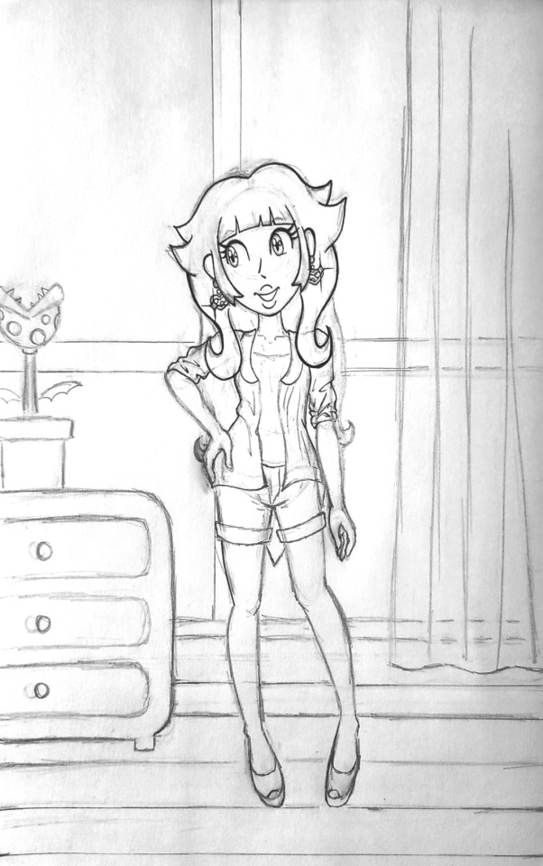

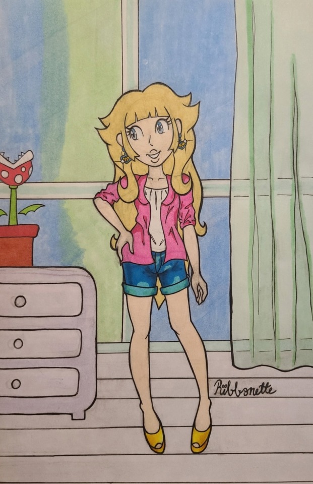
I haven't done progress shots in a bit and I think it's something I want to do more often because I like talking and blogging I guess haha.
Now that I have more experience illustrating digitally, this kind of direct reference drawing is MUCH easier to do digitally 😫honestly this felt like a self imposed challenge lol. BUT I did want to do some more traditional stuff because I feel that I had been doing a little too much digital, if that makes sense. It's nice to play with my markers and color pencils once in a while too!!
Doing the line art on this piece ESPECIALLY felt easier to do traditionally than digitally. For some reason, trying to do line art on a tablet screen feels too smooth or slippery or something. Lining traditionally feels easier, probably because I put so much pressure on the paper in the sketch phase that when the lining phase comes next, it feels like I'm just following the lines on the page like a train on a track ^_^
despite uploading a couple of illustrations colored with marker now, I still feel a bit like a novice when it comes to marker. I got a new pack of markers that I wanted to play with, which was even more motivation to return to paper for a bit. But honestly, I feel like I fudged the window color blending. I watched tutorials and stuff on blending with markers but I guess I still need more practice ^^;;; at least it looks a bit messy to me. This is how this piece came to be a mixed media illustration, since I tried using color pencils to make that transition from blue to green on the windows a little smoother.
I think the pot holding the piranha plant came out a tad too saturated and it's calling too much attention compared to the very light floor and dresser. I was trying to follow the colors on the reference closely as an easy re-intro to traditional art, but next time I do something like this, I think I'll take more liberties with color and see what happens.
Overall, I'm quite happy with how Peach turned out. I don't draw humans too often since I typically draw Sonic characters lol. Sometimes it feels like I have to re-teach myself to draw people as a result. I really liked using the gelly roll for the highlights on her face and the polka dots on her shirt :3 I highly recommend using that pen as my previous experiences with other white gel pens don't compare to this one (not to sound like a commercial I'm just really happy it worked as well as it did!).
And finally, although redrawing a creation from a dress up game screenshot is probably not the most imaginative exercise I could be doing with illustration, I think it's fun and it's pushing me to do things outside of my comfort zone. I'm using new art tools (I'll get better with marker I prommy) and I drew a background! I'd like to do more backgrounds like this as a practice to encourage more original stuff. Maybe. One day. Probably.
If you read all of this until the end, thank you! Have a wonderful day, and thank you for following me and supporting my art :3c 💝
#princess peach#super mario bros#the dress up game is called 'pink cutie' in case anyone wanted to know
30 notes
·
View notes
Text
another ramble about art again so i’m hiding it all under a ‘keep reading’ thingy so as to not clog ur feeds :]
aka thoughts about imposter syndrome, fanart, and what it means to draw stuff loosely disguised as a ‘ramble’. maybe a bit of akito almost-kinnie-isms (and probably ena) in there too because why not. also sorry this gets a lot less coherent as it goes on (i lost my train of thought near the end. it’ll come back someday)
i want to keep getting better. i want to keep growing and improving, so that i can convey the ideas in my head to others. i’m afraid to stagnate for too long, because what if it means i’ve hit my limit? what if i’ll never get better than i am right now? an irrational thought, really, but that doesn’t mean it’s impossible. hell, i felt like i hadn’t improved all that much from a year ago, when i tried to redraw a few of my older posts.
part of this stems from the question ‘how do people see my art? what kind of artist am i to them?’ which comes from when i got into fanart and fandom spaces, a long time ago. i would categorize the people i looked up to, my idols, my role models. there was the one that made comics that felt like home with your friends, and there was the one that made pieces that felt like i was sitting in a café in the middle of a busy city, and there was the one that made renders that felt like i was looking at liquid gold. i was fascinated by the effects of all these different artstyles, and decided that i wanted to do the same. i wanted to make art that made people feel at home, like a fic that you keep coming back to, or art that conveyed how i felt well enough that others felt the same way, or could understand it at the very least.
naturally, as i continued to draw and admire these artists from afar, i wondered why exactly their art appealed to me. at first, the answer was simple: i like looking at it. but that wasn’t good enough - what about the things i didn’t really care to look at, then? what made this piece any different?
so i tried to understand, why i liked something, or why others liked something. after studying art for a little (yay classes) i understood more, i understood why those artists made the choices they did. for one, it was their powerful composition, and how they wanted to pull the viewer in with the characters. for another, it was their color palettes, which were always balanced yet strong and guaranteed to catch your eye because of it. other times, it would be the lighting, angled to present the characters in such a way that it made you feel like you were there too, or linework that made you feel just how much the artist cherished the characters. there were other, less technical things too, but i was trying to build a foundation before diving into things that were harder to learn.
in short, there was so, so much more to everything than i had realized as a kid.
so i asked myself the same question. why do people like my art? why is my art appealing and worthy of your time? and where did i fit in, if i were to categorize myself?
these questions got a little worse. incredibly irrational. imposter syndrome was kicking in when i saw that more people were liking my art, especially when i compared it to myself from a year ago. or when my favorite artists were following me back. (it was weird, somewhat. i had always seen them as worlds away from my own space, artists that i had admired from afar and thus never believed that they would turn around and see me.)
‘do people actually like my art? is my art actually worth anyone’s time?’ i wonder. ‘do i deserve these nice comments, or even these likes?’
‘am i even getting better at all?’
these are a bit foolish of me to think. it shouldn’t matter, really. as long as i’m enjoying drawing and having a fun time, then why should it matter whether others like it or not? i don’t have to be doing my best, giving it 110% all the time, i’m allowed to make goofy art or self-indulgent art. this is my motto, for the most part. as long as you’re enjoying the craft, then it’s worth it.
but with the goal of improvement, i don’t always want to stay in my comfort zone. i want to keep pushing my limits, even if its just a little at a time, so i can make something impressive, something that really resonates as much as i want it to, as much as certain pieces resonated with me when i was younger. the same way that i kept coming back to certain pieces (and still do), i want to be able to do that too. i don’t want to feel like a kid playing at an adult’s game, like someone who doesn’t know what they’re doing and it shows.
it’s a tricky balance. i’m not sure if i’ll ever truly feel like i’ve ‘finally done it’. i think that most artists are never truly content with their work as a whole, anyways, and that’s okay. that’s something i should be more okay with. i can make art just for fun, and i can also make art with the intent of solely improving or practicing. i can even combine the two, and most of the time, i try to anyways.
(sorry, i lost my train of thought after writing the last few paragraphs... i dunno where i wanted to go with this exactly HHH.
tldr; i’m always stuck between ‘i’m happy making this art even if its bad’ and ‘i need to get better and leave people in awe to feel like i deserve the love and nice comments i receive’.
if you somehow managed to get to the end of this, ty for reading, even if it was a hot dumpster fire LMAO)
#cat does some thinking#I NEED A BETTER TAG FOR MY RAMBLES#even if theyre only like. once or twice a year max#lol after writing this i came back to the piece i was working on (and what solidified this whole thing)#and it doesn't look as bad anymore :)#argh lost my train of thought at the end of this. i got distracted#i know the akitoisms and enaisms arent explicitly said but i think theyre still there#shinonome struggles
77 notes
·
View notes
Text


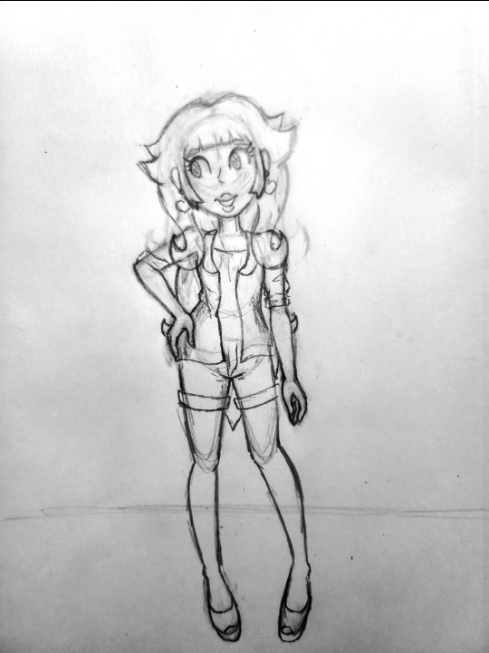
hi i realize i don't talk as much here as much as i do on twitter which. maybe i SHOULD talk here more because there are no character limits. okay so.
first image (aug 2022) i think was like. one of the first times i actually tried to reference and i had to trace bits of it and i didn't know HOW to reference. and i barely understood charlie as a character. did not understand how he would dress had not even settled on his tattoos. could not get the colors to look right so i think i like. put him at 90% opacity to make it work.
between that and the second one (sept 2023) not only has there been SO much character development (future version with a beard now exists. he has been electrocuted. he is now jacked. he is transgender.) but i have done so many anatomy sketches that i didn't have to reference at all. yes i still should / do / will but i didn't feel like i needed to just to get it done.
and i picked all the colors by hand i didn't use any layer modes. the shadows here are actually the base / local colors and the lighting is added in on top and i used actual color knowledge to do that. like how i learned that if you use a desaturated warm tone against a more saturated warm color, it makes the desaturated one look blue and that's how you get 'blue' light on warm colors without it looking weird.
i found a message from last year when i sent the first image as an example of how i "have clothing folds figured out in my style, maybe not realistically but they look good" and looking at the folds on that versus the new one is like...no i did not. i don't know why i thought that.
this obviously isn't like a 100% fair comparison since i didn't bother to shade the first one and i'm pretty sure i was experimenting with a different lineart brush / style (which is why i'm not commenting on that here) and i did actually redraw the chair image one-to-one already but. i was looking through charlie's gallery and this just stuck out to me like WOW. holy shit dude. jesus christ.
i will never ever ever get over how much just becoming deeply obsessed with a character makes you improve. to give you an idea he hit 69 images on toyhouse (lol nice) in october 2022. it is SEPTEMBER just under a year later and he is now at THREE HUNDRED SIXTY (360). I AM NOT JOKING. not all of those are by me but a lot of them are! i did studies SPECIFICALLY so i could draw him better. please note i had literally never done studies before and like i said did not know how to reference. i have never been so obsessed with a character before charlie and it's the best thing that ever could've happened to my art. AND me.
#art improvement#long post#stanley says stuff#stanley does art#charlie grimms#NOT TO MENTION my friends for#1. fueling the insanity making me bonkers over silver city and all the characters there#2. giving me art inspo!!! making me jealous of your art enough that it makes me want to do better!!!#please for the love of god if you want to get better at art 1. become obsessed with one character 2. MAKE SOME ARTIST FRIENDS ON GOD#literally tysm yall know who you are
11 notes
·
View notes
Note
Hello! I’ve been archiving stuff for a fandom I’m in (RWBY for context) and posting it to a side blog for fun. Really, I’m just compiling stuff I don’t see anyone sharing. I don’t want to misidentify what I’m doing!
I was wondering if you had ever posted anything about how you upscale images? You’re quite good at it, so I was wondering if you had shared any advice. When I upscale, the quality goes way down!
I don’t want you to think I’m using you instead of google! I’ve looked up guides on this, but I’m still struggling a bit. I’ve tried working with “vectors” on the advice of a friend.
Of course, I’m not really sure if this is the polite way to go about this. Maybe it’s a super secret and this is a severe faux pax! Please disregard this if it is! You feel a bit like an upperclassman in archiving (a senpai, if you prefer) and we’ve interacted several times.
Not top secret at all!! It's just kind of... esoteric lol... Been too lazy to explain it. But since you asked... ;P
I use Real ESRGAN for the main upscaling part of the process: https://github.com/xinntao/Real-ESRGAN/
It comes with instructions but basically you plop your image into the same folder as the .EXE and then run this in the terminal:
./realesrgan-ncnn-vulkan.exe -i input.jpg -o output.png
Replace input.jpg with the full filename of the file you're upscaling and then change output.png to what you want the upscaled file to be named. I usually just make it like [OG filename]BIG.png haha
Waifu2x works alright-ish too, if ESRGAN doesn't work on your machine for whatever reason: https://waifu2x.udp.jp/index.html
Once I've got the upscaled file, I do the rest in Clip Studio Paint EX 2.0. CSP's image resizer's not very good, so I don't rely on it. But the Smart Smoothing and general image adjustment tools are useful. Sometimes I'll do some light cleanup in CSP before upscaling the file too, like removing dust with the Clone Stamp or light redrawing of fuzzy parts, etc. Most art/image editing tools will have what you need. I don't get to use Smart Smoothing for archival stuff often enough to say it's absolutely worth buying CSP for.
ESRGAN is a very powerful tool, but it does lose almost all of the image's original texture when it upscales. Things like analog art or anything with rough or grainy textures will get smoothed, but already smooth digital art upscales beautifully. The best workaround I've found for restoring texture is to take the original image, resize it in CSP to the scale of the upscaled image, and then paste the OG image over it, adjust the opacity, and then use the Sharpen filter to fix it from there.
So if the original image is 400x800px and the upscaled image is 8000x16000px, you'll use the CSP resizer to enlarge the OG image to 8000x16000px and use that as the overlay to restore some of the texture. It's not perfect, but it looks better than leaving it entirely smooth. Each image is different, you'll get pretty good at figuring out what texture to use and which to erase. I've found making a greyscale static texture, setting its layer to Overlay mode, and adjusting that helps a little too. I'll put the texture I use under a readmore below.
If the image is too small, not even ESRGAN can help... It's also not too good at text if there's a lot of .JPG noise in the way. If there's text, there's a good chance you'll have to manually redraw it or font-match it and completely redo it.
Good luck!! Hope this helps. Thank you for the compliments, too!!
Sometimes Gaussian Blur-ing this very, very, slightly works with the image better but most of the time I find that leaving it crisp looks the best. Editor's discretion.
9 notes
·
View notes
Text
ok so disclaimer: i literally started writing this almost immediately after i woke up so there will be a bunch of typos which i dont bother fixing cuz im still very tired
had a dream where tpot 3 came out and i think it was 2 hours long and it was this HUGE bfdi finale video that had ALL the bfb characters (except…the tpot guys???? excluding 2 they were here at some point i think)
i remember not watching the whole thing cuz it was fucking late at night so i skipped to near the end but right before i did there was this ?? intro to the episode where its just cary in front of a greenscreen thianking everyone who watched battle for dream island and when he said this an image was shown on screen that looked like the "I HATE CHOCOLATE" lady from asoingbob. anyways before ihe could continue i skipped REALLY far in the video where 4 and x have everyone gathered by a stage

(drew this on my phone sorry it looks like dogshit i didnt feel like redrawing it SKDJHFSDJF)
he was gonna reveal…something?? but before that he started doing this REALLY sarcastic and 4th wall breaking speech that basically made fun of the osc and people that didn't like post split??? it was so fuckunf weird it felt like cary/michael/whoever wrote this was having a breakdown while writing yhat. but thankfully it was just a joke thing and all the contestants hated him for that because i think at some point during the speech 4 started making fun of them too??? i swear they described everyone as "marketable disney stereotypes" and went off abt each one like. ok
while listing off each contestants flaws on stage, loser suddenly TRIES TO interrupt 4 multiple times but it doesn't rlly work out (plus her voice is different?? kinda… i described it as "more manly and…hunk-y sounding" so take that wgat you will)
anyways loser was fed up w this and stands up to 4 and getd all of the other contestants to GET THEIR FUVKING ASS so all the contestants get up onto the stage and start destroying the thing that was under that tarp (it was some kind of bad machine thing?) and the whole time this was happening 4 was just going "ohhhh oh nooo" in the most deadpan monotone voice possible. and ooohh this descrution scene ends with loser flinging himself AND CAKE up into the air like this was some anime shit and she slammed into the machine with one fist while holding cake in the other arm. this made me fucking get out of my bed and start punching shit (very positive) oh my god i was freaking the fuck out here
i remember i coudlnt stop replaying that scene NOT ONLY CUZ IT WAS THE FIRST LOSER & CAKE INTERACTION IN . A FUCKING WHILE but i also wanted to take a screenshot of cake's face cuz he had the funniest expression (too lazy to draw it but he was blushing SO MUCH and also screaming cuz he was falling w loser) BUT I COULDNT TAKE A GOOD FUCKING SCREENSHOT SO. MOST OF THE REST OF THIS DREAM WAS ME ANXIOUSLY TRYING TO GET A SCREENSHOT OF THIS FUCKING THIGN. oh yeah also cake's design was slightly different, he just had a white (or light yellow) center rather than a darker brown one.
then after i THINK i managed to grab a screenshot i went on a rant w lan abot how forced??? loser's little arc felt cuz there was no buildup ig and i just ended up complaining abt post splt and how bad jnjs writing was
THE END thats all i remember, i woke up drenched in fcking sweat at 2 am cuz of this (/hj itsalso just really hot in my room)
#i might draw some stuff based on this dream but no promises i feel very dented#also its currently 3 am i havent been able to fall bac asleep after this HELP#nate dreamposting
13 notes
·
View notes
Text
prompts for workaholic characters // accepting.
@galactia // "no matter how hard you work, it won't bring them back." (for Kaveh, from Alhaitham)

THERE IS A MYRIAD OF BLUEPRINTS SPREAD ACROSS KAVEH'S DESK — it is a sign of days of work with little rest, as is evidenced by how some have splotches of ink & lines that are not quite as crisp as his work usually has. Later, he will take the time to redraw them, but today, he simply leaves them be, imperfect blueprints that would not see the light of day until they were pieced back together neatly in such a way that no one would ever know the messy versions had ever existed.
As with all of his rules, Alhaitham is the one exception, the witness to his frenzied sleepless nights in the haze of inspiration & one too many deadlines coming up. It is a fact Kaveh does not mind some days & detests on others — the other has seen the darkest recesses of his self-destruction & the anguish that has threatened to consume him for so long it has become part of him; like a parasitic presence in his brain, like a virus in his DNA.
( the sort of which he is almost afraid to part with. )
Perhaps he has stretched Alhaitham's patience thin ( he seems to be very good at that, these days ) or there is some sort of genuine concern in those words rather than a simple annoyance for the lack of quiet that his working must bring to their shared home — or maybe it is because he hasn't kept up with the housework in his artistic daze. Whatever the reason for those words may be, there is something within him that finds them irrevocably cruel.
They have fought before, many a time, but only once can Kaveh remember words that cut so deep that Alhaitham may as well have plunged a sword into his chest & called it mercy — that day many years ago, the argument that had lead their paths to diverge for so long that Kaveh had worried he had destroyed their friendship for the rest of eternity.
( he still regrets what he said that day. he wonders if alhaitham does, too. )
Yet these words are no personal attack on the ideals that have been ingrained into his heart since he was merely a child, ignorant of the ways of the world & the grief of losing a parent — no, they seem almost worried, if he were to make the assumption that Alhaitham was disquieted by his antics at any point, considering how he seemed apathetic at best some days. Kaveh knows, at least, that what seems like apathy on the surface is nothing of the sort.
( it would be easier if it was. )
Alhaitham is right, in a way — working himself half to death, as the scribe liked to put it, would not resurrect the dead ( his father who was only gone because of his encouragement, a soul he cannot put to rest ) nor would it bring their mother back to Sumeru, or into his life at all. She had moved on long ago & had a life to worry about that did not concern nor involve Kaveh, something he had encouraged if only because she deserved to be happy after the tragedy he had caused & the agony that had befallen her in her grief.
( yet it was kaveh who could not move on. the creator of his anguish from the very start, delivering retribution upon himself as if he deserves nothing else. it was he who would ruin all things kind & good someday, no matter how he tried to pretend otherwise & fix all he had destroyed in his life. )

❝If there's a chance it will, then at least I can try.❞ He replies, a little more snappishly than he would have liked — it can more aptly be described as defensiveness, the sort of which curls its tendrils around him whenever he feels his beliefs have come under fire by his roommate, as if his words would shatter any semblance of truth that Kaveh had gained throughout his life. ❝But that isn't why I've been working so much as of late.❞
If he felt less vulnerable in this moment ( exhaustion having crept into every crevice of his body, fully on display ) then perhaps he might have been kinder in his response & described to Alhaitham all the work he had to do & the deadlines he had to meet; the crushing weight of too many revisions & the loss of his artistic vision through the wishes of clients who asked him to change far too many things until his work became bland & unrecognisable. Simply another building in a sea of such things.
But today, Kaveh does not explain a thing. Today, he does not look up from his work to gaze at whatever expression the other holds on his face, if only out of fear he might see the same scathing look from many years ago that had been burned into his memory on a night he wishes he could forget.
❝If this is about the housework, I'll get to it soon, Alhaitham. Let me finish up this blueprint first & then I'll make sure the house is nice & tidy.❞ Or as tidy as it would be with the various books strewn throughout it — sometimes, Kaveh swore he didn't neaten them up on purpose, but he has no proof of that. ❝Also, if you wanted me to take care of things, then just say so, instead of...❞ Insulting him? No, that likely wasn't the intention. He can't describe, really, the way those words make him feel.
( the way they cause grief to come back to the forefront of his mind. )
❝Besides, if you really want to focus on which of us has the most problems... Have you even bothered reorganising those books of yours? If those shelves are even dustier than the last time I saw them, I'll make sure you don't even think about leaving them to collect any again.❞ Perhaps it is a welcome distraction, this familiar bickering & the routine between them. It is a small thing to say, the sort of which he has said time & time again.
There is something in him that loosens just a bit at changing the topic. He wonders how long it will take for it to start suffocating him again.

#002. ❝transmissions: down with the fallen.❞ — answered#& fandom — genshin impact#124. ❝build it up in a technicolour dream.❞ — kaveh#125. ❝we weren’t just born to fade.❞ — V1 ( main )#galactia#addressed to — alhaitham (galactia)#( kaveh's tried & true message: think about it & then deflect )
1 note
·
View note
Text
another solo ramble post - relicverse, ocs, flg, and 'succeeding as an artist'
one of the first pieces of digital art i’ve tried to do (not counting back when i was a kid on chickensmoothie) was a '100 OC’s Challenge', which, even at the time, little me thought “what? Just 100? bitch i’ve got this in the BAG” (i did in fact, have it in the bag) and so seeing it again made me want to do a redraw of it. y’know throw in their modern updated designs, maybe try to give them a little more expression, switch the order around and whatnot. but i asked myself “Well in that case, why don’t I just redo the whole thing instead of making it a redraw? Stick in some new series since little me got lazy of drawing from a list at like 75, and it can be something nice to refer to.”
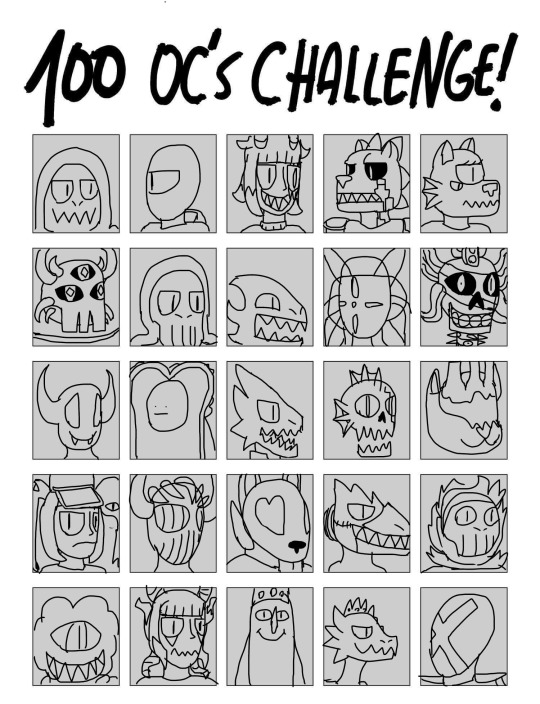

(pictured: old ass disgusting FLG page of the 100 oc’s challenge, as well as the infamous Crusty Backup Of An Old Version of the Ancient FLG Pixel Art Sheet)
then i remembered it’s ONLY 100 slots. by now, i’ve got WAY too much going on and i’ve had another “oh. Well shit. I forgot I’m nuts about this shit” because quite honestly I could probably do 300 without having to think too hard. And maybe that’s a bit of an issue. what is a girl doing with 300+ characters floating around her brain. i’ve got tens of stories where NONE have PROPERLY seen the light of day because i’m scared of comitting to a shitty adaptation that interests no one. or i get too overly ambitious in what’s actually possible and blow out my motivation to wanting it down in consumable form at that time. here i am cooped up in my little shack with the same problem i’ve had my whole life:
i’d love to have one or two eyes on my work who care about it, but i’ve never had any knack for attracting an audience. i spent YEARS on instagram to the tune of Only Making A Single Friend I Fell Out Of Touch With. All of the success I’ve had on twitter over the years is directly tied to “well did Friend 1 or Friend 2 Retweet This?” (With an exception i’ll get to) and only QUITE RECENTLY (in the scope of my artist career) have i made friends who LOOK at my ART and press LIKE. i just feel a little suffered! maybe i’m just scarred from instagram cause’ i was shit at drawing back then. maybe i just have to do fanart with the skills i have now and inevitably i’ll have followers of my own who i don’t see through the lens of “borrowed, not earned”. but i’m scared of failure. i’ve long failed, don’t get me wrong, but i’m afraid of falling deeper, despite how insignificant an Online Existence Like This already is.
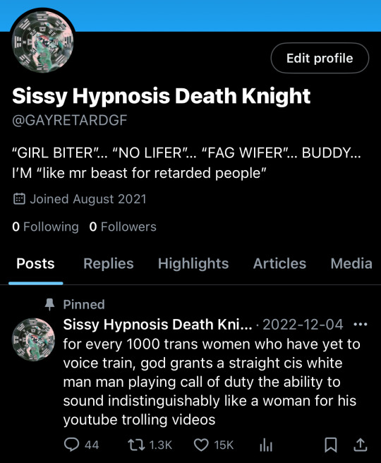
(pictured: record of existence)
my one success, being twitter’s “GAYRETARDGF” was the first time in my life i received any attention that made me think “oh shit, maybe i’m actually a little bit funny and not just an insane unfunny person”. i spent years playing Jester for My Personal King that i’ve kind of lost any frame of reference pertaining to how i’m perceived by others. i’ve always been terrible at that. despite getting suspended at another Peak Growth Moment and the fact i’ve failed to reclaim that spark, it’s made me realize “Maybe I can succeed creatively”. after all, GAYRETARDGF’s thing was vulgar quips and drawn out nonsensical scenario posts and WELL. not to name names or kick any other artists under the bus, unlike most Crazy Posters “artist careers”, my art, i find, is every bit as unserious, witty, vulgar, and STUPID as my tweets were. (i think the writing in Puzzling Commission is a testament to that)
even if i failed to recapture the lightning in a bottle that was GAYRETARDGF, knowing people find my stupid bits funny is such a candle in the dark i’ve been in my whole life. i’m always telling my friends “i’m trying to be the new henry darger” and even though i’m joking, I’m afraid that maybe i will be to a few souls who stumble on my work. i’ve found my own 'personal dargers' over the years who i bemuse over, wondering where they are now, and if they still care about art. I don’t want to give up. I want to keep pushing. I’m coming up on the 10th anniversary of FLG and finally at this point in my life i’m seeing the signs that potentially I can make ONE person BECOME A DEDICATED FAN of the relicverse. my art’s almost there, my writing’s there, and all i have to do it wait for the wind to catch these sails. (i will however, have to find the right sails for the job)
i’m far from kidding when i say the relicverse is my life’s work. i think i’d like to make it succeed. i hope in this modern landscape it CAN succeed. so i’m going to bust my fucking ASS OFF drawing fanart on tumblr and see where it goes. I’d honestly be satisfied just being a mildly successful fanartist in a fandom i like.
SURPRISE! THIS POST ISN’T DONE YET!

for the second part here, feel free to stop reading, i want to talk a little more about FLG. FLG is the series younger me put my whole SOUL into. even 'sarah' which i’m going by now (due to a strange set of circumstances which i might talk about in a future ramblepost about Gender and Stuff), is taken from 'sa’ara pyrophyte byblis' who at the time was my favourite character. To repeat what i said earlier with a little more information, FLG is in fact coming up on it’s tenth anniversary and that’s HORRIFYING. i’ve been working on this shit since before UNDERTALE. BEFORE UNDERTALE!!!!!!!!!! CAN YOU BELIEVE THAT SHIT?????
flg’s been sent to the backburner while i recontextualize a ton of lore, but in a lot of ways, it’s the reason the relicverse even exists. sure, these days, DEVIL’S MANNER opens up the gate, but the first series i wrote to acknowledge the planes and the presence of a shared greater universe is from FLG. hell, FLG’s story can be read as a parallel to Demiurge’s story (intentional) though… now that i say that, it’s not like anyone would know what i mean by that.
despite not DIRECTLY touching FLG in any significant way in these recent times, i think it’s only become more important to the greater universe. the kailash clan finds their origins in FLG, and by extension, the outer gods. hastur himself is a direct descendant of the outer gods, and despite being seen as an 'imperfect halfling' by the ancients during FLG, at the end of the story and before the events of sundown, hastur gains his proper respects as 'their greatest child', being half ancient and half elder god, essentially the image of purity they’ve been chasing. an ancient whose blood bears the love of their creators. oh. right. i guess now’s a good time to mention Hastur and by extension Ithaqua are both Kailash, though the two aren’t keen on identifying as such after everything Cass did to their friends family and home.
in the current scape of the relicverse, the Kailash are by far the only clan who has political relevance, both the berezaiti and sinai clans divided and mostly irrelevant in terms of modern planeswalker culture. The Kailash are like, kind of really important.
but, technically, the berezaiti are also from FLG. Ounon Thanast, chief of one of the Tindalosian Clans that find their homeworld in FLG’s Earth, is the parent of Yima Berezaiti, who, if for some reason you know my lore, is the whole reason the Berezaiti clan is a CLAN.
FLG’s earth, GENESIS EARTH, is pretty significantly important to the RELICVERSE. It’s one of the planes lying upon 'The Rim', with the control for influence over it contested by both The Planeswalker Association and the Hundred Nights Guild. Due to the presence of Azathoth’s Canvas Energy Offgassing, within GENESIS EARTH, everyone’s line of fate is rewritten to have them destined to awaken a Power (as in 'Powers' of 'The Five Elements') by lingering around in this plane for long enough, anyone can gain another unique ability JUST by doing fuck all!!!! which OF COURSE has led to the eternal struggle of planeswalkers upon their world.
Even the Trinity and RELIC EARTH aren’t safe, with Angelo Rust of INSIDERS being a Genesis Earth native and brother of the Sinai Clan’s Patriarch Einrich, Gervase Sinai, was condemned to the plane by the King of the Watchers, Samyaza, who is also one of RELIC EARTH’s Outer Gods. AND, SPOILER ALERT, GERVASE IS THE FATHER OF VIRGIL, THE PROTAGONIST OF FLG: SUNDOWN!!!
gaaaasp
There’s so many more little connections like that and yet somehow i never seemed to consider genesis earth as more than a footnote, until now, of course. but i’m not sure what i want to do with flg. the obvious answer is a COMIC, seeing as it’s about SUPERHEROES, but i can’t help but wonder if there’s another path also worth pursuing. Superhero media is everywhere these days, and with the success of works like Invincible’s adaptation, The Boys’s adaptation, and like, the crazy marvel movie explosion that happened with infinity war and endgame, Superhero stuff is back in the public consciousness. There’s a lot of avenues. That’s getting too far ahead though seeing as I’ve had a Big Inevitable Rewrite for it on the schedule… gruygh,,, there’s too much to ramble about today… what was it i was even trying to talk about…
oh. Yeah. Right. I’d love for FLG to find its success somehow, some way, someday, with beautiful 5 active readers, and 20 Asks in my Tumblr Askbox, but i’m a little fearful i might never have the time or power to get to it. I guess I’ll see. I’ll just keep plugging along.
Now shoo!!! Shoo!!!
1 note
·
View note
Text
So I recently remembered a old yearly art-redraw I'd do since 2014. At some point I forgot and stopped, felt like it wasn't really a 'redraw' as over time I'd change the pose, the area, even one of the characters in it changed over time. One of these 'redraws' was a completely different picture, even. But I decided to try to redraw the original 2014 art, more or less reviving the idea (if I don't forget next year).
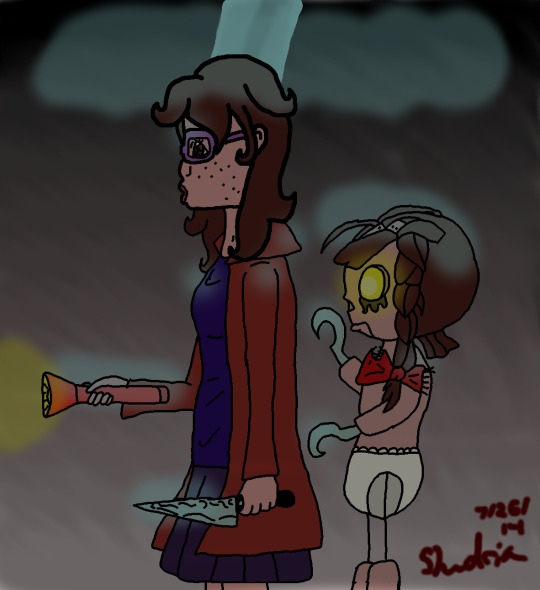
The original 2014, my first drawing put up on my old deviantArt. I was still learning the art program I was using then (I think Gimp?) and it's very obvious I didn't know pen stroke size or sensitivity yet (let alone anatomy)
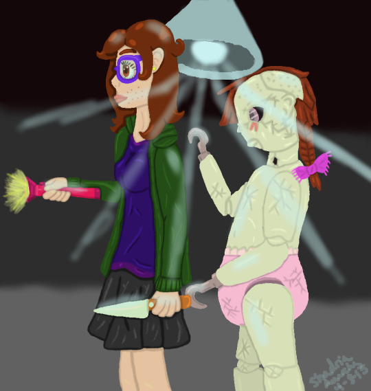
2015, the doll went from string thighs to ball joint porcelain. Pose stayed the same but small things like item colors and the ceiling light changed for one reason or another.

Here lots changed. I tried to make a lore/backstory to this drawing, as well as pose/angle changing. This is where I start seeing the 'redraw' becoming a whole different type of thing.

Angle went back to how it's supposed to be but pose and characters have massively changed. While the saran wrapped blade legs *are* cool, it's not what the drawing had originally.
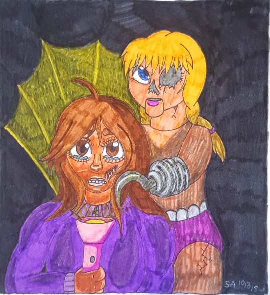
2018 was the 'climax' to that strange storyline the 'redraws' turned into. It was also the last one I did as it felt like it just went too far from what it was supposed to be, and then I forgot.

however I remembered it and decided to give it another go. I tried to return to the original 2014 drawing and redraw it instead of any of the other versions. There are some changes, but it feels more like a redraw than any of the others that went off the rails..
#my art <3#ocs#creepy#creepy doll#digital art#traditional art#the drawings were called 'The Forgotten's Revenge'#the doll is based on Doll Girl from American McGee's Alice series
0 notes
Text
my bud vi @sheylads/@eggmeralda is shadow banned but tried to send some asks anyway 😔💔🤘
Doing this with the Paladins :] 🌈
2.) which oc has never had their first kiss?
I feel like it's such a cop-out to say Amethyst but uh yeah her wivbwigj she's an amnesiac who's memories only started developing again three years prior to the series so she's not that concerned with dating oop
Hypothetically Ruby is the only one who hasn't dated anyone yet but honestly she's such a homie hopper (more in a "kiss the homies goodnight" though) that she probably has kissed one of the other Paladins before lmao
3.) what oc has the best music taste? the worst music taste?
Ruby! Her moms are both somewhere on the punk/grunge/emo/goth spectrum and canonically raised her on My Chem lmao.
Ruby tends to be the one to introduce the other Paladins to bands she think would fit them; Jay and her tend to share music tastes, Blaze would like Fall Out Boy, Rina would enjoy Panic at the Disco (well like the GOOD times), Ruby would be surprised that Turqbalt likes Linkin Park/Green Day, Amethyst would like Evanescence, aaand Ruby would be a little afraid to show her music to Rose oops. I also think she'd be a little shy to show her stuff to Tarum but Tarum surprises her for liking more Danger Days kinds of My Chem
I'd joke that Callaina is into hyperpop like me but I do think canonically Oriole has the worst music taste; he'd really like CORPSE songs, but really only the horny ones in a very unironic "Oriole is incredibly shallow and toxically masculine" kind of way
7.) which oc has the most cohesive color pallet? the craziest color pallet?
I think it's sort of the SUL style to have a veey cohesive color palette; they all tend to be monochromatic with an occasional achromatic color in their designs BECAUSE a good chunk of the series is about how everyone represents a color. The original Paladins are all directly monochromatic because they physically cannot produce any other colors of light
However, craziest one has got to be Sage; I love the vibes of their design, but it definitely feels a little too difficult to redraw over and over again. It doesn't help that their palette uses up a LOT of different shades of gray and green, so their palette is currently the craziest.
8.) which oc prefers flowing clothes? tight clothes?
Oh that's a whole motif in my stories lmao, the "compact" twin and "flowy" twin
Yin and Azureus prefer flowy clothes, because they're the calmer/introverted/gentler twin
Yang and Callaina prefer tighter clothes, because they're the hyperactive/extroverted/harsher twin
Tarum and Prima switch this around with Prima preferring tighter clothes but being the flowy twin, while Tarum prefers flowy clothes while being the compact twin (it probably makes more sense when you see their very atlasified designs from these comics)
Typically I use that motif to design twin siblings, but I use it for lots of other relationships too!
Aster vs Violetta, Aster is the compact one and Violetta is the flowy one
And of course, Ruby and Cobalt! I think the compact/flowy motif I use works pretty well with rivalry designs :D for rivals it tends to reflect their fighting styles.
For those two, Ruby prefers tighter clothes because it's,,, I guess more aerodynamic? You see Olympic runners only in shorts and tanks so Ruby's fighting gear underneath her jacket is only yoga pants and a t shirt, and even then her jacket is pretty short. She runs FAST, so she can't have anything super long for people to yoink/get caught on
Cobalt prefers flowy clothes because his fighting style allows him to stay more static, he's much more based on strategy (called a "fox fighter" in-universe) so he's not making super huge flashy movements to win a fight. Also, he's autistic and also Azureus in another form; he's really attached to long flowy clothing. He likes very soft fabric and lots of it because it's a good pressure stim for him. He hardly wears anything less comfortable than a hoodie and sweatpants, so his fighting gear is made of the same material to ensure his comfort.
0 notes
Text
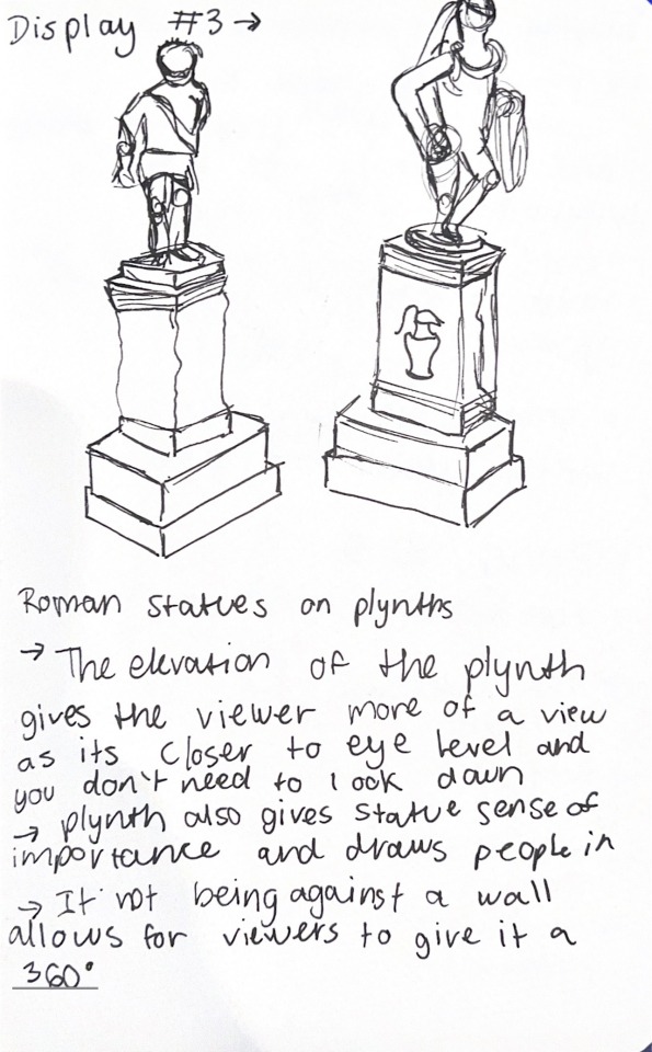
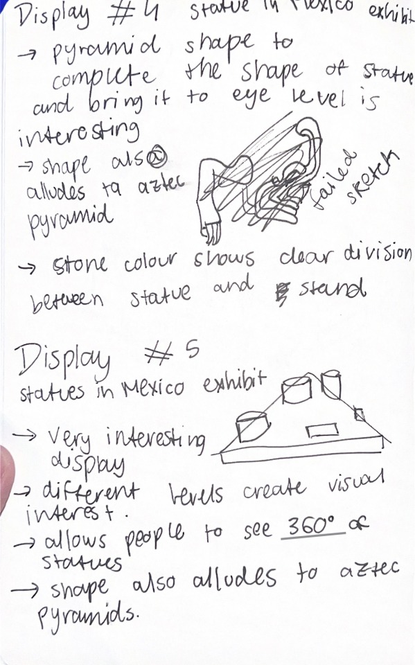
British Museum Visit:
For this visit we had to observe the way the artefacts and statues were curated, which involves the thought put into the way an object is exhibited. This can enhance the piece, or even change its meaning. We had to find 5 exhibits of interest. I did sketches for a few of them, some of them more rough than others, and sketch for display number 2 in particular inspired me.

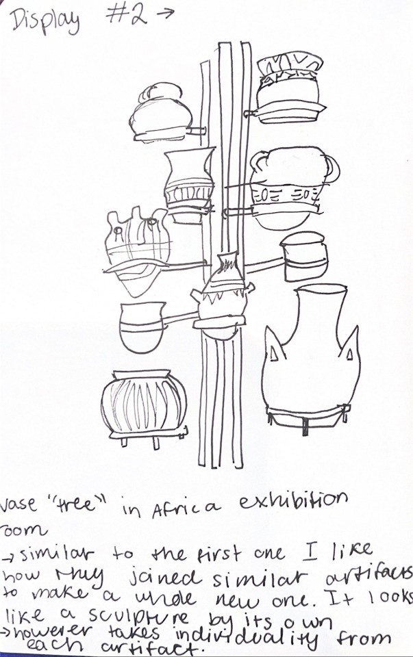

The tutor mentioned about thinking about which things could be exhibited as artefacts of elephant and castle, and to do an A4 sketch based on that. I did not have to think much as I realised that really the subjects I have been drawing up into these points really can be seen as “artefacts” of the pub we investigated. So I picked the exhibit of the African vases, as I found it incredibly interesting how, put together with that structure, they look like one sculptural body and a lot more interesting to look at compared to it by itself. So I thought to draw it (more carefully and polished compared to the initial sketch) and substitute the vases for the lamps and other objects that can be found in the pub.

I made it with pencil first, where I had a lot of repositioning to do while I went along. This is one of the times of this project where I struggle due to its handmade nature and how we cannot use digital for our final pieces. One of the reasons I prefer digital is due to being able to play around with composition before anything is final and explore possibilities in a short time. However doing this was also good so I do not only rely on digital. I then decided to add colours with markers, and used posca to make the linework similar to the other pieces so that they all feel cohesive. This also allowed me to add bits of texture that I found in the pub onto the structure that is originally made of metal and does not have a lot of texture.

I really liked the result but felt like it missed something more that would make it pop. I reflected that maybe it was the background, and how I feel the colour scheme needs one more colour to make it pop, but I felt very hesitant of doing something too permanent and ruining this piece. So I went onto Procreate and made a projection of how it would look like with colour in the backdrop and use very geometrical shapes.
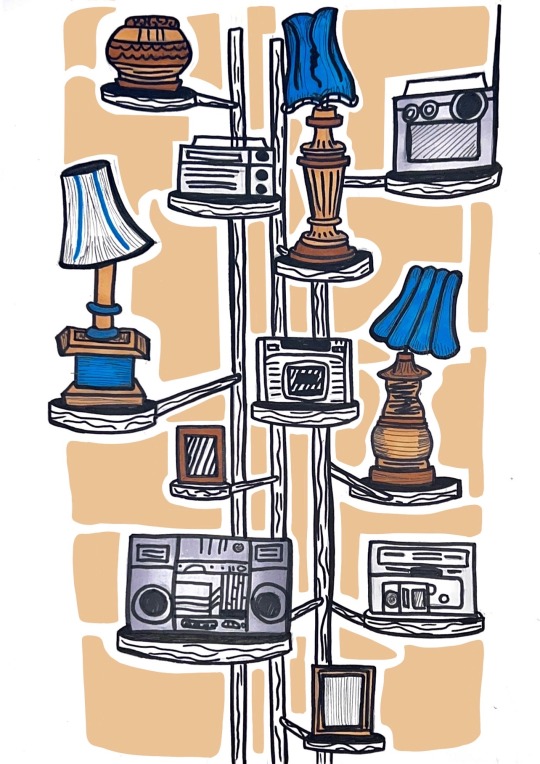
I was very happy with this projection and took it to a tutor during tutorial to discuss whether it was the right course of action and what medium I should use to bring this to life. I thought that maybe using coloured paper would make it more interesting and create more depth, and it would also allow me to experiment with different types of textured paper. So I bought quite a few options with different shades and finishes.
I first tried to print the projection and trace the shapes of the projection so I knew exactly what to cut, however I soon realised that no matter what I did the proportions of the shapes did not match the original hand drawn piece, so I had to redraw the shapes from scratch. I used the projection as a guide of what shapes I wanted and where, but had to freehand them on top of a tracing paper while seeing the original piece underneath.
With that I cut used the tracing paper to transfer the shape outlines into one of the papers, and cut out a few but not all of them to have an idea of how it would look like, and if the paper choice was the best.
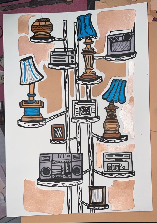
It turned out I did not like the effect of the paper as it was too shiny, and against the light a big portion of the shapes would have a reflected glare on it. This removes the pop of the colour and the stark outline of the shapes, which made it unsuccessful. I then chose a non-shiny paper of a bit of a deeper colour that would work better, and did the same process.
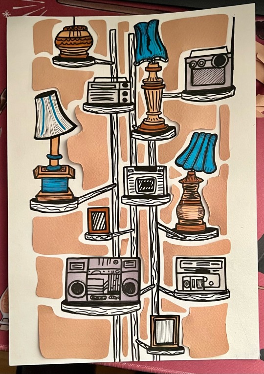
I was very happy with the outcome, but went and did a few microscopic cuts to refine the shapes, leaving me with the final piece.
0 notes
Text
2022 art review :]
Every year I like to take one piece from each month and go over it, what I like, what I don’t and how my art changed over the year

January- absolute dead eyed stare, I choose to not draw faces on both those statues only to put no effort into the center character’s face. This piece is the beginning of the bright colors that have had a choke hold on my art ever since
February- old Comet design my beloathed. I was trying to do something with this piece and it really just doesn’t work at all the values are awful. I will give this piece credit though, this is the birth of Comet but boy does it show

March- This has got to be my favorite piece of the year but I really really want to redraw this because there are things I really want to fix like the background (lord those pillars are rough) and posing to make things a bit more interesting
April- purble. I still think the concept behind this character is fun but like, you can really tell this is a first design, most under designed Goddess ever. I think the muddiness was there in the march art but its really apparent in this piece
May- I really havent wanted to draw faces these past months huh? The shading is just so muddy it was honestly at its worse during this time. This piece is also just so nothing, like for a piece about setting a church on fire with a magical stick you think it wouldn’t be so boring

June- Pride elf!
this is the coloring style I ended up adopting for Super V later in the year and god do I regret that. I wish I’d put more effort into the coloring on this because despite this piece taking like 5 hours It really doesn’t look it, but it’s a start I hope I don’t abandon it for several months
July- oh no. Anyway this is my most popular piece of art ever which if I knew that I wouldn’t have done nothing with the background. The muddiness is back with a vengeance and i feel like I should have emphasized the light source more even though it is just a candle. Sorry for making you all cry tho my bad
August- the typo in the original post still makes me chuckle. I tried to do some minor perspective work with this piece in the arm and it really doesn’t work huh. This has got to get redrawn this is the cover for my comic man, It just looks very low effort, which is most likely because I made it while I was on vacation

September- oh hey look that coloring style is back. Man this one just doesn’t look good. I think it’s the head and the left backpack strap I also just didn’t do any work on the center part of the hoodie, I did end up shifting away from this coloring style in my general art though since I don’t like doing it
October- mmm lot of experamentation this year huh, this shading style is also very bad don’t worry this is it. This was just some artsy hand practice but I really stood have just stuck to standard hand practive because that left one only has four fingers
November- I should have just gotten rid of that railing :/ 2023 is going to be the year I work on backgrounds I promise. I don’t mind this one too much, I think I just have a chase of staring at a piece so much I start to hate the sight of it

December- man this one really isn’t good either :/ I was doing a lot of experminentation this year and never really commited and worked on stuff long enough, except the bright colors, those came in like day one and they stuck with me.
0 notes
Text
Not all Redraws are as equal
So my dumbass tried recreating this piece from- I believe either late 2020, or early 2021? I don’t remember when I originally made and posted it- because like an idiot I removed it from my deviantart recently, since its an outdated piece. I didn’t check the posting date.
My Persona’s design has changed since this art work was created, hence why I kinda wanted to try re-imaging the work.
I did record it and will be making a video on the timelapse later, but to kinda explain- for the remake I really got annoyed with making backgrounds. Maybe I don’t have the patience anymore that I had for the original piece.. But that’s one reason why the remake isn’t as good as the original. As well as the coloring decisions, I ended up using a gradient map for a better result.

This piece above is the original. There’s a lot of color and effects going on. This was when I was highly experimenting with depth and light. I still view it as one of my best works color execution wise.
For the ‘’redraw’’ I was trying to make a different scene, and for that I wanted to use different colors. Which did not really work in my favor.

The scene has more sense of ‘’far away’’ dramatically approaching whatever is buried underneath those swords. The swords on the original piece are trying to push him out, lead him towards falling towers. By trying to make a different scene, some of the original ideas and magic of the old drawing were lost. It also was starting to annoy me, so I kind of wanted to be done with it.
I don’t have patience if I can’t enjoy what I’m making, and that’s kind of what happened during this redraw. I like both drawings, but the older one is definitely better even if my newer work is cleaner or contains the better version of the character’s design.
Here’s the gradient map version, since the colors made me feel meh.

I certainly like how much more dramatic the red orange-y feel this gives.
OH well.
This piece is actually based on one of my ‘’lyric poems’’ which are poems that I write as if they are song lyrics- at least that’s how they feel to me.
The title of this piece is ‘’TOWERS DOWN’’ and the original artwork was made after the piece was written.
TOWERS DOWN
From nowhere to oblivion
Trying to keep reign on kingdom gone
They can speak and they can whisper
So don’t mention you’ve moved on,
To drown the sorrows ongoing
I’ve been here, still, frozen
Afraid of fire, my nemesis, a moment
A Free will does, what the heart cannot handle
Here’s blue shades dulling out
Storming at the dawn, oh the panic
All we know is all we do or say
Language handled like cinematics,
Bad blood, and terrible family manners
Take your time, pain’s still here
Left by bitemarks and broken fingernails
Red flag one to three
Oh no, don’t you plant the seeds
I didn’t want to grow these damn trees
Now the forest blinds me
And the towers are breaking apart
How do I water the roots if nothing’s attached?
Close the gate, the flood still comes
Towers high, tore em’ in two
One more time-
The very heart in my tiny body
Shakingly refuses to move
Paper thin cuts on this sheet of skin
I’m still finding these daggers under everything
It wasn’t a war, no one ever wins
Compare to compete
Who hurt you, if it isn’t me?
Malicious people, eating the fruit
Leaving you empty, but never alone
Waiting for the very moment you get strong
Just to break one more bone
But the armor I thought I had, was already torn to shreds
Couldn’t fix me, tried to help you instead
Towers down, dearest memory
Daggers, spears, juvenile empathies
You never tried to sow these seeds
Trying to erase the trace, no deceit
There’s no control, can’t keep it here
Drown the sorrows ongoing, the bill is due
I’ve been here, still, frozen
Afraid of fire, my nemesis, a moment
Language handled like sad cinematics,
Bad blood, your terrible family members
Take your time, pain hasn’t left me yet
Red marked swollen eyes
Here’s blue shades dulling out
Storming at the dawn, oh the panic
Rivers filled with rocky pebbles
Speech bubble scripts for bad cinematics,
Bad blood boils, no one remembers
Point on, there’s one way forward
Malicious people, eating the fruit
I’ve become edible, and it hurts
I can’t move, I can’t move, I can’t move
Paper thin skin, easy to tear
Daggers and needles, stuck to my ears
Piercing a feeling, I can’t stay
Not without destroying the very last of me
I’ve become edible, and it hurts
Towers down, break it apart
Latch on nothing, let it fall to its rest
Towers down, dearest memories
I can’t move, I can’t move, I can’t move
I couldn’t speak, I couldn’t whisper
At the very least,
I could whimper, oh
Daggers, spears, juvenile empathies
You never did sow these seeds
Trying to erase the trace, no liars here
There’s no control, can’t keep it in
I’ve become edible, and it hurts
Red marked swollen eyes
Take your time, no, it hasn’t left me yet
Lovely and memorable cinematics,
Bad blood, your terrible family members
This pain’s hasn’t left me, no
Towers down, dearest memories
My worn heart, my tiny body
Shakingly refuses to move
Closing thoughts
Perhaps I should’ve reread the poem before attempting to make a new piece, or not redraw the old one. This makes me think, If I’m doing any new pieces inspired by these ‘’poems’’ I wrote, perhaps I should think of entirely new images that are fitting and inspired by it.
These old scenes have a lot of worth to them, even if the art is outdated to my current work. They wouldn’t exactly translate in the way I draw now.
#redraw#draw this again#blog#artist#digital art#art ramble#digital artist#vtuber#original character#oc#original characters#webtoon#webcomic#story#poetry#poem#lyrics#poetic#art meme#improvement meme#then vs now#artwork
0 notes
Last Seen Blogs
formarmain
Blessed Be

empty-thoughts
empty heart
treeclimbingnoodle
christine
salinasmart192
"My Hair Is Straight, BUT I'M NOT" I AM ME, NOT U!