#skillshare
Text
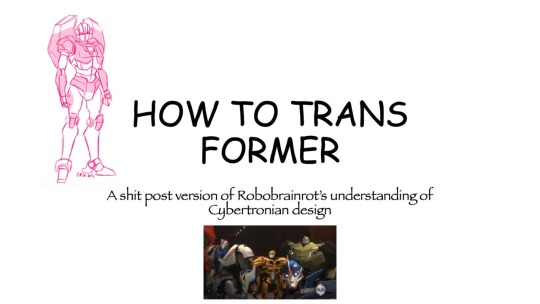
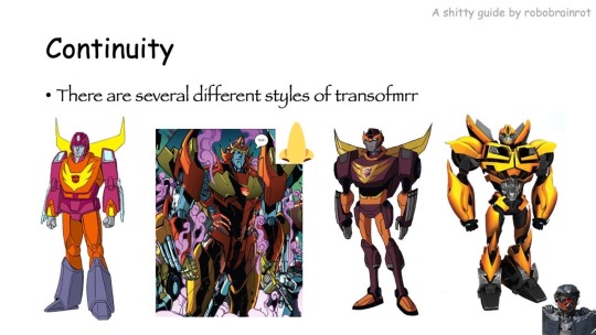
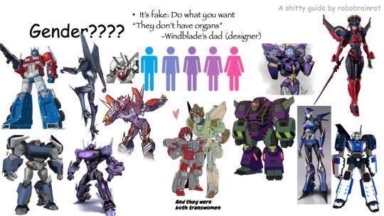
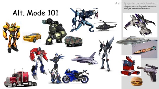
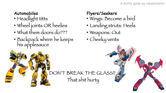
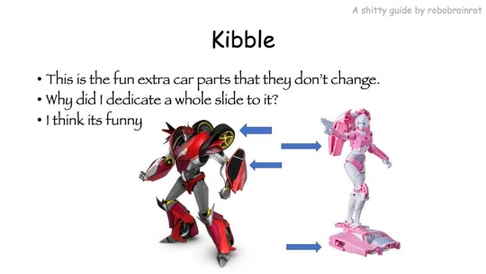
HOW TO TRANSFORMER: Part 1
Trust me, I'm a professional designer :)
Artist, please feel free to add your favorite details that I missed. I'm working on an illustrated/art tutorial version.
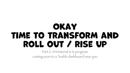
PART 2 UP NOW!!
#skillshare#transformers#maccadam#how to transformer#tutorial#kind of#might just be an#infodump#crapguide
1K notes
·
View notes
Text
Virtual Fibercrafts Skillshare THIS SATURDAY!
From our Climate Action Youth Advocate and General Volunteers:
BFP’s first Skillshare will be on Saturday 1/27 at 7:00 pm EST! Stop by if you want to learn how to make warm clothing to donate to your local community!
Here are the supplies you will need: Fibercrafts require very little to get started. For crocheting, you will need yarn (in this demonstration we will be using #4 worsted weight yarn, but other weights can be used, you just have to adjust the gauge), and a crochet hook (we will be demonstrating on a H/8 or 5 mm hook. Others will work, and if using yarn of a different size, be sure to check the standard gauges for your yarn).
For sewing, you will need fabric that is stiff enough to work with (fleece, flannel, and cotton will work,) sewing needles, some sewing pins, and thread.
A note on materials: cotton yarn is best for beginners as it is stiffer, harder to break, and doesn’t fray as easily, while aluminum hooks are best for beginners as they withstand pressure. Dollar stores and Walmart sell sewing kits cheaply, which are acceptable for beginner projects. You may have to buy extra thread, or pins separately. Nylon and polyester threads tend to be the easiest to work with. Some beginners also prefer double-sided sewing tape in place of pins.
#announcement#reaux speaks#fiber crafts#fiber art#crochet#craftblr#crocheting#sewing#diy#arts and crafts#fiber arts#discord server#skillshare#skills#learning#how to#tutorial#art tips#art tutorials#art resources#art help#warm clothes#donations#donate#donation#winter#cold weather
52 notes
·
View notes
Text
Setting Up a Zine Layout for Print (with Affinity Publisher)
Listen up shits spoons
Heyo back with another guide for folks new to art and layout! In this one I'm gonna talk about setting up your zine for print with a commercial printer (Like Mixam). If you wanna look at my other guides you can see them here (as of the time of this one I've done one other guide, but I enjoy doing these so I'll probably do more as time permits)
I'm specifically gonna be talking about using Affinity Publisher 2 because its what I do all my professional work in, but the ideas should hold solid for other programs like Adobe InDesign, Publisher 1, or others! I'm also gonna talk specifically with Mixam measurements since they're my printer of choice.
I'm going to get real into the basics of this one, so if you've done a good bit of layout already this is probably all old hat for you. I'm specifically skipping around the topic of Color Management, but I talk about it a LITTLE.
This is a lot of text, so if folks would like I can probably record the setup some time in the future if that would generally be helpful? Lemme know what we want haha
Okay lets dive in though
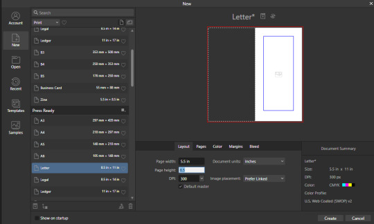
So lets start at the very beginning which is choosing a page size. I'm going to assume we are working with Letter sized paper because that's what most folks in the US do, which means we want to set the pages up to be half letter. This is gonna give us a zine that folds like this just for clarity.
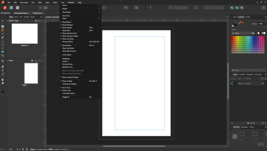
So lets hit File->New... up top, and you'll get a screen that looks like this. We are going to change our measurements to be Page Width 5.5 and Page Height 8.5 which is our measurements all folded and whatnot. We want to set our DPI to 300 so the printer has plenty to work with and we don't end up with pixely shit on the pages.
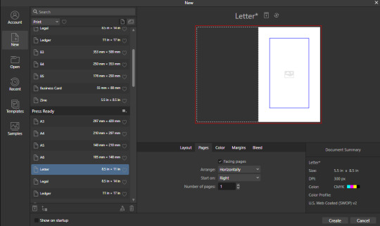
Under the Pages tabs things should default correctly, but we want Facing Pages to make layout a little easier, and we want to start on the Right with a single page. This tab should look like this
Next we are gonna hop on over to the Color Tag the long of the short of this is we want to work in CMYK/8. I'm specifically working with the color space used by Mixam within CMYK/8, but your computers default should be fine here, so just set your Color Format to CMYK8, and let it choose the default for Color Profile.
I don't personally set Transparent Backgrounds because I think they're a fucking eyesore, but that's dealer's choice and if you prefer them what's wrong with you good for you.
Color Management is really a pretty complex topic I'm not really good at talking about because I don't have the knowledge I should on it (I've largely worked in Black and White!), but here is a really solid primer on why we want to work in CMYK over RGB, and why that's so important for printing.

Hopping over to the Margins and Bleed tags, we are gonna do some minor changes to the default. If you're laying out something over say 60 pages I'd look at editing the inner margins here a bit.
I'm gonna go off the Mixam Full Bleed Print guidelines, and give myself some extra space for safety, but if your printer has other thoughts you should follow those instead. I've found that generally these guidelines work for most projects so you're usually safe to follow this bit as is. If you don't know what Margins or bleed are, I'd just read through the full bleed print guidelines linked above because it's a great primer. If you don't care or already know, keep reading.
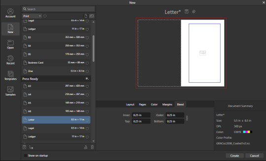
For Margins we are gonna include margins and set our inner margins to 1 inch, and our outer/top/bottom margins to .5 inches
For Bleed we are gonna set everything to .25 inches for safety, Mixam only needs .125 inches.

Finally, so we don't have to go through this every single time, we are going to save this setup by clicking the button up top (next to where it says Letter* on my screen). I'm calling mine Mixam Half Letter Zine so I can remember it next time.


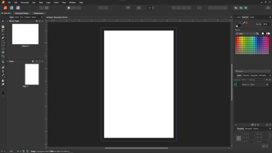
FINALLY you can click Create at the bottom right of the popup, and if you've done it right you should be greeted with a screen that looks somewhat like this
Now we're gonna set up some Master pages, font and paragraph styles, baseline grids, and guides to get the best looking zine possible.
At the top of the screen we wanna go to View->Preview mode, and make sure its unselected. This is gonna make sure we can see all the setup we are doing now, you can unselect it at any time (by hitting the toggle or Ctrl+shift+w) to see what the zine looks like without our guidelines on once we get them setup. Also on the view menu we want to turn on basically everything except Grid in the top bit. Here's what your menu should look like, and what your page will look like if things are setup right!
Okay so lets start with Masters! Setting up a good flexible master page or two is a great way to make sure your Zine keeps a consistent look throughout, and it carries your setup across pages! Look to the top left of the working space, and lets go work on Master A by double clicking on it.
I'm going to setup a quick set of guides just so I can lay things out a bit easier! While on Master A hit View->Guides and under Column Guides we are gonna add in 2 Columns and 3 Rows with a Gutter of .125 inches. The margins should be correct, and we want the Spread to be at x:0 y:0 which it should by default. In a lot of circles you will hear this called The Grid, but my friend Clayton did a great guide on this already so I'm linking that here. I also like to set some Horizontal and Vertical guides just so I know where the exact center of the working area is, so I'm going to make 2 Vertical Guides at 2.5 and 8.5, and a Horizontal Guide at 4.25 inches. The long of the short here is this gives us a lot of room to snap things to in the future. I set my Column Guide to pink to make it stand out a little more, but when you export this it'll disappear so just set it to whatever color works best for you.

With the master set, click back over to Page 1, and you should see it now has a series of guidelines based on this master. Hell yeah.
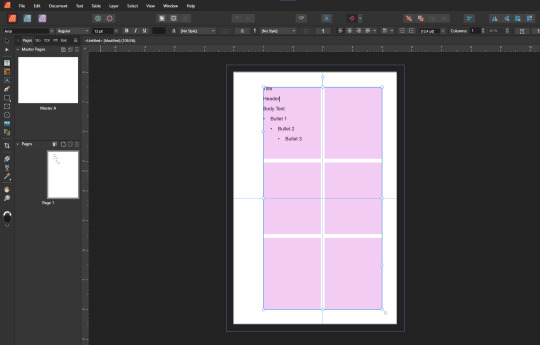
Lets move on to text styles now! These are going to save you a lot of hassle in the future with making sure everything matches, and works how you like. Double check that you're off the Master, and then lets make a text box using the Frame Text Tool, and lets get ourselves a text box somewhere on this page. The placement doesn't SUPER matter here because we are just going to erase it at the end.
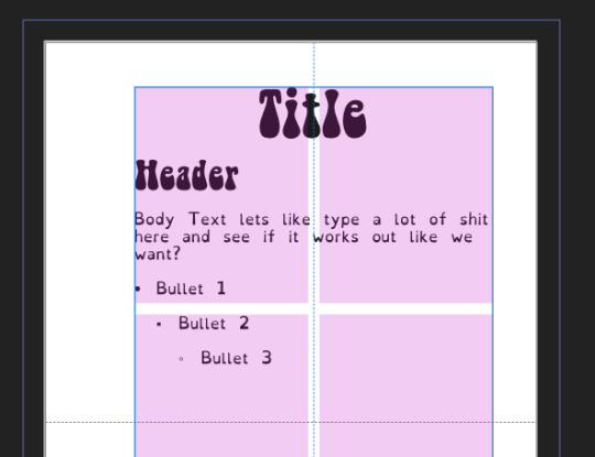
Toss a few lines of text into this box, I usually use Title, Header, Body Text, and then 3 lines of Bullet Text
Now we are gonna hop into the Text Styles menu. I keep mine pinned on screen, but if it isn't visible, you can find it under Windows->Text->Text Styles

Now highlight each of these lines of text, and double click the appropriate text style from this menu (ie we are gonna set Title to Header 1, Header to Header 2, etc). It'll look something like this when you're done

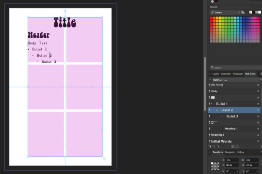
Now we're gonna change each of these lines of text to look how we want! For the example I'm making my titles and headers in Bellybeans FG, and setting the rest of the text to Open Dyslexic and resizing them so they look good.
My page looks like this now
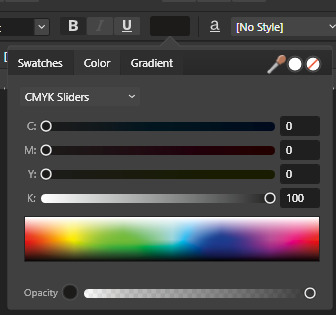
Now's a great time to mention that there is a difference between Rich and True black, and it's confusing and it fucks a lot of folks up. The link up above (the primer on CMYK above RGB) talks some about your blacks, and links to a follow up article about them! You can skip reading any of that for now (but like you should), because the tldr here is going to be make SURE that if you are using Black you have the color set to c:0 y:0 m:0 k:100 if you don't wanna have issues later!
Now we want to update our font styles to match! To do this we are going to go back and individually highlight each line of text, and then right click the matching Text Style, and hit Update. The screens should look like this.

Next we are gonna set up a baseline grid! This makes it so that text on one side of a spread is gonna line up correctly with text on the opposite side of the page, and just helps with making pages look good and even! We want to set the grid Relative to the Top Margin, and then set the spacing to whatever you feel is correct in your heart of hearts. These are the settings I've used, but do whatever looks good here, there are probably some hard and fast rules for how to do this well, but I do not know them.

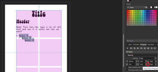
On my specific example you can see my Bullets are really spread out, and I don't like that, but the Body Text lays out much nicer. Lets deal with some spacing issues!
We are gonna hop on over to the Paragraph tab now, for me this is another tab on the Text Styles Window, but if you don't have it visible Windows->Text->Paragraph should bring it up.
So for me personally I want all my bullets to be on the following line, and not skip a whole line between them. I'm going to highlight all my text, and in this menu I'm going to go to Spacing > Space After Paragraph and set the amount to 0 pts.
You can also go further into this tab to change some more rules about what your bullets look like (things like how big your tabstops are, what the bullets look like, etc) but I'm not getting into that here!
After all this I'm gonna hop back into text styles, highlight each line of bullets, and Right Click->Update style on each of them (Just like we did previously!)
It's really tempting to skip this section of setting up your zine, but it enables a lot that can really help you out a ton in the long run. Having standardized Headers allows easy updating of headers and titles across the document, easy setup of Table of Contents for folks using them, and also on export is going to auto-bookmark the pdf for folks using PDF formats. It really pays to take time and set things like this up correctly the first time. After you're happy that this all looks good, you can go ahead and erase this text box.
Now we can break into zine layout proper, but if you just wanted basics you can stop here! Whatever you do from here is gonna print pretty decently.
If you'd like to stick around I'm going to set up some slightly nicer master pages, talk about why I use multiple masters, set up page numbers, and get us a table of contents!
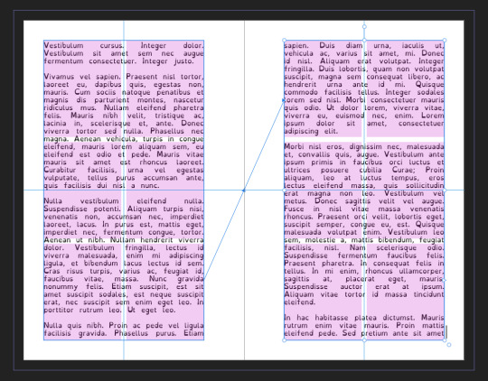
So from hereon I'm just gonna work on laying out a basic Zine. So let's hop back into our Master Pages, and start setting up some flexible masters. I know I want at least two masters, one where I have text on both pages, and one where I only have text on the rightmost page. For right now we are going to just work on the spread with text on both pages, so I'm going to create a text box on both pages within the spread that fills the entirety of that guide we set up earlier. On the leftmost page, I'm going to right click the text box with the Frame Text Tool selected, and I'm going to choose to Insert Filler Text so I can see how everything looks.

Make sure this text is in your Body Text Style, and then click the little triangle on the text box
I'm now gonna select the textbox on the rightmost of the spread. If you did it properly, your page should look somewhat like this.
After I'm happy with this page, I'm going to erase the text in both boxes. I wanna add in some page numbers now. They aren't going to fit in the boxes here, but if you remember correctly I left myself a little bit of wiggle room when I set up the margins! Mixam needs .25 in clear, but my boxes are all .5 inches from the edges of the page. To make sure I don't egress the space too badly here, I'm going to set up a new horizontal guide from the View->Guides page we used previously, and I'm going to set this guide at 8.25 in which is the true bottom edge of our workable space.
I'm going to create new text boxes for our page numbers that line up with the outer edges of our guides, and the new true-bottom line I just set up.
It looks like this, but there's an eye icon which means no text in this box is going to be visible!
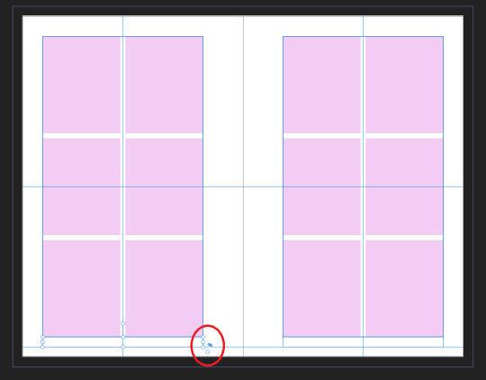
No worries this is because our baseline grid isn't playing nicely here, we are gonna break it in a moment, but for the mean time lets right click this text box, and select Insert Fields->Page Number

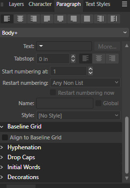
On the left page I'm also going to Bold and Left Align this box, but otherwise keep it in my Body Text Style. With the text all highlighted, I'm going to hop into the Paragraph window again, and scroll down to Baseline Grid->Align to Baseline Grid, and turn that option off.
My page now correctly shows a single # in the spot I'd want my page numbers to be. When this master is used, that number will automatically update to be correct! I'm going to duplicate this text box, and drag it onto the right page of the spread, and set the alignment to Right. I'm going to refill the textboxes with Filler Text for a moment, and turn Preview Mode on so I can make sure I like the page. For me this master now looks like this
I'm going to duplicate this master now, and on the left page of the spread I'm going to remove both text boxes. I like to name my masters so I know what they are at a quick glance. This is going to leave me a second master that looks like this.

You can get really involved on your master pages generally! I'm not doing anything fancy with this one, but previous projects have that heavily used masters might have pages that look more intense and include things like photo boxes, more complicated sets of text boxes, and even some text to use as a guide as I go.
Lets hop back to Page 1 of our doc, and leave the masters behind
Page 1 is going to be the title page for the book, but it likely now has a bunch of details now that you don't particularly need. If you have a master you don't want on a page, you can right click the page, and click Clear Masters.
I'm almost out of images on this post so I am gonna go mostly imageless from hereout. I'm gonna toss some text on pages, and then make a table of contents, and get my page numbers fixed up since most people don't actually want to count the Cover as Page 1 as far as page numbering goes.
With the project laid out, and the pages where I want them, the actual "Page 1" is going to start on Page 5 for me. Looking at the pages on the left side, I'm going to right click Page 5, and click Start New Section. On this new section I'm going to fill it out so the new section starts on page 5, and restarts the numbering at 1. Here's what it looks like for me.

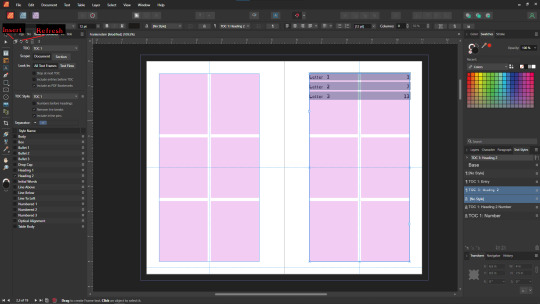
On page 3 I want to include a Table of contents so if the ToC window isn't visible I'm gonna hit Window->References->Table of Contents, and then in this window I'm going to hit the insert button. You can really dial in a lot of settings here, but as long as you've been using those Text Styles I mentioned previously, it should be pretty easy! Since I've been using only Heading 2 to start chapters, I'm going to unselect Heading 1 since it is effectively only being used on the ToC page and the cover, and I don't think folks need help finding those. This ToC feature rocks and as long as your page numbers are correct, and you use your text styles it should auto-update! If it doesn't there's a refresh ToC button on this window as well. Regardless (and perfectly using my 30th image) this is what it looks like for me now.
You'll also note I updated the text styles here as well! Anyway this is a real overview of zine layout for print, there's probably more things I should cover, but I'm out of images and tired so I'm leaving it here. If this was helpful I'm gonna put this template up on my itch after I clean it up some down the line.
I'm gonna have to come back with a Part 2 that talks about exporting and whatnot, but this is all I can realistically fit in a post for now.
If you get any use out of this and wanna throw a few bucks my way you can do that here
and if you have any questions I'll answer what I can! Just shoot me an ask on here, or like annoy me on my discord (its in my pinned post)
okay thanks bye
#skillshare#this one is gonna need a followup and I will make it one day but I ran out of images#I keep threatening to stream this so if thats something folks want I actually will I s2g
133 notes
·
View notes
Video
youtube
ANIMATING IN PROCREATE QUICK JUMP MENU
00:00 Tip 1—Storyboard Your Animation, with Karen Jordan
02:44 Tip 2—Using Animation Assist, with Rich Armstrong
05:33 Tip 3—Explore Fluidity in Animation, with Vera Rehaag
07:40 Tip 4—Export & Share Your Work, with Danni Fisher-Shin
09:44 Find More Tips with Skillshare
#art#animation#animation tutorial#digital animation#digital animation tutorial#procreate#procreate animation tutorial#how to animate in procreate#skillshare#Karen Jordan#Vera Rehaaq#Danni Fisher-Shin#Rich Armstrong#how to animate digitally#animation tips#animation help#animate in procreate
164 notes
·
View notes
Photo

Gartic phone Burger
Time was rougly 6 hours
I stream here every day : https://www.twitch.tv/xcoreus
Posted using PostyBirb
#Digital painting#Gartic#Huion#Kamvas 22#Skillshare#art#art school#art style#art vlog#artist#digital art#digital art tutorial#digital drawing#digital painting#digital painting tutorial#digitalart#drawing#drawing tutorial#gartic phone#garticphone#how to draw#how to find your art style?#huion kamvas 22 series#illustration#learn to draw#photoshop#portfolio#procreate#skilled#speedpaint
3 notes
·
View notes
Text

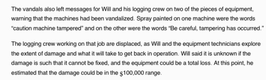
A logging company owner explains how to effectively disable heavy equipment about to be employed on a contested Timber Harvest Plan
#forest defense#permanently disabling logging equipment#explainer#worker safety#direct action#skillshare
28 notes
·
View notes
Text


3 notes
·
View notes
Text
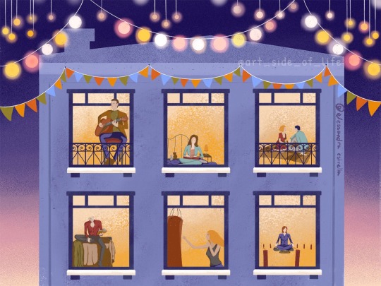
Piece done for this Skillshare class by Iva Mikles (Art Side of Life) to make stylized, simple characters in various positions with Procreate, then placing them in the windows of the building template she made!
Of course, I ended up doing Buffy characters lol I plan on making my own building when I have time. The video is a collection of short timelapses of me making the characters.
-My Instagram
#alex's stuff#art#college art#college artist#alex's art#graphic design major#spike btvs#btvs#willow btvs#willow rosenberg#buffy the vampire slayer#buffy#art project#skillshare project#skillshare#skillshare class#procreate#procreate timelapse#procreate art#ipad#ipad art#digital art#fanart#btvs fanart#btvs giles#rupert giles#art side of life#btvs dawn#dawn summers#btvs xander
6 notes
·
View notes
Text
Skillshare Review 2024: Is It The Platform For Grow Your Skills?
Skillshare is an online learning organization that offers thousands of classes to enhance the skills of creative and curious individuals. This company covers various topics including illustration, design, photography, video, and freelancing. This platform provides knowledge and experience to passionate students from the world’s leading teachers.
Read More: Skillshare Review 2024: Is It The Platform For Grow Your Skills?
#skillshare#is skillshare worth it#skillshare review 2024#skillshare review#what is skillshare#skillshare classes#skillshare free#skillshare overview#skillshare cost
2 notes
·
View notes
Text
does anyone have any recommendations for learning blender? i want to learn to use it to model and make some board game inserts and maybe dice towers but GOD is it confusing
(i’m already considering skillshare so if you have any classes on there that you recommend lmk!)
3 notes
·
View notes
Video
When you find the outtakes that you forgot you put together from filming your 2019 Skillshare class intro 😂
#she wasn't used to being in front of the camera#good to see we're still a silly goose#outtakes#skillshare#make an amigurumi crochet bee#bees#crochet class#beginner crochet#amigurumi class#how was this FOUR YEARS AGO#I'm gonna shidd
10 notes
·
View notes
Text
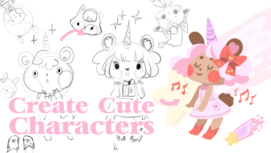
New Skillshare Class
Heyo! I have a new skillshare class up this month. Learn how to draw THE CUTE with me your humble teacher. https://skl.sh/3Mx0b3g
7 notes
·
View notes
Text
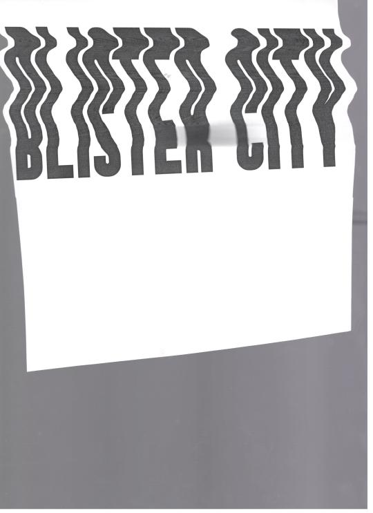
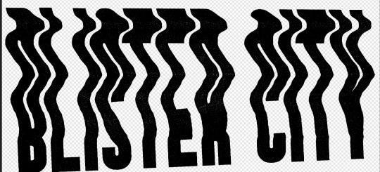
Okay I’ve learned a cool trick well enough to share it now
So I’ve been trying to do a lot of like physical manipulation to make cool digital effects for ttrpgs so I wanna show folks how to go from like this

to this

Using a combo of physical and digital manipulation. You’ll need a printer, a scanner, and something to cut with; and then I used the Affinity Suite for digital (especially photo), but you can probably do some similar shit with Adobe
The big things in here are “fucking up text with the scanner” and “creating threshold maps for texture and to hide issues”
so here we go
Okay so you’re gonna need a scanner I’m so sorry, but just print out whatever text (or images! It works on images too!) you can as big as your scanner bed will allow. You can go smaller, but you’ll lose a lot of sick texture on the way, and we don’t wanna do that tbh
The short version of this tutorial is “now drag it funny as the scanner goes down the page” but I’m gonna explain longer how that works practically haha
So print it out, cut off the white space on the left and right of the text to make it easier to work with (and I did under as well, but that’s less important). On the back of the paper with a pencil, mark the lines where you want the text to drag. For me that was above the midline on the E, but below the bottom of the top line

Like roughly here?
Set your scanner at a decent DPI, but beware the higher the DPI the harder this gets to do, because the super slow moving scanner light thing really highlights any amount of shaky. For my scanner the sweetspot is like 400 for good texture, but you’re gonna fuck up a lot doing it tbh so trial and error.
As the scanner comes though, keep the light between those lines, and drag it and wiggle it around! Just try to keep a consistent speed and have fun. After a number of scans you’ll pull something like this, there is a weird grey bit I don’t love and it’s gonna fuck us up just a little, but I’m gonna go over how I dealt with it as well~
Pull it into Affinity! If you have Publisher open it here, even if we are planning to work in Photo mostly, because the Persona manager is a life-saver when you’re doing cross program work.
So I first cut out the text, you don’t need to be super exact, but you only want the white paper, and the black text, not the grey of the scanner bed.
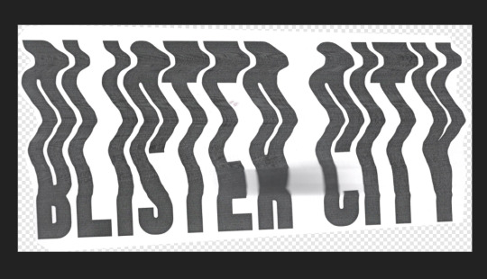
I usually then slap this text into a new document, because cropping is for idiots
then lets hop over to the Photo Persona~
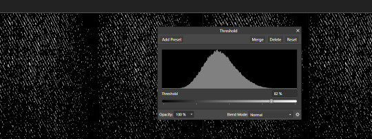
Duplicate the layer that is just the text, lock it, and hide the bottom layer because we’re gonna start destroying shit and we want old copies that aren’t fucked up. With your fresh layer, hop into Adjustments>Threshold at the bottom of the Layers Menu, and drag around the preset until the text looks how you like. This gets us cool texture, but also hides that weird grey blob on the page from where I squeeze the paper during the scan and fucked it up some. For me that’s around here, but obv ymmv
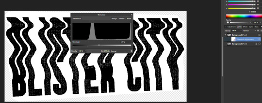
After doing this right click and rasterize your later
Now at the top of Affinity go into Filters > Colors > Erase White Paper

Where this leaves you might be perfect on it’s own! For me there are some areas I don’t love, so now we’re gonna texturize the whole thing. I circled the areas that I don’t love, but the tldr is I need to hide my sins where I had fucked up the scan some, and as a result have no texture

So if we zoom in on the gain some it is strongly vertical instead of just square
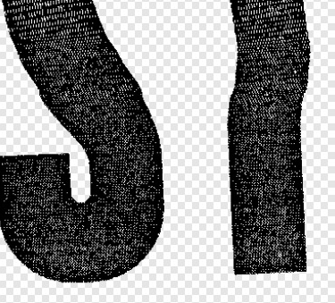
If your grain is a different shape you’ll wanna find different stock for this, but this looks a lot like denim to me? So I’m going into the Stock screen (View>Studios>Stock will bring it up if you don’t have it enabled already, but it just goes to Pexels and Pixabay to grab images for you is the tldr) and grabbing a high quality scan of some denim. You’ll wanna resize it so the fabric texture is around the same size as what’s here already. This might mean making it smaller than the whole page and that’s fine, for me I just duplicated it till I had enough to cover the whole image, but the tldr here is “cover the whole page in denim or concrete or whatever texture you’re using”
If you used multiple images group them, rasterize the entire group, tldr make it one big image. Afterwards hop back into the Threshold page, and try to replicate the grain pattern! You’re gonna slap it over the whole image so don’t worry about getting it perfect. You want the image to be mostly white, with black as a the textured bits, BUT if you can only get it to mostly black with good white texture? Totally fine, you’ll just want to inverse the image at the end (I personally find this way easier, but like ymmv)
anyway for me we ended up here
Because it’s mostly black we are gonna want to Adjustments>Invert on this. Same as before now we want to rasterize the image, and go to Filter>Colors>Erase White Paper. Set the blending mode to Erase
This whole thing requires a lot of patience, and a lot of trial and error, but eventually you’ll land on something like this
We aren’t going for a ton of texture, just enough hide some of our mistakes along the way
Group the whole thing, duplicate it, lock and hide the original again
Now on one group go ahead and rasterize it again, slap some color under it (or idk a book cover? That’s what this is for) and you’re good to go!
Anyway hope this is helpful, I do a lot of threshold maps on stock photos to get cool texture so I can zoom through this pretty quick, but like it takes some time and effort!
#uhhhh I need a skill share tag so im gonna make it#skillshare#yeah that'll do it#its nice not being on twitter because I can just do something like this without making a thread of it now
128 notes
·
View notes
Text
youtube
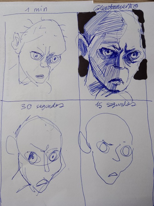
No me considero una persona creativa, así que intenté los ejercicios de este video para ser más creativo o algo así.
Primer ejercicio: dibujar sin levantar el lapiz.

Segundo ejercicio: dibujar autoretrato con la mano menos dominante.

Tercer ejercicio: blop monsters?

Cuarto ejercicio: dibujar mi mano

Quinto ejercicio: dibujo rápido
:l
2 notes
·
View notes
Text
I have exciting news! I’m now teaching on Skillshare and just uploaded my class How to Write Extraordinary Poetry. If you want to learn with me, this link will give you one month free to the entire site. I’ll talk to you on Skillshare!
#how to write#how to write poetry#poetry lessons#poetry class#writing poetry#on writing#poetry community#spoken word poetry#blackout poetry#poem#poets#queer poets on tumblr#queer poetry#indie books#booklr#bookish#skillshare#Skillshare class#nicole mae#poet#poetry#poets on tumblr#writing community#creative writing#class lesson
6 notes
·
View notes
Photo

Insanely realistic gartic phone portrait of yung gravy
Timelapse : https://youtu.be/IHl5Z28dTYo
Posted using PostyBirb
#Digital painting#Gartic#Huion#Kamvas 22#Skillshare#art#art school#art style#art vlog#artist#digital art#digital art tutorial#digital drawing#digital painting#digital painting tutorial#digitalart#drawing#drawing tutorial#famous#gartic phone#garticphone#how to draw#how to find your art style?#huion kamvas 22 series#illustration#learn to draw#photoshop#portfolio#procreate#skilled
1 note
·
View note
Last Seen Blogs

classic-online-game
Classic Online Game
broliever
It's trash CAN, not trash CANNOT

ra7iiq
رحيق
micahammon
Just So

tro-fro
my pixel life.