#procreate timelapse
Text

Trying new brushes with the boy to unlock my artistic self-esteem
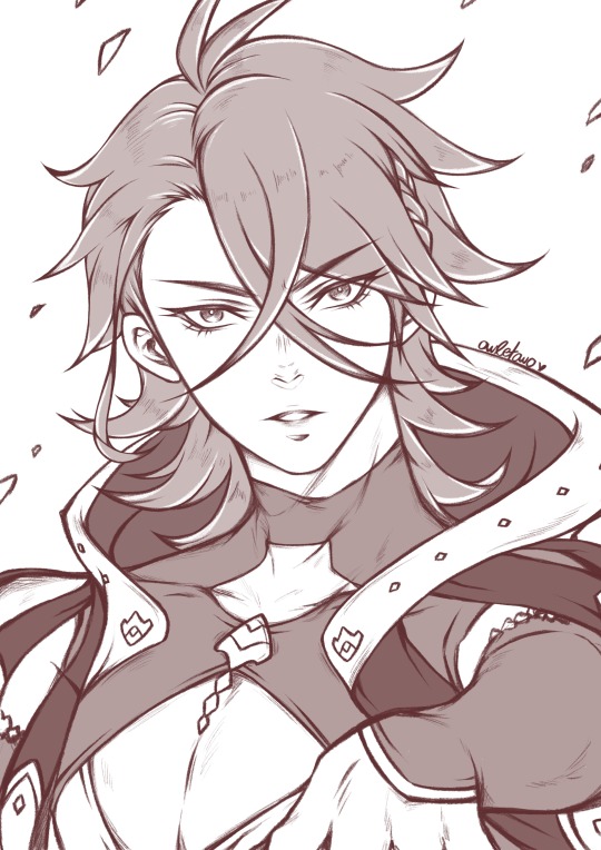
#hfw erend#very early#mutton chop monday#erend vanguardsman#horizon forbidden west#hfw fanart#procreate timelapse
68 notes
·
View notes
Text
This is the first timelapse I've ever posted of one of my fan art. I hope you enjoy it. I also managed to put in the music 🎵

#digitalart#fanart#james sunderland#heather mason#silent hill 2#silent hill 3#james x heather#silent hill fanart#silent hill#james sunderland x heather mason#procreate#timelapse#procreate timelapse
98 notes
·
View notes
Video
*:・゚✦ Pandreo ✦*:・゚
I really love it when he’s serious >///<
#fire emblem#fire emblem engage#pandreo#fe engage#fe: engage#fire emblem pandreo#fe17#fire emblem fanart#fire emblem engage fanart#fe pandreo#fire emblem art#fe fanart#fanart#my art#breaktime doodle#artists on tumblr#procreate#procreate timelapse
571 notes
·
View notes
Text
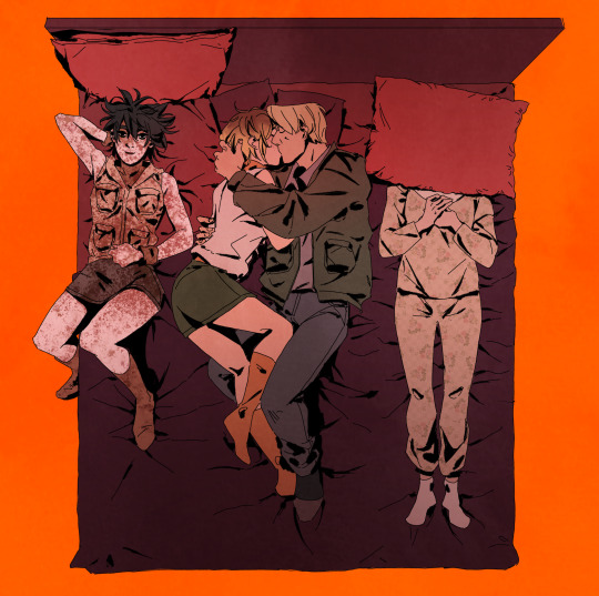
Timelapse of the ✨angst✨ brahms x greta
Also! If you guys have any ideas what to draw next, hit me up in the comments!
This was the most fun to do honestly!
#brahms fanart#brahms heelshire#brahms the boy#brahms the doll#brahms heelshire greta#the boy 2016#brahms x greta#procreate#digital art#slashers#procreate timelapse#slasher fanart#slasher art#slasher lover#ao3 slasher#slasher fanfiction#slasher fandom#slasher brahms#slasher fic#angst
151 notes
·
View notes
Text
Working on the Hazbin Hotel cast for my next enamel pin campaign!! Alastor and Lucifer are done! Charlie and then Angeldust next!
#hazbinhotel#digital art#fanart#Alastor#Lucifer#hazbin alastor#hazbin lucifer#Hazbin hotel#procreate art#procreate Timelapse#Timelapse art#lucifer morningstar#radio demon#enamel pin design#hellaverse#artist#digital artist#Hazbin hotel fanart#Alastor art#Lucifer art#fan art#fan merch#Hazbin hotel fan merch#lgbtq owned#furry artist
28 notes
·
View notes
Text


I have the time-lapse videos for both of these drawings up on my YouTube! Go check them out to see the process!
#timelapse#speedpaint#digital art timelapse#procreate#procreate timelapse#goldilocks#puss in boots the last wish#puss in boots 2#link breath of the wild#botw link#legend of zelda link#fanart#fanart drawing#character artist#character art#digital drawing#process video#art process
369 notes
·
View notes
Text

Hey! I finished it! And it’s awesome and I’m really proud 💜 The reference was Spike totally being a normal villain towards Buffy in Superstar (S4)
#Alex’s stuff#Spuffy#Btvs#Spike btvs#Alex’s art#Btvs fanart#My art#Art#iPad art#iPad#Procreate#Procreate art#Buffy the Vampire Slayer#Buffy#Buffy fanart#Fanart#Procreate Timelapse#Digital art#Graphic design major#College artist#Procreate illustration#Digital pencil drawing#Pencil drawing#Buffy summers#Superstar
37 notes
·
View notes
Text

Got into Ghost AND got my will to draw back at the same time so got possessed n managed this PapaCopia in 3 hours. We love a good reference image for this one.
If this motherfucker dies before the loop back to Europe I will cry isthmus
Timelapse bellow the cut
#ghost#ghost bc#the band ghost#thebandghost#papa copia#papa emeritus fanart#papa emertius#papa emeritus 4#papaemeritus IV#digital art#digital#greenfogg#art#digital illustration#cardinal copia#cardi c#procreate#procreate timelapse#timelapse
64 notes
·
View notes
Text
This piece of fan art ended up meaning a lot more to me than I expected it to. Like a lot of people, I see myself in Helga, so when thinking of ideas, I often draw from personal experience.
I remember being 15 and wanting to be grown so badly, then also tried to apply modern fashion trends to that, thinking about the things I see on Instagram. One thing that worried me through the drawing process was wanting her outfit to look a little “racy” but not sexy. It’s important to me that a 15 year old Helga is not sexualized through my drawing, especially with her mixed expression of nervousness and excitement. You can see through my drawing process that I changed aspects of her outfit throughout to give her more and more modesty.
Regardless, this one ended up being my favorite in this series of Hey Arnold fan arts, I hope you all enjoyed it. Also, thank you to all of the new followers and friends I’ve made from this week, you all are so cool!!
#shortaki#procreate#commissions open#cartoon#fanart#90s#90s cartoons#helga pataki#nickelodeon#nicktoons#open for work#character art#character illustration#hey arnold!#hey arnold#draw with me#timelapse#timelapse drawing#procreate timelapse
21 notes
·
View notes
Text
ooh I’ll also post kars timelapse ‘cause I just love how this picture turned out
sorry for spamming with him lol
19 notes
·
View notes
Text
Here’s the timelapse of Albedo and the twins! 😊
12 notes
·
View notes
Text
If this fanart has troubled you I have succeeded in the task ❤️
Designed it as a cover for a Heather/James comic book project that contrary to Escape from the deal is terribly cruel and depraved.
#silent hill 2#silent hill 3#james sunderland#heather mason#james x heather#silent hill fanart#james sunderland x heather mason#fanart#silent hill#procreate timelapse#procreate#digital art#psychological horror#horror
67 notes
·
View notes
Text
Timelapse time hehe ✨
Brahms from The Mask of Beauty and Rage by yaztheangel, fanfic of The Boy movie, on AO3🪄
I am slowly running out of ideas so it takes more time to come up with a composition or to choose a scene, so until then, I have timelapses to present!
#brahms fanart#brahms heelshire#brahms the boy#brahms the doll#brahms heelshire greta#the boy 2016#brahms x greta#procreate#digital art#slashers#procreate timelapse#work in progress#slasher fanart#slasher fanfiction#slasher fic#slasher fandom#slasher art#ao3 brahms#ao3 fanart#ao3 fic#ao3 the boy
95 notes
·
View notes
Text
Digital Portrait Study 90s Model Stephanie Roberts Timelapse video
#portrait study#digital portrait#procreate#procreate timelapse#90s fashion#90s models#black artist#90s aesthetic
10 notes
·
View notes
Text
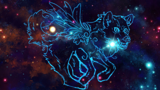
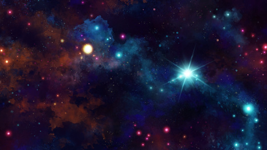
I call this one Soulstar. You can watch my process in a speedpaint/timelapse as well:
youtube
I am open for pay what you can afford commissions!
Please support my work by reblogging. uwu~<3
#silversugar#xsilversugar#art#my art#digital art#youtube#my oc#oc#original character#furry#anthropomorphic#feral furry#feral oc#feral art#werewolf#galaxy wolf#wolf#awoo#winged wolf#sparkle wolf#space#galaxy art#digital watercolor#digital illustration#watercolor#illustration#speedpaint#procreate#procreate timelapse#youtube video
7 notes
·
View notes
Text
(🌎/🇧🇷 Tradução das dicas abaixo!)
🌎 I tried making a lil art tips videos for instagram and thought you guys would like it too so here it is!! Lmk if anyone needs any clarification on anything!!
People usually compliment my color choices a lot so I thought about doing something with that! But I don’t really feel too knowledgeable to make whole tutorials and all so instead I decided to give some tips! Let me know if you’re interested in more! 🥰
🇧🇷 As pessoas normalmente elogiam muito minhas escolhas de cores então eu pensei em fazer algo com isso!! Mas eu não me sinto lá muito “conhecedora” de cores pra fazer um tutorial e tudo mais então ao invés disso eu decidi dar umas dicas! Me contem se vcs tiverem interesse em mais! 🥰
Tradução das dicas:
✨Dica 1: use o máximo de layers que você puder!! Isso ajuda a mudar o que você achar necessário depois! (Engraçado vindo de uma pessoa que usa o procreate, eu sei 🤣)
✨Dica 2: não se preocupe se você colorir fora das linhas, você pode esconder ou pintar por cima depois! (E de novo, colorir em layers separados ajuda muito com isso)
✨Dica 3: Não se preocupe em acertar as cores logo de primeira, você sempre pode mudá-las depois através das configurações de hue, saturação e luminosidade!! (Você pode até usar cores completamente diferentes só pra visualizar a sua peça melhor enquanto você ainda tá blocando as cores!)
✨Dica 4: já que estamos falando de hue, saturação e luminosidade, brinque com elas à vontade! Cores saturadas ficam melhor perto de cores desaturadas, e vice-versa! (Às vezes, o color picker pode deixar as suas cores menos harmoniosas, então pegar uma cor similar mas mais próxima da sua paleta faz mágica, pelo menos pra mim!)
✨Dica bônus: para criar uma peça bonita, você não precisa incluir as sombras sempre! As cores base sozinhas podem ser bem satisfatórias se feitas direito! (A cobertura do bolo não deixa ele mais gostoso se a base não tá boa, né? É o mesmo pra renderização na arte! Trabalhe na sua base antes de se preocupar com a renderização!)
#mews videos#scheduling this before i forget... again#art tips#art tutorial#digital art#digital art coloring#digital coloring#procreate#procreate art#procreate timelapse#ipadart#artists on tumblr#small artist#tutorial#reels#art reels#art reel
65 notes
·
View notes
Last Seen Blogs

soslaio-ei
soslei;
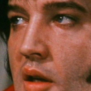
laura23elvis
Polk Salad Annie

hindi-shayari
Love Hindi – Latest Hindi Shayari
muddy-and-foxgloved
my friends got jobs, i've got issues
0hmyg0th
mars ☆