#otf: stark
Text
Rickon: *sends a super low-quality meme to the group chat*
Arya: if i had a dollar for every pixel in this image, i’d have 15 cents
Rickon: if i had a dollar for every ounce of rage i felt in my body after i read this text, i would have enough money to buy a cannon to fire at you
Sansa: Actually I did the math, Arya would have $225, not $0.15
Robb: If I had a dollar I would buy a can of soda :)
Theon: while you’re there could you buy me an apply juice please?
Robb: Sorry I only have a dollar
Theon: :(
Bran: hey I just realized sansa is wrong, arya would have $22'500 because it's a dollar for every pixel, not a cent
Robb: If I had $22'500 I would buy a can of soda and an apply juice
Rickon: you can buy anything you want with $22'500
Arya: yeah and he wants soda and apply juice
Jon: Apply juice to what
Theon: directly to the forehead
Sansa: Great chat everyone
#incorrect quotes#starkling edition#house stark#starklings#game of thrones#**#incorrect starkling#incorrect game of thrones#arya stark#otf: stark#sansa stark#robb stark#theon greyjoy#jon snow#bran stark#rickon stark
174 notes
·
View notes
Note
Would a box cutter be a viable weapon? Assuming the alternative is bare fists and it’s a street-fight type of situation with an untrained opponent.
Yep.
It's not even strictly in the context of against unarmed opponents, most box cutters are entirely functional as combat knives. On top of that, their folding design makes them very easy to carry and conceal.
Ironically, box cutters are easier to use than some heavily regulated concealable knife variants, like the balisong, or gravity knives. They're about as useful as an OTF or switchblade (and in a further irony, your average gas station box cutter is likely to be of a higher quality than a similarly priced switchblade.)
The box cutter is a cheap, and highly effective, concealable blade. There's a reason that no half-sentient security checkpoint looking for weapons will let you carry one through without a very good reason.
It's worth remembering that box cutters are entirely different from utility knives. Both of these are specific knife variants. A box cutter is a 3 to 4 inch folding blade. In most cases, it will articulate freely, and lock into position when unfolded. In some cases, they will have a spring assist, and depending on local laws, these may be considered switchblades, or subject to more stringent regulations.
Utility knives have an extremely thin, or outright flat, blade, usually with only a single edge. The blade may be fixed, or it may slide in and out of the grip. In some cases, the blade itself is diagonally scored, and as the blade wears down, the user is expected to snap it off and extend the blade further (sort of like a mechanical pencil.) In other cases (particularly if the blade is fixed in position), then the user is expected to remove, discard, and replace the blade when it wears down. (Replacement blades for utility knives are very cheap.)
Utility knives are sometimes (confusingly) also referred to as box cutters. (In this case, the name is more descriptive than technical.) They are not particularly well suited for use as combat weapons. The blades are rarely long enough to get into vital targets. Obviously, there are a few vulnerable targets, and if you know your physiology, you could potentially take out an artery with one, but in contrast to most knives, it's not enough to stab a few times and hope for the best. Because they have expendable blades, utility knives tend to be extremely sharp. However, their blades also tend to be pretty fragile. They're not designed to last. In the rare cases where you will find a long blade in a utility knife, it is quite literally designed to be easily broken.
Somewhat obviously, utility knives can be used against people, but it's more of an act of sadism or desperation than a functional combat tool. Box cutters on the other hand are entirely functional weapons.
-Starke
This blog is supported through Patreon. Patrons get early access to new posts, and direct access to us through Discord. If you’d like to support us, please consider becoming a Patron.
302 notes
·
View notes
Photo
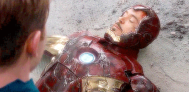


“i will miss you, tony.”
#marveledit#mcuedit#andyjwest#steverogersedit#tonystarkedit#otf: mariana x lena#ship: tony x steve#ch: steve rogers#ch: tony stark#p: chris evans#p: robert downey jr#gif[1]#gif: marvel#gif: rdj#dynamic*#500
785 notes
·
View notes
Photo


✧ end of year fandom meme ✧ → favourite ships
1) SanSan (Sansa Stark x Sandor Clegane) – from the A Song of Ice and Fire series (book-version ONLY). The Little Bird and the Hound…the OTP that got me hooked on fanfiction in the first place, and the one that, no matter what, will always have a stronghold within my heart.
2) Bethyl (Beth Greene x Daryl Dixon) – from that terrible show that shall remain nameless, my achingly beautiful post-apocalyptic OTP of otps, and the pairing I’ve written the most fic for over the years.
3) Anidala (Anakin Skywalker x Padme Amidala) – from the Star Wars Prequels and Clone Wars series. My love for these two as individuals, for their secret, intense forbidden romance, and for their glorious, devastating galactic apocalypse of a tragedy knows no bounds. To me, the embodiment of ‘Death and the Maiden’.
4) Snips and Skyguy (Anakin Skywalker and Ahsoka Tano) – from The Clone Wars animated series. My all-time favourite ‘Master and Apprentice’ relationship, and the brotp I ‘ship’ as hard as any romantic pairing — so much so, I refer to them as my ‘OTF’, aka my ‘One True Friendship’. There are few fictional relationships I have bawled my heart out over more. 10/10 would die for them.
#personal#tumblr memes#fandom#shipping#favourite ships#post-purge tumblr is insanely boring#so i'm trying to find ways to amuse myself...#so uh... here...#have a look into the (not-so-secret) depths of my fandom heart#;p#end of year round-up
15 notes
·
View notes
Text
Brutalist, Reverse Contrast Typefaces That Add a Touch of Weird
Experimenting with different font styles can infuse character into your work. you will be surprised by what an enormous change a seemingly small typographic tweak can do!
Originally an style of architecture , the brutalist aesthetic is one that's characterized by deliberate plainness or crudeness. Brutalism has made a comeback in many realms today, and you'll now find the design in fashion, furniture, and, more and more frequently, graphic and web design. When brutalism is employed in graphic design, the aesthetic is one that grabs your eyes with its rawness and unpolished nature.
Typefaces during this style substitute stark contrast to the fashionable neat, polished look that so often encapsulates contemporary design.
If you're trying to form your design projects a touch weird (or unique), inspect these 20 brutalist, reverse contrast typefaces. they are not your typical clean-cut body fonts, but ultimately, they will make your text more interesting and obtain more eyes noticing your creations than ever before.
Adele Moon
For a font with a definite artistic movement feel, try Adele Moon, created by Roselyn Carry. The typeface comes with 22 different ligatures with common letter combinations, and therefore the designer has also included9 pre-made logos that match the typeface's aesthetic as a bonus. The typeface is somewhat whimsical in feel, with curled ends and little , decorative serifs. this is often an honest choice of typeface for branding, titles, and logos.
Astoria
TanType created ASTORIA, a display typeface that features a mythical or antique feel. The designer of ASTORIA describes it as a "quirky display serif that spells fun" with a "psychedelic look." this is often definitely not a body font, but one that's best fitted to mastheads, posters, branding materials, and more. Because the serifs on this typeface are so slight, it pairs well with most convention serif or Helvetica fonts.
Hacky
For a font that exudes luxury, choose Hacky, created by madeDeduk. The font comes with 9 variable weights, also as uppercase characters, lowercase characters, numbers and symbols, international glyphs, uppercase alternatives, lowercase alternatives, and ligatures.
Hacky is a superb font to use for branding or packaging materials, and therefore the designer also suggests using it on an "invitation....t-shirt, label, poster, logo, etc." One perk of selecting this font is that you simply can visit the designer's Instagram to ascertain samples of what the typeface seems like within the world
Ethery
Another font compatible for luxury brands is Ethery created by LABFCreations. This stylish, symmetrical font is contemporary in feel, but its classic, minimalistic look makes it an honest fit any project with a clean, sleek aesthetic. The designer explains, "Geometric and classy , this font is right for creating logos and branding. With original ligatures...It works perfectly for creating stylish logos, striking editorials, invitations, graphic quotes, and more" once you purchase Ethery, you'll receive OTF, TTF, WOFF, and WOFF2 files with the font. there's also multilingual support for various languages.
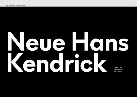
Kendrick Serif
Kendrick Serif may be a distinctively fun font with a bold look—perfect for headlines and branding. The typeface was designed by Jeremy Vesey of Hust Supply Co. It comes with 362 glyphs and regular and oblique versions of both the uppercase and lowercase set. once you download Kendrick Serif, you get TTF and OTF files, a Webfont kit, and western European characters.
Valky
From NEWFLIX.Bro may be a serif typeface with a vintage feel, and it's perfect (according to the designer to be used in "editorial projects, Logo design, Clothing Branding, product packaging, magazine headers, or just as a trendy text overlay to any background image. once you download Valky Classic, you get a bunch of fun features, like 4 font weights, lowercase and uppercase, stylistic alternatives and ligatures, numerals, punctuation, accented characters, and support for multiple languages. one among the good parts about Valky is that the designer is hospitable suggestions and welcomes requests for extra glyphs and language support.
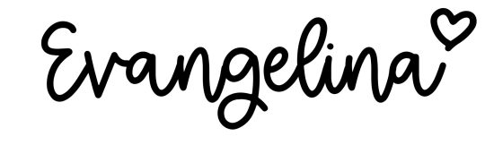
Evangelina
One of the fanciest, most intricate fonts on the list is Evangelina: a typeface created by designer New Tropical Design. The designer explains that it's intended to be a display font and designed as an ode to fashion photography from the 1970s to today. The font has elaborate curves and shapes, and since of its elaborate nature, it is best for headings, logos, invitations, and more. It's an attention grabbing choice of font, and it comes with OTF and web fonts, upper and lower cases, number, punctuation, and multilingual support. The designer of Evangelina says that it is a typeface that's "guaranteed to draw the eye!"
Bornice Modern Serif
Bornice Modern Serif may be a brutalist font with an unmistakable vintage aesthetic and just a touch little bit of cartoonish quirk. This font, which was designed by Damelev, has some interesting inspiration behind it, because the designer explains, that it represents "exuberance and faith in social and technological progress." Bornice was intended to be used for logos, t-shirts, apparel, badges, invitations, packaging, headlines, posters, magazines, greeting cards, wedding invitations, and more. you'll access its OpenType features on most Adobe programs, including Indesign, Illustrator, and Photoshop.

Cyrano
Dharmas Studio made Cyrano, a serif font where every letter was handcrafted to seem European and trendy . The designer created the font for fashion-centric projects. They suggest using Cyrano for "creating elegant, chic, lifestyle design like logos, title, magazine and more" The font comes with a lowercase that's actually uppercase and therefore the uppercase is alternate. once you download Cyrano, you get TTF, OTF, SVG, and Webfont versions; letters, numbers; punctuation, multilingual support, ligatures, and an alternate access guide.
Canyon
Canyon, created by Bnick, is a chic serif display font supported Henri Jules Ferdinand’s “Le Bellery Desfontaines” holotype . The designer explains, " I modified and refined each and each character (along with creating new ones) so as to be legible during a digital format." once you download Canyon, you get all English characters and punctuation, along side most Swedish and European characters. This font is obvious , simple, and straightforward to read, and it's slightly of character without adding anything too over the highest .

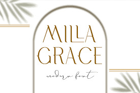
Milla Grace
From LABFCreations is Milla Grace, a thin, all caps elegant font that exudes classical beauty. The designer of Milla Grace explains that the font is right for logos and branding, also as "creating sites, logos, striking editorials, invitations, graphic quotes, and more." once you buy Milla Grace, you get OTF, TTF, WOFF, and WOFF2 files with each font. you furthermore may get uppercase characters, discretionary ligatures, and multilingual support for various languages.
Tittowest
Haksen created Tittowest Futuristic Serif Display Font, which is best fitted to headlines, logos, posters, packaging, t-shirts, and more. This font is funky and industrial-feeling, and it comes with both uppercase and lowercase. once you download Tittowest Futuristic, you get both a daily and Italic version, alternates in uppercase, ligatures in lowercase, numerals and punctuation, accented characters, and more. Multiple languages are supported, and therefore the download comes with OTF, TTF, and WOFF files. The designer recommends using it in Adobe Illustrator or Photoshop with OpenType features.
Pearl
Pearl may be a perfect name for this font from TanType because it feels elegant and female . With playful curves, the designer of PEARL explains that the font is supposed to "tease your eyes." Still, it also features a classy composition, fancy enough for elegant packaging, invitations, apparel, and other products that decision for whimsical, wavy fonts. The download comes with multilingual support and OTF, TTF, and WOFF files.

Cigra
Identitype created Cigra, a font that's fashionable and stylish but easy to read. The designer of Cigra describes the font as "a standout display font that's an ode to fashion typography in present day. Its elaborate curves and unique shapes make it perfect for headings, logos & wedding invitations." it's PUA Encoded characters that are fully accessible with none additional design software, and it includes multilingual support. Also, its Open type features are often access using Illustrator, InDesign, Photoshop, Word, and more. Indentitype sums up this luxury font perfectly, saying, "Cigra is all class, so if you would like a trendy font that's bound to draw the attention , then this is often it!"
Migaela
Migaela may be a fun, retro feeling font that was created by nurrontype. This display font features a distinct seventies-era aesthetic—with a fun little bonus - the dot of the i is formed of a snowflake! The designer of Migaela calls the font "cheerful, positive, and charming." once you purchase Migaela, you get three optional styles: regular, overlap, and smooth (rounded). think about using Migaela for a retro Christmas, winter, or holiday project because that snowflake detail is simply the wintry accent to enliven any wintertime project
Kindred
Looking for a cool , retro feeling display type that harkens back to a special era? Try KINDRED by TanType. this is often one among the foremost distinctive of the reverse contrast typefaces on Creative Market, and its curvy lines and quirky look make it good for a 70s-style project—or one that harkens all the way back to Mythical times (Thinks: a Funny Thing Happened on the thanks to the Forum). The designer, TanType, says the font is well-suited for any project you've got in mind, and that they include the font utilized in a spread of settings within the product's screenshot on Creative Market.
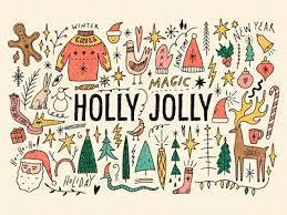
Holly Jolly Bundle
Annie Konst created Holly Jolly Bundle, an incredibly fun, brutalist type that's really well-suited for brand spanking new Years', Christmas, and winter projects. The font looks distinctly hand-doodled, and it pairs well with cartoon images or aesthetics. within the bundle, you do not just get the font. you furthermore may get tons of extras, including (according to the designer): "ready-made illustrations and PNG clipart for your projects, just take it and use!" one among the simplest parts about the bonus elements is that they're also editable in order that you'll fit them into your projects, and you'll work with these elements in Illustrator, Photoshop, or Canva.
Eclipse
Eclipse may be a classic, condensed serif typeface made by Studio Aurora. The font is best fitted to display-type projects, and therefore the designer recommends using it within the following projects: "magazines (titles and layouts), logos and branding, invitations, social media, quotes, blog headers, posters, and advertising." The font has language support for several languages, including Afrikaans, Albanian, Catalan, Danish, Dutch, English, French, German, Italian, Norwegian, Portuguese, Spanish, Swedish, and Zulu. This strange eye-catching font may remind you of watching the moon because it changes the form of their month.
Explore More Brutalist Typefaces
Brutalism is more popular than ever, thanks, perhaps, to a backlash to the sleek, clean minimalism that dominated the last decade. If you would like to require advantage of a design trend that's popular, eye-catching, and different than what most of the people have seen in recent years, consider incorporating some brutalist elements into your creations—particularly when it involves typefaces. These brutalist fonts draw eyes to projects and are unforgettable—helping your project draw attention and make an impact on anyone who encounters it.
For even more eye-catching, unforgettable designs, flick through all of the planning assets on Creative Market. because of the designers on Creative Market, the location is full of plenty of resources to assist make your work one-of-a-kind—particularly creative typefaces and retro fonts, get start your course for knows the facts of graphic designing find the best institutions which have the graphic designing course in Delhi.
Choose one among the brutalist fonts above, or browse the remainder of the location to ascertain logos, templates, icons, graphics, photos, and more from designers which will infuse just the proper amount of character into your project. you will be happy to understand that Creative Market designers have mastered every aesthetic—from wondrous to weird, and you will be ready to find many elements to form your projects look even more professional and aesthetically pleasing than ever before.

1 note
·
View note
Link
t3n News http://j.mp/2ofJBeT
Das Problem ist nicht, dass es zu wenige Schriftarten im Netz gibt, sondern dass die meisten davon die deutschen Sonderzeichen nicht unterstützen. Die zehn Fonts unserer Übersicht tun es ausnahmslos.
Akrobat von Fontfabric
Akrobat kommt in acht Schnitten und mit einem Haufen Glyphen. (Screenshot: t3n)
Die kostenlose Schrift „Akrobat“ aus dem Hause Fontfabric ist eine moderne Sans Serif mit geometrischen, aber kompakten Proportionen. Sie steht vollkommen kostenlos, auch für die kommerzielle Nutzung, bereit und bietet neben acht verschiedenen Schnitten die Unterstützung für deutsche Sonderzeichen, aber auch das kyrillische Alphabet und 500 Glyphen.
Der Download aller acht Schnitte erfolgt im Format OpenType (.otf). Webfonts werden nicht mitgeliefert. Alles in allem gebührt der „Akrobat” eine klare Download-Empfehlung.
Zum Download
Sophia von Emily Spadoni
Sophia unterstützt nur die deutschen Umlaute, ist aber zu schön, um sie zu ignorieren. (Screenshot: t3n)
„Sophia“ ist eine Handschrift im Brush-Look, die zwar nicht die kompletten deutschen Sonderzeichen, aber immerhin die Umlaute unterstützt. Im Download-Paket enthalten sind insgesamt drei Fonts. Neben der Hauptschrift erhaltet ihr noch zwei Varianten namens „Sophia Right“ und „Sophia Left“. Damit könnt ihr eure Wörter mit Ornamenten beginnen und enden lassen.
Neben den Schriften in den Formaten TrueType (.ttf) und OpenType (.otf) finden sich zusätzlich Webfonts im WOFF- und WOFF2-Format im Lieferumfang.
Trotz der unvollständigen Unterstützung der deutschen Sonderzeichen gehört „Sophia“ klar in den Designer-Werkzeugkasten. Der Font kann frei für persönliche und kommerzielle Projekte verwendet werden.
Zum Download
Tuna von Felix Braden und Alex Rütten
Tuna unterstützt die deutschen Sonderzeichen vollumfänglich. Wäre auch komisch, wenn nicht. (Screenshot: t3n)
„Tuna“ ist eine Serifen-Schrift der beiden deutschen Designer Felix Braden und Alex Rütten. Sie besteht aus fünf Schnitten, von denen einer, nämlich der „Tuna Medium“, zusammen mit der Kursiv-Variante „Medium Italic“ kostenlos verwendet werden kann.
Wer alle Schnitte in allen Varianten will, kauft das Paket über Myfonts für runde 220 Euro. Weitere Kombinationen sind möglich. Schaut euch bei Interesse die entsprechende Information auf Myfonts an. Hier wählt ihr auch die beiden freien Schnitte „Tuna Medium“ und „Medium Italic“, die entsprechend mit 0 Euro ausgezeichnet sind.
Felix und Alex vermarkten ihre Schrift sehr professionell, wie die eigens angelegte, sehr ausführliche und äußerst ansprechende Microsite zu „Tuna“ deutlich macht.
Im kostenlosen Angebot sind die Webfonts nicht enthalten. Ihr erhaltet zwei separate Zips mit dem jeweiligen Font in den Formaten TrueType (.ttf) und OpenType (.otf). Die Schriften dürft ihr sowohl in persönlichen wie auch kommerziellen Projekten verwenden.
Im Grunde ist es wohl unnötig zu erwähnen, dass eine Schrift aus Deutschland auch die deutschen Sonderzeichen unterstützt, „Tuna“ eignet sich jedoch für alle west-, ost- und zentraleuropäischen Sonderzeichen.
Tuna auf Behance | Tuna bei MyFonts | Tuna Microsite
MonaKo von Manfred Klein
MonaKo von Manfred Klein ist alt, aber zeitgemäß. (Screenshot: t3n)
„MonaKo“ von Manfred Klein ist eine Schriftart im Vintage-Stil. Sie hat schon ein paar Jahre auf dem Buckel, ist also nicht mehr frisch im Sinne der zeitlichen Definition. Allerdings passt sie dieser Tage wieder wunderbar in die Designwelt und sorgt insofern also doch für frischen Wind.
„MonaKo“ gibt es lediglich als TrueType-Schrift, das aber kostenlos. Die deutschen Sonderzeichen werden unterstützt.
Zum Download
Cooper Hewitt von Chester Jenkins
Cooper Hewitt ist Open Source und kommt sogar mit Webfont. (Screenshot: t3n)
Im Rahmen der Umgestaltung des Cooper-Hewitt-Smithsonian-Design-Museums leistete man sich eine eigene Schriftart namens „Cooper Hewitt“. Designer Chester Jenkins gestaltete eine moderne Sans Serif, die als Open Source vollkommen frei verwendbar ist. Der Font steht als TrueType (.ttf), OpenType (.otf) und sogar als Webfont zur Verfügung.
Zum Download
Kolikö von Alex Frukta
Kolikö ist ideal für Animationen. (Screenshot: t3n)
„Kolikö“ von Alex Frukta ist ebenfalls keine brandneue Schriftart. Jedoch eignet sie sich ausgesprochen gut für Animationen und andere Bewegtbild-Umsetzungen. Insofern ist sie prädestiniert für die immer populärer werdenden funktionalen Animationen moderner Websites.
„Kolikö“ ist eine Sans Serif mit geometrischer Formgebung. Sie wird in drei Schnitten als Paket aus TrueType (.ttf) und Webfont im WOFF-Format geliefert. Die Abwicklung erledigt Gumroad. „Kolikö“ unterstützt die deutschen Sonderzeichen. Alex Frukta stellt die Schriftart als Freeware zur kostenlosen Verwendung, sowohl in persönlichen wie auch in kommerziellen Projekten, zur Verfügung.
Zum Download
Frutilla von Ian Mikraz
Frutilla ist eine ausgesprochen schwungvolle Script-Schriftart. (Screenshot: t3n)
„Frutilla“ vom Grafikdesigner Ian Mikraz ist ein Script-Font, der jedem Kalligraphen die Freudentränen in die Augen treibt. Aufgrund seiner extravaganten Linienführung eignet er sich naheliegenderweise nicht für Fließtexte, kann aber als Akzent auf jedem thematisch passenden Plakat, Banner oder ähnlichem glänzen.
„Frutilla“ wird als TrueType (.ttf) und OpenType (.otf) geliefert. Die Abwicklung erfolgt über Gumroad. In der OpenType-Variante bietet „Frutilla“ 277 Glyphen und 86 alternative Zeichen. Die deutschen Sonderzeichen werden voll unterstützt und es bestehen keine Einschränkungen für den Einsatz. „Frutilla“ kann auch kommerziell genutzt werden.
Ian Mikraz bietet weitere kostenlose Schriften auf seiner Seite an. Schaut auf jeden Fall dort vorbei.
Zum Download
Black Animal von Faisal Tanjung
Wesentlich plakativer als Black Animal kann eine Schriftart nicht werden. (Screenshot: t3n)
„Black Animal“ von Faisal Tanjung ist ein Brush-Font. Die Buchstaben sehen aus wie mit dem groben Pinsel gezogen. Besonders eignen sich derartige Schriften für markante Slogans, Poster, Merchandise und andere Einsatzzwecke, bei denen es auf auffällige Typografie ankommt.
„Black Animal“ wird als TrueType (.ttf) und OpenType (.otf) geliefert. Zur OpenType gibt es eine Zugabe namens „Black Animal Swash“. Die Abwicklung erfolgt via Sellfy. Auf dem Creative Market gibt es eine erweiterte Kaufversion der gleichen Schrift mit ein paar mehr kreativen Features.
„Black Animal“ kann auch kommerziell eingesetzt werden und unterstützt die deutschen Sonderzeichen.
Zum Download
TM Vinograd von Vova Egoshin
Halboffene Buchstaben sind auf jeden Fall ein Hingucker. (Screenshot: t3n)
Auf den ersten Blick ist „Vinograd“ sicherlich die ungewöhnlichste Schrift dieser Übersicht. Der Eindruck wird besonders durch die halboffenen Varianten der Schrift geprägt. So etwas sieht man nicht so oft. Die geschlossenen Schriften sperren sich dann auch weit weniger stark gegen das Auge, ohne dabei jedoch zu gewöhnlich zu werden.
„Vinograd“ kommt in zwei Schnitten, jeweils in halboffener und geschlossener Variante. Die Schriftart unterstützt viele Sprachen, darunter auch die deutschen Besonderheiten. „Vinograds“ vier Varianten werden jeweils als TrueType (.ttf) und OpenType (.otf) geliefert. Im OpenType-Format sind rund 600 Glyphen vorhanden.
Die Verwendung ist kostenlos zu persönlichen und kommerziellen Zwecken möglich.
Zum Download
Orkney von Samuel Oakes
Zum Abschluss kommt die seriöse Orkney ins Spiel. (Foto: Alex Duffill)
„Orkney“ ist eine schnörkellose, geometrische Sans Serif, die sich am besten in nüchternen, modernen Präsentationen einsetzen lässt. Sie ist perfekt geeignet für Fließtext und Überschriften gleichermaßen. Für Blickfänger-Aufgaben eignet sie sich eher nicht.
„Orkney“ kommt in vier Schnitten im Format OpenType (.otf) und steht unter der Open-Font-License, was bedeutet, dass die Verwendung auch in kommerziellen Projekten möglich ist. Neben den deutschen Sonderzeichen unterstützt die „Orkney“ auch Rumänisch, Türkisch und viele andere Zeichensätze.
Zum Download
http://j.mp/2onQyYB via t3n News URL : http://t3n.de/
0 notes
Text
Robb: If you got arrested, what would be the charges?
Sansa: Theft
Bran: Disturbing the peace
Jon: Aggravated assault
Arya: Arson
Rickon: All of the above. In that order, probably.
#everyone thinks arya is the worst but rickon is the true wild child#at the age of three#incorrect quotes#otf: stark#starklings#stark life#robb stark#sansa stark#jon snow#bran stark#arya stark#rickon stark#asoiaf#asoiaf incorrect quotes
108 notes
·
View notes
Photo


THE STARKS ARE BY FAR THE MOST PROLIFIC FAMILY IN THE UPPER ECHELONS OF SOCIETY
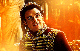
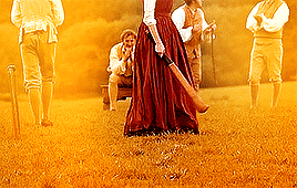
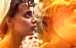
Robb Stark has been carrying much responsability from a young age. Ever since his father died, he has been taking care of all his family's necessities.
Is thinking of his duty that his put aside the last trace of his youth and decides to marry. However, remembering the state of his mother after the death of Ned Stark, he's determined to settle in a loveless match: a wedding with an agreable woman, but not one he desires passionately, will make his obligations much easier to execute.
That is, until Jeyne Westerling enters the scene. Neither of them would think she'd be a problem to his plan; she's not extraordinarily beautiful or has the most docile personality, her house name doesn't compare to his, nor does her fortunes. And yet, Robb catches himself more and more attracted to her person and by the sparkles that come from all their—bickering—encounters.
#robb stark#jeyne westerling#robb x jeyne#asoiafedit#robbstarkedit#gotedit#asoiaf au#starkedit#housestarkedit#got au#starksaubridgertons#robb stark as viscount bridgerton YES#bridgerton au#ch: robb stark#otf: stark#**
231 notes
·
View notes
Photo
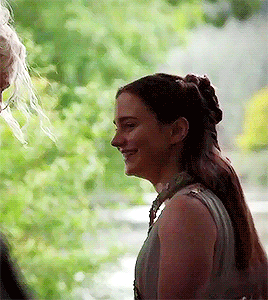
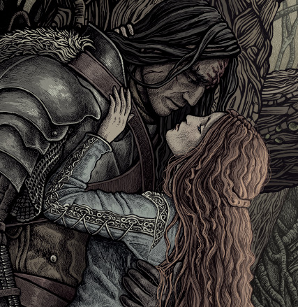
"You remind me of her sometimes. You even look like her." requested by anon
#arya stark#lyanna stark#rhaegar x lyanna#arya x gendry#game of thrones#got#gotedit#game of thrones edit#gendrya#aisling franciosi#maisie williams#house stark#tv: game of thrones#ch: arya stark#ch: lyanna stark#otf: stark#requested#so that was actually interesting bc that smile isn't in the episode#it's a scene from the revel the game of 7x07#but it's a nice parallel#got season 8#got s8#got s7#got season 7#xx#1k
3K notes
·
View notes
Video
youtube
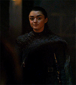
pain, you made me a believer
#yt**#ch: arya stark#tv: game of thrones#books: a song of ice and fire#arya stark#game of thrones#a song of ice and fire#asoiaf#asoifedit#got#gotedit#got edit#got fandom#asoiaf fandom#asoiaf women#maisie williams#stark#house stark#arya x gendry#arya x jaqen#arya x jon#otf: stark
2 notes
·
View notes
Last Seen Blogs

magc12-blog
شقاوي
teen-top-sarang
Teen Top Love
1∞4

thesocialconcept
The Social Concept

lola-and-mawu
Lola & Mawu