#or how to use clip studio in general
Text
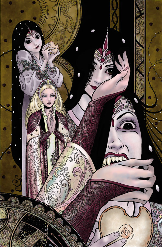
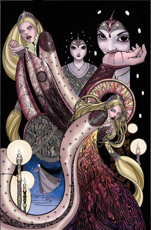
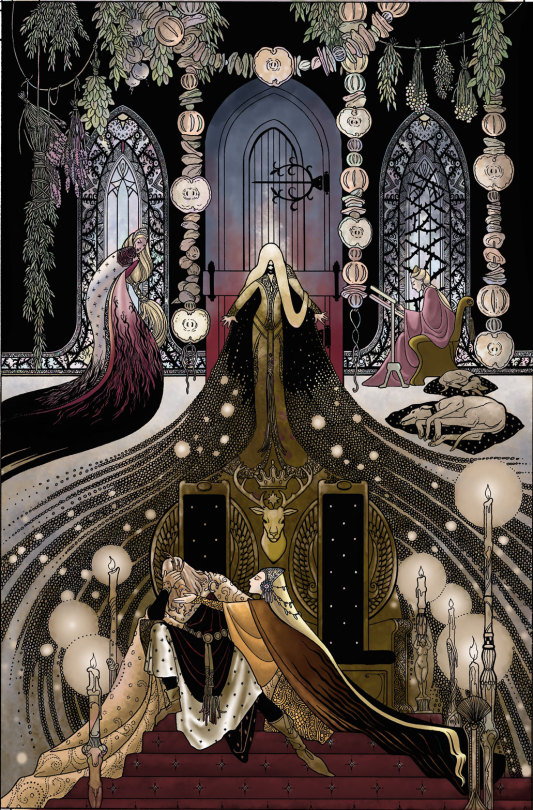
Sometimes I can't help myself at all
rip doggy allience you will be missed
Kind of a sequel to this
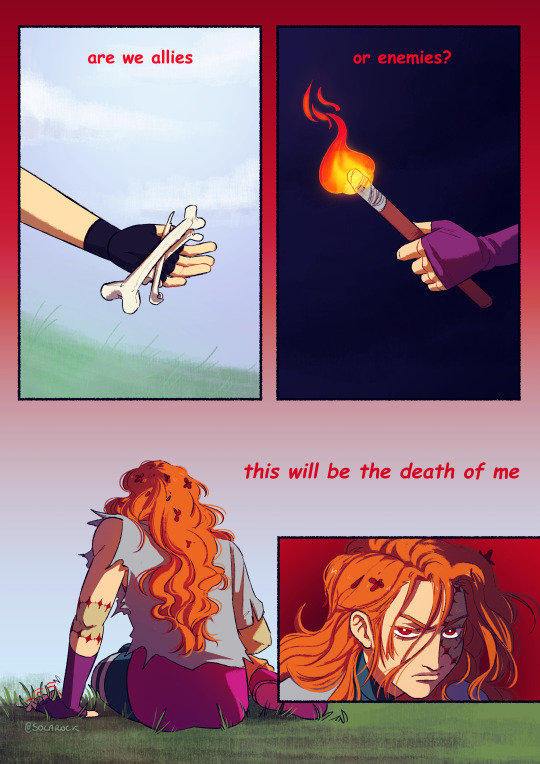
#they really can't stop killing eachother huh#its always so funny seeing cleo egg on pearl a perfect rappresentation of fuck around find out#also only one yellow in next session... things are about to go wild#secret life smp#zombiecleo#also kinda digging this humancleo design#zombiecleo fanart#pearlescentmoon#even if its just a hand#digital art#mcyt#artist on tumblr#fanart#sol art#mcyt fanart#trafficblr#traffic light smp#life serie#i need to learn how to do backgrounds#or how to use clip studio in general#live laught crane wives#the crane wives lyrics#i love how they are the unofficial mcyt/life serie soundtrack
1K notes
·
View notes
Text
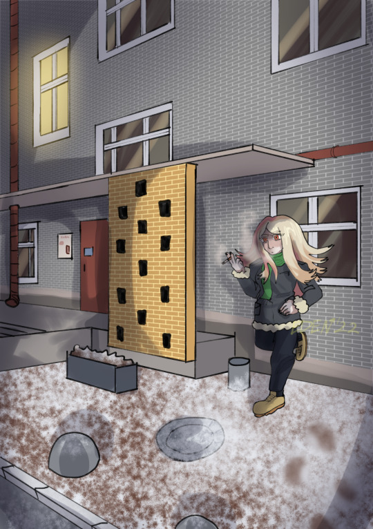
Long time ago
#oc#original character#original story#artists on tumblr#artblr#illust#illustration#イラスト#clip studio art#clip studio paint#original art#small artist#small art blog#Drawing this made me think a lot of thoughts#I am still bad at bgs but you cant get good if you dont try#Photo used for general reference Idk how houses work actually
11 notes
·
View notes
Text
My Favorite Cheap Art Trick: Gradient Maps and Blending Modes
i get questions on occasion regarding my coloring process, so i thought i would do a bit of a write up on my "secret technique." i don't think it really is that much of a secret, but i hope it can be helpful to someone. to that end:

this is one of my favorite tags ive ever gotten on my art. i think of it often. the pieces in question are all monochrome - sort of.

the left version is the final version, the right version is technically the original. in the final version, to me, the blues are pretty stark, while the greens and magentas are less so. there is some color theory thing going on here that i dont have a good cerebral understanding of and i wont pretend otherwise. i think i watched a youtube video on it once but it went in one ear and out the other. i just pick whatever colors look nicest based on whatever vibe im going for.

this one is more subtle, i think. can you tell the difference? there's nothing wrong with 100% greyscale art, but i like the depth that adding just a hint of color can bring.
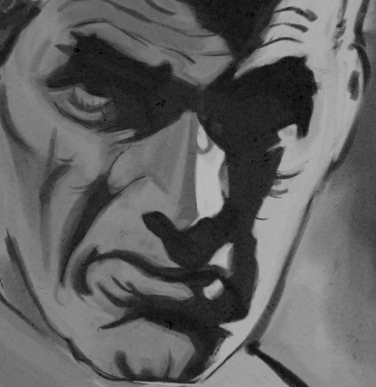
i'll note that the examples i'll be using in this post all began as purely greyscale, but this is a process i use for just about every piece of art i make, including the full color ones. i'll use the recent mithrun art i made to demonstrate. additionally, i use clip studio paint, but the general concept should be transferable to other art programs.


for fun let's just start with Making The Picture. i've been thinking of making this writeup for a while and had it in mind while drawing this piece. beyond that, i didn't really have much of a plan for this outside of "mithrun looks down and hair goes woosh." i also really like all of the vertical lines in the canary uniform so i wanted to include those too but like. gone a little hog wild. that is the extent of my "concept." i do not remember why i had the thought of integrating a shattered mirror type of theme. i think i wanted to distract a bit from the awkward pose and cover it up some LOL but anyway. this lack of planning or thought will come into play later.
note 1: the textured marker brush i specifically use is the "bordered light marker" from daub. it is one of my favorite brushes in the history of forever and the daub mega brush pack is one of the best purchases ive ever made. highly recommend!!!
note 2: "what do you mean by exclusion and difference?" they are layer blending modes and not important to the overall lesson of this post but for transparency i wanted to say how i got these "effects." anyway!
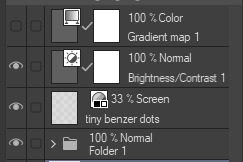
with the background figured out, this is the point at which i generally merge all of my layers, duplicate said merged layer, and Then i begin experimenting with gradient maps. what are gradient maps?
the basic gist is that gradient maps replace the colors of an image based on their value.

so, with this particular gradient map, black will be replaced with that orangey red tone, white will be replaced with the seafoamy green tone, etc. this particular gradient map i'm using as an example is very bright and saturated, but the colors can be literally anything.

these two sets are the ones i use most. they can be downloaded for free here and here if you have csp. there are many gradient map sets out there. and you can make your own!
you can apply a gradient map directly onto a specific layer in csp by going to edit>tonal correction>gradient map. to apply one indirectly, you can use a correction layer through layer>new correction layer>gradient map. honestly, correction layers are probably the better way to go, because you can adjust your gradient map whenever you want after creating the layer, whereas if you directly apply a gradient map to a layer thats like. it. it's done. if you want to make changes to the applied gradient map, you have to undo it and then reapply it. i don't use correction layers because i am old and stuck in my ways, but it's good to know what your options are.

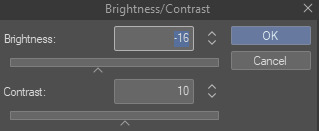
this is what a correction layer looks like. it sits on top and applies the gradient map to the layers underneath it, so you can also change the layers beneath however and whenever you want. you can adjust the gradient map by double clicking the layer. there are also correction layers for tone curves, brightness/contrast, etc. many such useful things in this program.
let's see how mithrun looks when we apply that first gradient map we looked at.

gadzooks. apologies for eyestrain. we have turned mithrun into a neon hellscape, which might work for some pieces, but not this one. we can fix that by changing the layer blending mode, aka this laundry list of words:

some of them are self explanatory, like darken and lighten, while some of them i genuinely don't understand how they are meant to work and couldn't explain them to you, even if i do use them. i'm sure someone out there has written out an explanation for each and every one of them, but i've learned primarily by clicking on them to see what they do.
for the topic of this post, the blending mode of interest is soft light. so let's take hotline miamithrun and change the layer blending mode to soft light.

here it is at 100% opacity. this is the point at which i'd like to explain why i like using textured brushes so much - it makes it very easy to get subtle color variation when i use this Secret Technique. look at the striation in the upper right background! so tasty. however, to me, these colors are still a bit "much." so let's lower the opacity.

i think thats a lot nicer to look at, personally, but i dont really like these colors together. how about we try some other ones?

i like both of these a lot more. the palettes give the piece different vibes, at which point i have to ask myself: What Are The Vibes, Actually? well, to be honest i didn't really have a great answer because again, i didn't plan this out very much at all. however. i knew in my heart that there was too much color contrast going on and it was detracting from the two other contrasts in here: the light and dark values and the sharp and soft shapes. i wanted mithrun's head to be the main focal point. for a different illustration, colors like this might work great, but this is not that hypothetical illustration, so let's bring the opacity down again.

yippee!! that's getting closer to what my heart wants. for fun, let's see what this looks like if we change the blending mode to color.

i do like how these look but in the end they do not align with my heart. oh well. fun to experiment with though! good to keep in mind for a different piece, maybe! i often change blending modes just to see what happens, and sometimes it works, sometimes it doesn't. i very much cannot stress enough that much of my artistic process is clicking buttons i only sort of understand. for fun.
i ended up choosing the gradient map on the right because i liked that it was close to the actual canary uniform colors (sorta). it's at an even lower opacity though because there was Still too much color for my dear heart.

the actual process for this looks like me setting my merged layer to soft light at around 20% opacity and then clicking every single gradient map in my collection and seeing which one Works. sometimes i will do this multiple times and have multiple soft light and/or color layers combined.
typically at this point i merge everything again and do minor contrast adjustments using tone curves, which is another tool i find very fun to play around with. then for this piece in particular i did some finishing touches and decided that the white border was distracting so i cropped it. and then it's done!!! yay!!!!!
this process is a very simple and "fast" way to add more depth and visual interest to a piece without being overbearing. well, it's fast if you aren't indecisive like me, or if you are better at planning.

let's do another comparison. personally i feel that the hint of color on the left version makes mithrun look just a bit more unwell (this is a positive thing) and it makes the contrast on his arm a lot more pleasing to look at. someone who understands color theory better than i do might have more to say on the specifics, but that's honestly all i got.

just dont look at my layers too hard. ok?
1K notes
·
View notes
Text
Welp. That's just GREAT. Thanks, PIXLR. Really LOVE your new AI art generator.
#/sar#well now's a great time to know how to use photoshop. for photopea. the last reliable photoshop program APPARENTLY#god fucking dammit. it was so good too#and they probably won't listen to people complaining bc it's super trendy rn + they don't normally listen to people's complaints#AND companies that add ai art generators never listen to backlash. literally the only one that i can name is clip studio. that's IT.#[sigh] they do have official social medias so please make it heard. and if you have premium CANCEL IT. make them know it's a bad choice.#can't believe I have to abandon my trusty photoshop engine. but this is not cool.#an individual known as lemon does the act of expressing her feelings with words
1 note
·
View note
Text
How Do I Do Stuff
The question was phrased a little strangely, and I don't want to embarrass the person by posting exactly what was said, but I'll answer it and hope this clears everything up.
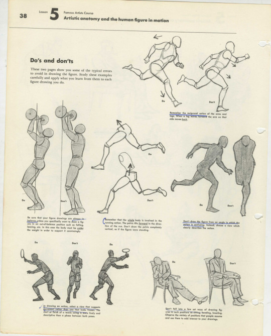
I do almost all of my drawing by hand. No, I don't trace in Photoshop. Not a judgment on those who do, but I come from a generation of artists who did not use Poser programs or other digital tools. We learned to draw using a technique called the Sight Size method. I know a lot of people assume everyone - including the old masters - traced everything using optical tools, but while it is true some people did, it is just as true that most didn't, and you can draw with great accuracy if you learned how to draw the old fashioned way.
Sight Size breaks everything down into its barest components of geometric shapes and you build from there. Once you learn it, you never forget, and it applies to everything you will ever draw.
I learned it using a set of Famous Artist Course books my mom had since she was a kid, and they are still the gold standard. They're often on ebay. If I were you, I'd buy them.
I actually find using figure reference really annoying because I like exaggerations and modifications from reality in my final work.
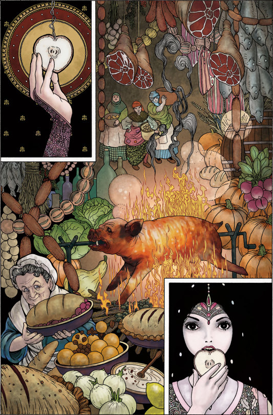
This page from Neil Gaiman's Chivalry was drawn and painted without figure reference of any kind.
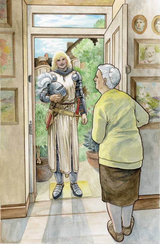
I don't know why people assume I trace all the time. If you were to try to use photographs to replicate these figures, you would find they are slightly off. There is no tracing here.
This is not to say I never use reference. This page, for example, was referenced from a photo of my mother. Isn't she pretty.
But this page of Sir Galaad was drawn and painted without reference.
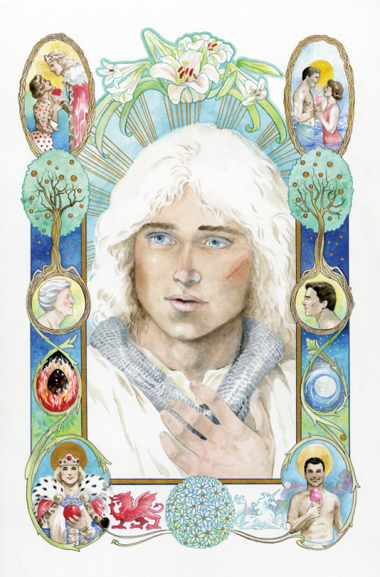
He's pretty, too.
If he were real, I'm sure a lot of people would be very happy about it. But he's not. And had I reference, the art would have gone a lot faster. I had a time trying to nail this face that is very alive in my head but doesn't really exist.
Back in the ancient days, all cartoonists had to learn to draw and paint extemporaneously because reference was limited and digital tools didn't exist. While some high end artists had photography studios and professional models with costume and sets on hand, small fry like me were limited to what was in the house or available at my small local library, which was no bigger than a few rooms of my current house.
Artists kept extensive "morgue files" or "swipe files" which were collected from magazine clippings and photographs so we would have as much of what we might need on hand for quick reference. These ephemera collections could get unwieldy. I have thousands of photographs I've simply never sorted. I finally dumped most of my files this past year.
Have I ever traced anything? Of course, especially if I have to re-use a shot or setting over and over. Making extra work for myself is just silly. It's my job to make pictures, not to perform magical feats, like copying one shot after another over and over without making a mistake.
However, for almost 15 years of my career, I refused to copy or trace anything, and did not even own a lightbox. On the one hand, that forced me to learn to carefully examine what I saw. On the other hand, it was a stupid hill on which many deadlines died.
Only after I realized many professional artists had lightboxes and overhead projectors did I finally break down and get one.
The one thing I use my lightbox for more than anything is for tracing my thumbnail sketches to the final drawing paper. Instead of trying to capture the liveliness of the original sketch by copying what I see - only bigger - I blow the thumbnail up to the size I want the final art to be, then I trace over the thumbnail using a lightbox onto the final drawing paper.
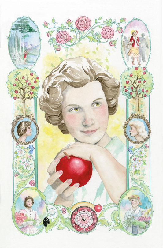
Here's a look at thumbnails from the graphic novel Neil Gaiman's Snow, Glass, Apples.
I enlarged these on my computer to fit onto 11"x14" paper, and traced the thumbs before finishing the art which was drawn in pen and ink and colored in Photoshop.
While I obviously made some changes, the essence of the thumbs is there in the final work. Tracing my thumbs retains some of the looseness of the original sketches, which is often lost otherwise.
So, there is a valid purpose to tracing at times, though in my opinion, too much tracing can weaken drawing ability, substitute for developing skills, and make the work kind of stiff.
If you want to, I'm not your judge. But it's weird to me that people think I must be faking my skills in some way.
Ironically, the word cartoon comes from the Italian word cartone, which is a large heavy sheet of paper - also, the origin of the word carton.
Preparatory sketches were made on this paper which was then transferred to the final work surface via either tracing or by stamping little holes in the paper through which dust was sprinkled, recreating the contours of the drawing for the artist to follow.
So the origin of the word cartoon comes from a process often used...for tracing.
3K notes
·
View notes
Text
How to Buy a Computer for Cheaper
Buy refurbished. And I'm going to show you how, and, in general, how to buy a better computer than you currently have. I'm fairly tech-knowledgeable, but not an expert. But this is how I've bought my last three computers for personal use and business (graphics). I'm writing this for people who barely know computers. If you have a techie friend or family member, having them help can do a lot for the stress of buying a new computer.
There are three numbers you want to know from your current computer: hard drive size, RAM, and processor speed (slightly less important, unless you're doing gaming or 3d rendering or something else like that)
We're going to assume you use Windows, because if you use Apple I can't help, sorry.
First is hard drive. This is how much space you have to put files. This is in bytes. These days all hard drives are in gigabytes or terabytes (1000 gigabytes = 1 terabyte). To get your hard drive size, open Windows Explorer, go to This PC (or My Computer if you have a really old OS).
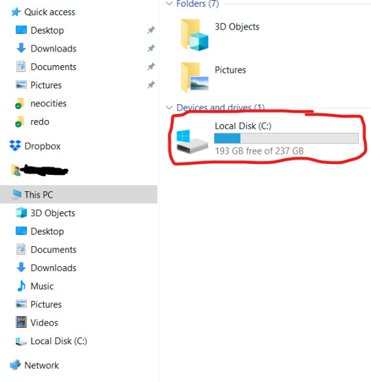
To get more details, you can right-click on the drive. and open Properties. But now you know your hard drive size, 237 GB in this case. (this is rather small, but that's okay for this laptop). If you're planning on storing a lot of videos, big photos, have a lot of applications, etc, you want MINIMUM 500 GB. You can always have external drives as well.
While you've got this open, right-click on This PC (or My Computer). This'll give you a lot of information that can be useful if you're trying to get tech support.
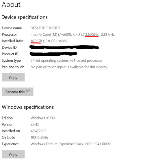
I've underlined in red the two key things. Processor: it can help to know the whole bit (or at least the Intel i# bit) just so you don't buy one that's a bunch older, but processor models are confusing and beyond me. The absolutely important bit is the speed, in gigahertz (GHz). Bigger is faster. The processor speed is how fast your computer can run. In this case the processor is 2.60 GHz, which is just fine for most things.
The other bit is RAM. This is "random-access memory" aka memory, which is easy to confuse for, like how much space you have. No. RAM is basically how fast your computer can open stuff. This laptop has 16 GB RAM. Make sure you note that this is the RAM, because it and the hard drive use the same units.
If you're mostly writing, use spreadsheets, watching streaming, or doing light graphics work 16 GB is fine. If you have a lot of things open at a time or gaming or doing 3d modeling or digital art, get at least 32 GB or it's gonna lag a lot.
In general, if you find your current laptop slow, you want a new one with more RAM and a processor that's at least slightly faster. If you're getting a new computer to use new software, look at the system requirements and exceed them.
I'll show you an example of that. Let's say I wanted to start doing digital art on this computer, using ClipStudio Paint. Generally the easiest way to find the requirements is to search for 'program name system' in your search engine of choice. You can click around their website if you want, but just searching is a lot faster.
That gives me this page
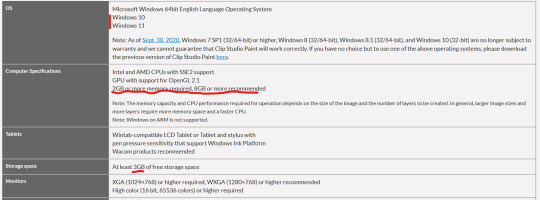
(Clip Studio does not have very heavy requirements).
Under Computer Specs it tells you the processor types and your RAM requirements. You're basically going to be good for the processor, no matter what. That 2 GB minimum of memory is, again, the RAM.
Storage space is how much space on your hard drive it needs.
Actually for comparison, let's look at the current Photoshop requirements.
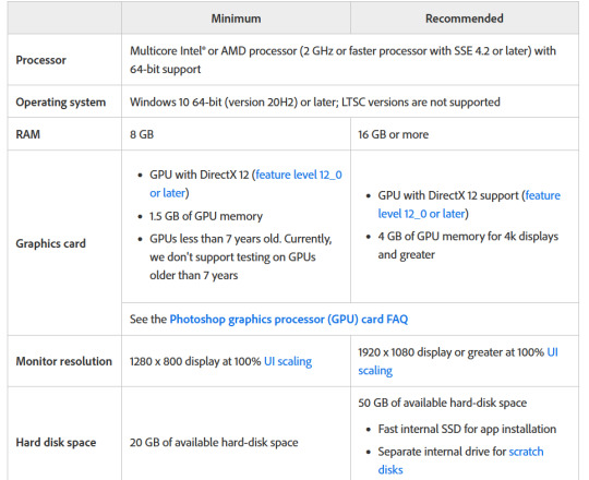
Photoshop wants LOTS of speed and space, greedy bastard that it is. (The Graphics card bit is somewhat beyond my expertise, sorry)
But now you have your three numbers: hard drive space, RAM (memory) and processor (CPU). Now we're going to find a computer that's better and cheaper than buying new!
We're going to buy ~refurbished~
A refurbished computer is one that was used and then returned and fixed up to sell again. It may have wear on the keyboard or case, but everything inside (aside from the battery) should be like new. (The battery may hold less charge.) A good dealer will note condition. And refurbished means any flaws in the hardware will be fixed. They have gone through individual quality control that new products don't usually.
I've bought four computers refurbished and only had one dud (Windows kept crashing during set-up). The dud has been returned and we're waiting for the new one.
You can buy refurbished computers from the manufacturers (Lenovo, Dell, Apple, etc) or from online computer stores (Best Buy and my favorite Newegg). You want to buy from a reputable store because they'll have warranties offered and a good return policy.
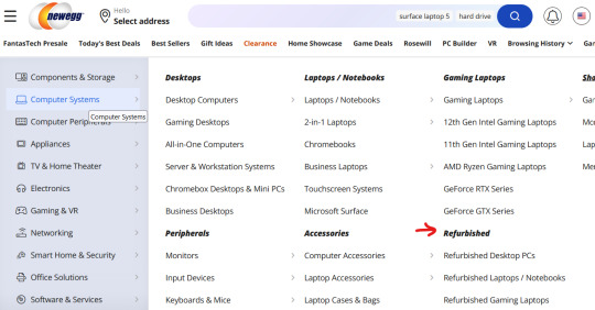
I'm going to show you how to find a refurbished computer on Newegg.
You're going to go to Newegg.com, you're gonna go to computer systems in their menu, and you're gonna find refurbished
Then, down the side there's a ton of checkboxes where you can select your specifications. If there's a brand you prefer, select that (I like Lenovos A LOT - they last a long time and have very few problems, in my experience. Yes, this is a recommendation).
Put in your memory (RAM), put in your hard drive, put in your CPU speed (processor), and any other preferences like monitor size or which version of Windows you want (I don't want Windows 11 any time soon). I generally just do RAM and hard drive and manually check the CPU, but that's a personal preference. Then hit apply and it'll filter down.
I'm going to say right now, if you are getting a laptop and you can afford to get a SSD, do it. SSD is a solid-state drive, vs a normal hard drive (HDD, hard disk-drive). They're less prone to breaking down and they're faster. But they're also more expensive.
Anyway, we have our filtered list of possible laptops. Now what?
Well, now comes the annoying part. Every model of computer can be different - it can have a better or worse display, it can have a crappy keyboard, or whatever. So you find a computer that looks okay, and you then look for reviews.
Here's our first row of results
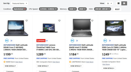
Let's take a look at the Lenovo, because I like Lenovos and I loathe Dells (they're... fine...). That Thinkpad T460S is the part to Google (search for 'Lenovo Thinkpad T460s reviews'). Good websites that I trust include PCMag, LaptopMag.com, and Notebookcheck.com (which is VERY techie about displays). But every reviewer will probably be getting one with different specs than the thing you're looking at.
Here are key things that will be the same across all of them: keyboard (is it comfortable, etc), battery life, how good is the trackpad/nub mouse (nub mice are immensely superior to trackpads imho), weight, how many and what kind of ports does it have (for USB, an external monitor, etc). Monitors can vary depending on the specs, so you'll have to compare those. Mostly you're making sure it doesn't completely suck.
Let's go back to Newegg and look at the specs of that Lenovo. Newegg makes it easy, with tabs for whatever the seller wants to say, the specs, reviews, and Q&A (which is usually empty).
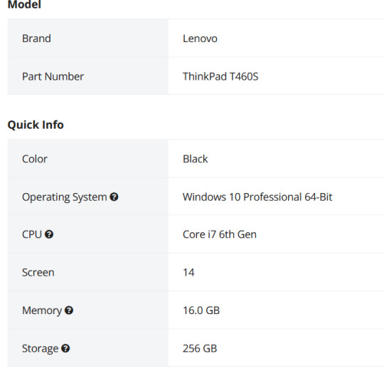
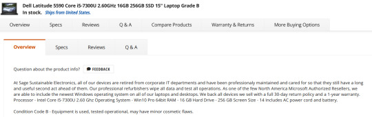
This is the start of the specs. This is actually a lesser model than the laptop we were getting the specs for. It's okay. What I don't like is that the seller gives very little other info, for example on condition. Here's a Dell with much better information - condition and warranty info.
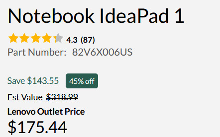
One thing you'll want to do on Newegg is check the seller's reviews. Like on eBay or Etsy, you have to use some judgement. If you worry about that, going to the manufacturer's online outlet in a safer bet, but you won't quite get as good of deals. But they're still pretty damn good as this random computer on Lenovo's outlet shows.
Okay, so I think I've covered everything. I do recommend having a techie friend either help or double check things if you're not especially techie. But this can save you hundreds of dollars or allow you to get a better computer than you were thinking.
980 notes
·
View notes
Text
[Click image for better quality]
I FIGURED OUT A WAY TO FUCKING MAKE THE IMAGE SMALLER FOR POSTING ON TUMBLR WITHOUT SACRIFICING THE ACTUAL QUALITY OF THE IMAGE OH MY GOD
Ok so, what I did is go into the clip studio paint file, make a new file, copy and paste the group in the original file, merge everything, get rid of the extra stuff outside of the canvas, and then make the flattened image smaller and crop the canvas. Once you have that, export it and you're done. This helps maintain the actual quality of the image and also helps shrink the file size down to something actually postable (if anyone has a better way of doing this please tell me)
[Edit]: Ok I guess posting something to Tumblr just naturally compresses the image a bit more somehow because I'm looking at it now and zooming in too much makes it a bit blurry so I'm still gonna have to futz around with image quality for future pieces oof
Artist's Note:
I'm so glad I figured out a way to do this because I like working on a big canvas so I can get as much detail in as I possibly can. Only problems are how laggy it gets while drawing lol.
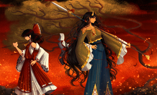
I had an idea for a drawing with Reimu and Zanmu because I really like thinking about their potential dynamic a lot. I also wanted an excuse to draw Zanmu again but in my normal rendering style because last time I drew her she was in my more sketchy style with generally flat colours so I wanted to draw her again. Speaking of, looking at the sketch for this is a jumpscare that I never enjoy seeing, like, man am I glad I didn't use those for my final piece.
Also about her spear. I was originally gonna make it like the ones she had in game, but it kinda threw off the whole piece. It was too big, too blue, and too flat, so I just went "fuck it" and gave her a different one instead. My headcanon justifying this is that the ones she uses in game are for danmaku battles whereas in any other fight she just uses a proper yari, or she still uses the yari and just makes it all glowy to power it up, maybe both lol. I pulled as much inspiration as I could from Sengoku era spears, and even put in some blue into the decorative part of the spear and also added a little skull to pay tribute to the original spear. Also, in my research I saw some art of izanami and izanagi making japan and saw that the yari izanagi has had a little decorative tassley thingy on it so I took some inspo from that and just made it one of Zanmu's tassles (Idk when that art was from or if the spear was still accurate to Sengoku period Japan but hey, probably the same reasons Eirin puts little bow ties on her arrows, it's just for personalization purposes).
I love rendering hair and clothes so much omg, while I like the super curly hair Zanmu, the longer, wavier hair suits her better for this drawing (I imagine it only does that like how Ghibli characters hair moves when they feel angry lol). I love making Zanmu's hair all messy and crazy, as well as giving her grey hairs, this woman has aged like a fine wine. Also, if the hem on the ends of her sleeves, top of her shirt, and her pants look like gold to you, that's because it is! It's fairly light so she's not collapsing under the weight, but it's gold! (I don't care how impractical it is, it's just cool). Not the undershirt though, it's made of a gold fabric. I had a cute idea with Reimu's hair to make it have a red shine to it. I also changed up Reimu's outfit so it isn't just a blob of red. I like it a lot when Reimu's skirt and outfit is segmented into different layers, so I wanted to incorporate that.
I tried to draw their hands differently as well, but IDK how noticeable that is. Also, I am super happy with how the side profiles for the two of them turned out, I used to struggle a lot with how to make the side profile of a character actually look like the character, so I'm really happy that they actually look like themselves.
Also added in the tree and rocks in the background as an homage to Zanmu's character art in Touhou 19, just because I was getting kinda stumped on what to do with the background lol.
In terms of a story idea with Reimu and Zanmu, idk why but the potential plotline of Zanmu wanting to ascend to godhood is so fascinating to me. Like, it is very possible that if she just convinced everyone she was a god (which would be very easy for her to do), she would become one in a heartbeat. Also, if she were to become a god, with her ability to return stuff to nothing, could she hypothetically get similar abilities to (Jojo Part 5 spoiler btw) GER? Like, idk about the death timeloop stuff, but the concept has been haunting me every night as I have been trying to find loopholes in GER's ability for a while now ( for no reason in particular). Back to the main topic, I imagine that she would probably tell Reimu that if she were to become a god she would take over the Hakurei shrine since the god there might as well be dead, and Reimu just says to her, "Over my dead body bitch." Like, I have no idea how to summarize their dynamic but like, it's the type of hero-villain dynamic where the phrase "We're not so different, you and I" would definitely be a phrase said during a fight. I think that if another IN style game were to release, Reimu and Zanmu would be in a team together. They could also have an interesting mentor and pupil kind of dynamic. Can you tell that Zanmu has been charging my mind rent these part few months? Like, instead of living in my head rent free, she kinda just uno reversed the whole situation and now she's the one charging me rent. What happens if I get evicted from my own brain? Actually, scratch that, I don't think I wanna know.
#touhou project#art#fanart#touhou fanart#touhou 19#touhou#東方project#zanmu nippaku#unfinished dream of all living ghost#reimu hakurei#東方
258 notes
·
View notes
Note
Looking at your recent commissions, those backgrounds are soo pretty!! Do you have any tips for backgrounds? I always struggle with them :>
aAA many many thanks!!
backgrounds can absolutely be a struggle but they don't have to be! they just require a little more creative planning~!
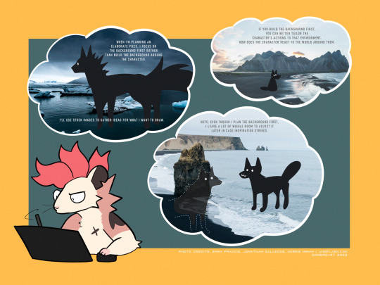
whether it be a commission or a personal drawing, if I'm building an elaborate art piece i focus on establishing the background First.
the background is the stage for your character! planning the background first will make it easier to tailor the character's actions and how they interact with the environment around them.
planning the background first can be the difference between your character standing awkwardly front and center with the setting going on behind them, or actually participating in their environment.

if i'm super stumped for background ideas, i browse stock image sites to get inspiration. sometimes it helps to doodle on an image to generate some ideas - kinda like you're playing with JPEGs like dolls.
that said - while i'm pinpointing WHAT i want to draw, i keep the ideas loose. i don't want to focus on the itty-bitty details until i've got the overall aesthetic and layout in mind, as i might get inspired to add something in later!
THUMBNAILING
if you're planning a big piece it can be helpful to break it down into something bite-sized before you go all in and start lining or painting. these are "thumbnails" - fast little sketches that establish the scene in a way that doesn't consume a lot of time or effort. it's also great as a little perspective exercise as a treat.
here i decided i want to draw a character walking home in a back alley street. with these photo references in mind, i can plan a layout and how the character will act in the scene. is this a candid shot? are they posing cutely? are they looking down at us in a tense way? there are many ideas to be had!
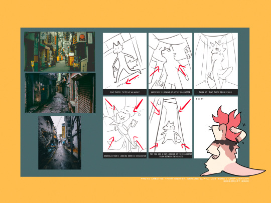
after you've chosen the layout / vibe for your idea, you can scale up your thumbnail to your preferred canvas size and start fleshing out the details. be sure to keep referring to your reference images to get additional ideas, such as storefronts, items, props etc!
3D MODELS
If you're trying to create a unique environment that photo references simply cannot help you visualize, 3D models exist! This gives you that ability to rotate / scale things for better visualization. Clip Studio has a vast catalogue of 3D models to download For Free that you can fiddle around with. i know there are many 3D builder sites out there as well, though i've never made use of them so i'm afraid i cannot recommend any off the top of my head. hell, you can even use the Sims game to design a setting and go from there!
also if anyone is going to come into my house and say 3D models are cheating: they are not. using a 3D model to better grasp an angle or get a better idea for perspective is not cheating. using 3D models to help plan the environment in your art is not cheating. they are no different than brushes; these are tools made to HELP YOU. use them!
PERSPECTIVE
perspective and angles can make a HUGE difference in the art piece. there's nothing wrong with static long shots! if that's what you want to draw, do it!! there's no right and wrong here!
but if you're finding your work to be a little robotic and stiff, slap an angle in there. consider an overhead view. these same techniques are applied to photography and film! nothing wrong with wide shots, but every once in a while it can help to throw in a dutch angle.
if there is one note i'd like to leave off on, it's that your backgrounds do not have to be 100% accurate-to-life to be Good. unless realism is something you're really striving for in your style, don't feel compelled to nitpick every brick and leaf in your art. us artists can tend to over-prune our work until our art looks a little bare and soulless. flaws can give your work character, and that's often a lot more appealing than how accurate the scale ratio between background building A and building B are [again, unless you WANT to go for that realistic look then you can fuss over those details all you like].
i hope this helped a little! MY APOLOGIES FOR MAKING IT SO LONG AH
606 notes
·
View notes
Note
i am FASCINATED by how you implement textures into your art - esp like for walls n shit lol. everything feels spicey n crunchy... i know you use procreate but are there any specific brushes or otherwise that you use for your effects?
Hi ty! A lot of ppl ask about textures so here's a quick demo along with the brushes I use. I just go over the solid color in low opacity in different colors with different brushes most of which are default in procreate: Salamanca, gouache and fresco for streaks, stains and general textural and color variances in the material. I also use this splatter brush for specks which can be emulated with brushes that already exist within procreate, but you can find the pack im using here: https://www.truegrittexturesupply.com/products/krafttone
And I do it on a clipping layer right above bc i feel it's easiest to let me select certain areas of the texture and resize it depending on if there's a plane change or smth else that needs to be done. Hope this helps !
289 notes
·
View notes
Note
How do you draw this comic?? I'm realy curious because its just so good!

That might need a little more explaining. It's a long read, so please proceed under the cut.
Basically, since I like to plan things way in advance, these comics follow a strict script (that is already finished). Only on occasion do I add an additional comic inbetween, but only in order to make things a little more clear if I notice there is some confusion going around and stuff.
I work in Clip Studio Paint for all my comics and art in general.
Naturally I start out with the sketch. The script is written in such a way that I can easily put together the overall panel layout. This right here is how the sketch of the latest comic looks like:
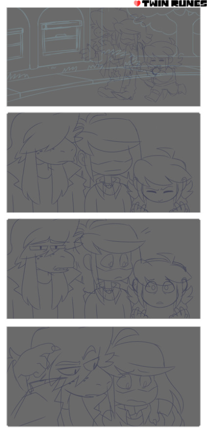
Typically I like to keep my sketches super clean that they almost count as lineart. This one ended up a bit messier than my usual ones. It might've been the second draft, since I always go over my sketches three times. They typically start out looking like this (oh hey a sneak peek!)

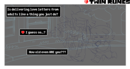
2. I add the dialoge and organize the text boxes in the earliest sketching phase. That way it's easiest to figure out the best text flow.
3. Next is foreground lineart. I like using a pixelated brush for crispy lines and ink the whole characters once using different brush sizes for details and such. And at the end I go over them one final time for the outside lines to make each character pop a little more.

4. The flat colors speak for themself I guess.
5. Same procedure for the background.
6. Most of the heavy lifting is done by the shading and coloring the inked lines. It adds to the ambiance and makes the foreground characters pop.
7. Last step is the rendering phase. This is basically where I do the shading on the characters, add highlights and color the inside lines. It's what ties everything together.

8. (Optional) I do this for specific lighting to set a certain mood, where I put a gradient mask over the colors for added effect. Notice the difference?
So yeah. That's how I do these comics. Hope this was a comprehensive enough read haha...
387 notes
·
View notes
Text
Pulp Covers And How To Paint Them
With the rise of cheap printing in the early twentieth century, mass-marked paperbacks swept the world, each offering lurid thrills for obscenely low prices. Sex, sadism, and incredible violence for as little as ten cents. An easy purchase to slot in between fifty cigarettes a day and enough bourbon slugs to kill a small garden.
Pulp fiction is where some of the greats of American literature cut their teeth, including the big three, Raymond Chandler, Ross MacDonald and Dashiell Hammett. The contents of these stories, both the dizzyingly good and astoundingly terrible, have been absorbed and digested and remixed and regurgitated in nearly every permutation imaginable, fuelling pop culture some one hundred years on. This isn't an essay on that. Nobody likes to open a tutorial and be greeted with a wall of text. The history is for another time.
But it is about how to paint it.
Don't let the pre-amble intimidate you, it's not as hard as it sounds. You will need:
Painting software with some image editing capabilities. You don't need all the bells and whistles of Photoshop, but I wouldn't recommend something like MSPaint, at least not to start with. I'm using Clip Studio Paint.
A really beat-up paper texture. The grungier, the better.
A lightly-textured brush. Here are the specific brushes I use, 99% of which is the well-named rough brush. Try and avoid anything with any impasto elements.
Go to your colour-picking tool and use the 'select from layer' option. Doing all the painting on a single layer is going to make your life easier.
A complete willingness to make mistakes and, instead of erasing, painting over them. It generates much more colour variation and interest! Keep your finger off the E key.
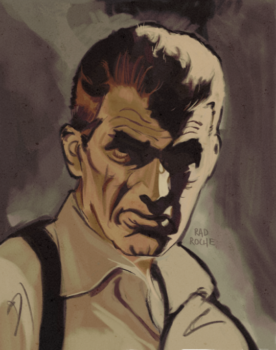
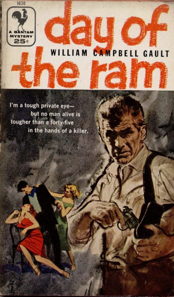
Good reference! That painting is a master copy of Mitchel Hooks' art for Day of the Ram. Find a style you really love and want to learn? Have no clue where to begin? Do direct studies!
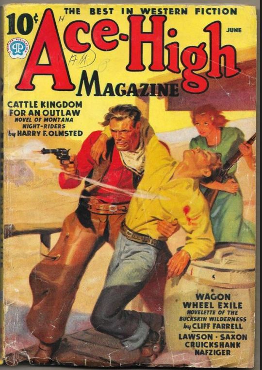
Let's not worry about whatever is happening in the background. It's probably fine. Let's get started! Pulp magazine art is a lot more varied than you might first think, so don't agonize over having a style that 'fits' or not. I'm also specifically aiming for something you'd see on the cover after printing, not the initial painting they would use for printing. The stuff I'll show here is a pretty narrow band of it, but here are some general commonalities. This is a painting by Tom Lovell.
Let's dig into this.

The colours are very bright and saturated, but the actual values, the relative lightness and darkness of them, are actually grouped very simply! You can check this by filling a layer full of black, putting it on top and setting its mode to colour. If the value of a painting looks good, you actually get a lot of leeway with colour. But here's what I think is the most important thing to keep in mind.
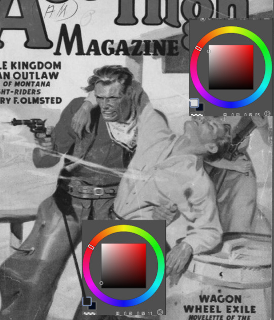
The darks aren't that dark, and the lights aren't all that light! Covers are paintings reproduced on cheap paper. Anything you wouldn't want to happen in the printing process, you lean into. Value wash-outs, lower contrast, colours getting a weird wash to them, really gritty texturing. So let's get painting! Here's my typical setup.
That bottom folder is the painting itself. The screen layer is the grungy paper texture. To get the effect you want, put it down, invert its colour, then set it to screen. That washes out your painting far, far too much, so to compensate, I put a contrast layer up on top. Fiddle around with the settings, but this is where mine ended up sitting.
Note I'm saying this before even starting the painting: you want to do this as early as possible. This is where the 'select from layer' colour picker comes in handy. You can paint without worrying about the screen or contrast layer. Something not looking right? Enable your value check layer and keep painting. When you turn it off, it'll still be in colour. Here's a timelapse so you can see what that looks like.
And when you check the values...
They're pretty simple! This isn't a be all and end all, but I hope it serves as a decent primer. I want thirty dames on my desk by Monday!
#rochedotpng#art tutorial#art resources#couldn't find a thing online about this style so here's how i do it#pulp#it's how i did the death shroud one more or less
161 notes
·
View notes
Note
Several things: -LOVE your art, it’s amazing! Especially the one with Crowley and Aziraphale under the umbrella - which software do you use? Your art always look SO gorgeous (cheeky quote from GO right there lol) - how did you get so good at drawing?And thank you for encouraging other people to keep drawing and being so kind as I sometimes can’t help but compare my sketches to others and feel silly, but I guess it’s just a learning curve… Thank you so much for bringing your art to the world!😊
Thank you so much!!
I use Clip Studio Paint for drawing and Photoshop for small adjustments!
2. Haha thanks! Honestly...it's the hyperfixations. I managed to improve a lot in just a year because I've been drawing SO much cos there's so many shows and movies I became obsessed with that I wanted to create art for. So by drawing a lot I just naturally improved. For example these two Illustrations are just a year apart:
I actually didn't actively try to improve, it's been a while since I did proper studies (I just don't really have the time for it between freelancing and art school), it just happened.
But I can absoluetly recommend going on YouTube and look for some art tutorials if you actively want to start improving! There's some channels that helped me so much back then:
moderndayjames
Incredible shape language and super insightful tutorials on all kinds of topics! I learned so much from him.
Ahmed Aldoori
So many awesome tutorials on so many different areas of art. Love it.
Marco Bucci
Incredible tutorials on color theory and understanding how color works in general! Learned SO much from him!
Sinix Design
The OG tutorials I began learning from. I watched his videos religiously as a teen. I adore his painterly style and adopted it in some way, haha.
Ethan Becker
This dude sometimes drops these tiny art tips that just completely blow my mind and that I adopt immedietly. He's super entertaining but also such a great teacher.
And I can also recommend checking out this book by James Gurney if you want to get better at colors!
And for anatomy I highly recommend the Morpho books!
But improvement doesn't only come from drawing a lot. A lot of the time I don't draw for a while and just study the world and artists around me and suddenly I improved when I get back to drawing. Don't ever overwork yourself to the point that you don't enjoy what you do anymore. Take breaks and listen to your body!
I learned to try and not compare myself to other artists, which helped a lot. Through conventions and social media I made so many lovely artist friends and realized how we're all struggling in a very similar way. A lot of us don't even really know what we're doing most of the time, haha. But we help each other out, it's such a wonderful community. I think when you're not actively part of the community it tends to feel like other, more successful artists are some kind of art gods that have perfected the craft and never struggle. But believe me, all the artists you admire go through rough times all. the. time. Sometimes what they do feels easy and natural, other times (more often than not) it feels like you have to try and learn how to walk all over again and you start to doubt your abilities. I personally go through that so many times.
So what I'm trying to say is that instead of comparing yourself to the artists you admire, learn from them instead. Ask questions, befriend fellow artists, study the artists you enjoy and just have fun with it!
And finally I thought it would be fun to share some of my horrendous Johnlock fanart from a decade ago for some motivation:

I hope my answer didn't overwhelm you, but I thoight it would be nice to give a more detailed answer!
Have a wonderful day and keep drawing! :)
448 notes
·
View notes
Text
THE MAP IS OUT!! Here's my individual part for it, along with my credit image! I'm so happy to have been able to work with such cool collaborators on this project, this was so fun! :D <33
WIP and fun facts below the cut!
First pass of my part!

General Notes:
- All of us had a cut-off frame so Sammy (our MAP host!) had space to transition shots! the stick in my cut-off is my oc Lixy <3
- As always, I don't have an actual animation program. Each frame of this was individually drawn in Clip Studio, saved as PNGs, and meticulously arranged in a video editing software. it took a while and a headache. the software crashed 4 times hdkjh </3
- The process was sketching, lining, then compiling it all together! Line art took the most time (because i don't like lineart hkjdh)
- Fun fact, all of the sketches (seen in the wip above) were all drawn on my first plane ride ever :> <3
- The background is Alan's animation program that I took from a screenshot from AVA 6 :> I didn't want to do anything too complex for it ;w; <3
- All of the slide transitions were done manually! It may look like tweening, but I don't have a program that can do tweening lmao :'> <3 Each of the slidings was individually 3-6 frames of moving them across the frame, a single frame of stretch for movement, then a settling frame before the next stick slid in.
- Green is doing air guitar as they slide in :3 <3
- My Blue design has a hat that can magically change into a Witch hat (when potion making), Chef hat (when cooking) or Sunhat (when gardening <33
- Purple looks nervous after he crashes into everyone, like they're expecting to be in trouble, but smiles and laughs when everyone else does. You can see Blue with their hands up, reassuring Purple.
- Originally Yellow didn't move as much in the final laugh scene, but I saw the first frame of the person after me (@/sleptonce!) which had Yellow in a little crouch :> i adjusted Yellow to match the next frame a little better!
- Also Yellow's hair is flipped from the way I usually draw it because I felt it worked better this way hgkjh <3
- (I totally didn't forget my Second's design has green eyes and had to edit those frames very quickly hfkjh <33)
- The only colors that aren't the stick's original colors are when Blue's hat falls on Purple, and Red's yellow bandana <3 (These are also the only movement animation in the blinking sequence!)
- Adding Alan's cursor was a literal last minute decision, he was never in any of the sketches, I literally added him in 15 minutes before submitting my part hgkjh <33 I think after my shot, Alan helps gently pick them up <3
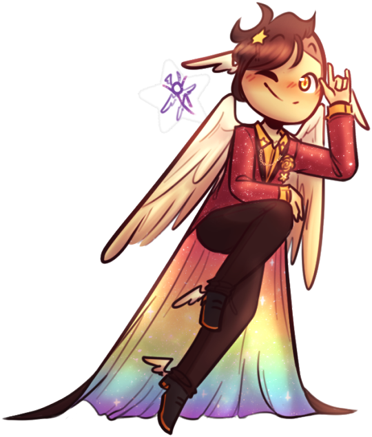
- My suit in the credits is mostly red and orange, because my favorite sticks are Red and Second! <3 The rainbow cape reflects how I enjoy the color gang the most though hkjdh <33
Thanks for reading!! :D <33
#Alan Becker#Animation Vs Minecraft#Animator Vs Animation#AvM#AvA#my avm art#avm red#avm second coming#avm orange#avm yellow#avm green#avm blue#avm purple#starlight originals#lixy
179 notes
·
View notes
Text
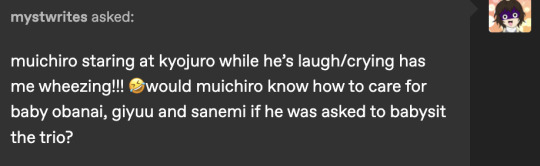
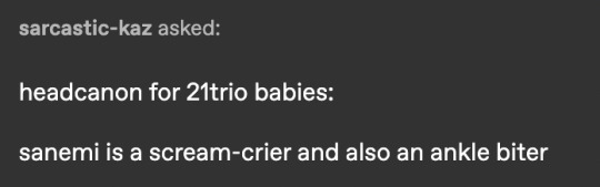
i got a ton of asks in my inbox so im just going to put all of them here so i don't spam u guys with it haha
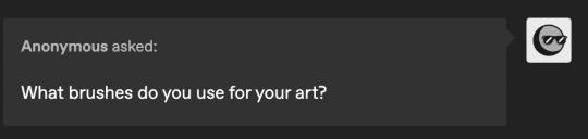
this is really the only guy i use. felt pen on clip studio is excellent for the sketchier style i like! when it comes to coloring i just use a basic solid brush !
i imagine they do, and they each get assigned a baby (tanjiro with giyuu, inosuke with sanemi, and zenitsu with obanai) but it lasts for barely a day. inosuke has no idea what hes doing and obanai cant stand zenitsu
tengens wives find the situation hysterical but they help out however they can. ofc they all fight over tengen. they love helping out with the kiddies but they especially enjoy taking care of the younger ones-- they think mui, mitsuri, and shinobu are adorable! tengen definitely tries to flirt with them but hes a cringe fail ten year old
kanao, aoi, and the butterfly girls all help out as well. kanao and shinobu are typically glued together
shinjuro and senjuro are shocked to see rengoku (and obanai) and while shinjuro is pissed off at first, he can't Not take in his boys. senjuro and little obanai are super similar in nature so
urokodaki, tengen, and nezuko are worried but excited about giyuu's transformation. they're like lets freaking go. good childhood moment
and of course genya thinks the situation is hilarious and hes happy to get to spend time with his brother, although he's VERRRRY awkward. he's a bit avoidant at times but usually gyomei and tanjiro can talk him
aw thank you! to answer your question;; shinobu and gyomei basically spend time with him and are attentive to his wants/needs to help him recognize he does matter. rengoku and the others help with this! essentially love language stuff and affirmations and what not
ill be honest i totally forgot about this. yea! i would say the babies are only put in a very specific area of the manor and they deep clean it constantly. if they have a good amount of sick/wounded i imagine they have gyomei or etc take them in. im not sure! in my mind the hashira all rotate and babysit and etc

this 100% happens. urokodaki learned the news and had never traveled to the headquarters so fast
ohh this is a fun question! truthfully im not sure what the answer to this would be... i appreciate all the questions/ideas/etc!! if anything id love to have more questions about general characterization stuff, since thats my favorite favorite favorite to talk about!!! maybe more questions about like... what their relationships are like, do they have nicknames for each other, that sort of thing... idk! either way im glad people are interested :D
sanemi tries to make them laugh. he remembers his little siblings always cheering up when he would make silly faces and sounds, so he does that here
giyuu awkwardly pats the other baby's back/head and is like "there there" ... he remembers how sabito's hugs would make him feel better so he awkwardly hugs the other. most of the time obanai/sanemi stop crying purely bc they're confused as to why giyuu is hugging them
obanai would usually talk them out of it, but he can't do too much since he's restricted to baby babble. so instead, he will try to find one of their toys and "gift" it to them. ex giyuu was sobbing hysterically until obanai found his fox plushie and gave it to him
awww shucks... stop it u guys.....!
im doing ok!!! hanging in! got 3/13 commissions done so busy busy!
also, for future ref, i prefer being called "bite" !!! i know a lot of people call me ghost, so i just wanted to take a moment to correct that :D
awwwwww this is so sweet!! thank you so much!!!!!!
defintely one of the rodent pokemon. my favorite pokemon changes constantly but im told i have mimikyu / teddiursa / bunneary vibes. i also like espurr. i have no idea UWEIHRWE
i think he would be a little awkward at first but he would get the hang of it. most of what he does is just keep them entertained and make sure they arent sick or hurt. though he eventually builds up the courage to ask if he can feed obanai. from that point on whenever muichiro is babysitting he's the one offering to feed him, though someone else has to make the bottle-- he doesn't know how to do that
this is canon
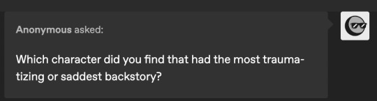
Hands down, Obanai. Though I also feel really sad for Gyomei and Muichiro, and I think Tengen's story (what we know of it) is pretty sad. I don't like comparing traumas, though! but yeah. obanai is. wow. poor guy
and to those of you sending art requests; i see them, i promise! commissions come first, so they may take time for me to get done!
thank you guys for all the questions! i always love checking my inbox and getting an excuse to talk about things...
82 notes
·
View notes
Note
Have you seen this?!
I thought I'd seen all the season 2 publicity but Michael asking David about his nerve curve and saying he SAW IT?!
Oh my lordy.
Hi there! First let me apologize for my egregious dereliction of duty when it comes to answering these Asks/Anons. RL stuff has been clogging up my brain and so I just haven't been in the right headspace for answering questions (hence why I temporarily shut off Asks altogether).
To your question, I did indeed see that clip! I think there were SO many interviews happening that day that this somehow passed us all by, but it absolutely is worth talking about...
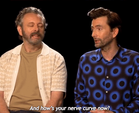
For those who may be wondering about the subtext here, "nerve curve" (in anatomical terms) generally refers to something related to the curve of the spine. What Michael (shamelessly) seems to be alluding to, then, is him seeing David's bare back.
I mean...good lord. This marks at least the third occasion where Michael has publicly talked about/thirsted over David's body ("slinky hips" twice, and also "sylph-like chest") in the last four years. Whatever filter exists in most human brains clearly does not exist in his, and I suppose we can be thankful for that, but also...wow, Michael.
The truly amazing thing, however, is this wasn't even the only sexual innuendo related to David that Michael made that day, as there was also this gem:
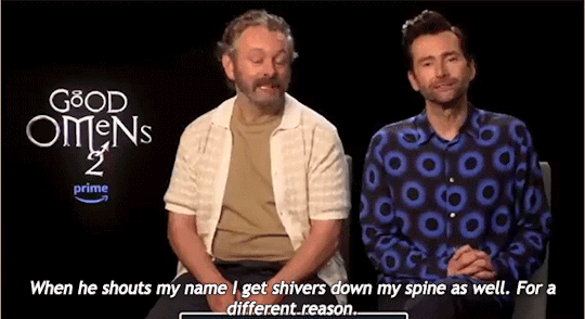
I sometimes wonder how long Michael is going to have to "joke" about him seeing David naked or him having sex with David before people finally pause and go, "Wait a minute..." And the nerve curve moment is so delicious because we can see David actually blushing after Michael says he saw it. They're both so drunk on each other and it is truly gorgeous to watch.
And as much as we miss Michael and David, I don't think it even holds a candle to how much they must miss each other. I can only hope that the studios will get their heads out of their collective asses and come to an agreement with SAG/WGA to end the strikes, because I so thoroughly want more of whatever this is to grace our screens. Please and thank you...
#turquoisedata#reply post#michael sheen#welsh seduction machine#david tennant#soft scottish hipster gigolo#also did i put 'bare back' next to each other on purpose? yes. yes i did.#michael is about as subtle as a drunken llama on roller skates#at this point the subtext might as well be a billboard#there's teasing the fandom and then there's whatever these two are doing#truth disguised as a joke#bisexual disasters the both of them#just bros being bros#casually making innuendos about fucking each other#ineffable lovers#discourse#gifs by me
153 notes
·
View notes
Note
If you are going to make a game here’s some things that might be helpful!
Game engines:
Godot: very new dev friendly and it’s free. Has its own programming language (GDscript) but also supports C#. It’s best for 2D games but it can do 3D also.
Unity: I don’t even know if I should be recommending Unity. It has caused me much pain and the suffering. But Unity has an incredible amount of guides and tutorials. And once you get the hang of something it’s hard to get caught on the same thing again. It also has a great Visual Studio integration and uses C#. I will warn you the unity animator is where all dreams go to die. It’s a tedious process but you can probably get some plugins to help with that.
Unreal: Don’t use it unless you’re building a very large or very detailed 3D game. It also uses C++ which is hell.
Renpy: Made for visual novels but has support for small mini games. It only supports Python iirc. Basically if you’re making a VN it’s renpy all the way otherwise you should look elsewhere.
What to learn: Game design and how to act as your own game designer. As a designer you need to know if a part of your game isn’t meshing with the rest of it and be willing to give up that part if needed. Also sound design is very important as well. If you want to make your own sounds audacity is perfect for recording and cutting up your clips. If you want to find sound effects I recommend freesound.org and the YouTube royalty free music database.
Sadly I can’t recommend a lot of places to learn this stuff because I’m taking Game Development in Uni. So most of my info comes from my lectures and stuff. One of my game design textbooks is pretty good but it’s around $40 CAD. It’s called the game designers playbook by Samantha Stahlke and Pejman Mirza-Babaei if you’re interested (fun fact there’s a photo of Toriel in there)
Anyway sorry for dumping this large ask on you I’m just really passionate about game design and I like to see other people get into it.
please do not apologize I'd never heard half of this stuff so this is super useful!! I've seen some godot tutorials on YouTube although so far I've played around with RPG maker MV (it was on sale. very very fiddly interface, i had trouble getting around it) and gamemaker, which recently became free for non-commercial use (a lot more approachable on first impact but like i said, haven't really done anything substantial in either yet).
mostly, I'm still in the super vague stage. I've got an idea for the main story conflict, the protagonist and their foil, the general aesthetic i want to go for (likely 2D graphics, but it would be cool to make like. small cutscenes in low-poly 3D) but not much else. haven't exactly decided on the gameplay either! it's gonna necessarily be rpg-esque, but I'm not much of a fan of classic turn-based combat so. I'm gonna check out other games and see if i can frankenstein anything cooler :P
#like for example. if i were ever to make a daemo game (knock on wood) i was thinking that it would work out quite well#if i made it a PUZZLE rpg kind if game. since the player character is no longer frisk/chara/connected to the player#and daemo doesn't really have any reason to 1) be possessed or 2) go on murderous rampages#so with a base game like undertale where those ARE crucial parts of player-world interaction I'd have to redirect it elsewhere#it being player input in the story#but I'm not sure puzzles are quite the solutions for this other story....... we'll see#answered asks#SAVE point#thank you so much!
76 notes
·
View notes
Last Seen Blogs

realbeautysblog
I lOvE ❤ B(. ) ( .)Bs

black-dog-daggers
A Black Dog At The End Of It All
pixanelle
✨Pixanelle✨
lopovkonja-blog
boginja vatre