#making watercolour like illustrations is hard
Text

Please watch Scavenger's Reign I'm shocked by how much people are sleeping on it.
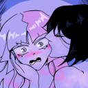
#this is my first time drawing humans in so long so I know some stuff came out wonky and it barely looks like azi#might try making more fanart as I have more ideas and hopefully they'll turn out less wonky lol#+ it's hard to get color right in photos with traditional art ^^;#I want to touch the fuzzy balls in the same way I want to touch fuzzy cacti#scavenger's reign#scavengers reign fanart#scavengers reign#scavengers reign azi#watercolor#watercolour#water color#water colour#traditional art#art#illustration#artists on tumblr#artist on tumblr#artists of tumblr#rinnartrae
34 notes
·
View notes
Note
Got me thinking about diluc in puffy sleeves, chest peeking thru a lacing detail with high waisted pants-
Victorian-gent!diluc is where its at for me😩
...but
Have u ever thought about him finding the reader stuck in the middle of a garden maze during a ball? All helpless and doe-eyed as they seek help from the ever so reliable and chivalrous Duke Ragnvindr?
Anywayss hope ur doing well my dear<3
i am literally always thinking of period romance drama-esque courtships and intrigue with diluc. he fills me with such victorian style longing, it's inescapable.
OH . . . but consider: the ball is thrown for him. with his father gone, and of marriageable age, he's aware that he's expected to make a match as soon as he can, if only to carry on the bloodline and ensure that his fortune has an heir - and of course, he's handsome and chivalrous, if his reputation has suffered a touch since his father's untimely and tragic death (withdrawing from society and going quiet and grave can do such things to a man, and diluc has had so much to shoulder in the years since crepus's death). he's a much lusted after figure in the community, and your parents had been delighted to receive the invitation for you and your sister--
your sister, of course, lovely and sweet and with all the hopes of your family pinned upon her. bought only the finest of elegant fashions, let wear mother's jewels - not that you are not wantable and loveable, your parents assure you, but . . . well. this is diluc ragnvindr they are talking about, and it would not do to set your expectations too high. one child ought to stay home to look after their parents in their dotage.
you escape from the ballroom as quickly as you can. the other men are desperate to fall over themselves in an attempt to snag the prospects they think diluc has discarded, after they have been pushed by coy parents towards him and the young noble has dutifully spoken once to them. your own mother is far too distracted by said sister - so you use the opportunity to sneak out into the gardens, to feel the moonlight on your face. you suppose nobody will be interested in this particular folly tonight; you have snuck a little book into your gown's pocket (a field guide of birds; you've grown fond of watching the songbirds from your window and wish to know more of them), and the light of the moon ought to be enough to illuminate the script. you wander in the perfectly manicured maze for what seems like hours, enjoying the fragrant bloom of cecilias around you and the peaceful night, with only the barest hint of the music from the classical trio playing in the ballroom on the breeze. until you realise you have gotten yourself hopelessly lost. the garden maze is large (the estate is large in and of itself), and whilst impeccably maintained it is clearly not meant for a single unfamiliar guest to wander through alone. fear crawls up your spine.
you wander helplessly for five minutes, feeling tears spring to your eyelids. a gardener or someone will surely find you, perhaps in the morning, but your parents will be so angry with you - and then, you hear the hoot of an owl, the flap of wings in the sky, and you go still. you recognise that particular hoot; the colours of the wingspan picked out by the glow of the stars. you fish the book from your pocket, flip through it, far too lost in the watercolour illustrations within - and you walk directly into something solid and rock hard.
apologies bubble from your lips, at the same time as relief that you are to be saved. but a familiar voice, quiet and deep and certain, cuts across - says the name of the breed of owl, and you are looking directly into diluc ragnvindr's eyes. you realise you have never seen him really smile, not since his father died - but as he looks down at you and the little book in your hands, his lips have tilted at the corners.
"lost?" he asks you. "i can help with that. although . . . i must say it's rather nice to be away from in there." he pauses. swallows; the bob in his throat obvious. his cheeks seem to flush a little, but he pushes on with the awkward air of a man who does not often indulge in idle chatter. "but. if you're really interested. in the birds. my mews are only just outside of the maze--"
177 notes
·
View notes
Text
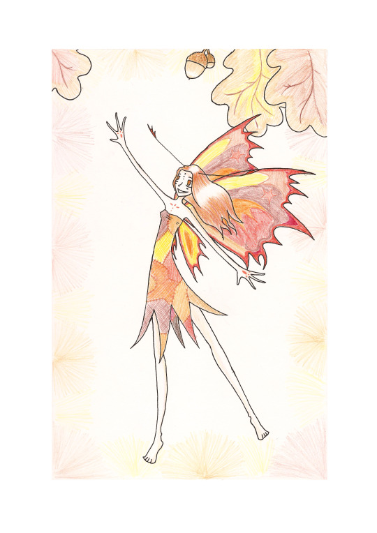


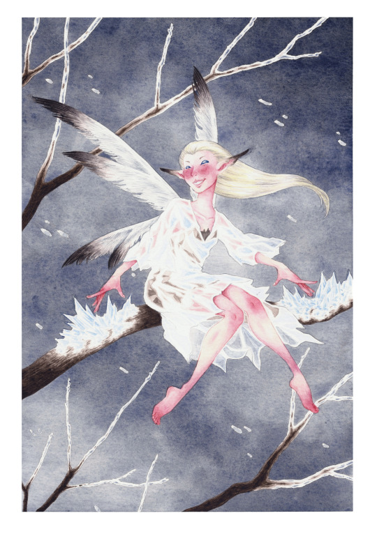
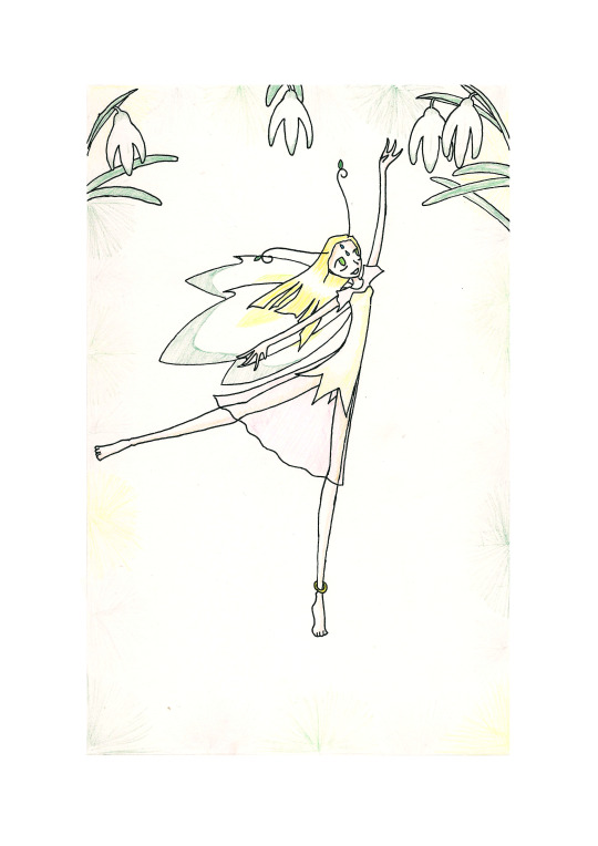

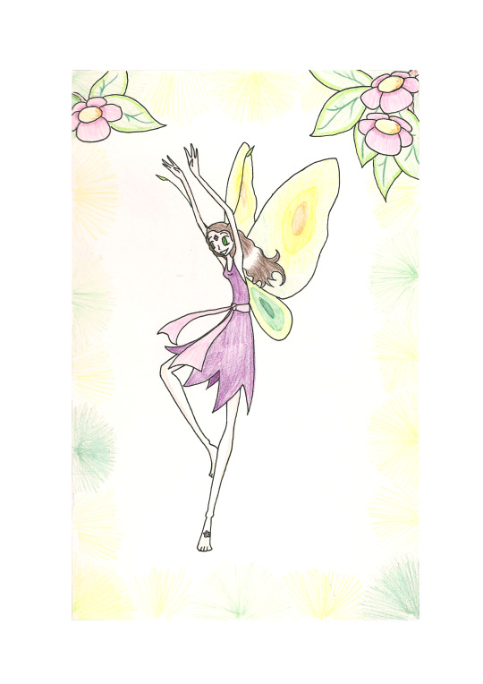
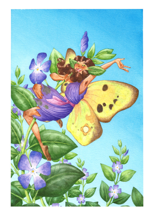
2002 vs. 2022
Last year I came across a set of season fairies that I drew when I was still in school. They were the first art I ever posted online and were the best I could do at the time. Since it had been exactly 20 years, I decided to redraw them and see the difference.
I tried to retain some elements from the original set; each fairy is facing the same way and has a similar outfit and colour scheme. In 2002 I used coloured pencils because that was my standard medium for colour, so I did the redraw in watercolour because that's become my standard medium over time. (Maybe I'll redraw one in coloured pencil too.)
Autumn is first because I drew her first back then! It was my favourite season. Autumnal fairies are still the kind I draw most, so the Autumn fairy was probably the easiest.
Winter is the one I changed most because she had a definite Christmas vibe in the original, which I remember being unintentional. (At the time I just couldn't think of any Winter plants other than evergreens.) I tried to make the new one match what I was aiming for in the past, rather than what I managed to draw.
Spring flowers are all very low-growing, so I moved the Spring fairy down to the ground. I'm really pleased with the mist effect in the background and how closely I was able to match the old colour scheme.
Finally, Summer! This one was interesting, I absolutely hated the season as a child (I had fair skin, light-sensitive eyes and debilitating hayfever) and I have strong memories of just bashing this one out to complete the set, so I had to figure out if there even was a flower that matched those generic 'flower' shapes I drew in the original. I hadn't tried very hard at the time, but in hindsight I thought her pose was more interesting than the others, so I tried to retain things like the bent legs by hooking them round the flower stem. She's also the one whose character design changed the least. I'm still not a huge fan of the season but I think the updated illustration might even be my favourite in the set.
Maybe I'll make some prints of these or some Redbubble products?
#2002 vs 2022#old art#redraw#old vs new#art#traditional art#fairies#fantasy#seasons#spring#summer#autumn#winter#watercolour#coloured pencils#periwinkle#snowdrop#oak
23 notes
·
View notes
Text
The first official post.
I posted some preliminary work over on @qwertyfingers a few days ago, but I've decided to be organised for once and stick everything on it's own blog, so here's an intro post for organisational clarity. I'll be posting any and all updates about the project here, and that's all it'll be used for, to keep the streams from crossing.
What is this project?
I’m aiming to produce a full major arcana for a tarot, using themes, imagery, characters and places pulled from Everything Everything lyrics and odds and ends like interviews, song Q&As and so on.
Some major arcana cards have immediately evident analogues in EEs body of work. For example, The Empress is a ‘great mother’/'mother nature’ figure, protective and wrathful in turn, obvious parallels to Tin (The Manhole).
They will embrace me tonight as a
A father and a son
And I will carry homo sapiens through the night
Our Empress can be represented by the Fox, and potentially bring in some evolution imagery from Choice Mountain, Leave the Engine Room.
Judgement meanwhile is a representation of a rapture-like apocalyptic event that rewrites everything we know - which is heavily telegraphed in much Mountainhead but especially Wild Guess and The Witness.
Do you know what I saw?
Nothing but endless fields of bodies swimming in the pit
There was blinding light
There were many eyes
How could I know that?
How could I know that?
If I wasn’t there?
The role of Judgement in this deck will be played by this great accident in the pit. The exact visual it will take on is less apparent, but we have our basic inspiration already.
Other cards are more difficult. The Devil is hard precisely because there are almost too many options to draw from, but few prominent or recurrent enough to be the obvious choice. There are multiple places to draw lyrical inspiration for The Hermit from, but none of them provide any visual information. But this whole thing is a process and I’ll get there eventually.
Why are you doing this?
I had the initial idea for this project in 2021. I became really intrigued by tarots status as a sort of agreed-upon set of glyphs and stories shared across time and spent a lot of time researcing the different designs and meanings of cards throughout time. I don’t “believe” in the power of tarot any more than astrology (i.e. not at all), but I’m fascinated by the function of the imagery and art of the cards themselves.
During my reading I got to thinking about what I feel strongly enough about to consider creating a deck and I struck upon this. The first card I ever had a plan for was The High Priestess. Described as a sort of spiritual or social leader-by-example, a representative of the best of humanity and our collective knowledge. In a tounge-in-cheek way, that’s exactly what Come Alive Diana is about.
Her phantom head is thinking for all mankind
I saw her portrait in the Mail
Her phantom head was directing the holiest of hunts
I was immediately struck by the image of a spectral Diana cradling her own severed head in a pretty gruesome pastiche of the traditional depiction of the card, and haven’t been able to get the thought of it out of my mind since. It’s spiralled out of control since then.
So yeah. Mostly I’m doing this because it interests me on a purely artistic level, and because it’s a fun challenge to approach something really creative in a strangely scientific way. Like I’m dissecting and analysing a bunch of art I really enjoy and creating horrifying chimeras with the remains. I love it.
How will it all get done?
I’m a relatively experienced watercolour and gouache painter and illustrator, though I’ve never tackled a project this big before. The thing that scares me most is having to learn architectural drawings for at least two of the cards I have planned so far. But I look forward to it.
Right now I’m working on typing up all of the notes I have scattered between sketchbooks and notepads about my ideas for different things and making sure I know which areas need my attention most right now. Otherwise, I’m just vibing.
I welcome any questions or suggestions you might have in my ask box or messages! In an ideal world I’d like to complete all of the card artwork myself, but I have no pre-existing skill in graphic or product design and have no idea how to go about choosing a font or designing a card beyond the illustration and so if that’s something you do know about and would like to get involved please do.
Currently I have no plans of printing these up or making any overtures towards this being more than a casual passion project. My only experience with the professional art world is very informal local gallery shows and I don’t feel ready to change that!
4 notes
·
View notes
Note
As an accomplished artist and someone who I guess is harder to impress, what type of art / artist excites you and inspires you ?
You flatter me by calling me an accomplished artist! I don't think I am but I still take the compliment to cheer me up when I have a low self esteem haha!
It's a great question and also terribly difficult... mhmmm
In terms of type and category…
I admire those who master techniques that I want to do but could never do, like oil painting. I'm extremely sensitive to smells and strong products like what is needed for this technique but when I see some process videos it looks so wonderful!
Or the artists who master to an extraordinary level the techniques or style that I practice myself and that I consider as goals to reach.
I do watercolours and comics but at a very basic level, I still consider myself a beginner, and I hope one day to reach even a tiny bit the level of Juanjo Guarnido with Blacksad, or Hermann with Jeremiah.
Or the artists who seem to excel in the areas where I'm a big slug, like speed and efficiency. I work slowly, I need to turn around my concept, do lots of drafts and tests, gather lots of references, so artists who can come up with an anatomically perfect drawing without a preparatory sketch or a composition that works great on the first draft blow my mind.
A special mention, I'm interested in linocut artists or those who do very elaborate black and white work like we see a lot in the metal world. I bought some material to do linocuts myself but I haven't had much time to do it yet and I love the ultra detailler black & white style but I think it's beyond my own patience which is already quite extended haha!
I'm making a small list, limiting myself to the artists :
-that I am currently following
-who are still alive
-who work in fields where I myself practice, namely illustration, comics and traditional techniques.
-whose name my horrible memory managed to retain and associate with the art…
Juanjo Guarnido
Yoann Lossel One of my great favourites. His universe is simply wonderful.
Wylie Beckert I'm in love with her style.
Joe Fenton
Stephen Wilson
Madd
Riccardo Federici.
Jaime Calderón.
Annie Stegg.
Nico delort
Ralph Meyer
Jordi Lafebre
Serge Birault
and many others, it's too hard to choose!
Sometimes it's other art consumers who talk about it so well that they themselves become a source of inspiration. I've already mentioned it here, Alt236, a French youtuber, who calls himself an archaeologist of fictional universes, every time I watch one of his videos I get a great art boost.
And my French community that makes letsplay RPGs centered on lovecraft kind of horror. I've been in this group for 10 years now, a lot of talented artists gravitate around it, come and go, participate and are motivating just by their enthusiasm or way of telling stories.
it is through this community that I've discovered that I think I'm a better artist when it comes to exploring other people's worlds rather than creating my own.
That said, don't think I'm an artistic snob, a funny drawing with a good dick or fart joke is enough to make my day!
And challenging myself with cursed drawings. I think I have a passion for pushing the boundaries of idiocy.
And I think I can stop there, to keep it digestible hehe. I hope this answers your question properly!
Thank you very much for this ask and your interest!
23 notes
·
View notes
Note
So I have a question. Lately I’ve been trying to get more into watercolour painting and I was wondering if you would have any tips or advice for me about it?
Omg I'm really sorry I don't know if I ever got this notification and I rarely check the inbox tab;;;;;;;
If you're still interested in watercolor painting, here are some things that range from technical to personal:
-materials will really make and break how you feel when you paint. But I think in hierarchy of importance I think Paper> Paint> Brushes. The less cotton percentage there is to a paper, the more it will buckle or how it effects the pooling/flow of your water paints or how intense the colors could be.
-Unfortunately the more cotton the paper is the more expensive. But when I started out I was using strathmore and fabriano for my classes and EFN comics with a 12 color artist grade paint set and was satisfied with those at the time.
Then I thought I was being big brained when I bought these gigantic XL Canson watercolor paper for sale for comic making and then I thought my skills went to dust cause painting felt so hard and the paper fought me with a lot of paper breakage and ugly color blends results.
-Lol I thought watercolor would be the easiest then my painting teacher in college declared 'Welcome to the Hardest Painting Medium of them all!!!' and I cried. XD But all he really meant was that compared to Oils or Acrylics you have to paint and plan your lightest to darkest ahead cause you can't paint lighter tones on top of the dark ones without risk of reactivating the paints.
Of course this doesn't matter if we're talking about mix mediums. And with today's tech you can always plan out your paintings first with digital tools like mateusz urbanowicz does.
In terms of youtubers there's tons to look at: I like Mateusz' for the bright and light illustrations, Mind of a Watercolor for some technical know hows in materials and tree scape techniques, and then Watercolor by Shibasaki is just a Japanese grandpa teaching you to be chill and just have fun as you paint.
Hope this helps and sorry again for the late reply;;;
2 notes
·
View notes
Text
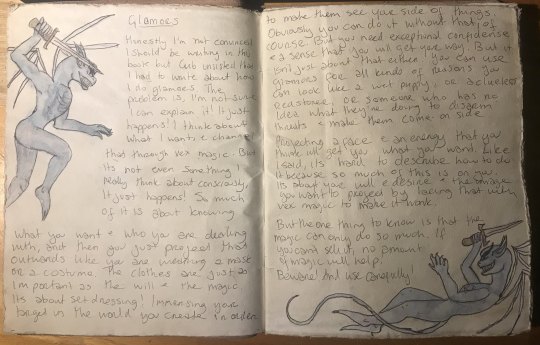

Guess who finally got around to finishing these pages lmao. XD tbh the watercolour pencils I used to colour the illustrations aren't ... quite the right shade for Vexes, but it is what it is. The photos kind of make them look slightly better tbh.
There's part of me that's not entirely happy with the conclusions this piece comes to, but the best thing about an iterative grimoire like this, for those who have never kept a grimoire or have no idea what grimoires are and what they include, is that there is room to revisit a topic, and I do plan to do something on the masks later, so there will be more expansion on this and on my thinking and how that's changed since I wrote this piece. Which does tell you how long ago I wrote this lol.
Also a note on my approach to this: I'm attempting to emulate Scar and Cub's voices and energy and vibe through these pieces and the style of handwriting I have chosen to use for each of them, rather than do any kind of (weird stalkery tbh) form of copying their actual handwriting. And I think that approach is a good one, because it wouldn't matter how close my handwriting was if their voices didn't sound right. So that's the choice I've made here.
Alsoalso: Scar is the Vex with the tail, bc of how much he said he wanted one in that bit where they were setting up ConCorp in s6, and Cub was like, wtf would you want a tail? So it gives me an easy way to distinguish the two of them in their Vex forms.
The transcript below has been tidied up and spaced out a little more than it is in the book itself, just to make it easier to read and you don't have to have a wall of text to deal with.
Glamors
Scar: Honestly I'm not convinced I should be writing in this book but Cub insisted that I had to write about how I do glamors. The problem is, I'm not sure I can explain it! It just happens! I think about what I want, and channel that through Vex magic. But it's not even something I really think about consciously, it just happens!
So much of it is about knowing what you want and who you are dealing with, and then you just project that outwards like you are wearing a mask or a costume. The clothes are just as important as the will and the magic. It's about set dressing! Immersing your target in the world you create in order to make them see your side of things.
Obviously you can do it without that, of course. But you need exceptional confidence and a sense that you will get your way. But it isn't just about that either. you can use glamors for all kinds of reasons. You can look like a wet puppy, or a clueless redstoner, or someone who has no idea what they're doing to disarm threats and make them come on side.
Projecting a face and an energy that you think will get you what you want. Like I said, it's hard to describe how to do it because so much of this is on you. It's about your will and desire and the image you want to project by lacing that with vex magic to make it work.
But the one thing to know is that the magic can only do so much. If you can't sell it, no amount of magic will help. Beware! And use carefully!
Oh! And you make be wondering why I call them glamors! it sounds like such a silly word, but I use it for a reason. These glamors are like masks. They change how people see you, but they don't change how you are at your core.
It's like when I wear the Vex mask. Kinda. It isn't a glamor, but it can be used like one. Do I want to make it clear the ConVex are in town? Then me and Cub wear the masks. They don't always have to transform us into our Vex forms or allow the vex to use our bodies.
Cub: Ehh, I wouldn't say the masks are like your glamors, Scar. Those masks serve quite a different function than you making someone think you're a wet cat. Those Vex masks are us, they aren't some fakery or pretense. The magic's different.
We are Vex at our core, the masks simply allow us to acess different magics, transformations, and powers. Plus, we don't really choose when to wear the masks, the Vex do that. It's just not the same, Scar, is all I'm saying. -- Cub.
Scar: Okay, look, it might be imperfect, but you know what I mean! I did tell you that I am bad at explaining these things! I did warn you! It's very difficult to explain something that I just do instinctively. It just happens, Cub, I can't teach it.
Also the Vex masks are definitely glamors! You can definitely use them that way. We just don't do that because the masks have different uses.
Cub: That is true, yo ucan use them like that. But the fact is we don't use the masks like that. They serve an entirely different purpose to simply being masks or glamors. They're sacred ritual objects that connect us to our power. It's very different!
Scar: OH hey Do you like my Vex drawings? I think they look so cute!
Cub: They're adorable, Scar, yeah!
Scar: I think I really brought out your mischevious face! Yeah!
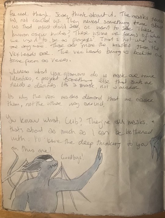
Cub: For real, though, Scar, think about it. The masks reveal us, not conceal us. They reveal something true about us that most don't see, or want to see. These humanesque bodies? These visions or forms of who we used to be as players? Tht's not who we are anymore. Those are more the masks than the Vex heads are. The vex heads bring us back to our true form as Vexes.
Whereas what your glamors do is mask our true identities, and project something else that suits our needs and desires. It's a mask, nota mirror.
It's why the masks demand that we master them, not the other way around.
Scar: You know what, Cub? They're all masks, and that's about as much as I can be bothered with. I'll leave the deep thinking to you on this one! Goodbye!
#hermitcraft#convex#cubfan135#gtwscar#metafiction perhaps#worldbuilding#vex magic#scar's magic#glamors#masks#vex magic grimoire#i have spent too much time writing glamour in the American way#bc authenticity#that is the extent of my accuracy wrt writing styles
13 notes
·
View notes
Text
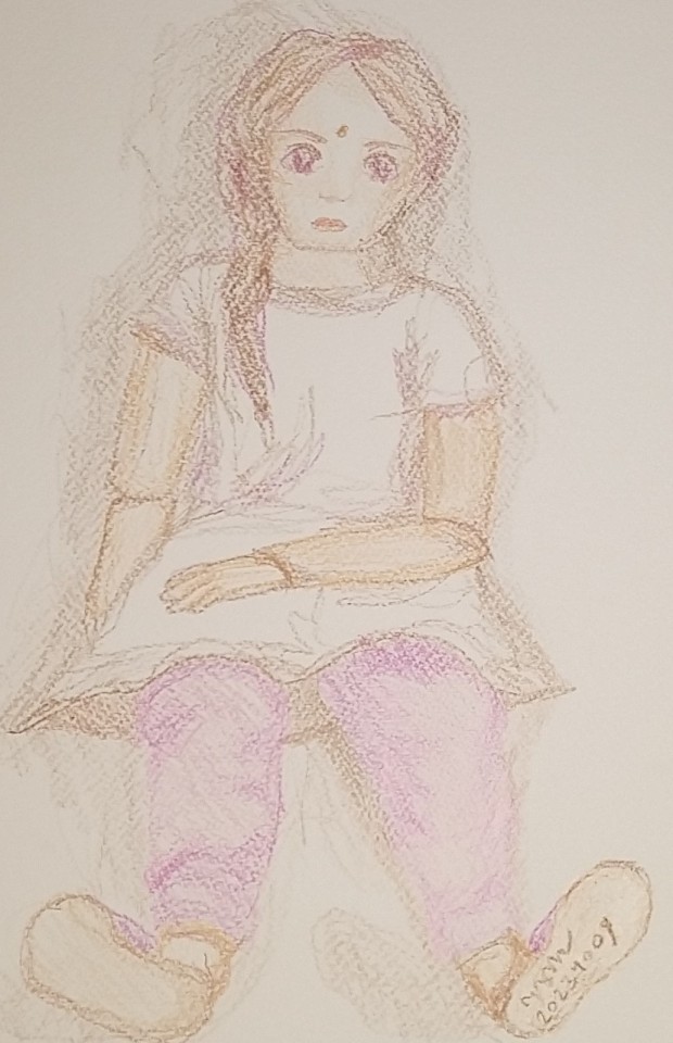
Drawing the Sandalwood Girl
An experiment in drawing with my non-dominant hand
In the last few years, I've been having trouble gripping pens and pencils, because the top joints in my fingers are weak. I have Hypermobility Spectrum Disorder, and although physiotherapy has helped with a lot of the resulting joint problems, there's not much I can do to stabilise my fingers. I could wear finger splints, or use pencil grips, or both, but these are quite expensive options. I opt for pens and pencils with thick bodies, because I don't have to pinch them. After work one evening - I work from home because it’s best for me with my changeable health - I decided to sit down and try it.
I did write (type, rather!) a whole 1,500 word essay with my left hand in my first year of university, because I dislocated my right arm 24 hours before the deadline and didn’t know how to ask for help, so I knew it wouldn’t be as hard as that, but… still quite a daunting thought. Picking up the crayon to make the first mark on the page was scarier than I expected it to be; I was quite shocked by how nervous I was.
Knowing I wouldn’t be able to do GCSE-level artwork with my left hand, because I can barely hold a pen with my left, I decided to be kind to myself and do something very simple. I got an old favourite book from my childhood (“The Sandalwood Girl” from the “Puddle Lane” series by Sheila McCullagh, Ladybird edition) and used one of the illustrations as reference.
I have a box easel that gives me a tilted surface to work on when I don’t want to (or can’t) spend an evening hunched over the table, drawing, and I have a big crate of about 150 Crayola wax crayons, plus lots of watercolour paper, which creates the most beautiful relief texture. I set my lamp and my easel up on the floor, got a cushion to support me, and started drawing with my left hand. I found I had to hold the wax crayons so peculiarly (relative to my right-hand habit) and couldn’t put much pressure on the page, but going over my work again and again let me build up the colour with a lot more control than I have in my right hand.
This is what I came up with - about an hour of drawing, I think, although I didn’t time it - and I’m so pleased with it!

My left wrist hurt a bit, but I thoroughly enjoyed this drawing, and I’ll definitely be drawing more with my left hand in future. I’m determined to make more visual artwork, but it’s not always possible with my hypermobility - my right hand takes a beating when I use my walking stick - so maybe this will help me do more of what I love. I also really liked the challenge of drawing with my non-dominant hand.
If you're an artist looking for a new challenge, this is exactly the kind of thing I'd recommend. (With apologies to my dear ambidextrous friends, this may be less of a challenge for you than for others.) I'm really looking forward to trying again!
#writeblr#blog#writer's life#artist#my artwork#anti ai#the sandalwood girl#puddle lane#sheila mccullagh#fan art#art experiments#disabled artist#hypermobility#hypermobility spectrum disorder#artist's life#disabled author#disabled writer#wax crayons
2 notes
·
View notes
Note
Sending you some flowers 🌷🏵️ for the ask game!
Hello! Thank you for your ask and the flowers 🥺💖💖
🌷 favourite current hobbies or ones you would like to pick up if you could?
My favourite current hobby is probably watercolour painting (it has been for 5-6 years now surprisingly - it’s hard for me to stick with one hobby but this one has somehow stuck with me). Also playing Minecraft with my friends 😂 (I love building nice houses for my friends while they go do the exploring)
Another one i’m currently learning is gouache painting! I always have a hard time working with opaque paints like oil and acrylic (i hate acrylic 😂 it’s like painting with literal mud, and i envy people with skills to make gorgeous acrylic paintings). I thought that watercolour gouache, having the ability to be layered and watered down like watercolour and the opaqueness of acrylics, would help me get better at using opaque paints! Also i’ve seen gorgeous illustrations with gouache and i adore its texture and flexibility, so i’d like to give it a try!
🏵️ what flower symbolizes you? if none come to mind, what’s your birth flower and do you identify with its meaning?
My birth flower is larkspur and waterlilies.
Apparently, larkspur represents an open heart (specific colour symbolism: pink - fickleness, white - happy-go-lucky nature, purple - first love/ sweet disposition). I think i most relate to the pink flower meaning haha. I’m a very specific person in a lot of aspect, which can comes off as fickle to other people. Not much of a happy-go-lucky person since i’m an overthinking anxious mess most of the time 😂
Waterlilies represent birth and resurrection. Which i don’t think i can relate to much right now, but maybe one day, when i’m older, i can look back and go “Damn Rina, you really made a come back despite so-and-so setbacks. You’re like a waterlily” or something? I’m not sure haha
5 notes
·
View notes
Text
The museum near my mum's was hosting a Raymond Briggs retrospective and it wasn't until we went today that I realised the absolutely outsize influence Briggs quietly had on my development and sensibilities as an artist. I've never really thought to flag him as one of my Favourite Illustrators but I realised walking around the room that his comics work - reading stuff like Fungus The Bogeyman and Father Christmas as a kid, and When The Wind Blows as a teenager - really formed like the platonic ideal for me of what comics should be and do.
A short list of things I think I've unconsciously learnt from his work without thinking about it:
the amount of character you can wring out of framing and posing
the idea of stylised faces in a highly rendered world
using repetitive panels to create meaning
breaking the edges of panels and frames
energetic lettering
filling up the world your characters inhabit with lots of little details you find entertaining
trying to create worlds and people that feel like Real Things That Exist by drawing on the world around you even if what you're making is a fantasy
borrowing faces and places that fit
it's allowed to be very silly
Anyway it's honestly left me quite emotional looking at his work like this bc I didn't know! I didn't know how much he'd influenced me! and there's something about looking at the artwork with all his notes to self around the margins and relettered phrases and "change this bit"s. there's a spread from fungus the bogeyman where the margins have been repeatedly filled with carefully drawn bubble letters counting down how many thousands of words and hundreds of hours of lettering he still had left to do and I'm just like i see someone is losing his actual mind lettering. relatable.
There was also. one of the last spreads in Ethel and Ernest, and it shows him and his dad coming to the hospital to see his mother's corpse after she died. and everything else on the page is done in his usual repeatedly-photocopied-and-redrawn style and worked through, but the body of his mother is almost just a pencil sketch over loose watercolour. and it's like. looking at that you can really really feel how unbearably hard it was to draw that. and next to that they had the closing spread where Briggs is showing his wife his parents' house after they died, and so right next to this drawing that evidently hurt too much to work on too long, you can see how in-depth and thoughtfully he's drawn the house he grew up in, he's done it brick by brick and every bit of detail worked in like he doesn't want to stop working on it and be done with the house. and idk it left me insanely choked up.
#red said#he died in August i think i missed that#oh i also noticed something i thought was really clever which is when he wants to transition from direct to reported speech#he'll move out of speech bubbles and into a white space with a conversation script written out#and it has a really amazing like. detemporalising effect#you get the sense that the conversation in speech bubbles is a conversation happening here and now in context#and the bit that extends into white space is the essence of an ongoing conversation happening At Some Points#it was in three spreads in the exhibition#one in When The Wind Blows after the blast in the middle of the night when they're trying to work out what to do
9 notes
·
View notes
Text
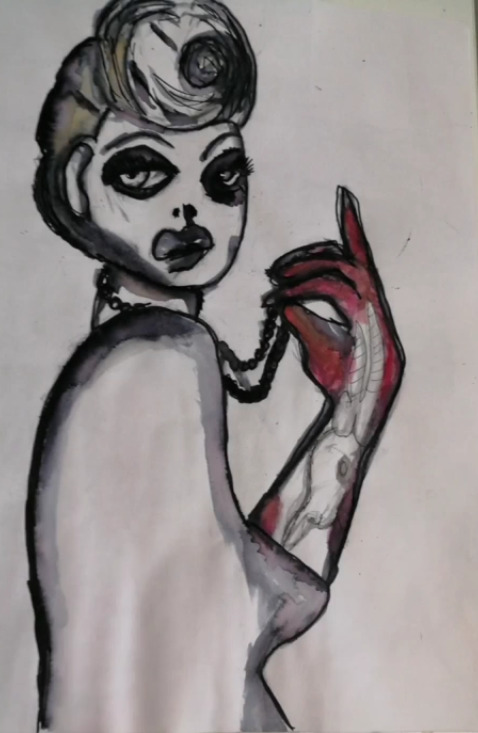
Cassandra Rhodins
For this piece of work I made a direct copy of Cassandra Rhodins' work for the continuation of portraits. I started drawing the hair and face free hand as it was the easiest for proportion to fill my page. Then i drew the body and arm to match the size for this piece I used the material of felt tip pen and water to create a smudge effect which Cassandra Rhodins captures in her work. I used a pencil at first for the basic outline but then for the colour I used red watercolour for her arm and a little for her eyes. I love how her hair turned out as it has the swirl I was looking for with the shape and style from Cassandra Rhodins' work despite that I found it hard to recreate her face especially the eyes. I believe if I tried this piece again I would not make it so dark around her eyes and also I would have a better experience using black felt tip and water as it was my first time using the material. Moreover, I enjoyed making her arm with the almost muscle and skeleton look as it brought me back to my skull project at school. I did enjoy recreating Cassandra Rhodins' work as it was something different compared to ordinary illustrations especially in fashion. In the future I will like to capture some of her work into my designs especially the way she draws body features to make her work stand out but still project her overall idea in the style of her illustration.
1 note
·
View note
Text
Rural Japan Train
Here I drew a Japanese rural traditional train. I found it hard to draw at first as it had movement with a curve as it goes round the rail. I started off by drawing the front of the train facing towards me and then I started to make the train look like it was turning I tried making panels to start making the effect of the train turning the corner. It was challenging but I think I had the angle right after a few attempts to adjust it's shape. I kept it in proportion with a ruler to keep it looking the same through all the train. It was my first attempt at drawing a moving train but it looks like it's turning but still a bit messy in my opinion. I thought about the media and the colours it had quite a range of colours but I found it was best to blend multiple colours to recreate the train. It consisted of green, turquoise, pink, yellow, peach, white and grey. I started with a mixture of watercolour and my pens as I tried blending with the watercolour and making highlights in the pen. As it started to dry I went back over my drawing with coloured pencils to keep with the realism drawing effect. It did take time and I was questioning if it look nice or messy. In the end I had a few mistakes with applying the wrong colour so I tried fixing it but it has not been successful as it has rubbed my paper leaving a bumpy texture. However I did not want to keep applying media over my work as I did not want to soak all the paper. I even tried to use a tea stain to see if that would hive me the peach colour for the side of the train. I think if I tried again I would have focused on one train carriage and used different medias from each carriage to see which media worked best for the colours. I finished off by outlining my train and adding the details of the window wipers and the train fastening. I shall keep practicing with my medias and trying new techniques to experiment with my media for my fashion illustrations after my designs later in my project.
0 notes
Text
Inked in Bhopal: Unveiling the Best Tattoo Artists and the Evolving Art of Body Canvas
Bhopal, the metropolis of majestic lakes and ancient grandeur, is also becoming a vibrant hub for creative expression, mainly in the realm of tattoo artistry. With a developing quantity of people in search of permanent, customized ink to adorn their bodies, the hunt to discover the high-quality tattoo artist in Bhopal can be both thrilling and daunting. This comprehensive manual will equip you with the expertise to navigate Bhopal's flourishing tattoo scene and collaborate with an artist who can translate your imaginative and prescient right into an everlasting masterpiece.
Beyond Aesthetics: Unveiling the Benefits of Tattoos
Tattoos go beyond mere aesthetics. They serve as effective forms of self-expression, permitting individuals to inform their stories, commemorate good-sized life occasions, or truly show off their inventive alternatives. Here are a few capability advantages of getting tattooed:
Self-expression: Tattoos provide a canvas for people to express their particular personalities, beliefs, and passions.
Personal connection: Tattoos can function as permanent reminders of loved reminiscences, loved ones, or lifestyle-converting reviews.
Body art as self-belief booster: A nicely designed and completed tattoo can increase self-confidence and frame photos.
Community and belonging: Tattoos can join people to a network of like-minded folks who share comparable creative possibilities.
Healing and empowerment: Tattoos can function as a form of catharsis, assisting people to triumph over hard studies.
The Ever-Evolving Canvas: New Tattoo Trends and Styles
The world of tattoo artistry is constantly evolving, with new techniques and styles rising all of the time. Here's a glimpse into a number of the most up-to-date developments currently fascinating tattoo fans:
Minimalism: Less is more! Delicate linework, geometric styles, and single-symbol designs are gaining massive recognition.
Blackwork: Bold and dramatic, blackwork tattoos utilize formidable lines and strong black ink to create putting visuals.
Fine Line: Achieving a nearly illustrative great, first-class line tattoos feature difficult info and sensitive lines for a complicated appearance.
Watercolour: Offering a tender and ethereal aesthetic, watercolour tattoos make use of muted colourings and blending strategies to create a painterly effect.
Neo-traditional: This colourful style takes proposal from traditional American conventional tattoos, however with a modern-day twist in terms of colour palette and layout elements.
Biomechanical: Blending human anatomy with complex mechanical elements, biomechanical tattoos provide a futuristic and sci-fi-stimulated aesthetic.
Bhopal's Best: Unveiling Top Tattoo Studios and Artists
Bhopal boasts a thriving tattoo scene with a plethora of proficient artists and official studios. Here are a number of the main names to don't forget whilst embarking on your tattoo journey:
Tattoo The Art Studio: Lauded for its numerous crew of artists, top-notch hygiene standards, and near-best online rankings, Tattoo The Art Studio is a top contender. Explore their artists' portfolios to discover the proper healthy for your desired fashion.
Skin Machine Tattoo Studio: Established in 2012, Skin Machine boasts skilled artists with a mastery of problematic designs. Their expertise in custom paintings makes them a top-notch preference for unique ideas.
Swapnil's Tattoo Studio: Renowned for its vast portfolio and willpower to exceed patron expectations, Swapnil caters to diverse styles. Their attention to each pre-designed and custom alternative offers flexibility.
The Tattoo Temple: Prioritizing cleanliness and inventive excellence, The Tattoo Temple houses artists gifted in black and grey, realism, and colour work. Their dedication to incredible artistry makes them a strong contender.
Gudna House: Receiving rave evaluations for its pleasant surroundings and professional artists, Gudna House caters to diverse patterns. Their recognition of purchaser consolation ensures a high quality and enjoyable revel.
The Art of Collaboration: Working with Your Chosen Artist
Finding a pleasant tattoo artist in Bhopal is simply the first step. Here's how to ensure a hit collaborative journey:
Research is Key: Before your consultation, immerse yourself inside the artist's work by way of exploring their portfolio to recognize their stylistic strengths and make sure of alignment together with your imagination and prescient.
Gather Inspiration: Collect reference pix that illustrate your desired layout factors, fashion, and site.
Prepare Questions: Don't hesitate to invite about ache management techniques, recuperation techniques, aftercare commands, and pricing.
Be Open to Feedback: A skilled artist might propose changes to beautify the layout's technical soundness and aesthetic appeal. Be receptive to their expertise.
Trust Your Gut: Comfort and clear communication are critical. If you do not feel completely assured about the artist or the design, keep in mind exploring other alternatives.
Beyond the Basics: A Look at Cutting-Edge Tattoo Techniques (persevered)
Scarification: This ancient practice involves controlled scarring to create everlasting designs on the pores and skin. However, due to the potential health risks, it's critical to discover a fantastically professional and experienced practitioner.
Biohacking Implants: This rising era includes implanting small, biocompatible items below the pores and skin to create precise and interactive body modifications. While still in its experimental ranges, biohacking implants offer a glimpse into the destiny of frame art.
3-D Printing for Tattoos: Though not broadly available, the 3-D printing generation has the capability to revolutionize the tattoo enterprise. This technology should create complex, multi-layered designs with unique detail and minimal scarring.
The Responsibility of Getting Inked: Safety and Aftercare
While tattoos offer a plethora of blessings and inventive expression, safety and aftercare are paramount. Here are some important components to recall:
Choose a Reputable Studio: Always prioritize studios with an established track document of cleanliness and hygiene. Ensure they make use of sterilized systems and disposable needles.
Consult with a Doctor: If you have got any pre-existing clinical situations, seek advice from a physician earlier than getting tattooed.
Aftercare is Crucial: Following a diligent aftercare routine is important for the most effective restoration and stopping of infections. This typically involves maintaining the tattooed location clean, warding off strenuous interest, and making use of recommended ointments.
Conclusion: Your Bhopal Tattoo Journey Awaits
The world of tattoos is a charming mixture of self-expression, artistry, and evolving era. With a plethora of talented artists and official studios in Bhopal, locating a pleasant tattoo artist in Bhopal in your specific vision is a practicable dream. By prioritizing hygiene, studies, and open verbal exchange, you may embark on a collaborative journey with an artist who can remodel your imaginative and prescient right into a permanent masterpiece. Remember, a tattoo is a lifelong commitment, so select accurately, embrace the creative procedure, and enjoy the enjoy of redecorating your body with a meaningful and delightful piece of art.
1 note
·
View note
Text
What is the Best Art Software for Digital Illustration?
If you're trying to mimic traditional media, using charcoals, oils, watercolor, pencils and brushes, then you want a drawing software specifically for painting!
With so many options available, it becomes hard to make a choice that would best suit the kind of art you want to make, whether you're just starting as a beginner or are a professional.
What you'd generally want is a digital illustration software that is compatible with the device you're using, supports the kinds of tools you need for the art you create, the cost, and any additional features that a creative can play around with.
Some digital art software may even be outdated, while others keep experimenting and keep further development at the forefront.
Different digital artists look for various features in the software they'd prefer to use.
In addition, The price point is always something to consider, but not to worry, there are just as many free alternatives to good quality software as paid ones.
Considering all of this, here's a comprehensive list of the digital art software that has the potential to be the right fit for you.
10 Best Free and paid Art Software for Digital Painting & Illustration
These are the 10 art programs that I personally like and would recommend:
If you want more info about them, I suggest you visit pctechtest site.
1. Photoshop
Photoshop is the industry standard, and preferred among most professionals, but it costs an ongoing subscription fee.
Photoshop's brushes work so much better, virtually no lag and a lot of variety. Importing brushes from pros also works easily because.. most pros use Photoshop.
2. Clip Studio Paint
Clip Studio Paint is the best for doing Line Art, Paintings, Comics/Manga, and even 2D Animation.
Clip Studio has a lot of the tools Photoshop does, but is just more intuitive for the average artist. Also it is a one time buy, you don't need a subscription.
Users value its quick loading time, lack of lag, pen stabilization for clean line art, and ability to export in PSD format for easy editing.
3. Krita
A lot of people use Krita as it's free and have plenty of useful tools and brushes, but there is some learning curve to getting the most out of it.
4. Corel Painter
Corel Painter feels like an entire art store full of stuff, very realistic brushes especially for water colour and charcoal etc.
5. Rebelle
Rebelle is a top choice for artists seeking a realistic, versatile, and user-friendly digital painting experience that's competitively priced.
Rebelle is really amazing at making painting feel very close to what is to paint on an actual canvas. The products you use like the paint and the canvas have an amazing interaction.
6. ArtRage
ArtRage is also an excellent and easy to use paint app that does a great job of simulating the flow and texture of real oils and watercolours.
7. Sketchbook Pro
Sketchbook Pro is a great tool to sketch when it comes to freehand drawings. Airbrush feature along with copic colors makes it perfect for art.
8. Medibang Paint
MediBang Paint is a free, lightweight and easy to use art program suitable for users who loves to illustrate!
9. Procreate
Procreate is a premium quality, low-cost app on Apple ipad for artists of every kind.
With abundant customizable features, expandability, and an attractive and intuitive user experience, anyone can create 2D and 3D paintings, drawings, hand lettering, and animations.
10. Paint tool SAI
Paint tool SAI is absolutely amazing for digital painting, but only available on windows devices.
It is so responsive to the pressure and movement of the pen and it's great. Once you get the hang of it, it isn't hard to use at all and you make amazing paintings.
What's The Difference Between Digital Art and Graphic Design?
Digital art is a form of art that involves the use of digital tools to produce images and videos.
Meanwhile, graphic design is a profession that combines artwork, text, and typography for use in advertising, web design, and other forms of communication.
Digital Designers rely on graphic design software to create, edit, and view graphic art.
Krita vs Photoshop - Which Program is for You?
If you're into basic drawing and sketching, A simple painting program like Krita might be enough.
But if you're a professional artist needing advanced editing, photo manipulation, vector graphics, or extensive text tools, then a photo retouching software like Photoshop is the best.
To let you know, Photo Editing software allows users to stitch images the way they want, which can make all the difference in the final look of your photos. such as online photo editor, RAW photo editor, etc.
Do I need a pen tablet to use with art program for drawing?
For hardware, outside of a half-decent computer and monitor, you may eventually want a drawing tablet with pen, whether that's a screenless (such as classic Wacom tablets), or a drawing tablet with display.
You don't need one to get started, and they take some learning of their own, especially screenless. Screenless graphic tablets for beginners are available for under $100, screen-in start around $200 for a very small decent one and go up from there.
Conclusion
Drawing software is an essential tool for an artist or illustrator, professional to novice wishing to create digital art.
The most important thing you need to consider when choosing the best drawing software is that you're comfortable with it.
If you want a powerful drawing program that will give you the best possible experience you want Photoshop, Clip Studio Paint or other paid software.
If you can't afford them, I recommend going with free software like Krita or Medibang Paint instead.
Free software can sometimes be less intuitive, but with use, you'll get used to it instantly and let your creativity flow.
1 note
·
View note
Text

For the first time I added media to this design I used coloured pencils. I really like how it turned out because I focused on layering the colours feather than just using one main colour which made it more effective. I tried to make parts of the dress and shoes look like denim. I did this by using multiple shades of blue.
For the second one I used gouache paint which is basically more opaque watercolour. I haven’t used gouache that much so I am still learning the proper techniques. I decided to make the denim black to see how it looked. However I think it makes it harder to tell what it is meant to be compared to the blue version.

This design ended up being one of my favourites after adding media.
When starting the first version I didn’t have many ideas. However I found a roll of these stick on rose petals which I thought would be quite interesting to incorporate into a collage. I am very happy that I found them because It is the perfect way to incorporate the trend of roses into my collection. I also used watercolours on this illustration because I felt as though it would look weird if used college on the face.
For the second design I wanted to try a completely different colour combination because the pink was very bright. I used coloured pencils and tried to emphasise the shadows and highlights.
I really like both versions of this design and found it quiet hard to pick the final design.

For the first version of this design I used pro markers. I love the colour combination that I created for this design as it is very bright and also it is monochromatic.
Because I like the colours so much I used the same on the second version. However h the us time I used watercolours. I really wanted to be more experimental with this one so I left the colours go wherever on the garment. I think the effect this made looks very cool and sort of like tie dye. I also added some swirls to add more detail.

Once again with this design I was already set on the colour palette which I wanted to use. I used both watercolours and pastels. After completing the watercolour version I knew taht would be the one to be on my final design boards because I loved it so much. Therefore I used the second one to experiment more. I decided to use pastels because I wouldn’t normal chose them. I really like how the colours are very bright. I attempted to blend and add shadows but it isn’t very noticeable and I struggled a bit when it came to adding extra detail.
0 notes
Text
ARTG 371 Week 12 - Create/Application
------------------------------------------------------------------------------
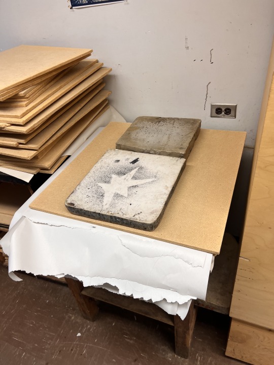
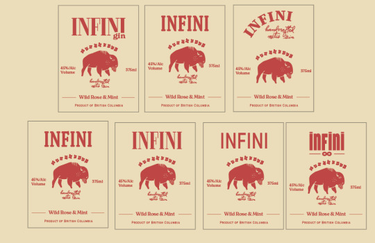
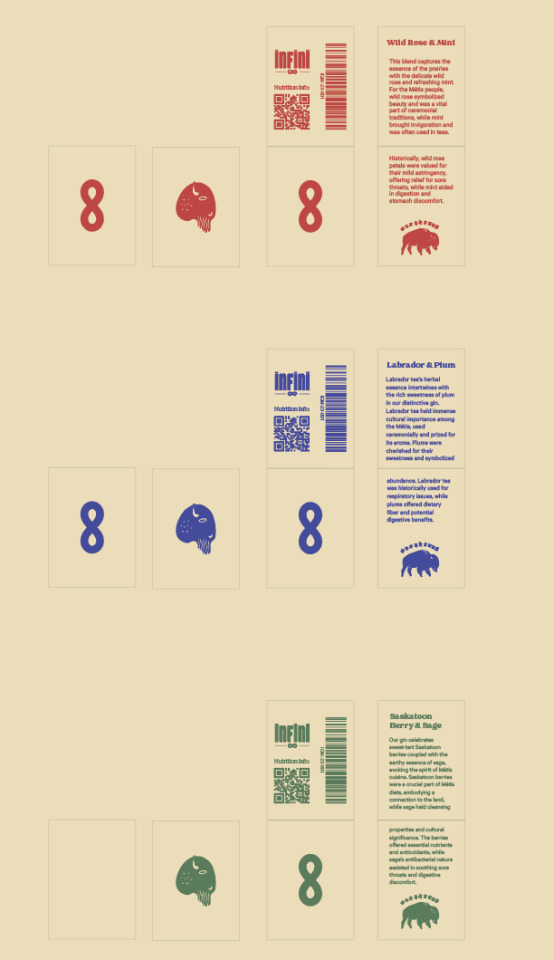
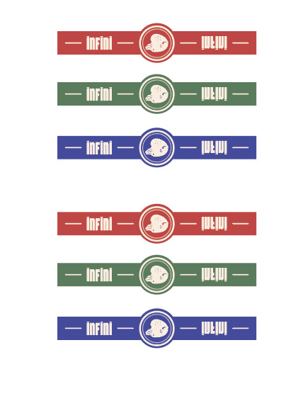
I am thrilled to bring my Gin to life. I began by gathering all the necessary materials, which includes printable watercolor paper, twine and Lino cut blocks. I will use sticker paper to make the sealant tab and the Lino block for the logo application of the tag and possibly for the label itself.
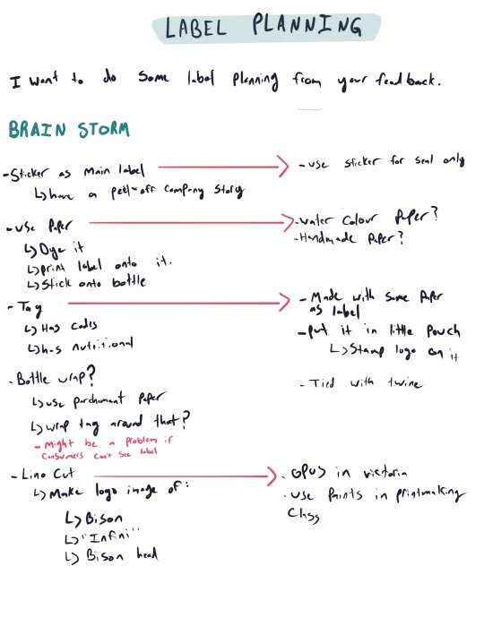
With all this figured out, I need to make an illustrator file that consist of these labels:
Bottle seal
Front label
Back label
Pouch for information card
Information card
---------------------------------------------------------------------------
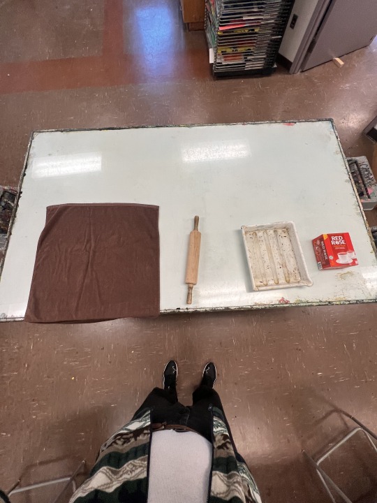
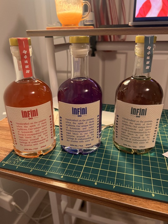
I am currently in the process of gathering and preparing the physical components of my project. To achieve the desired colors for my gin, I am dyeing it with raspberry tea, green tea, and pea flower tea. However, I believe that I might need to use food coloring to make the red and green colors more prominent. In addition to that, I am infusing the gin with orange and cinnamon to give it a unique taste.

---------------------------------------------------------------------------
I'm deviating from the idea of using stickers for my label, as you suggested, and I don't want to use kraft paper because it's too brown. I did some research and found out that dying paper with tea gives it a subtle cream color, which I really like. I decided to go with this method because the color won't get muddy when I print on it. I have ordered a nice textured watercolour printer paper that I will dye and flatten.
My process will go as follow:
Let paper sit in tea water for 20 seconds
Roll on towel to get rid of excess water
Flatten on pallete board with a block overnight
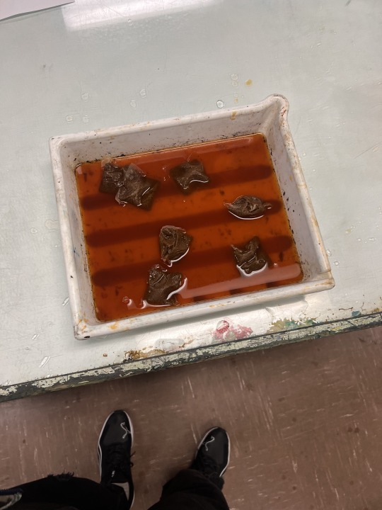
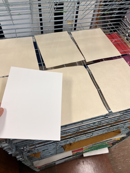
I love the color! The tea was too strong, so I diluted it to get the perfect shade.

Some pieces are darker than others, but that's okay. I'm going for a natural, vintage, and heritage look to mine, so everything doesn't have to look completely cohesive.
---------------------------------------------------------------------------
I have an idea of what colors I want, but I felt like I should print them on the dyed paper to make sure it doesn't look muddy. I chose my favourite three colours and adjusted them in Illustrator


---------------------------------------------------------------------------
It took me a bit of time to get the label right. I liked many of the typefaces I was discovering, but they gave my label a Western look. I want it to look a little western and vintage, but I also want it to have a fun type that might attract younger generations.

---------------------------------------------------------------------------
I loved the type I found, it adds that fresh look I wanted to add. The rest of the labels weren't so hard to design because at this point I had all the information and vectors.


---------------------------------------------------------------------------
I took a couple of pictures of my dyed paper and tried my best to colour-drop it so I could add it to as a bottle seal and not have it look unified.
This took me a bit of time to figure out because I wanted the specified info on the outside and the ingredient flavours on the inside.


---------------------------------------------------------------------------
Voila, here are my bottles ready for critique. I wasn't sure about flowers on the bottle seal or just having the bottle's name on it. I picked the name because I've used the flowers enough throughout my design.
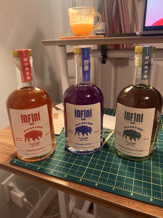
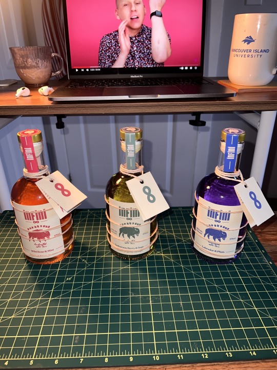
1 note
·
View note
Last Seen Blogs
molasses-house
Molasses House
yarosu
ghost froggy

its-always-the-quiet-girl
Ladiesmanblog
glutenfreepuns
For all your pun related needs