Last Seen Blogs

Text
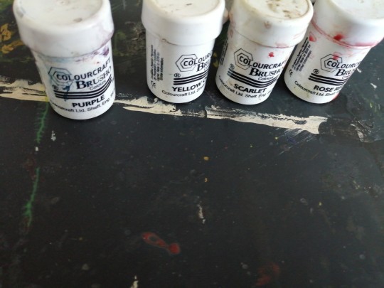
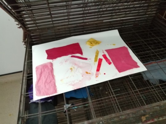
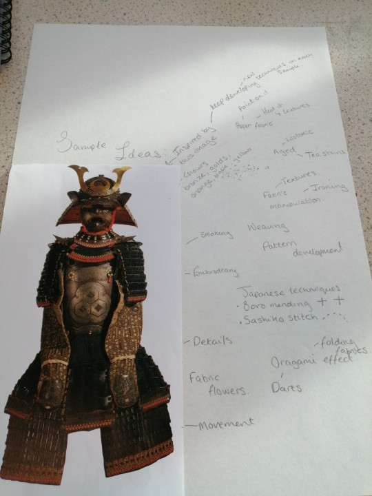
Colouring Silk Rice field Sample:
This is an experiment piece I thought of. As I had made several cuts to make my rice field window opening in my sketchbook. I thought I would make a see through textile piece as I thought of using green asetape however this only had one shade. Where I wanted to create several shades to recreate the shades in the rice field. I had thought of using silk as it was clear. I took some silk and my ink pens and started to colour onto the silk. It worked well as it held its colour strong and still left the semi-transparent result I wanted. The hardest part was not placing my finger down and smudging it. I was surprised that each colour would not just pigment and separate the inks as it was applied in silk. I had to place it on a spare piece of paper as it went through. It reminds me of stain glass effect I might continue to experiment with silk and create another sample but using the more traditional method silk painting. I think I will try try using brusho as I can mix colours together to have a range and shades. I am happy with my findings and now I will stick these on the window panel in my sketchbook to introduce my research page of rice fields and it's art in Japan.
0 notes
Text
Mount fuji print:
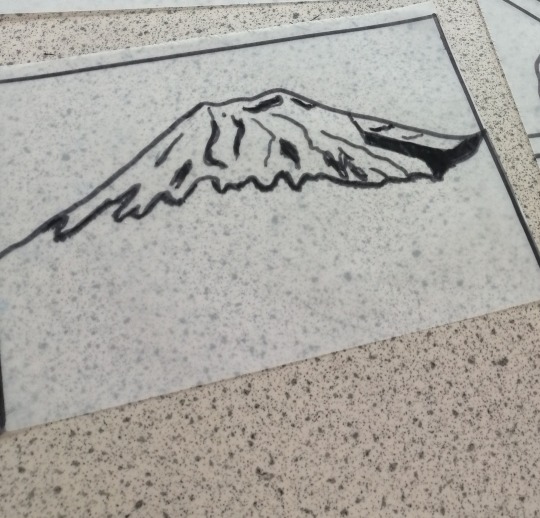
Here is my drawing of my Mount Fuji. When I took this photo, I was on the bullet train and the view of Mount Fuji was breath taking from the train view. So, I wanted to incorporate this in my development of research as it is an iconic symbolism of Japan. I thought it would create a great print idea if I merged or collage it together to make my own individual print idea. I started off with using my photo to draw a sketch of an outline of Mt Fuji I did a half and half drawing to keep it realistic. I tried to mimic the shade and depth of the snow on top. I thought to draw line and shade them in as a guide as I never drew a mountain before which was a little complicated, but, in my opinion, my mountain looks good for a first attempt. Using my drawing I traced over it using tracing paper to start my print. I used a thick black marker as this is the best to create the outline for it to be printed on fabric. I tried to represent the shading and depth by adding a thicker darker line to the areas using my marker. There is one area I could have improved which was the dark patch I made as I should have applied less amount than what I did. My next steps are to make this print larger and smaller to see if I can make a new print by merging and playing around with other prints to create my own original print. I shall add media to my Mt Fuji as well. But for my first attempt of drawing this it went well but I could have been neater for a clean finish.
0 notes
Text
Japan countryside view from bullet train journey:
This is another photo I took from the bullet train ride which shows the countryside of Japan. In the background you can see Mt Fuji which was stunning it was a nice break from the hustle and busy streets in the city of Tokyo. Therefore, I wanted to display this in my sketchbook to show the journey of my trip but as well to show distinct aspects of Japan instead of the well-known symbols and ideas of Japan which is technology, cyber and the cities. So, I have included a few pages of rural Japan to develop and expand my ideas. I started off this drawing with a simple pencil sketch I used my photo as a reference to help me draw the land out. It was a little challenging with the proportion of the land and the green house. It took me a small while to figure it out. After I was happy with my drawing, I started to think about my media application which is shown in the video. I decided to use watercolour, watercolour paint and coloured pencils as I tried a small sample piece and saw these medias blended quite well together. My first application was pencils and tea as this stain gave me the nice golden colour to represent the straw in the field as I wanted this drawing to be realistic and matching the photo. I then took another layer of water colour to add to the fields it was challenging as I did not want to wet the page with so much water, so I tested each colour on a scarp piece of paper before applying it to my drawing. I kept adding layers to show shade and depth. I mix and match between my watercolours and coloured pencils. For my final colour application, I used my watercolour paints as these create a strong colour to highlight. This was my first time using these paints, so I was very intrigued yet cautious to see the outcome. Overall, it gives a profound effect and finish as I think I have captured some realism with shade and depth. I outlined my drawing in a fine liner to finish it off. It took some time, but it looks quite nice after my hard work.
0 notes
Text
Mt Fuji drawing:
This is my Mt Fuji drawing I remember taking this photo and remembering how intricate and breath taking view it was. From looking back in my photos of my trip I decided to create a Mt fuji drawing as it symbolises Japan. I started off with creating a half and half drawing as I thought it would make it easier to compare them. I started off creating a simple outline in pencil. I wanted to capture the depth of the snow so I tried drawing in lines and movement to mimic it. The hardest part to draw was the snowy top as I had to create a 3D effect as I wanted to keep it realistic. To over come this I tried shading a few lines as creases to symbol the texture of the snowy mountain top. After my drawing I thought this would make a nice print so I took some tracing paper and drew over my drawing in a thick black pen to create a print. I thought to do this before adding my media as I wanted to try a new media. First I focused on the mountain do I used my watercolour pens to start with the basic layers with using the image as a guide I choose blues especially navy and dark blue and grey I tested the colours out first and started to blend with water. I tried adding shade to my drawing using the grey blends I then blended with more water and smudge it with my finger. I think it went okay however my is more lighter compared to my photo so I think I should have added more blue tones then added my greys but I did not want it to be too dark either. For the snowy part I wanted to try something new to make a 3D effect as I was think I thought about acrylice but I had previously used this so I went with stuffing. I added a layer of pva glue and started to add the stuffing to create a fluffy top to represent the snow. I did try layering it to create depth however I was unsuccessful as it was just sticking to my hands mostly. I think it does give a snowy finish to it. I quite liked using other materials to try a new outcome however this one isn't realistic but I think it still looks nice touch. I shall create a realistic print by adding the lines and creases to mimic the snowy layers.
0 notes
Text
Rural Japan Train
Here I drew a Japanese rural traditional train. I found it hard to draw at first as it had movement with a curve as it goes round the rail. I started off by drawing the front of the train facing towards me and then I started to make the train look like it was turning I tried making panels to start making the effect of the train turning the corner. It was challenging but I think I had the angle right after a few attempts to adjust it's shape. I kept it in proportion with a ruler to keep it looking the same through all the train. It was my first attempt at drawing a moving train but it looks like it's turning but still a bit messy in my opinion. I thought about the media and the colours it had quite a range of colours but I found it was best to blend multiple colours to recreate the train. It consisted of green, turquoise, pink, yellow, peach, white and grey. I started with a mixture of watercolour and my pens as I tried blending with the watercolour and making highlights in the pen. As it started to dry I went back over my drawing with coloured pencils to keep with the realism drawing effect. It did take time and I was questioning if it look nice or messy. In the end I had a few mistakes with applying the wrong colour so I tried fixing it but it has not been successful as it has rubbed my paper leaving a bumpy texture. However I did not want to keep applying media over my work as I did not want to soak all the paper. I even tried to use a tea stain to see if that would hive me the peach colour for the side of the train. I think if I tried again I would have focused on one train carriage and used different medias from each carriage to see which media worked best for the colours. I finished off by outlining my train and adding the details of the window wipers and the train fastening. I shall keep practicing with my medias and trying new techniques to experiment with my media for my fashion illustrations after my designs later in my project.
0 notes
Text
Cherry blossom primary imagery:


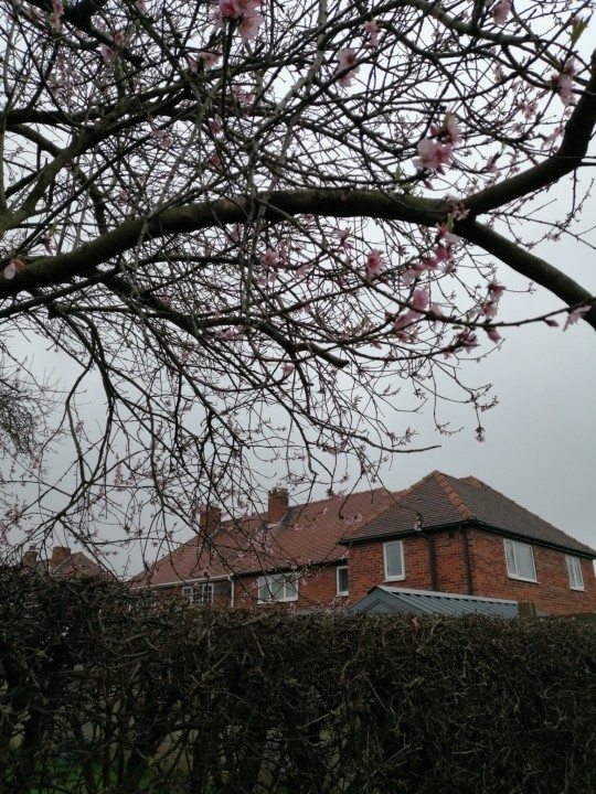
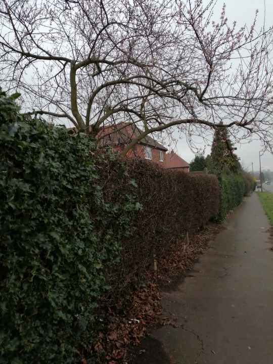
Today the sakura (cherry blossoms) trees started to blossom so I thought it would be nice to include some primary imagery of them as I have created a page and research on them. I walked round my street as they were in early bloom and took some photos. They weren't many at the time as a few only started to flower however they still had the pink colour. I was going to try to press some flowers but they were too delicate compared to other flowers. As the petals started to fall as u pick some of the tree. I waited one more week to find the full bloomed tree outside college with white cherry blossoms. It reminded me a snow with being pure. I knew that cherry blossoms came it a range of colours however I was unable to find a yellow one it was mostly pink and whites in my local areas. But they still are very beautiful. I shall include a photo and add it to my sketchbook. I hope when I finish my outfit the cherry blossoms will be still in bloom for my photoshoot but I don't think they will be in May. If I have time I shall soo if I can photo edit some of my cherry blossom photos into to my photoshoot of my final garment.
0 notes
Text
Tower research Page :
Development:
Here is my drawing development from my primary photo of the towers. In the video it shows me adding the basic structure and detail of the tower. I found it most difficult to keep it symmetrical and in proportion. As I started free hand drawing the tower I decided to use a ruler and give me a basic guide to know which part went where. I drew a line down the middle to help me mirror the tower and then I measured a set distance of each block of the tower from looking at the reference photo. I started off by drawing the to of the tower as I thought it was easier to work from top to bottom. I created the outline first to keep proportion. Before I started to add the detail, I re drew the outline giving it more shape to create a 3D effect with curving the lines to give it the effect of it being round. It did take a while to get the right shape and proportion. When I started adding the structure and detail I used a black fine liner and a ruler to make it more realistic and have a clean finish. After this I did decide to add media which I used a pink coloured pencil to match the light up tower. I used coloured pencil as I was able to shade better compared to my ink pens as I wanted a stuttle application. I tried to match the effect of the lights with lighter and duller areas. I like the result but I think I needed a darker pink to represent the photo better. But I think that I have captured the 3D effect of the round tower by the way I applied the pencil shading. I think my drawing stands well and doesn't get lost in my sketchbook. I am quite happy with pushing my presentation and layout compared to my usual style.
0 notes


Text
Rakuten Fashion Week Tokyo Shows:
youtube
youtube
youtube
youtube
youtube
0 notes
Text
Tokyo Fashion Week:
youtube
The Japan Fashion Week Organisation (from now on referred to as the "JFW Organisation") was founded in 2005 with the cooperation of textile/fashion manufacturers, fashion designers, and distributors, both upstream and downstream, with the goal of further strengthening and developing the international competitiveness of Japan's textile and fashion industries.
The JFW Organisation organises "Rakuten Fashion Week TOKYO" as the Collection Business and "Premium Textile Japan" and "JFW Japan Creation" as the Textile Business in order to disseminate information about Japan's superior textile/fashion products and services overseas and establish Tokyo as "only one of the bases for textiles and fashion in the world" and the centre of fashion trendsetting in Asia. Furthermore, in order to fulfil the above stated goals, the JFW Organisation collaborates with designers, manufacturers, and apparel retailers to organise a variety of industry-related events and seeks to establish relations with fashion-related organisations in Japan and throughout the world.
Referencing:
Rakuten. (2024). Rakuten Fashion Week Tokyo. [Online]. Rakuten Fashion Week Tokyo. Last Updated: 15 February 2024. Available at: https://rakutenfashionweektokyo.com/en/ [Accessed 15 March 2024].
0 notes