#i went through a few ideas for composition for this one. originally i was going to do his toa version with the idea that it was a vision
Note
Vakama in “Then the lizard takes another”

[ID: human!Vakama, an older man with long hair and a long braided beard, sits on a bench in front of a fire pit, elbows resting on his knees, one hand resting on the opposite wrist, gazing into the flames. The picture is rendered in browns, greens, and orange. End ID.]
I debated for a while about how to draw him but I'm happy with how he came out :) if it feels like there's less of the light greens it's because I used them in the fire effect lol
(Colour palette: "then the lizard takes another" from @color-palettes)
[Commissions open!]
#bionicle#as soon as i saw this one i knew i had to make his eyes orange#i went through a few ideas for composition for this one. originally i was going to do his toa version with the idea that it was a vision#and include the vahi. that would be orange and same with his eyes and nothing else#but i like this one. a bit simpler but it gets the point across#vakama#my art#still doing these btw!! send me a character and a palette and i will draw them bc this was FUN#human bionicle
11 notes
·
View notes
Note
i recall some kind of theory or pointing out of the fact that tsukasa's focus sets have had him getting less and less authority each time, and with the role of a minor character, it seems to have been intentional
oh i remember a lot of players on JP and KR side pointing that out when Phoenix released! and yeah I think it's definitely true
he went from king -> commoner -> jester/circus performer (for the king) -> a shadow


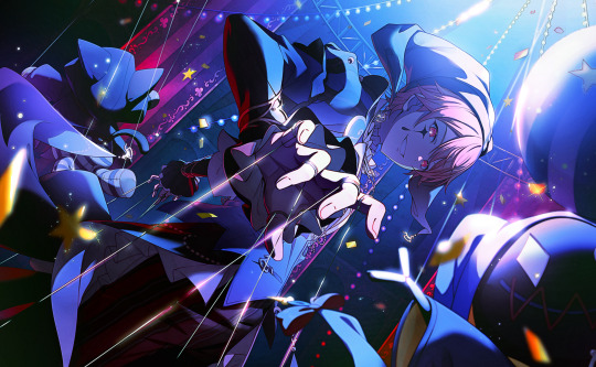
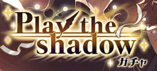
actually i have a lot of thoughts about his new card and i doubt this set will get an official blog post so i might just ramble a bit. (ftr: haven't read the event yet, sekai.best isn't updating and i surprisingly haven't really found anything from looking through JP/KR side either). specifically, i have a few thoughts about tsukasa being a shadow in this card because it's actually way more than that. oh to be a media student
first off the costume name: phantasmagoria. according to wikipedia, this was an old form of horror theatre that involved projecting scary images. (it's quite interesting actually you can read the article here). the effects in phantasmagoria productions would be done using magic lanterns, the ones you slide a disc with a picture into so it projects it onto a wall. usually, they'd use rear projection, where the lantern is placed behind the surface it's being projected on (so the surface would usually be smoke or some sort of semi-transparent screen) to keep up the illusion (rear projection is how old movies did backgrounds for reference).
now here's where the light in the card comes into play. for starters, rear projection clearly isn't being used here because he's on the stage-thingy (that will be relevant later). also instead of the light shining at him as if he were the subject being projected, it's shining down on him. while partially this was definitely done in part for composition cool points (the composition on this card is so fucking good actually it has nothing to do with symbolism but like holy shit), it's very reminiscent of a spotlight. as i said, i haven't had the chance to read the event yet but i'm assuming this will connect with him having to play a minor role (or play the shadow as the gacha says) and still putting himself in the spotlight.
i like that idea actually because if you link the fact he's standing in the spotlight that means he is still casting a shadow. it may appear to the viewer as if he's the centre of attention - he's right in the light, literally hitting all the composition marks to make him the sole focus of the card - but he's still just a shadow in a larger phantasmagoria. and actually, the spotlight sort of goes around him, he's pretty much cast in darkness despite being in the light and i love how that reflects him being part of a smaller role or "shadow". he stands in the spotlight and puts on a great show no matter if he's truly the star.
lastly: the pose. now look at this 4koma where he does a bird pose:

familiar? while in this 4koma he's meant to be imitating an eagle, i can't help but notice some striking similarities in how he's posed.
also the gacha has a feather! specifically a black one. unfortunately since there are no actual birds on the cards, nor are there feathers, I can't tell you exactly what bird he is meant to be..,
although if you wanted to really grasp at straws then his last event was called Towards the Phoenix at the Sky's Edge the play from that event was called Happy Phoenix and both the play and the lead role in it are incredibly significant to Tsukasa personally and he ended up cast as the lead role in that play and even though the lead role isn't the phoenix that bird is still significant to him in some way.
also going all the way back to the original point of his class decreasing with every set i think while yes in this set he has been reduced to nothing more than a prop, or even less so a mere shadow, but at the same time if you chose to go with that incredibly reachy phoenix idea, it's a comeback. the phoenix rises from the ashes, tsukasa can be reduced to nothing and still be the star owning the spotlight, the most powerful one in the room. hell, he's still on a stage despite everything. i think it's super neat actually that despite this being him at the lowest rank, he's actually in the place where he belongs.
i believe i've only briefly mentioned it in passing on this account before, but theatre is his life. above all else Tsukasa is an actor and the stage is where he thrives. i think it's so interesting how with each set he loses authority, but he also gets closer to being on the stage. the king is at (well, near) his castle where he leads (link to WMS), Torpe is at his piano where he performs (link to Dazzling Light), the Jester is at the circus where he performs, and then you get the one that's hardest to define as any set character. it's not a king or a pianist or jester, it's just some performer on a stage. this time there's no character, and it's not just "some performer" because this is tsukasa. it's still another role, but this time the role is, as the event synopsis states, more "real". this is tsukasa where he belongs, he never needed any sort of power or to play the role of another performer in order to shine because he himself is a performer at his core. Torpe is a performer, but Torpe is not Tsukasa. Tsukasa is Tsukasa, and Tsukasa is a performer. Something like that.
sekai.best please update
205 notes
·
View notes
Text

okay so. two things!! first of all, over the course of january (and the beginning of february) i participated in the kirby oc secret santa, which was wonderfully hosted by @/moonverc3x. i was lucky enough to be the santa for @/starflungwaddledee, and ended up with two of my best pieces so far!!
these were CHALLENGING, though. which is where the second thing comes in!! under the cut, i'll be going over some of the sketches, drafts and phases of either piece! there's also a speedpaint. exciting!!
i'll be starting with my starstruck piece! the theme here was wanderlust - literally one of the most whimsical words i know - and generally anything to do with the stars. i had a few things in mind, but considering how long it sometimes takes to make artwork, i decided to roll with what inspired me the most.
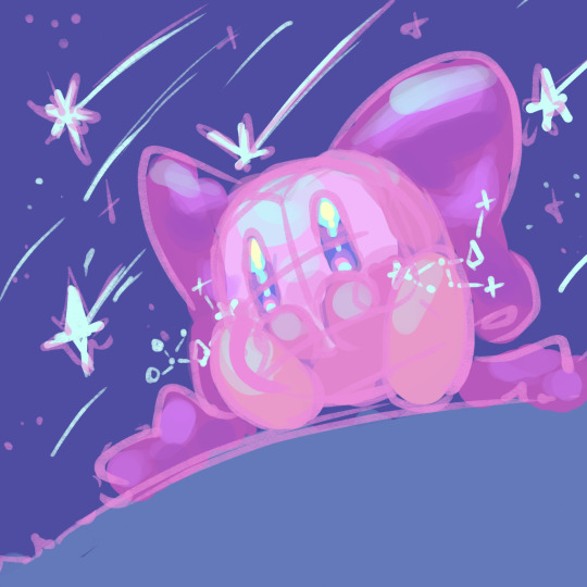
this is the final sketch compared to the final artwork. certainly one of the crazier transformations i've done. i had a mental image of most parts of the artwork, from the material of starstruck's bow to the lighting cast by the stars. everything except for the grass (i hate grass!!) i ended up rendering the grass and background first, anyway.
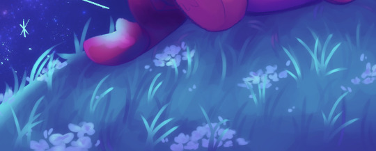
doing the background before the rest of the artwork helps define the lighting and shadows! if i decided to draw starstruck before the background, i'd have to draw it according to the lighting.
weird explanation, but in summary: background before character helps the character look like a part of the environment! character before background means extra steps need to be taken before the character fits in the environment!
starstruck's bow was also a decent challenge! i'm a fan of bows and satin, so a satin bow sounded like a good idea. it was, but i've never drawn satin before. the workaround was an active satin study! i stared at a satin bow i found on pinterest and tried to understand how light spread over the material. it's quite interesting!!
you might notice that i flipped the direction of the shooting stars. this is for composition reasons!! i wanted to make starstruck the obvious focus, and while the contrast between her warmer palette and the background's cooler palette easily achieve that, i wanted to cement it. i also added little hand drawn sparklies everywhere. because i like it.

of course, i have to talk about the eyes!! if anything, i noticed that in all of starflung's drawings of starstruck, she had really glittery eyes. literally adorable. so i made it my mission to capture her feelings in her eyes!! i had a lot of fun making them super shiny and adding little stars in there. i also needed to pay attention to the subtle gradient, though - they fade from blue to pink if you zoom into starflung's artworks - and decided to keep it vibrant.

okay. thats all for this one!! i'd like to mention that in the original sketch for this specific pose, bandee was in the background. i really regret scrapping that now. oh, well!
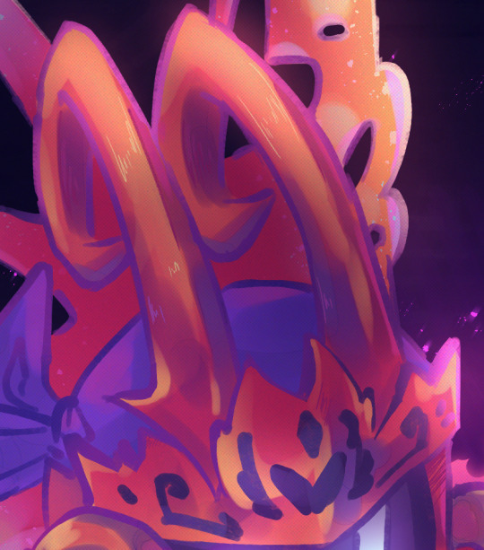
time for morpho dee! i'll be starting for with the speedpaint for this one, mainly because it sort of explains some of the process by itself.
i restarted the shading... three or four times at least? so yeah. i was losing it on this piece. i'll be completely honest, i contemplated dropping it for the sake of meeting the deadline. it wasn't stressing me out, but i had studies to worry about too, and i was worried that it wouldn't be of great quality? but after some advice from my beloved older sister, i managed to turn the tide!!
this is a first for me, but everything here was a challenge. if you scroll through my account and the few artworks i've posted, you'll notice that i draw gijinkas far more than orbs. now, you may be wondering why this didn't pose so much of an issue for my starstruck piece! it's mainly because i chose a far simpler pose for her than i did for morpho over here.
for morpho, the artwork needed to be dramatic. i draw cutesy things - while i've always wanted to draw something dramatic, i've never pushed myself to do it. until this artwork! i went for a dynamic pose which would (hopefully) pull the viewer's eye towards morpho dee. that's what's up with the foreshortned spear! i also realised that the plcement of his feet would be quite significant to the artwork. you might not know this, but feet are my greatest enemy. i'm still trying to figure out how best to draw them for people or orbs, but i'm getting there.
after 'lineart' (which really ended up being a cleaned sketch - this was supposed to be linelessly rendered, but i gave up on that) the pose was no longer a problem. because the shading was! hooray!!
nothing has quite bewildered me like metal shading has. i've shaded gold. satin. cotton, fluffy scarves, shiny things, grass. yet metal shading continues to elude me! this was, hands down, the most difficult part of this artwork. i struggled to make sense of how the lighting was supposed to work, even with references. and every time i thought it made sense, i ended up with something i didn't like the look of. the solution? long breaks, more references and pinterest tutorials. i have no clue how i managed this, but we got here anyways. i finished it off by colouring the lineart according to the shading.
i have experience with drawing fire, at least! it was three or four years ago in an old artwork, but i have experience! i simply had to figure out how to work it into the atmosphere. for the glow, i duplicated the layer, gaussian blurred it and used a slight glow layer! i did something similar for the durst particles, but i used motion blur instead.

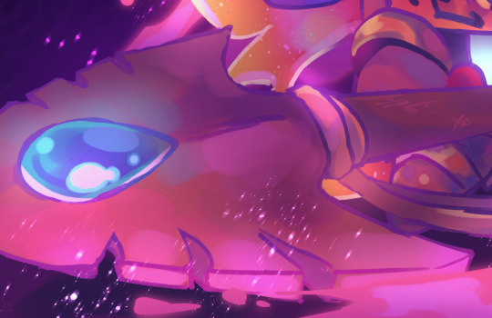
i also want to talk about the spear a little bit. you might notice that i added a bit of ambient glow around the blue gem. that was with the light intensity in mind, but also for a sense of realism! i also had to keep the pink light in mind, though. so i ended up using an airbrush to create a base for the lighting and i continued from there. i added a few scratches on the handle just to give it a bit more life, too.
and, finally, a one-to-one comparison between the sketch and the final! i have literally no idea how i pulled either of these pieces off, but i'm quite proud of them.
i recommend you drop by @/kirbyoc-secretsanta for other artworks! a total of 75 artists participated, so there are plenty of super cool ocs to adore over there and new artists to find!! this was my first secret santa experience, and @/moonverc3x made an amazing host (thank you for hosting, by the way!!) bye bye!!
#kirby#digital art#starstruck dee#morpho dee#sorry to everyone who thought this was short. and sorry to everyone who reblogs this#it really wasn't supposed to be so long but i had a lot to talk about#i'm pretty sure i've covered everything though#but these were a thrill to make!!#i've always wanted to make fanart for starflung because her characters are so cool and unique#so i was hoping to get her in the santa and. somehow i did#yeah i screamed when that happened. heehee#but!! i'll probably try to participate in more events like this!! this was super fun!!#i literally cannot thank moon enough for being such a great host#i'm generally a nervous person when it comes to talking online but moon was quite warm and sociable!!#this was an exciting first time for me!!#glitter in my ink
22 notes
·
View notes
Text

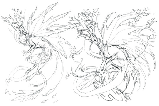
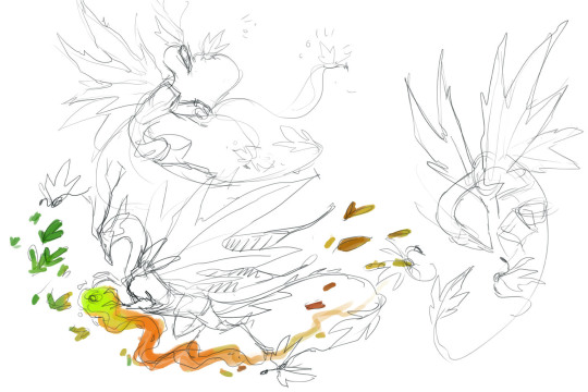
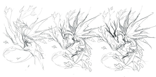
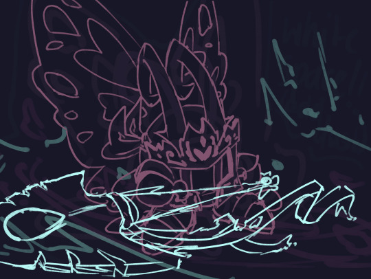
Thinking about leafy dragons again, and how tree based dragons fit into the garden drake world.
Still working on it, but I think that the tree drakes would have a few different life stages, going from seed/fruit drakes, to leaf drakes (like this one) to big tree dragon. Very few would make it to full tree, it probably needs specific conditions to be met. Maybe they have extra magic. But just imagine flurries of leafy dragons riding the breeze. They be FAST.
Went through a few different ideas, namely I'd originally wanted some sort of magicy autumny-turning leaves majestic thing, but had trouble finding something that felt right.
Still working on it, but may end up finishing the top one, it isn't the most exiting or imaginative pose//composition, but I like how it helps the shapes of the leaves and the really interesting thing may be the greens/browns and textures and edges. Might adjust the angles of the head/neck a bit, think needs to be lower or pulled away from the edge of the leaves a bit.
I still have no idea what the trees near work are, they look identical but some have five pointed leaves and some only have three-four. But this guy is based on those.
142 notes
·
View notes
Text
FFIII Fun Facts of the Whatever: Dev Interview Edition (Part 2)
When the DS version of the Final Fantasy III remake was released in Japan, Square-Enix released an official strategy guide to go with it. This strategy guide went into quite a lot of detail about the game, giving tips on how to use jobs, showing off unusual team compositions and even discussing some mechanics that may not be clear in the game itself.
I’ll talk about that stuff later, but the most interesting aspect is an interview with the game staff at the back of the manual, touching upon various aspects of the game.
Thanks to Alex Highsmith of Shmupulations, part of this interview has been translated. I only had enough for an excerpt, but this excerpt is very interesting: In it, Kazuhiko Aoki (Battle Supervisor) and Hiroaki Yabuta (Main Planner) discuss the battle system for III, several of the jobs, a few ideas that didn’t make it into the final game and a rather surprising fact: A PVP mode was considered.
--Please tell us about your overall concept for the battle system of FF3DS.
Aoki: The thing we were always aiming for, throughout the development, was making sure that the battle system would be easy to pick up and enjoy, even if you knew nothing about it or hadn't played the Famicom version. That's why we decided to change some of the finer details from the original. It should still give players that overall "Ah, it's FFIII" feeling, though. I hope older players will enjoy comparing their old memories of how the game progressed, which jobs were good, and so forth with the new game.
Yabuta: For me, I didn't want this to be one of those RPGs where you just spam Fight and breeze your way through it. That's why we changed many enemies' attributes and attacks. During the development, we actually made the enemies TOO strong, and after a single normal battle your party would be practically dead. (laughs)
Aoki: There's no thrill to the battles if you're just mindlessly pressing the A button the whole time. We instead wanted a system that forced characters to make tense choices, one where your characters could easily die if you aren't paying attention.
--It sounds like balancing that system was a big challenge. Compared to the Famicom, there's fewer monsters in each battle... was this also part of that balancing?
Yabuta: When you go 3D, the battles always get a little bit longer. We calculated how often we wanted players in a given dungeon to get close to death, and adjusted the number of enemies, their strength, and the encounter rate accordingly.
Aoki: Speaking of balancing, Aoki kept adjusting the strength of the final form of the Cloud of Darkness all the way to the very end of the development, moments before the deadline.
--Now I'd like to ask you about the job system. Let's start with Suppin [Freelancer].
Yabuta: Since we've added personalities for the four characters, it felt odd to suddenly start the game and see that everyone already had the "Onion Knight" class. So we brainstormed some new names, but it was surprising how quickly everyone settled on "suppin." (laughs) Suppin first appeared in FFV, as the most powerful class that could equip anything, but we've made them a little weaker for FFIII. With everyone in their basic default state like this, players would be able to better enjoy the prologue... that was our concept.
--Did you know from the beginning that you would split the Onion Knight and Suppin in this way?
Yabuta: We had planned to add some special bonus features as apart of the new Wi-Fi functions. At that point we already had separate designs for Suppin and Onion Knight drawn up, so we decided to make the Onion Knight a hidden job, something you'd have to dig a little past the surface to find. Rather than a brand new job, we thought it might make players happier to add the most popular job from the original FF3 as a hidden job.
--You acquire the Thief job earlier now too, and with their attack power and Steal command upgraded, they're a lot more usable.
Suzuki: There weren't many monsters in the Famicom version you could steal from (or items to steal), and we thought players who are used to modern games wouldn't be comfortable with that. So we gave players the Thief earlier and added more items so players could enjoy using Steal more. Also, the number of attacks you get in FF3DS is based on the weight of your equipment, not your speed stat, so you get to take more actions if you wear light equipment. The Thief excels on both these points so he can play a much more active role in battle.
--In contrast, you get the Karate-ka [Black Belt] later now.
Yabuta: The biggest reason for that was to maintain the balance of the number of jobs you get. The water crystal has a lot of fighter-type jobs. But strategically we couldn't afford to hold back the Dark Knight and Dragoon classes. So it was like, who can we put later... and that was Black Belt. My apologies to fans of this class from the Famicom version.
--The Ranger could use white magic in the original, but you've replaced that with Barrage.
Yabuta: Barrage didn't appear until FFV, but it's now one of the Final Fantasy serie's most well-known, signature abilities. Attacking four times feels great--and my personal love for that ability was a part of it too. (laughs) As for the white magic, we were worried that if there were too many jobs that could use magic, it would make the Ranger's role kind of confusing. We wanted him to be focused on fighting.
--How about the Sage?
Suzuki: Compared to the original we lowered their power a lot, so much so that I was wondering if it's OK. Our image for them was a balance between the Devout, Magus, and Evoker jobs.
--Next, I wanted to ask about the Scholar.
Suzuki: The Scholar works very well with the Thief. The Scholar can use the items the Thief steals 2x as effectively, while being able to discern enemy weakpoints too. He uses healing items like Hi-Potions twice as effectively too, so if you have a Scholar you don't necessarily need a White Mage. That versatility made him very popular with our staff, too.
Yabuta: The problem is whether players will realize these things. We definitely don't advertise the 2x item effectiveness very much in game. But I think once players notice it they will think the Scholar is awesome.
--Next up is the Viking, who I feel has been hugely improved from the original.
Suzuki: In the Famicom version, the Viking was one of those jobs that didn't really stand out. Since they don't get a lot of hits--or rather, they are a low speed character--we decided to compensate for that by making the Viking focused on single, one-shot power attacks. And the biggest change, of course, was adding the Provoke command. If you make use of that, the battles become quite easy.
Yabuta: It's easy for players to get into a habit of just spamming Fight for every battle, so Provoke adds a nice accent to that. It was a great addition for that reason, I think.
--It gives you more of a chance to combo attacks with your allies.
Aoki: Yeah. In the Famicom version he was more of a solo fighter, but this we're hoping players will think of the various combinations they could pull off with the Viking and other characters.
--Moving on, I wanted to ask about Yabuta's favorite job, the Evoker.
Yabuta: This job gave us a lot of trouble. At first, we considered letting the player choose the summoning effect (black or white), but ultimately we reverted to the original way of having it be completely random. We're hoping players will actually enjoy the slight unexpectedness of it.
Shiva, Ramuh, Titan, and Ifrit are about equal strength, and if you can figure out the right one for the right circumstance, then Evoker can be very strong. On bosses, Titan might be best for the consistent damage, while for normal enemies, Shiva is a good choice for the sleep or magic damage... if players realize those distinctions I think they'll have a lot of fun with it.
--Like the abandoned "at-will" Evoker ability you just mentioned, were there any other abilities you dropped during the development?
Yabuta: There were tons. (laughs) There was an ability called "tsuresari jump" [abduction jump] for the Dragoon.
--What was that like?
Yabuta: The Dragoon would grab the enemy, take them into the air with them, and then slam them down on the ground. Another idea we had, actually, was to have PvP battles using the Wi-Fi connection. And for awhile we had a number of abilities related to that feature, but ultimately we felt uncomfortable about it. "Should Luneth and his friends really be fighting and hitting each other...?" So unfortunately, we decided to put that off for another game in the future.
Thanks once again to Alex Highsmith for translating this. Shmupulations is a site that hosts translated video game interviews from various sources, including several Final Fantasy games, such as VI and Tactics.
#Final Fantasy#Final Fantasy III#FF3#FFIII#Unused#Interview#Onion Knight#Freelancer#Thief#Black Belt#Ranger#Sage#Scholar#Viking#Evoker#Game Design
14 notes
·
View notes
Note
I have several questions about your BG3 ocs! They seem interesting!
How does Renton Hillmane, Micheal Thornbrooke, Markus Bluebrook, and Ilvon Leafgrace look like?
Any fun facts about all of them?
Likes & dislikes?
Hobbies/Interests?
Hidden depths? Thanks! - Fluff anon
Note: You best believe I made the most excited screech when I saw this in my inbox!!
I'll go through each question in turn, with each character you've asked for, fluff anon! Some of them I do have actual in-game pictures of, others I've only got from the character creator, as I'm running out of space for runs!
I'll try not to go on too much about each of them... I could yap for hours to be honest
Renton Hillmane
Renton is a human in his early twenties, and has never left the farm that has been in his family for 4 generations. Due to the physical labour involved with farm work, he's very strong (with a stat of 16 STR in game, one lower than Karlach's STR) and also not that charismatic until much later in the adventure- the exact opposite of the typical bard. He plays the ocarina, and this was the only instrument he knew before going on the road (his abilities were later expanded, through means I may explain later and will be explored in depth in the fic!)
He's a fan of food!! He loves to eat - and try new food! He especially likes homemade food - bread, cakes and the like are a particular favourite!
He doesn't like crowds, though. They amaze him for a while, especially from a distance, but being in them makes him incredibly nervous and jumpy; he's never really been around masses of people before.
Renton loves spending time with animals - especially Scratch! At times it's hard to separate the pair of them. Scratch reminds him of home, and gives him some much needed furry company. When it comes to more magical creatures (Such as the Owlbear cub, and Tara the Tressym), he's a lot more wary, but quickly warms to them.
To begin with, Renton is very naive, but he's fairly quick to learn not all is as it seems in the big wide world. That being said, he's still susceptible to some tricks. The adventure is also the first time Renton has ever questioned his sexual preferences and identity, having never needed to confront the idea before!
Micheal Thornbrooke
Micheal is a 48 year old half-elf, who took an Oath of Devotion and went on the road at 17. He originally hails from Rivington, just outside Baldur's Gate, from a small compound-like community, full of elves, half elves, humans, and a few Dragonborn. He is the oldest of 4, having three younger brothers, one of which he never really got to meet.
He loves to walk! Whilst he's not a druid, he loves to walk through nature, or anywhere really. Seeing the world up close brings him a lot of joy - and thankfully he's had a lot of it due to his lifestyle. He also loves spending quality time with everyone around the campfire, sharing stories about everyone's adventures - like Karlach's time in Avernus, Wyll's time along the Sword Coast, and Gale's endeavours before the Netherese Orb.
Micheal isn't as fond of fighting as one may be led to believe; yes he has been in many battles, and yes he will talk about them if you ask, but he never brags and he never gloats. He dislikes war and will only fall on physical confrontation if there is no other option, or if someone is in danger.
He writes music about those he cares about - though most of these compositions never see the light of day, or the eyes of an orchestra. They're mainly a little pass-time for him, to keep him occupied on the odd day where he's taking a rest. He also likes birdwatching and star gazing.
The reason for Micheal's Oath is twofold: one, he saw an abundance of injustices as a youth in Rivington, and felt compelled to help put them right, and also the fact that his father and elders were bondservants in times gone by, giving Renton a deep-rooted feeling for justice, for everyone.
Markus Bluebrook

Markus is a Wood-elf druid, at 137 years old - He resides in Moonrise, and has done for quite some time. He is close friends with Ilvon, and was forced to take shelter in the Last Light Inn when the Shadow Curse overran the land. This has made him incredibly bitter, as he hasn't been able to do anything to save his home. His favourite wildshape form is a boar - though he's also rather fond of a stag, if he needs to move quieter.
Before the shadowcurse Markus travelled with Jaheira, Ilvon and Laenna for a time, being under Laenna's care after a personal family tragedy which he rarely speaks about. He, Ilvon and Laenna settled in Moonrise after that particular adventure, spending time with the locals - and Ilvon and Markus in particular teaching them about the land.
One of his favourite hobbies was weaving - he used to make the thread out of fibres himself, and would weave beautiful tapestries; though he had to stop after being cooped in Last Light, due to running out of thread.
His mood significantly improves if the Shadowcurse is lifted; but if not, he doesn't sit and mope, like Halsin does, he loses his temper big time. He blames Halsin for letting this fate befall his beloved home, he blames you for not doing more though you promised to help, and he will likely attack you also. The sight of his home being overtaken by an impenetrable darkness that kills all within has done a number on him - particularly the fact that he knows that most of his friends are likely dead.
Ilvon Leafgrace
Ilvon is a little older than Markus, at 209, but this Wood-elf is still close to his friend. Ilvon makes sure to make strong bonds with whomever he feels would make a good friend, and is actually quite sociable, although soft-spoken. His favourite wildshape form is an owl, but like Halsin he can get comfortable as a bear too. He's also been known to wildshape into a wolf!
He loves books - all kinds! He harbours a particular fondness for romance novels; particularly the spicier variety. He also absolutely loves trees. Not in a weird way, or anything, there's just something about them that piques his curiosity, but he can never quite explain what it is. He also likes to decorate people's hair!
His favourite thing to do is read by the river side, the gentle waves of the current soothing his mind as he indulges himself in a good novel.
Like Micheal, he's not a fan of violence - he's much more mellow than his friend, Markus - but when push comes to shove, he will do what he must.
Ilvon deeply, deeply misses the way Moonrise was, before the shadowcurse. He doesn't speak about it much because it pains him, but he thinks about it every moment there is a lull in activity; his mind just wanders there, to the time before, when man and nature were in near harmony in this small place, even if only for a moment. He hopes, that with Silvanus' blessing, some miracle will help them rid the land of the blight that has tainted his home.
Bonus, the message I sent to my best friend when I saw this ask in my inbox:

#requests open#bg3 fanfiction#bg3 x reader#fluff#baldurs gate 3#baldurs gate character#baldurs gate tav#original character#original character headcanons#original character x reader#renton hillmane#Micheal Thornbrooke#Ilvon Leafgrace#Markus Bluebrook#baldur's gate 3#headcanons#pavy talks#I have never written so quickly#i have never been happier#my hand is cramping
4 notes
·
View notes
Text
Devlog: The Music of Omega Timeline: Poppy's Story (... And Poppy Buys Milk)
Howdy folks! It’s me, Fms. On today’s special occasion, I wanted to take a moment to talk about the process for the soundtracks of Poppy Buys Milk, and thusly, Omega Timeline: Poppy’s Story in general.
As most of you know, I've done a concerted effort to produce a original soundtrack for Poppy's Story on my own. It wasn't generally a requirement- most of the story is told through comics and non-audio asks, but I generally wanted to give the AU its own flair— and mostly as a excuse to do the "Music Videos" showcasing several of the Areas in the Omega Timeline (which I want to get back to doing, those were really fun).
But when videos, and notably, the game, became a consistent thing I do for Poppy's Story, it was evident I couldn't just use Undertale and Deltarune's soundtrack, they simply didn't fit the situations depicted.
Though that said, while there is no shortage of callbacks and utilization of Undertale and Deltarune leitmotifs in the sountrack (Such as Snowdin/Dating Start, Reunited, Hometown, Once Upon a Time, and the handful of iterations of Uwa,) the soundtrack for this AU is mainly built on a handful of foundational motifs to represent the Omega Timeline itself, and to represent characters (such as Poppy herself).
For instance, here is Omega Timeline’s A, B, and C motifs, laid bare for you to listen.
You'll notice that these leitmotifs are repeated across a lot of the songs for both acts of Poppy's Story. And indeed, for this game, I brought myself to make a lot of new arrangements for a lot of the buildings and events in the game.
Below is a small sample of what I've accomplished in the last year and a half of development:
What do you think?
There are some songs I've had to update for this game overtime, such as Timeline Plaza's theme.
Now, the timeline plaza IS a really good track on its own; one of the most popular songs in the Act 1 soundtrack, even. But for the game, it didn't quite fit the vision I had for the Timeline Plaza in game (not to mention, you spend a lot of time in the timeline plaza, and the song didn't feel varied enough to carry the time spent).
However, the timeline plaza went through quite a few re-iterations before reaching the version I am content with.
Below are some samples:
Originally, the idea was to have the Timeline Plaza's theme build up as Poppy completed missions. However, I felt this song was a bit too punchy and grating overtime.
You may remember this song, as I showcased it's first phase earlier this year. Regardless... Continuing with the whole "Building Up as it Goes" idea, the plan is that Core Frisk's motif plays where you hear Poppy's up until the "4th" version of the song, showing Poppy's hand in helping everyone.
This song in general is pretty good, actually. I just felt this song didn't quite fit the mood I was going for.
There are also some character specific themes/rearrangements sprinkled here and there, but you'll have to wait to see what those are.
Overall, it's very fun composing tracks for the AU. It just takes a good bit to figure out what to go with. I'd also like to thank @xxtha-blog for helping out with overseeing most of the mixing and composition of the songs in the game.
And if you'd like to listen to the ACT 1 and ACT 2 soundtracks, be sure to check out the official playlist.
— Fms, Lead Director
38 notes
·
View notes
Text
We're On Tumblr!
Hey there :D You've probably never heard of us, but if you could spare a few minutes to read about the Suburban Dream project, see if you could be interested in it, we'd appreciate it a ton.
Suburban Dream is a small, two-person created comic book project. Our names are Milo (the one currently writing, she/her) and Sam (He/they). We've been working on this project for a few months, and we decided that it might be a good idea to post about it on another site than Wattpad (our current home site), and we figured that Tumblr was the easiest to go for.
Firstly, some background: Suburban Dream was originally thought up around the end of 2021 as video game idea by myself, but I quickly realized just how large and impossible the game would be in the scale that I envisionned and would just not be easy on my current coding skill level. So, I scrapped it, but kept it in the back of my mind as an eventual story ideas. But, during the beginning of 2022, me and Sam wanted to start a new project that would combine our writing and drawing skills, and we came up with making a comic. Long story short, we went through multiple ideas until landing on this, and production started.
Now, onto the really interesting stuff, aka the plot (kept loose so as to not spoil anything for you all) of Suburban Dream. Set in 1985 in the small suburban town of Orelwell, Okhlahoma, a small town with little modern technology, a peaceful community where the gravest crime reported is light shoplifting.
A series of disappearances leave the rangers clueless. Paula Saunders, a 16 year old citizen of Orelwell, has a choice to make: investigate or leave the situation to the authorities.
We'd like to also warn you all: as the both of us are still minors and have recently entered the french equivalent of high school, meaning more work than ever before, updates might be slow. We are doing our best to keep the quality/quantity ratio balanced, but we just wanted to warn you of the fact that if it ever comes up, we will prioritize our own well-being and happiness towards this project over anything. So, updates will be slow.
Finally, there are two versions of the comic: a book one and a comic one. Currently, only the book one has a prologue, but the comic will be worked on alongside it. Keep in mind the comic will take a decent amount of time to make as the work that goes into it includes panneling, composition and drawing the poses, as well as various other parts I'm not exactly qualified to talk about.
Anyways, this account will be for more extra bits (designs, behind the scenes, announcements, etc…) as well as official updates. Ask as many questions as you want, share it with friends, draw fanart, we'd love to interact with all of you :D And, with that, have a good day/night, hydrate yourselves and take care of yourselves <3!
2 notes
·
View notes
Note
i've seen you mention black 1010 before and i'm super curious, did you ever plan out a personality or lore for him? what was his relationship with white like? your little "family tree" doodle said he went rogue in desynchronized, does he play some sort of role in the au? do he and kerinting/e.g. ever meet? what sort of dynamic do they have if so?
i'm super sorry if this is coming off as annoying, i'm just really interested in your 1010 stuff! as someone with my own black 1010 oc, i'm always super invested in other black 1010s. have a nice day <3
Thanks so much! I'm always happy to hear when people like the nonsense that I babble about out here~
And it's all good, I love to talk about this kinda stuff, but sadly my Black 1010 is severely underdeveloped. More than anything, he was always just a plot device and I never gave him a solid personality.
The original idea was that he was the first 1010 to be retired because Black & White were too similar to justify keeping both when Red and Blue were conceptualized for the group. Of course, there were minor differences: White was supposed to be the more openly flirtatious and playful one while Black was supposed to be more gentlemanly and mature, but they weren't distinct enough for that to be clear to the fans.
What little could be separated from Black was added to the current White, so internally this White is referred to as "Gray."
At first, this didn't really bother him since his ability to process complex thought was more limited at the time, but as he's evolved through the years, his composite personality and memories started to resent the fact that he wasn't "allowed" to keep existing as 2 different people.
After desynchronizing, this resentment, on top of all the other stressors in his life, is why he developed such an ugly personality and became abusive towards Green who he saw as being "allowed" to exist despite Green's constant "failures".
At the time of developing the family tree (which may or may not be canon now, I haven't looked at it in a while XP), the idea was that after being retired, Black actually managed to escape Barracca and is the first "lost" 1010, and he's been living in the shadows of Vinyl City ever since. What exactly he was doing was never set in stone.
In some iterations, he was the ringleader of all rogue robots and he dedicated himself to making sure the rogues were able to take care of themselves, so he usually went around collecting spare parts and doing free repairs to the ones in need. In this iteration, Kerinting being a "spoiled rich kid" was a prominent part of his character arc, so Black was going to teach him about how the more unfortunate in Vinyl City have to live and the stark differences between the luxuries he had back home and what it really means to fight for survival. So he would have become the real mentor figure that Kerinting has been missing for most of his life.
In other iterations, Black was the mysterious champion of an illegal robot fight club. This was where Kerinting was going to meet him for the first time after he accidentally got dragged into the club while he was looking for work to pay off his debts to Kliff. Kerinting made it to the final round due to being one of the few actual combat droids in the ring, but when he faced off against Black, neither of them could hurt one another because they still recognized each other as 1010s, and 1010s cannot harm each other (normally). Usually Kliff would have stepped in to drag Kerinting out of there by threatening to report the fight club if they didn't release him, but there are also versions where they're able to communicate wirelessly, so Kerinting takes the loss since he wasn't really interested in staying in the fight club.
In almost all versions, Black would have defended Kerinting from an attacking White who was tasked with bringing him home for termination after it was discovered that Kerinting didn't actually self-destruct. In some versions, Black actually "killed" White to keep Kerinting safe (White would have just "respawned" at the mansion, but was clearly shaken due to encountering Black), in others Black simply tells him to go home to which White obeys because his system got so confused by Black still being alive that he starts malfunctioning. In either route, Black would have helped to repair Kerinting who'd already been heavily damaged by White before he'd intervened.
In a very recent rewrite for the new DSYNC continuity, I had considered rewriting Black to actually become the current Red to help justify why Red is closer to White even though Blue is Red's designated partner. I dunno if I'm going to keep this change, but otherwise I haven't really thought of anything for Black to do in DSYNC now that I'm trying to move away from those kinds of dark themes/moments.
So yeah, Black was very important to a few key scenes in Desynchronized, but he unfortunately just isn't a developed character in his own right. I'm sorry if that's disappointing UmU.
5 notes
·
View notes
Text
ATKA Shares Dynamic New Single “Lenny”

Atka, the London-based German musician, songwriter, and producer has shared “Lenny,” a new single off of her forthcoming debut EP, The Eye Against The Ashen Sky, out November 3. Of the song, Atka notes "This is a song about how one man's tunnel-visioned obsession with finding meaning turns everything around him into a swamp of meaninglessness that also sucks in everyone around him. It’s witnessing empty repetition right in front of your eyes and the helplessness and all-limbs-dropping-to-the-floor exhaustion felt as a result, when caring for someone who is depressed. And ultimately it’s about the absence of being perceived by that person and one’s drift into a ghost-like state. When no one is watching or sees me - do I even exist? Lenny is about “reverse-paranoia” if you want it."
“Lenny” follows her previously released single “Desiring Machines,” which FLOOD Magazine described saying, "Penned while working on her master thesis last summer, the track plays out like a gently building Florence + the Machine ballad crafted by the heartland-rock and post-punk proclivities of Gang of Youths.” Atwood Magazine went on to say “utterly breathtaking…shiver-inducing.”
The artist, whose real name is Sarah Neumann, wrote her debut EP The Eye Against The Ashen Sky last year in London parallel to completing her master's degree in philosophy, in which she intensively studied the French philosopher, Jean-Paul Sartre's, theory of the gaze.
Although Atka has been writing, producing and recording her own music for years, she has so far remained in the background of the music industry. Growing up in a tiny village in Germany, she moved to the beaches of the Gold Coast in Australia at the age of 15 and later to the snowy mountains in Squamish, Canada, before finding a home in London.
Initially pursuing a career in sustainability research and politics, Atka quickly became disillusioned by the bureaucracy of the political system and instead considered going into filmmaking. A few self-directed short films, runner- and costume assistant jobs later, she however returned to music as a journalist for Rolling Stone, Groove and Musikexpress and others. With her own sound however, she has only been tinkering in private – whether on her walks through St. James Park to procrastinate writing her master’s thesis, on the tube on the way to Soho or in her improvised home studio in East London. Atka comes up with ideas mostly when she is on the move. Incorporating that constant movement into her music, she wants her songs to create a cinematic feel – or how she describes it: to be “journey-esque.” A versatile musician who cites Joy Division and Kraftwerk as her most formative influences, she wrote her first song at the age of ten and later gained the attention of big names in the music scene for her poetic lyrics and unique flair for music production and composition.
On the EP, the musician now processes this academic debate through storytelling in a close, tangible manner. Here, intellectual interests and personal experiences blur into an autobiographical work about shame and paranoia. Track after track, The Eye Against The Ashen Sky meanders deeper and deeper through various manifestations of these emotional worlds to their origin in the overwhelming gaze of the Other. The tracks were produced primarily with modular and analogue synthesizers and guitars in the South-London home studio of Jung Kim, the lead guitarist of the band Gang of Youths and Stephen Sedgwick, the trusted mixer/sound engineer of the Gorillaz, Damon Albarn and Blur mixed the record.
Read the full article
0 notes
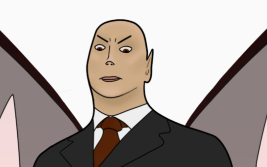
Text
Final Poster
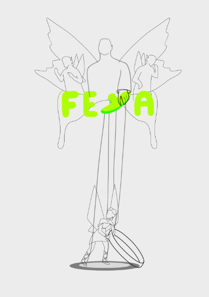
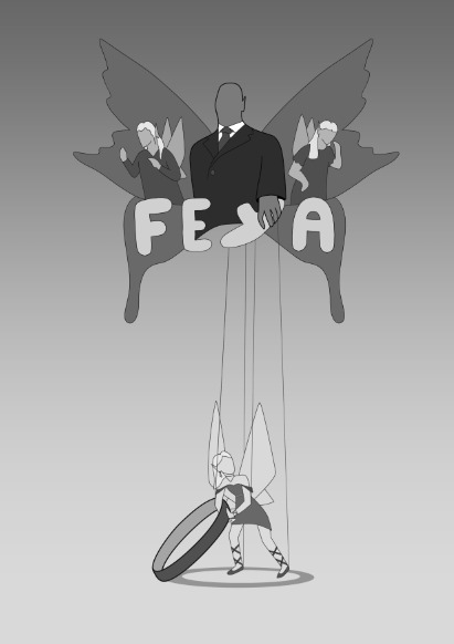
After receiving class feedback I knew I wanted to continue developing my second concept but knew there were many things I wanted to change.
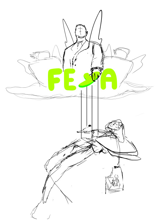
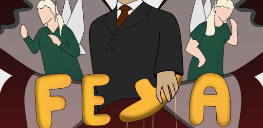
I wanted to make the presence of the mob-father feel more ominous and looming, and I wanted to include the siblings in some way. While trying to pick the direction I wanted to take this poster, I took inspiration from the Godfather movie posters with the hand holding the puppet strings. I thought it would make for an interesting composition to have the mob-father holding the puppet strings but the strings are coming off the Y in her name.
Below are the three concepts I came up with using the puppet strings as my starting point.
The first idea has her being hoisted up by the strings while she clutches a family portrait. In the family picture it would be them all when they were much younger with the father having been torn from the picture.
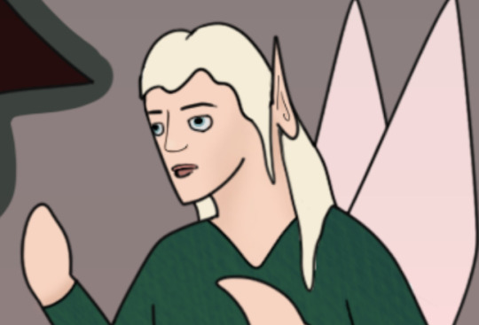
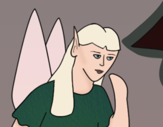
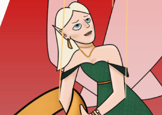
The second concept has her stealing rings while being attached to the strings. In both the first and second concept the siblings are up above next to the fairy mob-father.
The third concept has Feya sitting on a pile of stolen goods looking down at her siblings playing at the bottom. Above is the mob-father looking down on them alone.

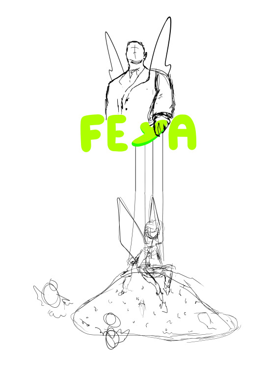
I felt like the middle concept had the strongest composition but I still wasn't happy with the characters pose. I was given advice that the rings on the table felt like a separate element and I should try have her interact with them more.
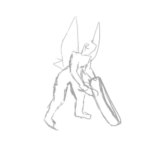
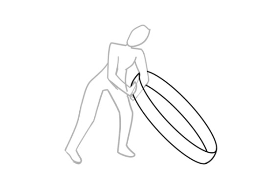
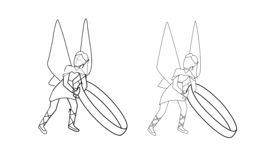
Taking the idea of her interacting with the rings I sketched out the following concepts:
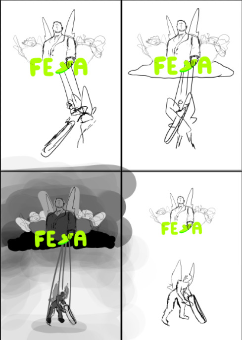
I felt like the bottom pose made the most sense and went through and mapped out some values to help me visualize the final poster.
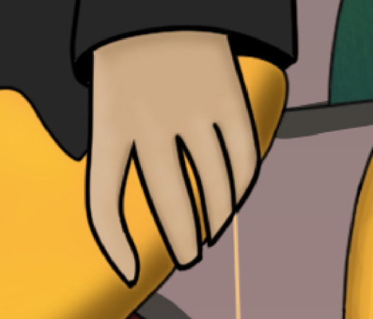
Moving onto constructing my final image, the first section I wanted to get right was the mob-father holding the Y because this was one of my main elements of the poster.


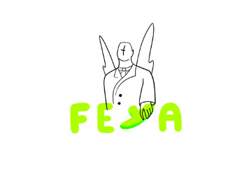
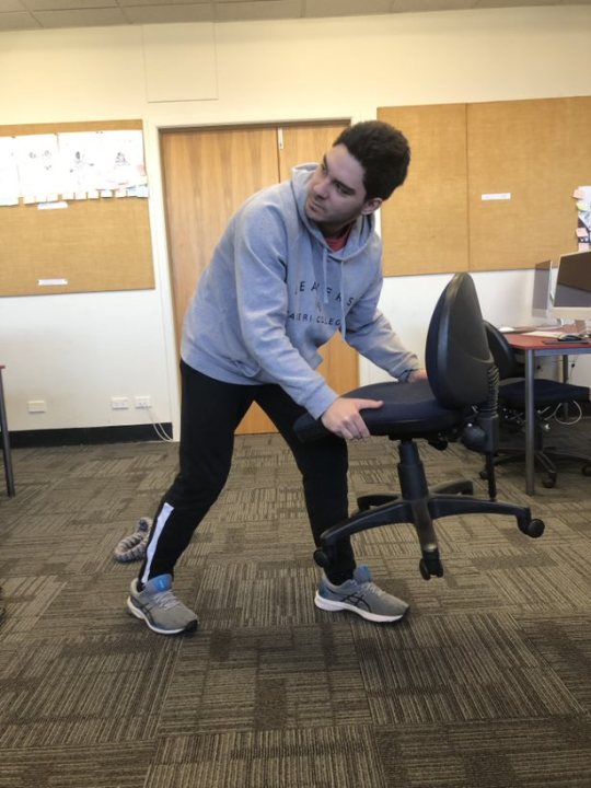
I got my flatmate to take a photo of my hands as I made a Y shape with one and grabbed it with the other. This allowed me to visualize how his hands needed to look. I also used this reference image of a man in a suit looking down to know how his body would look.
I then grabbed a reference image of a child from online to get the correct proportions, and then used my own arms for the poses. Because the siblings are twins I used the same child for both drawings, flipping the reference for the left side.

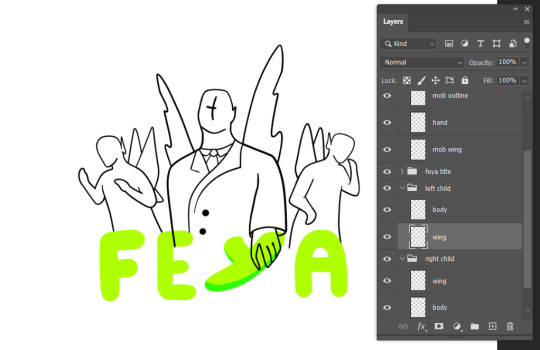
The next element I wanted to flesh out was Feya down the bottom. This was where I really started to struggle. I used a picture of Tom as my reference, but this ultimately ended up working against me as I was using a male human as a reference for a female fairy.
I tried a few different goes at sketching and outlining her but every attempt felt wrong. I was using Tom's proportions when I had originally designed Feya to have very long, slender limbs so she had lost her dainty nature.
After a lot of frustration I finally did what I should have done in the beginning and loaded a copy of my refined default pose into my document. This allowed me to see her exact proportions and I was able to more accurately draw her in this new pose.
Once I had her proportions right I was able to see that her line weight was also too bold, and this was throwing me off. One I had the initial outline I dropped the opacity and redrew her at a thinner line weight.
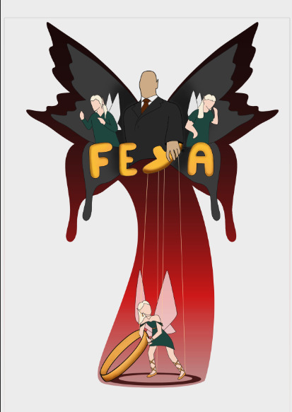
I decided to keep the ring at this heavier line weight as it helped add visual weight to the ring. The rings scale tells us that it's bigger then Feya, but by having this bolder line it looks like she is really struggling to hold it up.
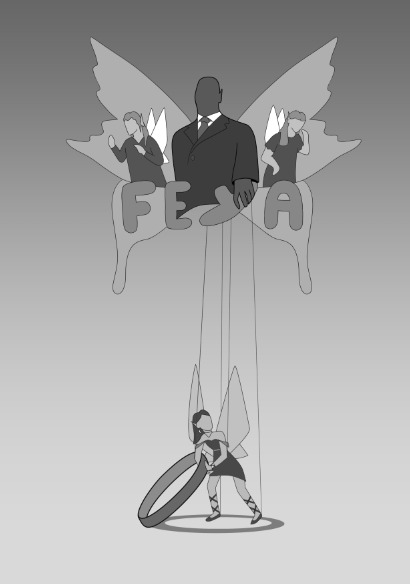
After seeing how much better Feya looked in this lighter line weight, I decided I needed to go over the twins as well. This was when I really started to feel more confident with my poster again. I chose to keep the mob-father at a heavier weight (although I did re outline him in the next weight down eventually), and also chose to experiment with making his wings look more battered and torn.

I didn't get many screenshots throughout this part as I was feeling very under the pump so was just trying to push forward but I played around with a few different wing shapes until I settled on a look I was happy with.
With this concept we have the extra symbolism of the mob-father taking the kids "under his wing" (for his own personal gain).
I would eventually go on to flip Feya as I felt it make more sense to have her looking over the other shoulder, I would also go through and refine the lines and where they connect on her.
Adding the ring shadow was my favourite addition to the composition thus far as it placed Feya within a context while still maintaining the vast amounts of negative space around her. It also helped with the interaction between Feya and the ring.

Once happy with my outline I went through and experimented with my values. This helped me figure out the direction I wanted to take the colouring in stage.
My first go at colour saw me playing around with a split complimentary colour palette and a gradient background. While I don't think this was a bad colourway, it's just not how I envisioned it looking. I also pictured the ring being gold to tie in with the description I had of Feya being in green and gold.
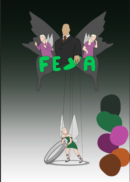
While I enjoyed the dark cloud around the trio up the top, I pictured significantly more white space to be surrounding them.
To create more white space while keeping the darker cloud around them I made a copy of the wing, enlarged it, and then made a layer mask - filling in the gaps made from enlarging it.
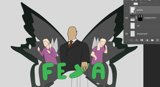
I would then go on to change this gradient to red and black to increase the ominous feeling. Because I always saw Feya in green and I made the outer wing shadow red I decided to lean into a complimentary colour palette so that the gold would still pop.
I expanded the outer wing layer mask down into a curved spotlight on Feya and finished adding in my other colours.
My title font is hand drawn and hand shaded. I followed the same process when colouring in the ring - I made my base layer the mid-tone and then added a highlight and a shadow layer using two different shades of the golden yellow to create dimension.
To add texture to the clothes, I used different texture brushes in various shades of green to create the fabric weave.
Here is a close up of both the twins clothes and the title font. I have also at this stage changed the mob-fathers wings to a lighter grey and changed the blending mode to screen so make them slightly translucent. I also added details along the wing edge to create more visual interest - although this would eventually change to a red outline.
I then moved on to creating my characters faces and adding in shadows in places like the mob fathers hands.
I am personally disappointed with my characters faces as I know I could have done better if I'd allowed myself more time to explore expressions. This was one of the areas I had intended to focus on, and while I spent a lot of time throughout this entire course working on things outside of class, after tripping on a couple of the middle hurdles and balancing work commitments at the same time - I really struggled to claw back that lost time.
To create the faces I created a layer for shadows and one for highlight, and then using two different tones I drew on where I wanted them. Once mapped out I used the blur tool on each layer to soften these lines until I had a seamless contour and highlight. I then went onto a new (named) layer to create the eyes, mouth, and other facial features
I followed the same process to create the mob-fathers face. I also went through and added very subtle shadow and highlight to his shirt and tie.
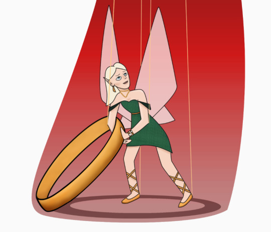
Feya was shaded in the same fashion, but with her I also added very subtle shadow and highlight to her whole body.
The final thing I did for my poster was add a light grey gradient behind the whole image to reinforce the initial idea of there being a darker cloud behind them while still maintaining the stark negative space.
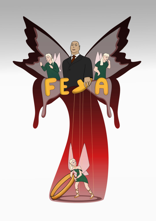
While I am relatively happy with my final poster result seen above, I am disappointed I didn't get the chance to add extra shadow and highlight using layer masks like I did with my TV dude at the start of the course.
Once I had added the ring shadow, I had planned to add more distinctive shadow and highlight from a more established light source to really emphasize the ring shadow. Considering how stuck I was in the final couple of days, I am very proud with what I was still able to create. In future I will aim to have things like composition locked in much earlier on to buy myself more time for when things don't work or when things aren't well received.
0 notes
Text
youtube
One flower One Sword (ENGLISH COVER)
Lyrical Analysis (一花一劍) – Heaven Official’s Blessing ( 天官赐福) Below (TLDR: I wrote english trans-lyrics to One Flower, One Sword theme from Heaven Official's Blessing)
Music + Writing commissions are open! x
Hey! How goes it? If you are only looking for the lyrics, you are in the wrong place! This link will take you to where you want to go!
This is a lyrical analysis of why I chose the phrasing, and/or to explain certain components as I understood it at the time of working on this. I really do encourage everyone to read the book/take a peak at the Donghua. With that being said I do heavily reference certain plot points, and should warn you that this may be a spoiler alert (not in a “who did it” kind of way) but just a generic plot run through as it relates to the song. If you would like to get straight to it, skip to the full disclaimer below!
So if you can’t tell already, I am already off schedule for a few reasons.
I found an audio issue in my test render/ copyrights are a thing. (Fixed for now)
I discovered that my harmony tracks were peaking (after playing around in a master file) and I attempted to revamp the mix– resulting in a far worse outcome than the original audio lol.
So now the audio mix is in limbo. I am having someone else look at it, and see whether they can do anything with it. It may just be uploaded as is. *UPDATE* so I mixed this about 5 times in a 48 hr period after having someone look it over for me. I went from Mixcraft back to Adobe Audition (Haven’t used adobe in like– 3 years???) and then mastered in Mixcraft and //shrugs// I think it is better than the original take that was intended for upload. I figured out my de-essers just aren’t de-essing the way I want them too, so I’ll blame it on poor recording technique at the time I recorded.
And finally?
There’s no need to rush it now.
I’m not the first one putting out lyrics so it’s totally fine! This was a goal of mine like last year, but I gave up on it as I just couldn’t find the motivation to work on this. I’m really proud of myself for pushing through completion on this project. I do not like working long term on anything, and this idea of working on this song has been there since August 2020. So uploading anything related to it at this point is still an accomplishment!
So this is my breakdown on the lyrics, plot, and practically everything I thought about regarding this song. One thing that initially stuck out to me with this song beyond the composition work and the musicality, was the story I got from it all. I felt like, “wow, I have to watch this” to fill in the blanks as to what happens between these two and determine whether or not this story is as great if not better than my feelings towards The Untamed/ MDZS. If it were not for this song alone, I would not have watched, nor read any of Tian Guan Ci Fu (TGCF). For this reason, I am thankful that it was featured in this series!
(I want to discuss the composition, but may dedicate time to that later, if I revisit the piano cover I did. )

Although I do usually avoid this genre, I will respect what is written and established canonically. I do not consider myself to be deeply engrossed in the fandom by any means, nor do I entertain fanfics.
Okay! Now on to the analysis!
Xian le’s shining grace reflects prosperity
A teenager in white descends with destiny
Flowers are displaced and I can see his face
In a flash, the rules are left broken
So, I rewrote this stanza twice because of the final two lines. I am not much of a person who cares to keep rhymes, but I considered it for this song in certain places because that is what stuck for me. One flower, One Sword is a song I heard from Hua Cheng’s POV, so I tried to keep that theme.
I do not remember every detail, but this depicts the first time Hua Cheng (HC) meets the crowned prince Xie Lian (XL). At this point in the story, he is known as Hong’er, but I will continue to refer to him as HC so as to not introduce too many names/ cause confusion. It was a parade proceeding and HC was a kid about to jump from a high bell tower. This parade is very important in the Xian Le kingdom as everyone believes that the procession helps to protect the kingdom from calamities. He sees XL (who is a teenager at the time) and is in awe, and ends up falling. XL sees the child fall and moves very quickly to catch him, breaking the parade traditions and causing quite a commotion among gossipers. The parade is technically interrupted by this event and the “rules” or traditions are broken at the moment because XL temporarily left his post to save HC. That’s basically the story behind the lyrics.
In the darkest night, are hidden glowing eyes
Dancing butterflies like lit stars in the sky
Surely he takes off, in the pursuit of a voice
Fighting in moonlight no matter all the time it takes
Fighting by moonlight no matter any consequence.
Ok, so as you can see, this line was altered lol. I am not currently reviewing the PV at the moment of writing, but this made me think about the war/ fighting that occurs in the novel. Xian le’s , the kingdom in which XL is from, was basically threatened and at risk of failing, leading to fighting, war, catastrophe (which comes up again in verse two I think?). I can’t remember whether or not XL has ascended or not by this time, but I believe he had at some point and was intervening in the human world/ affairs which was against the rules of the Heavenly Court.
Glowing eyes, and dancing butterflies are interesting lines. But I think this relates more to HC in his current form. Butterflies are his signature (silver butterflies).
A figure of flowers meet a sword at Yi Nian Bridge
Challenging the heavens, with thunder and lightning
Though time passes, and we change as time goes on
With one flower, and one sword I will defend thee~
so “figure of flowers” ? Can be taken a few ways… personification of XL fighting a mysterious person at Yi Nian Bridge (he was/ is an excellent swordsman). Or a figure, as in a number of flowers cross paths with clashing swords on the bridge (so either figuratively or literally) lol. And with fighting, one is generally defending someone, something, etc.
The indication of the time changes is also very important to note. XL experienced many ups and downs in his story that resulted in changes in his behavior, and his perception of the world in a sense. He also didn’t understand the value of those closest to him, Mu Cheng and Feng Xin as an example until they were gone. Essentially by the time we meet XL, he is very humble about his abilities and does not like bringing attention to himself unnecessarily. Or if you want to flip it to HC, he waited a substantially long time to reunite with XL. I mean, I could never– the point is, the passage of time is very important.
Challenging the heavens can be a reference to XL breaking the rules and being banished several times as well. Or, if you’re “nasty” XD could even say its in reference to HC challenging all the heavenly officials and whipping tail lol.
If I were to say that I hear the last phrase from HC POV, it would be because of the following 1) he is XL’s #1 devotee from youth to adulthood 2) he would often reside at the temple for XL and continuously change out the flower on XL’s statue. 3) He was also a decent swordsman and a figher. He often protected the temple from vandalism at times.
At Mount Tai Cang there was a calamity
Walls and houses down, a new reality
(From) Riches now to rags, met with such devastation
Unknown mysteries of war highlight a brazen truth
So I believe this is referring to the fall of the Xianle kingdom in the civil war. I don’t actually recall what was the initial start of this conflict. But the human face disease was a problem, along with XL’s futile attempts to help the people. HC was a part of the military and ran into XL several times. He was eventually kicked out by Mu Qing.
Taicang mountain could also relate specifically to when XL took HC there as a kid and the priest told him that HC had the worst fortune and would cause devastation and destruction anywhere he went. HC ran away at this point as well.
I think the quote below helps with the final phrase regarding the “truth” without spoiling the story.
“Because the Kingdom of Xianle was destined to fall. Since you raised your hand and messed up this game of chess, then, there will for sure be another hand that returns all the messed up pieces back in place.”
Tree of white flowers meet dark clouds at Yi Nian Bridge
And like ambers, time does wonders to a mystic
And like ambers, time burns on in a mystic scene
With the fog past, and clouds gone, truly serene
With a flower, and a sword I will never flee~
Staring at the flowers in trees, I do miss you
I don’t care if they laugh at me, I’ll live anew
The hereafter is bright, like colorful silks,
I’ll be with you, forevermore,flower and sword
Whether here or beyond…we’re together, always
I do not have much extra to add here. I am very strategic in how I phrase things here because things change a bit in the final chorus. “I don’t care if they laugh at me…” is quite ambiguous to me, as it could really apply to XL’s return 3rd ascension or to before HC was the HC that everyone was afraid of lol. I really liked singing “Hereafter”. I get so tired of singing “future”– like that word is just overkill in all english covers I think.
Fun fact: twitter helped me in a poll on the “never flee/ I’ll defend thee” bit. I didn’t realize that the chorus would change each time, and I ended up using both variations.
Colorful silks= I mean the red garments they wear. =v=, I’m shrewd with it in my mind.
Conclusion:
So I tried to convey the feeling of devotion without the necessary cringe implied in a typical love song. I felt that this was more poetic than just “I wanna be with you forever, and ever, one flower and sword, and ugugugu gege”. The art of storytelling is really important to me for some reason, so it makes me happy when I can maintain story related elements in an English take. I had to fight depression, anxiety, and imposter syndrome the entire time, but I finally made it to the end of this hot take on my thoughts.
If you actually read all this, you are honestly a trooper!
#writing#tgcf#one flower one sword#heaven official's blessing#heaven official blessing#tian guan ci fu#hua cheung#hua cheng#xian le#english lyrics#commissions open#music commission#lyrics#lyricist#writer#writing commission#commission#Youtube
0 notes
Text
Holiday SDL
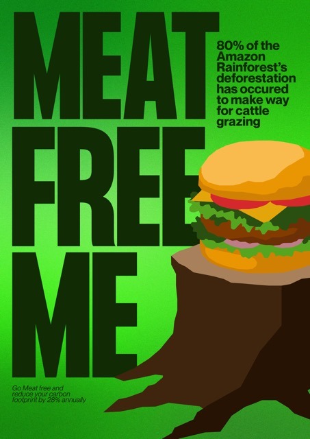
After my progress during the last couple weeks of before our mid-sem break, I found myself feeling really motivated and excited to make significant progress to my campaign and use these next few weeks as much to my advantage as possible. I started off by resetting myself with some research, with my research I really wanted to explore different areas of design and some different styles that I hadn’t really looked towards before. I didn’t want to feel particularly constrained to the limitations of my campaign as I felt as though in the last couple weeks my passion and inspiration had depleted and I was just looking to find work that made me feel motivated and rekindle my enthusiasm for creating. I looked to see what elements of these works I was drawn to and if there were any elements that I would be able to hijack and make my own. I found that through my research I was particularly drawn to a certain aesthetic that involved mesh gradients, with strong typography and the use of geometric shapes.
I experimented the idea of going forward with posters only using typography with no image assets. I created a mesh gradient in illustrator and experimented with different colourways and compositions to see how I might go about creating posters just using type. I found that these posters weren’t quite as effective as I’d hoped they might be, however, I’m still open to revisiting this ideas in the future but I feel as though I’m in quite a good direction with some of the visual metaphors I’m using and bringing forward with my images.
I then attempted to recreate my original posters with some of the feedback that I received from Raul through critiques but quickly realised that I had become quite unhappy and dissatisfied with the work and decided that I was going to have a go at redesigning my illustrations.
To start with, I looked back upon my research and found that the work of Zenji Funabashi was really inspiring and I really aligned with his visual style. I feel as though the work they produced as part of their vegetable series had a really calming yet personal feel and I really liked the geometric and sharp shapes created - almost allowing for the effect of cutting out pieces of paper and pasting them onto the page to form the objects. I really liked this look of appearing hand-crafted and felt as though it worked for the message of my campaign which circulates a lot of ideas about being natural, the earth, with a calm look and feel. This led me to redesigning some of my previous assets using this visual style.
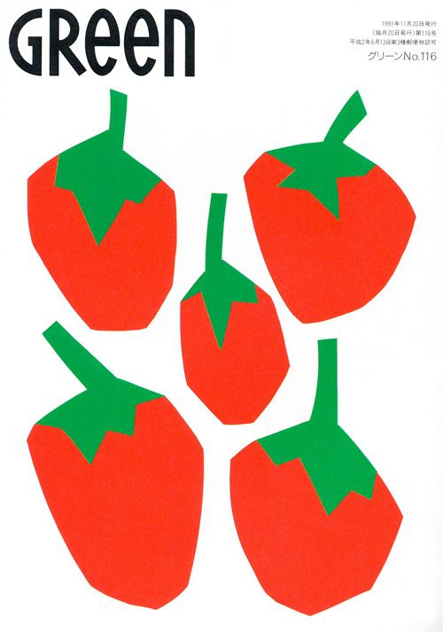
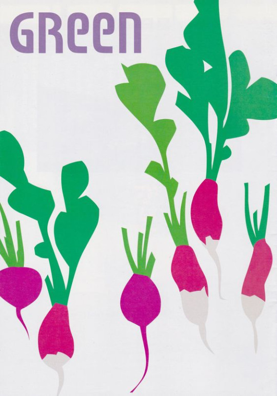
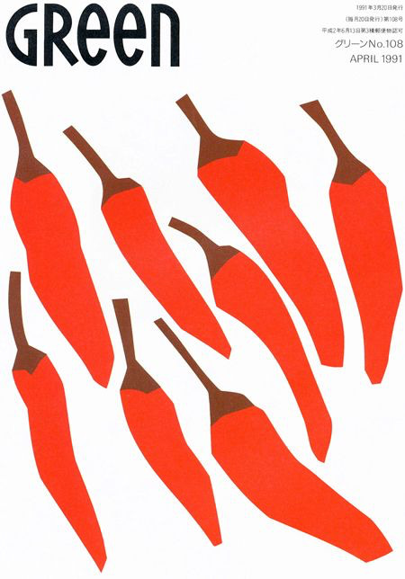
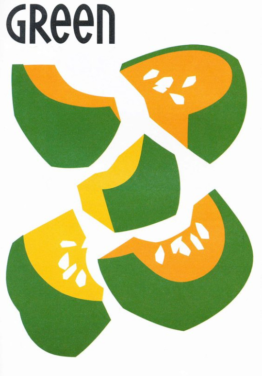
(above: Zenji Funabashi's work for Green magazine )

(Above: Some assets created using Funabashi's style of cutout-like geometric shapes as inspiration)
Overall I’m extremely satisfied with how these new assets turned out. I feel as though they work a lot better visually and are definitely a solid and significant development from my previous illustrations. I then created a series of posters using these assets as well. One of my new poster iterations introduces an illustration of a cow silhouette with a pattern of plastic waterbottles dispersed throughout. I am still on the fence about whether or not this is completely effective, but for now I’ve included it as another potential iteration.


After these initial posters I went on to experiment further with my layouts and decided to merge my gradient backgrounds with these new illustrations. I am very excited about this development as I feel like the gradients definitely add some more elevation to the campaign of which I feel to be very effective. This did create an interesting problem to navigate though as I wanted the gradient background to become part of my design system, and with my broccoli poster a central element is the ‘forest’ made of broccoli being the backgorund. This meant that I had to try and shift the composition in order to allow for the gradient to be prominent but also to keep the meaning and conceptual elements of the poster alive. I created two versions to present for feedback, one with white text and one with dark green text. As of now I am currently undecided on which version I prefer as I feel as though the white text is more loud and eye-catching but also quite harsh and intense - while the dark green and blue is calm yet not as engaging.


0 notes
Text
Back Home
I am writing to you from my kitchen table on Gad Tedeschi Street in Yerushalayim. It is 6:15 AM, still last night in New York. The cloudless sky is already bright blue and sunny. The air still has a bit of nighttime chill in it, but the sunlight is warm and lovely. Birds of some sort are twittering around in the trees just beneath our balcony. (Joan’s cousin down the road actually has hummingbirds in the trees off her balcony, but we just have something like the Israeli version of pigeons.) I can see the no. 78 bus pulling into the bus stop across the street to pick up the dozen or so people already on their way somewhere at this hour of the morning. The first few days we were here, I woke up each morning at 4:30 when the muezzin in one of the mosques in Jabal Al-mukkaber, the Arab town on the other side of our neighborhood, cranked up the volume to announce morning prayers. But by the fourth or fifth day, I became able to sleep right through it and barely, if at all, to notice it. When I asked some neighbors about it, they appeared not even to know what I was talking about.
By noon, we hope to be on our way. Our tenant is returning in a few days from her summer back home in Asmara, the capital of Eritrea. (She works for the U.N. and is stationed here in Jerusalem.) The cleaning guy is coming tomorrow morning to make the place perfect for her return; we ourselves are spending the night in Tel Aviv in a nice hotel on the beach (which we saved up the points on our Visa card all year to pay for), then heading to the airport tomorrow evening to fly home. So we leave here in stages—which is probably all for the best, since the kind of adjustment the whole re-entry thing requires is a process best undertaken one step at a time. It’s been a fabulous summer, a rich and rewarding stay in one of the world’s truly great cities. We’ve spent time—and lots of it—with Joan’s Israeli family and with friends of ours from back home and from all sorts of other places too. And we’ve had tine to go exploring on our own too, mostly extendedly on a lovely three-day trip north to the Upper Galilee where we went to all sorts of places we hadn’t ever been. I’d like to write specifically today to you about one of them.
Some of you may recall reading James Michener’s book, The Source, either when it came out in 1965 or later on. The story from the Stone Age through the mid-twentieth century of a single archeological site in Israel, the book somehow manages to engage the reader in the pageant of Jewish (and pre-Jewish) history without getting bogged down in endless dates and details. The book is a masterpiece and was surely one of the two of three most important books I read as a teenager fantasizing about a career in the rabbinate. (To this day it is the first book I suggest to people I meet who have come to see me because they are considering conversion to Judaism.) But the site, called Makor in the book, is fictional, a kind of composite of several different real-life sites that Michener created so as to be able to focus the action he wished to describe on one specific place. On the other hand, Tzipori, the city I want to describe to you today, is completely real.
Just reviewing its names will give you the general idea. The Jews in ancient times called the place Tzipori because the way its setting is perched atop a large hill suggested the way a bird (Hebrew: tzipor) might be perched on a branch. The Greeks called it Sepphoris, a Greek version of the Hebrew name. The Romans called it Diocaesaraea, but that name didn’t stick: the Crusaders restored the original name and called it La Saphorie and, eventually, the local Arabs called it Saffuriya. And the names it bore reflect its history: in one archeological site are visible remains of Hellenistic, Jewish, Roman, Byzantine, Crusader, Mamluke, and Ottoman towns. Christians revered it once as the birthplace of Mary, mother of Jesus, and built a huge church on the site they assigned to her birth. But for Jews, the importance of the place lies in the role it played in rabbinic history: after the crushing defeat of the Bar Kokhba revolt in 135 CE, many famous rabbis established schools in Tzipori, which became known as a center of learning and culture. Rabbi Judah Ha-nasi, the compiler of the Mishnah himself, moved there after the revolt. (He eventually relocated to Tiberias.) For most of the ensuing centuries, Tzipori was a Jewish town exclusively. But the earthquake of 363, combined with anti-Roman unrest on which the Jews found themselves (again!) on the losing side, prompted the decline of the place. When Muslims invaded from the east in the seventh century, they found the place almost deserted and built a village on the remains of the ancient town. When the local Arabs fled rather than embrace citizenship in the nascent State of Israel in 1948, the place was abandoned entirely for the first time in millennia.
And now it is a huge site, a giant archeological site in which visitors are free to wander around and try to fathom the almost unimaginable history of the place. And there we were, trying to take it all in and only partially succeeding.
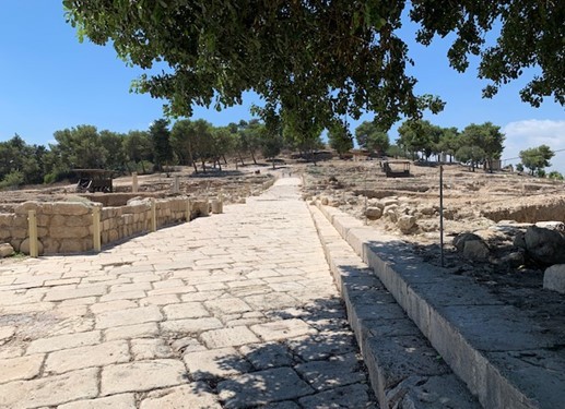
In a sense, our visit to Tzipi symbolizes our stay here in Israel. There’s a timelessness to this place that is hard to describe. The past feels real here, more like an actual presence than a mere memory. As I wandered aimlessly around the streets of ancient Tzipori and considered that not centuries but millennia before my people landed in our decrepit, unmissed Polish town (which I only am alive because my grandparents had the good idea to leave before everyone left behind was murdered in 1942), my people were wandering around these very streets, pausing in the cool shade of the buildings that lined those thoroughfares to catch their breath or to drink some cold water before venturing out again into the midday heat. To imagine Rebbi himself—the editor of the Mishnah and thus the father of all rabbinic learning—to imagine Rabbi Judah Ha-nasi himself strolling past the now-mostly-restored but once-fully-intact amphitheater on his way to teach or to learn, that would be a remarkable experience under any circumstances at all. But to feel the past as a palpable, real presence in a place that Maccabean king Alexander Jannaeus wrested from the Syrian Greeks in 104 BCE and no doubt visited personally as part of his campaign, to feel his presence and Rabbi Judah’s no less palpably than I felt Joan’s or the cousins with whom we were visited the place that July day just a few weeks ago—that was a truly remarkable, once-in-a-lifetime experience for me. And that is what I wanted to share with you all today—experiences like that are part and parcel of life here, the tangible, fully real, part of being a Jew in Eretz Ha-kodesh, in the Holy Land.
For those of you who haven’t experienced Israel, I can’t stress enough how fabulous an experience is awaiting you. For those of you who have been here before, including even those who have been here many times—there are places, as Tzipori was for me, that simply have to be experienced in person rather than read about in a book. To say that Jewish history—and, in a sense, Jewishness itself—comes alive in this place is barely to say anything at all. I return home not only invigorated intellectually and spiritually, but also emotionally. I’ve had a magnificent summer!
0 notes
Photo
All righty, let’s watch some sausage get made!
I managed to dig up all four of the WIP pixel art files for the Chemistry Sampler, with the oldest dating back to Dec 2018-- three years ago, now!-- and with them, loads and loads of old sketches, rejected ideas, and half-finished panels. So if you’d like to come with on a lengthy-- lengthy!-- dive into the process of making a 16-part sampler, click below!
(I’m not kidding, though! This got long as hell!)
I’m going to go through the sampler panel-by-panel, in the order they were first conceived, but that is not at all how the actual design process went. One doesn’t work on a single panel, finish it, and then move on to the next-- instead, it’s all working on every panel all at once, jumping from here to there, trying to make each piece look good on its own and also look good as part of a whole. I also started and stopped working on the sampler at least three different times over the years, which meant even more changes as my style and abilities altered over time. But for ease of organization, I’ll be taking things one panel at a time. So, from the top-! 🎬💥

The Test Tubes were the first panel sketched, with no specific color in mind, and the original composition didn’t change a pixel all the way to the end! The colors, however, changed constantly: I remember for a while they were mostly neutrals, but once I knew I wanted to have a yellow pencil, orange bottle, and some brown cookies in the other panels the colors of the test tubes changed to match.
When I went to stitch the sampler, this was the panel I started with: since it uses thread from every single color family in the sampler (except for the two blues), I figured if I could find threads that worked well together here, they’d look good everywhere else, too.

The Microscope was the second panel sketched, and it didn’t change too much, either. The very first sketch was wicked flat, and imho flat = boring, so I rotated it around to put it at an angle and give it some more depth. I later decided to put a little molecule model (ethanol-- looks like a cute little puppy) next to it to help fill out the space. There is also a full-panel picture of another molecule model elsewhere in the sampler, but by the time I decided to include that panel this one was both already completely designed *and* completely stitched, so it was a little late to change the molecule to something else. And anyway, I like the little guy! So I’m glad he stuck around. :)

The Periodic Table was the no. 1 absolute must-have for a chemistry sampler, but it also posed a unique challenge in that it was the only part where the size was out of my control: if I made each element 2x2 squares they wouldn’t all fit in the panel, so they had to be 1x1-- but that left a huge amount of empty space around them. My solution: placing the table inside a classroom, as a poster.
The first classroom draft doesn’t read well (is that a kitchen sink??) and the second one was even worse. I liked the idea of including larger squares for the elements, but drawing them that small and at odd angles made them hard to identify even as pixel art, and as a general rule of thumb fine details are always *less* distinct in the stitched version than in the digital pattern. Version three is much better: you can see multiple workstations and stools, making it clear that it’s a classroom space, and the repeated diagonal lines give it a nice sense of dimension. That’s always a good thing.
(Confession: on its own, I like the rainbow color palette better than the final one, but aside from a tiny bit in the volcano panel this was the only part that had any green at all. Next to all the blue and orange panels the green looked out of place, so for the sake of the larger, cohesive whole it had to change.)

The PPE was the reason this sampler ended up so blue! I liked the first sketch, and the first colors, so I started using the same two sorts of blues to sketch out other panels. Made a few small changes to this one later-- added another glove-- but nothing major.
The Molecule Sketch also didn’t change much, except that it started off *really* messy and was constantly tweaked to be a little cleaner each time I came back to the sampler after a break. Turns out it’s hard to draw a pentagon on a square grid! In the first sketch younger me tried to use antialiasing to smooth out the corners-- see the pale grey parts along all the diagonals-- but nowadays I would consider that extremely bad pattern design. Yeah, it’d make the lines look better when stitched on white fabric, but on dark fabric the pale parts would stick out like a lightbulb and the whole effect would be ruined.
I also eventually added a little backstitching detail, since somewhere between 2018 and 2020ish I finally got over my irrational fear of designing with backstitch. Baby steps! 🙏

The Boiling Flask started life as a closeup shot of a bunsen burner flame + some tiny bubbles, but after a little while I figured that the water was more interesting than the flame. Plus the silhouette is clearer!

We’ve already seen where all the blues came from, which means it’s time to bring in the oranges!
Jupiter in a Bottle is, along with the PPE, one of the two panels that set the tone for all the others. There were about three seconds where I thought I’d try for a pale, crystalline effect for it, but I quickly switched to something brighter and rounder. At that point the chem sampler looked roughly like this:

…so, ah, not very promising, but I remember thinking ‘well, if nothing else, at least I’d have fun stitching the goggles and the orange one”. So since I was sure I wanted to keep those two, all of the other squares ended up being designed around them and borrowed a lot of their colors.. In the end I decided to go all-in on the oranges and blues, and, well, I think it worked out nicely! :)

This little bastard was The Reagent Cabinet, and it’s one of the panels that eventually got cut! It was a very early introduction, and stuck around almost all the way to the finish. I didn’t ever like it, though: it’s not very interesting, not very beautiful, and if I had stitched it it would have been the *only* full-coverage panel in the entire sampler, and so would have looked very out-of-place and heavy compared to the rest of the design.
Still, it technically fit the color scheme, and technically the theme, too, so I didn’t actually have the guts to chop it until I went to export the image and start stitching. At that point, dreading the idea of laboring over an entire full-coverage panel of a design I hated, I finally deleted it and started stitching everything else anyway, just with a giant empty hole in the corner of the pattern. I figured “well, I may be burnt out on designing for now... but once I’ve been stitching a while I’m sure the spark will come back, and I’ll think of something to fill the space”. And so it did, eventually!

The Cookies, however, are a panel that I’ve loved from the beginning 🤎 I wanted to include a nod to ‘everyday chemistry’ alongside the more ‘serious’ designs; a carryover from the math sampler, in a sense, with its bees and shells.
These particular cookies are based off of my Mom’s chocolate chip cookies, which are kind of sort of like this recipe, but better somehow, and made out of old Y2K surplus that she bought off a disenchanted ex-prepper. Somehow the 20-year-old powdered peanut butter just hits different...
The Billowing Liquid was a effect that was, at least at the beginning, too far above my pay grade: I knew I wanted ‘some kinda sick-looking swooshy liquid effect, like in VFX reels or something?’, but that’s, uh, not a very concrete concept. I ended up realizing I was thinking of an ink-in-water effect, so from that I was able to look up reference vids and start sketching out some actual shapes. I added a little fizz on top, too, for extra effect-- and I think it did end up looking the way I originally envisioned it, even if I didn’t have the words or the skills to capture it back then!

Another cut panel! This one’s the Alchemical Equipment: the idea was that hey, the modern science of chemistry is descended from the mystical practice of alchemy, so wouldn’t be cool to put a nod to alchemy into the sampler? Also alchemical symbolism is wicked cool. ⁽ᴬˡˢᵒ ᵃˡˢᵒ ᵐʸ ᶠʳᶦᵉⁿᵈ ʰᵃᵈ ʲᵘˢᵗ ᵍᵒᵗᵗᵉⁿ ᵐᵉ ᵗᵒ ᵖˡᵃʸ ᴺᵃⁿᶜʸ ᴰʳᵉʷ: ᶜᵘʳˢᵉ ᵒᶠ ᴮˡᵃᶜᵏᵐᵒᵒʳ ᴹᵃⁿᵒʳ ᵃⁿᵈ ᶦᵗ ʷᵃˢ ʳᵉᵃˡˡʸ ᵍᵒᵒᵈ⁾
I tried a couple different takes on this panel, and I still like both of the last two a lot, but in the end they didn’t fit at all with the rest of the sampler, so! For the good of the whole ✂

The Atom is one of the few where I still had my very, very first sketch saved! 😆 Normally I don’t save these-- I’ll either start cleaning up the sketch on that same layer, or will delete the sketch once I’ve got a first draft started-- but not for this one, or for the next two with it!
After the jump from sketch to first draft, this panel didn’t change much: I just added in the nucleus and made some of the curves less jerky and more smooth.

The Glassware Collection was sketched at the same time as the atom, so you can see its original iteration too! The biggest challenge here was to figure out how I wanted to handle the transparency of the glass: all the other glassware in the sampler was filled with something or other, and I debated whether or not to fill in these beakers and bottles too, with either plain white stitches, or grey, or both. In the end I stitched a bit of white shine on each bottle as a highlight, and left the rest of the space empty. Straight up, on my fabric it’s hardly visible at all, but I made some mockups and found that if someone were to stitch this same panel on black or dark fabric, then this version would look way better than one with the bottles filled completely with stitching. So it may not make my version look any better, but hey, for somebody else someday it will. :)

The Volcano is a kid’s chemistry classic! I toyed briefly with the idea of doing one of the other classic childhood experiments: red cabbage pH tests, or the rubber egg, but none of them are as instantly recognizable as the vinegar-and-baking-soda volcano, I think.

The Element of Carbon is a spinoff from that one rejected periodic table idea! This panel was one I made right after returning to the project after a long, long break. To get back into the swing of things I went through a bunch of my old discarded prototypes, and discovered that there were some good ideas hidden in there: they just needed to be fleshed out more, and given their own space to breathe.
Also, in the time since I started this design I finally learned how to do a french knot! At long last, I’m a real cross-stitcher 🏅

The Bunsen Burner was made right before I started stitching the sampler: at that point I had the color scheme just about figured out, and most of the panels most of the way done, and there were only two or three spaces left with no design or a soon-to-be-cut filler design. At that point I reached out to a friend of mine who had studied chemistry in college and asked them for some feedback, and they helped me tighten up the design a lot! This is when the alchemy panel finally got the chop, and in its place the bunsen burner came back: now zoomed all the way out, for easy visibility, and with a pretty new shine effect up top.

The Centrifuge was the other panel my friend recommended-- and Evan, if you’re reading this, thanks a million! This one was an easy breezy design to make: pleasant shapes, an interesting subject, and lots of ovals. I do love a good oval.
This panel and the one before it came together *fast*: I was trying very hard to lock down final designs so I could lock in final colors so I could lock in a final arrangement so I could finally, finally, start stitching. I figured if I could get the sampler to the stitching phase then the ball would at last be rolling fast enough that I wouldn’t be in danger of abandoning the project again-- a pretty bold hope, given that I was more than two years and several abandonments in, but hey, I was still hoping!
One problem: this is the point when I finally cut the reagent cabinet, so, while I *had* finally gotten to the stitching phase, I was still only stitching 15/16ths of a pattern. Enter:

The Molecule Model
The final panel! I had hoped to come up with a suitable final idea in the process of stitching the sampler, and it took a hell of a long time to get there: I believe I had all the panels started, and a few of them finished, even, by the time the idea for this one rolled around. I was working, then, with a fixed position for the panel, along with a fixed color palette, but if anything those constraints made designing it easier. I just picked an interestingly-shaped molecule (theobromine, found in chocolate and tea), built it in MolView, spun it around until I got a cool angle, sketched it, and bam! Final panel complete!
…minus a mountain of tweaking, of course. All the other panels had had months to get their rough edges ironed out, but for this one I just kept the file open as I stitched, fixing problems as I found them. I would not recommend it-- you have to unpick a lot of stitches anytime you decide ‘actually, it looks better one square to the left’!
~~~~~~~~~~~~
So, did it work? Did it all come together in the end? God, I hope so!
But you know, I think it did. :)
Thanks for reading! ✌
-Geri
P.S. it’s not about any specific panel, but you see how the early drafts have colored borders, while the final version has white ones? At one point I was using a draft of the sampler to mess around with GIMP’s content aware fill, trying to make some glitch art, y’know? And the results were pretty cool, but also overwhelmingly line-y:

…and I was hoping to try and make glitched-out versions of the individual panels, instead. So I took the version I was experimenting with and deleted the borders from it, and from that discovered two things:
One, that it was a huge improvement to the composition and should absolutely be carried over to the official version of the file, and
Two, that it did not make the content aware fill work any better, and in fact made the results look worse.
This postscript has a happy ending though: turns out if you take any individual panel and use it to tile a plane then you can select a chunk of it, use the content-aware fill, and then pick out the best bits to make your own glitchy sampler :)

✌!
#cross stitch#embroidery#chemistry sampler#progress pics#long post#damn! someone remind me that I specced into math for a reason#and the reason was that writing is hard#but I do like reading abt other people's artistic process#so if you too enjoy that then#this is for you!#enjoy!
60 notes
·
View notes
Last Seen Blogs

thoughts-of-a-spider
Crocheting Spider Share Corner
steven-grants-world
💙Oscar Isaac💜

jiijjii
nvm
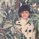
reem119132
REEM 119132

imsohappyicouldie
(^_^)'・*:.。. .。.:*・゜゚・*