#i go off too much
Text
I like to think that Vulcans who come to understand that Humans just can’t try to process emotions the same way as them, it’s just healthiest to let it out in harmless ways, decide that venting and stuff should be taken just as seriously as Vulcan’s meditation time, and will encourage the Humans around them to complain about what’s upsetting them
People who are used to aloof Vulcans who avoid Humans at all cost running into one comforting a Human
“-and then they said my cheesecake was subpar, and they didn’t even bring a dish!!!”
“The purpose of this event was that every participant brings a food item of sorts, correct?”
“Yeah!!”
“And they did not follow this rule while insulting dishes that were brought?”
“Mostly just my dish but yeah >:(“
“How illogical”
“That’s what I’m saying!!!”
#star trek#Vulcans#Humans#not based on a specific thing#but I used to know this annoying couple that were ‘family friends’#who would show up to potluck dinners and the like and would either bring nothing or bring something really just. out of left field?#like a bag of frozen chicken to a bbq#and then proceed to make sure they are first even if it was stated to let kids go first#would take HUGE amounts before anyone else got a chance to get a plate#and then make off with the leftovers again even if they were already claimed for#and it wasn’t a food insecurity thing trust me I would never speak bad about a person getting food if that was even a remote chance#the adults who raised us knew them really well and we’d been to their house a ton of times#they were just dicks#and yeah. they’d occasionally insult the food. while eating the MAJORITY of it.#it was so weird at their home they would go out of their way to get the healthiest options possible#you know the really bland tasteless expensive stuff that apparently was healthier#but then if they were visiting our house they would. eat all our unhealthy snacks.#that always pissed me off so much as a kid because we actually had a food insecurity thing going on#and also a variety of other reasons that are a bit too depressing to bring up on this post#but anyways we’d hardly ever get to have nice snacks#and this couple would just take them all??? even after we’d tell them repeatedly that it was ours and those snacks weren’t gonna be#replaced#hated that couple#if you’re wondering why they were ‘family friends’ it’s because the couple who raised us#(it feels weird to type it out like that but apparently legal guardians doesn’t fit since they never finished petitioning 💀)#liked having them around because it made them look like ‘such great Christian’s’ being nice to the people#that no one else wanted to be friends with#I always thought that was a really weird and fucked up reason to be friends with someone#this got long sorry 😭
23K notes
·
View notes
Text
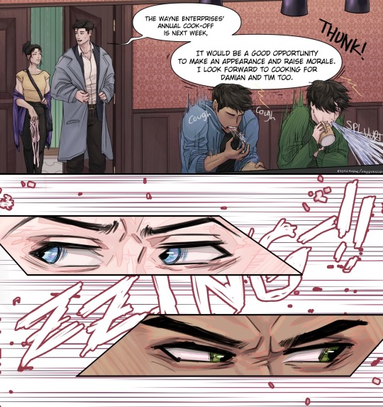
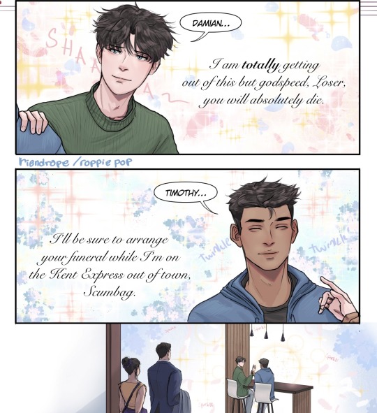
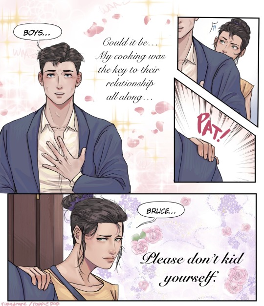
Who’s coming to the cookout?
#bruce wayne#tim drake#damian wayne#cassandra cain#batman#red robin#dc robin#batgirl#dc comics#batfam#batfamily#roppie tries to draw#WE ARE GOING TO IGNORE that comic where bruce seems to be able to cook now#bcs this has been in my drafts for literal years lmao thats how slow i am w these#this comic is also known as ‘wordless communication: how well your family knows you’#dont think too much abt the particulars abt any aspect of this ok 😃👍#i had fun playing around w how i color thinngs i hope its not too messy!!#WAIT DOES THIS SAY COOK-OFF I MEANT COOKOUT!!!!!!!!#(its not a roppie piece without a typo but please OTL read that as i intended im on the ground
11K notes
·
View notes
Text
you're in the habit of denying yourself things.
if someone asked you directly, you would say that you love a little treat. you like iced coffee and getting the cookie. you drink juice out of a fancy cup sometimes, and often do use your candles until they gutter out helplessly.
but you hesitate about buying the 20 dollar hand mixer because, like. you could just use your arms. you weren't raised rich. you don't get to just spend the 20 dollars (remember when that could cover lunch?), at least - you don't spend that without agonizing over it first, trying to figure out the cost-benefits like you are defending yourself in front of a jury. yes, this rice cooker could seriously help you. but you do know how to make stovetop rice and it really isn't that hard. how many pies or brownies would you actually make, in order to make that hand mixer worthwhile?
what's wild is that if the money was for a friend, it would already be spent. you'd fork over 40 without blinking an eye, just to make them happy. the difference is that it's for you, so you need to justify it.
and it sneaks in. you ration yourself without meaning to - you don't finish the pint of ice cream, even though you want to. the next time you go to the store, you say ah, i really shouldn't, and then you walk away. you save little bits of your precious things - just in case. sometimes you even go so far as putting that one thing in your shopping cart. and then just leaving it there, because maybe-one-day, but not right now, there's other stuff going on.
you do self-care, of course. but you don't do it more than like, 3 days in a row. after that it just feels a little bit over-the-edge. like. you can't live in decadence, the economy is so bad right now, kid.
so you don't buy the rice cooker. you can-and-will spend the time over the stove. you can withstand the little sorrows. denial and discipline are practically synonyms. and you're not spoiled.
it's just - it's not always a rice cooker. sometimes it is a person or a job or a hug. sometimes it is asking for help. sometimes it is the summer and your college degree. sometimes it is looking down at scabbed knees and feeling a strange kind of falling, like you can't even recognize the girl you used to be. sometimes it is your handprint looking unsteady.
sometimes it is tuesday, and you didn't get fired, and you want to celebrate. but what is it you like, even? you search around your little heart and come up empty. you're so used to denying that all your desires draw a blank.
oh fuck. see, this is the perfect opportunity. if you had a mixer, you'd make a cake.
#warm up#this isn't good#writeblr#this is complicated by the fact i can't stand up too long or i fuckken pass out and <3 hit my damn head <3#but i did take a deep breath and buy myself the stupid rice cooker#and!!! a very cheap sushi kit!!! i have been wanting to try making sushi for literally YEARS#the kit was only like 15 dollars!!!! and i haven't purchased it bc?!!??!?!?!?!!?#..... i didn't get the mixer tho that felt. like a lot. like too much.#on my list is a kitchenaid. one day when i get a check and i have paid off my student debt#and medical debt#i will put that first little bit of cash#into a kitchenaid 5qt stand mixer (with attachments)#i really do just go into their refurbished section and stare lustily at each option#but yeah i feel guilty about the rice cooker even tho i know for a fact this damn thing is gonna be a lifesaver#oh shit also fuck i forgot to mention . poached eggs
30K notes
·
View notes
Text
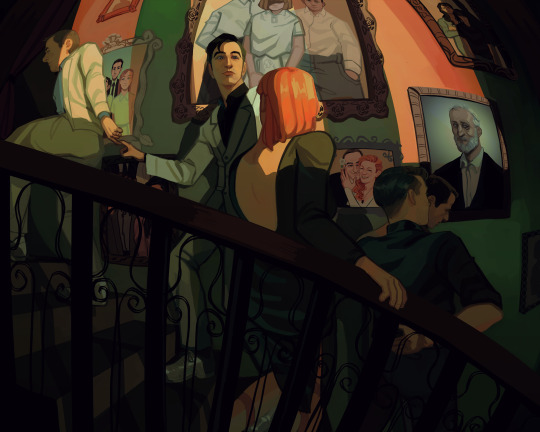
One wedding and three funerals
Background paintings under the cut
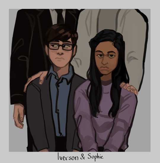
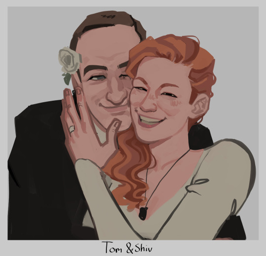
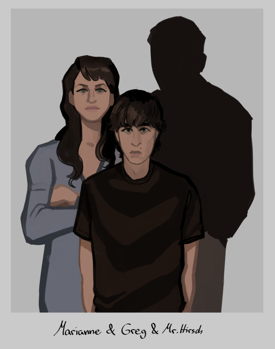
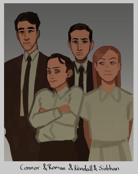
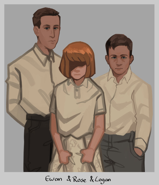
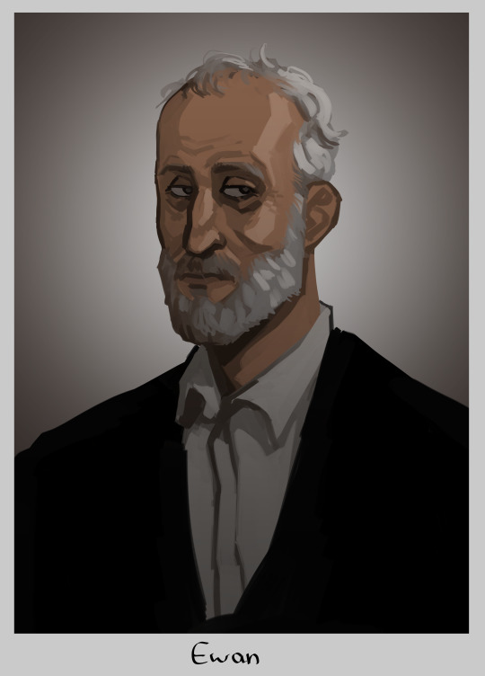
#tomgreg#succession#tom wambsgans#greg hirsch#shiv roy#roman roy#kendall roy#yeah no im not tagging everyone thats too much#this is me going 'how much implications themes and symbolism can i fit in one painting'#yes i gave rose shivs haircolor. if we ever find out how she looks like and its not like this im just gonna pass away i guess#but yeah i hope yall connect the dots#i put waaay too much thought and work into this. i was googling pictures of all the actors as kids just for reference (sigh)#honestly kinda wanted to make tom and greg link pinkies as like. a pinkie promise. but that was too hard to draw in this angle#at least not without obstructing the view of the ring which is important to see so ya#my fave is actually the tomshiv wedding pic i went off with that. i love them... they should have run away to become sheep farmers fr fr#anyway im so glad im done with this UGH!! finally i can draw smth else without being like oh noooo i need to finish this#i see a lot of you wondering why there is no portrait of logan but one of ewan#it's bc the placement of the painting represent their standing. logans portray would not hang next to the stairs#his present portrait hangs at the end of it. all the way up at the top. alone and withering away#basically the picture you see underneath ewan to the right? its where toms parents would be. the right side of the wall is tom and gregs#and the left one is the roy siblings theirs. since they grew up rich rich. and tom and greg didn't#but ya thats why ewan hangs here and logan does not :)
14K notes
·
View notes
Text
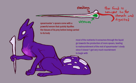


funny purple dog you get endless health issues
#character wise i see it as being kind of quietly pissed off most of the time from all the bullshit fuckery it has to deal with#hates being a messenger and just wants to go home to its creator for head pats and pain medication#dont look too hard at that ''skull'' it doesnt make much sense#rain world#rw spearmaster#art#2024#not super satisfied with the way i drew it here i might iterate (lol) on it some more if i draw it again
2K notes
·
View notes
Text
the terror (2018) requires a rewatch not only bc it is so good it will settle in the core of your brain and grow and spread there like a fungus until you die but also bc it is a show about a hundred something bearded victorian white men on a ship in the same clothes and by the time you start figuring out what name is attached to which guy half of them are already dead
#imma keep it real with y'all final episode when ned is like 'we gotta save the captain'#and dundy is like 'no we gotta move on'#i deadass was sitting there like 'whos this guy' bc id never connected the name le vesconte to his face#also when he was getting his toes snipped off i thought he was just some guy. complete blind spot in my brain for him#which is wild bc i would honestly start sucking face if he looked at me for 2 secs. dilf <3#there's simply too much going on every ep to keep a grip on what muttonchops belong to who the first time around fr#the terror
876 notes
·
View notes
Text
despite being more often than not a "rules as written" fan over "rule of cool", i really do love me a good "rules be damned, i'll give you this awesome moment" call. like matt giving fcg the otohan kill despite what her hp was at or brennan giving cerrit an extra mage slayer reaction attack at the end of calamity. honestly, if anything, i think the fact they mostly play by the book makes these moments even better because it really has that extra weight towards those decisions to put the rules aside.
#critical role#cr spoilers#i can't get over how crazy it was though. genuinely an incredible moment.#like tbh i was too entranced by the Incredible move sam made to cry or anything. i was so hype for how awesome it was.#it was perfect#but yeah usually whenever i see the dm advice of 'dont track a boss's hp just go off the Vibes' i get annoyed by it#but this was such an exception that i am SO glad that matt did it#im just fucking throwing words out there at rhis point i have no idea if any of my words make sense ever but#im trying to express how much i love this and its mostly just absolute nonsense
496 notes
·
View notes
Text

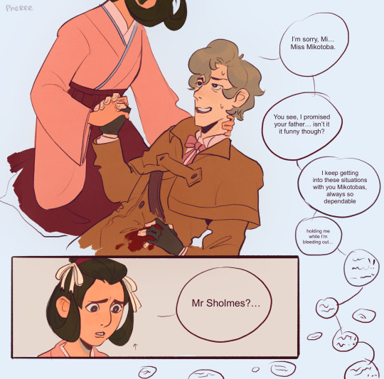
from the homumiko mines
#dgs#tgaa#dgs spoilers#tgaa spoilers#homumiko#idk why mikotoba is taller in the kiss. hes on his tiptoes#the first one is inspired by the moment when sholmes puts his hands on ryu's neck so he can feel how cold they are from blood loss lol#anyway i continue to be deeply fascinated with early years homumiko#i feel like my view of their relationship is more slowburn than most#like. they were both not at their best when they met and i can very much see a scenario where they start living together w/out necessarily#liking each other#the last one in based on a line in 1-5 where gregson (?) says that after an hour of blood loss even sholmes piped down or something#which makes me think he would not shut up beforehand. and i think he'd say some stuff He Really Shouldn't Have#but susato wrote it off as delirium + she was too worried abt her dad and messing with the crime scene#que like 5 months later her going .........ohhhhhh#thats not how you write que i think. anyway
648 notes
·
View notes
Text
Most annoying NMJ or JC take is when someone that dislikes them is like "oh you're a fan of him? *scoff* Well obviously you've only seen cql, where he was super watered down. In the novel he's a dislikable asshole and that's the objectively superior canon I'm working from instead of your woobified fanfic." Meanwhile your main canon is novel canon and you genuinely find novel Jiang Cheng and Nie Mingjue complex sympathetic characters.
#complaining and whining about fandom#mdzs#cql#the untamed#nie mingjue#jiang cheng#WHY DOES THIS KEEP HAPPENING TO THEM#it's quite funny because in nmj's case i actually see shit from cql being carried over to novel canon to hate on him#for example my's treatment under the nie was explicitly much worse in cql because they transplanted the langya captain to qinghe#while the worst we see post-promotion in the novel is cultivators (WHO AREN'T EVEN NIE!) wiping ther teacups#(they're visiting from other clans like xichen. That's also why none of them had seen meng yao before.)#you can absolutely choose to interpret that worse things were happening to him at the hands of the nie off-page#it's definitely possible! but cql has people acting like it's objective canon#also the thing about empathy being inaccurate and biased in nmj's favor#that's another cql thing. in novel canon wwx can and does see things nmj does not notice (like the teacups!)#so even if he has some insight into nmj's thoughts and feelings it quite literally can't be showing things exclusively from his perspective#it was a pretty cool ceative decision from cql! gave us some very interesting character moments!#but sometimes i see people discuss the novel going 'and this was warped by nmj's bias i bet he was even worse in reality' girl wrong medium#in jiang cheng's case a lot of hate seems to be coming from the corner of cql!mains too#so clearly it can't be *that* big a difference in likability
450 notes
·
View notes
Text
Prompt 277
Danny would be pouting, but this? This is actually kind of hilarious. He’d be laughing his ass off if he could, but allows himself to shriek excitedly around the binky in his mouth. Jordan on the other hand has no such thing stopping him, letting out his own toddler cackle as something bursts into flames.
Their current caretaker- Clockwork’s nephew apparently, who is on babysitting duty for the next couple of decades- coos, and then they’re off again. Someone had apparently wanted their sort-of-Fraid-member to go to a meeting despite him informing them he’d be unavailable.
So of course he- and the three of them and Ms. Teekl the cat- just had to set the whole place on fire. You honestly can’t be that rude! It’s like, not exactly maternity leave, but something similar- don’t make fun of him he’s stuck with a toddler-brain right now!
(All three of them would’ve had completely toddler minds if not for the fact that they were partially made from ectoplasm)
Really, it was perfectly normal for them to set the building aflame and disappear into another dimension, even if maybe not for humans. Everyone knew you didn’t try to mess with a nesting Realms being! Especially if they weren’t fully Fraid yet. Honestly it’s all the idiots’ fault.
#Prompts#DCxDP#DPxDC#Deaged Danny#Deaged Ellie#Deaged Dan#Halfas are like phoenixes in the fact they have to rebuild their flesh bodies too#So off to another dimension so they don’t have to worry about their own world#Klarion with triplet children: This is going to cause so much Chaos >:3#Space Core Danny#Moon Core Ellie#Sun Core Dan#Klarion: I shall bond with my baby cousins#Realms beings have a very group-orientated idea towards care of ghostlings#The DC world is the equivalent of the daycare world for a bunch of primordial beings#JL: Okay the chaos lord is acting strange wtf do we do-#Jordan Ellie & Danny chanting Fireball in ghost speak:#klarion the witchboy#So many misunderstandings because no one asks Klarion lol#klarion the witch boy#klarion bleak#klarion
410 notes
·
View notes
Text
Tiffany Aching is the ultimate weird little girl. Terry Pratchett went 'actually it's fine if you're angry and petty and overlooked and want to be selfish sometimes even if that's not a role you feel like you can play within your family structure. Also reading the dictionary is normal'
#perpetual perpetual ladies night#I love her so much#really went 'get off my fucking lawn' to the queen of faerie#meanwhile Magrat has adult weird little girl energy#woo woo hippie lady who gets pushed too far and goes 'i'm going to start biting people'#discworld
2K notes
·
View notes
Text
why Aurora's art is genius
It's break for me, and I've been meaning to sit down and read the Aurora webcomic (https://comicaurora.com/, @comicaurora on Tumblr) for quite a bit. So I did that over the last few days.
And… y'know. I can't actually say "I should've read this earlier," because otherwise I would've been up at 2:30-3am when I had responsibilities in the morning and I couldn't have properly enjoyed it, but. Holy shit guys THIS COMIC.
I intended to just do a generalized "hello this is all the things I love about this story," and I wrote a paragraph or two about art style. …and then another. And another. And I realized I needed to actually reference things so I would stop being too vague. I was reading the comic on my tablet or phone, because I wanted to stay curled up in my chair, but I type at a big monitor and so I saw more details… aaaaaand it turned into its own giant-ass post.
SO. Enjoy a few thousand words of me nerding out about this insanely cool art style and how fucking gorgeous this comic is? (There are screenshots, I promise it isn't just a wall of text.) In my defense, I just spent two semesters in graphic design classes focusing on the Adobe Suite, so… I get to be a nerd about pretty things…???
All positive feedback btw! No downers here. <3
---
I cannot emphasize enough how much I love the beautiful, simple stylistic method of drawing characters and figures. It is absolutely stunning and effortless and utterly graceful—it is so hard to capture the sheer beauty and fluidity of the human form in such a fashion. Even a simple outline of a character feels dynamic! It's gorgeous!
Though I do have a love-hate relationship with this, because my artistic side looks at that lovely simplicity, goes "I CAN DO THAT!" and then I sit down and go to the paper and realize that no, in fact, I cannot do that yet, because that simplicity is born of a hell of a lot of practice and understanding of bodies and actually is really hard to do. It's a very developed style that only looks simple because the artist knows what they're doing. The human body is hard to pull off, and this comic does so beautifully and makes it look effortless.
Also: line weight line weight line weight. It's especially important in simplified shapes and figures like this, and hoo boy is it used excellently. It's especially apparent the newer the pages get—I love watching that improvement over time—but with simpler figures and lines, you get nice light lines to emphasize both smaller details, like in the draping of clothing and the curls of hair—which, hello, yes—and thicker lines to emphasize bigger and more important details and silhouettes. It's the sort of thing that's essential to most illustrations, but I wanted to make a note of it because it's so vital to this art style.
THE USE OF LAYER BLENDING MODES OH MY GODS. (...uhhh, apologies to the people who don't know what that means, it's a digital art program thing? This article explains it for beginners.)
Bear with me, I just finished my second Photoshop course, I spent months and months working on projects with this shit so I see the genius use of Screen and/or its siblings (of which there are many—if I say "Screen" here, assume I mean the entire umbrella of Screen blending modes and possibly Overlay) and go nuts, but seriously it's so clever and also fucking gorgeous:
Firstly: the use of screened-on sound effect words over an action? A "CRACK" written over a branch and then put on Screen in glowy green so that it's subtle enough that it doesn't disrupt the visual flow, but still sticks out enough to make itself heard? Little "scritches" that are transparent where they're laid on without outlines to emphasize the sound without disrupting the underlying image? FUCK YES. I haven't seen this done literally anywhere else—granted, I haven't read a massive amount of comics, but I've read enough—and it is so clever and I adore it. Examples:


Secondly: The beautiful lighting effects. The curling leaves, all the magic, the various glowing eyes, the fog, the way it's all so vividly colored but doesn't burn your eyeballs out—a balance that's way harder to achieve than you'd think—and the soft glows around them, eeeee it's so pretty so pretty SO PRETTY. Not sure if some of these are Outer/Inner Glow/Shadow layer effects or if it's entirely hand-drawn, but major kudos either way; I can see the beautiful use of blending modes and I SALUTE YOUR GENIUS.
I keep looking at some of this stuff and go "is that a layer effect or is it done by hand?" Because you can make some similar things with the Satin layer effect in Photoshop (I don't know if other programs have this? I'm gonna have to find out since I won't have access to PS for much longer ;-;) that resembles some of the swirly inner bits on some of the lit effects, but I'm not sure if it is that or not. Or you could mask over textures? There's... many ways to do it.
If done by hand: oh my gods the patience, how. If done with layer effects: really clever work that knows how to stop said effects from looking wonky, because ugh those things get temperamental. If done with a layer of texture that's been masked over: very, very good masking work. No matter the method, pretty shimmers and swirly bits inside the bigger pretty swirls!
Next: The way color contrast is used! I will never be over the glowy green-on-black Primordial Life vibes when Alinua gets dropped into that… unconscious space?? with Life, for example, and the sharp contrast of vines and crack and branches and leaves against pitch black is just visually stunning. The way the roots sink into the ground and the three-dimensional sensation of it is particularly badass here:

Friggin. How does this imply depth like that. HOW. IT'S SO FREAKING COOL.
A huge point here is also color language and use! Everybody has their own particular shade, generally matching their eyes, magic, and personality, and I adore how this is used to make it clear who's talking or who's doing an action. That was especially apparent to me with Dainix and Falst in the caves—their colors are both fairly warm, but quite distinct, and I love how this clarifies who's doing what in panels with a lot of action from both of them. There is a particular bit that stuck out to me, so I dug up the panels (see this page and the following one https://comicaurora.com/aurora/1-20-30/):

(Gods it looks even prettier now that I put it against a plain background. Also, appreciation to Falst for managing a bridal-carry midair, damn.)
The way that their colors MERGE here! And the immense attention to detail in doing so—Dainix is higher up than Falst is in the first panel, so Dainix's orange fades into Falst's orange at the base. The next panel has gold up top and orange on bottom; we can't really tell in that panel where each of them are, but that's carried over to the next panel—

—where we now see that Falst's position is raised above Dainix's due to the way he's carrying him. (Points for continuity!) And, of course, we see the little "huffs" flowing from orange to yellow over their heads (where Dainix's head is higher than Falst's) to merge the sound of their breathing, which is absurdly clever because it emphasizes to the viewer how we hear two sets of huffing overlaying each other, not one. Absolutely brilliant.
(A few other notes of appreciation to that panel: beautiful glows around them, the sparks, the jagged silhouette of the spider legs, the lovely colors that have no right to make the area around a spider corpse that pretty, the excellent texturing on the cave walls plus perspective, the way Falst's movements imply Dainix's hefty weight, the natural posing of the characters, their on-point expressions that convey exactly how fuckin terrifying everything is right now, the slight glows to their eyes, and also they're just handsome boys <3)
Next up: Rain!!!! So well done! It's subtle enough that it never ever disrupts the impact of the focal point, but evident enough you can tell! And more importantly: THE MIST OFF THE CHARACTERS. Rain does this irl, it has that little vapor that comes off you and makes that little misty effect that plays with lighting, it's so cool-looking and here it's used to such pretty effect!
One of the panel captions says something about it blurring out all the injuries on the characters but like THAT AIN'T TOO BIG OF A PROBLEM when it gets across the environmental vibes, and also that'd be how it would look in real life too so like… outside viewer's angle is the same as the characters', mostly? my point is: that's the environment!!! that's the vibes, that's the feel! It gets it across and it does so in the most pretty way possible!
And another thing re: rain, the use of it to establish perspective, particularly in panels like this—

—where we can tell we're looking down at Tynan due to the perspective on the rain and where it's pointing. Excellent. (Also, kudos for looking down and emphasizing how Tynan's losing his advantage—lovely use of visual storytelling.)
Additionally, the misting here:

We see it most heavily in the leftmost panel, where it's quite foggy as you would expect in a rainstorm, especially in an environment with a lot of heat, but it's also lightly powdered on in the following two panels and tends to follow light sources, which makes complete sense given how light bounces off particles in the air.
A major point of strength in these too is a thorough understanding of lighting, like rim lighting, the various hues and shades, and an intricate understanding of how light bounces off surfaces even when they're in shadow (we'll see a faint glow in spots where characters are half in shadow, but that's how it would work in real life, because of how light bounces around).
Bringing some of these points together: the fluidity of the lines in magic, and the way simple glowing lines are used to emphasize motion and the magic itself, is deeply clever. I'm basically pulling at random from panels and there's definitely even better examples, but here's one (see this page https://comicaurora.com/aurora/1-16-33/):

First panel, listed in numbers because these build on each other:
The tension of the lines in Tess's magic here. This works on a couple levels: first, the way she's holding her fists, as if she's pulling a rope taut.
The way there's one primary line, emphasizing the rope feeling, accompanied by smaller ones.
The additional lines starbursting around her hands, to indicate the energy crackling in her hands and how she's doing a good bit more than just holding it. (That combined with the fists suggests some tension to the magic, too.) Also the variations in brightness, a feature you'll find in actual lightning. :D Additional kudos for how the lightning sparks and breaks off the metal of the sword.
A handful of miscellaneous notes on the second panel:
The reflection of the flames in Erin's typically dark blue eyes (which bears a remarkable resemblance to Dainix, incidentally—almost a thematic sort of parallel given Erin's using the same magic Dainix specializes in?)
The flowing of fabric in the wind and associated variation in the lineart
The way Erin's tattoos interact with the fire he's pulling to his hand
The way the rain overlays some of the fainter areas of fire (attention! to! detail! hell yeah!)
I could go on. I won't because this is a lot of writing already.
Third panel gets paragraphs, not bullets:
Erin's giant-ass "FWOOM" of fire there, and the way the outline of the word is puffy-edged and gradated to feel almost three-dimensional, plus once again using Screen or a variation on it so that the stars show up in the background. All this against that stunning plume of fire, which ripples and sparks so gorgeously, and the ending "om" of the onomatopoeia is emphasized incredibly brightly against that, adding to the punch of it and making the plume feel even brighter.
Also, once again, rain helping establish perspective, especially in how it's very angular in the left side of the panel and then slowly becomes more like a point to the right to indicate it's falling directly down on the viewer. Add in the bright, beautiful glow effects, fainter but no less important black lines beneath them to emphasize the sky and smoke and the like, and the stunningly beautiful lighting and gradated glows surrounding Erin plus the lightning jagging up at him from below, and you get one hell of an impactful panel right there. (And there is definitely more in there I could break down, this is just a lot already.)
And in general: The colors in this? Incredible. The blues and purples and oranges and golds compliment so well, and it's all so rich.
Like, seriously, just throughout the whole comic, the use of gradients, blending modes, color balance and hues, all the things, all the things, it makes for the most beautiful effects and glows and such a rich environment. There's a very distinct style to this comic in its simplified backgrounds (which I recognize are done partly because it's way easier and also backgrounds are so time-consuming dear gods but lemme say this) and vivid, smoothly drawn characters; the simplicity lets them come to the front and gives room for those beautiful, richly saturated focal points, letting the stylized designs of the magic and characters shine. The use of distinct silhouettes is insanely good. Honestly, complex backgrounds might run the risk of making everything too visually busy in this case. It's just, augh, so GORGEOUS.
Another bit, take a look at this page (https://comicaurora.com/aurora/1-15-28/):

It's not quite as evident here as it is in the next page, but this one does some other fun things so I'm grabbing it. Points:
Once again, using different colors to represent different character actions. The "WHAM" of Kendal hitting the ground is caused by Dainix's force, so it's orange (and kudos for doubling the word over to add a shake effect). But we see blue layered underneath, which could be an environmental choice, but might also be because it's Kendal, whose color is blue.
And speaking off, take a look at the right-most panel on top, where Kendal grabs the spear: his motion is, again, illustrated in bright blue, versus the atmospheric screened-on orange lines that point toward him around the whole panel (I'm sure these have a name, I think they might be more of a manga thing though and the only experience I have in manga is reading a bit of Fullmetal Alchemist). Those lines emphasize the weight of the spear being shoved at him, and their color tells us Dainix is responsible for it.
One of my all-time favorite effects in this comic is the way cracks manifest across Dainix's body to represent when he starts to lose control; it is utterly gorgeous and wonderfully thematic. These are more evident in the page before and after this one, but you get a decent idea here. I love the way they glow softly, the way the fire juuuust flickers through at the start and then becomes more evident over time, and the cracks feel so realistic, like his skin is made of pottery. Additional points for how fire begins to creep into his hair.
A small detail that's generally consistent across the comic, but which I want to make note of here because you can see it pretty well: Kendal's eyes glow about the same as the jewel in his sword, mirroring his connection to said sword and calling back to how the jewel became Vash's eye temporarily and thus was once Kendal's eye. You can always see this connection (though there might be some spots where this also changes in a symbolic manner; I went through it quickly on the first time around, so I'll pay more attention when I inevitably reread this), where Kendal's always got that little shine of blue in his eyes the same as the jewel. It's a beautiful visual parallel that encourages the reader to subconsciously link them together, especially since the lines used to illustrate character movements typically mirror their eye color. It's an extension of Kendal.
Did I mention how ABSOLUTELY BEAUTIFUL the colors in this are?
Also, the mythological/legend-type scenes are illustrated in familiar style often used for that type of story, a simple and heavily symbolic two-dimensional cave-painting-like look. They are absolutely beautiful on many levels, employing simple, lovely gradients, slightly rougher and thicker lineart that is nonetheless smoothly beautiful, and working with clear silhouettes (a major strength of this art style, but also a strength in the comic overall). But in particular, I wanted to call attention to a particular thing (see this page https://comicaurora.com/aurora/1-12-4/):

The flowing symbolic lineart surrounding each character. This is actually quite consistent across characters—see also Life's typical lines and how they curl:

What's particularly interesting here is how these symbols are often similar, but not the same. Vash's lines are always smooth, clean curls, often playing off each other and echoing one another like ripples in a pond. You'd think they'd look too similar to Life's—but they don't. Life's curl like vines, and they remain connected; where one curve might echo another but exist entirely detached from each other in Vash's, Life's lines still remain wound together, because vines are continuous and don't float around. :P
Tahraim's are less continuous, often breaking up with significantly smaller bits and pieces floating around like—of course—sparks, and come to sharper points. These are also constants: we see the vines repeated over and over in Alinua's dreams of Life, and the echoing ripples of Vash are consistent wherever we encounter him. Kendal's dream of the ghost citizens of the city of Vash in the last few chapters is filled with these rippling, echoing patterns, to beautiful effect (https://comicaurora.com/aurora/1-20-14/):

They ripple and spiral, often in long, sinuous curves, with smooth elegance. It reminds me a great deal of images of space and sine waves and the like. This establishes a definite feel to these different characters and their magic. And the thing is, that's not something that had to be done—the colors are good at emphasizing who's who. But it was done, and it adds a whole other dimension to the story. Whenever you're in a deity's domain, you know whose it is no matter the color.
Regarding that shape language, I wanted to make another note, too—Vash is sometimes described as chaotic and doing what he likes, which is interesting to me, because smooth, elegant curves and the color blue aren't generally associated with chaos. So while Vash might behave like that on the surface, I'm guessing he's got a lot more going on underneath; he's probably much more intentional in his actions than you'd think at a glance, and he is certainly quite caring with his city. The other thing is that this suits Kendal perfectly. He's a paragon character; he is kind, virtuous, and self-sacrificing, and often we see him aiming to calm others and keep them safe. Blue is such a good color for him. There is… probably more to this, but I'm not deep enough in yet to say.
And here's the thing: I'm only scratching the surface. There is so much more here I'm not covering (color palettes! outfits! character design! environment! the deities! so much more!) and a lot more I can't cover, because I don't have the experience; this is me as a hobbyist artist who happened to take a couple design classes because I wanted to. The art style to this comic is so clever and creative and beautiful, though, I just had to go off about it. <3
...brownie points for getting all the way down here? Have a cookie.
#aurora comic#aurora webcomic#comicaurora#art analysis#...I hope those are the right tags???#new fandom new tagging practices to learn ig#much thanks for something to read while I try to rest my wrists. carpal tunnel BAD. (ignore that I wrote this I've got braces ok it's fine)#anyway! I HAVE. MANY MORE THOUGHTS. ON THE STORY ITSELF. THIS LOVELY STORY#also a collection of reactions to a chunk of the comic before I hit the point where I was too busy reading to write anything down#idk how to format those tho#...yeet them into one post...???#eh I usually don't go off this much these days but this seems like a smaller tight-knit fandom so... might as well help build it?#and I have a little more time thanks to break so#oh yes also shoutout to my insanely awesome professor for teaching me all the technical stuff from this he is LOVELY#made an incredibly complex program into something comprehensible <3#synapse talks
751 notes
·
View notes
Text
the thing is there's like, a point of oversaturation for everything, and it's why so many things get dropped after a few minutes. and we act like millennials or gen z kids "have short attention spans" but... that's not quite it. it's more like - we did like it. you just ruined it.
capitalism sees product A having moderate success, and then everything has to come out with their "own version" of product A (which is often exactly the same). and they dump extreme amounts of money and environmental waste into each horrible simulacrum they trot out each season.
now it's not just tiktokkers making videos; it's that instagram and even fucking tumblr both think you want live feeds and video-first programming. and it helps them, because videos are easier to sneak native ads into. the books coming out all have to have 78 buzzwords in them for SEO, or otherwise they don't get published. they are making a live-action remake of moana. i haven't googled it, but there's probably another marvel or starwars something coming out, no matter when you're reading this post.
and we are like "hi, this clone of project A completely misses the point of the original. it is soulless and colorless and miserable." and the company nods and says "yes totally. here is a different clone, but special." and we look at clone 2 and we say "nope, this one is still flat and bad, y'all" and they're like "no, totally, we hear you," and then they make another clone but this time it's, like, a joyless prequel. and by the time they've successfully rolled out "clone 89", the market is incredibly oversaturated, and the consumer is blamed because the company isn't turning a profit.
and like - take even something digital like the tumblr "live streaming" function i just mentioned. that has to take up server space and some amount of carbon footprint; just so this brokenass blue hellsite can roll out a feature that literally none of its userbase actually wants. the thing that's the kicker here: even something that doesn't have a physical production plant still impacts the environment.
and it all just feels like it's rolling out of control because like, you watch companies pour hundreds of thousands of dollars into a remake of a remake of something nobody wants anymore and you're like, not able to afford eggs anymore. and you tell the company that really what you want is a good story about survival and they say "okay so you mean a YA white protagonist has some kind of 'spicy' love triangle" and you're like - hey man i think you're misunderstanding the point of storytelling but they've already printed 76 versions of "city of blood and magic" and "queen of diamond rule" and spent literally millions of dollars on the movie "Candy Crush Killer: Coming to Eat You".
it's like being stuck in a room with a clown that keeps telling the same joke over and over but it's worse every time. and that would be fine but he keeps fucking charging you 6.99. and you keep being like "no, i know it made me laugh the first time, but that's because it was different and new" and the clown is just aggressively sitting there saying "well! plenty of people like my jokes! the reason you're bored of this is because maybe there's something wrong with you!"
#this was much longer i had to cut it down for legibility#but i do want to say i am aware this post doesnt touch on human rights violations as a result of fast fashion#that is because it deserves its own post with a completely different tone#i am an environmental educator#so that's what i know the most about. it wouldn't be appropriate of me to mention off-hand the real and legitimate suffering#that people are going through#without doing my research and providing real ways to help#this is a vent post about a thing i'm watching happen; not a call to action. it would be INCREDIBLY demeaning#to all those affected by the fast fashion industry to pretend that a post like this could speak to their suffering#unfortunately one of the horrible things about latestage capitalism as an activist is that SO many things are linked to this#and i WANT to talk about all of them but it would be a book in its own right. in fact there ARE books about each level of this#and i encourage you to seek them out and read them!!! i am not an expert on that i am just a person on tumblr doing my favorite activity#(complaining)#and it's like - this is the individual versus the industry problem again right because im blaming myself#for being an expert on environmental disaster (which is fucking important) but not knowing EVERYTHING about fast fashion#i'm blaming myself for not covering the many layers of this incredibly complicated problem im pointing out#rather than being like. yeah so actually the fault here lies with the billion dollar industries actually.#my failure to be able to condense an incredibly immense problem that is BOOK-LENGTH into a single text post that i post for free#is not in ANY fucking way the same amount of harm as. you know. the ACTUAL COMPANIES doing this ACTUAL THING for ACTUAL MONEY.#anyway im gonna go donate money while i'm thinking about it. maybe you can too. we can both just agree - well i fuckin tried didn't i#which is more than their CEOs can say
15K notes
·
View notes
Text


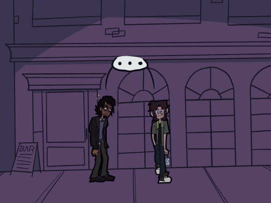

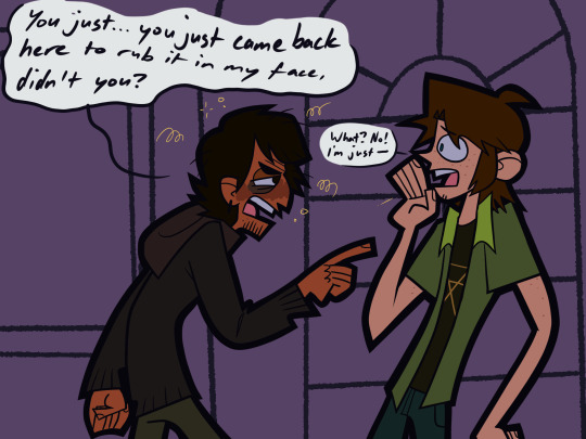
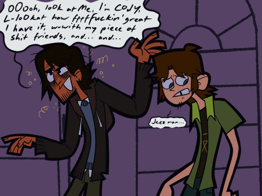

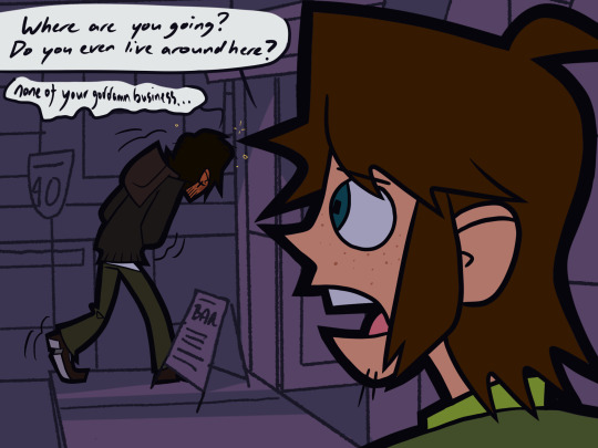
man how messed up is he? (3/24)
#noco family au#total drama#total drama noah#total drama cody#total drama noco#noco lore#sorry for the long wait ill try not to goof off as much when it comes to arcs#hopefully I get this one done somewhere round early feb#got too many ideas for this damned au#but yea also I like how everyones going on about the last few reboot eps#and like im like hey guys look at this its drunk noah look at him#but other than that the last few episodes were just meh#priya and Caleb thingy could have not dragged out for that long#winner was good though#very based#reboot season was very hit or miss#but when it hit#it hit HARD#idk
555 notes
·
View notes
Text

Walk the Divide
(7/14/23)
#fallout new vegas#new vegas#lonesome road#fallout#art#oc#lao#just finished this DLC again i forgot how much i like it#mechanically not just story-wise#like theres tons of locks to pick and theres useful items in every container#whereas the main game you rarely get to use the lockpick skill and containers are almost ALWAYS junk#marked men are fun enemies too esp when they suddenly use a stealth boy and you hear the sound effect go off#uhhh#the deathclaws sucked though#that did suck really bad
1K notes
·
View notes
Text
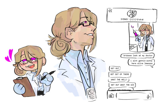
IM NOT A DOCTOR BUT I THINK I MIGHT BE ABLE TO HELP
#my art#dol#harper the doctor#HIIIIIIIIIIII HI EVERYONE 👋👋👋👋👋👋👋👋👋#its a little bit off so that makes me kinda upset :( but ill figure something out. it might be the colors :(#or maybe the spacing? i left a lot in the top left :( but its fine#and im going to use every lyric of that song for every harper piece i make so that i dont have to think about making captions okay?#but HERE. a HARPER PIECE YOU CAN REBLOG#i give them the stupid messy sidebun because its cute. to me.#im so sorry about the radio silence but i DID warn you all i get artblock often#but!!!!!! i was also accepted into a zine despite my lack of internet presence :) so ive also been busy with that and other stuff too#accidentally made this while practicing for the piece because i couldnt get the style right :( but hopefully ill get a better hold on it#anyways. harper is not a doctor and i love them so much it makes me sick#harper my EVERYTHING. hes my PRINCESS.#MY ANGEL.#i want you all to remember this isnt just an art blog. its a harper fanblog#ohhh but i do have a few few few announcements to make in my next post okay? so dont ignore it alright? kiss kiss love you#IM GONNA BE FUCKING SICK HES HOLDING THE SYRINGE WRONG. AND I CANT FIX IT NOW BECAUSE ITS BEEN RBED
706 notes
·
View notes
Last Seen Blogs
joestarluxe
joestarluxe.exe

welcometomytightholenowleave
If You Are Reading This You Already Know

banana-puns
眠たい

blackcucks
Only Black Cuck
slowtumbling
Slow Tumbling