#hence this “educational animal poster” was made.
Text
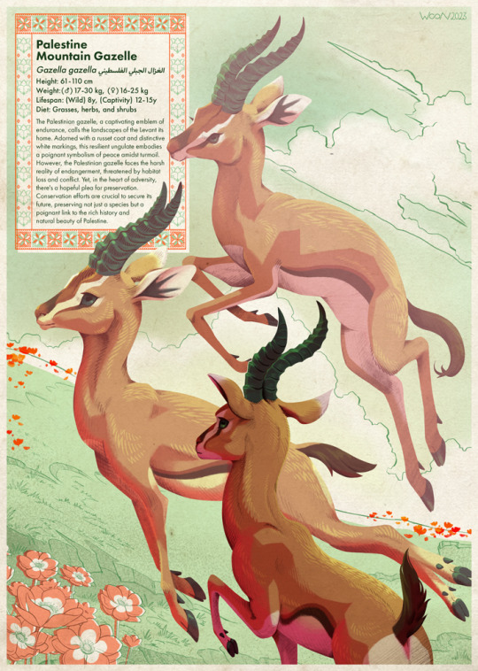
🕊️🍉💚
In solidarity with the people of Palestine.
(A contribution for @freewatermelonartjam )
#I live in a country that has continuously turned down protest requests and discourages people from displaying any political symbols.#Any form of activism is tightly restricted or kept subtle#hence this “educational animal poster” was made.#This artwork may be subtle in speech but my stance and views are not. Genocide is genocide.#free palestine#palestine#free gaza#ceasfire now#art for palestine#gaza genocide#gaza#apartheid#palestine mountain gazelle#Gazella gazella#mountain gazelle#animal art#zoology#taxonomy#wildlife art
1K notes
·
View notes
Text
Violet Evergarden Movie Summary

The initial plan was to make this a short bullet-point thing, but I felt like there was too much to clarify and I had no choice but use novel references to explain certain parts, so I decided to just write a normal summary. Many thanks before-hand to my friend Yuuki, who gave me all this info.
Apologies for taking relatively long with this thing. Not even I expected that I would end up writing this much. Buckle up for the ride, ‘cause it won’t be fun.
Nope, not kidding. It really won’t.
First thing I need to make clear is: this movie is one and a half hour long and divided into three parts and two different timelines: the times when Violet existed and the times after she dies. Already in the beginning of the movie, Violet is dead.
Yes, you read this right. She’s dead.
Now, I don’t mean that she’s dead in the literal sense. This is 60 years in the future. She might be alive or not, but it’s never said. However, the timeline of 60 years later is considered an era without Violet, apparently because she has retired and her “legend” is over, so to say. It’s also a time where Auto-Memories Dolls don’t exist. That’s one good punch in the face. Let’s keep counting.
The movie is sort of like a tale being read by someone else, which at some point goes into Violet’s first-person POV. The whole thing is kind of a look back on Violet’s life tragectory and how it took a new turn when she decided to continue looking for Gil despite all the mess of the TV series.
The era where Violet exists is an era where telephones are being introduced to the people, so Auto-Memories Dolls are starting to become unnecessary. I would argue that the creation of the telephone isn’t enough for an entire occupation to start disappearing so quickly, since new inventions are normally extremely expensive and not everyone has access to them (or even knows about their existence) so immediately after their conception. Realistically speaking, ghostwriters would still be important as long as there were still so many people unable to buy phones. Not to mention that this is a steampunk world where compulsory education doesn’t seem to be a thing yet, so even in the off chance that everybody can buy a phone, there would still be a lot of people who can’t read or write on their own. But all of this clearly went over the animators’ heads, so not only ghostwriters but also the mail business in general are nearing their doom in the movie.
The one looking back on Violet’s life was Ann, who was telling it all to her granddaughter, Daisy (who, by the way, is voiced by Morohoshi Sumire, the same girl who voiced the seven-year-old Ann). Ann had kept all the letters that Violet ghostwrote for her mother, as well as the newspapers about the CH Postal Company. Looks like the article was printed after Violet left CH, since she isn’t in the picture with everyone else.
In this era, CH’s main office has been turned into a museum. Nerine is shown working in it. Of course, she’s a grandma by then. Speaking of the CH personnel, Erica also quit being an Auto-Memories Doll and became a playwright like Oscar. She appears in the newspaper, though, so she probably a while left after Violet did. Taylor also appears there.
Back to Daisy, she was writing a letter to her parents, in order to learn how to properly convey feelings with written word. The message of this scene seems to be that, no matter the tools, what’s important is that we convey our feelings to the people we love.
As we see in the trailer, Gil’s mom has passed and Violet runs into Dietfried when visiting her grave on the anniversary of her death. To anyone who is wondering: yeah, Gil never went to see his mother and she died thinking that he was dead.
Nobody knew that Gil was alive. Not his mother, not Dietfried, not the Evergardens and not even Hodgins. No one.
Here’s what happened to Gil in the anime: he survived the incident at Intense, of course, but got separated from Violet in that explosion. His tag miraculously stayed on the same spot, though, as we saw in the TV series. Now, since this isn’t explained in the anime at all, I have to make it clear: the tag is that necklace the soldiers wear. It contains their names and ranks, so that their bodies can be identified even when they’re irrecognizable. Without the tag, the people who rescued Gil had no idea who he was, so he was sent to a different place to get treated. He ended up at a monastery hospital instead of the one in Enchaîné. I would debate that his uniform alone is enough to identify him as someone from the Leidenschaftlich Army, or maybe they could’ve just asked him which troop he belonged to after he woke up and relocated him to where his fellow men were, but who even cares about all these plot holes anymore? Definitely not me.
Anyway. After Gil was discharged, he ran the fuck away. Like, literally.
If anyone out there was hoping that Gil would finally have his moment to shine as the self-sacrificing, thoughtful and ridiculously kindhearted character that he is in the novel, I have bad news for you. What we had here was even worse than it being Gil’s excuse movie. It’s like the whole thing was made to drag his character so deep through the mud that he’ll never be able to get up again. There’s pretty much nothing in this one and a half hour that actually justifies what he did to Violet. I’ll elaborate on this as we go on.
Anime!Gil became a nomad and went traveling. He offed his ass to the island where that lighthouse displayed in the most recent official art is located (that’s why Gil and Violet were at the beach on the movie poster). He doesn’t have a prosthetic in the anime because, apparently, he was more worried about disappearing as fast as possible to somewhere he would never be found, and never attempted to contact anybody. So nobody knew that he was alive, hence the grave, which, as we feared, was not a fake one. His family really did think he had died.
This is a point that I have already addressed before, but that also means Gil really did abandon Violet to luck. If anything dangerous ever happened to her (as it did, and it was always very obviously likely to happen, since she was the southern army’s most outstanding soldier and quite literally fled from the military), he wouldn’t even know. If word ever got to him, it would probably be too late. And even if it weren’t, he wouldn’t be able to do anything to help her. More than allowing her to live freely, it felt like he was running away from his responsibilities regarding Violet.
Punch on the face count is currently at six.
By sheer coincidence, Violet learns that Gil is living in that island. She goes to see him and Hodgins goes with her after trying to stop her at first. When Gil finds out that they came to see him, he outright refuses to meet them. It pretty much takes the near entirety of the goddamn movie for them to see each other face-to-face. I say face-to-face because all of the following shit happens:
Hodgins goes to talk to Gil. It lasts about 20 minutes.
Gil talks to Violet from behind a door. This one is about 10 minutes.
Dietfried also comes to the island to talk to him. Also about 10 minutes.
At long fucking last, Gil goes to see Violet. But that, too, is only for about 10 minutes.
Hodgins gives him a speech very similar to what happens in chapter 8. Now get ready to fall back from your seats: Dietfried basically goes there to tell Gil that he won’t run away from taking over the family anymore, so Gil can live freely. Yes, Dietfried is officially a better Gilbert than Gilbert himself. I crave death.
So, after much ado, they come to a conclusion: Gil will stay in the island. In order to completely free himself of the shackles of his bloodline, he stays behind, living the way he wants to. ‘Cause all anime!Gil wants is to rot away alone by the sea, apparently. Now prepare yourselves, for it gets worse. Ready?
Violet stays with him in the motherfucking island.
That’s right, ladies and gents. Another fear became true. She quits her job at the CH Postal Company and goes to live with him. Well, at least, not as a housewife. She starts working with mail services in the island, and Gil helps her with it. Her life goes on like this and she dies in the island as well.
This is where the timeline after Violet passes away comes into light, parallel to the era when Violet was alive. Daisy talks about what happened after Violet left CH, as if it were a tale from the distant past.
That’s it.
The movie paints this as a happy ending. I can hardly see it as one. I know it almost looks like everything was solved, but it just got swept under the rug.
The main point that makes me sad in this ending is that Violet’s character development did a 360 degree flip. In the end, she threw everything to the air and went to live in someone who she always put before everyone else, even herself, but who didn’t do the same for her (in the anime). She’s gone to a crammed little island, where she led an uneventful life away from everyone and everything that’s ever had a positive impact on her. All she has is Gil.
Of course, he’s all she needs, but he isn’t all she should have, and that was the entire point of pushing her to go live on her own. Which is exactly what she earns in the novel: two loving parents, a father figure, a brother figure, a best friend and several other friends and acquaintances whom she formed a bond with. She has all she needs, so she doesn’t have to cling to Gil for any reason. There’s no emotional dependance on him anymore. She doesn’t need him to be whole. She just wants him because he happens to be the best person she’s ever met.
Anime!Violet is most definitely not whole. She almost got there, but then she backtracked completely. And anime!Gil... in my friend’s words, is a weakling. There’s nothing in him actually worth all this undying blind love. Sure, he’s full of regret and shit, but it’s too easy to only act upon it now, by vanishing into thin air like a coward.
The deal with novel!Gil is that he looks around at everything he has, everything that had been burdening him and killing him on the inside all his life, and decides to make use of it for Violet’s sake. He continues being family head and working in the army, amassing money and connections in order to have every means possible to protect Violet should anything happen to her. And as it turns out, he does end up having to use those means, more than once, but he will keep this up for as long as he needs to, because he lives for her now. That’s what makes him worth all the blood, sweat, tears, mental sanity and even body parts that she gave away for his sake: he pays it back. Every cent.
Punch in the face count ends at twelve. Thirteen if I include the fact that the movie ends with a last shot of Violet after she and Gilbert do a pinky swear. Looks like they were really trying to buy everyone with tears.
Oh, well.
I hope this has been a good enough summary. Sorry if I rained on anyone’s parade. I’m pretty sure we won’t get a remake ever, so I really wish we all can get over this soon.
#violet evergarden#fyeahvioletevergarden#kyoani#kyoto animation#violet evergarden movie#summary#gilbert bougainvillea#claudia hodgins#dietfried bougainvillea
352 notes
·
View notes
Text
Ok! Some more social and cultural psychology and copyright things. So as examples how the grown up xxx rated movies get away whit out lawsuits when making parody of pop culture, and we only making fanfiction of our popular characters shiping them as an ADULTS! Yes by al standards its valid and substantial only to a people subjective opinions! Here is the example of fair usage: Fanart and Fanfiction fall under fair use. Fair use is the defense against copyright infringement. However, to determine whether something is fair use is not easy.
Notwithstanding the provisions of sections 17 U.S.C. § 106 and 17 U.S.C. § 106A, the fair use of a copyrighted work, including such use by reproduction in copies or phonorecords or by any other means specified by that section, for purposes such as criticism, comment, news reporting, teaching (including multiple copies for classroom use), scholarship, or research, is not an infringement of copyright. In determining whether the use made of a work in any particular case is a fair use the factors to be considered shall include:
[6]
the purpose and character of the use, including whether such use is of a commercial nature or is for nonprofit educational purposes;
the nature of the copyrighted work;
the amount and substantiality of the portion used in relation to the copyrighted work as a whole; and
the effect of the use upon the potential market for or value of the copyrighted work.
Pop culture is prevalent today in modern times. There are conventions for almost everything movies, books, tv shows, anime, etc. At these conventions artists gather and do sell their work which can be in the form of posters, drawings, fan art, statues, etc. All of this has been happening for years. This all falls under fair use or does it? The answer is that it depends. The only way to objectively answer this is to look at similar cases in the past and see how the court ruled.
The case of Kienitz v Sconnie Nation LLC, 766 F.3d 756 (7th Cir. 2014) gives us an example scenario. In this case, a photo of a Wisconsim mayor was put on a T-shirt and sold to raise money for an event opposed by the mayor. The US Court of Appeals (only below the Supreme Court), ruled that the photo on the T-shirt was altered or “transformed” sufficiently that the background was removed, text was added, and only a green outline of the mayor’s smile remained similar to the smile of a Cheshire cat. Therefore, this fell under fair use. This case is probably the best reference for lawyers and defendants to defend fair use of fan art.
📷
How much of a photo do you need to alter to avoid copyright infringement? Hint: Cheshire Cat
Let’s look at another case, a more popular one where a photograph of ex-President Obama was taken and used to make a poster - Fairey vs Garcia. In this case, Shepard Fairey, a graphic artist, used Photoshop to modify the picture of Obama on the internet, to create a poster, sell it, and distribute it for free as well. Garcia was the original photographer who took a snapshot of Obama at a briefing. This was a Supreme Court case with the conclusion that neither party surrendered. However, Fairey did have to obtain a license from Garcia for future works.
📷
https://cyber.harvard.edu/people/tfisher/IP/Hope_Poster_Case_Study.pdf
Note that in both of the above cases, the work was commercialized and hence, the fair use defense was weaker. When it’s commercialized, one has to prove that the work is “transformative” to a significant degree from the original. Contrary to popular belief, copyright infringement occurs whether or not a product is free or not. The question then is - why doesn’t the copyright holder just start suing everything - including youtube, magazines, search engines, etc.?
The decision of whether to exercise the right of copyright is a cost/benefit analysis. It’s up to the copyright holder to determine whether it is more beneficial to allow others to talk about their product and gain free advertisement or whether the cost of losing profits is higher. If someone did go after fan art, it would ultimately lead to the fair use defense and they would lose if the fan art was deemed transformative enough. So that’s more cost than benefit.
3 notes
·
View notes
Text
WHEN WOMAN IS BOSS
An interview with Nikola Tesla by John B. Kennedy.
Colliers, January 30, 1926.
The life of the bee will be the life of our race, says Nikola Tesla, world-famed scientist.
A NEW sex order is coming--with the female as superior. You will communicate instantly by simple vest-pocket equipment. Aircraft will travel the skies, unmanned, driven and guided by radio. Enormous power will be transmitted great distances without wires. Earthquakes will become more and more frequent. Temperate zones will turn frigid or torrid. And some of these awe-inspiring developments, says Tesla, are not so very far off.
AT SIXTY-EIGHT years of age Nikola Tesla sits quietly in his study, reviewing the world that he has helped to change, foreseeing other changes that must come in the onward stride of the human race. He is a tall, thin, ascetic man who wears somber clothes and looks out at life with steady, deep-set eyes. In the midst of luxury he lives meagerly, selecting his diet with a precision almost extreme. He abstains from all beverages save water and milk and has never indulged in tobacco since early manhood.
He is an engineer, an inventor and, above these as well as basic to them, a philosopher. And, despite his obsession with the practical application of what a gifted mind may learn in books, he has never removed his gaze from the drama of life.
This world, amazed many times during the last throbbing century, will rub its eyes and stand breathless before greater wonders than even the past few generations have seen; and fifty years from now the world will differ more from the present-day than our world now differs from the world of fifty years ago.
Nikola Tesla came to America in early manhood, and his inventive genius found quick recognition. When fortune was his through his revolutionary power-transmission machines he established plants, first in New York, then Colorado, later on Long Island, where his innumerable experiments resulted in all manner of important and minor advances in electrical science. Lord Kelvin said of him (before he was forty) that he had contributed more than any other man to the study of electricity.
"From the inception of the wireless system," he says, "I saw that this new art of applied electricity would be of greater benefit to the human race than any other scientific discovery, for it virtually eliminates distance. The majority of the ills from which humanity suffers are due to the immense extent of the terrestrial globe and the inability of individuals and nations to come into close contact.
"Wireless will achieve the closer contact through transmission of intelligence, transport of our bodies and materials and conveyance of energy.
"When wireless is perfectly applied the whole earth will be converted into a huge brain, which in fact it is, all things being particles of a real and rhythmic whole. We shall be able to communicate with one another instantly, irrespective of distance. Not only this, but through television and telephony we shall see and hear one another as perfectly as though we were face to face, despite intervening distances of thousands of miles; and the instruments through which we shall be able to do his will be amazingly simple compared with our present telephone. A man will be able to carry one in his vest pocket.
"We shall be able to witness and hear events--the inauguration of a President, the playing of a world series game, the havoc of an earthquake or the terror of a battle--just as though we were present.
"When the wireless transmission of power is made commercial, transport and transmission will be revolutionized. Already motion pictures have been transmitted by wireless over a short distance. Later the distance will be illimitable, and by later I mean only a few years hence. Pictures are transmitted over wires--they were telegraphed successfully through the point system thirty years ago. When wireless transmission of power becomes general, these methods will be as crude as is the steam locomotive compared with the electric train.
Woman--Free and Regal
ALL railroads will be electrified, and if there are enough museums to hold them the steam locomotives will be grotesque antiques for our immediate posterity.
"Perhaps the most valuable application of wireless energy will be the propulsion of flying machines, which will carry no fuel and will be free from any limitations of the present airplanes and dirigibles. We shall ride from New York to Europe in a few hours. International boundaries will be largely obliterated and a great step will be made toward the unification and harmonious existence of the various races inhabiting the globe. Wireless will not only make possible the supply of energy to region, however inaccessible, but it will be effective politically by harmonizing international interests; it will create understanding instead of differences.
"Modern systems of power transmission will become antiquated. Compact relay stations one half or one quarter the size of our modern power plants will be the basis of operation--in the air and under the sea, for water will effect small loss in conveying energy by wireless."
Mr. Tesla foresees great changes in our daily life. "Present wireless receiving apparatus," says he, "will be scrapped for much simpler machines; static and all forms of interference will be eliminated, so that innumerable transmitters and receivers may be operated without interference. It is more than probable that the household's daily newspaper will be printed 'wirelessly' in the home during the night. Domestic management--the problems of heat, light and household mechanics--will be freed from all labor through beneficent wireless power.
"I foresee the development of the flying machine exceeding that of the automobile, and I expect Mr. Ford to make large contributions toward this progress. The problem of parking automobiles and furnishing separate roads for commercial and pleasure traffic will be solved. Belted parking towers will arise in our large cities, and the roads will be multiplied through sheer necessity, or finally rendered unnecessary when civilization exchanges wheels for wings.
The world's internal reservoirs of heat, indicated by frequent volcanic eruptions, will be tapped for industrial purposes. In an article I wrote twenty years ago I defined a process for continuously converting to human use part of the heat received from the sun by the atmosphere. Experts have jumped to the conclusion that I am attempting to realize a perpetual-motion scheme. But my process has been carefully worked out. It is rational."
Mr. Tesla regards the emergence of woman as one of the most profound portents for the future.
"It is clear to any trained observer," he says, "and even to the sociologically untrained, that a new attitude toward sex discrimination has come over the world through the centuries, receiving an abrupt stimulus just before and after the World War.
"This struggle of the human female toward sex equality will end in a new sex order, with the female as superior. The modern woman, who anticipates in merely superficial phenomena the advancement of her sex, is but a surface symptom of something deeper and more potent fermenting in the bosom of the race.
"It is not in the shallow physical imitation of men that women will assert first their equality and later their superiority, but in the awakening of the intellect of women.
"Through countless generations, from the very beginning, the social subservience of women resulted naturally in the partial atrophy or at least the hereditary suspension of mental qualities which we now know the female sex to be endowed with no less than men.
The Queen is the Center of Life
"BUT the female mind has demonstrated a capacity for all the mental acquirements and achievements of men, and as generations ensue that capacity will be expanded; the average woman will be as well educated as the average man, and then better educated, for the dormant faculties of her brain will be stimulated to an activity that will be all the more intense and powerful because of centuries of repose. Woman will ignore precedent and startle civilization with their progress.
"The acquisition of new fields of endeavor by women, their gradual usurpation of leadership, will dull and finally dissipate feminine sensibilities, will choke the maternal instinct, so that marriage and motherhood may become abhorrent and human civilization draw closer and closer to the perfect civilization of the bee."
The significance of this lies in the principle dominating the economy of the bee--the most highly organized and intelligently coordinated system of any form of nonrational animal life--the all-governing supremacy of the instinct for immortality which makes divinity out of motherhood.
The center of all bee life is the queen. She dominates the hive, not through hereditary right, for any egg may be hatched into a reigning queen, but because she is the womb of this insect race.
We Can Only Sit and Wonder
THERE are the vast, desexualized armies of workers whose sole aim and happiness in life is hard work. It is the perfection of communism, of socialized, cooperative life wherein all things, including the young, are the property and concern of all.
Then there are the virgin bees, the princess bees, the females which are selected from the eggs of the queen when they are hatched and preserved in case an unfruitful queen should bring disappointment to the hive. And there are the male bees, few in number, unclean of habit, tolerated only because they are necessary to mate with the queen.
When the time is ripe for the queen to take her nuptial flight the male bees are drilled and regimented. The queen passes the drones which guard the gate of the hive, and the male bees follow her in rustling array. Strongest of all the inhabitants of the hive, more powerful than any of her subjects, the queen launches into the air, spiraling upward and upward, the male bees following. Some of the pursuers weaken and fail, drop out of the nuptial chase, but the queen wings higher and higher until a point is reached in the far ether where but one of the male bees remains. By the inflexible law of natural selection he is the strongest, and he mates with the queen. At the moment of marriage his body splits asunder and he perishes.
The queen returns to the hive, impregnated, carrying with her tens of thousands of eggs--a future city of bees, and then begins the cycle of reproduction, the concentration of the teeming life of the hive in unceasing work for the birth of a new generation.
Imagination falters at the prospect of human analogy to this mysterious and superbly dedicated civilization of the bee; but when we consider how the human instinct for race perpetuation dominates life in its normal and exaggerated and perverse manifestations, there is ironic justice in the possibility that this instinct, with the continuing intellectual advance of women, may be finally expressed after the manner of the bee, though it will take centuries to break down the habits and customs of peoples that bar the way to such a simiply and scientifically ordered civilization.
We have seen a beginning of this in the United States. In Wisconsin the sterilization of confirmed criminals and pre-marriage examination of males is required by law, while the doctrine of eugenics is now boldly preached where a few decades ago its advocacy was a statutory offense.
Old men have dreamed dreams and young men have seen visions from the beginning of time. We of today can only sit and wonder when a scientist has his say.
#nikola tesla#interview#quotes#prediction#future#technology#climate change#smartphone#transportation#energy#wireless#ahead of his time#ahead of our time#science#history
1K notes
·
View notes
Text
Spreading environmental awareness through internet.
“IF WE TAKE CARE OF ENVIRONMENT; ENVIRONMENT WILL TAKE CARE OF US”
Internet was first discovered in the 1960s but at that point in time very few people were actually aware of the term “Internet". There was a huge communication gap around the globe. It was not before the post-globalization era during the 20th century, that Internet was known. After 1991, the Internet had a spontaneous breakthrough in the whole world. Maybe it was the globalization or liberalization that stimulated the growth of the Internet. Not before early 2008, society was famous amongst everyone. Long before when social media was not in the pictures, It took long ta time to connect with a mass number of people, but after the very growth of social especially after 2008, we could connect with a mass number of people by social media platforms and connecting them with our ideology, our perspective about something or our views. We actually use the power of social media to educate and influence the masses about various factors one of which is of course the environment. Anything and everything on the internet spreads like a wildfire.
Nowadays many social activists and organizations use social platforms to aware people of social issues. Now the question is how? We can easily say that the social platforms as a catalyst to promote awareness regarding any factor that would be considered as fruitful for the environment. There are many social media groups of specific organizations that actually spread awareness through posters, pamphlets, videos, animations, podcasts, poetry, and contents. The hashtags (#) play a very important role in social platforms. All the promotions could be connected with just a hashtag.
Using social media platforms like Facebook, Twitter, Reddit, Youtube, Instagram, Medium, we can connect with a large population and make them realize that how nature is deeply connected with us. The youngsters play only a crucial role in our generation because they are specially an internet addict. Some organizations hold activities and games to perform which could actually result in creating awareness and when someone wins, they are rewarded. In my opinion this initiative is what is actually needed. Now, the internet does not only mean social media, the internet can comprise of anything hence it can also be said as ‘mass media’. Our government has also taken some initiatives to enhance the environment and also to spread awareness. “Swachh Bharat Abhiyan” and “Toilets before Temples” are some of the famous initiatives which took the heart of the internet. Our prime minister along with various other prominent personalities coming down to the streets and cleaning it took the viewer's heart. This did set an example for the awareness for the environment and people actually did follow the same to keep the globe green and clean. Something or anything on the internet travels and reaches people more than even the speed of light. The fire in the amazon rainforest reached the masses even before the fire actually spread. These incidents not only spread awareness but also made all of us determined to save the very nature, else nature would engulf humanity and the human race through environmental disasters (earthquakes and tsunamis). So love the mother earth and take a small step ahead to save or planet.
Because “IF WE TAKE CARE OF ENVIRONMENT; ENVIRONMENT WILL TAKE CARE OF US”.
2 notes
·
View notes
Text
Belief and perception
Go, find a girl and get married, otherwise you will go mad, suggested a classmate. But I don’t remember when I last fallowed a suggestion by him but this time it was different. Different in the sense, he was suggesting me to go and get married, quiet contrary to all previous cases. My appreciation to this advice was that since I was busy mostly with books or my laptop, typing something and talking to myself, so called early stage of madness, but this madness I was eager to do. I was eager for madness because I wanted people reading my writing to go mad like me, while writing. I was quiet confident that it was going to happen, as I have lead my friend go mad listening narrations of my story, I was also aware that only mad man will advise someone to get married when somebody is at peak of his writing. But I fallowed his advice and left place where he and me were staying, but not permanently as I gave him time to recoup and be ready to listen more of it when I will be back, While leaving home I left with very few clothes, pen and my beloved diary, just being ready to stay wherever I got to.
I started for the journey so called to find a girl and get married, But it was difficult for me to find anything worth writing, earlier when I use to see something I use to get at least 5 lines to write about but in last three days I have seen thousands of things but nothing have come on diary. I tried changing pen and diary in fact I also changed my getup, sleepers, hairstyle but nothing new was happening. One day while I was travelling in a bus, I was badly feeling sleepy even though, I had a nice and sound sleep in last three days. Once it happened that while in my sleep I banged my head to an iron bar fitted near my seat and had a bubble coming over my head, exactly where ladies put there “bindia”. I de boarded and got a band-aid on injury, it was yellow in color, kids around started shouting bindia uncle bindia uncle making me realize how odd it was on my face, in an effort to get it corrected I again went to a medical store and got a band-aid of white color. The moment I came out of that medical store, kids again started shouting white bindia waley uncle white bindia waley uncle. A writer who fascinates other with his creative comments was irritated by creative comments of kids. Again in a final effort to get it corrected I removed band-aid and went outside, kids were not saying anything, I was finally looking good as I perceived when an elderly woman asked “beta kha mar pit karke aa rhe ho”. But now I was not going to change anything, I started to change my thoughts about things and I am able to see and ultimately raising question on my behavior, in fact it made me believe for some time that I am going mad but that was only for a short time. With all such experiences and thoughts I had traveled to an area away from cities as I could realize without opening my eyes with lesser sound outside and light on my closed eyes was also fading slowly, I was in mood to continue feeling that calmness but as said when you want to do something you have to make some effort and somebody around me made an effort, chanting “ajao ajao phuch gye” and it was time for me to make some effort and finally I opened my eyes. I opened my eyes and my mind had a thought about the place where I de boarded. The place had many things made of wood all painted in different colors, some had man painted in black, some had woman painted in blue and so many other figures painted in hundreds of blend of colors and then I met one woman whose statue was made in wood and her entire body was painted with green color but bindia was painted white and it reminded me of that incident where I was changing colors of bindia made on my face, I realized how sensitive I was to those innocent, immature kids, it made me realized, I have not only gone mad but I am also have grown more intolerant or I have just gone more intolerant which is contributing to my madness, while all this was happening in my mind I almost crushed myself on an statue, I was not clear whether that statue was of male, female, both or of none, but I left that place before doing much damaged to sculptures with my intolerance, madness and confusion.
After much rest and sleep, I went out of my room and was surprised to see confused but common world. At first I could see a banner of some political party which was actually placed in an horizontal manner but with mounting pressure of confusion outside, it was tilted to diagonal and netaji on poster was like trying to come on ground and see things may be to solve it but no way to come down as poster was still hanging in air. For once, it came to my mind, to put that poster touching ground but my conscious mind intimated that, it might contribute to my madness and I decided to go tolerant. My curiosity pushed me to walk further when my eyes could again see four man, holding a green cloth and playing something on a small music player and people contributing money to those people by throwing coins, at first I thoughts it’s a kind of information they are paid to disseminate but had it been such, everyone must have contributed, contrary to that only few contributed but again came a thought that it might be of some relevance to only those people hence they contributed, but it was all again going confusing, so I decided to ask it to a pedestrian, At first that man’s reaction was that, I am trying to make fun of him but with little effort to make him aware of I being unknown he said that it’s a customary practice by some poor Islamic clerics to fulfill their needs. I was surprised, even god also needs help from people to get their needs fulfilled, before I jumped to any conclusion, my mind suggested that I shouldn’t be conclusive on matters related to religion as it’s a belief and belief changes with our experience. My first-hand experience of Islam, make me believe that it’s a great religion. With such thoughts my day came to an end, now I could realize that travelling to this place has worked and I am able to think now and that incidence related to Islam had ignited a thought in my mind for another change, the change in belief or in short “change in religion”. While I was trying to sleep in night a thought came about changing belief. In order to change my religion or belief I need to change my physical appearance but my previous experience of “Bindia” wala incidence resisted me. In the end of tussle with various ways to change my belief, my mind decided that I will fallow Islam without any approval from any religious head and without changing my physical appearance and food habits, the other reason behind this decision was that I might need another change in thought in near future and it is difficult to switch when you are linked with religious heads and after all, if I need permission to fallow any god that means he is a tailor made god of some people cashing on emotions. This decision had convinced my mind which went for a sound sleep with a motive that I will wake up tomorrow in world of a different religion.
Next morning and I felt like I have to start it all together because the first thing came to my mind after I woke was that “ I started by an advice to get married”, but changes thereafter had pushed me much away from any such thoughts and I am getting involved in something, which if others came to know about will lead to, an explicit isolation of me from friends, society and may be from family. But sometimes doing wrong attracts more interest than being usual self and to overcome my loneliness, I need to enjoy some things, may it be at cost of whatever social life I had, Since I use to write all these sitting at one particular place, sometimes people come around asking something or May be in a thought to become part of my writings. Of all those came to me, I asked one what they think before coming to me and one elderly man said that they think I am more intellectual than what they are or may be I am one of those intellectual type who became authors at an young age, I asked what made them think like that and that man said you look like an educated man and I said “how an educated man look like?”, that man being trapped in his own comments said “that’s why I said you are an educated man”. I remember once one of my family friend saying” all writers are mad, you can easily see and identify them being entangled in their words, scary people. Thank god I did not get that kind of reply from that elderly man otherwise my friends belief must have intensified its effect on me .while I was going through such meaningful complicated conversations, I could notice a boy wearing white skull cap and following his animals to grazing area, exactly kind of cap those people expecting contributions were wearing, it was so inviting that, leaving conversation with that elderly man I walked towards that boy , when that elderly man shouted “where you going boy”, maybe he was saying me boy because he was not knowing my name nor he was aware of my caste otherwise he might have sarcastically said Gallib or Kanhaiya or Angrerzibabu and while my mind was busy with such words I was about 35 meter away from that boy wearing skull cap, but I was also puzzled, how to make him halt so that I can talk to him, unaware of his name, I called him, oh boy but he didn’t stop, being clueless I finally called him “chhote miyyan” and he stopped, a inner voice came from within, great great and great is religion. The best way to extract anything from somebody is to be friend to him and for that I started an conversation, I asked him “up to where he will go” and he replied “yeen ye duang” and I realized that he was dumb, can’t speak anything but at least he can hear what I want from him. I thought it as best way to ask him something and guess what he want to say. A kind of test of my appreciation, something which I have not done since a long time. I walked him till a place where all his grazing animals got enough to graze and he had some time to rest, and so, I got something to ask. Before I begin asking him anything. I took a selfie and posted it on Instagram with a tagline “beginning of change in belief” not many of have expected that my change in belief was related to change of religion. My Conversation with that dumb boy
Me: what is your name? (all answer of him was appreciated by me based on his actions)
Boy: you may call me chhotemiyyan
Me: but why?
Boy: you called me that name and we are friend now, which means name is just to approach anybody rest is all our behavior and habits.
Me: from where did you learn that?
Boy: pointing towards a distant concrete made structures.
Me: what your father do?
Boy: wrestler
Me: how you feel with these animals around you?
Boy: all are like me
Me: why?
Boy: they also can’t speak like me, but they understand who is good to them
Me: what is good?
Boy: we behave well with each other
Me: does good means only that to you?
Boy: rest is all taken care by allah, as he said pointing towards sky.
Me: will you take me to your home
Boy: once my animals finish with their grazing
Me: how will you come to know about that?
Boy: just wait and watch
Me: for the time being I went busy clicking some pictures and interacting with those animals with postures and gestures, sometimes I felt like they are responding and something they were running behind me as If they were aware that I was manipulating them, which I was trying, may be with an hope to extract some info about their masters thought and my new belief. After sometime sun was going down and I could see most of his grazing animals have automatically turned towards way back home and that boy indicating me with whatever voice he had,
Boy: time to go home
Me: I could see how all animals under him were lined up to go home, a rare discipline we men fallow and I realized goodness of that boy who was not able to speak, I realized a connection between emotion of a good social animal with other animals and power in goodness to build that trust, even more solid than that of concrete structure which was somehow instrumental force behind inculcating goodness in that boy. It was evening and I proceeded towards my place where I was staying with a promise to myself that I will return tomorrow. That night I was busy, rather my mind, heart and eyes were busy searching for a definition of goodness, which can define goodness of that ‘chhote miyyan’ but my imagination and perception was failing to arrange some words for that boy, but I was helpless like so many other occasions and went to sleep with an hope that I will be blessed by an answer in next morning.
Next day with sunrise was another morning of hope not just for name of that boy but for so many new things to be explored. For a better understanding of the religion or you can say belief I happen to go into one of the rich area of settlement, the moment I entered in colony I could hear sounds in decibels more than normal, people were shouting like anything, heads tilted to front (to me it seemed that head was tilted in front because of weight of beard). My first observation was that it is going to really different to be part of such religion, but this also reminded me of a character in story of my grandmother, which she use to tell me just for the purpose of making me aware of outside world and its nuances . But today with her blessing I have grown up to search for those nuisance, fight against and for it. Slowly and slowly with thousands of thoughts in my mind I approached few who were gathered after offering prayer, greatest difficulty for me at that time was how to start, when one elderly man approached from behind with words “janaab”. I was surprised but it was good, I found somebody who knew me, he was the elderly man who once said that I look like a writer. Half of my tension was relieved and I conveyed my reasons to visit that place and he was like happy to let me know about his religion and belief, I said religion and belief because for him his belief was that his religion is best in world and to prove his belief right he took me for tour of mosque and promised to explain importance of every activity. Before he could say anything I asked him certain questions
Me: what people say in daily prayers of six times?
Man: people utter all those good things written in holy book
Me: can you say some of them?
Man: it’s about our daily things
Me: what are those daily things?
Man: its about how you live in society, what things one should follow, for example he said “one should take bath daily”(he tried to produce humors but I was still not clear what he was trying to say )
Me: why you wear turbans?
Man: it’s a matter of pride
Me: how does that contribute in pride?
Man: it’s in belief that man should be always with turban and women with hijab.
Me: I nudged my head in agreement but it was just virtual as my inner self was with a belief that, the turban and hijab have overshadowed personality of man and women, it also dominates over original customs and tradition made for welfare of common mass.
That man explained me whatever he could but as like a learned man I was not convinced and impressed with his belief and what I could conclude from his words, and also decided to find it in my own style. The best method I could invent was to first learn about my belief and religion and then compare with others and reading from book will not help my purpose, keeping that in my mind I decided to go on a religious tour, a never before initiative and that is just to know my belief, I was changed and words of my friend to send me out of that room helped.
After some four days of travel, I reached back to my room, my friend was studying something from a dictionary kind of book, I use to call that ‘scary book’, the moment he saw me, before even I could have entered the room, he started saying “look man I don’t want to listen anything on religion and please I beg your forgiveness to believe that by sending you out for some day I can remain in peace”. As like every other conversation I said “have you seen religion?”. It took me 7 days to convince him that lets go on a religious tour, and finally he agreed, and I got a new tour....
1 note
·
View note
Text
MACRO POST 3
With the red ribbon week coming up in a few weeks our team was energetic and excited to meet with the students of the middle schools. with the videos and the posters being ready to be displayed in the schools we started to work on providing every student with some reminder for this event so we came up with an idea to make red bow pins to distribute to the student to symbolize the red ribbon week which could also be used as a memory of the event and a reminder for them to say no to drugs. Apart from the posters and the pins, we wanted to provide them with some resources that the middle schoolers could use in the future that might help them in time of need. Hence, we came with a plan to make brochures with a few facts about opioid addiction, statistics and data on substance abuse, helpline number for substance abuse and mental health services administration (SAMHSA) to seek help and also, we included signs of overdose and first aid for overdose and counseling and assessment services for them to seek help if need. after the completion of the required need for the event, we contacted the school counselor to sort out a few last details such as the number of students and number of participants for the poster contest and the schedule for the red ribbon week and the event. At both, schools the interactive video and the testimony video was played prior to the event. On the day of the event on the 29th of October, we visited the Benson middle school in the morning followed by McGee’s crossroad middle school in the afternoon. The schools have arranged their posters for the poster competition and they were presented on the walls of each homeroom. We were able to judge these posters and score them according to their use of quotes, illustrations, messages they spread, and their usage of the ultimate theme “the red ribbon week” and “Drug-free me looks like me”. There were several amazing posters made by these children which were difficult to judge and select just a few among them but we decided on selecting one for each grade and among them present the winner and two runners-up. These middle schoolers came up with several innovative and unique quotes to make their posters unique and they were able to represent the theme of the competition with unique animations and other visual representations. On the visitation of the results day, all the students in the school were very eager to hear who won. Then the winning classes were presented with a pizza and ice cream party which were a winner among the students. We were able to speak to the student from some classes and get to know their thoughts on this initiative. A lot of the students were already aware of the information on substance abuse and they were very determined to stay away from it. And some who were not aware of the consequences got to learn and pick up a few good things from this event conducted to educate them. With these kinds of initiatives, we wanted to involve the students to be a part of the learning process and get their hands on creating posters by which they will be more informed on the perils of substance use. We later distribute the brochures one in each homeroom, to sum up, all the things they’ve learned with the details on how to help someone they know with facts and helplines. Team angels with JOCO angels we were able to accomplish some of our goals this semester by creating awareness on addiction to these young minds. We would like to sow in the benefits of staying away from drugs and like to let it grow in their minds. We know that a small step is all that is needed to create a big impact in people’s lives especially with a young kid who is going to be the future of this world. I also believe that these initiatives be continued throughout so that even if there is 50 percent of these students learn something from these events then we might a 50 percent more change to reduce substance abuse among teens.
0 notes
Text
WHEN WOMAN IS BOSS
An interview with Nikola Tesla by John B. Kennedy Colliers, January 30, 1926
The life of the bee will be the life of our race, says Nikola Tesla, world-famed scientist.
A NEW sex order is coming--with the female as superior. You will communicate instantly by simple vest-pocket equipment. Aircraft will travel the skies, unmanned, driven and guided by radio. Enormous power will be transmitted great distances without wires. Earthquakes will become more and more frequent. Temperate zones will turn frigid or torrid. And some of these awe-inspiring developments, says Tesla, are not so very far off.
AT SIXTY-EIGHT years of age Nikola Tesla sits quietly in his study, reviewing the world that he has helped to change, foreseeing other changes that must come in the onward stride of the human race. He is a tall, thin, ascetic man who wears somber clothes and looks out at life with steady, deep-set eyes. In the midst of luxury he lives meagerly, selecting his diet with a precision almost extreme. He abstains from all beverages save water and milk and has never indulged in tobacco since early manhood.
He is an engineer, an inventor and, above these as well as basic to them, a philosopher. And, despite his obsession with the practical application of what a gifted mind may learn in books, he has never removed his gaze from the drama of life.
This world, amazed many times during the last throbbing century, will rub its eyes and stand breathless before greater wonders than even the past few generations have seen; and fifty years from now the world will differ more from the present-day than our world now differs from the world of fifty years ago.
Nikola Tesla came to America in early manhood, and his inventive genius found quick recognition. When fortune was his through his revolutionary power-transmission machines he established plants, first in New York, then Colorado, later on Long Island, where his innumerable experiments resulted in all manner of important and minor advances in electrical science. Lord Kelvin said of him (before he was forty) that he had contributed more than any other man to the study of electricity.
"From the inception of the wireless system," he says, "I saw that this new art of applied electricity would be of greater benefit to the human race than any other scientific discovery, for it virtually eliminates distance. The majority of the ills from which humanity suffers are due to the immense extent of the terrestrial globe and the inability of individuals and nations to come into close contact.
"Wireless will achieve the closer contact through transmission of intelligence, transport of our bodies and materials and conveyance of energy.
"When wireless is perfectly applied the whole earth will be converted into a huge brain, which in fact it is, all things being particles of a real and rhythmic whole. We shall be able to communicate with one another instantly, irrespective of distance. Not only this, but through television and telephony we shall see and hear one another as perfectly as though we were face to face, despite intervening distances of thousands of miles; and the instruments through which we shall be able to do his will be amazingly simple compared with our present telephone. A man will be able to carry one in his vest pocket.
"We shall be able to witness and hear events--the inauguration of a President, the playing of a world series game, the havoc of an earthquake or the terror of a battle--just as though we were present.
"When the wireless transmission of power is made commercial, transport and transmission will be revolutionized. Already motion pictures have been transmitted by wireless over a short distance. Later the distance will be illimitable, and by later I mean only a few years hence. Pictures are transmitted over wires--they were telegraphed successfully through the point system thirty years ago. When wireless transmission of power becomes general, these methods will be as crude as is the steam locomotive compared with the electric train.
Woman--Free and Regal
ALL railroads will be electrified, and if there are enough museums to hold them the steam locomotives will be grotesque antiques for our immediate posterity.
"Perhaps the most valuable application of wireless energy will be the propulsion of flying machines, which will carry no fuel and will be free from any limitations of the present airplanes and dirigibles. We shall ride from New York to Europe in a few hours. International boundaries will be largely obliterated and a great step will be made toward the unification and harmonious existence of the various races inhabiting the globe. Wireless will not only make possible the supply of energy to region, however inaccessible, but it will be effective politically by harmonizing international interests; it will create understanding instead of differences.
"Modern systems of power transmission will become antiquated. Compact relay stations one half or one quarter the size of our modern power plants will be the basis of operation--in the air and under the sea, for water will effect small loss in conveying energy by wireless."
Mr. Tesla foresees great changes in our daily life. "Present wireless receiving apparatus," says he, "will be scrapped for much simpler machines; static and all forms of interference will be eliminated, so that innumerable transmitters and receivers may be operated without interference. It is more than probable that the household's daily newspaper will be printed 'wirelessly' in the home during the night. Domestic management--the problems of heat, light and household mechanics--will be freed from all labor through beneficent wireless power.
"I foresee the development of the flying machine exceeding that of the automobile, and I expect Mr. Ford to make large contributions toward this progress. The problem of parking automobiles and furnishing separate roads for commercial and pleasure traffic will be solved. Belted parking towers will arise in our large cities, and the roads will be multiplied through sheer necessity, or finally rendered unnecessary when civilization exchanges wheels for wings.
The world's internal reservoirs of heat, indicated by frequent volcanic eruptions, will be tapped for industrial purposes. In an article I wrote twenty years ago I defined a process for continuously converting to human use part of the heat received from the sun by the atmosphere. Experts have jumped to the conclusion that I am attempting to realize a perpetual-motion scheme. But my process has been carefully worked out. It is rational."
Mr. Tesla regards the emergence of woman as one of the most profound portents for the future.
"It is clear to any trained observer," he says, "and even to the sociologically untrained, that a new attitude toward sex discrimination has come over the world through the centuries, receiving an abrupt stimulus just before and after the World War.
"This struggle of the human female toward sex equality will end in a new sex order, with the female as superior. The modern woman, who anticipates in merely superficial phenomena the advancement of her sex, is but a surface symptom of something deeper and more potent fermenting in the bosom of the race.
"It is not in the shallow physical imitation of men that women will assert first their equality and later their superiority, but in the awakening of the intellect of women.
"Through countless generations, from the very beginning, the social subservience of women resulted naturally in the partial atrophy or at least the hereditary suspension of mental qualities which we now know the female sex to be endowed with no less than men.
The Queen is the Center of Life
"BUT the female mind has demonstrated a capacity for all the mental acquirements and achievements of men, and as generations ensue that capacity will be expanded; the average woman will be as well educated as the average man, and then better educated, for the dormant faculties of her brain will be stimulated to an activity that will be all the more intense and powerful because of centuries of repose. Woman will ignore precedent and startle civilization with their progress.
"The acquisition of new fields of endeavor by women, their gradual usurpation of leadership, will dull and finally dissipate feminine sensibilities, will choke the maternal instinct, so that marriage and motherhood may become abhorrent and human civilization draw closer and closer to the perfect civilization of the bee."
The significance of this lies in the principle dominating the economy of the bee--the most highly organized and intelligently coordinated system of any form of nonrational animal life--the all-governing supremacy of the instinct for immortality which makes divinity out of motherhood.
The center of all bee life is the queen. She dominates the hive, not through hereditary right, for any egg may be hatched into a reigning queen, but because she is the womb of this insect race.
We Can Only Sit and Wonder
THERE are the vast, desexualized armies of workers whose sole aim and happiness in life is hard work. It is the perfection of communism, of socialized, cooperative life wherein all things, including the young, are the property and concern of all.
Then there are the virgin bees, the princess bees, the females which are selected from the eggs of the queen when they are hatched and preserved in case an unfruitful queen should bring disappointment to the hive. And there are the male bees, few in number, unclean of habit, tolerated only because they are necessary to mate with the queen.
When the time is ripe for the queen to take her nuptial flight the male bees are drilled and regimented. The queen passes the drones which guard the gate of the hive, and the male bees follow her in rustling array. Strongest of all the inhabitants of the hive, more powerful than any of her subjects, the queen launches into the air, spiraling upward and upward, the male bees following. Some of the pursuers weaken and fail, drop out of the nuptial chase, but the queen wings higher and higher until a point is reached in the far ether where but one of the male bees remains. By the inflexible law of natural selection he is the strongest, and he mates with the queen. At the moment of marriage his body splits asunder and he perishes.
The queen returns to the hive, impregnated, carrying with her tens of thousands of eggs--a future city of bees, and then begins the cycle of reproduction, the concentration of the teeming life of the hive in unceasing work for the birth of a new generation.
Imagination falters at the prospect of human analogy to this mysterious and superbly dedicated civilization of the bee; but when we consider how the human instinct for race perpetuation dominates life in its normal and exaggerated and perverse manifestations, there is ironic justice in the possibility that this instinct, with the continuing intellectual advance of women, may be finally expressed after the manner of the bee, though it will take centuries to break down the habits and customs of peoples that bar the way to such a simiply and scientifically ordered civilization.
We have seen a beginning of this in the United States. In Wisconsin the sterilization of confirmed criminals and pre-marriage examination of males is required by law, while the doctrine of eugenics is now boldly preached where a few decades ago its advocacy was a statutory offense.
Old men have dreamed dreams and young men have seen visions from the beginning of time. We of today can only sit and wonder when a scientist has his say.
http://www.tfcbooks.com/tesla/1926-01-30.htm
2 notes
·
View notes
Text
Evaluation !
Since September, I have been working on the first project of my year two graphics communications course which was titled PAGE TO SCREEN. This project was about famous books that have been turned into a movie and creating artwork from them. I had to create alternative book covers and film posters for my selected theme, which was The Jungle Book.
I was pleased with my selected book/film as I knew I was going to be focusing on the audience of children. This would mean many different colours were going to be incorporated into my project and also an element of education was going to be brought in my artwork as well.
For a lot of my outcomes, I used Pinterest for inspiration as I wanted to see what had been done before so I could create unique results that would stand out.
When you look at my outcome, there are elements of the jungle throughout all of them as one of my goals was to focus on grabbing my audience's attention. A fair amount of the features were animals. The reason for this was because my target audience being children I wanted my artwork to educate them on animals that would be found in the jungle.
There was a lot of trial and error within the project as I was experimenting with different styles such as thresholding, halftoning, extra. One of the processes that helped me get over mistakes was having the pieces of artwork up on my desktop and then create the same thing again on photoshop but changing the bit that didn't look right. Still, by doing this, it allowed me to have better outcomes than the first and also made me learn a lot more, and by learning, I was able to broaden my skill base. Alongside this, there was a lot of research. Not just artist research I was researching the author of the book Rudyard Kipling and also researching about the jungle, the jungle book originated from. By doing this, it allowed me to look at colours and animals for inspiration, and by doing this, my artwork came out well.
Within my project, I created five book cover designs, and 11 movie poster designs within all these designs I was making illustrations to use on them including digital images drawn on photoshop and procreate and also hand-drawn work using pens, paint and pencils.
When I was given the jungle book, I was excited to start creating artwork. As I got into the project, I began to find it hard as I had problems that I didn't think of such as showing expressions through an animal's face and being able to create cartoon looking animals to represent the 1968 animation film but soon realized it was hard so, during my project, I decided to focus more on the real-life jungle book that was made in 2016. This made it slightly more manageable as I was able to use an image of real animals to work from and not having to create my animal from scratch.
Other issues that I had to approach was the colour pallet at the beginning of my project. I was focusing on the colours of the jungle as I wanted the colours to represent it, but then all my work started merging into one, so I decide to use a website called coolers.Co this was a colour generation site, and by using this, I was able to use unique colour pallets that made my outcomes stand out. First, I started adding different colours in slowly then completely didn't use green, and the results came out well. My final book cover design had no green on it at all, which can show progress has happened, and I have worked on targets.
The journey of the project had a high at the beginning due to my interest and excitement to create but then went downhill but soon lifted again after I had the problem solved and come up with solutions this made it run more smoothly.
With having been doing the concept and topic of page to screen the jungle book I knew it was going to be children based as I said at the beginning, I knew my aim was to make fun, unique, educational pieces of artwork. Nowadays I feel like children are more into movies as technology is overriding the classics such as books that is why I have made many different movie posters as that is what I feel children would be more drawn too now. However, there are still children who love books hence why I always focused on creating book cover but just not as many as the posters, I was still focusing on the educational bit for both of them, But mainly the book as that is something you pick up and really absorb whereas with a movie poster it is something that you look at to get an a fell of the movie and get a feel for what's to come and with my outcome, I think you can see that being portrayed.
This whole project opened my skill base hugely as I was learning new skills every day and not just the skill I was being taught. I also learnt skills about organization preparation but mainly understanding of my target audience. I feel that out of the skills I learnt from college understanding my audience and how important it is to understand and get on the same wavelength as your audience. This will give you the best outcomes as you are putting your self in there shoe's. It works well and makes you want to do more artwork as it gives you a lot of inspiration. But overall, it also helped me with this project.
Page to screen project was a project that consisted mainly of computer-based work. This included the materials of photoshop and illustrator and in my case also procreate there was also the element of practical workshops such as typography, collagraphy, screenprinting and illustrations(continuous line drawings), my favourite media that I used was probable the digital art as I like the effects and texture I was able to create, and how I was able to bring a piece of artwork alive, the only thing that wasn't as enjoyable about the digital art was having to constantly create layers, so you were able to move them around even though it helps a lot when you want to manipulate the outcome, its frustrating when you get to the end and realize its all on one layer but when that has happened, I have always been able to sort it out eventually. My favourite part of the practical workshop was probably the illustration workshop as it was a challenge having to keep the pen on the paper the whole time to create the illustrations were hard but what I drew was terrific illustrations.
With each book cover and movie poster design I had to select the right size for both of them so throughout the project this became a prosses I had to do every time I wanted to create an outcome. With the book cover, I have to prepare an a4 horizontal white page on photoshop making a 2cm gap in the middle for the spine of the book with the rulers and then with the movie poster I had to create an a3 white page on photoshop.
Another process I had to use throughout the project was looking and planning my design to do this, I went on to Pinterest and had a browsed at different book cover/posters for inspiration.
A technique that appeared in this project was animating. I had done this technique in another project before last year; this benefited me as I was able to crack on with it. The only thing that was different was the animation have a different topic/concept. Animating was an old skill to me, but I managed to learn a new skill within it which was another way of animation I learnt that you were able to create an animation without having to do the process of moving and saving this helped as it was an easier but effective way of animating.
With the current situation of COVID19, we were asked to create a blog on Tumblr this was to ensure us that our lecturers were able to see our work in case of other national lockdown and also minimizing cross-contamination of passing our journals back and forth. I really have enjoyed having tumbler as our alternative sketchbook and journal as to me look a lot nearer than my previous projects, and with my specialism being graphics communication, I can present my work in a high-quality way compared to last year, and with Tumblr, I was able to look at my blog as a whole project. I was also learning about aesthetic as you could transform your blog to link to your topic. My blog contains a lot of work, including research. The research was a big part of this project as I needed to learn about The jungle book but not just the storyline, but about the background of the jungle book, this helped me a lot as I was able to plan colour pallets layouts and general inspiration and overall enjoyable to me. It helped me with my target audience a lot. As I am on the topic of research there was research on my blog about the artist that inspired me the main artist that inspired me to do my final book cover design was Coralie Bickford smith she is an amazing illustrator for book cover designs, and I just fell in love with her work and I was able to create outcomes using inspiration from another artist that help me more with digital illustration, his name is Roy Lichtenstein he inspired me with my halftone work, and I can happily say it some of the favourite work I have created.
One of my the pieces of primary research I did was creating my own mood board using objects to help me understand the topic of the jungle book, and I used Jordan Bolton as my artist inspiration for this as I wanted to link to back to an artist.
I have really enjoyed this project of the page to screen and can happily say I am pleased with my outcome.
My outcomes are very strong and show planning, and the main thing is catered to my target audience I feel like they could be a genuine poster and book cover, but there are also some weaknesses, but the weaknesses were not with my outcome because I am happy with them it more about my blog side to the project if I was to work on something it would be delving into more artist research and even though it was hard to find an artist that inspired me I still feel like I could have done some more but still happy with what I have achieved.
With this project, I feel like was to be harsh on myself, and I did this as it made me work harder what I mean by this is when I looked at my work I reviewed it as two people one of them was saying the good thing and the other picking up on things I wanted to change, and this helped me and was an effective way of self reviewing and help me at the end with outcomes.
To me my outcome show progress as from the start of the project from the 16th of September to now you can see my work has grown and this is down to workshops such as halftone, typography workshops and these were only in the first couple of weeks on the project, and there were many more, but you can see it has helped me grown as a designer and learn, I feel the workshop that has to help me the most was the typography because it made me understand how much can be conveyed through typeface and also helped me understand how important it is.
Overall my outcome has worked well there have been displayed on my blog along with my research, other outcomes and problem-solving. The way my work has been displayed is in a unique way I have placed my book cover design onto a book, so it looks more realistic as with my poster I have made sure I have a high quilty picture and has been put onto a mock-up on to different billboards in different areas.
My whole project shows the progress of my skill and how my outcomes have been created and that is what I wanted for my blog to portray and I am excited to use the skills that I have learnt in my future project as they are very useful and I know I have a lot more knowledge on the audience and that will help me plan and create better and significant outcomes in the future.
0 notes
Text
Final Project - Self Branding
In the final project, we were to work on a brand identity by creating a publication in the form of a brand style guide. There were 2 options to choose from to develop the brand: Self-Identity and a branding for the Department of Communications & New Media. The project deliverables were a Logo, a Business Card and a Resume/Poster, all included into a Brand Style Guide. These deliverables were extremely intimidating, as I have never made anything like that before.
Brainstorming Process
After receiving the project brief, we had some time to brainstorm ideas before doing a 5-minute pitch to Kai. I thought about both options, but just could not decide between the 2 of them. On one hand, I wanted to do the self-branding because it seemed really interesting and would be a good chance to see what would happen if I were to brand myself into something tangible. It looked like an option that can allow a lot of creative juices to flow, and basically let me do whatever I want. However, this flexibility is very intimidating too, as how should I even begin to do it? Also, how much of myself do I want to include in this brand? I had various doubts on this option, and took a lot of time to think about it. On the other hand, option 2 looked more straightforward to handle. Maybe it was due to the fact that I will be working on it as a third person, this option looked more structured and “safe” in a sense.
Up to the project pitch, I was still unable to decide between both of them. However, eventually I decided on option 1 – self branding. One of Kai’s comments was the catalyst for me to make the final decision. He offhandedly commented that one of my classmates really likes rabbits, so they were going to center their identity around a rabbit. This led me to think about some things I like that can be incorporated into the brand.
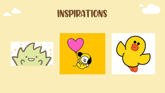
I eventually narrowed down to 3 of my favourite characters for inspiration. I particularly like the weed from Sumikko Gurashi, because not only is it absolutely adorable, its back story was also touching and relatable. It is a weed who dreams of becoming a bouquet of flowers!! I remember reading this backstory many years back and sharing it to anyone in my vicinity for at least a week after. With this backstory, it has since climbed up the list of my favourite things. I am also enamored with Chimmy from BT21 and Sally from LINE Friends as they are both so adorable and bright. Coincidentally, my friends also usually associate me with the chick emoji for some reason, which led me to think about having a chick as a mascot.
Logo
For the research presentation, I sketched out 3 different types of logo options and presented to my peers. I incorporated both the chick and my favourite weed into a sprout chick, where the feathers that chicks normally have on their heads will be 2 leaves here. I shaped the 2 leaves in a form of a heart as I thought it would look cuter, and I also wanted to make the chick look as round as it can, because I thought that it would bring out the fluffiiness of animals that I adore. I absolutely adore fluffy animals and like most animals!! I drew some inspiration from this bird that I really like called the crow-tit.

I love this bird because it is just so round looking and I wanted my chick to look as round as it too hehe In the logo, I also included the word "jochi" which is both my username for many things, as well as a combination of my name "Joline" and the word "chick".
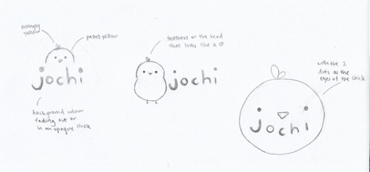
There were 3 different ways I thought I should present the chick. One was it hiding behind the word and peeking out, and I intended to add like a scenery view behind as well. Second was the chick simply standing beside the word. I thought that this would be good because it can highlight the whole body of the chick, and is simple enough to look at and read. The third was where the eyes of the chick is used as the dots in the "j" and "i" of jochi, which I was just experimenting with and looked pretty okay so I left it.
After receiving critique from the research presentation, I decided to first work on the comments that suggested new logo ideas. There was a comment about using Jochi as a onesie suit/hoodie that the mascot will be wearing, which I thought was an immensely cute idea!!! However, I soon realized that the words “jochi” would then be too small to see, so I kept this idea for perhaps an icon in the future.

Another comment was to have the word 'jochi' and play around with the 'o' and the 'c' to make it look like a pictogram of a cute chick emoji. I thought that this would be a cool idea as well so I sketched out a design of it like above. During the peer review session, I showed the new logo option to my peers, but they all agreed at the this would make the mascot look too small compared to the words. Hence, I decided not to go with it as well.
After working on the new logo options, I then began to digitalise the second option of the logo first with the help of Adobe Illustrator. During the research presentation, I received various feedback from my peers that the second logo would be the best. I made use of the pen tool to trace my sketch, and deleted anchor points as needed to fit the round organic shape of the mascot, which I had now named Chichi. I also took into account some comments from my peers. With regards to the sprout on Chichi’s head, there was a comment to put the weed onto Chichi’s head instead of a sprout. There was also another comment saying to make the sprout bigger so that it is more obvious. Personally, I wanted the sprout to be like a little add on to Chichi, perhaps something that moves when it is happy or wilts when it is sad. Putting a whole weed on Chichi’s head would mean I would need to add a face to the weed, so it would be like a friend to Chichi. However, I felt more for the version where the sprout is a part of Chichi, so I decided to keep it as a sprout, but made it bigger to be more visible.
After completing the digitalized version, I felt like something was still missing as it was not as fluffy as I hoped for. Upon consulting with my peers during the peer review, I was advised to look at some of the ways fluffy birds were drawn and make reference to them.

I then found this picture of a really cute bird. Referencing the picture, I thought that perhaps a sketched outline would be good for Chichi.

However, upon trying it out, I was not able to grasp why the stroke would result in a bald Chichi, and my peers during the peer review could not help me with this issue as well.


After the peer review, I decided to look for references of round objects, as my main goal was to make Chichi round. Eventually, I found a picture of a sphere, and added a shadow to Chichi to showcase its roundness.
Colour
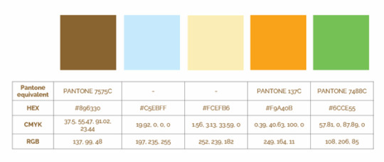
The colours I chose were mainly colours that I thought would match with me and the overall bright and morning-like theme that I am trying to portray. The first 3 were the main colours and the last 2 the accent colours. During the research presentation, I mentioned that I was unable to input my favourite colour, purple, into the project. This received various comments from my friends saying that I should add my favourite colour in, which got me thinking how to incorporate it. In the beginning, I was thinking of changing the colour of Chichi’s sprout to purple, so that it makes a purple heart. I eventually scrapped the thought and just went back to green as I felt like changing it to purple would lose the subtlety of the sprout being a sprout.
During the peer review, there were also comments to make Chichi a brighter yellow. However, upon some trial and error, we decided that the original colour would be best.
Typography

These 2 fonts were the fonts I chose because of how rounded and clean they are. Kai had some comments on using Chicken Quiche as the logotype, which I also agreed with as I had initially planned to handwrite the font in the logo. However upon trying it out, writing with a mouse just isn’t working out. Hence, I went on a journey to look for fonts again.

After scoping the trusty Internet for new fonts again, I eventually found a font that was very close to my handwriting. Hence, I decided to add it in as my logotype.
Business Card
For the business card, I made use of the colours in my primary palette and created a double-sided card with rounded edges. Creating the namecard also finalized the logo decision to be option 1. This is because when option 2 was placed in the namecard, the font felt like it could not stand alone and was awkward with the background. Putting all the elements in a circle would give a cleaner feeling, which better suited the aesthetics I was going for.
Both the logo and card got many praises from my peers in the peer review and the final presentation as well, which was heartening to see.
Resume
During the peer review, I also consulted my peers regarding the layout of my resume. Initially, I wanted to make 2 pages of resume, with the whole front page in the form of an infographic. Elements like who I am close with, daily schedules and hobbies were some of the options I considered to include in the first page. Then the second page would be more professional with elements like achievements, education and work experiences. I received feedback that a resume should perhaps be more professional, and that if I were to go with my idea, I could perhaps switch the pages around, such that the page with more casual details would be the second page. After thinking more about the resume, I eventually went with just a professional design where everything is clear and legible.

During the final presentation, I received various critiques regarding the alignment of the resume and empty space. I then decided to bring back the hobbies section that I had wanted to add before and attempted to add in icons. After the final presentation, I had my final examinations for all my other modules immediately cramped within that few days. So I was thinking really debating on whether I should add icons, as they always take up such a long time to draw. However, I thought again about the comments and felt that the addition of the icons would indeed bring up the quality of my work, hence I took an unforgivingly long amount of time to draw the icons. The icons eventually turned out pretty well on the resume, so I am satisfied.
Final Prototype
Piecing together the different elements of the project into a single brand guide was the hardest part of the whole project. During the final presentation, I already came across various problems with using Adobe Indesign. The problem lies with shifting the work onto Indesign. I tried both methods that Kai mentioned – importing the Illustrator file directly into Indesign and copy and pasting the work directly in. However, I was unable to properly get my designs in, and when I tried to edit it in Indesign, I was also unable to do so. Eventually I gave up and opted for continuing the work I already had on Illustrator.
During the final presentation, Kai commented that I should try to incorporate the cloud theme into my brand style guide as well. I agreed that the brand style guide looked a bit plain compared to my presentation slides, as I had initially thought that the style guide was supposed to be professional looking. After the comment, I added in the cloud themes to my brand style guide as well, with the main theme of the sky blue.
Following the comments regarding the resume, I ran into a huge problem. Previously I was able to scale the resume down into the A4 size of the brand guide with little to no problems. However, this time with the addition of the icons, I realized that the same method does not work at all. The scaling down caused all the icons to be distorted, and I had to edit all the different weights of the strokes one by one.

The constant shifting of the work here and there has led to a WHOLE mountain of layers that I cannot even get to organizing, and constant trial and error led to so many artboards. So I could not even properly select the layers to lock them, which made it so difficult to edit all the strokes one by one. After I managed to adjust the strokes, I then realized that because the icons were scaled down so small, all the strokes are unequal despite them being the same weights.
I spent so long googling the solution to the problem, and eventually found out that the solution was just to make a bigger artboard. I realized belatedly that perhaps I should have worked on a bigger artboard in the first place for all my work, as scaling down would have been made much easier and the strokes would have been less wonky. Especially since Illustrator does give up the liberty to zoom all the way in and out, so creating the work on a much larger scale would not have posed problems to the working process at all.
Overall Thoughts
All in all, this project was so so so fun and I loved every moment of it. Though it was so frustrating when I could not get things to work and also had to face the impending and threatening deadline (that I missed unfortunately), this module really let me explore a lot about these software and myself as a person. I learnt to give up when things are not working out and look for suitable alternatives that can produce the same results. This was one of the few times where working on a project made me excited and I was elated to constantly share my progress with my friends. I hope to familiarize myself with the tools more, so that in the future I would be able to work faster and more efficiently.
0 notes
Text
Visual Design and the art of persuasion: session 3
Week 3 - Visual Design and the art of persuasion:
In Today's session we explored visual design and art of persuasion. firstly we looked at the semiotics 'Denotation and Connotation' Ideology by Roland Barthes, Denotation is what you see, so when you first view an image what do you think of? whereas connotation is a deeper understanding into the message of the image (or whatever you are looking at) perhaps researching and looking into why they used what they had and what does it mean. For example I looked at a poster by 'Panzni'

I first looked at the picture in pairs and thought about what were their intentions with this advertisement and what were the connotations and denotations. I noticed the net bag and that made me think of the 'market feel' to enhance that the product is fresh. I then noticed the colours (red, green and yellow) ands my partner researched the colours and found they are the colours of Italy (flag) which is where the product is trying to 'locate from' and enhance the Italian feel. Also how the poster looks like a painting to again give more of a quality (luxury). I enjoyed this exercise and felt as it prompted more of an examination side for me and will help me when creating my own content in future. I will definitely consider more things than just a shape, eg, consider colour, font, text, material etc.
I then looked at Persuasion: "the process of steering someone’s beliefs or attitudes towards a particular idea or set of ideas." using colour, semiotics (signs with different impacts/meanings). Along with Roland Barthes ‘Denotation’ Lets say for example this image: “THE RED ICEBERG”

we can tell its an American image from the 10Cents, but lets dig deeper into the message it's portraying. when I first look at this I instantly am drawn to the red iceberg with the Soviet Union logo on it, this portrays that as big as the Soviet Union was it was inevitable that it was going to end in death (hence the gravestones). I also noticed it was almost a reference to the ‘Titanic’ (sunk in 1911) with the ice berg and boat, which lead me down the path of thinking that this was Soviet Union propaganda for a second as the iceberg was the downfall of the Titanic. but then I thought perhaps this was a tactic of fear used by USA to scare the public into thinking the Soviet Union (iceberg) will sink them and are evil.
I wanted to understand this poster more which meant looking into the (semiotics) ‘Connotation’ part of Roland Barthes theory and some further research into it, I noticed the date of publish ‘1960′ which it was published during the Cold War. ( I mean obviously it had to represent some war but I'm not as educated in the wars and was interested/ needed to further research to be able to understand the messages and image). I used this article to help me research further. I found this part of the article most helpful and could support my idea of the iceberg sinking
“The message under this painting is saying that the Soviet Union is dangerous and warns of the dangers ahead should Uncle Sam fail to steer clear of the "Red Iceberg." So if you let communism take over, or if you believe in it, its saying that you are going to suffer or end up like the other countries that the Soviet Union had taken over and spread its Communist influence to which had failed to do so. Its also saying that the Cold War is driving the US into the Red Iceberg and the US is going to suffer great damage”.
I enjoyed this task, especially digging deeper outside of class, it allowed me to have a real think of why people use propaganda and why it is so important (it can be used to manipulate people bad or good. its a dangerous tool and during the Cold War it was used excessively) I also liked the fact I felt like I was a reporter in a way. I am really intrigued by this concept and will like to explore it as the idea of propaganda and controversial subjects with it.
This particular image also caught my eye:

As it reminds me a lot of the packaging for tobacco as is a very strong message, can be considered controversial in a way as it does affects people differently (as is basically about babies dying).
Previously I did actually explore this with a charity "Refill" and pitched that we should use this concept on plastic water bottles (with animals effects on the labels) to encourage people to use reusable bottles (I prompted metal bottle) so I was quite familiar with the use of the concept of showing after effects.
Apologies if these images trigger you in any way:
I figured if we could put images similar to these on plastic water wrapper with say a turtle stuck in plastic or a bird chocking on water caps or even just polluted plastic itself in the water I feel it will influence peoples decision on buying ‘just another water bottle’ compared to buying a reusable bottle they can keep! so if I was to task this task further into a product project of marketing etc I would like to pursue this idea (especially with the environment media of this time, marches etc I know it won't goes unnoticed) and getting a further understanding into theory like Ronald Barthes helps me consider the detail.
I then looked at Gestalt Theory laws:
-similarity: having all the subjects look the same (eg, beer glasses in the air multiplied to create a foreground. Or having multiple images and a stand alone image different to make it standout more, this can be used to highlight a product to make it look more 'unique'.)
-proximity: having multiple shapes close together (not touching) to create a single image (eg, the 'Mystery Island' uses lines for the island and dots for the reflection of said island underneath to create an image.)
-continuity : using illusions to create an image (Eg, a single golden arch of the McDonalds logo on one side of a bus stop is my personal favourte and allowing the other arch to reflect creating the famous 'M' I find it a clever way of advertising and gets people to look or even taking a photo of it, which shares the ad).
-closure: using shapes,space and colour to create an image (Eg, the WWF logo of a panda uses white and black shapes to create the animal with out completing it.)
-Figure and Ground: hiding images within the images. (Eg, the CoCo Cola ad which used hands and a colour to create a hidden bird image, this made me think of the 'Easter egg' in the Toblerone packaging with a bear image hidden in the mountains.)

what I taken away from this was the use of 'illusions' that can be worked into advertisements and how I could use them, I liked the examples but its not really the direction I wanted to take (I want to go more towards the photography side and 'photoshop' and less towards 'graphics', however I will take the Theory into consideration and use them when I see an opportunity to experiment with it, perhaps with continuity - play with water reflections? I like that idea.
Next I did the activity of creating my own advertisements/ campaigns (Posters) on a website called Canva, which I really enjoyed; I found the website easy to use. Despite the fact you have to buy a lot of the materials and mrs cheapskate doesn't find that as easy (most likely won't be purchasing anything). I did find it hard to come up with ideas at first and find desired backgrounds that were for free) but I got the dice rolling and couldn't stop. the path I went with as it was close to International's Woman's Day, I wanted to use that subject and promote the day. As mentioned in previous blog I want to experiment with the woman's figure and provocative content so I came up with two designs around that subject:

The first one is by far my favourite one, I used the Moto "free the nip" as it is a wide campaign woman are promoting as the app instagram deletes any post that shows a woman (not mans) nipple which is something they should change and allow women to express. I'm really proud of this, if I was going to expand it I would get a model pose with paint on the breasts "just tits, get over it" to enhance the message and not hide the reality. I also found it fun to play around with hunting for images and colours I wanted to use. If I was to reference my earlier learning of Ronalds Barthes theory of connotation my image I would say that I used the colour pink for the woman to also imply the ‘Breast Cancer Support’ charity which colours are pink. When the lecturer put this image on the board infant of the class, a sense of satisfaction and excitement took me and I wanted to see how people reacted; it was like the feeling it was all worth the time (As said in previous Blog, I like to share things I create so this was nice Thank you lecturer for putting it on the board).
The second image is a more 'taboo' poster i created that I'm not as impressed with but feel as though it has comedy aspects towards, it can make the viewer either uncomfortable (if you are reading this and are uncomfortable, I apologise) or laugh (if you are reading this and are laughing, yay me !). I did try to use Gestalt Theory of closure by using the ... shapes (objects) but I failed and didn't enjoy it. I don't think I want to expand on this idea as I can't see much potential with it and its not something I would want framed on my wall, the other image on the other hand definitely.

I also wanted to create a poster for the app TikTok which if you were hiding under a rock it is a very popular content sharing app (the equivalent to ‘Vine’) I also took the simple approach as I felt it suited it more, If I was to take this idea further I would want to explore the same concept but with montage of various 'tiktokers' to show the community side of the app which is a very large aspect, less of a post-poster and more of an interactive poster.
I enjoyed this session and love the fact i took theory work and produced my own from that understandings of the theories. In reflection to my previous Blog I really like blogging ( I hope I am doing it correctly aha) I can see I have taken a style of ‘writing how I think’ and feeling as though I'm physically taking to someone, that helps me anyway. So thank you for reading and Im looking forward to my next session.
0 notes
Video
youtube
Case Study
Don’t Hug Me I’m Scared // Web Series // March 2015 // Episode 4
DHMIS is a British animated surreal horror comedy web series created by filmmakers Becky Sloan and Joseph Pelling that first appeared online in 2011. The goal of the series is to comment on children’s television and learning, particularly in Britain. The intended audience of the series is teens and young adults of middle-class but, can be misinterpreted for young children at first glance. When the narrative of the series begins, it is clear that there is a deeper and darker message behind everything and thus, not suitable for younger audiences to watch. According to The Film Theorists, the context of the work is, “ultimately a parable for the loss of control that artists trade off when they work on bigger screens”. Their messages are manipulated and their morals are poisoned by others with ulterior motives. Thus, it addresses the negative influence of media on youth in terms of kid shows and manipulation. Each episode is only several minutes long that uses puppets as actors. For this case study, I will be focusing on Episode #4 entitled, Afternoon of the series as it is most relevant to my topic, directly dealing with the internet and technology. Each episode however, forms into one piece as the entire narrative takes place on the same day, but at different times of the day.
Analysis of Events
1. Question Fun
The episode begins with three puppets, Red Guy, Yellow Guy, and Duck, representing cast members from an ‘educational’ show for children. They are shown playing a board game called ‘Question Fun’ and the Red Guy chooses a card that asks, “What is the biggest thing in the world?” Looking at the details around the room, the viewer can see a calendar hanging on the wall with June 19th as the date, various wall decorations usually depicting an animal, and skill-based activities such as a bookshelf, a globe, and a math timetable poster. In addition, in terms of colour, the image of the room is very dull, boring, and uses mainly primary hues. Moreover, this scene questions the concept of ‘fun’ which is something that is never thought about in my experience. As Red Guy reads the question, he and his friends are unsure of the answer thinking, “if only there was a way to learn more about the world” thus, they turn their attention towards the globe for help. The globe spins around as a personified item with a face that is about to educate the puppets about the world, however a computer suddenly appears into the scene from behind and disrupts their attention from the globe. This expresses the notion that technology distracts users from finding answers with the resources that are available around them, for as mentioned before, the room is filled with other means of access to knowledge.
2. Digital Mind
The computer starts to sing a song that goes along the lines of, “im a computer…I would like to show you inside my digital life, inside my mind there is a digital mind”. I believe it expresses the notion that the user behind the computer is the mind inside the computer as people can be seen as functioning with the mind of a computer, hence being absent from the physical world with digital thinking space. The Red Guy asks the computer his question, thus choosing digital information rather than to look at the globe. However, his question gets interrupted as the computer sings about how wonderful he is for, “im very clever…I tell you the time, help you find something your wanting to find…you can do it all digitally”. During the song, the items that are mentioned are shown in a pixelated/bit-map style. The style used to portray the images relates to the concept of the online interface design. Also, a newspaper is shown on the table entitled ‘OPINOIN’ which is misspelled and the computer holds a magnifying glass over the news that is replaced with an image of oats. This expresses how useful information is replaced with ideas that are meaningless and pointless. Furthermore, as the computer continues to sing, the viewer can hear that auto tune is involved, expressing how people rely on these technologies for everything. I should also mention that the computer has hands that are usually mouse cursors. Furthermore, the word ‘Digitally’ is emphasized from the song as the word itself appears across the screen through a glitching process in a pixelated font. As the song wraps up, the Red Guy points out the fact that they already have a computer, showing a laptop placed near the globe slowly opening. This valuable piece of information had been cropped out of the scenes until this very moment. It expresses that even though the puppets were aware they had a computer, they did not seek it first for information.
3. Information
The computer mentions that, “before we begin our journey, I just need to get some information from you. What’s your name? Where do you live? What do you like to eat?” At this time, it shows the personal questions being printed out from the computer, with the icons and type on the paper in a pixelated style. The puppets immediately answer the computer with their personal information without taking the moment to think about what is being asked of them. This expresses the notion how users are willing to give up their information, especially when signing up for a new website or when starting up a new computer. The computer continues to ask a few other questions, but the Red Guy slowly begins to feel overwhelmed and irritated that he hits the keyboard and tells the computer to essential be quiet. The computer becomes incredibly angered by this and everything in the physical space begins to glitch. The puppets are suddenly transported into the digital world.
4. Digital World
The puppets transform from something tactile into a digitized representation of the self. The computer leads the puppets in an orderly line on a checkered path singing, “Welcome to my digital home! Everything made out of numbers and code!” The computer is suddenly seen with wires as legs, towering over the puppets in relation to height, depicting the notion of control over its users. Throughout the transition, a series of glitched and 3D graphics are shown of items that are floating around with large, googly eyes, looking directly at the puppets as they walk. The Digital world appears to be over-saturated, interesting and engaging unlike the ‘real’ world. The Yellow Guy is confused with what is happening as he questions, “If im sitting at home, but im inside the screen?” The computer answers, “but your not you, you’re your digital you, virtually real whose controlled by real you”. However, the puppets are not using any tools, such as a mouse, to control their virtual selves, so who is really controlling them? The Red Guy begins to show interest in this new world and asks, “in this digital world, what can we do?” The computer offers that, “there are over 3 things to do” showing only a bar graph that symbolizes information, digital style that symbolizes the need to keep up with the trends, and digital dancing that symbolizes entertainment. These words are replayed over and over and each puppet that opened their own door finds something new. The sequence gradually gets faster and the music also speeds up in the background. Everything at this point becomes dark and creepy as the Yellow Guy opens a door to no information, while the Duck’s design style becomes more realistic, and the Red Guy sees more people joining in on the dance. This moment shows how users are distracted by other things that the internet has to offer, such as fashion or entertainment that appear to look more realistic, resulting to the user not finding useful information in the end.
5. Physical World
The scene is shown back in the ‘real world’, however the Red Guy is sitting alone in front of the computer screen attempting to pull himself away and shut off the system. The two other puppets seem to have ceased to exist in the real world physically and are thus, portrayed as creepy pixelated holograms. This expresses the notion that the digital world is trying to create a presence in the real world. At this time, the digital world is shown in a chaotic state as it is glitching uncontrollably during a party. Behind all the ‘digital dancing’ there is a large glowing computer screen that can be seen as a symbol of control with wires exposed from the bottom in which link to the main puppets as some sort of binding chain. The Red Guy notices a plug that stretches from the room and under a door leading to another room. This door can be seen as the divide between the real and digital world as the Red Guy opens it both in the digital scene and in reality. When the door opens, the viewer is shown the backstage of the ‘set’ of the series that is supposed to resemble the room that the episode starts off in. In this room, there is a camera shown with the same large eyes as seen on previous items, which in this case, are constantly ‘rolling’, implying how everything is being recorded. The space is deprived of color and the puppet actors are revealed to be random props, such as a mop or a box of oats. In addition, the design of the room is expressed in an illustrative, amateur style along with handwritten type. Suddenly, a person in white appears from behind the props, holding one of them in one hand, hence expressing the figure that manipulates all the objects behind the scenes. The episode concludes with another figure in black entering in front of the screen with a clapperboard to wrap up the scene. The Red Guy realizes that he was not living in reality and that there were people controlling what he thought was ‘his own free actions’.
Conclusion
Episode 4 of the series is all about computers and how it can teach us about the world, but in the end, the message gets corrupted and it concludes that in the digital world, people end up doing frivolous things like fashion and mindless entertainments. The episode conveys how users are initially getting sucked into digital technology and become distracted with superficial things rather than information they were looking for in the first place. For instance, the question asked at the beginning of the episode was never directly answered by the computer that it is in fact the digital world, but throughout the episode, the red puppet is seen resisting the influence and manipulative behaviour of the computer. It tells the viewer how technology is changing people, distracting us from our goals, taking our personal information, and appearing as something that looks very real, hence confusing the distinction between what is real and what is not. Hence, the theme is how lessons can either fail or succeed in ‘educating’ – brainwashing a specific view onto a person. More specifically, how T.V. shows are not educating kids, but are focused on making money instead. According to The Film Theorists the date June 19th is a time when stock markets reached record highs all over the world, but it was also a time when television was a huge deal in Britain. The internet can thus, be a dark place where things go creepy and too digital, however the episode ‘Afternoon’ teaches the viewer a lesson on a worthwhile topic of digital technology.
This related work is relevant as it uses design elements to portray a sense of the ‘digital’ such as pixelated imagery/text, along with extreme glitch transitions. In addition, the work is thought-provoking, educating the viewer through critical thinking about their own self and how they can relate to what is being shown to them. Other design methods such as pattern, personification, and colour are also used with intent in the series to express a specific message of symbolic meaning of the action taking place. Everything that is seen on the ‘set’ is there for a purpose, linking one idea to another to create a more sinister outlook of the issue at hand. Moreover, the entire concept of the video highlights key points that I wish to bring awareness to within my own project. This includes the notion of surveillance and how the digital world attempts to overpower the physical world with its ideologies and intelligence. This take on the internet reveals the dark qualities that come with it, as they are undermined and hidden from the user by showcasing only its best attributes. Hence, it underlines how the innocence of a digital environment can be so easily corrupted when it begins to blur the distinction with reality.
2 notes
·
View notes
Text
A Short History of Graphic Design
Graphic design is a field that is widely known today by people around the world, but even if it had been existing since forever, its origins had to come from somewhere. The term itself first appeared in print in the 1922 essay “New Kind of Printing Calls for New Design” written by a typographer William Addison Dwiggins. Later on, “Raffe's Graphic Design” published in 1927 was the first book title that included the words ‘graphic design’ on a cover. Although Leon Friend's 1936 book “Graphic Design” is believed to be the earliest comprehensive description of the field, today, there are millions of publishings that focus on both its brief history and its compelling subject in general.
We’d like to think that everything that is significant in history happened during our lifetime. However, to truly grasp the bigger picture of graphic design , we should take our time to dig into its historical discoveries, starting from the very first cave paintings. This is where it all began.
Graphic Design Roots: Prehistory Age
Image source: Medium
Where should you look to find the origins of graphic design? You’ve probably heard of the Lascaux caves in Southern France, Rome's Trajan's Column, or the illuminated manuscripts of the Middle Ages and so on. Fast forward just a couple thousand years later, you’ll discover the Blau Monument (3100-2700 BC), a pair of inscribed stone objects from Mesopotamia which is now located in the British Museum. It’s the first known artifact to use both words and pictures on it.
We already knew that the history of graphic design didn’t kick-off with computers or any other digital means. It has been assumed that graphic design has almost no end and is strongly interwoven with human existence and culture. The traces of the earliest undisputed art originated with the Homo sapiens’ Aurignacian archaeological culture in the Upper Paleolithic. Hence, it could be said that the vague preference for aesthetics probably already emerged in the Middle Paleolithic, which was about 100,000 to 50,000 years ago.
Cave paintings 38,000 BCE
Since graphic design, in its most basic description, is the art of creating graphics on a surface, it can literally be done on canvas, paper, computer screen, stones, pottery, or even on cave walls. The other name for cave paintings is "parietal art", and they were exhibited on cave walls, ceilings, and date back to around 38,000 BCE in Eurasia.
Around 35,000 years ago, the first cave painting “Pettakere” was made in Sulawesi, Indonesia. However, their exact purpose is still not yet entirely known by scientists. Ancient people decorated walls with paint made from dirt or charcoal mixed with spit or animal fat. What's important is that at that time, they couldn't write, so apart from being just a simple decoration, their designs could have probably served as a means for communication as well.
Some theories ascribe a religious or ceremonial purpose to them. The most common themes in European cave paintings are large wild animals, such as bison, horses, aurochs, deer, and tracings of human hands (most likely artists’ signatures) as well as abstract patterns.
Sumerian written language 3300 – 3000 BCE
At one point, writings started to appear, and one of the earliest known written languages is Sumerian. The so-called proto-literate period of Sumerian writing spans roughly 3300 to 3000 BC. In this era, records were purely logographic (icons used to represent entire words instead of phonetic sounds), and they all had phonological content.
It was underlined by researchers that this logographic way of constructing a language suggested the natural ability for humans to use visual representations to communicate complex ideas. Surprisingly enough, this natural method refers directly to the field of modern graphic design. Archaic Sumerian was the earliest stage of inscriptions with linguistic content, beginning with the Jemdet Nasr (Uruk III) era from about 3100 to 3000 BC. The oldest document of the proto-literate period was the Kish tablet.
Paper and Printing Era
Image source: ThoughtCo.
Before the idea of graphic design has proliferated to support commercial and creative endeavors such as magazines, logo designs, book covers, and outdoor advertisements up to reaching its digital forms, it first had to get familiar with paper and print! Contrary to popular belief, Gutenberg entered the playfield pretty late, since the origins of paper and graphics actually began with Chinese discoveries.
The invention of paper in 105 AD by a Chinese man was what led to the concept of printing. It was around a thousand years later, in 1045 AD, that the first moveable type was invented. In 1276, a paper mill arrived in Fabriano, Italy, and this era was known for officially kicking off the first paper mill in Europe. However, only in 1450 was the system for printing books and other forms of literature at its heights. In 1460, the first illustrations in a printed book followed.
Advancements in Chinese printing 200 CE – 1040 CE
Some of the Chinese printing discoveries included non-papyrus paper making, woodblock printing, and movable type. Since 200 CE, they were already using wood reliefs to print and stamp designs on silk clothes and later on paper. It was only in 1040 (400 years before Gutenberg) that Bi Sheng invented the world’s first movable type printing press out of porcelain.
During the Tang Dynasty (618–907), wood blocks were initially cut to print on textiles. However, they were later used to reproduce Buddhist texts. The Buddhist scripture printed in 868, was the earliest known printed book. Beginning in the 11th century, longer scrolls and books were produced, making them widely available to the masses (960–1279).
Medieval calligraphy 700 - 900
It seems as if people have always had the inherent drive towards art, and this has been evidential since the early cave paintings. As human development progressed, typography became more important, since aesthetic horizons were being broadened and the intellectual mind was increasingly eager to collect information.
This period dates all the way back to the Middle Ages. Texts in this era were still produced and replicated by hand, and the artistry in producing small portions of exquisite books was what made these items and its creators stand out of the crowd. Interestingly, in Islamic cultures for example, figurative art was seen as sacrilegious. Therefore, typography was among the few permissible ways of artistic expression at the time.
European heraldry ~1100 - 1400

Image source: Enacademic
Heraldry is a system by which coats of arms and other armorial bearings are devised, described, and regulated. In all likelihood, the first real logo, in its semantic entirety, was actually the coat of arms which became a symbol used to represent family houses or territories. During the Crusades, soldiers from different countries used them on armor and battle flags to distinguish themselves apart. As coats of arms are therefore used to represent certain values, it can be successfully compared to the modern use of a logo for brands.
Storefront signage 1389
Looking back at the 14th century, times seemed rather hard. During this era, beer and ale were commonly drunk by people, therefore King Richard II of England made a law that ale houses must have signs out front so that the public could find them easier. This allowed for various work opportunities for graphic designers at the time since pubs ' visual identities and drinking etiquettes were graphic products waiting to be designed. This was how the first signage that represented commerce was born.
The Birth of Graphic Design - The Industrial Revolution Era 1760 – 1800

Image source: Foundation for Economic Education
For hundreds of years, people’s lives were primarily focused on agriculture. Folks farmed small pieces of land for the subsistence of their own families, producing DIY tools, furniture, and clothing for their use or inter-neighborhood trade. The Industrial Revolution began in Great Britain around 1760 and from then on, it spread to other parts of the world. To put it shortly, it was a cultural and economic shift from the cottage industry to a factory-based manufacturing system. But what did this mean for the field of graphic design?
As a major turning point in the history of human mankind, it marked almost every aspect of daily life. The general mechanization acted as a strong accelerator of processes. When it comes to printing speed in 1810, industrial innovation allowed for 400 pages to be printed per hour. According to some critics, civilisation was shifting from admiring humanist values to worshiping material goods. Mass production brought the need for mass communication, therefore the nature of visual information had changed significantly during this era. Graphic communications became more important, photography was invented, while the expansion of printers, advertisement, and posters also occurred.
Growth of Graphic Design: Up until 1900s
This was when good design days came about. Gutenberg's printing press enabled people to recreate text, art, and design on a massive scale and in a cost-effective manner. From this, companies started to learn how to grow in terms of their visual identity and how to sell with the use of it.
Invention of the Gutenberg press – 1439
What changed thanks to Johannes Gutenberg's invention was people’s attitude towards printed books and the press. With accessibility came all sorts of profits starting with easier mass communication and affordable knowledge and information. The year 1439 changed civilisation and shaped Western culture. Graphic design ultimately gained a supporter, with the Gutenberg press paving the way for its broad commercial use.
First logos – late 1400s
We've already mentioned where the roots of logos lie, but before the press arrived, it had been a whole different story. The printing industry allowed for graphic designs to be multiplied perfectly in an infinite number of times. The first logos were limited to marks on companies' documents. Parallel to actually being used to visually represent a company, a logo was also meant to present the brand’s advancement in its printing technique. In short, how well the logo was printed reflected how well everything else was printed by them.
First print advertisements – 1620s
You know them. They are funny, and today we often laugh at them when they appear on the internet. The first printed advertisements' amateurish style were as amusing and original as for our modern, refined perception. They appeared suddenly in massively printed newspapers. In that era, they were called “coranto”. The ads invasion happened in Europe in the early 1600s, but written advertisements initially date back to ancient Egypt. So what was all the fuss about? The thing is, this became the first time people could actually see images in mass-produced ads.
Chromolithography – 1837
The further the technological progress reached, the more the world of graphic design could develop and spread its wings. Look at the seemingly simple ability to print in color or at chromolithography for example. It dramatically changed the perspective and broaden the range of advertising possibilities - characteristic, brand-linked color schemes, color-based emotional connections, etc.
Furthermore, chromolithography enabled a higher degree of realism and attractiveness added to the simple objects of life and fashion. Until then, graphic design was solely based on shapes and marks. That's why the message was first of all clear and informative. Later on, the graphic design field of commerce started to approach the topic based on emotional attitudes, an approach that is very well-known to us today.
Growth of Graphic design: After 1900s
In 1993, Paul Rand successfully distinguished the core of this profession: “To design is much more than simply to assemble, to order, or even to edit: it is to add value and meaning, to illuminate, to simplify, to clarify, to modify, to dignify, to dramatize, to persuade and perhaps even to amuse. To design is to transform prose into poetry.”
Today's form of graphic design began developing since the late 1800s. Whereas technological advancements of the industrial revolution era completely changed the game, the time to develop the specific tools and learn how to play with them came afterwards.
Image source: My Modern Met
In 1903, the first graphic design agency, The Wiener Werkstätte, was established. The benefit of graphic design became evident and widely recognized since then, which helped kick off an entirely new industry. The Wiener Werkstätte was the first organization of visual artists which included architects, painters, and early graphic designers. They boldly reached out to cubism and other stylistic innovations, and their symbolic accomplishments set the stage for the Bauhaus and Art Deco styles.
Staatliches Bauhaus was founded in 1919 in Weimar, Germany. Another difficult German word linked to it, the ‘Gesamtkunstwerk’, was an artistic ideal that encompassed or synthesized existing art forms into one perfect work. The goal that was actually brought into life - Bauhaus became one of the central driving forces behind the popularization of the modernist style.
In 1922, William Addison Dwiggins explained in his book what graphic design actually was. Hence, the actual profession and the style of life in which it brings has been well-described through it. Moreover, “Thoughts on Design” by Paul Rand (the designer responsible for the logos for Ford, Westinghouse, Yale, ABC, UPS, and IBM) was published in 1947. In his book, he focused on “functional-aesthetic perfection,” an ideal balance between a logo looking good and communicating its points effectively. Up to this day, graphic designers' books and speeches collectively happen to fuel all the creative innovations within this field.
Graphic design in this day and age
From the 1950s onwards, the Industrial Revolution became almost insignificant compared to the digital one. Instead of mass printing, humans are enjoying the continuous technological advancements, with the computer, Internet, and social networks being huge turning points to how graphic design is today.
Online platforms created many professions and opportunities for graphic designers. Meanwhile, digital softwares became more and more polished, cheaper, and more accessible than ever before.
In 1990, the first version of Adobe Photoshop was released, creating a revolution in the way graphic designers worked. Photo manipulation created a whole new subcategory of graphic design. Prior to this, only artistic collages provided the possibility to blend together elements of photography, illustration, and CGI. Now, practically everything can be done. What are the forecasts for the future then?
The above-mentioned route of surprising turns in the development of graphic design and the progression of visual communication is exciting because it shows that this field has no end. It continuously develops and changes paths, but the core idea of communication with the use of visual symbolism remains the same. Today, graphic design trends, styles, and preferences vary from designer to designer, but one thing is for sure - there is infinitely a plenitude of space for development.
Read the full article
0 notes
Text

hey sunshines ! my name’s dallas, i am nineteen, the australian timezone sucks, and i am your resident history geek. i am beyond excited to get to know you all and interact with your characters. please feel free to message me anytime to plot, headcanon, send me pictures of your pets or to tell me about your day :’) now let me tell you a little, or a lot, about jude. there’s more to read under the cut.
► 「 NICK ROBINSON, TWENTY, CISMALE, MUSE 10B 」 hey, have you seen jude malinowski around the streets of mansford lately ? he has been living here for the past twenty years, and during that time people have really gotten to know them as zealous andwitty. rumour has it that they tend to be a bit complacent and cynical, though. i heard they are a store clerk at revolution records. maybe you can find them around the nearby concert venue ! 「 dallas, nineteen, she/her, aest 」
► backstory.
jude malinowski was born and raised in mansford, texas. the malinowskis conformed to the ideas of the stereotypical suburban, nuclear family. they were normal, regular in every sense of the word. jude and his brother are the second generation malinowskis to be locals in mansford. from an outside perspective, others would describe them as quiet yet having a certain homeliness. a family that breathes an air of contentment. his father, dominik malinowski, is a man only to be described as reticent — his father was never a man of many words, was often difficult to please however still had a big heart. he works as a real estate agent in the area of mansford, but also other smaller suburban towns outside of houston. his mother, ruth malinowski, was a stay at home mom for the majority of her sons’ childhood and teenage years. she was, to many, a familiar face around town — having acquiantances everywhere, from childhood friends to people she knew from the primary school bake sales she always actively participated in. his mother was always a social animal, even if her relationships with others were often superficial. his parents always seemed to know their place in society, lingered in their middle class status and did not seek to soar higher than they were meant to. they were always quite content in their current position.
jude’s brother, however, he is an entirely different story. lukas malinowski was the type of man you wished for your son to be. lukas was exactly what you would describe to be the boy next door — a real golden boy, the pride of the family name. often praised for his academic success, he was also part of the student council for most of his high school years, would often be found conversing with the neighbours on his way back to school, would come home with report cards with only straight a’s and would be the type of man who would safely offer you a ride home late at night. if you were to ask jude, he would describe his brother as nothing but a bore; an overachiever who sought nothing but approval, whose superiority complex was through the roof and who never managed to pique his interest. his parents, their opinions were quite different. his parents were quite ecstatic about the personal successes of their son, often providing him with all the tools to grasp many opportunities he was granted with both hands. he was to become a man with more concrete goals. excelling in the field of biology, mathematics and chemistry, he wished to go into medicine. lukas had big dreams, and the family had big expectations. they felt nothing but pride at one of their sons striving to have more than they had, do more than they had ever done. someone who reached for a societal status higher than their current one, who would marry a nice lady, live in a nice house, have nice children and grow old.
now, these were expectations that lukas malinowski was able to live up to, with his abilities and his aspirations. jude, however ? he is a completely different story. experiencing difficulties with school from a very early age, he never set goals for himself that were even remotely similar to lukas’. academic success was out of the question. he struggled in many of his classes, was always visibly distracted, too. he was discouraged by his own inability as well as unwillingness to learn. in school, jude was always a bit cynical, a bit of a class clown type. he would often get in trouble for the littlest things, whether that was his sharp mouth or skipping a class in favour of going downtown to spit through the new releases at revolution records. jude was more of a rebel without a cause — maybe calling him a real rebel would be misusing the word, as he was quite mild in his rebellion, however he was always pushin the boundaries and breaking rules. although slightly.
being compared to his brother, there was not a battle he could win. he always felt overshadowed by his brother, who seemed to be the family’s first priority. perhaps it had to do with him being both the oldest and the most traditionally successful. albeit his parents never truly painting jude in a negative light, he always felt somewhat like the black sheep — a secondary part of the family, a minor part. it was debatable whether jude would ever be able to surpass his brother. but then again, neither did he really wish to.
► personality.
the boy being overshadowed by his brother could have led to a fight for the approval of his parents, however it never did. rather than seeking success he knew he would and could not achieve, he sought validation in the simpler things in life. you could say that jude is quite complacent, and finds himself easily pleased with his own achievements for the exact reason that there is nothing more to drive him. validation was something he sought in goals that were more attainable, more attainable for him at the very least. this could be in the very simple form of attempting to bring a smile to someone’s face. playing the role of class clown.
not that approval truly gave him that much satisfaction — approval, of anyone, had never been something he attached a lot of value to. if he were to look for that rush of contentment, jude resorted to other forms that granted more immediate satisfaction; that being the recreational use of drugs like marijuana or casual sex. even the thrill of small adventures would be one of many ways in which he were easily pleased.
another thing about jude is that although his interests are quite narrow, he does find himself particularly passionate about those exact things. in his case, the big love of his life is music. music is something that he does wish to succeed in, although it isn’t something that would necessarily earn him his parents’ approval. he wishes to succeed in music on his very own terms. it is something he connects with on a higher level than anything else, and whether the success he achieves is selling out stadiums or having a gig in a small venue in downtown houston is not relevant. all he knows is that he wishes to do something with this passion he has, because it would be the only thing that would not drive him crazy in time. the only thing he would be able to pursue without getting tired, slipping down the black hole of dull everyday life, in which days go by without having something to appreciate.
he has learned to appreciate the littlest things in life, and to keep appreciating the details. sometimes he might lose track of the bigger picture by focusing on merely a small part, but then again, it is debatable whether in jude’s life there truly is a bigger picture. to him, everything is short, quick; as if things will change in a heartbeat. there is no such thing as a ten year plan for the future.
the kind of philosophy jude lives by in life is short and sweet — find something that makes you happy. right here, right now. in this case, and for him, that is creating music. he does not follow the example of his brother. he does not reach for the stars, something that would make him lose sight of what he loved so much about music in the first place.
jude also has quite a sharp mouth. he is honest in a manner that it is almost painful — he never tries to sugarcoat the truth. he does not feel as if a nicer wording of the harsh truth would be beneficial. to him, the truth is more valuable. in the case of coming to jude for advice, he would never be particularly careful in sharing his opinion. he will often disregard outside factors, such as the opinions of others or the expectations of society. in jude’s mind, the main focus is on one thing and that is ultimate happiness. the seemingly smarter choice does not always achieve that.
all in all, it is easy to say that jude is addicted to the feeling of contentment. of feeling at peace. what he seeks most is life being easy, for his reality to remain tangible. he never wishes for his future to be something abstract, for his relationships to complicate themselves more than they have to. jude wishes to live a life that is low maintenance. simple. nothing out of the ordinary. just the life he wishes to live.
► aesthetic.
denim jackets, messy undone hair, music that is loud enough to block out your thoughts, riding a bicycle instead of driving a car, oversized sweaters, spending the evening in, to wallow in the presence of close friends, epic guitar riffs, late nights, the cynicism of rock song lyrics, messy bed sheets, walls covered in posters, a large vinyl collection, black dr martens boots, mosh pits, being covered in inexplicable bruises.
► factual information.
jude made the very conscious decision not to go to college. he did not know what further education he wanted to pursue, neither did he really think higher education was meant for him. although he is unsure what he wants to do for the rest of his life exactly, perhaps wishing to break through in music, he settled for a job at revolution records. it was one of his favourite places around town growing up, hence why it is one of the only places he is able to spend his time. and getting a bit of money for it, too.
despite not going to college, jude did move out of the malinowski family home upon graduating high school. somewhat of a graduation present, perhaps. he lives in the outskirts of the town in one of the more affordable places with perhaps one or two roommates.
jude knows how to play various instruments. he taught himself how to play the guitar first, something he mastered when he was around twelve years old. ever since he has tried to expand his knowledge, attempted to get the hang of various other instruments. he knows how to play the bass, joshua bennett is teaching him how to play a bit of the drums. in his spare time, he even attempts to learn to get the hang of playing the piano. jude also sings, finding that his voice is just another powerful mechanism to share a message. his voice is quite deep, a little rough around the edges. i imagine it a bit similar to eddie vedder from pearl jam. like, not exactly like him but it is very much that vibe !
his birthday is on april 4th, which makes him an aries. his full name is jude alexander malinowski. nd idk probably more that i’ll add later.
► wanted connections.
roommates. i would love to see one or two people he lives together with. these could be friends of his, these could be off campus college students, it could be a complete stranger. whatever dynamic could be very fun !
childhood friend. someone he grew up with, perhaps a neighbour of the malinowski’s. someone that has known him from square one and perhaps someone he just cannot envision his life without.
casual fling. someone’s company he often seeks. not because there is any emotional connection, but because he seeks physical closeness.
enemy. i’d love to see someone who knows how to push all the wrong buttons. usually jude is quick to cut someone out of his life when they get on his bad side, but i would love a scenario in which it seems impossible to avoid this person !
ride or die. someone he is inexplicably comfortable around, the one person he always calls if he were wanting to go on a somewhat impulsive adventure. there is this unspoken agreement that they will always have each other’s back.
one sided crush. a plot where jude is the subject of their affection, although he is quite unaware. although the love might not be returned from him, it could be a really cute and soft plot.
former friends. a plot where they used to consider each other close friends however a sudden change of events caused them to have a huge falling out. ever since their relationship is tense and neither seems to be willing to deal with it.
share a secret. your muse and jude that, regardless of their dynamic, share a secret. whether that is a bad decision they made together, or a very personal detail they told each other. they simply do not trust each other with this information and know that it would ruin their reputation if it were ever to come out.
other connections. confidants, sworn enemies, childhood crush, family friends, exes on good terms, neighbours, drunk friends, wing(wo)man, enemies to friends, love / hate, mentor, rivalry, good influence, bad influence, anything else that you can think of !
0 notes
Text
Artist and designers who use colour, Pop Art and aesthetics.
Polly Apfelbaum

Apfelbaum is an American contemporary and visual artist, who is best known for her colourful drawings, sculptures, and fabric floor pieces. They are referred to as "fallen paintings".
The artist is influenced by music, art history, popular culture, and cartoons. When looking at her work I believe that Apfelbaum brings in the high and low by using different mediums. There is a lot of experimentation through Apfelbaum’s work and she describes her self as a hybrid. The mediums the artist works with include fabric, paint, dyes, wallpaper, plasticine, and ceramics—her work has dissolved spatial, plastic, and temporal boundaries.
The Ikon Gallery presented Polly Apfelbaum’s work, which featured a large scale colourful installation of textiles, ceramics and drawings. Her practise is framed in a wider social and political context and the legacy of post war American art. The background behind her work has allowed Apfelbaum to create pieces of art that are expressive through the visual element of colour, shape, form and movement. This is why it is important to have a lot of research and context behind your work. From experience this has helped me as a artist / designer to create expressive pieces.
The artist was intrigued by the space, obsession and otherness. This was emphasised by the way the gallery was put together. It was a visual experience and made me think that i was apart of the art.
I really liked the work of Polly Apfelbaum and the use of different mediums and techniques she included in her work to create something different and innovative. She has explored the visual element colour successfully. Moving forward, I too would like to open my mind to using materials I wouldn’t use in order to be experimental and innovative.
Josef Alberts


Josef Albers is an artist and educator who uses the use of colour to express the most important element in painting. Albers was influenced by Minimalism, colour field painters, Abstract Expressionism, Op Art and has influenced me as an artist / designer to use colour to explore aesthetics and rule breaking in design. This is an area I am interested in and would like to explore again during my time at University.
Some of Albers’s work is intriguing to view as some colour choices are not suppose to be paired together. For example dark green and black, pink and red or tones of colours . In my opinion, I like these colour choices.
Albers wanted his audience to understand the complicated ways the human eyes perceive eyes. I want my audience to open their eyes when they view my art and to analyse what is really there. Albers was interested in the way colours interacted with each other, and the effect that interaction had on human perception. I will take inspiration of how effective I can use colour and composition because I want to improve and develop my skills.
Aesthetics
Aesthetics is the philosophical study of beauty and taste. The term stems from the Greek word “aisthetikos,” meaning “of sense perception,” and is related to the study of sensory values. In design, aesthetics refers to the visual attractiveness of a product. Studies have proven that creating good aesthetics in a product leads to better usability and user experience.
Gunta Stolzl
Gunta Stolzl was a German textile artist who played a fundamental role in the development of the Bauhaus school's weaving workshop.
The artist uses colour and shape to create successful composition and visual excitement. I like the harmony of the curvilinear and horizontal lines and vertical grids. The materials and techniques used to create these vibrant colours without any digital editing is amazing. Stolzl ideas are from the color theory, Paul Klee visual thinking, and Wassily Kandinsky abstract art. This knowledge was then used into the method of weaving. Lack of technical guidelines allowed the artist to question and experiment with different materials and techniques, allowing her to make the step from traditional textile techniques and weaving done by generations before to the new weaving that would become admired by generations after.
It would be interesting to experiment with these materials and techniques to combine it with visual designs. I like how the lack of technical guidelines allowed Gunta Stolzl to experiment with techniques and materials to create textile designs that is still admired and loved generations after.
Shelia Hicks

Shelia Hicks uses colour to create fibre art sculptures. Her methods include knitting, knotting, bonding, felting and tufting. I love her vivid use of colour, experimental and innovative approach using natural materials. Her work is refreshing, for the reason that it allows me use the inspiration of texture and colour in my work and use it in a style to express myself as a designer. Hicks doesn’t just use one shade of colour, the artist uses different tones and shades to convey a particular feeling or mood.
Again, I like how Shelia Hicks is another artist who uses colour differently and explores it using materials that require the artist to put it together using their hands and not relying on digital techniques.
Morag Myerscough

Morag Myerscough is a design agency based in London. The work is characterised by an engaging boldness, creating specific, local responses to each distinct audience that will see and experience the design, using it to create community and build identity.
I love the designs, use of colours within these designs. The use of strong colours, big type, stripes, spots and puzzle-like arrangements of geometrical elements creates scale and drama. This is what I call visual excitement!
The artist states that she ‘likes interpreting spaces; by ‘putting narrative into spaces that don’t exist’. What I really like about this design agency is that they are not just creating pictures or art for aesthetics; the art has a use for places and people. For example, train station, cafe, installations, exhibitions and interpreting buildings. Myerscough works with community groups to develop ideas that reflect the identity of the users. This is successful approach used and allows design to be shared between cultural history and heritage of the local area.
Morag Myerscough states that ‘’ I’m not a graphic designer, illustrator, architect or a sculptor, but maybe I’m all of those things. It’s about mindset and trying to create something for people to feel they are part of. My mantra is the Chinese proverb - make happy those that are near and those that are far will come’’.
This research has opened my mind to think about what I communicate and how I do this. I realised that there isn’t a limit and through experiments and opening your approach, you can achieve something wonderful. Looking at the work within this agency I first thought that it doesn’t really have any meanings or use. After some researching my opinions have now changed. I love how the agency use bright colours and other elements, which in a way hypnotises and consumes you.
Philip Stearns


Philip Stearns is a Brooklyn based artist and designer, who is well known for using glitch and combines this technique with textiles.
The work has been developed by a curious exploration of visual technology through corrupting the hardware of digital cameras. This then creates distorted images that show unnatural acidic like colours and shapes. Stearns then went onto explore glitch as a textile concept; now producing rugs and blankets.
Stearns has achieved bring contemporary technological rebellion and traditional weaving into a new concept together. A viewer might not feel ready to be exposed by this art, however once you understand it, it starts to become less intimidating. When I look into the art I feel memorised by the mix of colours and this visual experience and human interaction is what a lot of artist and designers are starting to use. By enjoying and embracing the aesthetics of technological mistakes, the beauty of art becomes a deep feeling of complex streams of information, visual media, and our own lives converge in the chaos of art. I believe that bad designs has some kind of control and we can’t help but amend bad design.
Sam Coldy


Sam Coldy is a graphic designer, surface designer, filmmaker, animator and art director. This artist is successful in using colour and composition.
I decided to research into Coldy’s work as his designs have intrigued me. Sam Coldy has used elements of hazy, blurred and strong geometric textures and forms. These elements overlap within each other to create a bright and noticeable piece. Analogous and complementary colours have been used to create harmony within in the piece. Different tones and shades are used to highlight the colour scheme and it becomes dramatic.
Coldy states that it is good to try something new and unique for each project; hence why Coldy’s designs vary. I have learnt to incorporate this professional advice into my experimentations, as I feel it is important to try new things, even though might make mistakes. I think this is why I am really intrigued by art that is experimental and uses other techniques and materials. I believe you should embrace this and accept it as art; this can be achieved by pushing the boundaries and trying something new and developing visual elements you never know what the outcome is.
Pop Art
The technique of screen printing became a popular printing method in the 20th century, in the commercial and artist printmaking sector. This technique has produced some of the most successful print images and greatly influenced the silkscreen print production, graphic design, poster works, and garment printing of the present.
Colour plays an important part in this historical art movement. The colours used were yellow, red and blue. In contrast to other art movements, pop art does not reflect the artists' inner sensation of the world. Instead, they refer to the popular culture.
Examples of this include Andy Warhol, Roy Lichtenstein and Peter Blake.


Screen printing is a form of stencilling that first appeared in China during the Song Dynasty (920-1279 AD). It was then adapted by other Asian countries like Japan. It then came west in the late 1780s when silk mesh started being traded. Early in the 1910s, several printers experimenting with photo –reactive chemicals with glues and gelatine compounds. The medium changed to photographic techniques that influenced art and print. Not only did it influence art and print the Industrial Revolution had its impact on this art form as well, as the frames and presses started to become mechanised. The end of the 19th century brought about the first 'silk-screen' patent.
Looking at how successful this historical movement has been, the method and technique of screen printing has appealed to me. In my opinion, I believe that these artists chose the medium of screen printing because it allowed them to maintain bold, bright colours when reproducing their works. Boldly colourful and novel, screen printing has become one of the basic techniques of postmodernist art and contemporary art. The versatile in design and technique makes screen printing different and is perfect.
Other examples I have found that use colour in the creative industry.
W&Q is the work of two young Chinese designers who are exploring the relationship between classic Chinese bamboo handcraft and modern Chinese design, using bold colour in unexpected ways - vibrant blues, emerald greens and sunburnt oranges mix with intricate woven pattern.
Splitz Popsicle's brand identity is visually pleasing and features popsicle packaging with graphic and geometric details. They feature three flavours that are designed for the health-conscious consumer with a sweet tooth.

#branding#consumer#audience#target audience#splitz popsickle#food#brand design#graphic design#design#graphic design blog#art#artist#history of design#knowledge#Artist Research#research#chinese desinger#screen#screen printing#andy warhol#roy lichtenstein#peter blake#pop art#pop#concept art#contemporary#contemporary art#its nice that#sam coldy#surface designer
0 notes
Text
My Anime List Refresher 2013-2016
With so much anime series being produced and all easily available to watch, I have so much on my bookmark list, all queued up! Some I have started to watch then lost interest or got distracted by another thing to watch (could be live action thanks to Netflix, but that’s like a totally different list - another tricky one lol) Even if it’s not a fave of mine, I usually finish what I started - unless it really doesn’t interest me.
So this list will be my favorites? or unfinished but still want to watch. Hmm...just a refresher for me as i want to update my brain haha like if I think of my officil fave anime series: Welcome to NHK, School Rumble, Melancholy of Haruhi Suzumiya, Azumanga Daioh, Lucky Star, Skip Beat...all the things I watched before 2013 (February to be specific, when I moved to SG). And with so much anime series on my list now, just want to clean it up and say hey! i love this one! ^_^ haha, no specific order and keeping it short. Especially with the Japanese names...hard to remember for me.
1. Chihayafuru
I actually already included this in my official fave list, hence mentioning it first. Just going with the flow of all things watched from 2013 onwards. Didn’t know a show about playing cards can be so thrilling and this one is freaking emotional too. Always love cute underdog stories and likable weirdo villains.
2. Shirobako
What could be better than watching anime? Watching anime about making an anime series! Probably the most realistic as there’s no fantasy or exaggerated drama or comedy. Just day to day stress of adults working and yes, that many characters. To actually see how animation studio works, the collaboration of everyone from different departments - and to actually having a finished product. Definitely a must see for anime lovers, to get better appreciation and respect to those working the industry just so we can enjoy watching them. Plus the ending when the girl got the voice acting job, great great job!
3. Durarara
Took a while for me to finish this (GOT, TWD etc) and I was determined cos it is weird, bizarre like what the hell and lots of funny characters and awesome scenery of Tokyo city. One of things I love in anime is seeing real places drawn. I just love the details in the background and Tokyu Hands always making a cameo lol. I’m not really into action but this is just cool, all thanks to Celty! Headless biker chick who’s badass but emo. And the chatrooms, cray cray!
4. K-Project
Already mentioned that not into much into action but this is visually - the most beautiful art I have seen in anime series (yeah, anime films are separate haha) I got intrigued when I saw a poster for their film Missing K at some bus stop and decided to jump into the series so I can watch the film after. The fight scenes - stunning modern art complete with cool soundtrack. Art aside, I knew I was getting into it when I was really rooting for Mikoto to win.
5. Wake Up, Girls!
I watched 3 animes of ‘idol’ genre (Love Live & Shounen Hollywood) and this is the one that I finished and looked forward to watching the next episode. Catchy tunes (in my ipod), fan service (panties for pervs lol) and just the underdogs with the advantage of having one member as an ex-idol and going after the big corporate idol groups. Plus the head of their agency is wtf hilarious.

6. Kids on the Slope
Music-wise, this wins easily! Coming of age, 60′s setting, Jazz music. Plus I watched this around same time i watched Whiplash so yeah I was kinda adding Jazz music to my playlist. Just saw trailer on Animax, they were performing Favorite Things (Sound of Music) and I was like I have to watch this! Don’t care much for the girl or the romance, I found the friendship story of bad boy drummer and nerdy pianist more interesting and just the excitement & bond forming between them when they jam. Easy to watch, relaxing countryside ambiance.

7. Denkigai no Honya-san
Title is kinda hard for me to remember but I enjoyed watching this. This is like otaku heaven! Perfect setting for otaku characters: a manga store. This is so my type with all the quirky randomness happening and the staff having their own brand of weirdness. Watched this alongside Shirobako so it was a perfect balance, both workplace, with that more serious and this just silly fun. Plus the otaku culture references and cosplay, very amusing.
8. Stein’s Gate
For my sci-fi, time-travel kinda fix, it’s this one! Sometimes not sure if quirky or serious, works well with the flow of the story and its characters. Paranoid protagonists are always interesting to watch with their mumblings and witty lines. I have been wanting to see this cos it was always recommended by MAL when I’m looking for something like Welcome to NHK. Plus the geeky hacking working hard and the different timelines, got me hyped!
9. Polar Bear Cafe
I haven’t finished this one (too many episodes!) but this is the most kawaii thing ever! My go-to anime if I want to feel relaxed it just soothes my brain. A polar bear who owns a café and is besties with a penguin and a panda. Plus the other animal customers, mixed with humans like it’s the most normal thing ever. And my fave character: Panda, who loves everything Panda (panda accessories) and works at the zoo as a…panda! Cuteness overload and the art, not very cartoony which makes it wackier to watch.

10. Food Wars
Currently watching this and I love it! Food in anime always looks so gorgeous and tasty, including everything in this list. But since this is set in a culinary school, this has the most scrumptious food and educational as well – how they explain the recipes and cooking process. This is the only school focused in my list, but it’s not your normal high school as it’s like food network combined with Japanese perviness - they nailed in spoofing hentai through tasting awesome food…it’s just an explosion of flavour and feels.
Honourable Mention (random order):
1. Tokyo Magnitude (the one that made me cry the most, not included in top 10 cos I totally forgot about it)
2. The Devil is a Part-Timer!
3. Eden of the East
4. Space Brothers
5. No Matter How I Look at It, It's You Guys' Fault I'm Not Popular!
6. I Can’t Understand What My Husband Is Saying (short)
7. Re-Life
#anime#list#myanimelist#series#chihayafuru#shirobako#durarara#k-project#wake up girls!#kids on the slope#denkigai no honya-san#stein's gate#polar bear cafe#food wars#japanese#animation#tokyo magnitude 8.0#Tokyo#asian
6 notes
·
View notes
Last Seen Blogs


phuckingphil
null⚕️

itzleebanks
Untitled

anaceinthecrowd
An Ace In The Crowd
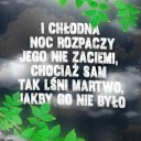
slowamimalowane
słowami malowane