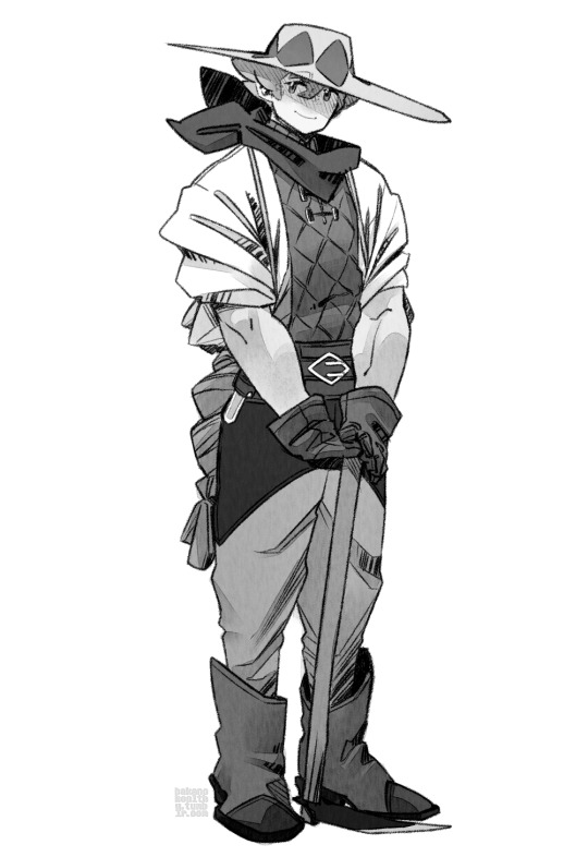
#haha i did his design
Text
Goth gf
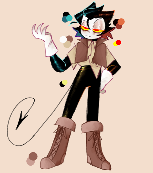
#haha i did his design#probably the only one who truly changes#but that's probably because i draw ONLY him#LMAOOOO#i hated his pants shut up#bendy and boris in the inky mystery#babtqftim#bendy and boris the quest for the ink machine#bendy the dancing devil#bendy the dancing demon#toon bendy#bendy and the ink machine#batim#batdr#bendy and the dark revival#i hate his goggles. so I didn't draw em#haha.#normalize giving ur blorbos pretty eyelashes
222 notes
·
View notes
Text

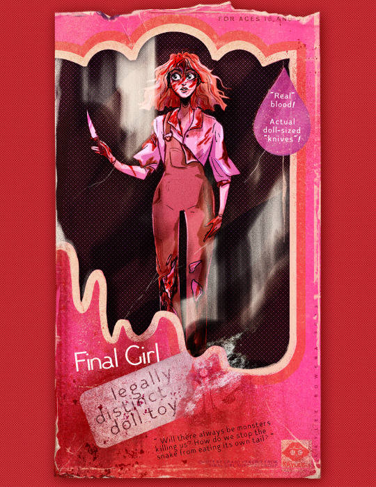

horror barbies legally distinct pink-themed horror dolls available now from your local t-shirt store!
#kaylee.art#horror art#horror illustration#gothic horror#slasher#final girl#gothic#barbie art#came back wrong#living dead girl#gothic heroine#bonfire#barbie horror#Definitely Not Barbie though. for sure not barbie#thanks to bonfire for being very chill with me updating these designs mid-campaign to not have them taken down haha#figuring out how best to obscure the logo while still keeping the vibes of the piece was fun! even if i do miss the fun text stuff#i did with the logos i do think the individualization there is neat!#scheduling this post at midnight so i don't keep forgetting to post it. hi from 12-hours-ago kaylee! hows it going future-tumblr?
3K notes
·
View notes
Text
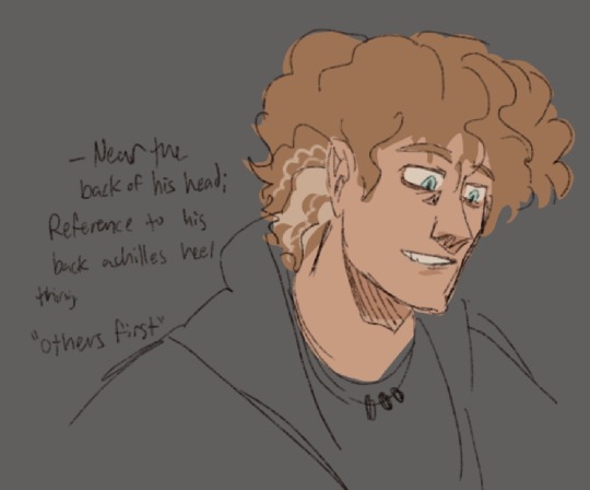
ok this is old (by like a month or two) so excuse the slightly outdated stylings. but i forgot to post this here so ENJOY!
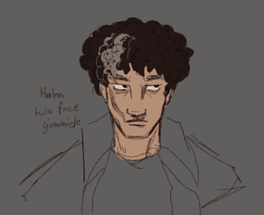
it’s a shame a design element as fun as the grey streaks are just put in the same spot all the time. so have my placements and the reasoning behind them (because it wouldn’t be a percexe design without cramming character significance into every little detial)
#i forgot to watermark these ummm#plz don’t steal xoxo#or rather plz don’t repost#that was off topic ummmm character design fun#i enjoy how past simon put a lot of text for percy and annabeth’s explanations#but just did ‘trick ass bitch’ for luke’s#in reality i just really enjoy playing with the idea of duality with luke and his character- specifically the haha two faced thing#and i’m incapable of talking about it without spiraling into 30 paragraphs#but whatevs#percy jackson#percy jackon and the olympians#percy jackson and the olympians#pjo#annabeth chase#luke castellan#my art
212 notes
·
View notes
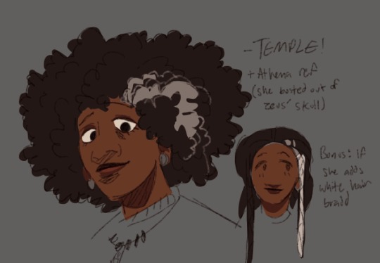
Text
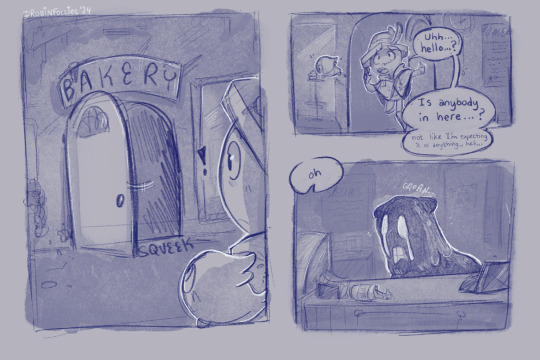
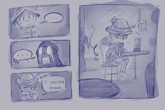
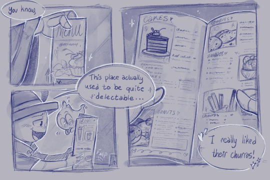
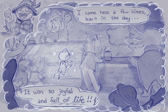
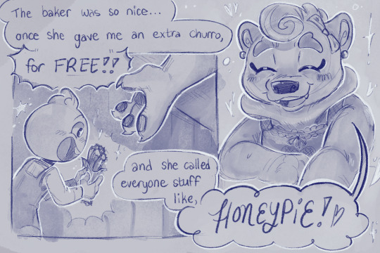
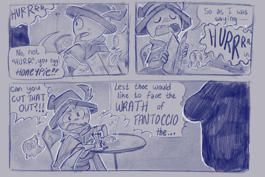
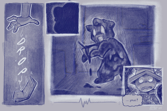
Been really pondering Fantoccio and the cursed citizens lately… like, if you’re stuck in a city for 15 years with some of your only company being these cursed globby versions of the people that used to surround you normally, you’d start to Notice Things that remind you of who they used to be, right?
#I HAVE SO SO MANY THOUGHTS ABOUT THIS GUY HE MAKES ME SOOO SAD. FANTOCCIO….#i really do think about his time in the city a lot. like a whooole lot.#like ofc these are weird amorphous blobs but yknow. there may still be some semblance of who they used to be within them#they have old habits or hang around in places they used to live idk idk.#they still have some of that old humanity they used to hold i guess… even in their cursed forms…#a little spark of hope that maybe everything will go back to normal someday#i dunno. and maybe eventually they even start to LOOK normal. all in ur head#fanto’s supposed to be younger here btw!! id personally put him at around 12-14 maybe?#also the bear baker’s name is Miss Cardamom!! unfortunately she is doomed by the narrative…. so sad… ú_ù#the bg characters were VERY VERY FUN to design!!! hehehe#billie bust up#bbu fantoccio#bbu the fella#robin’s art#2024 art#didnt mean to go as hard on the art as i did… twas supposed to just be a simple sketch comic HAHA#comicfollies
278 notes
·
View notes
Photo
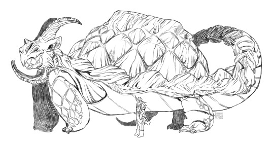
yay! I drew these quite literally three years ago. dragonheart!milo and raihan! a knight on a doomed dragon hunt being lifted out of his station by a small village medicine man. together they become magic lawyers and overthrow the government
the main details in these do survive into the iterations I’ve drawn (instead of these actual designs I spent time to make el oh el): the “leaf” diamond quilt/gambeson and the plaited coattail for milo, the “atypical” weapons, long coat, and large number of scattered fake gold trims and accessories for raihan. I think I lost raihan the hat and added a cape for milo further down the line because like this their general silhouettes are too similar for my liking lol
#pokemon#swsh#applinshipping#dragonheart AU#gym leader raihan#gym leader milo#leon is the puppet king in this one (I never made a design for him lol. lmao) (its not about him!!!!) (it is just a tiny bit#sonia actually disappeared out to sea like just the year before raihan got sent off too. and the shows up where raihan and milo are later on#as usual the everything between those three are messy in a way that makes every one of them embarrassed to bring it up lmao#if u remember one of the october pieces I did last year. the applinshipping one. yeap thats from this AU too#lmao. also remembering the swordsman AU. in every AU where I bring up a king you can TELL I cant WAIT to get rid of that guy#(its usually leon)#anyways it's not about him this is about raihan and milo!!! iirc everyone in the village knows milo is Something. bc he has literally not#aged at all for four generations#he's like doing his therapy away from the dragon hierarchy out here and raihan crash lands nearby#laughs this is so hallmark movie romance I just realized. except the city girl is trying to#extract her family from the palace before stealing the declaration of independence#oh yeah the AU is named that Specifically because the 'artifact' the whole plot runs around is supposedly a 'calcified' heart of a dragon#and the magic lawyer part is so raihan will seize the right to the throne by haha. winning a living dragon's heart instead#I'm actually surprised I remember this much abt this AU lmao it's literally been three years! I don't even remember what Im#supposed to do tomorrow#it's gettign a USB stick isnt it. Im doin a canadian horror triple feature with the senpai#I gotta remember that. well I remember This so. maybe there's a chance#man there are actually a number of applinshipping things I wanna draw... theyre my Fuckin BoyS#well! there's this at least. have a good night lads! I'll have cake soon#it's time to put cinnamon in things.
235 notes
·
View notes
Text

@h-y-p-h-e-n-d-o-t-s said:
big paw pads and claws...... thinking about lbh tackling lqg to the ground and squishing him with his body weight and a paw on his chest...... pushing down and watching lqgs face as the claws come out and press against the fabric of his robes :VVVV
lqg shoving his lbhs big face away and saying he and sqq should pin u down and clip ur claws if ur gonna get it caught on everything lel
here's luo binghe weighted blanket moment
#kamaeteDRAWS#luo binghe#liu qingge#svsss#tiger tiger#acernor's tiger tiger ;v;#thank u for adding this to my post im LOVE the idea haha#i changed his design bc i VIBE with pseudo melanistic tiger binghe#also i did not draw him as BIG as i wanted to but i was Struggling with this pose OTL
91 notes
·
View notes
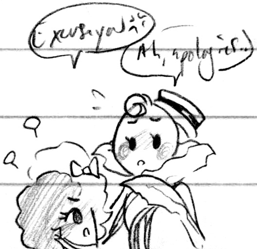
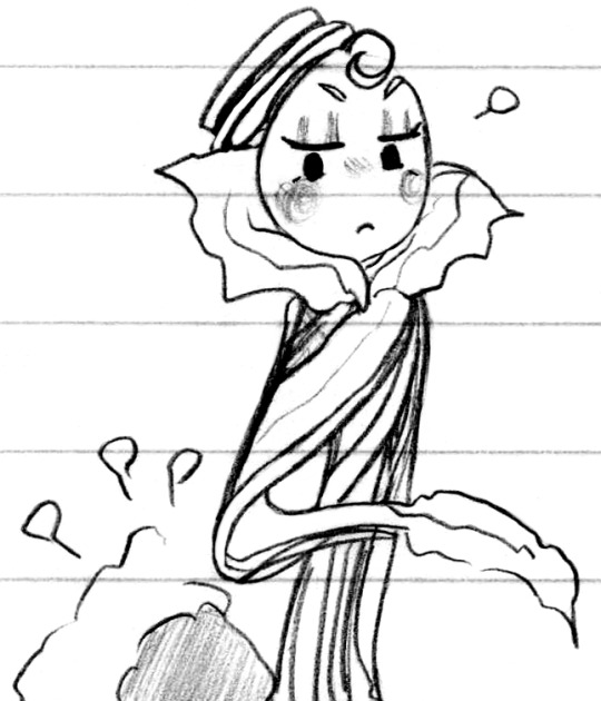
Note
Ah, if there are slots open still for requestober, and if you'd like to draw this one-- human RGB, and Hero's reaction to meeting him, please? Apologies if I misunderstood any of the rules and this isn't in line with them...

Day 22 - Nuh-uh! That's not a TV!
#My art#Requestober#The Property of Hate#TPoH#Hero#RGB#You're all good anon! :D#As a quick reminder/rundown - slots are open either until they're filled with requests or the day passes without a request#So there's a limited number of slots just through the passage of time >:3c#And I almost called this one on a technicality since I've drawn RGeeBs bunches but didn't remember drawing his human form -#But then I went and looked and no yeah I totally did once lol silly me! It's been a bit but that counts! :D#I actually haven't been caught up in a while so excuse if their designs look on the older side lol#I mostly went based on the one from last year - I'll catch up again after a while :)#They are both still quite fun to draw haha ♪ Hero's got such a cute and sweet design even with all the replacements!#And while I love RGB's TV head he's quite handsome as a human - and his proportions are still the same!#Funnest legs to draw in the West (lol)#Forced to be a bit on the vulnerable side! Crouching down for her to inspect and hunched on in himself hehe#Be subjected to scrutiny! Turned this way and that! Gotta get used to your sounds coming out of this ''new'' face hehe#Cute lads <3
106 notes
·
View notes
Text

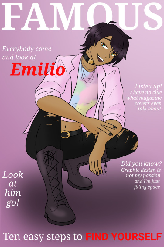
Wooooo did an art trade with @ruvikdraws , I got to draw her lovely oc, Emilio! It was so fun drawing him -- he has such a sweet design and I hope I did him justice 📸✨️
#ocs#he really is so pretty ;-;#my biggest failing is that i couldnt capture how Soft and Fluffy you drew his hair ✨️✨️✨️#all your ocs had such beautiful designs -- it was so hard to pick one to draw haha!#whats better than a stunning identity-struggling guy in big stompy boots and pastel huh#he looked so happy and bold in your art!! it made me smile :D#i debated on making him more punk-ish (and you did confirm he likes to tease :3) but im glad i stuck with the sweet vibes#id read about him in a magazine 👏#im gonna reblog ru's in a sec -- stay tuned!! it came out gorgeous
30 notes
·
View notes
Text

Do you think since the castle at this time was formed through Maxim's will, that Death may have taken form similarly? Well you can call me a wanted outlaw because I sure am reaching for the sky like I always do with these random comics. ( J` O`)J
This was what I was thinking while doodling Death in his various designs. Not to mention, when I see a ribbon, I may accentuate them.
This was also an excuse to touch-up how I draw Juste, as I made the dumb decision of forgetting the little bow on his outfit-- I did not add that onto Death's cloak by the way.
#does that even make sense?#also... you know how I usually draw death in his sotn design#who brought that castle back eh? what did they look like? yeah :)#maybe it can't apply to /every/ form of death when someone else revives the castle but it makes sense here (to me) I'll roll with it#if it will help death reunite with his master then sure why not#(and you know what juste ends up giving him the info he needed so it worked after all)#doodle-daas#comics#juste belmont#and death say hello to him haha he gets no proper tag
61 notes
·
View notes
Text
I wish that more English Danganronpa V3 fans knew that in the original Japanese version, Gonta didn’t talk in caveman/Hulk speech. He spoke in normal polite Japanese, only struggling with the meaning of certain words from his lack of experience. He did however talk in third person but Tenko and Angie did as well. In Japanese 3rd person speech works and is used to make characters cute and childish. But in English none of this comes across and instead is just distracting. Its obvious that the NISA translators only kept Gonta in 3rd person to insert weird American humor into the series.
I especially dislike this translation because Gonta is one of the most important characters in ndrv3, especially when it comes to Kokichi’s character arc. Now, instead of being the sweet and naive entomologist who allows the audience to see beneath Kokichi’s mask, he is now seen as nothing but a joke side character.
Which not only ruins Gonta’s entire character but also makes Kokichi’s character and intentions even more confusing.
(No wonder people are confused that Kokichi and Gonta got official Anniversary wine together haha)
To make things worse, they also changed Kokichi’s character by making him more childish and aggressive.(even going as far as changing his sprites on scenes!) I’d say one of the worst mistranslations though was making his whiteboard have “trustworthy?” written below the photo of Shuichi. In Japanese it says something more along the lines of “dangerous?” or “untrustworthy?”. I really don’t know how they messed this up but it was likely because there was a translator who wanted Kokichi to be shipped with the protagonist. The translation error to me was strange because most of his interactions with Shuichi were negative so, to suddenly say that Shuichi was the only one he trusted would feel like a contradiction. It’s also frustrating because, the original whiteboard translation imo implies that Kokichi may have suspected that Shuichi was the mastermind which is SO INTERESTING and gives their dynamic so much more depth.
In conclusion: NISA ruined V3 lol
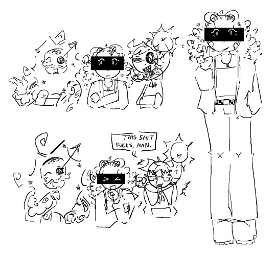
#gonta gokuhara#kokichi ouma#shuichi saihara#danganronpa#new danganronpa v3#ndrv3#killing harmony#Kokichi seeing Shuichi as the mastermind also just makes so much sense when you look back at everything#it would only make sense that Kokichi would use the whiteboard to continue Kaede's goal of finding the mastermind#and shuichi out of the whole class is the most suspicious given how much power he has over the whole class and the fact that despite being a#detective he barely did anything to find the mastermind#all he did was solve the class trials which just made the killing game continue on#from Kokichis prospective Shuichi being alone with Kaede so much before rantaros death could also be suspicious#you could even argue that this would explain why Kokichi acted weirdly aware during his love hotel scene and why he sprints out of the room#at the end. also speaking of the love hotel NISA also added a weird line to shuich in the Kokichi scene where he basically says that he#found himself wishing that kokichi would stay but repressed the thought#this wasnt in the Japanese version so I dont understand why they would add this other than to add more ship bait#oh and I also find it interesting how similar Shuichi and Tsumugis designs are#I have so much more to say about this but I'll stop for now haha#this was supposed to be about Gonta but oh well;;
374 notes
·
View notes
Text
chonny would make a charming third mic in litwtc
#🔥:#haha did you see what i did there#sighs#anyway i tried to make a litwtc-core(?) design for mr jash!#eyes are a ref to “blacks out his eyes” from thermo#x y is a ref to 20xx#outfit from FIF#i really like the design & i might play around w it more later#um. litwtcers meet chonny jash#um. jashers meet litwtc#i'm tired dawg#chonny jash#life in the world to come#litwtc#chris dunne#will wood#my art
37 notes
·
View notes
Text

did i ever post this freakish ososan oc line up on here. no? okay.
#ososan oc#ososan#im NOT tagging anything else. iam shy….#they’ll get individual graphics soon. haha yes. I did take a graphic design class. (smirks. I forgot everything)#their names end with an (ee) sound bc i wasn’t thinking#they’re self aware i think#hi gorls#ppp
65 notes
·
View notes
Note
*cracks knuckles* Get ready for a long ask
As an animator/artist myself, I have a lot to say about the character designs.
I'm sure you've heard this before, but these characters are not animation friendly. More detail just makes it harder to animate. (While Bee is a notorious example, nearly all of the characters suffer from this)
When designing a character for animation, you need to pick and choose the key parts of their design, because you're going to be drawing the same thing over and over.
Another thing: The characters have so much freaking red to them.
I won't dwell on this for long, but they don't stand out from the background because there's so much freaking red
(Another thing that bugs me is that the characters don't look like what the artist wanted them to be like)
Ex:
Charlie doesn't look like a doll
Vaggie barely has a moth resemblance
Angel Dust doesn't look like a spider
Alastor doesn't look like a deer
Niffty doesn't look like a bug or B-movie styled aliens
Ozzie doesn't look like a rooster
Beelzebub doesn't look like an animal trainer (you would think with all the suits and shit she likes to use, an animal trainer's outfit would be perfect for this)
Another thing: Her characters reuse the same design tropes. Bow ties, suits, fingerless gloves, gold tooth, stick thin figure, top hat, etc
I'd excuse it if this was a beginner artist (heck, I used to do this, but eventually learned and grew out of it) but this is a woman in her 30's who graduated art school.
TL;DR The designs are bad and hard as heck to animate
Couldn't have said it better myself
I feel like, when Viv sits down to design a new character, her personal preferences come first and everything they're actually supposed to represent second. Sort of tacked onto the final product like "yeah sure that'll do it"
As for the details, if I may add on: not long ago I've studied screencaps of a character from Helluva for redesign purposes. The amount of inconsistencies I came across was surprising! I'm pretty sure he didn't even have an official ref sheet (nor has one been posted to date), but I've heard that even for more prevalent characters the animators only have the most basic turnarounds? Also stuff like Millie's hair and spots tend to be inconsistent. With so much gratuitous/weird detail and apparently lack of proper reference, consistency suffers
Everyone is also very spiky and full of triangles; I'd love a more soft or even square character. Also some different body types... I mean, remember Mimzy from Hazbin? I don't know if Viv does. I wonder if she's still gonna appear at some point. But anyway
On a more positive note, there's a lot of background character designs that I find really cool & enjoyable! Maybe I'll make an appreciation post for them sometime
#confession#you know what also bugs me? somewhat less prevalent than the bow tie. and relatively harmless. but#c h o k e r s#a lot of characters have them. Millie. Loona. Verosika. Angel Dust. Vaggie. Crimini (pretty sure she was retconned but still)#and they're just there... because. no particular reason for it#(except for Loona I suppose. bc spiky dog collar)#it annoyed me because I was gonna give said redesign a choker to symbolize something. but then it felt redundant#also remember when they gave us a green environment for most of the episode where the imps stood out for a change#and then a new character with a wholly green design. and his ass was completely camouflaged for a significant number of scenes#it was almost funny#(but man I sure did NOT enjoy that episode)#helluva boss critical#hazbin hotel critical#helluva critical#hazbin critical#OOPS HAHA FORGOT TO ADD THE TAGS I am silly
35 notes
·
View notes
Text
So is the community in agreement that the makeshift set is just Reth's terrible attempts at carpentry or has this headcannon spiraled out of control for me?
#headcanon nonsense#palia but tangentially#but not tangentially i'm just shy about posting my thoughts in the main tag orz#i remember tish mentioning ONCE that it's based on furniture her and reth designed as kids but#the makeshift armchairs specifically implying they're ancient torture devices (re: his Path convo)?#the one planter that implies it came out of reth's trash?#i can just imagine him attempting things and tish helping to make them some semblance of useable#but given how self-depreciating he is he just threw them all into the lake or the bay or whatever because he was ashamed of them#and that's why you've been fishing them out all over#i like to think about him visiting the homestead and having to pause like#hey fancypants uh... where did you get those armchairs on your lawn? fished em out of the lake? haha! put em back!#you have to give him credit for being ambitious enough for a 76 piece furniture set though#even if he doesn't see any hope or future in his original path#tish has the skills but the makeshift set has so much charm because they worked on it together...#anyway this has been on my mind because i'm trying to gather the set + catch 1 of every fish thanks for coming to my TED talk
15 notes
·
View notes
Text


i finally did something lineless again for the first time in A While, so i felt like comparing!!
old ones are from october 2018, new ones are from very recently (august 2023)
#man. that's nearly five years huh. dang#low stakes 🦇#sometimes it's just really fun to compare recent stuff with old similar stuff#just to see how your art has progressed. and also how their designs may have subtly changed. very neat#also don't worry einarr still mainly has a sidepart haha#i like playing with his hair!!! i always did#i've drawn him with a middle part back then too#it's fine#also it was 2018 einarr was only BARELY starting to become a character at this point#also yeah i've been drawing mort's hair a lot wavier lately#it's more fun and it looks very nice actually#morten still has the top hat too. don't you worry#again i like playing with their designs and morten has a lot of hats <3#but yeah. pretty sure that old lineless mort actually never saw the light of day until now. he was literally still in the psd file#i wasn't completely happy with it at the time
24 notes
·
View notes
Photo
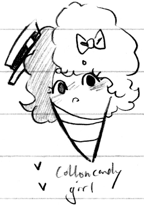
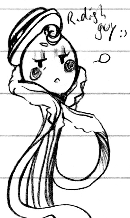


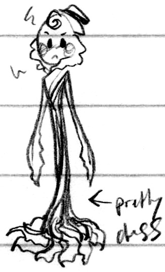
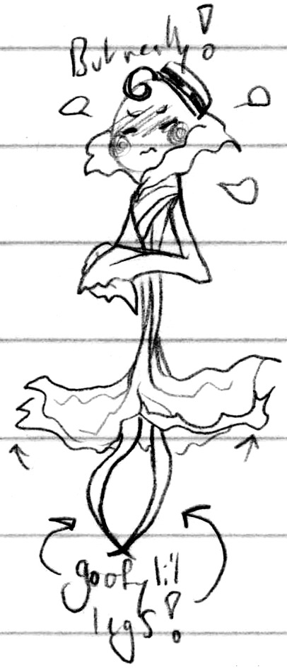

Food group swap!
#Doodles#Pajama Sam#Florette#Luke Wigglebig#Flukette#'Sup it's been like a year and I'm comin' back atcha with a design swap lol#What if they were each other's type of food! What might that look like!#I think Florette would be cotton candy and Luke would be a radish lol#The only real change would be the nature of their insults lol - Luke is no longer a flathead and Florette no longer a shrub#They're still both delegates and both their same heights and limbs - although I guess now Luke has feet lol#And Florette has a wrapped paper body! Y'know like a cone - what's used for cotton candy at state fairs and the like lol#It's wider than average which also makes it looser - so she can wrap and unwrap herself to act as limbs in place of the jacket I gave her#Luke gets to keep his arms tho! How unfair!#I guess the General did have arms and he was a veggie so it's not like it's unheard of#And like the Ice Cream Cone guy from the S.S.A.M. didn't have arms so! There's precedent on both sides!#Mostly it was just a lot of fun seeing how much I could bring them out in their design while being completely different lol#They've still got the same catty attitude towards each other (and ship as far as I'm concerned cough) lol#But turning Luke's lapels into a leaf collar and giving him more leaves for hands ah! They're really fun to draw actually haha#And cotton candy is already an obvious favourite for me lol#Yes I was imagining her as a blue/pink combo lol I'm very predictable#I guess she could be green :0 Pastel green isn't exactly common but cotton candy can be any colour so#A radish for Luke felt obvious tho lol - pink veggies are a thing! Lean into it#They were both really fun to design and doodle bouncing off each other hehe ♪
10 notes
·
View notes
Last Seen Blogs
m3thusela
Methusela

screechingcomputermagazine
Untitled
nots125heartpoint-blog
🖤nots125heartpoint💘

strawbekka
oh, worm?
jorgadystymik
úzkosť...