#designconcepts
Text

Lessons in Architectural Disaster: The Narrative of Structural Failures
Amidst the vast landscape of architectural education, the Tacoma Narrows Bridge collapse stands as a haunting reminder of the intricate relationship between structure and design. Lectures reverberate with the echoes of "cumulative effects of undampened rhythmic forces" and "intense resonant oscillation," cautioning against the pitfalls of disregarding structural integrity.
The Millennium Bridge in London, too, bears witness to the repercussions of overlooking structural dynamics, as the rhythmic footsteps of pedestrians induced unsettling vibrations, prompting its temporary closure for remediation. Even the historic Albert Bridge, adorned with a sign prohibiting marching soldiers from Chelsea Barracks due to resonant frequencies, serves as a stark testament to the delicate balance between form and function.
Yet, as the annals of architectural history unfold, today's lesson arrives with a sombre tone—the fall of Baltimore's Key Bridge after a devastating collision with the vessel Dali. The narrative echoes the timeless tale of the Ancient Mariner, where the misfortunes of one reverberate through the fate of many.
In the wake of this tragedy, architects are confronted with a poignant reminder—the conceptual notion of disaster as a design element. It is not merely an abstract concept but a tangible reality, intent on imparting its lesson to students of architecture.
As the Key Bridge crumbles into the depths below, it serves as a stark symbol of the consequences of overlooking structural integrity and the profound impact of design decisions on the built environment. The incident underscores the imperative for architects to not only master the principles of form and aesthetics but also to embrace a holistic understanding of structure and engineering.
Amidst the chaos and devastation, there lies an opportunity for reflection and growth—a call for architects to imbue their designs with a deep reverence for the forces of nature and the imperative of resilience. For it is in confronting the challenges of disaster that architects find the true essence of their craft—a synthesis of artistry, innovation, and unwavering dedication to the safety and well-being of society.
As the Key Bridge stands as a solemn reminder of the fragility of human endeavour, architects are tasked with the solemn duty of weaving disaster into the very fabric of their designs, transforming tragedy into resilience, and imbuing the built environment with the wisdom gained from the lessons of the past.
#ArchitecturalDisaster#StructuralFailures#LessonsLearned#DesignConcepts#ArchitectEducation#DisasterPrevention#SafetyInDesign#StructuralIntegrity#ArchitecturalNarratives#architecture#berlin#area#london#acme#chicago#puzzle#edwin lutyens#massimoscolari#oma
3 notes
·
View notes
Text
Trending Design Concepts
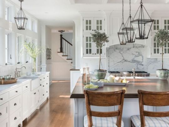
It is no mystery that modern contemporary has taken the cake for most popular design choice for people buying or building a home in todays world. This doesn't mean however that modern contemporary is the only trending design in 2024. A timeless design theme is the modern farmhouse, which never gets old and is making a comeback in recent years as the runner up to the modern contemporary design. I personally happen to think you can blend modern contemporary and farmhouse together.
In today's world with having a small homestead to sustain your families food intake, the movement of everyday life, cooking, raising children; while still maintaining a beautiful modern design is all possible in 2024. Modern contemporary allows for design features that are minimalist in nature offering a mathematical approach to your space. You can enjoy high ceilings and larger then normal doorways.
It is when we begin to add the farmhouse features that the magic happens. A grand entryway allows you a space that supports the growth and movement of your family. A large living space to build forts and enjoy a wide variety of indoor activities with the kids. Moving into the kitchen, we see that the open concept kitchen to living room theme tends to feel a little too open. When we incorporate the farmhouse feature, the kitchen gets its own dedicated space for cooking, canning, baking, and entertaining. With plenty of counter space and storage, a large walk in pantry is perfect for that emergency food storage you've been dreaming about.
There is every reason why we should be able to enjoy the best of both worlds in 2024 and blending modern contemporary and farmhouse is the best way I see to move forward in my design expertise.
Stay tuned while I grow this idea in to something truly beautiful and unique.
#HeatherLessard#HeatherSetdhaya#InteriorDesign#ModernContemporary#Farmhouse#DesignConcepts#Home#Kitchen#Interiors#DesignExpert#Florida#FloridaDesign#ModernLiving#ModernFarmhouse
2 notes
·
View notes
Text
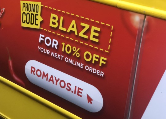
I found this poster on a bus in Dublin and it IMMEDIATELY caught my eyes. The color red works amazing for getting immediate attention. The use of contrast here is also effective. "BLAZE" and "10% OFF" are words one can almost immediately read to get an idea of what message the poster is trying to pass across. It is great for advertisement. The arrangement and hierarchy of texts also works great.
2 notes
·
View notes
Text
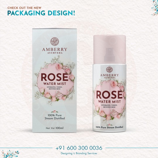
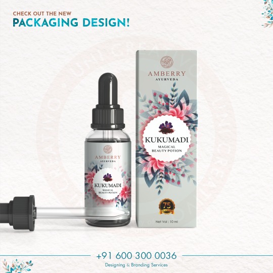
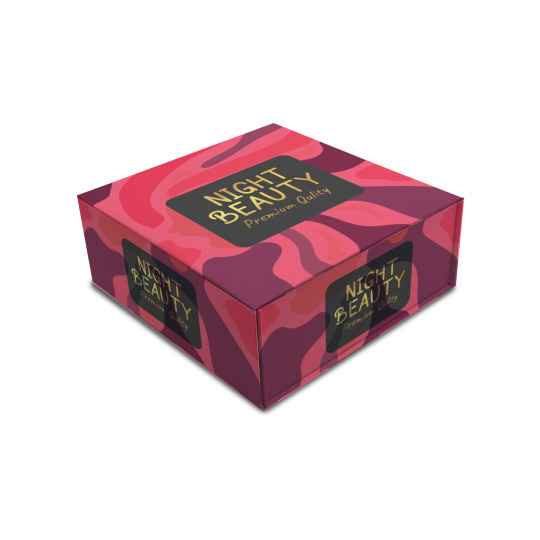
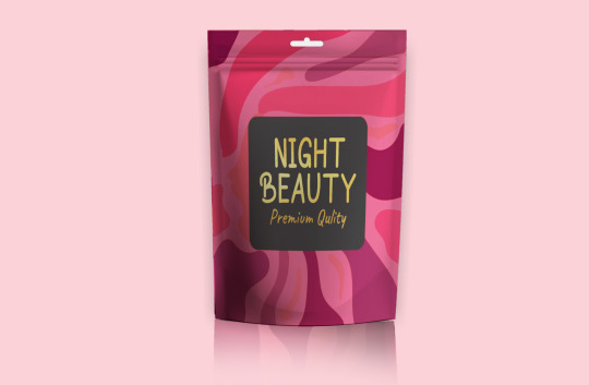
Are you want to packaging design?
#packagingdesign#packaging#designconcepts#design#packagingsolutions#boxdesign#box#box packaging#packaging boxes#giftbox#foodpackgeing
3 notes
·
View notes
Text
Unlocking Home Design Potential: Introducing HomeDesignsAI

Introducing HomeDesignsAI
HomeDesignsAI is an innovative web-based application that harnesses the power of artificial intelligence to generate interior and exterior design concepts for homes. With its user-friendly platform, individuals, regardless of their design background, can effortlessly create personalized and visually stunning design ideas for their living spaces.
#HomeDesignsAI#InteriorDesign#ExteriorDesign#AI#ArtificialIntelligence#DesignIdeas#3DVisualization#Customization#HomeDecor#HomeImprovement#DIY#Collaboration#SaveTimeAndMoney#Innovation#RealEstate#Inspiration#DesignConcepts#PersonalizedDesigns#RevolutionaryDesign#InteriorInspiration#ExteriorInspiration#DesignTools#HomeStaging#ProfessionalDesign#HomeProjects
0 notes
Text
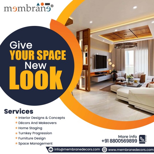
🌟 Discover a World of Possibilities for Your Space!
✨ From cutting-edge interior designs to stunning makeovers, we specialize in:
✔️ Interior Designs & Concepts
✔️ Décors And Makeovers
✔️ Home Staging
✔️ Turnkey Progression
✔️ Furniture Design
✔️ Space Management
💫 Let's create a space that reflects your style and personality.
💥 𝗙𝗲𝗲𝗹 𝗳𝗿𝗲𝗲 𝘁𝗼 𝗴𝗲𝘁 𝗶𝗻 𝘁𝗼𝘂𝗰𝗵 - 𝘄𝗲'𝗿𝗲 𝗮𝘃𝗮𝗶𝗹𝗮𝗯𝗹𝗲 𝘁𝗼 𝗮𝘀𝘀𝗶𝘀𝘁 𝘆𝗼𝘂.
📞 +91-8800569899
📧 [email protected]
🌐 www.membranedecors.com
#MembraneDecors#InteriorDesign#Renovation#InteriorStyling#DreamSpace#CustomFurniture#Transformation#DesignConcepts#InteriorDecorating#SpaceSolutions#Goals
1 note
·
View note
Text
Fashion News and Trends in 2024 modern world
Fashion Designer Spotlight: Where Innovation Meets Inspiration
The fashion industry is a canvas painted with strokes of creativity, innovation, and the boundless spirit of its designers. This spotlight shines on the individuals who push boundaries, challenge conventions, and leave an indelible mark on the world of style.
Fashion Designer Spotlight: Where Innovation Meets Inspiration
Runway Report: Fashion Shows Redefined
Modeling in 2024: Shattering Stereotypes, Embracing Diversity
Sustainable Fashion: Stitching a Greener Future
Tech Meets Fashion: Where Innovation Threads Style
Style Guides for Every Occasion: Your Sartorial Compass
Fashion Industry Icons: The Pillars of Style and Innovation
Global Fashion: Where Cultures Collide and Trends Take Flight
The top 21 fashion brands in the 2024 world
Comparing the Fashion Industries of India and the USA:
Pioneers of Progress:

FASHION
read full article in details https://mahashankh.com/fashion-design-trends-modern-world/
Read the full article
#ArtandFashion#Athleisure#AugmentedReality#AugmentedRealityFashion#BodyPositivity#BohemianStyle#BusinessAttire#CasualFashion#CelebrityStyle#ColorTrends#ConsumerTrends#CulturalInfluences#DesignConcepts#DesignPhilosophies#DesignerInspirations#DesignerSpotlight#DiversityandEmpowerment#Eco-FriendlyApparel#Eco-FriendlyDesigns#EmergingDesigners#EmergingTrends#EthicalChoices#EthicalDesign#EthicalFashion#FabricTrends#FashionAccessories#FashionAdvice#FashionandActivism#FashionandCommunity#FashionandConfidence
0 notes
Text
The Art of Visual Communication in Graphic Design
Graphic design is a dynamic field that blends creativity with technology to convey messages and ideas through visual elements. Among the essential components of graphic design, one of the most crucial is the art of visual communication. This article delves into the second point, "Elements of Design," which encompasses the fundamental aspects of graphic design that every designer should master.
1. Color: The Palette of Emotions
Color is a powerful tool in graphic design, as it has the ability to evoke emotions, set the tone, and create a visual hierarchy. Designers must understand color theory to make informed choices when selecting color palettes for their projects. For instance, warm colors like red and orange can convey energy and passion, while cooler tones such as blue and green often represent calm and serenity. The skillful use of color can guide the viewer's eye and elicit specific emotional responses.
2. Typography: The Art of Letterforms
Typography is the art and technique of arranging type to make written language legible, readable, and visually appealing. Choosing the right typeface is crucial, as different fonts carry various connotations and can greatly impact the message. For example, a playful and whimsical typeface may not be suitable for a formal document, while a sleek, modern font can enhance the aesthetics of a tech startup's logo. Proper alignment, spacing, and hierarchy within text also contribute to readability and aesthetics.
3. Images and Graphics: Telling a Visual Story
Images and graphics play a pivotal role in graphic design, whether it's creating stunning illustrations, enhancing photographs, or crafting compelling infographics. Designers often utilize software like Adobe Photoshop and Adobe Illustrator to manipulate and edit visual elements. The choice and placement of images should align with the design's purpose and message, reinforcing the overall visual narrative.
4. Layout and Composition: Organizing the Visual Space
Layout and composition involve arranging all design elements within a defined space to create a harmonious and visually pleasing composition. Concepts like balance, contrast, alignment, proximity, and repetition guide designers in achieving effective layouts. A well-structured layout ensures that the viewer can easily navigate the content and grasp the intended message.
5. Hierarchy: Guiding the Viewer's Eye
Visual hierarchy is about emphasizing certain elements over others to lead the viewer's eye through the design. This involves using techniques such as varying font sizes, colors, and placement to guide attention to the most important information. Effective hierarchy is vital for ensuring that the viewer can quickly and intuitively understand the content's significance.
6. Simplicity: Less is Often More
The principle of simplicity emphasizes the importance of clarity and minimalism. Graphic designers should avoid clutter and excessive detail that can overwhelm the viewer. Often, simplicity leads to elegance and a more profound impact.
In conclusion, understanding and mastering the elements of design is fundamental for any graphic designer. These elements serve as the building blocks for creating visually compelling and effective designs. By harnessing the power of color, typography, images, layout, hierarchy, and simplicity, designers can craft visual narratives that captivate, inform, and inspire. Whether working on a logo, a poster, a website, or any other project, these design elements remain at the heart of every successful graphic design endeavor.
#GraphicDesign#DesignPrinciples#VisualCommunication#ColorTheory#Typography#ImagesAndGraphics#LayoutAndComposition#VisualHierarchy#DesignElements#DesignFundamentals#CreativeDesign#DesignAesthetics#VisualArt#DesignBasics#SimplicityInDesign#DesignSkills#ArtOfArrangement#DesignConcepts#EffectiveDesign#GraphicDesignTips
0 notes
Text
Make Your Business's Raksha Bandhan Special! 🎁 Add a personal touch to your gifts with our Festive Packaging Design Service, featuring your brand's identity.✨
Connect Now
.
.
#packaging#packagingdesign#festival#designconceptscreatives#branding#designconcepts#brandidentity#marketing#product design#product packaging#brandpackaging
0 notes
Text
Packaging And Label Die Cutting
In the process of die cutting, forms are created from a range of materials, such as paper, cardboard, plastic, and metal. This technology is adaptable and may be used to produce a range of packaging and labeling items.
Custom packaging for goods is frequently made using die cutting. Boxes, bags, labels, and other containers might be included in this. Unique forms and designs that can make things stand out on the shelf may be produced using die cutting.
Custom product labels may also be made using die cutting. This can apply to labels for product identification, warnings, and other kinds of labels.
Labels with intricate designs that are challenging or impossible to manufacture using other techniques can be made using die cutting.
Die cutting advantages
Die cutting has various advantages for packing and labeling. Among the most significant advantages are:
Accuracy: Die cutting allows for the creation of exact cuts that are challenging or impossible to achieve using other techniques. This might help to guarantee the best possible quality for your labels and packaging.
Quickness: Die cutting is a quick operation that may help you save time and money.
Versatility: Die cutting can produce a broad range of shapes and designs, enabling you to develop distinctive and attractive packaging and labels.
Cost-effectiveness: When compared to other production techniques like printing, die cutting can be a more affordable approach to create packaging and labels.
Conclusion
A range of packaging and labeling goods may be made using the flexible and effective die cutting method. You can assist to guarantee that your packaging and labels are of the highest quality and satisfy your demands by adhering to safety regulations and making use of die cutting's advantages.
Additional Information
Safety Instructions: In order to avoid accidents when utilizing die cutting, it is crucial to abide by safety instructions. The following are some of the most crucial safety recommendations:
Always wear safety glasses when using a die cutting machine.
Verify that the die cutting device is securely grounded.
If the die cutting machine is damaged, do not use it.
Do not put your fingers near the cutting edge.
Keep an eye out for anything or anybody that could be in the path of the cutting blade by being mindful of your surroundings.
Die Cutting Machine Types: A wide variety of die cutting machines are available, each with specific advantages and disadvantages. Die cutting machines come in a variety of popular configurations, such as:
Rotary die cutters: To cut forms out of material, rotary die cutters employ a number of revolving blades. When cutting a lot of material, rotary die cutters are a suitable option.
Flatbed die cutters: Flatbed die cutters carve forms out of material with a single blade. Flatbed die cutters are an excellent option for cutting intricate forms or little amounts of material.
Laser die cutters: A laser is used to cut out forms from material with a laser die cutter. For cutting complicated forms or materials that are challenging to cut using conventional techniques, laser die cutters are an excellent option.
Die-cutting expenses
Die-cutting expenses might change based on the machine type, the size and intricacy of the cuts, and the materials being cut. In general, die cutting is more affordable than other techniques like printing for creating packaging and labels.
0 notes
Text
Make your product stand out on the shelves with Uni Creativo's new packaging design services. Our team of expert designers will create a package that perfectly reflects your brand and catches the eye of potential customers. Contact us today for a consultation.
🔰Contact: +91 600 300 0036
🔰Mail: [email protected]
#packaging#packagingdesign#designconcepts#creativeagency#digitalagency#creative#design#digitalmarketing#graphicdesign#marketingagency#advertising#branding#marketing#brandidentity
1 note
·
View note
Text
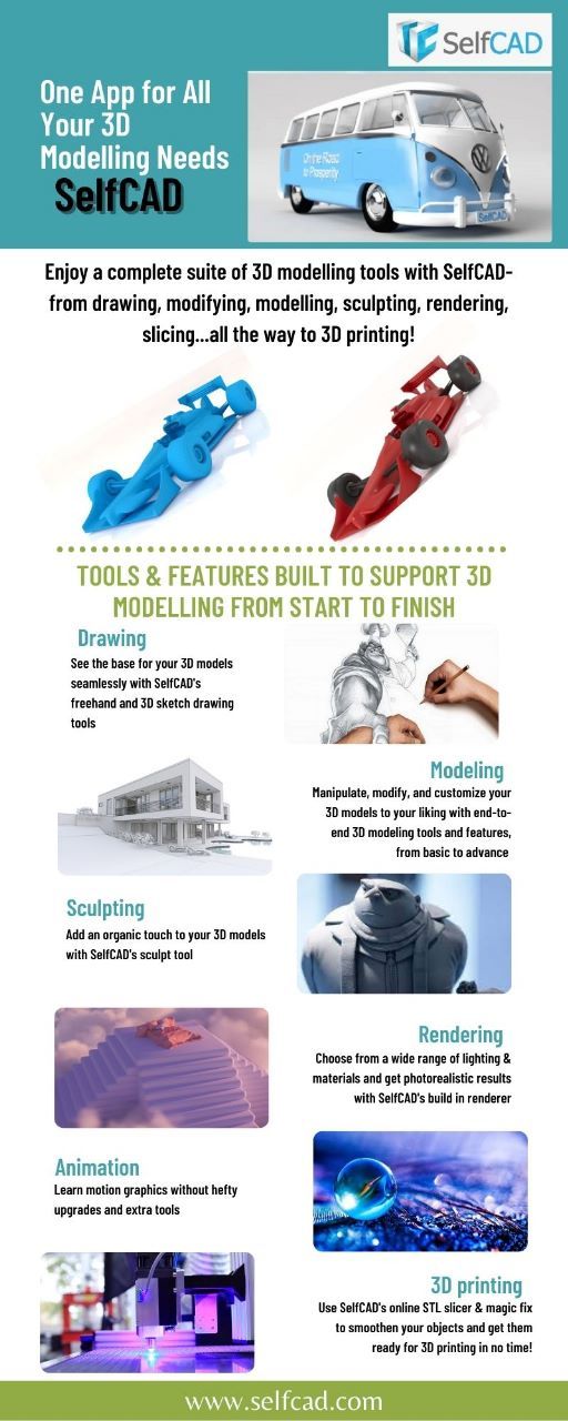
SelfCAD is an all-in-one 3D modeling software that provides a range of tools and features to support the entire 3D modeling process from start to finish. From basic shapes to intricate designs, SelfCAD has everything you need to bring your ideas to life.
The software features an intuitive drag-and-drop interface that allows you to easily create and manipulate shapes. You can also use the software's advanced tools to add intricate textures and details to your models, making them truly unique and lifelike.
One of the standout features of SelfCAD is its built-in slicer, which allows you to prepare your models for 3D printing with ease. The slicer provides a range of customization options, allowing you to fine-tune your models for optimal printing results.
To help you get the most out of SelfCAD, the 3D_Modeling_101 tutorial provides a comprehensive guide to the software's features and functions. The tutorial covers everything from basic modeling techniques to advanced design concepts, making it the perfect resource for beginners and experienced designers alike.
Whether you are looking to create 3D models for personal or professional use, SelfCAD is the ideal solution. With its intuitive interface, powerful tools, and built-in slicer, it provides everything you need to take your designs from concept to reality. So why wait? Start exploring the world of 3D modeling today with SelfCAD and the 3D_Modeling_101 tutorial!
#SelfCAD#3DModeling#AllInOneSoftware#Slicer#DragAndDrop#DesignConcepts#Tutorial#3DPrinting#OptimalResults#IntuitiveInterface#PowerfulTools#BringIdeasToLife#Explore3DModeling
0 notes
Text
REASONS WHY COLORS MATTER IN PACKAGING
Red, Blue, Yellow, Green, colour may simply be a piece of the fundamentals however for organizations they stand a critical job. Colour is significant in marking and advertising since it is the place initial introductions of clients are based. Additionally, Color is the mystery in creating a decent personality for an organization. Colours are something other than a visual guide since colour pass on feelings, sentiments, and encounters. There are implications behind different hues and for organizations, it will help if they are side by side with this because picking a shading plan can influence their business – it might either represent the moment of truth to them.
When it comes to packaging, colour is one of the most important components for attracting shoppers. Visible from a greater distance than other elements such as copy, illustrations or graphics, it’s often one of the first things people notice.
Pick a colour that will inspire the most recognizability and commitment on the rack. Consider if a remarkable colour can be utilized that suits the brand and is unusual in the classification. Keep in mind that the amount of shelf space your brand has will influence whether or not you can create strong colour blocks.
When looking at a new product entry into a category, consider picking a strange shading to stand separated from the standard inside the classification. When picking hues, here are a couple of standards to remember:
Keep it straightforward and attempt to just utilize 2 or 3 complimentary (Colors that are inverse each other on the shading wheel). Individuals like straightforwardness and it makes your package more obvious. There is an intrinsic threat in utilizing such a large number of colours as each shading has significance and includes or detracts from your message whenever utilized incorrectly.
Try to use contrast to make elements on your package stand out. People often assume a colour difference is what makes contrast but that’s not true. You might have two colours that are completely different but have no contrast because their tone is the same. To test out your colours contrast, turn them into grayscale and review their contrast.
Keep in mind your target market. Blue is liked universally by both genders while there is little agreement between men and women when it comes to purple. Men tend to prefer bold colours and shades (colours with black added), whereas women are more receptive to tints of colours (colours with white added). Also, be aware that cultural perception plays a strong role in colour appropriateness which in turn can influence choices.
Colours have universal perceived meanings, here is a quick run:
BLUE – Blue is seen to be a very positive colour. It may invoke trust, security, and responsibility. It is also associated with creation and serenity. Blue instils trust and security that’s why many institutions count on this colour.
RED – Red is a powerful colour. It is also very energetic, aggressive and provocative. Red can be used to incorporate passion and energy into your product.
GREEN – This colour symbolizes health and nature. It also has a calming feeling especially for lighter shades of green.
YELLOW – Yellow is the colour for vibrancy and optimism. It can also be motivating and captivating that’s why some tag prices are in this colour because it helps get the attention of customers.
PURPLE – This colour offers sophistication, nostalgia, exclusivity, and royalty making it perfect for some of those selling expensive jewellery.
PINK – Dark shades of pink are very energetic and instil excitement while lighter shades show a romantic feel.
ORANGE – This colour can be effective for children because of its cheerful, friendly and fun feel.
BROWN- This shade elicits simplicity and stability. It also looks very down to earth.
Black – Black promotes a serious or classic campaign. There is also sophistication and exclusivity in this colour which works well with expensive products.
White – This colour looks very plain but when used, it shows purity, cleanliness and is very enticing to the human eye.
Just give a pause before you choose the colour for the logo or packaging of your brand and think, how you want your potential clients to see the products/services you provide. What kind of emotion or message does your brand pass? What are the values you are adding through your product/service in their life? These are the questions you need to ask yourself before building your brand’s identity through your packaging or marketing and be consistent with this. Because you can change anything but you cannot change the brand identity once built.
0 notes
Text
Dreaming of the Dream✨
1 note
·
View note
Text
Have your need packaging design remmeber to me.
1 note
·
View note
Text
0 notes
Last Seen Blogs

quanghuyhome
Thiết bị vệ sinh, gạch ốp lát

victor-grantz-letters
Hello, I am Victor Grantz

blendcredible-blog
Blendcredible Podcast

mcmoonlight
MCmoonlight
iamheretemporarly
Oh! You're an "abused 12!mikey" truther?