
thoughtsntalesonline
Thoughts & Tales
Hi there! My name is Chisom George.
Welcome to my visual diary—a space where I capture everything related to visual communication. From graphic design and typography to user interface design, I'll share my thoughts on design-related imagery, both self-captured and discovered online. Join me on this exciting journey as we explore the world of visual creativity together!
21 posts
Don't wanna be here? Send us removal request.
Last Seen Blogs

tombsbeats-blog
Beats by Tombs

newlife4you
NEWLIFE4YOU

itsaromatissue
That's Aromatissue to you

annoyedpanda-blog1
Untitled
annoyedpanda-blog1
Untitled
Text
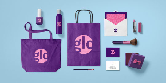
I found this picture while browsing the web on google as I recently took some interest in brand design. I have come to love the concept behind branding and creating intentional designs to communicate with a target audience. This conceptual company called "glo" has a designed logo with 2 different shades of purple being its primary colors. I like the simplicity of the design, though I would have preferred all the letters to fit into the circle. Perhaps the designer had a reason for making the words touch the edges of the circle, to blend with the darker shade of purple outside of it.
I personally like minimalism in design and so this works for the brand, although it would have been nice to add some (brand) personality into the design
0 notes
Text

Disney's logo is all about the way the words look. The letters are drawn in a fun, curly style that feels like it's from a magical story. The main letter "D" is extra fancy and the other letters have lots of curves, making them look playful and friendly.
This writing style used is called "Waltograph," and it's a big part of what makes Disney special. The letters are simple but still unique, so they're easy to read and remember, whether they're big or small.
Colors blue or black are used for the letters, which helps the logo stand out and keeps it looking classic. Overall, Disney's logo is a great example of how writing can show what a brand is all about, being both fun and easy to recognize for everyone.
0 notes
Text

This is one of my favorite books ever, and I thought to analyze the cover from the perspective of a visual communicator. I recently talked about book cover design in my presentation in school, and this made think to properly talk about the creative and artistic design of this book.
First of all, "A Broken People's Playlist" is an anthology of short stories inspired by songs, with underlying themes so beautifully woven that the stories flow naturally into one another. In addition, the stories pay tribute to and express love for Port Harcourt, Nigeria the setting for the majority of them.
From the cover of the book, we see the title swirling, mimicking the curves of the cassette tape. We see the cassette that represents the theme of "retro music" and musical icons 'dancing' around the page.
The tetradic colour scheme complements the overall theme of the book.
Blue and yellow form one pair of complementary colors.
Pink and purple form another pair of complementary colors.
Overall, this book cover design makes use of simple colours and creative typography and imagery to pass across an effective message of what the book is all about.
0 notes
Text

I saw this poster on the streets of Ballymun and I got intrigued. I wanted to know what the design was about so I searched online. I found out that The Better Ballymun Trinity Comprehensive History Trail was launched during Better Ballymun Action Day.
This interesting event, organized collaboratively by Ballymun Tidy Towns, Trinity Comprehensive, and Dublin City Council, aims to celebrate the rich history of Ballymun. It's an exciting opportunity for students to contribute by creating an engaging history trail that features eleven remarkable sites.
The Ballymun History Trail serves as a walk down memory lane, inviting the community to rediscover the captivating history and heritage of Ballymun.
I like the fact that the picture used in this design is in black and white, showing that there is a form of history in the design and evoking a sense of nostalgia amongst the people of Ballymun.
The elements in the design are also center-aligned, making it easy for the reader to browse through. The sans-serif font used here is also very legible, making reading easier and enhancing effective communication.
0 notes
Text
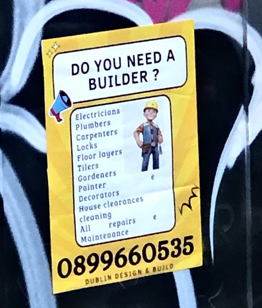
I saw this interesting poster on a wall close to College Green, Dublin. I had to zoom in to capture it properly, hence, the low image quality (my apologies).
I just really like the overall layout of this graphic design. It has a bright color scheme, yet is minimalistic. It is also detailed, yet very straightforward. I also like that the heading and content are grouped into rectangles with borders, creating hierarchy in the design.
To ensure maximum visibility, the advertiser's phone number is prominently displayed in a bold, large font. This intentional emphasis draws attention to one of the most crucial aspects of advertising: establishing contact with potential clients.
The clever use of an engaging question, "Do you need a builder?", further enhances the poster's ability to capture the viewer's attention. By presenting the question in uppercase letters, there is an added sense of emphasis and impact.
Within the main content area, the poster highlights various professions related to building, such as electricians, gardeners, and plumbers. This serves to inform potential clients of the range of services available, creating a holistic presentation. Immediately following this display, the prominently placed phone number provides a clear call to action for interested viewers.
Lastly, at the very bottom of the page, the name of the company, "Dublin Design & Build," showcases the brand responsible for the poster's creation, adding credibility and establishing a clear connection to the advertised services.
Overall, this poster I encountered in Dublin successfully combines attractive design elements, effective messaging, and a cohesive layout to engage viewers and communicate essential information. It is a great design job.
0 notes
Text
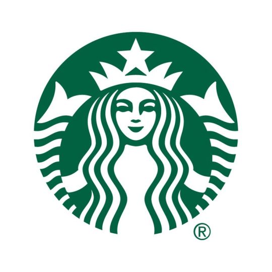
I have recently been researching on logos, and while getting some coffee at school, the Starbucks logo intrigued me. "Who is this woman on the logo and why does she have a crown?" I asked myself, and boy was I in for a fun 'logo-research' ride 😄
The iconic Starbucks logo features a twin-tailed siren, often referred to as the Starbucks mermaid. This intriguing figure is inspired by Greek mythology and maritime folklore, known for luring sailors with her enchanting voice. But fear not, she won't lead you astray when it comes to coffee!
The mermaid's placement within a circular green background gives a sense of balance and harmony. The green color, reminiscent of fresh growth and natural elements, aligns with Starbucks' commitment to sustainability and its origin as a coffee company. It evokes a sense of being grounded and close to nature.
Interestingly, the crown adorning the siren's head indicates a connection to the maritime tradition of a ship's captain. This serves as a metaphor for Starbucks' desire to be the captain guiding the coffee-loving community to delightful flavors and experiences. How fun is that?
0 notes
Text
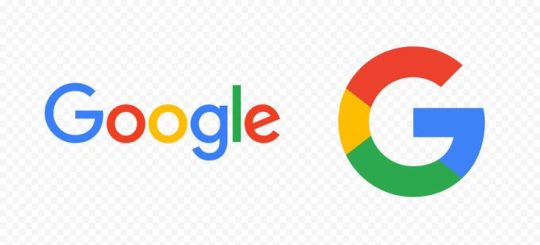
I found this picture on Google - pretty iconic, isn't it? 😄
The Google logo is instantly recognizable, and its simplicity plays a big part in its effectiveness. Each letter in the logo is bold, vibrant, and distinctly positioned. The playful use of primary colors adds a sense of energy and youthfulness.
In terms of composition, the letters are evenly spaced and aligned, allowing for easy legibility. The geometric shapes of the letters, especially the rounded edges, create a friendly and approachable feel. The rotation of the "e" in Google adds a touch of uniqueness and visual interest.
I particularly fancy the letter "G" logo, that makes use of the brand colors. These colors showcase a playful yet instantly distinguishable design. This letter, standing for Google, embodies various colors, often resembling a rainbow.
Each color in the "G" symbolizes something meaningful: red, yellow, blue, and green. They represent Google's dynamism, diversity, and innovation.
I also like that the logo's simplicity and strong use of color make it highly versatile, as it can be easily adapted across various platforms and sizes. The amazing part is, even when scaled down to smaller sizes or displayed in grayscale, the logo's clarity and impact are maintained
0 notes
Text

I stumbled on this pretty cool design while surfing through Google Images. I really love this design for a number of reasons.
The word ‘RED’ has been warped into the vegetable, pepper.
RED is the natural color for pepper
RED as a color also symbolizes Hot. Pepper is a hot vegetable when eaten.
Warping RED into a RED HOT Pepper is a simplistic, yet genius design concept.
0 notes
Text
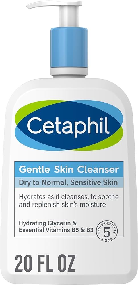
I have recently found interest in product packaging, photography and design. And as a designer, I'd like to analyze Cetaphil's Gentle Cleanser product packaging from a design perspective, focusing on its color scheme, hierarchy and minimalism.
Color Scheme: Cetaphil's packaging employs a clean and soothing color scheme with predominantly white as the background color. White in this case my signify purity, cleanliness, and simplicity, aligning perfectly with the brand's image of gentle nd simple skincare. The light blue and green colour accents create a sense of calm and trust, reinforcing the product's suitability. The color choice effectively communicates the product's core message of gentle and mild cleansing. The background blue color used on the words "Gentle Skin Cleanser" and the skin type that follows also gives it some sort of emphasis and hierarchy.
Typography and Hierarchy: Cetaphil's use of typography is straightforward and functional. The font is clear, simple, and easy to read, reflecting the brand's commitment to transparency and simplicity. The brand name, "Cetaphil" is at the top of the bottle, prominently displayed in a large font and calling attention to the brand. Also product name, "Gentle Skin Cleanser," is in bold font, establishing hierarchy and ensuring that consumers immediately recognize the product's purpose. Other essential information, such as product claims and directions, is presented in a smaller, legible typeface, making it easy for consumers to find the information they need.
Minimalism and Simplicity: Cetaphil's packaging adheres to the principles of minimalism. The design is uncluttered, with a focus on essential information and branding elements. By eliminating unnecessary visual elements, the packaging conveys a sense of purity and gentleness. This simplicity aligns with the brand's reputation for being hypoallergenic and suitable for sensitive skin.
0 notes
Text

Upon discovering this image on dribble.com, I couldn't help but smile at the amazing creativity.
Lesia Artymovych's Geometrical Minimalistic Portrait is a captivating blend of geometric shapes and minimalism. This artwork showcases a carefully selected palette of colors that harmonize beautifully, creating an emotional and aesthetic experience.
The use of shapes, including triangles, circles and other polygons to form facial features, demonstrates precision and individuality.
The power of minimalism in this piece allows viewers to connect with the subject on a deep level, as the essential elements invite personal interpretation.
Despite its abstract nature, the portrait conveys a range of emotions, making it a compelling example of how design elements and principles can evoke feelings and engage the viewer's senses.
Artymovych's work reminds us of the universal language of art, transcending boundaries and speaking to the essence of the human spirit.
0 notes
Text

I found this beautiful work of typography on Behance.It was designed by Cyla Costa, a Brazilian artist, who crafts stunning lettering pieces with a distinct and alluring aesthetic.
I love the swirls of the cross of T's and how the words seem to have their own movement. Even the word "Resistance" seems like it has its own energy.
The words "This Is A Movement of Resistance" seem as though they move in waves and the perfect contrast of colours and font-weight is used in the right proportion to make this work.
0 notes
Text
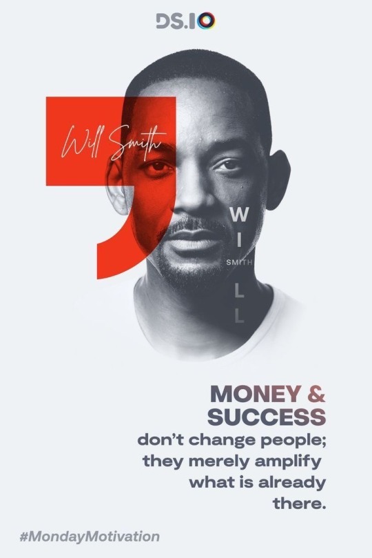
I have been spending quite a lot of time of Pinterest lately. That’s because my courses in school require creativity, and what better way to do that than get inspired by posts on Pinterest?
I believe that this poster was created with the notion of motivating the viewer/reader. On the bottom left of the page, you can see the hashtag “#MondayMotivation”. A greyscale picture of the person being featured, Will Smith is displayed on the center of the page with an edit of no background. His name is also displayed on the red quote icon and on his face.
I like the creativity of putting a small text of his surname “Smith” in-between his first name “Will”.
I also love the gradient used in the quote, located at the bottom right of the page. I’m not sure if I enjoy the choice of font, but it works well.
I would also prefer that the red quote icon takes the color of the gradient used in the text instead. The red kind of oddly stands out.
However, this could be because I like minimalistic designs, but recently I’ve been trying to embrace maximalism as stated earlier.
Overall, I think this is a pretty solid graphic design
0 notes
Text

I found this design on Pinterest. It was designed by a Model Management Agency. I particularly love the use of shapes in the design.
The image being moved into shapes to form a collage is very creative. I also like the fact that the purple shade of color (in the circle shape) at the top left is in contrast to the greyscale pictures in the other shapes.
I also like the simplicity of the text “storm men show package”. I like the minimalism displayed overall in this design.
0 notes
Text

This is a text-based design I discovered on a wall somewhere close to the City Center. I love the blue and yellow colour combination as it creates a nice contrast. The words "Not For Sale" almost takes up the entire page, making it the main focus of the design. The Guardian's logo is seen at the bottom right of the page in bold, drawing secondary attention and letting us know what organization the design belongs to. Also, an additional text on the bottom left gives context to the words "not for sale", explaining to viewers/readers that the newspaper is not funded by billionaires, but by readers, by the people of the society. This sends a message that the organization is objective and not influenced or funded by the rich, and so it is not for sale.
I like the simplicity of the design and the use of different sizes and weights of text.
0 notes
Text
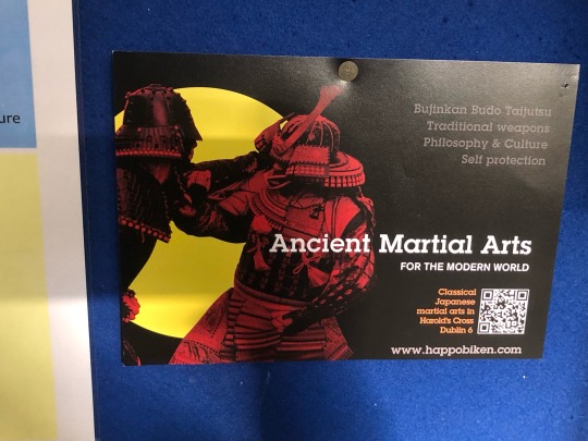
I found this poster in Griffith College’s library. I love the colour combinations and the brilliant use of contrast. The yellow circular background that creates a contrast for the martial fighting figures helps to accentuate the color of the figures. The colors red (ish-wine) and yellow also go well and create balance. I like the use of white-colored text on the black background (for the sake of contrast, emphasis and easy reading).
1 note
·
View note
Text

I found this funny sketch online. It is a meme aimed to represent an “empty head”.
I find the illustration of a ladder climbing up and the “Hello” words curved to give the reader an illustration of sounds (the text is curved to imitate sound waves) brilliant and very funny.
0 notes
Text

Though written by hand, this still counts as a graphic design. It achieves its basic purpose-communication. 
The message that there is “Bike For Sale & Locks” is passed across through emphasis on the text. However it is difficult to tell if the writer/designer actually meant “Bike & Locks For Sale”. So this design is quite confusing. This brings to mind the importance of hierarchy in design. Words should be positioned and distinguished clearly to avoid miscommunication.
Icons showing bike locks are also drawn for the purpose of illustration. 
The address is written in smaller text, with the phone number in a bigger size (to draw attention to the contact details). However, this handwritten billboard doesn’t have the best spacing arrangement. As seen in this image, the phone number is squeezed in to fit the board at the ends.
Overall, I think though quite amateurish, it still does a basic job of advertising.
Although I’m not too sure if people will be drawn to the colours used.
0 notes