#VisualHierarchy
Text
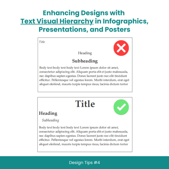
Enhancing Designs with Text Visual Hierarchy in Infographics, Presentations, and Posters
#scicomm#sciencecommunication#VisualHierarchy#TextHierarchy#Typography#InfographicDesign#PresentationDesign#PosterDesign#Layouts#Fonts#Contrast#Alignment#DesignTips#DesignPrinciples#GraphicDesign#WebDesign#PrintDesign#CreativeProcess#DesignInspiration#DesignCommunity#DesignThinking#GoodDesign#EffectiveDesign#DesignMatters
8 notes
·
View notes
Text
Key Elements to Elevate Your Website Design
#shorts#WebsiteDesignTips#WebDevelopmentEssentials#DigitalDesignTricks#UserExperienceUpgrade#VisualAppealBoost#ResponsiveLayoutIdeas#CreativeWebSolutions#InnovativeDesignConcepts#ModernWebFeatures#InteractiveInterfaceDesign#WebDesignEssentials#DesignElements#WebsiteCreation#UserExperienceDesign#VisualHierarchy#ResponsiveLayout
1 note
·
View note
Text
Crafting Seamless Experiences: User Experience Design Principles for Website Crafting Seamless Experiences: User Experience Design Principles for Websites
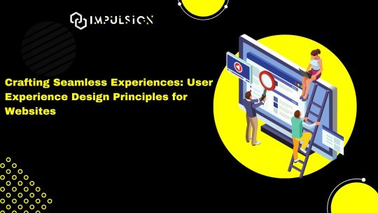
In the digital age, user experience (UX) has emerged as a cornerstone of effective website design. A well-crafted user experience not only delights visitors but also drives engagement, fosters loyalty, and ultimately leads to conversions. As we navigate the intricacies of website design in 2024, let's explore the fundamental principles of UX design that are essential for creating seamless and intuitive experiences for users.(Read More)
Understanding User Needs
The foundation of exceptional UX design lies in understanding the needs, preferences, and behaviors of your target audience. Conducting user research, gathering feedback, and creating user personas are crucial steps in empathizing with your users and designing solutions that address their pain points effectively.(Read More)
Prioritizing Accessibility
Inclusivity is paramount in UX design, and prioritizing accessibility ensures that your website is usable by everyone, regardless of ability. Considerations such as color contrast, keyboard navigation, and screen reader compatibility play a vital role in making your website accessible to users with disabilities, enhancing the overall user experience for all.(Read More)
Embracing Mobile-First Design
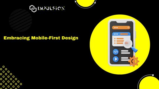
With mobile devices accounting for a significant portion of web traffic, adopting a mobile-first approach to design is imperative in 2024. Designing for smaller screens forces prioritization, ensuring that only the most essential elements are included and encouraging a streamlined and intuitive user experience across all devices.(Read More)
Simplifying Navigation
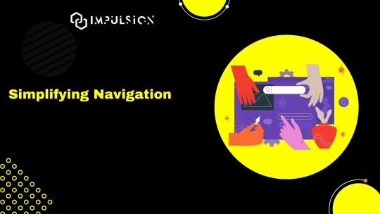
Clear and intuitive navigation is key to guiding users through your website and helping them find the information they need efficiently. Implementing familiar navigation patterns, such as top or side navigation menus, breadcrumbs, and clear calls-to-action, simplifies the user journey and reduces friction, resulting in a more satisfying experience.(Read More)
Fostering Visual Hierarchy
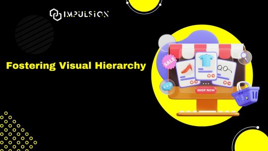
Visual hierarchy plays a crucial role in directing users' attention and guiding them through the content hierarchy of your website. By employing techniques such as contrast, spacing, and typography, you can create a clear and intuitive visual hierarchy that emphasizes important content and aids users in understanding the structure of your website.(Read More)
Ensuring Speed and Performance
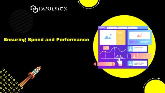
In an era of instant gratification, website speed and performance are non-negotiable. Optimizing loading times, minimizing server response times, and leveraging caching mechanisms are essential steps in ensuring a fast and responsive website that keeps users engaged and prevents frustration.(Read More)
Iterating and Testing Continuously
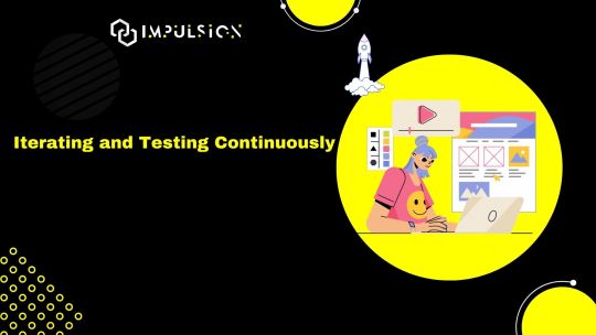
UX design is an iterative process, and continuous testing and refinement are essential for optimizing the user experience over time. Conducting usability tests, analyzing user behavior metrics, and gathering feedback through surveys or user interviews enable you to identify areas for improvement and make informed design decisions that enhance the overall user experience.(Read More)
Conclusion: Elevating User Experience in 2024
In the rapidly evolving landscape of website design, prioritizing user experience is more critical than ever. By embracing the fundamental principles of UX design—understanding user needs, prioritizing accessibility, adopting a mobile-first approach, simplifying navigation, fostering visual hierarchy, ensuring speed and performance, and iterating continuously—you can create websites that not only meet user expectations but exceed them, driving engagement, fostering loyalty, and ultimately achieving business success in 2024 and beyond.
Ready to elevate the user experience of your website in 2024? Embrace these principles, prioritize user needs, and embark on a journey of crafting seamless and intuitive experiences that delight and inspire your audience.
Visit our website: www.impulson.in
#UXDesign#WebDesign#UserExperience#Accessibility#MobileFirst#VisualHierarchy#WebsitePerformance#UsabilityTesting#DesignPrinciples#DigitalExperience
0 notes
Text
The Art of Visual Communication in Graphic Design
Graphic design is a dynamic field that blends creativity with technology to convey messages and ideas through visual elements. Among the essential components of graphic design, one of the most crucial is the art of visual communication. This article delves into the second point, "Elements of Design," which encompasses the fundamental aspects of graphic design that every designer should master.
1. Color: The Palette of Emotions
Color is a powerful tool in graphic design, as it has the ability to evoke emotions, set the tone, and create a visual hierarchy. Designers must understand color theory to make informed choices when selecting color palettes for their projects. For instance, warm colors like red and orange can convey energy and passion, while cooler tones such as blue and green often represent calm and serenity. The skillful use of color can guide the viewer's eye and elicit specific emotional responses.
2. Typography: The Art of Letterforms
Typography is the art and technique of arranging type to make written language legible, readable, and visually appealing. Choosing the right typeface is crucial, as different fonts carry various connotations and can greatly impact the message. For example, a playful and whimsical typeface may not be suitable for a formal document, while a sleek, modern font can enhance the aesthetics of a tech startup's logo. Proper alignment, spacing, and hierarchy within text also contribute to readability and aesthetics.
3. Images and Graphics: Telling a Visual Story
Images and graphics play a pivotal role in graphic design, whether it's creating stunning illustrations, enhancing photographs, or crafting compelling infographics. Designers often utilize software like Adobe Photoshop and Adobe Illustrator to manipulate and edit visual elements. The choice and placement of images should align with the design's purpose and message, reinforcing the overall visual narrative.
4. Layout and Composition: Organizing the Visual Space
Layout and composition involve arranging all design elements within a defined space to create a harmonious and visually pleasing composition. Concepts like balance, contrast, alignment, proximity, and repetition guide designers in achieving effective layouts. A well-structured layout ensures that the viewer can easily navigate the content and grasp the intended message.
5. Hierarchy: Guiding the Viewer's Eye
Visual hierarchy is about emphasizing certain elements over others to lead the viewer's eye through the design. This involves using techniques such as varying font sizes, colors, and placement to guide attention to the most important information. Effective hierarchy is vital for ensuring that the viewer can quickly and intuitively understand the content's significance.
6. Simplicity: Less is Often More
The principle of simplicity emphasizes the importance of clarity and minimalism. Graphic designers should avoid clutter and excessive detail that can overwhelm the viewer. Often, simplicity leads to elegance and a more profound impact.
In conclusion, understanding and mastering the elements of design is fundamental for any graphic designer. These elements serve as the building blocks for creating visually compelling and effective designs. By harnessing the power of color, typography, images, layout, hierarchy, and simplicity, designers can craft visual narratives that captivate, inform, and inspire. Whether working on a logo, a poster, a website, or any other project, these design elements remain at the heart of every successful graphic design endeavor.
#GraphicDesign#DesignPrinciples#VisualCommunication#ColorTheory#Typography#ImagesAndGraphics#LayoutAndComposition#VisualHierarchy#DesignElements#DesignFundamentals#CreativeDesign#DesignAesthetics#VisualArt#DesignBasics#SimplicityInDesign#DesignSkills#ArtOfArrangement#DesignConcepts#EffectiveDesign#GraphicDesignTips
0 notes
Text
Elevating Brands with Captivating Website Graphic Design

In the digital realm, where attention spans are fleeting, a visually captivating website is the key to making a lasting impact. This is where the power of website graphic design comes into play. By seamlessly blending aesthetics and functionality, businesses can elevate their brands and engage their target audience. Let's explore the transformative potential of website graphic design and how it can shape the online success of your brand.
The Art of Visual Seduction
Website graphic design is the art of visual seduction. It goes beyond mere decoration and delves into the realm of creating an immersive experience that captures the essence of your brand. A masterful website graphic design seamlessly combines colors, typography, and imagery to evoke emotions and leave a profound impression. Every visual element is thoughtfully curated to reflect your brand's personality, values, and unique selling proposition, creating a visual language that speaks directly to your target audience.
Designing for User Delight
A successful website graphic design is not just visually appealing; it also prioritizes user delight. It understands the importance of user-centered design principles and creates intuitive interfaces that guide visitors effortlessly through your website. By employing strategic placement of elements, clear navigation structures, and engaging interactions, website graphic design enhances usability and ensures a seamless user experience. The ultimate goal is to create an enjoyable journey that keeps visitors engaged, encourages exploration, and drives conversions.
The Power of Visual Hierarchy Website
Graphic design leverages the power of visual hierarchy to guide users' attention and communicate information effectively. It strategically arranges content elements, such as headings, images, and call-to-action buttons, to establish a clear hierarchy of importance. By employing visual cues, such as size, color, and position, website graphic design directs users' focus towards key messages and desired actions. This not only enhances the user experience but also increases the chances of driving desired outcomes for your brand. Amplifying Brand Identity Website graphic design serves as a powerful amplifier for your brand identity. It helps you establish a consistent visual language that resonates with your target audience across all touchpoints.
By incorporating your brand's color palette, typography, and imagery into the design, website graphic design reinforces brand recognition and creates a cohesive brand experience. This strengthens brand loyalty, fosters trust, and differentiates your brand from competitors in the crowded digital landscape. In the digital age, where first impressions are formed within seconds, investing in captivating website graphic design is crucial for elevating your brand. It combines the art of visual seduction with user-centered design principles to create immersive experiences that captivate your target audience. By amplifying your brand identity and guiding users through an intuitive journey, website graphic design empowers your brand to make a lasting impact and drive online success.

#WebsiteGraphicDesign#VisualSeduction#UserDelight#VisualHierarchy#BrandAmplification#decish#DigitalSuccess#CaptivatingDesign#BrandExperience
0 notes
Text
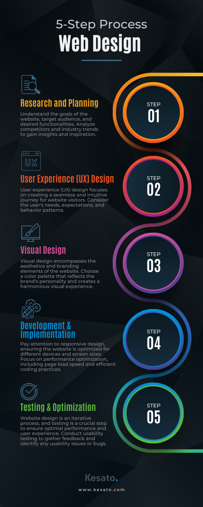
Discover the essential 5-step process to create captivating websites that captivate users. From planning to optimization, master website design!
#WebDesign#UserExperience#UIUX#ResponsiveDesign#WebsiteDevelopment#CreativeDesign#DigitalDesign#VisualIdentity#GraphicDesign#InteractionDesign#MobileDesign#WebUsability#InformationArchitecture#Wireframing#WebOptimization#FrontEndDesign#WebAccessibility#ContentStrategy#VisualHierarchy#WebTrends
0 notes
Video
youtube
(via Divi: Shifting Elements with Z-Index for Layering Effect!)
Dive into the world of web design wizardry with our latest blog post, "Divi: Shifting Elements with Z-Index for Layering Effect!" In this comprehensive guide, we'll explore how to masterfully manipulate the stacking order of elements on your Divi website using the Z-Index property. Whether you're a seasoned Divi user or just starting your journey, this step-by-step tutorial will empower you to create stunning layered designs that captivate your audience.
0 notes
Text
See, how color and contrast can alone make a big impact in a design

Color and Contrast, are one of the most important visual hierarchy principles every designer should know.
Read more such design rules - Good Design Rules
1 note
·
View note
Note
What are you usually looking for in an Editorial portfolio for client`s like Orbit books or Tor books? I really want to work for them. I know having some covers in your portfolio is good, but for example, can I have just the cover image with no type? It makes sense to me just to show the image and not the type since I want to be hired as an illustrator and not as a designer. Thanks!
Never put type on your illustrations unless you are a designer and want the type to be judged. It makes publishing ADs twitch and the bad type completely distracts them from the quality of your illustration.
Truth be told, your image should look suitable for a book cover without having to be explicitly told it is. It’s about composition, visual hierarchy*, and focal point. Having pieces be in a roughly 6x9″ vertical format helps, but ADs looking for book covers can tell if you’ll be good at covers by how you handle composition & visual hierarchy in any shaped piece in your portfolio.
—Agent KillFee

* Visual Hierarchy is how you control where the viewer’s eye goes, manipulated through size, contrast, color, silhouette, etc. You need to not only have a very strong focal point, but decide a 2nd, 3rd, etc. The shape of the path that the viewer’s eye makes thru your piece gives it subconscious emotion, and is the difference between the eye glazing over it on a shelf (or row of thumbnails) vs. getting sucked in deeper.
46 notes
·
View notes
Photo

Live UI/UX Design Reviews - The Negative Space http://ehelpdesk.tk/wp-content/uploads/2020/02/logo-header.png [ad_1] Submit your work for review: htt... #3dmodeling #adobe #adobeillustrator #adobexd #aftereffects #autocad #blender #characteranimation #characterdesign #design #digitalpainting #drawing #garysimon #graphicdesign #live #livecoder #live-coding #marginpadding #motiongraphics #photoshop #revit #spacinginui #spacinginuidesign #spacingui #userexperiencedesign #userinterface #visualhierarchy #visualhierarchytutorial #visualhierarchyui #visualhierarchywebdesign #webdesign #webdesigntutorial #whitespace #whitespacetutorial #whitespace #whitespacetutorial #wordpress
0 notes
Text
How to Use #VisualHierarchy to Create Impactful Interfaces https://t.co/UlEu9220SI #UI https://t.co/9qbGctvbpC
How to Use #VisualHierarchy to Create Impactful Interfaces https://t.co/UlEu9220SI #UI pic.twitter.com/9qbGctvbpC
— Macronimous.com (@macronimous) August 28, 2019
from Twitter https://twitter.com/macronimous
August 29, 2019 at 12:22AM
via IFTTT
0 notes
Text
Visual Hierarchy with Andy Crestodina | @AmFam®
Where do you want your customers to look? Learn the secret of designing a call to action with expert Andy Crestodina.
Get more business tips, content, and videos at https://www.amfam.com/insurance/business/business-accelerator.
Insure carefully, dream fearlessly @ http://www.amfam.com/dreams. #DreamFearlessly
-----
Subscribe to AmFam for more: http://www.youtube.com/amfam
Follow AmFam on Facebook: http://www.facebook.com/amfam
Follow AmFam on Twitter: http://www.twitter.com/amfam
#VisualHierarchy #BusinessAccelerator #CallToAction #CTA #AmFam #SmallBusiness
from Auto insurance Liberty, MO. David Lawson https://www.youtube.com/watch?v=pGk66rBqUdU
0 notes
Photo

How to Arrange Your Design Elements More Effectively So They Follow Natural Eye Movement Patterns? #visualhierarchy #ux https://t.co/wCcfPMU6FK
0 notes
Text
TOP Visual Hierarchy Principles That You Must Know
One of the truth bombs that we wish to drop is appearance matters when it comes to graphic design. It is all about visual elements, so the result should be aesthetically appealing and digestible. Design trends may come and go, but the design and user experience’s basics are forever. Today we will talk about some fundamental elements of visual hierarchy and how they can make an actual difference. Being a reliable and emerging favorite graphic design company in Ahmedabad, we offer extraordinary graphic design.
Visual Hierarchy Principles
1. Size Matters
One of the thumb rules in the design that can change the entire visual game is the size of the element. The usual argument is that larger is always better, but the main question is how large the element size should be? The largest element in the design should have maximum emphasis. 90% of the information sent to the brain is visual, and the brain processes images 60,000 times faster than text.

The above example clearly states how the usage of the right size for different elements narrates the story that the storyteller wishes to tell. The size of one element, with respect to the other, allows to create a balance and focus on dominant elements.
2. Negative Space Matters

Spacing is the key to a neat and beautiful website. It improves the aesthetic and overall message of the website. Negative space is defined as the space between text, graphics, images, margins, and other elements. The negative space dictates how a page reads and flows, plus it allows visitors’ eyes to relax, especially after scrolling through a heavy text page. Here is an example of beautiful usage of negative space:
3. Color And Contrast
Color and contrast are an important part of the visual hierarchy as they play a vital role in distinguishing core elements. For example, when a user sees colors like orange or yellow, it creates a sense of joy and liveliness. When users see purple or blue colors, it gives a calm and relaxed feeling. Bold colors are easy to use and thus used to highlight objects or set contrast in the visual.

For example, in the above image, you can see how using the same color is ruining the overall experience, and the second image showcases how using color contrast can be impactful for users.
4. Typography Hierarchy

Another essential element that helps design stand out and give a free flow to users is the typography hierarchy. Using different levels indicates the importance of the text. Bigger and bolder typography means important, and smaller and thinner text becomes secondary. There are two patterns through which humans absorb information quickly, whether it is a website, illustration, or printed article. These two patterns include F Pattern and the Z pattern.
5. An Illusion Of Depth
Another element to consider is the illusion of depth, and an illusion of depth can range from a few inches to several miles. In layman’s terms, it is a way of manipulating space, and depth can be created in various ways like focus, overlapping, light, shadow element, etc. Depth pushes two-dimensional surfaces into three-dimensional surfaces. There are multiple ways to add depth, including aerial perspective and optical.
6. Proximity

Proximity is a key rule in the visual hierarchy. In web design, some items need to be separated while some grouped down. Proximity helps to segregate the same type of content in one place and other types in another place. The main purpose of proximity is to create a spatial relationship between different components that can tell a story or make sense in design.
7. Elements Alignment

The right alignment of elements is necessary as it is important to align elements when you have plenty of text or images in the design. As mentioned above, the F or Z pattern can be used to align them to make them perfectly aesthetically appealing. If elements are placed randomly, then the entire design can lose its appeal.
8. Rule Of Thirds

Balancing the overall composition of the design is very necessary for designers, and this is where the rule of thirds can be used. It is mainly used to get the best visual results. In this, a design or image is divided into different sections using rows and columns to form a grid. With this rule, you can plan out the important element placement in the design.
Concluding Words
The above discussed are some foundational principles of visual hierarchy in graphic design. By using these principles, you give a clear and understandable message to the audience. If you wish to hire the services of graphic designers in Ahmedabad, Pixenite should be your choice. We have an in-house team of expert graphic designers with plenty of experience working for different industries.
Article Source: https://www.pixenite.com/top-visual-hierarchy-principles-that-you-must-know/
0 notes
Video
youtube
Divi Wizardry: Moving Elements Front and Back with Z-Index!
🚀 Step into the realm of Divi wizardry with our latest tutorial, "Divi Wizardry: Moving Elements Front and Back with Z-Index!" In this enchanting guide, we'll unravel the secrets of Z-Index manipulation, empowering you to take control of element positioning in your Divi designs. Whether you're a seasoned Divi user or a curious beginner, this tutorial is your key to unlocking the magical possibilities of Z-Index for creating visually captivating web layouts.
⚙️ Join us on this journey as we delve into the intricacies of Divi wizardry, demonstrating step-by-step how to use Z-Index to move elements seamlessly to the front and back. Discover the art of layering and depth control, enhancing the visual appeal of your website with Divi's powerful design features. From creating dynamic visual effects to mastering the nuances of Z-Index, this tutorial ensures you leave with the skills to weave your own spells of creativity in Divi. Dive in and let the wizardry begin! 💻✨
THEMES AND PLUGINS USED IN THESE VIDEOS:
Try out the Divi theme: https://bit.ly/TryDiviNow
Divi Supreme Modules Pro Plugin 10% Off: https://divisupreme.com/system22/?ref=6
Divi Supreme Modules Light Plugin: https://bit.ly/SupremeFreeVersion
#youtube#DiviWizardry ZIndexMagic DiviTutorial WebDesign ElementManipulation VisualHierarchy DiviDesignTricks WebDevelopmentTips EnhancedUserExperien
0 notes
Last Seen Blogs

momocupcake
you're the cause of my euphoria

wetsocksinbed
soggy soggy baby

crowtobio
mit

booksand-glitter
Relax, it's all chaos...

dadddybangtan
daddy bangtan