#cinematography analysis
Text
how the van scene confirms mike's feelings - the framework & editing
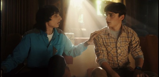
i noticed something while editing a compilation of mike staring at will lovingly (because bless finn's amazing acting) and suddenly found myself analysing the editing choices/shots from the van scene (will’s monologue).
i found this scene doesn't only confirm will's feelings for mike, but mike's too.
what exactly makes this scene confirmation of mike's feelings besides the brilliant acting? it's the perfect cinematography and editing. ST's cinematography has been one of its greatest strength's, in my opinion at least. they know how to move the camera perfectly to tell us exactly what a character's thinking. the editing is also perfect.
**for this post, i won't be bringing up the lighting work or acting (at least not much) because it's something that's already acknowledged a lot.**
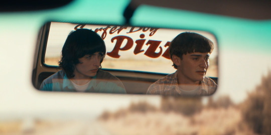
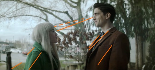
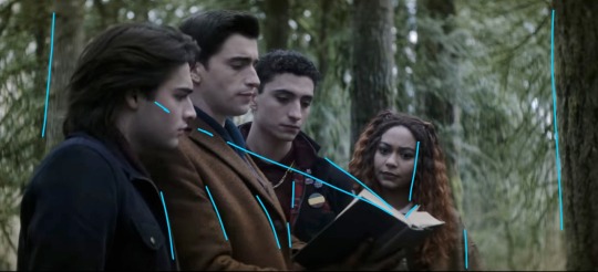
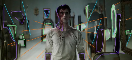
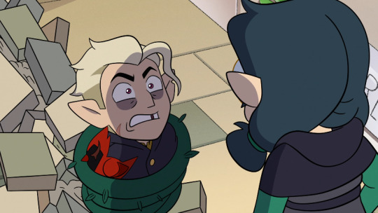
in the van scene, we are only able to really realize mike's feelings because of its choice of shots - specifically two subtle shots.
first shot:
every shot of mike during the speech had will still in the corner. unfocused, but still there. (minus the rear mirror and window shots)
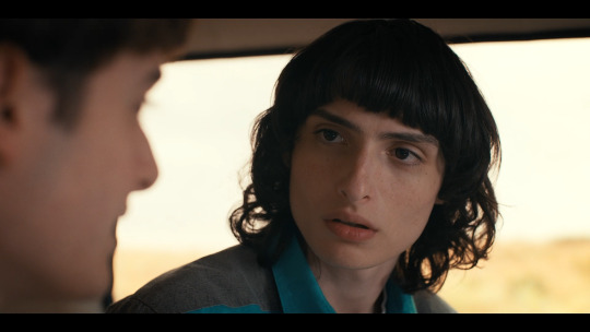
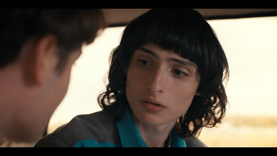
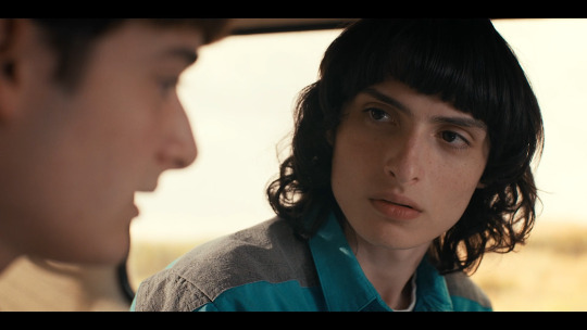
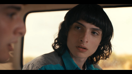
except for one...
the editing work is one of the main keys to what makes this scene so intimate besides the great acting. the way it goes back and forth between close ups is meant to display tension/intimacy. they keep swinging between the both, almost telling the audience to pay close attention. there's something happening that isn't being said. the editing choice inflicts a feeling that rest of the world is gone - it's just them. (which is often what you typically feel when there's raging chemistry between you and someone else)
then they throw this one shot in, which subtly parts mike away with this conversation. he is distracted by something else..
the fact this one stands out different from the rest is important. will could still be seen in the other shots while showing mike is focusing deeply on what will is saying. then suddenly, just for one shot, will isn't there anymore. it's just mike, nervous and breathless. this is telling us that mike is no longer paying as much attention to what will's saying, but more on what he himself is thinking.
despite this being such a minor thing that is easy to dismiss, it changes a lot if you would've just framed it like the rest. not only would it get repetitive, but there would be nothing to take from the scene [visually] other than the fact mike is focusing on what will's saying… and sure, enjoys looking at his lips a lot. but, when you really think about it, the inclusion of this shot is what actually confirms finn's acting is intentionally romantic. the editors wanted to give the audience this one specifically framed shot of mike to draw your attention from what will's saying, to start wondering what mike is thinking.
and if you haven't already caught onto all the lip staring and quick glances, he’s thinking about will.
second shot:
there's one other shot that confirms it, too - the shot with jonathan and the rear mirror. this happens twice.

referencing back to what i said earlier about how chemistry between you and another can feel like the world shuts out and it's only you two, despite that being how it feels, it’s the exact opposite - everyone notices it. people around you can also see that chemistry. though.. it's only noticeable when it's truly real.
this is the point of the rear window/jonathan shot.
jonathan is noticing a shift in their relationship. he notices not only will's feelings, but mike's too. will is turned away, mike is looking at will - something will can't see. will story-wise believes his love is unrequited... when it's clearly not to the audience (or jonathan in this case).
this rear window shot is included to confirm to the audience that it is exactly what we're thinking - there is something romantic going on, there is electricity. so much so that other characters are catching on themselves. it isn't just a pretty shot. if it were, jonathan wouldn't have been included, and it wouldn’t be there two different times. filmmaking is precise, never forget that.
-
filmmaking (cinematography in this case) is so powerful and complex. any slight adjustment in editing or choice of framing can change the story you are trying to tell.
so all in all, byler endgame
#byler#mike wheeler#mike wheeler is gay#stranger things#stranger things 5#byler is endgame#cinematography analysis#st cinematography#my analysis
399 notes
·
View notes
Text
Hey Good Omens lovelies
#good omens#good omens analysis#Gomens#aziraphale x crowley#good omens season 2#ineffeble husbands#good omens cinematography#cinematography analysis
53 notes
·
View notes
Text
I will never get over this cinematography lighting change from the red, purples, and yellows that represent the love and joy happening to the sickly green as Ned Low attacks the ship, all while Ed is protecting Stede.
#our flag means death#ofmd#ofmd s2#ofmd spoilers#our flag means death s2 spoilers#ofmd season 2#stede bonnet#ofmd stede#ofmd edward teach#ed x stede#ed teach#blackbeard x stede#blackbonnet#gentlebeard#ofmd season two meta analysis#ofmd meta#cinema#cinematography#meta analysis
588 notes
·
View notes
Text
it's interesting to me how the filming and presentation of the resurrections of qTubbo and qBad reflect their states upon return.
when Tubbo wakes up we are in his perspective, first person, similar to how we've always experienced Tubbo's pov. he remembers sunny, that he loves her, he remembers who he is, he remembers his friends. however ccTubbo's facecam is not visible, as it usually is. qTubbo's strange now. he's still tubbo, but different. aggressive, manic, manipulative, angry, insecure, and everything else, dialed up to an extreme degree. this is still Tubbo, his memory intact and his personality mostly unchanged, but he's wrong, not completely different from how he was before but noticeably changed.
When we first see Bad again, we are outside of his perspective, looking at him from a distance. We don't know much about his mental state at this time, but there is palpable fear from the Ghosties, his constant companions, upon seeing him. The outside perspective others him, makes him alien. This is not OUR Bad anymore, in the ways that really matter. This is something that looks like him, but we know nothing about him on the inside, reinforced by how we only see from the outside and not the inside.
i just thought that was really interesting, how the choices in filming and point of view almost contribute to the narrative and vibe of each, upping their effectiveness in eliciting desired reactions from the viewer.
#its so cool it's SO COOOOOLLL#owo#oddly posting#qsmp#qsmp meta#qsmp analysis#q!tubbo#q!badboyhalo#i've got worms in my brain and they're THEMES and CHARACTERS and CINEMATOGRAPHY and they're all PARTYING
217 notes
·
View notes
Text

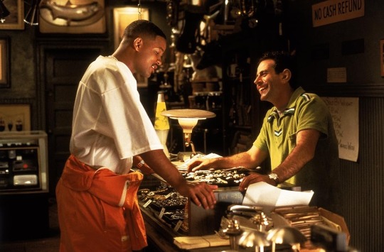
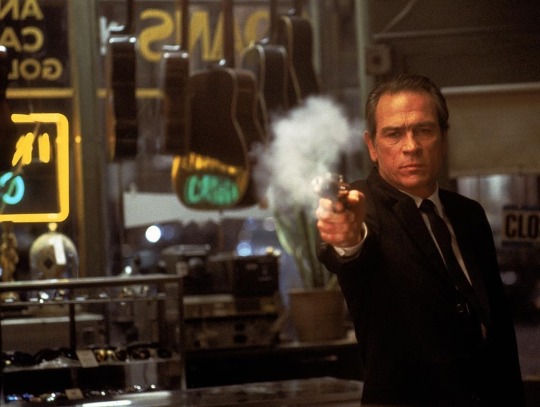
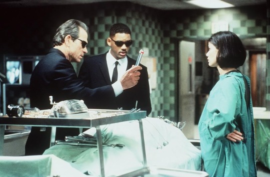


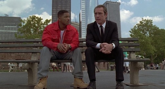
Can we talk about how much style the first men in black had, like this was Cinematography. The greens and oranges, the blues and that pleasing hazy filter over everything.
It wasn't just like a blockbuster, and it didn't have that CGI cleaness. There was a purposeful look here, it was an unwinding, fast paced, well written conspiracy detective flick.
Like the state troopers at the start with their little uniforms getting covered in goo, the classic UFO crashing on a farm with a cow. It was acknowleding the genre of kooky alien invasion films and then world-building off of it.
It just had such a Clear premise and was able to pull it off so flawlessly cause it knew exactly what it was! And I understand why it was so popular cause it makes you want to be a part of that world, the suits, the glasses, the eye-candy weapons. It all just looks so tactile and fun,., But SO GROUNDED, it's a completely approachable film
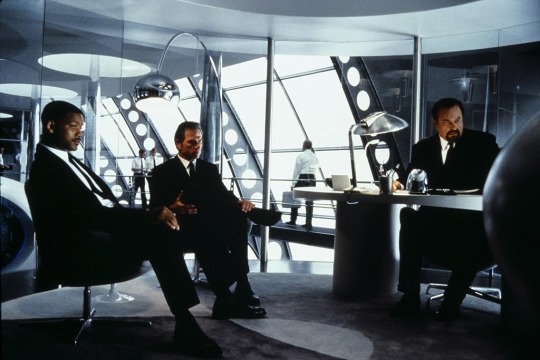
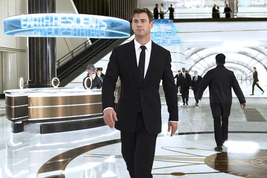
Like not to get High Art Film Snobby😭 but can you see it, can you see the difference. It's the same place, same concept but there is such a specific signature here that has just been Stripped away
#men in black#men in black international#scifi#movies#cinematography#will smith#tommy lee jones#cinema#screenshot#movie analysis
283 notes
·
View notes
Note
yo, hi,
please rant about the use of colours/shots in dead boy detectives (if you want to), that would be amazing to read!
omg hell yeah i would love to. <3 buckle up everybody!
(there were some other people in the comments who wanted to hear more as well. for convenience's sake i'm going to keep it all in one post.)
I'm not going to talk about every single frame in the last post, because there are a lot, but I'll be sure to touch on all of the ones that have a good amount of depth beyond the dramatic lighting. (sorry, Angie shot.)
...this is going to get long.
so first, this one:
With Edwin's brown coat, Niko's green coat, the brown bushes in between them, and the trees behind Edwin, this shot is cohesive and satisfying. I drew the orange lines to sort of illustrate how your eye moves across the frame; the line of eye contact, the tree branch (dashed lines) almost parallel to that, the sidewalk/grass line, and the lapels/shadows/folds of their jackets all form a general diagonal streamlined snapshot. Then the black post behind Niko, the tree between them, and the tree trunk behind Edwin continue to divide the frame vertically and add to the additional invisible "line" created by their height difference. Finally, the sky behind Niko, as well as her hair, contrast heavily and very well with the darker colors of the tree behind Edwin, though there is still white on his side (the building) and brown on hers (tree branches). If you were to take a single diagonal line from the bottom left corner to the top right, you would get two incredibly distinctly colored sections, but they complement each other so well.
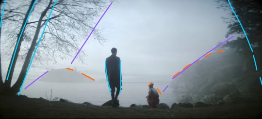
This whole scene is gorgeous because of the pale sky and water up against Niko's hair and the brown tree trunks with Edwin's jacket, but I also love it because it's so simply colored. We have the classic blue+orange color dynamic, but diluted down to very pale blue and very dark brown. This shot specifically features Edwin focused at the center (the blue lines show that he is standing mostly straight up, while the trees on the borders of the frame are all leaning inwards), with Niko crouched down to fit with the shape of the hillside (orange) AND the silhouetted rocks in the foreground. Then the hillside, the shadow on the water, the general cutoff of the tree branches, and the island in the distance (purple) frame the two of them in the middle without making a Point of it. It looks very natural, especially with the dark shadows around the border of the frame. (personally sort of brings to mind Wanderer Above The Sea of Fog).
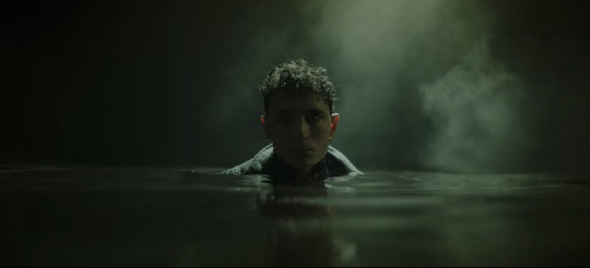
I don't think I need to add any annotations to this one. The lighting is sharp and so are the shadows. The fog and the shine on the water, his hair, and the collar of his coat are starkly lit, while everything else, including his face, is deeply shadowed. Plus it's all an ominous, murky green. It's almost the opposite of Lilith coming out of her blood-red ocean. 10/10 frame, I have no words.
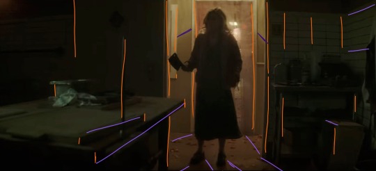
I gasped the first time I saw this shot. There are so many vertical lines (orange), which make the space feel thinner: the spike, the bulletin board(?) on the far left, both doorframes, the edges of the table and boxes, the tile on the wall on the right, Maxine herself... and then there are the diagonal lines, all sort of spreading out from Maxine, which includes the table edge, the shadows, and the wall tiles again. Then there's the fact that it's all so dark, but not quite pitch black. Once again we have a green/orange combo, and the light behind Maxine being so small in the whole frame makes it very effectively claustrophobic. We also never saw her enter this room from behind, which elevates her as threatening, because the camera work makes it seem as though we, the audience, are backing away from her as she enters, and then hiding from her as well. While I am devastated by the lack of a sapphic romance arc, I have to say I was blown away by the production of this scene.
I love this one because they're arranged so neatly around the book. I didn't draw a curve over their heads, but it's easy to visualize by following Monty's hairline up to Edwin's, and then Edwin's down to Charles' down to Crystal's. The height order is perfect. Then there's the black-brown-black-brown of Monty's jacket, Edwin's jacket, Charles' jacket, and Crystal's hair. The book itself helps frame their faces (diagonal blue lines), and their clothes fall into uniform with the vertical trees behind them, creating a satisfying, natural, unobtrusive background. This is definitely more visually appealing than a shot of them leaning over and looking down at the book/camera. It's also broken up very nicely by the greenery. Plus, none of their faces are shown from the same angle! Refreshing!
Poor Monty :( but hey, he gets a really awesome shot here! We're back to orange+blue, and the angle of this shot makes it look like the vertical trees behind him are positioned diagonally (orange) to follow the dark blue shadow behind his head. We also get two light sources: one of them is the moon, and the other one comes from the same place as the music. The moonlight (blue) sort of encircles his head and cuts off at the line of trees about halfway across the frame. Both the back of his hair and the far side of his face are illuminated, which is very effective in terms of bringing him into the foreground and making him the focus of the shot even though he's not in the middle of the frame. It's also balanced nicely by having background detail on the left, with the orange trees, but not on the right, where there's nothing but dark blue behind Monty. This is also a great shot when it comes to his hair and jacket, because the jacket is used to add to the framing of his face with the dark blue background, and his dark brown hair is lit sparingly, which ties in the left side of the frame.
Like the frame with Maxine, this one has a lot of shadow and a little bit of light, and again works with an orange/blue (or teal, really) color scheme, but this one is much friendlier. The windows are larger than the doorframe and Charles isn't actually blocking the light the way Maxine did. Instead, he's illuminated from the right by Edwin's orange lantern, and the shot is balanced by highlights (blue) that stop it from becoming cramped and stressful. There are stable vertical lines (purple) and rafters and shadows spreading out from the center (orange). Charles, though he is blocking the window, is wearing a white tank top, and his skin takes on the warmth from the lantern, so he's not in silhouette and he blends very nicely with the scene. I love that he's not at the center of the shot, but instead framed almost perfectly in the right window. (Another thing I love about this show is that the characters almost always interrupt the continuity of the background even when they're positioned to be framed by it. It makes the scenes feel much more natural even while they continue to be gorgeously directed from an artistic/stylistic point of view.)
This is one of the simpler ones, but it's perfect. The Night Nurse's hair and vest are the same brownish orange, and her shirt is the same as the walls, sticking with our tried and true brown/green (easy variation on orange/blue) color scheme. She is framed in the blackness of the doorway, but once again interrupts the white doorframe on the left side. Even the lamp and the board (?) on either side of the frame fill the negative space in a natural way. Also, the vertical lines of the board, doorframe, door, and lamp aren't perfectly spaced apart, which makes the whole shot feel more down-to-earth.
There is so much going on in this shot. The beams of light (orange) are emanating from behind Edwin in a shape sort of reminiscent of wings. The angles of light/shadow and the immediately obvious position of some of the mirrors (blue) also spreads out from behind him, reinforcing the wing imagery and focus. The background is lighter than the floor, and Edwin's clothes blend in with the floor and the reflecting highlights (green) in the mirrors. It's all balanced by shadows (purple), which aren't so much shadows as they are dark-colored mirrors and the blood on Edwin's face. This shot is an unsettling combination of chaos and order, increased by the strange phenomena of mirrors endlessly reflecting into each other, especially since Edwin doesn't show up in any of them. You'd expect him to look out of place, and he mostly does, but there's just enough immediate immersion with the color scheme and light angles to make him fit perfectly. And he wouldn't fit in this shot nearly as well if he were wearing his usual clothes. It's such a good way to introduce Despair. I love this scene.
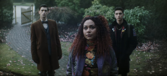
Now I needed to include these two next to each other, because they're. They're the same scene. Maren is on the porch looking down at Crystal and the boys, but the color schemes and blocking are so starkly different. Maren is wearing black, and the house is washed-out yellow and maroon, both unfriendly colors in this scene. The windows all show the gray reflections of the dead tree instead of even a glimpse inside the house, immediately showing that Maren is hiding something. Then in the shot with Crystal and the boys, they're positioned behind her on the path. Edwin is next to the brown gate and gray stones, and Charles is sort of shadowing Crystal and framed by the green bushes. Crystal's shirt is flower-patterned to match the pink petals on the ground, and her red hair and purple jacket make the whole shot more vibrant and friendly-looking than Maren's, even though Maren is supposedly the one being helpful/friendly/hospitable. The first time I watched this episode I knew I couldn't trust Maren as soon as I saw her standing on her front porch. This scene is, as Charles would say, brills.
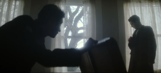
Okay, last one, I have to stop somewhere. (I have so many more. I have. SO many more. that i could talk about. but this post is so long already). There are three windows, evenly spaced, white light and curtains framed in them. Charles is in nearly full silhouette as he opens that chest; his head and the lid of the chest intersect with the vertical window frame, and his arm runs parallel to the middle bar. He also blocks a good portion of the leftmost window, while Edwin stands in front of the one on the right. He's fully framed by the window and standing farther back than Charles, not quite silhouetted but still very dark compared to the background. When he ducks down to inspect the cabinet, his head ends up in front of the wall between the two windows. This whole scene is an excellent display of blocking/framing/lighting, just in terms of where they end up holding any given position while they talk. Once again, there's nothing artificial or manufactured about their blocking. These aren't statement shots (all film projects have a few Really Good Shots, but they're often at extremely important, pivotal, or emotional times, instead of spread out through the storyline.), which makes them even better.
I might have to make another post and include shots with Jenny, the sprites, the Cat King, Esther, and more landscape shots. There is no shortage of stunning frames and scenes, and there's no reason not to dive into the production and hidden meanings.
TL;DR: this show is an ARTISTIC MASTERPIECE. Please watch it. :)
#dead boy detectives#edwin payne#charles rowland#crystal palace#niko sasaki#monty finch#monty the crow#film stills#cinematography#this. got away from me.#appreciation post#color schemes#film techniques#analysis#symbolism
92 notes
·
View notes
Text
The Godfather (1972)
#filmmaking#cinematography#cinephile#director#film analysis#film stills#black on tumblr#film major#cinemetography#art#francis ford coppola#the godfather
70 notes
·
View notes
Text
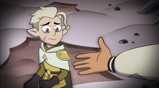
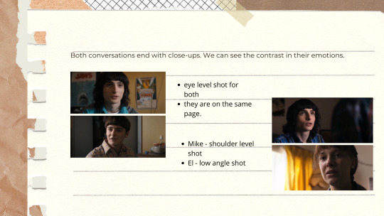
mike at the beginning of s4, to will in the roller rink: “maybe you should have reached out more, why is this on me?”
Mike, at the end of s4, literally reaching out to will
#stranger things#byler#will byers#mike wheeler#st4#stranger things season 4#byler analysis#st analysis#st cinematography
1K notes
·
View notes
Text
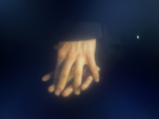
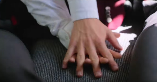
Tiny YR S3 Analysis
Just wanted to compare the parallels between these two hand holds in 3x05 and 3x06:
(Please ignore the shitty screencaps, I tried my best)
In terms of composition, these shots are identical. A hand-hold centre to the frame, in a car with the camera placed in the middle. However, they're underpinned by different narrative contexts.
Here, the first shot from 3x05 is drenched in darkness. The actual lighting inside of the car is dim enough to obscure both of their suits, which almost blend them into the seats and so it becomes hard to distinguish between the two of them - The only focussed light is on their conjoined hands. Notably, the actual touch itself is tentative, almost like the bridging of an awkward divide on the way to the palace. Neither of them are sure what the touch actually means. Even their sleeves fall over their wrists and interfere with the actual act, so we only see the bottom half of their hands. Simon reaches out first and places his hand in the open sliver between the two seats before Wille accepts and laces their fingers together. It's an assured squeeze that reads as: "I'm not sure what will happen. I'm nervous." "I am too."
This scene has garnered a lot of analysis for its parallel to the Kristina x Wille car scene in S1 where people have commented on the reversal of blocking - Wille now assumes Kristina's position and Simon equally assumed Wille's. We now know that this arrives before the birthday explosion, and so it's also a touch that signifies confronting the inner workings of an oppressive environment (the palace). It's nerve-wracking and cautious and consolidating, but it's also doubtful. We, as spectators, pick up on visual and physical cues and so we begin to see the hand-hold as an visual indicator that the unity between the two characters is about to be disrupted.
~~~~~
However, the shot in 3x06 reads entirely differently. The first thing is that the shot is bathed in light. It's a bit like an embrace, contrasting the previous presentation of a cold backseat, Simon and Wille are literally basking in the sun. Most importantly, there is a light flashing on Wille as it seeps in from the windows, illuminating his spot as a person who is newly free. Simon sits to the left with the natural light (no abundance of light) because Simon has always strived to be free. He has never turned away from the light. As he said earlier in the episode: "I never gave up on us. I gave up on the royal court." For Simon, the issue was never the fear of being free, but the constraint of not being free. For Wille, fear hung over his shoulders just like a King's robe would. Being free was an aspiration, never a reality.
But that has all changed. The light is let in. It stands similar to a spot-light, where Wille finally lets the sun hit his body and not have it scorch him, but rather enlighten him.
The actual act of holding hands is no longer bridging an uncomfortable space; It's an assured togetherness. It is the two of them acknowledging everything that has happened and knowing that a future for the two of them is no longer a "possibility", but a truth. It's giddy and confident and safe.
It's also the final touch of the season, and so it had to speak louder than dialogue ever could - Which I think that it does. Throughout S1 and S2, we understood that physical touch was always done in private, or if not, it was done discreetly with the knowledge that it was fleeting. S3 saw the transition from private to public, but not without the fight to touch and not have it be seen as a revolution. To just let it be what it is. And THIS is what the show has been working towards for 3 years. It can all be summarised with this simple, final hand hold in a sunny car that's racing towards a future that finally, finally resembles their dreams. It's not overtly revolutionary, it's not a grand gesture; It's just theirs.
#yr s3 spoilers#young royals season 3 spoilers#young royals spoilers#young royals#tv analysis#young royals season 3#this is all I could write amidst my burnout so I'm very sorry#I'm desperate to sink my teeth into the analysis of this season because it was fantastic#but also because the cinematography of this season was SCRUMPTIOUS it was beautiful#as we all know I love when parallels parallel because it's not only a great aesthetic motif but it's also narratively telling#these things are put in for a purpose and I love dissecting things#I hope to do some longer analysis' when I'm feeling more up for it but I hope this makes sense!#lisa ambjörn#rojda sekersöz
57 notes
·
View notes
Text
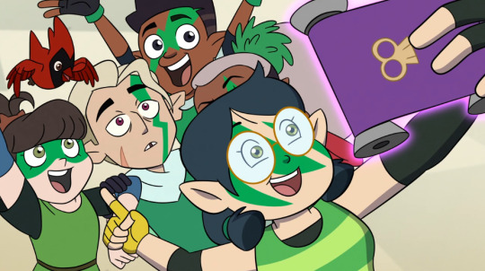
Hunter's Character Arc: A Hopeful Narrative

Wrote this for the 2-year anniversary of Separate Tides, especially since we now have the boi's full story arc too. This meta could come to life after I re-read the one I wrote about enmeshment (link).
You also get my geeking out about cinematography and visuals this round, instead of the mental health angle that I usually come in from. What I found is this: while some fans feel that the writing put him through too much, the frame composition of every Hunter scene - no matter how dark and horrifying the scene is - wants to paint him as an empowered survivor, and root for him, getting us viewers to be on his side in a way that is never really overt.
The way he is framed within the 'camera', evolves as his story arc evolves throughout the show: from being so high-ranking that only Belos appeared to be superior to him, to actively participating in society as an equal, to not only learn from others and be loved by others but also impart knowledge and love to the world.
Bringing his scenes to life wasn't just about Zeno Robinson's voice acting, along with how animators draw his expressions and poses; the camera also has to be placed in certain ways to add to the emotional weight of his scenes (even if in a subtle manner). These all add up in less obvious ways, to get specific emotional responses from us in the audience.
What I remember from the cinematography classes when I studied animation (honestly the only areas I didn't suck in were the preproduction and film analysis modules, everything else was bleh) are some general rules:
1. Shots with characters that are further away with a wider angle, are often to establish the setting (location and mood). Shots that are closer to the characters are more personal, of course.
2. Both low angle shots and high angle shots provide us with info about power/hierarchy, control and vulnerability in characters. Low angle shots may empower a hero, making them look more heroic if they're roughly facing the camera, but could make them appear vulnerable if their back is to the camera. High angle shots usually depower a character, making them feel small and feeble.
3. Shots with a height that is at eye level with the character(s), allow us to connect more directly with a character.
4. These rules can be creatively bent at times, in shows and movies. And you'd also have to factor in where and which characters are placed within the shots, e.g. their back is facing the camera, vs. us seeing them in full front-view.
- An extra, not-so-important note: There's the rule of thirds, a rough guide for the screen's composition during important moments, to be more aesthetically pleasing to the human eye (which isn't an area of focus in this particular analysis).
There are so many screenshots I could've fit into this post! But there's the 30 pics limit and I've chosen the best ones I could think of.
Diving in...
It's stating the obvious, but the camera gets closer to Hunter as we get to know him more. When we start out, his presence feels distant, ominous and impersonal, like he's a smaller cog in a massive machine, just someone that Belos has sent out to do his bidding:

But the sense of his personhood, its importance, and his desire to fight for it, is felt more and more by us as time passes.
A really strong contrast would be this comparison:
Not quite knowing who this kid is (camera is far away and impersonal), vs. being terrified out of our wits as he appears helpless while possessed, because we're personally so invested in his wellbeing by that point. He has become a literal puppet, 100% physically coerced to do what Belos wants, in a more violent way than Belos previously coercing him to perform his Golden Guard duties using emotional manipulation.


After he was unmasked in Hunting Palismen, we connect with him and his vulnerabilities, since we can see through the armor (both literally and metaphorically) that he has to put up to survive as long as he did in the Emperor's Coven, prior to his decision to run away. We journey alongside him through the good and the bad.
Things become a bit less obvious when we get to low angles vs. high angle shots, plus the eye level shots.
Low Angle Shots:
Before being unmasked, he appears to be an intimidating antagonist who is not to be trifled with (though Luz manages to hold her own against him) and we feel that Luz is vulnerable to being possibly hurt by him:

but once he has met Luz and his mask comes off...

He is framed less and less as an antagonist, and lives out what he truly wants to live out, heroically braving many challenges and triggers to genuinely help others.
This even happens when things are really going south for him, when it appears that he has no way out:

To me, it feels like we are with him, at his level, as the storytelling aims to respect everything that he goes through. All thanks to the camera height, that can go as far as lowering itself all the way to the floor with him.
High Angle Shots:
An incredible difference would be between him watching Luz from the shadows below, even having power over Salty, telling the audience that he has control:

and fast forwarding to Luz offering him her hand during one of the pivotal moments in Hollow Mind:
I suppose this one shot is the one of very few that depower Hunter, and here, his old faith in Belos's reign is being dismantled. But whenever this is the case, it's from the vantage point of a kind-hearted character who will offer him help and never hurt him.
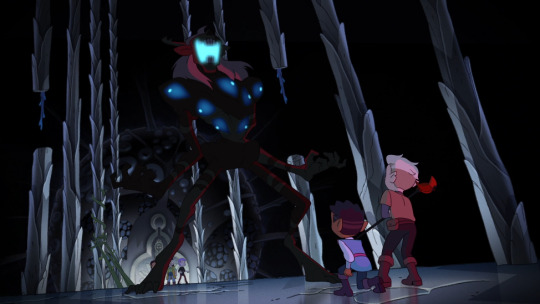
What stands out is, any high angle shots of Hunter do not ever show him being all alone with Belos. The closest to that would perhaps be these:


But I'd point out that in the Hollow Mind screenshot, Hunter and Luz in the present are watching from a distance: this moment is a step towards his empowerment because he reaches that awareness and clarity that Belos has been lying to him.
In the For the Future shot, it's the impact of Belos's abuse - the trauma sustained - staring Hunter in the face, not Belos himself. And while Hunter is all alone in the shot, he isn't completely consumed by anguish, having a support network that's obviously offscreen but nonetheless there with him.
The only shots where he is dangerously alone with Belos would be from moments like this:

But he hadn't been unmasked yet, and we weren't even so sure back then about details such as his age, true motives and true intentions. And...any high angle that involves Belos never seems to be used to depower him.
The crew took consideration to respect the portrayal of this kid's experiences of trauma, and his development.
When Luz and Willow look down at him, he may be temporarily rendered powerless, but we can already trust that they won't treat him poorly:
Eye Level Shots:
These seem to be used for moments of uncertainty, keeping us on edge. We may wonder for a moment, where Hunter's loyalties lie, or wonder if he will survive a horrible situation:

But the eye level shot is also for us to connect as directly as we can with him.
This important frame from Hunting Palismen seems like a pretty unique Hunter shot in his entire arc. I haven't come across any other shot composition like this which involves him, though I could be wrong. He's standing between a taller scout (and the scout is actually lower in rank than him, yet Hunter can't produce the proof that he's their high-up superior) and Luz who is shorter than him.
We may start to sense that he may be less powerful than we initially thought, and there are further confirmations of this in the subsequent scenes. This shot is not quite eye level, yet not a stark low angle shot.

With regards to the unhealthy vs. healthy mentorship he receives in the show, somehow we're told through the frame composition that wanting to be guided towards the right cause is very important for him, something he is emotionally invested in.
My ultimate takeaway from this is: the writers never want to convey that he is beyond hope and saving.
There seem to be far more low angle and eye level shots of him when he is both masked and unmasked, yet different meanings are communicated: control while masked (furthering Belos's cause to wield power in the Isles) vs. empowerment when unmasked (Hunter's own personal agency).
There are a few lovely subversions of what we normally expect from low angle and high angle shots:
An empowering moment where Hunter is part of something that is healthy for him, instead of high angle shots that are normally depowering for whichever character is in focus.
This low angle shot achieves two things, I think: not only to highlight how terrifying Belos is, but also that Hunter isn't alone and has Flapjack and Gus to help him (especially since Gus could disarm him with powerful Illusion magic just before Belos charged at Hunter). No matter how you slice it, Hunter isn't dangerously isolated and isn't rendered helpless here, despite being very terrified. This nicely presents an equal chance on both sides of winning this fight (before The Collector is freed from their prison), and keeps us on edge.
And only today did I notice a pattern from significant frames in all the S3 specials:
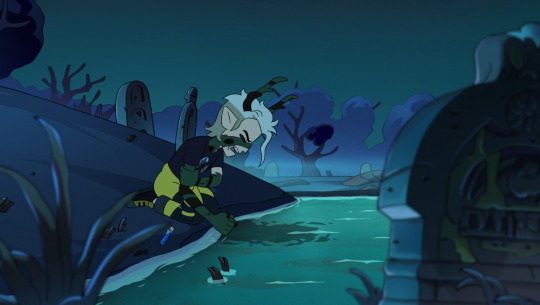


Being on his knees. Look at dat body language!! But the camera never stares him down in a condescending, insensitive and detached fashion: it's once again a low-ish angle that meets him at eye level. Which goes to show how much connection matters to this kid, even in the form of us viewers connecting with him.
To wrap this up...
When it comes to him feeling like he's part of something larger, we feel so different looking at these last two shots:

Belonging only to Belos, being owned, dangerously isolated but not completely silenced, reduced to someone whom Belos refers to as "this one", being a breakable "thing"...but later on: finding personal autonomy, his own voice, the things and people that he as an individual loves and wants to nurture and protect, not being above or below anyone in society.
To think that this gentle, empathetic kid's story started and ended at drastically different points.
#yet another spontaneous meta!! that's what this kid does to me#toh hunter#the owl house#toh analysis#golden guard#owl house cinematography#loz writes a meta
232 notes
·
View notes
Text

Obsessed w the way they lit Henry in this scene. It's all so soft, and warm, and cozy, and almost dream-like, not to mention that backlighting is so flattering. And the way it lights his hair like he's got this halo as if he's some kind of angel from above. They didn't have to go that hard, but they did. It keeps me up at night.
#alex also looks absolutely stunning in this scene ofc#not to be a nerd but yeah#I have an excuse I'm literally in uni for mediaproduction#I'm just so in awe of well done cinematography and beautiful shots#when a movie is visually stunning <3#also wondering if they used a perlescent filter for this or if it's all camera and lighting#and color grading ofc#rwrb#rwrb film#rwrb movie#red white and blue#red white and royal blue#red white and royal blue movie#red white & royal blue#rwrb analysis#media analysis#ig?#mine
111 notes
·
View notes
Text

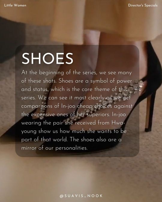
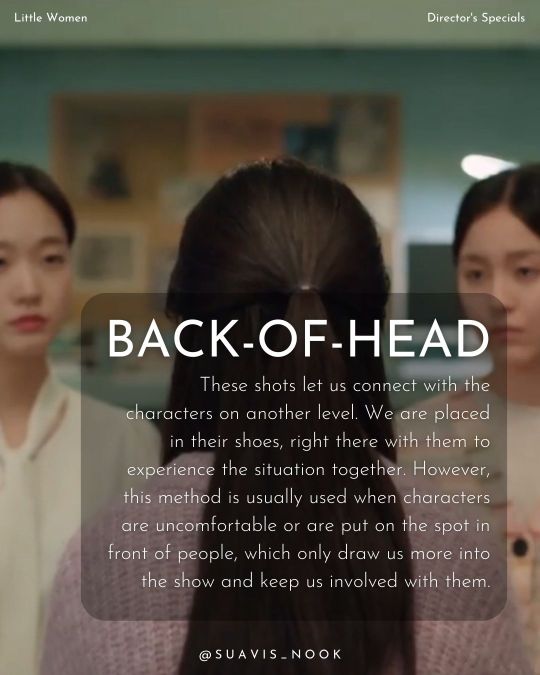
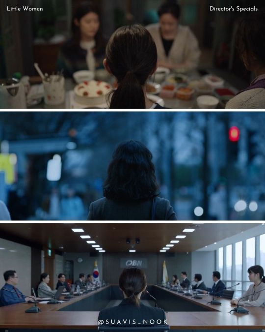
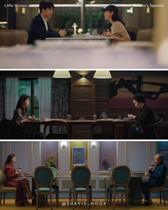
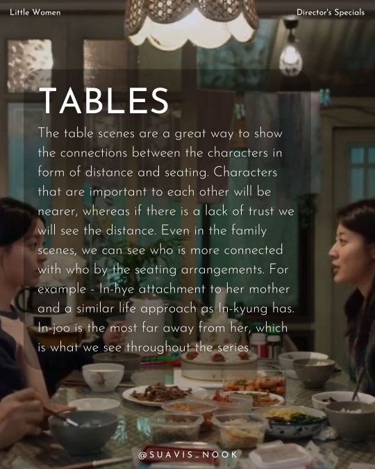
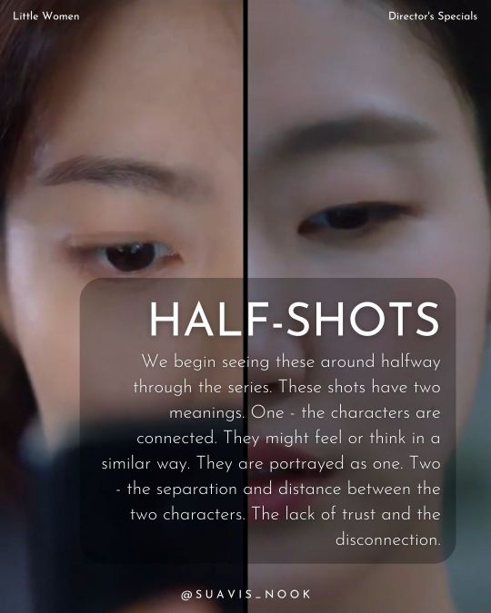
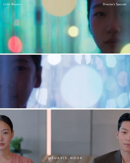
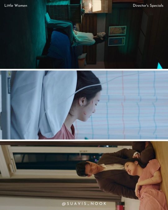
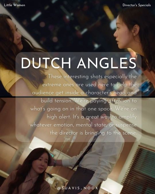
Little Women - director's specials 🎬
~directed by Kim Hee Won
#little women#little women 2022#little women kdrama#littlewomenedit#kdrama#kdramaedit#cinematography#film analysis#kim hee won#movie blog#kim go eun#wi ha joon#nam ji hyun#park ji hu#uhm ji won
433 notes
·
View notes
Video
CINEMATOGRAPHY ANALYSIS ON MIKE’S MONOLOGUE: by someone who works and studies in the industry :)
Check out Youtube Link Here - feel free to subscribe :)
Link to all other analyses including: Rink o’ Mania Fight, Mike & El’s Fight, Desert Scene, etc.
#byler#byler analysis#mikes monologue#mike wheeler i know what you are#stranger things cinematography#cinematography analysis#byler theory#byler endgame#stranger things analysis
93 notes
·
View notes
Text
I've talked about it before but the use of Spaghetti Western shots primarily on Izzy in season one and then with the eye closeup on Kraken-era Blackbeard is such a loud choice.
These type of shots are used during standoffs and with the "bad guys."
Izzy, Fang, and Ivan's introduction: How in every shot Izzy is in front, with the duo flanking him. How the camera zoom in and plays western music. The choice of their dark clothing versus Stede and co's light clothing.
How Izzy talks like a Shakespearean villain, immediately drawing you in, while Stede fumbles his way to beating Izzy (not for the first time) and we see just how much Stede's crew is out of their depth in the classic pirate sense, yet in their own way perfectly adequate. And this and the combination of Izzy's lies to Ed just fuel Ed's obsession of Stede.
The shot through Stede's legs when they start their fuckery, get their men back, also reveals the power dynamic, the trio still in the villain shot and Stede in the hero one. We already know just from this dynamic that Stede is going to win.
The closeup in Kraken-era Blackbeard. He is just going through the motions, it's just another Tuesday, another raid. And we see how dead his eyes are; how devoid of life they were in the past. Instead, as he states during this scene, he's the devil; he's full on embracing the picture of himself in Ed's book with nine guns and even using the term "devil pyrate." The standoff is between him and himself, while being framed as the wedding they attack.
I am obsessed that only Izzy and Kraken-era Blackbeard are shot this way. Cause it shows and tells you exactly how you are supposed to feel about them using old camerawork techniques and cues.


#ofmd#our flag means death#ofmd s2#stede bonnet#ofmd stede#ofmd edward teach#kracken era blackbeard#izzy hands#ofmd izzy#ofmd meta#meta analysis#spaghetti western#cinematography#camerawork analysis
217 notes
·
View notes
Text
A deep dive into the MK1 cinematics (PT1?)
Hi, I'm a nerd and I like breaking apart scenes for small details and hidden meanings that adds to the overall story. For my first official post on The Collective Fixation blog, Mortal Kombat 1 is going to be topic subject today. I’ll be talking about random scenes in the game and trailer that I found really cool and some of the relationships between characters. (I actually blame my family for introducing me to MK1 the other month and I’ve literally not stopped thinking about it so lets get into it hehehe.)
!WILL CONTAIN SPOILERS YOU HAVE BEEN WARNED!
Ok MK1 is definitely in my top three list of best looking cinematics in video games.
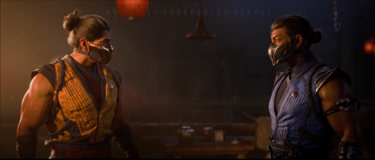
This scene from the trailer was my favourite because it uses the lighting in the building as a medium for foreshadowing. Scorpion (Kuai Liang) being in the warm, bright lighting while Sub-Zero (Bi-Han) being in the cool, dark lighting. The light side referring to Liu Kang as he is first seen with light around him as he ascends down and Shang Tsung representing the dark side as he steps out of dark shadows revealing himself in the trailer. Foreshadowing the betrayal and the two sides of the story that occurs further on in the story.
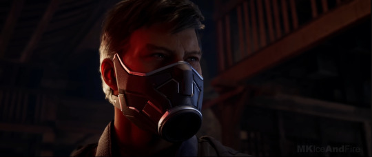
When Smoke first gets introduced he is seen under red light which can indicate danger or a sense of evil, paired with the dramatic shift in music from calming to almost a startling shift into a intense music. This convinces the audience to think that he is the antagonist in that current moment. The extreme close up on his face shows off his emotions, which is difficult to do since he has the mask on, so actors have to get creative with their facial expressions. We see this with the intense look Smoke has when surveying the area, indicated with his eyebrows and eyes. Also the camera pans left to show off more red light on his face. The camera is below his face making a low camera angle, low camera angles most commonly indicate a sense of power, strength and intimidation to the subject in frame.
(Side note: Live Laugh Love low camera angles, you see them so much in this game and I love itttttt)
The film codes (technical and symbolic) in the scenes between Johnny Cage and Kenshi Takahashi play an important part in the growth of their relationship. When Kenshi is revealed to the audience, the camera pans up from his feet to his sword to his face leaving in at a low camera angle. This increases dramatic tension by slowly revealing to the audience what Johnny sees. When taking in account of the music changing to a upbeat fighting kind of soundtrack the audience makes the conclusion of you guessed it danger, antagonist.
(Ofc cause he isn't the actual villain in the game but as the time he is lol)
(Side note: i love the way the game developers made it so the cameras seems hand held or on a dolly and not fixed in place, seems like we are in the game/story experiencing everything with the characters.)

Not that important but I love how the light from the pool reflects off both Johnny and Kenshi, its all about the details.
Now lets talk about THE SLOW MO BETWEEN JOHNNY AND KENSHI. Gotta admit, it caught me off guard a little, because normally a slow mo is used to focus on a character’s emotional reaction to a person, place or event in that current moment. And after thinking long and hard, I have come up with a conclusion on why the directors made this decision.
To show the tension between Johnny and Kenshi. Kenshi at the beginning of the story does not like Johnny or his ideals, its shown between dialogue when talking about their reasons to becoming Earthrealm defenders and Kenshi disapproval. And is the base of why they interact in the first place, because Kenshi wants Sento and Johnny wont give it over. The slow mo focuses on kenshi’s facial expression of aggravation and intensity about his fight with Raiden and about Johnny’s bad sport man ship in the previous scene with Johnny vs Raiden when Johnny’s ego was talking was basically he talked down Raiden’s abilities. This contrasts Kenshi’s ideals of honour.
(side note again, I haven't done a full deep dive on their characters nor have I done a deep dive on a character so I may have gotten some stuff wrong but I haven't fully played the entire game yet I'm like halfway rn so yea)
Ok that’s all for now, I’ll maybe talk about more scenes once I fully play through the game. Feel free to share your options because I love talking about these kind of things.
-Bookworm
#mortal kombat#mk1 2023#mk1#johnny cage#kenshi takahashi#tomas vrbada#mk1 smoke#sub zero#bi han#kuai liang#scorpion#mortal kombat 1#deep diver#cinematography#film#film analysis#game analysis#thecollectivefixation
58 notes
·
View notes


Last Seen Blogs
big-anime-totties
big anime totties

cmssssssssssssssssss-blog
CAITLYN GOT THROWN BACK

hersinkingsun
edit the sad parts.

johncarol11
The Blogging of Ayala 664

monkeefistphotography
Monkeefist Photography