#blend tool in illustrator
Text
youtube
#cover designer#how to create b&w letters#how to create block letters#how to create a font logo#how to create letter logo#s optical illusion tutorial adobe illustrator#adobe illustrator optical illusion tutorial#optical illusion adobe illustrator#how to create an optical illusion in adobe illustrator#op art tutorial illustrator#how to create optical illusions in illustrator#optical illusion in illustrator#how to make optical illusions in illustrator#s#blend tool tutorial#adobe illustrator#blend tool in illustrator#how to use blend tool in illustrator#3d type in adobe illustrator#Youtube
2 notes
·
View notes
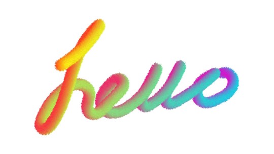
Video
youtube
illustrator Blend Tool | Adobe Illustrator Tutorial 2022
#blendTool#Blending#blend tool in illustrator#kavucreative#logo#logodesign#logoidea#logomaster#logomaker#logocreator#logoinspiration#frrelogo#freelogomaker#freegraphic#freelearnign#illustrator tutorial
1 note
·
View note
Text
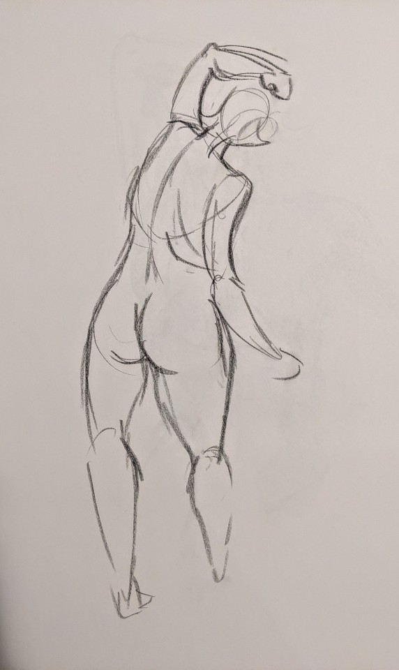
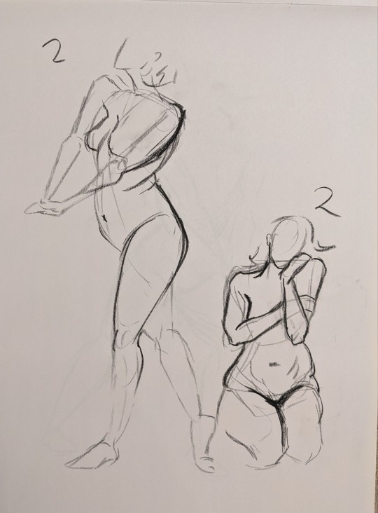
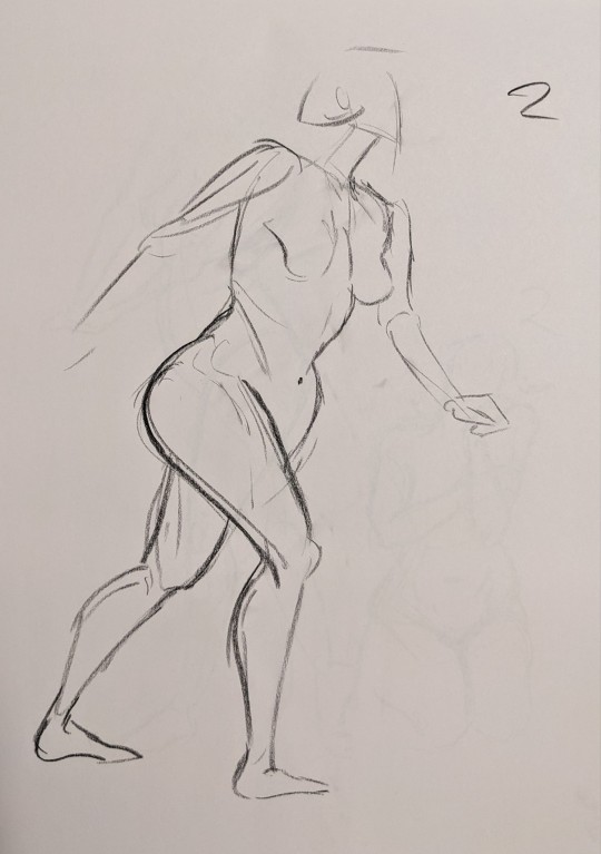

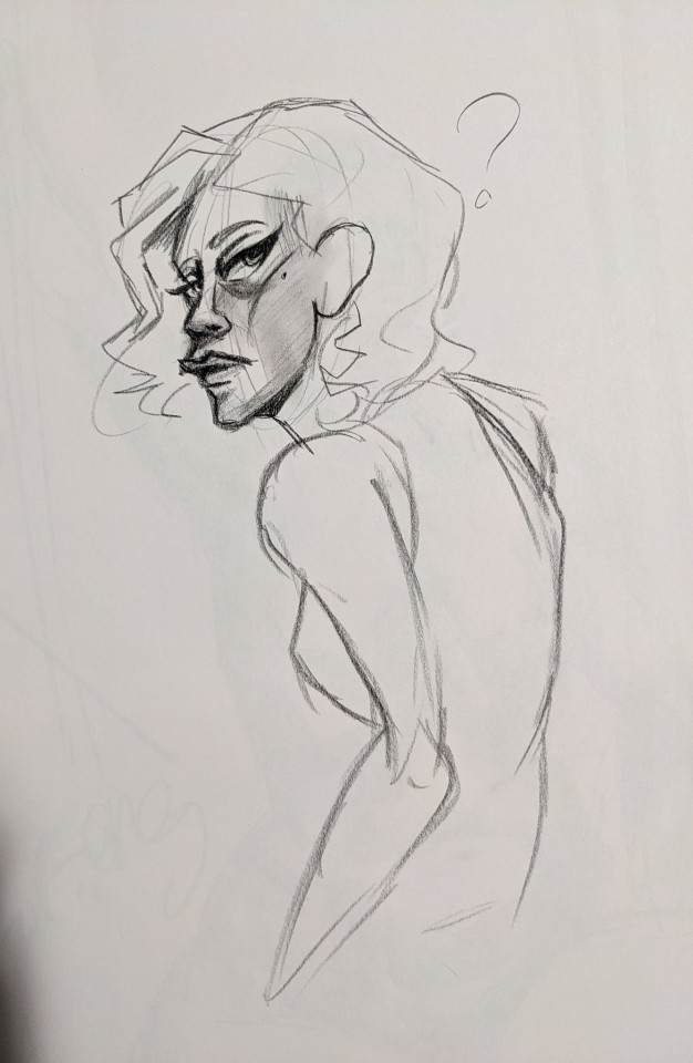
Some quick two minute gestures + a little doodle I did in between poses.
#conté art#conté#conté drawing#art#drawing#doodle#artwork#sketch#illustration#traditional art#figure practice#figure studies#gesture drawing#gesture sketches#art practice#my art#figure drawing#do you like not being able to create precise lines in your drawings?#do you enjoy not knowing where your marks will land on the page?#do you hate being able to blend out shadows to build up your drawing?#introducing conté sticks!!#“iTs a bAd aRtiSt tHaT bLaMEs tHEiR tOoLs” fuck you I'm petty and never claimed to be good#figure study#artists on tumblr
22 notes
·
View notes
Text


Icon Design
#adobe #adobeillustrator #illustrator #illustration #vector #vectorart #Ai #graphicdesign #graphicdesigner #creative #creativegraphicdesigner #creativegraphic #creativedesigner #sahdevvala #valasahdev #kshitijvivan #kshitij_vivan #educationvala #educationcala.com #drawingandillustrations #vectorart #art #illustartiondrawing #blendtool #usingblendtool #illustratorblendtool #blendtoolillustrator
#adobe#kshitijvivan#sahdevvala#Adobe illustrator#illustrator#illustrations#blend tool illustrator#using blend tool#blend tool#blend tool icon
0 notes
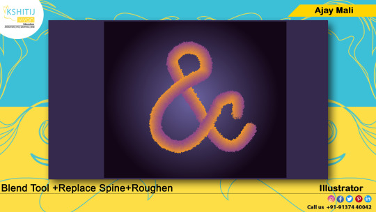
Text
Mastering Adobe Illustrator's Blend Tool: Tips, Tricks, and Design Magic

Unveil the creative wonders of Adobe Illustrator's Blend Tool! 🎨 Discover Replace Spine and Reverse Spine techniques for breathtaking designs. 🚀 Join us for expert tips, tricks, and design magic. Let's craft brilliance together! ✨
Watch Tutorial Now
#Adobe Illustrator Blend Tool#Design tutorial#Graphic design techniques#Blend Tool options#Replace Spine in Adobe Illustrator#Reverse Spine technique#Stunning design creation#Creative tips for Adobe Illustrator#Graphic design magic#Illustrator tutorial#Design tricks and tips#Adobe design tools#Digital artistry guide#Enhancing designs with Blend Tool#Illustrator design inspiration
0 notes
Text

#kashitij vivan institute#photoshop#image#googel#large images#background change#illustrator#text#blend tool#gradient colour tool#shadow effect#reffrence
0 notes
Link
0 notes


Text
Imbolc Altar Ideas & Correspondences
Imbolc, also known as Candlemas or Brigid's Day, marks the halfway point between the winter solstice and the spring equinox. It's a time to celebrate the returning light and the awakening of the Earth.
Altar Decorations:
Candles: Imbolc is strongly associated with the element of fire. Decorate your altar with candles in shades of white, yellow, and light blue to represent the increasing daylight.
Brigid's Cross: Craft or purchase a Brigid's Cross, a traditional symbol associated with the Celtic goddess Brigid. Hang it on your altar as a protective charm.
Seasonal Flowers: Place early spring flowers like snowdrops, crocuses, and daffodils on your altar. These symbolize the first signs of life returning to the land.
Herbs: Incorporate herbs such as rosemary, thyme, and cinnamon for their purifying and invigorating properties. Bundle them together with a red or white ribbon.
Seeds: Represent the potential for growth by adding a dish of seeds to your altar. Consider seeds associated with early spring crops like wheat or herbs.
Imbolc Symbols: Include symbols like lambs, ewes, and the sun to capture the essence of this seasonal transition.
Candle Holders: Choose unique candle holders or lanterns to enhance the ambiance. Consider using candle holders in the shape of suns, stars, or nature-inspired designs.
Divination Tools: Add divination tools like tarot cards or runes to your altar for seeking guidance during this transitional period.
Symbolic Stones: Integrate crystals such as citrine for abundance, aquamarine for clarity, and moonstone for intuition. Arrange them aesthetically around your altar.
Feathers: Symbolizing air and spirituality, feathers can be incorporated to invoke the energy of the season. Choose feathers from birds associated with the goddess Brigid, like swans or owls.
Artwork: Display artwork or illustrations that resonate with the themes of Imbolc. This could include depictions of Brigid, snow-covered landscapes, or symbols of growth and renewal.
Imbolc Incense: Craft or purchase incense blends with scents like frankincense, myrrh, and chamomile to fill your sacred space with a soothing and purifying aroma.
Correspondences
Goddess Brigid: Imbolc is sacred to Brigid, the Celtic goddess of hearth, home, and inspiration. Invoke her energy for healing, creativity, and protection.
Colors: White, yellow, light green, and light blue are associated with Imbolc. Use these colors in candles, altar cloths, and decorations to align with the festival's energy.
Stones: Crystals such as amethyst, garnet, and clear quartz resonate with Imbolc's energies.
Foods: Dairy products, especially cheese, and foods made with seeds like bread or muffins are fitting for Imbolc. Set offerings on your altar or incorporate them into your celebration feast.
Water: Imbolc is also associated with the element of water. Include a small bowl of water on your altar to symbolize purification.
Creativity Symbols: Imbolc is a time for inspiration and creative endeavors. Include symbols of your creative pursuits, such as a paintbrush, musical instrument, or writing quill.
Anointing Oils: Create or purchase anointing oils infused with herbs like lavender, rosemary, and frankincense. Use them to anoint candles, tools, or yourself during Imbolc rituals.
Animal Representations: Incorporate figurines or images of animals associated with Brigid, such as lambs, cows, or swans, to honor her connection to the animal kingdom.
Wheat or Corn Dolls: Craft small dolls from wheat or corn husks, symbolizing the harvest to come. Place them on your altar as a representation of the Earth's fertility.
Bell or Chimes: Hang a bell or wind chimes near your altar to symbolize the awakening of nature and the stirring of life. Ring it during your Imbolc rituals to mark significant moments.
Decorative Cloth: Choose an altar cloth with intricate patterns or symbols related to Imbolc, such as suns, wheels, or Brigid's crosses, to add a touch of magic to your sacred space.
May you find warmth in the returning light. <3
#pagan#witchcraft#paganism#witch#occult#wicca#dark#magick#neopagan#wiccan#imbolc#february#witchblr#imbolg#brigid of kildare#goddess brigid#st brigid
671 notes
·
View notes
Note
I love love LOVE your watercolour work! Are you still using the strathmore paper in your faq or have you switched to something else? (I’m shopping for new paper rn - trying to work out what’s a tool problem & what’s a me problem!). And would you every consider doing a little walkthrough of your process? Do you work in lots of thin layers? Your illustrations really evoke lovely stories so I’m always happy to see them. Have a great day!
hello!! Sorry It took so long to reply anon!
To start, Thank you so much!
Alright now about my matierial, Not much has changed but I am not using Hot press paper (Saunder Waterford Hot press 300g/140lb) the most nowadays!
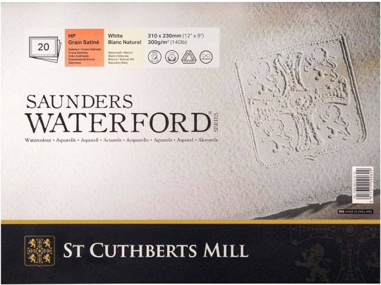
Its very similar to the Hot press from Strathmore I liked so either are not a bad choice! (And cold press from both brand are still a perfectly good choice! especially if you want more texture in your paper!)
Now for my process!
I normally start with colored pencils lines for all my art. You can choose one color or many! I try not to choose too dark of a colour so that it blends in better.

Then its paint time!
Watercolour is all about layers! (Like Onions, Like an Ogre)
Patience is key with watercolours! Believe me I still to this day add way to much water/paint because I am excited to do a certain effect or want to get that wash right. But there is always a way to make it work!
Half watercolours for me is to work with the little accidents water or paint caused.
So I start with a pale color (often a soft yellow or orange or a blue but Go wild!)
and then I build on it!
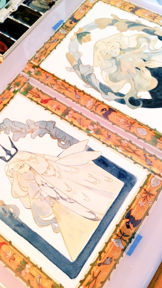
and you just continue to do that, waiting in between paint layers for them to dry (Or almost dry depending of the effect) . You can work on another section during that time, or (My favourite thing) just sit back and watch a long 4 hours video essay.:)
Then once the paint is done I normally define and add some details with Colored pencils again!
Then I scan the art and will adjust a bit or go full on mix media in procreate! It depends on the piece!
And then you have the full piece!
Hope this helps!
218 notes
·
View notes
Note
Hi, I'm sure you get this often but I really love your recent genshin artwork, do you think you could explain your painting process? I love the colouring effect in that piece especially. Thank you.
Thank you so much! I got a few messages like this from my previous piece (thank you guys for the staff pick & blaze btw, I really didn't expect all the support😭) so I thought I'd share a bit of my process below as thanks.
I always do my lineart first because it feels less daunting to me when applying colours. I will do some rough colours first so I can easily adjust it to my liking.

Next, I make sure to separate each character into different layers when I clean it up. I like to work one character or object at a time, it's less overwhelming for me that way, and I can use clipping masks for ease of rendering.

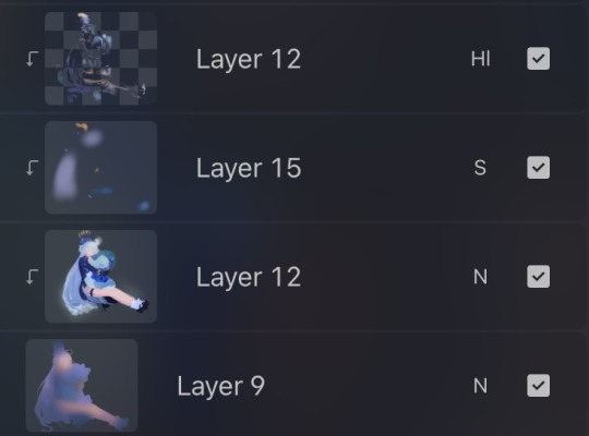
I'll usually apply some adjustment layers on top of the base layer for shadows and highlights. When I say base layer, I just mean a layer of the colour without any effects.
I like using 'hard light' for shadows, and 'screen' for highlights, but you can really use whatever clicks with you.
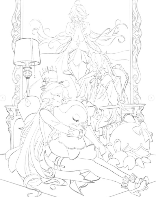
Rinse & repeat this process for every character in the illustration. Note that I make Furina the focus so everything behind her will be less rendered than the elements in front of them (Neuvillette is a lot less rendered compared to Furina, and the painting in the back barely has much shading).
Once I render out each asset in the illustration and add shadows & highlights to my liking, I then to merge foreground/ midground/ background elements so I can make the overall illustration clearer to read. I don't want it to feel messy or overcrowded, and I think it's easy to get tunnel-visioned in small details and lose the clarity of the entire illustration.
Make sure to zoom out constantly and make your illustration B&W to check the values to see if the drawing is clear.

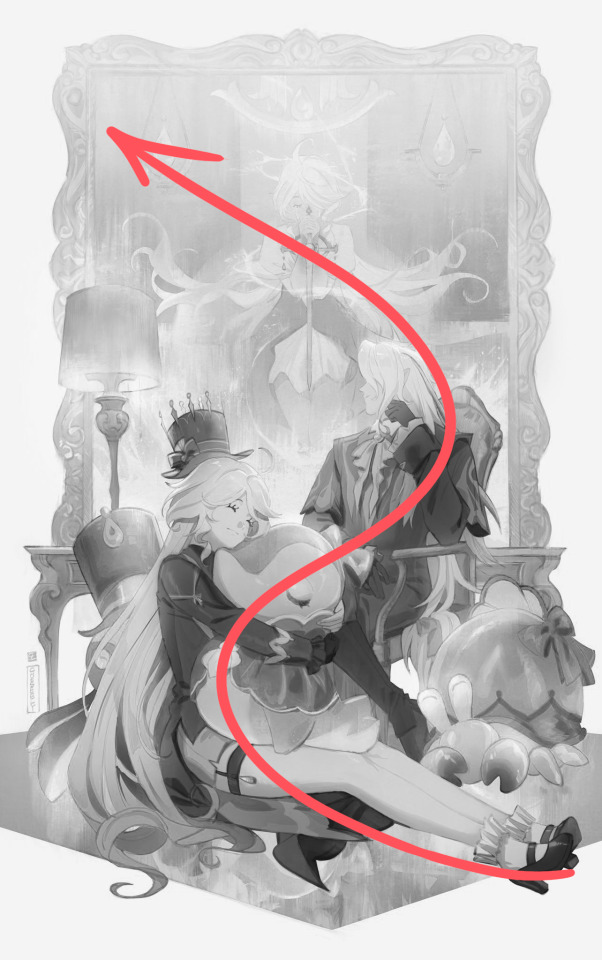
I created a simple S curve with the values for readability, and have the foreground elements have darker values & contrasts.
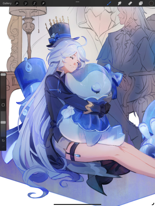
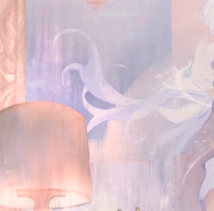
As for the BG, I wanted to add more textures into the drawing, particularly the painting in the back. Here's an image of it when I only added in the base colours.
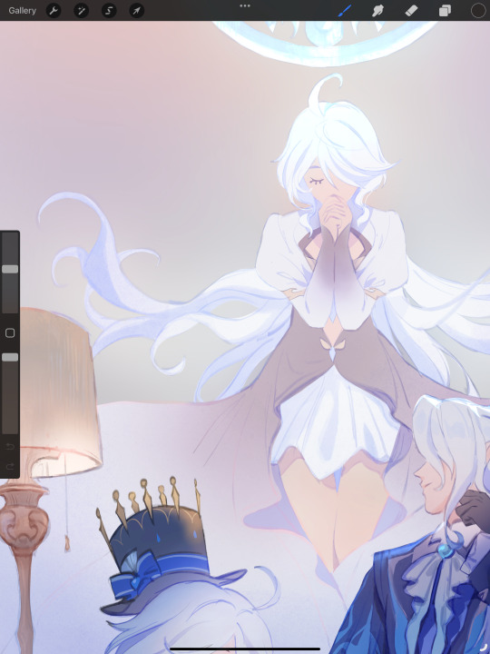
I use the smudge tool to create more texture once I fill in the base colours. Since I don't really 'paint' anything with the textures in, I just put in the base colours and take a textured brush to smudge it. However, over-smudging can lose the painterly texture I want, so I usually smudge vertically or horizontally in a single stroke to create a sense of movement.
Another thing to note is that I only textured the BG, I thought it would help it blend into the background a bit better. I usually wouldn't do this for the foreground because I want those elements to be clearer.
At the very end, I tend to spend a fair bit of time just fiddling with more adjustment layers, various filters (such as blur, or noise), or liquify small details to really finalize the piece. Just vibes...basically this is me

Anyway, I hope that was helpful & it made sense!! Feel free to message me if you have any other questions & I'll try my best to answer! I might've glazed over a lot since I didn't wanna make this too long.
210 notes
·
View notes
Text
Charles Alston: A Luminary of the Harlem Renaissance and Beyond
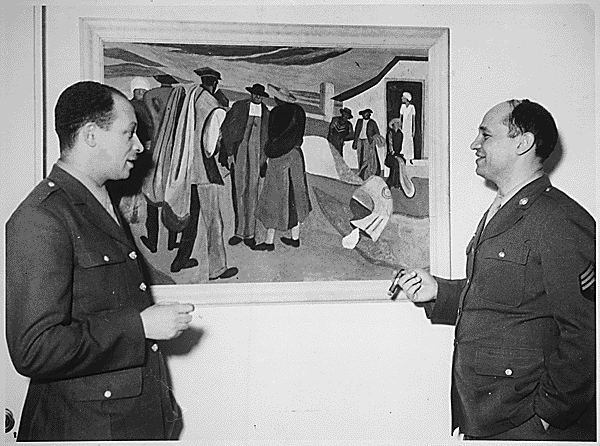
In the heart of the Harlem Renaissance of the 1920s and 1930s, Charles Alston emerged as a beacon of creativity and activism, blending the vibrancy of African American culture with profound social commentary. As a pioneering African American artist and educator, Alston’s legacy is celebrated for its dynamic impact on Black art and cultural expression during the 20th century. His work, which includes murals, illustrations, and sculptures, showcased his contributions to the Harlem Renaissance and his role in uplifting African American heroes through art.


Alston’s murals, commissioned by the Federal Art Project of the New Deal-era Works Progress Administration, adorned public spaces, bringing the narratives of the African American experience to a broader audience. His role during World War II, creating illustrations for the Office of War Information, further exemplified his commitment to using art as a tool for advocacy.


These illustrations, many of which are preserved in the National Archives, underscored the contributions of African Americans to the war effort, challenging the racial prejudices of the era. Alston also designed and painted murals at the Harlem Hospital and the Golden State Mutual Life Insurance Building. In 1990, Alston's bust of Martin Luther King Jr. became the first image of an African American displayed at the White House.
Beyond his artistic endeavors, Alston’s mentorship of future luminaries like Romare Bearden highlight his dedication to nurturing the next generation of artists. This mentorship underscored his belief in art’s power to foster community, inspire change, and bridge cultural divides in the United States. His influence extended to the civil rights movement, where his art continued to serve as a catalyst for social justice.

Charles Alston’s work remains a testament to his visionary blend of art and activism. For those interested in exploring Alston’s enduring impact and the rich tapestry of the Harlem Renaissance, the National Archives offers a treasure trove of resources:
Fully Digitized Artworks: https://catalog.archives.gov/search?availableOnline=true&page=2&q=Charles%20Alston&typeOfMaterials=Photographs%20and%20other%20Graphic%20Materials
https://catalog.archives.gov/search?availableOnline=true&page=2&q=Charles%20Alston&typeOfMaterials=Photographs%20and%20other%20Graphic%20Materials
84 notes
·
View notes
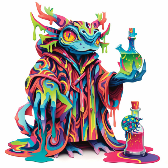
Text
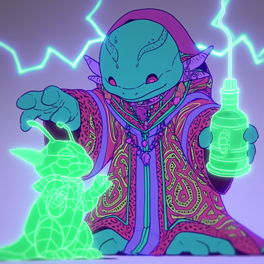
A friendly wizard and style reference.
Midjourney has just released both the version 6 of its niji anime engine and the first version of its "style reference" tool.
Functionally this is a variation of the image prompting system (explained here), in which breaks a submitted image down into the 'token language' the AI uses internally and uses that as a supplement to a text prompt. "Style Reference" (or 'sref') lets you do this with up to three images, only with only the tokens associated with 'style' being drawn upon.
This is not to be confused with style transfer, a much older and very different AI art process.
But what is a style in this context? And how does it affect generation?
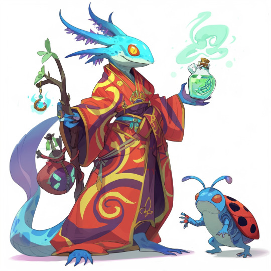
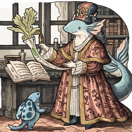
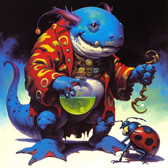
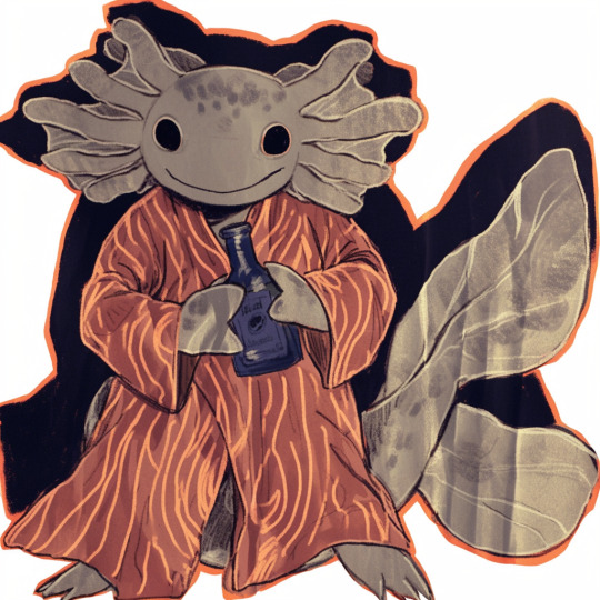
Prompt: a blue axolotl-anthro wizard in a red-and-yellow swirl-pattern robe, holding a sheleighleigh made of purple wood and a potion full of glowing green energy drink. A blue-and-green ladybug familiar stands near his feet, white background, fullbody image
Settings: --niji 6, --style raw --s 50 --seed 1762468963
Here, I've tested the same seed and prompt with a number of reference images.

My semiorganized ramblings under the fold
The first thing I note is that style reference affects the gen so much that same-seed/different style ref comparisons are kind of pointless. Way too much of pose, composition and content changes for it to matter, so for future style ref tests, I'm probably going to drop the seeds.
The second thing I note is that there are certain limitations. You need to change up your prompt for things like photography, and the system interprets styles using its own criteria, not ours. If image prompting misinterprets something, so will style ref, but perhaps not in the same way.
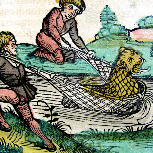
This is notable for the one prompted with a scan from the Nuremberg Chronicle (first row). It recognizes that its a woodcut and emulates that general vibe nicely, but MJ is highly tuned for aesthetics, and emulating real world jank and clumsiness is a weak area. This is literally the first printed (european at least) book with illustrations. Every example thereafter is building on that skillset, so the dataset for woodcuts is going to be largely of a higher apparent quality.
In short, with Midjourney, additional prompt work is needed to replicate the look of early jank or intentionally 'ugly' art styles, and even as recent as v6 I've had no luck with things like midcentury Hanna-Barbereesque cheap TV animation styles or shitty 1990s CGI.
Style reference can help, I've gotten some pretty good cheap 80s-90s TV animation looking stuff from v6 niji and style ref in my early tests:
Color observations: Absent specific requests in the prompt, SREF will stick pretty close to the palette and lighting conditions of the referenced image. With such instructions, you get blending, so the one referencing the okapi fakemon (second row from bottom), for instance, has a lot of colors the reference image doesn't have, but they're in similar in vibrancy and saturation.
One limitation, however, is it doesn't apply to the aspects of the gen that come from any image prompts, so it will always blend the style of the style reference with the style aspects inherited from the image prompt, and that is very strong compared to the style ref.
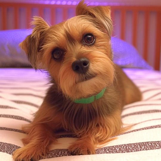
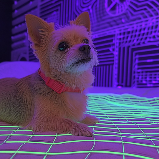
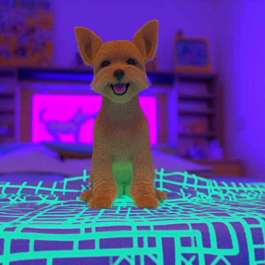
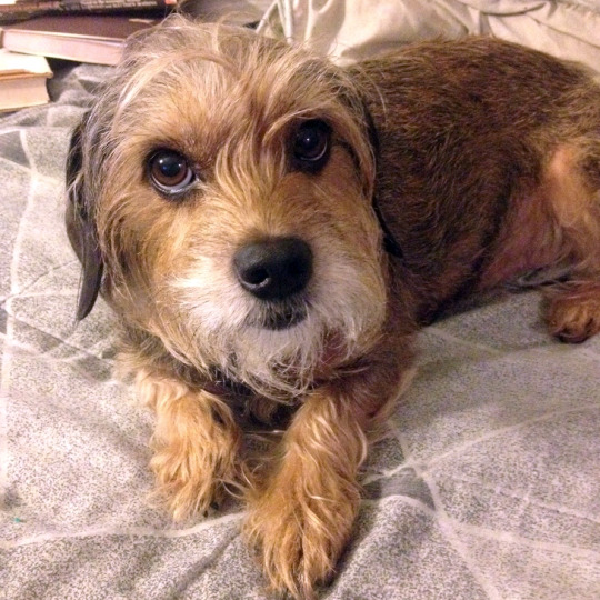
Using the dog as the image prompt, and the TFTM reformatting as the style prompt, and the text prompt: "a cute older yorkie dog sitting on a bedspread", we get the image on the left. Dropping the image prompt weight to .25 gets us the center option, and removing the image prompt entirely produces the one on the right.
I expect this will be patched eventually, or general image prompting may fall out of favor compared to a combination of style ref and the upcoming character reference option, which will be the same thing, but will only reference the tokens associated with the character in the reference image. Depending on how that works that will have a lot of uses.
Stay tuned for more experiments. There's some good potential for freaky, unexplored aesthetics with combinations of multiple style refs and text prompts.
#ai artwork#style reference#midjourney v6#nijijourney v6#generative art#axolotol#wizard#prompt testing#ai experiments
55 notes
·
View notes
Text


Blend Tool
#adobe #adobeillustrator #illustrator #illustration #vector #vectorart #Ai #graphicdesign #graphicdesigner #creative #creativegraphicdesigner #creativegraphic #creativedesigner #sahdevvala #valasahdev #kshitijvivan #kshitij_vivan #educationvala #educationcala.com #drawingandillustrations #vectorart #art #illustartiondrawing #blendtool #usingblendtool #illustratorblendtool #blendtoolillustrator
#adobe#kshitijvivan#sahdevvala#adobe illustrator#illustrator#illustrations#blend tool#using blend tool#blend tool illustrator#fur effect#text gradient effect#text fur effect
0 notes
Text
#kashitij vivan institute#photoshop#image#googel#large images#background change#illustrator#roughen#blend tool#pencil tool#pen tool#gradient colour tool#steps
1 note
·
View note
Text
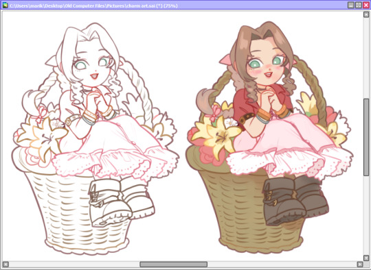
brush theory doodle
my brush settings + how i use them under the cut
I use paint tool SAI
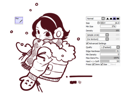
PEN BRUSH • LINER + FLAT COLORS
this is the basic pen that comes with SAI. I use it for sketching, lining, and throwing down colors. It's very lightweight to use, and responds great to pressure. i like how soft it looks but it's still solid for selecting areas and paint bucket filling when coloring later on

MARKER BRUSH • BLENDING COLORS
this is the marker tool, i have it set to a fine flat tip to use like a copic chisel tip end. It's semi transparent so it works just like a marker, more pressure will give more color. It's great to add a wash of shading in a picture when using on a separate layer. When coloring on one layer, it'll pick up colors and blend them like when painting with oil paints.
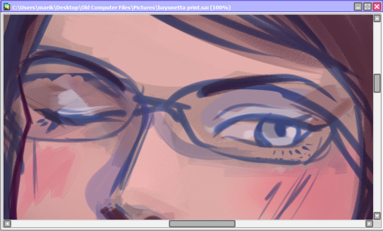
here is an example of using it to lay down shadows in this wip, but it leaves a lot of harsh edges that i'll blend out with a watercolor brush.

SUGOI BRUSH • LINER
this brush i got from an artist that's no longer on tumblr...
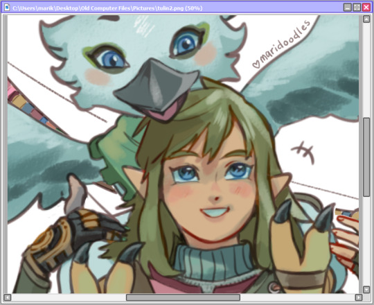
i do not use this to color because it pulls colors really weird when painting on one layer. But it's great if you want very straight lines. I use this when i want thicker consistent lines like my merch art
it also layers very fun because it's semi transparent. I use it when I want very soft casual lines like in this illustration, see how the lines blur into the colors on the layer underneath?
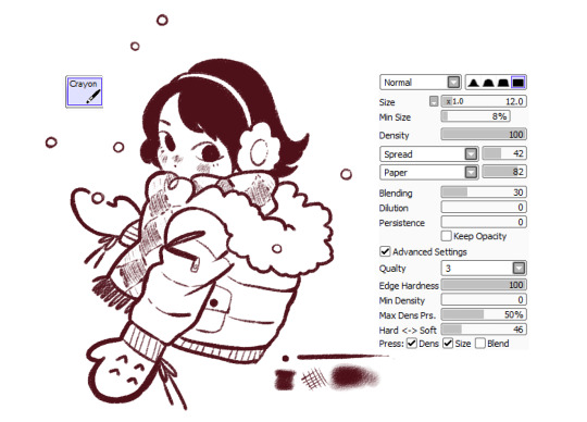
CRAYON BRUSH • TEXTURE
this is my favorite brush. it mimics a rough 2B pencil, it has a beautiful texture. However, it has so much texture that unless you have very thick lines it'll leave pixel gaps so you cannot use the paint bucket fill/select tool making it not great for lining.
I use it to add blush lines and shade hair like Serafina's from my Ghoulfriends comic. Use it on a seperate layer for the sharpest results

i saw this brush theory trend on instagram and wanted to join because i love talking about all i put into my art
bye
#brush theory#i ramble for 10 years under the cut sorry#tutorial#tutorials#brushes#paint tool sai brushes#my art#original
44 notes
·
View notes
Last Seen Blogs
imlaylasmom
*:・゚Lia✧*:・゚

farmlife70
Untitled

slyr123
Indecent Secrets

88moofs
woah

andr3wace
Breaking Free