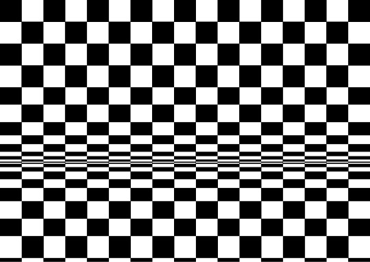
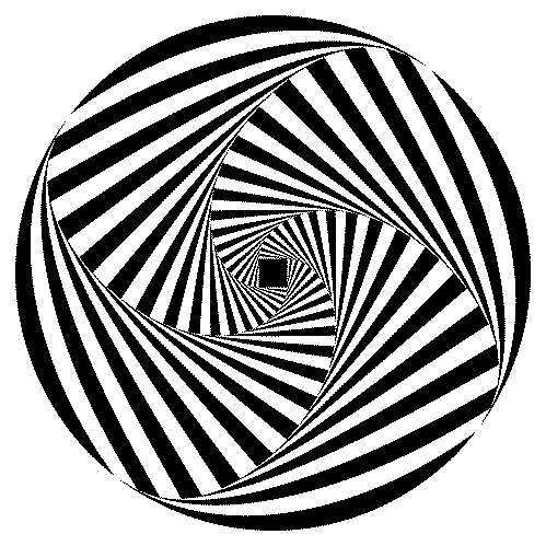
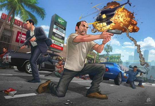
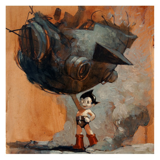
#op art tutorial illustrator
Text
youtube
#cover designer#how to create b&w letters#how to create block letters#how to create a font logo#how to create letter logo#s optical illusion tutorial adobe illustrator#adobe illustrator optical illusion tutorial#optical illusion adobe illustrator#how to create an optical illusion in adobe illustrator#op art tutorial illustrator#how to create optical illusions in illustrator#optical illusion in illustrator#how to make optical illusions in illustrator#s#blend tool tutorial#adobe illustrator#blend tool in illustrator#how to use blend tool in illustrator#3d type in adobe illustrator#Youtube
2 notes
·
View notes
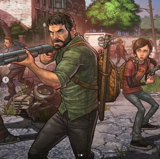
Text
Welcome to my Blog!
✨💛✨💛✨💛✨💛✨💛✨💛
💛 Orfeo / Lau
💛 20s
💛 Artist @orfeoarte
💛 they/he
🌻⭐🌻⭐🌻⭐🌻⭐🌻⭐🌻
OP of the post about Argentina AMA
More about me under the cut or find my interests here
★ I'm Latino. Please don't take my posts about the Global North personally. I don't hate you, I hate that I'm oppressed because of geopolitics and xenophobia.
★ I might block, but never a friend. It's hardly something personal.
★ I'm an art professional. This involves my work in: education (university level), [queer art] research, freelance illustration, books, and video games.
→ if you're struggling with art and need ANYTHING at all, just ask! I don't mind giving people classes or tutorials for free. Seriously. Same with books. Just ask!!!
★ I'm not here for discourse, please try not to start any of it. This is my personal blog where I may vent, but ultimately I want this to be a place of respect and kindness.
★ I'm a leftist (the Latinamerican kind), and I have a nonstandard view on faith and religion for myself. Please be aware of that
★ I can't tag everything, but you're welcome to ask.
Please be kind to yourself and others! Feel free to message me at any time!
23 notes
·
View notes
Text
Autopsy - tutorials database
tutoriel sur la manière dont Vanrah à réalisé plusieurs de ses illustrations.( tutorial on how Vanrah made several of her illustrations. )
Karma & NeverenD belongs to VanRah/poizongirl @poizongirl
⚠️ Source Vanrah Deviantart ⚠️
https://www.deviantart.com/vanrah/art/Versus-Necromancia-op-5-321498027
#vanrah#van rah#poizongirl#@poizongirl#neverend#Autopsy - tutorials database#Karma#Karma Faust#deviantart#Vanrah devianart
2 notes
·
View notes
Text
Other artists with unusual style. Part 1
Malika Favre:
Malika Favre is a French illustrator and graphic artist based in Barcelona. Her style of works could be characterized by pure minimalism within Pop art and Op art, where it sometimes described as 'Pop Art meets Op Art'.
How does Malika Favre create her art?
She does this through experimenting with metaphors, positive and negative space, shadows, layers and many other key tools. Photography is a significant tool in this initial stage, helping Favre to extract colours, patterns and graphic elements.
What software does Malika Favre use?
This is what Malika Favre's answer for this question: ''I've stopped sketching by hand. I now sketch with Illustrator, sometimes in black and white, other times in color, to draft the composition and idea. The most important part of the process is to generate ideas. Everyone has their own way and there aren't any rules.''
What are some interesting facts about Malika Favre?
Favre was born with a severe case of strabismus, or crossed eyes. It was surgically corrected when she was very young, but she still sees perspective differently from the rest of us. “I can't see 3-D, for example, so if you give me 3-D glasses, I see blurry.
My opinions for this artist as her style is showing off, negative spaces mixed with positive spaces as she uses such bright and bold colours as well to show the complex to show the colours compared very well like white mixed with red and different shades of blues which is very well done for Malika.
╰── ⋅ ⋅ ── ✩ ── ⋅ ⋅──╯
Jack Teagle:
Jack is a freelance illustrator based in South West England. He has worked in a large variety of fields, including editorial, character design, storyboarding, poster/ product/ textile design, and worked as a cartoonist for Front magazine from 2010-2014. He wrote tutorials and worked as a columnist for Digital Artist Magazine
Jack paints in his free time, and has exhibited his work worldwide.
He is also a prolific self publisher, with his comics being translated into Polish, and Russian.
Jack Teagle comes from a town where more than 250 people applied for a single job at 'Pound Land'. Jack decided to become an illustrator instead. Jack graduated with an illustration degree from the university of Plymouth in 2009 and now works as an illustrator, comic artist and painter.
Selected Clients include:
Time to Change, VW, Adobe, Netflix, Apple, Universal Music, The Vlog Brothers, Iam8bit, Cartoon Network, Minecraft, Landyachtz, Converse, McSweeney's, Ohh Deer, Nick Jr, Bloomberg Business Week, FHM, Front Magazine, Evisu, The Economist, YCN, Research World Magazine, Anorak Magazine, Nobrow Press, Intercity Design, Havana Club Rum, ASP Industries, Daddy Donkey Mexican Grill, Illustrated Mind, Nexus Productions, Texas Observer, The Portland Mercury, Digital Artist Magazine, Future Publishing
Solo Exhibitions:
That's Life!- The R.A.G.E, Dublin, 2011
Zona De Combate- Dama Aflita Gallery, Porto, 2010
Dungeons and Desktops- Nobrow Shop and Gallery, London, 2010
My opinions for this artist, that his style is very cartoony as his own art works has lot of colours which is mixed with dullness, brightness and pastel-ish colours in his art works. I think he making lot of positive shapes on his art works with cartoony style.
╰── ⋅ ⋅ ── ✩ ── ⋅ ⋅──╯
Dan Hipp
Dan Hipp was born on 11 September 1978 in Fresno, California, USA. Dan is an art director and writer, known for Teen Titans GO! To the Movies (2018), Marvel Snap (2022) and Manga Motion Comics (2009).
Dan Hipp is a cartoon and comic book artist well known for his work with Warner Media, specifically DC Comics.
Prior to working as an artist, Daniel Hipp attended Edison High School in Fresno, California. He went into further studying at the University of California in Irving. Sometime after his schooling was done, Dan got jobs with big name animation studios, including Warner Bros. Animation, Random House, DC Comics, and, most recently, Cartoon Network.
As of right now, Hipp once specialized as an art director in Teen Titans Go!. His own personal art can be seen numerous times throughout the show, as many of the pictures and signs throughout the Titans Tower are Dan's creations. In addition, many Teen Titans Go! comic book cover is the work of Hipp's hands.
My opinions for this artist, that he also creates lot of positive spaces on his art works which I think that he does this to show the more details on the works so that people can see the whole page and not specific parts and he uses lot of bright colours that he used on his arts.
0 notes
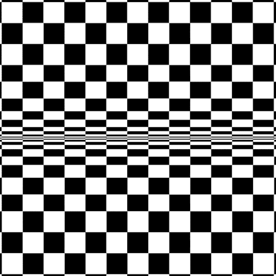
Video
https://www.youtube.com/watch?v=fPYCRi501MM
#illustration#illustrator#vector#opart#op art#opticalar#optical illusion#today i learned#adobe#adobeillustrator#adobe illustrator#tutorial#graphic design#youtube video#design#video tutorials#3d#3d effect#vectorart#3dart#designtips#youtube#how to design
7 notes
·
View notes
Text
Op Art Digital Task
Creating ‘Op art’ digitally is a much quicker, and simpler process than doing it by hand. And it can often give out much more refined outcomes. Every design that I will be creating this style will be done using Illustrator, which also means I have an infinite quality as it uses vectors. Illustrator is my favourite design program, and creating work like this is always a great way to explore all the little features and tricks I’d be yet to find out.
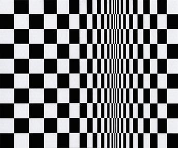
Movement in Squares, 1961
This ‘Op art’ design is inspired by Bridget Riley’s ‘Movement in Squares’. This is an interesting piece of art work, because it appears to be curving without using anything but black rectangles. It’s an amazing effect, and something that I intend on exploring. However, I do not want to exactly copy the work.
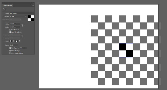
The first step in this design was to create a grid background. I wasn’t sure which grid size I was going to be using so opted for a pattern instead. To achieve this it was easy as creating a small black and square, and holding ALT + SHIFT whilst dragging it diagonally. After making sure it is completely aligned,
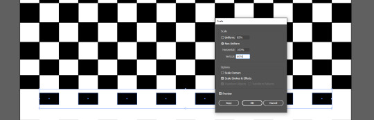
The key to this effect lies in the size of the squares. This essentially means that the squares need to get gradually smaller as they go down to give the illusion that they are going around a curve. To make sure I did this in an effective manner, I selected one row at a time and right-clicked to go to Transform > Scale. Here is where I changed the vertical percentage and went down 10% at at time. As I got to the last few, I went down 5% a time instead.
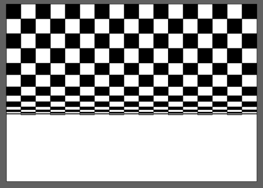
Below you can see that it is beginning to look more like ‘Op art’ is the illusion starts to become visible, but this is obviously only the top half of the image.
Adding the bottom half of the image was easy as all I had to do was duplicate the top, rotate it and delete a layer. Below you can see the final result of this piece of art and I am very happy with it. It employs the same effect as used by Bridget Riley, but obviously features a different orientation and is still functional.
When scrolling up and down this webpage when writing this post, I noticed a strange effect happening to the image I just created. Upon doing this several times, I decided I would make a GIF from this effect by moving it up and down. I did this using the Timeline window in Photoshop while the design is a Smart Object.
It was something I found just by coincidence, yet I feel the outcome is very effective and almost hard to look at. Even if it is just squares moving up and down.
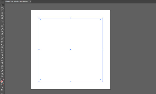
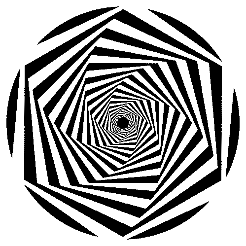
This next design is another ‘Op art’ piece that I created in Illustrator. When initially making the first variant of this design, I followed this step-by-step tutorial on YouTube. It is a quick effect to create, but is very effective.
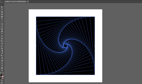
The first thing I did was create a square. I did this from the centre of the artboard using CTRL+SHIFT whilst dragging. This made sure that the square would stay a square, and not become a rectangle. The square itself had a 1pt stroke with no fill.
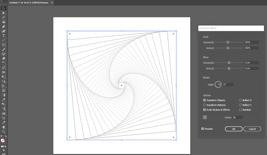
The next step was to create the spiral effect. I did this by selecting the square and going to Effects > Distort & Transform > Transform, which opened up the Transform Effect window. Here is where I changed both Scale values to 92%, the Angle value to 5%, and the Copies to 36. Upon checking the Preview box, I could see that it had been successful. I then clicked OK to be finished with this window.
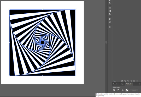
After the previous step, I clicked the outer square several times until it was selected by itself. I then pressed the double-ended arrow above the swatches on the Tool Panel to convert the stroke to a fill. It was then as easy as selecting the whole image again and going to Object > Expand Appearance. This left me with every part of the design as individual squares.
After ensuring that the black square was the very top object by pressing CTRL+SHIFT+], I went to the Pathfinder panel. I selected Exclude on the far right to convert the design into what you see below.
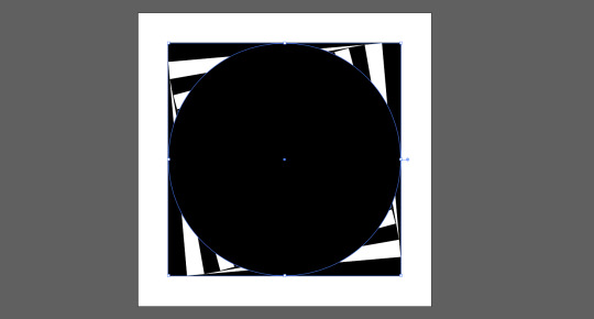
The step below was just to select the Ellipse Tool by pressing L and create a circle. I did this from the centre by using ALT+SHIFT.
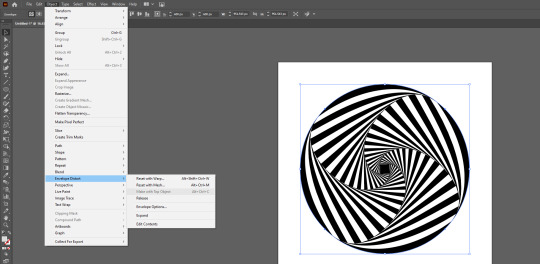
I then pressed CTRL+A in order to select every shape within the document, double checking that the circle I had created was the top layer. Then I went to Object > Envelope Distort > Make With Top Object. This both fitted the shape into the circle, and curved the lines to make it look seamless.
Below you can also see that I experimented with a Metal gradient and a grainy textured pattern from the Swatch Library.
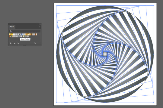
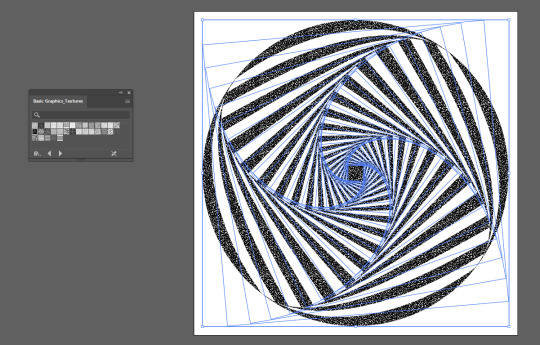
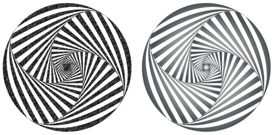
Below you can see a side-by-side comparison of the same design but using different Swatches.
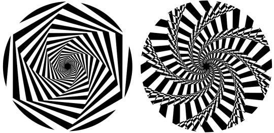
What I liked about this design was the ability to use it with other shapes. The process could be kept exactly the same aside from the Make with Top Object. This distorted the design too heavily, so I opted for a Clipping Mask instead (CTRL+7). The design on the left is using a hexagon, and the one on the right is using an 8 point star. I created this by using the lesser known feature of the Star Tool, which is you can subtract and add points with the up and down arrow keys. It will only work whilst you have started dragging to display the star.
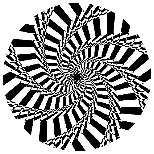
Although the images are by themselves optical illusions, I thought animating them to rotate could produce some interesting results. This was a simple process of rotating them within the Timeline window in Photoshop, and exporting them as a GIF. I further speeded up the process by relinking the image each time, so I didn’t even have to do the Timeline settings again.
3 notes
·
View notes
Text
5 INSTAGRAM ARTISTS SHOWCASE (OCTOBER 2020)
Hello beautiful and fabulous people! so I decided to do a list of Instagram artists that I‘m a fan of. Now, one thing I want to note is that this list is not exactly a ‘top 5’ list or anything, in other words, it is not in any particular order, so the artist that is on the very top of the list doesn’t necessarily mean that he/she is my most favourite or anything like that. Basically, I love these guys’ work, I don’t like picking favourites mostly cause it’s a headache to have to pick one or two favourites when all of them are awesome in their own way (or maybe I’m just lazy and tired to figure them out heheh). Alright! Let’s begin!
1. Patrick Brown (@patrickbrownart)

Alright! First on the list is Patrick Brown. Now, he’s not necessarily an Instagram artist (not initially anyway) He has an Instagram account now which is nice, but I actually found out about him on Youtube where he actually did this tutorial thing many, many years back. He was actually in the back of my mind for quite some time, until I rediscovered his work on Instagram recently.

His work is AWESOME! And surely to a lot of other cartoonists or illustrators out there as well, especially if you’re into character/comic book illustrations. Now, I know it’s subjective, like all things, but I do believe his work is awesome for one, the way he poses the characters are really fluid and dynamic, which I love. Second, his digital coloring and environment illustrations are also amazing! I mean, if you take out the coloring, and just keep the line art, it’s not going to pop off as much (to me at least), so it’s the way he digitally colors(shading and lighting) his characters and environments that boosts the quality of his work significantly. I specifically ADORE his splash pages/illustrations where there’s like tons of characters in one scene.
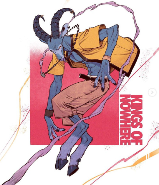
2. Roosh (@koteri.ink)

Next on the list! Koteri.ink. I found his work on Instagram, I think probably over a year ago? And I have loved his work ever since. There’s something about his art style that I'm diggin’ so much. I especially love it when he draws humanoid animals (?) not sure if that’s the right way to describe it.
He has this successful Kickstarter comic (Kings of Nowhere) he’s doing and still producing new chapters at the moment. I haven’t read it but from what I’ve seen so far, and from the comic’s synopsis, it’s a pretty interesting concept! Really love the way he designed animals, and his anatomy game is freakin’ strong! Check out his work!
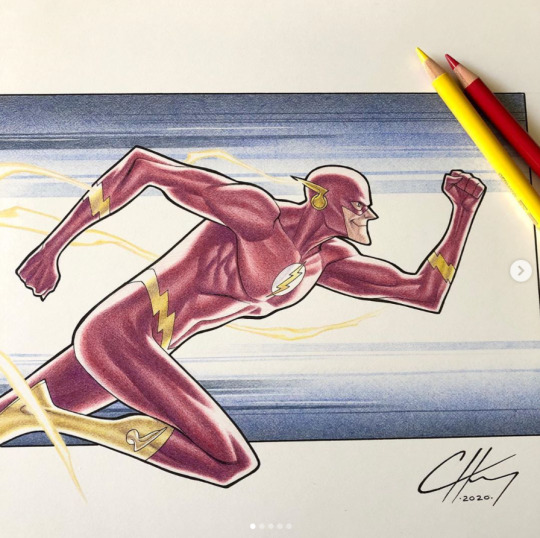
3. Clayton Henry (@claytonhenryart)

Third on the list! Clayton Henry. He’s an illustrator/comic book artist, at the moment he mostly does commission work for DC. If you check out his Instagram, his feed is filled with DC superhero illustrations like Batman, Superman, the Flash, etc. So, it may not be your cup of tea but he does post other works as well occasionally.
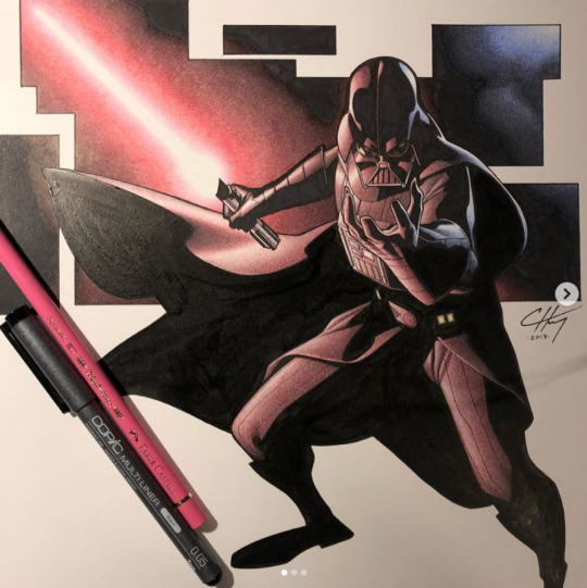

What I really love about his work is his art style and line work- especially his line work. Honestly, my own inking or linework is heavily inspired by this guy. Or at least, AT THE MOMENT (that’s why I don’t like picking favourites, cause it’s changing all the time xD). But I also love the way he traditionally colors his stuff using colored pencils. Something about it is just freakin’ great. I wish I could color my work traditionally like that. Maybe I can, I just need to start…maybe tomorrow.

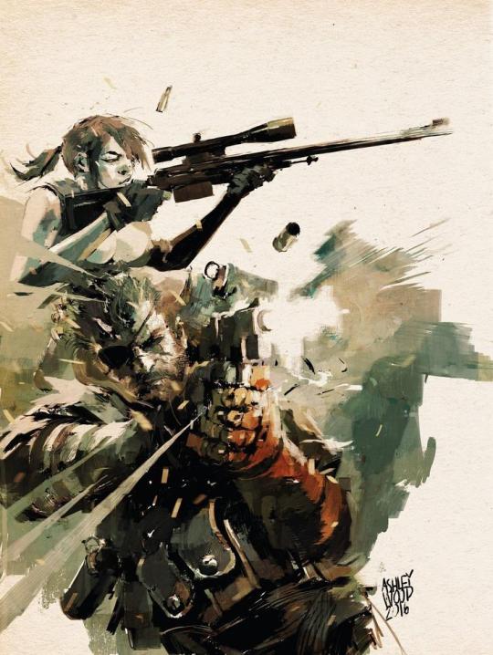
4. Ashley Wood (@ashleywoodart)
Next up, Ashley Wood. His work is… it’s hard for me to describe it. It’s really paintery, consisting of brushes or strokes, it seems very conceptual sometimes - like they are unfinished but still looks f*cking amazing!
Besides oil painting, he also does sketches in the form of inks. I mean, it LOOKS like sketches, but they are not really? Again, it looks unfinished but I would still put it up on the wall, y’know. I actually found out about Ashley Wood from the work that he did on one of my favourite video game series - Metal Gear Solid. He did the graphic novel for MGS and his work was also showcased as an in-game comic-ish animation for the Playstation Portable’s MGS game called Metal Gear Solid Portable Ops (not the best MGS game, but pretty good for a handheld). I was really digging the whole conceptual or ‘sketchy’ art style that I looked him up online - and ever since then I’ve been a fan of his work. Seriously, check out his work! They are amazing.
5. Seung Eun Kim (@kse332)
Finally, Seung Eun Kim. Man, going through this list just makes me feel bad about myself cause I have to look up their stuff and I keep thinking’ I probably won’t be this good. If this list is actually in order of the top being my ‘favourite’, Seung Eun Kim will be among the very TOP of this list. Just check out his work, this guy is among the greats when it comes to working in the visual development or concept artist industry.

He works on animation, he was a former principal artist at Riot games (yes, THE riot games), he worked with Sony Pictures - if you look at his stuff, you can see him working on storyboards and stills of scenes from films. He can do realism as well as cartoon-ish art style but he mostly does realistic style than cartoons. He probably only does cartoon-style when he needs to (like if he’s part of a project that requires him to make them). If you want to get a taste of his work, just hop onto his Instagram page, it has everything from character illustrations, portraits, storyboarding, visual development/concept arts and more! I just… I can’t… I really love his work!


And that’s it for this October Instagram artist showcase list!
These are just among MANY other AMAZING artists on Instagram. There are a lot of amazing artists out there, I’m glad the internet exists so I could look them up and get inspired by them… or feel like shit cause they’re too good. But hey, you’re terrible until you’re not, so.
Thanks for stopping by!
4 notes
·
View notes
Text
I'm kinda just making this blog for myself to reblog cool comics and compile comic resources. I’m gonna pin this and regularly update it with the different tags i use just for a self reference and easy index. hopefully this will keep this all organized this way but who knows how long that'll last ¯\_(ツ)_/¯
Resource Tags:
#resource - General comic tips, advice and tutorials for making comics.
Categories:
General
#master ref // #tips
Writing and Pre-Page-Production
#writing // #analysis // #thumbnails // #layout // #composition // #characterdesign // #characters
Production
#penciling // #perspective // #inking // #lettering // #coloring
Marketing
// #marketing // #industry // #promotion
Inspiration Tags:
#inspo - General comic inspiration, including full pages/ strips and character designs, etc. Basically just anything I think looks cool/inspiring.
Origin:
#art by op // #indie // #web comic // #fan art // #bigtwo (Marvel, DC)
Type:
#pages // #strips// #single // #character art // #architecture // #illustration
Color Type:
#bw // #monochrome // #spot color // #palette color // #full color
4 notes
·
View notes
Photo
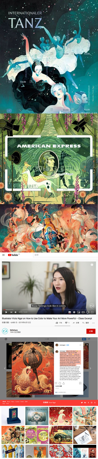
Victo Ngai / Illustrator
The illustrator that i chosen in this week is Victo Ngai, a New York based illustrator from Hong Kong and graduated from Rhode Island School of Design and majored in illustration. Her career life is successful with lots of Awards, for examples, she got the FINALIST, Hugo Award Best Professional Artist in 2018, 2017 and The New York Times 20 Notable Op-Ed Art in 2010, 2012, 2013. Her had lots of experiences to cooperate with international company or publication, for example New York Times,Reader’s Digest, Hong Kong Airlines, Adidas, Apple, American Express and Head & Shoulders……etc.
Victo keeps updating her event planning every month, also the portfolio is shown on her Personal Website in very detail. Clearly is for business considerations. The contents in her personal website also contained the new magazine’s interview and report, Q&A sessions about her creation and concepts.
Besides, she is a full-time illustrator with well - time management and work planning. She loves eating and traveling and GOT ( an TV drama Series ). There are many posts about these daily life topics are appeared twice a week (Especially, her Instagram has a lot of her holiday trips and book sharing posts). Moreover, she would upload all her illustration’s progressing onto her social platforms accounts( like instagram ), for skill sharing and concept explanations. She has lots of social platform accounts and pages to sharing and promote herself. Although, most of them having similar contents, it could touch more people with different aspects or backgrounds. To compare with her personal website, these online platforms are more closer and “approachable” to the audiences and readers. Sometime, she would accept interviews with TV broadcast, Newspaper, Magazines or events, like CCTV interview for China, be the guest in Offset 2019, Dublin and UK Digital Artist magazine interview. She sharing her creation process or skills or tutorial in the interview
Plus, her working hours in each day around 5 hours normally or 7-12 hours (on busy day, heard form her guest talk in Hong Kong Business of Design Week 2017 and in Hong Kong Design Institution).
Victo cooperates with serval agencies for open commissions, such as WEPRESENT, Morgan Gaynin, Pinzle etc….. On the agency websites, we could see the portfolio and her past commission experiences.
The commissions from New York Times, famous international companies or magazines, are all through Agency to accept.
She said cooperated with agency could save time. “You don’t need to negotiate about the salary and illustration styles with your client. Your Agency will take care of it”, from her guest talk in Hong Kong Design Institute, 2017. She also said that all the things she have to take care just about the quality of illustration, and focusing on your own creations.
On the creation freedom aspect, Victo had said that her client gave her lots of space on it. The clients always gave some concept and keywords, then the rest of the details were her own creations. For example, New York Time would gave her the article and let herself design the compositions, colours, characters……everything.
According to the online resources and her personal website informations, Victo would not accept any unpaid jobs. She only have free online tutorial courses on Skillshare.com . Also, she had a online store for selling illustration prints and books.
• Personal Website @https://victo-ngai.com/work
Facebook Fans page @ https://www.facebook.com/VictoNgaiArt/
Instagram @ https://www.instagram.com/victongai/
Twitter @ https://twitter.com/
YOUTUBE @ https://www.youtube.com/watch?v=XyRMzZ2ROHw
• Agency Site :
WEPRESENT @ https://wepresent.wetransfer.com/story/victo-ngai/
Morgan Gaynin @ http://www.morgangaynin.com/artists/ngai/
Pinzle (Korea Agency)
• Interviews & Talks & Lecture ( Magazine / Online Media)
(Korea) Pinzle : Online interview
(China) CCTV interview
(Dublin) Offset 2019 : Talk guest
Skillshare : Online Tutorial & Lectures ( First 2 month free of class) @ https://www.skillshare.com/profile/Victo-Ngai/2197279
WeTransfer ThisWorks Interview →
(Hong Kong) Business of design week 2017 : Guest Talk, Guest sharing talk in Hong Kong Design Institute 2017
CommArt Fresh →
Juxtapoz →
Escape from Illustration Island interview →
Non-slick interview →
Oldbookillustration interview →
UK Digital Artist magazine interview →
The Fox is Black →
BOOOOOOOOOM →
Ape on the Moon →
1 note
·
View note
Photo

Victo Ngai / Illustrator
The illustrator that i chosen in this week is Victo Ngai, a New York based illustrator from Hong Kong and graduated from Rhode Island School of Design and majored in illustration. Her career life is successful with lots of Awards, for examples, she got the FINALIST, Hugo Award Best Professional Artist in 2018, 2017 and The New York Times 20 Notable Op-Ed Art in 2010, 2012, 2013. Her had lots of experiences to cooperate with international company or publication, for example New York Times,Reader's Digest, Hong Kong Airlines, Adidas, Apple, American Express and Head & Shoulders......etc.
Victo keeps updating her event planning every month, also the portfolio is shown on her Personal Website in very detail. Clearly is for business considerations. The contents in her personal website also contained the new magazine’s interview and report, Q&A sessions about her creation and concepts.
Besides, she is a full-time illustrator with well - time management and work planning. She loves eating and traveling and GOT ( an TV drama Series ). There are many posts about these daily life topics are appeared twice a week (Especially, her Instagram has a lot of her holiday trips and book sharing posts). Moreover, she would upload all her illustration’s progressing onto her social platforms accounts( like instagram ), for skill sharing and concept explanations. She has lots of social platform accounts and pages to sharing and promote herself. Although, most of them having similar contents, it could touch more people with different aspects or backgrounds. To compare with her personal website, these online platforms are more closer and “approachable” to the audiences and readers. Sometime, she would accept interviews with TV broadcast, Newspaper, Magazines or events, like CCTV interview for China, be the guest in Offset 2019, Dublin and UK Digital Artist magazine interview. She sharing her creation process or skills or tutorial in the interview
Plus, her working hours in each day around 5 hours normally or 7-12 hours (on busy day, heard form her guest talk in Hong Kong Business of Design Week 2017 and in Hong Kong Design Institution).
Victo cooperates with serval agencies for open commissions, such as WEPRESENT, Morgan Gaynin, Pinzle etc….. On the agency websites, we could see the portfolio and her past commission experiences.
The commissions from New York Times, famous international companies or magazines, are all through Agency to accept.
She said cooperated with agency could save time. "You don't need to negotiate about the salary and illustration styles with your client. Your Agency will take care of it", from her guest talk in Hong Kong Design Institute, 2017. She also said that all the things she have to take care just about the quality of illustration, and focusing on your own creations.
On the creation freedom aspect, Victo had said that her client gave her lots of space on it. The clients always gave some concept and keywords, then the rest of the details were her own creations. For example, New York Time would gave her the article and let herself design the compositions, colours, characters......everything.
According to the online resources and her personal website informations, Victo would not accept any unpaid jobs. She only have free online tutorial courses on Skillshare.com . Also, she had a online store for selling illustration prints and books.
• Personal Website @https://victo-ngai.com/work
Facebook Fans page @ https://www.facebook.com/VictoNgaiArt/
Instagram @ https://www.instagram.com/victongai/
Twitter @ https://twitter.com/
YOUTUBE @ https://www.youtube.com/watch?v=XyRMzZ2ROHw
• Agency Site :
WEPRESENT @ https://wepresent.wetransfer.com/story/victo-ngai/
Morgan Gaynin @ http://www.morgangaynin.com/artists/ngai/
Pinzle (Korea Agency)
• Interviews & Talks & Lecture ( Magazine / Online Media)
(Korea) Pinzle : Online interview
(China) CCTV interview
(Dublin) Offset 2019 : Talk guest
Skillshare : Online Tutorial & Lectures ( First 2 month free of class) @ https://www.skillshare.com/profile/Victo-Ngai/2197279
WeTransfer ThisWorks Interview →
(Hong Kong) Business of design week 2017 : Guest Talk, Guest sharing talk in Hong Kong Design Institute 2017
CommArt Fresh →
Juxtapoz →
Escape from Illustration Island interview →
Non-slick interview →
Oldbookillustration interview →
UK Digital Artist magazine interview →
The Fox is Black →
BOOOOOOOOOM →
Ape on the Moon →
#HA5106_WaiyanTang #week3 #group1submission #digitalethnography
1 note
·
View note
Text
Sword Art Online 21 Unital Ring 1 Review
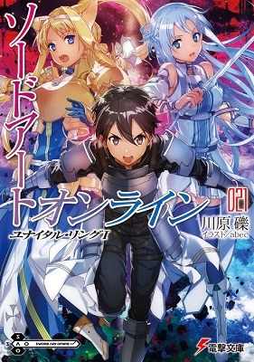
Writer: Reki Kawahara
Illustrator: abec
Label: Dengeki Bunko
Release Date: 7th December 2018
Story:
The plot of Unital Ring starts off with Kirito hanging around with Asuna and Alice in ALO when suddenly something goes wrong and they end up in a completely different location. They’re back to level 1, are unable to fly and all of their equipment and magic skills are gone (but not sword skills so Asuna gets to keep Mother’s Rosario. Yay!). They soon realize that they have somehow ended up in an open-world survival game called “Unital Ring”.
To get potential drawbacks out of the way, this arc is much slower than the majority of SAO arcs. I liked that it was but if you were a fan of the earlier arcs because of the fast-paced story packed with action, you might not like this.
Personally, I liked this volume a lot. It was fun, interesting and exciting and I honestly think people who don’t usually like SAO would enjoy this volume. Like said in the premise, Kirito gets nerfed almost straight away and the female characters gets lots of chances to shine (even Yui!) but I’ll come back to that later. This volume brings back the survival aspect from the Aincrad arc but significantly lowers the stakes. That’s not to say that there isn’t any stakes or tension but it’s likely not life-threatening to most of the main cast. Personally, I think that’s a good thing. This could be SAO’s last arc and I think it should be remembered as something fun instead of something stressfull. It feels like a gift to the fans and a celebration of the series and that’s what a last arc should be.
I complained a bit in my Mother’s Rosario review about how boring and needless the recaps of previous volumes were but I think they worked well here. They’re paced well, don’t overexplain things and are done on a need-to-know basis. The game mechanics were also explained well. I remember reading Infinite Dendrogram 1 last year and how annoyed I got at the tutorial-like parts constantly interrupting the flow of the story and forcing you to sit through numerous scenes that were just an NPC or another user explaining things to the protagonist and it was so bothersome to read. Unital Ring, on the other hand, reveals game mechanics by having the characters test out theories and having conversations with eachother as they figure out how the game works. It was fun to read and easy to understand and helped me to see a bit of the charm of Survival Games, even if I don’t personally play any myself.
Character
Like I said above, Kirito gets nerfed at the beginning and is honestly pretty useless this volume, save for a couple of moments, but he’s still the narrator (for the most part, anyway) and I actually found his narration to be quite amusing. He’s always been a cheeky little shit but he’s even more so here and it makes for an entertaining read. Alice and Asuna really get to shine during their side of the story and they interact a lot (I ship them so much). Lyfa shows up around the half-way point to show off her survival skills, even if she can no longer use magic or fly. Meanwhile Silica, Liz and Yui get a storyline mostly independent from Kirito and have a lot of fun interactions. In particular, Silica really steps up and is probably the most delightful surprise of the volume as she really becomes her own character. Sinon is breifly mentioned but doesn’t show up nor do Kleine or Agil. The epilouge introduces a new character who appears to be connected to Accel World (? Or so I’ve heard; I haven’t read AW) and reintroduces a character who hasn’t been seen in the main series since Aincrad.
Will I be reading the next volume?
I will be waiting for it with much anticipation. Hopefully, it’ll be out this year but in the meantime I have Progressive 1 waiting for me to read and I plan to give Girls’ Ops and Clover’s Regret a go soon-ish. I may read Zettai Naru Isolator or Accel World at some stage too.
Personally, I liked this volume more than most of the other SAO volumes, aside from maybe Mother’s Rosario and some Alicization volumes. I’m really excited to see where this arc goes!
#Sword Art Online#Unital Ring#Review#light novel#light novel review#volume review#May 2019#Reki Kawahara#Dengeki Bunko#abec#Favorite volumes
7 notes
·
View notes
Text
the great, big popnikki contributors post
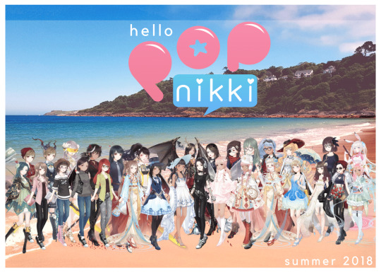
Greetings from Miraland! Love, the POPNikki Team
That’s all of us. All 30+*. This is the team that’s worked (for a lot of us daily) since May to brainstorm, draft, and bring life to this crazy vision-turned-project.
Now that we’re literally 30 days from Zine launch (and two weeks away from launching Site + our YouTube channel), I want to introduce you to everyone because POPNikki is not just the simple FanZine Project I started out asking fans to join. It’s since become a collective of like-minded creators, and don’t you think you’d like to meet all of us?
*NOTE: Our FanArt Team Co-Lead Kira is technically missing from this group shot, but she’s with us in spirit and despite a busy schedule WILL make an appearance in our Summer Zine after all! ^^ Also not pictured is Site Team’s periidote and IRL Team’s Luna-- also with us in spirit!
Team Leads
POPNikki is divided into three divisions and each has its own subdivs requiring, well, WORK. The following group of Contributors help me keep each sector running smoothly (including a Contributor named Lilly who you’ll meet in the next section!).
The Librarian:
Editor-in-Chief of POPNikki Zine and the founder of this operation, I have a toe in every division if I really think about it. But my personal skillset lies in brainstorming, cheerleading, and editing, which is why I head up the FanFic Zine Team and Co-Lead FanVid with Sea. ^^ Follow my blog for LN Resources. I archive them neatly so we can find them all again later ^^
Clow:
Site Team Co-Lead, Developer, and Zine Editor (read: my partner-in-crime), Clow is a great collaborator who can take a vision, no matter how messy and turn it somehow into exactly what you need + want. Clow’s creative but modern style (and way of thinking) is reflected in the Site she’s helped design (can’t wait for y’all to join and see! ^^). You’ll want to follow Clow’s blog for all sorts of LN related posts, my faves being the lovely Starry Corridor photos found from all over.
Yoko:
Unfortunately Yoko is taking a break from Tumblr, but when Site opens, we’ll update with a way to reach her! Yoko is the other Site Team Co-Lead and Developer whose incredible patience and research skills have helped bring Site to fruition.
Ms. Loki: Ah, Loki... What can I say that you don’t already know? When I can’t find my head or my glasses (which often leads to me consistently uploading the wrong things), Ms. Loki is right there going above and beyond the call of IRL Team Co-Lead. Not only does she manage a group of Contributors (and I swear, most days, me!), but she also finds time to Contribute, herself! Look forward to her art and articles as she’s become a key part of our FanArt and IRL Teams. (And if you’re not already following for ALL OF THE LN THINGS... ^^ Ms. Loki is usually the OP!)
Val:
FanArt Team Co-Lead Val has really had to step up this season due to an unexpected scheduling conflict. "Single-handedly” juggling a whole team of artists using a collaborative leadership style, Val has shown not only her skill as an artist but as a leader this term. Follow her art blog for a peek at her versatile art style or her personal blog to reciprocate the support she’s shown to POPNikki this Summer~
Sea:
My FanVid Co-Lead and one of our three video editors, Sea is just amazing to work with. Perhaps it’s her eye for beauty (or the fact that she can find the beauty in everything), but every conversation ends in laughter and every problem finds a solution. She’s always ready to cheer our team on, so please do the same for her (and we’ll be sure to link you to her personal YouTube channel after Zine Launch!).
Dayan:
IRL Team Co-Lead and Artist, Dayan’s ideas and participation have both played integral parts in the fruition of this project. Dayan almost bursts with creativity and an energy that really keeps you going. Did you know that in addition to her LN Blog, she also has another blog for her art? I’m such a fan of all our Contributors, but there’s something so lovely about Dayan’s style that I can’t help but share every post. I feel so lucky to have her on board, and y’all are lucky too because you won’t have to wait for Zine before seeing some of her work. She’s also been working on a very fun Site Feature that will meet you guys once we launch! ^^
*Kira: FanArt Team Co-Lead (and supposed to be on break for this issue, Kira did a few of the background illustrations for Zine articles I know you are going to LOVE! If you don’t follow her LN blog, you’re missing out on a wealth of .png and background resources.
Site + Social Media Contributors
Lilly:
Despite a busy schedule offline this season, our Social Media Manager Lilly still managed to pull off a very special project, complete IRL and FanFic write ups, edit, and head the Social Media subdiv by some miracle over the past few months (thank you so much). Lilly’s eye for detail has been extremely valuable and so when you go to follow her LN blog, be sure to note how you’ll only be getting the good stuff over there ;) You may also get to chat with Lilly at some point if you follow us in her domain-- the POPNikki Tumblr (and soon, our other social media).
Red:
Our IRL, Site, and Social Media Contributor, Red, has been such a gift to this project. In Fall, we can’t wait to show you the fun project he’s been working on, but in the meantime, look forward to his Game Guides. Are you counting down the minutes with us? Red can be found here and here on his LN specific blogs!
Royce:
Royce recently joined POPNikki but has hit the ground running. Now our go-to for Site graphics, we can’t wait to hear how you like the awesome visuals Royce has whipped up! You may already know to follow his LN blog for only the best Royce RP aesthetics on the block. Blue roses to anyone who does XD (or check out his OCs RP blog)
Clark:
Part of our Social Media subdiv and working on a super fun, super secret FanFic project for a future Zine edition (why yes we are thinking about Fall...), Clark’s been a supporter of this project from the get-go. Follow him for fun from a slew of different fandoms (Monster High meets LN, anyone? I’m just sayin’).
periidote:
periidote is a Site Team Contributor who will be helping with Site FanPOP Features starting end of Summer/ early Fall! Follow periidote’s LN blog here and get ready for great content from her~
YouTube Contributors
Legs:
My go-to video editor in a pinch (whether it’s for advice or for help or to make sense of this vision I had in a dream...), Legs always returns a product above and beyond expectations. July 18th, y’all. Be ready! And in the meantime, follow Legs, for game-related jargon (including but not limited to Love Nikki)
Haley:
FanVid Team Contributor and YouTube Channel manager. Haley is always full of great ideas, but when YouTube opens, feel free to drop us comments with even more!
Brittany:
FanVid Team + FanFic Team Contributor Brittany is also one who’s always brainstorming. We can’t wait for you to see her tutorials and meet her ideas in Zine when it drops this August!
LittleAvalonia:
I’m very excited for what the future holds with an actress like LittleAvalonia on our team. Funny (and having fun), LittleAvalonia brings a new element to LN FanPOP that we can’t wait to share with you.
Witchy:
IRL + FanVid Team Contributor, Witchy, is a gem in the POPNikki Contributor pool. Look forward to Halloween (feels so far, I know!) when we debut their sketch(es ^^) and articles. In the meantime, follow Witchy to check out their art and more.
Joltik:
Our newest video editor thanks to her enthusiasm and helpfulness after our latest Open Call, Joltik is already hitting the ground running in her new role! Full of ideas and ready to work, I feel so grateful she’s joined our team! ^^ Don’t forget to give her a follow for LN related tips, tricks, and info.
twinklebear:
Joining us with awesome content come Fall, twinklebear helps out where needed, particularly in Site Team and of course, here in the FanVid group. ^^
Zine Contributors:
Donsveertje:
Donsveertje (known as Beetle to me) is a phenomenal artist who answered a POPNikki Open Call. Happy to help with any project when time allows (and actually working a few zines at the moment!), Beetle has great energy, ideas, and can really bring your vision to the page. The laughs are a blessed bonus. ^^
Fishbone:
The more I work with Fishbone, the more I fall in love with her work. An artist who’s willing to try different things (no matter how crazy they sound) until they work, Fishbone is such a dedicated and positive team member. With like a million Tumblr accounts XD (follow them all here and here and here as well!).
ArtisticArmoury:
Another Open Call gem, ArtisticArmoury has been so great to work with. Every part of the process is not only well done but also fun as we’ve been having a blast adding even more expression and visual color to the FanFic Feature he’s now a part of. Check out ArtisticArmoury’s art or personal blogs to get a sense of his work.
Inky: Also finding the time between a tight schedule, Inky has jumped into this project as an artist from an Open Call. You may recognize Inky as the artist of that awesome piece re: the doctor. But Inky has another, strictly LN blog that I hope you’re following because it is full of fun LN stuff (like important update infos but also MEMES y’all).
Zemiki:
Zemiki is a Feature Artist in the POPNikki Zine Summer Issue. Already known for her great work, Zemiki’s providing several original pieces for fans to enjoy to accompany our second FanFic Feature! Get a feel for her style by following her art or personal blogs.
Astie:
IRL Team Contributor Astie has an unstoppable energy that brings life and joy to the POPNikki Team. Look forward to the article Astie has prepared for y’all in Zine this Summer (while we work on finding the link to the Tumblr-- we’ll update you on Site after the launch! ^^).
Roulette:
Roulette is such a hardworker for Zine I cannot. Contributing content to both IRL and FanFic Teams, Roulette writes articles and provides Spanish translations for our guides. Give her a follow! (EDITED TO UPDATE: her blog link! Here’s the best account to reach her at~)
Sophie: My writing buddy, I could honestly send all of the virtual hugs to Sophie. Working together on her FanFic Feature story has shown me both her dedication to the game and being a writer-- two of my favorite things in the whole wide world! XD We also share a love of tea (which is besides the point, but still). While you await Zine launch to get a taste of her words, check out her Tumblr and say hi to my hardworking team member (whose mind and articles are split between FanFic and IRL)~
Yasjupe: Another FanFic Team Contributor (and Feature writer), Yas is a writer whose gorgeous ideas flow into gorgeous thoughts and words on paper. I think you’ll truly enjoy the story she’s been working on. Check out her Tumblr while waiting for Zine to drop!
Megaera: After reading a fic by Meg re: Prehistory Lord, I knew she HAD to be a part of POPNikki’s FanFic Team this first issue. Megaera’s Summer Feature does not disappoint, and I count my blessings that I get to work with so many talented writers-- and read their work early, of course ;) Be sure to follow Megaera’s LN blog in the event she posts more fiction! She also has a personal blog you’re welcome to follow.
Rev:
For this summer’s issue, IRL Team Rev teamed up with FanVid Team to create a sweet tutorial for you all. Honestly, you’ll be amazed, I think when Zine drops! In future, we might also see articles by this Contributor as Rev is known for helpful guides and great Starry Corridor pics! You can also check out Rev’s personal blog.
Iri:
Many of you might recognize Iri for her helpful event guides and suit breakdowns on YouTube. We know her as apart of the team (and seriously, what a joy ^^)! Despite a hectic schedule, Iri has Contributed an article and exclusive interview for you guys this summer. Can you imagine what Fall will bring? If you’re already hype, subscribe to her YouTube channel to hold ya over to Aug. 1st ^^
Contributors Debuting this Fall
Jace-Darkheart:
Officially part of FanFic Team as a comic writer and artist, we hope you’ll get to see Darkheart’s work come Fall!
Ile:
Though scheduling conflicts mean you won’t be seeing our Artist, Ile’s work this Summer, we hope you can find some in Zine this Fall!
Luna:
Though scheduling conflicts mean you won’t be seeing IRL Team Contributor Luna’s work in Zine this Summer, we hope you’ll be able to see her fun article on Site or in Zine by Fall!
Our Team is huge so following everyone might seem like A LOT. But don’t forget that you can follow @popnikkiofficial on Tumblr now to ask questions about the project and officially become part of the POPNikki Community here on Tumblr. In all honesty, y’all already are part of that Community, and I mean, so are we! So if you can’t follow all, here’s the best one! We’ll see your lovely comments and someone will be checking the POPNikki Ask box later this week to answer questions. (And, I mean, I’m always down to fangirl about this project lol!)
To all of the Contributors on this list (and to come), thank you all so much for making this thing happen. ^^
#love nikki#love nikki dress up queen#popnikki#the librarian is grateful#thanks y'all#secret project
78 notes
·
View notes
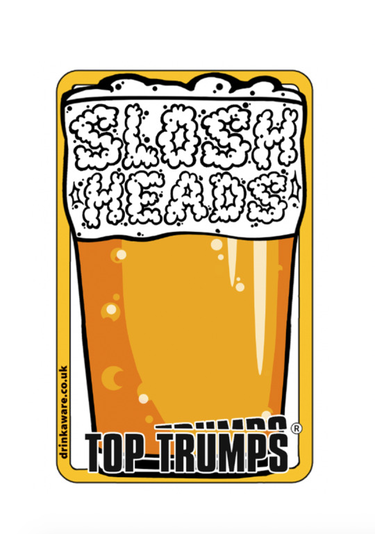
Text
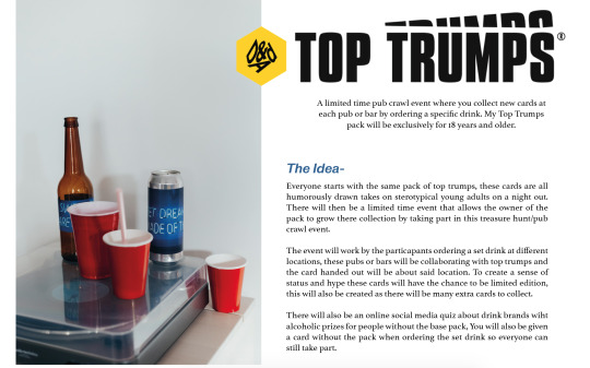
Top Trumps
-Further Research/Development
For the tutorial I created a slideshow summarising the idea and style of cards I want to create. I didn't show any research aside from how I want to market it just to keep the idea clear and where I want to take it. The feedback I got was helpful and a few things were brought up that I hadn't thought of.
The next stage is to come up with the cards and how I can create these stereotypes in a comedic way without being nasty and rude. I also will research further into art style, marketing and packaging and being to put together concepts and designs to move forward.
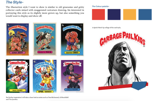
Artists/Inspiration
Tom Richmond
https://www.tomrichmond.com/art/caricatures/
The first artist I looked at was Tom Richmond, ‘an American freelance humorous illustrator, cartoonist and caricaturist whose work has appeared in many national and international publications since 1990.’ I will use his work as inspiration when drawing my own cards. I will be using this artist as inspiration when trying to draw my exaggerated characters for the cards.
Al Hirschfeld
https://www.britannica.com/topic/The-New-York-Times
‘an American caricaturist best known for his black and white portraits of celebrities and Broadway stars.’ His style was a lot less exaggerated in facial features and often uses the whole body to convey emotions and statue. This black and white illustration style is something I would love to explore in my own card design as I think its a really clean and cool looking style it also means Id be able to do a few limited edition cards in colour as in the brief we aren't allowed to change the material.
Barry Blitt
https://www.barryblitt.com/
Barry Blitt is an American artist. Barry Blitt is a cartoonist and illustrator, best known for his New Yorker covers and as a regular contributor to the op-ed page of The New York Times. Blitt creates his works in traditional pen and ink, as well as watercolors. Looking at different artists styles will help me to create the limited edition cards as these will have to look different from the regular pack.
More Visual Research,
I then decided to try and come up with a name for the pack for this I just brainstormed and put anything down before refining it and developing these ideas further. My favourite names from these were, Slosh heads, Wasted and Beverage buddies. I then broke these names down to help me decided which one I will use and begin to make the brand for.
I also began to thin about character names however these were just really rough working outs my main goal is to get the name and logo and font all sorted out first before exploring characters for the cards.
I actually thought of Slosh Heads before trying to come up with a name and I was quite drawn to it so maybe I was slightly biased when choosing a name, however I think its quite a humorous name that also would play well with caricature art. The name also uses slang that all 18-25 year olds would recognise. The Definition of sloshed. : drunk, intoxicated. Synonyms & Antonyms Example Sentences Learn More About sloshed. So I will experiment with both slosh and sloshed to see what works.
Logo/Font Research
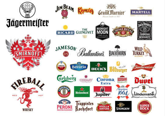
I looked at alcoholic brands to help inspire the direction I want to take the title of my cards. I also looked at more top trumps cards to see how they design their own packs to make sure my pack is still fitting to the brand. I from this I found out that there isn't too much common in brands however it does show more decorative fonts in use to catch the customers eye and be clearly recognisable. To keep everything alcohol related I'm going to take a closer look at these fonts and see how they can be used and manipulated to create my own identity. With this I will also have to make sure the fonts pair well with the top trumps font and that both pair well together.
I looked at a range of fonts using these alcoholic fonts as a starting point of the decorative style, I did also look at more thin fonts and slab fonts to make sure I was exploring a range of possibilities. From this list I then picked my favourites and compared them with the top trumps logo to see if the combinations would work or not, from this I was surprised to see that the fonts that worked were the fonts that I thought would clash actually became the ones that looked the best i think this is due to top trumps being for children so with the brand these in your face fonts actually work.
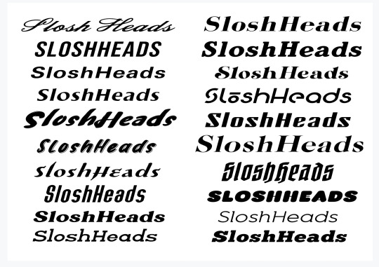
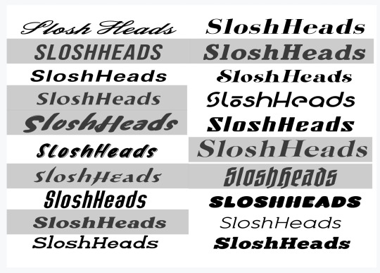
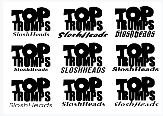
From these I found that the two that worked are the top right and bottom right, these however aren't the fonts I want to use but now I know which style works I can look closer at these to find the one I want.
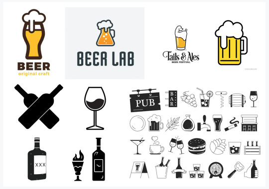
I looked at a few alcoholic illustrations and symbols to explore if using a vector would help the pack especially as top trumps often use different symbols on there packs to replace the O in TOP, this would keep the brand identity but also have originality for my game. These will also help me create the logo as some symbolism would really help show the point of the game and tie the name together well.
Stereotypes on a night out
For this I used personal experience, the experience of friends and online sources, for these I tried to make the situations as friendly and playful as they can be as I wouldn't want to make anything that could potentially be damaging or triggering as alcohol does have a lot of negative connotations.
The few card examples I thought of are,
The person Who gets everyone shots
The one who always throws up/Tactical chunder
Crying Drunk
The dancer
The fighter/ Angry boy
These aren't the names of the card but the beginning of some example situations I could design some cards for. I am aiming to do at least four cards as I want to also have the time to design other elements for the branding campaign. These situations will change as I design and create characters for the cards as I will want to make sure Im using the best ones for the game.
Development after the tutorial 28th
I didn't realise we had to create a complete pack that is going to be a lot harder than I originally thought for this it will now be my priority to design and illustrate and get a start on this aspect of the project while keeping in mind of all the other parts I had researched as I would like to have a few things to show my work at the end of the project. What I will do next is begin to create and design the look of the card. To start I decided to create the back of the cards. So I looked at a few examples to see how top trumps design their own so I can make it current with the brand I then did a few sketches to see what could work for my card design. We also came to the conclusion of not calling them stereotypes as it is quite negative but characters, I will have to brainstorm a bunch of names for these characters and create an art style that can be applied to each of them and be recognisable.
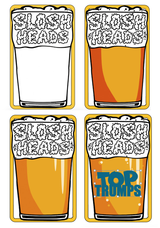
The Card Design
This is where I began to look at the features and dimension of a pack and with this I will begin to accurately design my own mock ups and hopefully test prints. The amount of cards in a pack is 30 however as my idea will hand out cards these packs will hold less to ensure there's space to grow the collection.
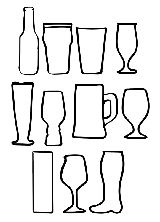
With the symbol idea I decided after the tutorial to use an alcoholic symbol as the boarder on the card for this I used some photos of pint glasses, wine glasses and novelty glasses. These were really rough quick line drawings just to see which glass would work as the boarder or not. I decided that on of the pint glasses was the best.
With this glass I then experimented more and did a few rough ideas of how I could create the rest of the card with this preset boarder. I then knew I had to find a font so I looked back through my research to try and see if I liked any parings. I couldn't find any that I liked or felt worked so I had a rethink and decided to try and use a decorative font to act like beer froth and spill out of the glass to go well with the boarder and enforce the idea of the pact.
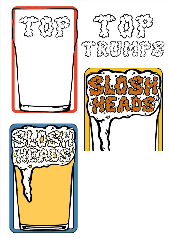
This is what I had started creating I was playing around manipulating the font and roughly making the card and had started to experiment with colour however I didn't like any of these so I started again this time using parts from the initial rough version of the card. This went much better than the original version and I decided to cut the froth over flowing and make it appear inside of the glass as the head of the beer. This looked better and fit the boarder much cleaner than before which showed off the shape of the glass.
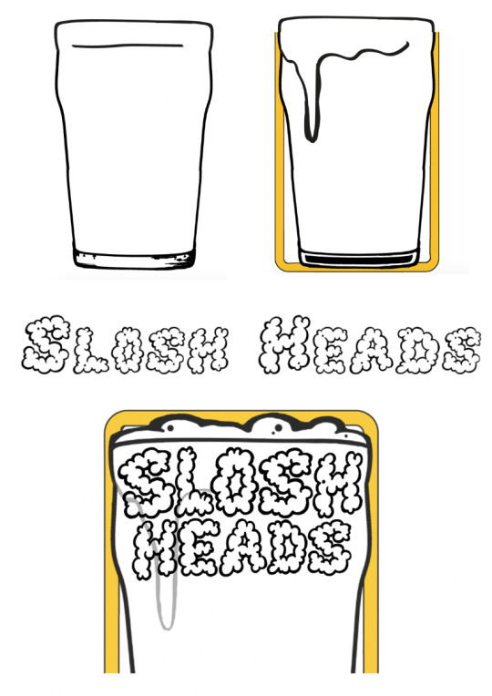
I also decided to put the card name at the top as I felt changing the Top Trumps logo this much so it was foamy would make it harder to recognise the brand. This isn't font it was a font I had downloaded however I changed the stroke and added details and manipulated to fit better in the glass.
Here is the process of the stages I took I did also add the old foam into compare and make sure this was a better version.
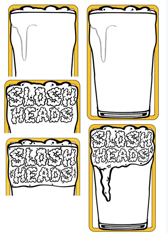
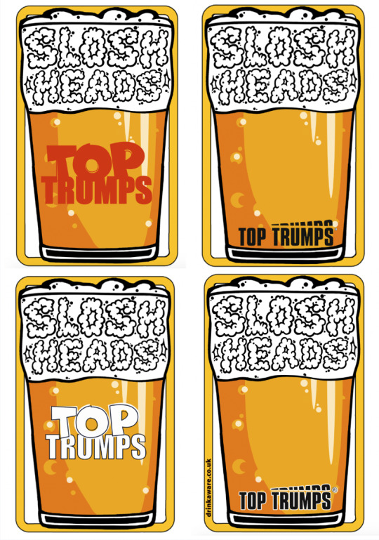
I then was happy with the glass so began to colour the beer and add layers and details to make it recognisable, I used different opacities and shapes to make it feel more genuine I also ditched the original bottom of the glass as It was quite detailed and realistic and I didn't want to then have the cartoon like beer juxtaposing that. Now the card was coming together I was using the Top Trumps logo to try and create a beer brand on the glass, however everything I did ever colour change or detailing I made It didn't feel right or there was too much space or classing font hierarchy so I then decided to focus the font at the bottom of the card but to also use there other smaller more grown up logo which is fitting for the card game.
0 notes
Text
This project i wanted to look at animation and computer generated images on after effects and adobe illustrator. Adobe after effects you can change the size of a video or object, you can change the opacity, you can change the position spin rotate. These are all very basic effects and transformable commands i will used throughout all my video creating this project. I drew shapes and patterns to animate and move around, i think this very basic animation of moving shapes around creates a calm feeling when the colors are clean. I liked how symmetrical it is and as there are lots of straight lines and sharp edges it created cool patterns. Duplication of shapes creates patterns interesting
I looked at op art which is normally intricate paintings that give the impression of movement and depth and space out of the 2D image. i thought this would be a good topic to explore animating. i thought about doing cartoon animation but this seemed time consuming and my drawing skills are poor where as in op art there are lots of straight lines which is easy to draw on illustrator.
I looked at Bridget Riley and here wave piece and was inspired to create a similar moving wave work. i used a sine wave after effects tutorial to create one using the wave warp effect. i liked how it endlessly went on repeating its motion up and down, i then duplicated the wave and stacked them all on-top of each other. i used black and white as they are not distracting from the motion of the wave. i then masked the a circle over it to create a circular wave pattern to move around and manipulate. this was my first gif. i then went on to draw some circles and squares with a color gradients of orange to white, this meant it looked like the orange slowly blends into the background and moving the object that blend in looks good.
i then looked at 3D objects and creating 3D worlds on a 2D screen thought animation. i used the sphere effect on a video of the orange shape sliding across the screen to create a ball changing the outside of its colors. I used a checked black and white(see thought at times) checkered board to move around and spin to create a feeling of moving walls or floor to create a 3D. i also looked at bending the checkered 2d flat image to make it feel 3D.
I then went on to do lots of exploring of the effects on after effects to find cool ways i can mess with shapes i have drawn. i also played more with different gradients moving and mirroring the videos and duplicating it to create pattern of changing colors which i found soothing.
I liked making this video and exploring CGI to create a abstract experimental piece made for enjoyment
0 notes
Link
#illustration#illustrator#vector#opart#op art#opticalart#optical illusion#today i learned#adobe#adobeillustrator#adobe illustrator#tutorial#graphic design#youtube video#design#video tutorials#3d#3d effect#vectorart#3dart#designtips#youtube#how to design
0 notes
Text
Evaluation
As always there has been a range of new skills and techniques I've learnt throughout this project. For example some studio based outcomes from when we didn't have access to the adobe suite so i started creating outcomes hand based like marbling which is using nail polish in water to create different patterns. I really like this technique as it was quick and easy and the outcomes were really good and everyone's unique. Even though I didn't use this in my final design, I hope I can implement it into my future designs. Another skill i learnt was op art which was cool as i've never done anything like this before so was nice to have a change. Also as we watched a tutorial it helps teach you and how you could think about making your own. Lastly, zentangle art which i've done before but was nice to redo and create just some very loud, ‘messy styled’ artwork. Next i've learnt loads of new tools I can use in illustrator and photoshop such as using the shape builder tool which i used through the majority of my project to help make the highlights and shadows. As well as the pattern tool and how to make my own and how this helps me work more efficiently as i would have to keep recreation the star formation so saved a lot of time and was able to do more in a smaller amount of time. This project was also nice to rebuild my knowledge of other skills like the tilde key work.
Before i started creating my designs, I did a lot of research on various websites to help get ideas and concepts of what is possible and get a better idea of what i want to achieve from this project. Firstly, working for someone was a good start as you could look through his instagram profile and get an idea of the standards and what kind of things have been done so you don't create something that was similar. Then I did a lot of research on card designs on playingarts.com and there were lots of great examples on there. My favourite ones were the cards that got rid of the original ideas and completely transformed them and inspired me to make completely redesigned ones while keeping the necessary things such as suits and numbers. The theme of multi verse was also helpful as it narrowed down the concepts but by researching into it a bit more and creating a mindmap i could link to my favourite idea which was space.
If i had more time on this project i would have created different court cards for each suit so you can easily tell them apart, even more so, and also developed the designs further and made them look more realistic. Another thing I would do is obviously complete the whole pack completed with all the 52 cards and 2 jokers. Also if i had more time is to research more so i could link my work to other space related artists. Lastly if i had more time i would make the packaging better as i had hardly any time left for the packet so i had to use the star pattern i had used throughout which works fine however it looks a bit boring. I also may have changed the colours a bit but overall I'm really happy with the outcomes and the style of the cards and was happy to see them on the mock ups and get a glimpse of how they would look in real life.
Working in lockdown was a much harder process as I was working at different times and it was hard to keep a routine and this meant I got more distracted so in many ways it was much longer. Another thing was at the start i didn't have access to adobe suite so i started using another programme which made me have to learn the layout and how to do things so took time getting used to it. But overall I'm happy with the outcomes and how they look and I think it's some of my best work. In some ways it was better as I started off developing ideas on paper so it meant I got my ideas right before starting to actually design them.
0 notes
Last Seen Blogs

youngneilfucker
i want to fuck neil

bisexualbuckk
Untitled
spaceshipsandpurpledrank
Nerd Life Presents: Spaceships and Purple Drank

stansbill
he knew well enough.

totes-mahgoats-blog
tu vois, quelqu'un m'a dit...