
Last Seen Blogs

anana-rama
Sup.
this-is-amazing
Never Alone

bloomsensei
we're all fucking screwed,

thepurplepuddle-blog
Jump right in!
anana-rama
Sup.
Text
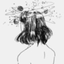
The progress of comic:
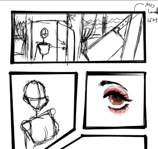
This is the sketch of the comic ideas as I did colouring on the eyes as I showing the ideas of the panals which that I shows the position and the backgrounds to show the ideas on the comic pages. I do make mistakes by trying to get the clothes rights.
I don't have the screenshots for the mistakes but it was really rough and I have to use a Inso from the modelling as that it really helpful.
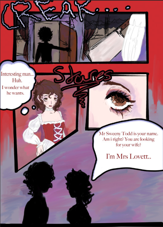
This is the final progress and that I don't have any screenshots before this and that I lost it or didn't save the screenshot at all when I made a ideas for making texts by using doing it with my handwritings.
0 notes
Text
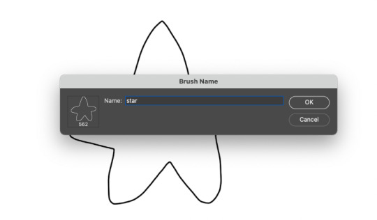
Custom Brush process
I learned how to make my own custom brush as it was bit complex as you have to draw a design like any design for example a hearts, more dots to make like a freckles and etc.
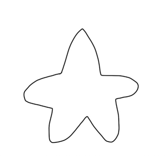
I did this design as it is just a simple star so I decided to make it as my own custom bush to try making a drawing with this by testing it out and I hope I did it very well for this own custom brush by clicking define new custom brush in the 'Edit' sections so that design of this simple star can be transfer to that define new custom brush and accept of it.
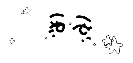
So after that I can do what ever for this custom brush as drawing with my own custom bush so I did some drawing of a simple eyes as I have no other ideas what to draw with my own custom bushes.
0 notes
Text

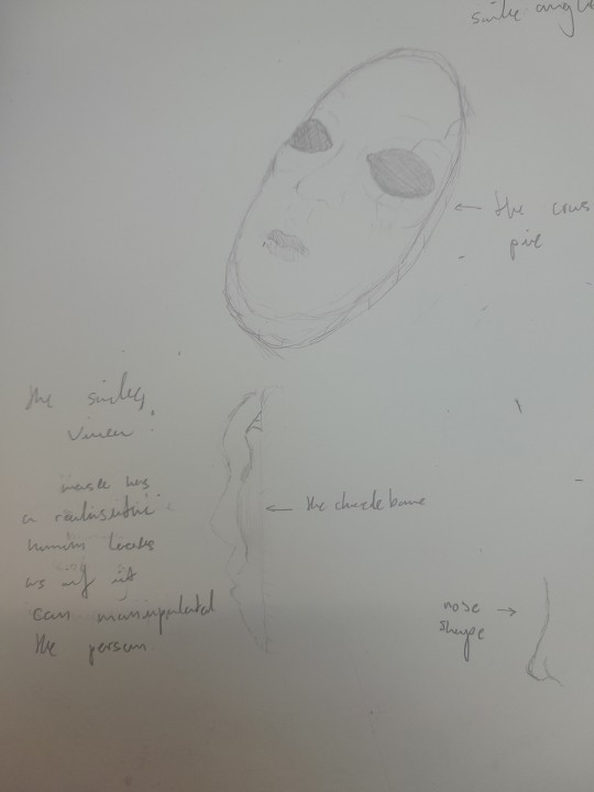
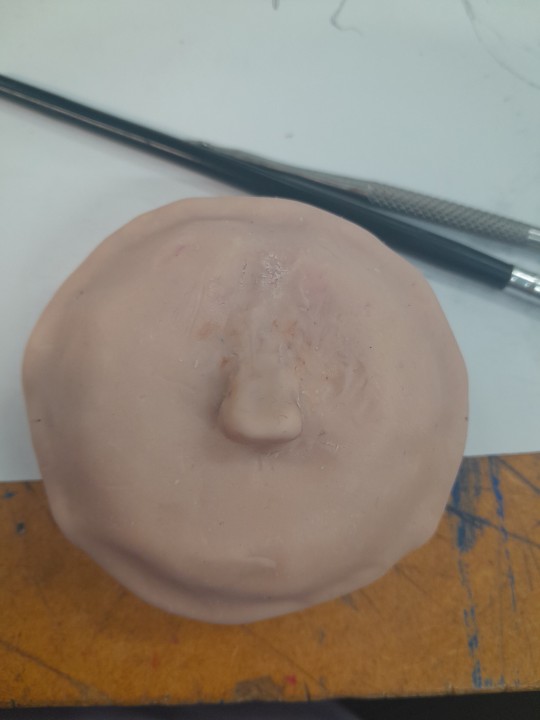
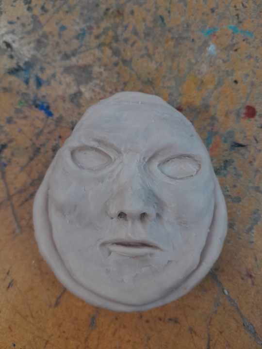
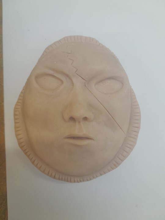
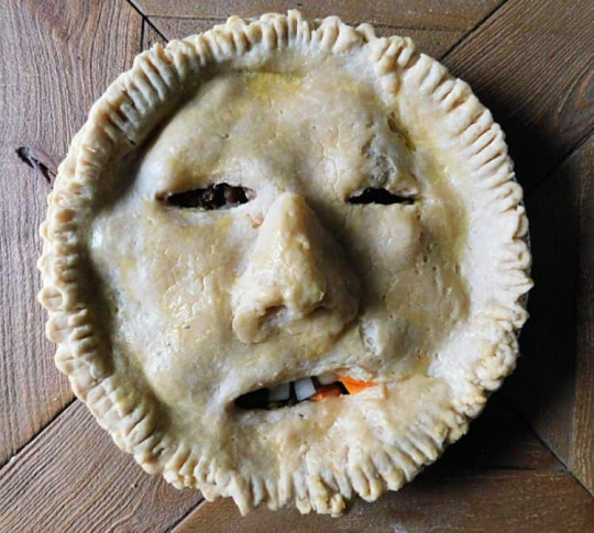
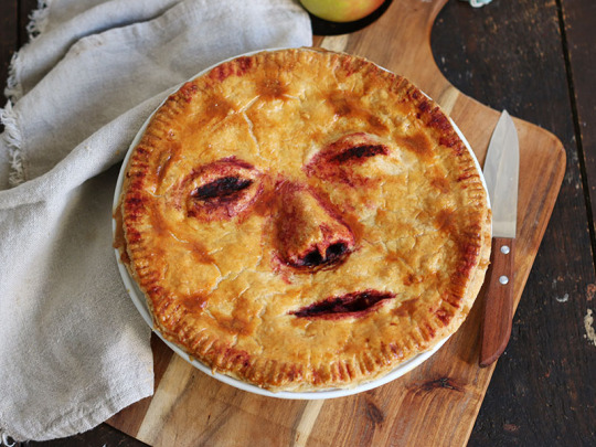
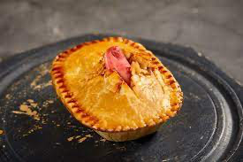
The progress and the result of making a sculpture of a dreadful and horror theme pie as I made a ideas of making a masked pie which that can manipulated a person who is eating to their lovers, close friends or family member. As it is very twisted and horrific way as the masked of the pie can manipulated the faces of the people of who is the people which the person who is eating it.
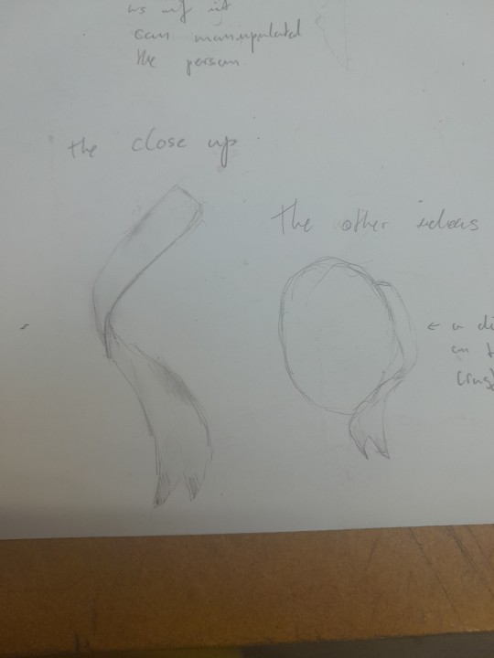
As I have some ideas for my pies but I didn't have a enough time for these ideas so they are my unused ideas which is a dirty ribbon around the mask so that it makes a mixture of horror and dollhouse theme.
There is another unused ideas which is a realistic eyes inside of the mask's eye socket but that is also not going to be enough time to make the realistic eyes the same as the dirty ribbon.
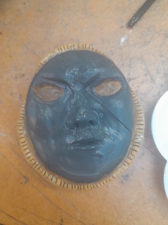
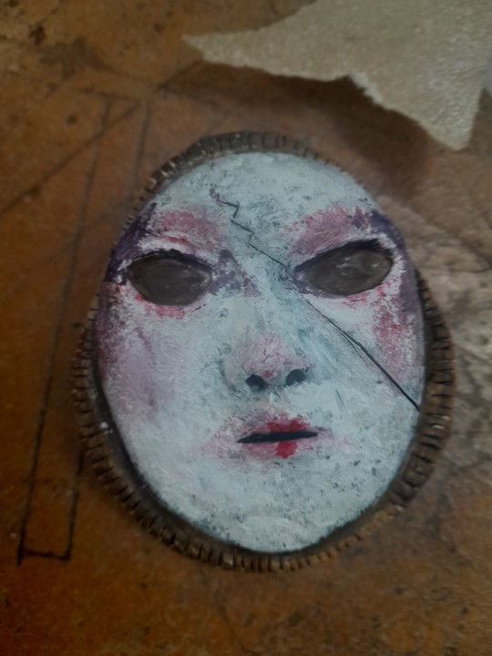
The tries and error I did:
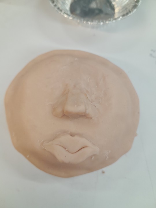
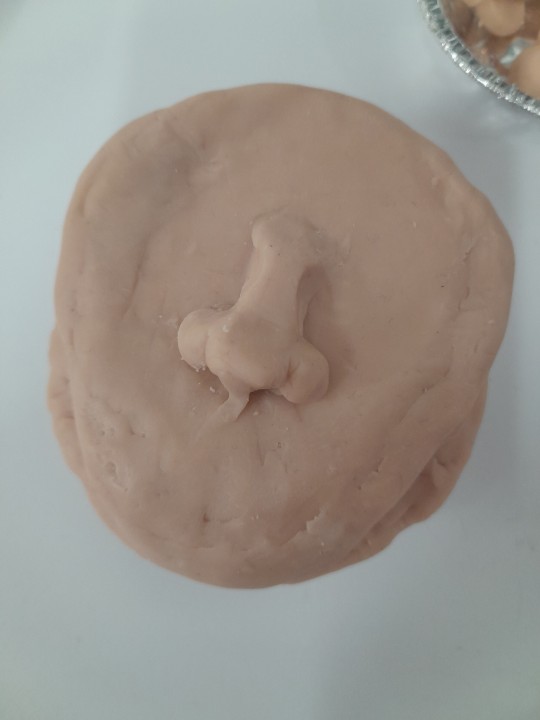
These are my tries and errors I made on the progressing of the pies, the first try I have was a hard starts as I didn't have a enough materials for the beginning so I was a bit in struggling so my second try, I did try more semi realistic which it did not worked the during of making the masked pie which that it too big as I did got some support of how it supposed to be so the third try was a success as I am continuing getting a realistic mask for a refence from Pinterest.
The progress till the finished up.
0 notes
Text
Researching about Penny Dreadful
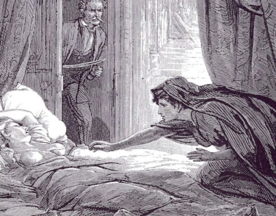
The Accidental Murderess by Missus E. Mooney:
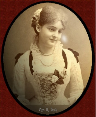
It is a horror short tale by a writer name Missus E. Mooney as the short tale is about a young woman name Miss Hermione Tandy who is a youngest daughter of a fortuitous gentleman known as Mr. Hollingsworth Tandy, who is had endeavored to exert a great deal of
paternal authority by removing her acquaintance.
As it is explaining about Hermione Tandy (Mr. Hollingsworth Tandy's the youngest daughter) left her home, seemingly undetected,
to meet her lover. This evening she was followed by her father, who concealed himself by the docks and waited. She too waited for some time, but her lover did not show himself.
As if her own lover vanished into a thin air while Hermione Tandy wasn't looking at as this short tale have a plot page and 4 page of story about this short tale 'The Accidental Murderess' by Missus E. Mooney.
Stage Door Secrets by Connie-Spears:
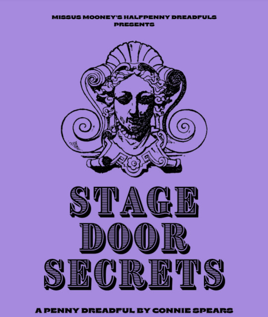
The stage door secret is also a short tale and it made by Connie Spears, but the odd thing is about this short tale, it doesn't have any plot of what is going on, so we have to read and making notes about what is going in this short tale and aswell getting ideas about the plot written when this plot is unwritten.
As we getting the character's name like Aleksey, Director Richard Clarence, Mary Conley and etc. These name are appeared in the first page, so we are getting ideas about the character and aswell the plotting starting in the very first page.
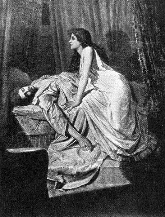
Varney The Vampyre or The Feast of Blood by Thomas Preskett Prest:
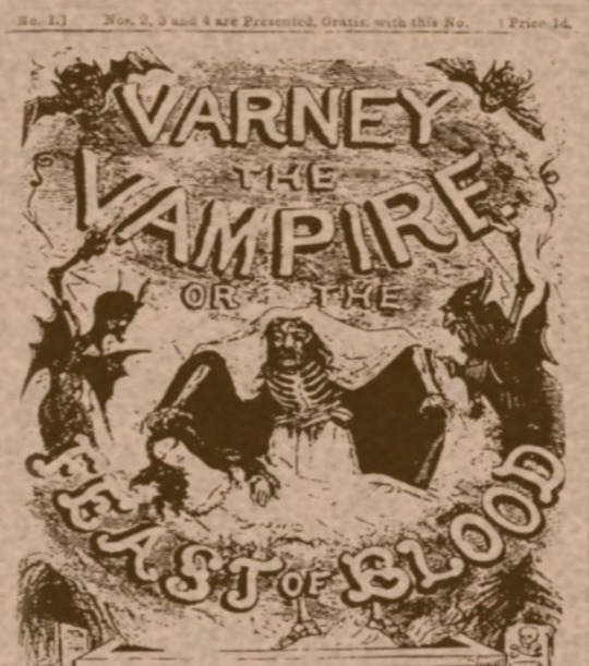
This is not ordinary short tale, it is a full story and it is a book as it have a plot, preface as telling what is this book have and published as it is published in 1713 which is roughly over 300 year ago when this book was founded in London, September 1847.
This horror book have lot of pages and lot of chapters as this book have over 900 pages and have 237 chapters in this book. Which is impressive for a human being to make this book by hands about this book called 'Varney the Vampire or The Feast of Blood' as it is about a vampire which is popular as that it haunts in old London era, that these supernatural beings known as 'Vampires'
0 notes
Text
Other artists with unusual style. Part 2
Kei Zama:


Kei Zama (座間 慧 Zama Kei) is a Japanese comic artist and metalhead. After discovering Last Stand of the Wreckers, they fell hard for Transformers and started hunting down every Western comic they could, with Geoff Senior and Derek Yaniger being faves and influences for their "powerful and aggressive" styles.
Starting as a regular cover artist for IDW Publishing, they became the regular artist on Optimus Prime in late 2016.
As well as Transformers, they've drawn for their fan-fave 2000 AD: starting with those other war robots, ABC Warriors, for a 2017 Free Comic Book Day special. They were unsure about doing it at the same time as starting their ongoing Optimus Prime gig but John Barber, their co-creator, talked them into it.
Kei Zama is a Japanese comic book artist who has worked on several Star Wars projects for Marvel Comics as an illustrator and cover artist, including War of the Bounty Hunters – 4-LOM & Zuckuss 1, Life Day 1, and Doctor Aphra (2020) 21. They enjoy the prequel trilogy films and appreciated the experience of drawing characters from the 1999 prequel trilogy film Star Wars: Episode I The Phantom Menace for the Pride Month variant cover of Darth Vader (2020) 24.
My opinions for this artist, they have made lot of details when they are making transformers comics as which they've drawn for their fan-fave 2000 AD which is starting with those other war robots aka Cybertrons and Decepticons.
╰── ⋅ ⋅ ── ✩ ── ⋅ ⋅──╯
Ben Templesmith:
Ben Templesmith is an Australian comic book artist best known for his work in the American comic book industry, most notably the Image Comics series Fell, with writer Warren Ellis, and IDW's 30 Days of Night with writer Steve Niles, which was adapted into a motion picture of the same name.
Templesmith produced his first commercial American comics work in 2001, providing the art for Todd McFarlane Productions' Hellspawn, which was published by Image Comics. He has gone on to create his own original works as well as contribute to many licensed properties at various publishers, most notably IDW Publishing, with which he had an exclusive agreement through most of 2008 and part of 2009 before returning to being a freelancer.
Original works Templesmith has produced include the miniseries Welcome to Hoxford, the New York Times best-selling Wormwood: Gentleman Corpse Tommyrot: The Art of Ben Templesmith, Conluvio and Choker at Image Comics with writer Ben McCool. He also provided a number of covers for the Oni Press series Wasteland.
In April 2012, DC Entertainment announced that Templesmith would be one of the artists illustrating a new digital Batman series with stories set outside regular DC continuity.
My opinions for this artist, that his art works have like different emotions but he want it to be in the dark theme scene on the comic as it very unusual for it in the comic itself as it is like explaining the emotions with colours but in dark theme style.
╰── ⋅ ⋅ ── ✩ ── ⋅ ⋅──╯
Joëlle Jones:
Joëlle Jones is an American comic book artist and writer, best known for her work on Lady Killer, a series published in 2015–2017 by Dark Horse Comics, for her cover work on various Marvel Comics series, and for her work writing and illustrating DC Comics series including Batman and Catwoman.
Joëlle Jones is an Eisner nominated artist currently living and working in Los Angeles, CA. Since attending PNCA in Portland, OR, she has contributed to a wide range of projects and has most recently has worked on Batman for DC comics. She also wrote and drew the series, Lady Killer, published by Dark Horse comics. Jones has also provided the art for fashion designer Prada, and various projects for Marvel, Boom, Vertigo, Oni Press and The New York Times. Joëlle currently has projects with DC comics as well as continuing her Series Lady Killer.
My opinions for this artist, that her art works has very complexing colours on her work as she works on the details little by little as she had made positive spaces and aswell negative spaces to show what specific parts that our attention should be.
╰── ⋅ ⋅ ── ✩ ── ⋅ ⋅──╯
1 note
·
View note
Text
Other artists with unusual style. Part 1
Malika Favre:
Malika Favre is a French illustrator and graphic artist based in Barcelona. Her style of works could be characterized by pure minimalism within Pop art and Op art, where it sometimes described as 'Pop Art meets Op Art'.
How does Malika Favre create her art?
She does this through experimenting with metaphors, positive and negative space, shadows, layers and many other key tools. Photography is a significant tool in this initial stage, helping Favre to extract colours, patterns and graphic elements.
What software does Malika Favre use?
This is what Malika Favre's answer for this question: ''I've stopped sketching by hand. I now sketch with Illustrator, sometimes in black and white, other times in color, to draft the composition and idea. The most important part of the process is to generate ideas. Everyone has their own way and there aren't any rules.''
What are some interesting facts about Malika Favre?
Favre was born with a severe case of strabismus, or crossed eyes. It was surgically corrected when she was very young, but she still sees perspective differently from the rest of us. “I can't see 3-D, for example, so if you give me 3-D glasses, I see blurry.
My opinions for this artist as her style is showing off, negative spaces mixed with positive spaces as she uses such bright and bold colours as well to show the complex to show the colours compared very well like white mixed with red and different shades of blues which is very well done for Malika.
╰── ⋅ ⋅ ── ✩ ── ⋅ ⋅──╯
Jack Teagle:

Jack is a freelance illustrator based in South West England. He has worked in a large variety of fields, including editorial, character design, storyboarding, poster/ product/ textile design, and worked as a cartoonist for Front magazine from 2010-2014. He wrote tutorials and worked as a columnist for Digital Artist Magazine
Jack paints in his free time, and has exhibited his work worldwide.
He is also a prolific self publisher, with his comics being translated into Polish, and Russian.
Jack Teagle comes from a town where more than 250 people applied for a single job at 'Pound Land'. Jack decided to become an illustrator instead. Jack graduated with an illustration degree from the university of Plymouth in 2009 and now works as an illustrator, comic artist and painter.
Selected Clients include:
Time to Change, VW, Adobe, Netflix, Apple, Universal Music, The Vlog Brothers, Iam8bit, Cartoon Network, Minecraft, Landyachtz, Converse, McSweeney's, Ohh Deer, Nick Jr, Bloomberg Business Week, FHM, Front Magazine, Evisu, The Economist, YCN, Research World Magazine, Anorak Magazine, Nobrow Press, Intercity Design, Havana Club Rum, ASP Industries, Daddy Donkey Mexican Grill, Illustrated Mind, Nexus Productions, Texas Observer, The Portland Mercury, Digital Artist Magazine, Future Publishing
Solo Exhibitions:
That's Life!- The R.A.G.E, Dublin, 2011
Zona De Combate- Dama Aflita Gallery, Porto, 2010
Dungeons and Desktops- Nobrow Shop and Gallery, London, 2010
My opinions for this artist, that his style is very cartoony as his own art works has lot of colours which is mixed with dullness, brightness and pastel-ish colours in his art works. I think he making lot of positive shapes on his art works with cartoony style.
╰── ⋅ ⋅ ── ✩ ── ⋅ ⋅──╯
Dan Hipp
Dan Hipp was born on 11 September 1978 in Fresno, California, USA. Dan is an art director and writer, known for Teen Titans GO! To the Movies (2018), Marvel Snap (2022) and Manga Motion Comics (2009).
Dan Hipp is a cartoon and comic book artist well known for his work with Warner Media, specifically DC Comics.
Prior to working as an artist, Daniel Hipp attended Edison High School in Fresno, California. He went into further studying at the University of California in Irving. Sometime after his schooling was done, Dan got jobs with big name animation studios, including Warner Bros. Animation, Random House, DC Comics, and, most recently, Cartoon Network.
As of right now, Hipp once specialized as an art director in Teen Titans Go!. His own personal art can be seen numerous times throughout the show, as many of the pictures and signs throughout the Titans Tower are Dan's creations. In addition, many Teen Titans Go! comic book cover is the work of Hipp's hands.
My opinions for this artist, that he also creates lot of positive spaces on his art works which I think that he does this to show the more details on the works so that people can see the whole page and not specific parts and he uses lot of bright colours that he used on his arts.
0 notes
Text
Comic artists researches. Part 2
Osamu Tezuka:
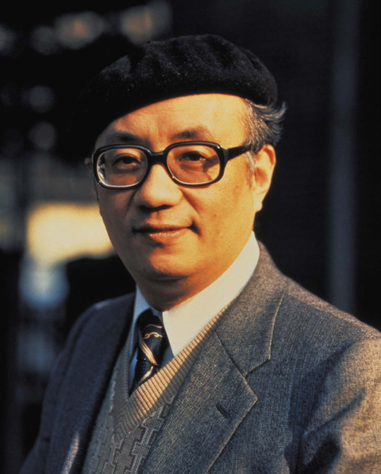
Osamu Tezuka was a Japanese manga artist, cartoonist and animator. Born in Osaka Prefecture, his prolific output, pioneering techniques and innovative redefinitions of genres earned him such titles as "the Father of Manga", "the Godfather of Manga" and "the God of Manga".
What is Osamu Tezuka famous for?
In Japan, however, Tezuka is revered as a “god of manga,” a pioneer in the development of comics and animation, and, as one recent biographer described him, an almost-superhuman figure, “like Walt Disney, Stan Lee, Jack Kirby, Tim Burton, Arthur C.
What is Osamu Tezuka art style?
Osamu Tezuka's art style had a tremendous range. Although usually defined by his trademark Disney-influenced "cartoony" style, Tezuka was quite an accomplished artist with the ability to draw breathtaking realism. Of course, he could also go the other way.
Why is Osamu Tezuka the godfather of anime?
Starting in the 1950s, Tezuka created and wrote more than 700 manga series containing over 170,000 pages and he also penned over 200,000 pages of anime storyboards and scripts. His impact on anime and manga is impossible to overstate. His influence on the industry was nothing less than miraculous.
My opinions for this artist that his style its have a mixture of a anime and cartoon together as he made anime which his style it is Disney-Influenced ''cartoony'' style when he is known for ''godfather of anime'' that he made amazing anime and manga for his cartoony style.
╰── ⋅ ⋅ ── ✩ ── ⋅ ⋅──╯
Steve Ditko:
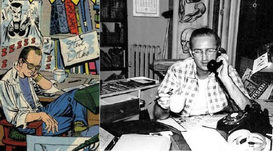
Stephen John Ditko was an American comics artist and writer best known for being co-creator of Marvel superhero Spider-Man and creator of Doctor Strange. He also made notable contributions to the character of Iron Man with the character's red and yellow design being revolutionized by Ditko
Why did Steve Ditko leave Marvel?
In 1966, after being the exclusive artist on The Amazing Spider-Man and the "Doctor Strange" feature in Strange Tales, Ditko left Marvel for a variety of reasons, including creative differences and unpaid royalties.
How many issues of Spider-Man did Steve Ditko make?
Writer-editor Stan Lee and artist and co-plotter Steve Ditko created the character of Spider-Man, and the pair produced 38 issues from March 1963 to July 1966. Ditko left after the 38th issue, while Lee remained as writer until issue 100.
Are Stan Lee and Steve Ditko friends?
Ditko and Lee were never really got along as friends and Ditko felt he was being given enough credit from the start of the book so this decision became the last straw for him and he quit.
My opinion for this artist as his style is also pop culture-like as he uses very bold and bright colours like red, blue, grey, black, etc. As he uses his own style that he made notable contributions to character of Iron Man with that character's red and yellow design which is the idea from Steve Ditko.
╰── ⋅ ⋅ ── ✩ ── ⋅ ⋅──╯
Jack Kirby:
Jack Kirby was an American comic book artist, widely regarded as one of the medium's major innovators and one of its most prolific and influential creators. He grew up in New York City and learned to draw cartoon figures by tracing characters from comic strips and editorial cartoons.
Why did Jack Kirby quit Marvel?
In 1970 Kirby left Marvel over creative differences with Lee and joined rival DC. The following year he launched a trio of comics—New Gods, Mister Miracle, and The Forever People—which he envisioned as finite series of interlocked stories that would eventually be collected in a single volume.
Did Jack Kirby make Thanos?
In creating Thanos, Starlin drew inspiration from Jack Kirby's New Gods series for DC Comics, particularly the character of Darkseid. Thanos is usually portrayed as a villain, although many stories depict him as believing his actions to be justified.
Why did Jack Kirby create the Hulk?
Kirby also commented upon his influences in drawing the character, and recalled the inspiration of witnessing the hysterical strength of a mother lifting a car off her trapped child. Lee has also compared Hulk to the Golem of Jewish mythology.
My opinion for this artist for his art style as it is like realistic style mixed with comic/cartoon style to the comic so that it will be not difficult to make it simple as it will be time consuming to make VERY small details on the comic.
╰── ⋅ ⋅ ── ✩ ── ⋅ ⋅──╯
1 note
·
View note
Text
Comic artists researches. Part 1
Frank Miller:


Frank Miller is an American comic book artist, comic book writer, and screenwriter known for his comic book stories and graphic novels such as his run on Daredevil, for which he created the character Elektra, and subsequent Daredevil: Born Again, The Dark Knight Returns, Batman: Year One, Sin City, and 300.
What is Frank Miller doing now?
On April 28, 2022, it was reported that Miller was launching an American comic book publishing company titled Frank Miller Presents, or FMP. Miller will act as the company's president and editor-in-chief, working alongside Dan DiDio as publisher and chief operating officer Silenn Thomas.
Did Frank Miller draw Daredevil?
He started out with minor tasks, like drawing covers and short stories for Spiderman anthologies. Then, at the beginning of 1979, came the big break: Miller became the official artist for Daredevil, one of Marvel's lesser-known series.
Who influenced Frank Miller?
Among his graphic influences were Neal Adams, Ernie Bushmiller, Guido Crepax, Will Eisner, Jack Kirby and Goseki Kojima. His made his debut in 1978 with contributions to Gold Key's The Twilight Zone. He soon also drew for DC anthologies and Marvel titles like 'Spectacular Spider-Man' and 'John Carter: Warlord of Mars'.
My opinion for this artist of his art style is very interesting for my opinion, that he uses some specific colours for different comic he made for Sin city, Daredevil and 300. As my point of view toward his comic is a mixed with a big art of scene in the comic and four small boxes to show what is going on with that scene which is very interesting to me.
╰── ⋅ ⋅ ── ✩ ── ⋅ ⋅ ──╯
John Romita Jr.:
John Salvatore Romita is an American comics artist best known for his extensive work for Marvel Comics from the 1970s to the 2010s. He is the son of artist John Romita Sr.
When did John Romita Jr draw Spider-Man?
Romita Jr. made a name for himself as a key Marvel artist thanks in large part to his work on Spider-Man. He first drew the character in 1977, as the rising star son of the legendary John Romita Sr., and went on to become one of the definitive pencillers to ever work on the character.
What was the first comic of John Romita Jr?
Romita Jr. began his career at Marvel UK, doing sketches for covers of reprints. His American debut was with a six-page story entitled "Chaos at the Coffee Bean!" in The Amazing Spider-Man Annual (1977)
Is John Romita Jr back at Marvel?
He drew many of Marvel's greatest characters, and then moved to DC for a short period, where he also drew their greatest characters. John Romita Jr. has since returned to Marvel, getting his old job on The Amazing Spider-Man back.
My opinion for this artist of his art style is very pop culture-like as he is uses pop colours for example, red, blue, orange, yellow, etc. As he worked for Marvel as he did his work on Spider-Man as he first dew the character in 1977 as he is going to work back on the Spider-Man for Marvel.
╰── ⋅ ⋅ ── ✩ ── ⋅ ⋅ ──╯
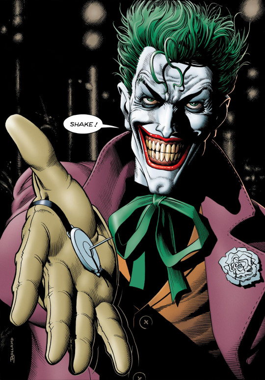
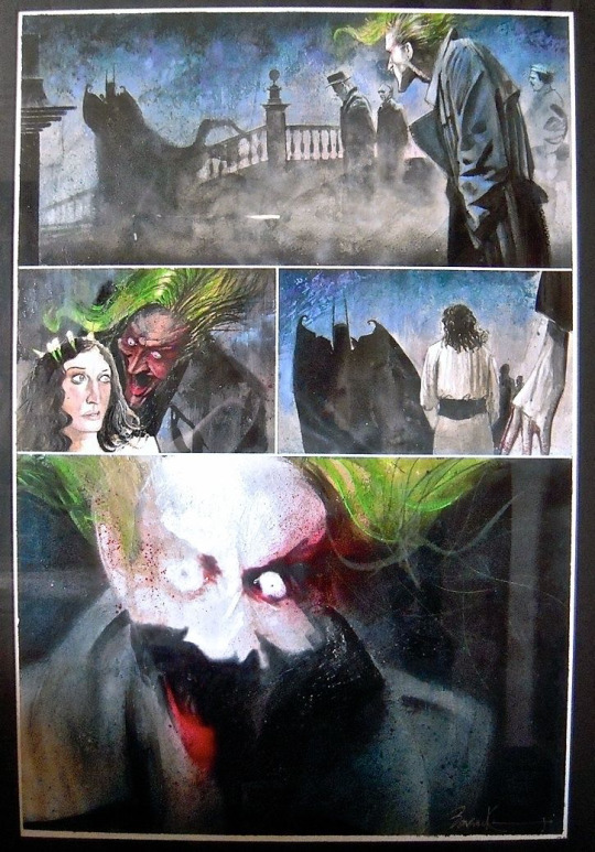
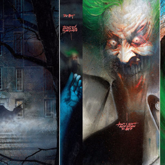
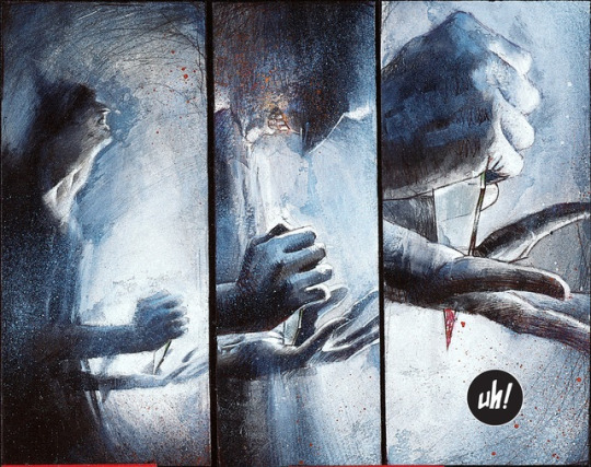
Brian Bolland:
Brian Bolland is a British comics artist. Best known in the United Kingdom as one of the Judge Dredd artists for British comics anthology 2000 AD, he spearheaded the 'British Invasion' of the American comics industry, and in 1982 produced the artwork alongside author Mike W. Barr on Camelot 3000, which was DC Comics' first 12-issue comicbook maxiseries created for the direct market.
What inspired Brian Bolland?
As early as 1962, aged 11, Bolland remembers thinking that "Carmine Infantino's work on the Flash and Gil Kane's on Green Lantern and the Atom had a sophistication about it that I hadn't [previously] seen." He would later cite Kane and Alex Toth as "pinnacle[s] of excellence," alongside Curt Swan, Murphy Anderson
You'll be surprised to hear that even though Judge Dredd had been in 2000AD since Prog 2 the editors weren't sure which of the interior characters would sell the comic best if that character was on the cover. Artists like me just came up with cover ideas and, if they liked them, we'd draw the cover and they would write a one-page text story based on it to go inside. These early covers of mine fall into that category.
Other covers followed for nearly a third of the first 30 progs, as well as stand-alone pages and some inking duties on Gibbons' Dan Dare. Already familiar with Nick Landau (acting editor), when another artist dropped out, Bolland was called directly to complete a Judge Dredd story in Prog 41 (3 Dec 77) and soon was established as a regular artist on the series. "From that point on," writes Bolland, "either he [Landau] or his successor Steve MacManus called me direct whenever they wanted me to do a Dredd story."
Bolland's early work on Judge Dredd was much influenced by McMahon, a talented newcomer whose idiosyncratic style was fuelling the interest in the new character. Bolland thought McMahon was "terrific, the real ideas man on Dredd," but noted that McMahon's approach was "very impressionistic," while the "average comics reader, certainly at the time, does tend to prefer realism." Bolland therefore states that he "aped Mike's genius... and then reinterpreted [Dredd] in a style which actually borrowed a lot from the work of the American artists," retaining McMahon's "granite-jawed" look but bringing a level of realism and fine detail to the character, which Mark Salisbury says "finally cemented the iconic image."
My opinion for this artist of his art style is horrific but in a good way as he is showing us in the comic with joker and batman as showing the Joker a villain in a horrific, disgusting and creepy style as he is showing toward us in world that the style of his is amazing as he did a well done of showing the art style on the comic book to show what horrific is it.
╰── ⋅ ⋅ ── ✩ ── ⋅ ⋅ ──╯
0 notes
Text
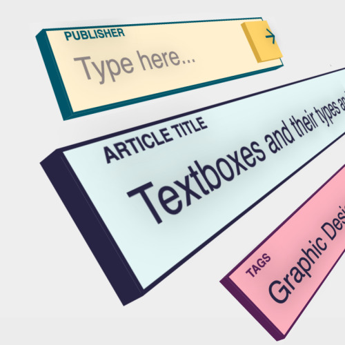
Types of text box researching
What is text box style?
Introduction. Text boxes can be useful for drawing attention to specific text. They can also be helpful when you need to move text around in your document. Word allows you to format text boxes and the text within them using a variety of styles and effects. Optional: Download our practice document.
What are text boxes called?
Alternatively referred to as a text field, a text box is a section or object on a page that allows a user to enter text. Text boxes are often used on the Internet for pages that require input from a user. TEXT FIELD.
What are two ways in which a text box can be used?
Text boxes can be useful for drawing attention to specific text and can also be helpful when you need to move text around in your document.
What is the input box called?
A textbox is a common input control in HTML, but it has various hidden attributes. An HTML text box is an area on the screen wherein the user can enter the text input. It is a common input element found in many software programs, such as web browsers, email clients, and word processors
Types of text box in comic
What are the different types of text boxes in comics?
Captions. There are four types of captions in comics: Location & Time, Internal Monologue, Spoken, and Editorial. Location & Time captions can be in the same font as your dialogue only inside a caption box and italicized. Alternately they can be blocky, sans-serif fonts to indicate locations and time stamps.
What are the boxes in comics called?
Panel. A panel (alternatively known as frame or box) is one drawing on a page, and contains a segment of action.
What are the different types of comic panels?
Horizontal Panel: A horizontal panel is a long and rectangular, often used to show a landscape. Vertical Panel: A vertical panel is a tall and skinny rectangle, often used to show simultaneous events like several character reactions side by side. Inset Panel: An inset panel is when one panel is within a larger panel.
What text type is a comic?
The comic format does not change the text-type, it simply gives it a new format. This means, of course, that comics themselves cannot be classified as text-types. On the one hand, this dependence on standard text-types makes the comics easy to read and to understand. The reader's expectations are fulfilled.
0 notes
Text
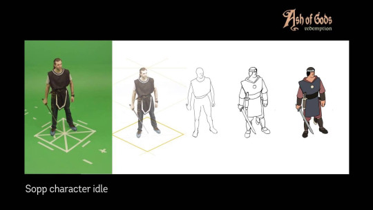
Character Design sheet researches
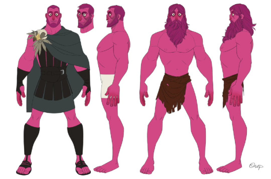
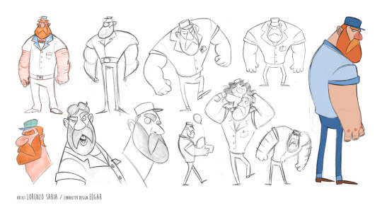
What should a character design sheet include?
At least one full body illustration of your character in a pose. Full color. At least 3 expressions showing the character's bust and head in various poses. A single paragraph describing the character, titled with the character's name.
What is the character model sheet used for?
Character design sheets — also known as model sheets, character studies or simply 'studies' — provide an important reference point for animation and design teams. Using a model sheet, the original designer can provide exact visual specifications of a character to other animators.
What is a character design document?
A character design sheet, model sheet, character board, character rotation or study is a document used as a guide for the appearance, poses, and gestures of an original character in animation, comics, and video games.
What is the purpose of character design?
In film and games, a well-designed character compels their audience to feel invested in the unfolding story. These are often memorable characters who are instantly recognizable by their clothing, how they enter a room, and their subtle quirks and idiosyncrasies.
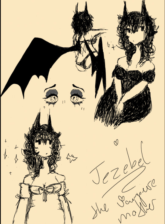
My character design for example as I show what she looked like in black and white films as she was inspired by vampires, 19th century book 'Dracula' and etc for the style as I am trying to getting the ideas of she is living in the 1900s to present as she is wearing different clothes to show what she wears and I put her name and the nickname she have below on her name.
More examples for different character design sheet:
0 notes
Text
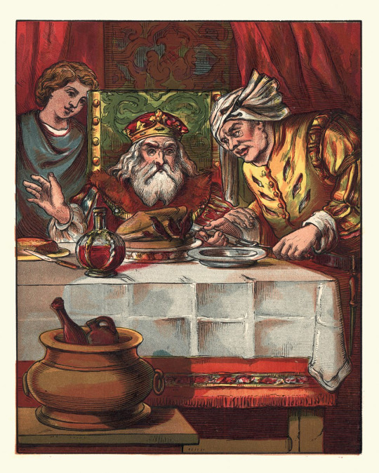
Dreadful Pie research
The History of Pies
Food with a lid. A lid you can eat. And edible sides and bottom too. When you think about it, the pie is a masterpiece of gastronomical engineering.
Perhaps it should come as no surprise then, that 75% of the British population eat a pie at least once a month and the industry is worth £1.2bn a year in the UK alone.
With fillings and pastry cases to suit all dietary needs, it’s a dish that can turn up on anyone’s plate and when you consider the history of the pie, it’s been on a long and fascinating journey to get there.
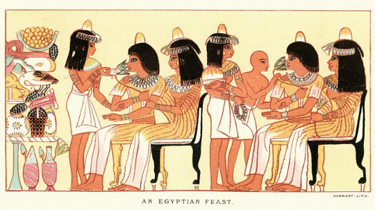
From Egypt to Rome via Greece
The Ancient Egyptians were the first to invent a dish close to what we know as a pie today. They had a honey filling covered in a crusty cake made from oats, wheat, rye or barley. A recipe for chicken pie was also discovered on a tablet carved prior to 2000 BC.
Facts about Pies:
Pie is an ancient dish invented by the Romans
They gave us roads and running water and the Romans are also credited with giving us pie – the first example of a meat filling enclosed in a basic pastry made of flour and oil can be traced back to ancient Rome.
Pie crust was originally used as tupperware
The crusty top/lid of a pie actually served to preserve the food as a sort of container – in fact the shells were tough and basically inedible but they served well as a sort of utensil to eat the filling before being discarded.
The theatre of pie
Medieval chefs were often tasked with outdoing one another for their masters entertainment. Birds are said to have flown out of pies and it’s even rumoured that dwarves came out of pies at feasts.
Fruit pies and the Tudor connection
Called ‘pyes’ in medieval England and filled with meat, fruit pies first appeared in the 1500s, but British tradition says that the first cherry pie was served to Queen Elizabeth I in the late 16th century.
0 notes
Text
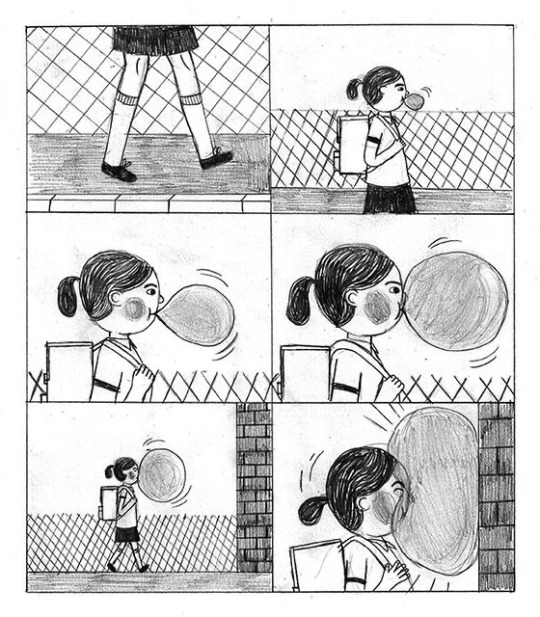
History of animated walking cycle
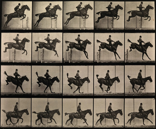
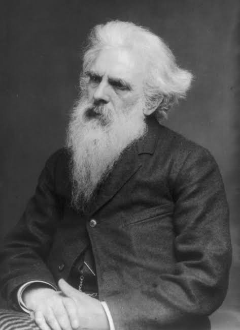
Who is eadweard muybridge?
Eadweard Muybridge was an English photographer known for his pioneering work in photographic studies of motion, and early work in motion-picture projection. He adopted the first name "Eadweard" as the original Anglo-Saxon form of "Edward", and the surname "Muybridge", believing it to be similarly archaic.
Why was Eadweard Muybridge important?
Eadweard Muybridge is remembered today for his pioneering photographic studies of motion, which ultimately led to the development of cinema.
Why did Eadweard Muybridge photograph horses?
This simple request, intended to confirm Stanford's theory that all of the horse's feet were off the ground simultaneously at some point during its stride, launched Muybridge on a lifelong pursuit to record animals in motion.
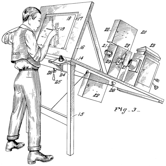
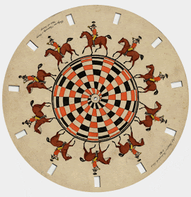
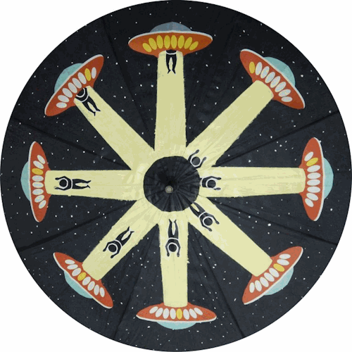
What did Muybridge invent?
| Zoopraxiscope
The zoopraxiscope is an early device for displaying moving images and is considered an important predecessor of the movie projector. It was conceived by photographic pioneer Eadweard Muybridge in 1879. Muybridge used the projector in his public lectures from 1880 to 1895.
| Movie projector
A movie projector is an opto-mechanical device for displaying motion picture film by projecting it onto a screen. Most of the optical and mechanical elements, except for the illumination and sound devices, are present in movie cameras. Modern movie projectors are specially built video projectors
0 notes
Text
Rotoscope animation researches
What is a rotoscope animation?
Rotoscope animation describes the process of creating animated sequences by tracing over live-action footage frame by frame. Though it can be time consuming, rotoscoping allows animators to create lifelike characters who move just like people in the real world.
Why is it called rotoscoping?
This projection equipment is referred to as a rotoscope, developed by Austrian-American animator Max Fleischer. This device was eventually replaced by computers, but the process is still called rotoscoping.
How is rotoscoping different from traditional animation?
According to a basic Wikipedia definition, Rotoscoping is “an animation technique that animators use to trace motion picture footage, frame-by-frame, to produce realistic action.” This basically means that rotoscope animation is just like traditional animation, except it uses pre-recorded footage as a basis for the animation, opposed to the animators creating the movement.
Why do animators use rotoscoping?
Rotoscope animation describes the process of creating animated sequences by tracing over live-action footage frame by frame. Though it can be time consuming, rotoscoping allows animators to create life-like characters who move just like people in the real world.
Is rotoscoping more expensive?
Rotoscoping is a more labor-intensive process than masking, as each frame needs to be traced and animated manually. It can also be more expensive, as it requires specialised equipment and trained personnel to complete the process.
How many frames do you need for rotoscoping?
Most animators rotoscope on 2s or 3s. To animate on 2s mean to animate every other frame of a video, meaning that if you have a video shot at 30fps, you're animating at 15fps. To animate on 3s is to animate on every third frame, so your animation frame rate would be 10fps.
0 notes
Text
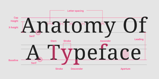
Typography researches
Typography is the art of arranging letters and text in a way that makes the copy legible, clear, and visually appealing to the reader. Typography involves font style, appearance, and structure, which aims to elicit certain emotions and convey specific messages
Typography Basics
There are five basic classifications of typefaces: serif, sans serif, script, monospaced, and display. As a general rule, serif and sans serif typefaces are used for either body copy or headlines (including titles, logos, etc.), while script and display typefaces are only used for headlines.
Therefore, good typography is measured on a utilitarian yardstick. Typography that is aesthetically pleasant, but that doesn't reinforce the meaning of the text, is a failure. Typography that reinforces the meaning of the text, even if aesthetically unpleasant, is a success.
Typography in design involves selecting fonts, adjusting spacing, and arranging text to enhance readability and convey a message effectively. It establishes hierarchy, tone, and visual appeal.
The 5 Most Important Typography Rules
Understand Contrast.
Use Visual Hierarchy.
Understand & Use Grids.
Limit Your Font Combinations.
Never Distort Your Fonts.
0 notes
Text
Dave McKean researches
David McKean is an English artist. His work incorporates drawing, painting, photography, collage, found objects, digital art, and sculpture. McKean has illustrated work by authors such as Neil Gaiman, Grant Morrison, Heston Blumenthal, Ray Bradbury and Stephen King. He has also directed three feature films.
What is Dave McKean famous for?
Sandman series.
Probably best known for his groundbreaking illustrations of 76 covers for Neil Gaiman's Sandman series of graphic novels, the English artist Dave McKean has also applied his explosive talent to book design and illustration, esoteric comic book illustration, CD cover design, advertising photography, writing
Dave McKean has taken his inspiration from the worlds of painting, modelling, photography, typography and computer graphics to create a totally natural and spontaneous style. Each choice he makes in visual terms bulks up the story and contributes to his narrative.
Arkham Asylum: A Serious House on Serious Earth
Writer Grant Morrison is known for his innovative work on comics from the graphic novel Arkham Asylum to acclaimed runs on Animal Man and Doom Patrol, as well as his subversive creator owned titles such as The Invisibles, Seaguy, Joe the Barbarian and WE3.
Written by legendary comics creator Grant Morrison and beautifully illustrated by artist Dave McKean, the timeless, genre-bending tale Batman: Arkham Asylum is brought back to its classic beauty, now with updated artwork lovingly restored by the artist himself!
0 notes
Text
Storyboard researches
A storyboard is a visual representation of how a story will play out, scene by scene. It's made up of a chronological series of images, with accompanying notes. It's similar to a roadmap, guiding the journey of storytelling from the beginning to the end. A storyboard communicates a filmmaker's vision.
What is persistence of vision?
Persistence of vision is the optical illusion that occurs when the visual perception of an object does not cease for some time after the rays of light proceeding from it have ceased to enter the eye
Persistence of vision is an optical illusion where the human eye perceives the continued presence of an image after it has disappeared from view. Also known as retinal persistence, this optical effect was described by English-Swiss physicist Peter Mark Roget in the nineteenth century.
0 notes
Text
Card Design and the ideas of it.
So I did made a card of the front card design and as well the back card design for the project I am making on which is based on 19th century as I have the ideas of vampires and society of it (from the blog talking about the society of the vampires and the doings of the cults.)
When did the idea of vampires start?
The concept of the vampire as an undead creature inflicting harm originated in Eastern Europe, specifically in Bulgaria, a thousand years ago. Make no mistake, this was a legend isolated among the Slavic people. It was not widespread or well-known.
Card Design for back and front:
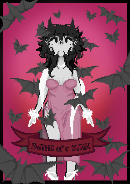
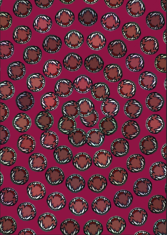
I made these in Photoshop as I am done the style of pixel arts which I did try my best to not make very complex as I did the back of card which is the design of the cult leader's wife's mouth to show the ideas what I did on these cards.
The ideas of the front of card which is mixed with simple but also complex as I wanting to put lot of bats around the cult leader's Wife or Jezebel (which is her name.) that she is like the mother of these bats around her to show that she is like the powerful vampire she live for over more than 200 years as that she is helping her husband who is the cult leader that the humans who hurt their kinds will be punished expect the human's children that the cult did not want to harm them at all so that they let them be.
0 notes