#because i like the concept of fantasy characters wearing modern outfits
Text
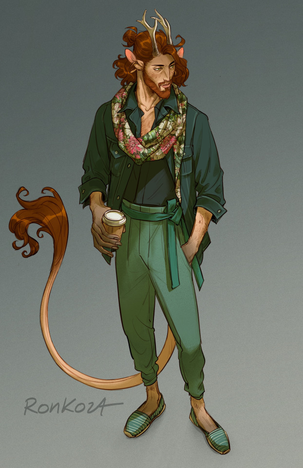

cow in modern clothes ✨️
#original character#stjerne#stjerne mossvik#dnd character#because i like the concept of fantasy characters wearing modern outfits#stjerne would dress a bit different than arne#stjerne is like 'high waisted pants and no socks'
2K notes
·
View notes
Text
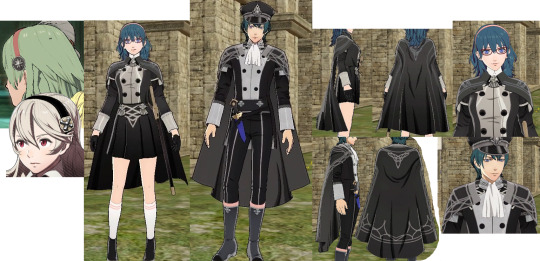
Details and analysis of 3H outfits
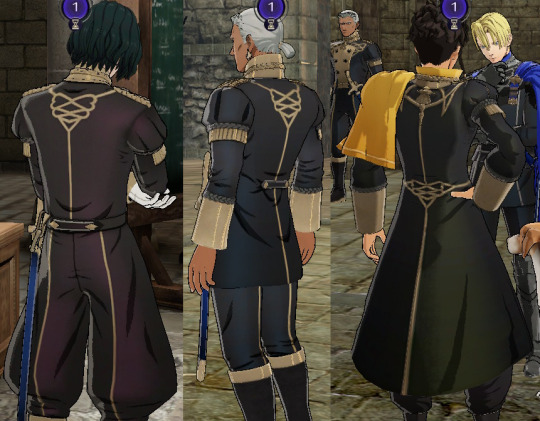
There is a reflection of the house color in the uniforms of students. Although the examples presented in the image are non-recruitable characters, when you recruit students, the color of the reflection in their uniforms will change to the color of your chosen house.
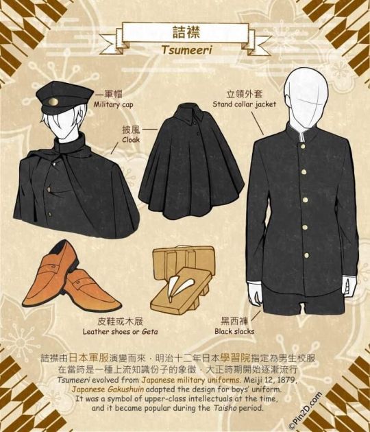
The Byleth academy uniform concept is based on the concept of student uniforms in modern japanese media. Such as the female uniform, which is based on a japanese female student uniform in terms of a hairband, short skirt, andwhite stockings. The male uniform is based on a uniform from the Taisho period.
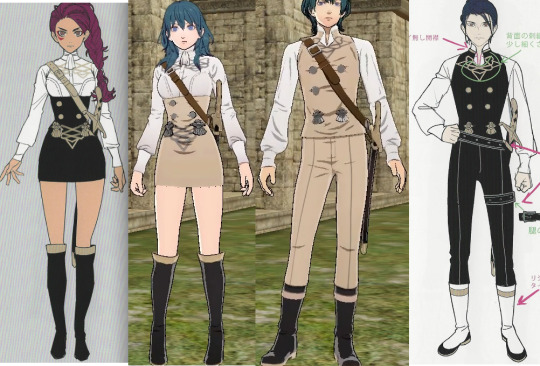
Female summer clothing is based on the Patra's uniform with the color scheme reversed, the reason may be due to Petra's nature that adapts to hot weather. However, male summer clothing is based on Felix's uniform🤔
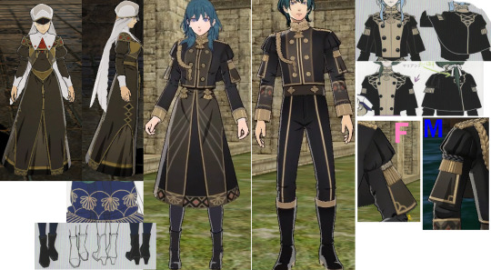
The evening wear consists of an Aiguillette which symbolizes honour, and a stylized design of Pellegrina which has a rhombus (males) and heart (females) shape on its edges, with a standard CoS pattern on the males sleeves and females skirts. The female skirts specifically are the same design as the nun's which both contain the pattern of Sothis' dress. Since the evening wear is intended to celebrate Garreg Mach's establishment, it is only natural that the design combines a formal uniform with CoS clothing.
Duscur
The children wear clothing similar to ancient Egyptian clothing, but the clothing of the man and woman closely resembles those of northern europe. (However, I may be wrong, so feel free to add to this post if you know more about the type of clothing of the Duscur people)
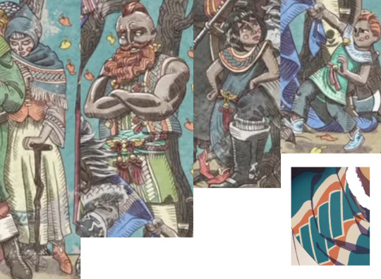
All clothing of the Duscur people of this feature a pixelated pattern, and color schemes of teal, light orange, vanilla, and red cords.
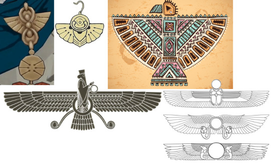
The design of their jewelry appears to be a mixture of wing symbols from cultures such as American Indians, Egyptians, and Persians.
Almyra
This man from the VW end mural wears clothing similar to Nader's, and with a color scheme similar to Claude's and the color purple, which symbolizes royalty in persian culture, he is very likely the king of Almyra.
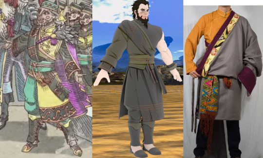
What I found interesting is that although Almyra is inspired by Persian culture, Nader and king's clothing is similar to Tibetan clothing. However, this is not a problem, there is no shame in drawing inspiration from a number of different cultures to make a culture in a fantasy story, as is the case with Duscur.
Dagda
From the clothing of the man on the camel and the helmets of the soldiers, Dagda appears to be inspired by Ottoman culture.
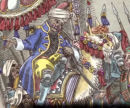
The reason I believe they are from Dagda is because there are many Shamir's design elements at their design.
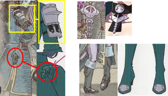
Well, my statement that "there is no shame in drawing inspiration from a number of different cultures to make a culture in a fantasy story," this is an example of the opposite.
This man from the CF end mural wears the emblem of the kingdom, but his clothing style is that of the alliance. Why🤔
To know the difference between the clothing style of Fodlan countries, read this.
525 notes
·
View notes
Text
I'm curious and a little worried about F3 outfits. What are the artists going to do, what kind of style they will choose?
The F2 suits were more of a source of critique for me: First, they abandoned interesting concepts of gray and silver hooded cloaks(the mist concept) and cloaks of the autumn leaves colour(the forest concept) for the sake of a safe rout with classic pink and blue, just repeating F1 outfits.
Second, the F1 outfits, at least a little, followed the 19th century motives.
The F2 outfits are almost modern, they seem to have no a focal point in style and time, but they are not a fantasy thing too. (By the way, the Spirit dress, oddly enough, is more 19th century than Anna's dresses, because of its open shoulders and a mantle silhouette) I don't really like Anna's post F2 books outfit because the skirt is too short and narrow.
F3 outfits will have to express the fact that the sisters have changed and not play the same motif all the time. Although, perhaps, Elsa can not get a new outfit since the Spirit dress is a new Ice dress, her "work" suit and she usually changed her appearance for an important reason. If only it would be something for adventuring in the Northuldra style?
The costumes of Anna and Kristoff should probably undergo the most changes, reflecting their new status, but I just hope it will not be restricted black.
(I can't believe that at first they wanted to give Kristoff a ridiculous outfit with big bows for the epilogue scene).
Basically, I would want F3 return back to the 19th century and folk roots.
Another problem that the Franchise has with costumes is generic identical extra characters costumes. On the concept arts we saw a variety of colourful characteristic costumes, but in the end all the Arendelle wear one blue-green suit, and all the Northuldrans are in beige suede of the same style and of almost identical line for women and men–and on the concept arts their clothes were looser and wilder, more catchy.
You can do better, Frozen.
3 notes
·
View notes
Text
Daniel LaRusso: A Queer Feminine Fairytale Analysis Part Two of Three
Part 1
Part 3
6. Sexual Awakenings part 1: Love, Obsession, & Size Differences
[Insert that post talking about the creators making sure that Daniel’s antagonists were much bigger than him so that the audience would sympathise, spawning 10000 size kink fics]
I’m sure this won’t awaken anything in Daniel
Corporate wants you to find the difference between these two pictures
The hallmark of feminine fairytales tends to be growing into womanhood, with all those symbolic sexual under/overtones, searching for a prince, encountering monsters (or evil stepmothers), on the surface tending to be quite passive/reactive, but actually being about young girls and women getting out of their environment and choosing to tussle with those deep, dark desires – monsters. They’ve got to function within the limitations of power that they have – escaping an abusive situation through marriage, chasing forbidden desires under the guise of duress, asking questions about sexuality through things like symbolic plucking (flowers) or consumption (fruit) or pricking (needles), etc.
Daniel isn’t striking out to find his fortune or win a girl or a kingdom Like A Man, he’s not a threat to Silver, who – like Jareth in Labyrinth – is in control for almost the whole of the narrative, he’s not actually able to do much more than react until he makes the decision to stop training, and even then he’s immediately ganged up on and assaulted, needing to be saved by Miyagi while he stands and watches, bloodied and bruised.
Daniel’s journey in the third movie is to be forced into an impossible situation, seduced by Silver, and then prove that whatever violence Silver did to him isn’t enough to destroy him. It is incredibly similar to Sarah’s in Labyrinth, who by the end declares: “you have no power over me,” and that’s her winning moment. Not strength, not wits, not a direct fight, (although Daniel does fight Barnes and gets beat up again – only winning in in the end by taking him by surprise, unlike in TKK1 or TKK2 where you could argue that he proves himself to be a capable physical opponent to Johnny and Chozen), but by declaring that whatever power was held over her is now void.
Daniel’s narrative isn’t satisfying in the same way, because the dynamic of Silver and Daniel only accidentally emulates this - it’s not an intention on the side of the film-makers.
When Miyagi tells Daniel that he has strong roots, when he tells him not to lose to fear and Daniel wins over Barnes (in an almost fairytale-esque set of events), on paper he’s defeated whatever hold Terry Silver has over him. In the film itself though, Daniel never defeats Silver (which will likely be confirmed once he returns in Season Four). Daniel cannot simply say “you have no power over me,” and see Silver shattered into glass shards.
The film is a contradiction: It wants to be a masculine sports film, but it exists in the same realm as Goblin Kings seducing young girls with the promise of: “Just fear me, love me, do as I say, and I will be your slave.” Unlike Sarah, Daniel doesn’t claim the power that’s been promised to him on his own terms. His subtextually sexual awakening is so corrupted that all he can do is pretend it never happened.
Still, Daniel proves in the film that his strength is not in his fists. It’s in his praying to the bonsai tree that’s healed despite a violent boy brutally tearing it in two.

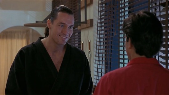
These looks on Daniel and Silver though?
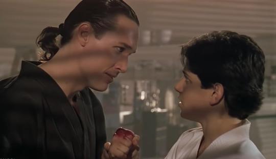
So why does Silver become obsessed with him? What’s up with all those red outfits (that he doesn’t wear in Cobra Kai)? What does the temptation reveal about Daniel? How does it recontextualise TKK1 and TKK2? Is Daniel bisexual? (yes).
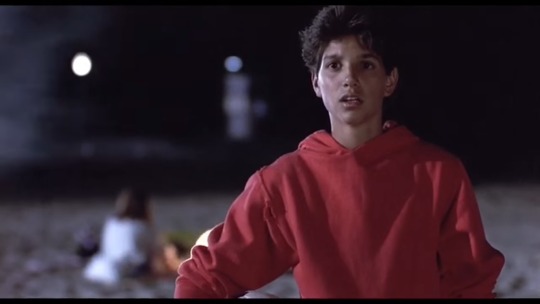
Ah, beach-Daniel, in your red hoodie and your cut-off jorts. Iconic hot-girl summer vibes.
If you didn’t want me over-analysing this, you shouldn’t have put him in so many red outfits and then have this man leering at him like he wants to eat him alive.
Surface-level it’s not hard to read into a Dude Story: Masculine power fantasies are about strength in a very direct way. Fighting, control, suaveness – and if you’re not the most traditionally masculine of guys, asserting dominance through being a good lover or intelligent or overcoming that unmanliness in some way through beating the bully or convincing the hot girl to go out with you, levelling up in coolness. Being A Man. It’s not too dissimilar from Daniel’s arc in the first movie, if you watch it without taking later events into account, although Daniel is never interested in proving himself as a man, and more in making Miyagi proud. Still, he does win and gain respect, and arguably “get the girl,” although Ali’s interest in him was never dependent on the fight.
7. Sexual Awakenings Part 2: Sexual Assault, Liberation, and Queerness
Feminine power fantasies are often about sex. Metaphorically. More accurately it’s “owning sexuality.” Even more accurately: “Freedom.” They also inhabit a fluid space in which empowerment through monstrous desires and non-consent can happen at the same time. And on top of that, many of these “fantasies” are actually being written by men, so whose fantasy is it really? A lot of them are based in oral traditions so presumably they were originally from the mouths of women, even if modern iterations (starting with Grimm’s collections) are filtered through cis men’s perspectives.
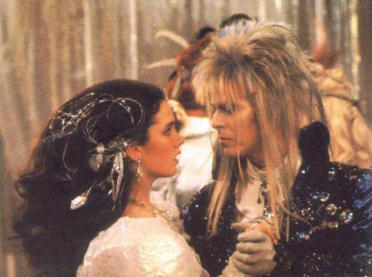
All of that being acknowledged: In Angela Carter’s “The Company Of Wolves,” Red Riding Hood unambiguously sleeps with the wolf. Belle discovers her freedom from expectations and unsuitable suitors (and in some versions, evil stepsisters) by falling in love with a Beast (the original novel was written by a woman, the 18th century Gabrielle-Suzanne Barbot de Villeneuve). Jareth informs Sarah of his obsessive devotion to her in Labyrinth. To lean into horror for a moment – Buffy is stalked and eventually has relationships with both Angel and Spike, Lucy in Coppola’s Dracula (which I have mixed feelings about) is raped by the werewolf and Mina is stalked by Dracula, The Creature Of The Black Lagoon kidnaps Kay (the lead’s girlfriend) – subverted in both The Shape Of Water in which Eliza forms a consensual relationship with the amphibious sea-god and in the short-lived horror series Swamp Thing, in which the connection is purposefully framed as seductive…
and in The Karate Kid Part Three Daniel LaRusso punches a board until his hands bleed because an attractive, older man tells him to and in this moment he gives in to what he (thinks he) wants.
Not all of those examples are equal. Some are consensual, some are hinted as abusive and/or stalkery, all of them have large age gaps, and a few are outright non-consensual.
But they’re all fantasies.
They’re all power-fantasies.
Except for Daniel, because he’s a man and the idea that being obsessed (lusted) over by an older man who keeps you in his thrall, specifically because you tickle his fancy for whatever reason, because you’re beautiful, breakable, different – could in any way be considered empowering is a difficult concept to wrap your head around. It doesn’t contain that “but I’m a good girl, I’d never go off the path and pluck flowers if a bad wolf told me to, honest,” societal context or the social context of rape culture. It’s closest comparison is closeted (perhaps even unknown until that point) queer identity.
There have recently been some comparisons of Daniel LaRusso to Bruce Bechdel in Funhome (and everyone who says that Ralph Macchio ought to play him in the upcoming movie: you’re right and I’m just not going to enjoy it as much without him). I’ve written a post about Sam being the heir to his legacy and trauma, specifically as a queercoded man. It’s not dissimilar to the plot of Funhome in a lot of ways.
The other interesting source that’s been going around in connection with Daniel is the essay “The Rape of James Bond,” which discusses the use of sexual assault as a plot device for women and not for men: “About one in every 33 men [in the US] is raped. … [your statistically average, real life man] … doesn’t have a horde of enemies explicitly dedicated to destroying him. He doesn’t routinely get abducted, and tied up. Facing a megalomaniac psychopath gloating over causing him pain […] is not the average man’s average day at the office.” That last bit is just a descriptor of Terry Silver, (although I take issue at the blasé use of psychopath).
The two part youtube essay Sexual Assault of Men Played for Laughs posits that there is nothing more de-masculinising than the threat of sexual assault and therefore any narrative that features this “rightfully” must mock any man who has been a victim or who fears being a victim of sexual assault. It is feminising. There is nothing more humiliating – and therefore unheroic – than a man dealing with sexual assault.
So what do we feel when we see an attractive young man being put into a vulnerable position by an older man? A trope associated with female characters, a trope that is considered unpalatable for men (see reactions that happened when the hint of sexual assault was introduced in Skyfall).
Was it the fact that he was being threatened, or the fact that James’ next line is: “what makes you think this is my first time?”
Some thoughts added by @mimsyaf are around the idea of safety in how a lot of cis women might relate to this narrative through Daniel’s eyes. He’s not a woman, he has – societally – more power than a girl or woman would have, which makes this a different watch to, say, if Danielle were to go through the same narrative. Daniel doesn’t carry that baggage of rape culture, or of the male gaze that you might find in a similar scenario of Buffy the Vampire Slayer or Christine in Phantom of the Opera (and once more the age differences between these characters and the men who love/lust over them are substantial), which makes the narrative “safer” to engage with.
I agree with that, although as a transmasc person I also come at it differently. I specifically like to headcanon Daniel as a trans guy and find his fraught interactions with masculinity through his own non-toxic lens relatable, as well as the way other boys and men react to it – also I think Terry Silver is hot. I know there are people who write Terry Silver with female OCs, which is also a form of empowerment.
On the flipside putting Daniel in this space runs a risk of fetishising him as a queer youth who is either Innocent and Pure, or a bisexual stereotype that deserves to be assaulted for not being a real man. After all, Real Straight Men don’t run the risk of sexual assault.
Alas, the road to empowerment never did run smooth.
The comparisons between the way Daniel is treated by the text and how female characters are often treated in texts are undoubtedly there. Through Ralph Macchio and TIG’s casting and the direction and acting, but also within the text itself.
It might not be with the same purpose as Neo’s symbolically trans journey, but it puts the whole narrative that Daniel’s going through from TKK1 under a different light than if there had only been one movie that ended on a triumphant sports win and a girlfriend.
Johnny’s masculinity and the use of tears as liberation, now that’s a whole other analysis….
#daniel larusso#terry silver#the karate kid part three#the karate kid#cobra kai#ck#cobra kai meta#part two of three#we're going into labyrinth and james bond in this one fellas#(non-gendered fellas)
99 notes
·
View notes
Note
How about 🐉 for everyone and 🙆 in general? :)
Oops, this took a while, haha. Thank you 💜💜
From this ask game! (Continuing to accept asks but they may take a while because I'm being way too particular with these...)
🐉 How would their fashion differ in another genre (fantasy vs modern, etc)?
This one's really interesting because I did think about making everyone amore traditional high fantasy design... then I decided to go modern. So here't what they could have looked like!
Ayre would have been much more royal in their personal style, maybe giving a stronger impression of their background? I think what steered me away from this was that it felt too on-the-nose, if you know what I mean.

Jolenn has always been sort of a foil to Ayre in both fashion and personality, but there's a strong chance that they might have wound up just topless with a scarf if I stuck with the high fantasy concept, haha.

Nex could have wound just being a horse most of the time, but I changed my mind on that after some deliberation. When in "human" form, they would have just been nude with some kind of fabric draped over them.

Wren was originally a character concept for a different game, so I always pictured them as the "mysterious wandering trader" archetype... without the wandering, haha.

🙆 Do any of your characters share a style similar to your own?
Really, I think everyone borrows a little something from my wardrobe, similar to how they all borrow something from my music taste... I want to like the way they look, obviously, haha. I also have a terrible habit of giving all my characters tattoos and/or piercings because I have them and I think they're cool. 💜
Ayre has the hat, which has long been a staple of my wardrobe, as well as the leather harness accessories, which I love. I don't share their love for gold and jewelry, though.
Jolenn has my love for jackets, sweatshirts, and layering, although I don't wear colors like they do.
Nex, although their "official" outfit is rather plain, takes after my love for street fashion and techwear in a lot of the stuff I put on their Pinterest.
Wren might be closest to my regular outfits with the jeans, flannel, and boots, but I'd never wear that much color... or florals.
#work is crazy busy right now#so I'll be slow on asks#but I promise to get to them :)#asks#zorlok-if#ayre#wren#jolenn#nex#the gilded
6 notes
·
View notes
Photo
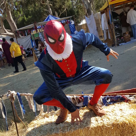
Spiderman from Marvel 1602 // Cosplayer: kammospark
Tell us about Spiderman1602, I’ve seen many versions of Spiderman but thiis is a new one to me! What led you to this concept of this version of Spiderman?
Well I've always had an appreciation for lesser know outfits of popular heroes. Looking through many wardrobes and outfits, the obscure ones always stood out to me, "Wow, I've never seen this one before!" I'd think to myself, and I figured others who know the characters well would love to see them brought to life too, or even people curious about the stories of them would enjoy seeing it. I feel everyone has a love for Spider-Man; he's such an iconic superhero and has so many suits, and even though they can be quite diverse, they still feel recognizable as one of the Web-slinger's costumes.
While I was looking at different Spiderverse characters for inspiration on a new Spider-Man cosplay, I saw Marvel 1602 and it immediately caught my attention; I thought it was such a fun looking design. Definitely away from a modern or futuristic look, it's charm won me over, and I had to put it together. And as a fan of the fantasy genre in general, thanks to many years as a GM from D&D as well as other media, I also enjoy Ren-faires and wanted something to wear to show my love for Superheroes and Renaissance.
When you wore it out to conventions, what was the response? Obviously they knew you were Spiderman because of the mask but were they confused about the rest of your outfit? What were some of their guesses?
Oh people certainly get a kick out of seeing the outfit. Some people have called Me 'Lord Spider-Man', 'Ren-Spidey', 'William Spider-Speare', a lot of creative names for it that never fail to make me smile as much as it does for them. Whenever I wear a Spider-Man cosplay, I always want to try and take pics with as many Spider-Men as I can find, and most of the time it's the other Spiderman cosplayers that recognize who the character really is. I love having people laugh and get excited over the character, it's part of that Con Magic where people just can't help but feel like a kid when they see something that fills them with joy; its my favorite part of this fun hobby, just making someone's day memorable, even for a moment.
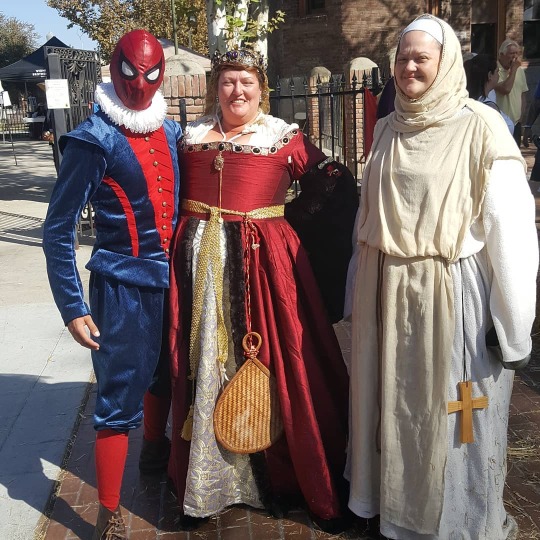
Besides conventions , I see you wore the costume to a Renaissance Fair. What was responses there? Was it different from conventions?
Ren-faires in general are a great time! And when I started this costume, I was excited just thinking of the reactions from people and how happy they may be. I've taken 1602 to quite a few Ren-faires: Central Coast Ren Faire, NorCal Ren Faire, and Kingsburg Renaissance of Kings.
The first place I ever debuted it was as CCRF, and I was stopped by about 20 people before I could make it past the first 3 booths. It really does feel like a different environment going to faires. D
uring them, I'd be a bit more 'theatrical' and introduce myself as Peter Parquagh, and try my best to make people smile or laugh. I've gotten the opportunity to meet many wonderful people and people with stunning and gorgeous Renaissance outfits. Kids come walk by amazed that they actually got to see a Spider-Man at a Ren Faire.
One instance, a bard played the spider-man theme song on a lute as he traveled around me. At two different faires my presence was requested by the Queen, and I was escorted to her, one even knighted me! Everyone just has a blast role playing and getting caught up in the fun, the energy is so infectious and delightful!
Take us through how the outfit was put together?
Well, I cannot take full credit on the cosplay. My mother was actually a large part of it. Growing up, my mom was always really involved and loved making costumes for Halloween for me and my sister. And one of her favorite aesthetics is period piece era fashion and she loves Jane Austen.
As I was looking for ideas for a new cosplay and showing her, she was drawn towards 1602 and offered to do as much as she could to help create it, and she loved helping putting it together. The suit is a handmade outfit following a 14th century cavalier pattern. The design called for detachable sleeves and very baggy slops, but we decided to have the sleeves attached and slim down the slops slightly, to give it a mix of authentic and Spider-man's sleekness.
We went looking online and found this wonderful blue velvet fabric with Fleur De Lis imprinted onto it and thought it'd really help the outfit pop! We had to make sure we kept the fabric in the same direction: it has a difference in shimmer if facing a certain way, and we wanted the Fleurs facing the same way as well, so we tried to be mindful of that. We pleated the red fabric in the front and it was quite stubborn, but we tried our best to make it look similar on both sides of the torso. The back has a spider and has legs that lead unto the front; we cut out red fabric and hand-stitch embroidered on, and was quite meticulous.
Me and my mom kept an eye out online for just the right buttons we wanted for the costume. Something antique and era appropriate but also thematic, and after a while, we stumbled across a web-designed antique gold button set. We also looked for a thick ruff rather than the costumes original thin look. The original costume look also called for the mask to have open eye holes, but I opted out of that, and felt that a traditional mask look better complemented the costume. After that I acquired socks and shoes and then it was finished!
How did you discover cosplay?
As mentioned earlier, my mom loved making mine and my sister's costumes growing up. She's a seamstress as a hobby, and is so creative and artsy. Halloween was probably my favorite holiday growing up, and I was so happy I got to wear something made with much love from my family. Some of my favorite notable costumes growing up was a knight, an astronaut, and Pikachu.
As I got older, around high school, I still liked the idea of costumes, even bought a cheap Captain America outfit for The Avengers premiere night, but I mostly dropped off on dressing up. I grew up in a very small town, but eventually, after I moved out to the city, I heard about 'conventions' and I was interested and wanted to try and wear something to one. I decided to make a classic Punisher costume, and wore it for the con. It was a small venue, but even then it finally hit me, 'This is a thing people do. People love to dress up, go make friends, bring smiles and show their love for their Fandoms and interests. THIS is what Cosplay IS'. I finally understood what this little hobby of mine was, and I embraced it.
Have you discovered something about yourself through cosplay?
I've always thought of myself as a people pleaser. I'm someone who really only want others to be happy. I'm also someone who loves to share their interests and engage with others about things that we can share and discuss and geek out over.
When I was young, I often felt left out from social circles, due to my often eccentric personality. I found it really hard to make friends, and I am forever grateful for the friends that I have made and been with me for years.
Cosplay has opened up another avenue as far as friends and socializing. My first couple of cons I was initially intimidated, but I have to say that I'm so glad I got into this hobby, for I've met many people with interesting stories and wonderful personalities, and people I still talk to often. It's really helped me feel like I can make good friends and memories, and I'm sure that others have felt similarly and that's something I treasure.
What are your future cosplay goals?
As with most cosplayers I'm sure, I have way too many projects in my head with very little work on a lot of them. I suppose my current goal is to rework the headpiece of a cosplay I finished last year, my Bioshock Big Daddy Doll. The head was massive and too cumbersome so it needs to be redone.
As far as new projects, I would very much like to do a Prince Link cosplay, inspired by the creation of theLostSindar. Another idea would be to do more superhero variants and make a Blue Lantern Flash that 8ve been eyeing for a couple of years.
One thing I definitely want to get good at is working with foam. I am massively inexperienced with foamsmithing, and I strive to learn how to be good at it and learn how to make wonderful things with it. It's just like when I first went to cons; starting off can be a bit scary or even overwhelming before we really get it going, but that exposure to things we really desire is all we need to get hooked and make it our passion.
https://www.instagram.com/kammospark/
#Marvel 1602#marvel 1602 cosplay#spiderman 1602#spiderman 1602 cosplay#spiderman#spiderman cosplay#cosplay#cosplay interview
44 notes
·
View notes
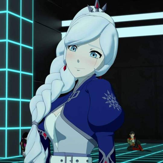
Note
Weiss!
okay so this shit is about to get PERSONAL because weiss is my daughter (real) ((emotional))


THIS ? good. simple. i like her flared(?? idk words) sleeves. i like the red in her jacket and the lil black thing on her top for ruby and blake.
i like the blue and white and sparkliness of her design overall in 2d, which doesn't really get translated to 3d, but i think it looks fine. but in the early volumes when all the girls had that glowy effect to them, she was kind of unbearable to look at with all that white. that's where the red and black come in handy and i think a small amount of blue would've helped in 3d too.
also, her 2d design has little ice crystals on the end of her skirt that don't look as pretty in 3d--with all this in mind im giving her first outfit 2 separate rankings. 8/10 for the 2d design and 7/10 for the 3d model.
volume 2 outfit: this one will be quick but this is like, fine. white and black works well for her and the peacoat is cute. not much to say though. 6/10


mistral arc: i feel like i may be in the minority camp when i say this is, like, fine. its not horrible! i actually think it works rly well for where her character is at--she's at her father's house and her design isn't so bright white anymore, it's now gray. her open collar is now tight around her neck, and i think in the concept art her ponytail was straight back instead of on the side, which would've been a nice touch--she could've adjusted her ponytail back to the side after escaping, just that small show of rebellion--but ultimately its just, a side ponytail in the actual show. which is fine. wouldve been cool tho
its really not TOO different from her original outfit, and i think thematically it works fine. i like the jewels on her collar to spice it up a lil and give her more of that rich girl class.
which she had red and black back. also her boobs ? r bigger ?? 6/10
here we FUCKING go. THIS is what you wanna hear about. THIS shit. this garbage!!!!!! THIS DAMN OUTFIT !!!!!
there's so much wrong. it changes her silhoutte so MUCH. why are her sleeves puffy. rwby we've established your puffy sleeves don't look good !!!!! AND THESE ESPECIALLY DONT LOOK GOOD !!!!!!!!!!!! why are they such a dark blue ?!?!?!?! why are they two DIFFERENT shades of blue ?! are her gloves and sleeves attached?! they look like it. why !!!!!!!!!!
her skirt looks AWFUL in 3d, it has none of that ruffled texture or folds or creases and it looks like a BLOCK. its so stiff in motion. the red is back but it's LOST because her dress refuses to move !!!! she looks so heavy ?!
she's top heavy with her huge sleeves and her GIGANTIC BRAID HOLY SHIT THAT THING IS A LETHAL WEAPON, and she's bottom heavy with all her layers of skirts. speaking of her hair WHY DID THEY CHANGE HER BANGS ??? THEY LOOK SO SMOOTH ?????? ITS WEIRD ?!?!??!?
also, the asymmetry in her skirts doesn't look THAT atrocious in the 2d concept art, but again, in 3d, its so stiff. it looks janky and unfinished. it looks like a modeling error !!!!
WHY IS SHE WEARING SO MANY BELTS ??? WHAT ARE THEY FOR. shes fallen into the "modern design now feels like fantasy" trap. also what the hell is the 3rd layer over her 2 dresses? the one around her waist ?
ultimately she doesn't look warm at all. and like, maybe she's used to it, and to be fair when she was in atlas previously she was wearing a much shorter skirt so maybe she's used to the cold but if thats the case WHY CHANGE HER WHOLE DESIGN SO DRASTICALLY???
but wait, lets not forget the other important part !!
weiss has huge mommy milkers now !!!! she got a boob job !!!!! WHY DID THEY INCREASE HER TIDDY SIZE. all the girls just have the same boob size now but its especially noticeable on weiss because she was like..flat chested before, but now they all just....have the same body type. and its boring !! BORING !!!!!!
0/10. AWFUL job
9 notes
·
View notes
Text
A Fistful of Munny - Extended End Notes
Notes for A Fistful of Munny that don’t fit within the character limit under the cut!
Please, read the fic before reading this post
All right! Welcome to the extended notes, in which I go into excruciating detail over a bunch of stuff that doesn’t matter, because I like the sound of my own voice!
Let’s start with some more broad stuff that didn’t make the exclusive end notes space. To do the Fistful of Dollars homage, I needed a place where I could have two villainous factions intersecting for Strelitzia to play against one another. After some brainstorming and asking for help from other people working on the Entwined in Trine Sorikai zine (and ultimately ignoring all their very good suggestions (Sorry, guys!)), I eventually realized that the Wasteland from Epic Mickey was a perfect place for this story, both in the sense of having mooks to destroy without Strels committing actual murder, and in the thematic sense of forgotten characters. There was just one issue.
I hadn’t played Epic Mickey.
And that is how I spent my summer, playing both Epic Mickey games. Both, because I was looking for a good location to set the story in in-world. Since the Wasteland is based on the Disney theme parks, I was hoping to find one based on Frontierland, their Western section. Such a location did exist – Disney Gulch – but only in the second game. Which meant I had to play Epic Mickey 2, as well. (The first one is a better game, but that’s not really the fault of the developers; they were not given the time they needed to make it as good as the first one. Here’s a video with trivia about the series that goes a little into the development.) I also needed to learn the Mad Doctor’s ultimate fate, since I wanted his Beetleworx/Blotworx to be one of the two villainous factions. In the game, depending on whether you chose the Paint (Paragon) or Thinner (Renegade) path, the Doc is either redeemed… or dead. Neither of which was helpful, so I had to invent.
But let’s talk about characters and why I picked them in order. The short version for why these choices, at least on the Final Fantasy side, is set-up for later. Obviously I can’t go into detail why. Before that, let’s talk about the Beanie Baby.
Chi is, as I hope you were able to guess, Strelitzia’s Chirithy. I’ve brought it up several times, but I personally do not like mascot characters. There are a few exceptions, but Chirithies are not one of them. Like I said, KHUx isn’t what happened in this AU, so you’ll have to wait for in-universe answers on why it’s a cat now. Out-of-universe reason is this was the only way I could make it palatable for myself. I arbitrarily decided on a gender for it because as a real cat, it would have a sex. Canonically Chirithies appear to be genderless, and in Japanese refer to themselves with the gender-neutral (but masculine-leaning) boku. I would’ve left Chi that way, save for the fact that he’s a completely normal cat now. (And before you ask, no, not every real cat that appears in KHΨ from this point on is a Chirithy.)
As for Strelitzia herself, it’s hard for me to pick up a character’s voice when they’re… not voiced. Intonation and cadence do a lot for me mimicking the way a character talks, so it’s a bit more difficult when they don’t technically speak. I tried for a mix between Sora and Kairi, while still keeping her defining character traits of being shy, but also impulsive.
You may notice that while she’s started remembering faces, if not names, the Player’s name and face still eludes her, despite her (canonical. Deal with it.) crush on them. There is a story reason for this, and will become clear once Luxu takes centre stage.
The name “Jane” was chosen with more consideration than just “Jane Doe” being the standard name in (at least my corner of) the English-speaking world for a woman of unknown identity. See, the Man With No Name actually has three names. In A Fistful of Dollars, he is referred to (by one character in one scene, once) as “Joe”. “Joan” might have been a more clear homage, but I figure Jane makes sense. And as you might guess, in the next fic, Strels will be going by a different name, still not her own. She’ll remember her name… eventually.
One might think I could’ve picked any old Cid, and one would be wrong for reasons I can’t explain yet. In fact, I can’t explain much of anything surrounding him yet. What I can say is no, Cidney Aurum is not dead, she’s just not related to Cid Sophiar in this fic verse. An unfortunate consequence of where I wanted to put each of them in the narrative; making them not be related was the only way it made any sense, geographically speaking.
Hyperion on the other hand, I can talk about. He’s one of the Gremlins in Epic Mickey, and… wait, first things first. Gremlins are from an abandoned Disney film based on a Roald Dahl book, itself based on the cryptids that supposedly haunted airplanes and caused them to malfunction, the earliest known written-down mention of the concept being from the 1920s. The film never got made, but the designs Disney would have used were adapted into a second printing of Dahl’s book, and they were later used in Epic Mickey. Hyperion is, like the publishing imprint that Disney owns, named after a street that Walt Disney used to live on. In-game, Hyperion is in Bog Easy (based on the Haunted Mansion), not Disney Gulch, but his name stuck out to me as being particularly fun, so I picked him instead of trying to figure out what Gremlins actually are in the Gulch (they have names in the files of Epic Mickey 2, but not in the actual game, so it would have been a hunt).
Regardless of where the setting ended up, for the second villainous faction, I was always going to plop down the good old Don. More things I can’t talk about. For everything FF7, know that I’m always going to be pulling from a mix of the original game, Remake, and Machinabridged. Hence, Corneo’s outfit is a mix of his original and Remake designs (which basically just means he’s wearing blue jeans instead of brown). I didn’t think bringing in his three lieutenants from Remake was necessary, especially since this was supposed to be a kind-of small operation.
Leslie is picked up and dropped from Remake pretty much unchanged. I needed someone to do the murders Strels couldn’t, and even if he’s not a complete asshole, he’s still mostly an asshole. Have we ever seen small, Materia-like balls used to cast magic before…?
Onto the fun bits, which is the Disney characters. We’ll start with Percy, who is from a Goofy short called “How to Ride a Horse”, from 1950. And that’s about it. The conceit in Wasteland is that all of the Toons there were basically actors, and they wound up in Wasteland if they were forgotten (that’s not exactly correct, but I’m generalizing). This is interesting, since two of the Toons in Epic Mickey are Horace Horsecollar and Clarabelle Cow, both of whom… are residents of Disney Town in Kingdom Hearts, having shown up in Birth by Sleep. So that’s an interesting continuity snarl that I’m going to just ignore.
Persephone and Pluto, on the other hand, are from an earlier short called “The Goddess of Spring”, from 1934. It was one of the projects Disney tried as practice for Snow White. If you’re about to protest that his name should be Hades, not Pluto, then you’re going to need a time machine so you can tell them back in the 30s. The Goddess of Spring is a musical, in the sense that every single line is sung. Watch it for yourself. There’s a video with better quality floating around YouTube, but for some reason it’s the French dub. And that’s why both of them sing most of their lines. I tried matching the meter of their actual parts, but Persephone’s doesn’t actually follow a syllabic pattern that I could make out. I eventually gave up and just gave her the meter from the start of the short. Pluto’s was easier to manage (and more consistent).
The skeletons are Disney veterans, presumably the same ones from “The Skeleton Dance” (1929), but more specifically they’re mimicking what they did in “The Mad Doctor” (1933), the first appearance of our other villain. They’re fun.
The original Mad Doctor was supposedly named “Dr. XXX”, according to the name on his door. This was before the modern film rating system was put in place; it was a different time. In the original short, the Mad Doctor kidnaps Pluto (the dog) with the intent of cutting him in half and putting his front half on a chicken For Science!, and Mickey follows him to his castle to rescue the purloined pooch. The short wasn’t a musical in the same vein as “The Goddess of Spring”, but… the Mad Doctor’s only spoken lines were a song (aside from evil cackling). While I had already decided to do the “Toons that sang in their short can only communicate through song” with Persephone and Pluto before starting on Epic Mickey 2, I hilariously discovered that the game developers had done the exact same gag with the Mad Doctor, most of his lines in the game being sung. (In Epic Mickey there were no fully voiced lines, so he speaks as normally as anyone else does). Which made it easier to write his songs here, since I could just rewrite his songs from the game. I used to write alternate lyrics for songs back in high school, so this was an interesting trip back in time for me. They were stuck in my head for weeks afterwards, but it was worth it.
I believe that’s everything for the characters. Let’s talk about Keyblades.
It irks me that three people in KHUx have the same Keyblade. Ephemer, Skuld, and Strelitzia all have variations of Starlight. Now, in KHΨ, there is only one Starlight, and it belongs to Luxu, so I’m going to have to decide on different Keyblades for each of them. (Ephemer’s has already been decided, and I haven’t started brainstorming for Skuld yet. No I do not need suggestions, thank you). Pixie Petal bears a noted (by KHWiki) resemblance to one of Marluxia’s alternate scythes, so that tangential connection was enough for me. Both siblings have flower-themed Keyblades – it makes sense to me.
You might notice a few disparities in the magic. These are on purpose, and will eventually make sense. And that’s all I can say on that at the moment. ;)
Oh, yes, one important thing I probably should have said on the main notes: I’m not going for a realistic depiction of amnesia here. Anything I got right was entirely accidental, and I’m fairly certain there’s not much. There might be a story reason for why it works the way it does… and it might be the same reason why other people from KHUx have or had amnesia in the present day…
You know what’s funny? Although Orcuses look more impressive than Invisibles, their stats in Days are actually worse. I’m fairly sure that this is because the only time we see an Orcus, it’s actually an illusion cast over Xion so that Roxas will fight her to the death. There are no other stats for them (according to KHWiki), since they’ve never been used elsewhere.
A friendly reminder that Apprentice Xehanort invented the term “Heartless”, which was why Aqua didn’t know what to call them until Mickey told her. Thus, nobody from the era of the Keyblade War should know the term “Heartless” without being told by someone in present day. “Darkling” was the term they used instead. I’m fairly certain KHUx ignores the continuity on this (so why should we trust its continuity for anything else, hmm?)
I think that covers everything! Or at least everything I’m willing to share at this point. If you’ve read this far, thank you! I appreciate your dedication! ^_^
4 notes
·
View notes
Note
👤- Favorite character?, 👗- Favorite outfit? One you’d like to see?, 🍂- Favorite scene in either film/ trailers?, 🛷- What would you like to see in the future? for the Frozen Fandom Asks :D
Thank you so much for sending these! I love you!
👤- Anna. Anna forever. Anna Anna Anna. Elsa is cool but she's not Anna. You know how all 13 years old lesbians had their gay awakening with Elsa? Yeah my gay awakening was with Anna. Idk she's just exactly what my type is like irl. I saw her and I knew she'd be my favorite character ever. I just think she's very well developed, and has this different kind of angst that Elsa doesn't posses. Elsa is all about wallowing in Angst but with Anna, it's like they're stabbing her and she doesn't even realize because her brain has broken and refuses to process it and somehow that hurts even worse. It's easy to comfort Elsa if she's sad, sure, just hug her and shit. But Anna doesn't even know she needs to be comforted even though the kid has gone through so much trauma. Idk my protective instincts go wild with Anna. She's my baby and I love her.
👗- oh boy. Ok ok so I'd love to see some traditional norwegian bunad some day. Like, actual norwegian bunads. The fantasy outfits are neat but... bunads are already so Disney princess-y it's unbelievable.

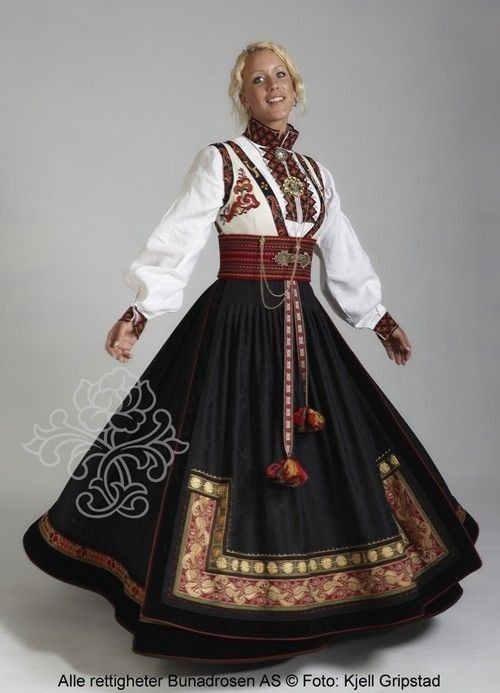


I'm just in love with how these look. Oh! And real sámi gávttit as well! The clothes the northuldra wear in the movie look pretty historically accurate I think, and I think they look really good, but they all look the same and that in itself makes them a bit boring i think Disney could have a bit more fun with them.


I think the blue and red colors are a bit more modern so I understand Disney keeping their outfits with more brown-ish colors, considering they couldn't trade for 34 years, but as the last picture shows, there's still a lot of stuff you can do while keeping brown as the main color (and white! White fur looks so pretty!).
If we're talking about my current favorite outfit, they have to he Elsa's Dark Sea dress and Anna's post-coronation dress w jacket and her hair up. I love whoever designed that dress. I like the low key military vibe it gives, and it makes me wonder if it's somehow foreshadowing the plot of some future installment 👀 ngl i love war stories and I want to see Queen Anna leading an army of giants into battle.
🍂
Oof dude i LOVE Anna leading that army of giants. I love the dam scene and I love The Next Right Thing. And I really love For The First Time in Forever (Reprise?) that scene was like ANGST. AAAAAA. Oh and that time when Anna looks up the stairs and sees her hot sister being hot and she gayly low key stutters-- or when she HIGH KEY gayly stutters during the coronation ball because her hot sister called her beautiful... yeah that's when I started shipping Elsanna. My heart felt something there. It was too sweet for me. But seriously, my favorite scene must be when Elsa watches Runeard's memory insult magic and the Northuldra, and you see her expression slowly shift into sheer horror because she realizes this man, her grandfather, hated everything she is, and he would have killed her-- his own family-- because of her ethnich background and magic (for better or worse, Northuldra identity was strongly tied to magic in F2, and they became two concepts impossible to divorce, and I'm actually writing a longer post about it). I FELT that ok? My own grandfather on my white said of the family has said some very fucked up shit to me. Ever since it was revealed Elsa and Anna were mixed I deeply identified with them, even more than before. They're the closest I have to mestize representation since fucking Balto. And then you start to observe and think about what the movie has said so far about Runeard and magic and the Northuldra and it culminates with Elsa learning the truth about her Arendellian side of the family and... God i think I needed to see a character go through that. It's the highest point of a long process that recontextualizes the whole Frozen franchise (at least to me lol) and I love it for everything it does.
🛷-
Mmmm well I'd love to see the girls physically together again, but not in a coward or bitter way. I don't want Frozen 2's ending to be meaningless. I think Frozen needed these three stories to be told, right? A) The story of Elsa and Anna finding each other again, B) the story of Elsa and Anna learning to be sisters again and work together after being reunited, C) and the story of Elsa and Anna finding themselves, on their own. Now, as I see it, Frozen 2 is either a very tragic resolution to the franchise, or an awkward way to squeeze story C) in the middle of the saga as to not turn it into the final resolution. I firmly believe the story of Frozen 2 needed to be told, and finishing the movie the way it did makes a lot of sense, but I honestly don't want this to be the final note the story of Frozen ends with. Think about it, if you had stories A, B and C in order, the logical conclussion would be.... httyd 3 😭 if you tell the story of Anna and Elsa having their solo arcs as the season finale, then they remain split up. Goodbye. Having it in the middle is weird and uncomfortable but I believe Frozen 2 could work a lot better as an in-between movie than a single sequel. I would like Frozen 2's ending to be used in an inteligent way to proppel the story of Frozen 3, to give it strenght and meaning. I don't want it to be shamefully swept under the rug, as if the writers regretted it and want to desperately backpedal on their plans. Even if they do regret it, they have to make it seem like it was part of a bigger plan all along and make it work accordingly.
Ik this sounds like I think the final episode is so bad there's a secret episode with the real ending somewhere in there, and I recognize Frozen 2 might very well be the ending of the franchise. I think both are equally plausible options. I mean, can you imagine a Frozen 3 in which Elsa and Anna are not spending time together? Can you imagine the writers giving Frozen 3 the exact same ending as Frozen 2? It's not even about the separation, you just can't end a movie in the same place it began. What? Anna and Elsa team up one afternoon to fight their monster of the week and then say goodnight and go to their respective homes? A sequel needs to somewhat challenge the status quo. The status quo of the F2 ending is the girls going on their separate ways. Good for them. I think their solo arcs will be healthy. But the separation is not an afterthought or a sidequest, like Kristoff's propposal. Frozen 3 doesn't need to challenge Kristoff's propposal because it's not central to the story, but it does have to somewhat interact with the hearts of Frozen and Frozen 2 and that means it needs to build upon them. Honestly, I don't think I'm delusional. I think my predictions for a hypothetical F3 are pretty sensible.
24 notes
·
View notes
Note
First of all, kudos for representing your culture ♥ I wanted to ask you though: As someone who shares a similar background with you, I was genuinely conflicted when I first saw your MC, I think I was worried about misrepresentation? Since finding out you're channeling your own culture though, I do feel a bit better, yet still conflicted... Maybe I'm still afraid of doing the same, y'know? How do you feel, genuinely, about sharing yourself like this? [1 of 2]
Going to add your part two: “And, I'm really sorry about the heavy topic of this ask. It's just been weighing on my mind for a good while now and I've only finally mustered up the courage to visit your blog and send it. I'm not sure what I'm feeling and I was hoping you might understand, haha. Please feel free to ignore. [2 of 2]”
Hey there, definitely not gonna ignore. And don't be sorry about the heavy topic. I'm genuinely glad you asked this question and it's something that had been weighing heavily on my mind before I decided to finally make content for the character I've had in mind for so long.
Gonna start by introducing Quetzalli and what it means for someone like this in the Arcana world. Because it's a fictional universe, there's no such thing as Mexica. Same goes for all other canon characters, we know the cultures they were influenced by, but the people don't actually exist in this world. But I absolutely love that characters do have influence from our real world cultures and I wanted to share that of my ancestors because all of our cultures have a right to influence fiction just as much as any other. And when I realized Nopal is influenced by modern day Northern Mexico/Southwest US, I felt so happy to think people inspired by ours could exist in this world because they're ignored in every other fantasy.
One other good example I can think of is Avatar the Last Airbender which has nations and people inspired by real-world cultures. Inuit, Chinese, Japanese, and Tibetan cultures are among them yet even then there are other elements and no one nation is strictly influenced by one culture alone nor do they completely mirror them. I was also happy to notice that the Sun Warriors were primarily influenced by Mesoamerican civilizations including Mexica, Incan, and Mayan with some Southeast Asian influences as well. On the other hand there are movies like the Road to El Dorado that has established itself in a real-world setting and so I’d be very strict on how the culture is represented.
As you probably figured, Quetzalli is influenced by the Mexica (Aztec) culture as it used to be before La Conquista. And the Mexica as the people they were haven't existed since then, but instead have changed with time. Yet I've grown up surrounded by their legacy and that of the Chichimeca people in my town in Mexico, particularly the Zacatecos, Caxcan, and Guachichil (Quetzalli's mother is influenced by Chichimeca peoples who would likely be placed in the Catclaw desert in the Arcana world). But honestly, what has pissed me off so much is the way our people are seen and treated. Even many people in Mexico are racist and still look down upon those of indigenous descent. But we should be proud and I wanted to create a character who is proud, brave and powerful because that's what I feel like when I embrace that part of me. Thus Quetzalli was born!
But integrating the character into the Arcana universe is tricky. There are many elements that I could keep and some that I couldn't because not everyone will understand some concepts. Death is a tricky subject and even in the Arcana universe, it's heavily influenced by western concepts of death in which death is like some ultimate scary thing and that's that. While of course I don't take death lightly, even as a child it wasn't ever truly scary. I was raised to believe it's a cycle and death is not feared but honored and respected. So when I was taught about Mexica sacrifice as a kid (most people only know about sacrifices like some bs to justify la Conquista while there’s SO MUCH good shit like public education and genius engineering) although I don’t agree obviously, it makes sense to me because I could understand how a people would view it as a cycle that must continue. The sun rises and falls, seasons change, people die, people are born. Even enemy war captives who have a sliver of divinity that allowed the capture. It's all a cycle where life and divinity must be returned in order for it to be given back. There was never enough blood to give to everyone that is and will ever be and so much be returned.
This is one of the things I'm leaving out in Quetzalli because it's a delicate subject that I know people won't understand. And because she's a fictional character only influenced by the Mexica in a fantasy world, I feel okay leaving the bloodshed out (also people might vilify her and the Mexica people for it like they already do). If I was to make her a character in a real world scenario, then nope, I'll need to be strict and include everything whether everyone likes it or not. Other things about her that I've stretched is the fact that she's an Eagle Warrior. Although women had more independence over their work and finances (compared to many European women at the time) and that it was believed women could be powerful leaders (depicted in stories and history) they weren't allowed in combat, at least in the last 200 years of the empire. I'm not counting the time women joined the struggle under Huey Tlatoani Cuauhtemoc because that was a desperate last stand.
But if you read my short story "the game begins" it's known that Quetzalli cannot become a warrior and thus will listen to Huehuecoatl in hopes he'll help her get there. Another thing I stretched is her coliseum outfit. I wanted to incorporate some essential parts of the Eagle Warrior's uniform: the greaves, the chimalli, and especially the cuacalalatli and feathers lining the leather so she may embrace the eagle's fighting prowess. Those parts are there but I also wanted to keep in with the theme of the Arcana coliseum outfits in that they are very revealing and made for show over function as we've seen with Julian and Asra. I also wanted to share the cuacalalatli and I think the idea of embracing an animal's prowess is beautiful in that one looks up to nature to feel strength.
I try to add Mexica elements where I can because I love to share more and so few people know about Mesoamerican cultures. But I also try to keep it on the same level as the other Arcana characters who show their real-world cultural elements while not making that everything there is to know about them. I want her to still feel apart of this world and story, she’s a character like all the others. So sometimes I’m limited to clothing, tools and weapons, language, flowers and plants, motifs, her hummingbird familiar, even the appearance of the “Ascending Eagle” but I think references to our world’s Tonatiuh is as far as I can go while maintaining Arcana universe.
But to summarize what I feel about it. Indigenous american cultures are widely ignored among Arcana apprentices and I honestly feel that we should not feel ashamed to include them, especially if they're our own. And I do understand the feeling of not wanting to misrepresent cultures, it IS important to avoid stereotypes even if it's a fantasy setting. Also one thing some forget is that indigenous people are PEOPLE like everyone else and have every right to exist in media. We don't have to adhere to every aspect of our culture nor should we be ashamed and hide it away. Quetzalli is influenced by Mexica but she's a normal person in this world with every right to be there like any other character, wear her clothes, speak her language, get upset, be sensual, kick some ass, hate and love... None of this says any less of her or her culture.
The things I've included in her has been a monument to the power she feels and that of the people she's influenced by, the same pride and power I feel when I embrace my roots. It took me a while to finally get around to sharing her, but I'm glad I am. Thank you so much for this ask.
Si quieres hablar mas, o si todavia tienes miedo de crear un personaje como este, dame un mensaje? Nuestra gente y nuestros ancestros tienen derecho a existir aqui. :D
48 notes
·
View notes
Text
also a long... long time ago someone asked me for an artist!mc wanting to draw satan. I still 100% want to do it, but here’s a little placeholder in the meantime!!
Satan intensely examines the framed work in front of him--you think that it might be some kind of… statement on fertility? There’s definitely a feminine figure in the garish swathes of puke green. Maybe. Could also be a peanut. If you squint and tilt your head, it kind of looks like an animal?
You’ve never had an eye for this sort of thing, only agreeing to come because Satan had invited you.
hope u guys don’t mind i completely veered off the request path.. but here’s something short!!
1.3kish words, gen, satan/gender neutral!mc
~~~
“Mammon would be furious if he knew he missed you like this,” he grins, bowing and holding his hand out.
The outfit is… fancier than anything you’ve ever really worn in front of the brothers. It’s perfectly tailored to your body thanks to Asmo, the vest cinched at your waist like one of Lucifer’s. It accentuates the slight curve of your waist, enticingly settling at the small of your back.
Your brows raise at the outstretched hand, before rolling your eyes and snorting at the gesture. Satan looks like he expects you to playfully bat his hand away with some flustered complaint. To his surprise, you take his hand, and lace your fingers with his.
Satan’s eyes widening is a sweet reward in itself.
-
-
-
The art exhibit Satan takes you to is far fancier than Satan had led you to believe, so with each passing devil appraising you, you’re glad you let Asmo guide you into his closet for an outfit upgrade.
Satan is dressed in a casual sports jacket and fitted slacks, but his natural good looks and the undeniable power radiating off him would have made him a knockout even if he was wearing a tracksuit. (Maybe. That actually sounds hilarious.)
You fiddle with the hem of the vest, at the quintessential, billowy-sleeved Asmo shirt he’d paired with it. You look like you belong in a fantasy novel as a princely character, but perhaps that’s what Asmo intended. If you had any doubts about how different your outfits are, the worries are blown out of the water by the sheer chaos of Devildom “high fashion”.
Besides, Satan seems to like it, if his constant gentle touches mean anything.
By comparison to the eccentric shades of Devildom fashion (some more... daring than others...), the art itself is nothing exciting. Once you’ve sipped enough champagne to calm your nerves, you realize that the art is actually...
Terrible.
You’ve seen some god-awful art up in the human realm, but it’s almost comforting to know that there are also snobby devil artists with bad technique and signatures as big as their egos. But… Satan likes it? You think.
You’re not quite sure, honestly, and you don’t want to offend him by saying anything negative. He stares at every framed work with an intensity that would burn through the canvas if looks could kill. Sometimes it’s a few seconds, sometimes several minutes, but Satan will nod once he’s finished appraising the canvas, and then move on to the next one.
Almost without fail, he will place his hand on your waist or the small of your back and lead you to another… suspect… painting.
Satan intensely examines the framed work in front of him --you think that it might be some kind of… statement on fertility? There’s definitely a feminine figure in the garish swathes of puke green. Maybe. Could also be a peanut. If you squint and tilt your head, it kind of looks like an animal? You’ve never had an eye for this sort of thing, only agreeing to come because Satan had invited you.
“This isn’t your kind of date,” Satan states, and you jump, looking at him with cinched brows.
“I never said that--” Satan rolls his eyes.
“You’ve spent more time looking at me than at the art.”
You’re a work of art is the infantile comeback that comes to mind, but you don’t have the strength to be so bold or cheesy. Crossing your arms sheepishly, you look anywhere but at him.
“I… You seemed interested, and I didn’t want to tell you no?” You admit, and Satan sighs, like he’s not sure what he’s going to do with you. “Did you…” You fumble over the words, “Did you like this one?”
Satan blinks as he looks at you, his head tilted. Huffing with amusement at what he finds in your expression, he shakes his head. He looks back at the painting and squints at it.
“Honestly, no. It’s gaudy, the technique is terrible, and I’m sure the artist was drunk the entire time. There’s Demonus stains in the corner here.” he groans, pointing at the out-of-the-ordinary purple splotches that don’t match any of the other materials used. You can’t help the glee that fills your chest at Satan admitting that he also thinks these works are absurd--there’s relief as well.
You’re not sure if you’d be able to stand another hour of this.
“Why would anyone buy this?” You ask, and Satan looks at you helplessly.
“I have no idea. Art is subjective, but most modern art makes me furious,” Satan says, shoulders shrugging, “Sometimes I try to stop and really, really look at the piece. Usually that works. I suppose if I bend over backwards, I can start to maybe piece together whatever asinine meaning the artist intended.”
“What if you end up still hating it?” you question. Satan huffs.
“Then I buy it,” Satan’s gaze shifts to look at you from the corner of his eyes, and he can’t help his wicked smirk, “And I use it for kindling.”
“What?” you ask, eyebrows cinched together. Satan holds his hands up noncommittally, and you shake your head with a fond, disbelieving laugh, “You’re terrible.”
“You think so? Let’s just get on with the second part of our date. I think you’ll enjoy it much more,” Satan hums, and before you have a chance to ask, he’s looking out into the crowd.
“Malphas!” Satan calls, and waves a hand over at a timid looking demon in an older suit.
The demon, Malphas, shuffles over with a toothy smile--it was far too easy for Satan to get his attention in this crowd. Was the demon waiting for Satan to call him over? He shakes hands with Satan, grabbing the brother by the forearm in an enthusiastic greeting.
“Satan! I’m glad you could make it,” he rasps, a row of sharp, tiny teeth in the demon’s mouth bared in what you think is a smile.
“No, thank you for the invite.” Satan is charming--you’ve always thought so, but to watch him interact with anyone not you or his own family is an interesting change of pace. Malphas seems to be tripping over himself to gain Satan’s approval, even as his beady black eyes flicker between the two of you. Satan gestures at you with one hand, placing the other hand on the small of your back.
You flush at the contact.
“Malphas, this is our human exchange student,” Satan says your name, and you extend a hand out to him. Malphas blinks down at your hand, as if it will burn him, and you realize that with how little you know of demons.
Even if you forget when you’re amidst the brothers, there are quite a few devils who are hesitant about Diavolo’s integration ideals. You trust that Satan would never let you come to any harm from them, though. Malphas coughs, but then he’s bringing a small, clawed hand up to yours. His skin is clammy, and a strange texture, but you both manage the handshake under Satan’s careful watch.
At the civilized shaking of your hands, Satan beams, “Malphas is the gallery owner. He invites me to shows for up-and-coming artists, and I attend when I can.” The brothers often comment on Satan’s popularity, with varying reactions of disbelief and envy, but getting to live it is a whole other experience in itself.
"Listen, Malphas," Satan points at the painting in front of you, "I'd like to buy this painting." Satan winks at you from the corner of his eyes, and you glance at the demon to see if he noticed Satan's wink. Malphas, however, only wrings his hands together and lets out a pleased growl, nodding his head. "Bill it to my account."
"Excellent choice, my lord," he chirps, almost like a bird, "I will get this prepared for you immediately!"
Malphas skitters off, leaving Satan smiling at you and you staring at him in utter confusion. The hand on the small of your back slides to your waist, and Satan’s holding you close to his side--the mere concept of Satan buying this shitty painting is still enough of a distraction that you don’t immediately burst into flames at it. The opulence of this gallery opening also screams expensive. Satan hadn’t even asked for the price? You have so many questions.
"But this… is awful?" You ask, trying to picture where the hell Satan would hang this. Its bright colors don't match the interior of his bedroom at all; if Satan were to hang this, you'd never be able to not see it.
Another mischievous quirk of his lips, and realization dawns on your face.
Oh.
-
-
-
Satan has an interesting definition of fun.
Something about the ingredients inside the paint used on Devildom works causes a spectacular chemical reaction. You wonder how many poor portraits have fallen prey to Satan’s sadism--but remembering the work itself, you’re not particularly bothered.
Ashes and paint dirty the sleeves of Asmo’s shirt and you worry about getting the stains out, but then Satan’s sidling up behind you... and you’re sure Asmo will forgive you if you compliment him enough! Probably!
Satan’s height allows him to rest his chin on your shoulder as you both stare into the makeshift bonfire, his arms wrapped loosely around your center.
“I thought you were joking,” you snort as the bright red smoke billows up into the Devildom sky.
Satan’s hot puff of laughter tickles the hair by your ear.
144 notes
·
View notes
Text
Runeterra Retcons 5: Janna
Ah Janna: a classic example of League’s older champion design philosophy. While discussing a character’s actual appearance isn’t really my forte, nor is it the point of this series, I do feel like it’s an important aspect to bring up regardless. See, in my honest opinion Janna’s current lore state following the 2015 retcon was actually handled pretty well.
The issue I and many others have is that her design doesn’t really match her lore like, at all. They’ve redesigned her a bit for Wild Rift by giving her more clothes, but that, in my opinion, doesn’t really resolve the larger issue at hand. Before we can delve too deep into the current state of Janna’s lore, however, let’s take a step back and examine how she began as a Champion, and see where things went from there.
Alright, so her first lore portrays her as a mage so in-tune with wind magic that she effectively elevated herself to a higher state of being. At the time, this could easily have put her on-par with mages like Syndra, Zilean and Xerath: other characters who achieved higher states of being through pure skill and mastery of their craft. Sure, her outfit still looked like generic female fantasy get-up #347, but she her archetype was clear enough: wind mage.
Janna’s original lore is… OK. It’s nothing groundbreaking, but it’s fine for what it is: she’s a street orphan who quite literally elevates herself through sheer talent, and now wants to use her new power to help others in need. This was, of course, from a time when the regions of Runeterra weren’t what we know today, and Zaun was apparently more about rampant magics than twisted science. Even still, Riot would go on to update her bio once Zaun became a more science-focus region.
Alright, so this version of Janna is still more-or-less the same as the first, but a little more fleshed out. The most notable change, of course, is the fact that she tends to ally more with Piltover rather than her home due to Zaun’s pollution and reliance on chemtech. Keep in mind that this was a time in which Zaun and Piltover were literally two completely separate cities, as opposed to different layers of the same one. In fact, it could be said that the reason for Janna’s current lore state is because Piltover and Zaun have been retconned into what they are today.
Now, let me clarify that I’ve got no real issue with how Piltover and Zaun are portrayed in the current lore state; in fact, I much prefer what Riot has done with those two regions and how both factions have their ups and downs. In the modern lore state of Runeterra, Piltover is directly responsible for nearly all of the pollution in Zaun, and both sides have their share of dubious science experiments going on. In fact, it’s because of this particular change that Riot chose to retcon Janna once again, and this is where things get complicated.
Before we delve too deep into that particular subject, let’s take a look at Janna’s third, and final lore state in League, shall we? In this bio, Janna is retconned into being a proper wind spirit, rather than a human who simply became a really powerful wind mage. As I’ve said before: I really don’t mind this retcon. It tells a lot about how spirits function in Runeterra and offers some interesting insight into the founding of Piltover and Zaun as a double-layered city.
That said, this was an excellent opportunity for Riot to give Janna a proper VGU and make her into a more spiritual-looking entity, yet they instead chose to keep as a generic fantasy babe with extremely revealing clothing. I mean, look at how the other spirits in Runeterra manifest: Anivia is a giant bird made of ice, Ornn is a big flaming anthropomorphic ram, and the Kindred appear as humanoid ram with a bow and ghostly flying wolf head! Yeah, sure, her Wild Rift design looks BETTER, but it still just makes her look like a typical fantasy elf rather than a literal embodiment of the wind.
There’s also the issue that Janna’s outfit in both incarnations doesn’t do anything to associate her with the region she’s supposed to be tied to: Zaun and Piltover. If anything, her white outfit with the gold trimmings makes her look DEMACIAN. It’s really just a simple case of her design contrasting her lore and character concept: she doesn’t look like a spirit, and she doesn’t look like she’s from Zaun. All of this could have been fixed with a simple VGU, but it seems like this is the design Riot wants to stick with, and thus it is the design we’re stuck with.
So, with all of that said, let’s get into the fixes, shall we? My mission for this rewrite is actually fairly simple: I’m going to give Janna a backstory that maintains her current status as a protective wind deity while ALSO giving a better justification for her appearance. So, without further ado, I give you: my take on the story of Janna. Enjoy.
For ages, mortals have put their faith in the winds. From sailors praying for a good breeze in their sails to children playing with kites, the people of Runeterra have long relied on the wind to bring change, good fortune, and prosperity. Of course, for many the idea that the wind can truly hear such prayers is nothing but a superstition. Those who truly open their ears, however, may hear the wind answer back.
The spirit that would come to be known as Janna began as little more than a small breeze, blowing aimlessly around the southern coasts of Valoran. Every now and then, sailors wishing for a fair breeze would find their requests mysteriously granted, even when the air seemed still only moments prior. Rumors spread, and sightings of a small blue bird appearing just before strong wind became frequent tales among traders. Over time, praying to the Wind Bird became a common ritual for all peoples of the coast, and none held this tradition more fervently than the seafaring folk of Oshra Va’Zaun.
For years, people prayed to the Wind Bird for guidance and protection, building statues and carving charms in her honor. Their belief empowered the spirit further, and it was through them she acquired the name Zephir, meaning “Guardian of Wind.” When uttered by foreign tongues, however, they frequently mispronounced her name as ‘Zephyr.’
Worship of Zephyr became commonplace, until the emperor of Shurima decreed that all “false idols” were to be discarded and the people place their faith only in the Ascended. The temples dedicated to Zephyr in Oshra Va’Zaun were torn down, and yet people continued to carry trinkets depicting her in secret, especially on voyages out to sea.
When the empire fell and Shurima was torn asunder by warring Ascended, the people of Oshra Va’Zaun, now referred to simply as Zaun, prayed to Zephyr for protection. Though her power was lesser than what it had once been, Zephyr nonetheless did all she good to drive back the armies of the Ascended with fierce gales and raging storms. As the war drew to a close, peace finally returned to the people of Zaun, and yet Zephyr was surprised to find her power weakening. In the war’s aftermath, the people of Zaun grew ambitions, wishing to make their city more than just a bustling trade port.
A canal was carved through the isthmus separating Valoran and Shurima, uniting two seas as one. This, in turn, brought peoples from all lands to Zaun in pursuit of greatness, and thus the prayers for fair winds were drowned out by desires of wealth, advancement, and expansion. Soon, Zephyr found herself reduced once more to a faint breeze, drifting aimlessly along the coasts as the world seemed to forget her… That is, until she heard her name spoken on the wind.
The culprit was a young woman named Janna, who had come to Zaun from the far-away kingdom of Demacia. Janna had grown up on tales of the ancient past, devoting her life to studying Valoran’s many myths and legends. Among them, Janna was particularly fascinated by stories of an ancient protector of winds, whose name had been all but lost to time. As the city of Zaun continued its expansion, widening the canal in the process, Janna continued her studies of this fabled guardian, and her fascination only deepened whenever the wind blew past her, as though a presence were calling out to her…
Then, the canal reached its completion, and a grand ceremony was held to celebrate the event. Thousands attended to watch the grand opening of the Sun Gate, yet what should have been a celebratory occasion turned to disaster. Construction of the canal left many areas of Zaun unstable, and the rumblings of the Sun Gate caused whole portions of the city to collapse and fall into the sea. Zephyr watched helplessly as hundreds of mortals fought uselessly against the clashing currents. Many cried out for help, though it was one cry in-particular that caught the spirit’s attention: it was Janna, calling out Zephyr’s name even as water filled her lungs.
In that moment, Janna felt herself being held aloft by a powerful gale. The air itself seemed to speak to her, telling Janna that her faith alone could rekindle the ancient guardian’s power and save the people from calamity. Putting her trust in the wind, Janna allowed Zephyr’s power to course through her, manifesting a staff to control the spirit’s power as her own. As others watched this miraculous display, their faith, too, began to return. Bolstered by their pleas, Janna and Zephyr summoned a massive gale to carry the people of Zaun to safety, before collapsing back into the sea from exhaustion.
Time moved on, and as the city of Piltover was built atop the remnants of Zaun, Janna’s miraculous deed that day also passed into legend. Even still, many continue to tell her story, and the faithful can be found wearing small bird-shaped pendants to honor the ancient spirit that protects Zaun. For those who struggle against the toxic fumes the Zaun Gray, wrestle with the tyranny of chembarons, or face any number of perils, it is commonplace to offer prayers to the wind.
Sometimes, if one truly believes, she may just answer back.
And there we have it. As you’ll notice, I kept much of the early lore the same, with one key exception: the spirit’s name. Now, Zephyr has always been a part of Janna’s character, even though it’s never explicitly referenced in her prior lore states. Zephyr was conceived to be Janna’s familiar: it’s that little bird you see in the background of her splash art. You know, the one that hovers around her in-game?
In her new lore, they try to say that Janna and Zephyr are one and the same; the bird is just a weaker manifestation of her power, though the art and game imply that she can manifest as the bird AND the woman at once? In her kit, Janna’s passive ability is still described as “Janna launching her elemental at a target,” as though the bird is still supposed to be her familiar. So, I decided: what if we kept the spirit as the bird, and made Janna herself human again?
Admittedly, I would have liked to flesh out this Demacian Janna more as a character, and I had a few versions of this bio in which that was the case, but I decided to stick to having the story of the spirit be forefront because I felt that would be closest to Riot’s current vision of the character. Even still, the one part of her current bio that DOES irk me a little is how suddenly the people of Zaun all collectively start praying to Janna to save them. I mean, no one had prayed to Janna for literal centuries, so why would that be the first thing they thing to do in a situation of peril? I felt it would make more sense to have her come back because of the ONE person who still somewhat believes in those ancient stories, rather than hundreds of people all at once.
Now, admittedly, this next part might be a bit controversial to some. Janna fusing with Zephyr might seem like a bit of a cop-out, but I’d like to remind you all that people playing host to spirits is hardly a new concept in League; we have Udyr, Lee Sin, and Illaoi, just to name a few. I also think that it ties in well with the concept of Janna’s original lore, where she was a human that basically elevated herself into being an air elemental. Fusing with spirits to become semi-immortal entities isn’t even that much of a stretch either, thanks to Yone’s lore (though he might be a topic for a future episode.)
As for the conclusion of the story, well… I know it’s a little vague. What actually happened to Janna after she passed out? Where is she now? I decided to leave that up in the air (no pun intended) because I wanted to keep Janna in the same current lore state Riot has her in: an entity of the wind known mostly through myths and stories who might occasionally pop up if people pray hard enough. Plus, you could probably expand on that with her accompanying color story, though we’re not going to be touching on Deep Breath right now.
So, that’s Janna, the Storm’s Fury… Ugh, OK, let’s address that elephant in the room really quick. That is an AWFUL title for her. It sounds like something more befitting of Volibear, or maybe even Kennen. It’s certainly not a fantastic title for a benevolent deity known for showing kindness rather than fury. Maybe change it to something like The Gale’s Mercy or The Will of the Wind.
But alright, in all seriousness, that’s my take on Janna. As always, feel free to share your own thoughts, opinions, and comments down below.
4 notes
·
View notes
Photo


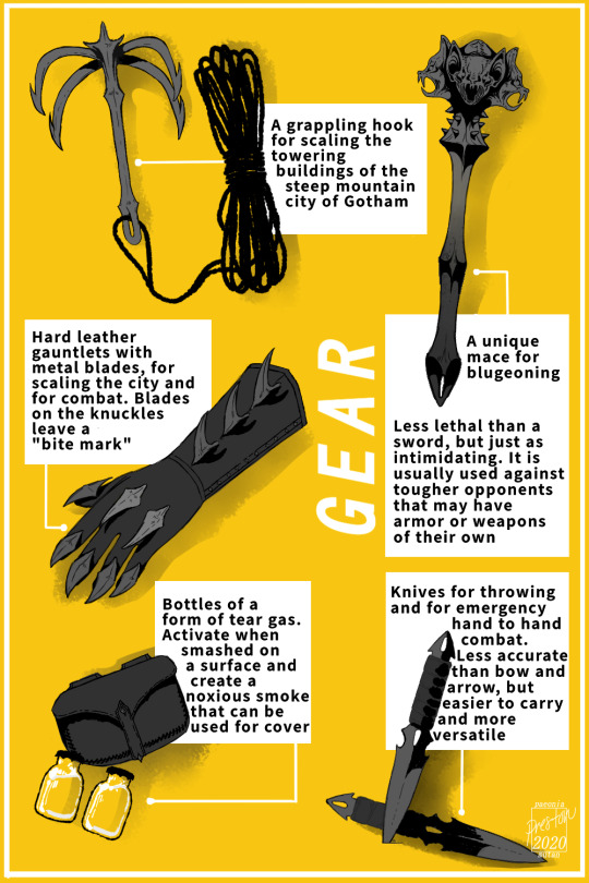

As part of a hypothetical character design assignment created by my beloved Stella, I redesigned good ol’ Batman into a medieval fantasy vigilante!
A transcript of the character concept page, as well as lots of additional design notes under the cut!!
Character Concept
As a young prince, he witnesses his mother's murder at
the hands of a lowly thief. Hatred pools inside of him during
years of living in his wicked father's shadow, and one
day, it spills up and out of him.
He is content with putting hands on the lowly scum of Gotham
for a while, reveling in a misplaced sense of righteousness. He
becomes a folkloric creature of the night that the
peasantry fear, but crime continues, because it must. It
simply becomes more secretive, and the criminals become more
resourceful, or more desperate.
Some nobles hate the beast for not publicly abiding to their
laws, trivializing the societal order and encouraging rebellion.
Some nobles admire him for being a symbol of "justice" upon
the peasantry, and for acting outside of the laws that restrict
their own pursuit of "justice". They perpetuate the mythos of
the beast, not calling him a man, for men are woefully bound by
law.
He uncovers a treacherous conspiracy involving the people
of the court and his own father, the reigning king,
to fabricate a sensationalized excuse to persecute the masses.
By pursuing his senseless, self-satisfying revenge,
he realizes he had been playing into it, and that his
his no-kill rule was pointless, as criminals were handed over
to a lethal system he and his family controlled anyway.
He had known this for a long time, and was simply complacent.
He begins to pursue bigger fish, because he must to discover
what really happened that night, and because he begins to
realize that it is not the peasantry that are the cause
of rampant crime in Gotham.
The tides turn against him when he turns his sights to
the nobility, and moves from myth to man.
Designed for adaptation into a comic no more than 1 volume long.
Completely grayscale with yellow only on the over and
chapter illustrations.
Inspirations
The Dark Knight -- For examination of power structures and
of the "purpose" of batman, and social consequences therein
Batman Black and White -- For grayscale art inspiration
Batman Beyond -- For batman outfit design, "modern, streamlined" with no cape
Lord of the Rings -- For batman outfit design, armour and helmet designs inspired by the nazghul characters
Berserk (90s anime) -- For tone and setting inspiration, an "operatic medieval
fantasy story"and for art design, the emphasis on "key frames" instead of constant animation and action scenes
Design Notes
For the beast outfit, it was difficult to strike a balance
between practicality and intimidation. A cape may make him
appear larger and less humanoid, but this iteration of batman
primarily uses hand-to-hand combat and weapons with very
little range. As well as seeming inconvenient for close combat,
I also just wanted to focus on armour design, and a cape
either completely concealed everything, or ruined the silhouette/
didn't fit over the armour. It was scary, but not practical for a
vigilante that had to scale the towering buildings of fantasy Gotham.
With the cape out of the way, I focused on making his armour. Only
a few pieces are made of metal, with the majority of the material
being tough dark leather plates and even some plain cloth garments.
I did not want to put him in a full suit of metal armour because it
wouldn't be appropriate for stealth or maneuverability, and because
it would ruin the stream-lined silhouette.
It helps that his main targets are the defenseless peasantry, and not
the nobles who might sic fully armoured guards on him -- in which
case I imagine he would struggle quite a lot with his light armor
and blunt weapon. I think that could be an interesting point to
explore in the text, how his outfit along with his ideology, literally
fall apart when he takes a swing at someone his own size for the
first time.
Deciding on a weapon for a medieval fantasy batman also proved
to be quite difficult. A sword seemed the most practical, and would
be one of the few weapons that could take on soldiers and guards
in full armour that exist in this universe. But once I decided
he doesn't run into knights very often, it was easier to rationalize
giving him a blunt weapon that could severely injure people without
killing them outright. Along that same line of thought, I opted
to give him knives for throwing and for emergency combat, instead of
a crossbow or other ranged weapons. He can control the lethality
of them much more than he can an arrow, and they are much easier
to carry.
When I got to the bat belt, I couldn't resist giving him some sort of
disposable "gadget". I thought a sort of tear gas solution would be
useful to him, either to subdue groups of people or conceal himself.
My biggest struggle throughout the whole project was designing
the grappling hook, and figuring out how he would carry it. I ended
up having to redesign the hook so that it could be folded inwards,
making it more portable and less dangerous for him to carry on his
body. Placing it and the rope onto the belt was tricky, and it
still seems quite impractical and dangerous. But I am very stubborn
about not giving him some sort of backpack to carry it in, and also
did not want to go back and design a full body harness like those
worn by real life rock-climbers. I attempted both, and I feel
they clashed too much with the fantasy aesthetic. So ultimately,
I am satisfied with how it came out and that it all fit on the belt,
even though it would almost certainly never be carried like that in
real life. The leather armor plates and chainmail make me feel a
little better about the grappling hook resting against his body.
Perhaps the most defining feature of the design is the spiked
outline, because the citizens of Gotham would only ever really be able to
make out the silhouette in the darkness of night. It may not evoke a
bat because of the lack of a cape, but it evokes a monster, and I think that
does well enough. In full lighting, the bat-like imagery of the helmet's
ears, eyes, and fangs are more apparent. I also wanted it to mirror the
tyrannical spiked crown he wears in the day time, for heavy-
handed symbolism.
For his princely design, I considered the "every man" look of Bruce
Wayne, and translated it to a handsome young fantasy prince. I thought
of giving him short hair so he could bear more of a resemblance to Bruce,
but longer hair better suited my idea of an "unhinged man" -- and I find
Bruce's design quite trivial to begin with.
Note: I realize there are a few typos in the images, and I am at peace with this
Thank you for reading!
#Batman#the dark knight#DC comics#DC#my art#character design#this took 574843 million years but it was a lot of Fun!!! :-)
37 notes
·
View notes
Note
Have you or anyone else made a list of the seven kingdoms in "Beginnings" and the countries that they're from? I don't remember which one is Neserdnia. Also, I get why TDK is not listed, because it's kind of dead, but what about Equis?
It’s up to the people in the Tangled universe/the people making the show to decide who is included in the Seven Kingdoms, not the people watching the show. (Also, it’s not like there are only seven kingdoms in the whole world.) I imagine Equis isn’t included because it’s at odds with Corona.
Anyway, here’s the list, per @jollylines (who did the character designs):
“Ingvarr: So while I can’t speak to whatever backstory our show may have given the fictional country of Ingvarr, I can say that the designs themselves were based on Persian/Iranian women. I collected lots of images of both modern Persian women and women in traditional Persian garb to influence the draping and details of their costuming (eventually I’ll post some concept images where you’ll see more options of what those characters could have looked like/dressed in). And then I pumped up the “warrior” aspect by melding those traditional elements with the silhouette of old European armor.
I feel the need to say: As a character designer on the show, I didn’t have control of the eventual coloring. I would have loved to have seen all of the Ingvarr women with black hair and a slightly deeper skintone. That’s how I’d envisioned them. But things shake out how they shake out.
Koto: Think standard “American/Euro” fairytale royals. Black and white, in your typical floofy animation royal dresses.
Neserdnia: Based on Pacific Islanders. Instead of typical crowns like the Kotos wear, they wear flowers and beading.
Bayangor: Asia mixed with Classic Greece. I wanted the women themselves to look of Asian descent, but for their outfits to be a blend of kimonos and ancient Greek robing and draping.
Galcrest: Based on Inuit women. I tried to combine more current garb with traditional details.
Pittsford: I was literally told, “Take the king we already have and just turn him into a woman around his age. Also turn him two slightly younger women.” SO THAT IS WHAT I DID. haha.”
As you can see, it is not a one-to-one specific ratio for specific countries, just like Corona isn’t one specific country. (Yes, I know people like to say it’s supposed to be Germany, but it’s not. It’s design, per Nathan Greno, is meant to have influences from both Bavaria and France, but also leans heavily on Fantasyland at Disneyland. It’s a made-up kingdom in a fantasy world, not a specific parallel to a real location in our world.)
#Tangled#Tangled the Series#TTS#Corona#Kingdom of Corona#Ingvarr#Kingdom of Ingvarr#Koto#Kingdom of Koto#Neserdnia#Kingdom of Neserdnia#Bayangor#Kingdom of Bayangor#Galcrest#Kingdom of Galcrest#Pittsford#Kingdom of Pittsford#jollylines#Amanda Jolly#Answered#Anonymous
44 notes
·
View notes
Text
GG Strive Thoughts: Part 3
Welcome to the last part of my Guilty Gear Strive thoughts!^_^ I'll be focusing on the art-style and character designs, so there will be lots of pictures in this post. I hope you enjoy reading!
Art-Style & Graphics
---------------
Guilty Gear's visuals always had a detailed, Sci-Fi fantasy anime look with creativity of the 1990s and early 2000s. This mostly stayed the same until Xrd SIGN, which introduced 3D cel-shaded graphics in a new way. The art-style also changed a bit from previous games, although it has kept its creativity.
GG Xrd SIGN and the following games(Revelator and Revelator 2) look beautiful, but it took me a while to get used to the art-style because of those dreaded chins. The characters should've just used their chins to fight cause of how long and pointy they are; just go "SLLASSHHHH!" XD Certain features of characters were exaggerated like Sol's shoulders being a bit too wide for his body or how Baiken's hair is thicker and spikier. Some people say it's "too anime", but that isn't the right word for it. I would say "whimsical" is main trait from the art-style, which is fitting for how funny the interactions are in-game and lighter tone in story.
Guilty Gear Strive keeps the cel-shaded 3D graphics, but manages to expand it further. Instead of its presentation akin to an anime TV series, it's now akin to a high-budget anime movie with detail given to both the characters and the environments. It's less whimsical this time, giving the impression the story will be darker in tone. I'm really happy the art-style was changed to being closer to the older GG games like X2; no more ice-cream cone chins!XD The characters also got redesigned to match the essence of the new game. I'll be talking about eachone in order from least to most in terms of design changes. I'll also rate them in Guilty Gear style grade form.
POTEMKIN
-------------------
There seems to be mixed reactions when Potemkin got revealed for GG Strive. Some were happy he looked generally the same while others were a little disappointed and asked, "How come he didn't get a huge redesign like the other characters?!" The answer is he already did; this is how Potemkin originally looked like in the GG series.
This design relates to Potemkin's story in the beginning. The Zepp empire in the past was a very corrupted, technology advanced nation. It contained battle-slaves with strength enhancement steriods and bound them with a special limiter. Potemkin was one of these battle-slaves with his huge, red metal color being the limiter. If he ever took it off, it would explode. However, Zepp was changed when Gabriel became President and freed all the Zeppian slaves, including Potemkin. He now serves as Gabriel's bodyguard out of genuine loyalty, gratitude, and care for his mentor and the renewed Zepp.
Judging on his old design by itself, I think he looked average(based on what he's wearing). His features definitely fit the saying "don't judge a book by its cover" because Potemkin is actually a gentle giant who's very intelligent. But the way he looks(except when interacting with certain characters), it's like he wants to break someone's bones, lol.
In the concept artwork in Guilty Gear X Plus(Japanese exclusive game), it hinted of what Potemkin will eventually developed into look-wise and story-wise. Even the pose from this pic was used later in Xrd SIGN. I really wish the design of the boots was used instead those weird looking ones he's wearing now, XD.
Now to look at Potemkin's design in Xrd SIGN.
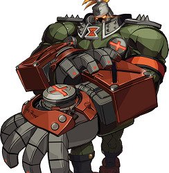
This is Potemkin's drastic redesign needed because of the changes in his life and his resolve being tested. I love this design so much because it accurately portrays Potemkin's personality. The first is his steel helmet with a spike at the top, accented with the Zepp symbol at the center of his forehead. His face is mostly shrouded in darkness except for the glowing lens. The yellow ponytail fur attached adds to the essence of a modern steel knight. Next is the black collar having spikes at the front; he also has on spiked shoulder plates to emphasis his strength. The power part is also in the round-shaped limiters attached to the upper parts of his uniform and glove compartment of his gauntlets. The design of his gauntlets is derived from the GGX Plus concept art, except the gloves completely cover his fingers and has a robotic aesthetic to it. I notice green is the most dominant color in Potemkin's design and there's a reason why besides it being Zepp's uniform.
Here is the Green Personality taken from Color Psychology
(https://www.empower-yourself-with-color-psychology.com/personality-color-green.html):
You are a practical, down-to-earth person with a love of nature. You are stable and well balanced or are striving for balance - in seeking this balance, you can at times become unsettled and anxious. Having a personality color green means you are kind, generous and compassionate - good to have around during a crisis as you remain calm and take control of the situation until it is resolved.
You are caring and nurturing to others - however you must be careful not to neglect your own needs while giving to others. You are intelligent and love to learn - you are quick to understand new concepts. You are a good citizen and like to be involved in community groups. You have high moral standards and doing the right thing is important to you.
There is more, but I only taken pieces that describe Potemkin's personality, showing why green is his main color. Now onto his look in GG Strive starting with his helmet.

On the forehead of the helmet, the Zepp symbol is no longer a design mark, but an carved symbol with the words "Armor-clad faith" underneath. Instead of just darkness on his face, it accentuates the robotic aesthetic with the gears and the lens having an orange tint. Next is a full body screenshot of Potemkin.
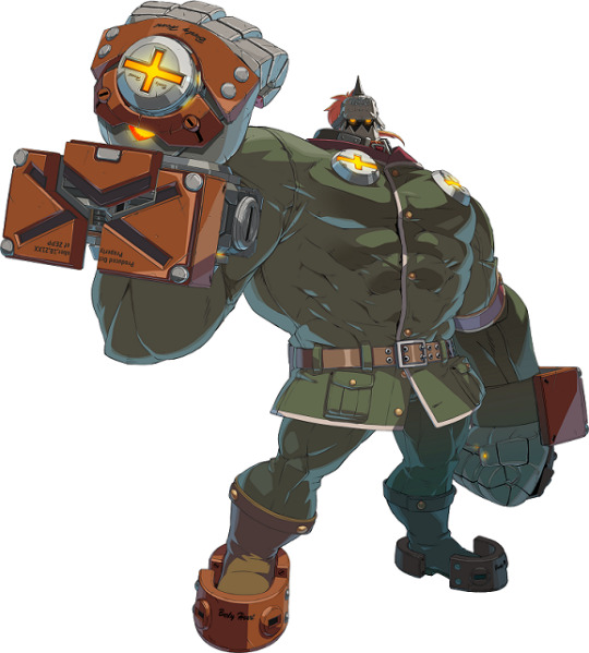
The spiked shoulder plates is less noticeable and his uniform is more formal. There's now a maroon-red collar with white trim and yellow buttons. The spikes on the black collar part of his outfit is gone, there's thick pockets on the lower part of his suit and has a brown belt instead of black. His boots is also brown instead of black and the plates around his feet is orange instead of red. There's additional limiters on his upper back that is revealed when doing certain attacks, showing his power has grown more. His muscle mass has also gotten super HUGE to the point I wouldn't be surprised if he reached Sentinel(X-Men) size, XD.
Design Rating: S++(Fantastic!)
SOL BADGUY
------------ ----------
Sol Badguy is the main protagonist, so there was never a worry or surprise of his GG Strive design. There's also the fact his design isn't really new; it's heavily derived from the artwork of Guilty Gear 2:Overture. But first is looking at Sol's most iconic design from the GG series.
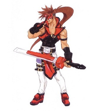
I'll always love this design because I think it's stylish, cool, and timeless. He's handsome in the traditional tough-guy way and perfectly fits the anti-hero type. His metal red headband acts as a limiter for his Gear powers and has the words "Rock You" in the center of his forehead. Besides it symbolizing his love for Queen's "Sheer Heart Attack" music album and controlling his Gear powers, it also symbolizes how he keeps his inner thoughts to himself and close-mindedness. He wears a black undershirt layered with a sleeveless, chest-length red jacket with a buckle strap. This style is very unconventional, which is exactly Sol is; he doesn't follow typical conventions. His red and black gloves conveys his toughness while his belt with the "FREE" tells of his philosophy. This also hints complexity to his nature since the belt is from when he was in the Holy Order, an aspect of his past. This shows he's inwardly caring and values the people in life along with his experiences. Lastly, is his white pants accented with buckles and red shoes.

The GG2:Overture Short Stories goes into some detail of the events before the game like how he was entrusted to raise Sin(Ky & Dizzy's son), etc. The major difference with Sol's design from the short stories is he's wearing a sensible red jacket similar to his old one, but its design still has traits of being its own style. His black undershirt is slightly different with a small V-shape cut-out in the middle, longer sleeves, and slightly loose around his stomach instead of fitted. His gloves has more of a biker vibe to them and no aspect of red nor buckles within them. He still wears red shoes on his feet, though tweaked in its looks. While this did hinted of Sol's character development, it wasn't a large factor because alot of the huge events at the time and before were placed on him rather than him confronting it by himself. It's why for Xrd SIGN, he primary reverted to his iconic look, though his GG2:Overture Short Stories look did get tweaked and used within the game's Story Mode. Now for his GG Strive look.
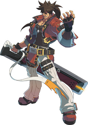
His GG Strive design blends both his GG2:Overture Short Stories look and aspects of his iconic design, which I really like. The red jacket with black trim conveys his free-spirited persona, yet also comfortable and relaxed. There's also a little bit more white seen on the cuffs of his jacket, meaning his heart is more open. This relates to his character development of finally confronting his past, his feelings, and his relationships. But he's still Sol Badguy and there's much for him to find out and explore, especially since red and black is still his main colors. There is deep meaning to this too.
Red Personality(https://www.empower-yourself-with-color-psychology.com/personality-color-red.html):
You are action oriented and physically active - sex is a necessity to you - you have strong survival instincts. Lovers of red are the explorers and pioneers of the world, the entrepreneurs and builders who like to be first in discovering new physical realms. You are always in a hurry, wanting to do everything right now. Patience is not one of your strong points. Red people can be aggressive and easy to anger, often exhibiting a violent temper - this is negative passion and energy. You flare up instantaneously but calm down quite quickly once you get it out of your system and then forget it ever happened. You have a strong need for power and control which is connected to your basic survival instincts.
Black Personality(https://www.empower-yourself-with-color-psychology.com/personality-color-black.html):
You are independent, strong-willed and determined and like to be in control of yourself and situations. You may appear intimidating to even your closest colleagues and friends, with an authoritarian, demanding and dictatorial attitude. You hold things inside and are not good at sharing yourself with others, possibly out of fear. You may be retreating behind black during a difficult time in your life such as a serious illness or a period of grief - black protects, allowing for a deep inner healing without interference from others.
I'll add traits of the color White since there's a noticeable amount on Sol.(https://www.empower-yourself-with-color-psychology.com/color-white.html):
Positive traits of White: Simplicity, self-efficient, growth/new beginnings, open, equality, rescuer, and sense of completion.
These traits describe Sol. Overall, I like the design and feel it suits him well.
Design Rating: S+++(Perfect!)
MAY
-----------
So far, May is the only female character revealed for the initial roster of GG Strive. There's mixed reactions with May's redesign for the new game. Some are happy she finally looks like she's in her early to mid teens(like 14 or 16) instead like a little girl. But others aren't happy with the changes to her outfit, saying it's bland. Let's look at May's iconic design.
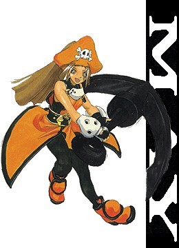
In my opinion, May is the coolest looking child character. Her open-sides style coat with side slits layered with a skin-tight bodysuit blends both cute and stylish. Adding to it is the tricon pirate hat, silver plating on her wrists and neckline, and orange short boots with black trim. Lastly, a black belt is around her waist while buckles accents her orange coat. This shows she's spunky, cheerful, and deceptively strong. In the story, her origins was unknown at the time, which perfectly fits due to there's black as part of color scheme(one of the meaning for black is mystery). Story-wise, May's development gradually grows from finding Johnny and later recruiting Dizzy as a member of the crew. Her curiosity of her heritage surfaces, causing some changes in her design.
In Xrd SIGN, Her skin-tight bodysuit is gone and replaced with just a black, fitted tank underneath her orange overalls. Her pants is loose-fitting along with having a big buckle around her waist and different boots still in orange with black trim. She doesn't have the silver plating collar, but other aspects of her iconic look like her pirate hat is kept. May finally finds out she's Japanese and dealing a mysterious condition that (currently) can't be cured. This is a huge story development for May that leads to be expanded further and another redesign. First is looking up the facial shot of May for Guilty Gear Strive.
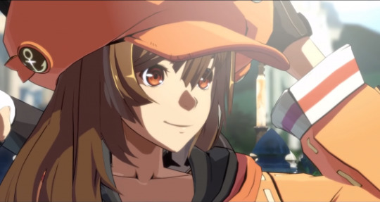
May's facial features is the first noticeable difference. The art-style is a strong factor in this, but May looks physically older. She still has big, cute brown eyes, though not as large as in Xrd SIGN. This makes her face appear a little longer face to convey a hint of maturity. Yet, she still hasn't escaped being just cute in an innocent way. Another difference is her hair is slightly shorten to halfway to her back instead to her waist. It's also loose instead of a thick ponytail within her pirate hat, which I think it's a nice little change. Her hat is shaped more round instead of oversized tricon while still retaining the pirate skull at the front. The anchor design on the sides makes it both simple, yet stylish. Now to see the full body of May's new look!

.....Lol, May is wearing a dumb orange hoodie, XD. What's worse is the hoodie has no special designs pertaining to May's personality or style; it's overly casual. There's also no shape, making her look like a fat fish. The skin-tight black short-shorts doesn't help with how oversized the hoodie is, which if it weren't for certain angles, it gives the illusion she isn't wearing anything on her lower body. It looks like lounge wear meant to be worn around the house instead of clothing a person would wear going on an adventure. Speaking of adventure, she has a backpack.
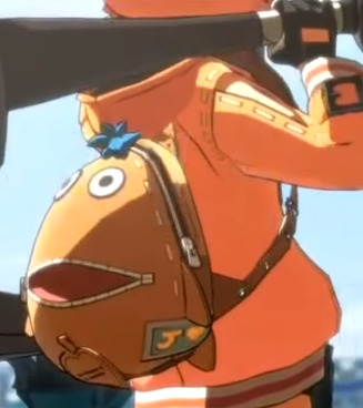
The backpack itself is cute because it's Chimaki(mascot of GG) and do see the the letter J with a heart; meaning love for Johnny. But other than this, this backpack also doesn't really relate to May. Besides being the mascot for the series, Chimaki is specific to Sin because it's favorite toy. None of May's official art ever showed her having a Chimaki toy or accessory. The casual look gives me the impression she quit the Jellyfish Pirates, but her winning animation of her saying "Jellyfish victory!" and Leap(the elderly lady who cooks) being there disproves this theory. Besides the hat, the only things kept from her iconic look is her gloves and boots. There's a heart on one of her thighs; a fitting aspect for a pirate.
Now to look at the Orange personality since it's May's main color(https://www.empower-yourself-with-color-psychology.com/personality-color-orange.html):
With orange as your favorite color, you are warm, optimistic, extroverted and often flamboyant. You are friendly, good-natured and a generally agreeable person. You are assertive and determined rather than aggressive - having a personality color orange means you are more light-hearted and less intense than those who love red. You thrive on human social contact and social gatherings, bringing all types together.
You live your life based on your 'gut reactions'. You are an adventurer - you love the outdoor life, camping, climbing mountains and indulging in adventurous sports such as sky diving and hang gliding. You are the daredevil, always looking towards your next challenge, your next great adventure.
This definitely fits May's nature. My impression of her simpler look probably hints of May is unsure of herself and trying to figure something out. Her expression in her new character portrait has this too; it's the first one of her not smiling. But I still think this new look for May is bad(except for the hat, the boots, and the gloves). Her design should've been something like this picture link below.
https://imgur.com/Ue1XdhT
The top would need to cover her stomach, but this design perfectly fits with May's nature and role as a Jellyfish Pirate. It also conveys she's adventurous and can easily implemented the backpack as part of the design. But it wasn't used... I'm nicknaming her May of the Jelly-Fat, lol. Worst design so far(and hopefully the only one).
Design Rating:D(for Derailed)
KY KISKE
-----------------
Ky's radical redesign for GG Strive was such a huge shock to everyone. At first, people thought it was Sin(Ky's son) until examining him closely. It's funny how many people are saying "Ky's handsome now" and saying he has an athletic body when in reality, he always did, XD. It isn't the first time Ky got big changes to his look based on the events in his life, but I'm going to focus on Ky's iconic design.

Ky is the opposite of Sol; the traditional knight-in-shining-armor type hero. This is another design I'll call timeless and my personal favorite look for Ky. He's very handsome in a princely way, which is fitting since Ky is a French noble. He wears a white shoulder cape containing a high collar with blue trim. It's attached to the blue knight-tunic with black trim in the front, accented with a white, trench-coat like detail. There's twin belts attached to his blue and black gloves while one is on his matching boots. Layered underneath his uniform is his black and white, sleeveless turtle neck and fitted detached sleeves. The belt around his waist with "HOPE" conveys Ky's philosophy. This attire is the Holy Order uniform, which conveys how strongly Ky holds onto the teachings and experiences he had during those times. His story at the time was about fulfilling his duty and doing what he knows and believes is right. Blue and white has always been Ky's main colors, which tells alot about his personality.
Meaning of White Personality(https://www.empower-yourself-with-color-psychology.com/personality-color-white.html):
Having a personality color white means you are neat and immaculate in your appearance, in the presentation of your home and in your car, almost to the point of being fanatical. You are far-sighted, with a positive and optimistic nature. You are well-balanced, sensible, discreet and wise. You think carefully before acting - you are definitely not prone to impulsive behavior. You tend to have a great deal of self control. You may appear to be shy, but you do have strong beliefs about most things and love the opportunity to air those beliefs. The challenge for you is to be open-minded and flexible and to communicate your needs and desires.
Meaning of Blue Personality(https://www.empower-yourself-with-color-psychology.com/personality-color-blue.html):
You are conservative, reliable and trustworthy - you are quite trusting of others although you are very wary in the beginning until you are sure of the other person. At the same time, you also have a deep need to be trusted. You are not impulsive or spontaneous - you always think before you speak and act and do everything at your own pace in your own time. You take time to process and share your feelings. You are genuine and sincere, and you take your responsibilities seriously. Having a personality color blue means you have a deep need for peace and harmony in your everyday life - you don't like having your feathers ruffled. You would benefit from daily meditation and quiet time for reflection, introspection and self-discovery.
You appear to be confident and self-controlled, but may be hiding your vulnerable side. Being a personality color blue means you are generally fairly even-tempered, unless your emotions take over - then you can become either moody and over-emotional, or cool and indifferent. You are sensitive to the needs of others and caring with your close circle of friends. While you are friendly and sociable, you prefer the company of your own close group of friends.
You are a rescuer and love to be needed but one of your lessons is to learn to love yourself first - you live from your heart and are always busy putting the needs of others first. You can be rigid - you like to stick to what is familiar to you and it is hard to sway you from your path - you stubbornly do things your way even if there is a better way. You need to have direction & order in your living and work spaces - untidiness and unpredictability overwhelm you.
You are approachable and friendly, always making people feel welcome in your life. You have a thirst for knowledge in order to gain wisdom and appear knowledgeable in whatever area interests you. You are spiritual or religious with a high degree of devotion to family, God, or other causes that are important to you. If reacting negatively, you are prone to self-pity.
These perfectly fit Ky's personality and has mostly stayed with him throughout his character development. Now to look at his GG Strive redesign beginning with the head.

One of the obvious difference is Ky's hair is short, reminiscent of his iconic look. But it raises the question of how since according to the story, it's stated his hair grows rapidly no matter how many times he tries to cut it(due to heavily implying he's part Gear). I'm guessing either Ky followed Sin's method of cutting his hair every 3 days or he found a special hair product to prevent rapid growth, XD. I notice the style of his hair is a bit different; the strands of his bangs is shorter and thicker. It creates a boyish look instead of a young man, which doesn't fit Ky. It doesn't seem noticeable during gameplay, but cutscene-like sequences it's the opposite. His hair should've been exactly like GGX2.
His facial structure and eyes in GG Strive is exactly like in GGX2 except for one part; his chin. While Ky's chin was never wide like most male characters, it usually isn't this narrow either. The narrower chin makes him look younger and with how the hair is styled, it gives the impression it's Ky from an earlier timeline. If his chin was similar to how it was in GG X2, it will improve his look alot and show he's mature and sophisticated. Next is examining the full body picture of his new look.
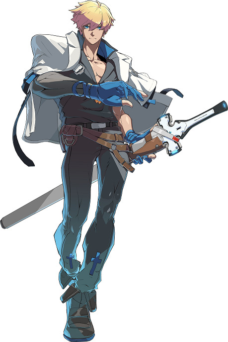
This is a huge departure in many ways. The only aspect inspired from his iconic design is the shoulder cape, but it lacks the blue trim around the helms and collar. Instead, there's black trim at the helms and hints of blue at the back with the words "Illyrium". His semi-fingerless gloves with fingernail plating is something he doesn't usually wear, but the back of his hands does have plating saying "Nothing can be done without hope". It shows he still generally has the same philosophy and key traits he's known for. The fact his "HOPE" belt is replaced with 2 standard belts(one black and the other brown) implies his mindset he carried from the Holy Order is gone and became open-minded. His open, V-neckline shirt with a single sleeve is inspired from this.
I do find it interesting how this reveals(pun intended) a different side of him, XD. It adds a sense of sensuality that leading men from romantic novels have and obviously it being sexy. Next is his fitted pants accented with blue crosses at the front then his boots with blue trim at the bottom. The most significant change is how Ky's dominant color is now black, which has important meaning to his character development.
Positive traits of Black: Include protection and comfort, strong, contained, formal, sophisticated, seductive, mysterious, endings & beginnings.
Negative traits of Black: Depressing and pessimistic, secretive and withholding, conservative and serious, power & control, sadness and negativity.
All of these fit Ky and since he's wearing alot of black instead of blue and white, this implies he has or going to have an internal struggle. I haved mixed feelings about his new design.
I love the concept of it and think it's nice to see Ky wear something different as his main attire. By itself the outfit is good and easy to adjust to, it's just not as unique as his original design. The design of blue crosses from his GG Accent Core Plus ending should've been implemented in the new design and add some gold trim to balance out all the black. I think his gloves should be changed to be more stylish along with the silver plating. If it had these tweaks, Ky's new design would be perfect.
Design Rating: A(Great!)
CHIPP ZANUFF
------------------------
The reveal of Chipp's redesign has mostly been positive, but all of us immediately said "He is so BUFF!" People say he looks handsome now and have joked he worked out at the same gym as Chris Redfield, XD. Let's look at Chipp's previous design!
Chipp's iconic look definitely displays the street-punk style and rowdy persona. This perfectly fits with his dark past of being a former biochemical drug dealer and addict. He has wild spiky hair, small red earrings, and a leather choker around his neck. The fishnet undershirt is both punk-style and those who practice ninjitsu wears. He has fingerless gloves with silver, square-shaped plating. This aspect is also on his belt and short-length boots. There's two leather buckles strapped around the right leg of his white pants and has on a loose-fitting ninja vest with silver buttons. This highlights his newly adopted values he got from his mentor and father-like figure Master Tsuyoshi. Chipp even has on black eyeliner around his eyes to emphasizes the punk look. Since he primarily wears black and white with hints of red, this tells about his personality. Black and white together obviously means viewing things in a straightforward way instead of complex like gray. Red conveys of his hot-headed masculinity, passion, and impatient nature. Combined with the other colors, it shows Chipp's other side of having pure intentions, even though it doesn't always come across right.
In Xrd SIGN, only minor tweaks were made such as adding a red sash attached to his belt, extra detail on his pants and boots, and slightly thicker eyeliner. Ever since becoming president of a (currently) unofficial nation dubbed "Eastern Chipp Kingdom", Chipp's personality seemed to have mellowed some, though still has his impulsive tendencies. Chipp has been through alot of character development since the beginning. Now for his redesign for GG Strive starting with his face.
One of the things I notice about Chipp's face is while it's still narrow, it's a little fuller and smoother with slightly higher cheek bones. His chin is also about an inch or 2 wider than how it was in the Xrd series. His eyes still has the same defined shape, but the eyeliner isn't as thick. These tweaks to his facial features makes him look handsome and approachable instead of angry and rough. But his fiesty side is still there because besides his eye shape, his upper teeth now has some small fangs. Now to see a full body picture...
Chipp's hair also got tweaked; tt's still spiky, but more stylish instead of wild. Instead of strands of hair rest on his forehead, he has noticeable asymmetrical bangs. Besides his red earrings, Chipp's 2 main colors(black and white) is kept along with a little more red from the strings attached to his ninja gauntlets and strapped sandals. He still has the red sash attached to his belt, though this time he has a thick, rope belt(I think it's called "Obi"). His white pants is very loose-fitting and no longer has twin buckle straps, but does have a little more detail with the side silver buttons. On his upper body, Chipp has on a leather vest with a form-fitting, sleeveless turtleneck. The height of the collar covers his mouth and contains buckle straps. This look is inspired from his design in "The Butterfly and Her Gale".
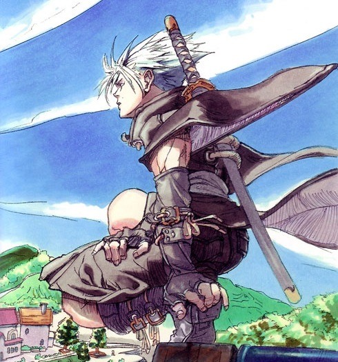
It has aspects of the high collar, gauntlets, and boots, even though the boots was tweaked to be sandals. This redesign shows Chipp fully embraces Japanese culture and the ways of ninjitsu. I think it may also hint of him being or becoming a master himself and training others, especially with how he's gotten so muscular. The way they mixed old and new with Chipp's redesign is amazing and love the tweaks to his face and hair. I do think his pants maybe a bit too wide along with the rope-belt, but other than that his look is perfect.
Design Rating: S++(Awesome!)
AXL LOW
-------------------
"Axl got PANTS!" is the main reaction people had when he got revealed and the majority agree it's a much needed upgrade. This is the 3rd time Axl has gotten major design changes since GG:The Missing Link. His look from GGX and onwards greatly emphasizes he's heavily inspired from real-life singer Axl Rose. For Axl, I'm going look at his redesign for Xrd SIGN.
In comparison to the others, Axl's design was never high-fantasy or elaborate, but it makes sense he's from the 20th century. His look in Xrd mixes aspects from the 1st GG and GGX, which conveys his easy-going nature and trying to adapt to the future he's in while maintaining his values of the past. He still has his signature UK cap, brown fingerless gloves, and matching shoes. His white shirt has a unique black zipper tie that adds a hint of contemporary along with his blue jacket. Attached to his black belt on the hips is cloths of the UK flag and has on blue shorts. Red and blue has mostly been his main colors(with some white) that tells of his peaceful, friendly, and passionate nature. In the story, Axl is finally confronted about why he time-skips and must make a hard decision that forever change his life. The choice he made leads him to major character development along with what role he will play in the story, so he needed another redesign to reflect this.
This design shows Axl has embraced the current timeline while maintaining his love for his country. His fingerless gloves is a lighter brown along with his ankle-length boots. He wears a red plaid jacket with white sleeves and black with orange trim at the helms. Underneath is his a sleeveless, form-fitting tank with 3 zippers at the front and a brown buckle at the mid-section. On his lower body is a belt with a UK buckle and fitted, detailed black pants with zippers on the side. This look is inspired by the concept art.
I notice his new design as a mixture of colors compared to before, though it seems black is the most dominant color. One of the meanings for black is power and control, which fits with how Axl now has control over his Time powers. He also has an aura of confidence compared to his uncertainty in the past games. This is the perfect design for Axl because he looks amazing and conveys his personality well.
Design Rating: S+++(Perfect!)
Thank you for reading this! I'll make a series of this as more characters of the game are revealed in the future!^_^
#GG2020#Guilty Gear 2020#GGS#Guilty Gear Strive#GG Strive#arc system works#daisuke ishiwatari#Sol Badguy#Ky Kiske#May#Chipp Zanuff#Potemkin#Axl Low#character redesign#my thoughts#analysis
12 notes
·
View notes
Note
hi! i love all of the work youve been sharing for your game- it's so inspiring!! you mentioned a while back watching character design videos and stuff- do you have any you'd recommend? thanks so much!
thanks so much! it means a lot to know that people are even a little invested in the work i’ve done so far ;-; i can’t wait to have a demo put together to share with folks...
and yeah sure! i wanna preface this by saying that i’ve found it REALLY hard to find tutorials on creating good character designs that don’t boil down to ‘create interesting and varied silhouettes!’. because sure that’s great advice if you’re working on non-human characters or in a fantasy world or in a cartoon art-style or in any other situation where your chosen medium allows you to actually make those kinds of silhouettes work!!
but if you’re drawing modern-ass humans wearing modern-ass clothes you, at least in my experience, can’t push silhouettes as much as you can in those other instances. you can still create lines of motion based on body shape/the way clothes fit/etc., but you can’t do the kinds of silhouettes you could do if you could give everyone armor or capes or cool swords lol
so in saying that i don’t have a LOT of videos to recommend lol but the one that has been by far the biggest help to me is this one:
What Makes a Good Character Design? by Super Eyepatch Wolf
my biggest takeaway from that video is something that more experienced artists than me definitely already knew but i fucking literally legit never stopped to actually think about critically so admitting this WILL make me look like a buffoon but
my approach to designing characters until very recently was like “make a cool and unique outfit and hairstyle so they’re visually interesting!” which like... for some characters, that IS what u should do! but in general i was missing like... the whole fucking point LMFAO what i should have been doing was trying to convey as much visual information about the character as possible. you can really see the changes i’ve been triyng to make in my recent development of sloan’s outfit design!

design 1 (old design) says very little beyond ‘shes slouchy and chill’, so when i did design 2 (newer design) i wanted to make her design show that she’s a fighter and that she’s a dedicated athlete and that she’s decidedly masculine-leaning and that she’s rebellious and cool and doesn’t give a fuck (i obviously have a long ways to go bc design 2 is still broadly generic but it at least says more!)
so i’ve been focusing much more on packing information into designs now!! as opposed to making them look unique and flashy
like back when i did taz art i got lucky with my designs for Taako because in trying to make him look flashy and cool... i played into his character trait of BEING flashy and cool (or trying-but-not-trying to be cool in Taako’s case). but i COULD have been asking stuff like “how can i visually portray his laissez faire approach to life?” “how can i show that he’s kind of a kleptomaniac?” “how can i visually evoke the way that Taako tries to be a smooth-talker but actually has very little charm?” “is there a way i can show the double-layered approach he has to the way he presents himself to the world?” i feel like my designs could have been so much stronger if i was asking myself those things!
so all that being said, here’s some more videos:
Concept Art BOOT CAMP 7: Character Design I (3 Keys to a successful character!)
Concept Art BOOT CAMP 8: Character Design II (Designing a NEW character from scratch!)
How to Design Characters // 6 Tips & Tricks!
57 notes
·
View notes
Last Seen Blogs

yavuzturkk
İsimsiz

soniamilo-blog
Sonia Milo
annodalpha-blog
LA DONNA ALFA
x-bluefire-heart-x
Safe haven for anyone

officialsohalshopfront
Sohal Shop Front