#also sorry im not drawing all that (the headgear)
Text

the many layers of simon riley
full layout:

#call of duty#cod#ghost#simon riley#simon ghost riley#mw2#in honor of mw3's announcement and me in the foreseeable future not acknowledging if this man dies#once again. sketch turned serious#also sorry im not drawing all that (the headgear)#also very very subtle#ghostsoap#but its just him saying soaps name (in my head its in a loving manner)#dnncats
2K notes
·
View notes
Text
GUYS I'VE OFFICIALLY LOST IT-
So. Awhile ago, I saw this post, right? Basically it just said that Sera and Sir Pentious' cards have very similar compositions, and that Seraphim, which is what Sera is, are often associated with serpents. Interesting, but could still be a coincidence, right?
So anyways I checked the reblogs and saw somebody say they should kiss. And now I'm insane.
Because like... the only thing we know really about Sir Pentious' potential story arc in the show is that he's gonna have a crush on one of the other characters. And the only thing confirmed about his sexuality(to my knowledge) is that he is attracted to women. We don't really have any way to know who his crush is, because there are a lot of women in Hazbin Hotel, but could still be noteworthy, right? And like... okay this is gonna sound like the most "trust me, bro" evidence I could possibly pull out of my ass at first but I just need you to hear me out here, okay? Sera's crown and Sir Pentious' hat have a lot of visual similarities. Here's a helpful diagram :)
Which like. Okay. Could literally be nothing, right? Except for two small things that I can't let go of: One, Sir Pentious' goggles + the v-shaped brim on his hat were added to his design AFTER he was given a more prominent role in the show-
(Pilot design, back when he was meant to be a one-off villain of the week vs current design as a member of the main cast)
And two, the Hellaverse shows kind of have a tendancy to use visuals in order to signify characters' relationships to eachother. It's also just a pretty popular form of symbolism as a whole tbh, but the Hellaverse has a lot of really good examples. Like, for instance, how Vaggie's new outfit is a lot closer to Charlie's color pallette than any of her previous designs, or this really good breakdown by @/raeynbowboi about the symbolism of hearts in Hazbin Hotel and how they pertain to Angel Dust/his relationships! It's from awhile ago so some of the info is a tad outdated, but overall I do think the analysis holds up. Meanwhile, in Helluva Boss, Moxxie and Millie have basically the same color pallette and they were the most functional relationship in the entire show before before Fizzmodeus came along. Which, speaking of those two...
See, I made this diagram because, after I pointed out the similarities between Sera and Sir Pentious' headgear to my dad and asked him if those kinds of similarities were a valid form of analysis(because I am but a humble highschooler that doesn't know everything about media analysis, and also I felt like I was losing my mind-), my dad said that I should look at the creator's(Vivziepop's) other works to see if couples having similar motifs was a recurring theme. So obviously, I picked my favorite couple in either show and disected their designs for every little detail that could maybe possibly be an intentional parallel. And while some of it is kind of iffy, like Fizz's limbs being the same kind of blue as Ozzie's tufts could just be a way to show that Ozzie made them, or both of them having uh, two things sticking off of their head(that one's definitely a reach-), I think stuff like both of them having hearts as a recurring detail in their designs or having lITERALLY THE SAME EYE COLOR??? Are pretty good evidence that Viv/the Hellaverse design team tend to use visuals to signify characters relationships.
ALSO!!!! If the Fallen Angel Vaggie theory ends up being true, there could be some interesting parallels to draw between Chaggie and Sera/Sir Pentious! Something about like... demon royalty/random angel vs angel royalty/random demon. Could be used to draw parallels between how the two societies treat that kind of thing idk.
So, now that all the meta evidence is out of the way, we can get down to what really matters: would these two work as a couple? Do their personalities mesh well togther? And the answer to that is!
IM SORRY FOR USING THE GIF IT WAS A GOOD JOKE IN MY HEAD BUT TYPING THIS OUT IDK IF IT'S ACTUALLY FUNNY-
But in all seriousness, I don't actually know. We just... haven't seen enough of Sera to know for sure. In fact, this whole theory is based off of small details that definitely add up to SOMETHING, but could very well be pieces to some very different puzzles that I'm trying to shove together because somebody jokingly suggested that they would fit. Like, the parallels really COULD mean something, and it COULD have something to do with Sir Pentious having a crush on another character, but like. There could also be a million other answers to both of those questions, y'know? I also have a tendancy to make wild conspiracy theories about genuinely inconsequential details... I almost never talk about them publically, but still. Though I will say, based off of Sera's description in the leaks, I could definitely see a world where she bounces off of Sir Pentious pretty well. Her description in the leaks very much gave me uh... Isabela cover of Surface Pressure vibes, y'know? Shit that is- that is a weird way to describe that but most people on here have seen Encanto right? Y'all get it? And Sir Pentious is both a Victorian Gentleman Type and completely unhinged. Like... idk there's something there. I could maybe see it working. But at the end of the day, it's just too early to tell.
That being said I WILL be trying to pump out some fanart of these two before the actual show comes out and crushes my crackshipping dreams. Also their ship name is either SeraPentious or PentSera I can't decide.
Edit: Wait a second... SeraPent. Serpent. PUN!!!!!!!!!! Okay I think I'm going with SeraPent-
#this is really just my attempt to make PentSera a thing before the show airs and I look like a fool#CRACKSHIPPERS ARIIIIIIIISE!!!!!!!!!#hazbin hotel#hazbin hotel analysis#idk if that's actually a tag but who cares#sera#hazbin sera#hazbin hotel sera#sir pentious#sir pentious x sera#sera x sir pentious#serapentious#pentsera#I might just stick with pentsera tbh it rolls off the tongue way better#analysis#long post#I feel like. I should tag this with late night ramblings. this feels like a late night ramblings post.#probably because I'm sleep deprived and so depressed I'm constantly exhausted#I'll tag late night ramblings for now and remove it if I change my mind ig#late night ramblings#serapent#gal overanalyzes random shit
25 notes
·
View notes
Note
AHHHH
I FORGOT IT WAS YOU WHO WAS OBSESSED WITH ALBERICH!!
IM SORRY!!! I GET IT MIXED UP!!!
or do you both love him
I forget.
ANYWAYS GIVE ME ALL YOUR SILLY THOUGHTS ON HIM YOU MUPPET!!
AHAHAHAHA well it is hard to tell... You see, yeah, me and @heraldofcrow are both his fans... But also not fsdhhfdhfds

(fhsdhfdhfds JHFSDHGFSD OKAY OKAY LOOK Crow sorry idk how to make this meme aroace just imagine that you have a wholesome sleep-over after a night of bad movies and yet you still wish it was Luther LOL fhsdhdfs)
________________
AHAHAHAHAHA okay to the topic now
❤️ Basically, we co-share the headcanons with @val-of-the-north since he learned of the character sooner than I did, yet I was the one who got obsessed xd You can see repetition of a lot of it here: ( x )
❤️ Basically, I think he is having a similar process going on in his body as what Azur and Lusat faced! Only with Blood Glintstone instead of more average "cosmic" one! I see it especially supported by how his headgear looks when altered:

Like... Just TELL me that his upper half of the head is not turning into a glintstone at this rate fdshfhdsfd But I assume similar process is going all over his body, especially his arms. Again, similar to the brothers!
❤️ I think that he drops not his own tongue upon defeat, but rather, he cut off Ensha's tongue for talking shit about him!! Ensha is stated to not only be an unspeaking character, but also have weird 'golden' bones, whereas Alberich is said to have been driven mad by jeering tongues... The item he drops is called 'taunter's tongue' and it IS golden colored, and there is nothing to say the rest of Ensha's body (especially entrails) could not have turned golden as well... Basically, I think it was Ensha who got screwed up fdshfhd But I also fully support Alberich xd
❤️ Yeah, correct, Val infected me with 'Alberich is Gideon's son' headcanon... Which would mean Alberich is at least half-Nox! ( x )

That makes me think that in younger years, Alberich used to have yellow irises, that only turned red as the result of his sorcery.... ...until he simply lost his eyes. lol.
❤️ With that said, of course, Alberich can perceive things perfectly without seeing them! Despite upper half of his face growing bloody Glintstones and him losing normal eyesight, he can still perfectly perceive any creature that has blood in it nearby. Think of a "vision" of bats, or more close to home - vision of Choir, Vileblood guards, etc. Naturally, anyone without blood, or more specifically, without red blood cells, would evade him... Basically, Alberich can't "see" crabs.
❤️ He DOES have vampiric behaviour and features. He will gladly not only use blood of the murdered for more Blood Glintstones, but also to add extra flavour to his tea fsdhfhsd However, he doesn't always have to kill someone. Sometimes, drawing their blood suffices.
❤️ Val was right, lol; Alberich fell for the trap of being able to do any sort of atrocity for as long as he could punish himself for doing so with religious self-flagellation -_- If you ever wronged him - it is a MUCH better idea to let him "punish" you for that, than to resist and become his victim. At least, you will survive the punishment. Like Val said and I seconded, he has a twisted idea on sin + punishment.
❤️ I am not actually as sure at the idea of Alberich having hated Nepheli as Val! I do think the two had a slight age gap, so when Nepheli was a child, Alberich was a teen. But I personally see the two as having had some good bonds as involuntarily siblings! Especially since Alberich was yet to discover the Blood Star as even a concept in his teen years! He however already was fascinated with grim, dark, bloody concepts... So when Nepheli would murder a scary monster and bring it's eye/fang/blood/etc as a trophy - Alberich was sure to find a use for it! He was just a slighly-asshole type of an older brother for her, although he could tell Gideon valued her for merely being easier to control -_-" (we also kinda hate Gideon on this blog fhsdhfd /j)
❤️ He DOES have severe daddy issues, though. That I fully accept. Whenever he accomplishes something important, he does think of how stupid Gideon would feel for not having trusted him.
❤️ He will often speak to himself, and they are some creepy things. He gained his nickname thanks to people who'd overhear him doing so.
❤️ Absolutely agreed that his "politeness" is more often than not a mask. You can only learn more of his true personality by talking to him for more than 2 minutes. But Alberich never counts on a long conversation, all too comfortable being by himself and the "revelation" he discovered. He will kiss lady's hand, though, unless she is like Dolores (masculine) or like Nepheli (feral and a warrior).
❤️ He has sharpened fingernails, though, and enjoys stabbing his own palms to extract blood and cast lesser blood briar sorceries. He will, of course, enjoy scratching his "wrongdoers" with them as soon as he could corner them. He is also especially powerful for a few days every month for no reason in particular
______
❤️ + Cut content headcanon! (is this even a thing...?)
The images of his set pieces picture his blood Glintstones having some green part to them. This made me think of Sellen - another sorcerer notorious for her sacrifices of other people in her pursuit! That made me wonder if notably green Glintstones Sellen has emboldened in her crown are of the same nature as Alberich's bloody sacrifices. More specifically; if Glintstones of Alberich are simply more grim and "progressive" nature of Sellen's green Glintstones.
Checking of Alberich's set on my player character unfortunately proven that 'green' part of Glintstones on Alberich's set is simply a design error... maybe? They show up on item image but not on the character. It made me hesitant on the headcanon, but I decided it was still worth a mention!
_________
Basically, I REALLY love this character, actually!!! I became obsessed with him from the very first day I even learned who he WAS, because the vibe of insanity + blood appeals to me like nothing else! He falls for the trope of a character that witnessed something not meant for humans and went mad that I LOVE, yet he feels so... harmless? So individualistic and genuine? I love that he minds his own business in pursuit, rather than deciding for the rest of the humanity what is good for them. Not counting his unfortunate victims for "bloody sacrifices"... But I feel that he only sacrifices people who were 'bad' and actually committed something evil; Alberich considers his actions as doing them a favour in atoning for their sins. He reminds me of my headcanons on Mic0lash a bit, with my headcanons that Mic0lash believes he is doing his victims a favour, "kindly" letting them be a part of something bigger. Likewise, Alberich believes he is "saving" the sinners. And if he went too far...... right, he simply punishes himself with the briars for that. xd
Thank you for the ask!!
#elden ring#mad tongue alberich#elden ring headcanons#ask replies#shitposting#doodles#crow i am sorry i had to fdhhfdshfds
36 notes
·
View notes
Text
thinking about....... salmonlings.........
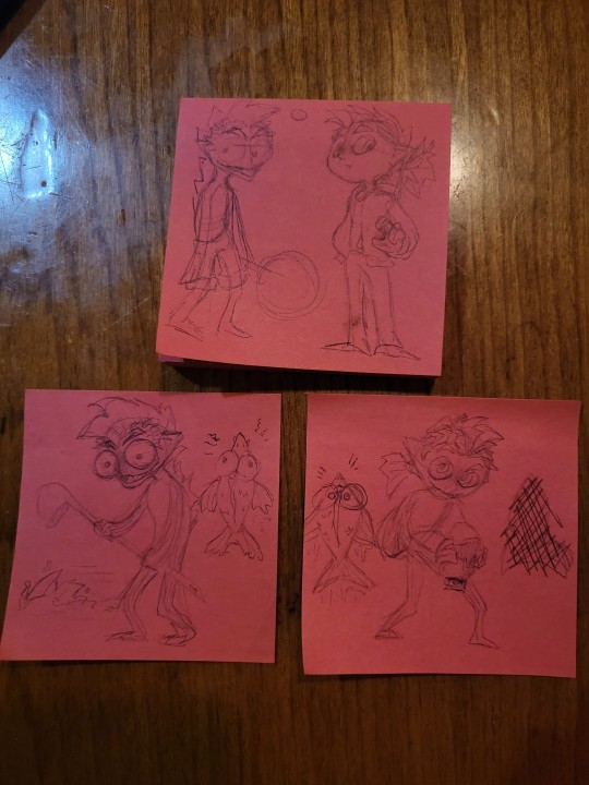
two main ideas, ones that evolved naturally and ones that evolved with help from the Alternian liquid crystals after the events of story mode in 3 (maybe there was some shit on the rocket idk i just wanted to design bitches lol)

im gonna reffer to them as
Salmonling - Left, evolved with help
Salmonidling - Right, evolved naturally (and if anyone can think of a better name , feel free to suggest PFFH,)
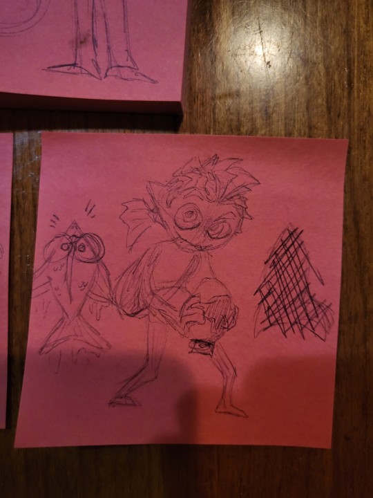
the little fresh guys, salmonlings! their hair usually has that main fin down the middle, but does not continue down their back. kind of hard to describe how the fins work, maybe I'll illustrate that later if ppl like these guys
their swim form is fucking adorable (scientific term) and they're closer in appearance to a regular, non-spawning salmon. because they had the aid of the Alternian liquid crystals, they can change their ink colour, unlike their natural counterpart. their fins change colour, including from about the forearm down. they have three fingers, a thumb, index, and a large flexible chunk.
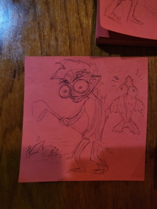
tbh i love the way these guys turned out, the silly (i still might make some changes tho, not exactly 100% on these guys)
salmonidlings are much more clumsy than their Alternian counterparts, but also stronger in some ways. like inklings, they can only swim in their own ink, and to counteract the constant onslaught of enemy ink, they can jump pretty damn far in swim form. I'd say they can swim a very short distance in enemy ink, and unless they end up in their own ink on the other side, they're forced into bipedal mode with a bit of damage already done. they have weapons that spread ink as well, I've been thinking of a few (the ladle was a last minute decision, i drew the left arm before the weapon 🫠)
their middle fin is much more pronounced than Salmonlings' are, and it continues down the back. in swim form, it peeks above the ink, but you'd be really lucky to have one swim close to you, their clumsiness mainly comes into play in their bipedal form. switching from swim to biped is much slower than ink/octo/salmonlings,(so they'd tend to swap farther away) but I'd be willing to bet their weapons make them something to be feared (perhaps you could pick them up once they're defeated.....🤔)
they have two fingers, thumbs and then one chunk, like a mitten. swim form of course, looks closer to a spawning salmon.
fun fact, they don't have ears, those points are extended gills. i dont know if salmon have ears to begin with! (probably in the splatoon universe at least, otherwise omega-3 would have a hell of a hard time selling) [i imagine they have ear holes, like some birds. maybe behind the extended gills?]
---
theres still some stuff im trying to figure out, like wether or not salmonlings can enter water. i imagine if they can, and participated in turf wars or the like, in order to keep it fair they'd have a bursting pack of enemy ink for if they fell in like in some of the Octo Expansion levels. either that or those liquid crystals fucked them all up i guess
i was also thinking about a salmonling specific ability, because salmon have amazing senses of smell, if they're standing still in swim form and press R, they can see everyone through walls, like Thermal Ink. The drawback would be a subpar sub weapon, like a splat bomb but smaller or something.
part of me doesnt like this though, because then every salmonling would be forced to use a small splat bomb. maybe it could be a main ability attachment to headgear? or maybe be its own sub weapon(anyone can use it this way, which I'd been trying to find a workaround for anyways), and while you do it, you can't recharge ink. I'm digging that last one
lots of thoughts. head full. love these. tell me what u think if u want. sorry all the drawings are on sticky notes i only ever really have the willpower to draw at work rn but i do wanna make these guys digital
#salmon run#salmon run next wave#splatoon#splatoon 3#splat2n#I'm proud of these tbh 💝💖 i love love love thinking about stuff like this#my stuff
7 notes
·
View notes
Text
𝙲𝚘𝚖𝚙𝚕𝚎𝚝𝚎𝚕𝚢 𝚁𝚊𝚗𝚍𝚘𝚖 𝙰𝚛𝚌𝚊𝚗𝚎 𝙷𝚎𝚊𝚍𝚌𝚊𝚗𝚗𝚘𝚗𝚜// 𝙼𝚘𝚍𝚎𝚛𝚗 𝙰𝚞
𝙰𝙽- sorry theres less for Ekko and Vander I didn’t have as many for them ^^
𝙸𝚗𝚌𝚕𝚞𝚍𝚎𝚜 - Mylo, Clagger, Powder, Vi, Vander and Ekko!
꧁--------------------------------------------------꧂
Mylo
He’s definitely that one kid in school that always has his headphones in or is starting unnecessary trouble
Constant detentions for late homework, gluing the teachers to chairs and fighting but never turns up to them.
Usually only gets into fist fights over something “moral”. Like standing up for his friends.
Refuses to join any after school clubs
“I have better stuff to spend my time on”
Those better things consist of playing video games or drawing a character he made up.
Thriving in maths, music, art and PE
Failing horribly In science
Probably has a pet lizard
Or a spider
His room is only clean because Vander will ground him if not
Falls asleep constantly in class
100% a Rick and morty fan
Sleeps in an oversized Rick and morty shirt
Collects dream catchers
Cried when Arthur died in rdr2
Probably lives in cargo shorts or baggy clothes
Loves Halloween
Overall a menace to society, more so than he is in zaun
Avoids relationships at school. He says it’s a waste of time but In reality he is just terrified of messing it up.
Got made fun of for his hair, so he started putting it a man bun
Really interested in history but not good at it.
Went through a massive fnaf phase and still isn’t completely over it
Clagger
Thriving in every subject, other than art and PE
Gets money out of tutoring others
Tries to help powder and mylo in subjects they aren’t doing great in
Cleanest room in the house
Lives in hoodies and flannels.
Has pictures and articles of space stuff all over his walls
Followed by a professional telescope kept tidy in the corner of his room.
The main one who gets bullied at school and the main one Mylo sticks up for.
Always looking for his glasses. A l w a y s
Usually the one to clean up Powders room
Does extra maths after school… for fun…
Massive Marvel fan
Definitely has an innocent crush on black widow
Also loves comics
He wants to draw but he just can’t get the hang of it. So he dropped art
Imagines himself being an astronomer or chef one day
Strangely good with cars
As soon as Vander introduced him to star wars he got hooked
Him and mylo bond over it
Has Lego figured of darth vaders headgear
Powder
Doing well in school but not classed as one of the good kids
Always playing pranks on teachers
Regularly scolded by Vi for stealing the teachers stuff
Very good at cross country
Does a lot of sports
Adored by her art teacher
Her best friend is definitely ekko
Anime lover
Has Disney princess bed sheets for sure
Followed by hundreds of old princess dresses in her wardrobe from when she was younger
Obsessed with bath bombs
Massive sweet tooth and Vander limits the amount of fizzy drinks she’s allowed
Always sneaks to the shop after school to get a coke
Does gymnastics and competes
You can imagine the whole gang will be there cheering her on
Im sorry but she would definitely went through a roblox/gatcha kid phase 😭
She’d also hate herself for it
She’s the ‘popular’ girl in her year but only because she’s brave enough to mess with the teachers. And because everyone knows she’s related to mylo and vi.
Mainly gets picked on my older kids, who vi ends up beating the living shite out of.
Vi
Definitely in a boxing club
Stoner!!!!
Frequently gives herself stick n pokes
Pierced her own ears
Loves artists like p!nk, lady gaga, Amy winehouse, Radiohead and Lana del ray and has posters of them.
Would also like the occasional punk rock
Gives of massive Chloe vibes from life is strange
She is an average student in school, not caring too much about her grades but still passing.
Spends her free time working out, skating, helping Vander, playing minecraft with powder or out doing something sketchy.
Doesn’t quite understand minecraft but tries to play anyway.
“Everythings a cube?”
“Yeah vi… that’s kinda the whole point”
The first to get their drivers licence out of all the kids
Gets a motorbike instead of a car
She’s usually the one to shove mylo in lockers at school
Gets the most phone calls home too if you Couldnt already guess
Gets asked out by thousands of guys till everyone catches on that she is 💅
Openly flaunts her relationship with cait cause she adores her so much.
Went through a hunger games phase
Mainly because she had a massive thing for katniss
Vander
Massive top gear fan
Still Owns a bar (which they all live above) but works part time as a mechanic
Has a massive family car for everyone
Tried online dating but stopped when he got catfished
Does NOT understand technology and is honestly a little scared by it
Is that dad to turn up at school and intimidate the kids when he finds out one of his children are being bullied.
Frames powders drawings and hangs them around the house
Goes all out for holidays
Especially for powder, he will dress up as Santa and everything
Loves playing Lego with the kids
They made an entire Lego city together once until ekko tripped over claggers toy lightsaber and broke everything
Gives the kids weekly pocket money
Rolling Stones and a Queen lover
Blasting Bohemian rhapsody when picking the kids up from school
Very into the guitar and attempted to teach all the kids. Mylo was the only one to take interest
Probably takes the piss out of Americans
I don’t know why, he just likes to mock their accent when they do it to him.
It’s his main source of entertainment
Massive Disney fan
Ekko
BIGGEST TEACHERS PET
above average in everything
Loves dance and takes after school club in street dance and tap
Emotional wreck
If he gets told off he will burst into tears and purposely make everyone feel bad
Is smart enough to help vi and mylo with their homework
Went through a Creepy pasta phase and gave himself nightmares
He then shared the stories with powder and infected her with nightmares too
Now he regularly checks his wardrobe at night to make sure slender man isn’t waiting for him.
Him and powder write little stories together. He does the writing and she draws the pictures for them.
Has a crippling fear of elevators
The kinda person to pet every single dog he sees
“Ekko!! That’s not a dog that’s a possum!!”
When he is older he would dye his hair every single colour.
Has a minecraft world dedicated to red stone contraptions
He blew up his console once with the amount of power it used
111 notes
·
View notes
Note
i forgot to add: how do design ????!?!??????
So I’m not expert but this is how I think of character design! (also sry if you were asking about clothing/outfit design thats a little different)
under the cut because this is long im so sorry

So in my opinion there are three really important aspects for character design!
AESTHETIC: obviously everybody’s aesthetic is different, but this is more about what vibe the character has, what makes them THEM design wise.
INTENTION: who is the character supposed to be? this can range from their personality, their back story, their occupation, or their role in the story, but the design need to fit that intention.
COHESION: does the design go well together? or do certain aspects clash too much? obviously you can have disjointed parts of a character design, and if those serve a purpose then thats fine, but if its so disjointed its distracting from the character as a whole you might need to tweak things.

AESTHETIC: the contrasting part of the design (white flowers in dark hair, dark trim on dress, and dark shoes) provide interest to the eye. The mixing of round and sharp shapes also keeps the design from feeling “boring” even though its relatively simple.
INTENTION: so what role would this little doodle character have? according to her design elements, shes cute and friendly with her round shapes (bouncy balls, babies, etc), but could have a sharp/fast/active or even dangerous edge to her with the triangles (arrows, knives etc). of course the design doesn’t limit her possible roles. She could be a bubbly younger sister who teases the older protagonist, or maybe she’s the villain hiding in plain sight. the shape this character design doesn’t really have is squares(think bricks and rocks), which communicates that she might not be really strong, steady, or reliable.
COHESION: repeating the curves across her whole design builds cohesion, it communicates that “yes, these are all part of the same character”, it also allows the eye to “rest” on a familiar shape or line.
NOW LETS LOOK AT SOME DESIGNS

(Boku no Hero Academia) so both of these characters are super heroes, but have vastly different design elements. so lets analyze them.
OCHAKO(the pink one) is all rounds, with a few pointed shapes in hair mostly, but a little on her costume as well. Her personality is cute, bubbly, and friendly which perfectly suits her soft and bouncy design. Howevre she also has a very slight edge to her, which is seen her determination and drive to improve herself over the course of the anime.
KIRISHIMA(the red one) at first glance, seems to be super pointy!! shapes that are usually seen on villains or really dangerous characters, but while he IS sharp(literally sometimes) and sometimes aggressive, he is also made of squares, which perfectly suits his loyal “i gotchu bro” attitude towards most of the other characters in the anime.
ISSUE AREAS: so the only problems i have with Ochako and Kirishima’s designs is that their costumes each have one area that clashes a little too much for my taste. With Ochako, the belt over the color blocking stripes down her crotch are......questionable taste wise. I think the design would be better if the pink chest ended above the belt in a shallow v. not only would this mirror the triangle aspects of her hair, it would fit the belt outline, and continue the trend her costume has of being “grounded” or “heavy”. Kirishima has those.... gears??? around his shoulders??? and while the gear teeth are technically squares, the gear shape itself is a circle, which is a shape that isn’t present anywhere else in his design. I think changing the gears to something similar to his boots or his mask/headgear would create a more cohesive design(also the gears just look hard to move in)
These two characters are presented as individuals so their costumes don’t have to match at all even though they are still seen as “connected” because of the art style for the face, hair, and body.
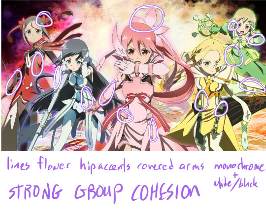
In a group giving the outfits cohesive motifs is an easy way to present a strong team image! In Yuki Yuna is a Hero, the girls all have colored lines(usually princess seam placement), armor or fabric hip accents, covered arms, and similar flower shapes in their hair. The Aesthetic of each girl is strong in a monochrome signature color, but not over whelming as the black+white connects them even in color so they aren’t out of place.
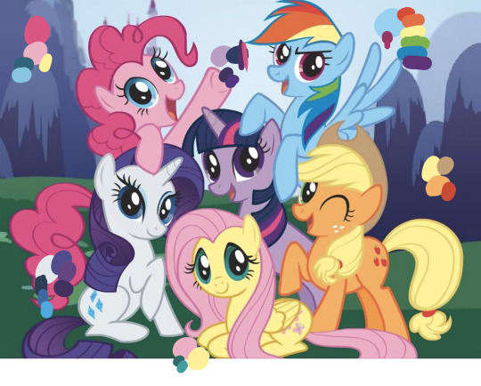
Speaking of color! if your characters are all similar looking (like same body for all of them) you can communicate their personality and aesthetic just with color! (only gonna talk about a few of the ponies) Pinkie Pie (the really pink one) is energetic and playful, so her color scheme is a variation of the primary colors(happy, child like), and have one of the more saturated colors(high energy, intense) of these characters in a large quantity. Apple Jack (the orange one) is a down to earth farm girl, and her color palette is accordingly, mostly earth tones, its also warm analogous colors, which makes her appear un-complicated and warm personality wise. the pop of red is a nice touch to add interest, but notice that its uses sparingly in her cutie mark and tail accessory. Rarity on the other hand is elegant and fussy, her high contrast scheme of white and dark blue/purples gives her more visual interest and is something that makes her appear more “complex” in addition to the gradient thats included in her hair. the colors are also all cool colors, bringing to mind cool glass or water which both have connotations of grace and beauty.
however all the characters here are unified by their colors being on the pastel side, which is also important for a cohesive cast.
another, short, note on color; making the color/line/shading of your figure different from the background can help them stand out, this is used ESPECIALLY in children’s media, but can be applied to any illustration or animation as needed.
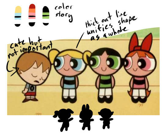
Color can also help your characters “read” quickly on screen, the powerpuff girls are a prime example, of having a distinct color blocking and silhouette. even the color blobs at the top and my crappy hand silhouettes STILL read as the characters despite being broken down into abstract elements. I also really enjoy the thick outline in the powerpuff girls, it really makes the characters pop to the foreground even though they have pretty simple designs and are often in a colorful setting.
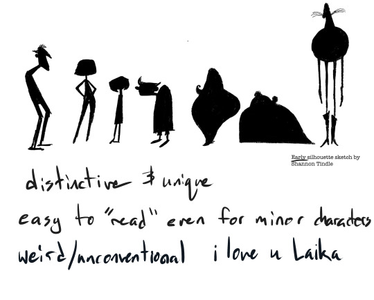
Also, for a lot of animation, silhouette is INCREDIBLY important for your characters, some designers sketch silhouettes and then design the particulars its so important to nail the shape. These examples from Coraline are some of my favorites (though Laika wins in my heart every time no matter what lmao) because the simple shapes are SO CLEAR and indicative of the character, you literally don’t need to have watched the movie to know these are each different characters with different personalities and roles.
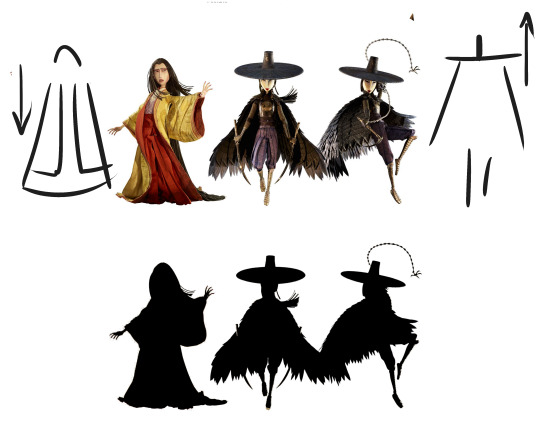
silhouette can also help tell the story. In Kubo and the two strings (another Laika film) the above three characters are sisters. One has chosen to leave her home in the heavens to live on earth, and the other two stay in their roles as “heavenly” warriors. This is even shown through their designs, the two sisters are weighted on top and their cloaks don’t even touch the ground, while the first woman has trailing, heavy sleeves, hair, and robes all grounding her and emphasizing her connection with the earth.
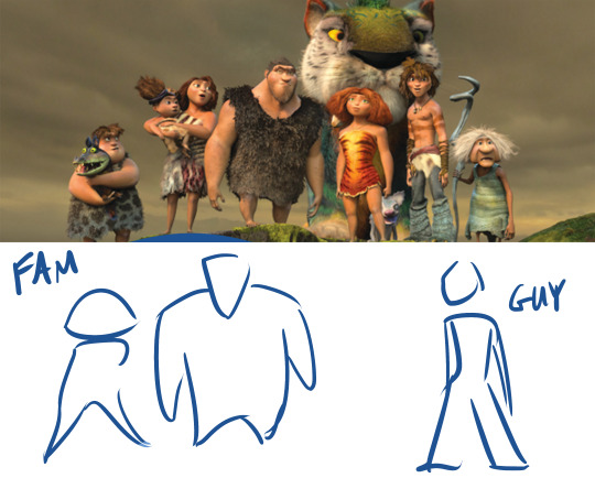
another example of shape/silhouette reflecting the story, In The Croods, the family of cavemen are for the most part very top heavy, with large torsos and arms, usually in a more hunched over position, while the newcomer, Guy, is bottom heavy with thin arms and stands more upright. In the plot, the family represents the old ways, the strength and rules that have helped them survive, they look like very stereotypical “cavemen”, while Guy resembles the modern man, and appropriately is associated with new ideas and forward thinking.

MORE SHAPES, in DC super hero girls each girl has a distinct personality emulated by her shape language. Zatana is dramatic curves and edges, Super girl is hard, straight edges against curves, giving her a solid muscular shape. Wonder Woman, though also strong, is taller and leaner, lending to a confident leader type. Green Lantern is slim, her lines all flow into each other giving her a go with the flow look. Bumble Bee is, of course, tiny, but her boots and gauntlets add weight and strength to her otherwise small frame. Batgirl is lanky and has a lot of pointed style lines, reminding the viewer of a skinny cat (ironic what with cat woman i know) or weasel which mirrors her preferred “sneaky” crime fighting style. (also yes this was just an excuse for me to gush abt how much i love the dcshg designs shut up)
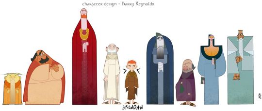
so in my opinion, Cartoon Saloon’s The Secret of Kells is PERFECT in aesthetic, intention, and cohesion. Kells focuses very strongly on creating silhouette WITHIN the larger figure shape via color and line, most of the characters pictured here have no neck, the one who does, Brendan, is the main character and the use of negative space that cuts into his shape is used to draw attention to him. Kells is also very strongly inspired by Medieval Illuminated manuscripts (namely, the book of kells lmao). The characters still manage to stand out against outrageously detailed backgrounds via their simple shapes and strong color blocking.

Aisling, a secondary but very important character, is not human, and has a totally different shape language from the rest of the characters. She is thin and pointy, while most of the others are round or square. Aisling also has the most negative space making up her silhouette, compare the triangles made by her arms and legs in the above picture to the figures in the first image where everybody’s body is self contained with no negative space. She is also very different color wise, very pale and cool colored, as opposed to the warm saturated colors of the human characters. (yes this was another excuse to gush abt one of my fave pieces of media deal with it)
hopefully that wasn’t too rambley and actually helps? if yall have more specific design questions lemma know lol
#askems#a-magical-human#design#art tutorial#tutorial#Character Design#boku no hero academia#yuki yuna is a hero#yuki yuna wa yusha de aru#my little pony friendship is magic#mlpfim#madeline#powerpuff girls#ppg#coraline#laika#kubo and the two strings#the croods#dc super hero girls#dcshg#the secret of kells#cartoon saloon
842 notes
·
View notes
Text
@captainwordsmith thank you for the question! :D
!DISCLAIMER! Nothing of this is set in stone... since i’m not producing for an official comic or TV show, i keep myself the freedom that i can sometimes change things up if i find a better design idea.
For any history/fashion buff reading this, I’m really sorry if i name things wrong xD this is more about what i’m looking for when i look up references, but i always also change things up or combine them.
So, since the seven kingdoms are loosely based off europe, i always thought it a given that the fashion in them is different from region to region :D When i look at a character or house i get like... an idea in my head, and i try to finetune research until i find the real life fashion that mirrors it. While i always name a country it’s never really 100% consistent since i’m not making accurate historical art... i always mix it around with several influences/time periods, and im more about getting a look that’s semi-consistent in itself than a look that’s necessarily consistent with a historical period. after all im trying to make fashion for a fantasyland... So this is more of a list of what stuff i look up when researching.
Also, unless speciifed, if i say a country’s name i either refer to folk clothing, or medieval fashion and up to the 16th-17th century.
The amount of info is based on how often i draw the people from the region, so sometimes a lot, sometimes very little (yet!).
There’s also my pinterest wall where i collect references, nothing i uploaded myself just stuff i favourited from browsing the site
The North
The North makes me think furs, and clothing from solid materials. My mental image is always primarily slavic countries, but with added scottish and scandinavian influences since it’s a huge region and should have differences in itself.
House Stark: Since they are the main northern house and have many important characters, i try to give them a more standard "fantasy” appearance; they are kind of like an introduction to both the north and the series itself, so while i want to already start with the furs and all, i still like to kind of keep them like the readers and show watchers would expect. though i saw a really rad polish eddard and it makes me want to up the slav with these guys
House Karstark: what i would call “high russian”... I don’t really have a deep reason for this it is just the mental image that immediately springs to my mind. Maybe their sigil reminds me of that aesthetic
House Bolton: Elegant clothing, not too fancy but not conservative either. I first kind of got an idea for their vibe when i saw someone describe roose as “westeros’ vlad the impaler”; so usually when i look for references i try to stick to romanian and hungarian clothing, and stuff that fits in with that fashion; The dreadfort lies in the east, so hungary/romania/ukraine seems fitting to me.
House Ryswell: Very loosely scottish influences... also for the women, 14th century french/german vibes
White Harbor: They migrated there from the south, so i try to give them a more “southern” fashion (ie fashion that does not look like the rest of the north). Influences from france/italy, and netherlands.
House Umber: Vaguely russian, but not very elaborate. Kind of simple, big, warm, clothing (they are the closest to the wall), but with those cool hats.
House Dustin: Pretty celtic, invoking an idea of “the first king”. Maybe a king arthur vibe added... normannic...
Riverlands
When i read descriptions of it, i always think germany... Green, with a river through it, and medium climate...
House Frey: really vibe me as german, flemish or dutch, so that’s kind of what i’m going for with their clothing. Also some 16th century influences, i often see paintings in museum’s where im like “thats walder!!”
also these hats
House Tully: Kind of a conflict with the german/dutch thing i want to have going on, but the name is irish and they have red hair so irish fits... usually a case by case decision how i mix it
Vale
this is hard to specify because i can’t quite name what exactly im seeing in front of my inner eye... It’s this sort of, really medieval style, maybe 12-15th century, influences english and german?
The eyrie is so far up and kind of magical seeming, it reminds me of a fairy tale... so that is the vibe im slightly trying to achieve, this innocent medieval vibe you get from history books geared at kids. Maybe also sort of a king arthur feel.
Obviously neighbour to the riverlands so it can have similar fashion at times... exchange of trends....
And since It’s near Essos we can also look at cultural exchange there. It would make sense if a vale lord or two had mixed heritage...
House Royce: Their seat is runestone, and runes are on their sigil, so maybe these crowns... or some fantasy dwarf elements... Also general celtic influences (very vague and i WILL research more about celts when i actually draw members of this house). Hope when i research, that i will find a good idea on how to differentiate to two cadet branches well.
Westerlands
House Lannister: I’m seeing the Lannisters as like, really hip english and french fashion. You know the awesome hats, and beautiful dresses... The hair up in this horn-like headgear... jewels and ornaments...
Not so sure on the rest of the westerlands houses since i don’t “see” the characters around as much, i didn’t form a good impression... But I’m thinking solid english/french folk. Not the same as the ryswells, more of a rennaissance flair.
The Reach
House Tyrell: something in me wants bosnian Tyrells... The way the reach’s described in Dunk&Egg makes me think of my summers there, and they have brown hair/brown eyes. Though realistically (as in, what seems intended by grrm) i’m getting a huge french vibe (highgarden like those french gardens), so i’d strive for a good mix. I just need to differenciate it from the Lannisters, probably by keeping the mediterranean influence strong.
House Hightower: Burgfräulein vibes
Crownlands
Nobility/King’s Landing: Should scream “king’s court”, im thinking just the coolest looking medieval fashion i can find. A bit more modern, rennaissance-y, maybe. And stuff like this
House Targaryen: very boring but whatever the influences for LotR elves are, plus generally european kings, those with all the drama that martin was inspired from... i will need to work out something right proper for future targ drawings tbh
Dorne
House Martell: I had a drawing or two using the indian influence that is popular in fan art, but i'm not sure if i want to keep it... ivansbadart gave me the idea for north african influences, i might use morrocco myself, and i think i might also look into middle eastern fashion a bit. Or i mix a bit of both, considering the Region’s history of both the martells and the rhoynar... Most importantly i need to agree with myself on what my main inspiration for the rhoynish look will be.
Stormlands
Mainland: I don’t really have an idea for the stormlands at all, i can’t remember if any of the books ever had a segment there... i just have zero impressions so far.
House Tarth: Toying with a greek vibe, since it is located in the narrow sea... maybe mixed with a bit of italian.
Iron Islands
I really really have to get into researching a bit for this location... whenever i want to draw greyjoys my mind’s just like “uuuh vikings” and that’s that. this is theon
#as you can see i draw characters from some regions more often than others....#also i left out anything from essos because the post already became so long#though i draw some places in essos more often than like 2/3 of these xD#hope this is what you were looking for in terms of design philosophies :0#my art#asoiaf#long posts#captainwordsmith
71 notes
·
View notes
Note
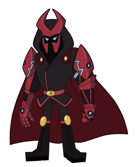
What's your opinion about the red leader/tord design?
ohhh, I’ll give it to you with pleasure anon ! I hope you’re ready, long rant ahead bc im an art student and that means, I’m Overly Technical, I Throw Personal Opinions Around, And I’m Probably Too Mean For What Eddsworld Is
for those who did not see it :
anyway
so let’s start with starters. shape. when you first look at the design you notice immediatly : it’s triangles and rectangles (aside from the lonely ass knee pads. and belt which are just “shield” coded) what the fuck this mean ?? well, triangles = DANGURUS, S H A R P n shit. you get it, the codes for danger and stabby shit. it’s also the code for hierarchies n such cause pyramids. this guy is high in the hierarchies, this guy is made to step on people and shred them. curvy + pointy = teary. simple designs maths. its ideal for cartoon characters who are pretty outside = inside coded. after, ngl, they went /super basic/, whats “expected” when you go with that. rectangle legs and feet, triangle torso, square jaw, yadda yadda… they laid down the stereotypes and called it a day.
now let’s see the colours, which are treated pretty much the same. you have classic black for darkness, evil and death, classic red for blood, war and yadda yadda, eletric blue for electricity and basic robot aesthetics, gold for power and wealth and royalty, and of course because tord is a basic tankie bitch who wears the communist colours. theyre p average but at least they aren’t at full saturation so-
anyway. next layer of rant. the “themes” for the clothes. ok its just, obvious magneto copycat with a mix of the clothes from typical centurion outfit but robot and your average modern army clothes. we get it, honour, strenght, war, evil, yadda yadda. extra average. looks like the phantoms from the zelda franchise too. symetric but not too much cause arms. and tbfh they bother me- the robotic one just…. doesn’t make sence ? you have precise groups of muscles that are set in a precise way to move one way or another. and this arm simply just doesn’t respect them at all and they dont seem to be any sort of functional whatsoever in their setup. I’m not sure how he could lift his arms with his shoulders pillons setup this way. I also fail to understand how the robot exoskeleton on the other arm works, and I honestly find it God Damn Ugly like bitch ! that aint following no movement whatsoever. it’s fucking shapeless, yikes ! yea point being, nice try but it’s super average and the arms would need a Lot of work. also capes are terrible in modern fights because they get stuck everywhere and if there’s wind they can make it harder to be stable which is shit if you need to aim at stuff but w/e.
however, what’s interesting is a winks about the previous stuff, namely the black hoodie. it’s funny cause tord’s developpement went a bit like this, when you look : nerd who faps at hentai and loves guns -> asshole who doubles as miracle scientist with dreams a little too big to be good -> kylo ren- okay okay that was a joke. but point stands still, total dictator who is a little too edgy for his own good, literally wants to rule the world as an absolute god. it’s very stereotypical but if they had made part 2 of tord’s developpement a lil more funny, I bet it’d have gone well. they switched tones and its where it just didnt work. eh well.
so yeah summed up, its a very average design. hard to distinguish from your average mary sue. but, guess what ? mary sues can be pulled off with the right universe. they can go and make him a villain that smashes everything with little thoughs and… itd be perfectly in line with what he did previously. I mean, cmon. we’re talking about “I moved in the house of my ex friends and bugged them for ages and bullied them and blew up their house when i couldve just pretended to come for a visit of a day or just broken in to get the robot and be done with it, aka im an edgelord doing unecessary shit just for the sake of wrecking stuff”. of course that guy would want overdone outfits that barely look functionnal ! of course hed be like these stereotypical brute leaders ! hes a walking parody of them- after yeah, couldve done it better. couldve either pushed the evil even deeper into the stereotypes to make it ridiculous just like that outfit. i could see it with the new costume. that or, tord trying to be evil, but his outfit just… keeps getting in the way. stepping on the cape/getting it stuck in doors, barely being able to move his arms, constantly suffocating under the headgear, etc… could work. but I can’t see tomska make it work, sorry. i say a lot of things here but ngl, I’m 90% sure they didn’t think of even half of what I said when they did the design. so lol.
anyway, hold my faygo. i have the rep of being a wizard able to make anything look good n hot. so sit down and watch while i demonstrate. see also : tweaking a lil the design
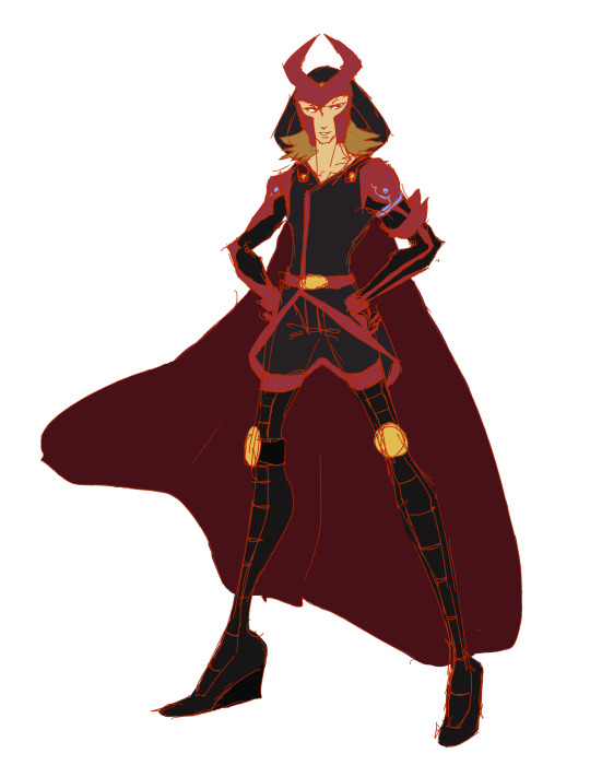
(didnt turn as good as planned so will give another shoot tommorow. i still cant draw hoodie hoods fdjskdjdsk)
Big Sib, [06.02.18 23:30]he goes out and poledances in the same outfit, probably
97 notes
·
View notes
Last Seen Blogs
koralprawny
Koral's Stuff

likingandblogging
Blogging
ardibestboy
Happy Birthday, Sweetheart
atozndttrainingacademy
A TO Z NDT Training Academy
yuzu-all-the-way
floored by that figure skater dude