#also just flat out good character design
Text
big fan of all of the socialstuck interpretations of twitter just being
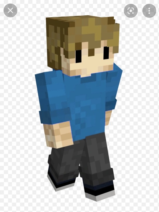
#humanoid with big fuckin wings#its really funny to me#also just flat out good character design#but i am just a fan of any
2 notes
·
View notes
Text

Caught up by another soft-hearted, skinny-legged clown on the run✨
#trigun#trigun stampede#vash the stampede#fan art#i just wanna put him in my pocket with all the others i’ve got in there#gotta love when a show opens up and flat out says ‘this man is a human disaster’#love to see the good boye scramble#very yosh character of course i love him#also the camera in this show is BONKERS and im in love with it#the animation arcs are so tasty aghhhh#good friggin design
60 notes
·
View notes
Text
This has probably already been pointed out a million times and I don’t pretend to have a way with words but I’ll try:
One thing I love about good omens is the visual storytelling, and the way in which Aziraphale and Crowley approach interior decor provides an insight into the journey they take as characters.


Take Aziraphale’s bookshop, it couldn’t contrast more with the stark and soulless minimalism of Heaven, he loves clutter and mess and you can tell this space is a reflection of who he is as a person. The set design here shows that rebellion against heaven doesn’t just lie in doing evil and consorting with the enemy but also in appreciating and surrounding himself with the things that bring him joy.


Then there’s Crowley’s flat, this time a brutalist and spacious middle finger to the dark and dank corridors of hell. His appreciation of art and plants and light is reflected in this space and once again goes to show that rebellion really can be as simple as distancing himself from the looks and ideals of the place he has come from.
TL;DR the good omens set designers kick ass and I can’t wait to see more from them in series two
6K notes
·
View notes
Text
I'm begging people to please just learn to enjoy things, genuinely. Like yes, think critically while consuming media and stay alert, but also remember to allow yourself downtime.
I'm tired right now and probably won't be able to articulate this properly, but I just saw someone on Twitter complain that movies like The Menu and Glass Onion are shallow half-critiques that don't actually say anything radical about the rich/class systems, and I mean... Yeah? That's actually ok? They're entertainment products designed for mass appeal. And I'm not saying that something can't be entertaining as well as taking a clear, defined position, but I'm saying that not every piece of media has to be an in-depth takedown of social/political systems.
Both films had something to say, and do a good job of getting people thinking about our current society and it's issues. They aren't documentaries created for a niche group who have thoroughly studied these ideals, nor do they claim to be. Not everyone watching these movies will have the same knowledge of social systems, and most people certainly don't want to be flat out lectured by fictional characters.
Learn to enjoy things for what they are sometimes, without feeling the need to condemn them for every way they didn't live up to your personal standard
#The internet is insufferable sometimes#not every moment needs to be a fight!#anyway#The menu#Glass Onion#could they have done more? sure. But they aren't required to#we're reaching a point where absolutely everything we do or consume has to meet a particular level of moral cleanliness#or else both it and we are considered willfully ignorant or bigoted#should have mentioned that it wasn't just the initial tweet which got me bothered but many of the replies as well
3K notes
·
View notes
Text
Star Firesight!

Bonus! Healer/Second Firesight:
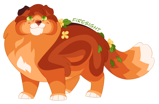
And Outsider/Apprentice Rusty/Fire:

Design Notes:
I redesigned him again despite saying I would stop doing that... Prev design and old bio here.
He still has a lot of the same features as my previous design, i mostly just changed his pattern and coloring! I wanted him to be a rustier color!
I also changed his cheek fluff to be round, mostly just for an interesting face shape! his cheek fluff hangs a little more flat when he's older just to give him a more matured look (hes been thru some shit, his cheeks hath deflated)
Character Bio:
Star Firesight
(Fireheart/star)
Bisexual & Polyamorous; Trans Tom; he/him
Age as of 1st arc's beginning: 7 moons; 11 Hyrs
Age as of 1st arc's end: 2 cycles, 5 moons; ~26 Hyrs
Title meaning: -sight = this cat can spot things that others cannot; a cat with a close connection to the Stars; this healer receives many signs from the Stars; the healer may also be very good at spotting illnesses or injuries.
Outsider -> Healer -> Second -> Leader of Thunder Order
Mentor: Redtail (died) -> Spottedleaf
Mother: Nutmeg
Father: Jake
Sibling: Sapheart (Princess)
Half Siblings: Socks; Ruby: Tinyclaw
Mates: Sandstorm; Shriketail
Kits: Squirrelflight (sire: Sand); Leafpool (sire: Shrike); Foxleap (sire: Sand); Icecloud (sire: Shrike)
Grandkits: Star Hollyleaf; Falconstrike; Jaywing; Alderheart; Sparkfire
Other notable kin: Cloudtail (nephew); Snowshoe (nephew); Mistletoe (niece); Spiderleg (nephew); Shrew (nephew)
Notes:
Firesight has chronic pain (and mobility issues later in life):
Fire has the Scottish Fold breed's mutation which effects cartilage in the body, this causes his ears to fold, but it also causes chronic joint pain and can progress into swollen and inflexible joints.
For Fire, he is has the heterozygous version of this mutation, which means that his disability progresses more slowly, as a young cat he does experience some joint pain, with some days being worse than others. He is able to medicate with his own chronic pain herbal mix he created as a Healer. However as Fire grows older his joints will worsen, and by the time of his old age he will be unable to jump and some days is unable to walk.
He is able to still use his medication to aid him and is able to lead a happy life, but he is disabled and I didnt want to leave that out of his character! It's important to have disability rep (and spread awareness of the issues with the Scottish Fold breed) and I hope I serve him justice!
Character Summary:
In Progress (to be added later)
...
[Image 1 ID: a digital drawing of Star Firesight, an AU version of Firestar from Warrior Cats. He is standing with his left side showing and has a proud and happy expression with a smile. He is a short, chubby and round shaped rusty orange and red tabby tom with small folded ears and green eyes. his chest, underbelly and paws are all a lighter shade of orange, and he has a red stripe down his back as well as a single red swoop shaped stripe on his side. He has red to orange striping on his face and red freckles on his cheeks. His right ear is brownish-black, he also has a small black spot above his nose and a black stripe on his back. He has a white flame shaped spot on his chest, a white muzzle, white paws and a white tail tip. He wears yellow flowers and green leaves in his pelt and a simple crown rests on his forehead made up of a diamond shaped red stone and a small teardrop shaped white stone below it./End ID]
[Image 2 ID: a digital drawing of Firesight, an AU version of Fireheart from Warrior Cats. this drawing is almost the exact same as the first image, but in this he has no crown./End ID]
[Image 3 ID: a digital drawing of Fire, an AU version of Firepaw from Warrior Cats. this drawing is almost the exact same as the first image, but in this he has no crown, or flowers and leaves adorning his pelt. his face also seems younger and he has a brighter happy expression on his face with his mouth open in a smile like he is talking./End ID]
#millionth redesign lol#cryptidclaw's warriors au#rise of change#firesight#firestar#fireheart#firepaw#firestar design#fireheart design#firepaw design#firestar au#warrior cats au#warrior cats design#warrior cats#warriors
478 notes
·
View notes
Text
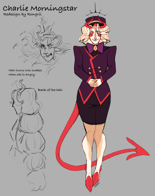
Continuing on my Hazbin redesigns, here is Charlie! You can also check out my last redesign of Lucifer here.
I didn’t really like Charlie from the start, she seems a bit flat and just a super positive main character, but I started to love her :]
I am still working on my au and on Charlie specifically, so I didn’t write too much about her :(
Visual changes:
- Colors. I don’t think Viv knows color theory very well. Original Charlie has only two colors, red and white/yellow(they are very close, and white is not a color so I am counting them as one). Three colors would make design more interesting, so I added purple to go with yellow. It creates good contrast and now Charlie is not that plain!
- I added goat features to Charlie basing on Baphomet/Devil/Satan, + it makes her facial features more interesting. She looks plain just being a human, maybe that needs to make her different from animal demons but,, ehhh..
- Other details: A tail, (maybe I will change it to lion like in the future, idk yet). Patterns on her body, it’s not suitable for animation, but that’s not what I am going for in here. A little crown-halo thing on her head, resembling her princess and good/holy kinda side!
Personality:
- Charlie will face problems in her future encounters with Sera: Charlie follows idea of forgiving everyone, but she would not be Able to forgive Sera. This will result in Charlie being confused on her own morals while trying to make herself forgive someone she can’t.
- She is constantly being infantilised, and her ideas being not taking seriously. It resulted in Charlie’s low self-worth: she doesn’t defend herself even tho Charlie has great strength. Charlie slowly forgets who she is. She puts her need lower than others.
#art#artists on tumblr#sketch#drawing#digital art#rongrii art#hazbin hotel#hazbin hotel fanart#hazbin hotel redesign#hazbin hotel criticism#hazbin hotel critical#hazbin charlie#charlie morningstar
384 notes
·
View notes
Text
Various HH characters x Artist reader
Prize 4/5 for @coldestcoconut
This post contains: Charlie, Vaggie, Alastor, Angel Dust, Husk, Sir Pentious, and Nifty
Notes: Reader is GN
CWs: None
CHARLIE
Its canon that Charlie herself is an artist, she makes her own presentations and everything! Shes very open to sharing her supplies with you, though a lot of the colors she has are very bright and saturated. You might inspire her to have an artsy based exercise in the hotel, you... may get a few groans and looks from some of the other hotel residents.. whoops.. gushes and goes insane whenever you make something for her or really show her anything, she can go on for hours and hours about how lovely your work looks! Woukd put it on the fridge/hj
VAGGIE
Not at all an artist, and she doesnt... exactly know techniques and terms. She is proud of you and shes trying her best to show that, but... her compliments seem to fall a little flat when praising you thanks to her voice as well as her just not knowing terms. A lot of the time its comments like "oh, this looks good," whereas other characters can say WHY it's good. Though is that really that important when seeking validation? Keeps all the art you give her in a folder somewhere, neat and away from harm
ANGEL
It should be a given that hes going to ask if you can draw something... rather inappropriate. Were you really surprised? He might likely also ask you to draw fat nuggets, he even offers to pay you. Keeps some of your doodles pinned up on his vanity mirror on his room. Hes an artist, just not in the way you are. He has an appreciation for your work even if it's a different genre! It doesnt matter what your skill level is, hes going to be a little interested. He offers to pose for you if you need a quick reference, he can offer something interesting thanks to his flexibility! Free of charge, too!
ALASTOR
Similar to Angel, hes an artist just in a different way! Angel is a dancer and an actor, and Alastor uses radio as his medium! Hes.. interested enough in your work, though he can be a little more.. critical in his criticisms (but only if you ask for it, hes not rude!). He doesnt intent to fully stamp out your excitement, hes simply trying to get you to reach your fullest potential as an artist. It is balanced out by elements he enjoys in your art. Watches you like a hawk when you work. Dont try to be sneaky and try to draw him, he already knows what you're doing.. but he might just allow it, it's not like you're using a camera
HUSK
Hes indifferent, at least.. mostly.. he listens when you talk about your hobby and he makes sure you know hes paying attention. But you can tell that hes not sure how to keep the conversation going thanks to him just... not being into art. Sure he can tell when something has talent and had work put into it, but hes not the type to sit down and really dissect a piece. Though... his appreciation for art does grow thanks to you. Keeps the doodles you slide to him while he's working the bar- gets a little pissed at himself if part of the papers get wet from the condensation from the drinks
SIR PENTIOUS
NIFTY
She draws! As a hobby and when shes not warring with the bugs in the hotel! Sometimes the two of you sit and draw together- though Niftys more.. scribbling on the papers. Shes just excited is all! Don't ask where she got the red paint from. Hoardes the art you give her, very possessive of the drawings. Probably attempts to stab someone if they get too close to her stash
Hes a bit artistic himself, being an inventor and all! He draws his own blueprints and as well as his own designs. It may not be the same as the things you may create, but it's still a bonding point between the two of you. He let's you use his fancy pens and stuff, just please return them! Will praise you to heaven and back whenever you show him something, he knows some art terms and you can bet hes going to be using them to really push his praise! If you ever draw him anything hes going to keep it, likely framing it as well!
#hazbin x reader#hazbin imagine#hazbin hotel imagine#hazbin hotel x reader#charlie x reader#charlie imagine#charlie morningstar x you#charlie x you#vaggie x you#vaggie imagine#vaggie x reader#angel dust x you#angel dust x reader#angel dust imagine#alastor x you#alastor imagine#alastor x reader#radio demon x you#radio demon imagine#radio demon x reader#nifty x reader#nifty x you#husk x you#husker imagine#husker x reader#husk x reader#husk imagine#sir pentious x you#sir pentious imagine#sir pentious x reader
208 notes
·
View notes
Text
On Project Moon
Hey, this is gonna be long, I'm putting most of it under the cut. This post is about the recent firing of VellMori from Project Moon, I know that it warrants some tags for triggers, but I have no idea what's commonly used, so if I miss something, please tell me.
Additionally, I have written this up in a way that if it escapes the target audience of Project Moon fans, it can still be understood, so with that in mind, there will be Library of Ruina spoilers.
The tl;dr for those who don't wanna read the full thing is that Project Moon was put in a very bad position with some violent extremists targeting them and that I'm not happy about any of what happened.
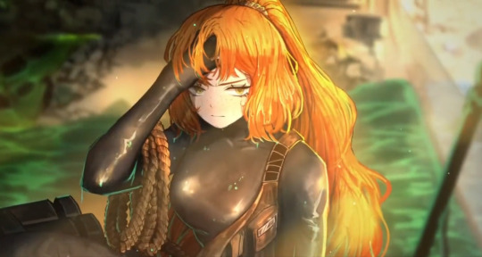
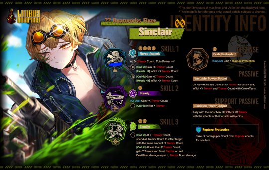
So, for those unaware, Project Moon has fired VellMori, the CG artist for Limbus Company. Now, a not inaccurate statement that can be made from this is "Project Moon fired a woman for being a feminist" but this is... somewhat reductive. Let's immediately get out of the way that VellMori did absolutely nothing wrong. Some people have said she is a TERF. I've seen no evidence of this. Some people have said she wished death on all men. I've seen no evidence of this.
What I HAVE seen is that VellMori thinks sexual abuse is bad. Now, why would this lead to a firing? The short answer is that a bunch of violent incels, one of which was literally dressed as a clown, came knocking at their office doors.
See, Limbus Company has a "beach" event coming up. In this event, we are getting a water themed outfit for two of the characters, one male and one female. For Sinclair, the guy, he has been given an EXTREMELY slutty mechanic's outfit. For Ishmael, the woman, she has been given a very skintight wet suit outfit. Now, I wanna take care to note that VellMori is the CG artist - she had no hand in these designs, a man made them. I would also like to mention that both outfit designs are amazing, and I will be including them at the end of this post for reference.
Now, upon revealing the wet suit design for Ishmael, a bunch of whiny incels on what is basically Korean 4chan got upset that Ishmael, instead of being in a bikini as is usual for gacha games, was wearing a wet suit. Nevermind that the designs in Limbus Company have always been conservative and that the Sinclair design is the most skin we've ever seen and it's just an open shirt. Again, the wet suit is still super revealing, it's skin tight and this is literally the first design of her that doesn't make her look flat chested. They're not rioting over the lack of sex appeal, they're specifically mad that it's not a bikini.
The incels come to the conclusion that the lack of any skin being shown on Ishmael's outfit is a result of evil feminism. No, I'm not exaggerating. They initially begin harassing the artist who is actually responsible for drawing the outfits, but upon learning that he is a man, set their sights on VellMori because she's a woman, and being an artist is good enough I guess. What they do from here is they start digging and digging and digging on VellMori's twitter, making use of archived pages because many of the "offensive" tweets had been deleted.
I'd like to take a moment to point out that VellMori never actually tweeted anything out here - it was all retweets from a 4-6 year old archive, and retweets that have been long deleted. These retweets contain such transgressive statements as "I'm sick of misogyny" and "If being against patriarchy makes me antisocial, then so be it" and just... mirroring back to men what those men were saying to women. Some people would like to have you think she was calling for death to all men. She wasn't. She ALSO retweeted all this stuff while she was a teenager and well before she worked for Project Moon.
Nonetheless, the incels had decided that feminism was the reason Ishmael had a wet suit and not a bikini and they had found a feminist working for Project Moon. It is at this point that we must take a brief detour and talk about Library of Ruina, Project Moon's previous game.
See, in Library of Ruina, one of the protagonists, Angela, has this whole arc about escaping her abuser and becoming a human. Yes, she is literally a robot, but Project Moon isn't exactly a stranger to symbolism in their stories and a feminist reading of Angela is ridiculously easy. The main antagonist in Library of Ruina is Argalia, the Blue Reverberation, and his crew is called the Reverberation Ensemble. Every member of the Reverberation Ensemble is a violent lunatic who each want to reinforce the status quo in their own unique shitty way. In addition to this, typically in order to reach the titular Library, you would need to be invited. The Reverb Ensemble are the "uninvited guests", the ones who managed to reach the Library and knock down the door without an invite.
Why am I talking about this? Well, the incels decided to start calling themselves the Reverb Ensemble, and referring to each other using names of the Reverb Ensemble members such as Pluto, Elena, and Oswald. Having taken on the moniker of the uninvited guests, they then showed up to Project Moon's office to protest. Over the lack of a bikini. Now, remember how I mentioned someone was dressed up as a clown? One of the Reverb Ensemble members, Oswald, is a clown with an extremely tenuous grip on reality. So much so, that his ideal world is one in which there is no meaning whatsoever. That is the character they chose to dress up as. This is either a case of extreme self awareness or extreme self unawareness.
Eventually, the incels were let into the office possibly as a form of damage mitigation to prevent the crowd of protestors from getting any bigger. This was a questionable decision, but they had a group of violent incels at their doorstep either way, and I don't exactly have full details on this. Regardless, Project Moon had on their hands a group of violent protesting incels, who they felt compelled to let into the building, and who had demands including the firing of their feminist employee. (7/28 update: a translation of the transcript posted to DCInside has surfaced. Please check the reblogs for it. Project Moon was verifiably threatened.)
So while "Project Moon fired a woman for being a feminist" isn't inaccurate it also isn't the full picture. More appropriately, it'd be "Project Moon fired a woman because a group of violent incels who weren't satisfied with a form fitting wet suit instead of a bikini showed up to their office demanding that an artist who did not make the wet suit design be fired because she retweeted some feminist stuff 5 years ago while she was a teenager".
I'm not happy with this. None of this is good. People are allowed to be feminists, and Project Moon stories have always presented progressive ideas to anyone with half a brain to do some basic literary analysis. I can understand why they would cave to the demands of people who were threatening them and showed up to their actual place of work, but at the same time, that's someone's livelihood gone and proof that in the future, the same sorts of people can use the same sorts of tactics to bully Project Moon into doing whatever they want. All of this sucks.
For those who would like to see the retweets in question alongside translations: https://twitter.com/danghwangs/status/1683884236888223744
And for people who would like reference as to what the artworks these incels were up in arms about, Ishmael in the wet suit and Sinclair in the mechanic's outfit.
925 notes
·
View notes
Note
Your comic series is the first Rottmnt comic Iv ever read! It was an amazing first impression to the Rottmnt fandom! Could you teach me how to draw the turtle boys ( rise turtles)?
Also love the new update!
Aw! I’m so glad my comic made on good impression on you! ^v^
Of course! I’d love to help you!
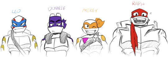
So first thing’s first, here’s the boys the best I can draw them. The most important thing when learning to draw new characters is identifying what makes them look like them. We’ll start with the faces since that’s, in most cases, the point of focus.
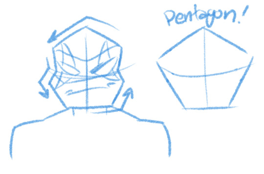
Leo’s face is a pretty tall and vaguely pentagonal. His face is also very angular, the corners of his cheeks and top of his head are very sharp. Leo has the traditional style mask with tails that drop down to about his waist.
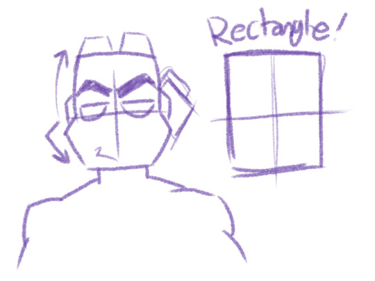
Donnie has that smart boi forehead and majestic eyebrows. His forehead often has a soft curve to it while, similarly to Leo, his cheeks and jaw use sharp angles. Remember too that the top of his head is flat, there’s no curve. His mask is that newer pirate style that wraps over the top of his head, with the tails looking like curvy squares.
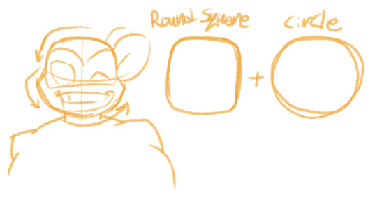
Mikey’s face is a combination of a rounded square and a circle. The top of his head, while much rounder than Donnie’s, is somewhat square. The bottom of his face is a curve. Sometimes I draw the curve in line segments, but it’s not a requirement and won’t impact the way he looks. In general though, Mikey has a very circular face. His mask is the traditional TMNT style with the rounded bouncing tails on the back.
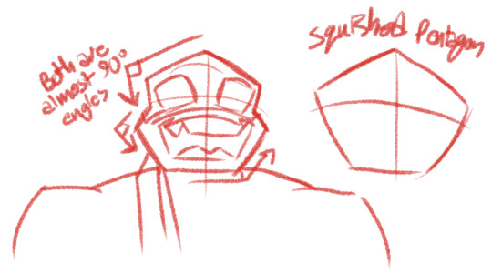
Raph is arguably the hardest to get right for some odd reason. Really though Raph’s face is just a shorter version of Leo’s face with slightly more exaggerated angles. His face is like a fat pentagon. Also tip: Raph’s eyes are always just a little smaller then you think they’re going to be. Trace some scenes from the ROTTMNT movie, you’ll see what I mean. Raph’s mask is the same style as Donnie’s where it covers the whole top of his head. There’s a small nick on the edge above his right cheek and the tails are tattered.
Okay, next are their markings! They play a lot in how easily identifiable they are.
I figured these diagrams should help as a little map as to what spots go where.
Alright, now we’ll look at their shells. There are many amazing diagrams and explanations for drawing their shells on Pinterest I’ve found, but I’ll sum it up here as best I can.
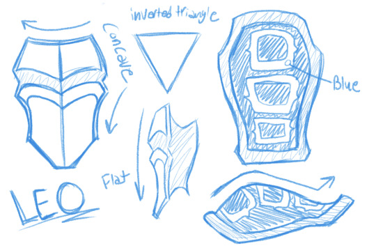
Leo’s shell is very sleek in design making his is profile look the thinnest of his brothers. Many people describe his general body shape as being an inverted triangle.
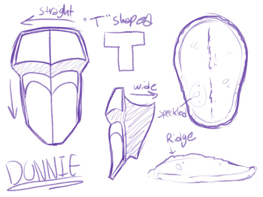
Donnie’s shell is very straight with hardly any curves. I didn’t include his battle shell in this since that qualifies as “gear” in my opinion, so you get to see what Donnie’s shell looks like! You’ll notice that the sides of his shell are very wide, which I’m guessing is because the curve of his carapace is so shallow.
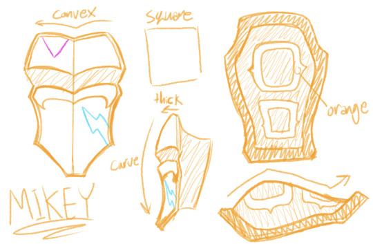
Mikey’s shell is very similar to Leo’s but is a lot thicker and boxier(haha get it? Cause he’s like, a Box Turtle? :D I’m so lame…). He’s also much rounder and the distance between his plastron and carapace is pretty big.
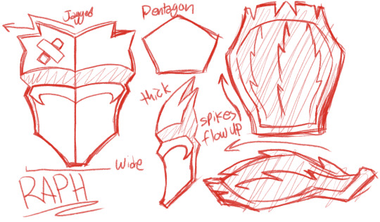
Raph’s shell is probably the most complex of the boys because of all the spikes. Good things to keep in mind are that the spikes on the top of his plastron angle out, and spikes on his carapace flow up. In general think of Raph as a pentagon, he’s got big broad shoulders and arms and almost comically short legs. (And yes, I’m aware that I didn’t include the side of his shell here, it was too big to fit on the diagram. But just to give you an idea of where it should be, around the “w” in “flow” is where it should connect to his carapace.
Okay! So now that we’ve covered what the boys look like, let’s apply it to their bodies!
Here’s a quick sketch of Leo. “Oh, but Indie” I hear people say, “I can only draw basic shapes and stick figures!” Well to that I say good because that’s what I’m doing too!

For drawing action, it’s crucial to capture the energy of the character. And in a style like Rise’s energy is an iconic trait. So I’ve re-invented this “shape method” to actually be useful. The number one thing is that these shapes are loose guides as to the positioning of the body. Don’t think of these shapes as “well chests are like cubes and arms are like rectangles.” These shapes are place holders. I could replace those circles with stars and it wouldn’t change anything. I just use circles because they’re faster to scribble and stand out against the hard angles of everything else.
Here’s a picture of the shapes overlayed on the image, as you see, these shapes are guides to help comprehend a complex angle in 3D space. Sadly I don’t have much I can assist with on proportions, since I learned purely by studying total uncreepily real life people and myself (I swear I’m posing in the mirror for purely educational reasons! Okay!?).
But anyway, for this kind of thing, practice is the only remedy. Just draw action pose after action pose. Trace scenes from ROTTMNT and the movie to teach your eye to see what things should look like and to train your brain to recognize patterns of shapes and angles.
I hope you found this at all helpful. I’m not really sure how great of a teacher I am but people keep asking questions like these so I guess I’m okay. Glad you liked ROTP so much and I’m glad it made such a good impression on you! ^v^
Good question! :]
And of course if you have more questions, feel free to ask. Here are some previous asks about drawing I’ve gotten that you might also find interesting:
Tricks for Drawing Extra Expressive Faces
More Tricks for Drawing Expressions
Tips and Tricks to Drawing Non-Graphic Wounds
Basic Guide and Tips for Drawing the 2012 and Rise Turtles
How to Draw 2012 Raph’s Fire Ninpo
Nailing The 2012 TMNT Style in 2D
Important Concepts in Drawing Female Characters
#q&a#tmnt#ninja turtles#teenage mutant ninja turtles#rottmnt#art#art tips#drawing#drawing tips#drawing stuff#rise of the tmnt#rise of the teenage mutant ninja turtles
434 notes
·
View notes
Text
Thoughts on Dune pt2:
Excellent cinematography, set design, music, and effects. It is a gorgeous movie, and as a science fiction movie it does a very good job of portraying a world that feels big, believable, and complicated, even though in terms of number of visited locations and characters Dune is just not that complicated a plot, and the setting has some serious plot holes (what do millions of Fremen eat? Where is their industrial base? How do they manufacture or acquire future tech like stillsuits that they need?)
Some plot dynamics Villanueve has decided to spell out a little too meticulously, like Paul’s reluctant Messiahhood. Other aspects he simplified too much: the ending falls a little flat because some important moving pieces are absent (the politics of the spacing guild and Bene Gesserit in particular). It also bugs me that they go to the trouble of explicitly showing Paul recovering the family atomics, but not why the Great Houses can’t use atomics in normal warfare, and hence why they don’t just nuke Paul from orbit after he takes Arrakeen.
I’m not sure I’m totally on board with some of the character interpretations; I think the comically over the top evil Harkonnens in particular tended more toward goofy than threatening.
All in all, Dune is a drama-first science fiction story with a unique vibe and some pretty epic moments. You have to make that drama believable while preserving the heightened character of the narrative, and you also have to make the *world* believable. I think overall the movie succeeds. It’s extremely fun to watch, and the core emotional//dramatic structure is there. I have some gripes, but I hope Villanueve continues with Dune Messiah. It certainly will not be boring.
184 notes
·
View notes
Text


i present to all of you: the designs of the evil au the duo travel to (and... CHARACTER LORE!??!) for dimensional delivery
see under the cut for ~ the lore ~
alright chat, welcome to under the cut. here's the lore @pinkygrocket and i hashed out that i remember
evil pep still runs a restaurant, but he's not involved with it. he used to be and was the chef, but as business grew and steadily turned into a front for money laundering, he grew more and more distant from it. he's so paranoid that he literally doesn't even have friends. anybody he "trusts" he doesn't even trust fully, he always takes into account that they could betray him. basically, regular pep's negative traits but heightened: he's more selfish, paranoid, plus he's gotten a lot better at being manipulative
gustavo runs a more hidden restaurant as a peaceful temporary hole away from the chaos. brick helps him with the place. he's a very good cashier you know. gustavo really does not like the way pep turned out, but it was the breaking point when noise was murdered by pep. gustavo and brick both hold a grudge against evil pep, but gustavo moreso as he used to be best friends with him
mr stick is flat up a loan shark. he's not evil but he's not good either (unless you count loan sharks as evil which is based). he's constantly tried to work with evil pep but because of the latter's paranoia there's been no progress on that front. however stick's loan sharkery outside of pep has been successful so he has a slightly cooler fit to boot
noisette's gone into hiding. she ditched the "noisette" name and costume, just privately going by her real name (which i like to think is hazel). if she goes out in public, it's as mr. incognito. she's lost a lot of her outlook due to noise's passing so she's a lot less silly, but she still has a kind heart
pizzahead also has his own joint, but not for the Wholesome Purposes like gustavo. sure, it's often seen as a place of peace away from chaos like gustavo's, but it's still not great. he cares more about entertainment than about providing a good place so if it's funny and fun to him he doesn't care. fortunately he doesn't find death all that fun
noise was Killed by Evil Peppino ! i don't know the circumstances around it yet but let's just say evil pep definitely justifies it to himself as "oh he was annoying anyway. all he ever did was just get in my way, so i just found a permanent solution to it is all"
#dimensional delivery#pizza tower#pizza tower au#peppino#peppino spaghetti#gustavo#gustavo pizza tower#brick#brick pizza tower#mr stick#noisette#noisette pizza tower#mr incognito#pizzahead#the noise#noise pizza tower#sklart
396 notes
·
View notes
Text
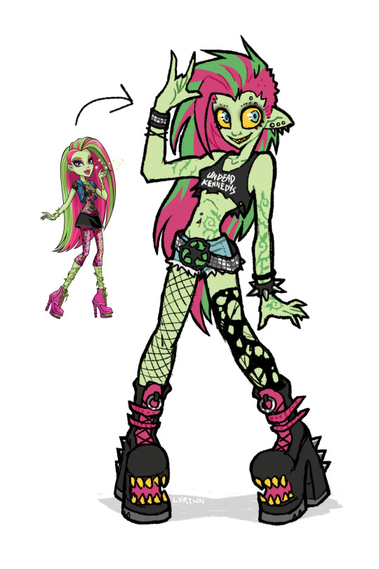
venus if she was awesome
speedpaint and more thoughts under the cut
venus has always been one of my favorite characters, though i feel her design is pretty underwhelming with a lot of wasted potential. this is kind of a redesign, kind of my own personal headcannon, and kind of how i imagined venus in my head as a kid.
this is supposed to be my version of g1 venus, more similar in facial features and keeping the straight hair. i absolutely love her new hair and face in g3 but im hesitant to call the new outfit an improvement. both g1s outfit and g3s outfit are bad in their own ways. i dont want it to seem like im shitting on the new design. again i think the face sculpts, hair, and body types of g3 are so awesome. its great to see more diversity being included in the designs. i just decided to go with g1 venuses look because thats the venus i grew up with
i definitely took some inspiration from g3s outfit for this design. i like the idea of it but the execution is just not great, not to say her original outfit is any better. i feel like out of all of tge original monsters she was the one with the most waisted potential. i love her personality and the abilities she has but the way she was styled has always bothered me.
in the movies shes described as “eco-punk” which is SUCH a cool style to go with a plant monster character. i just feel like the “punk” in “eco-punk” was never really represented in her outfits. i personally love punk music and clothing; ive been an active member in my local diy scene for many years and i love seeing all the outfits people put together.
i thought i would give her an outfit that shows off a couple of my personal favorite staples of punk style. big chunky leather boots with lots of straps and buckles. kept the shoe mouths from the original because they cool as hell. lots of leather, studs, spikes. i gave her denim cutoff shorts inspired by her gen 3 outfit, same with the torn black top. punk style has a big focus on comfort, practicality, and making things yourself. i imagine she cut a pair of old pants into shorts, roughly cut her “undead kennedys”band shirt tank into a crop top, and probably repurposed the remaining fabric. i also totally didnt draw this whole thing as an excuse to use that pun. i included asymmetrical leg accessories, with one fishnet stocking and one torn up sock. i also feel like she repurposed these, continuing to wear her old torn up socks instead of just throwing them out. i gave her a big chunky studded belt matching one of her cuffs with a recycling symbol belt buckle. i feel like it communicates an important aspect of her personality just at a glance, plus i just love big belt buckles. lastly i added piercings because 1. theyre cool and 2. i for some reason remembered her having an eyebrow piercing but i guess she never had one.
i mostly kept her body and hair the same. changed her ears and hair color slightly but thats just personal preference. i decided to make the vines on her body look more like tattoos instead of being 3d. i imagine she can make them grow into real vines, but when shes not using her powers theyre just flat against her skin. gave her a facial expression that made her look a little more unhinged. she might only do things for the good of the earth but she can still mind control people at will.
i wish i leaned a little bit more into the plant theming but im overall still super happy with how this came out. maybe ill made more monster high redesigns in the future
164 notes
·
View notes
Text
Choose your favorite!

Vote in the other polls!
What fans say:
Kung Fu Panda:
Honestly iconic. The progression of story, the message, the acting.
The way this movie balances tone is nothing less than astonishing to me. It's funny and lighthearted but also intense and dramatic and neither ever take away from the other. Every joke and emotional beat lands excellently. Not to mention. The fight scenes SLAP. And so does the score!!
It's just GOOD. I love how all of them were insanely genuine. Po genuinely wanted to be a Kung Fu master. The Furious Five genuinely wanted to be the very best like no one ever was. And Tai Lung genuinely wanted to kick the shit out of anyone that even looked at that dragon scroll. But seriously one of the best movies.
Treasure Planet:
The setting and focal relationship!
WHALES IN SPACE. Second best treasure island adaptation (#1 is muppets). The song The Song!!
Where do I begin with this movie? It blends CG and hand drawn animation beautifully. All of the backgrounds are gorgeous. There are so many cool alien designs. The score is absolutely perfect. The amount of detail put into the design and worldbuilding shines through. All of the characters are so much fun to watch, especially Long John Silver and Captain Amelia. This movie takes at least partial responsibility for my love of space/sky pirates. Also it was actively sabotaged by Disney so I need to vouch for it at every chance.
Space pirates in a classic novel. It's gorgeously animated with a blend of 2d and 3d. Also, LONG JOHN SILVER HAS A 3D HAND thats hecking impressive for a main character to be a blend of the two in 2002. Did I mention the twink protagonist and malewife for the rich halfwit son? The aliens are beautifully unique, and a mantis guy floats off into space. from a pirate ship. because they aren't just space pirates, they're aliens and cyborgs on pirate ships going through space. Which fucking rocks.
It's a genuinely creative adaptation of Treasure Island that has so much heart and incredible animation. It helped pioneer 3D animationa nd it was the first feature animated film to utilize both 2 and 3 D animation
The animation is so good, and the way that the antogonist isn't black and white, he genuinely cares for the protagonist <3
Pirate ships in space!
Watched this on loop as a kid, gave me solace for not growing up with a dad
It fucks
The ☆A n i m a t i o n☆!! And captain Amelia
It's so fun looking, cool character design. It's funny, it's emotional. I love it so very much please aaaaaaa
How this movie looks is absolutely amazing. A space-steampunk pirate story with fantastic visuals and (mostly) great characters. The vibes this movie has are off the charts. Jim is the bad-boy-good-heart kid, the doctor is a silly-goofy-but-oddly-competent support and Silver is a complex father-figure-who's-made-mistakes. Also MORT the cute little jelly that won me over in 0.5 seconds flat. I am also a slut for a good soundtrack and this one SLAPS. I will stand by my opinion that the Russian version of the song I'm Still Here did a better job of fitting the montage and the mood. That's a hill I will die on.
494 notes
·
View notes
Note
Hi! :] For the little edits/changes ideas post have you considered doing edits of charlie with a more gold/blue palette? Something that would fit more in heaven given her character o: that or lucifer with something more violet since that's the biblical color of Pride?

(This was really really fun to do, like making alt color palettes for a fighting game lmao, also excuse the janky pixelated lineart, I am NOT good at extracting it)
I didn't make any alterations to add patterns or anything, just flat fills where color already was. I think they turned out well!
For the pride purple, I added a golden undershirt since I think it contrasts well and all
The heaven design has the original pilot pupils, with a lighter pink blush as more human-ish features on her design. I wanted to keep the yellow pants, but I thought they might be a bit too bright and attention grabbing so there is an alt.
Thanks for asking! :D
#hazbin hotel redesign#hazbin critical#hazbin hotel criticism#hazbin hotel critical#hazbin hotel critique
92 notes
·
View notes
Text
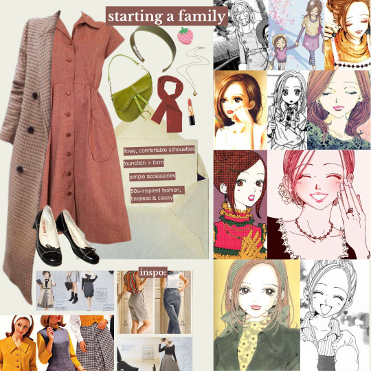
🍓 style analysis: nana komatsu / hachi (NANA)
welcome to the first entry in my style analysis series- where i take a different fictional character for each entry and take a look at their fashion sense, as an exploration on how fashion plays a role in forming a character's personality & overall identity. in other words, it's a deep dive into the intersection of story & style. today we're starting off with nana komatsu (who we'll be affectionately referring to as hachi from here on out) from NANA, my favourite character from my favourite manga of all time.
NANA is a manga very near and dear to my heart. i could spend all day talking about why, but i'd say one of the biggest reasons is for how ai yazawa (the creator of NANA) uses fashion as a means of storytelling. in NANA, clothes are not just a typical character design element, but are instead a visual narrative tool used to convey a characters' personality, as well as to express their traits and feelings. today i've chosen hachi for the style analysis because i'm fascinated by the subtle changes to her style syncing with her character development over the course of the story. also, i think her style is just super cute. so let's get into it! (⚠ anime & manga spoilers ahead)
🍓
overview

if i only had one word to describe hachi's style, i'd say feminine- think frills and lace details. she's all about babydoll silhouettes, pleated skirts, knit cardigans, ballet flats, and generally embodying shoujo fashion from the early 2000s with a good balance of cute and classy. hachi's fashion sensibilities lean more towards the modest side, as her dresses and skirts are usually around midi-length, and mini skirts are often paired with extra layers like tights or leggings underneath. it's a very good girl chic look, which fittingly leans in to her innocent personality. hachi is very stylish and clearly puts a lot of thought into picking her outfits everyday, as she's not afraid to occasionally experiment with different styles every & to use fashion as a key means of expressing herself.
in terms of colour palettes, hachi's wardrobe has a bit of everything- warm hues, earth tones, soft pastels, which all work together to capture the warmth and sweetness of her character. she's definitely more attuned to light colours than dark. this suits her personality better too, as light coloured clothing is said to convey feelings of friendship, fun, compassion, and approachability. fabric-wise, hachi likes to keep it light and airy with materials like chiffon and tulle; switching to warmer fabrics like cashmere and wool for cold weather, giving her outfits a vintage feel.
we can see that hachi pulls fashion inspiration from various aesthetics and fashion trends across different decades. she definitely incorporates her love for vintage fashion in her style, particularly with elements we've seen her wear before like mod dresses, neckerchiefs, pearl necklaces, long fleece trim coats, and brown platform boots. you can also see it in how some of the pieces she wears feels so unique, like a surprise gem you would find in a vintage boutique while thrifting. in dressier looks, hachi's girlish charm and allure is slightly reminiscient of 1960s it girls, like twiggy and sharon tate. she draws from a lot of 60s-inspired elements- the romantic parisienne style, and a bit of vintage preppy chic.
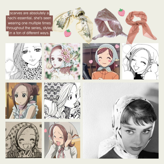
scarves and bandanas are a vintage essential as well as one of hachi's signature accessories. they have tons of versatile styling options, plus the potential to be dressed up or down. we've seen her wearing one scarf (exhibit A) multiple times over the series. the babushka scarf version has to be my favourite, it's very hepburn-esque, who i 100% i could picture hachi having a poster of in her childhood bedroom. i also think that having characters re-wear pieces we've seen before is generally just a cool subtle styling detail, which adds to the realism of NANA's 10/10 worldbuilding. the scarf's many appearances styled in different ways also goes to show how hachi enjoys being creative with her outfits, loves the pieces she owns and wants to get as much use out of them as possible.
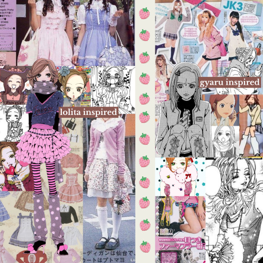
hachi's style also incorporates a touch of influence from the kawaii lolita subculture, particularly modern offshoots like larme-kei. lolita is french rococco-inspired with a focus on cuteness, and has its origins in early 2000s harajuku street style- which is also where mori/kogyaru fashion originates from; hachi's go-to style during her high school years (see: her modified school uniform, miniskirts, fuzzy legwarmers). both of these movements were heavily pioneered by j-fashion magazines of the time like FRUITS, Olive, Larme & CUTiE, which were mainly popular with teenage girls and young women, and hachi is no exception. her fashion sense is also heavily inspired by famous japanese celebrities and style icons like risa nakamura.
if we had to really narrow it down, i think hachi's style can be best described by otome (lit: maiden) fashion. known as one of the predecessors of lolita fashion, this style was very popular among young girls in the 70s-80s and is heavily centered around embodying all things traditionally feminine. sweet, cute, girly, and romantic are all common descriptors of the style, which pulls influence from 60s mod fashion (which, as we've seen, has prevalent elements in hachi's style). think tons of layering, pattern mixing, longer hemlines, and mary janes/flats, all of which we frequently see in hachi's outfits. we also see that she takes elements from modern lolita fashion like frills, bows, ribbons, lace, tights & stockings, and incorporates them into her own personal style as more understated outfit details; making it more wearable on a daily basis while still being a tribute to one of her sources of style inspiration.
now that we've explored what makes hachi's personal style unique to her character, let's dig into how her style is influenced in relation to how the story progresses and how her character develops. and just for funsies, i'll also be styling a casual everyday outfit that i could picture hachi wearing for each story arc. let's go!
🍓
i. art school
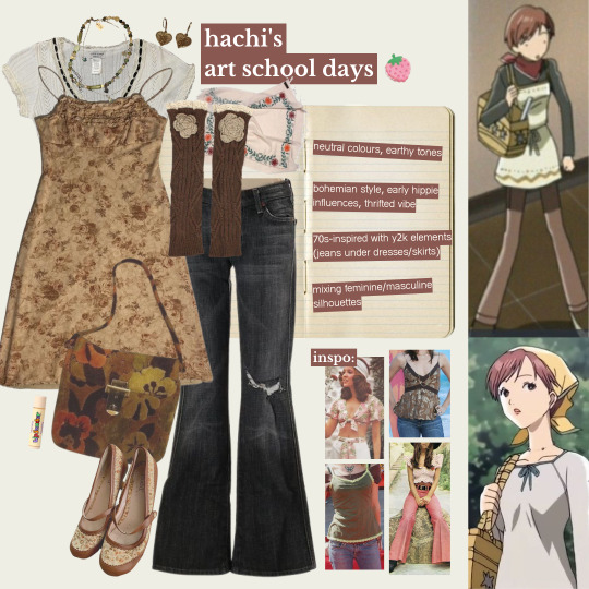
i'd describe hachi's style here as the most youthful, which makes sense considering she's freshly moved to tokyo to study at an art school. we see her sporting a face-framing pixie cut, which gives her look a bit of edge, but not too much as she still retains her signature soft girl style to balance it out. also, can i just say: super farmer's daughter vibes when paired with a bandana! jeans were having a moment too- during this era, hachi was often seen wearing a pair of bellbottom flares or baggy jeans, creating a casual and easygoing look which really leaned into the artsy college student fashion. this would also mesh well with her then-best friend junko's more bohemian/indie, woodstock-inspired hippie style. the short hair paired with her experimentation on androgynous silhouettes definitely accentuates her gamine facial features, lending to a cute boyish look.
all these style elements are in direct contrast with the hyperfeminine looks of her high school years, back when she'd opt for skirts over jeans and long, styled hair; showing how hachi underwent a pretty drastic style change whilst adapting to the new environment in tokyo. at the same time, it could also hint at hachi's approach to self-expression & using fashion as a coping mechanism to deal with major life changes. dressing more casually to blend in with the college crowd is one of many indicators on how easily influenced hachi can get, which is pretty on-brand behaviour for someone with a tendency to seek validation from others instead of oneself.
so let's get into the first look i've picked out for her: layers on layers on layers baby! for this outfit, i took a lot of inspiration from hachi's first day of class outfit. i tried to be consistent with her theme of 70s-inspired prints and silhouettes during this phase, but also wanted to incorporate a modern y2k touch since we know that younger hachi (before fully developing her unique & personal sense of style) is more of a trend chaser, and what could be more early 2000s than a blouse + dress + jeans combo? accessories-wise, i wanted to pick out unique-looking pieces that had a lot of charm, as i was really going for that 'flea market finds' vibe since she obviously wouldn't have been able to afford any designer yet on a college student budget. also please notice the gorgeous vintage floral print ballet flats- i was so excited when i found it, i thought it screamed hachi!! they look so comfortable to walk in on top of being cute, it's the perfect shoe to slip on for a long day of classes without sacrificing style.
🍓
ii. apartment 707
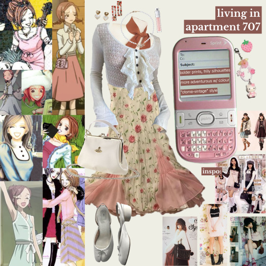
during this time, we see hachi start to embrace feminine styles again. she lets her hair grow out and we see her back in skirts, dresses, and all things girly, which is why her otome fashion influences shine through most here. she wears tons of pieces in floral and polkadot print, as well as flowy babydoll tops which are very y2k-girl-next-door-reminiscient. we also see her starting to wear vivienne jewelry (the pearl choker, the dainty silver orb earrings), likely as a result of nana's influence (who she heavily admires and looks up to) & wanting to emulate her style. hachi's outfits here seem to have more colour and print, which i believe is reflective of her mental state here; happy, confident, and surrounded by support. good vibes all around, her environment at this time encourages her to take more risks in not just decision-making but also in her fashion choices.
in general, this era is where hachi seems to be getting a better hold on growing into her own personal style. she's still open to trying out different styles every now and then, but we can see there are some style elements that really stick and appear most often in her outfits. she's also seen here experimenting with all kinds of different hairstyles- french braids, pigtails, twin buns, the half-updo. to me, i think all of this signifies how hachi's style development runs parallel to her identity formation and how she grows as a person. at this point of the story, hachi believes she's finally found a place where she fits- within this ragtag but loving cast of unique characters.
so the second look was a little more of a challenge to work with- that's because hachi's style during this era doesn't subscribe to any one specific aesthetic or subculture, but more like a bit of everything, and her outfits can differ a lot between episodes. the goal here was to go for a casual daytime outfit, and i ended up super proud of the colour coordination in this one! i've styled hachi in a frilly vintage floral print chiffon slip dress that's almost reminiscent of the strawberry dress of 2020, but with unique details that give it much more character. i gave hachi a cream-toned vivienne crossbody purse, a scarf to balance out the salmon pink of the dress accents, styled as a neckerchief, some strawberry hair clips to match, and of course i had to include her much-spotted pearl orb necklace too. the highlight of this look are definitely the shoes, which are maison margiela tabi ballet flats- something i could 100% picture hachi wearing if NANA were set in the context of modern day fashion trends.
🍓
iii. motherhood
as time passes, we also see how hachi's fashion sense has slightly evolved into a classier, more refined version. more adult, if you will. this occurs when hachi decides to move out from apartment 707 and starts getting serious with takumi. not only did her living situation change, but as did her lifestyle, and with that, her fashion sense too. her style here simplified and took on a more mature look. she started prioritizing function over form as she cut down on layering and accessorizing. she would also opt for longer, flowier silhouettes and comfortable styles, often wearing simple dresses or aprons over a basic shirt-skirt combo. i really like how the change in style here - which pulls a lot from the 50s-suburbia housewife trope (think frilly aprons, puffy dresses, flared skirts, modest hemlines) - feels like a sublte detail to show how hachi settles into her new role of motherhood, expressed via clothing choices.
as a whole, this period of her life signifies the drastic 180° change from spending carefree days of young adulthood, to taking on the role of mother/wife in a nuclear family unit. it's the most major life change she's ever had to experience at this point, and it's expected that her style evolves alongside this. she's seen wearing noticeably less patterns or colour during this time, which could hint at possibly representing her inner feelings- the bleakness of spending her days in a mostly-empty home, and the isolation of being separated from the friendships she once surrounded herself with daily. thankfully, we do eventually see her return to dressing fashionably again after the timeskip. however, it's extremely important not to gloss over this period of her life as it portrays how she must have felt having most of her agency taken away overnight, with her style being all she had left as a form of control.
so last but not least is the final outfit, which was tough styling as there was comparably less material to go off, but i based it on the few going-out looks we get to see hachi wear post-takumi. rolling with the 50s-inspired looks, i've styled her in a coral short-sleeve button down dress. for the outerwear i picked a long checkered overcoat, which nicely complements the dress in addition to being a going-out staple for classy ladies everywhere. since the outfit is mostly harsher silhouettes, i decided to keep the colour scheme light to balance it out. while i was going for 'stylish mature woman', i still wanted some youthful elements in there to maintain hachi's signature girlish look. i balanced it out by accessorizing with a headband (a prep chic essential) and dior saddle bag, both lime green for a pop of colour and contrast. and of course, i had to incorporate the iconic neckerchief too as it doesn't get any more vintage-looking than this. the final piece to tie it all together are a pair of classic miu miu ballet flats- chic and comfortable!
🍓
final thoughts
all in all, hachi's fashion sense is super girly and sweet, which i'd say directly reflects on her character's personality. hachi is an outgoing girl who wears her heart on her sleeve and has a lot of love to give. she's warm and approachable, which she expresses through her clothing choices by embodying the cheerful, down-to-earth girl next door look. her bubbly style is youthful and fresh, which personality-wise is in character with hachi's innocence and willingness to trust others. this is shown through how much hachi cares deeply about her loved ones & often (unhealthily) prioritizes their feelings over her own. however, this naïveté unfortunately leaves her a lot more vulnerable to others seeking to exploit her emotional attention.
hachi's fashion evolution over the series shows how she uses fashion as a coping tool to help adjust to life changes, capturing her emotional growth and how she matures over the course of the story. the way that hachi's sense of style develops alongside her character is so realistic. her style development tells the story of a girl who finds herself and loses herself over and over again, frequently changing jobs and wardrobes in a constant struggle to find an identity to latch onto- until she does. hachi's style story is one of self-expression & identity formation; a story that speaks to all the young, unsure girls out there who see a bit of themselves in her, trying to figure out their place in a world in a world that often decides for them.
#oc#nana#nana manga#nana anime#nana komatsu#nana hachi#ai yazawa#collage#collage art#digital collage#fashion collage#fashion moodboard#style analysis#fashion analysis#character analysis#anime style analysis#essay#fashion essay#coquette#jfashion#harajuku#kawaii#pastel
1K notes
·
View notes
Text
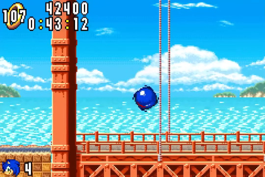
Alrighty fellow insane sonic fans i have something very cool for you today: a WORLDBUILDING theory!! this is something that's been kicking around in my head for so long that i forget it isn't something I've shared with many others yet lol
[ This post primarily covers stuff from Sonic Adventure, Sonic Adventure 2 and Sonic Advance, and ignores Sonic Chronicles and Sonic Pocket Adventure as they have been struck from canon (see: Encyclo-speed-ia) ]
[ It should also be noted that this theory is built on the idea that "the world" as depicted in Sonic Forces is not accurately depicting the entire globe, but rather depicting Eggman's takeover of just the island archipelago where the animal cast lives (South Island, West Side Island, Mirage Island, Northstar Islands, Angel Island) as to explain its geography and lack of human characters ]
Right! So, a big theme in the environmental design of the original Sonic Adventure was having the Sonic cast sort of "cross over" into the human world more - the wording on this was initially nebulous, but with updated translations and clearer official word recently, we now know that it means that the "human world" is moreso like a mainland populated by humans that exists separately from the animal-inhabited island archipelago of Sonic 1, 2, CD, 3&K and Superstars (see: Sonic Origins). My immediate first point of comparison - of all things - is something like the first Madagascar movie, where the lemurs are able to be a fully functioning society in a region completely isolated from humans.
Except it's not quite like that movie, is it? We see in Sonic Adventure (and further in Unleashed, 06) that animal characters like Sonic and c.o are able to exist just fine within the human world, to where Amy has flat-out moved into Station Square. Big and Tails, too, have settled down by the Mystic Ruins close to where Angel Island (sometimes) crashes down by, Rouge owns a club in Sonic Battle - you get the gist. Animal characters, the majority population of the islands as we see in Forces and the IDW series, are able to migrate into the "mainland" human societies, but it appears to still be a rarity, likely not even something everyone has the opportunity to do (Big might've been born on Angel Island, Tails and/or Sonic can fly any of Sonic's friends to wherever they want to go, etc.). The most contact humans have with the animal world is through the Mystic Ruins site, or Eggman using his excessive wealth to fly in and try and effectively colonize the islands as we see in Sonic 1, 2, Superstars, CD, 4.1 and 4.2 (for note: CD, 4.1 and 4.2 take place on the same island of Mirage Island)

Sonic Adventure 2's level select is obviously to be taken with a grain of salt as a stylized take on a world map, but it seems to infer the same thing that Origins' main menu and Angel Island's close proximity to the Mystic Ruins both corroborate - the island archipelago inhabited by the animal characters seems to be quite close to the mainland "United Nations" landmass, most evidently close to Rouge's Route 280 level. And given how often Eggman lays his sights on the islands as a primary target for his schemes (Heroes may well also be taking place on the islands, as Seaside Hill is confirmed to be near/on South Island), it would make sense from the United Nations' POV to try and make access to the islands more accessible. For example, to enable easier import and export of goods, help citizens evacuate from possible disaster (eg. how the Metal Virus in IDW described how it was impossible to evacuate to anywhere else but Angel Island), and so on - a way to connect the two societies more smoothly only makes sense.
With ALL that context and preamble out of the way, this is my theory, and where Sonic Advance finally comes into the picture:
Radical Highway in Sonic Adventure 2, and later Neo Green Hill Zone from Sonic Advance, were together depicting a brief attempt to connect South Island to the United Nations mainland.
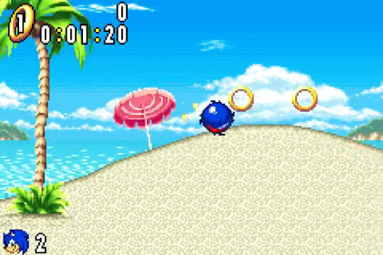
You may think this is a bit of a nutty conclusion to draw given how little of a story Sonic Advance actually has, but I think there's a lot we can glean from just the environmental design of Neo Green Hill Zone alone. Compared to the original Green Hill Zone, and most of the levels in the Classic Sonic games that aren't just flat-out urban cities/facilities seemingly built under Eggman's control (Star Light, Spring Yard, Chemical Plant), Neo Green Hill Zone's touches of human infrastructure are far more...friendly, for a lack of a better word. There's parasols and wooden scaffolding, a grind rail or two along paved sidewalks, yet the natural beauty of the area is left entirely in tact. Nothing about it appears like Eggman's work, yet it is quite evidently structured for human interests, for tourism and walking/biking rather than all the funky ways in which Sonic's animal cast are comfortable moving around. Then there's of course the name: NEO Green Hill Zone, as if it's reinvigorating the idea for a fresh new facelift, re-marketing it!
But how does all that connect to Radical Highway?
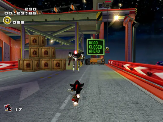
Radical Highway (and Mission Street by extension) have a quirk unique to them when compared to almost all other urban city levels in the series - as you can see in the image above, they're themed around still being under construction. Compared to a level like Lethal Highway from Shadow the Hedgehog (or the aforementioned Route 280 from SA2) the holes and gaps in Radical Highway are presented as being specifically because the winding roads are still under construction. You can see this on the level map above too - Route 280 and Route 101 appear to be part of a long, linear, already-finished stretch of road, wheras the area of Radical Highway and Mission Street is filled with gaps, inlets and breaks in the road. Route 101/Route 280 already appear to fill the function of letting people cross between the two city areas depicted on Adventure 2's world map...so then, what exactly is the construction and general wobblyness of Radical Highway for?
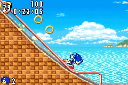
Well, let's look at Sonic Advance again: Specifically, the end of the Neo Green Hill Zone stage, and the way the game progresses immediately thereafter:
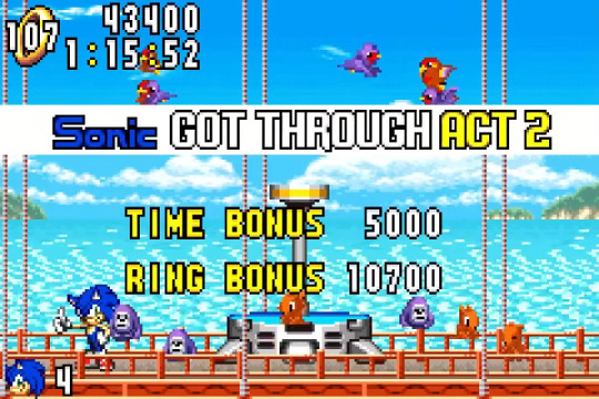
The natural beach environment of Neo Green Hill Zone Act 2 suddenly bows out before the Eggman boss fight to give way to something quite interesting: A red bridge extending out from the island's coast. The bridge's architecture doesn't quite match that of Radical Highway, most notably using tall suspension wires hooked up to some off-screen upper portion of the construction, but I think the idea alone is fascinating enough: This is drastically more modern architecture compared to the rickety wooden bridges otherwise seen in Green Hill Zone. We're still a bit unsure of if Advance 1 takes place before or after Sonic Adventure 2, but if it's before - it may also be possible that the work on this bridge began on the South Island end of things *before* the mainland Radical Highway-end were finished with their work, with the idea of joining the two bridges somewhere in the middle.
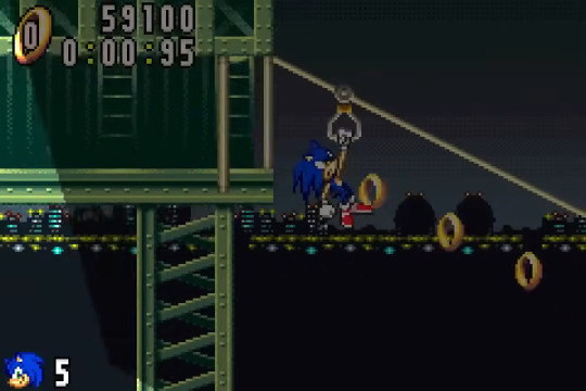
Let's again also consider where this bridge takes our characters in Advance - to Secret Base Zone, a shockingly urban facility which we still don't really know the location of. Sonic and c.o need to zip-line into its entrance, with a background that only features light and buildings far off into the distance - is it possible that the Secret Base exists sort of like an oil rig in the middle of the ocean, inbetween South Island and the mainland, as some sort of production facility for the UN? Regardless, it serves as a pit-stop in the Advance campaign - after it, we can pretty cleanly chart a roadmap for where the cast travels. Casino Paradise's ocean background seemingly depicts it as being part of the coastline (bottom left of the SA2 map), Ice Mountain is pretty clearly meant to be another area of Ice Cap Zone given how it leads to the Angel Island Zone - which is, in reality, a dilapidated Sky Sanctuary. Effectively, the campaign seems to go from South Island, to the bridge connecting South Island to the mainland, to a coastside Vegas-like casino wonderland built by Eggman, which is near the Mystic Ruins and thus near Angel Island by extension (it may be connected to Night Carnival from Sonic Rush?). And all of it connected thanks to the works of a bridge, seemingly set up in Adventure 2 with Radical Highway being under construction, possibly with the goals to connect the two core parts of Sonic's world.
Whew! That's pretty much all the words I have, and I've now reached the max cap of images per posts. I truly don't know how many Sonic fans care about these granular details and concepts about the environment of Sonics world in games from 20+ years ago, but I hope it got some gears turning - and if there is some merit to this, it may further get you wondering as to why the path connecting the two was seemingly cut off in the end? Given the cityscapes we see in Forces and IDW, it's possible that this mutual relation between the two worlds lasted for a fair while - what could've possibly led to that bond being broken? Maybe Unleashed breaking the world apart had something to do with it...
Thanks for reading this far if you did - and feel free to add your own ideas or things I might've missed in all of this!
#mel alphabet soup#ill make you eat those words!#sonic#sonic games#sonic the hedgehog#sonic lore#sonic adventure#sonic adventure 2#sonic advance#sa1#sa2#sa2b#sonic writing#sonic theory#sonic series#sonic franchise#sonic x shadow generations#sonic heroes
144 notes
·
View notes
Last Seen Blogs

theframelines
The FrameLines

corrysstories-blog
Corry's Stories
kisha9343
Untitled

thisisithyd
Untitled
girlstourlikeworldtour
视频里是本🐍