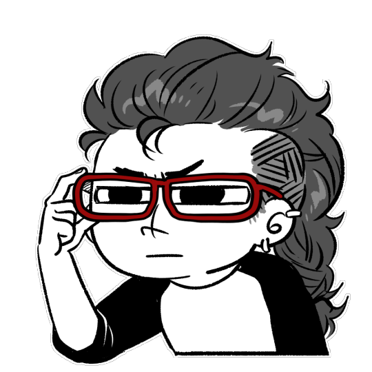
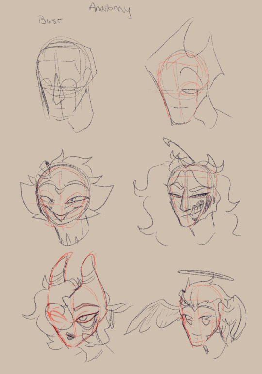
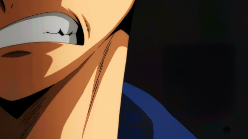
#I wanted to try drawing him with more realistic proportions
Text

quick study
#yes I know the leg stripes are wrong#my art#sonic the hedgehog#sth#shadow the hedgehog#I wanted to try drawing him with more realistic proportions#and also kinda visualize how I imagine his hands and feet ig#just a Shadow study in general#hehe#I luv him#his shirt is inspired to one I own ahaha#I am getting a hang of drawing mobians#I drew this during a long ass meetin while waiting for unreal engine to respond
40 notes
·
View notes
Note
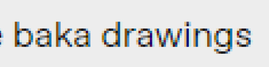
I was trying to study buff anatomy, I was using pinterest, but then it started showing up some baka drawings and weird photoshopped photos and it makes me really uncomfortable. Do you know any site I could use to study that has at least an option to show only safe for work images?
Anon, I think I understand what you're asking but I just need to confirm one thing...

....bara?
Did you possibly mean bara drawings???
If you did indeed mean that you don't want to potentially be flipping through mildly sexual bara images and bad photoshop jobs wherein dudes give themselves too many abs to compensate for a lack of personality, then perhaps I might be able to help!
Keep in mind that if you want to study musculature and anatomy, you may need to put up with nudity no matter what. And no matter what way you spin it, many nude anatomy studies may be classified as 'nsfw' because unless you work in an art studio...... yes, it WILL be not safe for work, even if it's not sexual.
My first piece of advice - stop using Pinterest.
It's a good tool for collecting images, yes, but it will not be an adequate teacher for this sort of thing. It may also give you references which are not entirely realistic. Of course, un-realistic art and exaggeration in art are fine! But as a baseline to learn from, it isn't good.
Second - if you're looking for poses to reference for art, check out AdorkaStock, a long-time, famous photo-reference account that has thousands of human references for free!
Third... If you're looking specifically for BUFF references, it's going to be better to look for actors or famous people who you KNOW are well-muscled instead of searching for a random 'big buff guy' online.
For example, think of an actor you consider 'buff'. Search via google for candid photos of him - with safe search on. Chances are, you can get some references which are not uncomfortable for you.
Look, here's one of Jason Momoa!
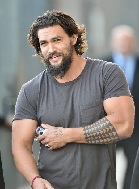
For a beginner artist, this may be enough! You don't have to draw every single muscle bulging to give the idea to your viewers that a person is ripped. The proportions of his shoulders, the wideness of his arms, etc, is already enough, and it will go a LONG way to visually suggesting muscles than a rob liefield lookalike.
For anything more than that, you'll need to get comfortable with seeing people naked, or almost-naked, and simply seek out photos of athletes with the type of body you want to draw! Swimmers, triathletes, football players and rock climbers are all 'buff' but in different ways. Looking through photos of these athletes may give you a better idea of the variety that's out there.
And for any other anatomy lessons, I do recommend YouTube because there are many art teachers who offer their advice for free. For example this guy, who explains anatomical bone and muscle groups to help your illustration!
youtube
446 notes
·
View notes
Text
Tagging: @slashingdisneypasta
Nobody asked, I just felt like posting this.
WFRR Characters as humans
Please note, I am not great at physical descriptions. This would be so much easier if I could draw xD I'm trying to be as descriptive as I can without dragging on too long. I hope I'm successful.
Roger Rogers (Roger Rabbit)
Yes, he has and will joke about his last name. He stands at about 5'1, and was born 1921 (26 years old in the events of the film), and is a lanky man with the flexibility of a wacky inflatable tube man. Roger still sticks to more loose, casual clothes similar to his toon counterpart. His nose is round and a little red, looking almost like a button ^^ though he is white (not overly pale. Might even have a slight tan. I'm not too sure). And yes, he still has his buck tooth, along with a head of fluffy orange hair. And I'm giving him freckles.
Jessica Rogers (Jessica Rabbit)
Honestly, Jessica looks pretty much the same as her toon self. With more realistic proportions, of course. She is 6'1 and was born in 1917 (30 years old). And above all, she still adores her short king, and feels loved by him everyday ^^
(I feel bad for not giving Jessica so much of a description, but she's the only adult humanoid looking toon, and I can't imagine her looking any other way as a human)
Herman 'Babyface' Douglas (Baby Herman)
A short, pudgy man. His exact height is 4'11, and was born 1897 (50 years old). Though he'll claim he's younger than he is. His skin care routine does help him look younger though, hence his nickname (don't expect him to tell you his secrets though), and how he can get roles usually reserved for younger actors. His hair is a bright strawberry blonde, but thinning, so he tries to style it in ways that make it look fuller. His eyes are still a bright blue. Herman prefers dressing in more expensive suits and coats (bro literally had a thick fur coat in one short), to show off his wealth and trying to make himself look better than everyone else.
Benjamin 'Benny' Brown (Benny the Cab)
(His initials are BBB like the now bankrupt store-)
I actually imagine Benny as an African American. He is 5'10 and was born in 1891 (56 years old. He said he was a cab for 37 years in the film, so that would mean he would've started, at most, when he was 19 in the human AU). He has short, kind of choppy black hair and dark brown eyes. He also has a scruffy goatee. Benny possesses a more muscular build, though it's mostly hidden by his jacket, so he just looks like a generally big guy (yes, he does perform his own maintenance on his car).
Anderson 'Andy' Winston (Smartass Weasel)
(If this guy was in the modern era, he'd get so sick of all the Toy Story jokes)
Standing at exactly 5'0, this New Yorker was born in 1912 (35 in the events of the film). He has a skinny frame, though broad shoulders, and is fairly strong for his size (he literally punched Eddie so hard he twisted around and doubled over the bar counter. Smarty has to have some strength, right??). He has olive skin, chestnut brown eyes, and actually has a bit of red in his hair. It's not too noticeable unless you're really looking, so he's not a red head like Jessica is. Also has a tooth gap! He cant grow facial hair though, even though he wants to (he wants a nice mustache. But can't grow one)
Miguel Rodriguez (Greasy Weasel)
His height is 5'9, and he was born 1909 (38 years old). He's got skinny arms and hands, which only makes his wandering hands feel just a bit more creepy on your skin (look at his hand/arm when he rolls his sleeve up! Not to mention how his sleeves hang off of him. Somebody put meat on those arms), though he's got a more curvy body with a bit of a belly too. I also imagine he's got a darker skin tone, and can grow scruffy facial hair if he forgets to shave. And he applies hair oil partially because his black hair is actually really curly (the tips curl up despite the hair oil? That's got to be some serious curl strength there). His eyes are a really dark brown, almost black, but in the light you can see the color.
Francis Green (Wheezy Weasel)
Yes, his last name is meant to be ironic. His height is 6'2, and he was born right at 1900 (47 years old). Kind of skinny, but you can see the sinewy muscle as well, hinting to his own strength. He looks pretty sickly, and has blemishes all over his body (he was a picker before becoming a smoker). His eyes are a slate blue, and he has ash blonde hair. Unlike Greasy, he rarely shaves, so he's got a rough, scratchy beard too, and yellow teeth from his smoking habit. I also see him having a more crooked nose shape.
(Honestly just imagine Bill Moseley and you'd get what I imagine human Wheezy would look like).
Charlie Renfield (Psycho Weasel)
(his last name may or may not be a reference to a certain Dracula character)
Psycho here is 5'3, and was born 1919 (28 years old). He has a skinny, angular build. No curves to be seen. Similar to Wheezy, he's got a sickly pale skin tone, and has scars and blemishes along his body from being careless and actively picking and scratching at himself. His most prominent scars are two on the corners of his lips from the times he's carried his razor in his mouth (he actually did do that in the movie. He's so lucky he's a toon). He's got a big head of fluffy, dark brown hair. Not curly necessarily, just... Poof. Also, he has split heterochromia; his right eye is blue, and his left eye is yellow (I know partial heterochromia would be more accurate to his swirly eyes, but I like the complete split more).
Thomas 'Tommy' Winston (Stupid Weasel)
This big lug is 6'4, and was born 1922 (25 years old). He is pretty chubby and has a round face, though don't let the plushness deceive you; that isn't just fat that makes him huge. He's got pretty big hands, especially (even as a weasel, he had huge hands! You guys saw his hand when he flipped the switch to the DIP machine too, right?). He also has olive skin, though it's more tanned as well, and he has freckles ^^ also has a deeper red hair color than Andy does, and it is more wavy than his too. I'm debating on whether or not he'd have brown or green eyes (everyone else has brown, blue, or yellow eyes. Green would complete the set). His buck tooth is still here, though smaller because human teeth.
Bonus! Sophie O'Brian (Poppy O'Hare)
(Yes, my OC. Technically I already made a post for Poppy, but I didn't really like how I wrote it. So this is take two. Hopefully I feel better with this one 😅)
Pops is the shortest of all, standing at 4'10. And was born 1920 (27 years old). She has pale, porcelain skin- though has developed some worry lines along her eyes- and big, bright brown eyes. I'm still having trouble deciding whether or not she has glasses, even for her toon self. But for her human self, I'm gonna say she only needs glasses when reading; any other time, you won't see her with a pair. She has a thinner, but still feminine build that she prefers to keep hidden under her clothes. Her hair is wavy and black, and reaches just under her chin.
(Hm... Honestly, when thinking of actors for human Poppy to look like, I keep thinking of Anya Taylor Joy. I'm not too sure about it though).
I hope you guys liked reading this ^^
#Who Framed Roger Rabbit#WFRR#Disney#Disney Heros#Disney Villains#Roger Rabbit#Jessica Rabbit#Baby Herman#Benny the Cab#Toon Patrol#Smartass Weasel#Stupid Weasel#Greasy Weasel#Wheezy Weasel#Psycho Weasel#humanization#my own characters#my own oc's#Poppy#i didnt add Doom cause we already got his human-sona in the film XD#... Herman and Greast might have more in common#with theor expensive tastes in fashion and behavior towards women#though i imagine Herman can get away with his attitude because of his fame =_=#(literally in one comic Herman is bossing a woman around and shes thinking to herself 'im only putting up with this until im a star')#(or something like that)#so even then people can acknowledge how insufferable Herman is#i wonder then how he abd Roger became friends 🤔
44 notes
·
View notes
Text
Okay, my voice designs are complete! I am about to ramble about them.
Some general comments before getting into each individual one; I'm terribly inexperienced at drawing creatures, so while I adore how some artists are making them different birds and I would've loved for them to have actual beaks, I care too much about quality to do that to myself. So I just gave them pointy noses. Don't question the ears. At first I was just going to make them all have different outfits that could be worn by any gender or shape of person, because anyone can play the game, but that got in the way of other ideas I had. So they all have different styles/proportions to make them stand out. At first they had different feather bits, but then I realized how much I liked the cannon Long Quiet's little head bits that look like cat ears, which are already super expressive. So I went with that.
Going in rainbow order, first we have Voice of the Paranoid!
I'm pretty sure his was the first of the group I designed, or at least, he's gone through the least revisions. I went full bug-eyed panic obviously. The eyes also make squinting in suspicion very obvious. While I like the designs that include the vital organs he keeps running, he serves a more general role in other routes. The outfit was the hardest to figure out, but I landed on the baseball tee because it was a bit more distinct, not too childish, but still very casual. Some symbolism I realized later is that you get to the Nightmare route by making choices that are uncomfortably in the middle, and that's reflected by Paranoid's shirt and pant sleeves stopping in the middle of the arm, right in the joint.

Voice of the Skeptic.
This one was the hardest for me. I don't know him too well, and he doesn't have a specific action or attitude to play into. I finally got an idea when I decided against using realistic proportions for a different voice, that Skeptic was perfect for realism, he's all about facts and reality. The glasses came pretty quick, and I decided on the beard because he needs something to stroke in contemplation. He almost had a pipe as well, but I decided against it. The outfit was difficult again, I looked up a lot of references to scholars and various sherlock interpretations, and finally decided on a dark academia style turtleneck and the long coat, which was everywhere in my searches. If you could see both of the little head thingies the other one would be sideways kind of like a quirk eyebrow.
Voice of the Contrarian.
While I adore the jester parallels so many others have made, I wanted to focus on the immature side of him. So he's a little brat with a backwards baseball cap because he's rebellious. I wanted to make sure to incorporate the sympathetic side that shows up later in Stranger.

Voice of the Opportunist.
He's honestly one of my favorite voices, and I think part of that is how he's good with people and social interaction, so I leaned into that side by going for a sleezy business man aesthetic. He also mentions that he likes to travel, so I gave him that excellent shirt. He's on the business casual side because you can't be serious all the time, you need to relate to the people. He doesn't know what the earpiece is for, it's just there.

Voice of the Hero.
Everyone's favorite boy! My main goal with the body type was friend shaped. Cause he's your bud. Went with the classic Link tunic because it's so incredibly hero coded, and the half cape to keep it fresh and friendly. I liked that another design gave him pauldrons to convey an upside down triangle shape, which represents intelligence and change, which I thought fit him very well. But fighting isn't really his thing, so I went with only one, putting the design off balance in a way I really liked. The head thingies came like first try, he's definitely swoopy and dynamic.
Voice of the Hunted.
This one sucked to design because as I said previously, I'm bad at animalistic designs and shapes. My first thought was an Australian Bear Grylls type survivalist with realistic proportions, but it wasn't quite working and I loved everyone else's feral creatures. So I tried. The hair thingies came to me at random, and I like that they look like deer antlers. By this point I had everyone else down and none of them had a top heavy face shape so I tried that for Hunted and I liked how it turned out. I learned in my failed creature designs that a wide neck was important, so I did that. I kept the shark tooth necklace for flare.

Voice of the Cheated.
I got very tall vibes from him for some reason. Maybe because it helps contrast his squinty eyes. For his outfit I went with a "someone who went broke at the casino" vibe. It felt right for everything to be mismatched, uneven, and messy. He's also the only one I gave a tired line.
Voice of the Stubborn.
Of course he had to be buff, also wide things are sturdy. The tank top was the best shirt to show off those muscles, and I feel like the basketball shorts were a necessity for this stereotype. Thick eyebrows because angry. His head thingies are tiny and adorable mostly because I found it a funny contrast. The blue was honestly a bit of an afterthought, I'd already given red to Paranoid, and the orangy colors felt too weird for him. I think the blue works though.
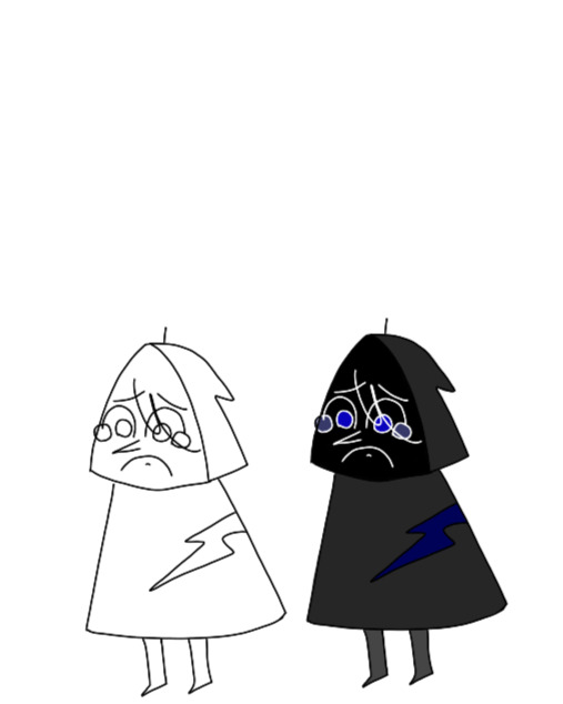
Voice of the Broken.
He's small. I had to go for a hoodie because it's gloomy and also to give cult vibes. The face needed to be big in order for those watery eyes to be prominent, and I felt keeping it in shadow was the easiest way to keep it simple. I had a lot of crazy ideas about unmatched puzzle pieces and wobbly towers that I'm incapable of executing, but I needed some sort of literal expression, so there's that big scar. The little line on the top is supposed to evoke a puppet whose string has been cut. I imagine that the others drag him around by it if they get frustrated.

Voice of the Cold.
It was a bit difficult to figure out his design until I realized that he's the type to do hard drugs if given the opportunity to. Then things clicked. And once I made the connection of black lipstick, everything came together. The head thingies are supposed to look like dreadlocks.

Voice of the Smitten.
I struggled so hard with this. I can not draw handsome people, but I can't have Smitty looking like a dork. The swoopy head thingies were easy enough, but most of the rest didn't look right, or was literally just Roman from Sanders sides. But I got in a chin, and decided to go for the heart body shape and I think it turned out well in the end. I was even able to keep the shirt sleeves and bowtie that I had discarded earlier for being too dorky.
17 notes
·
View notes
Note
do you have any tips on how you draw kitty and puss? I really like how you draw them and I'm struggling a bit since I don't draw animals alot ( also i don't wanna accidentally fall into the sexualized female anthro animal trope with kitty )
Honestly, before this movie, I didn't have much experience drawing anthro-ish animals, or even just animals in general. One scroll thru my art tag can probably tell you that Im not really much of a furry artist, and I mostly draw people. So starting out attempting the characters, I really just did a bunch of sketchy screenshot redraws, trying to find shots from different angles to get a feel for the proportions and how I personally wanted to stylize them.
(redraws of the doctor scene, practicing him undressed and from the side)
The good thing to note is that if you know how to draw puss, you know how to draw kitty. Kitty is literally a modified model of Puss (all the cats in tlw are, according to the artbook), therefore without accessories their sillouettes are basically identical. This makes sense considering Puss and Kitty are... not really anthro animals? The most humanoid things about them are their paws being slightly more hand-like than is realistic for a cat, and the fact that they stand just a little too straight when on 2 legs. Otherwise they are basically just normal cats. Which means you can also use the internet's extensive plethora of cat images as body reference as well.
(literally cats just look like that when standing like a person. its ridiculous)
So I basically use the same base for both characters. Most of the differentiation of them is in details, for me. I personally make my Kitty have softer angels than Puss, especially in the face. I also give Puss longer, wavier whiskers. But these are all personal stylistic choices. If I were you I'd look to some of the concept art as well. The artbook is really great to have tbh! But obviously if you can't afford that, like 99% of the art in there has been floating around on the web anyways. You can get a better sense for how various artist chose to stylize and simplify the characters, and experiment from there.
(jesus alonso iglesias's puss concept arts. I personally take inspo from these for my own interpretation)
so that's about it? really all this advice boils down to is "use reference and take stylistic choices from other artists" but that's basically how you learn how to draw anything, so mileage may vary. The real answer to this question is go back in time and hand your ten-year-old self a copy of Warriors: Into The Wild so you already have a way to draw cats etched into your psyche.
66 notes
·
View notes
Text
I’m really glad that people in the TMNT fanbase have finally started calling out the insistence that 2012 Splinter is irredeemably abusive. As well as how the criticism comes across as racist. The way the character is depicted in the show versus the way he is often depicted in fan content is like night and day. I’m open to different fan interpretations, but I’ve seen an insane amount of fans confidently state that he’s canonically abusive. And this is one of the worst misinterpretations of canon I’ve ever seen in fanon.
2012 Splinter was raised in Japan, and seems to take on a more East Asian style of parenting. He’s stricter with his sons, but usually when they put themselves or their brothers in danger. However, I would say that he’s far more gentle and understanding than anything else. And I would like to clarify that reasonably disciplining your kids and teaching them right from wrong is not abusive. That’s what it means to be a parent. Never correcting misbehavior is another form of abuse, one that borders on neglect.
Another thing to consider is that he’s in a very unique situation. Splinter and the turtles are mutants. They will never be accepted by society and will always be seen as monsters; he knows this. He teaches his sons how to fight so they can defend themselves in a world that will try to hunt them down and kill them. He has nightmares about his sons dying. The show explores the terror he faces as a parent, which is something he’s already experienced with the loss of his daughter and wife.
Splinter is devastated and relieved to find that Miwa is alive. He loves her as his daughter, but that doesn’t mean he no longer sees the turtles as his sons. He views them as being his children just as much as his biological child. He clarifies this to Leonardo. The reason I love TMNT so much as a franchise is because it’s one of the few pieces of media that explores familial love within an adopted family. And TMNT 2012 constantly reiterates that family can look unconventional and does not need to be bound by blood.
Splinter is a realistic depiction of a parental figure. Most parents in media are either abusive or perfect with no in-between. Splinter is the type of parent who tries his best but still makes mistakes. In real life, there is no such thing as a perfect parent. Even the kindest parents are going to make mistakes from time to time. But my favorite thing about Splinter is that he almost always owns up to his mistakes. Rather than doubling down or pretending he did nothing wrong, he admits his wrongdoing and apologizes. And that’s way better than a lot of parents.
I don’t want to get too personal, but I grew up with several abusive adults in my life. I know firsthand what it’s like to experience very violent abuse at the hands of an adult. It fucked me up and I’m still recovering from it. Pretty much none of those adults ever admitted wrongdoing or grew as a person. In their eyes, they were always in the right and I deserved what I was getting. I would’ve loved to have a patient and kind adult in my life like 2012 Splinter.
Abuse looks different for everyone, and I don’t want to imply my experiences are universal. But as someone who did grow up in that environment, it’s upsetting to see people blow Splinter’s actions out of proportion in order to validate their dislike of a him. To me, it feels like fans are using the abuse as a tool to make their opinions look morally correct. As a writer, I understand making alternate universes to amp up the angst potential. But insisting that fanon is canon is where I draw the line, especially when it comes to willfully misinterpreting a character.
#tmnt#tmnt 2012#tmnt 2012 splinter#i’ve been wanting to make this post for a very long time#and no this is not an invitation to shit on other versions of tmnt#fanon is not canon#and yeah it does feel racist#it reminds me of when people were saying abuela from encanto was super evil#no these two characters are nuanced#and it’s fine to dislike this character#but as i said it’s when people try to make him look morally bad#to justify their opinion as the correct one#idk guys fandom is super weird :/
73 notes
·
View notes
Note
Can you do your drawings more the manga style? The others are fine but anime characters shouldn’t be drawn in a realistic style because it looks weird. Your art is good but maybe you can draw actors your one style and then anime for the other. I read you were practicing for the manga. Dont worry I want to read it! The thing about realism is that you cant represent a character factually in their true cultural foundation since it doesnt exist. The character doesnt exist. How can you draw Sasuke as a Japanese person and represent him as one in real life when you dont know what he looks like? Same with Naruto. This is no hate but just advice for your future career. I see many artist making mistakes like this and this is just a warning to prevent you from making it worse. I hope you can see it as such and not make a big deal out of it. I like your analysis’s though, keep up the good work have a nice day. Peace ✨
“Can you do your drawings more the manga style?”
No matter how much you try to formulate a question like this in order to make it sound “polite”, you don’t grasp the severity of the thing you’re “asking”.
You’re asking an artist (in my case someone who’s practicing to become one professionally), to change their art-style. An art-style is something that belongs to a person. It’s something that develops and an artist can play around with it, but you (and anyone else) don’t get to decide how they should do that.
It’s impossible, even if we "wanted to".
And quite rude.
When I first started with commissions people always asked me to “draw me this like that artist does” and basically they always wanted a copy. It used to be so confusing to me, because if they wanted something that looked exactly like the other artist’s drawing.. then why ask me? Why tell me you “like my art so much”, come to me for a commission because of it, but then don’t want it the way I draw it?
It made me really insecure about the way I draw.. and it still does to be honest.
“Copying” an artist’s art style can be a good way to practice art and figure out what you like, there is no shame in that, but it isn’t part of “us”.
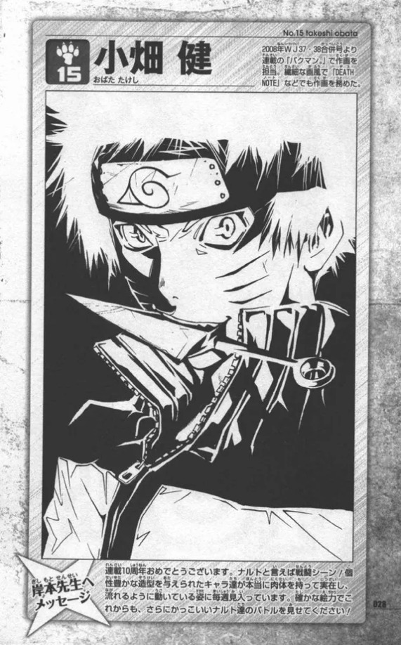
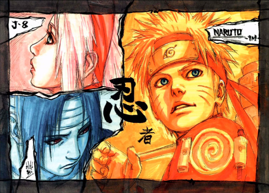
What do you even mean with “manga-style” anyway? You do realize that there is not one “manga-style” either right? Have you seen the ‘Naruto’ tribute drawings made by other Mangaka’s? They look very different from Kishimoto’s “manga-style”.
Hirohiko Araki:

Mitsubishi Shimabukuro:

Masanori Morita:

Toshiaki Iwashiro:

Kentaro Yabuki:

Takeshi Obata:
And these are only a few... (lmao to fan-artists getting criticized for slightly different facial proportions being part of their art-style when it's more than normal (in the Manga world), but ok.)
“The others are fine but anime characters shouldn’t be drawn in a realistic style because it looks weird.”
This statement in itself is ridiculous. Anime characters drawn (semi-)realistic-looking being “weird” regardless of how it’s drawn or by who, is your opinion. Your own personal opinion which is weird to send to someone. Meaning: your opinion is not factual. Now that, is not my opinion, that’s commonly accepted as a fact.
Kishimoto himself drew his characters more "realistic" as well.

Not just him, but there is another Mangaka who did.
“Dont worry I want to read it!”
I wasn’t.
“The thing about realism is that you cant represent a character factually in their true cultural foundation since it doesnt exist. The character doesnt exist. How can you draw Sasuke as a Japanese person and represent him as one in real life when you dont know what he looks like? Same with Naruto.”
You talk like you have zero understanding of what “art” even means in the first place.
I don’t even have to explain myself to you, but:

.. these aren’t even all..
(Please guys, I’m aware of what is happening.. and yes I get them too. I’m not going to talk about other blogs, my blog isn’t a call-out blog, but this is going against my style specifically.. so here we are.)
Adding “realism” is just an interpretation, a way to enrich the fictional fantasy of a character. It’s true that you can’t represent a character “factually in their true cultural foundation since it doesn’t exist” as you say.
Because Konoha doesn’t exist. Ninja’s (from Naruto) don’t exist.
Konoha isn’t an accurate representation of Japan and its culture either as Kishimoto is also influenced by different media from all over the world. His fantasy world in which this creation was born from exists, because it isn’t limited to one cultural region and it doesn’t have your personal boundaries. His childhood as far as we know was full with superheroes that were created from minds all over the world with super-powers that aren't tied to our realistic (cultural) representations. We can't manipulate Chakra like these characters do, now can we?
That’s why it’s fiction.
That’s why you’re right and also contradicting yourself because of it.
Why the hell would I want to take the beauty out of something that not only entertains us, but perhaps even helped us cope or forget this dumb “real life” you talk about and bring it ‘back to Earth’ when the mouths that lick the asses of those that embrace this ‘cancel culture’-mentality so-lovingly want to steer us towards all these ‘problematic’ things they call “reality”. Seemingly: you.
The beauty in art or fanart, fan work, fiction, fantasy is exactly that it does NOT have to represent anything exactly in real life, but it can be whatever the creator wants it to be. Interpretation is never the same for everyone. And frankly, you don’t have to agree with it. You can turn on your news-channels, discuss shit on Facebook or focus on something else if you want to see something that “represents your reality” and even then that’s questionable to say the least :’)
Art, this platform, entertainment, humor or this story that exists from the mind of a man that somehow, someway came up with the most beautiful.. tragic, love story of all time, discussing it, getting lost in the charm or artistry that went behind in making it- it’s supposed to be fun. A way to escape that reality, but all this backlash and criticism towards not just fan-artists, but also fan fiction authors who do nothing, but share their works for free does not make it very attractive to do so. One day this fandom will die down, because of this, yet it doesn’t have to.
People will always do what they love to do.
Let them.
(Morally)
“This is no hate but just advice for your future career. I see many artist making mistakes like this and this is just a warning to prevent you from making it worse.“
No, artists following your advice is the mistake. Uno reverse warning.
Have fun on your journey drawing, writing or anything that you love to do. You’re the only one having access to your mind. In art specifically, there is not one art-style, it’s something you develop overtime through drawing the things you love drawing. Every time you’ll think to yourself “hey, I liked that, I want to incorporate that the next time I draw too!” It’ll build from there.
“I hope you can see it as such and not make a big deal out of it.”
I hope you see the hypocrisy in this sentence.
Have a nice day too. I left you a drawing. (It’s the latest one.)
180 notes
·
View notes
Note
could you explain how you draw fpk? he looks like a very shaped beast /pos
Hm, I'm not sure how to explain it exactly. But I suppose I could talk about my thought process for his design and how I portray him.
My main sources of inspiration for him are reptiles and mammals, as time went on I definitely started to lean more into the latter. Because he's covered in skin instead of scales, his body is very soft, and I try my best to emphasize that in my art. With his additional fat, I also look at fat reference to make sure it has the proper shape, softness and physics.
It's also worth mentioning that his design changed over the year, he was a lot more reptilian and sharp when the AU started, so that also affected my drawing process for him. A big change was to his proportions - his head used to be a lot bigger, his legs shorter and his arms smaller. His tail was also quite thin, and his belly was closer to what you see on kittens than how I draw it now (which unfortunately also made him look swollen, or even pregnant, and since that wasn't my intention, I decided to change how I depict it). His proportions are a bit closer to a small person, and that also affected his posture. He's more upright now, has longer legs and arms, and a smaller head.
The tail is also much more thick now, he drags it behind him almost like the very old depictions of dinosaurs, and it's very important for counter-balancing his large head (even if the head is not actually very heavy). The tip is much more flexible and almost prehensile, so I make sure to put emphasis on it in my art. I imagine it would wiggle around a lot so I want to make that apparent when I draw him.
A big part of how I draw him is his crown. I make the horns very short compared to his canon design, and they're more spade like with round tips, they're also much closer to one another. This is both a stylistic choice and also part of his design, and it gives him a more streamlined look. The two spikes on the sides of his head are probably the only sharp part of his design, and they're very stylized. Realistically they make no sense, but he's a cartoon character so that's fine. If I were to draw him more realistically, they'd be positioned on his cheeks, I don't think they'd actually go all around (so you wouldn't see them on the top of his head in the profile view).
His face is salamander like, flatter at the bottom and rounder at the top, with a significantly more pronounced nose and snout than before. No nostrils or earholes though, he does have them but they blend in so well they're not visible in my art. And there's of course his eyes. Big and reflective, I pay extra attention to making them look alive and "wet".
His colors are also very important, I intentionally made him leucistic so that he has a pink undertone to his colors, which gives him this soft marshmallow look. The pink around the face, elbow/knee joints and at the tip of the tail really emphasize it.
I don't have any specific "guide" like images for this, so I'll just add my most recent drawing since it illustrates everything I said the best.
In short, the soft colors and the roundness are definitely the biggest factors to his design. He's meant to look very approachable, and the cushion-y marshmallow/dumpling vibe is definitely something I really enjoy about his design. So I pay attention to the weight distribution, the color palette, and all that, my goal is to make him look as if he was very soft to touch. It is a relatively recent direction, but one I'm much more satisfied with than his older, more gray/blueish design with sharper traits.
I hope this was somewhat informative, I wasn't sure how to approach this ask but hopefully you enjoy the answer!
19 notes
·
View notes
Text
Things that came to mind while watching this episode:
-SWORDS
-Urokodaki's intro to the Corp is both necessary and info-dumping but in a way that I have lovingly come to accept as KnY style. However, the first time I watched it, I think I totally forgot about it.
--Also while watching it the first time, I was like, "whoa, more time has passed? More time has passed? MORE time has passed??" and later I was like "and Nezuko was conveniently asleep the whole time" but being as deep as I am now, I'm like, "yes, what a wonderful training montage, I love that Tanjiro kept a diary, Nezuko was working so hard this whole time too, yes of course Tanjiro took that much time to fully ingrain all that manliness into his muscles."
--Urokodaki comparing humans to demons and mentioning how human limbs don't grow back? Kind of on the nose.
--Mentioning how swords can break easily? Also kind of on the nose.
--I didn't intend for 'on the nose' to be a reference to the Tengu mask, and I even less intended for 'on the nose' to refer to Urokodaki's sense of smell. Seeing the connections now, I choose to stick with this phrasing.
--I know that Urokodaki was realistically trying to prepare his children to face monsters who actively want to murder them, but... did any of them die in training??? Those are real sharp objects! I can imagine Nezuko happily reading Tanjiro's diary later, but then pausing and looking up to stare incredulously at Urokodaki, appalled that he had nearly killed her only remaining brother.
--That being said, the Corp is an organization of some few hundred swordsmen (at any given time), with some huge portion more who died at the Final Selection, and some still more huge portion who failed to gain permission to attend the Final Selection. If we compare to, say, modern day competitive children's sports all going for the same championships, then it's not a large number. However, it does go to show the widespread damage demons cause, and how many children are driven to find putting their lives on the line to take down demons is their only remaining calling in life after having lost everything. Urokodaki has seen it so many times, so every time he accepts a student, he accepts someone who has given up anything else to live for, and he has to accept the consequences of their choices and how it may be out of his hands, all he can do is give them the best chance of survival he can and try to protect his own heart against the inevitable. Withdrawing from Tanjiro to leave him to his own devices may had been part of that.
--Ok, but also wouldn't it be funny if the scar on Sabito's face is from training with the traps on Mt. Sagiri?
--Hanae Natsuki had so many good sounds over the course of this training montage. Zenitsu gets the reputation for it, but let us never forget that Tanjiro is the OG "NE~ZU~KO~" screamer.
--Speaking of sounds, the sound of the sword as Sabito draws a real blade on Tanjiro at the end of the episode? CHEF'S KISS. Also, even if Sabito doesn't have a scent, he has manifested so much physicality that he's got remarkable sound effects as he attacks Tanjiro. And those flutes as he appears on the rock? So nice.
--AND THOSE ATTACKS, OH MY GOSH. THE HUMAN-ON-HUMAN SWORDPLAY IS SO GOOD. It's like Tanjiro said, not a singe wasted movement, Sabito's swordplay is so smooth and there is such a stark difference between him and Sabito in that first encounter. Also, SOMETHING I LOVE: Tanjiro blocks the first few strikes from Sabito with the hilt of his sword instead of with the blade. This goes to show Tanjiro's hesitation to use the blade, both for how it may deal damage and how the blade might take damage. It's after a few more blows that Sabito forces him to start defending himself with the blade instead of the handle. That was masterful swordplay storytelling.
--Gotouge, have you practiced martial arts? Breath technique is of fantasy level proportions, but so many core ideas and true training methods are on display so well.
--Random, but the bright coloring on Tanjiro's eyes in this episode? SO PRETTY. And so much focus on his facial expressions, especially in his concern for Nezuko. I was falling for this boy so hard by the time I got to this point in my first watch.
--But THAT SABITO SMILE, OH MY GOOOOSH
--There's a part of me that has always wondered if Tanjiro ever had a crush on Makomo, or at least found her somewhat cute initially before fully accepting her in more of a sempai role. In his experience, he's likely never encountered a girl like her before, and similar elements might had been what made him notice and ponder Kanao later on when he saw her with the butterflies. Not saying I think it would had been a serious crush or even anything he was aware of, I just wonder if he's always had a type (I mean, we know he did, I just wonder if Makomo fits his lily-of-the-valley-faithful-dog type).
--I love that Breath technique isn't necessarily a "summon your qi" kind of spiritual power, and instead focuses on oxygen and the physicality and wraps the psyche into part of one's overall physicality. That's pretty grounded martial arts technique, and likewise, I like how demons' abilities are also grounded in physicality (their bodies and blood having transformed) instead of, say, drawing power from outside sources like magic. But you could also poorly describe this series as "yogis vs Michael Jackson."
--You know what makes Makomo & Sabito's presence so believable, despite how Tanjiro found them mysterious and noticed right away that Sabito didn't have a scent? Mt. Sagiri, as a setting. This mountain is so much bigger than Tanjiro is, and Urokodaki is never shown saying more than he needs to for Tanjiro's training purposes, so for all Tanjiro knows, there are other children training concurrently, in their own pockets of the mountain. He's had to work so hard to gain his own mastery of Mt. Sagiri that he wouldn't be surprised to encounter people who know it better than he does, enough to be able to watch him while he wasn't aware (what with having his attention so focused on his own desperate training). As they probably don't have demon sisters to keep an eye on, it would make sense that he might be the only one to dwell with Urokodaki.
--That split boulder has become so iconic and I love it.
51 notes
·
View notes
Note
Hello the marvellous KK!
I was just wondering if you could give some tips on how you draw? Like anatomy and how you get ideas for characters! For example Ruth and Allen.
Thank you
-Curious Anon
Ooooo amazing question!! Although a very long one to answer haha…
I’m honestly not too sure how to sort this so I’ll just put the stuff you mentioned here rather than a whole jumble of tips
ANATOMY
yeah I’ll be straight up this still isn’t my strongest point soooo- I can only suggest looking at as many references as you can, try to keep bodily proportions the same in different sketches of the same character to get a more realistic look at ‘em
I usually keep a base shape of a human head in mind when applying it to different species
Of course this rule doesn’t always need to apply
POSING
just added this here for funsies, POSING. You really want to have a fluid pose when creating a piece, the best way to do this is by using the line of action. The line of action is essentially the guideline for how your drawing is going to flow, you can find a ton of resources online if you wanna dig deeper into that topic. I also use Line-Of-Action.com to find references, pretty good site.

This is basically how I do most of my sketches
CHARACTER DESIGN
Now this is the one that got me hella excited- this has to be my favorite thing to do when making a new story. I’ll just use Allen for my example.

For every character I make I want there to be a good sense of personality in their design, especially the face. You need to be able to tell what type of personality a character has by just looking at them wether it be from expression, clothing choice, body language, etc… The more exaggerated/expressive the design is, the better

I definitely put a lot of emphasis on his eyes when designing him, he is an owl after all and I wanted to be able to convey that. I also liked having the irony of also having his eyes usually be slits/half closed to further present a sort of “oh I’m totally not evil haha” look, but also being able to have the be super huge when needed to convey more emotion. His design is based both on Asa Sweet from Lackadaisy and Stolas from helluva boss (more so Asa). It’s good to find inspiration for characters but just remember to make sure they aren’t a carbon copy yk, that’d be mean. He has definitely changed over the years I mean just-

Look at him…
Old art jumpscare aside- yeah this is just basically random stuff that hopefully can help you out, reminder I am not a professional and art is subjective so you do you babes
My other art tutorials:
Same face syndrome
Expression Tutorial
12 notes
·
View notes
Note
Your oc pairings doing the tiktok couples paint each other trend? (It's what it sounds like, couples paint each other and film it to show their reactions) (unfortunately I've seen a lot of sad cishet ones where the guy paints his gf or wife really badly, like intentionally, where the gf/wife looks like a monster so I need some actual nice ones to feel better and thought I'd ask about your ocs)
Awww that sounds so cute! (though it really sucks about the sad cishet ones, I don't know why you'd want to paint your partner badly on purpose, that's just mean and awful :( )
I'm just gonna answer this for the couples you know I think, just for simplicity's sake
Rae: Isn't that much of an artist, but she'd do her best. It's not fantastic quality but it's really clear that she tried to get all the details (especially in his eyes because she loves his eyes). I think she'd either just stick to drawing a bust of him just to make sure it's manageable, or would try something ambitious like him with his wings wrapped around her.
Warren: Refined upbringing... I'm sure he's taken some art classes, not to mention his mom liked to paint, so he knows how to paint. He hasn't done it in years so it's a bit of a slow start, but once he finds his rhythm he actually makes something really beautiful. It has Rae crying a little when he shows it to her (but happy tears of course)
Robin: She's more of a music person than a 2D art person, so her solution is to paint a bunch of wiggly stripes in shades of blue and silver and say "it's you at superspeed" - kinda cheating, but it makes Peter laugh.
Peter: Tries his best... that's about all he can say. He tried to paint her singing onstage for Carmen since that's how they met, but it's a little lopsided and goofy since he's not the best painter. It's not intentionally bad, he's just not an art guy, so he and Robin just laugh together when he shows her.
Madison: Would probably opt to sketch him rather than painting him (she's better at sketching, it was one of her hobbies to pass the time out in the woods), and would actually draw a really accurate sketch of Alex. He's very impressed (and it makes him a little embarrassed about his own drawing, honestly)
Alex: Isn't a great artist, so he kinda just stuck to the key details - plus, as we both know, she's kinda hard to draw. Madison thinks it's sweet no matter how it turns out though, he could have drawn a stick figure and she'd still think it was sweet that he tried.
Jasper: Tries to draw the time the two of them kissed across the railing at Jasper's derby bout...
Kyle: Ends up, by total coincidence, drawing the same exact moment, since it's also his favorite kiss that they've had. Jasper's is more cartoony and Kyle's is stuck in that vague zone of "past the anime character stage but not quite the right proportions yet" but they were both so surprised to flip it and reveal the exact same moment that neither of them are really paying attention to the quality of the paintings.
Prometheus and Corinthian: I feel like as dreams they'd probably have some kind of like... photographic art thing? I mean, they are themselves artistic creations, in a way, and they're not exactly human.... I guess what I'm saying is they'd both make realistic paintings of the other, and though they'd both find it sweet they also wouldn't quite understand the point of it... it's more of a human trend, I think.
Indie: Also opts to draw him rather than paint him (maybe with pastels or colored pencils, and she'd play with a fun color scheme), since she already enjoys drawing. It comes out really clean and accurate, and Hux is both impressed and maybe a little overwhelmed because I can't imagine anyone's paid enough attention to draw him before he met Indie.
Hux: I also feel like he knows how to sketch a bit (admittedly this is a headcanon I latched onto from a fic I read, but still), though he's probably rusty since he hasn't drawn since he was a teenager. Indie kinda tries to brush it aside when he shows her, saying he's biased and she definitely doesn't look as nice as what he drew, but he insists that it's how he sees her. I mean, we already knew he's completely smitten for her.
#my friends!!!#answered asks#my ocs#rae mckinney#robin cassidy#madison douglas#jasper wilson#oc prometheus#oc indigo
4 notes
·
View notes
Note
Hey! I was wondering if you have any tips/ would be willing to share your process for drawing character faces and expressions? It's something I'm trying to improve in my own art, and I adore how specific and clearly readable yours are across all your different pieces.
Absolutely! To start, I wouldn't say I have a "process", it kind of varies depending on the style of the piece I'm doing. That being said, since most of my art here is mostly all comic book/animesque style, I'll give some info on how I tackle expressions and how to build a good foundation for any expressions you want to draw.
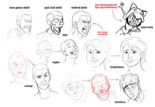
The Basics: The Skull
Everything starts with the skull 💀 I've spent a lot of time learning the underlying structure of the human head, namely the skull and facial muscles. The skull is divided into many zones and regions (of which I do not remember all the scientific names), so to simplify things, I divide the skull into the four main parts below:
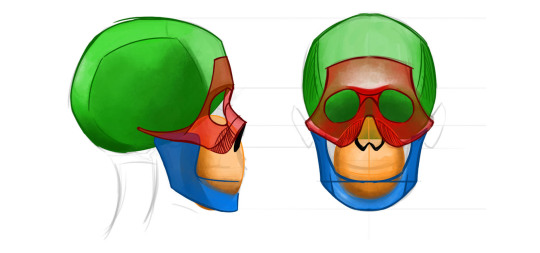
(I simplify the maxilla and teeth into a circle, since it's approximately curved when closed.)
I usually spend at least 5 min a day just doodling skulls so that way I don't lose the visual inventory I have in my mind. It makes it easier when I want to sketch characters and expressions on the fly.
That's the structure, but now you need to learn how the motion of the skull actually works. Do studies of how the jaw moves compared to the cranium and maxilla. This is important because if you want to draw your characters screaming/crying/arguing etc., you need to understand how the face stretches to accommodate the open jaw.
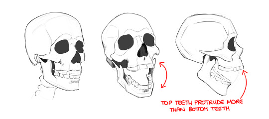
It's also important to learn how to draw the skull in 3D space. Yep, I'm talking about head angles. For my Tucker Neon post, since we’re staring down at him from a high angle I drew a rough skull to figure out how his facial features would work in this perspective:
Having a good understanding of the skull will provide you with a solid blueprint for drawing any expressions you want, which brings us to...
Facial Muscles
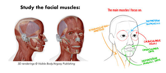
If the skull is the foundation, I would say that the facial muscles are loosely the “architecture” of a person’s face. It’s always moving, always changing, and learning how they behave across the human face is a must for nailing expressions. To get a better idea of how the muscles contract/stretch across your face, I would recommend two things: scrunch your face, and use a mirror!
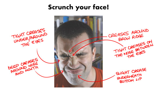
Here you can feel all the areas that crease, which areas are tighter, and which areas “lift” more when you work those muscles! 💪 These creases can add more emotion and intensity to whatever expression you’re drawing; how much creasing depends on the intensity, which is up to you.
This is something that manga & anime make excellent use of; they’re not shy when it comes to conveying what their characters are feeling:
Which brings us to our last topic...
Stylization
Are these guidelines I said so far hard rules? No, they are not. Part of drawing expressions is stylizing and exaggerating realistic human proportions and behaviors. This is why I love collecting anime expression studies. Look at these awesome faces and acting:

And here’s some western animation examples added for good measure:

Do real-life mouths stretch like that? Or do eyebrows move on top of the eyes when you glare? No, but it’s all in the service of exaggerating the expressions and emotions that the characters are feeling and really communicating that intent with your audience. You learn the structure of the skull and facial muscles to get a good understanding of how they work, and then you use what you know to stretch and exaggerate the physical limitations of the human face.
Essentially: Learn the rules so that you can break them.
And now that I have subjected you to my long-winded TED talk, let me get to answering your actual question and showing you my process! 😂
When I’m drawing expressions, I act them out in front of a mirror; this is the best way to learn expressions, by drawing them from real life. As you can see, sometimes I do a quick sketch of a skull to get an angle accurate, but if a character is stylized or facing the viewer at eye level, I just skip ahead to the final sketch.
I hope this was helpful! I’m going to include a post full of good resources and tutorials on drawing expressions later today!
32 notes
·
View notes
Note
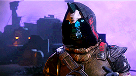
Do you have any advice about how to draw Exos? I really want to draw my warlock a bunch but my art is focused on simplicity and circles so trying to make detailed Destiny stuff fit is rough. Like, just understanding the robotics on her face is giving me a hard time.
Also your art is super cool and I don't know your OCs well yet but I already love them!!
Thank you very much! <3
It can be a bit problematic for me cuz exo faces are technically like human skulls and obviously have the same proportions as human faces. It's good to know some basics about it, srl. It's worth it. Helps improve A LOT.
But anyway!
Srl, drawing each detail is not worth this. I see many artists do the same if they're not super realistic. Personally, I make some studies of my Iberis-3 before I started to give him 'my art style'. I chose only parts that are for me more important than others or make it more simple. Creating Iberis to the version I really liked took me 2-3 weeks so don't hurry with this. Obviously, his design had changed during these 3 years and It's not a shame.
Compare the art style I usually use and the version from the game:

For example, I made his eyes much easier. Only black holes and a small white dot. It's a popular technic in the fandom.
Much more problematic is showing emotions on exos faces. They're not really expressive in the game. No eyebrows, small mouth, etc. Only Cayde-6 had eyebrows + these big blue eyes gave him so much more expression than all other exominds. If there is another exo like him in the game, pls let me know.
Because I'm my style is more cartoony I had to 'find the way'. Like I said eyes/optic/ eyebrows or however we can name it.
The red lines are parts that I use to show emotions. This face model can 'have' eyebrows like Cayde but I never liked it so I use this one.

Also mouth ale necessary part of emotions too but with exos is hard to do it. The big holes in the cheeks place are cool when they speak and show light but take so much place. The red line shows which part I use.

It's not a lot compared to how much we can show on the human face. Also, important for me - my exos have 'fake teeth'. The game one didn't have it. I create this part cuz It let me easier show emotions. They're not always white. For Cayde I always use black cuz It just looks better for me.
Examples from my style about eyes and mouth:
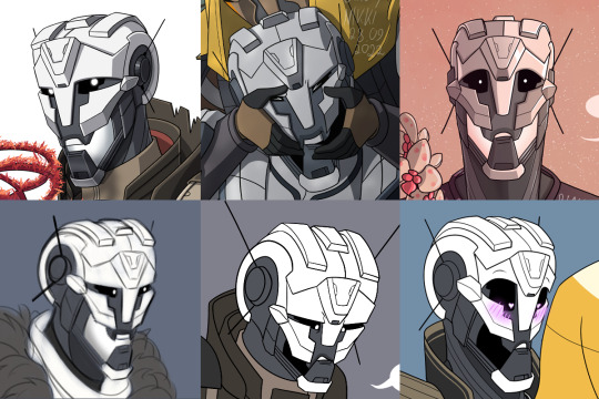
This is all I can tell you. I hope I helped a bit 'cause I don't really feel like I'm a good person for this. Honestly most of the time I don't have any idea what I'm doing.
19 notes
·
View notes
Text
In the time of black and white films, most film was what's called "orthochromatic". It did not render colour evenly accross the spectrum. Blues might appear brighter and yellows much darker. Or something. For this reason, the majority of films used grey sets and costumes so that they could predict exactly how the colours would come out in the final film. They intentionally made the sets look LESS realistic to get a more realistic outcome because the medium had some limitations.
When you draw stuff you're not rendering it in a perfect photorealistic way. I really hate the art advice to draw things "as they are, not as you think they are". Firstly, from what I've read, Quentin Blake seems to disagree and I'm gonna side with him. Secondly it just doesn't work for me. Maybe it's great for some people but in my experience if you're drawing a hand that has lots of tiny bumps in the shape that gives them a rich and detailed outline, that'll look awful and your best bet is to drastically simplify the shape to the essence of what people THINK a hand looks like. Sometimes there's no shadow somewhere, but there needs to be a shadow to convey the shape of the thing or its relationship to other objects. In my experience it's better to add the shadow at all times.
Now arguably if I was better at art I'd be able to get a good drawing out of the way the thing actually looks.... I'd have better proportions or placement in the tiny details so they'd still look good. But this is advice people give BEGINNER artists especially so... Maybe you'll improve better if you follow it? However in my experience the main barrier to improving is all my art looking like shit so I don't want to continue, and any advice that tells you to make art that looks like shit as a learning experience is misguided at best and intentionally trying to weed out "the weak" in a malicious and shitty way at worst.
As far as I'm concerned this is the opposite of correct and one of the most important skills in art is actually drawing what will convey what you want the audience to see NOT what you literally see in what you're drawing. A lot of the time this comes down to understanding the medium. Sometimes you can't meet the resolution of a detail or its colour as it is and you have to find the right place TO meet it instead.
Most of my best pieces happened when I stopped looking at where there were literal shadows in a reference and thought about where a shadow could fall to define a shape. Maybe I got less accurate lighting but you know what I also go? Art that didn't look like shit. Which was what I wanted.
5 notes
·
View notes
Text
Team sonic!!! but theyre cats now too
disclaimer the same as previous ones, these are not designed intended to be realistic and rather designs based more off the design of feral oc cat designs, still a bit grounded (for the sake of being able to bring my own colors to the table) but otherwise not meant to be realistic in anyways!
This time? team sonic! I was TORN on this one for a while, for multiple reasons! one of which included wanting to draw the sonic design with metal and bell, but I Decided against that, Ive been following loose team formats for so long it’d be a shame to break that! So! heres team sonic, mixed bag of feelings for these designs but i hope they’re at least serviceable!

This batch of designs include tails, sonic, and knuckles! tails is meant to be a cat here but they did end up looking like a fox lol- not complaining though!
also did you know (albeit its due to a genetic mutation) cats can have two tails? yeah! so tails gets to keep his name sake woah! maybe should’ve added a small scar to tails at least to compare to the other two but i dunno! just didnt happen! without further a do, lets dig into these designs a bit and some thought process junk! :D
Tails!!
-Gets to keep both tails!!! tails are shorter to give off that sorta kitten look, also explaining a lot of the proportions too, they were supposed to look a bit more kitten like in nature! 8 year old genius in canon ya know
-Some of the general markings were inspired by foxes!!! if I was to draw an actual tails design id probably incorporate those markings myself
-fox build!! they’re a cat but look like a fox... listen I couldnt help it with him it came naturally
Sonic!!
-WANTED to keep a proud but still very scrawny look, dudes fast and agile and still probably runs around a lot!! so messy fur
-Fur also meant to mimic canon designs quills in ways, still looking like a cat but keeping some ideas to resemble quills in general too
-scars!!!! they cant avoid everything and anything
-scruffy, scrawny, and all spiked up! sonic the hedgehog! or likewise, cat here

Knuckles!! (note: i really struggled with this one and still dont know how to feel about the design, it could very much still be up to change)
-Made fur? mane? area? to try and lightly mimic knuckles quill designs too
-decided that if they were a cat they’d likely be named claws instead, so i really tried to hammer in the claws in the design
-Big and strong! he has eaten his veggies
-scars!! theyve fought a lot and also goes to show his experience with fighting as a whole
#team sonic#sth#sonic the hedgehog#sonic fanart#knuckles the echidna#tails miles prower#tails the fox#cats#design#my art#ogughghghgghfhgfghh kitty disease#sonic au
13 notes
·
View notes
Photo


Well right now one of my chickens, and my quail are sick and I'm kind of sad to think about what to say but here is a portrait I've been working on these last 3 days.
I was practicing on how to draw human faces and I decided to make a realistic portrait, but then I remembereddon't know how to render skin XD, I'm more used to painting fur.
I decided to try to paint a portrait of Egan, or Small, because I haven't drawn him for a long time. I also want to update the reference sheet of Small, and Amranth.
Here he looks more like a red head, but I'm still not sure what hair color I'll give him, since I don't like the hair color I originally used :b the same with Amaranth, I'll change his color palette a bit.
Well, I hope it looks good, I know the proportions look a bit off, but I changed the position of the face as I worked, and that's why now it looks kind of weird.
#human#human oc#clouds#sky#blue#orangeclouds#oc#digitalpainting#digitalart#digitalartwork#kid#small#Egan#portrait#scar#realistic portrait#digital portrait#seldnac
4 notes
·
View notes
Last Seen Blogs