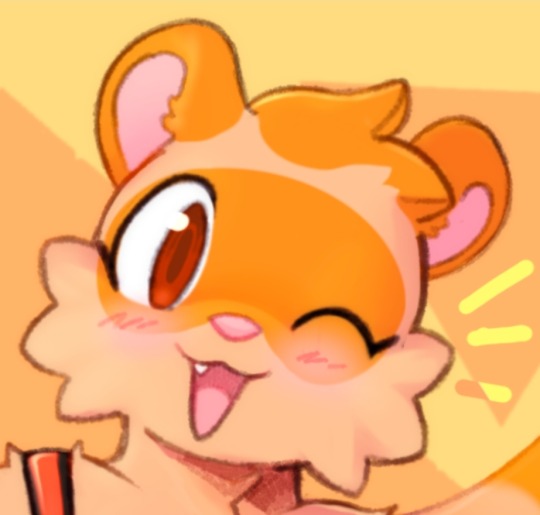
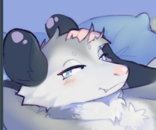
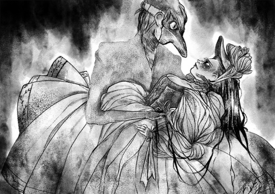
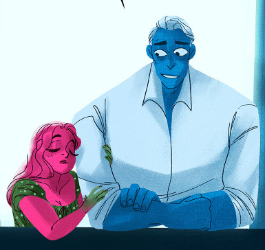
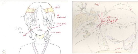
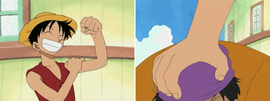
#I like drawing him a lot even if this example is very cartoony
Text
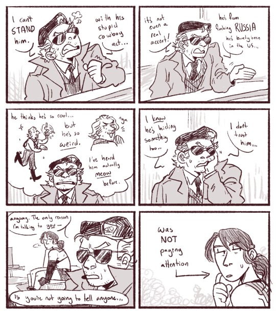
coworker complaints on mother base
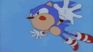
#mgs#metal gear solid#kazuhira miller#quiet mgsv#mgsv#revolver ocelot#ocelhira#sort of….#my art#quiet has been looking at a cool bug for the past 20 minutes#my interest and investment in mgsv is shouldered almost entirely by kaz#I like drawing him a lot even if this example is very cartoony
1K notes
·
View notes
Note
hi I'm new to making kemono art and was wondering if you had some advice for a struggle I've run into...so all of the characters I draw end up looking the same. I can differentiate features like hair and clothes/body but when I try to deviate facial features it stops looking like the kemono style...help?
Hmm hmm!! I definitely know how you feel. Trying to get things to "feel kemono" was very hard for me. My biggest tip is to study lots of kemono artists!! ケモノ is the term in Japanese that can help you find stuff on twitter, pixiv, etc. I used to Google [species name in japanese] ケモノ to look at examples when I first started. The more artists you follow the more approaches you can see!!
In terms of my own art I think that "flat face" kemono relies a lot on subtle proportional difference. A small snout can end up looking very prominent in this context. Same with other small proportional differences that clue you into the species/animal even if they're technically pretty far off from reality.
Little snout vs bigger snout. A big difference here is also the eyes. Learning how to draw lots of different eyes helps differentiate characters and is ofc a big part of anime visual language.
Here are pretty flat faced characters that all feel different because of their personality and the proportions of their faces.
Learning to make non-flat face kemono can be a little harder because drawing these shapes is hard, but studying and figuring out how to place an anime eye naturally onto a snout is key and helps a lot with differentiation!!
Basically you are learning a new visual language that is slightly different than cartoony furries, and it takes time to figure out the equivalent of each part. There's also a lot of room to play around and still be "kemono."
Here's my early kemono stuff where you can see me trying to figure all this out:
63 notes
·
View notes
Text
Hi :)
₊✩‧₊˚౨ৎ˚₊✩‧₊

Questions:
About me:
I mostly go by Rua or Tam but I'm also 100% okay with any nicknames! (Tamarua, Tamari, Tama, Tamachi, Ruma, Ru etc.) I'm a digital & traditional artist and I mostly draw my OCs or characters I like. I'm in A LOT of fandoms (lmk, jttw, jjk, kny, greek myth, Hamilton...). This blog respects and supports the LGBTQ+ community :> (WHERE ALL MY ARO/ACE BUDDIES AT??-). I'm catholic but I prefer not to talk about religion a lot, I just like it that way. My preferred pronouns are She/her but I don't mind if you refer to me as a they/them or he/him. I don't usually get mad, and my humor is very... Uh, what's the word? Stupid? Yea, very stupid. I speak English, Croatian and I know a tincy-tiny bit of Italian.
What art program do I use?:
I use Clip Studio Paint and Ibis Paint, in Ibis I mostly use the default brushes and in Clip studio I use the defaults as well as Artemus pencil pack and Artemus chalk pack (both of the packs are free btw)
Where else can you find me?:
I'm on Twitter (@TamaRuaArt), Pixiv (@Tamachi), Reddit (@TamaRuaArt "Tam & Rua✩") and tiktok! (@tamaruaart "Tam✩") (but I don't post anywhere else soo)
What are the rules for my blog?:
-No offensive/hurtful comments on sertant groups of people
-No nsfw topics
-No politics
-Please keep your comments relative to the post
-Please no heavy-religion based topics
-No racism
-No sexism (idc if towards men, women or ANY gender identity)
-No homophobia or transphobia (nor to any other sexuality)
What do I mostly use this blog for?:
Well, I mostly use it to talk about my jttw/lmk OC Zhaoyan (or just Zhao is fine). Zhao is a sorceress who was brought to the journey as a healer for Tripitaka. Basically, she has the power to heal any wound, illness, disease etc.
Where can I find out more about your oc?:
For now my tumblr blog is the only place. I do 100% plan to write an AO3 fanfic regards her one day (because she honestly has so much lore that isn't even jttw/lmk related). But not any time soon, I'm very busy with school and I still have to work her whole character out before I start writing. When I do publish the story I'll announce it here :D
What sort of art do I do?:
I do character art/character design, backgrounds, cartoony styles, semi-realism, rendered pieces, short comics, templates, coloring pages, buildings, creature designs and plants (I suck ass at animals tho >:'( )
Is this blog R18?:
Not really, I do swear quite a bit and I do bring up a bit more serious topics from time to time. But besides that I don't deal with any nsfw things and I don't really talk about any drama going on in the world rn. At the end of the day this is just a silly little blog for me to talk about my interests :)
Do I do suggestions/requests?:
Yeh, just don't expect a masterpiece. I'll probably draw your suggestion as long as it's a character, also just a heads up but if I don't feel like it I can always decline. (you can suggest someone threw my in-box)
Do I do coms?:
No
wewooweoweewowweee
yes
My Playlists:
Zhaoyan but as a ✨Playlist✨:
An introduction to my characters and some extras:
Free chibi OC commission (closed):
And that's basically all you need to know about me
ba-bye 👋

#monkie kid#lmk oc#lego monkie kid#jttw#journey to the west#jttw oc#lmk#lego monkie kid oc#monkie kid oc#oc#lmk oc; zhao#jttw oc; zhao#blog info#oc playlist#Spotify#lmk oc; yueliang#lmk oc; quanshuǐ
22 notes
·
View notes
Note
This isn't meant to be a hateful ask, but you should probably stop saying you've 'fixed' Rachel's art whenever you redraw comic frames. At first, I could see why your posts were titled that, considering they were just edits made onto a frame, trying to keep in mind the style of the comic alongside it (and let me say, you absolutely nail colors when it comes to your gLOw series, I use your notes for my own art all the time). But it seems like for your more recent posts, you're redrawing panels in your own style and saying that you've 'fixed' the frames. I'm not saying that you can't do that, redraws are a core part of the LO community. But it feels as if you're putting Rachel's art style down in favor of your own. For example, your recent post. Smaller necks and 'googly eyes' (big eyes with small pupils) are usually apart of LOs more cartooney style, they aren't something as bad as LOs men's shoulder to head width, or awkward hand and feet positions, etc. The point I'm trying to make is that you should probably start titling frames you redraw in your own style as that, a redraw, not 'fixing' someone else's art style
EDIT: oh god I totally went off with this, BIG apologies for the essay dump in response to a very simple ask, it's just a topic I'm very passionate about and am willing to talk about at really extreme lengths. I appreciate your takes on this even if I do disagree with them, I just don't make shit easy and I apologize for that 😖 😂
Oookay, so I'm gonna try and answer this as best I can, with as little curtness as possible, because I know you're asking it genuinely, but please understand that this is a topic that comes up a LOT in artist/LO spaces and I'm sorta exhausted with having to talk about it. Often times because it's approaching the argument with a very misconstrued idea of what 'style' is.
Ironically enough, before I get into this, I actually do have a post queued up for tomorrow already that's called a 'redraw' because unlike the panels I'm assuming you're calling out, I actually painted the upcoming ones for tomorrow entirely from scratch. I'm still trying to replicate the LO style, of course, but it's not trying to remain quite as faithful as my edits tend to be because it's meant to be a redraw in the true sense of the word like you're referencing. My edits are often just a normal layer on top of the original that I paint over, which is what the last few posts have been. My redraws are drawn from the ground up, backgrounds, faces, poses, etc. often times with the goal of re-compositing the scene entirely. The ones from the last couple days were not drawn from the ground up, simply altered over the originals - but the unfortunate reality is that some of them simply can't be accurately edited entirely due to the original composition being such a visual mess. That includes this one which was a struggle to edit faithfully without my own anatomical stylizations bleeding into it due to how janky the original was (IMO). Like, the original panel didn't even "look like LO", it's godawful, and it's a stretch to say I'm dissing Rachel's "style" when I'm fairly certain Rachel didn't even draw any part of that original panel, it's INCREDIBLY obvious two different people from her team drew it and there's no way of knowing whether or not Rachel was one of them. I did not touch Hades because he's not the problem with the panel. Hades as you see him in that panel is exactly how he was in the original, I merely tried my best to edit Persephone to look more consistent with Hades and less creepy.
Disclaimers over, let's get on with this.
So here's the thing - if it were a simple matter of "style", I'd agree wholeheartedly with you. I'm not about pitting artists against one another, we're all different people with different takes and inspirations making our own thing.
However, there's a difference between style and execution.
With full disclosure, I do not accept the argument that because LO has a more "cartoony style", then it's "fine" for it to very blatantly lower its quality in technical execution or turn into a cheap copy of what it once was. LO was never 'cartoony', it was more akin to storybook art, like something you'd find in old Disney concept art pieces or in children's illustration books. 'Cartoony' as in 'not realistic', sure, but definitely not cartoony in the way most people envision it or market it (like what you'd see in legitimate cartoon shows). The use of color was vibrant and had thought put into it, compositions were dynamic, lineart was only used where needed to create depth, and overall, there was a vibe to it that many of you can still recognize, it's what a lot of my blog talks about.
When I do these panel "fixes", my goal isn't to go "hey, my style is superior to Rachel's! Fuck Rachel!" Far from it. My goal is to analyze what made the original LO art so special and unique, and help preserve those elements in newer panels through key elements such as color choice, glow layers, composition, texturing, etc. many of which are elements that are outright missing from S2 of LO onwards.
Because, full bluntness, LO has zero effort being put into it anymore.
LO never had perfect anatomy and it's always struggled with creating a cohesive visual narrative, but it hid its issues well with a good balance of color choice, mood/tone, and lineart-less rendering. It wasn't meant to be some hyper-realistic comic, what set it apart were the colorful panels and vignettes and use of 'cutout' style backgrounds and foreground elements.
Stuff like this:
I have spent literally hours dissecting LO's art style, researching and hunting down its brushes, crawling the best and most recognizable color palettes, drawing and redrawing old panels in attempts to replicate Rachel's style and techniques as best I can. I'm not doing all that just to try and be like "I can do it better", more so to preserve what once was and could have been. Because I genuinely miss how old LO looked and so do many others. It's my own way of participating in a fandom that's being torn apart each week by the new episodes that only seem to further degrade the comic's original presentation and why people liked it.
Trust me, if I wanted to just draw LO in 'my style' as some sort of self-gratifying flex (because everyone in the art world nowadays thinks the only point in creating art is to have a "style" that they can pit against other "styles" as if styles are collectables like fucking Pokemon lmao), you wouldn't even recognize it.
THIS is my "style", y'all. The only elements that I've purely taken from LO is the background and how I did the lighting effects along the side but everything else is my standard 'style' when I draw anything that's NOT LO, especially with my own comics and my day job.
"Style" is not a tangible thing, at least not in the way people nowadays tend to define it. Style is an accumulation of everything that's influenced an artist over years of practice, learning, refinement, and mastery. It is not something any one person can 'own' nor is it something that can or should be 'fixed' in and of itself. Just like how Rachel has adopted elements of her style from inspirations such as Glen Keane and Mary Blair, I've gotten my stylistic inspirations from anime, manga, video games, and other webcomics. Our styles and why we create art and who we create art for are completely different.
I have zero issue with Rachel's 'style'. At its core it's actually freaking gorgeous, when she puts in the effort. Not even just LO, take a look at her even OLDER art that's still available to sift through on her DA:


The issues I'm bringing up have to do with the execution of said style, how it's blatantly obvious Rachel doesn't put any effort into the art anymore and often has her assistants picking up the slack in a very disorganized manner that leads to disjointed, bland, weird ass art that often can't even maintain consistency between SINGLE PANELS, like this:


The magic is gone. These are not reflections of Rachel's capabilities in the slightest. She is far capable of so much more, this is beyond being a 'stylistic choice' and falls more under the implication of laziness or lack of care.
What's wild is that she's outright stated that she's "streamlined" the LO creation process to make it easier for new assistants to acclimate - which would be fine, if it weren't for the fact that 'streamlining' shouldn't mean 'downgrade'. There are plenty of ways to streamline the LO art style that can still retain the original charm of LO that drew people to it in the first place without cheapening it. It's not like LO is the only webtoon under strict deadlines, Rachel has more assistants than most working for WT and yet everyone else on the platform seems to only improve in their comic's production workflow and its presentation whereas LO has only declined.

(The Kiss Bet, 2019-Present)


(Tower of God, 2014-Present)
Not every comic needs to make improvements this drastically, and technically LO didn't even have to make improvements in its original execution - but it's so far gone in the other direction that it begs the question, "Why do other creators and comics with less prestige and as many or less assistants compared to LO seem to make such bigger strides in the technical execution of their work?" Regardless of whether the style is erring more towards anime or cartoon or realism, 'style' doesn't make up for poor technical execution and lack of consistency. That's the same energy we get all the time from newcomers to the craft who reject any form of criticism towards their technique and understanding of the fundamentals with "THAT'S JUST MY STYYYYLE". Even many animators who predominantly work on cartoon productions still understand their fundamentals and utilize them in the creation of stylized pieces of work. This isn't even me questioning how much of the fundamentals Rachel knows because, again, she clearly has understanding of it in her older work, she just seems to have stopped caring or isn't doing a proper job directing her team.
I criticize the stick necks and googly eyes the same way I do the inconsistent body types, refrigerator shoulders and same-face syndrome because they're all things that are detracting from and lowering the quality of LO's art as a whole. They didn't always shade whites in the old episodes of LO, but they did often tint them to make them less jarring against the more vibrant colors. They didn't always color in the irises back in 2018/2019, but at least when they were just solid black pupils, they were actually drawn EQUALLY, vs. the solid pupils nowadays which feel like they're each on their own schedule and are never the same size or facing the same direction. They didn't always draw perfect necks and faces, but nowadays it feels like the heads are being stuck on sticks and attached to separate bodies that aren't even consistent with the characters' body types. All of these things are issues, there's no 'hierarchy' of problems, they're each a part of a much bigger lackluster whole.
When it comes to my own panel fixes/redraws/whatever you wanna call them, if they don't look enough like Rachel's 'style', that's either because we're failing to recognize what makes Rachel's art unique due to it being so watered down over the years, or because I'm just not doing a good enough job replicating it. Undoubtedly a little bit of both. I'm still 'adjusting' to a workflow that accommodates the LO style and how it looks. It's not exactly easy to just jump from one style (my style) to another without my own usual biases bleeding in (trust me, I'm not happy that there are people who know my usual art style who can still 'see' it in my LO art, because that completely defeats the purpose of what I'm trying to do lmao)
All that aside, we can't pretend that S1 LO's signature style is still being executed to its fullest potential in S3.
If I can be really brash here, there are WAY more egregious panel 'editors' out there who straight up are drawing stuff legitimately just in their own style. And they're still all great in their own right and get to the point of what they're trying to say even if they don't fit what you would define as a "fix". Don't bug me about mine.
Rachel's style in and of itself is gorgeous and unique. It's the lack of effort in the execution as time goes on that is the topic here. I can never hope to fully achieve that 'vibe' that so many people miss about 'old' LO because that was all Rachel and I can never fully capture the spirit of her work because it's hers, it's the accumulation of everything that's inspired and influenced her in her artistic journey.
What I can do is point out and design alternatives to the many errors, inconsistencies, and technical issues that tries to get it closer to that original look and feel of S1 LO that better reflected Rachel's original efforts. It's what it could potentially look like if modern LO art wasn't so disjointed among its scattered assistants and rushed with as little visible effort possible. It's what could have been if it didn't feel like Rachel has essentially given up.
Does it really matter how I specifically word my posts between 'edit' and 'redraw' in this context when both things are attempting to accomplish the same goal?
#thanks for the discussion#i'll always take a good essay op#i'm genuinely not trying to be a dick#i'm just tired of 'style' being conflated with effort and visual appeal#this is another ask that turned into a fundamentals of art rant#lore olympus critical#antiloreolympus#lo critical#ask me anything
80 notes
·
View notes
Note
how do you go about creating characters and designs and a story for them?? im an aspiring character designer / storyteller and i looove your designs so im curious!!
when it comes to stories, i always try to imagine something that turns common tropes/things on their head ! like for ultimate excalibur, as its focused heavily on naval stuff, sailing and pirates, instead of regular ships on the sea, its all in space ! and for reassassination, the main character is a teenager, but her dramas are all mostly focused on assassinating people while juggling exams and rumors, so i guess it's kinda like a juxtaposition? for my stories i always get a lot of inspiration from other media (ult. ex is inspired greatly by the premise of one piece and other media and reassassination is very loosely inspired by panty and stocking), so it's good to broaden ur horizons when looking for new things to watch/play/read - you could find a new story idea from that!
for designs, i focus on three things: character personality, profession, and cool/cuteness factor. for example, musa marine - she has a bright and energetic personality, so her colors are bright and sunny (yellows and blues), she's a pirate, so her clothes are rugged, and she's more cool than cute to me, so 'cool' pieces of clothing are added like her big hat. other 'cool' character traits include V-CON's shades and clyde's scarf, but cuter characters like mina have other design traits like a starfish hairpin (who is also mina's manager!) i like to call these specific design traits 'the key point' - to me, theyre what make the designs unique! i use a mental 'cute - mix - cool' scale for that, but you don't need to if you don't want to! its just a weird thing i like to do ^_- but stuff like that is just the beginning!! when designing characters you have to take into account how they'll look next to everyone else in the cast - even if they have a similar color pallete to another character, they have to look unique while still being obvious as someone from your story's universe ! like, if i gave savory animal ears and plunked him into ult. ex, he'd look out of place because his sharp design and darker color scheme clashes with everyone else. speaking of sharpness, shapes are really important too! for my own designs, i like to take one or two shapes and apply those to as many aspects of the design as i can - like in my deep cut designs, i tried to focus on sharp, triangular shapes! shape language can help accentuate personality especially if you have a more cartoony/anime artstyle ! :D there are lots of people who are better than me at explaining character design/story stuff so i'd suggest you look at other guides or watch videos on how to write + design! also, this is just a me thing, but if i see a design or a story that i really like that inspires me to draw/write something, for the first few weeks/months of the development, i like to wear that inspiration on its sleeve if that makes sense? like it'll look *very* heavily inspired as it starts out - this is because i know that as the story develops, the characters/story will be redesigned to look unique ! like, when i first started writing starsaints carnival in 2021-ish, all the characters looked like rip-offs of characters from worlds end club lol ,, but as i redesigned the characters (3 times!!), they now all have (imo) unique designs while still looking inspired by wec!!
that's pretty much it about character design and story, sorry this is so long ;w; ,,, i just like talking about characters and stories,,, hope this helps !!
#long post#sorry for using my own ocs as examples here 😭😭#but i didnt know what else to do#maybe ill go more in depth on chara design in another post#but thats all for now !!
24 notes
·
View notes
Note
Not gonna lie but l actually love Modern SpongeBob (Seasons 9-13) than Old SpongeBob. Don't get me wrong, l love both Old and Modern SpongeBob. But seasons 9 - 13 are much more interesting and have a much better animation/art style. The art style is much more cartoony and colorful.
Tbh I get that. I really enjoy the modern seasons of sb. They're equally tied with the classic seasons in my heart. I know that's like a sin amongst sb fans but its true! Its so fun and colorful and you can see that there is a lot of love put into it. It might not always be so strong writing wise but I still adore it. I feel like nowadays cartoony cartoons have gone out of style hence why there's so much vitriol when a show is silly and light hearted.
Go anywhere online and say you like the current show, people would act like there's something wrong with you in the head. They can't conceive that you can just like something for fun. They act like you're an idiot for enjoying something so silly and light hearted. There always has to be some cynicism, angst or some serialized drama to it. Which I do very much enjoy very much but I also like this and I feel like they both have much to offer. I also feel like cartoons in general are SUPER underrated. Unless it proves itself to be "deep" then it nobody cares for it. They think silly expressions or wacky movements means its for only children (and ignoring the fact that drawing those things are actually VERY difficult, I prefer doing realism but I struggle HARD to get down the wacky expressions spongebob does on a regular basis! It takes skill!)
I also like a lot of what the newer seasons have to offer. People always go on "modern spongebob tortures squidward too much" "modern Spongebob made patrick into a jerk" and they refer to an episode that came out 10-15 years ago lol. Its really discrediting a lot of what the show has to offer. They made Patrick much more nicer in recent episodes and he willingly stands up for Spongebob when he gets pushed around. Squidward torture rarely happens. The show constantly experiments and has amazing art all around. I feel like a lot of that gets ignored. Gosh I really wish it got acknowledged more! Season 13 has been pretty experimental I've been really enjoying it.
You know what's funny? The modern seasons get so much hate because its not ""hillenburg"" and it doesn't have the old writers even tho Hillenburg technically never left. He was Executive producer and gave his ok on scripts and episodes. He wasn't as actively involved as he was in the first 3 seasons but he wasn't fully gone. AND he returned around season 9. He vowed to work as long as his health allowed him and so season 13 is the only season he hasn't worked on BUT he trusted the show to the current crew which is mostly made up of the same folks who made the first 3 seasons. Literally you can pull up a modern episode and there's always someone who worked on the first 3 seasons. Obviously they aren't going to produce the same things they made almost 25 years ago but you can tell they're doing their best. Its rare to get the same thing that clicked 20ish years ago but they should be free to experiment and do something new too. Spongebob has always changed and adapted for the times. Most people don't even notice that each season is different from each other. Season 1 is wildly different from season 3 for example.
Anyways classic and modern have a special place in my heart for the same reason. They're both massively comforting to me and I can put on either and they'd make a bad day feel so much better <3
Also Classic Spongebob and Modern Spongebob would be besties. Don't believe the art work of classic sponge hating his modern counterpart. They'd get along SO well.

#Djinarocks#Sorry this is late but yeah#the spongebob connoisseur#spongebob#spongebob squarepants#sb#spongebon squarepants#spongebob meme#Ask
21 notes
·
View notes
Note
4 8 19 25 29
4. Fav character/subject that’s a bitch to draw
I love Charn, some days I'm surprised I made him, but I won't lie, his elaborate design is why I don't draw him as often as I'd like. Every time I draw him, I question how his lapels should look, or how his eyes would look at varying angles. This isn't to mention the more robotic/mecha-influenced parts of him that I haven't shown off yet.
For subjects, probably action scenes; I admittedly don't draw them a lot, because when I do, I usually find myself dissatisfied for one reason or another. "This pose is too stiff" or "that effect looks bad" or "that background could have been better", etc.
The weapon art for Make a Good Mega Man Level is a bit of both; I try to keep Mega Man accurate to the official Capcom weapon art, but also give each one a distinct pose or angle. Lot of time goes into those, trying to get the lineart, colours etc. just right.
8. What’s an old project idea that you’ve lost interest in
OK this is a bit of a cheat since it's something that was once part of something I very much have not lost interest in, but it's something I still remember even almost 10 years on. Back when I first came up with what would become The Sorceress of the Stars, my overambitious 15 year old self envisioned a game like Sonic 3 & Knuckles, with three different playable characters with their own stories and their own supporting cast. These were a kooky old scientist, a robot he made that would gradually become more humanoid over its story, and his grumpy magic-using granddaughter. That last one was just a funny afterthought.
(Incidentally this is how Charn became what he is; he was supposed to embody each of the trio's main aspects.)
I made some old comics with the three; however, after some time I realised that I was struggling for a title, what I was planning was very much unfeasible for one person, and I cared very much about the magic granddaughter's story, the robot's less so, and the scientist's even less than that. So I decided to cut those two and focus entirely on Jessica instead. Perhaps the robot at least may get revived in the future, as part of TSOTS or their own thing.
19. Favorite inanimate objects to draw (food, nature, etc.)
This is a tricky question; I'm not sure I draw a lot of inanimate objects, and the ones I do tend to be stuff I don't think about much (or outright not like drawing). I guess maybe something like clothing and starry night skies count? Let's go with that.
25. Something your art has been compared to that you were NOT inspired by
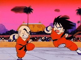
Many people both online and IRL have told me my art reminds them of Dragon Ball Z. For the longest time, I didn't actually follow it; the most influence I drew from it was basing Jessica's boots on Android 18's. These days I have an appreciation for Toriyama's art (particularly his style around the Piccolo and Saiyan arcs), but it's still not something I consciously try to imitate.
29. Media you love, but doesn’t inspire you artistically
I think the most prominent example that comes to mind might be Seasons 1 and 2 of Star vs the Forces of Evil. I'm typically not a fan of overly-cartoony movement or expressions etc., but that first season somehow managed to make it work, and it was never dull to watch. It's honestly a crying shame that by the final season, the animation, character design, and backgrounds became so flat, stiff, dully coloured and lifeless (I swear every episode the characters do the same Family Guy-esque "bottom eyelids up, hands outstretched" pose).
2 notes
·
View notes
Note
Artist asks; 4, 19, 25
Thanks! ^^
---
4. Fav character/subject that's a bitch to draw
FARIN URLAUB. Altho I wouldn't say a fave cos I in general don't exactly have favorites, but we all know how annoying his face is to draw. It's just so symmetrical and he simultanously looks unique and so normal that in 9/10 drawings he looks like someone who looks like Farin but is more like some weird AU clone where something is off but you can't exactly pinpoint what that is.
He's fun to draw to my comics tho, I guess I've pretty much succeeded at capturing his most farinesque features for that version of him, but every single time I try a semi-realistic or realistic approach with or without a reference, I just fail miserably. UNLESS I use the grid system, but sometimes I fail even with that.
Also his hair is so annoying to draw (semi-)realistically. Every hair tutorial says "don't draw individual hairs, but strands of hair!" BUT HOW WHEN THIS MAN HAS NO STRANDS OF HAIR??? It's just all individual hairs pointing upwards and I feel like having a stroke when I stare at photos and try to figure out his hair 3-dimensionally but it feels more like some 5-dimensional thing that shouldn't exist in this world.
---
19. Favorite inanimate objects to draw (food, nature, etc.)
I like anything with depth and perspective, like something that is a rectangle, for example. In fact I like drawing almost any kind of object from phones to idk, stoves. They're fun challenges. Just anything that I can easily draw to look 3-dimensional! Unlike Farin's hair.
---
25. Something your art has been compared to that you were NOT inspired by
Hmmm. My art has never really been compared to anything afaik 🤔
If not counting in that time when I was ~10-11 and created one of my various comic book characters I created back them. It was this worm/snake creature (which I called as "Käärme-Matoset" in Finnish which means "Snake-Wormeys" whatsoever. Idk how to explain it in English, but mato = worm, matonen = little worm, so the -nen works a bit like -chen suffix in German!) and I showed it to one of my then-friends also liked to draw a lot. And she just claimed that I had copied some comic book character from a comic that I had never even heard of, and I told her that I don't even know what that is, and she just claimed that nope. You copied this character X from a comic Y.
Here's a cover I did for my "comic book" back in the day (I used to just stack papers together and make a 'comic book' for most of my comics if I didn't have or didn't want to use a notebook for them):
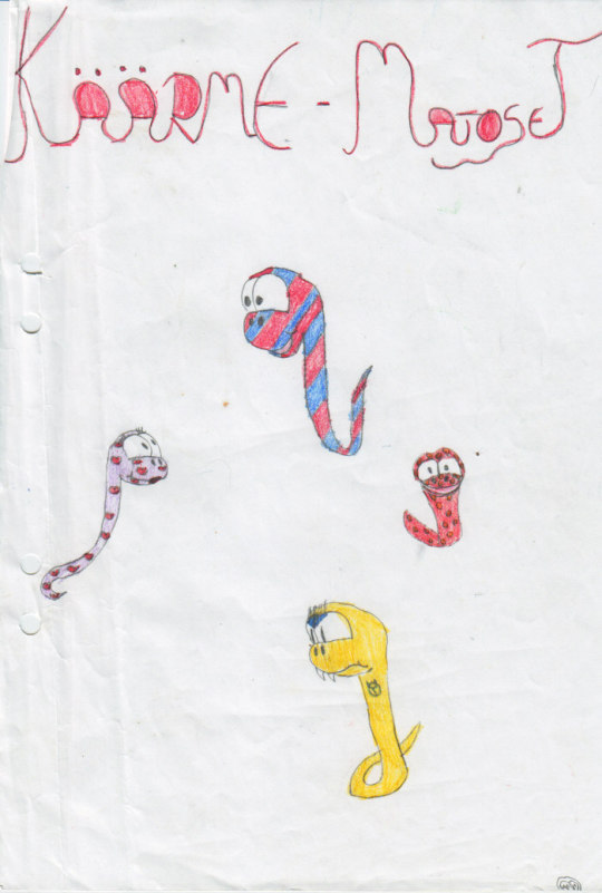
The comic I allegedly copied from probably doesn't say much to you, as it was in a comic from a Swedish comic book artist, Lena Furberg, who drew (still draws?) lots of horse comics (both realistic and very cartoony) for a Swedish "horsegirl" magazine which had its Finnish counterpart too. So this comic was just about a girl with tons of pets and one of them was a snake. I wasn't into horses at that point yet, so I had never read that magazine, unlike this classmate. I think I was already a teenager or a bit older when my siblings started collecting the same magazine and I finally saw what the comic, I was accused of stealing from, looked like.
But yeah, other than that I in general don't get much feedback on my art or drawing style. One of my friends just keeps saying I have unique style with my comics and she has never seen anyone else draw like I do, which is a HUGE win cos my attempt is exactly that: to do my own thing and not have my art to resemble anyone else's unless it's like a tribute (which I honestly have not done ever) or just shows who have influenced me without my art looking like a copy of the art of any of those comic book artists.
With my Micron (the fineliner pens) drawings I think it might have been you, tho, who once said the messy style reminded you(?) of some artist but I no longer remember who that artist was as I had never heard of him before.
1 note
·
View note
Text
So. the butch hartman rant. i wanted to kinda just... talk about some of the weirdness of the dsmp artworks from an art perspective, cause we all know he does literally no research and its a shitty way to promote his stupid commissions. thats not what im talking about here. i want to talk about how the way he draws the characters either tells us nothing about their personality or actively hinders the audience from understanding who they are.
so, let’s start off with the first character he drew, Dream.
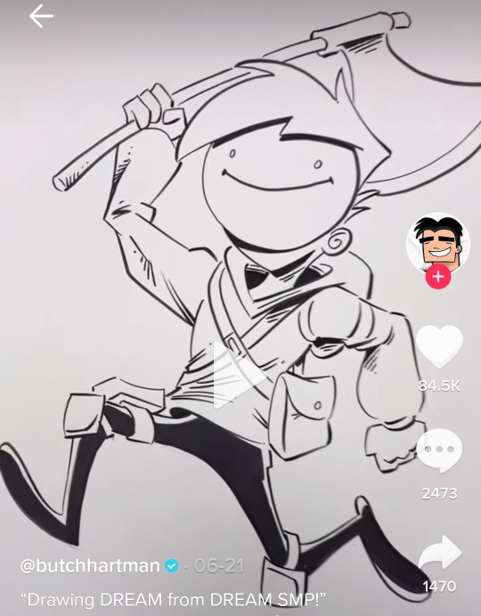
so without knowing anything about the character, what can we learn from this image butch has drawn? well, he’s got a really cartoony, almost silly gait to his run, and he seems like hes almost jumping excitedly, so at least what i am picking up from his pose alone is that he’s a fun, silly character, who is a bit of a fighter with his axe he uses. his mask looks cheerful, as if he’s just a normal looking young person- he looks 14 in this idfk why- who’s maybe a superhero? maybe he fights the bullies off at school or something.
and, as we all know, that is just the complete opposite of who dream is as a character. and that’s the start of how it can just completely shift who these characters are. how do we fix his posing to better reflect his personality? i feel like a slightly top-down angle, walking forward, holding the axe down towards the ground pose could show what an intimidating character he is. just an example though.
and i want to stay on dream for a moment longer to touch on the biggest problem butch has- because it doesn’t show up in dream’s art at all. it’s that his compositions cut off the characters at the weirdest spots and makes the drawing feel even more awkward than it already is.
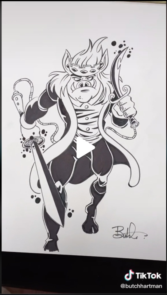
we see this in technoblade’s fanart with one of his hooves getting cut off right at the tip, making you think he could have just sketched the character a little higher.
and we can see this in quackity’s artwork (im going to be pasting in the rant from earlier here so if youve read this already you can skip it)
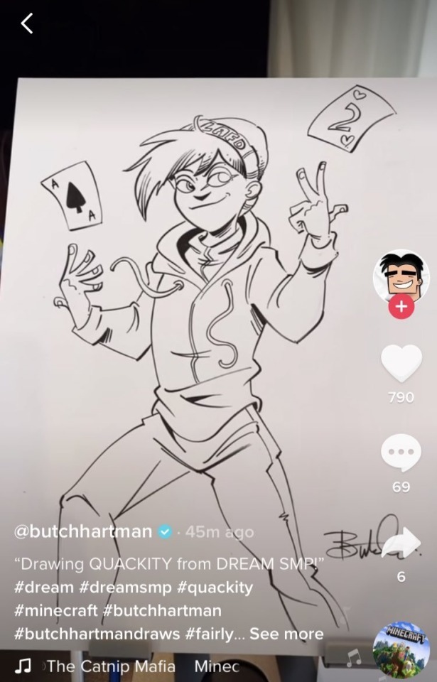
in the video, he started from the head, and went down, so the waist up looks good, but he for some reason feels the need to try and fit a full body, even though the page doesn’t have room for it.
here’s a screenshot of it happening:
most people would just redraw the image to better fit the space of the page, but he doesn’t, and for an experienced person like him (i mean….. debatable but u know-), it shows just how fucking lazy he is and how much he just doesn’t give a shit about these characters.
and now im going to touch on tommy because i want to culminate all of this with his latest (as of july 16th 2021) character.
so.... tommy.
tommy is the worst offender when it comes to his shitty designs (yes over wilbur) because sadly this one references a lot of things in canon but he fucks them up so that’s why his is the worst.
this design not only is just a terrible exercise in character design imo, but also just completely butchers everything about c!tommy all at once.
let’s do the same thing we did with dream’s art. i see a very young, probably around 9-12 year old boy, posed very quietly and nervously, holding a sword he looks like he doesnt know how to use. he is dressed like a child playing pretend pirates in the backyard with his friends, and he has some bandaids on his face, probably from where he and his friends got into a tussle.
and again, obviously this is just not tommy like. at fucking all. to accurately pose a character like this- when drawing them for the first time so we can get a read on their personality, WHO THEY ARE- i think he needs a pose more like dream’s or wilbur’s.
he’s energetic and loud and bombastic (yes i know hes also a sweetheart and hes gentle and stuff but im talking about first and foremost what we see of tommy). give him a big shit-eating grin, have him hold a weapon like he knows how to use it, and make his stance something confident. because without the personality of the characters shining through- something butch hartman clearly knows nothing about- these are lifeless, shitty character designs.
and this has all culminated (thus far at least) with ranboo. my poor fucking boy. oh my sweet jesus [garfield speak to me meme goes here].
because god either hates me specifically or doesn’t exist at all, this happened. and we can use the things talked about above and see them here in this drawing. we have the complete misunderstanding of the character, to the point of him clearly just googling ‘ranboo’ and seeing the cc.
we have the total lack of understanding how posing can show us things about a character- and i think ranboo’s is the worst because he’s not getting any information about who he is, BECAUSE he isnt seeing fanart. at least with characters like quackity he could pull at the very least a fucking expression from the fanart on google, but because he has nothing to go off of, the pose feels stiff and lifeless.
we have the awkward cutoff of the drawing at the knees- which also have this weird shading applied to them that makes no sense unless we can see his feet? very odd choice. he does it on his back arm too, and it makes the arm look detached, almost prosthetic, because it’s one of the only parts of the drawing with that harsh shading- aside from the legs, which we can hardly see because theyre cut off.
we have the fact that this is the sloppiest drawing of them all so far, with the glasses not even being set right on his face, the line on the black side of his mask not connecting at the cheek, and i am not even going to touch on how weird it is that he drew his thighs and crotch like that. not even touching on that.
and finally, we have the fact that ranboo and tommy are nearly the same age, and tommy looks 9 while ranboo looks 27.
i have no fucking clue if this was at all like. good. i just have a lot of fucking hatred for bitch fartman and i cannot believe- and it is a pure coincidence probably- that the first canonically not-cis character he picks to draw, he draws the fucking CONTENT CREATOR AND NOT THE CHARACTER BUTCH I HA-
#mcyt#text#long post#readmore#tw butch hartman#hi this is one massive bitchpost on bitch fartman bc i despise him
597 notes
·
View notes
Note
I think it's the ironic fact that JTTW fans already know how DBK and Sun Wukong's friendship broke apart but are more curious on LMK versions of Sun Wukong and the Six Eared Macaque were friends alongside falling out.
HA! Well, while it often does seem that way, I'm going to go ahead and be a complete snob in a Journey to the West purist kind of way by wondering how many Six Eared Macaque fans would consider themselves more JTTW fans or more Monkie Kid fans, or if they feel they're a mix of both...
I've seen a lot of people argue that these two works of fiction are their own thing and that as such Monkie Kid (and associated fanworks) shouldn't be expected to follow the canon of JTTW, and fair enough for some parts. I've also, however, seen people who argue for this complete separation seeming to use it as an excuse to not acknowledge or learn about ANY original aspects of characters such as Sun Wukong and the Demon Bull King, or even very important deities such as Guanyin and the Jade Emperor, and who as such end up making some pretty gross generalizations/assumptions about them even though they are of great religious and cultural importance.
For example (and while I know a lot of the fun people get from fan works is in exaggerating certain traits), Sun Wukong seems to often be presented with an "inherently" evil/thoughtless/chaotic character, while his intelligence, deep love of his family, genuine efforts to become a better person, & many acts of saving lives, as presented in JTTW, aren't even mentioned. I feel like a lot of this is due to the way he acts in Monkie Kid (while I maintain that this version of Sun Wukong seems to be Bad End Monkey King, he does do a lot of deflecting his issues with a show of humor/a carefree attitude & does seem really bad at communicating due to a fear of making things worse). Even so, the popularity of Thoughtless/Evil/Selfish Sun Wukong that doesn’t really allow for any of the nuance or a display of his beneficial traits as shown in JTTW does make me wonder how many people have been exposed to a good translation of og classic Sun Wukong...As I've said before, I've noted that a number of Chinese people on this site have expressed frustration with the fact that a good chunk of the monkey king’s Western audience seems to be getting their impressions about Sun Wukong, the Demon Bull King, the Six Eared Macaque, etc. from some mix of Overly Sarcastic Productions, Monkie Kid, and social media instead of from at least a translation of the original text, and it is true that a LOT of the nuance of these work and these characters can be very easily lost, especially if your drawing your information of them primarily from a cartoony version of the original source.
That would be an interesting poll though...out of curiosity, how many of you fine folk have read the break-up & fight between Sun Wukong and the Demon Bull King either in the original text or in a translation, or is your exposure to them primarily through Monkie Kid?
Again, I need to make it clear that I'm not Chinese & didn't grow up with the story, but I will admit for my own part that reading the DBK/SWK break-up in the Yu translation actually made me more curious about how their dynamic is going to play out in Monkie Kid than I am curious about what's going to happen with Mr. Macaque.
This is primarily because besides SWK’s fight with Princess Iron Fan and DBK being given a LOT of page space in JTTW, there seems to have been some serious stuff that went down between the three of them in the events post-JTTW and pre-the main plot of Monkie Kid...the last we see of DBK in JTTW (if memory serves correctly) was him being hauled off by a host of heavenly warriors to be judged for his crimes of not giving SWK the palm leaf fan & also eating humans. When Monkie Kid starts, however, we are told that DBK had emerged “from the Netherworld” & immediately starts wrecking everything around him. What this suggests--if Monkie Kid is something of a fan continuation of JTTW--is that DBK ended up being executed by the heavenly forces, but managed to fight his way out of the underworld in a manner somewhat similar to SWK, who we are told he is equal in strength to in JTTW. In that beginning fight of Monkie Kid DBK is also shown as so enraged that he won’t stop his path of destruction until SWK buries him under a mountain for 500 years. It’s never said in the show, but--and this is important--this is basically exactly what Buddha did to SWK to start him on the path of atonement. So there seems to be some very intentional parallels between SWK’s havoc in heaven & DBK’s havoc on earth, which may suggest that one of the things Monkie Kid SWK really wants is for his former dear friend, his sworn brother, to find a way like him to be less violent and thus ultimately less vulnerable to destructive and self-destructive behavior, and that the way he tried to start this was by giving DBK the same treatment he got when he was a raging warlord.
We are furthermore told that it was right after DBK was sealed that SWK disappeared for all those centuries, and while the impulse may be to write it off as him just wanting to enjoy himself (given a lot of his behavior in the show’s timeline), given the indications that this SWK may be deeply depressed, I feel like the answer could be something a lot more tragic...there seem to be a number of clues in Monkie Kid that while the journey of JTTW happened, something made it end disastrously, with SWK either assuming or knowing that Zhu Bajie, Sha Wujing, Tang Sanzang, and Bai Longma are dead. And per JTTW, this wouldn’t be the first time that he’s experienced a horrific loss, given the war with heaven and the burning of Flower-Fruit Mountain. And then right after THAT, it seems DBK emerged from the underworld, and so Sun Wukong was put into a horrific position: either murder his sworn brother, or let him continue to rampage & harm and/or kill who knows how many humans. SWK ultimately gives up his staff to do the repeat of “500 years under a mountain in solitary confinement route,” which as per JTTW he considers better than the alternative, but he immediately follows that by exiling himself. In JTTW SWK is a really sociable person who makes friends wherever he goes, but man, for this SWK...his life must at that point just feel like one failure after another, that in spite of all his best efforts he wasn’t able to save anyone he really cared about, and now he just trapped someone who was so important to him under a mountain & fated him to suffer the same things he had when he was in that position. How much more does he have to hurt his fellow yaoguai? How many more times does he have to choose between yaoguai and humans, feeling like no matter what he decides it’s just going to result in pain for him and/or his loved ones? I can easily imagine super sociable & easily upset (he cries a LOT in JTTW) SWK feeling like after sealing DBK, he just can’t do this any more. He just...can’t.
This is all just speculation, but knowing the JTTW backstory between SWK and DBK does, at least for me, make their Monkie Kid relationship a lot more intriguing than it might be otherwise. Especially now that DBK seems to actually be making some small steps to quell his constant rage & lust for power. He even saves SWK and Qi Xiaotian from an explosion/nasty fall in the season 2 special! The Bull family weren’t really present in season 2, but I really hope they make a comeback in season 3 (if/when we get it) precisely because Red Son, Princess Iron Fan, and especially DBK have such an involved history with SWK. Plus it would be really fun to see two old warlords trying to awkwardly make amends with each other & struggle to be good teachers & positive role models to their student & son.
In any case I feel this potential is more interesting than whatever fanfic The Six Eared “I’mma Plagiarize The Demon Bull King’s Backstory Of Being Best Friends with Sun Wukong” Macaque is creating lol.
#monkie kid#journey to the west#lego monkie kid#lmk#lmk sun wukong#lmk dbk#lmk six eared macaque#anon answered
106 notes
·
View notes
Text
Another Sonic ramble
So once again I’m here with one of my rambles about my incredibly subjective view of how the Sonic series should be handled!
*Beat*
...anyway.
So, one of the more recurring opinions on the fandom is that Sonic games should be written by Ian Flynn, I have talked before about the gripes I have with his writing and why I disagree with this but this post is not entirely about him, but rather a more general topic that has been bugging me for a long time.
The other day I was watching a video speculating about the upcoming Sonic Rangers, there’s not much to write home since it was pretty well made but there’s a particular part that inspired me to do this post and talk about it with other fans to discuss it.
See, at one point the video critisized the fact that Sonic Forces was written by a Japanese writer because they have to re-write the script in English and that can cause problems with localization, and that it would be better to have western writers from the get-go since Sonic’s main demographic comes from there, while making an off-hand suggestion that Ian Flynn could be a main choice. While I can see where they’re coming from, my response was a simple:
‘‘Absolutely, not’‘
See, I have a lot of issues with this to put it bluntly and I’ll try to break them down and explain them the best I can since they’re pretty subjective in nature, but I’m bringing this up because I want you guys to share your thoughts as well.
So, why does it bug me so much the idea of Sonic being handled by western creators?
In my case, the main reasons are because Sonic loses a core part of it’s appeal because of this, the fact that SEGA of Japan seems to have a better grasp of the franchise’s tone and characters and there’s the very subjective point that, in my eyes, American versions of Japanese franchises were always nothing more than dumbed down products of the source material.
To start with my first point, whenever someone talks about Sonic’s creation, a lot of people are quick to point out that our favorite blue hedgehog and his games were inspired by western pop culture and cartoons, and that is true, however oftenly they forget to mention a core thing that not only inspired, but also formed part of the core identity of this franchise.
Sonic is very inspired on anime, and at heart this franchise is a shonen.

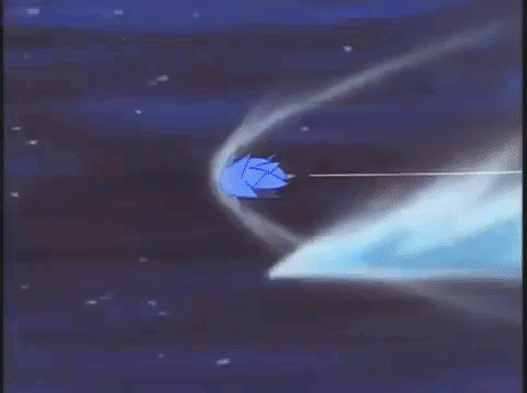
(This image by The Great Lange expresses more clearly what I mean)
Generally, the most acknowledgement anime gets on it’s hand on Sonic is the mentions of Sonic being inspired by Dragon Ball, particularly the Super Saiyan, but there’s so much more than that, as Sonic blatantly takes inspiration from Studio Ghibli films specially in games like Sonic 3, which draws a lot of inspiration from Laputa: Castle in the Sky, this great post shows proof that this is not a coincidence.
And it doesn’t stop there, Shiro Maekawa himself has stated that SA2′s story (and in particular, the characters of Shadow and Maria) draw a lot of inspiration from the manga Please Save My Earth.
Even Sonic’s character design resembles shonen protagonists moreso than the main characters of silent cartoons, don’t believe me?
Sure, Sonic has a cartoony anatomy, no one can deny that, but he also exhibits a lot of traits from shonen characters such as spiky hair/quills (?), dynamic posing, a confident, courageous and energetic personality and most importantly, fighting spirit.
If you compare Sonic’s personality and more specifically, his abilities and moves to, say, cartoon speedy characters like the Road Runner, there’s a pretty big disconnection between him and western cartoon characters. Hell, this disconnection is even just as present if you compare him with a character like The Flash from DC.
Simply put, Sonic acts, moves and more importantly, fights like a shonen anime character. He doesn’t just go Super Saiyan and that’s it. Here’s even a quick comparison if necessary.
And this is important because this doesn’t apply just to him, but the whole franchise as a whole and when it takes a more western approach, all of these details are kinda lost or more downplayed, of course this depends on the artists and there’s YMMV at hand, but I think my point is clear.
My second point is...SoJ has consistently proven they have a much clearer grasp on how Sonic’s world and characters are compared to SoA.
Hear me out, yes, Sonic 06 and ShtH exist and yes, SoJ is not perfect by any means. But hear me out...when did the characters start to get flanderized and turned into parodies of themselves? In the 2010s...and when did SEGA move from Japanese to western writers in the games?
Of course it was more then that since there’s a whole tone shift that came with this decade and the new writers, but it’s not a coincidence that when writing in Sonic started to decay, western writers also happened to get on board with the games.
Besides that, SoA has a wide history of not getting Sonic’s tone and characters, from how they made media without much of Sonic Team’s input, to altering how characters are seen in the west. (Such as how they amped up Sonic’s attitude in their media or how the English scripts of the games featured things like Sonic seemingly barely tolerating Amy while the JP scripts portrayed this as Sonic just not understanding girls all that well instead, or for more recent examples, the addition of the ‘’torture’’ line in Forces).
Not only that, but even ignoring obvious infamous writers like Ken Penders, even the ‘’best’’ writers from the western side of Sonic are still not above of giving us Pontaff-esque gems.
Like this one.
Or alternatively, I feel like sometimes western writers on Sonic rely a bit too much on their personal vision about Sonic which may or may not be a good thing, clear examples of this are Ian Flynn himself and Pontaff.
By contrast, while SoJ has it’s own share of notorious inconsistencies when dealing with writing (The 2000s era is a big offender), it seems that for them Sonic hasn’t changed much and this is visible not only on the JP scripts of the Modern games which are for the most part better than the ENG ones, but also things like the Sonic Channel comics and the recent one-shots they made with Sonic interacting with the cast show that for all intents and purposes, the Japanese’s staff vision of Sonic is much more clear and consistent compared to the west. Because of this, I’d rather have a good Japanese writer on Sonic games with the localization being focused on being faithful with the original script than have a more western writers dramatically changing the characters. (I don’t mention the tone since either way, SEGA is the one in charge of that and the writers have to follow that)
My last and very subjective point is that, at least for me, everything SoA does with Sonic involving the writing and canon feels like a dumbed down version of the source material.
One of the reasons it bugs me so much that in the latest decade Sonic has taken a more western direction is because a lot of what I pointed out gets lost as a result, even if some of those elements are still there, you can tell they’re more downplayed with products like the Tyson Hesse shorts having a more predominant cartoon direction. If any of you have been following my blog for a long time, you should be aware that just because I prefer the Japanese Sonic content doesn’t mean I won’t give the western products a chance, my enjoyment for Mania, the Tyson Hesse shorts and the movie should be a testament of that, but at the same time I can’t help but being sour about the fact that because of these products, we don’t have stuff like a new anime for Sonic or even a serialized ‘’main’’ manga as an alternative for the comics, and my hype for these products is generally more subdued as a result since I’d wish SEGA rather spent that money and resources on more Japanese content than just merchandise.
In particular, because Sonic is a Japanese franchise with a notorious inspiration from anime, what I get from this is a pretty big contradiction. I know Sonic is much more popular on the west but...is it really necessary for his game or products to be handled by western creators to keep their appeal?
For instance, imagine if Dragon Ball’s manga and anime got replaced by western comics and animated series because of it’s world-wide appeal, would that really be the same?
Or imagine the same thing with Fullmetal Alchemist, a pretty aclaimed anime that has a lot of western influence. Would it really not matter at all if it’s Japanese products were replaced with western ones?
At least for me, it wouldn’t.
And what I said about American versions of Japanese franchises being nothing more than watered down versions of the source material? I have that view because of countless examples.
Mega Man and how the English manuals removed a lot of important information about the story of the Blue Bomber’s game and world, causing a lot of plot holes in the process.
American remakes like Godzilla 1998 or Dragon Ball Evolution being an in-name only version of the source material.
Or the many censored anime English dubs from the 2000s, for instance, whenever I see the Yu-Gi-Oh! dubs, I only see a very dumbed down and childish version of a show that was originally a shonen.
And I know that all of these things don’t have to necessarely get lost since every creator is different and there’s franchises like Avatar which are made on the west but draw a lot of inspiration from anime and I’m aware of that, and I want to make it clear that I’m not trying to say that American writers are not allowed to work on Sonic, what I’m trying to say is that inevitably there’s always gonna be some culture dissonance and clash when writers from another culture handle a foreign franchise. And even with examples like ATLA, I think being made by one culture while being inspired by the other is actually a big part of these franchises appeal and it’s something that can’t simply be replicated by handing it to creators from that specific culture they draw inspiration from.
I think James Rolfe’s quote about the same thing with the Godzilla franchise sums up how I feel about this.
‘‘It’s like champagne, anybody can make their own and call it champagne, but unless it’s from Champagne France, it’s not real champagne’‘
So, this last part was very subjective, but I think this post in general sums up why I dislike so much the idea of Sonic having western writers specifically in the games or just focusing more on that side in general.
But what do you guys think? I guess I am too biased so that’s why I wanted to ask for opinions and discuss this topic.
27 notes
·
View notes
Text
One Piece Animation Thesis: East Blue
If you would prefer to follow via the master Google Doc, [HERE] is the link! This will be updated as we go through the arcs and is currently planned to be updated weekly!
------------------------------------------------------------------------------
Whew hey everyone!
So this is the beginning of a project that I have had in the back of my mind for quite some time and finally decided to start working on. A quick rundown of what this actually is, it’s a somewhat showcase of the animation found within the main One Piece anime (so, no movies/specials/filler arcs between canon arcs etc. although that may be something I will attempt to tackle one day if this does well). This will also include some insight into the anime industry and essentially give some insight on behind the scenes and why certain decisions are made as well as giving names of the hard working animators to their respective scenes. Hopefully this whole thing will continue to give a bit of insight into the One Piece anime as I believe that it is greatly under appreciated and while criticisms of it are valid, there definitely needs to be more of an understanding as to why the anime is the way it is.
This will be a long journey ahead so please bear with me! Let’s get started!
The One Piece anime, including movies and specials, is animated by Toei Animation, and they are responsible for many other famous animated properties and adaptations, including Digimon, Dragon Ball/Z/GT/Super, Sailor Moon, Toriko, Gegege no Kitaro among many others. They animate many different series and have a big load to take on. This is something that will be touched on later, because it greatly affects the anime in later years. But for now, I’ll be going through the arcs, starting with the East Blue saga.
The East Blue saga is made up of episodes 1-53 (including some filler) and consists of quite actually not that many noteworthy animated scenes, even though it covers many arcs (Shells Town, Orange Town, Syrup Village, Baratie, Arlong Park, LogueTown). Animation throughout this portion of the anime was quite limited, using minimal movement and taking appropriate shortcuts where necessary. Scenes are also quite hard to tell exactly who animated what due to the style consistency. There are a few noteworthy scenes though, but first I would like to introduce the rough structure of how the anime is made.
An important part in animation is someone who is the character designer, someone who essentially designs the characters and in this case, attempts to replicate Oda’s style for it to be easily animated. During this part of the anime, the character designer is Noboru Kizumi who would continue to be the character designer for the anime for the next 10 or so years. These are the some of the sheets he made for the main characters:

This is something I’ll continue to showcase as we continue to go through each of the arcs, showcasing the strawhats as they pop up in the story. When the time comes, we will also compare the changes of style and why things have changed. But for now, I’ll just present the first designs.
One Piece at this stage was very cartoony and had quite a different style, especially compared to a lot of the current anime/manga at the time and it still continues to have a distinctive style to this day. Following these sheets allows for a good sense of continuity, which is very important with anime. If anyone out there attempts to draw something without looking at a reference, it’s not going to look quite as well as we want it to. So in using a reference, we can have a better grasp as to how the character looks from certain angles, heights compared to other characters, facial expressions and more.
In order to keep these characters looking somewhat similar so as to not disrupt the viewer’s experience by seeing jarring styles, someone works as a Chief Animation Director. They aim to ensure that characters remain consistent throughout the episode, and that they are on model. So, how is this achieved? Well, we’ll have a look at the process on how something is conceptualised and then put to screen.
Initially, a script is conducted. Going through the manga, people take what is deemed necessary material and put it into script format. It is important to note that as the anime and manga continue to go on for years, the gap between the anime and manga release shortened significantly, resulting in pacing issues. Keep this in mind for later as this is something I plan to touch on. Then a storyboard is created, having very rough lines in order to convey what is to be created. Here is an example:
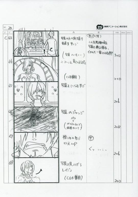
A good storyboard can make or break an episode, as it dictates angles, how long scenes linger on screen, etc. Once the storyboard has been decided on, the animating can begin. Scenes are appointed to animators, where they create something called Genga. This is done on paper, similar to how it’s done in other parts of the world. Here are some examples of older Genga:
Even though times have changed and anime has become digital, with some animators now exclusively animating digitally, the anime industry still uses Genga, using paper and pencil to create their scenes. Here are some examples of newer Genga:
Once the Genga has been created, the Chief Animation Director will go in and correct what is necessary to ensure that the style remains consistent. Others may also help participate in this process, such as an Animation Supervisor. Here is an example of a Genga being corrected to ensure that it remains consistent in style:
In doing something like this, some animators can animate great action and keep their lines rough to save time, and an Animation Supervisor can clean it up and make it look good.
After this has been completed, the Genga is then made into what is called Animation Cels. This is not exclusive to Japan, as for decades this is a process that has been used. This is a transparent sheet that had the lines and colours painted on, and is then photographed over painted backgrounds. Yeah...A long and dubious process indeed. This is not common place anymore due to how time consuming it is, and with the rise of digital, creating colours, effects, filters and backgrounds are much faster and easier to accomplish. Here are some examples of One Piece animation cels:

I would have much preferred to share cels directly from the anime itself and not the movies but they are quite difficult to come across and have more than likely been sold off from Toei long ago. But they will suffice, as it gives a good idea as to what they look like.
But voila! Animation has been created! All that’s left is music, sound effects and voice over and you’ve got yourself an anime. Wonderful. Easy right? Yeah, not exactly. All of this takes time and patience. And this is something that needs to be remembered. Time. A very important keyword in the animation industry and a lot more important than the word budget that likes to get thrown around. Due to One Piece being a long running weekly series, the animators have a lot less time than, say, My Hero Academia or Demon Slayer, two very prominent seasonal anime. These series do not have more money shoved into them, more budget, than One Piece that results in higher quality and consistent animation, a problem the One Piece anime definitely faces further down the road. Here’s an example:
Michelangelo is one of the most famous artists of all time, due to his remarkable attention to detail in his works present in the High Renaissance period. One of his most famous works is the Statue of David, an incredible piece of work that was worked on for 3 years. However, if you were to tell him to replicate it but say, give him a month, he’s not going to get anywhere near the same results as the piece where he spent 3 years on. It would be quite rough around the edges, and quite rushed. No matter how much money you throw his way, he still won’t be able to get anywhere close to those results. And this is the same with any artist, including animation. This is a big misconception in the anime community, and that is that as long as you throw money at people, they’re going to end up creating incredible works, regardless of the poor time management. That is just not how it works.
This does seem like quite a ramble, and it’s already quite long prior to even reaching the main aspect of this whole project, in which I showcase animators, but this is important background information that needs to be understood prior to delving in. With that very long introduction, let’s now get to showcasing animators!
Some of the animators that were present on many early One Piece episodes include:
Kazuya Hisada, Masahiro Shimanuki, Naoki Tate, Jin Inaba, Tadayoshi Yamamuro. Please note, there are many others involved animating wise, but these are some key names, and ones that will develop and evolve as the years go on.
Kazuya Hisada is someone who will pop up later and fulfil a more important role in the series, but in the early days he created some great scenes with some snappy timing, while using lines to help convey impact. He is found throughout early One Piece, however due to the limited animation and consistent style thanks to Noboru Kizumi, he can be difficult like most during this era to spot.
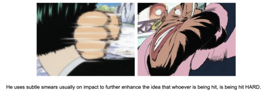
Hideaki Maniwa is more prominent in his animation, being more pronounced due to his camera movement on his characters. He uses subtle smears usually on impact to further enhance the idea that whoever is being hit, is being hit HARD. He also created the most animated piece of early One Piece in episode 23 where he creates seemingly natural movement of the background of the ship and water, making the sea feel powerful and heavy.


So what have we learnt so far.
Well, there is a lot of hard work that goes into the production of an anime series, and that is no different with One Piece. Early episodes for the most part had not too many interesting scenes animation wise, and the animators essentially got the work done in order to produce and release the series week to week. It will continue to be a bit of a slow start, with arcs like Alabasta and SkyPiea being similar in the regard of not many noteworthy scenes however, we can begin to see the cracks of emerging stars and evolving styles that will later become staples within the series.
This is it to the first of what is hopefully a long and engaging project! So far it has been quite a read and very lengthy and I apologise for that. Hopefully from here on out we should be able to successfully get through more animators and styles become more distinct and animation continues to evolve. Next up I intend to cover Alabasta.
------------------------------------------------------------------------------
A massive thank you to everyone who has participated and uploaded at Sakugabooru! Without it, I would not have been able to make nearly as much as I have without all the hard work in identifying and tagging animators’ work! Most of the footage used to showcase these animators has come from there! I simply just turned the videos into gifs for an easier showcase.
I would also like to issue a big thank you to Animators Corner! The staff listing really helped me in determining who worked on what episode to identify animators and their works!
#one piece#anime#opgraphics#gif#if you could please share this!#would love for this to be spread thank you!#op animation thesis
229 notes
·
View notes
Text
youtube
Watch the American Climate Leadership Awards 2024 now: https://youtu.be/bWiW4Rp8vF0?feature=shared
The American Climate Leadership Awards 2024 broadcast recording is now available on ecoAmerica's YouTube channel for viewers to be inspired by active climate leaders. Watch to find out which finalist received the $50,000 grand prize! Hosted by Vanessa Hauc and featuring Bill McKibben and Katharine Hayhoe!
#ACLA24#ACLA24Leaders#youtube#youtube video#climate leaders#climate solutions#climate action#climate and environment#climate#climate change#climate and health#climate blog#climate justice#climate news#weather and climate#environmental news#environment#environmental awareness#environment and health#environmental#environmental issues#environmental justice#environment protection#environmental health#Youtube
11K notes
·
View notes
Text
ok J&H Fandom, let’s talk:
“Popular” blog @thatsmyhyde is a prominent creator in the J&H Fandom. But here’s where the problem shows up:
the content they make is concerning at least, and full of red flags at worst.
DISCLAIMER: This is all information I have gathered through their tumblr blog - I am not aware of what other things they may be posting on other social medias or their written work.
ANOTHER DISCLAIMER: Please be polite, I am a minor, and am just creating this post to ward off / warn other minors from following this person. If you are an adult interacting with this post and blog, be mindful of your actions and be responsible
Trigger warnings for: discussions of homophobia, discussions of p//phillia, fat-shaming, fat-phobia (?), etc. Just be on general edge for this post, we’re talking about a lot of weird stuff
I will be linking their posts as I am not going to take screenshots of their art.
This is not a comprehensive list of all the things they’ve done - these are the ones I could think of and was able to adress. If you have anything additional you want to add to this post (such as concerning things they may do on other social media), feel free to reblog and add on the things you need to say, just please don’t be dumb.
Let’s start with the premise: Henry Jekyll creates an alter ego, Edward Hyde. They begin a relationship - an emotional and physical one. Their AU features Jekyde (A popular ship in the fandom, the name stands for Jekyll x Hyde), people have various views on this ship.
So far so fine, right? Here are the problems:
1. Their Henry Jekyll is an awful person. Now, let’s start by saying that of course you can have bad people in your works, those are, after-all: villains. The problem is,Henry Jekyll is a harmful walking gay sterotype, and an outlet for Biscuit’s obvious fat fetish. But their relationship isn’t just toxic it’s romanticised in how toxic it is.
a. The harmful stereotype - Their Henry Jekyll has a “thing” for younger men, even though he is in his middle-ages, and Hyde looks like a young child. (Age gap relationships are their own thing - they come with their own burdens, and this is not the post to discuss them. This topic will lead into the Edward Hyde section of this post.) But, it was a known homophobic scare-mongering tactic of straight parents to accuse everyone who is gay that they are ‘out to prey on your youths’. This is a stereotype that stigmatized the LGBT community, and still harmfully affects them to this day.
b. The fat fetish: Jekyll is frequently seen with cake (as seen here, here, and here) or being self-loathing, to the point of suicide. (click the link here to acess a list of suicide and other crisis hotlines! you matter to me!). Now, the self-loathing could be a symptom of depression or other mental illness, so I am not going to talk about it, as a person with mental illnesses. But the self-loathing in addition to him being fat is not good. Media is drowning in the “self-loathing fat person” and as someone who isn’t thin i’m tired of seeing this.
- The fetish aspect comes in him constantly being referred to “Chonky”, a term usually used for overweight/obese cats and being drawn obsessed with cake. It fetishises his weight and dehumanises him into something people call their animals. Also, here’s more of Jekyll eating food and being embarassed by it, though this time because it’s seen as “servant’s food”.
- Biscuit admits to liking them “Big and chunky” in posts like this.

[Photo id: A string of texts that says: tantok, frankenstein, twink lore, dorian slipped through the cracks and got himself sketched by yours truly the other day because he brought lord henry along, he and the slime didn’t have to fight to the death because they’ve both got their own chonky old toxic henries to focus on, but this blog still ain’t big enough for the two of ‘em. end id]
- They also talk about how they ‘prefer’ to draw fat (chonky) people. Image attatched above. the thing that should be noticed is that they say ‘chonky old toxic henries’ . they, once again, are making fat people a fetish.
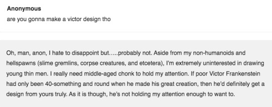
[Photo id: Anonymous asks: are you gonna make a victor design tho biscuit responds: Oh, man, anon, I hate to disappoint but.....probably not. Aside from my non-humanoids and hellspwans (slime gremlins, corpse creatures, and etcetera), I’m extremely uninterested in drawing young thin men. I really need middle-aged chonk to hold my attention. If poor Victor Frankenstein had only been 40-something and round when he made his great creation, then he’d definitely get a design from yours truly. As it is though, he’s not holding my attention enough to want to. end id]
Biscuit once again talks about how he doesn’t want to draw ‘thin men’, because he is only interested in older ‘round’ people. He, is, once again, bringing to light his fetish for fat people.
2. Edward Hyde is basically a child - Edward Hyde is drawn in boy’s school clothes, is taken in and raised like a child after Jekyll’s death, and is constantly cooed over by the creator, even earning a nickname of ‘slime’ from them. In addition, he also has ‘family photos’ taken with Utterson, has his toenails kept, is the height of a child, and teeths. This, paired with the fact that he is in a toxic, abusive, relationship with a man in his middle ages is concerning and should not be romanticised.
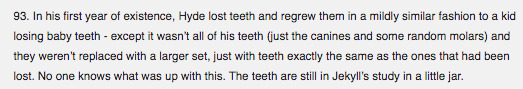
[Photo id: the text reads: In his first year of existence, Hyde lost teeth and regrew them in a mildly similar fashion to a kid losing baby teeth - except it wasn’t all of his teeth (Just the canines and some random molars) and they weren’t replaced with a larger set, just with teeth exactly the same as the ones that had been lost. No one knows what was up with this. the teeth are still in Jekyll’s study in a little jar. end id]
a. Hyde is treated like a child after Jekyll’s death. Hyde teething is concerning because that’s something infants do. He also clings to utterson like a child. The idea that he gets taken in by Utterson, whisked away to an estate out in the country, despite both of them having romantic feelings for Jekyll is. how do I put this: WEIRD. (seriously, imagine your father/father-figure dating ur significant other / having a crush on them before you two got together and after).
b. Hyde dresses like a child, whilst being sexually active and wearing lingerie. Now, on their own, these traits aren’t a problem - but together? They are very much a problem.
- Hyde dressing as a child is concerning because he is also treated like a child at certain points in their “lore”. After Jekyll’s death, Hyde becomes a singular entity, and is taken away by Utterson. To care for, like a child. This post sums it up well: he wears both children’s clothes and lingerie.
- Hyde has a very strange appearance - if you compare it to his early design (which was less cartoony and looked more like a man in his twenties), Hyde’s current design is concerning. Why does he have the height of a child? Why does he have eyes that take up a grand part of his face? Now, one could argue that ‘he is not human’ - but if he is treated like a human, whilst wearing children’s/youthful clothes, teeths, and his general enchanment with the world - he appears as human (and looks eerily similar to a child), which is why him being sexually active, wearing lingerie, and being friendly with prostitutes (one that gave him underwear and other articles of clothing) is concerning.
- That said, Utterson is directly talked about being ‘adopted into gremlin fatherhood’ (paraphrasing).
[Photo id: the text reads: 59. Jekyll is irresitibly attracted to everything about Hyde, but if he could somehow be forced to list hte most attractive physical attributes of Edward Hyde in his opinion, aside from Hyde’s youthful appearance in general it would be his eyes, his overbite (Jekyll perceived the way Hyde’s-) the screenshot cuts of the rest of the paragraph. end id]
- Jekyll has a ‘thing’ for younger men. This is to the point that the most attractive part about Hyde is that he is young. (or looks like it), Hyde looking very young is concerning because that would make their verison of Doctor Jekyll a p*dophille . This is something the artist has either not recognized, realised, or simply does not acknowledge.
3. The toxic relationship (and how it’s romanticised) - The relationship in this ‘AU’ is: love comes first, toxic nature comes second. If you scroll through the blog you may see some reference of ‘Henry Jekyll is such a toxic person teehee’ and a lot of them kissing, being together, smiling, or enjoying life. Now, obviously, an artist - if they do not want to - should not draw characters being toxic to each other. But it is concerning when the above points come into a factor, that the toxic nature of their relationship comes second to the highs of their relationship, at least on their blog.
Here is one of the only examples I’ve seen of Biscuit talk about the relationship in a detailed negative light.
4. The fandom - Whilst Biscuit says it’s ok for minors to interact with his blog (in that blog he says that he tags nsfw - which is true.) he does not regularly mention that his jekyde is toxic - not in a concerete way. He romanticises it (despite acknowledging it’s flaws), and the only way it may or may not be (i would not know) acknowledged is his fic: which is mature and not meant for minors. He does not tag his posts with regular triggers for things like: alcohol, drugs, mental illnesses, or abuse (any variants). They’re not even in his blog’s description! If Biscuit had acknowledged it in his blog, something along the lines of: “Hey! This blog has <content warnings> be warned when interacting! But no, he does not.
- A lot of the people who draw things, or generally interact with Biscuit are minors. Being exposed to such a thing may be harmful to my peers, and I am worried. To minors who are fans of Biscuit: if you’ve made it this far, thank you, I know you’re mature and responsible, but being exposed to content creators like Biscuit could lead you down a dangerous path of having this kind of thing normalised to you. Be careful with the content you consume, please! And thank you for making it this far, I’m sure you’re a lovely person :)!
Thank you for taking the time to read this! Stay safe, tell the people you love that you love them.
#J&H#jekyll and hyde#henry jekyll#edward hyde#i spent months thinking whether or not to write this#but#i'm worried about fellow minors on this website seeing this user's blog#and not thinking critically about this#so i snapped and made this#long post#like r e a l l y long post#i am so tired.#brb to answer the hate lmao i need to throw up#forgive me if by the end of this post i sound exhausted : i am#i spent this evening writing this post#goth lit fandom grow up challenge#aus do not remove the context of the original#listen to the minorities if they call you out#fiction REALLY AFFECTS REALITY
239 notes
·
View notes
Note
please, what's your opinion on Murata's akira fanart?
HHHHHHHHHHH
I think it’s neat :] The way he draws the characters looks great, but idk if his shonen style would very much fit the grungey universe that Otomo has set up for Akira. I think Otomo’s style fits very well for the urban cyberpunk hell in his series, the characters aren’t obnoxiously attractive and the Neo-Tokyo backgrounds are often the centerpiece of a lot of the panels in Akira. Murata’s characters are often really expressive, cartoony, and mostly the focal point of his illustrations. This isn’t a bad thing, they’re both super talented artists and I would give them my life, but they both excel in very different categories of art. Otomo prioritizes atmosphere and Murata prioritizes character. Although, I’m probably wrong; I’m not a very well-versed artist myself and I am aware that what I’m saying could be complete bullshit but it’s just muh oPiniON....
I really like the way he draws Tetsuo, but like I said, the characters are too attractive. They’re just kids in Akira, and Murata has drawn them like fully-grown adults (except maybe Kai lmao). He also did the same thing when he drew some art for Mob Psycho 100, I guess Murata has trouble drawing convincing teenagers (cough COUGH, Metal Bat and Garou).
It’s super cool that he’s a big fan of Otomo! I mean, who wouldn’t be? Everyone that finds Akira always falls in love, it’s just really cool seeing two art gods in kahoots with each other.
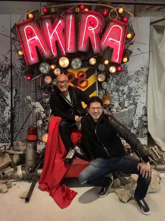
But peep the background: it’s Neo-Tokyo. An example of one of the atmosphere-centric illustrations I was talking about. Whenever Murata does promo art, it’s always of the characters he’s promoting. When Otomo does promo art, it’s (almost) always the universe. Very interesting! :) thanks for asking! ❤️ I would love to see more of Murata’s Akira fanart, though. Even if it doesn’t exactly fit the series, seeing new stuff from him is always a treat.
42 notes
·
View notes
Text
INFJ’s art tutorials #4: Hair!
I really like drawing hair, it’s one of my favorite things to draw. A friend of mine wanted to know how I did it so I made this tutorial! My program is Sketchbook Pro but this can work in any program!
NOTE: this is for stylized hair, not realistic. It’s in my style which is rather cartoony so if that’s not what you’re looking for, look elsewhere!
So, there are three main principles that are essential for drawing hair well: form, shape, and movement.
Form is the concept that even when working with 2D art, everything has mass, everything is three dimensional.
Shape is the concept that everything has a... well, shape. Everything can be broken down into three basic shapes: triangles, circles, and rectangles.
Movement is the concept that even when you have a still image, there is a certain sense of direction and intentional path that the objects in a piece make.
Okay! Now that we have those basic rules established, let’s get into it! We’ll start with a basic sketch underneath that serves as our head and shoulders. Hair covers this area in different ways and styles depending on texture and thickness. I’m going to use a typical long hairstyle for an example.
First, here’s something I see a lot that you shouldn’t do.
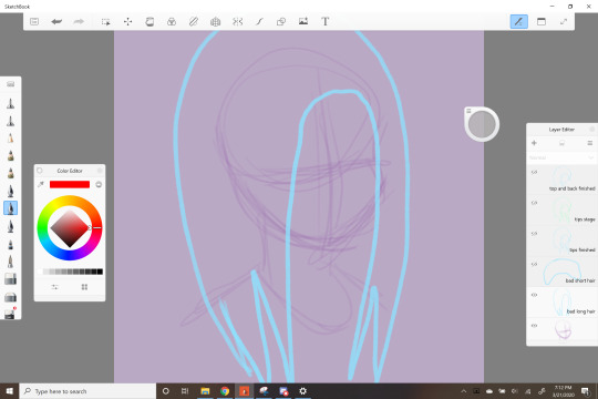
This is a beginner mistake that is all over the place. The problem with this is that it’s just a blob, a mass sitting on top of the drawing. It has none of the three principles we talked about above. Hair isn’t one mass, it’s made of individual pieces that come together to make a whole with form and shape. So now we’ll start on how to do hair the right way.
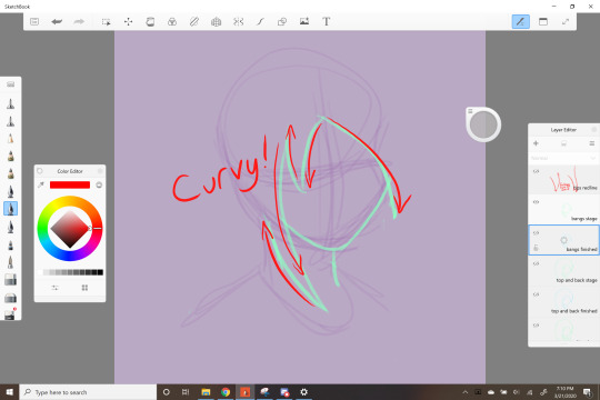
This is going to be a relatively straight hairstyle, but it still curves around the face, forming a frame. I like using anime-ish shapes in my hair, so there’s a lot of curved zig-zag lines forming smaller pieces pointing in different directions which creates movement.
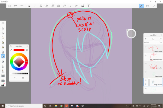
Next we start the back and top of the hair. Still keeping our lines curvy, we show form by drawing the lines following the scalp but not touching it. The part goes closer to the scalp than the rest of the hair though. We also stop behind the shoulder to imply that there’s more hair, but it’s our of view.
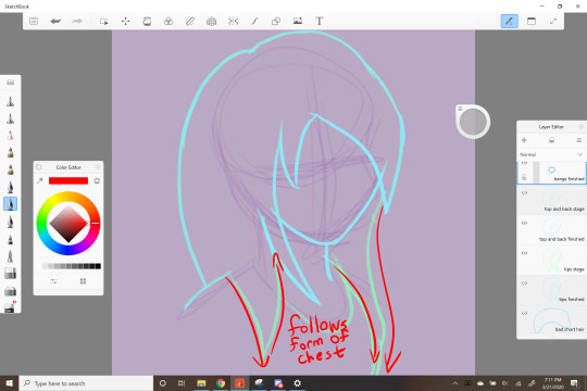
Lastly we complete the shape by drawing the tips resting over the shoulder and down the front of the body. Lots of triangular tips! The shape follows the form of the body underneath, so we know it’s resting on something.
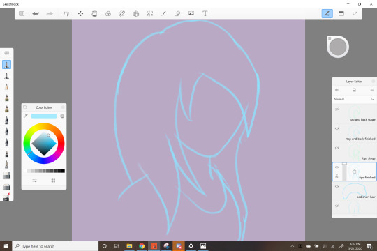
And there we go! We have shape, form, and movement to create a three dimensional object that follows the curves of the body underneath. Now let’s take all of these principles and push them even further with something a lot more complex.

Oh look, a bastard. I LOVE drawing Vio because his hair makes a fun challenge. It has a lot of fluffy tufts and still has the “link” hairstyle but it also has emo bangs which very much fits him. The difficulty level here has gone way up from our previous example, but the same principles are present. There are a lot of curvy zig-zags to form tufts, but there’s a LOT more movement here. With more complex shapes and forms, you can create more interesting movement.
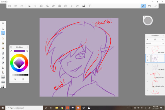
And that’s about it! Let me know if there are any other tutorials you want from me, I’m always happy to help!
#art#art tips#art advice#hair#hair tutorial#digital art#digital drawing#Digital art tutorial#art tutorial#infj's art tutorials#my art#hair tips#autodesk sketchbook
52 notes
·
View notes
Text
TRAINS
Tumblr, this is sincerely the nerdiest thing I’ve done and that’s a high damn bar. Hope you like trains.
If you’re anything like me, you enjoy trains. You think to yourself, gee, me, I like trains. I wish there were more Transformers that turned into trains. You say, there’s lots of trains out there. Why aren’t there more train Transformers? I have wondered this exact thing many times, dear reader.
There are many factors that contribute to this dearth. First, there is only one prominent character with a train alt mode in the original G1 cartoon. Second, the aesthetic choices made by most elements of the Transformers franchise since G1 have made train alternate modes difficult or unlikely. Third, it is highly uncommon for Transformers to have altmodes more than a handful of years old, or that aren’t famous or widely used at the time of their release. Considered in inverse, these challenges constitute a set of criteria that determine whether or not a train is likely to have a Transformer. The most significant reason that there are very few train Transformers is not, fundamentally, that HasTak simply don’t make many trains because of these challenges. Rather, it is that almost all of the trains toys that can be created with these constraints have already been created.
Although Transformers has featured a diversity of franchises with unique art styles, characters and toy design, HasTak have continued to draw on some of the most successful elements of the original G1 cartoon in almost all of their subsequent media. Nearly every single Transformers cartoon features Optimus and Megatron characters, and oftentimes much of the supporting cast is also heavily inspired by G1. For example, Transformers: Prime contains a Cliffjumper, an Arcee, a Ratchet, a Smokescreen, a Wheeljack, a Starscream, a Soundwave, a Shockwave, and even a Breakdown, all of whom have G1 counterparts. (ItsWalky, Transformers) Even in franchises like Transformers: Armada, where the departure from G1 templates is more pronounced, they are still invoked as a source of character names and broad strokes concepts. Armada Cyclonus is different in many particulars from G1 Cyclonus; however, both are flying evil henchmen. (ChrisMcFeely, Mendou) With the contemporary omnipresence of Generations and other CHUG lines, the already large influence of G1 has grown even more pronounced.
What has this to do with trains, you might well ask? Of all the many characters in the G1 cartoon, only one, Astrotrain, turns into a train. (ItsWalky, Astrotrain) Moreover, Astrotrain is not simply a train Transformer, but rather a triple changer; he turns into both a train and a space shuttle. (ItsWalky, Astrotrain) As noted in my Transformers: Universe essay, figures of characters with multiple alternate modes tend to be larger (although Astrotrain himself has a deluxe class figure), and often pose more design challenges. (ItsWalky, Astrotrain) This added difficulty in producing and selling toys likely has steered HasTak away from using the Astrotrain template. Indeed, although present in various comic series, convention media, and CHUG lines, a character did not use the Astrotrain template until 2020’s Transformers: Cyberverse. (MSipher) Since Astrotrain is the only template, and is demonstrably difficult to employ, the number of new train characters is severely restricted.
Of course, far from everything in Transformers is a G1 homage. Almost every franchise introduces completely new characters and designs based on the aesthetics of that franchise. However, for one reason or another, many of these aesthetics have a difficult time integrating trains. Beast Wars obviously didn’t introduce any characters that turned into trains, and Beast Wars or Machines product was on shelves for a good five years. Micheal Bay’s Transformers films, one of the dominant media pillars of the franchise since the release of the first film in 2007, focus heavily on the most sleek, modern sports cars or the most fearsome military vehicles, leaving little room for trains.
From the perspective of cartoons, Armada, Animated and other franchises largely revolved around futuristic, blocky cybertronian vehicles, which precluded the use of classic steam locomotives or even more modern diesel engines. Of course, this does not prevent the design of a train Transformer with some imagined cybertronian train mode, or a more cartoony train. Indeed, this is a route that Energon opted to explore with Omega Supreme. (RolonBolon) However, a common criticism of cybertronian altmodes is that they are somewhat unfocused, and this is particularly true of the two extant cybertronian trains. Both Omega Supreme and Titans Return Astrotrain stretch the concept of train to its very limits, and the resulting designs can be somewhat challenging to parse.(RolonBolon; ItsWalky, Astrotrain) This is not to say that these designs are objectively bad, or that this potential difficulty would prohibit HasTak from pursuing this avenue altogether. Rather, this argument is to emphasize that HasTak’s primary consideration is to sell toys. If design constraints increase the likelihood that a child will find a toy unappealing, it decreases the likelihood HasTak will create a toy with those constraints.
Trains also confront several core difficulties, independent of the aesthetic idiosyncrasies of a franchise. Trains are much larger than most other common types of vehicle, in turn making the Transformers that turn into trains much larger than their compatriots (although lord knows this doesn’t stop them from making fighter jets). Traditionally, characters that are much, much larger than their peers have, for logistical reasons, limited screen time. It is difficult for that character to be involved in the intricacies of planning a battle when they don’t fit in the same room as their allies. This limited screen time in turn makes it more difficult to sell toys.
Similarly, trains require rails to move. This creates something of an awkward dilemma from a writing perspective. Either all of your action must take place within easy reach of train tracks, or you must abandon a quite noticeable level of realism in your storytelling. The G1 cartoon opted to abandon realism, which was a reasonable choice in an environment where Megatron and the other Decepticons could themselves fly with no visible means of propulsion. However, in a more serious and dramatic show like Transformers: Prime, such a lapse would likely feel out of place and silly. Perhaps even more than size, the difficulty posed by rails complicates the inclusion of any potential train based character in a new franchise.
In the real world, trains occupy a significantly different design space than cars. Cars are a consumer good, and there are significant financial incentives to continually introduce new generations of cars. In contrast, trains tend to be costly infrastructure investments, either by companies or governments. For trains, the incentive structure runs much more towards long lifetimes, and as a result few new generations. Moreover, not only are new trains somewhat scarce, but many of the most iconic train designs are very old indeed; steam locomotives have been around for almost two hundred years.
This is a significant limitation from the perspective of Transformers alternate modes. It is extremely uncommon for a Transformer that turns into a real world vehicle to turn into something more than a handful of years older than the toy. There are some exceptions, of course; Movieverse Starscream turns into an F-22 Raptor despite the age of the plane, partially because the Raptor continues to see widespread use, and partially because it is extremely iconic. However, it is almost unheard of for a Transformer to turn into a Model-T, for example, or even old airplanes like the p-51. This is a natural consequence of the overriding imperative to sell toys; children are more likely to desire a figure that reflects something in their environment to which they have a preexisting connection. Because of both the infrequent generations of train design and the huge body of classic trains, this simple fact presents an almost insurmountable obstacle to the creation of many train Transformers.
With all these challenges, one would not be unreasonable to ask if there are any train Transformers at all. Yet there are! For all the difficulties posed, seven Transformers in the modern era are based on trains, and even more in the later stages of G1. These figures have been created because they manage to slip through all of the barriers outlined above. An inversion of our above challenges allows for the formulation of an explicit set of criteria governing the creation of train Transformers. All of the extant train figures meet one or more of these criteria; more remarkably, almost every single train that meets these criteria has a corresponding Transformer. Phrased a different way, the most fundamental cause for the lack of train Transformers is not that, for one reason or another, train Transformers are not made. Rather, it is because almost all of the train Transformers that can exist, do.
The first criteria for the creation of a train Transformer is, simply put, that it should be of Astrotrain. Although much of the proceeding discussion concerning Astrotrain was focused on limitations, he is still a G1 character, and a popular one at that. Where cartoons have neglected him, media and toylines targeted at collectors have been much kinder. Astrotrain has received a number of figures over the years, and is far from forgotten.
Second, the figure should be in a toyline largely dedicated to licensed, real world alternate modes. This avoids all the design difficulties associated with cybertronian train modes. Moreover, real world alternate modes have something of an existing natural sample space. Where a cartoon has any number of imaginary cars it could exploit, licensed vehicle focused lines can only exploit a handful of real models from a handful of real manufacturers.
Third, the figure should be of a train that is either extremely iconic, or that has come out in the last five years or so. More explicitly, it should be a train that children can have attachment to. Although this criteria stems from age of train, it encapsulates more than that. It is crucial that Transformers has two separate audiences, because of the dual ownership of the property. Hasbro aims at American children, and Takara aims at Japanese children. In the United States, trains are not widely used, and do not have the meaningful cultural impact of, say, cars. In Japan, however, where many Transformers are at least in part designed, trains are a much more normal part of daily life, and have a correspondingly larger cultural footprint. So, for a child to have attachment to a train, it should not only be new and iconic; it should be Japanese.
The first two of these criteria are for figures, and the third is for the trains used for alternate modes. Before discussing each modern figure and its relation to the first two criteria, the third criteria will be applied to gain some understanding of the scope of the crucial limiting reagent, the pool of plausible trains. When the third criteria is applied to this pool, it shrinks dramatically. Almost every train made before 1960 falls away, eliminating most steam locomotives at a blow. Similarly, all American trains are eliminated. Indeed, even most Japanese trains are eliminated. However, there is one group that remains; the Shinkansens.
The Shinkansen is Japan’s high speed rail system. The Shinkansen is iconic, especially in Japan. One of the very first high speed railways in the world, the incredible reliability of the trains, both in terms of punctuality and safety, has made it famous.(Shinkansen) The technology and trains have been exported to other countries the world over. (Shinkansen) These trains are Japanese, they are iconic, and, in part due to their widespread usage, have frequent generations. Because of all these factors, we would expect to find Shinkansens dramatically overrepresented among train Transformers, and indeed, this is exactly what we find. Of the twenty six different train molds, fully eleven are Shinkansens. More, of the eleven, eight are of the hundreds series of trains, the series containing the very first Shinkansen. This is remarkable, because there are only eight kinds of hundreds series trains; every single hundreds series train has a corresponding Transformer. (Shinkansen) Indeed, of the other three Shinkansens, two are based on or modifications of 100 series trains. Not only are the most viable series of trains dramatically overrepresented, they are represented with a stunning completeness.
Having reviewed in general what pool of trains is viable for Transformers production, we will now conduct a figure by figure survey of the 100 series trains and the existing modern train figures to examine how they relate to the first two criteria.
0 series: Shouki
The Transformer representing the 0 series of trains is the Headmasters character Shouki. The leader of the Trainbot combiner team, Shouki was released (exclusively in Japan) in 1987. (M Sipher, Shouki) Although the first 0 series trains began running in 1964, they continued running until 2008. (Shinkansen) Moreover, their status as the very first Shinkansen makes them unquestionably iconic. Although headmasters was not a line focused on realistic vehicle modes, Shouki and his team were originally developed for the pre-Transformers Diaclone line, which was. (M Sipher, Shoki). Shouki, not being Astrotrain, meets two of our three criteria.
100 series: Leaf and Spark
The 100 series of trains is represented by two characters, Leaf and Spark. Both are members of the Liner Team combiner team, and can merge to form Sixliner. Interestingly, although they share an altmode, the two are unique molds. The 100 series began running in 1985, and Leaf and Spark were released in 1991, under the Return of Convoy line, again only in Japan.(Shinkansen; Deceptitran; Repowers) Leaf and Spark are interesting, since though they themselves are real vehicles, Return of Convoy most decidedly is not focused on that. They meet one of our three criteria, namely the third. (Deceptitran; Repowers)
200 series: Yukikaze
Another member of the Trainbots combiner team, Headmasters character Yukikaze represents the 200 series of trains. The 200 series began running in 1982, and, like Shouki, Yukikaze was released in 1987. (M Sipher, Yukikaze; Shinkansen) Again like Shouki, Yukikaze meets two of the three criteria. (Most characters are not, in fact, Astrotrain).
300 series: Desire
Desire is a retool of Spark, and a member of the Train Team combiner team. Although the TFwiki identifies him as a “Hokkaido Bullet Train” , Desire has several features characteristic of the 300 series, primarily the headlights, the high seated windows, the skirt, and blue stripe. (Dr Spengler; 300 Series) Desire was released in 1992 in the Operation: Combination line, the same year the 300 series began to run. (Dr Spengler; Shinkansen) Operation: Combination was retools or redecos of existing G1 toys, many of which were real life vehicles. Desire meets two of the three criteria.
400 series: Windy
Like Desire, Windy is a member of the Train Team, and was released in the Operation: Combination line in 1992. (Rosicrucian) Unlike Desire, and all the other members of her team, Windy is not a retool of a member of the Liner Team; rather, she is a new mold. (Rosicrucian) The TFwiki identifies her as a “Yamagata "Tsubasa" bullet train”. (Rosicrucian) The 400 series was “introduced in 1992 on Yamagata Shinkansen Tsubasa services” (Shinkansen). This, in combination with the visual features Windy shares with the 400 series, is a compelling positive identification. With her release coinciding with the release of the 400 series and featuring in the Operation: Combination, Windy meets two of the three criteria.
500 series: Railspike
A member of Team Bullet Train, Railspike was one of the first modern train transformers. (M Sipher, Railspike) He transforms into a 500 series Shinkansen, accurate down to the 500 printed on his side. Railspike combines with the other members of his team to form Rail Racer.(M Sipher, Railspike) The 500 series began running in 1997, and Railspike was released in 2001 as part of the Robots in Disguise line. (Shinkansen; M Sipher, Railspike) RID was not exclusively focused on real vehicles, as it contained many Beast Wars figures, among other things, but almost all of the autobots had real alt modes. (Siax) Railspike meets two of the three criteria.
600 series: No one
The 600 series of Shinkansens doesn’t actually exist. (Shinkansen) It could be argued that Midnight Express, another modern train toy who turns into an e4 Shinkansen, is in spirit a 600 series, as the 200 series served many of the same lines.(M Sipher, Midnight; Shinkansen) However, this argument is tenuous at best, given the 400 series served entirely different routes. (Shinkansen)
700 series: Rapid Run
The third member of Team Bullet Train, along with Railspike and Midnight Express, and one of the seven modern train toys, Rapid Run transforms into a 700 series Shinkansen, specifically, the Hikari Rail Star. (M Sipher, Rapid) The 700 series began running in 1999, and Rapid Run was released in 2001. As with Railspike, he meets two of the three criteria.
800 series: Astrotrain
Although Astrotrain’s G1 toy turns into a JNR Class D51, in 2006 he received an update in the Classics line. (S.H.I.E.L.D Agent 47) Instead of his original alt mode, Classics Astrotrain turns into the more modern 800 series Shinkansen. (S.H.I.E.L.D Agent 47) The 800 series began running in 2004. (Shinkansen) Classics was a complex line with many facets; although many altmodes were made up out of whole cloth, many were also based on real vehicles at least loosely. (Nevermore) Astrotrain, being Astrotrain, meets all three criteria.
Three modern train figures have not been discussed in the survey of hundreds series Shinkansens. Two of these are Astrotrain figures; Titans Return Astrotrain and Siege Astrotrain. Titans Return Astrotrain turns into a cybertronian armored train, and Siege Astrotrain turns into an approximation of his JNR Class D51 mode. (S.H.I.E.L.D Agent 47) Both figures meet only one criteria, namely being Astrotrain. However, this is a powerful criteria indeed and in many ways can replace the third criteria of age and attachment, especially in the current collector driven market. Although children don’t have a connection to Astrotrain’s altmode, collectors certainly do. HasTak are therefore able to sell toys, the primary driver of the third criteria.
The last remaining modern train figure is… unusual, by any metric. Released in the 2014 japanese exclusive toyline Transformers:GO, Optimus Exprime is a version of Optimus Prime that can turn into a train resembling a 700 series Shinkansen, a Dragon, and can combine with other figures from the line.(SanityorMadness) This figure meets zero of the criteria, on its face. Speaking personally for a moment, I honestly don’t know how this exists, or why. It appears that one day, Takara simply decided to… make a train Transformer. In many respects, this undermines the primary thesis of this essay. It is not part of a line oriented towards realistic vehicles, it is not Astrotrain, and it's not readily identifiable as a 700 series, but rather cartoonish and genericized. If Takara made such a thing once, what is to prevent them from doing it on other occasions? Perhaps, as argued with the Astrotrain figures, the sheer power of the name Optimus Prime is enough to overcome all the strangeness of the figure and make it attractive to children. After all, G1 Optimus Prime has turned into some truly silly things. This appears to be a reasonably compelling argument, enough to at least award the figure half a criteria. Although Optimus Exprime is exceptional, the fact that it is an Optimus Prime figure makes it work where a new character might, unfortunately, not.
As mentioned previously, there are some 15 train toys that have not been discussed here, all from G1 or immediately subsequent japanese toylines. Almost every one of these is either part of the Trainbots, the Liner Team, or the Train Team, and almost all of them are Japanese trains. Although many of these are older trains, I suspect many of them, like the JNR Class D51, are iconic in their own way, although this is difficult to verify without much more in depth research. Moreover, despite the age of the trains, these figures were created in an era in which almost literally every figure was based on a real vehicle, regardless of the obscurity. Although this essay is somewhat more expansive, the general scope of the Transformers Aesthetics survey does not include G1; as a result, these figures have not been given as much attention here.
Other than the hundreds series, there is one other primary series of Shinkansens that is not as well represented in Transformers, namely the E series. There are some compelling temporal reasons this series has been ignored. The E1 was released in 1994, in the thick of Beast Wars; Takara would have been unable to release a new train figure at the time. (Shinkansen) The E2, E3, and E4 were all released at the same time, in 1997. (Shinkansen) As mentioned previously, the E4 was released as Midnight Express; it makes sense that Takara could only release one of the trains from this generation, especially given that they had chosen to use two other train figures to make the 500 and 700 series at roughly the same time. Simple explanations are more difficult for the E5, E6, and E7, which were all released much more recently. (Shinkansen) The explanation may to some extent lie in the shape of the E series; unlike the hundreds series trains, the E series does not tend to be sleek and bullet shaped, but oddly duckbilled. (Shinkansen) Perhaps the explanation lies in the aesthetics of the then concurrent cartoons; it would have been quite difficult to work trains into either Transformers: Prime or Transformers: Robots in Disguise (2015).
This almost completely exhausts the pool of available trains as defined by the three criteria outlined above. Most of the other Shinkansen trains are either very niche, or some variation of the 700 series. (Shinkansen) Although it would take further research to verify, I suspect that subway cars and regular commuter trains are significantly less iconic in Japan, and therefore suffer greatly under the third criteria.
So, although there are many, many kinds of trains, for one reason or another, most of them are very difficult to make as commercially successful Transformers. Those trains that have the potential to work have almost all already been created. Moreover, those trains, like the E1, that might have at one point been viable but were not made as toys due to an accident of timing are now supremely unlikely to see release; the E1 is almost 25 years old. (Shinkansen) Although Takara has demonstrated a willingness to make a random train in the past, it was tied to Optimus Prime, arguably the strongest single Transformers character. Moreover, Takara acting on their own is increasingly unlikely in the wake of the brand unification initiated during Power of the Primes. While a train figure could theoretically be made for an older train or a less iconic, non-Shinkansen train, the difficulty these toys might encounter at general retail will likely keep them from existing. Moreover, Siege Astrotrain is, in many ways, the definitive version of the character, being hyper accurate to his robot mode and both vehicle modes. (S.H.I.E.L.D Agent 47) It is unlikely Astrotrain will receive another update for some time. This means that any new toy of, say, the E1, or a subway car, would require a new character. Given both the aesthetics of the recent Transformers: Cyberverse cartoon, and its recent end, it is unlikely that a new character with a train alternate mode could find a home there.
What does this imply for the future release of train Transformers? Depending on the aesthetics of the next cartoon, we might see a release of an E8 when it begins service in 2024. (Shinkansen) However, given that the last cartoon that meaningfully involved real vehicles was RID 2001, it seems unlikely. It seems that the hundreds series is more popular than the E series; it is possible that if and when the 900 is released, we would see a figure of that in some way, shape or form. However, the gap between the releases of hundreds series trains appears to be 5 or so years, and the 800 came out in 2004, and on a more minor line at that. (Shinkansen) Moreover, JR seems to be favoring upgrades to the 700 series, with the N700 in 2007 and the S700 in 2019. (Shinkansen). A possible 900 series seems a long way off indeed.
Given the limited potential of future trains being released, it seems the greatest chance of new train figures being realized as figures lies in HasTak choosing to revitalise some of the G1 designs. There seems to be something of a good chance of this; Takara revealed a banner with a silhouette resembling Raiden, the combined form of the Trainbots, that appeared to hint at a masterpiece release. (william-james88).
Although Siege and Earthrise have been releasing updated micromaster figures, there has not even been a whisper of a rumor about the micromaster sixteam combiners being revitalized. Updated versions of the Liner team and Train Team seem quite unlikely, especially given the shift in emphasis of Kingdom to Beast Wars. Overall, it seems that the next release of a train in Transformers will come from Masterpiece Raiden.
Well, dear reader, there you have it. Why aren’t there more Transformers trains? It turns out they’re quite difficult to make successfully, and many of the trains that could be used in this way have already been taken. In many respects, it’s truly amazing how many train figures we’ve gotten over the past few years, and how complete in particular the hundreds series is. The past is expansive, the future is somewhat bright, although more limited than one might wish. What more can one ask for?
Well, a really sick steam locomotive. Or one of the BNSF trains. How cool would that be?
Choo choo.
Works Cited
ChrisMcFeely et al. “Cyclonus (G1)” TFwiki.
https://tfwiki.net/wiki/Cyclonus_(G1) Accessed 9/20/2020
Deceptitran et al. “Leaf” TFwiki. https://tfwiki.net/wiki/Leaf Accessed 9/20/2020
Dr Spengler et al. “Desire” TFwiki. https://tfwiki.net/wiki/Desire Accessed 9/20/2020
ItsWalky et al. “Astrotrain (G1)” TFwiki.
https://tfwiki.net/wiki/Astrotrain_(G1) Accessed 9/20/2020
ItsWalky et al. “Transformers: Prime (Cartoon)” TFwiki. https://tfwiki.net/wiki/Transformers:_Prime_(cartoon) Accessed 9/20/2020
Mendou et al. “Cyclonus (Armada)” TFwiki. https://tfwiki.net/wiki/Cyclonus_(Armada) Accessed 9/20/2020
Monzo et al.“Beast Wars:Transformers(toyline)”, TFwiki,
https://tfwiki.net/wiki/Beast_Wars:_Transformers_(toyline) Accessed 4/25/2020
M Sipher et al. “Astrotrain (disambiguation)” TFwiki. https://tfwiki.net/wiki/Astrotrain_(disambiguation) Accessed
M Sipher et al. “Midnight Express (RID)” TFwiki. https://tfwiki.net/wiki/Midnight_Express_(RID) Accessed 9/20/2020
M Sipher et al. “Railspike (RID)” TFwiki. https://tfwiki.net/wiki/Railspike_(RID) Accessed 9/20/2020
M Sipher et al. “Rapid Run (RID)” TFwiki. https://tfwiki.net/wiki/Rapid_Run_(RID) Accessed 9/20/2020
9/20/2020
M Sipher et al. “Shouki” TFwiki. https://tfwiki.net/wiki/Shouki Accessed 9/20/2020
M Sipher et al. “Yukikaze” TFwiki. https://tfwiki.net/wiki/Yukikaze_(Headmasters) Accessed 9/20/2020
Nevermore et al. “Transformers: Classics” TFwiki.https://tfwiki.net/wiki/Transformers:_Classics Accessed 5/11/2020
Repowers et al. “Spark (ROC)” TFwiki. https://tfwiki.net/wiki/Spark_(ROC) Accessed 9/20/2020
Rolonbolon et al. “Omega Supreme (Energon)” TFwiki. https://tfwiki.net/wiki/Omega_Supreme_(Energon) Accessed 9/20/2020
Rosicrucian et al. “Windy (OC)” TFwiki. https://tfwiki.net/wiki/Windy_(OC) Accessed 9/20/2020
Saix et al. “Transformers: Robots in Disguise (2001 toyline)” TFwiki.https://tfwiki.net/wiki/Transformers:_Robots_in_Disguise_(2001_toyline) Accessed 6/13/2020
SanityorMadness et al. “Optimus Prime (WFC)/toys” TFwiki. https://tfwiki.net/wiki/Optimus_Prime_(WFC)/toys#Go.21 Accessed 9/22/2020
S.H.I.E.L.D Agent 47 et al. “Astrotrain(G1)/toys” TFwiki. https://tfwiki.net/wiki/Astrotrain_(G1)/toys Accessed 9/20/2020
William-james88 “Possible Masterpiece Raiden Coming” Siebertron https://www.seibertron.com/transformers/news/possible-masterpiece-raiden-coming/44268/ Accessed 9/20/2020
“300 Series Shinkansen” Wikipedia. https://en.wikipedia.org/wiki/300_Series_Shinkansen Accessed 9/20/2020
“Shinkansen” Wikipedia. https://en.wikipedia.org/wiki/Shinkansen#Types_of_lines Accessed 9/20/2020
8 notes
·
View notes
Text
youtube
Watch the 2024 American Climate Leadership Awards for High School Students now: https://youtu.be/5C-bb9PoRLc
The recording is now available on ecoAmerica's YouTube channel for viewers to be inspired by student climate leaders! Join Aishah-Nyeta Brown & Jerome Foster II and be inspired by student climate leaders as we recognize the High School Student finalists. Watch now to find out which student received the $25,000 grand prize and top recognition!
#ACLA24#ACLA24HighSchoolStudents#youtube#youtube video#climate leaders#climate solutions#climate action#climate and environment#climate#climate change#climate and health#climate blog#climate justice#climate news#weather and climate#environmental news#environment#environmental awareness#environment and health#environmental#environmental issues#environmental education#environmental justice#environmental protection#environmental health#high school students#high school#youth#youth of america#school
11K notes
·
View notes
Last Seen Blogs

magicstreak
Untitled
maudiemoods
Ren
oobleswoobles
ThE iNK God

crypto360world
Crypto.360

iransggroup
Iran is redefined with our services