#I honestly don’t know if I like lineart or rendering more
Text

Tried to practice rendering again
#I honestly don’t know if I like lineart or rendering more#Maybe there’s a way to combine it…hmmmm#pain and suffering#lego monkie kid#lmk fanart#lmk#lego monkey kid fanart#lego monkie kid mk#lmk mei#red son#lmk red son
464 notes
·
View notes
Note
nsnnndnhfur
I love your art so much-and I don’t know if this question has been asked before-
But I was wondering how you go about rendering things? Cause you do it so pretty and knjkdkjchdkjhcoehcoiheouch
ur just awesome
AWh Sorry it took me so long to answer! V flattered QQ) But now since I'm out of the perpetual remission that's called college- I'm gonna tackle this now HAH
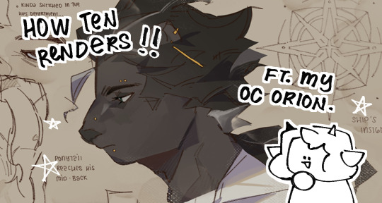
We're gonna use my (unwilling) OC Orion for this little compilation
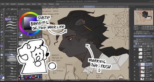
Base colors comes first as always, I also do -some- marking? Mostly for blush or any flush-ed-er areas uu)
Then I do base shadows! Usually on a multiply layer above everything at like 40-50% opacity since I like making them dark ! Gives me more incentive to play around with hues and building form.
I'm a little wishy-washy on where shadows go since I usually just wing it once I know where the lighting is supposed to be,,
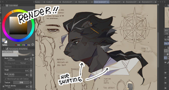
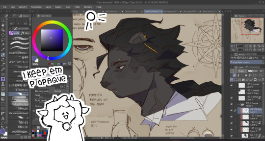
Then it's basically rendering at that point-! I paint a layer above my lineart, coloring the lineart also adds into this! I didn't do much here since it was for a character page
Usually it's just me defining the face plans and adding more oomph to the hair (if that makes sense) and hue shifting for the darkest shadows and rim lights!
BONUS ONE SORT-OF:
It depends whether or not I make them obvious but I love adding texture and abusing gritty brushes and halftones to add more pizzazz to everything, I just go ham honestly
And that's kinda it! Not sure if this was a good tutorial in any shape or form ngl I'm bad at those- BUTTT AGAIN I APPRECIATE THE SENTIMENT HUHU
32 notes
·
View notes
Note
how clean are you colors before you merge them into the lines for painting? because i cant seem to find a balance between "my god i need to do this whole thing from scratch (too sloppy)" and "well whats the point of painting here (nothing left to paint if i merged the lineart)". sorry if this doesnt make any sense idk how to word myself better sometimes
I think I get you! Honestly I have a kind of threshold I reach where I know that I’ve done all that I can on separate layers and if I were to keep them separate, I’d just be creating more hassle for myself/forced to select layers and keep everything properly organised and it becomes a drag when I’d just rather be painting. And this is usually because I want to take advantage of the mixing effect of Sai’s paintbrush tool to start blending stuff. Also all my colours are on one layer anyway from the beginning (if I need especially ‘clean’ colours I might have a layer for them but I always merge them to the main colour layer before continuing). (also sorry I am away from my pc for a bit so I can’t show you actual Sai screenshots.. you will have to imagine). I ended up writing out the whole process in a way which is probably unhelpful
So for a painting like that one in the last post, I do my lines. Then I close the lines with a separate layer in the same folder (because the lineart looks better with gaps, but i fill colour by selecting outside the lineart while the folder is active, inverting selection, and paint bucket tool. Then delete the layer that closes the lineart). Base colour is usually the most common one in the palette. When I plan to merge the lines I usually make them solid/normal layer mode and colour the lines exactly to match the colours beneath, which is tedious but helps avoid the kind of translucent look lines on multiply layer give. But for that one the lines are on multiply. I lock the colour layer and paint in the other colours - different markings, materials, etc. It can be pretty rough because I know I can just paint over a wonky looking edge, but not so rough that I will have to go over it excessively later. Then with the lines and colours still on 2 separate layers, I put them both in a folder and clip a multiply layer onto that for cast shadows. Paint in cast shadows (again, it’s pretty rough, I know I will be merging & touching up everything at the end so it doesn’t have to be perfect. I hate multiply as a way to shade but I wanted shadows fast, again like I said it was a sketch I over-rendered I didn’t plan to polish it up so much. Normally I choose shadow colours and paint them like normal in the colour layer).
Then I merged the folder and the multiply layer into one layer (i usually make a copy of the lineart to keep it intact, just in case, and keep it hidden in the psd file). I make a new layer and paint in details that need to be sharp - usually around the eyes and face, where there is a focal point. This is because the default paintbrush in Sai has a slight mixing effect, and if I went in on the same layer it would not be as sharp. I use this new layer to paint in areas that need this sharp contrast and clean, tapered lines - like the stray hair and fluffy bits. Then merge all. Now I paint over the main layer all the things that don’t need that sharp treatment, this time taking advantage of the slight mixing effect of Sai’s paintbrush - I like this effect a lot and it’s what I use to blend the lineart into the colours, you can kind of ‘pull’ the lines out a little into the surrounding colour to make them less stark. Then I clip a new multiply layer to it, all one shade, to dim the entire painting so that the stark white highlights stand out more, clip a new layer on that, do the white highlights, merge all and bam it’s done
79 notes
·
View notes
Text
Answering Asks about Isekai Maid! Pt.2
Asks are down below under the cut, and there are a bunch! Some of these are a bit old, sorry I couldn’t get to them in time. ( T w T )
Warning, I’m going to talk about topics like stalking, sui//cide, slavery, and domestic abuse. There’s also some swearing in the asks as well.
Someone else does it, I have no presence on TVtropes. :P

Thank you! Yes, I really enjoyed making Phantom in the Mirror, it actually helped me a lot and without it I wouldn’t have a lot of the building blocks to make Isekai Maid.

I liked Melissa a lot, Yona and Yuri. Wish Yuri/Melissa were endgame, honestly, but I do like Nine too!
As for dislikes, I feel like Nine’s brother was a bit underdeveloped and I wanted them to really dive deep into his character and why he is the way he is. We get some of it in the side stories, but I really feel like there is something missing about him to make him whole...!
I want an anime dang it!
I think it’s a matter of framing. So much of Otome Isekai in general is about reframing certain scenarios and looking at other character’s points of view. I’m sure that if we were following these characters in a comic/novel, we would be conditioned to accept whatever they do, even if it seems cruel because in this genre many protagonists believe that the ends justify the means as long as they have the excuse of “I need to survive at any cost.”
So Otome Isekai protagonists can justify having servants/commoners dragged away and executed/punished because they “didn’t know their place.” They can excuse things like slavery because “oh well, it’s the world I live in can’t stop it!,” and freely indulge in buying people. And there will be readers who don’t look past the in universe justifications and accept it at face value.
Yes, Phoebe wanted to make sure that Clara didn’t have any allies. Interestingly enough, the original book that Phoebe and Clara were isekai’d into, “Flowers Thrive in Autumn,” was poorly received by audiences because of the tragedy elements and the ultimate fate of the original Phoebe (dying from domestic abuse) and Clara was one of the most hated characters in the book.
Helen, the reincarnator, was one of the readers who couldn’t stand her and thought that Clara didn’t deserve to have a happy ending because she felt it was at the expense of Phoebe. She was also a fan of the prince character, who was a minor character and she wanted to use him for protection. Phoebe reasoned that if Clara had any help or allies whatsoever that it would cause a butterfly effect and the story would make Phoebe die once again.
One week. I work a lot of hours, it’s difficult to keep track because it can vary a lot.
I do 15 hours to do sketching, resketching based on the 3D model where I draw over the rendered image and lineart/flats.
6 hours to render the backgrounds in Blender (I have a specific process where I keep the model and size reference and lineart separated and have to save 3 files at a time).
Roughly it takes about 9 hours to add shadows, textures, and effects (5 hours if I book it!).
2-3 hours for writing dialogue, and about an hour and a half before launching the comic online to check for spelling errors. And that doesn’t count when I have to reupload chapters after the fact when I notice errors, which can extend my schedule by one day or so.
Sometimes it’s more, since my schedule slips up and I don’t pull all nighters anymore (too tiring!).

Yes, Phoebe is aware that Joshua’s death is an accident. But she felt that Phoebe took most of the brunt of the blame and thinks that Clara should take most of it.

I think that there are so many things in the world that are normal, like demons being such a real threat where they have to alter funeral practices to keep them from spreading, to magic schools and teleportation, that the idea of reincarnation isn’t too far fetched.

Thanks! Unfortunately, I have had the displeasure of watching that film for a film class. It wouldn’t surprise me if readers who justify slavery in stories like Death is the Only Ending for the Villainess, would look at Scarlett O’Hara and think of her as an inspiration.
We already have a lot of slavery isekai (which, honestly...why.), and while it breaks my heart that people justify and gush over slaveowners like Penelope and Scarlett O’Hara, it’s nothing new and is a sign that these kinds of stories are doing harm in how we depict human suffering in slavery.
Even back when the movie was released, people thought of Scarlett as a role model, even when she was the face of the exploitation and gleefully participated in the cruelest forms of human trafficking and suffering. As long as it convenient for the protagonist to do so, people will just about justify anything they do.
Thank you! I find most of my designs from Dover Books, such as “Victorian Fashions: A Pictorial Archive, 965 Illustrations (Dover Pictorial Archive)“ and “Victorian and Edwardian Fashions from "La Mode Illustrée" (Dover Fashion and Costumes)“ You can find them on Amazon or online


Erica did regret it, and she did try to call it off, but it was too late. Erica at one point, truly did love Clara and thought of her as the daughter she never had, but she was also very subconsciously jealous of her older half sister, Misty (Clara’s mom) and took it out on Clara.
Erica and Misty were half sisters on their mother’s side. Their mother had slept with one of her Limpetta butlers, a man named Calvin, when she was an unmarried woman, and gave birth to Misty, who she adored. But her father forced her to give up Misty to Calvin and had them hidden away.
Her mother was then made to marry a much older man who was very wealthy. She gave birth to Erica, and while she showed her love but it was always underwhelming. When her husband died from old age, her mother wasted no time in finding Clavin again and marrying him, forgoing any inheritance she may have gotten as his wife and instead giving it to Erica.
Erica felt forgotten and familyless, but tried to maintain a relationship with Misty and be friendly with her. They were close, but there was always a lingering estrangement because Erica could tell that her mother loved Misty more than her.
When Misty got married and had Clara, Erica was given the chance to name her. Erica was touched and remained close to Clara. But the resentment still remained, and came again to the surface after she lost her son. She felt that Clara belonged to her more than Misty, and was the last remnant of her son but hated that she was alive while her son was dead.

I’ve watched both! ( T 7 T ) Sorry, but I always watch Otome Isekai when it gets an anime adaptation.
Callisto...🤢🤮 Can’t stand slaveowner characters....I’ll take your word for it, I didn’t like him honestly!

Yep! She survived the Three Week Riot, her name is Tabitha Nguyen.
Sorry this answer came so late, but as soon I saw this message (back when the episode was posted) I updated the content warning!
Pretty much. Clara said in passing to Phoebe that she had other lives, but never elaborated much. Phoebe kind of just assumed that she was also a reader who coincidentally read the same book.
Prince Dimitri’s reason (or justification by the original author) for acting the way he is is due to his mother’s death. As a child, he lived the first eight years of his life as a commoner with his mother, a noblewoman. He was the king of Kolt’s son, and his mother wanted to raise him away from the palace life.
He asked where is dad was, and why he wasn’t with them. While searching for his dad, he accidentally revealed to someone in his village information about his noble mother’s whereabouts and they told the king. This lead to the king tracking them down and forcibly making his mother come back to the palace with him.
In most scenarios like this is Otome Isekai stories, the mother is able to repair her relationship with the king as he will be a good father to his son and she doesn’t have a choice either way (so, yeah, kidnapping and gaslighting). But this story took a deadly turn, as the king threatened to execute her for hiding an heir from him (he thought he was infertile and never took a wife).
He applied so much pressure on her that she broke psychologically. She took her own life. Dimitri felt immense guilt and felt that his want for a father lead to his mother’s death.
As a result of his own guilt, the king allowed him to get away with practically anything, even killing people. But Dimitri later kills his father, and there is a coup within the aristocracy that tries to execute the prince, which is how he is almost killed by assassins and meets Clara, or Phoebe depending on the timeline.
The thing is, Phoebe did have feelings for Dimitri, but she wasn’t sure his feelings for her were real, or that he was even a real person. Even years into the marriage she felt like this. Phoebe doesn’t think that the people around her as as real as her, think as deeply as her, or have true autonomy. She thinks that she lives in a world fully of puppets.
To her, all she did was be in the same place as Clara and say the same things as her. On one hand, it could mean that Prince Dimitri is his own person who chooses to be with someone different this timeline. But on the other hand, because she did what Clara did, it also means that he could swayed not by the individual actions person who saves him, but falls in love due to someone fulfilling a role and might as well just be a piece of code going through the motions.
To Phoebe, Prince Dimtri, unlike her father, was faithful and that was good enough for her. She wanted an attack dog that could protect her from her bad ending.
Nope, she’s a different character.
39 notes
·
View notes
Note
who are your biggest artistic influences my furry friend? we had art classes together for years but i still feel like i don’t know 😭
😭😭😭 honestly thats probably cus a lot of my artistic influences are specifically internet artists that ive been following for several years and not things i couldve brought up in art class. you know that lame ass mr smith wouldve hated me if i said 'yeah i draw like this cus of some bts fanart girlie on twitter'. thankfully i have the Archivist's Temperament and save like literally everything thats had an effect on my style... so below is a journey thru my artistic influences (and various insp folders on my computer) as far as i can remember
of course the most basal Dorian Influence is disney movies. you are my brother in arms in the lion king fandom so you know this. whenever i am feeling extremely artistically bankrupt i try to revitalize myself by rewatching the lion king, atlantis, and treasure planet. and also the prince of egypt but thats dreamworks LOL
in 2016 i found the first "online" artists i distinctly remember wanting to imitate, which were sara kipin and celia lowenthal because i was obsessed with how they used color to block out their illustrations. ive also been following dimetrodone(/dimetrodrawn/deinocheirus) on here since 2016 and love all the shapes and colors in her work
in 2017 i started doing more detailed shading because i saw bts fanart by the artist tyu_naxx on twitter and loved how they did it (below is like THE piece that made me change my whole shit up)
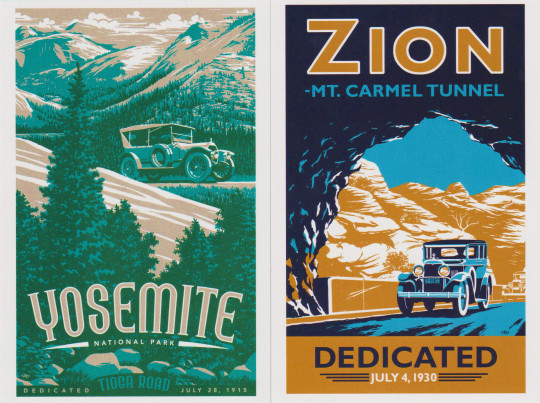
around then is also when i started trending towards using limited palettes and that was mostly inspired by various national parks promo artworks that would only have like 5 colors in them. wish i remembered who made these but heres ancient scans of some postcards i got at sequoia national park that changed me

in early 2019 i started wanting my style to be more cartoony so i would constantly peruse the backlogs of kiwi, officialspec, skunkes and mimiadraws to get whatever inspiration i could from them
in late 2019 i completely pivoted for some reason and started doing lineless rendered semirealistic stuff instead. i think that was mostly cus i hated doing lineart. one of my biggest inspirations in that era was atissi
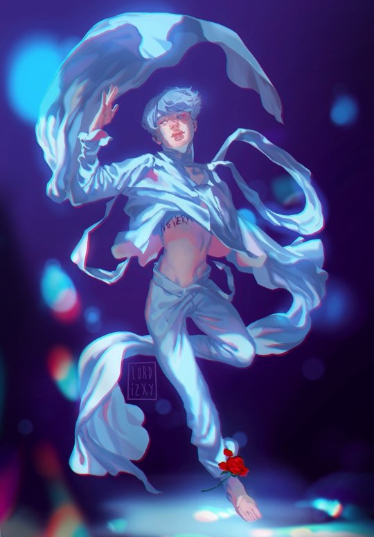
in 2020 i remember i went crazy stupid on using glow effects and chromatic aberration on stuff and i genuinely think all of it can be traced to this ONE piece of bts fanart by lordizxy on twitter like i was fully obsessed (putting it below also in case it gets deleted somehow)
mid 2021 was when i got tired of semirealism and thought it was too amorphous and restricting so i went back to cartoony shit. i was still looking at the artists i listed for early 2019 but i also added artists like iplidl, catmunches, and chunkysoup22 to the mix
2022 was an inspirationless nightmare i have no clue what i was doing for that entire year. the artblock was BAD. i mostly just looked at art from all the artists i mentioned before while artistically wandering in circles. a lot of this was me trying and failing to figure out whether i wanted to do more dynamic yet less rendered art or... the opposite of that
thankfully in 2023 i finally FIGURED THAT SHIT OUT. i would say the current dorian art era started with this silly drawing of graydon and riley hivemind as a dogboy and a catboy ⬇️

you can kinda see the influences of all the cartoonists i listed above but a lot of the way i draw now is just. me trying to not make myself hate doing art. ive always hated redoing a line 30000000 times for clean lineart so now its sketchy. rendering my art was making my drawings feel super stiff so now thats all messy too. etc etc
i think Right Now the artists i go to for inspiration the most are still kiwi and skunkes, but i also found the artist robottoast recently who makes RIDICULOUSLY good furry art, its so full of life and personality and i definitely need to commission them someday. the most recent singular piece thats changed my whole shit up is this scott pilgrim fanart by benadieshekiel (also below) because i really liked how the clothes were fully rendered while the skin and hair are less detailed with clear lineart. so sometimes i do that too

ok i think that is as full of a chronicle of Dorian Influences that i can give you rn. i was not lying when i said i wanted to yap. hope you enjoy <3
#ask#saintsdead#also obviously have influences for the themes in my original work but i do not feel like going into all that tbh#how my art Looks is MUCH easier to trace
6 notes
·
View notes
Photo

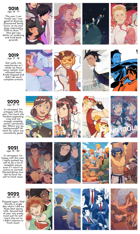
nine years of drawing with a digital art tablet baeby! i have some older traditional/non-tablet digital pieces as well but i dunno what year they’re from. i’ll make a more complete yearly progress chart next year.
overall, i’m pretty okay with things considering it’s just a hobby.
it’s still a bit frustrating to see that i peaked with pretty stuff in 2018, but as i said before i’ve improved a lot more in other ways and i don’t think i’d be happy with myself if i kept just drawing pretty faces with boring compositions.
before i compiled this, my feeling was that i thought i did really well in 2020. but that was just the year my posts did well on social media (did well for ME). looking back, there wasn’t really anything complete and unique that i liked a lot. and i thought i kinda flopped in 2021 ‘cause i didn’t post all that much, but i’m really happy with my output that year TBH. i want to draw more fun scenes and pictures with deep feelings!
the time i spend on a complete piece has decreased a lot because i’m more concerned with having an interesting atmosphere over making sure the rendering and anatomy is perfect. also, i’ve just gotten quicker at drawing overall. i always try to keep it under 10 hours nowadays unless it’s got lineart... that shit makes it take so much longer orz.
2022 kinda felt like a flop again, aw man. i kinda forgot that i spent a good part of the early year drawing a whole korekiyo dojinshi? i felt really down about it at the time since i was utterly unmotivated (it’s fucking korekiyo i don’t know how i cared enough about him to draw a whole comic about him), but now i’m like... woah... people actually enjoyed that? i sold out of all 28 copies i had printed, so now i’m considering reprinting it again. who knows...
anyway i got an ipad this year and started using procreate so i sketched a good bit more. i finished dai gyakuten saiban, got motivated by my chemical romance, and completed a bunch of stuff i was pretty proud of in a single week. unfortunately completing dai gyakuten saiban also made me fall in love with barok van zieks for some reason so i basically spent the second half of the year just drawing self-ship art and van zieks pr0n. it’s not even crap worth posting.
i feel like i didn’t complete or post that much (at least on my main account) because of that. but actually, i always forget i have more finished pieces for zines that i don’t post... idk if i should admit it but i use zines as a way to motivate myself to finish stuff honestly. i think without that i’d flop even more and not get me to draw anything... but i will stop doing that from now on because i don’t feel satisfied with my artistic output drawing for zines. bleh.
last year i was obsessed with making dojinshi and this year i got into merch stuff since i was tabling at a convention for the first time, but honestly...! it’s a pain in the ass!!! i don’t want to bother with maintaining an online store and i don’t want to create products for the sake of creating products so i’m only gonna make what i personally want from now on.
so i spent 75+ hours rendering a barok van zieks dakimakura.
I WANT TO THROW UP!!! IT’S SO SICKENING TO ME THAT THE PIECE I’VE SPENT THE MOST TIME ON EVER IS A FUCKING VAN ZIEKS DAKIMAKURA!!!! HE’S NOT EVEN IN MY TOP 5 ACE ATTORNEY CHARACTERS!!!!!!!!!! preorder link in my bio btw.
that was just 2 weeks ago basically, but i felt so fucking ill about it. luckily i finished off the year with a nice complete drawing so i’m happy and i love myself again ^_^
i want to focus on 3D art next year, draw more complete scenes, get around to my drawing idea backlog... get into some new fucking media because i am sick of that white man cursing me for the past six months. yep yep!
8 notes
·
View notes
Text
anon asked: Hi!!! I’m a tad bit shy so sorry if I seem awkward but… What inspired your art style? I noticed that you have very soft coloring and you have very cute art
hmmm i suppose a good part of it is inspired by enstars? at least, i admire the enstars art style a ton and it probably shows in the way i draw the characters somewhat, though it's not like a 1-to-1 replication of it by any means haha (i can't do clean lineart at all with the type of shading enstars does unless i purposefully try and replicate it which takes SO much time) i've been inspired by a number of art styles in particular though, many of them looking very different from each other? i can't really exactly point to one specific art style besides enstars that i can definitively say greatly influenced my art, it was more just me feeling inspired by certain aspects of how people colored, drew, painted, and the amalgamation of all of the artists i look up to shows in my art now? i did want to have an art style that had a more rendered, finished, almost paintery style while still maintaining a sort of anime-art style (i can't explain this well ahaha) but i don't know that that description particularly fits well with how my art style looks at the moment
i'm sure a lot of my art style now also comes out of the habits i'm just used to doing ahaha like how some of my 'finished' drawings are quite sketchy in a sense because i'm too lazy to sit down and render for hours and hours hgnhgh. i don't really do line art, because early on when i began drawing more seriously i was kind of frustrated with the whole process of doing line art and i preferred to do sketches and cleaned them up later in the process, and i have more fun drawing that way so i think that affects how my art looks a lot. it makes rendering SO time-consuming though, having to clean up all the mistakes because i was too lazy early on to clean up the little details :") i suppose that process does makes my art look the way it does so...
as for coloring, i'm honestly still learning how to color now ahaha i actually have no idea what i am doing in regards to coloring... coloring for me is just slapping colors onto the canvas and playing around with blending modes until hopefully something looks cohesive, though with playing around with colors and layer modes i've started to color in a way that's relatively consistent now? but my method of coloring is kind of all over the place and a little different compared to how i've seen other people may choose to color (throwing all the flat colors onto one layer and slapping a bunch of multiply layers and such until it looks cohesive) ... yeah learning how to color intentionally is definitely on the bucket list of things i want to learn, and some of my favorite artists are able to utilize color in such a beautiful way that i can't help but admire
thank you for the compliment!! my drawing process is lowkey whack, but i've drawn inspiration from so many artists even if my art really does sort of look nothing like some of the artists i greatly admire... to name some artists i've admired (even though my art looks quite different from theirs lol), i like gearous, @/velinxi, @/meltsmelts, @/cirqlr, and a bunch of other danmei artists over time. sorry for the long-winded rant, i like talking about art and artists i admire [Smile or comment on the answer here](https://retrospring.net/@airabuhan/a/110669242407708697)
4 notes
·
View notes
Text
Please read carefully before commissioning a piece from me!
As always, if you have questions that aren't answered here or something below is confusing, just ask! I’ll be happy to help!
What types of commissions do you take?
I will be doing character Headshot commissions the most since they are the least likely to burn me out and I can churn them out quickly. But, I will occasionally be doing larger works. There will be fewer open slots for these. In general:
10 Slots for Headshots
3-5 Slots for Larger Commissions
What types of Backgrounds can I get with Headshots? Larger Commissions?
Available Backgrounds for Headshots (you can choose a background fill or a shape/color block in most of the following):
transparent (no background)
solid (1 color background)
2-color gradient
2-color pattern (additional charge*)
Pride flags
stylized Pride flags (additional charge*)
Larger Commissions can have the same backgrounds as above or a scene. The scene will incur an additional charge based on what type of commission you ordered (colored sketch✳, lines, flats, cel shading, or full render✳).
*See next section for pricing and add-ons
✳Colored Sketch and Full Render are exclusive to larger commissions and cannot be ordered in Headshot Commissions
What are your prices?
Prices may change depending on circumstances. Prices shown are BASE or starting prices and are subject to add-ons!
Headshot Base Prices:
Lineart: Starting at $20 USD
Flats: Starting at $25 USD
Cel-Shaded: Starting at $40 USD
Add-ons are charges incurred for more detailed work, special backgrounds, and/or currency conversion fees.
Headshot Add-ons:
Intricate details: $5 USD
(super-intricate headwear, tattoos, mech, and/or jewelry)
Patterned Backgrounds: $2 USD
Stylized Pride Flags: $3 USD
(Example: cyberpunk character with techy pride flag)
Currency Conversion Fee: 4% of overall price
(To make up for Paypal's fee, I'll be charging more for customers outside of the US)
Larger Commission Prices TBD*
Do you do refunds?
No. I work with you extensively throughout the process, updating you and getting critiques from you and implementing your suggested revisions; all so that your end product is something you are happy with.
I don’t consider the commission complete until you’re satisfied with your product. If you don’t like the finished product at that point, honestly, that ones on you.
Can I get a background with all types of commissions?
No; not all. If you order a Sketch or Lineart piece, you will not be able to get a special background. Lineart is always B&W/ grayscale.
How long does the process take?
I will generally reach out to selected commissioners immediately to let you know you've been accepted.
You'll get a sketch within 3 days, possibly sooner depending on how many commissions I have in waiting (Headshots are quick). Once you approve the sketch, I'll send you an invoice.
After I have been paid, please allow up to 14 days to get your finished piece (also depending on how many commissions I have in waiting). Headshots tend to be quick, but just in case.
If I need more time due to life events, I will reach out to you and we can discuss the next steps.
Terms & Conditions
You must be 18+ (or age of majority) to commission a piece; meaning you are legally able to have your own account with Paypal and similar sites.
(Yes, PayPal allows invoices to be paid with Credit/Debit if you do not have an account, but due to the nature of some commissions, I am a bit uncomfortable working with minors.)
I reserve the right to reject requests
I exclusively use Paypal. Please be aware of this.
Please do not remove my signature. It will be small enough that it won’t interfere.
Please do not feed my work to an AI or resell/ develop as an NFT.
What to Expect:
Most times, there will be a Google Form to fill out as an application for a commission. Please fill this out when it becomes available if interested.
If accepted, I will contact you via my comms email. You may need to check your spam folder (I don’t think this will be an issue but just in case). This is where I will ask you to provide as many references for what you want as you can.
I will reach out to you with an initial sketch for you to approve within 3 days of acceptance.
Once you approve the design, I will send an invoice.
Payment will be due upon receiving your invoice. I will not start work on your approved design until I have been paid!
Please allow up to 14 days from the day of payment to receive your completed piece (more for a large commission; I will give you a better estimate while in contact). I will reach out if I need more time.
Please consider crediting me if you would like to post the work outside of Tumblr. You don’t have to, but it would be nice!
Do you have restrictions on what you'll draw?
Yes. See Below:
Will Draw:
Your Ocs
Blorbos*
Your Fursona/ furries
Mech (super-intricate stuff incurs an additional charge)
Light Kink (leather gear, some props, puppy masks, collars, etc.)
Won’t Draw:
Racist, anti-LGBTQIA+, antisemitic, Islamophobic, misogynistic, and other hateful content/symbols
Gore/ Horror
Pedophilic or incestuous content
Abusive or sexually explicit depictions of real people/celebrities
Super sexually explicit or violent acts (See gore/horror and abusive acts involving real people)
I will literally draw anything that does not fall into the "Won't draw" category. You are not limited to options in the "Will Draw" category; I'm only including them as examples!
*Specific Media Exceptions:
Media that’s fine, I’m just not willing to draw (I have made it twelve years on this site without seeing any of these and I don’t intend to start [not judging you - do you little dudes/dudettes/dudenbies, just curating my experience thanks]):
Superwholock
My Little Pony
Miraculous Ladybug
Steven Universe
Homestuck
Undertale/ Deltarune
Tumblr Sexymen™
Media that I will absolutely block you for asking me to draw:
Harry Potter
Attack on Titan
Dream SNP
Copganda (yeah ALL those shows)
Military propaganda (like C.O.D., Top Gun, etc.)
2 notes
·
View notes
Text
2023 Art Reso
So it’s already 2nd of Jan where I am, but fuck it I wanted to make a new year’s resolution post anyway :D
I’ve always identified as a pragmatic optimist - I want to believe that good things can happen, but if they are to happen they must happen while being grounded in reality. I kinda want to…change it up this year though. I want to be a bit of a dreamer and embrace that side of me. Life’s too short to stay in the doldrums of reality all the time, and it’s kinda limiting to do that too! You don’t really know what’s possible or “realistic” unless you take a chance.
So going to be a bit bold and daring on my art resolutions, stretch goals abound:
Character Drawing
Goal: Cover weak spots in drawing characters; issues that consistently appear in all my pieces.
P0 list is below:
- Fabric studies: EDGE CONTROL, 3D volume and rendering of fabric folds; not too fussed about the material itself as long as the basic fold volume is captured with good 3D form and shape language)
- Head studies: structure of head from multiple angles; facial proportions (distance between eyes, forehead height, etc.); facial features (3D volume of eyes, mouth, nose, ears, etc. how to simplify and stylise to my aesthetic tastes)
- Hair studies: 3D volume of hair, how to simplify and stylise using good shape language/capturing the silhouette effectively
P1 (these are lower priority because I can do passable versions of them in my art, i.e. they do not stick out as a weak point)
- Expressions, Hands
Style Studies
Goal: Improve and finetune my personal art style and aesthetic.
P0 focus will be on drawing and lineart; P1 is rendering.
- Master studies on drawing style; the goal is 1:1 copy, no need to extrapolate or personalise when doing master studies, just focus on achieving similarity.
- Not too sure if I should aim for quantity or quality. My experience has shown that higher quantity with a “passable” quality will get you to good quality eventually, whereas low quantity with high quality feels more like a one-time effort with less organic learning. So…focus on quantity with passable quality (it can’t be shit quality otherwise you’re just practicing the wrong thing repeatedly).
Dynamic Art
Goal: Make art look more dynamic, better “flow”, characters look alive and in motion.
Tbh the path to achieving this feels a bit more abstract to me, but I’ve distilled some practice areas based on some features that I’ve noticed in “dynamic” looking art.
- Gesture drawing: I never really practiced this, so my gesture drawing is weak. I mostly just referenced static poses, e.g. standing, sitting, from Pinterest. There are lots of courses on gesture drawing online, so will take a look to try to absorb some of the main principles (which are honestly unknown to me lmao) and do some timed gesture drawing as well. The goal will be to draw characters in movement in a natural and “flowy” way - exaggeration is needed in body movement.
- Linework: I’ve noticed that a lot of dynamic looking art has really good linework. This is especially obvious in lineart-only pieces, but even in partial/fully rendered works I notice that the line strokes and brushstrokes just look so dynamic and good. Line weight and direction contribute…wondering how to get better in them though. This is a bit of an unknown to me - so will need to do research.
- Lighting: This is more on the rendering side of things. Dramatic lighting schemes, strong separation of “light” and “dark” areas with daring emphasis on the protrusions of 3D shapes helps to create a very dramatic and dynamic look. Studying the structure of the face and dynamic lighting photography on the face could help (since the facial volume is the easiest to get “wrong”, you’ll need a strong understanding of the face structure to use dynamic lighting effectively instead of carving the face into an unappealing or inaccurate mass of shapes).
- Composition: I tend to pose characters very statically in the middle of the canvas, so I think a first-step improvement would just be to make them take up more of the canvas, to crop away some edges if needed, e.g. hair bits, shoulder (I get precious about keeping the entire character in, which makes the piece look a bit stiff at times). I think some style study is needed to supplement portrait studies for this, as I noticed most real portraits do not carry the full dynamic quality of drawn portraits since you can indicate movement in drawn portraits. I can focus on effective single-person composition first, with a stretch goal of handling multiple people in a frame.
- Perspective and camera angles: Related to composition. A dynamic pose can only go so far if the perspective is from a regular eye-level and we’re staring at the character straight on. Will need to work on drawing the human body in perspective and studying how different camera angles can convey different moods. The human body in perspective part might be a bit of a stretch goal tbh but let’s see how far I can go with it. Perspective is challenging enough when it’s not the human body lol.
0 notes
Note
Hello hello!
I come to you with an artistic existential crisis (feel free to ignore). So, I'm still kinda new to art, and I love drawing but the thing is, there so much stuff on social media, different people that I find absolutely amazing and I'm an easily influenced person and always come back to doubting myself on the path I'm currently taking. For exemple I do lineart but there are so many incredible lineless pieces of art that I question myself about this (I tried, it didn't feel right for me but I still feel like maybe I should try harder?) And then there are those who use thick lines while I do mine thin, muted colours versus bright colours or simply black and white...
So I guess what I want to ask is: how do you differentiate the art you simply admire and the element you actually want to put in your own art? How do you know what kind of stuff you want to make? Or I guess how you figured it out since you've been doing this for a really long time.
Anyway, thank you for gracing the world with your amazing art and have a nice rest of your day!
Oh it’s a daily struggle lmao, I see art I love and I’m like THIS WHAT I WANT TO DO and when I first started out, my style varied widely bc of that. But in general, my art is always influenced by whatever I’m currently interested in haha. Since I’m back on my Naruto BS, I take heavy influence from Kishimoto’s work, but I’ve added my own flair and stylistic choices based on my own experiences and personal taste. So it really is up to you on what you want to incorporate into your artwork.
I usually just keep a couple things in mind:
1. It takes time to incorporate new elements into your art style. Of course your style is going to be different from the original work, so whatever element you want to add has to be fitted to YOUR work, as it was fitted to the inspiration’s work. It may not work the first few times, it may not work the first dozen times, it may not work at all, but it never hurts to try it out. And Hey, you may even develop something new and better suits your style, which is what often happens to me haha.
Honestly there is nothing stopping you from trying out ALL of those different elements you mentioned, I certainly have before and I’m sure all artists have at some point. That’s the point of practicing and producing art! Go wild, especially since you said you’re just starting out
2. Keep in mind what your art goals are. Are you trying to achieve an aesthetic for professional purposes? Are you trying to match a style to tell a certain story?
For me, my goal is to be as LAZY AND FAST AS POSSIBLE. I don’t have much time to spent drawing so when I do want to draw something or make a comic, I want it to be done FAST. That’s why I rarely color. I simply don’t have the time to spend 8 billion hours thinking of a color palette and lighting and rendering artwork. Otherwise I’d never produce any content or finish any of the stories I want to write.
The same goes for linework, rarely do more than 2 passes of refining lines bc that would take too much time. That’s why my line work is squiggly and sketchy at times and that has somehow turn into a stylistic detail for me along the way. Of course, with practice, I’ve developed more confidence in line placement so I don’t have to do more than a couple passes anyway.
But this is just me, I don’t draw professionally and really only draw to satisfy my own interests, so this works for me. I am fully aware my work is not professional quality nor do I intend it to be, and I’m totally ok with that.
73 notes
·
View notes
Photo
@Izzy’s Dag-Dag The Artist… Tag
By @morgynemberisagenderfluiddaddy
~ Rules ~Show us a rendition of yourself in your own art! Can be anything! Sims render? Random stick figure? Picrew? Go nuts! (Just be sure to tag the artist if you use someone else’s picrew!!!!) Tag the blogs you want to know, and don’t be a dick that’s it! Also, feel free to answer as vague or in-depth as you want. And if you don’t want to answer a question for any reason just don’t vibe with it! Skip it if you wanna! Also make sure you tag me and use #dagdagtheartisttag so I can see it!!!!!!!!
Answers below, cause uh LONG and stuff.
~Questions~
1.) Do you prefer to be referred to by your name or blog name?
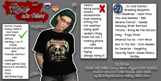
Either! I totally don’t mind. You can call me Beloved, Poison, Rose, or even V. (V is part of my true first name but I prefer my middle one of Rose) but yeah call me Bitch if you wanna, I’ll answer to ALMOST anything. I’m really not bothered. lol
2.) Where are you from?
England! Give me tea or give me death! XD No I’d actually prefer coffee but shhhhhh don’t tell the other Brits that, they’ll kick me out! :D
3.) Do you have pets? 👀
Yup! Just the one currently. My Burmese/Korat mix, SilverBullet or just Bullet.

4.) Tell us about your “dream”.
Uhhhh honestly it’s just to have a small house, a couple of Staffordshire Bull Terriers (English Staffies) and live happily with my partner and our spawnling. I don’t have big dreams, just Staffy sized ones. lol
5.) Aside from art, what are your hobbies?
Well I don’t really do ART as such but most of my hobbies are artistic in nature I guess? Photography, collecting Asian Ball Jointed Dolls and 1/6th Action Figures/Poseble figures, Writing (both original stories and fanfiction sometimes), anything to do with computers.
6. )Does anyone irl know about your blog?
Sure. My partner, my spawnling, I don’t really share it with anyone else because they just wouldn’t be interested/understand but that’s fine with me!
7.)Do you know anyone from your blog irl?
Sadly not. There are some truly awesome people that I would love to know irl if that were ever possible though.
8.) What are some fun facts about you?
uhhhh I mostly only have things I’ve already shared a long time ago or on my old blog but um... trained car mechanic, also trained child minder, I was 16 when I got my first tattoo (yes this IS illegal, behave kids don’t be a dumbass like me! seriously DON’T EVER do this!) I have 8 piercings and I want more, I’m dyslexic and also slightly ambidextrous and I have monkey feet as my partner calls them. I’m fairly good at picking things up with my feet. lol
9.) What’s your day job?
Currently I uh... actually don’t have one. I’m watching over my partner who’s mentally unwell and unable to work himself.
10.) Do you have a celebrity look alike?
Nope. Don’t think so. I kinda used to get compared to Lucy Lawless aka Xena the Warrior Princess when I was younger and honestly I am DOWN with that! (though I know I never actually looked anything like her, my mum kinda did but I look more like my dad soooo lol)
11.) What’s your aesthetic?
Uh I’ve always been told it’s a little bit goth, a little bit punk, a whole lot of black, silver and resting witch face. ;)
12.) What kind of artist are you?
Digital and an editor? idk honestly, like I use photoshop and my digital drawing pad to make small changes to my photography/sims pics/colour peoples linearts when they let me but does that make me an actual artist of any kind? lol But also idk does writing count? It’s a form of art in a way so...
13.) How did you get into your form of art?
Since it’s mostly all photography or to do with photography (taking sims pics kinda counts as that really) uh basically my sister and brother-in-law are both heavily into photography and so was my father-in-law (RIP Dad <3) and I just sorta picked it up from all of them? I learned a few things and just picked up the bug and then it evolved into digital editing and then attempting digital art/colouring and just yeah it all spiraled into whatever this is.
as for the writing, well I watched Inuyasha and Naruto a long, long time ago and fell in love with the characters and stuff and somehow stumbled upon fanfiction and I was like Ooooooooo! I can write shit like this?! and uh I just started getting into various fandoms from there and writing all these stories based on them, the characters from them or just the basic worlds they take place in and so yeah it just went from there.
14.) What do you watch/listen/read/anything else while you create?
Usually I have either true crime programs or else fictional crime programs on as background noise. Things I’ve watched a million times before. I need background noise, can’t do silence. OR I have music on. a random playlist filled with a mixture of rock, metal, dance, trance and pop on shuffle usually.
15.) What is your favorite of your own creations so far?
Oh damn uh honestly it’s probably a threeway tie between this, this and this
I’m rarely actually proud of anything I produce but I usually kinda like it, these ones though, I still adore.
16.) How would you describe your art style?
Shit, no idea dude. Like style? who that?! I don’t know her. I basically don’t feel I have a style, not for this anyway. Just, I do whatever style is needed for the pic I’m trying to make. Sorry I honestly have no clue.
17.) What is more satisfying to you coloring or outlining?
colouring. I can’t draw for toffee, like at all so it’s defo colouring BUT I also can’t shade for jack either. so yeah idk.
18.) What meme would you use to describe yourself?
This one! It’s completely me. Honestly I know memes but I could not for the life of me think of a single one. Just happened across this one and went oh hi yeah that me! lol

19.) What character from any media form do you most identify with?
Uhhhh I never really thought about this tbh. I guess Kakashi from Naruto or Hermione from HP because well always reading! and I’m known as the human dictionary and also the human library so it kinda makes sense. But also The Hulk from Marvel. Cause well, ‘That’s my secret Captain, I’m always angry.’
20.) If you were on the run, what would you change your name to?
Axel or Cooper probably. idk very masculine names I know but most of the time that’s just me.
21.) Have you ever or do you want to change blog names?
Um yeah I kinda wanna actually. I picked this one because well hi I’m BelovedPoison and I do sims stuff. But it just sounds so stupid and meh now but I literally have no idea what cool or funny name to call myself. Sooooo we stuck here for now. lol
22.) God forbid Tumblr decides to pull a MySpace and lets us have page songs, what song would you choose?
Oh jeeze uh I have no idea honestly. Probably one of the songs that always scream Sarge, my oldest OC’s theme songs to me. Either I Stand Alone or I Fucking Hate You by Godsmack. #sorrynotsorry!
23.) Oh yeah, I’m still on the MySpace train and I’m starting discourse! Who’s your top 8?
Ummmm fuck I guess
@lazysunjade
@cyansimblr
@morgynemberisagenderfluiddaddy
@veethe
@raccoonium
@neriney
@amuhav
@oydis
I too just grabbed people I could think of at the time. I just went through the names I talk to the most often lately. It’s nothing against anyone, I love you all promise!
24.) Did you understand those references or did you have to look them up? (I’m fully away I’m ancient, but are you?)
OMG please don’t bring me back to my Myspace days... I remember when this thing literally just started. I was on there all the time. Yes I sadly understood everything there. lol
25.) One last question; why are you like that?
Who the hell knows! If you figure it out, could you explain it to me, cause honestly I have no more clue than you do! lmao
Dag dag?
Now tag tag!!!
other than the ones I’ve already mentioned/tagged above, gonna tag: @madeofcc @poetic-falls @aniraklova @ladykendalsims @katterpile @ds-sims @plasmavamp @kittenkatsims @pixeles @pixelit0s @disasterbri @saku-12 @wolfrynn313 @bloodmooncc and YOU! But you don’t have to do this if you don’t want to. Ok bye!
21 notes
·
View notes
Note
so like, ive been insecure about my art for a long while, cause i tend to have a very hard time connecting all my lineart. it ends up looking what i like to call 'fine i guess' but. i noticed that you Also dont connect all your lineart and it just, looks super gorgeous anyway?? like it takes absolutely nothing away from your peices like i expect it to in my own and thats inspired me quite a bit so i wanted to say thank you q>q;; anYways have a nice day jfbdjdh
Thank you so much!! And honestly, do whatever feels right to you! I don’t even do lineart, almost everything I put up here are supposed to be sketches, unless Im feeling fancy enough to actually color something. But using Implied line can make a drawing look really nice if you know where to use it. I usually like to have my art have more of a sketchy look as opposed to rendering it all the way (but uh... that’s mostly due to me not having the patience for rendering and clean lineart.) And for me, having good gestures in characters and having strong confident lines done in one or two strokes is more important to me than connecting the lines all the way. So if your gestures are strong and your linestrokes are as well, it still looks fine even if it’s not touching.
I’d probably be able to explain this better visually but, uh.... idk if you’d like me to elaborate on that. But yeah, honestly it’s also up to the persons style and how they like to draw, but again, thank you very much! And sorry for the big ol explaination rant.
186 notes
·
View notes
Note
does each alter have a different art style or different things that they're good at like line work or shading?
I’m sure there’s a bit of this going on, but honestly art is usually such a blurry mess parts-wise that it would be hard for me to say who’s good at what. I get the general sense that Rin and Moss are more intuitive with art--they like to experiment and tend to have a better grasp of, I don’t know, freeform creativity? I know at least Jasper prefers to do lineart, which pretty much nobody else enjoys...but he hates sketching, composition, and rendering. But that’s about all I can think of off the top of my head.
Oh, somebody just wants to draw wings all the time. Like if we get frustrated over art it devolves to drawing wing shapes. I dunno what that’s all about.
Some of us also just can’t draw. I mean, we still have some muscle memory for it, but there’s a massive disconnect when it comes to actually getting something down on the page, and the finer points of our drawing software are temporarily forgotten. If we weren’t so touchy about art things in general I would offer to show some scrapped sketches, because they’re really....they’re really not good. (And for the past week or so that’s all we’ve been able to produce, which is really a bummer...)
9 notes
·
View notes
Note
do you have any favorite guro artists? im looking for more to follow ps your blog is great
ohhhhhhhh this is SUCH a great ask THANK U. i am definitely going to miss some people bc my brain is made of holes but YES OFC omg.
(also not a comprehensive list of my fav artists in general obv - most artists don’t really exclusively (or mostly) draw guro lol so its kinda difficultt? also these are just sorta ppl off the top of my head rN )
@corviday yall KNOW oh my god corviday has been one of my favorite artists forever, SUCH goopy chunky forms and really creative body horror and gore. look in the inktober/goretober tags for some suuuper cool stuff, i especially like the red-themed year and some goopy stuff from the orange one. they draw bodies so WELL forever insp for me
@catoad oh no i see that they are inactive now but they have a bunch of really cool illustrations on their blog already!! very simplified chunky style with kind of shaky lines that i really really like and idk a bunch of just like. fun characters and compositions and colors
@bunvomit has such a lovely sketchy and flowing style and such wonderful character design,, oh my gosh. ahhhh the body horror of it all is so GOOD . i cannot overstate how much i love her character designs askldjfh. and the palettes :))
@feverworm has some suuper cool gory stuff and their painting style is also my favorite. again it’s not like……a guro-only blog so there’s also a bunch of really great and unique character design, if you’re into that too. again one of my big insp artists just AHhsjkgdf
@saccstry does a lot of facial horror, lots of fucked up teeth and eyes and stuff but it never gets old, like it’s so varied despite all of the similar subject matter and that is SO impressive to me,, and like. mmmm reds on pinks.
@bubblebaath idk if this counts as like. guro art specifically but there is a TON of cool body horror and spooky dudes and really really cool effects work, like a ton of unique processes and rendering and weird lookin shit and i am also suuuper inspired by them alksjdhf
@routexx will not. get tagged. anyways some of my fav color palettes ever, like a lot of varied bright hues and really cool painting style imo. not a ton of guro latelyyyy but there’s a lotta good tg stuff in there if ya go back in their archive a bit - it’s like some of my absolute favorite art from that lil era of fandom for me idk
@nishou doesn’t have a ton of art on tumblr but what is there is wowowowowo such unique and detailed and flowing and cool body horror and lineart style. i don’t know their work as well but would recc checking them out :)
@astrono77153462 is again, not really guro, more like horror stuff but there’s so much cool art in there damn
@ciervobizarro OH MY GOD i almost forgot the most prolific guro and gore artist i’ve EVER come across, ENDLESS wonderful and creative art and like. i do not KNOW how all this gore art stays so fresh and varied bc like. aslkdjfhasdfhkj can i reiterate like. so PROLIFIC omg get ur guro art fix if u do not follow already but i bet u do. also i love the tiny lil animations
@princemeato AKJSGHFLAKSHF another artist with an incredible style that i almost forgot!!!!!! idk i just love the way they draw, it’s so…spiky?? and textured? and colorful and detailed and such cool poses and compositions and everything aklsjdfhakd GOD 10/10 good art omg. warning for some like, nsfwish stuff sometimes? idrk
@svnddlsnts is another one of my top favorite artists and super prolific yet again……..lots of varied gore, body horror, guro, and monster design type of stuff, suuuuuper unique and varied concepts and honestly just SO MUCH wonderful art to look through, and such a good lineart style and consistency just wow
@gloomilo is more like…..gothy demon girls and stuff, but there’s some blood in there if that’s what u wanna see! idk i love her art style as well
oh man….im so sorry i KNOW im missing people but this list is already SO long fsfjdgas sorry. i mean u can also just look thru my blog loll try r0ttenc0r3.tumblr.com/random and see whatcha get?? sometimes i do this because i like my own taste in art lmaoo. anyways, ik this sort of turned into more body horror stuff than guro but that’s more what i’ve been into lately, i guess? hope this is a varied enough list! ^^
#rottenpost#i got VERY carried away with this#but i still feel sort of guilty like i probably missed some or a bunch of artists that i like so ah#anyways anyways#will update if i think of anyone else lol#thanks for the ask!
28 notes
·
View notes
Note
hiiii! i just wanna say, i adore your art. second, im teaching myself to draw and while i can draw simple basics (mouths and sometimes eyes if im lucky), im still a beginner. ive watched many art videos and im still a bit confused on wtf im doing. so i just came here to ask if you had any words of wisdom for beginners? could be anything from what tablets to buy to simple mistakes to avoid. ive read some of the other posts here and have found it all extremely helpful so far! Thx for all you do!!
Hey there! Thank you so much!
I would put a read more but tumblr is broken. I’m trying to cover a lot of varied thoughts in little points, so if there’s anything you would like me to elaborate on or otherwise have questions on, feel free to shoot me an ask or dm me!
General
I think the biggest thing to remember is not to compare yourself extensively to others. A little bit of comparison is healthy... But too much will destroy your confidence, motivation, and take the fun out of art. Particularly if you are comparing yourself to someone older than you (life experience and coordination come into play here) or that has been drawing much longer (practice).
Additionally... If you’re not having fun (and you’re not getting paid to do it), don’t force yourself. If you find yourself being frustrated or bored with art, don’t force yourself to do it. That’s how you burn out and get art block! This applies to parts of a peice, too! If you don’t feel like drawing a face or a hand today? don’t force yourself to finish it. Come back to it later when you aren’t as frustrated or are getting better results. Even if its a week or a month from now. Honestly, at any given time I have probably ten headless bodies in my drafts. That’s okay! I just come back to them when I’m ready to do the face. And don’t be afraid to abandon something if it doesn’t feel right!
Something that also doesn’t get said enough.... take care of your body! I never knew when I started art, but artists are supposed to do warmup sketches and stretches and muscle exercises! I didn’t do any of this, and i went through a period of a few months where I was drawing for 5ish hours every single day. I developed carpal tunnel from it! So remember to take care of yourself. Take breaks, stretch, remember to eat.
Practice
Practice!!!! Even if its just for fifteen minutes every day. Or twice a week. But if art is something you really want to get good at, you have to put in the time and effort!! You can’t expect to draw an hour per month and be on the same level as someone who draws an hour a day!
I know I say this a lot but I think the biggest thing is just reference! If you don’t know what something looks like, look at a picture of it when you draw it! To go hand in hand with that, though, don’t just copy what you see! Learn from it and apply it! So take, for example, a shoe! pay attention to the way the heel is shaped, the location of the eyelets for the laces... how large the toe is, how steep the top! While you’re at it, look at other styles of shoes as well, and compare them! See what makes it look like a boot versus a trainer! And then the next time you draw it, hopefully you’ll remember all the things you learned the first time around!
I do lots of studies that serve no purpose other than to teach me things! I use referencing/studies to learn about color theory, shapes, and anatomy in a real environment. For example, hands or fabric folds! Oftentimes I’ll do them timed (20 or 45 minutes) so that I don’t fixate on perfecting things, just on the process itself and what I can learn from it. This also helps with getting better acclimated to your software and more coordinated with what you’re doing. Repetitive learning, like with playing sports.
I’ve realized a lot of people don’t quite understand what a study is? Basically you just look at a photo and try to replicate it so that you can learn about lighting or color theory or textures or anatomy or whatnot. So here’s an example of a timed study.
Additionally, don’t avoid!! We, as humans, have a tendency to avoid things that make us uncomfortable or are difficult. But it will make you a better artist in then end. When I first started, I absolutely hated doing fabric. I felt like I wasn’t good at it. So instead of avoiding drawing clothing, I sat down and did studies and sketches of different kinds of fabric. By the end of this learning period, I became comfortable with it and grew to enjoy it. These days, I adore sketching clothes, and it’s why my pants and shirts and things tend to be detailed instead of stylized in line art. If you don’t like drawing hands because you feel like you aren’t good at it? Sit down, look at a bunch of pictures of different hands, and practice it. By the end, you’ll be more comfortable, you’ll have learned something. Even if you feel like the drawings you ended up with aren’t good, you’ll still have learned, and that’s what matters!
Style
I worked on basics before I tried to develop a style. I made sure to start with a very realistic method at first, so that I could be sure I understood how fabric folds, anatomy, and realistic expressions worked before I tried to stylize them. I think in the long run this approach really paid off for me. It also allowed me to be conscientious of what elements I was absorbing into my artwork. I hear from so many artists that they started drawing when they were younger and into anime or cartoons or things like that, and tried to emulate it. Because those styles became so ingrained into their artistic skillset, it becomes near impossible to iron out those influences and get rid of them later. So starting with realism is a way to ingrain proper anatomy and other good practice into your artwork.
One way to develop style is to take a look at the artwork of someone you admire, and try to list out the things you like form their style - perhaps the thickness of their lines, or the way they do eyes. Do this with several artists, take all those little details you like and try them out! See if you enjoy using them in your own drawing process! Think of it like a grab bag or a pick-n-mix, sprinkling in the elements you like here and there to create something new and your own - not just copying another artists style word for word.
Don’t worry too much about it though; don’t allow yourself to become anxious or fixated on “achieving a style”. Its a natural ever evolving process that comes with time and practice. I know a lot of people get hung up on style, but just take it one day at a time!
Also try to keep in mind what style you’re going for as you begin drawing. And I don’t mean that like sailor moon vs. ghibli. I mean that as in, is this piece going to be a painting, a lineart, a lined painting, cell shading...? It will help you in the longrun if you narrow down the broad kind of style you use, and refine from there.
Workflow
My workflow for paintings is very different from my workflow for lineart and cell shading. A full tutorial on how I do paintings can be found here! A process video for how I cell shade can be found here!
Everyone is going to have a different method that works for them! You just have to experiment and find out how you like to draw! For me, personally, I use color blocking for painting (see the tutorial above) and a spine method for lineart. How the spine method works is that I will draw lines that represent the legs, arms, back, etc. so that I can determine the placement, length, and composition. From there, I’ll add a dark outline that actually shows the shapes of the body. Then, I’ll use thinner lines to add details. This is the method I’ve found that works for me. Another commonly used method that I’m sure you’ve seen is representing body parts with cylinders and cubes. There are lots of good tutorials out there on breaking down bodies into shapes like this!
Something that I do is if I’m not quite happy with a part of a drawing, I don’t just erase it. I duplicate the layer so that I always have the original copy, and then I make changes from there. Sometimes I can end up with five or six different versions of the same arm or face that i’ve made minor changes to. And then I compare and pick the one I like best, or condense all the parts I like from each version to make a “best” version.
Tools
Currently I use Procreate and the standard Ipad with Apple Pencil. Prior to March I was using a Wacom Bamboo Touch and Photoshop Elements 2008. I find its harder for me to do full paintings in procreate, but its made my life a million times easier for lineart and cell shading. The pen pressure is phenomenal, and I also adore that its wireless / active screen instead of plug in like the wacom. The programme itself is intuitive and easy to get the hang of; it simply lacks a lot of the neat tricks that photoshop has, like rendering (lens flares, for example), gradients, and gradient maps. Try testing out different trials of programmes... firealpaca, photoshop, autodesk, whatever it may be! What works for me may not work for you!
285 notes
·
View notes
Text
February 12th-February 18th, 2020 Reader Favorites Archive
The archive for the Reader Favorites chat that occurred from February 12th, 2020 to February 18th, 2020. The chat focused on the following question:
When applicable, what about a creator’s art might convince you to check out their comic?
carcarchu
I like a wide range of art styles so it's hard to pinpoint specifics but if an artist is able to draw very attractive looking characters (recognizable character designs, outfits that don't look like they came out of 2004 gap catalogue, characters that can still be recognized even when they change their hair style) then i find that very appealing. beyond that how well an artist can integrate the characters with the actual space they exist in is something i find very important as well. a bunch of floating heads can only carry a series so far. if the artist can make the characters feel like they properly exist in the space i think it can really elevate the series although in practice this is something very difficult to do.
Deo101 [Millennium]
For me, honestly some art styles are very inspiring to me and that will sometimes get me to read just because I want to see the art more and learn from it. Things like textures, colors, character design... It can draw me in just by exciting me as a learning opportunity
chalcara
For me art‘s the hook and story the line. Come for the art, stay for the story, you know?
Funnily I‘m looking less for pretty art and more for good visual story telling. I want the art to show whats going on without having to rely on dialogue.
Cronaj (Whispers of the Past)
I'm honestly very picky about art styles when it comes to comics, and that's a personal issue It has some to do with art styles being attractive to me, but honestly, the most important aspects of a creator's style to me are (1) consistency of style and anatomy, (2) level of completion, and (3) clear communication of what's happening. When it comes to whether or not I check out the comic initially, the main things that come into play with the promotional materials, covers, and/or thumbnails are contrast of the image and cleanness of the rendering. Of course, obviously, my personal tastes play into it. (I tend to like semi-realistic styles, sort of anime-ish but with a twist, or painted styles that may resemble concept art.) But honestly, probably more important than grabbing me initially to begin reading is readership retention. And that's where the 3 qualities I look for come into play: (1) Consistency of style and anatomy: This is probably the most important part for me as a reader. If I can't tell who is who because the characters change appearance from panel to panel, I'm ducking out, because that affects the clarity of storytelling. I also cringe everytime I see a particularly egregious anatomy error. I know what people look like. I see them every day. If I feel pain from looking at an artist's work, I'm not sticking around. (To be fair, everyone makes some kind of anatomy mistakes, but really it's if the anatomy mistakes are really awful to me and aren't as a result of a deliberate style CHOICE. Keyword, C H O I C E.) (2) Level of completion: This really just means that if it looks like the artist rushed through the panels or they were being lazy, I feel like their comic isn't worth my time. I mean, if an artist themselves doesn't care about their work, why should I?(edited)
. (3) Clear communication of what's happening: Once again clarity of storytelling is absolutely essential. If the composition of a large portion of the panels don't clearly show the actions of the characters, I can't follow the story. Aaaaaand as a bonus: Please, please, for the love of all powers that be, please, make your fonts legible. If I can't read the comic without squinting because your text is too tiny or hard to read, I'm not going to try. I have bad eyesight as it is. Take pity on your readers. I'm not going to suffer for your work. I have dropped far too many comics to count because the creator didn't care enough to make sure that the font was legible. And this applies to both desktop view, mobile view, scrolling format, and page to page format. Just.... Make your fonts big and clear.(edited)
sssfrs (JOE IS DEAD)
That's interesting to think about how recognizable characters are when their hair style changes. I might try to use that as a character building exercise
Deo101 [Millennium]
Solid excercise: can you tell them all apart when they're bald and naked?
Cronaj (Whispers of the Past)
OoooooooOOOOOOOOOOHHHH
I
Might partake that challenge
Deo101 [Millennium]
Also it's really fun to draw characters in all sorts of hair and clothes so idk what id do if I couldn't tell them apart when doing that!!! That's like 40% of my art!
Cronaj (Whispers of the Past)
This just convinces me more and more to do AU art
Deo101 [Millennium]
Yeah aus are another 20% of what i draw LOL
Look im drawing the comic most of the time so I wish to partake in non canon things the rest
carcarchu
@sssfrs (JOE IS DEAD) i've read series before where the character gets a hair cut / dyes it and i'm like WHO ARE YOU? IS THIS A NEW CHARACTER?
Deo101 [Millennium]
Oh another good excercise is drawing your Characters in many different styles and seeing if they remain unique when not in yours.
Cronaj (Whispers of the Past)
I want to do all of this
This is stuff I hardly ever have time for
So I am extra attracted to it
Also, there IS a time later in the comic where a certain character's hair gets partially burned off
And then he cuts it pretty short to get rid of the singed edges
And I feel like his hair is like 80% of his character design
So I'm just a little scared about that
Deo101 [Millennium]
Also, @Cronaj (Whispers of the Past) , I am unsure what you mean by "readership retention" with something that makes you interested in a comic, could you explain?(edited)
Cronaj (Whispers of the Past)
By readership retention, I mean aspects of the art that decide whether I'll continue reading past the first few pages
(obviously story comes into play as well, but I won't pretend that the art in the first few pages of a comic don't contribute)
Deo101 [Millennium]
Oh okay, I thought you meant like how many readers have unfollowed or something
Cronaj (Whispers of the Past)
Nah
More like, "oh cool! Your cover and blurb seem interesting. Lemme check out the comic!"
And then after reading the first few pages/chapter:
"ah... Not for me." Or "Nice, I'll keep reading!"
Deo101 [Millennium]
Gotcha
Capitania do Azar
Ohh I don't feel like dissing particular artsyle choices, but I know a few aren't for me. I'm no big fan of ultra realistic, hyper detailed stuff you usually see in super hero comics (other genres pick that style too sometimes and I still don't really appreciate). I particularly like artstyles that are distinct and recognizable, I have a hard time with stuff from different authors that just looks... Like a carbon copy (sometimes, the style being referenced is waaay too obvious and that is always a big no for me) Good use of color is key. Give me some good values too. I want colors to make sense and I am very tired of pink. I also appreciate consistency. If you give me artwork with a more paintery style but then the comic is cellshaded, that might tip me off. But not necessarily (tho I appreciate inner consistency inside the comic itself). Rushed stuff, like mentioned above, is also not a good look, but only insofar as it distracts me from what's happening in the story. Consistency is a very important word here, because I love seeing a common line that is able to take in all the differences that are necessary in character design and backgrounds, but also make me believe that they all could live in the same world.
Oh! And also: if the artstyle involves using lineart, I am really fond of sharp, clear lines with weight variation
sagaholmgaard
I'm curious about what you guys mean with consistency- do you guys not like if an artist's art style changes over the several years it might take to make a finished webcomic? Is it that it peeves you when the backgrounds are done in, say, a painterly style while the characters are done with lineart? Is it when the artists makes ordinary illustration work in a completely different style from their comic pages? (This is genuine curiosity I hope no one's feeling attacked rn ^^)
carcarchu
i personally really like seeing an artist's skills improve and evolve over the many years it takes to draw a series
even at the expense of a more "consistent" final product
sagaholmgaard
Yeah me too, it's one thing i really like about webcomics
chalcara
Can‘t talk about the others, but I get thrown off when one page is sprite comic, the next painterly, third cell-shaded without having a in-story-reasons for those style changes, like flashbacks or pov-changes. But more commonly, the issue’s the classic „comic‘s usually coloured, but oops, this time you only get the pencils because I had no time to update“. If that happens too often and/or doesn‘t get fixed for the archive I just lose investment in the comic.
Art evolution is natural, both in webcomic and published work with a dedicated artist.
Ah, that‘s another source of inconsistency - people switching colourists or even artists around. Once in a while is fine, but if it happens every month or so, I tend to get annoyed by it. It‘s actually why I killed my first webcomic twenty years ago; it was a collaberation and life kept getting in the way forcing me to switch colourists every five pages or so.
carcarchu
oh actually i have read a webcomic where they changed artist's 18 chapters in. i really fell in love with the magical and dark tone of the original artist and was engrossed in the world that they set up. they had a painterly style and it really set the atmosphere of the entire series but then the new artist had a super clean and cutesy art style and the sudden tonal shift really threw me off. in the long run the new artist was actually extremely consistent and better at actually releasing long chapters and very good quality chapters and the writing actually improved too because of it but it was never able to recapture what it was that i really loved about the original art style. also the new artist changed the character designs a little so the heroine was no longer even recognizable as the same person
since it was relatively early in the series i definitely would have preferred if they just got the new artist to actually redraw the first 18 chapters in the new style just so the change wouldnt be so incredibly jarring
chalcara
Any harsh breaks like that will cause some people to break away from the comic, I found. I dumped one of my favourite-for-years comic because the creator got bored by their main character and completely sidelined her in favour of a group of minor characters I had absolutely no interest in.
Didn‘t mean the comic got worse - by all accounts its still beloved by quite a sizable audience - it just wasn‘t for me anymore.
sagaholmgaard
Ahh that I can relate to. I get super attached to the main character and usually have a hard time getting into any spinoffs with the rest of the cast, even if I want to (and im a hypocrite because i also want to make spinoffs for ever side character in my own comic LOL) i guess if the style changed a LOT from page to page that would throw me off too. that feels like the artist is trying to experiment, maybe making sort comedic comic strips would be more acceptable then? Every style would at least be contained to one strip at least
DanitheCarutor
That's... actually a really good question. I don't really go for a specific aesthetic. Sometimes what's going on in the thumbnail attracts me, or it could be the use of color, the style, a character design. I'll check out a comic with just about any art style. I guess maybe if I have an idea of what the creator is going for with their art? Like, the art may have a lot of kinks, but maybe being able to tell what style they're trying to go for makes me want to check out their work? Honestly, I don't have a really strong art bias, as long as the comic is readable I'll go for almost anything. Maybe I won't check something out if the style looks extremely uninspired... like if it were the most generic, based off Japanese cartoons, style ever then I might give it a pass. But even then I do sometimes check it out anyway, so I really don't know! This question is surprisingly hard to answer! To give my last quip about last week's topic, since I don't want to derail the current one. I feel the creator's personal life is no one's business. I understand if they're a legit bad person, but digging into a creator's life to see if they qualify to be supported is... I dunno. This mindset makes me feel that if someone who liked my work ever tried to get to know me, they would be doing it solely to see if I'm good enough for them, which feels really invasive and predatory. I fully understand most people can't just enjoy something, that's how the world is, it just kinda sucks sometimes. The world kind sucks sometimes. Alright! I'm doing with giving my final thoughts on that subject.(edited)
Deo101 [Millennium]
The question is specifically about what draws you to art, rather than what turns you away so if you don't want to rag on any art styles that's not what it was asking for I think! Though yes it's very closely related (and it's not bad to say what you don't like)
Eilidh (Lady Changeling)
I definitely am more likely to read a comic that has a distinctive style - no particular style preferences, really. Interesting use of colour/value is definitely a bonus. But as long as it's engaging and the composition is good/readable, I don't really mind whether the art is "good" or not.
DanitheCarutor
@Deo101 [Millennium] I wasn't trying to rag on anything. I couldn't specify what about someone's art would draw me to their comic, it was easier to the one thing that might not, but I still said that I may be drawn in regardless. Sorry if I came off like a douchebag, totally not my intention. <_<'
Deo101 [Millennium]
No I know, someone earlier said "I don't feel like dissi g particular styles" I'll be honest I was typing my post as you were and so I didn't even read yours til after I said something(edited)
Just kind of a general thing! Feels like it went to what turns us away instead of what draws us in so just kinda a reminder of the op
sagaholmgaard
Readability is definitely important for me to want to continue following a comic, but what about the art that makes me want to read something...? I definitely have a preference toward cartoony styles overall. A solid character design will make me wanna check out a comic. If the main character has a recognizable silhouette and interesting shape language. I also love really bold lineart, especially if it's used to create shadow and contrast. Interesting color schemes too. I think how the background is drawn can really make me want to read something as well. I know BGs aren't people's favorite thing to draw but to me if the setting looks very well though out and designed, that definitely motivates me to check something out. And awe-inspiring sceneries are always hella cool! I read a lot of things outside of my artistic preferences though, but I think these are the things that might make me pick something up based only on the art itself.
keii4ii
I think I tend to find more appeal in certain compositions, which is a more subtle aspect of style. I am a major sucker for evocative use of backshots/ not-showing-the-(whole)-face, for one thing. Compositions that make full use of the three dimensional space around the figure(s) is another (this doesn't necessarily mean putting a lot of stuff around the character; you can have a mostly empty space and still make it feel very 3D).
(I hope both of those things show in my own works... I just love those things soooo much )
Deo101 [Millennium]
Oh I LOVE when a panel like... Cuts a face. Something about it makes me lose my mind every time
DanitheCarutor
@Deo101 [Millennium] Ooh! Lol sorry about that! I was so caught up with off computer stuff that I didn't notice anything else typing while I was. I haven't read the whole conversation yet, but I can see how it would turn to that. "What draws you in" is a hard topic to stay on. At least I imagine it would be since it's hard for me to talk about.
Ah! I admit I really like shots focused on scale, specifically ones were you can feel how tiny the MC is compared to what the camera is focused on. Does that make sense? Like the panel shows this ginormous thing, and it has the MC in it to show how massive it really is. That's awesome when done right.
Deo101 [Millennium]
Tiny little person. Yes. Very good
DanitheCarutor
Tiny people in giant worlds are the best!
keii4ii
I love those too!
DanitheCarutor
Oh, also this isn't a webcomic, but I've been interested in reading Vinland Saga after seeing this page on Twitter.(edited)
Something about extremely hideous expressions on semi-realistic faces jives with me.
FeatherNotes(Krispy)
What draws me in easiest is the design aspect of characters, environment and the webcomic title! It's a bit of a turn off when the title doesn't look polished. That's one of the main draws for me is an intriguingly designed logo with a catchy name that follows through their chosen aesthetic. I've seen many comics that stand apart from the title image they chose and it's a bit jarring to see! Great examples of wonderful execution of these aesthetics are BlackOut City, O'Sarilho, Sink Your HookTeeth and Shadrunners(obvs there are many more) I have to agree with @sagaholmgaard about backgrounds! There are quite a few creators who avoid them and stick to simple colours and gradients that just dont keep me in the comic- though my fave genres include a lot of world building, so BGs in a romance may not be emphasized as much. Lastly, dynamic character design!! I love a wonderfully crafted cast that allows me to read the characters easily no matter what setting or outfit they're in. Also it's really random but i do love an artist who can draw really good shoes?? That is always a draw in for me (edited)
Capitania do Azar
Oh I meant it in the way that if you spend a lot of time experimenting with different styles and techniques, you'll never be good at any of them. Style and approach changing over time is, imo, inevitable and good :) @sagaholmgaard(edited)
@@FeatherNotes(Krispy) I constantly think my logo looks like crap next to other webcomics', so thank you (edited)
DanitheCarutor
Oh god, @FeatherNotes(Krispy). Titles and logos are legit my weakest point, that part of the comic creation process is the worst! I have this cosmic-horror/fantasy comic I've been developing since 2005, and it took me till just last year to come up with a decent title. It'll probably take another 14 years to come up with a passable logo. Lmao!
FeatherNotes(Krispy)
It is really hard! Because that image/logo and name represents the body of work so firmly, its also got to stand strong with what it's representing and stand up to other titles too! Basically, i like to think of something that will help generate top results when i search on google for the title, which to me helps it stand on its own on the web, and sound catchy enough for pitches in person! I don't want to steer the convo away too much from the prompt, but there is definitely more to discuss about titles and their chosen aesthetics
varethane
@DanitheCarutor have you read Golden Kamuy? If you love hilariously hideous expressions in manga, it seems like it may be your jam lol
(it's also set in a specific historical period and contains a lot of really interesting material about the time/place it takes place in)
Also I feel like I have never, even one time in my life, come up with a good title for anything-- both Chirault and Wychwood are placeholder titles that I used just to kinda name the story for myself, which I initially intended to change when something better came along, and then nothing ever did
LadyLazuli (Phantomarine)
I know I'm generally drawn into a comic if it's just... generally a visual feast? And it doesn't even have to be a beautiful feast - just... a feast! A super intriguing artstyle, beautiful or not, is something for my brain to pick apart and enjoy. Detailed backgrounds, intricate costumes, fascinating presentation/layout... all the way to crazy expressions and fun asides, and even some gory or scary bits to make me go EEK. Basically, if I'm reading it, and my hand is twitching with the prospect of drawing fan art, then I'm in for good.
DanitheCarutor
@FeatherNotes(Krispy) Urg that is such a nightmare! And there are only so many different styles you can do for a logo, and so many variations of words, it's like how there aren't any truly original stories anymore. I got lucky with the title for my current comic, it's the most generic thing ever, but fits in a tongue-in-cheek way. @varethane I've never heard of it, but the face compilations I'm seeing are intriguing! Man, I love stupid facial expressions.
Capitania do Azar
@varethane golden kamuy, I see you are a fellow of taste as well
varethane
(I love it so much)
Capitania do Azar
@DanitheCarutor oh idk about the "only so many things you can do with logos", I've seen amazing things in this world, if there's a limit I'm not seeing it
varethane
(I can always tell exactly when I was binging it because there's a big chunk of my phone's photo gallery that's all screencaps of Asirpa making dumb faces)
Capitania do Azar
@varethane guys shooting each other in the woods? I'm always in for that
DanitheCarutor
@Capitania do Azar Lol I guess? I can't see how you can have an infinite number of designs for writing, while still trying to keep it vaguely readable. But I really don't like lettering, so my imagination is hardcore lacking in that department.
Capitania do Azar
Lettering and logo design are their own fields of expertise, it's ok
meek
Hmm I'm similar to a lot of previous responses where I can't pinpoint a specific style or trend of art work that draws me in because the styles of comics I read differ incredibly. That being said, there are some things that I do look for to keep me coming back: 1) Consistency of style/anatomy: unless there's a specific reason for the general art style to change (not including semi-deformed or chibi versions of characters), I appreciate characters staying proportionate or just otherwise consistent throughout the comic. And art evolution isn't something that's at odds with consistency, it can actually help that by making characters more distinct and easier to distinguish from each other. 2) Potential for art evolution: Almost the opposite of the previous point lmao but if I find a new comic and I see the latest page is of a much higher skill level than the first page, I'm immediately hooked. I want to see the journey. And I want to see how far that journey goes, even past the point where the art "gets good". There's at least one comic that I can think of where once it hit the style that it wanted to, the art has stayed consistent for the past several years but so much so it's almost plateaued and become stagnant. It's still good art, by all means! But I want to see it grow and evolve more. 3) Good panel/speech layout: Okay it's not quite art in the same sense but someone else mentioned this above and I think it's important too? There are so many comics I can think of that I couldn't read or I dropped off at a point because reading was a chore, either because of giant or unsightly speech bubbles, tiny or ill-fitting font, a combination of the two, etc. Sure, graphic design and layout is a skillset completely different from pure illustration, but it's one worth knowing because otherwise you could do a disservice to your art and your story.
Cronaj (Whispers of the Past)
@meek Seriously, the text is so important to me, and I consider it a large part of page layout and design
meek
Agreed!! It's something that bothers me with printed comics all the time. I've tried to read so many "classic" graphic novels and I just.. I can't get past the giant text boxes with small font with miniscule kerning and ESPECIALLY if they then add color to it. Please, keep in mind your readers with reading difficulties But to turn this into a positive One of my favorite things that also helps make a comic feel more personal is when the creator turns their handwriting into a font or otherwise have FUN with the speech bubbles
Cronaj (Whispers of the Past)
YES. As someone with bad eyesight, typography is one of my favorite aspects of finishing a comic page.
Deo101 [Millennium]
It also is super important for me with ADHD, reading is hard enough as is! so bubble layout and clarity can really bring the whole thing together and elevate a comic
Eightfish (Puppeteer)
I tried that but got the feedback that my text is hard to read and the way i format my speech bubbles is distracting (: But some people have said they really like it so ¯\_(ツ)_/¯ Though I do think I could have done better with the font. I have good eyesight and bad handwriting do I think i have a much easier time reading weird text than many. Since you guys care so much about text, would you mind taking a quick glance at my comic and telling me how readable it is? It'd be nice getting feedback from random people as opposed to only my readers who felt strongly enough to leave a comment unprompted
meek
Oh man I have this specific panel in mind from some early 2006 Avengers comic of like.. what not to do Basically it was a bright yellow text box with this white/light blue font. It was just. It was a nightmare to read Oh sure!! Definitely send me a link
Cronaj (Whispers of the Past)
Yep! Send me a link too! I'd love to help you out
I also have a good typography book to recommend if you're interested. I can drop it into #art_resources(edited)
Eightfish (Puppeteer)
Here is link: https://www.webtoons.comen/challenge/puppeteer/list?title_no=290620
Thanks for taking the time to give me critique!
Cronaj (Whispers of the Past)
The link's not working, but I can probably find it on Webtoon
Eightfish (Puppeteer)
And I think i dould find a typography book interesting, so yes please do send the link
Sorry, i think the link is missing a slash
Did we both delete the link
Deo101 [Millennium]
did we both delete a
yah
i got it
Eightfish (Puppeteer)
Lol
Deo101 [Millennium]
https://www.webtoons.com/en/challenge/puppeteer/list?title_no=290620
Eightfish (Puppeteer)
Thanks
Cronaj (Whispers of the Past)
I found it
(The font is a bit small on mobile, but the font is fine?)
Eightfish (Puppeteer)
Wait can we move to shop talk?
FeatherNotes(Krispy)
(maybe we can have this discussion on shop talk channel? )
Cronaj (Whispers of the Past)
Sure
FeatherNotes(Krispy)
OH LOL
DanitheCarutor
@Capitania do Azar Oh god, they so are! I envy anyone who enjoys that craft, I'm a lot better than I was, but lettering is still so hard. ;v; At least the fancy stuff is hard, regular speechbubble lettering is easy as long as my hand cooperates.
Cronaj (Whispers of the Past)
There's a book I had to read for a web design course I took, and it is seriously a life saver
It put text in a whole new perspective
DanitheCarutor
I do all my lettering traditionally, but maybe that book would be helpful, I legit hate doing it no matter what medium I use. (sorry for continuing to derail the channel.)
Capitania do Azar
@DanitheCarutor i used a website that converts handwriting to fonts + font forge for tweaks to get personalised fonts
DanitheCarutor
I used to type bubbles out, and I've thought about it for my current comic but I mix up words and letters really bad, and I forget to add words entirely while typing. It wouldn't be so bad if my brain saw the mistakes while rereading everything, although sometimes it takes a couple days or another set of eyes for me to actually see them. When I write the bubbles in with a pen I make a lot less mistakes since it takes more effort to write out each letter, also my brain can keep better track of the ones I do make. I feel like that's an excuse that makes no sense.
Deo101 [Millennium]
no it totally makes sense
snuffysam (Super Galaxy Knights)
I can't say I'm ever especially drawn in by art? Besides the sense of "it looks like a lighthearted action story and I like lighthearted action stories", not much catches my eye. Though, I will drop a comic if I'm put off by the art. Like I can forgive if some things look janky at the start of the comic, but if that jankiness doesn't improve over time, I'll drop the comic. I'll also drop the comic if the character designs are bad (i.e. indistinguishable from each other, or in rare cases just too gross to look at). But again, I can't exactly say "good character designs draw me into the comic" because a lot of comic banners/thumbnails don't really show off full character designs.
chalcara
Varied bodytypes are catnip for me. And I like comics with expressive characters over comics that limit expressiveness to keep the characters pretty.
Eightfish (Puppeteer)
Oh, definitely agree with that second part. Comics where it looks like everyone has had a ton of Botox is a huge pet peeve of mine
Like, eyebrows are not the only part of the face that can move.
Do more
renieplayerone
Yeah i agree with the janky art thought. I think it helps me follow through the jank if i see that the later pages, the artist has shown growth, and i dont want to force anyone into a "gotta redraw it" loop if thats not something they want (of course everyone has their reasons and theyre also valid af) Ill tend to be more forgiving about the jank if i know its someones first webcomic or first comic in general, because you cant learn how to make comics without actually sitting down and making the dang thing. So yeah, the jank can be a double edged sword(edited)
What super draws me in is comics with a great sense of color. While i love anything vibrant, if the softer watercolors are done well, they're chefs kiss. Prime example of that is Stand Still Stay Silent
mariah (rainy day dreams)
I've been thinking about this question all week and I think I finally boiled my answer down to something short, sweet, and to the point. It's gotta be some kind of spooky and some kind of cute I have a pretty broad range of art styles I like and I definitely also read stuff that doesn't fall under those categories, but I think my favorite stories or artists are some blend of those two things. I don't really have a preference between color and greyscale. Like I definitely love a good color feast comic, but if you know how to use your grey tones or even just black and white well it's just as good for me. Maybe that's also just me trying to justify being mostly a greyscale artist to myself TuT
FeatherNotes(Krispy)
@mariah (rainy day dreams) devils candy would def be up your alley then!
mariah (rainy day dreams)
Devil's candy v good
renieplayerone
Devils Candy is amazing
mariah (rainy day dreams)
I love to combination of cute monsters and action also.
DanitheCarutor
@renieplayerone I'm not sure if it fits totally with your preference, but if you're looking for watercolor Lost Honey is gorgeous! https://www.losthoney.com/
mariah (rainy day dreams)
Lost Honey is another great comic great to look at, really interesting world
DanitheCarutor
It's one of my faves! ;v; There is another comic that was half watercolor half digital that I used to love reading (if I remember right pages set in the current time were digital, and backstory stuff was in watercolor.), but it has been discontinued for years now. It was called Toilet Genie/D00R, a comic about a genie who was locked in a public toilet and was awakened by a pug that got thrown out by her owners. It was so pretty, with such an interesting style!
mariah (rainy day dreams)
Oh wow I haven't thought about that comic in 5 years! X'D I didn't read much of it, because I don't think there was much of it available at the time, but yeah, that one was also very pretty (edited)
renieplayerone
Oh those colors are really pretty!!
DanitheCarutor
Right? Lost Honey is total eye candy. @mariah (rainy day dreams) Yeah, it's sad the creator never got to finish it. I think about it every so often since it's one of the extremely rare (semi)watercolor webcomics out there.
Also I'm extra attached to traditional mediums since I work in a traditional medium myself.
mariah (rainy day dreams)
Same. Got that ink wash/watercolor bias.
Eilidh (Lady Changeling)
My current comic is marker shaded but I so want to do something with ink wash after this one...
DanitheCarutor
Yeah, right now I'm working with color pencils since they're cheap but I want to give gouache or acrylic a try for my next project, depending on which story I do.
Kabocha
Hm, the question is... a lil' challenging to answer. I think in a lot of cases, the art isn't necessarily what gets me, but when it does -- Sometimes it's when someone uses a resource I like/made and I can go "OOOH! I know that thing you used!" Screentones are another one that gets my attention pretty quick. Sparkles... And probably effective spot color use. As much as I enjoy many full color webcomics, there are many that get tiring to try to read for one reason or another (usually it's either a font or a saturation issue - too many similarly saturated colors near one another gets tiring to read). Also, soft coloring. Oooh, just... when the art feels like it ought to be printed on those soft-touch covers... Yeah, that gets my attention. ...and watercolor/inkwash, too. ... okay that's a lot of things that grab my attention, but tl;dr: oh hey look at all that cool stuff that people can do!
mariah (rainy day dreams)
That was part of what was so hard for me thinking about this question cuz really, a lot of things get my attention X') and the more I thought about it the more I was like "I like when a comic is like X, but oh also Y is great and I do really enjoy Z as well!" I just ... like so many things. But I think that's better than being really picky. I've meet some folks that are super picky about art and basically only like one style and I'm just like... you're missing out on so many amazing things!
Kabocha
Right? And heck, even in some comics where the style would normally be unappealing (to me), there's just something about the art and the aesthetic that clicks to make it all work together for that project.(edited)
I do think, though, that there's always going to be a special place in my heart for greyscale or screentoned comics. There's just something about art that knows how to effectively make use of shading and contrast to make their work... well, work for me.
kayotics
Art is probably the first thing that draws me in to read a comic. The top, top tier thing that gets me to pay attention to a comic is really strong inks. I love inking, and unusual inking styles. To those who know me, that's probably incredibly unsurprising. I also love really angular styles. Some other stuff I gravitate towards: cartoony styles, expressive faces, and kind of ugly characters. I enjoy seeing characters that might be described as plain or are drawn in a bit of an ugly way. The last thing that draws me in? Hands. If an art style pays attention to hands, then I'm all for it.
mariah (rainy day dreams)
Does a comic have characters with big, crooked, toothy grins? I'm down for the count X'D https://media.tenor.com/images/618576ebcc4f6d2a12438624be77c54f/tenor.gif
varethane
oh hey, did someone mention webcomics done in ink wash/marker?
Chirault was that!
1367 pages of..... ink with greyscale marker..........
FeatherNotes(Krispy)
honestly blows me away that you toned it traditionally like, all of GJS is inked trad, but to ink AND tone in marker is just.....damn
sssfrs (JOE IS DEAD)
I love ugly characters
RebelVampire
When it comes to art, I'd say there are about four factors that will draw me in.
First, readability. Can I visually follow wtf is going on in the comic? I have no interest in the visuals if I can't understand what action characters are taking. So the first point is always for if that is true.
Second, character distinguishability. Can I tell one character from another? I am notoriously bad even in real life at being able to tell people apart, so when reading for fun, it's super important to me that I don't have to put a lot of effort into telling characters apart (exceptions for identical twins, of course). Third, personal appeal. Do I think the art is pretty or cute? Like, obviously this is subjective so I can't really put into words why I'd find one style appealing and the other not. But ya know, I like stuff I think is pretty to look at. Fourth, backgrounds. If a creator puts a lot of effort into their background scenery, I'm very sold on it. I love beautiful backgrounds, and the effort put into them give me an overall better impression of the comic as a whole. Since it takes some real passion to take care with backgrounds. All this being said, I'm not much of a stickler for art. If a comic is well-written enough, they can fail all these points and I'll still read it. This is just a list of what aspects have to be in the art for it to draw me in.
Eightfish (Puppeteer)
My points are pretty much the same as Rebel's, with the addition of a few things: I adore comics with dramatic facial expressions and consistently excellent anatomy. Also, if the art style is unique? If I feel like I've never seen someone draw that way before? That's ++. So good. I've read comics where I thought the art was good but the story was mediocre, but I've never read a comic where the art met all my points (and Rebel's), where it made me go, "holy fuck," audibly, and then had the story disappoint. Comics where the art made me go "holy fuck" audibly: Excecutioner's Academy: The art is so pointy and colorful and detailed and weird. It's full of personality and life and so are the characters. Warning: hiatus comic ): https://tapas.io/series/Ex-Ac Ava's Demon: You guys know about Ava's Demon, right? With original music and animations ending every chapter, this might be the most effortful comic I've ever seen. https://www.avasdemon.com/pages.php#2611 Sfeer Theory: Everyone looks so different from each other, it's fantastic. Some characters are not conventionally beautiful, yet they're still so appealing. And backgrounds! And a thought-out and unique magic system! https://sfeertheory.com/comic/01-00/ Electric Bones: Backgrounds! Banter! http://electricbonescomic.com/index.php/comic/page-001/ I also loved Prague Race, but unfortunately it was cancelled ):
If anyone else has recommendations for comics with amazing art, I'd love to hear them!
Cap’n Lee (Flowerlark Studios)
For me, it just has to be an art style I like to attract my attention. I generally like realistic art, stylised art, or pretty much any style that hasn’t been done to death (like generic anime art; much as I love manga, I’m really tired of the over-saturation of bland and soulless anime-inspired art). Pretty much anything unique and well executed will grab my attention. I especially like greyscale and limited palettes.(edited)
And just to clarify, I do like anime-style art when it has expression and/or skill behind it; just not when it looks generic and manufactured. Overall, though, it’s the writing that’s ultimately the most important thing to me in a comic, so I’ll enjoy comics for their writing even if I’m not a fan of the art.
#ctparchive#comics#webcomics#indie comics#comic chat#comic discussion#comic tea party#ctp#reader favorites
1 note
·
View note
Last Seen Blogs
believefx
aliens are real scully

israelindie
Wake Up With a New Song Every Day
williambetterfan
William

quinnpunchline
Quinn Punchline