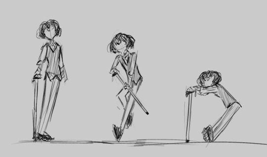
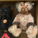
#But practicing helps anyway
Text

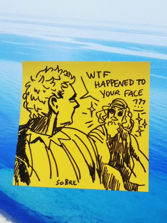
Practicing my aziraphale on post it
#good omens#aziraphale#crowley#ineffable husbands#aziracrow#bildad the shuhite#Post it#The first one is laminated and it looks great!!! Almost like a transparent polaroid#Crowley is si much easier to draw#But practicing helps anyway
89 notes
·
View notes
Text
the shining sun!! ☀️

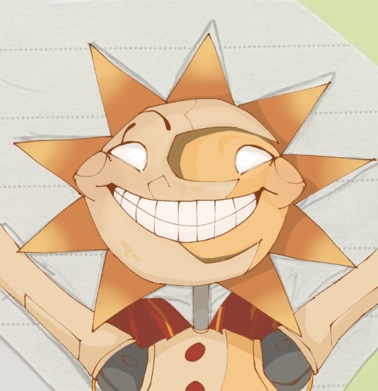
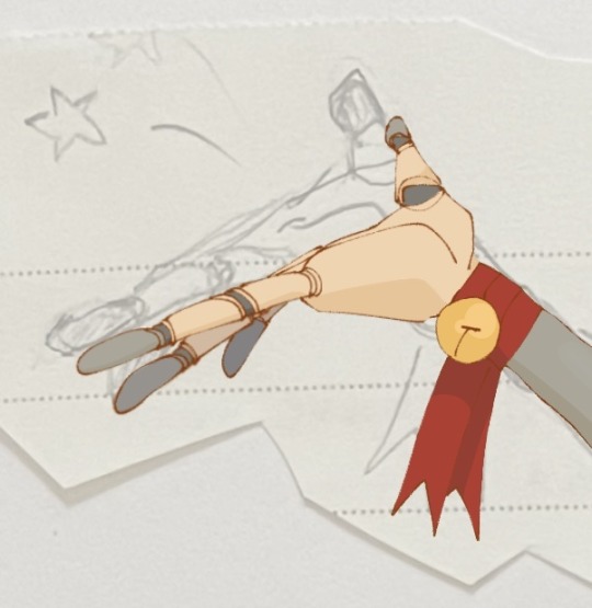
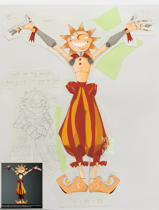
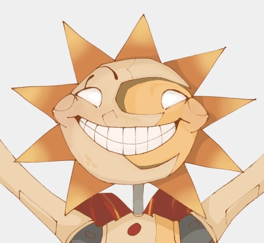

#yippie !!!#im mostly doing these for practice but they are so fun like? lookit him hehe#i must do moon next! my boy!!#also!! if you have any pictures of their models…. i would very much like to borrow them please#for reference#i have like. over 80 rn but… i need MORE#anyway!!#fnaf#my art#mita doodles#fnaf sb#fnaf help wanted 2#fnaf daycare attendant#fnaf dca#fnaf sun#sundrop#as i was writing these tags i got my acceptance letter email?? (hooray)
1K notes
·
View notes
Text
okay he’s kinda sweet actually
#my art#single-handedly responsible for his caffeine addiction 👍#I love talking to him bc he’s always like#“there’s just no patients anymore… it’d sure help the practice if someone got grievously injured.. stay safe farming :)”#I’m sorry pelican town is too healthy for you sir#anyway my farm is suffering I just keep talking to people#stardew valley#sdv#stardew valley fanart#digital art#digital artwork#sdv fanart#stardew harvey#stardew valley harvey#sdv harvey#procreate
792 notes
·
View notes
Text
why Aurora's art is genius
It's break for me, and I've been meaning to sit down and read the Aurora webcomic (https://comicaurora.com/, @comicaurora on Tumblr) for quite a bit. So I did that over the last few days.
And… y'know. I can't actually say "I should've read this earlier," because otherwise I would've been up at 2:30-3am when I had responsibilities in the morning and I couldn't have properly enjoyed it, but. Holy shit guys THIS COMIC.
I intended to just do a generalized "hello this is all the things I love about this story," and I wrote a paragraph or two about art style. …and then another. And another. And I realized I needed to actually reference things so I would stop being too vague. I was reading the comic on my tablet or phone, because I wanted to stay curled up in my chair, but I type at a big monitor and so I saw more details… aaaaaand it turned into its own giant-ass post.
SO. Enjoy a few thousand words of me nerding out about this insanely cool art style and how fucking gorgeous this comic is? (There are screenshots, I promise it isn't just a wall of text.) In my defense, I just spent two semesters in graphic design classes focusing on the Adobe Suite, so… I get to be a nerd about pretty things…???
All positive feedback btw! No downers here. <3
---
I cannot emphasize enough how much I love the beautiful, simple stylistic method of drawing characters and figures. It is absolutely stunning and effortless and utterly graceful—it is so hard to capture the sheer beauty and fluidity of the human form in such a fashion. Even a simple outline of a character feels dynamic! It's gorgeous!
Though I do have a love-hate relationship with this, because my artistic side looks at that lovely simplicity, goes "I CAN DO THAT!" and then I sit down and go to the paper and realize that no, in fact, I cannot do that yet, because that simplicity is born of a hell of a lot of practice and understanding of bodies and actually is really hard to do. It's a very developed style that only looks simple because the artist knows what they're doing. The human body is hard to pull off, and this comic does so beautifully and makes it look effortless.
Also: line weight line weight line weight. It's especially important in simplified shapes and figures like this, and hoo boy is it used excellently. It's especially apparent the newer the pages get—I love watching that improvement over time—but with simpler figures and lines, you get nice light lines to emphasize both smaller details, like in the draping of clothing and the curls of hair—which, hello, yes—and thicker lines to emphasize bigger and more important details and silhouettes. It's the sort of thing that's essential to most illustrations, but I wanted to make a note of it because it's so vital to this art style.
THE USE OF LAYER BLENDING MODES OH MY GODS. (...uhhh, apologies to the people who don't know what that means, it's a digital art program thing? This article explains it for beginners.)
Bear with me, I just finished my second Photoshop course, I spent months and months working on projects with this shit so I see the genius use of Screen and/or its siblings (of which there are many—if I say "Screen" here, assume I mean the entire umbrella of Screen blending modes and possibly Overlay) and go nuts, but seriously it's so clever and also fucking gorgeous:
Firstly: the use of screened-on sound effect words over an action? A "CRACK" written over a branch and then put on Screen in glowy green so that it's subtle enough that it doesn't disrupt the visual flow, but still sticks out enough to make itself heard? Little "scritches" that are transparent where they're laid on without outlines to emphasize the sound without disrupting the underlying image? FUCK YES. I haven't seen this done literally anywhere else—granted, I haven't read a massive amount of comics, but I've read enough—and it is so clever and I adore it. Examples:


Secondly: The beautiful lighting effects. The curling leaves, all the magic, the various glowing eyes, the fog, the way it's all so vividly colored but doesn't burn your eyeballs out—a balance that's way harder to achieve than you'd think—and the soft glows around them, eeeee it's so pretty so pretty SO PRETTY. Not sure if some of these are Outer/Inner Glow/Shadow layer effects or if it's entirely hand-drawn, but major kudos either way; I can see the beautiful use of blending modes and I SALUTE YOUR GENIUS.
I keep looking at some of this stuff and go "is that a layer effect or is it done by hand?" Because you can make some similar things with the Satin layer effect in Photoshop (I don't know if other programs have this? I'm gonna have to find out since I won't have access to PS for much longer ;-;) that resembles some of the swirly inner bits on some of the lit effects, but I'm not sure if it is that or not. Or you could mask over textures? There's... many ways to do it.
If done by hand: oh my gods the patience, how. If done with layer effects: really clever work that knows how to stop said effects from looking wonky, because ugh those things get temperamental. If done with a layer of texture that's been masked over: very, very good masking work. No matter the method, pretty shimmers and swirly bits inside the bigger pretty swirls!
Next: The way color contrast is used! I will never be over the glowy green-on-black Primordial Life vibes when Alinua gets dropped into that… unconscious space?? with Life, for example, and the sharp contrast of vines and crack and branches and leaves against pitch black is just visually stunning. The way the roots sink into the ground and the three-dimensional sensation of it is particularly badass here:

Friggin. How does this imply depth like that. HOW. IT'S SO FREAKING COOL.
A huge point here is also color language and use! Everybody has their own particular shade, generally matching their eyes, magic, and personality, and I adore how this is used to make it clear who's talking or who's doing an action. That was especially apparent to me with Dainix and Falst in the caves—their colors are both fairly warm, but quite distinct, and I love how this clarifies who's doing what in panels with a lot of action from both of them. There is a particular bit that stuck out to me, so I dug up the panels (see this page and the following one https://comicaurora.com/aurora/1-20-30/):

(Gods it looks even prettier now that I put it against a plain background. Also, appreciation to Falst for managing a bridal-carry midair, damn.)
The way that their colors MERGE here! And the immense attention to detail in doing so—Dainix is higher up than Falst is in the first panel, so Dainix's orange fades into Falst's orange at the base. The next panel has gold up top and orange on bottom; we can't really tell in that panel where each of them are, but that's carried over to the next panel—

—where we now see that Falst's position is raised above Dainix's due to the way he's carrying him. (Points for continuity!) And, of course, we see the little "huffs" flowing from orange to yellow over their heads (where Dainix's head is higher than Falst's) to merge the sound of their breathing, which is absurdly clever because it emphasizes to the viewer how we hear two sets of huffing overlaying each other, not one. Absolutely brilliant.
(A few other notes of appreciation to that panel: beautiful glows around them, the sparks, the jagged silhouette of the spider legs, the lovely colors that have no right to make the area around a spider corpse that pretty, the excellent texturing on the cave walls plus perspective, the way Falst's movements imply Dainix's hefty weight, the natural posing of the characters, their on-point expressions that convey exactly how fuckin terrifying everything is right now, the slight glows to their eyes, and also they're just handsome boys <3)
Next up: Rain!!!! So well done! It's subtle enough that it never ever disrupts the impact of the focal point, but evident enough you can tell! And more importantly: THE MIST OFF THE CHARACTERS. Rain does this irl, it has that little vapor that comes off you and makes that little misty effect that plays with lighting, it's so cool-looking and here it's used to such pretty effect!
One of the panel captions says something about it blurring out all the injuries on the characters but like THAT AIN'T TOO BIG OF A PROBLEM when it gets across the environmental vibes, and also that'd be how it would look in real life too so like… outside viewer's angle is the same as the characters', mostly? my point is: that's the environment!!! that's the vibes, that's the feel! It gets it across and it does so in the most pretty way possible!
And another thing re: rain, the use of it to establish perspective, particularly in panels like this—

—where we can tell we're looking down at Tynan due to the perspective on the rain and where it's pointing. Excellent. (Also, kudos for looking down and emphasizing how Tynan's losing his advantage—lovely use of visual storytelling.)
Additionally, the misting here:

We see it most heavily in the leftmost panel, where it's quite foggy as you would expect in a rainstorm, especially in an environment with a lot of heat, but it's also lightly powdered on in the following two panels and tends to follow light sources, which makes complete sense given how light bounces off particles in the air.
A major point of strength in these too is a thorough understanding of lighting, like rim lighting, the various hues and shades, and an intricate understanding of how light bounces off surfaces even when they're in shadow (we'll see a faint glow in spots where characters are half in shadow, but that's how it would work in real life, because of how light bounces around).
Bringing some of these points together: the fluidity of the lines in magic, and the way simple glowing lines are used to emphasize motion and the magic itself, is deeply clever. I'm basically pulling at random from panels and there's definitely even better examples, but here's one (see this page https://comicaurora.com/aurora/1-16-33/):

First panel, listed in numbers because these build on each other:
The tension of the lines in Tess's magic here. This works on a couple levels: first, the way she's holding her fists, as if she's pulling a rope taut.
The way there's one primary line, emphasizing the rope feeling, accompanied by smaller ones.
The additional lines starbursting around her hands, to indicate the energy crackling in her hands and how she's doing a good bit more than just holding it. (That combined with the fists suggests some tension to the magic, too.) Also the variations in brightness, a feature you'll find in actual lightning. :D Additional kudos for how the lightning sparks and breaks off the metal of the sword.
A handful of miscellaneous notes on the second panel:
The reflection of the flames in Erin's typically dark blue eyes (which bears a remarkable resemblance to Dainix, incidentally—almost a thematic sort of parallel given Erin's using the same magic Dainix specializes in?)
The flowing of fabric in the wind and associated variation in the lineart
The way Erin's tattoos interact with the fire he's pulling to his hand
The way the rain overlays some of the fainter areas of fire (attention! to! detail! hell yeah!)
I could go on. I won't because this is a lot of writing already.
Third panel gets paragraphs, not bullets:
Erin's giant-ass "FWOOM" of fire there, and the way the outline of the word is puffy-edged and gradated to feel almost three-dimensional, plus once again using Screen or a variation on it so that the stars show up in the background. All this against that stunning plume of fire, which ripples and sparks so gorgeously, and the ending "om" of the onomatopoeia is emphasized incredibly brightly against that, adding to the punch of it and making the plume feel even brighter.
Also, once again, rain helping establish perspective, especially in how it's very angular in the left side of the panel and then slowly becomes more like a point to the right to indicate it's falling directly down on the viewer. Add in the bright, beautiful glow effects, fainter but no less important black lines beneath them to emphasize the sky and smoke and the like, and the stunningly beautiful lighting and gradated glows surrounding Erin plus the lightning jagging up at him from below, and you get one hell of an impactful panel right there. (And there is definitely more in there I could break down, this is just a lot already.)
And in general: The colors in this? Incredible. The blues and purples and oranges and golds compliment so well, and it's all so rich.
Like, seriously, just throughout the whole comic, the use of gradients, blending modes, color balance and hues, all the things, all the things, it makes for the most beautiful effects and glows and such a rich environment. There's a very distinct style to this comic in its simplified backgrounds (which I recognize are done partly because it's way easier and also backgrounds are so time-consuming dear gods but lemme say this) and vivid, smoothly drawn characters; the simplicity lets them come to the front and gives room for those beautiful, richly saturated focal points, letting the stylized designs of the magic and characters shine. The use of distinct silhouettes is insanely good. Honestly, complex backgrounds might run the risk of making everything too visually busy in this case. It's just, augh, so GORGEOUS.
Another bit, take a look at this page (https://comicaurora.com/aurora/1-15-28/):

It's not quite as evident here as it is in the next page, but this one does some other fun things so I'm grabbing it. Points:
Once again, using different colors to represent different character actions. The "WHAM" of Kendal hitting the ground is caused by Dainix's force, so it's orange (and kudos for doubling the word over to add a shake effect). But we see blue layered underneath, which could be an environmental choice, but might also be because it's Kendal, whose color is blue.
And speaking off, take a look at the right-most panel on top, where Kendal grabs the spear: his motion is, again, illustrated in bright blue, versus the atmospheric screened-on orange lines that point toward him around the whole panel (I'm sure these have a name, I think they might be more of a manga thing though and the only experience I have in manga is reading a bit of Fullmetal Alchemist). Those lines emphasize the weight of the spear being shoved at him, and their color tells us Dainix is responsible for it.
One of my all-time favorite effects in this comic is the way cracks manifest across Dainix's body to represent when he starts to lose control; it is utterly gorgeous and wonderfully thematic. These are more evident in the page before and after this one, but you get a decent idea here. I love the way they glow softly, the way the fire juuuust flickers through at the start and then becomes more evident over time, and the cracks feel so realistic, like his skin is made of pottery. Additional points for how fire begins to creep into his hair.
A small detail that's generally consistent across the comic, but which I want to make note of here because you can see it pretty well: Kendal's eyes glow about the same as the jewel in his sword, mirroring his connection to said sword and calling back to how the jewel became Vash's eye temporarily and thus was once Kendal's eye. You can always see this connection (though there might be some spots where this also changes in a symbolic manner; I went through it quickly on the first time around, so I'll pay more attention when I inevitably reread this), where Kendal's always got that little shine of blue in his eyes the same as the jewel. It's a beautiful visual parallel that encourages the reader to subconsciously link them together, especially since the lines used to illustrate character movements typically mirror their eye color. It's an extension of Kendal.
Did I mention how ABSOLUTELY BEAUTIFUL the colors in this are?
Also, the mythological/legend-type scenes are illustrated in familiar style often used for that type of story, a simple and heavily symbolic two-dimensional cave-painting-like look. They are absolutely beautiful on many levels, employing simple, lovely gradients, slightly rougher and thicker lineart that is nonetheless smoothly beautiful, and working with clear silhouettes (a major strength of this art style, but also a strength in the comic overall). But in particular, I wanted to call attention to a particular thing (see this page https://comicaurora.com/aurora/1-12-4/):

The flowing symbolic lineart surrounding each character. This is actually quite consistent across characters—see also Life's typical lines and how they curl:

What's particularly interesting here is how these symbols are often similar, but not the same. Vash's lines are always smooth, clean curls, often playing off each other and echoing one another like ripples in a pond. You'd think they'd look too similar to Life's—but they don't. Life's curl like vines, and they remain connected; where one curve might echo another but exist entirely detached from each other in Vash's, Life's lines still remain wound together, because vines are continuous and don't float around. :P
Tahraim's are less continuous, often breaking up with significantly smaller bits and pieces floating around like—of course—sparks, and come to sharper points. These are also constants: we see the vines repeated over and over in Alinua's dreams of Life, and the echoing ripples of Vash are consistent wherever we encounter him. Kendal's dream of the ghost citizens of the city of Vash in the last few chapters is filled with these rippling, echoing patterns, to beautiful effect (https://comicaurora.com/aurora/1-20-14/):

They ripple and spiral, often in long, sinuous curves, with smooth elegance. It reminds me a great deal of images of space and sine waves and the like. This establishes a definite feel to these different characters and their magic. And the thing is, that's not something that had to be done—the colors are good at emphasizing who's who. But it was done, and it adds a whole other dimension to the story. Whenever you're in a deity's domain, you know whose it is no matter the color.
Regarding that shape language, I wanted to make another note, too—Vash is sometimes described as chaotic and doing what he likes, which is interesting to me, because smooth, elegant curves and the color blue aren't generally associated with chaos. So while Vash might behave like that on the surface, I'm guessing he's got a lot more going on underneath; he's probably much more intentional in his actions than you'd think at a glance, and he is certainly quite caring with his city. The other thing is that this suits Kendal perfectly. He's a paragon character; he is kind, virtuous, and self-sacrificing, and often we see him aiming to calm others and keep them safe. Blue is such a good color for him. There is… probably more to this, but I'm not deep enough in yet to say.
And here's the thing: I'm only scratching the surface. There is so much more here I'm not covering (color palettes! outfits! character design! environment! the deities! so much more!) and a lot more I can't cover, because I don't have the experience; this is me as a hobbyist artist who happened to take a couple design classes because I wanted to. The art style to this comic is so clever and creative and beautiful, though, I just had to go off about it. <3
...brownie points for getting all the way down here? Have a cookie.
#aurora comic#aurora webcomic#comicaurora#art analysis#...I hope those are the right tags???#new fandom new tagging practices to learn ig#much thanks for something to read while I try to rest my wrists. carpal tunnel BAD. (ignore that I wrote this I've got braces ok it's fine)#anyway! I HAVE. MANY MORE THOUGHTS. ON THE STORY ITSELF. THIS LOVELY STORY#also a collection of reactions to a chunk of the comic before I hit the point where I was too busy reading to write anything down#idk how to format those tho#...yeet them into one post...???#eh I usually don't go off this much these days but this seems like a smaller tight-knit fandom so... might as well help build it?#and I have a little more time thanks to break so#oh yes also shoutout to my insanely awesome professor for teaching me all the technical stuff from this he is LOVELY#made an incredibly complex program into something comprehensible <3#synapse talks
743 notes
·
View notes
Text
D...Day 3 of drawing Matt's teen facts TvT this got out of hand


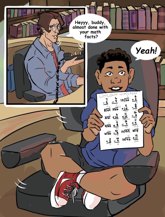

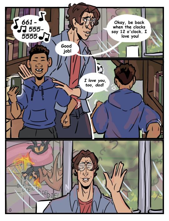
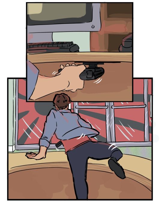
S2E3: Link's favorite class was P.E. aka Personal Entertainment which he did whenever Grant had to do taxes, run errands...or whatever else it was that dads did!
#i. this series was supposed to be like. a drawing for each fact 😭😭#I COULDN'T HELP IT#it was good practice tho lol#i love grant teaching link its so cute#look IK HES A MASS MURDERER BUT REMEMBER LINKS NAT 20 FOR HOW MUCH HE LOVES HIS DAD#i will never shut up about it#anyway#Marco gets random calls from Link when he's having PE#marco just stops in the middle of giving a house tour to a client and holds up a dad finger while he's on the phone with him#my art#dndads#dndads art#dndads s2#dndads fanart#lincoln li wilson#grant wilson#marco li#dungeons and daddies#dungeons and daddies art#dungeons and daddies s2#nick close#hes sort of there lol#how tf do people tag for nick#nick foster#wtf??#nicholas freeman next??? nicky swift???#idk lmao#li wilson family#ignore the last pose i was losing steam 😭😭😭#and the background pls for the love of dood 😭😭
1K notes
·
View notes
Text
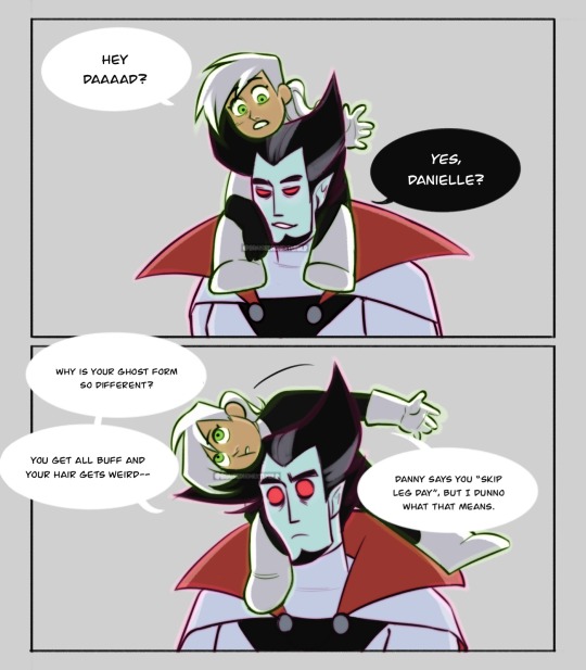
answer her questions vlad. why do you skip leg day vlad.
(more of this bc honestly, dani deserved so much better. also learning how to draw dani.)
still inspo from @lilianade-comics au where vlad sucks less! kind of! but also just generally a decent parent vlad au lmao.
(do not tag as ship. pls.)
#danny phantom#danny phantom fanart#dp#dp fanart#vlad plasmius#vlad masters#dani phantom#really really trying to like. relax a little when it comes to art#like with the shapes and style and w/e#cartoony comics like this help#insert spiderverse miles copying peter meme#anyway comics practice <3#ney’s art#ney’s comics#ALSO i drew dani like. way too tall in the last one#she is baby#this is why you use references folks bc otherwise your proportions turn out WEIRD#… just imagine she was older in the other one ig. highschool teenage daughter suffering vlad’s homicidal tendencies#DO NOT TAG AS SHIP#seriously. please.
1K notes
·
View notes
Text
In love with the idea of captain marvel being Billy's imaginary friend. Like, it'd be so easy. Early depictions had them as almost fully separate people sometimes, like one soul with two minds, rather than just two filters like we mostly see now.
But imagine a Billy down on his luck, hurt and hiding from police and criminals alike, daydreaming the hours away as children do, taking inspiration from all the superheroes rising to fame, making little stories to play out his dreams of saving the world with a generic action doll he found while dumpster diving once. Most of the paint's rubbed off.
Red's his favourite colour, his comfiest jumper is a bright ruby even after all the grime and washes. Gold, too, it's shiny and warmer than silver! A hero cape is a must, big and eye catching! And he can fly, of course, like superman, and in his daydreams, when he's sore and frustrated after a long day's grind, his superhero is smart enough and knows all the right words to get the bullies to stop without resorting to fighting.
His superhero fantasy is one he spends a lot of time on, the first one he goes for when struggling to sleep at night, and he can picture it so clearly. Captain marvel is big and bright and kind, strong enough to lift the boxes for the old lady up the road who's moving all by himself, fast enough to catch Jamie who fell out of the tree on Saturday and broke his leg and couldn't come to class for weeks. He appears at the entrance to alleys when Billy is cornered, he steps up behind to cover for him when he gets caught shoplifting, he sits at the bus stop with him when it's pouring rain and the right bus doesn't seem to be coming.
And then the wizard comes, or rather whisks him away, and like a magician from a fairytale breathes life into his imaginary friend until Billy feels thrice his size and a million times more invincible.
From then on, captain marvel is a real hero, just like Billy is a real boy, and as one they save the whole city, and then the whole world, and get cats down from trees and help Mrs Victoria move the last of her boxes and she gives them a pinch in the cheek and cookies for the road and sometimes it hurts but it's so much better than he imagined.
#dc comics#captain marvel#dc captain marvel#shazam#billy batson#imaginary friend#imaginary friend au#Billy's great because you can give him the most buck wild adventures with the most self indulgent plots and it makes perfect sense#Batman and superman are out here having mental health crisis no.528 and marvels away having dance offs with gnomes#Billy would fit perfectly into gravity falls he really would#Anyway imaginary friend au is near and dear because it encapsulates that sort of safe fantasy for change and companion ship#And a protective imaginary friend brought to life is going to be just a fascinating character no matter what#And it's the perfect cover for non imaginary cap anyway. Why does he prioritise this kid over everything despite having never mentioned him#Imaginary friends always have to care for their creator! But you can't expect an imaginary friend to do your taxes!#Why is cap so eternally kind and bubbly and a bit childish? That's because his creator is a kid! Duh!#This particular imaginary friend just so happens to have encountered magic and is now real enough to play basketball with asteroids.#He's strong enough to match superman but it's fine he's got a child's heart and an unending protectiveness for humanity.#Just don't try anything with the kid or you're toast.#I love the jl needing to save/help Billy in some way and cap; who's practically the jls puppy mascot at this point#Is just shamelessly and unrepentantly possessive of Billy while being openly wrapped around his finger. Number one fan#Like 'he's the specialist boy and if you don't clap for him I'm going to blow this whole building up' type#Have you read Split on ao3 it's like that. Cap is the most unaffiliated person on the team and then bam Billy is number 1 priority 100%#Go read split if you haven't 10/10#Like it never crosses caps mind to hinder or harm Billy he is Devoted. Platonic God/worshipper except the deity in question is an 11yo#And the worshipper is the closest thing to a deity without being one you can get in dc.#But like a healthy relationship lmao.#It's a soul deep claim with total freedom on both sides and they teach each other love and they're the same person#AUGH
419 notes
·
View notes
Text
:D
#okaaaay so.... im sorry about the watermarks- from what ive read this is best practice for protecting your art from ai#though i worry it wont help at all. i just want to try#ive never cared about people reposting my art but the ai stuff makes my skin crawl#anyway if for some reason you want the version without a watermark just tell me and i can email it to you i dont care who has it#knd#kids next door#my art#I JUST WORRY THE WATERMARKS ARE STILL NOT BLOCKING ENOUGH like i worry theyre too light. but i hate using them
184 notes
·
View notes
Text


The fact that people are actively trying to avoid doing the 4th quest is the funniest thing ever.

#sky children of the light#sky cotl#thatskygame#skyblr#season of revival#doing the 4th quest for revival is like encountering a mission nobody likes to do but has to do it anyway for completion#don't get me wrong I'm still a bit butthurt from losing my WL after getting all 150 of them#but I had to go to Eden anyway for a wing buff and I was low on ascended candles#also hi Eden Uber#why is no one asking me to help them go through Eden??#i am practically the person for the job
327 notes
·
View notes
Text

this is fyozai to me cuz i think they’re neat
also bonus trenchcoat man with a cane going squish
#i didn't mean to make daz shorter#i was doodling him with his cane as an anatomy practice#and then squish#also fyozai is running rampant around my empty skull help#i luv them a healthy amount#anyways#bsd#bungou stray dogs#bsd dazai#bsd fyodor#fyozai#night does art
197 notes
·
View notes
Photo
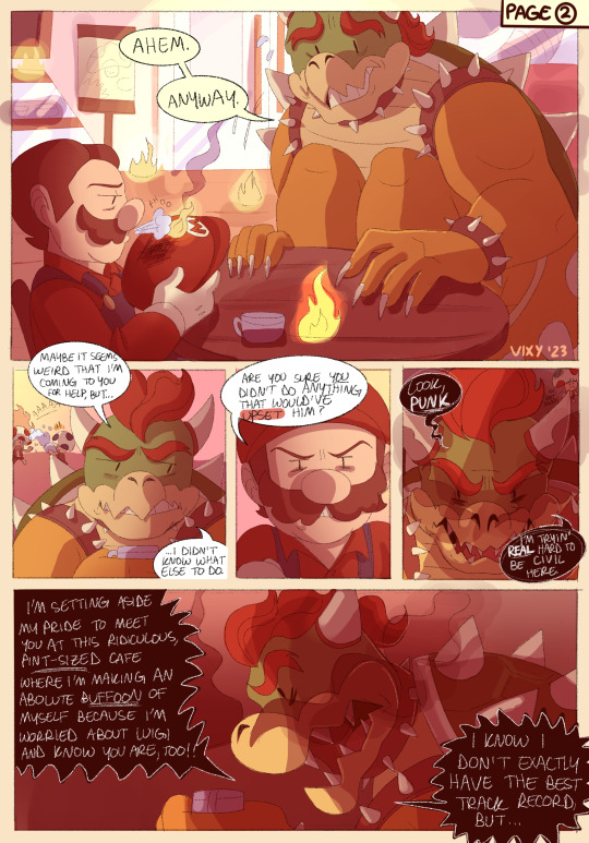

UNTITLED EVIL LUIGI AU COMIC THING | Page 2 & 3 of (???)
Eggman Bowser’s come to make an announcement. Particularly to shut down any premonitions Mario may be holding onto a little too tightly. Bowser and Mario are able to set aside their differences (for now, at least) so that they can work together on a common goal-- figuring out where the hell Luigi is.
(A/N under cut)
---
believe me when i say i really wanted to link all the pages together in a neat, practical way so that everything would appear more organized than it actually is, but tumblr hates me and won’t let my posts show up in the tags if i include a hyperlink of any kind. :D
i read somewhere that tumblr only disallows posts from showing up in tags if it includes an external link (vs an internal/link to another tumblr page), which, in theory, shouldnt be an issue since the pages i’d be linking to are also on tumblr but regardless it’s not cooperating with me anyway. i’ve been on tumblr for what feels like a million years but this is the first time ive tried to make my posts cohesive like this so if anyone knows how to fix this issue im all ears 🙃 for the record, everything related to this au will be going into the following tags on my blog: #my art, and #evil luigi au. we’ll just have to sort things that way for now, i guess 😭
i start work tomorrow so can’t say when there will be a new page but i do have a lot planned out already. so hopefully i’ll be able to continue what ive started for at least a handful of more pages 🤠 next page will be fun to work on. for a bowuigi-centered story, where’s the luigi?! he’ll show up soon. just in the form of a flashback for now though 👀
also sorry if my handwriting is evil. it’s just personally easier/faster to write out everything by hand than type everything out but i may try to type the next page’s dialogue to see how it goes and to see if it makes things look ✨cleaner✨
(also also i spent so much time trying to figure out how to draw them doing a handshake for the “truce” panel. i ultimately failed. therefore.... fist bumps LMAO)
#bowuigi#bowser x luigi#bowser#mario#super mario bros#super mario movie#bowuigi comic#my art#mine#evil luigi au#remember how i said last time there will be absolutely no consistency to this in any sense of the word#these 2 pages really showcase that LOL#love how i go from drawing bowser with a full set of teeth to like. 3#maybe i really should consider typing out the text thatd probably help#anyway i hope i can keep this going for a bit#i do plan on writing an original comic someday so this is good practice/is a good confidence booster for me#i love drawing bowser holding teeny ass cups. it is so funny to me. why#also working on trying to better distinguish this story from mr L's story#because when i started it i did not really know about the whole mr L thing LOL#so im hoping it doesnt seem like im trying to like.......rip off that whole concept#that would be sad :(
1K notes
·
View notes
Note
*positive vibes intentions and wishes from the other side of earth being sent to you*
Hope you're doing well and if you dont right now i hope you will tomorrow!!! :)))
<33 THANK U FRIEND! i am getting better every day i think 💪
#not having a lot of practice regulating my emotions is a recent struggle i've had to start facing again which has been hard#but ten years of yoga and forcing myself to learn breathing exercises i think will be very helpful!!#and one thing i'd like to also try doing is not giving myself constant psychic damage by going on my phone all the time..#that will be hard but ultimately worth it..#anyway thank u for ur kind message!! i appreciate it#binask
96 notes
·
View notes
Text
"Do you ever wonder why it rains?"
#Guess who's getting into another gacha?#also I am just a little obsessed#just a little#Random character: *has anything to do with rain*#Me: I'll die for you#I'm not predictable at all shut up >:(#helps that I'm learning russian rn so I practice by translating his dialogue#is playing gacha secretly an academic endeavor?🤔🤔🤔#His dialogue for entering a team is “Can I.. not?” which is so funny to me#like me too#the amount of tags is getting out of hand#anyways#reverse 1999#re1999#зима#зима reverse 1999#zima reverse 1999#fanart#reverse 1999 fanart
153 notes
·
View notes
Text

bloodstained patient zero
#ocs#my ocs#my ocs art#original character#reassassination#octavia#zomcat#this was practice (as is every drawing i make) - this time with values background and perspective#i dont think i did well in anything but perspective but of course ill post this anyway#and this outfit is octavia's nurse uniform which she wears when helping savory with his experiments or operations#she doesnt like the outfit because its easily bloodstained hence the title 'bloodstained patient zero'#zomcat is there for moral support i guess#tags ->#blood#cartoon blood#syringe#needle#?#zeno's art
228 notes
·
View notes
Text

angeal baby please just one chance i would treat you right
#BEAR ANGEAL!!!!!!!!!! BEAR ANGEAL!!!!!!!!!!!! BEAR ANGEAL DO YOU HEAR ME ANGEAL SHOULD BE A BEAR!!!!!!!!!!!!!!!!#i made him like more muscle bear here. but in my head (if he lived) he would lose that more down the line. post shinra#but anyway. angeal is socutes oTL. he's been giving me trouble for Months but i think i got it#shoutout my oc bernard he helped me practice LOL#more bear angeals ok? take my hand? prommy?#hh art#ff#ff7#ffvii#angeal hewley#angeal#genesis rhapsodos#and him too.
123 notes
·
View notes
Text

#team fortress 2#tf2#sniper tf2#spy tf2#on the left is the spy doodle that I made with an ink pen because#on the right is a minor render practice and sniper was my victim because#(both of these mfs have been living in my head completely rent free for over a year please help)#(I’ve actually been drawing these two a lot haha ((help))#anyways just wanted to post something before new year
106 notes
·
View notes
Last Seen Blogs

scribblebibble3
Untitled
manabuhosaka
保坂学のtumblr

obsidianbwitchedmoon
Obsidian.
funny-bones-mcjones
Lets Be Skeletons Fam
okyanusahasretdenizkizi
derinlere meftun🌊