Photo
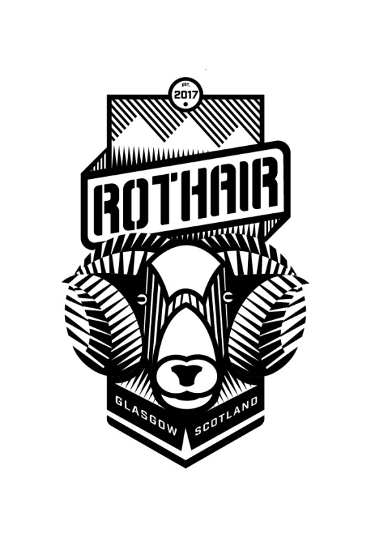


New bicycle crest design for Custom Bike Shop based in Glasgow, Scotland. “Rothair” is the Gaelic word for ‘Bicycle’
#gaelice#bicycle#bike#cycling#velo#crest#badges#logo#logodesign#graphic design#illustration#cycle#gaelic#ram#shepp#design#adobeillustrator#scottish#bespoke#typography
3 notes
·
View notes
Photo
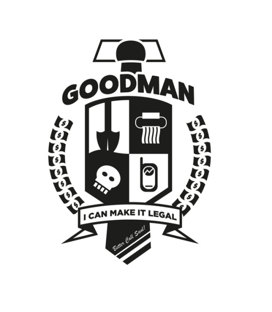
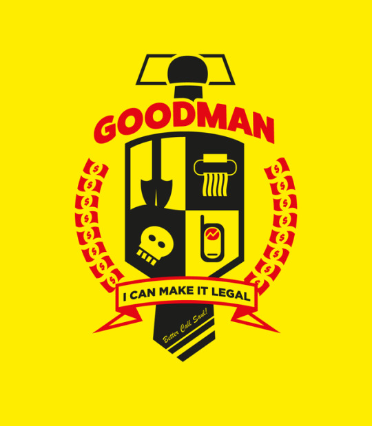



Took part in Aaron Draplin’s excellent Skillshare course. This was my class project - The Family Crest of Breaking Bad’s Saul Goodman.
#breaking bad#bettercallsaul#breakingbad#graphic design#illustration#aaron draplin#crest#heraldry#logodesign#saulgoodman#bob odenkirk#amc#logo#better call saul
1 note
·
View note
Text
Sheer Utter Chaos Poster
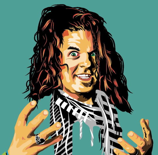
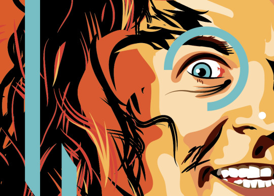
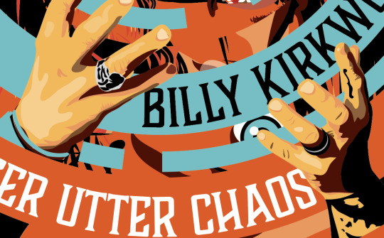
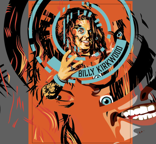

Always a pleasure to work with the evil wizard of Scottish comedy Mr. Billy Kirkwood. The show’s title demanded a chaotic treatment. The basic process was to meticulously make a vector portrait of Billy and then destroy it in a random circular way. All emitting from his evil eye. Pretty pleased with the result.
Based on an original photo by Warrior Fight Photography
#graphicdesign#illustration#vector#artwork#adobeillustrator#scottish#standup#comedy#billy kirkwood#glasgow comedy festival#poster#print#wrestling
0 notes
Text
Blabbermouths Poster

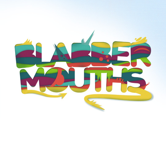

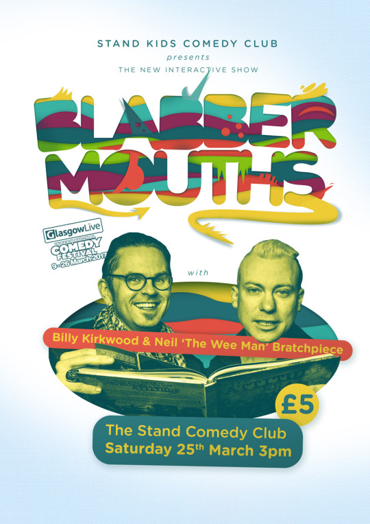
3D Lettering and Poster design for Billy Kirkwood’s new interactive kids show at The Stand Comedy Club Glasgow
#3d lettering#photoshop#illustrator#typography#kids#childrensbooks#storytime#standup#comedy#glasgow#festival#the wee man
0 notes
Text
My Type of Workshop
Now a firmly established annual event with some global heavyweight hitters involved, Graphic Design Festival Scotland gives me a headache.
The prelude to a month long exhibition at The Lighthouse, GDFS offers a week of talks, mentoring and workshops. It’s the latter series of finely packed 1-day workshops, which run concurrently that cause my frontal lobes to swell.
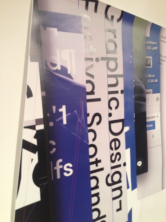
How to choose from the likes of the glorious brush work of Ciarán Glöbel's sign painting, the brand mastery of O Street, the DIY content craft of Good Press Gallery, Alan Kitching’s bold wood type, Maklabs clever 3D creations…? Oh just give me them all.
Deep creative soul searching, and seeing him give an inspiring talk at LongLunch, saw Alan Kitching's Letterpress Workshop edge it. The chance to escape the digital prison of my Mac for a day and create lettering, keyboard free, was nourishment for my graphic soul.
The chance to escape the digital prison of my Mac for a day and create lettering, keyboard free, was nourishment for my graphic soul.
On the day, unlike the other workshops based at the Lighthouse, we began our session in the magnificent Case Room at the Glasgow School of Art. The setting, with it’s shelves of huge wooden letter blocks and racks of metal type was so charming and distracting it took me time to tune into Alan’s briefing. Which was quite simple, we each had to pick a name of a whisky, get a wood block of the initial letter, then take the full name and set that in smaller metal type. The eventual result was to produce a label for a whisky bottle taking the initial letter as the main graphic with it’s name neatly set inside it.

I chose ‘Aberfeldy’, fine name, fine whisky and a subtle nod the indie folk band band of the mid 00’s. So, to the shelves, clunking and rattling through hand-carved blocks to find that ‘A’. Some 40pt Egyptian did the trick. Then to the word itself, I rifled through a case of 14pt Bodoni. A familiar font but this was the first time I’ve held the weight of it in my hand.
The capital letters went first for print. 3 presses lined one side of the Case Room, 2 of which were drum presses from the 70's, the other, a more vintage flat bed press with impressive wrought iron handles. This was my press for the day and I set up my capital letter block with 3 other students. Placing my ‘A’ on the bed, the challenge was to make it a tight fit within the frame of the bed. I had to knock and swap several spacers and use some finer leading (Yes - Actual ‘made out of lead’ leading) to finesse my letter into place. A test pull showed the positioning on our paper. Under Alan’s direction, we shifted our letters around in the appropriate picas until we were centred on our particular part of the sheet.
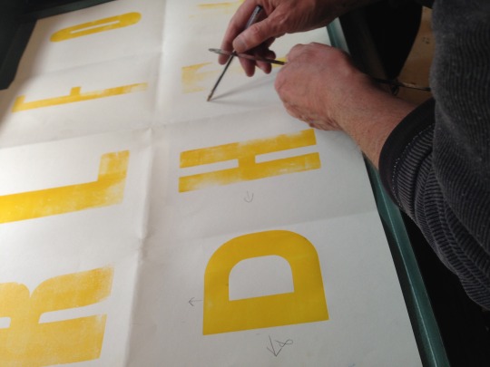
Then, to get messy. Choosing 4 primary tones of green, red, yellow and blue, we inked the blocks in a random overlapping system and began our print run of 25. As the run developed, the colours shifted and what began as a red primary tone plunged into a richer earthier hue. Which, by a happy accident, was ideal for a whisky label.
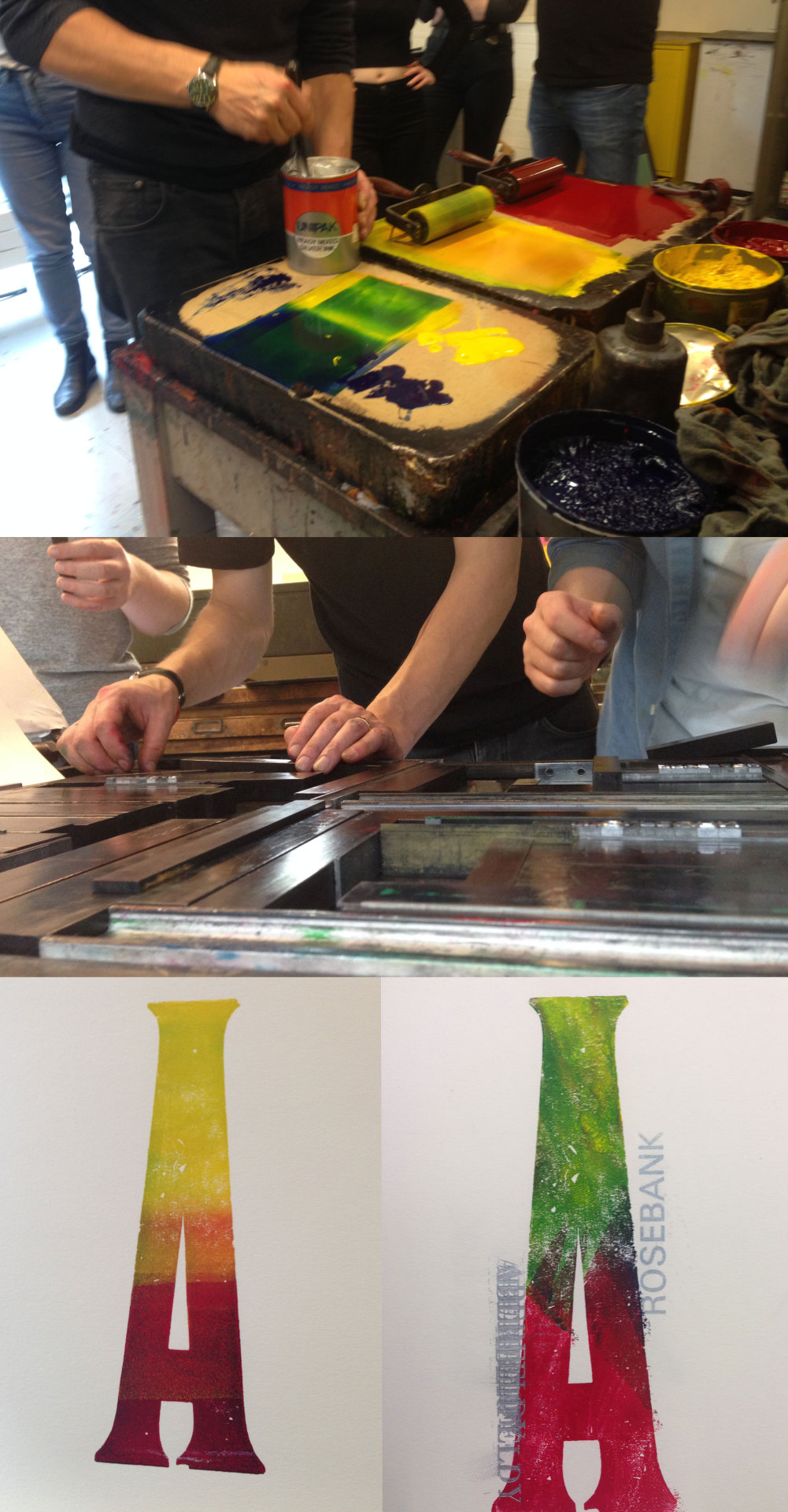
Then metal type of the word ‘ABERFELDY’ was next on the press and this time the colour was shimmering silver ink. There was a battle with registration and positioning, to get the word to sit just right on the letter, but it paid off handsomely as the first pulls were made. The rich silver sparked off the darker tones beneath and the art began to reveal itself.
The rich silver sparked off the darker tones beneath and the art began to reveal itself.
Our first few pulls were gathered, cropped to the given dimensions of the proposed label and we assembled around Alan to assess our work. The label-less side of a large bottle, he walked through the parade of freshly pressed prints. Wrapping them around the bottle, we fully realised the object of the exercise. I love the various interpretations among the group. My letter sat white nicely on its side within the label, but other students had gone with even larger letters that, although heavily cropped, could still be seen in their form and was a magical result.
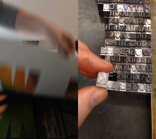
These prints were 'what's important', Alan stated. The process by which we arrive at the prints he 'couldn’t care less' about. It’s important at the time, but all the presses, inks, spacers, wooden block are merely scaffolding and will remain in the case room, while the print is what is taken out and shown to the world.
On the train home, I studied the samples I had printed and those of the other students. The chaos of the inky pattern, all the variables that made it, neatly framed in the order of the letterform. There simply is no Photoshop action out there to replicate it. My narrow digital view of Graphic Design had widened since the start of the day.

Head on over to the GDFS website and prepare yourself for a welcome headache at next year's event.
Pearse O'Halloran is an independent Graphic Designer, based in Glasgow. Find out more at www.btdt.co.uk.
Alan Kitching is one of the world’s foremost practitioners of letterpress typographic design and printmaking. Alan Kitching is renowned for his expressive use of wood and metal letterforms in creating visuals for commissions and his own limited edition prints.
#letterpress#typography#alan ktiching#graphic design#handcrafted#letters#type#printing#artwork#glasgow#festival#scotland#whisky#product#packaging#design#alan kitching
0 notes
Photo

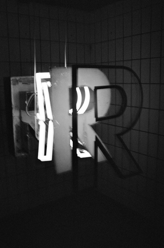
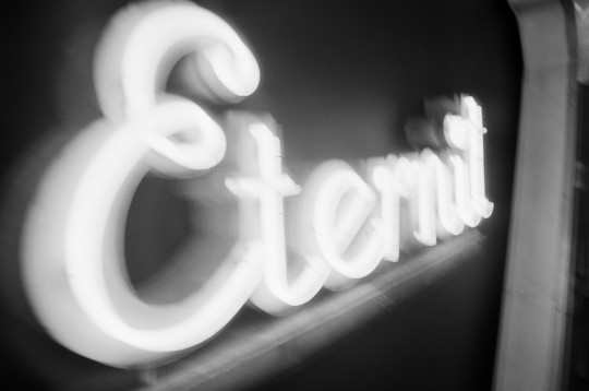


Photos from the Buchstaben Museum in Berlin.
Taken on Black and White film on a Canon SLR EOSD.
0 notes
Photo
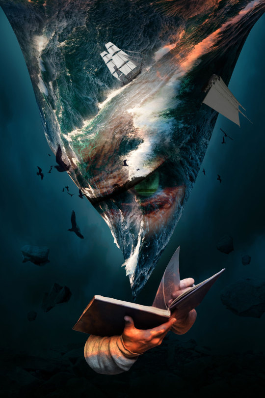
My Entry for Adobe’s #TakeTen Contest.
Taking 10 selected stock images and merging them into a theme of ‘The Storm’.
View on Behance →
#taketencontest#adoeb#photoshop#digital art#storm#sea#vortex#photography#stock#adobe#storyteller#graphic design#illustration
0 notes
Photo
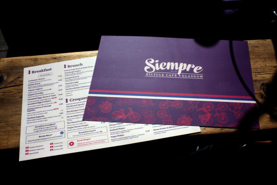


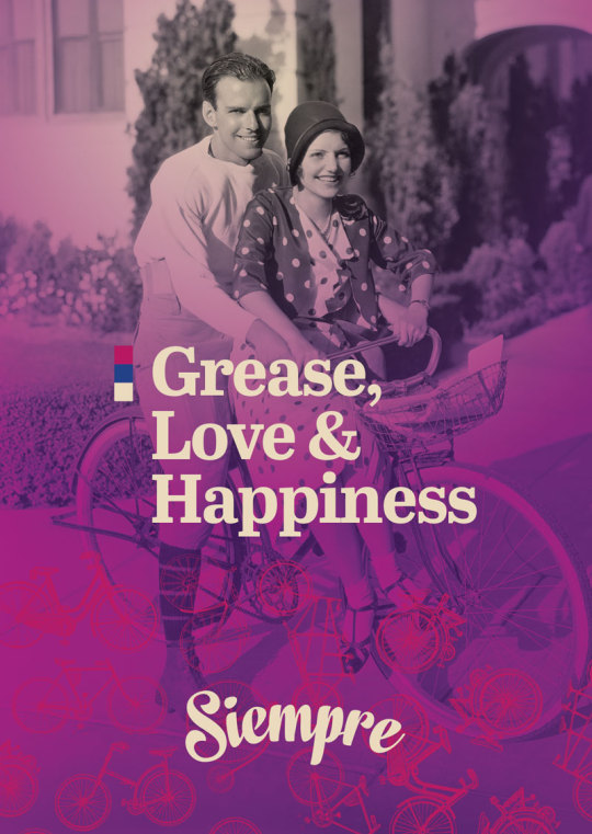
My recent refresh of Siempre Bicycle Café can now be viewed on Behance.
0 notes
Photo

Flyer artwork for Glasgow’s best alternative comedy night CHUNKS. It was created using by deconstructing of the artwork of previous shows, by the ringleader NEV.
0 notes
Photo


“Am I still growing is the real question?”
In March this year, a very good friend and absolute legend, Colm O’Mahony lost a long battle and passed, criminally early. On his 35th birthday, we’re getting together with some stand-up comedy pals of mine for a show to celebrate his life. All proceeds go to the Lord Dowding Fund.
Tickets.
3 notes
·
View notes
Photo

Poster for the Graphic Design Festival Scotland 2016
0 notes
Photo
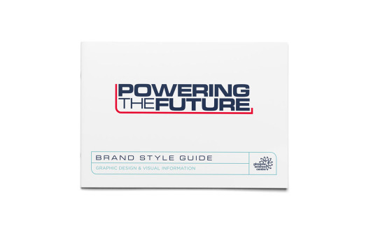

Powering the Future Branding now on Behance
My branding work for the incredible ‘Powering the Future’ exhibition by Glasgow Science Centre is now laid out on that there Behance.
0 notes
Photo
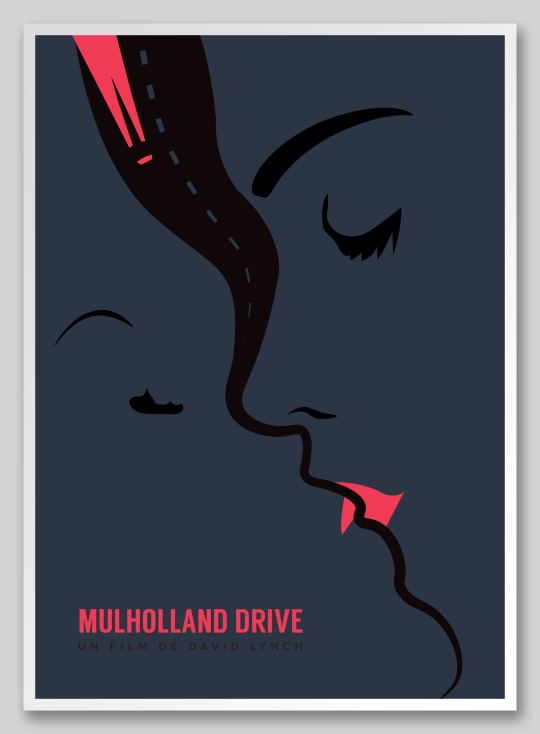
Minimal Movie poster for David Lynch’s “Mulholland Drive’. BUY
Facebook | Twitter | Behance
107 notes
·
View notes
Photo
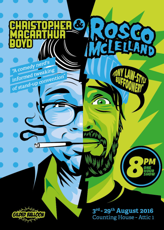
Poster artwork for Scottish Comics, Christopher Macarthur Boyd and Rosco Mclelland.
Twitter | Facebook
#stand up comedy#scottish#edinburgh#fringe#festival#the cramps#misfits#rockabilly#illustration#vector#graphic design#adobe#portrait#face#drawing
1 note
·
View note
Photo

Layered animation of the artwork for comic Darren Connell
1 note
·
View note
Photo
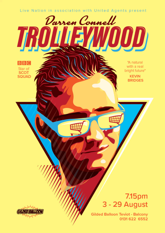
Poster design for the stand up comedian and star of BBC’s ‘Scot Squad’, Darren Connell’s ‘Trolleywood’ show this August.
#darren connell#graphic design#illustration#80s#retro#classic#vector#poster#edinburgh#fringe#festival#comedy#stand up#comedian#scot squad
0 notes
Photo

My entry for Poster Project.
Based on the word ‘STRESS’.
0 notes